Embed Size (px)
Citation preview

Making your publication conveniently available for on-the-go readers is absolutely necessary to retain and grow readership in the future. The process is unique for each publication, employing editorial, marketing, creative, technical, administrative, and monetization disciplines. This white paper provides general guidance through the process and a case study of a successful mobile project with a SIPA member company. Andy Swindler President, Astek 773.486.6666 [email protected] @aswindler @astekweb www.astekweb.com
A s t e k | 3 5 8 0 W B e l d e n A v e , S t e 3 , C h i c a g o I L 6 0 6 4 7 | a s t e k w e b . c o m
December ʼ11
Astek | Going Mobile for Publishers
Going Mobile for Publishers
773.486.6666 | astekweb.com © 2011 Astek Consulting LLC 2
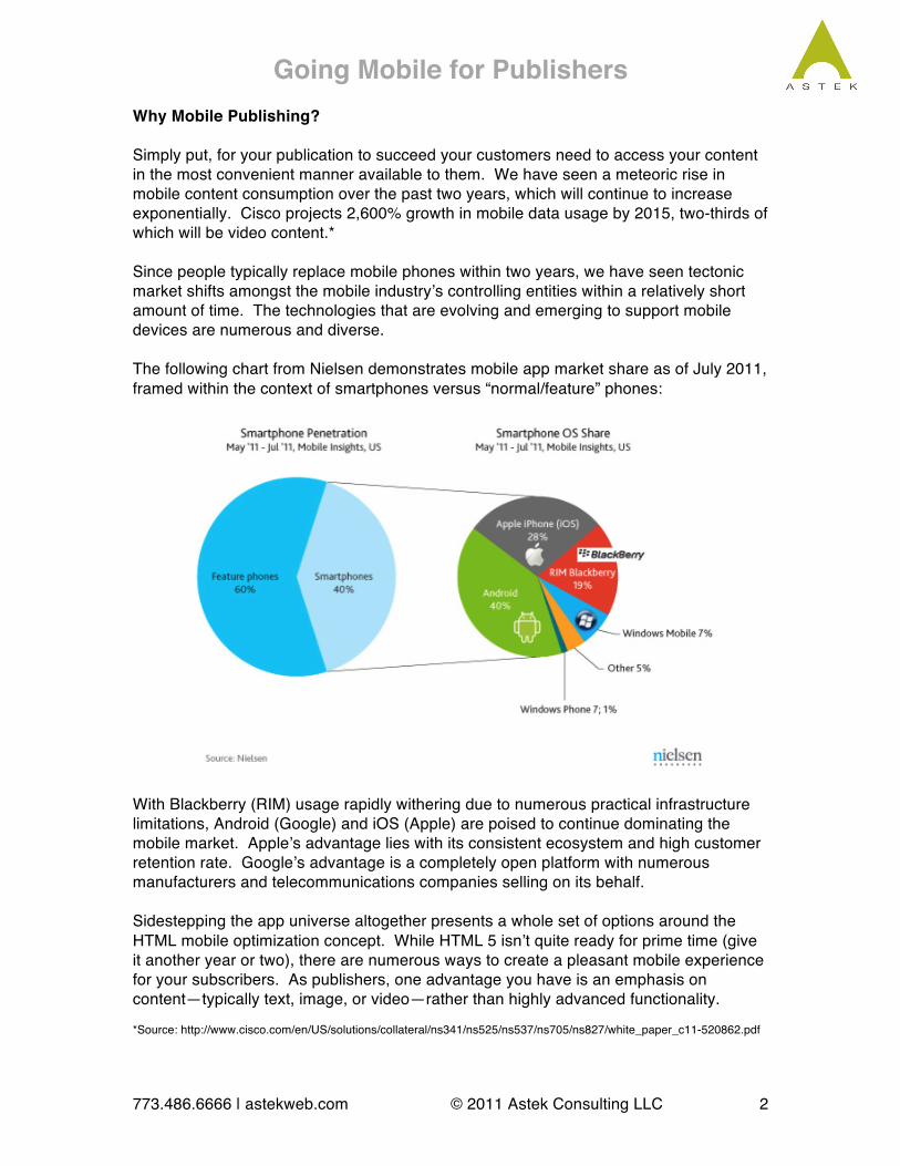
Why Mobile Publishing? Simply put, for your publication to succeed your customers need to access your content in the most convenient manner available to them. We have seen a meteoric rise in mobile content consumption over the past two years, which will continue to increase exponentially. Cisco projects 2,600% growth in mobile data usage by 2015, two-thirds of which will be video content.* Since people typically replace mobile phones within two years, we have seen tectonic market shifts amongst the mobile industryʼs controlling entities within a relatively short amount of time. The technologies that are evolving and emerging to support mobile devices are numerous and diverse. The following chart from Nielsen demonstrates mobile app market share as of July 2011, framed within the context of smartphones versus “normal/feature” phones:
With Blackberry (RIM) usage rapidly withering due to numerous practical infrastructure limitations, Android (Google) and iOS (Apple) are poised to continue dominating the mobile market. Appleʼs advantage lies with its consistent ecosystem and high customer retention rate. Googleʼs advantage is a completely open platform with numerous manufacturers and telecommunications companies selling on its behalf. Sidestepping the app universe altogether presents a whole set of options around the HTML mobile optimization concept. While HTML 5 isnʼt quite ready for prime time (give it another year or two), there are numerous ways to create a pleasant mobile experience for your subscribers. As publishers, one advantage you have is an emphasis on content—typically text, image, or video—rather than highly advanced functionality. *Source: http://www.cisco.com/en/US/solutions/collateral/ns341/ns525/ns537/ns705/ns827/white_paper_c11-520862.pdf
Going Mobile for Publishers
773.486.6666 | astekweb.com © 2011 Astek Consulting LLC 3
You know you need to go mobile, so now what? Your starting point for this process depends upon unique aspects of your publication, including:
1. Current technical infrastructure 2. Editorial content and workflow 3. Revenue model 4. Goals, budget, & timeline
Start by learning and documenting as much as you can about these issues, which are explained in more depth below.
1. Current Technical Infrastructure CMS – You probably have a content management system (CMS) of some kind in place. This tool allows you to centralize your content and workflow while decentralizing access to it (typically via the Web) for distributed teams. Ideally, your CMS will have mobile HTML optimization capability built-in or available as an add-on. If not, it may be time to move. This allows readers to view your website in a mobile-friendly format without downloading a specific app. They will need a smartphone with a capable web browser, which includes iPhone, Android, and many other devices produced within the past two years. CMS to App – If you are interested in creating an app or series of apps for your subscribers, you will ideally still want to feed content to those apps from your CMS. This tends to get a bit more complex as your tech team will need to coordinate between systems using an Application Programming Interface (API), which may or may not exist on your system. There are numerous nuances to consider when getting these systems to work together reliably. User Authentication – If you sell subscriptions to your digital publication, you must have a technical process for verifying that those readers have access to your content. You will ideally want your mobile solutions to utilize the same database of users for ease of managing that subscription data. This will require coordination between existing technical teams and your mobile team, or conversion to a new system.
2. Editorial Content and Workflow Going mobile means that you will need to evaluate your content and make choices about the hierarchy of that content for your readers. Mobile devices are physically smaller, which means you have less space to display your content. Itʼs critical to maintain or improve the efficiency of your editorial process. Depending upon the size of your publication, you may or may not be in a position to alter that workflow. Short-term downside is training for your editorial team.
Going Mobile for Publishers
773.486.6666 | astekweb.com © 2011 Astek Consulting LLC 4
Long-term upside could be a more efficient and reliable process for everyone. If you have documented your editorial workflow, itʼs time to pull that out and determine if any adjustments need to be made before you add the mobile variable to the equation. If youʼre comfortable with your process but havenʼt documented it, I would recommend doing so. Even a basic flowchart will help you communicate the process with your mobile team.
3. Revenue Model Similarly, is your revenue strategy well documented? Itʼs a good opportunity to make sure youʼve thought through the best strategy for monetizing your publication, whether through subscriptions, ads, up sells, or any other means. Since the mobile universe offers even more options and in some cases complications for maximizing your revenue, it is important to be clear about your publicationʼs overall strategy for this, which also speaks to the brand culture and expectations youʼve established with your readers.
4. Goals, Budget, & Timeline Your goals for going mobile should align with your overall goals for your publication and business. Like all tech-related buzzwords over the past decade (e.g., SEO/CMS/Social), you need to start with your business goals to determine how to approach the strategies and tools that will help you reach them. Common goals for publishers include:
• Distribute free or “freemium” content • Generate revenue via subscriptions or ads • Protect paid content from unauthorized distribution & sharing • Expand audience by increasing brand awareness & trust in quality • Cross-sell with compatible publications (internal or partner)
At the end of the day, your primary goal is to allow your customers to access your content in the most convenient manner possible for them. Mobile phones and tablets are rapidly becoming the most convenient way for most people to access information and communicate with other people. While you are setting your goals, be sure to put a stake in the ground regarding budget and timeline. This will likely need to be modified once you work out the details of your mobile plan, but it will help to have a starting point.
Pick Your Platform(s) Once you are comfortable with your current assets, processes, and goals, itʼs time to decide which mobile platforms are most important to you. The best way to determine this is to learn as much as you can about your readers and the technology they are using. A combination of studying your existing website usage data (such as Google
Going Mobile for Publishers
773.486.6666 | astekweb.com © 2011 Astek Consulting LLC 5
Analytics) and sending a survey to your subscribers will help you learn what they are using now and what they want in the future. Go here for ideas about creating a survey: http://www.astekblog.com/index.php/marketing/going-mobile-how-to-survey-your-customers/ Armed with information about your customerʼs preferred reading methods, you are ready to choose one or more of the following options:
1. Optimized HTML 2. Mobile Apps 3. Proprietary Content Platforms
Each of these is explained in more detail below.
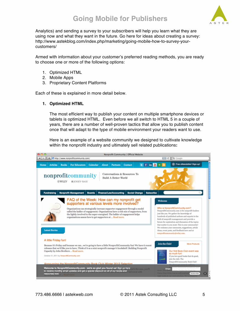
1. Optimized HTML The most efficient way to publish your content on multiple smartphone devices or tablets is optimized HTML. Even before we all switch to HTML 5 in a couple of years, there are a number of well-proven tactics that allow you to publish content once that will adapt to the type of mobile environment your readers want to use. Here is an example of a website community we designed to cultivate knowledge within the nonprofit industry and ultimately sell related publications:

Going Mobile for Publishers
773.486.6666 | astekweb.com © 2011 Astek Consulting LLC 6
And here is the same website on an iPhone:
The person using the iPhone did not need to do anything special to load the mobile version. The website detected the phone and automatically displayed the preferred mobile layout. As you can see, much of the information on the website homepage had to be removed to focus on the main content in the limited space of the iPhone. This is the root of HTML optimization—create a seamless user experience that doesnʼt force the user to make technical choices. Get your reader to your content as quickly as possible to avoid losing his or her interest. There is no limit to how you can organize mobile content or craft a mobile experience. For example, you may first wish to present your readers with a menu of including various types of content, login, or account-related activities. Bear in mind that smartphones and tablets provide different mobile experiences and should be evaluated separately to optimize the experience for each device. HTML optimization for tablets is not as important as phones, since many websites display well on tablets already. HTML Advantages:
• Standard content formatting for Web and email • Free available, flexible, and open • Typically reduced production cost and time • Typically easier CMS integration • Easier viral distribution and sharing, with methods to deter unauthorized
copying

Going Mobile for Publishers
773.486.6666 | astekweb.com © 2011 Astek Consulting LLC 7
HTML Disadvantages (HTML 4):
• Reduced offline content viewing • Reduced control of brand and user experience • Fewer options for rights management • Fewer ad revenue options • Fewer interactive features
Since NonProfitCommunity.com is based on Wordpress CMS, we used the MobilePress plugin. Here are a couple of other good Wordpress mobile plugins:
• WPTouch http://wordpress.org/extend/plugins/wptouch/
• Wordpress Mobile Edition http://wordpress.org/extend/plugins/wordpress-mobile-edition/
There are numerous plugins available for Wordpress, and as always you need to make sure that they are compatible with other aspects of your installation if you are using Wordpress as your CMS. One challenge with Wordpress is that you need to configure your mobile home page if you want to provide more options to a user than a list of your basic content/articles, as blogs typically do.
2. Mobile Apps
If you decide to build apps, you then need to decide which app platforms you want to support. Keep in mind that building an app isnʼt just a one-time exercise or expense. You must keep your app up-to-date, sometimes making adjustments due to new hardware or software beyond your control. Do you need an app? App Advantages:
• Maximum Control over brand, user experience, and rights management • Expanded options for ad revenue • Currently more capability for media-rich content • Enhanced ability to view content offline (such as a plane) • “Cool” factor
App Disadvantages:
• Typically higher production and maintenance cost and time • Subscription access is limited to device platforms you can support • Potentially more difficult to integrate with existing Web publishing
solutions (CMS) • Reduced flexibility for quick changes
Going Mobile for Publishers
773.486.6666 | astekweb.com © 2011 Astek Consulting LLC 8
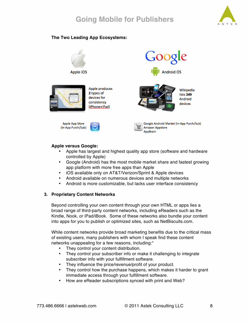
The Two Leading App Ecosystems:
Apple versus Google: • Apple has largest and highest quality app store (software and hardware
controlled by Apple) • Google (Android) has the most mobile market share and fastest growing
app platform with more free apps than Apple • iOS available only on AT&T/Verizon/Sprint & Apple devices • Android available on numerous devices and multiple networks • Android is more customizable, but lacks user interface consistency
3. Proprietary Content Networks
Beyond controlling your own content through your own HTML or apps lies a broad range of third-party content networks, including eReaders such as the Kindle, Nook, or iPad/iBook. Some of these networks also bundle your content into apps for you to publish or optimized sites, such as NetBiscuits.com. While content networks provide broad marketing benefits due to the critical mass of existing users, many publishers with whom I speak find these content networks unappealing for a few reasons, including:*
• They control your content distribution. • They control your subscriber info or make it challenging to integrate
subscriber info with your fulfillment software. • They influence the price/revenue/profit of your product. • They control how the purchase happens, which makes it harder to grant
immediate access through your fulfillment software. • How are eReader subscriptions synced with print and Web?

Going Mobile for Publishers
773.486.6666 | astekweb.com © 2011 Astek Consulting LLC 9
• What effort is required to convert your content to their format and how does that affect your workflow?
• Will they allow you to access archives, search, bookmarking, notes, and discussions?
• Can they sell single issues versus subscriptions? • Do they have adequate copy protection in place? • Converting from your legacy data will be harder than you think. • Subscribers think itʼs all for free.
*With contributions from Greg Krehbiel, The Kiplinger Washington Editors, Inc.
Go Mobile! While the specific process will vary depending on a number of variables, these are the general steps you will take to make your publication available to mobile users:
1. Define goals, budget & timeline 2. Survey your readers and staff 3. Pick your Platform(s) – HTML is most cost-effective 4. Define your team (internal/vendor/project management/testing) 5. Functional Specification Doc – Get as detailed as you can, include items such as:
a. Project overview b. Workflow c. Common app elements d. Testing procedures e. Server/CMS interface & Application Programming Interfaces (APIs) f. Authentication/Login process for paid subscribers g. Languages/Caching h. Screen designs i. Privacy & Security
6. Design – KISS, mobile phones are small and fingers are clumsy 7. Develop/Test – Test as much as possible with “real” users/devices 8. Launch – Each app store is different. Test again after launch. 9. Marketing 10. Respond to Feedback & Improve Mobile Experience
Whether you go app or optimize, youʼll need to think very carefully about your content. If you have one publication, this might be fairly straightforward. If you have multiple publications, you need to make some careful choices about your content hierarchy. As always, your home page is of critical importance, as it will orient the user, display the primary options for accessing your content, and begin to form your brand impression. You will typically design a mobile landing page with options that include a login, forgot password option, a menu of options for accessing content once they login, and perhaps links to free content if the user is not logged in. Itʼs good to have a plan, and itʼs good to be somewhat flexible. As wishlist items come from all areas of your team, itʼs best to be conservative about adding them to the first build, as they will prolong the development cycle and can be added to the next version.

Going Mobile for Publishers
773.486.6666 | astekweb.com © 2011 Astek Consulting LLC 10
Case Study – The Medical Letter (TML) Mobile App Development The Problem: The Medical Letter is a well-established publisher of drug-related facts, with a strong paid subscriber base, mobile HTML-optimized website, but no apps. The Solution: Build apps across 3.5 platforms, including iPhone/iPad, Android, and Blackberry (BB), which at project start had the highest usage amongst TML subscribers. The Strategy: The Medical Letter has internal design resources, so they were able to approach us with some sample layouts of screens. These designs would go through much iteration, but served as a starting point for discussion. It was important to TML to accommodate all major mobile platforms, so we created a plan to develop complementary apps for iOS, Android, and Blackberry. TML decided to invest in an iPad-specific version to take advantage of the popular tabletʼs screen size. TMLʼs Google Analytics data initially showed that most of the incoming mobile traffic came from BB devices. Over a brief period of time, the data changed to show iPhone/iPad usurped the # 1 position, followed by Android, iPod & BB. The trend of BB losing market share was clearly reflected in the data. We pursued the development steps outlined above, starting with a detailed (50+ pages) functional spec doc, which went through several iterations. As laborious as this step may seem, itʼs always better to spend more time revising the spec than changing code. Testing proved to be a long process, especially with multiple platforms involved.
The Results: The first goal was to increase the convenience of existing subscribers, allowing them to access their subscription content from the device of their choice without a mobile browser. The second goal was to increase subscriptions and therefore revenue by widening the potential market for The Medical Letterʼs published information. These apps also position TML as a thought leader and progressive purveyor of technology. Since the appsʼ recent launches, we have satisfied the first goal and are getting good feedback from existing subscribers. More time is needed to quantify the second goal, but there is no question that TMLʼs market potential has been expanded.
Going Mobile for Publishers
773.486.6666 | astekweb.com © 2011 Astek Consulting LLC 11
Summary: Going mobile starts with content and goals. Going mobile can be simple or complex, depending on your goals, editorial content, and resources including technology and personnel. Monetization strategies and existing infrastructure are important considerations that will affect each publication differently. Youʼll likely need help with this process, especially if you have limited technical staff. Itʼs best to start with something you can manage, and then grow from there once you can review the results. Be careful not to take on too much internally to avoid distracting you from your primary mission of publishing worthwhile content. HTML and app development are long, complex processes that require a wealth of knowledge across several disciplines. Your publication has specific needs and strategies, and your mobile implementation is no different. Youʼll be hearing a lot about HTML 5 in the next two years, which provides a number of alluring possibilities and efficiencies for publishers who need to go mobile. About the Author: Andy founded Astek in 2003 building upon strong relationships with real estate, publishing, and arts clients. His goal was to create a Web strategy, design, and production agency to service the unique needs of clients in these diverse areas. Andyʼs skills have grown to lead Astekʼs work in social media, mobile, and marketing with speaking engagements and publication. Combining a Communication Studies degree and Journalism minor from Northwestern University with years of practical experience in communication strategy, technology, user interface design, project management, and client interaction, Andy sees the needs of clients from a communication delivery and enabling perspective, rather than purely aesthetic or functional. While an understanding of the mechanics of the medium is important in delivering the appropriate message to the intended audience, the discussion of communication must begin with clear business goals. Andy contributes and shares knowledge of the publishing and real estate industries through participation as a member of the Specialized Information Publishing Association (SIPA) and the Chicago Chapter of CoreNet Global. When he is not beating drums or pounding ivories, Andy is active in the local technology and film communities and supports non-profit organizations in these fields, particularly documentary filmmaking. He is currently President of Promethean Theatre Ensembleʼs board of directors and Vice President of 137 Films, whose first feature-length documentary recently aired on PBS. About Astek: Astek is a boutique interactive agency with publishing expertise, a personal touch, and the ability to get it done. In addition to mobile consulting and development, Astek helps you connect with your readership using engaging websites, SEO/SEM strategy, social media marketing, and email campaigns. From consulting to production, our proven solutions integrate rights-managed CMS, e-commerce, podcasts, webinars, custom database applications, and emerging technologies to fulfill your publishing goals. Astek is an active SIPA member, an “A” rated BBB member, and has been in business since 2003. Please give us a call if you have any question regarding this white paper or Astekʼs services.


![Netex for Publishers | Digital Solution for Educational Publishers [En]](https://img.pdfslide.us/doc/110x75/54444146b1af9f600a8b481f/netex-for-publishers-digital-solution-for-educational-publishers-en.jpg)