Embed Size (px)
DESCRIPTION
Citation preview
Mini Evaluation
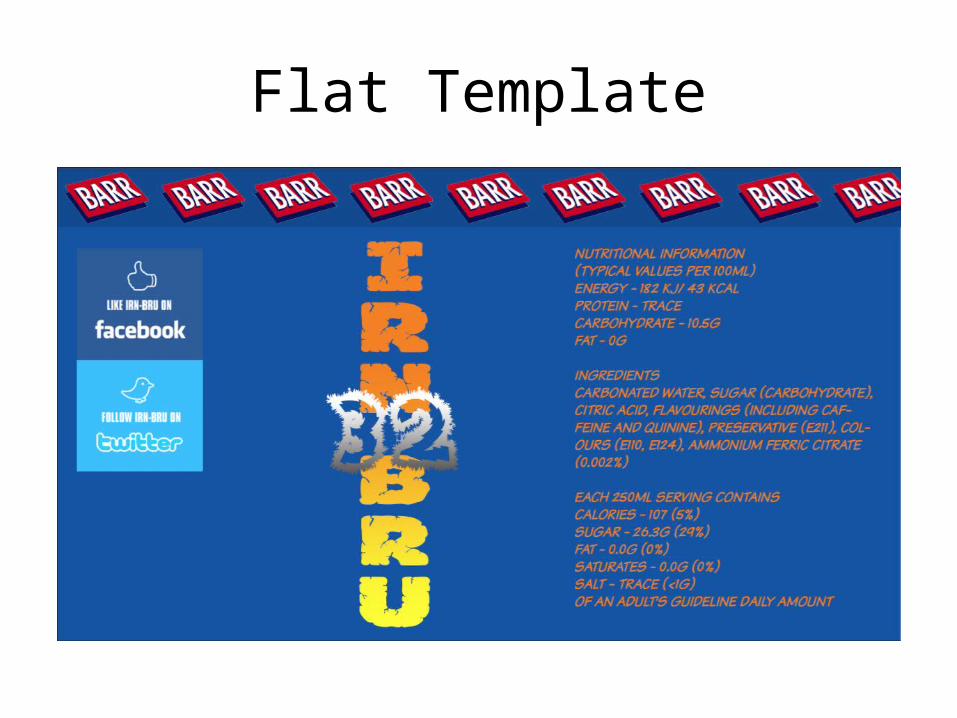
Flat Template

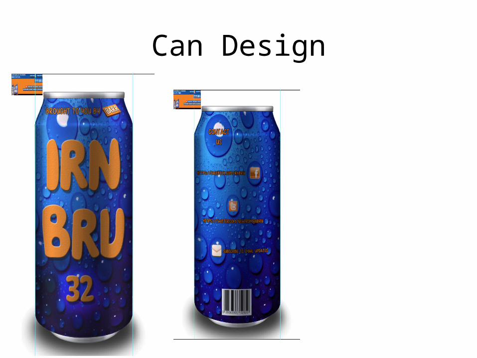
Can Design
Mini EvaluationWhat is going well?I am pleased as to how the design of my can has turned out. The design I have used on the
can in this powerpoint is the same one I created when I was doing further development with my ideas. I thought that this design worked well but I have made some small changes to the original idea. I have given the text a gradient from orange to yellow instead of keeping it to two shades of orange. I found that this effect was more eye-catching. The 32 also doesn’t have the same gradient as on the original, mainly because I couldn’t seem to find the right tones to make it look similar, which may be something I will need to work on.
What is not going so well?My template is not completely finished yet but I do need to fill in the extra spaces and try to
add more content and perhaps use the IRN BRU website to help me complete my template. As mentioned in the last question, I may need to work on the gradient for the 32 if I want my design to be consistent and follow the lines of my original idea.
What could you improve on your next draft?On my next draft I could improve on my creativity and also develop my ideas on the
template before going ahead and designing the can.

Flat Template
Can Design
Mini Evaluation
What is going well?I am much happier with this can design than the first one I did. I have
been more creative when making this design and I have used the technique of changing the layer style which helps in making the can look more 3D and realistic. I have adjusted some of the objects I have used which I did not create by myself, like the BARR logo and the social networking logos on the back of the can. I have changed the colour of them to match the colour scheme of IRN BRU.
What is not going so well?I think that I could of used the bubbles more effectively when I was
designing the contact information on the can. Or I could of found a way to make the text on the back bigger or more eye-catching.