Embed Size (px)
Citation preview
CONVENTIONS OF AN INDIE DIGIPAK
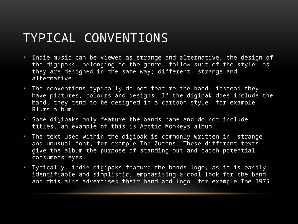
TYPICAL CONVENTIONS• Indie music can be viewed as strange and alternative, the design of the digipaks, belonging
to the genre, follow suit of the style, as they are designed in the same way; different, strange and alternative.
• The conventions typically do not feature the band, instead they have pictures, colours and designs. If the digipak does include the band, they tend to be designed in a cartoon style, for example Blurs album.
• Some digipaks only feature the bands name and do not include titles, an example of this is Arctic Monkeys album.
• The text used within the digipak is commonly written in strange and unusual font, for example The Zutons. These different texts give the album the purpose of standing out and catch potential consumers eyes.
• Typically, indie digipaks feature the bands logo, as it is easily identifiable and simplistic, emphasising a cool look for the band and this also advertises their band and logo, for example The 1975.
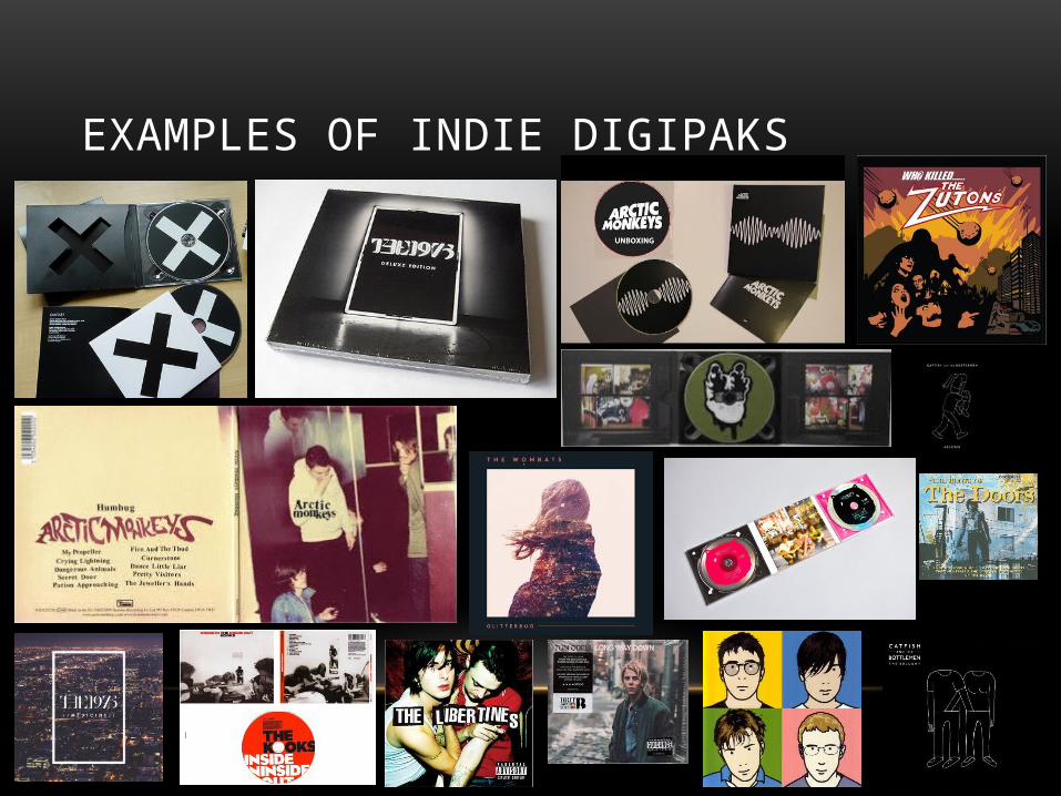
EXAMPLES OF INDIE DIGIPAKS