Embed Size (px)
Citation preview

Codes and Conventions
Front Covers
Fader Common Codes and Conventions
• Fader magazine uses a big artist on the front cover of their magazine as it attracts a large audience because of their wide fan base. The cover is then minimalistic with no text at all except the masthead, name of the artist below and the issue number. This simplistic style of magazine is my favourite and I wish to try it on my own print.
• Fader uses the same font for their masthead in every issue produced. Every time the masthead is white and occasionalally the ‘F’ changes colour. Its always at the top of the cover.
• The photo of the artist on the front cover is the main attraction of the magazine. It takes up the whole page and occasionally overlaps the masthead, showing the artists importance. All music magazines I have looked at use the main artists as the cover photo, which is what I will be using when creating mine.
• The music artist usually seems to be facing the camera, which allows the audience to feel as if they have a personal relationship with him.
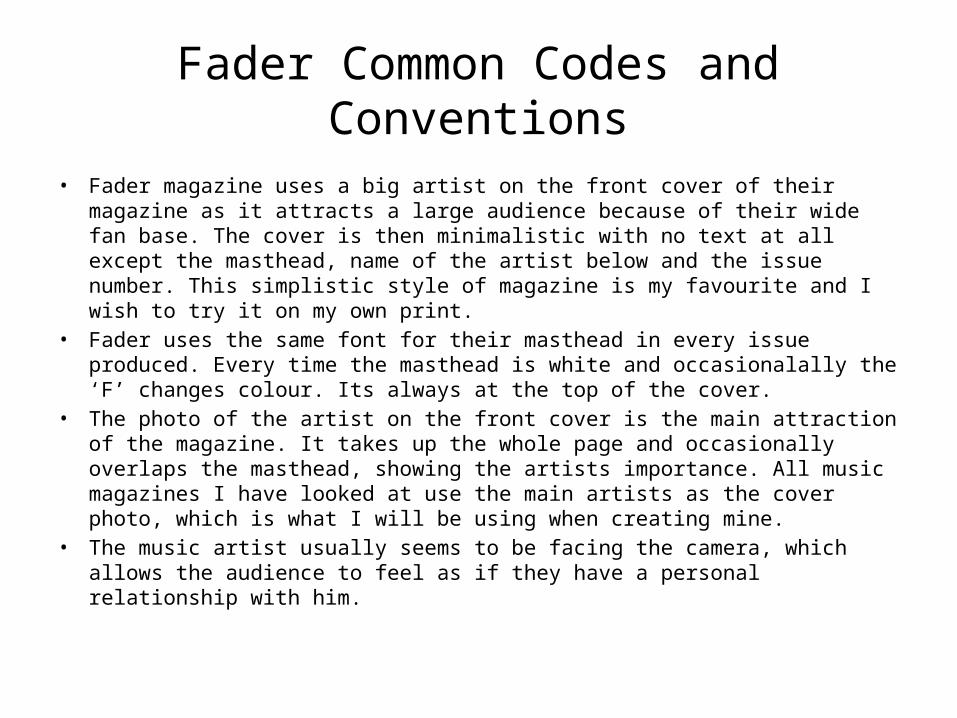
Image of artist overlaps masthead, showing the importance of him. He’s the focus of the magazine.
Masthead obstructs the artist image, in usual font and house style.
Issue number clear on every Fader issue.
Animalistic expression from the artist, its strangeness attracts audience. Artist also directly looking at camera creates the personal relationship with audience.
Artist featured in the issue is clearly stated. This emphasises that this issue is all about him and the readers know the main feature.
Simplistic white background, allows more focus on the main image of the artist.
Minimalistic text intrigues the reader to what is inside.
Travis Scott is a huge artist, which are the sort of artists Fader use. This sells the magazine to a large audience.
Billboard Common Codes and Conventions
• Billboard’s masthead are always written in the same font which readers recognise. This becomes memorable instead of changing the font each issue. They tend to use quite neutral colours which appeals to both genders.
• Billboard’s front covers always have the artist as the main subject of the page, with quite minimal text around them. Again this shows that the magazine is focussed on this artist and lets the reader know who it is about. It catches the eye of the magazines audience.
• The front cover does have minimal text, but they have a bit more information than Fader magazine for example. This extra information gives the reader a better idea of what else is inside of the magazine.
• Billboards masthead varies from down the side of the front cover and then also at the top.
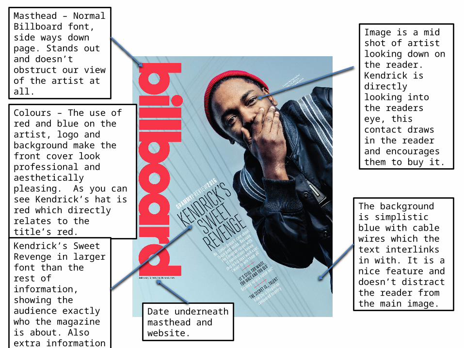
Masthead – Normal Billboard font, side ways down page. Stands out and doesn’t obstruct our view of the artist at all.
Colours – The use of red and blue on the artist, logo and background make the front cover look professional and aesthetically pleasing. As you can see Kendrick’s hat is red which directly relates to the title’s red.
Date underneath masthead and website.
Kendrick’s Sweet Revenge in larger font than the rest of information, showing the audience exactly who the magazine is about. Also extra information about what is in the magazine.
The background is simplistic blue with cable wires which the text interlinks in with. It is a nice feature and doesn’t distract the reader from the main image.
Image is a mid shot of artist looking down on the reader. Kendrick is directly looking into the readers eye, this contact draws in the reader and encourages them to buy it.
Clash Common Codes and Conventions
• Clash magazine has a bold, simple white masthead that remains exactly the same on each issue of the magazine. This helps make the magazine recognizable by the audience. They also use minimal text on their front covers.
• The artist featured in the issue is the main focus on the front cover. Again, I plan to do this in my magazine.
• The text on the front cover is usually in white font. The text therefor stands out a lot, but doesn’t take attention away from the artist.
• A lot of the time, the artist doesn’t make direct eye contact with the camera unlike many other magazines. This is quite unconventional as they use other shots than the usual magazines.
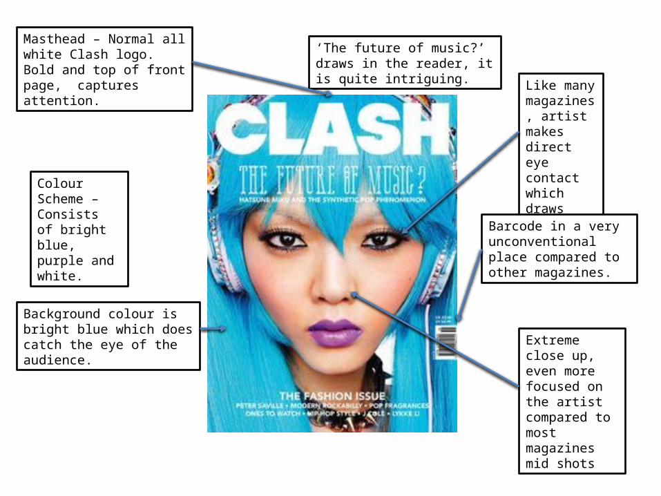
Masthead – Normal all white Clash logo. Bold and top of front page, captures attention.
Colour Scheme – Consists of bright blue, purple and white.
Background colour is bright blue which does catch the eye of the audience.
‘The future of music?’ draws in the reader, it is quite intriguing.
Like many magazines, artist makes direct eye contact which draws reader in.
Extreme close up, even more focused on the artist compared to most magazines mid shots
Barcode in a very unconventional place compared to other magazines.