Embed Size (px)
Citation preview
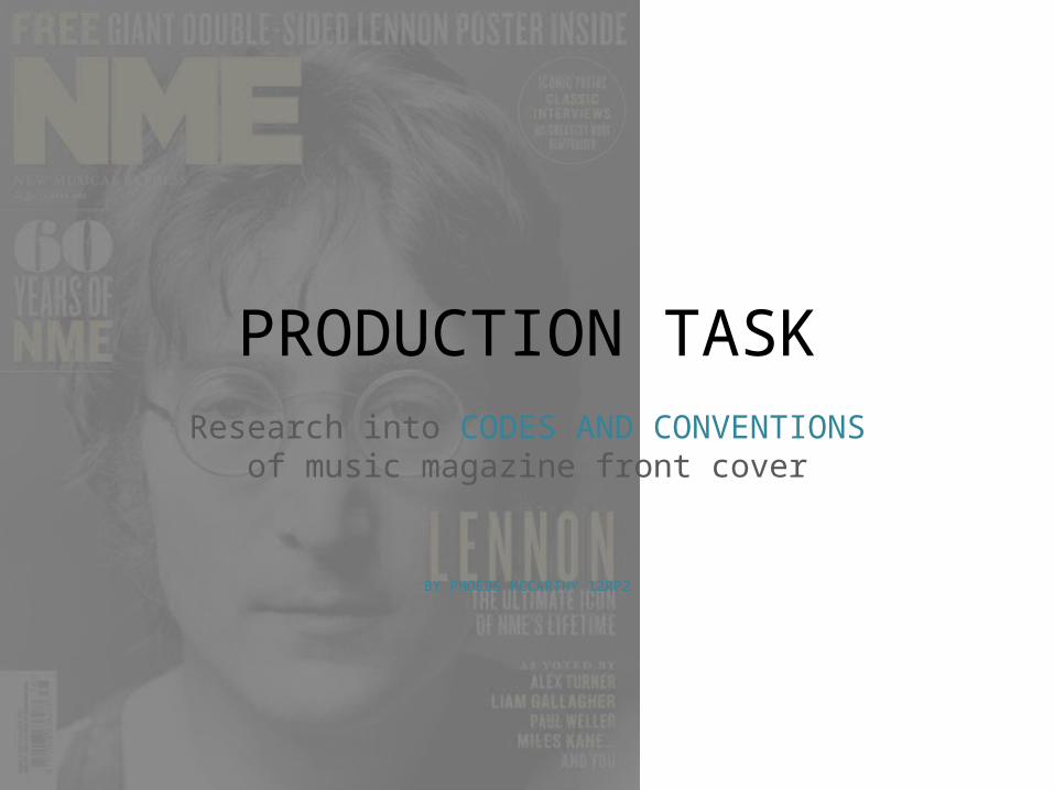
PRODUCTION TASKResearch into CODES AND CONVENTIONS
of music magazine front cover
BY PHOEBE MCCARTHY 12RP2
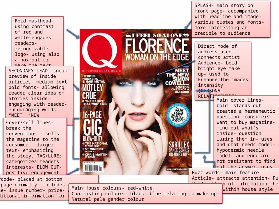
Bold masthead- using contrast of red and white-engages readers- recognizable logo- using also a box out to make the text stand out more Direct mode of address
used- connects artistAudience- bold bright eye make up- used to Enhance the images intensity (PERSONAL RELATIONSHIPS)
SPLASH- main story on front page- accompanied with headline and image- various quotes and fonts- more interesting an credible to audience
Main cover lines- bold- stands out- creates a hermeneutic question- consumers want to buy magazine-find out what's inside- question luring them in- uses and grat needs model- hypodermic needle model- audience are not resistant to find out the answer- uses grat and needs model to answer the unknown
SECONDARY LEAD- sneak preview of Inside articles- medium text-bold fonts- allowing reader clear idea of Stories inside- engaging with reader- encouraging words- “MEET” “NEW”
Cover/sell lines- break the conventions - sells the magazine to the consumer- larger text- emphasizing the story. TAG/LURE: categorizes readers interests- BLOW OUT- positive engagement
Buzz words- main featureArticle- attracts attention- Puff Words- flash of information- hereWhite used within house style
Barcode- placed at bottom Of page normally- includes- Date- issue number- price- website- Additional information for the reader
Main House colours- red-whiteContrasting colours- black- blue relating to make-up-Natural pale gender colour
Q CODES AND CONVENTIONS
• From re search the masthead in all of Q magazines is continuous meaning that the logo colour and position is always the same, this is a usual convention and a positive concept as it makes the magazine more reconcilable by the consumers. Even though I am only producing one version of my magazine I intend on using a continuous layout and colour scheme through the different pages.
• The house style in Q magazine is also continuous as the images in a large amount of the magazines are model shots I wish to use this type of photography in my final production of a magazine as I feel it would be beneficial to me as I could choose the colour scheme of what the model wears, the position of them etc to suit the design of the magazine. Furthermore throughout Q magazines the layout has a frame that surrounds the image in the centre, leading the magazine to look more professional and organized.
• Cover and main sell lines are a main selling point for the magazine and lure people in to buy it. For example in Q, the use of bold white text contrasting with the celebrities red hair stands out along with the different sizes of text uses adding uniqueness along with engaging the reader.
• The use of the hermeneutic question and hypodermic needle method draw the reader into wanting to read the magazine as the audience wants to find out the ‘unknown’ from the Tag lines.
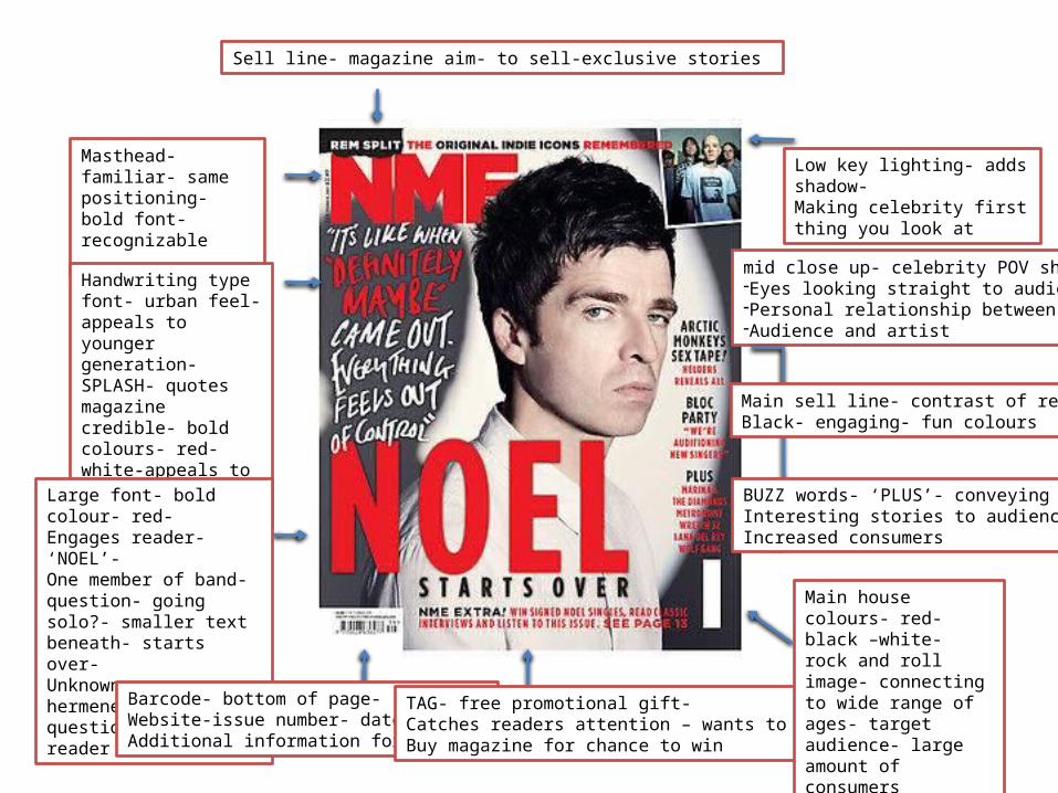
Masthead-familiar- same positioning- bold font- recognizable
Handwriting type font- urban feel- appeals to younger generation- SPLASH- quotes magazine credible- bold colours- red-white-appeals to reader
Sell line- magazine aim- to sell-exclusive stories
Large font- bold colour- red-Engages reader- ‘NOEL’- One member of band- question- going solo?- smaller text beneath- starts over-Unknown answer hermeneutic question- lures reader in
Barcode- bottom of page-Website-issue number- date- price-Additional information for reader
TAG- free promotional gift-Catches readers attention – wants to Buy magazine for chance to win
mid close up- celebrity POV shot-Eyes looking straight to audience -Personal relationship between -Audience and artist
Main sell line- contrast of red andBlack- engaging- fun colours
BUZZ words- ‘PLUS’- conveying Interesting stories to audience- Increased consumers
Main house colours- red- black –white- rock and roll image- connecting to wide range of ages- target audience- large amount of consumers
Low key lighting- adds shadow- Making celebrity first thing you look at
NME CODES AND CONVENTIONS
• The mid close-up shot catches the attention of the reader and by having the celebrity posing so there is a point of view shot present, this makes a personal relationship between the audience and artist as the eye match connects with the reader. I would like to use this convention in my final front page to make sure my front cover is eye catching and noticeable.
• The SPLASH in this particular magazine is the main headline however the font used is handwriting like along with different colours used simultaneously between the lines. I wish to use this in my final production of my front page due to the urban feel because of the handwriting font and the contrast of colours, along with the fact that I want my target audience to be in the range of 16-25 years old.
• The TAG used in this particular magazine is a promotional offer and competition by using BUZZ words to lure the reader in, and increase the amount of consumers. I would like to use this in my final font cover production as I feel it would make the magazine look more professional and organized which is the look I am aiming to succeed.
• The low key lighting adds definition to the image and is the main feature that engages with the reader to make them look at this particular magazine. For my front cover I wish to use thing lighting and the white blank screen in order to gain a highly professional image and increase the intense feeling of my front cover.
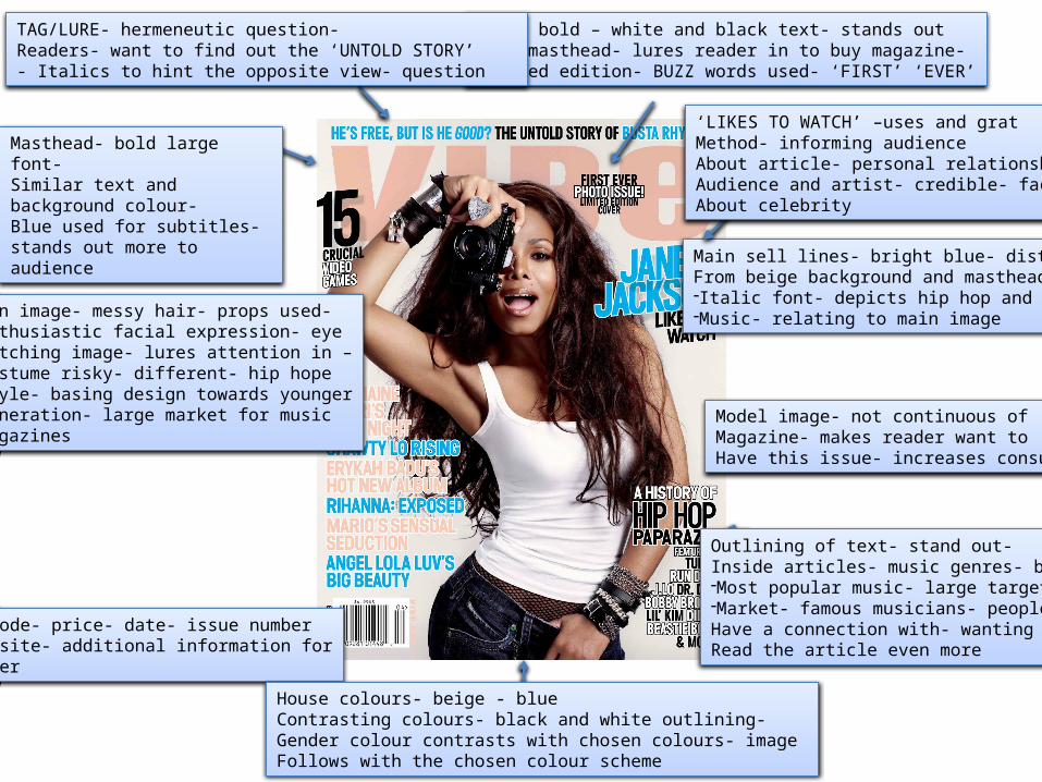
Masthead- bold large font-Similar text and background colour-Blue used for subtitles- stands out more to audience
LURE- bold – white and black text- stands out From masthead- lures reader in to buy magazine-Limited edition- BUZZ words used- ‘FIRST’ ‘EVER’
Main sell lines- bright blue- distinct From beige background and masthead-Italic font- depicts hip hop and RnB-Music- relating to main image
Model image- not continuous of Magazine- makes reader want to Have this issue- increases consumers
Fun image- messy hair- props used- Enthusiastic facial expression- eyeCatching image- lures attention in –Costume risky- different- hip hopeStyle- basing design towards youngerGeneration- large market for music magazines
‘LIKES TO WATCH’ –uses and gratMethod- informing audience About article- personal relationship-Audience and artist- credible- facts About celebrity
Barcode- price- date- issue number-website- additional information forreader
Outlining of text- stand out-Inside articles- music genres- bold -Most popular music- large target-Market- famous musicians- people Have a connection with- wanting to Read the article even more
TAG/LURE- hermeneutic question-Readers- want to find out the ‘UNTOLD STORY’- Italics to hint the opposite view- question
House colours- beige - blueContrasting colours- black and white outlining-Gender colour contrasts with chosen colours- image Follows with the chosen colour scheme
VIBE CODES AND CONVENTIONS • In VIBE magazine the colour scheme is not continuous and varies in each magazine depending on the model/ celebrity and
the clothing. However the positioning of the masthead is continuous and is always places mainly in the centre reaching across the width of the page. As I am not making a series of magazines I don’t have the chance to experiment with continuous colour scheme or positioning of the logo however I would like to use the same or similar colour scheme throughout my front page, contents and double page spread as I feel it will make the set of pages look more professional and appeal more to an audience.
• In this particular issue of VIBE magazine the outlining of sell lines is present, I feel like this makes the smaller article stories still engage with the audience increasing the number of consumers towards the magazine. Along with the italic font for TAG and LURING lines I feel like this is a very effective feature as it firstly catches the attention of the audience along with making the magazine look more interesting and the perceived thought by the audience of the stories inside more enjoyable to read.
• The main feature in this magazine is the main image. I feel that this image is very effective for the magazine design as it portrays a fun yet risky image that depicts the hip hop and RnB genres of music through using props; (camera) along with the choice of costume relating to these music genres. For my Final production I would like to use different clothing and props to relate to the genre of music I intend to do, as I feel it makes the magazine as a whole look more organized and illustrates a clear idea of what the particular magazine is about.
• Moreover in this VIBE magazine even the sell lines are outlined and in bold font even though they are of a smaller size, I feel that this is a positive feature of this magazine as this makes the audience still notice these titles, which can be one of the most important concepts of the magazine as the sell lines are what ‘sells’ the magazine and without the audience being able to straight away notice them the amount of consumers could possibly decrease.
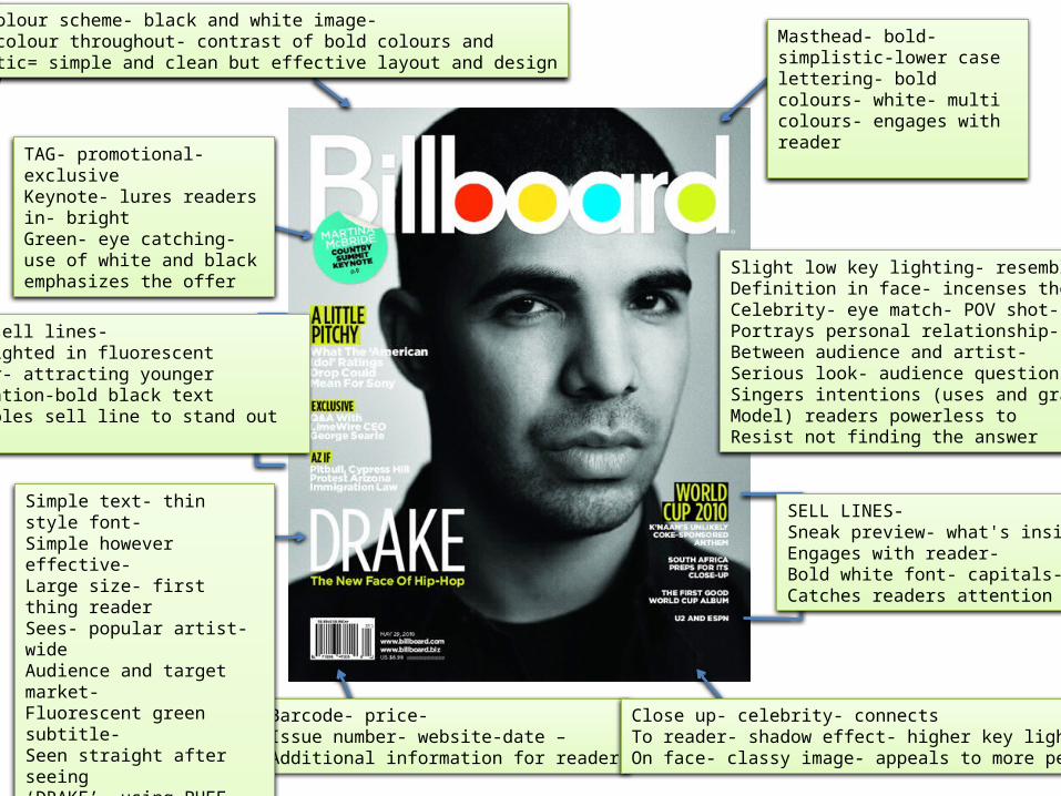
Masthead- bold-simplistic-lower case lettering- bold colours- white- multi colours- engages with reader
Barcode- price-Issue number- website-date –Additional information for reader
Main sell lines-Highlighted in fluorescentColour- attracting youngerGeneration-bold black text- Enables sell line to stand out
Slight low key lighting- resembles –Definition in face- incenses theCelebrity- eye match- POV shot-Portrays personal relationship-Between audience and artist- Serious look- audience question theSingers intentions (uses and gratsModel) readers powerless to Resist not finding the answer
TAG- promotional- exclusiveKeynote- lures readers in- bright Green- eye catching- use of white and black emphasizes the offer
Simple text- thin style font-Simple however effective- Large size- first thing reader Sees- popular artist- wide Audience and target market- Fluorescent green subtitle-Seen straight after seeing ‘DRAKE’- using PUFF flash of Information- inc. hermeneutic Question audience want to findSuccess- answer to statement etc.
SELL LINES- Sneak preview- what's inside-Engages with reader-Bold white font- capitals-Catches readers attention
Close up- celebrity- connectsTo reader- shadow effect- higher key lighting On face- classy image- appeals to more people
House colour scheme- black and white image-Pop of colour throughout- contrast of bold colours andSimplistic= simple and clean but effective layout and design
BILLIBOARD CODES AND CONVENTIONS
• In Billboard magazine the logo Is continuous throughout all of the issues. I like the way of the different bold colours in some of the letters as I feel it catches the eye of the younger generation due to the ‘pop of colours’ and by the colour scheme including fluorescent colours this also adds to the luring in of the younger generation. In addition to this I like the way that there is hints of bright colours and I wish to use this in my final production to engage with the readers as I am aiming for a target market of 16-25 year olds.
• One of the best features of this magazine in my opinion is the simple but effective design and layout of the front page, I like this feature because it’s a very modern concept yet retro design. By using simple fonts (mostly long and thin) and keeping the colour scheme very plain apart from the hints of colour this adds more effect than having a full page with too much to look at. I wish to use a clear and simple yet effective design in my final production to lure in the younger generation.
• Furthermore the image is the main feature of the magazine from looking at the image and the slight low key lighting adding definition to the celebrities face; I wish to use this lighting in my final production on my front cover as I feel this is the most eye catching and the main feature that engages with the audience.
• Finally the use of the uses and grats model and the hermeneutic questions throughout this piece it makes the readers question the meaning behind the sell lines and want to find out the answer therefore having to buy the magazine to read on. Completing the magazines aim to sell the magazine and increase the amount of consumers. In my final product I will be using this terminology to make my magazine look and read more professionally also adding to the layout and design.