Embed Size (px)
Citation preview
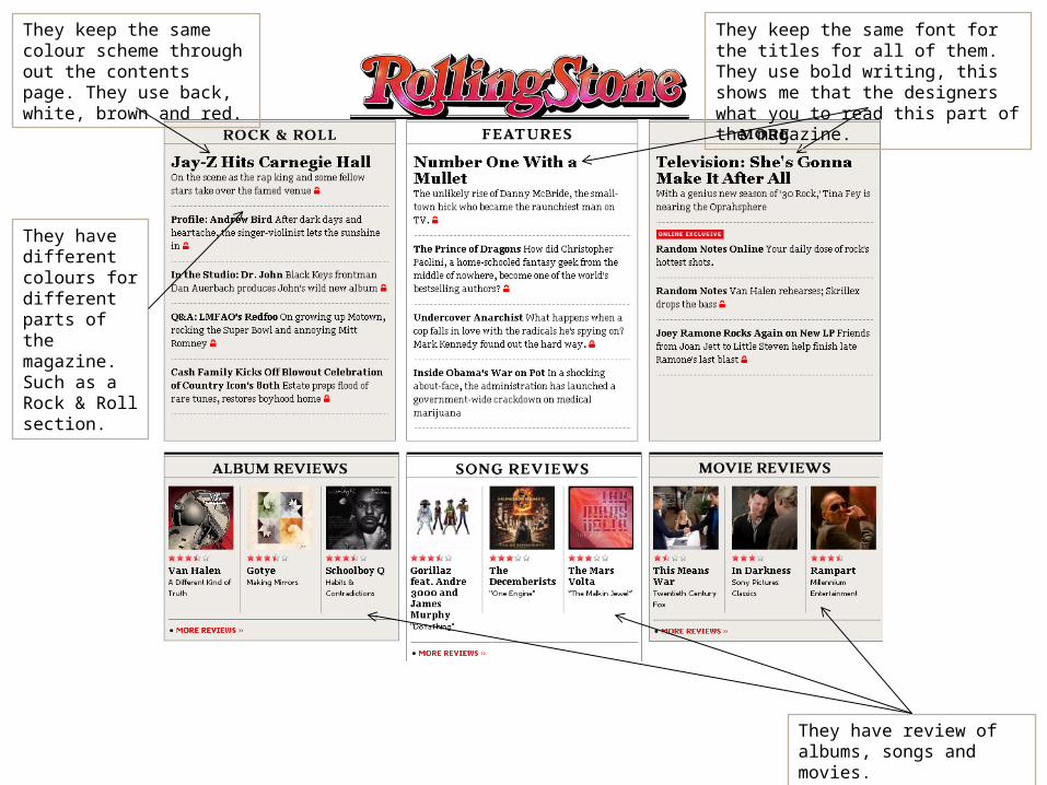
They keep the same colour scheme through out the contents page. They use back, white, brown and red.
They have review of albums, songs and movies.
They keep the same font for the titles for all of them. They use bold writing, this shows me that the designers what you to read this part of the magazine.
They have different colours for different parts of the magazine. Such as a Rock & Roll section.
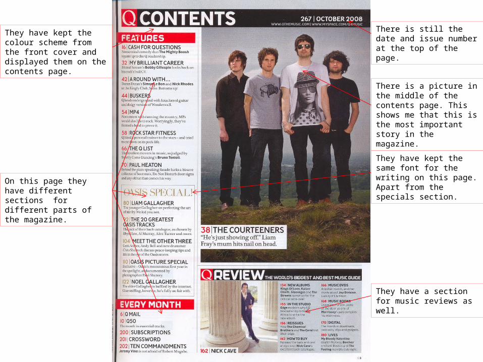
There is a picture in the middle of the contents page. This shows me that this is the most important story in the magazine.
They have a section for music reviews as well.
On this page they have different sections for different parts of the magazine.
They have kept the same font for the writing on this page. Apart from the specials section.
They have kept the colour scheme from the front cover and displayed them on the contents page.
There is still the date and issue number at the top of the page.
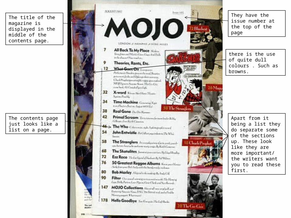
The title of the magazine is displayed in the middle of the contents page.
The contents page just looks like a list on a page.
there is the use of quite dull colours . Such as browns.
Apart from it being a list they do separate some of the sections up. These look like they are more important/ the writers want you to read these first.
They have the issue number at the top of the page