Embed Size (px)
Citation preview
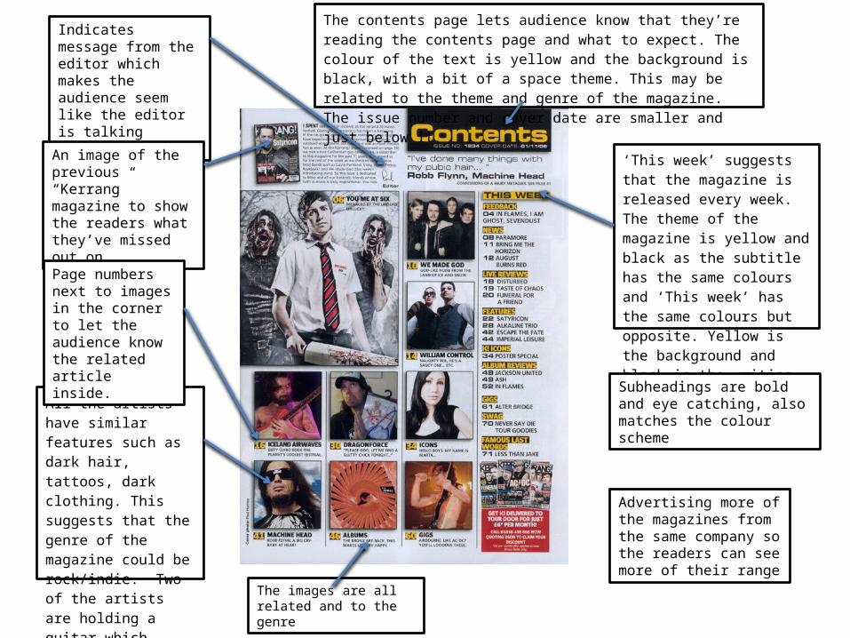
‘This week’ suggests that the magazine is released every week. The theme of the magazine is yellow and black as the subtitle has the same colours and ‘This week’ has the same colours but opposite. Yellow is the background and black is the writing
The contents page lets audience know that they’re reading the contents page and what to expect. The colour of the text is yellow and the background is black, with a bit of a space theme. This may be related to the theme and genre of the magazine. The issue number and cover date are smaller and just below it.
All the artists have similar features such as dark hair, tattoos, dark clothing. This suggests that the genre of the magazine could be rock/indie. Two of the artists are holding a guitar which links to these genres.
Indicates message from the editor which makes the audience seem like the editor is talking directly at them
An image of the previous “Kerrang” magazine to show the readers what they’ve missed out on
Page numbers next to images in the corner to let the audience know the related article inside.
The images are all related and to the genre
Subheadings are bold and eye catching, also matches the colour scheme
Advertising more of the magazines from the same company so the readers can see more of their range
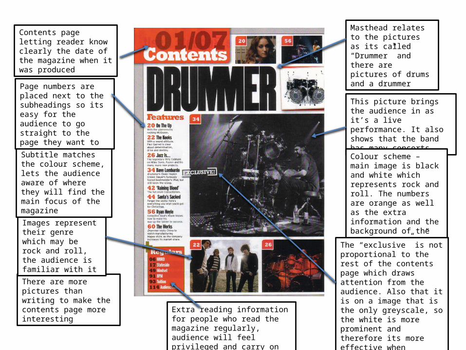
Contents page letting reader know clearly the date of the magazine when it was produced
There are more pictures than writing to make the contents page more interesting
Images represent their genre which may be rock and roll, the audience is familiar with it
This picture brings the audience in as it’s a live performance. It also shows that the band has many concerts
Masthead relates to the pictures as its called “Drummer” and there are pictures of drums and a drummer
Colour scheme – main image is black and white which represents rock and roll. The numbers are orange as well as the extra information and the background of the title “contents”
Subtitle matches the colour scheme, lets the audience aware of where they will find the main focus of the magazine
Page numbers are placed next to the subheadings so its easy for the audience to go straight to the page they want to
Extra reading information for people who read the magazine regularly, audience will feel privileged and carry on reading the magazine
The “exclusive” is not proportional to the rest of the contents page which draws attention from the audience. Also that it is on a image that is the only greyscale, so the white is more prominent and therefore its more effective when captioning the picture
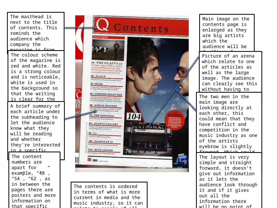
The masthead is next to the title of contents. This reminds the audience which company the magazine is from
The colour scheme of the magazine is red and white. Red is a strong colour and is noticeable, white is used in the background so that the writing is clear for the audience to read
Main image on the contents page is enlarged as they are big artists which the audience will be familiar of
Picture of an arena which relate to one of the articles as well as the large image. The audience can clearly see this without having to read through the contents page
A brief summary of each article under the subheading to let the audience know what they will be reading and whether they're interested in a specific article or not
The two men in the main image are looking directly at each other, this could mean that they have conflict and competition in the music industry as one of the artists eyebrow is slightly frowned. Which could link to one of the articles in the magazine
The content numbers are apart for example, “48”, “54”, “62”, as in between the pages there are posters and more information on that specific article and topic
The layout is very simple and straight forward, it doesn’t give out information as it lets the audience look through it and if it gives out all the information there will be no point of the magazine
The contents is ordered in terms of what is more current in media and the music industry, so it can relate to people of all ages