Embed Size (px)
Citation preview

Magazine Contents Analysis…

This contents page is took from V magazine, who are very different when it comes to layouts throughout their magazine, however this is one of the main reasons as to why I like this page. To start, “contents”, is laid out stylistically, with a bold effect. This style used by V, shows style through the breaking down of the word. Following on from this title, the information is laid out directly below in the same consistent style. This allows the reader to follow up on the information clearly and also establish the main style used throughout. The format of this contents page is laid out very professionally and doesn’t contain too much detail, I think that this is a key feature, as to what makes a successful magazine
Overall this page, uses a greyscale tone, where the only colour shown, is the heart which appears on Kanye West. This instantly draws the readers attention towards this part of the contents, which then will lead to them looking at the chosen person on the cover. This heart could signify many different things, from love, to one of his albums.
V magazine have took into consideration as to what styling they will have used, and have heavily based this page upon fashion. The clothes Kanye wears are considered as fashionable in todays modern society. This signifies that this magazine is not only music based, but also have others areas in which it will cover, such as fashion.
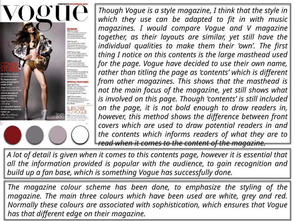
Though Vogue is a style magazine, I think that the style in which they use can be adapted to fit in with music magazines. I would compare Vogue and V magazine together, as their layouts are similar, yet still have the individual qualities to make them their ‘own’. The first thing I notice on this contents is the large masthead used for the page. Vogue have decided to use their own name, rather than titling the page as ‘contents’ which is different from other magazines. This shows that the masthead is not the main focus of the magazine, yet still shows what is involved on this page. Though ‘contents’ is still included on the page, it is not bold enough to draw readers in, however, this method shows the difference between front covers which are used to draw potential readers in and the contents which informs readers of what they are to read when it comes to the content of the magazine.
A lot of detail is given when it comes to this contents page, however it is essential that all the information provided is popular with the audience, to gain recognition and build up a fan base, which is something Vogue has successfully done.
The magazine colour scheme has been done, to emphasize the styling of the magazine. The main three colours which have been used are white, grey and red. Normally these colours are associated with sophistication, which ensures that Vogue has that different edge on their magazine.

Out of all of the layouts, I feel that NME is my least favourite due to their styling of their magazine throughout. Most of the magazine pages in which they produce, never have one key feature to their pages, so you are often confused as to where to look first. However one of the things I like about this contents is the colour scheme, as the colours are bold, so stand out and all compliment each other relatively well. Often colours are used by NME to highlight and section off different parts of this page, for example “NME” in the masthead, and the page numbers are red to highlight, so that it highlights what's available to read on the different pages. Though the colour scheme is plain, NME continues to make it work, as well as ensuring that the picture they use contrasts with the existing colours.
The layout used is a typical convention of NME’s style, who constantly use this layout for their contents pages. Readers will become familiar with this magazine, as they will instantly know that it is an NME magazine. They are much different to many magazines which is another way they increase their fan base.
The writing style used is very informal, and would attract a younger base who understand the lingo used within the magazine. Though it appeals to people such as young adults, I would categorize the style of this magazine with the Indie Rock social group, because of those featured.