Embed Size (px)
Citation preview

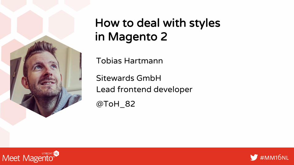
How to deal with styles in Magento 2
Sitewards GmbHLead frontend developer
@ToH_82
Tobias Hartmann
STOPCOMPARING
FREEYOUR MIND

FIND YOUR WAY

3 WAYS TO COMPILE YOUR FRONTEND
Server sidewith Grunt
Server sidephp oyejorge
Client side JavaScript

DON‘TFORECAST
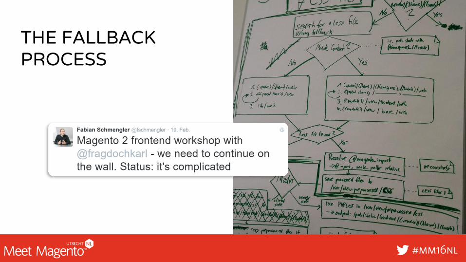
THE FALLBACKPROCESS
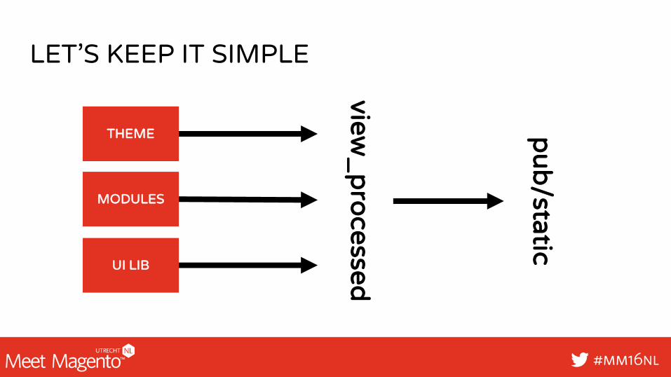
LET’S KEEP IT SIMPLE
MODULES
UI LIB
THEME
view_
pro
cessed
pu
b/static
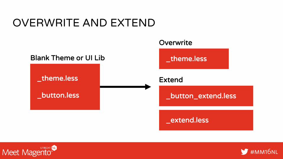
OVERWRITE AND EXTEND
_theme.less
_button.less
Blank Theme or UI Lib _theme.less
_button_extend.less
Extend
Overwrite
_extend.less
FRONTENDFRAMEWORK
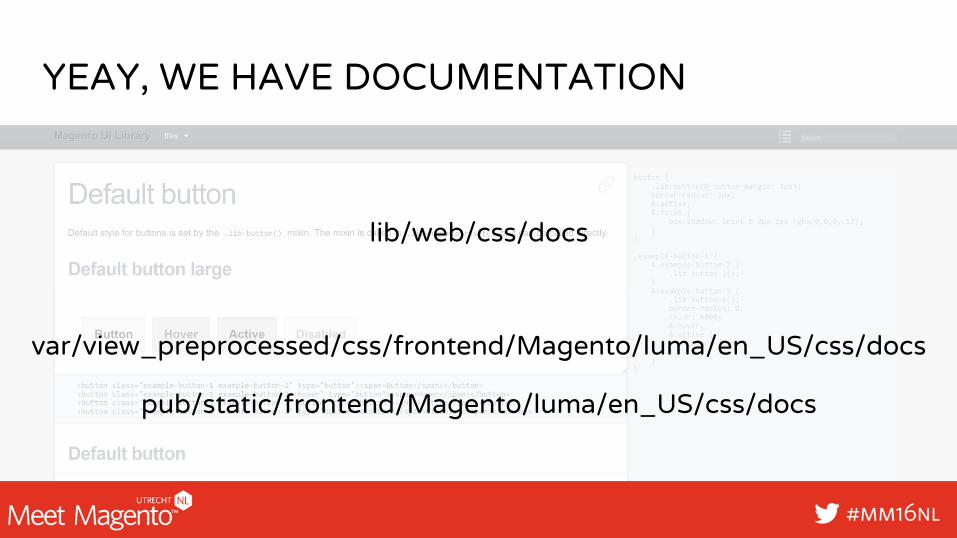
YEAY, WE HAVE DOCUMENTATION
lib/web/css/docs
var/view_preprocessed/css/frontend/Magento/luma/en_US/css/docs
pub/static/frontend/Magento/luma/en_US/css/docs
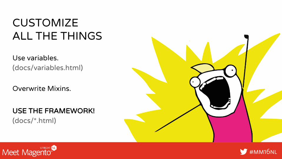
CUSTOMIZE ALL THE THINGS
Use variables. (docs/variables.html)
USE THE FRAMEWORK!(docs/*.html)
Overwrite Mixins.
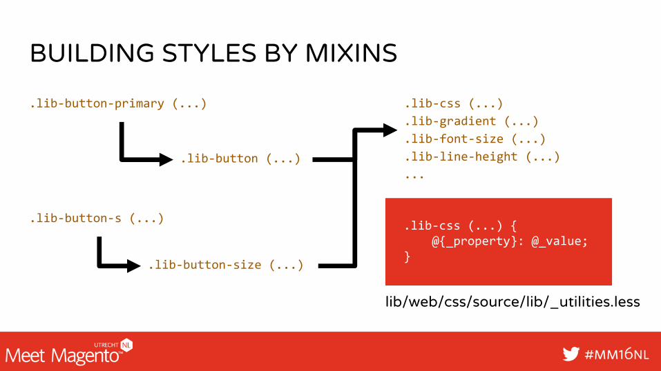
BUILDING STYLES BY MIXINS
.lib-button-primary (...)
.lib-button (...)
.lib-css (...)
.lib-gradient (...)
.lib-font-size (...)
.lib-line-height (...)
...
.lib-css (...) {@{_property}: @_value;
}
.lib-button-s (...)
.lib-button-size (...)
lib/web/css/source/lib/_utilities.less
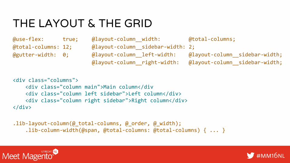
THE LAYOUT & THE GRID@use-flex: true;
@total-columns: 12;
@gutter-width: 0;
<div class="columns"><div class="column main">Main column</div<div class="column left sidebar">Left column</div><div class="column right sidebar">Right column</div>
</div>
@layout-column__width: @total-columns;
@layout-column__sidebar-width: 2;
@layout-column__left-width: @layout-column__sidebar-width;
@layout-column__right-width: @layout-column__sidebar-width;
.lib-layout-column(@_total-columns, @_order, @_width);.lib-column-width(@span, @total-columns: @total-columns) { ... }
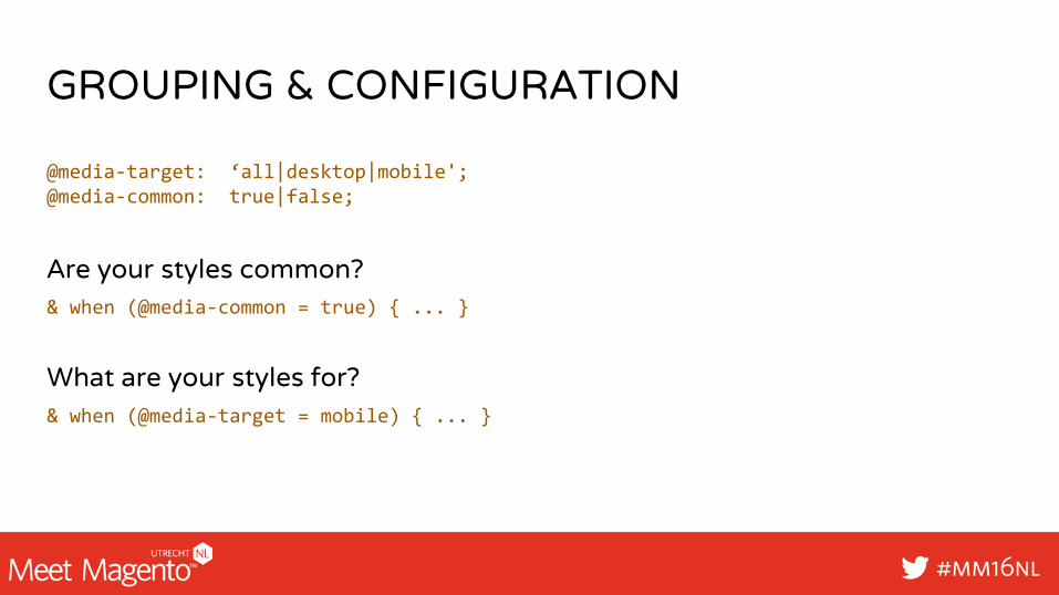
GROUPING & CONFIGURATION
@media-target: ‘all|desktop|mobile'; @media-common: true|false;
& when (@media-common = true) { ... }
& when (@media-target = mobile) { ... }
Are your styles common?
What are your styles for?

HELPTO IMPROVE
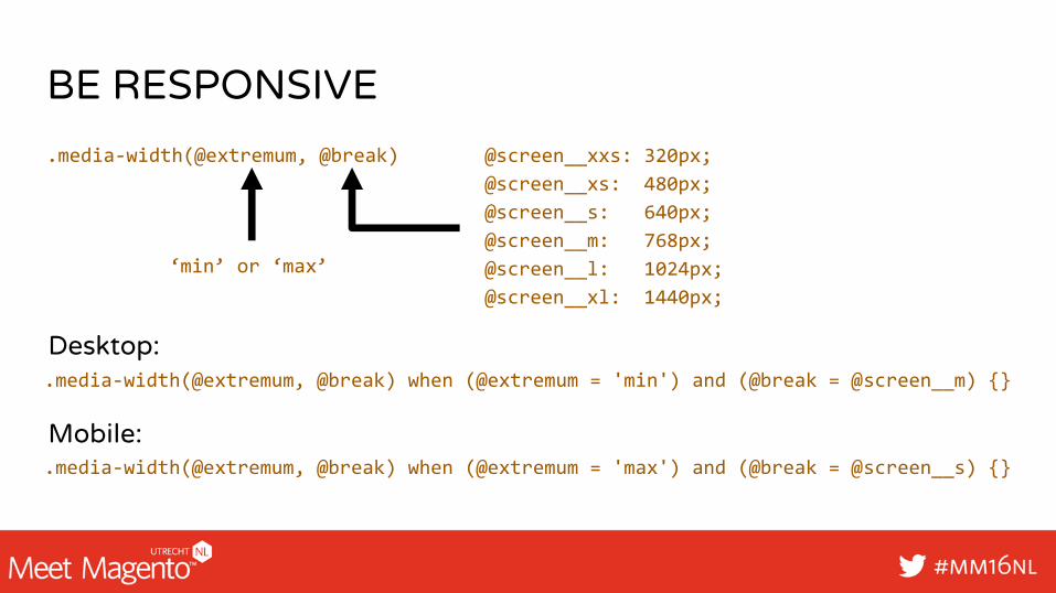
BE RESPONSIVE
@screen__xxs: 320px;
@screen__xs: 480px;
@screen__s: 640px;
@screen__m: 768px;
@screen__l: 1024px;
@screen__xl: 1440px;
.media-width(@extremum, @break)
‘min’ or ‘max’
.media-width(@extremum, @break) when (@extremum = 'min') and (@break = @screen__m) {}
.media-width(@extremum, @break) when (@extremum = 'max') and (@break = @screen__s) {}
Desktop:
Mobile:

STATS OF THE RESULT – LUMA THEME
.bundle-options-container .product-options-wrapper
.fieldset-bundle-options .field.choice .price-notice
.price-including-tax + .price-excluding-tax {}
styles-m (285Kb) > styles-l (81Kb)Not IE9 compatabile. (allowed selectors 4095, luma 4140)
#cccccc is listed 85 times!important is used 16 times[class^=""], * selectors 44 times
http://www.testmycss.com/
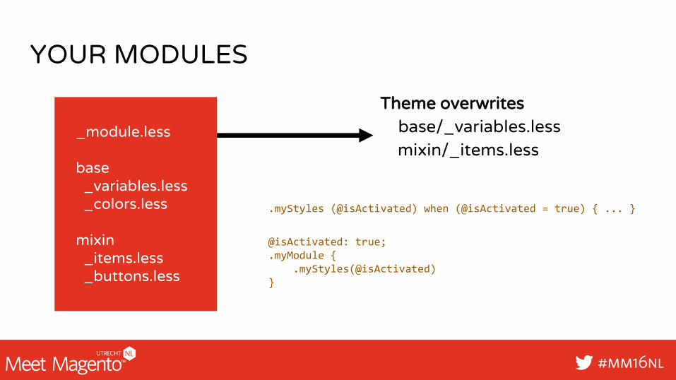
YOUR MODULES
_module.less
base_variables.less_colors.less
mixin_items.less_buttons.less
Theme overwritesbase/_variables.lessmixin/_items.less
.myStyles (@isActivated) when (@isActivated = true) { ... }
@isActivated: true;.myModule {
.myStyles(@isActivated)}

MAKE ITAWESOME