Embed Size (px)
Citation preview
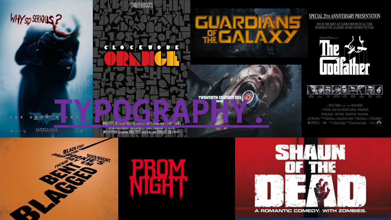
TYPOGRAPHY.
WHAT IS OUR AIM?
• Our aim is to make our typography completely different from what our opening sequence is. The of use different fonts and colours that have inspired us to create something better than what we as a group thought. Our opening sequences will be in black and white but the typography and the title sequence will be in a different colour this is throw off the audience into thinking of the opening sequence not being what it really seems there are examples of the typography subverting from what a typical opening sequence for a particular genre would be the biggest one that I've personally seen is Drive.
• There are plenty of more with these and I think by exploring that particular use of typography for they visual style has inspired me to have a personal overall thinking of what our opening sequence would be.
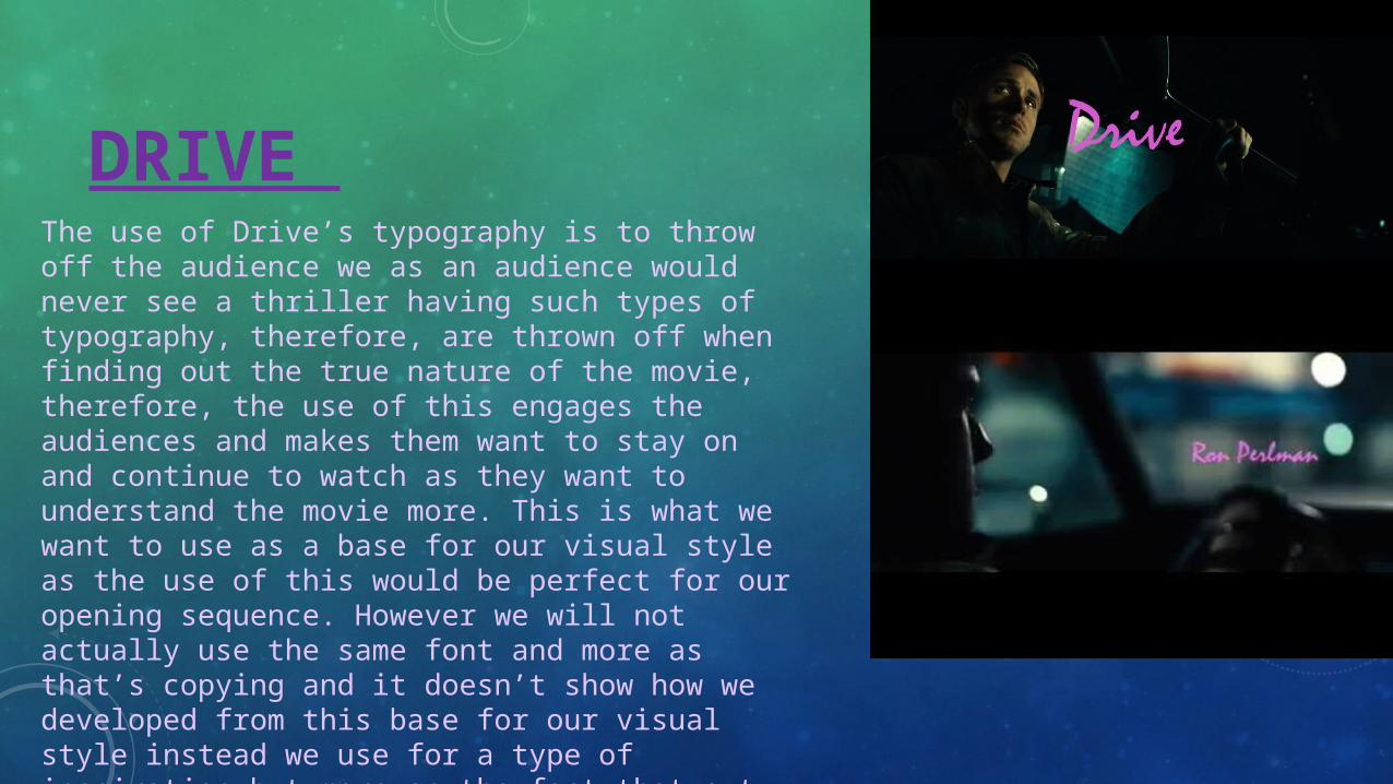
DRIVE The use of Drive’s typography is to throw off the audience we as an audience would never see a thriller having such types of typography, therefore, are thrown off when finding out the true nature of the movie, therefore, the use of this engages the audiences and makes them want to stay on and continue to watch as they want to understand the movie more. This is what we want to use as a base for our visual style as the use of this would be perfect for our opening sequence. However we will not actually use the same font and more as that’s copying and it doesn’t show how we developed from this base for our visual style instead we use for a type of inspiration but more on the fact that out typography can be explained with this movie as we have the same genre of thriller and therefore shows how we managed to process.
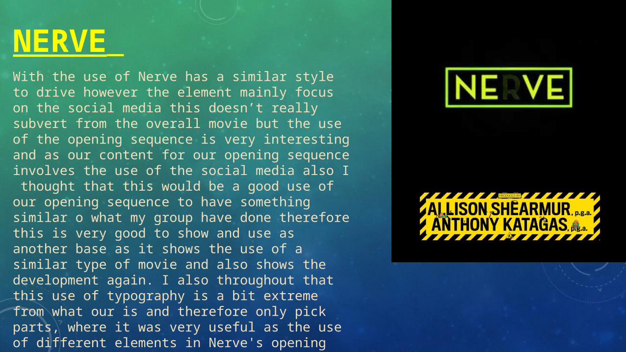
NERVE With the use of Nerve has a similar style to drive however the element mainly focus on the social media this doesn’t really subvert from the overall movie but the use of the opening sequence is very interesting and as our content for our opening sequence involves the use of the social media also I thought that this would be a good use of our opening sequence to have something similar o what my group have done therefore this is very good to show and use as another base as it shows the use of a similar type of movie and also shows the development again. I also throughout that this use of typography is a bit extreme from what our is and therefore only pick parts, where it was very useful as the use of different elements in Nerve's opening sequence, wouldn’t be what our aim was and therefore instead of subverting we would actually be conforming and so I thought carefully about what I wanted to use from the use of Nerve and with these they conform to Nerve’s movie but subverts from our own.
INSPIRATION
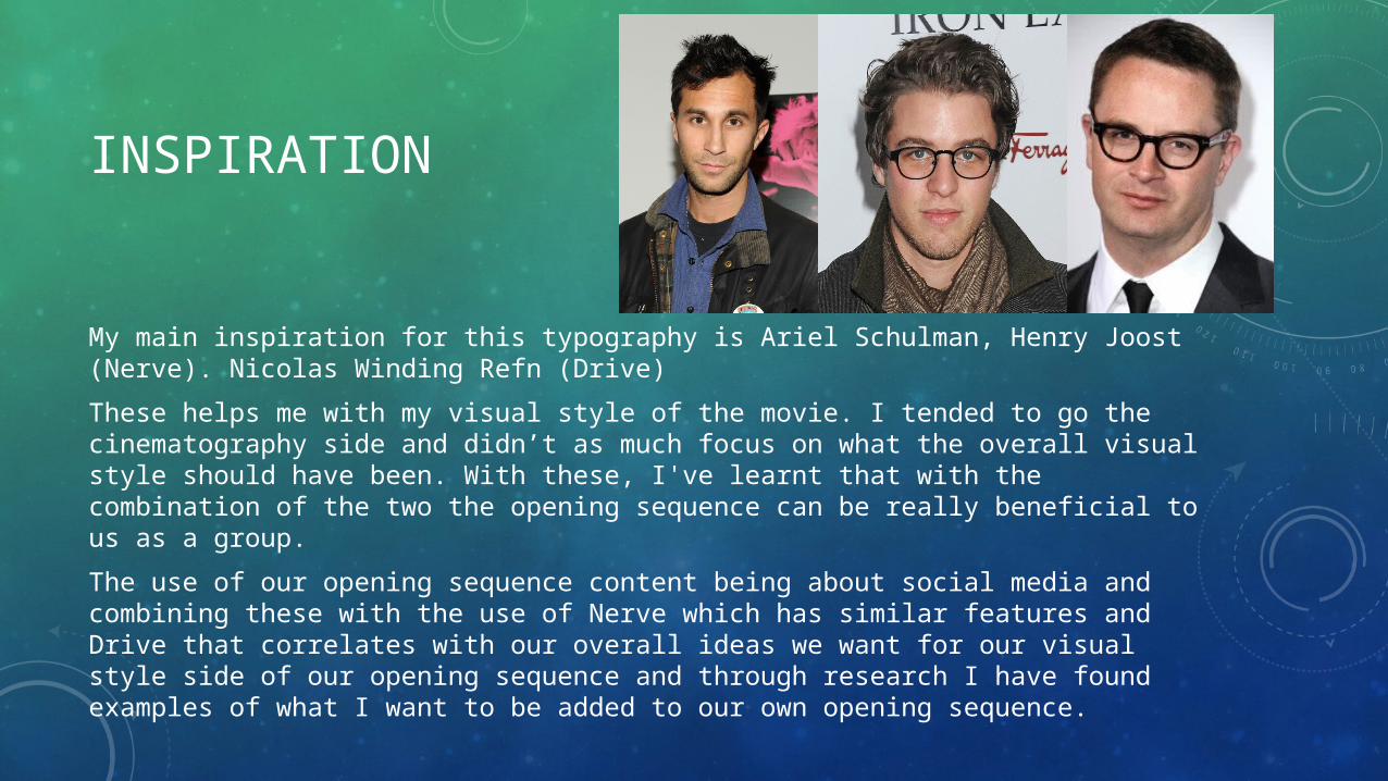
My main inspiration for this typography is Ariel Schulman, Henry Joost (Nerve). Nicolas Winding Refn (Drive)These helps me with my visual style of the movie. I tended to go the cinematography side and didn’t as much focus on what the overall visual style should have been. With these, I've learnt that with the combination of the two the opening sequence can be really beneficial to us as a group.The use of our opening sequence content being about social media and combining these with the use of Nerve which has similar features and Drive that correlates with our overall ideas we want for our visual style side of our opening sequence and through research I have found examples of what I want to be added to our own opening sequence.
![DONOVAN BRINSON TYPOGRAPHY 270 2018 CASLΩ · TYPOGRAPHY 270 2018. 2 TABLE OF CONTENTS [1] Research - Images and Inspiration 3 [2] Research Pt. 2 - Vector 8 [3] Caslon Font - Title](https://img.pdfslide.us/doc/110x75/5f767f4f682b517efd328da3/donovan-brinson-typography-270-2018-casl-typography-270-2018-2-table-of-contents.jpg)