Embed Size (px)
Citation preview
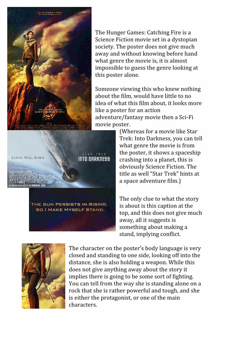
The Hunger Games: Catching Fire is a Science Fiction movie set in a dystopian society. The poster does not give much away and without knowing before hand what genre the movie is, it is almost impossible to guess the genre looking at this poster alone. Someone viewing this who knew nothing about the film, would have little to no idea of what this film about, it looks more like a poster for an action adventure/fantasy movie then a Sci-‐Fi movie poster.
(Whereas for a movie like Star Trek: Into Darkness, you can tell what genre the movie is from the poster, it shows a spaceship crashing into a planet, this is obviously Science Fiction. The title as well “Star Trek” hints at a space adventure film.)
The only clue to what the story is about is this caption at the top, and this does not give much away, all it suggests is something about making a stand, implying conflict.
The character on the poster’s body language is very closed and standing to one side, looking off into the distance, she is also holding a weapon. While this does not give anything away about the story it implies there is going to be some sort of fighting. You can tell from the way she is standing alone on a rock that she is rather powerful and tough, and she is either the protagonist, or one of the main characters.
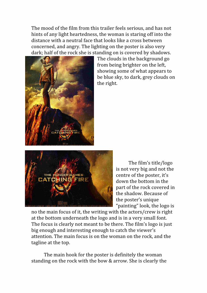
The mood of the film from this trailer feels serious, and has not hints of any light heartedness, the woman is staring off into the distance with a neutral face that looks like a cross between concerned, and angry. The lighting on the poster is also very dark; half of the rock she is standing on is covered by shadows.
The clouds in the background go from being brighter on the left, showing some of what appears to be blue sky, to dark, grey clouds on the right.
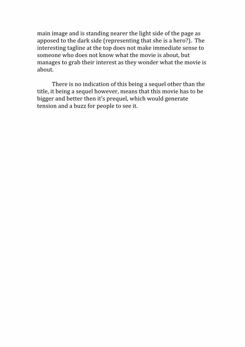
The film’s title/logo is not very big and not the centre of the poster, it’s down the bottom in the part of the rock covered in the shadow. Because of the poster’s unique “painting” look, the logo is
no the main focus of it, the writing with the actors/crew is right at the bottom underneath the logo and is in a very small font. The focus is clearly not meant to be there. The film’s logo is just big enough and interesting enough to catch the viewer’s attention. The main focus is on the woman on the rock, and the tagline at the top.
The main hook for the poster is definitely the woman
standing on the rock with the bow & arrow. She is clearly the
main image and is standing nearer the light side of the page as apposed to the dark side (representing that she is a hero?). The interesting tagline at the top does not make immediate sense to someone who does not know what the movie is about, but manages to grab their interest as they wonder what the movie is about.
There is no indication of this being a sequel other than the
title, it being a sequel however, means that this movie has to be bigger and better then it’s prequel, which would generate tension and a buzz for people to see it.