Embed Size (px)
Citation preview

Name: Andy PattersonCandidate Number: 4113Center Name: St. Andrew’s Catholic SchoolCenter Number: 64135

Masthead Ideas• World of Music – Got the idea from different forms of social media e.g. World of Warcraft. The idea is to
get the ready to know that the magazine is mainly about music. It also tells the reader that there is going to be a broad range of music within the magazine by using the word ‘World’. The chosen font is a font I came across on dafont.com called ‘Primetime’ because it is in an old-school style font that Q and Smash Hits both have.
• Music 4 the Mind – Based on ‘text’ language used in different social media. The ‘4’ is meant to be able to connect with young people because it is informal and connects with what young people type on social media. The font could be in ‘Impact’ because it would stand out and catch the ye of someone who is in to music.
• X – Got the idea from Q magazine. The X is meant to mean ‘Xtreme Music’. The magazine is aimed at teenagers and young adults so the informal term, xtreme, might also connect with young people. The font is ‘Travelling Typewriter’, which The inspiration was from how global megastar, Ed Sheeran, releases his music using that font
• Kaboom! – Based on the name ‘Kerrang!’ which is aimed at rock music. My magazine features interviews with pop and rock artists, so the term ‘Kaboom!’ might sound like a younger version of Kerrang! The font is in ‘Vexler Slip’ from dafont.com, because it has that feel that is similar to Q or Smash Hits.
• Microphone – Based on the classical music magazine Gramophone. Classical music is aimed at adults but since my magazine is for those aged 16-30, this might be used to connect to less sophisticated readers and give information to their favourite artists. The font could be in ‘Times New Roman’ but with less curl effects in the lettering.
MUSIC 4 THE MIND
Microphone

Proposal
MUSIC 4 THE MIND

2nd Proposal
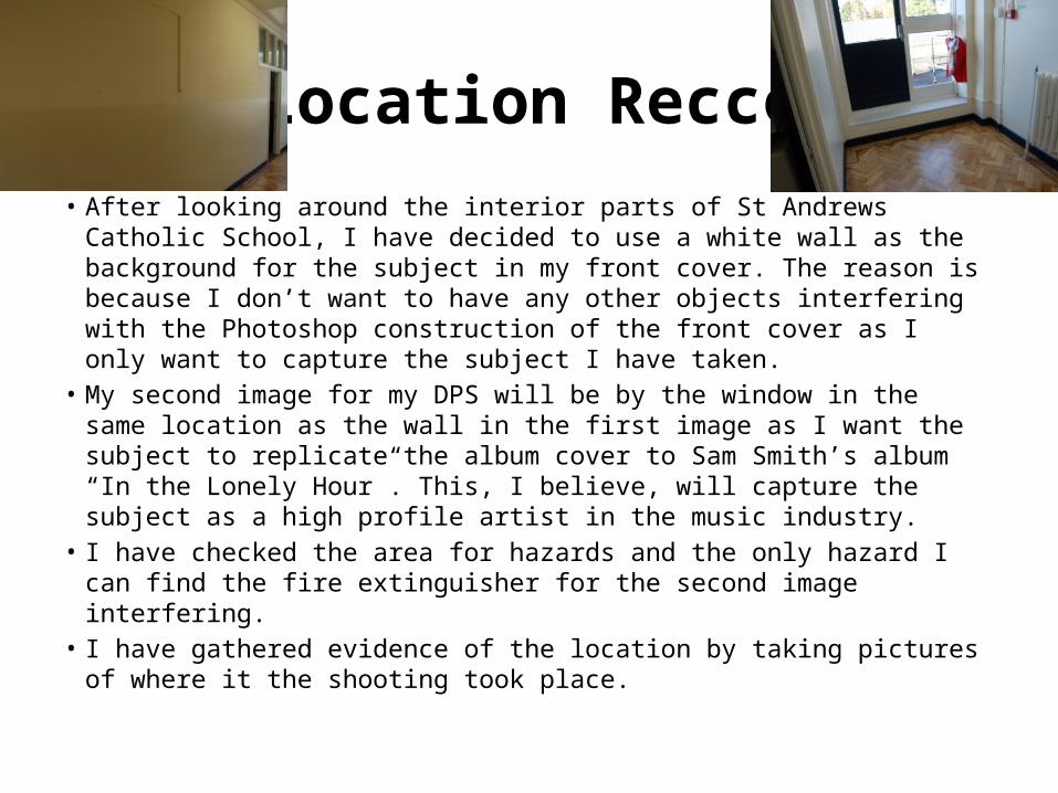
Location Recce• After looking around the interior parts of St Andrews Catholic School, I
have decided to use a white wall as the background for the subject in my front cover. The reason is because I don’t want to have any other objects interfering with the Photoshop construction of the front cover as I only want to capture the subject I have taken.
• My second image for my DPS will be by the window in the same location as the wall in the first image as I want the subject to replicate the album cover to Sam Smith’s album “In the Lonely Hour”. This, I believe, will capture the subject as a high profile artist in the music industry.
• I have checked the area for hazards and the only hazard I can find the fire extinguisher for the second image interfering.
• I have gathered evidence of the location by taking pictures of where it the shooting took place.

Location Recce Continued
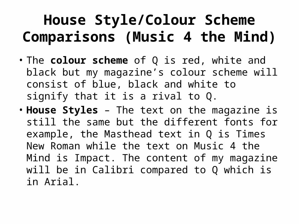
House Style/Colour Scheme Comparisons (Music 4 the Mind)
• The colour scheme of Q is red, white and black but my magazine’s colour scheme will consist of blue, black and white to signify that it is a rival to Q.
• House Styles – The text on the magazine is still the same but the different fonts for example, the Masthead text in Q is Times New Roman while the text on Music 4 the Mind is Impact. The content of my magazine will be in Calibri compared to Q which is in Arial.

House Style/Colour Scheme Comparisons (Pop!)
• Pop! will have many different colour schemes which is what Smash Hits had over the years. The colour schemes will mainly consist of bright colours and white in places as it is aimed at teenage girls.
• House Style – Smash Hits’ masthead changed over the years, but I have chosen Kraash from dafont.com because of it’s cartoonish appearance and will be something to appeal to teenage girls.

Format (Size)
• My magazine will be approximately 30cm tall and 23cm as it is the normal size of a British magazine.
• Q is almost the same size, being 28.5cm tall and 21cm wide, but as Q is also my rival I don’t want to make it bigger in size as it may not improve sales.

Test Photography• These are all the images I took for my front cover. They are all the same
and in good quality but only one could be chosen. It is always important to take more than one image because you don’t know how it is going to turn out, for example, it might be distorted or blurry. I included one of the four for the front cover and made it black and white two make the magazine seem compatible with Q.
Sample Materials

Graphic Layouts• These are the graphic layouts to both my front cover and DPS. They
will both determine what my final magazine pages will look like when they are created on Photoshop. My magazine will be 28cm high and 21.5cm cm wide like a other magazines.

Graphic Layouts Continued• These are the graphic layouts to my front cover and DPS for
my planned but scrapped magazine idea, Pop! They both demonstrate what they would have looked like if I chose Pop! over Music 4 the Mind.

Rough Sketches (Front Cover)
Barcode
Story SeparationSeparates story from subject on front cover
Headline“How ‘X’ did better the Sam Smith, Coldplay and Paolo Nutini’s albums” is in bold and in black. The black in the ‘X’ is made to stand out as the album’s title. Black is made to match the colour on the album cover. The ‘3’ in “3 Page Read” is white so it stands out against the blue background.
MastheadThe denotation of the masthead is Music 4 the Mind and is above Ed Sheeran/Sam Smith’s head. The masthead is shown above his head so that he can be seen on the front cover.
Subject ShotConnotes that this is a close-up of Ed Sheeran, who is the artist from my survey that readers will want to see on the front cover.
Headline“When will his next No. 1 be?” is also in bold and black. Sam Smith’s name is in white and also bigger than the rest of the text because he is the subject on the front cover and the main feature in the magazine. The ‘5’ in “Page 5” is also bigger to show which page Sam Smith is featured in.
The colour scheme goes with the design because I said I would have it repeating throughout.

Rough Sketches (DPS)
8 9
Article Title‘The Man Who… What, exactly?’ connotes that this copy is based on the title of the Travis album ‘The Man Who’
Main ImageOne of the first pieces of a double page that is noticed by someone reading the magazine, connotes that the image of Fran Healy (of Travis) is the first thing to come to mind to a reader. The shot of the artist is going to be a mid-shot.
www.music4mind.co.uk
The CopyThe story from Fran Healy/Naughty Boy in detail by the editors for the purchaser to know the whole story about.
Page NumbersWebsite
Sentence StarterConnotes that this is where theContext begins in the DPS
Article Title‘At the hotel… Hotel Cabana’ connotes that this copy is based on the title of the Barry Manilow song ‘Copacabana’
The colour scheme goes with the design because I said I would have it repeating throughout.
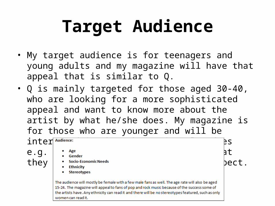
Target Audience
• My target audience is for teenagers and young adults and my magazine will have that appeal that is similar to Q.
• Q is mainly targeted for those aged 30-40, who are looking for a more sophisticated appeal and want to know more about the artist by what he/she does. My magazine is for those who are younger and will be interested in what the artist also does e.g. what they do while touring or what they secretly do that no-one would expect.

Photography PlanLocation Picture Needed Permission
NeededPotential Hazards/Risks
Back Up Plan
Corridor at St. Andrews Catholic School
Man in casual clothes, against a white background, looking sad, away from camera
Need to make sure that the chosen subject has permission to be featured in magazine
Make sure no-one blocks the subject’s way during photo-shoot
Take a lot of the same image if the first one taken isn’t good enough

Hand Drawn
Photoshop
Hand Drawn/Photoshop Drafts(Front Cover)

Hand Drawn/Photoshop Drafts(DPS)
Hand Drawn
Photoshop