Embed Size (px)
Citation preview

By Annie Davies
Q1. IN WHAT WAYS DOES YOUR MEDIA PRODUCT USE, DEVELOP OR
CHALLENGE FORMS AND CONVENTIONS OF REAL MEDIA
PRODUCTS?

USING CONVENTIONS - COVER
Masthead: Normally at top centre or top left hand side of page. Largest piece of text usually, although headline may be bigger.
Cover image: Normally fills the majority of the cover. Subject makes eye contact with camera and normally top half of body – head shown.
Headline: One of the largest lines of text on the page – this is used to draw the reader in and make them buy the magazine.
Cover lines: Used to draw the reader in and make them buy the magazine. A rock magazine typically has a lot to make the cover look busy.

USING CONVENTIONS - COVER
Dateline and Barcode: This is conventionally really small and placed in the corners of the page, such as under the masthead.Quote: Used to draw the
reader in as it shows authenticity of magazine and therefore persuades the purchase of the magazine.
Insert image and Splash: Adds colour and dynamic to the cover.
Subheading: Adds more information about the cover article, often talks informally at the reader.

USING CONVENTIONS - CONTENTS
Photos – either lots or one main image, tell us the genre
Contrasting colours – writing on photos
Editor’s letter and photoSubscription details
Quotes

USING CONVENTIONS – CONTENTS
The Issue number, name of photographers, date, brands worn on cover and copy of cover are usually small and kept to a corner of the contents page.
Title – ‘contents’ normally covers majority of top of page.
The bottom of the page has chronological information about each of the pages. This is where the detail that makes the customer buy the magazine comes in. I have included columns so that the contents page looks busy, in keeping with my theme. I have been careful not to miss any page numbers so that the page makes sense and looks as realistic as possible. I have also highlighted important information, such as band names, so that the customer can quickly see if the product I what they want to buy.

USING CONVENTIONS - ARTICLE
Text – the text is broken up by using paragraphs, which are formatted by the questions and answers in the article. The whole body of text is aligned left, and not hyphenated so that it is easier to read. The question and answer format can be seen by the change in font and colour of the text. As I changed two features of the text, I felt I did not also need to change the text size.
Columns – I chose to include 4 margins per page because this makes the page look busier and I can fit more information on the page.
Margins – although I did not want the margins to be too big as I wanted to include lots of the interview, I needed a decent sized gap so that the text was easy to read. This was important as the font size is so small.

Images – I chose to use a single image because this is usually used for an artist instead of a band. As the image is cut out, the article still looks edgy and is in keeping with my house themes.
Pull quote – I have created interest with the pull quote as it is unusual to hear a rock artist talk about their family. I also included the word ‘Rock’ as this is a pun.
Page number – This is in the corner of the page, which means that it is easy for a reader to flick through and find the page they are looking for.

USING CONVENTIONS - ARTICLE
Drop Cap – I chose to make the drop cap only two lines long, whereas it is normally anything up to 8. This is because I did not want a huge indentation as a larger drop cap could also been seen on the page as a graphic, and there was already a large graphic on that page, behind the title.Footer – these normally
include links to social media, expanded content and web links. I have used the web address for the magazine website, as well as advertised the album as expanded content.
Background – I have followed convention and chosen to use both black and white backgrounds. This is so that the text is easy to read as the main body of text is either blue or white.
Index tab – placed at top right hand side of page, to allow easy flicking through.
USING CONVENTIONS - ARTICLE
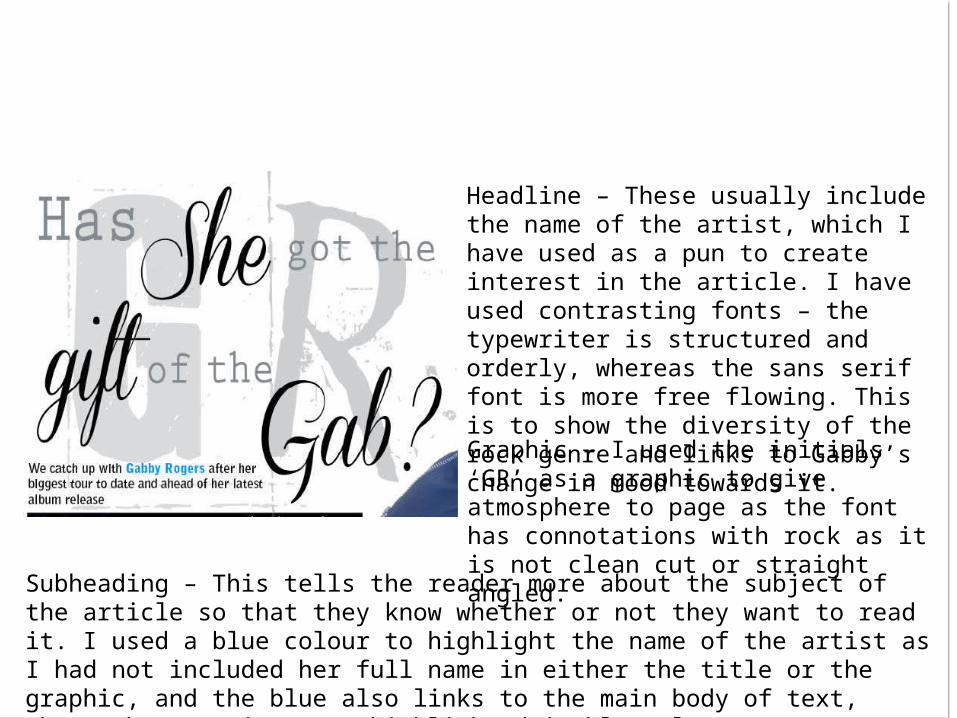
Graphic – I used the initials ‘GR’ as a graphic to give atmosphere to page as the font has connotations with rock as it is not clean cut or straight angled.
Subheading – This tells the reader more about the subject of the article so that they know whether or not they want to read it. I used a blue colour to highlight the name of the artist as I had not included her full name in either the title or the graphic, and the blue also links to the main body of text, where the questions are highlighted in blue also.
Headline – These usually include the name of the artist, which I have used as a pun to create interest in the article. I have used contrasting fonts – the typewriter is structured and orderly, whereas the sans serif font is more free flowing. This is to show the diversity of the rock genre and links to Gabby’s change in mood towards it.

DEVELOPING CONVENTIONS - COVER

DEVELOPING CONVENTIONS – COVERCover image: I think my cover image goes with the conventions as it fills the majority of the cover and Gabby has maintained eye contact with the camera, which draws the reader towards the magazine on a shop shelf. I have kept editing the photo to a minimum as I found, by flicking through Kerrang! Magazine, that they rarely airbrush skin tones. The top half of Gabby’s body is shown, also keeping in line with conventions.
Masthead: I based my masthead on NME’s as it has a simple, yet eye catching format. The font is in keeping with the genre of music, and the colour relates to my target audience. It is a similar size and shape to the NME masthead, and therefore follows convention.

DEVELOPING CONVENTIONS - COVER
Dateline and Barcode: This is conventionally really small and placed in the corners of the page, such as under the masthead. My barcode and dateline therefore follow convention.
Quote: My quote stands out as although the pink and green contrast, it is in keeping with colour scheme of the page, as well as clear and easy to read.
Insert image and Splash: Although I did not include an insert image, I included two splashes. These create a 2D feel to the page, but also help certain cover lines, or quotes, stand out. This is because they overlap other images and text, therefore keeping in line with conventions.

DEVELOPING CONVENTIONS - COVER
Strapline: These appear at the top and bottom of the page – following conventions. The footer goes across the whole page, which is very common.
Headline: This follows convention as it is one of the largest pieces of wording on the page. It is the name of an artist, which is also not uncommon, and follows the colour scheme. The font is also clear to read.
Subheading: It is underneath the headline, therefore following conventions.

DEVELOPING CONVENTIONS – COVER
Cover lines: I think my cover lines are quite conventional as they fill in the gaps left by the image, and are to the edge of the page. They are bright and contrasting, which draws the reader in, and are of a topic that would interest a potential buyer of the magazine. A rock magazine typically has a lot to make the cover look busy, and I think the colour scheme helps with this. I have taken inspiration from NME’s cover by highlighting words.

DEVELOPING CONVENTIONS - CONTENTS
I have taken inspiration from Rock Sound magazine with my layout as it is bright, colourful and busy looking. I liked the idea of putting the page number over the image, along with the name of the band / artist pictured.

CHALLENGING CONVENTIONS - COVER
I do not think that I have challenged any conventions with my magazine cover as I have tried to follow inspiration I took from Kerrang! And NME very closely. This was to ensure sales of my magazine – I did not see any point in challenging conventions when the ideas already work well for so many popular and well-known magazines.

CHALLENGING CONVENTIONS - CONTENTS
I do not think I have challenged conventions of a contents page hugely, although I have not included some of the usual aspects. This includes the name of magazine, or website.
I have also not included an advert or a mixture of cut out photos and non-cut out photos in the conventional way. This is because the yellow star in the middle of the page could be described as an advertisement for the magazine subscription, although it is not an advert for an external company. The majority of the photos are in a very regimental format, although the photo of the editor is at a slant, therefore could be described as cut out from the layout of the page.