Embed Size (px)
Citation preview
Creating my contents

Here is a first rough drawn sketch of the contents. I instantly liked the design and decided to use it as a basis to creating the final version. Furthermore, I drew out how I wanted things to be arranged including images, title, contents list and the editors note.
First plan

First stage
Following on from the original plan, I started creating my contents page. I arranged out the background and the title.

Second stage
I then added the text which included the contents list and the editors note.
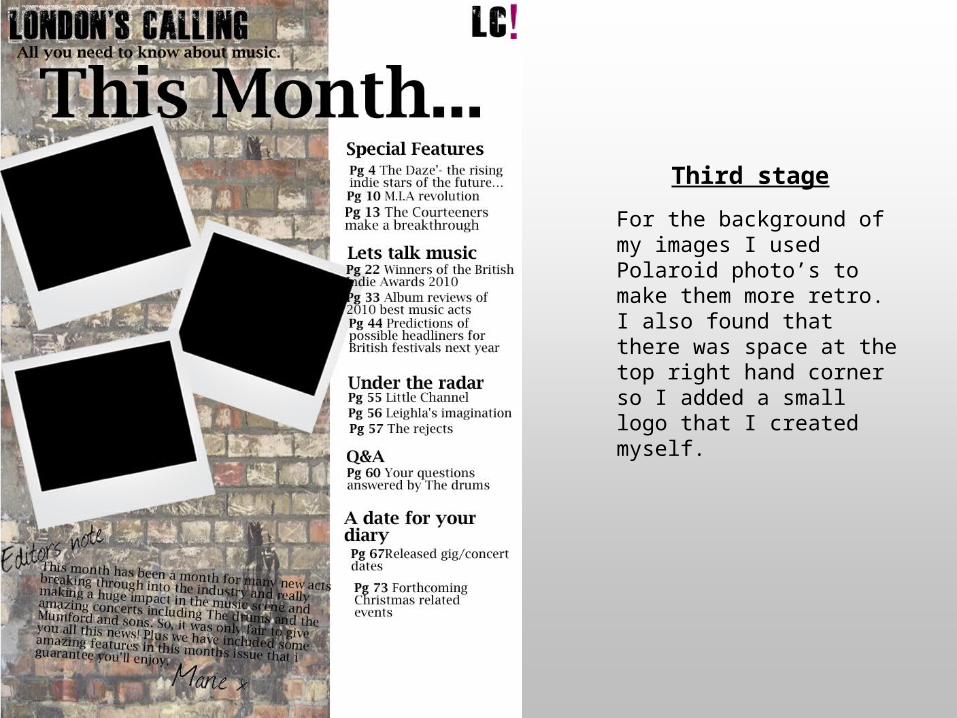
Third stage
For the background of my images I used Polaroid photo’s to make them more retro. I also found that there was space at the top right hand corner so I added a small logo that I created myself.

Fourth stage
Next, I added the images to the page which were the images that related to the contents list. I decided to put them in quite a rough layout so they would fit in with the genre of indie. Plus, an image of the editor.
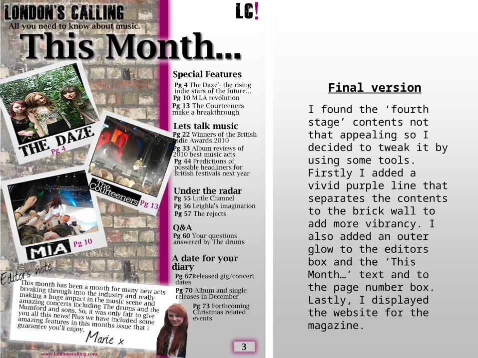
Final version
I found the ‘fourth stage’ contents not that appealing so I decided to tweak it by using some tools. Firstly I added a vivid purple line that separates the contents to the brick wall to add more vibrancy. I also added an outer glow to the editors box and the ‘This Month…’ text and to the page number box. Lastly, I displayed the website for the magazine.