Embed Size (px)
Citation preview
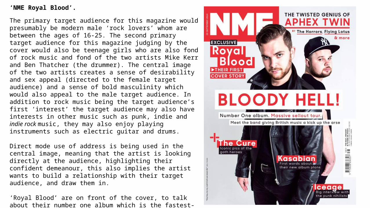
‘NME Royal Blood’.
The primary target audience for this magazine would presumably be modern male ‘rock lovers’ whom are between the ages of 16-25. The second primary target audience for this magazine judging by the cover would also be teenage girls who are also fond of rock music and fond of the two artists Mike Kerr and Ben Thatcher (the drummer). The central image of the two artists creates a sense of desirability and sex appeal (directed to the female target audience) and a sense of bold masculinity which would also appeal to the male target audience. In addition to rock music being the target audience’s first ‘interest’ the target audience may also have interests in other music such as punk, indie and indie rock music, they may also enjoy playing instruments such as electric guitar and drums.
Direct mode use of address is being used in the central image, meaning that the artist is looking directly at the audience, highlighting their confident demeanour, this also implies the artist wants to build a relationship with their target audience, and draw them in.
‘Royal Blood’ are on front of the cover, to talk about their number one album which is the fastest-selling British rock debut in years.
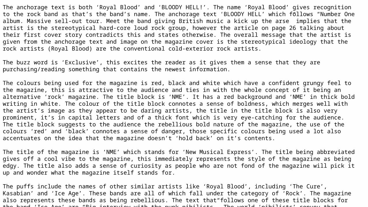
The anchorage text is both ‘Royal Blood’ and ‘BLOODY HELL!’. The name ‘Royal Blood’ gives recognition to the rock band as that’s the band’s name. The anchorage text ‘BLOODY HELL’ which follows “Number One album. Massive sell-out tour. Meet the band giving British music a kick up the arse” implies that the artist is the stereotypical hard-core loud rock group, however the article on page 26 talking about their first cover story contradicts this and states otherwise. The overall message that the artist is given from the anchorage text and image on the magazine cover is the stereotypical ideology that the rock artists (Royal Blood) are the conventional cold-exterior rock artists.
The buzz word is ‘Exclusive’, this excites the reader as it gives them a sense that they are purchasing/reading something that contains the newest information.
The colours being used for the magazine is red, black and white which have a confident grungy feel to the magazine, this is attractive to the audience and ties in with the whole concept of it being an alternative ‘rock’ magazine. The title block is ‘NME’. It has a red background and ‘NME’ in thick bold writing in white. The colour of the title block connotes a sense of boldness, which merges well with the artist’s image as they appear to be daring artists, the title in the title block is also very prominent, it’s in capital letters and of a thick font which is very eye-catching for the audience. The title block suggests to the audience the rebellious bold nature of the magazine, the use of the colours ‘red’ and ‘black’ connotes a sense of danger, those specific colours being used a lot also accentuates on the idea that the magazine doesn’t ‘hold back’ on it’s contents.
The title of the magazine is ‘NME’ which stands for ‘New Musical Express’. The title being abbreviated gives off a cool vibe to the magazine, this immediately represents the style of the magazine as being edgy. The title also adds a sense of curiosity as people who are not fond of the magazine will pick it up and wonder what the magazine itself stands for.
The puffs include the names of other similar artists like ‘Royal Blood’, including ‘The Cure’, Kasabian’ and ‘Ice Age’. These bands are all of which fall under the category of ‘Rock’. The magazine also represents these bands as being rebellious. The text that follows one of these title blocks for the band ‘Ice Age’ are “Big interview with the punk nihilists”. The world ‘nihilists’ convey that these rock stars don’t conform to any religion or any figure which accentuates their rebellious nature to be free and wild. Scrutinising the magazine right off the bat, and analysing the short sentences in the puffs and artist’ names we get the idea that the magazine is targeted stereotypically for people who enjoy rock, alternative indie music.
The different strategies the magazine uses to attract the audience is the variety of bold colours but keeping it to a bare minimum (black, red and white), large basic readable fonts, puffs and buzz words as well as choice of lexis, the words “BLOODY HELL!” is placed right in the centre of the magazine, the use of it being unequivocal and probably under the vocabulary of the target audience intrigues the target audience straight away.
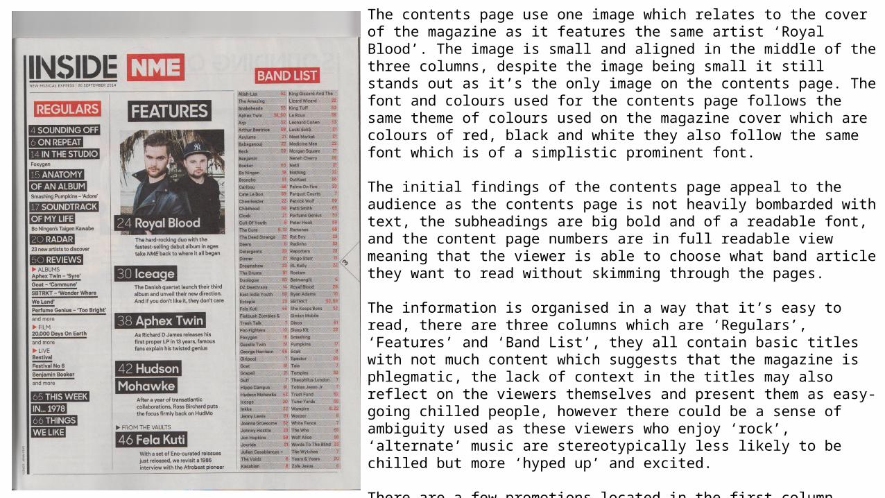
The contents page use one image which relates to the cover of the magazine as it features the same artist ‘Royal Blood’. The image is small and aligned in the middle of the three columns, despite the image being small it still stands out as it’s the only image on the contents page. The font and colours used for the contents page follows the same theme of colours used on the magazine cover which are colours of red, black and white they also follow the same font which is of a simplistic prominent font.
The initial findings of the contents page appeal to the audience as the contents page is not heavily bombarded with text, the subheadings are big bold and of a readable font, and the content page numbers are in full readable view meaning that the viewer is able to choose what band article they want to read without skimming through the pages.
The information is organised in a way that it’s easy to read, there are three columns which are ‘Regulars’, ‘Features’ and ‘Band List’, they all contain basic titles with not much content which suggests that the magazine is phlegmatic, the lack of context in the titles may also reflect on the viewers themselves and present them as easy-going chilled people, however there could be a sense of ambiguity used as these viewers who enjoy ‘rock’, ‘alternate’ music are stereotypically less likely to be chilled but more ‘hyped up’ and excited.
There are a few promotions located in the first column which are various alternative albums, the film “20,000 Days on earth” and other bands/artists such as, “Ice Age”, “Aphex Twin”, “Hudson Mohawke” and “Fela Kuti”.
The magazine logo is placed on the top of the page, it intelligently ties in with the words “INSIDE” which makes it “INSIDE NME”. It is quite dominant as it’s one of the three title blocks on the page that has a red background.There are no social media sites for the magazine placed on the contents page.
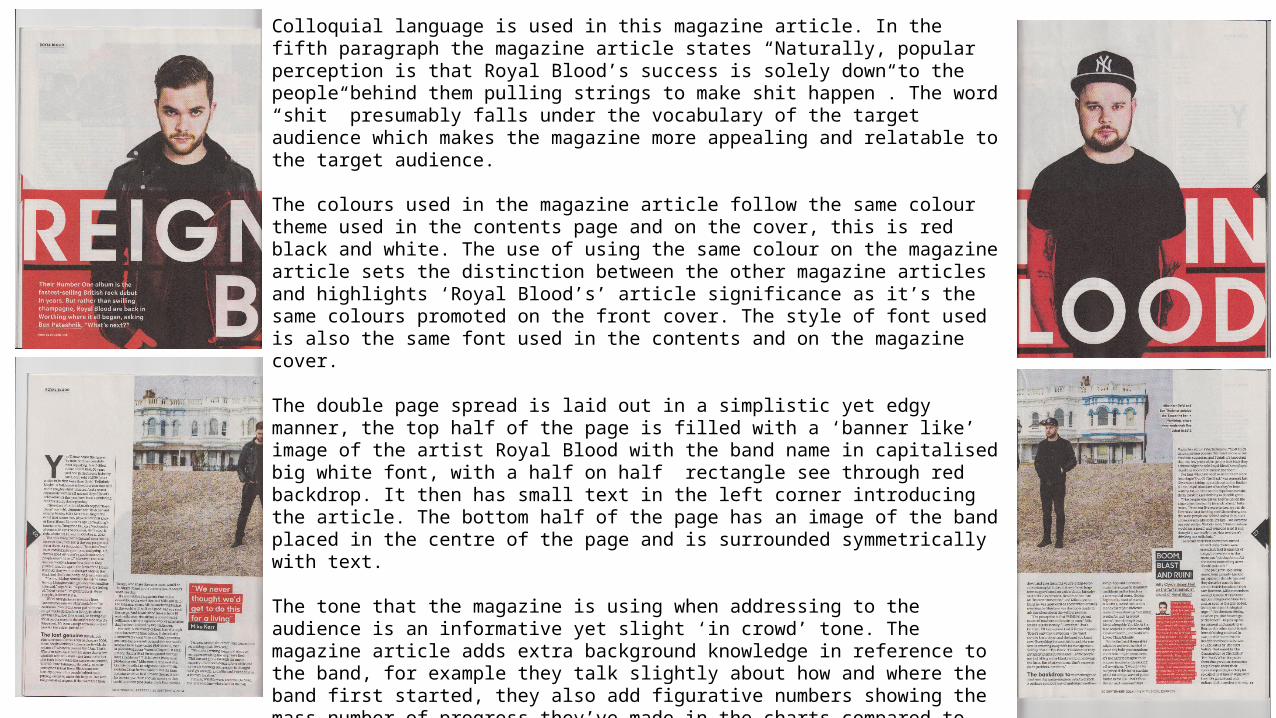
Colloquial language is used in this magazine article. In the fifth paragraph the magazine article states “Naturally, popular perception is that Royal Blood’s success is solely down to the people behind them pulling strings to make shit happen”. The word “shit” presumably falls under the vocabulary of the target audience which makes the magazine more appealing and relatable to the target audience.
The colours used in the magazine article follow the same colour theme used in the contents page and on the cover, this is red black and white. The use of using the same colour on the magazine article sets the distinction between the other magazine articles and highlights ‘Royal Blood’s’ article significance as it’s the same colours promoted on the front cover. The style of font used is also the same font used in the contents and on the magazine cover.
The double page spread is laid out in a simplistic yet edgy manner, the top half of the page is filled with a ‘banner like’ image of the artist Royal Blood with the band name in capitalised big white font, with a half on half rectangle see through red backdrop. It then has small text in the left corner introducing the article. The bottom half of the page has an image of the band placed in the centre of the page and is surrounded symmetrically with text.
The tone that the magazine is using when addressing to the audience is an informative yet slight ‘in crowd’ tone. The magazine article adds extra background knowledge in reference to the band, for example they talk slightly about how and where the band first started, they also add figurative numbers showing the mass number of progress they’ve made in the charts compared to other bands. The ‘in crowd’ tone is evident as the band speaks of what they want to achieve next and how they never thought they would be where they are now – thanks to their fans.
Through the images the band are represented as grungy, edgy hard-exterior rock artists, this is evident through the colours used (red black and white) the posture and body language of the two artists, looking directly at the camera (direct mode of address) and neutral yet demeaning facial expressions.
The style of the article slyly contradicts the image on the magazine cover as when we read on in
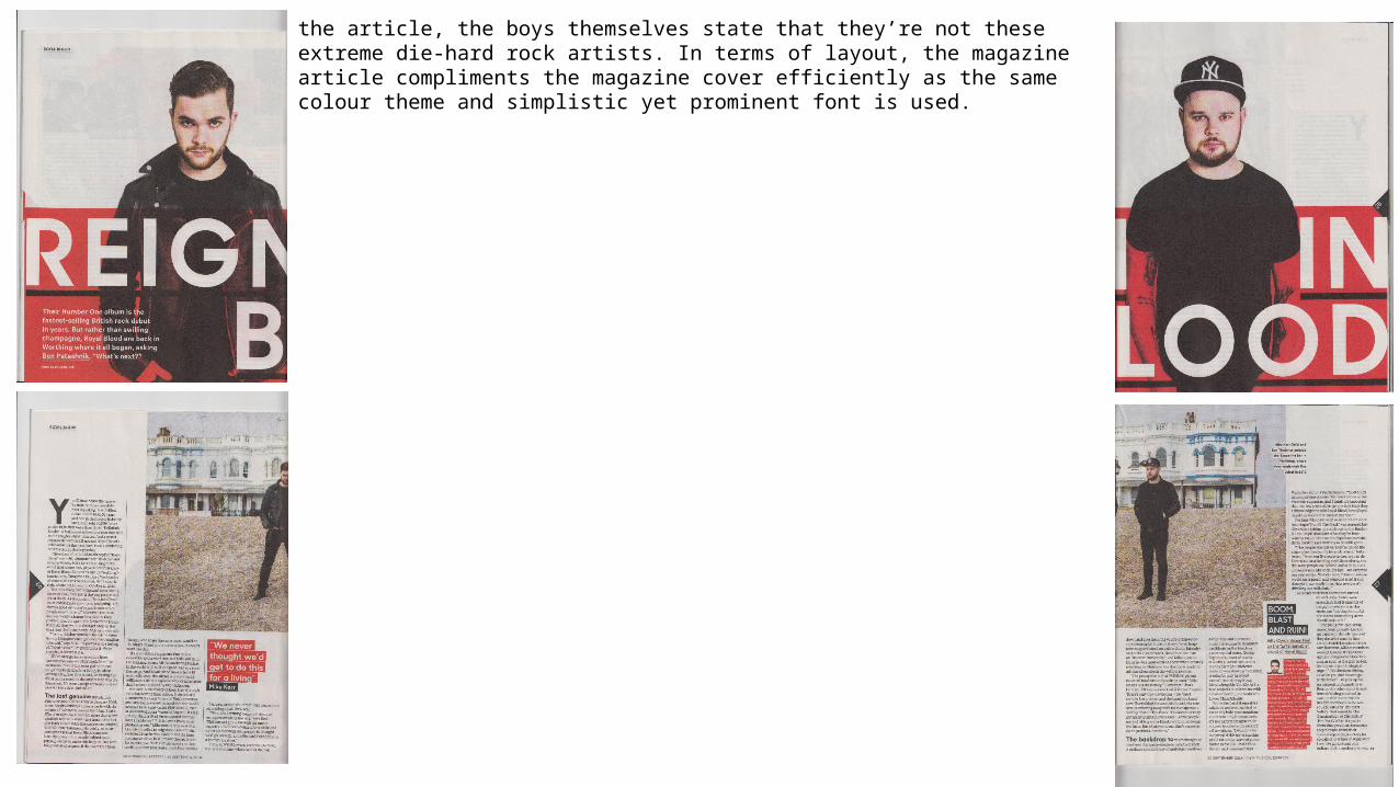
the article, the boys themselves state that they’re not these extreme die-hard rock artists. In terms of layout, the magazine article compliments the magazine cover efficiently as the same colour theme and simplistic yet prominent font is used.


![Detailed class analysis of music magazine one nme[1]](https://img.pdfslide.us/doc/110x75/58ee303f1a28ab1f278b46cd/detailed-class-analysis-of-music-magazine-one-nme1.jpg)