Embed Size (px)
Citation preview
NME Analysis
By Najat Hachem
The masthead for NME is always in the top left hand corner of the magazine. It is also in a sans serif font in white and in a red rectangle shape. Moreover, it is also used as a logo which makes it recognisable for the readers. In Q magazine they also have their masthead in the same position. The colours used for the masthead is also used for the cover story, which reflects to the readers its importance.
The centre of visual interest is the main image on the magazine which is a close up shot of Noel Gallagher which links with the main cover story. This is a main code and convention in most magazine that the main image on the front cover links with the cover story. The image is in black and white for the famous artist. The facial expression of the artist shows he is serious and he is looking directly at the camera which makes the reader feel he is looking at them and trying to make direct connection towards the reader.
The splash over story is the largest text on the front cover except for the masthead. It is in white and in sans serif bold font and underlined in red. The catches the readers attention and suggests to them that it is the main story in this issue, as it has the name of the artist. There is a wob effect used on the masthead where the white text is placed on black or different coloured background which is the image, this makes it stand out and shows how important it is, especially from the rest of the text.
The issue date is placed vertically in the rectangle shape where the masthead is. In most NME magazines the date is placed next to the masthead. Not all magazines place the date next to the masthead, usually next to the masthead.
The pull quote is placed in a square shape box with white outline and the text is in white. Locating the quote in a box, suggests that is separated from everything else on the front cover and it makes the reader want to look at it separately, not like the other features on the page.
The bar code is placed vertically on the side of the page and in a white rectangle shape. This does not follow code and conventions of magazines as usually bar codes are located on the bottom right third of the page. The bar code is noticed on the front page, which suggests that the audience can look straight on it when buying the magazine as it includes the price of the magazine.
The colour scheme of the magazine is white, black, red, grey and some blue. Following the colour scheme creates a sense of professionalism and it is a main code and convention in most magazines. The colours used are similar to ‘MOJO’ magazine. The colours black, white and grey go well together however, the red and the blue makes features stand out on the front cover. The use of the colour shows importance and suggests to the readers that they must see this specific feature. The colours also meets with the target audience as the target audience for NME is men as they like dull colours such as grey and black.
The running head is a list of artists that are covered inside the issue. They are in white serif font and below each head in a blue rectangle shape which states specifically what the article inside the issue is about and the title. This follows codes and conventions of the other magazines as they usually promote what articles are inside the magazine.
The ‘+’ sign that is used here and followed with subheadings suggest that there is more inside the magazine and is another way to inform the audience what type of stuff will be included inside the issue, for example some band names and if someone is interested in one of the bands would want to read the magazine.
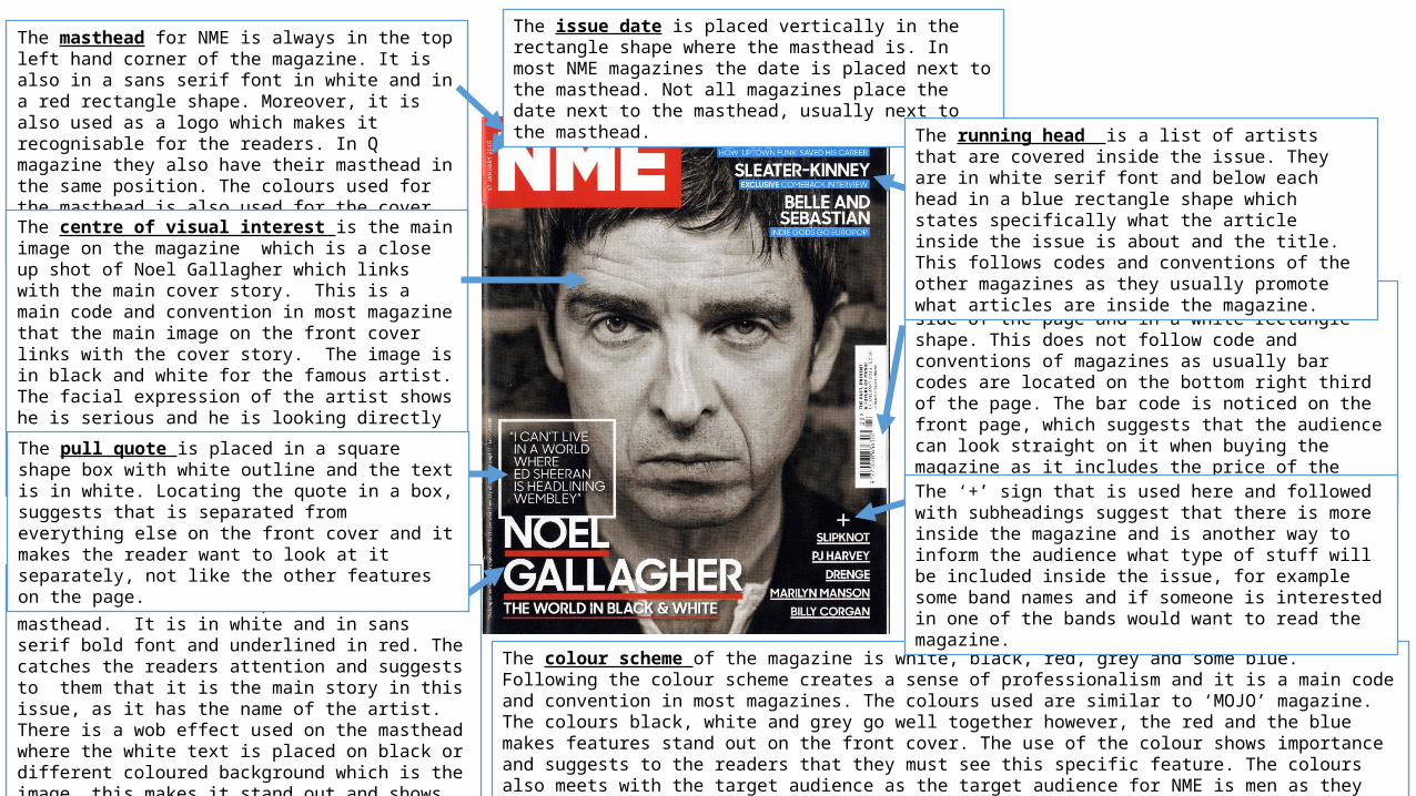
In NME instead of stating that it is the contents page by having the title as ‘contents’ they said it in a different way by saying ‘Inside NME’. However, this doesn’t follow the codes and conventions of magazines, as they usually refer to it as ‘Contents’. Also, it doesn’t stand out as much on the page, which makes the audience focus on what features are inside the magazine. The ‘NME’ masthead has also been placed on the contents page which is most common in all NME magazines. This suggests that they always refer to the magazines masthead. The masthead is also the same colour and font as the front cover.
The date is located under the heading, which is similar to MOJO magazine. The date will allow the readers know if it is the latest issue.
The main image on the page is placed slightly on the bottom centre of the page. It is a medium shot of the singer Mark Ronson, where below the image it has the contents title of his name, so there is a link between the image and the contents title. This is a professional technique that it used in most magazines, so the audience can refer to what they want to read and makes it more interesting.
Similar to MOJO, they self-promote the magazine and include a sell line on the contents page. This shows that the magazine is an independent and successful brand, so they don’t need sponsorship. However, not all magazines self-promote their magazine on the contents page, they might of done it on a different page inside the magazine. Moreover, as they have placed it on the contents page it shows that NME has a big promotion as it a limited offer ‘January Sale’ so they might not be able to get this offer again, so they should make it easy for the readers to see it as soon as possible.
One of the main contents title is the band list, this is a professional idea as it would inform the readers what bands are inside the magazine. The use of colour red makes it stand out on the page and suggests its importance on the page. This is not a main common and convention in magazines as not all the magazines include a band list on the contents page. This suggests that it is a unique magazine and uses different techniques. Moreover, it also makes it easy for the reader to find the particular band they are looking for.
Another contents title is ‘REGULARS’ which is common in most magazines and contents titles are a common code and convention in magazines. It is in a red rectangle with white in sans-serif font, which stands out from the rest of the text. Also it is the same font as the masthead which suggests its important to look at.
The colour scheme is similar to the front cover, as they only used the colours white, red, and black. The connotations of the colour red on the page show that it is an important and significant colour and it is only used on important features. Keeping with the colour scheme makes the magazine more successful and professional.
The contents are in a black rectangle and with white text inside; this is a wob effect. This has been used to make easier for the audience to read and find what they are looking for. It is also makes it look neat and readable.
The centre of visual interest which is the image that is spread over the double page spread which makes it dominate and that it has a link over the two pages. It is a photograph of three famous artists and it is a medium shot. This follows conventions of double page spreads as most of the time the main image spreads over the two pages. The information the DPS is linked to the image and which grabs the readers attention while flicking inside the magazine and if they are interested in these artists they would like to the read article. Also, if they don’t know them they might would to read it due to the image.
The use of the drop cap on a double page is a code and convention as on most DPS they use a drop cap to start an article. This suggests to the readers where the article starts if they are not sure.
The page numbers for the pages are usually located at the bottom or the top of the page. However, in this DPS they are located differently to other magazines.
The cutline is a common code and convention is magazines as they use it to inform the readers that are not sure who is in the photograph. This technique is used to keep the audience filled up with information so they don’t miss on any important information and navigates them in the magazine.
The pull quote is located under the main image and it stands out from the rest of the text which makes it significant and important. It also grabs the readers attention as it seems important and they would be interested because the artist said it and before they start reading the article. Pull quotes are used to make the reader more excited about reading the article and it gives them a quick idea what it is about. It is in white on a black background and text that is larger than the rest of the text in the article which makes it stand out to the reader. Below the pull quote it says who quoted in in an orange rectangle shape around it.
Similar to MOJO, on the DPS they advertised the discography that the artist has and has some information about them. This promotion makes the reader interested and informed about the music the artist has. So, they would want to find out about them and would might like to buy the tracks. This promotion is located in between the article text, so while the reader is reading the article they would see it straight away and would feel that they are missing out if they don’t have them. Also, instead of the reader reading the article continuously, they can take a break by looking at different things.
Double page spread
The layout of the columns makes it easier to read for the reader as it is clear. However, there is a lot of text which suggest that the reader would be interested in reading articles in depth and would like to know a lot of information, also the font is readable.


![Detailed class analysis of music magazine one nme[1]](https://img.pdfslide.us/doc/110x75/58ee303f1a28ab1f278b46cd/detailed-class-analysis-of-music-magazine-one-nme1.jpg)