Embed Size (px)
Citation preview

MAIN ARTICLE ANALYSISSEAN DOEL
This is the music magazine article that I will be analysing, it is from Kerrang magazine.
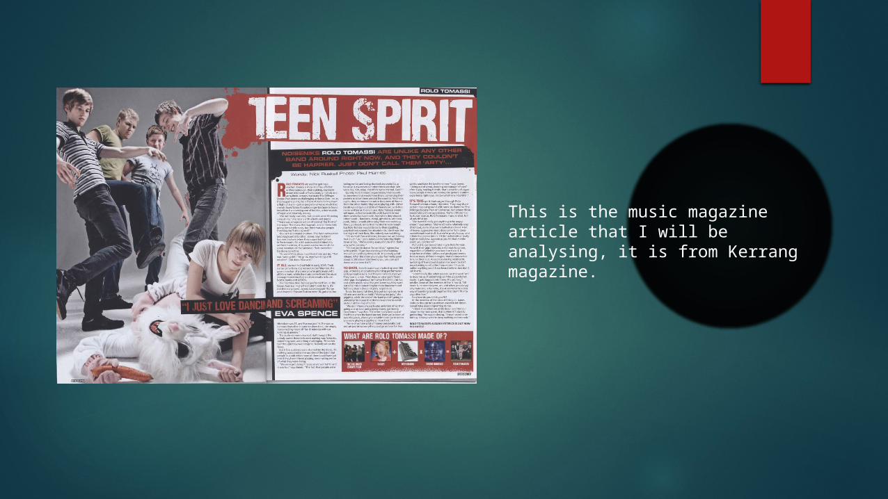
This is the Headline and also the subheading. The colour scheme for this is Red, White and Black. This shows us that the genre of the magazine is a Rock style of magazine. The font is a rough looking font and it is on a Red background with a ‘splash’ effect. To make the subheading stand out from the rest it has been put onto a different background which is black and the writing is Red.
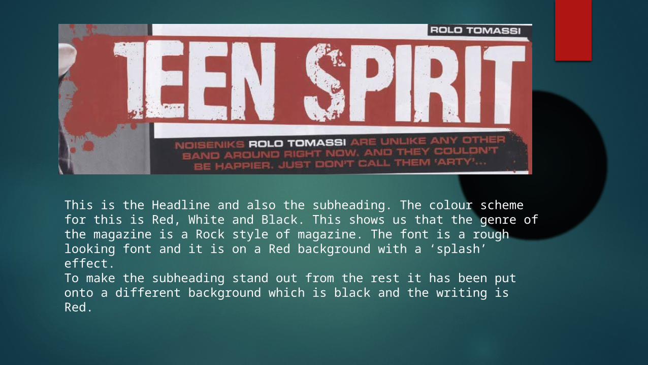
This is the main image on the left side of the double page spread. It takes up the whole side and this means that it is very large. It is a picture of the band and it is a unique photo because they are doing an interesting pose. It shows violence and this shows the readers what type of band they are.
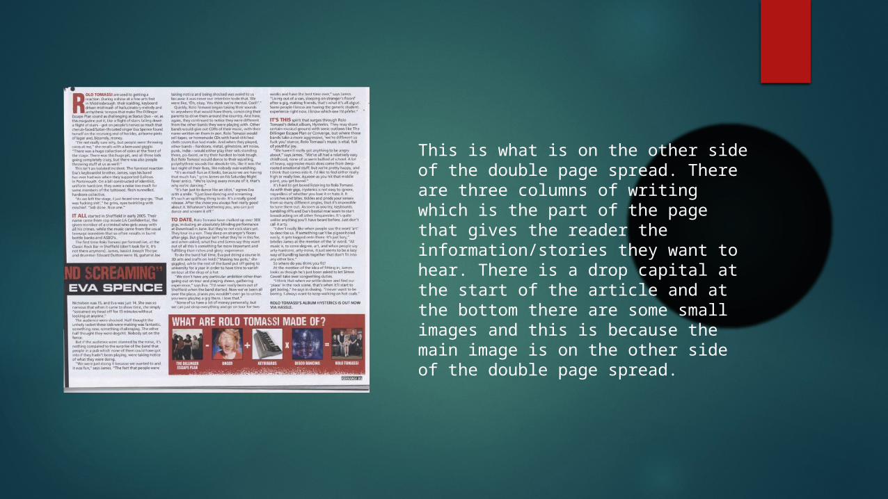
This is what is on the other side of the double page spread. There are three columns of writing which is the part of the page that gives the reader the information/stories they want to hear. There is a drop capital at the start of the article and at the bottom there are some small images and this is because the main image is on the other side of the double page spread.
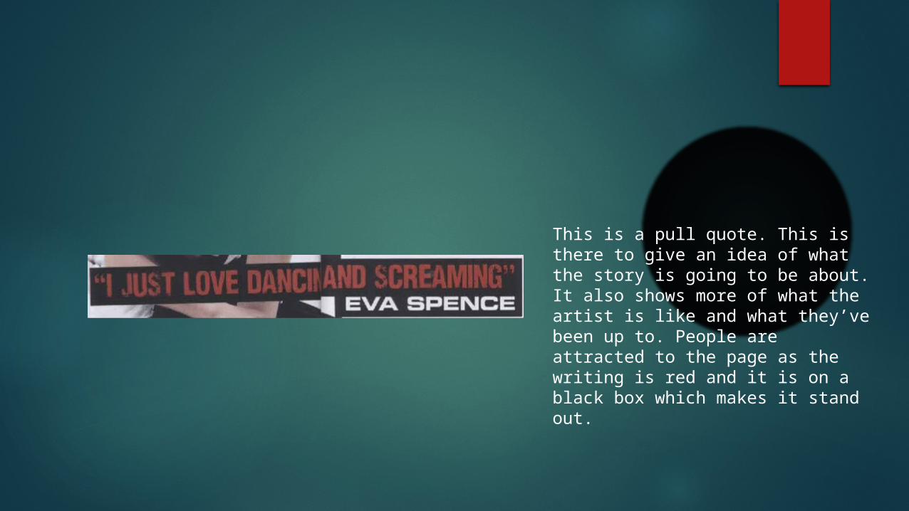
This is a pull quote. This is there to give an idea of what the story is going to be about. It also shows more of what the artist is like and what they’ve been up to. People are attracted to the page as the writing is red and it is on a black box which makes it stand out.