Embed Size (px)
Citation preview
ARTICLE ANALYSIS FOR MEDIA STUDIES IN THIS HOMEWORK I WILL ANALYSE 2 ARTICLES TAKEN
FROM MUSIC MAGAZINES
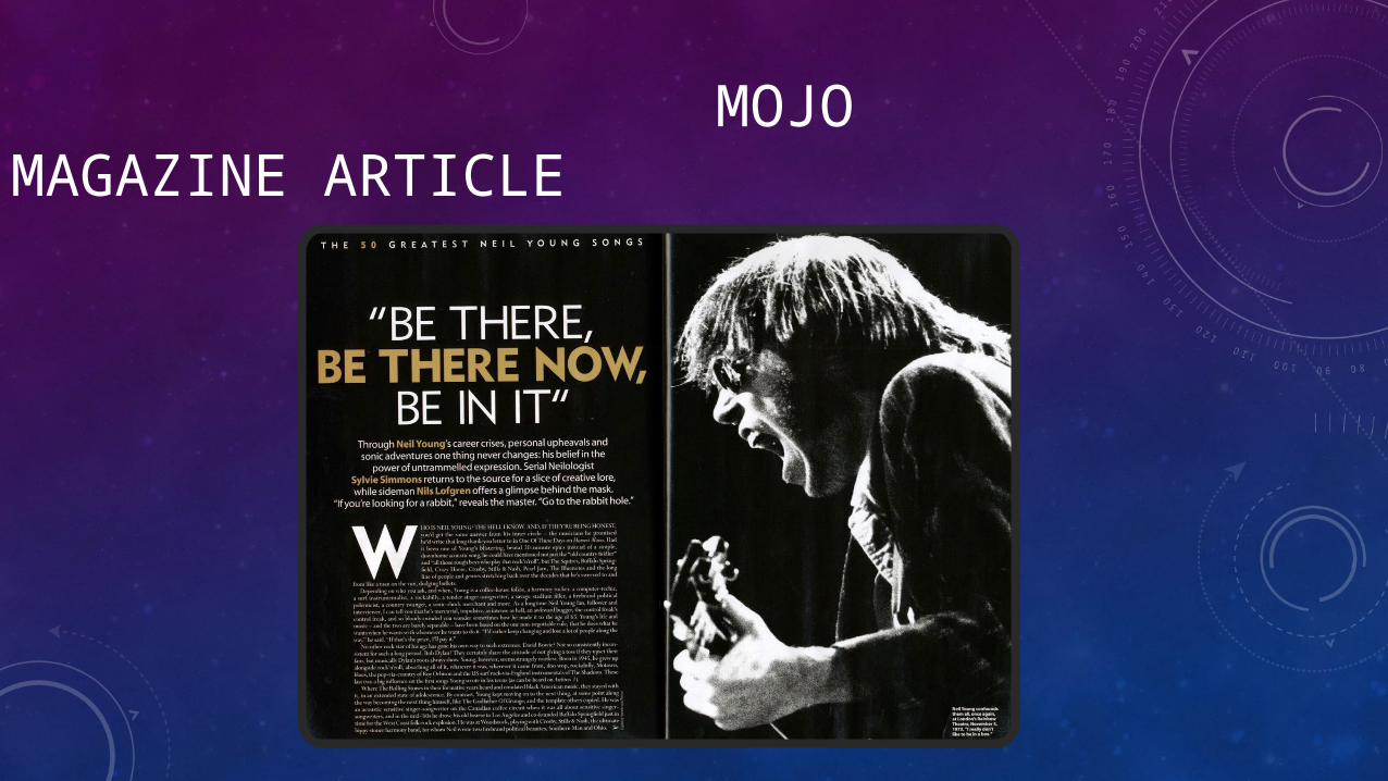
MOJO MAGAZINE ARTICLE
This music magazine article is a biographical article because it talks about somebody's life. It conveys quite a reminiscent theme because it uses a black and white image and almost everything else is in the same colours with the background being black and the text being white. The text is centrally aligned and uses a drop cap at the beginning of the article.
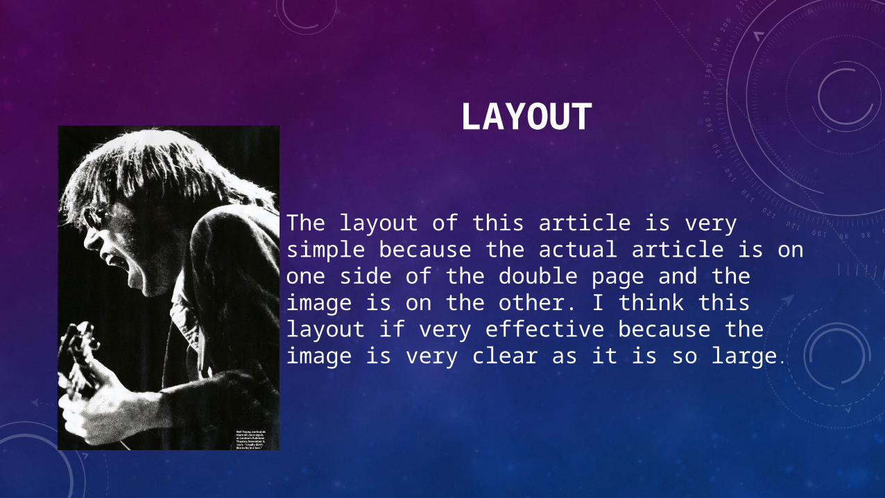
The layout of this article is very simple because the actual article is on one side of the double page and the image is on the other. I think this layout if very effective because the image is very clear as it is so large.
LAYOUT
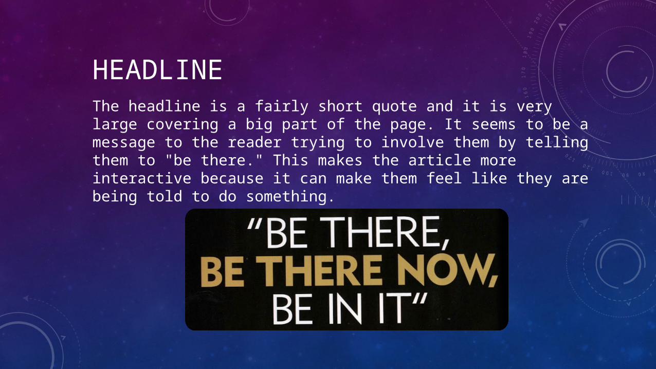
The headline is a fairly short quote and it is very large covering a big part of the page. It seems to be a message to the reader trying to involve them by telling them to "be there." This makes the article more interactive because it can make them feel like they are being told to do something.
HEADLINE
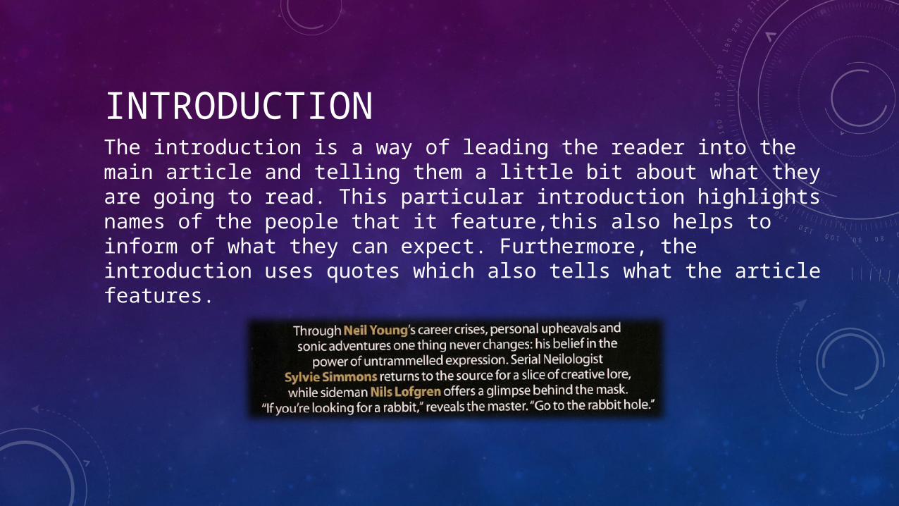
INTRODUCTION The introduction is a way of leading the reader into the main article and telling them a little bit about what they are going to read. This particular introduction highlights names of the people that it feature,this also helps to inform of what they can expect. Furthermore, the introduction uses quotes which also tells what the article features.
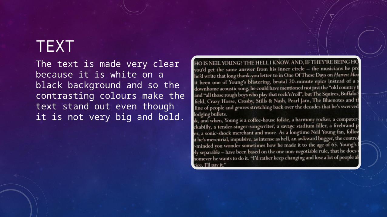
TEXTThe text is made very clear because it is white on a black background and so the contrasting colours make the text stand out even though it is not very big and bold.
MADONNA MUSIC MAGAZINE ARTICLE
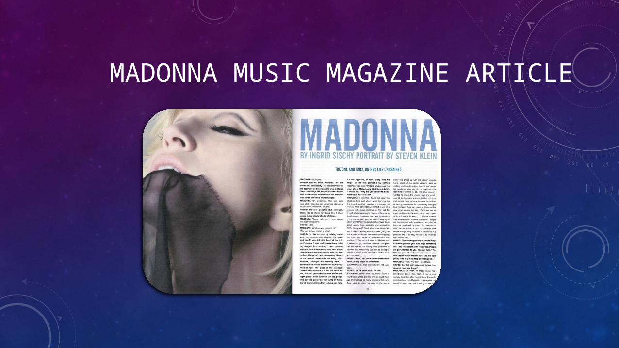
The second article is about Madonna and it is a Q&A article. It has quite a feminine style because the main image is of Madonna. Also the use of colours is very calm.there are no bright colours that make the text stand out.

LAYOUTThe layout of this article is exactly the same as the first one. The main image is on one side of the double page and the text is on the other side. This layout is very clear and makes the reading easier for the audience.
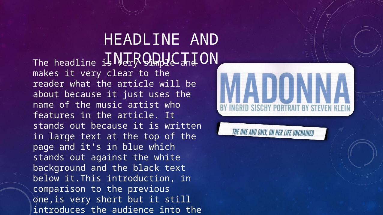
HEADLINE AND INTRODUCTIONThe headline is very simple and makes
it very clear to the reader what the article will be about because it just uses the name of the music artist who features in the article. It stands out because it is written in large text at the top of the page and it's in blue which stands out against the white background and the black text below it.This introduction, in comparison to the previous one,is very short but it still introduces the audience into the article quite well because we are told that it is about madonnas life.
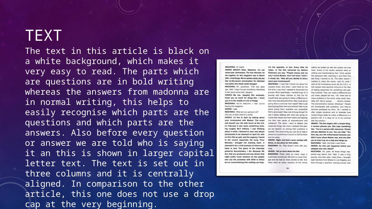
TEXTThe text in this article is black on a white background, which makes it very easy to read. The parts which are questions are in bold writing whereas the answers from madonna are in normal writing, this helps to easily recognise which parts are the questions and which parts are the answers. Also before every question or answer we are told who is saying it an this is shown in larger capital letter text. The text is set out in three columns and it is centrally aligned. In comparison to the other article, this one does not use a drop cap at the very beginning.