Embed Size (px)
Citation preview
This double page spread is from a music magazine called NME: a pop/rock music magazine. By featuring an artist who makes pop/rock music, the primary audience are forced to buy the magazine as they are enticed with the same music genre.
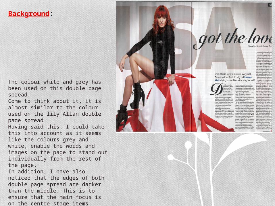
The main image dominates this double page spread; unlike the double page of lily Allen. NME have achieved this by making sure that sharp colours are used on the image. E.g. red and black.
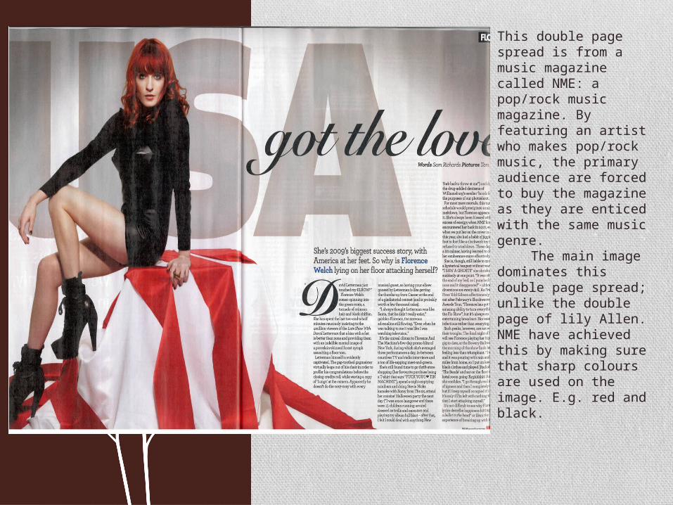
TITLE:
While i was trying to crop the title off, the double page spread I noticed that the title also included both “USA” and Florence (the celebrity on the page) also, which also takes up a lot of the page. Subsequently, the title does not just include “got the love” but rather “Florence &USA got the love” The phrase “we've got the love” was a song by Florence which only primary audience may be able to understand fully without any misunderstanding. Having said this, unlike the double page spread of lily Allan, this double page spread doesn’t just include an image/celebrity and a story about them, but rather connotes something with it. For example a hidden meaning, which the readers could figure out if they are interested in the genre and music type. Also, by using Florence's already produced song, as the title, the magazine promote the song/album. This could be classified as a covert advert, as it is not a blatant advert.
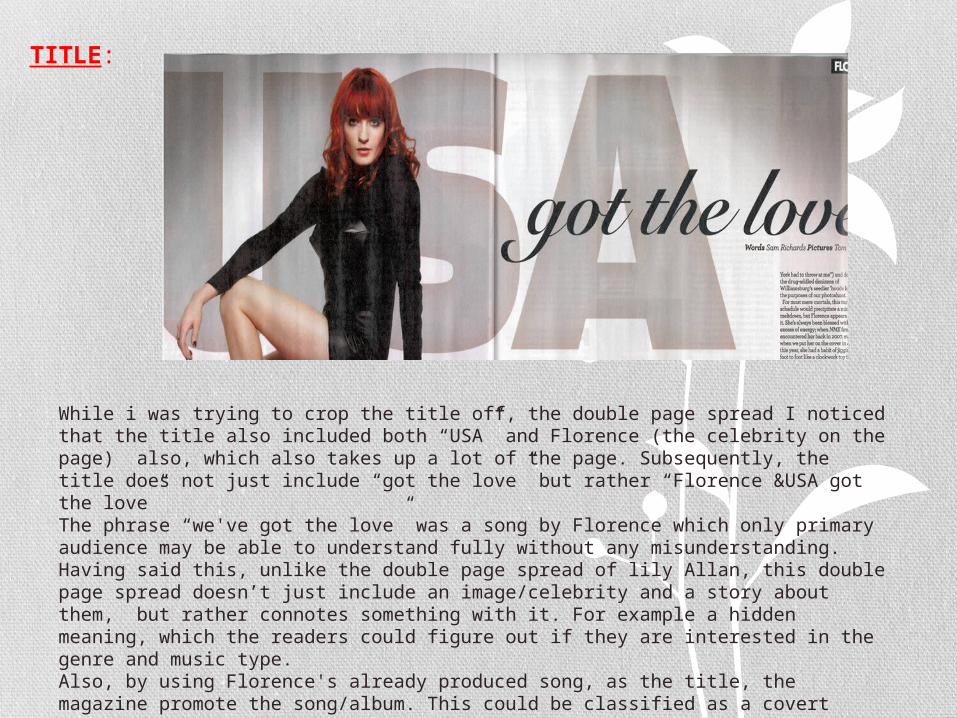
Main image:
Again, I found it difficult to just crop a section of the double page spread. This is because the main image is very dominate and stands out from the rest of the page. NME have done this by using a sharp colour as her outfit; black. Black is a colour which is constantly used to promote rock. This colour is also constantly used throughout the NME magazine. By including this colour in this article it could connote that NME are honoured to have her in there magazine. This makes reference to the magazine genre and style. In addition, the cloth which Florence is sitting on is both red and white which is contrast each other. However, NME have used this in a positive way, I say this because it makes the image stand out even more than it already does. In addition, the title “USA” behind Florence, in a way, detracts some attention from her. I say this because once the primary/secondary audience's recognise the celebrity, they look at the word behind her; “USA” The producer has done this to ensure that (for instance) primary audience do not just admire the image, instead they are lured into reading the article both the main image and the title are positioned in the same place.
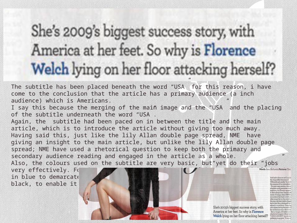
The subtitle has been placed beneath the word “USA” for this reason, i have come to the conclusion that the article has a primary audience (a inch audience) which is Americans. I say this because the merging of the main image and the “USA” and the placing of the subtitle underneath the word “USA”. Again, the subtitle had been paced on in between the title and the main article, which is to introduce the article without giving too much away. Having said this, just like the lily Allan double page spread, NME have giving an insight to the main article, but unlike the lily Allan double page spread; NME have used a rhetorical question to keep both the primary and secondary audience reading and engaged in the article as a whole. Also, the colours used on the subtitle are very basic, but yet do their “jobs” very effectively. For instance, the words “Florence welch” has been highlighted in blue to demarcate it from the rest of the writing. While the rest is in black, to enable it stand out form the white background.
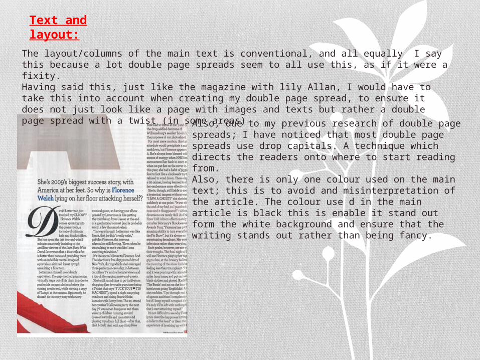
The layout/columns of the main text is conventional, and all equally I say this because a lot double page spreads seem to all use this, as if it were a fixity. Having said this, just like the magazine with lily Allan, I would have to take this into account when creating my double page spread, to ensure it does not just look like a page with images and texts but rather a double page spread with a twist (in some areas)
Text and layout:
Also, due to my previous research of double page spreads; I have noticed that most double page spreads use drop capitals. A technique which directs the readers onto where to start reading from. Also, there is only one colour used on the main text; this is to avoid and misinterpretation of the article. The colour use d in the main article is black this is enable it stand out form the white background and ensure that the writing stands out rather than being fancy.
Background:
The colour white and grey has been used on this double page spread. Come to think about it, it is almost similar to the colour used on the lily Allan double page spread. Having said this, I could take this into account as it seems like the colours grey and white, enable the words and images on the page to stand out individually from the rest of the page. In addition, I have also noticed that the edges of both double page spread are darker than the middle. This is to ensure that the main focus is on the centre stage items rather than the whole entire page.