Embed Size (px)
Citation preview
Graphic Narrative Evaluation
Emily Pinder
Does your final product reflect your original intentions?
• I feel that my final product does reflect my original intensions as the storyline is the same as my plans and my pages are very similar to my storyboards. My pages do look very different to my digital flat plans as they were only a rough guide of how I wanted my book to look. However, I did change the layout of my book as I struggled to fit two images and two paragraphs of text on one page as my page size is small.
• I also made slight changes to my script to help my story flow and be easier to understand. My characters and background also look very different from the digital flat plans as I found better source images to use to create these.
• I feel that my story is less advanced than my original intensions as I did not want to include a lot of violence that the original Batman stories have. I also feel my script is less advanced than what I first planned to use.
How well have you constructed your images?
• I feel the overall appearance of my images is well constructed as I made 3 different versions of my children's book, each time editing the backgrounds and characters. I made a big change to my Batman character and decided to create a new one that was bigger, bolder and more defined than my first attempt.
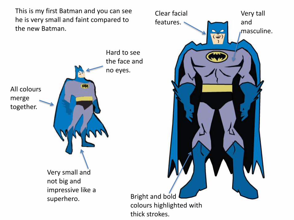
This is my first Batman and you can see he is very small and faint compared to the new Batman.
All coloursmerge together.
Hard to see the face and no eyes.
Very small and not big and impressive like a superhero.
Clear facial features.
Bright and bold colours highlighted with thick strokes.
Very tall and masculine.
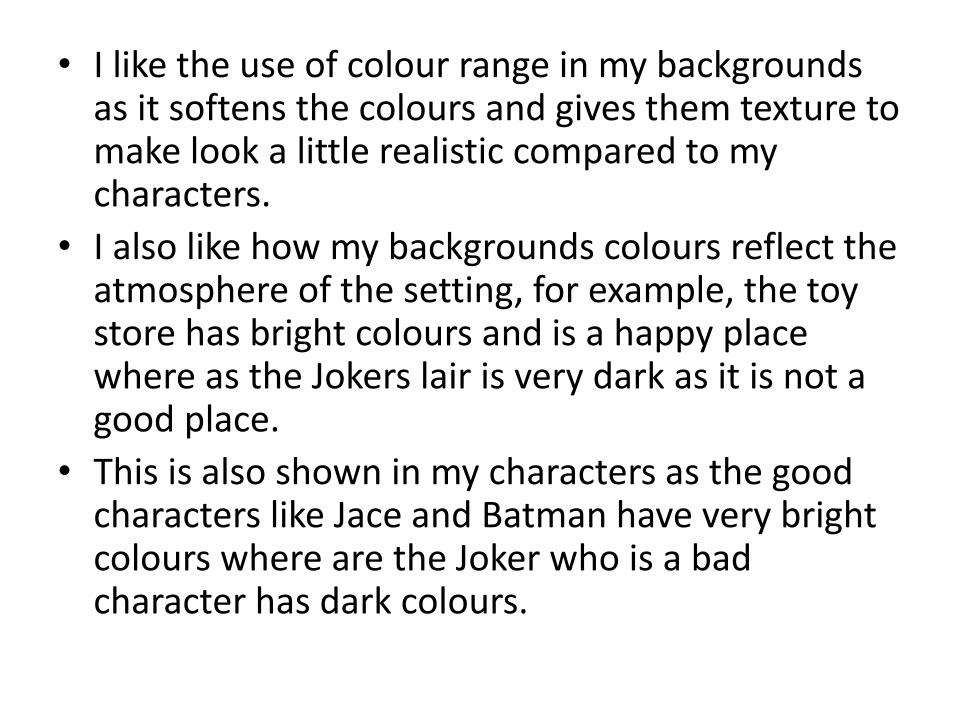
• I like the use of colour range in my backgrounds as it softens the colours and gives them texture to make look a little realistic compared to my characters.
• I also like how my backgrounds colours reflect the atmosphere of the setting, for example, the toy store has bright colours and is a happy place where as the Jokers lair is very dark as it is not a good place.
• This is also shown in my characters as the good characters like Jace and Batman have very bright colours where are the Joker who is a bad character has dark colours.
How well have you used text to anchor your images
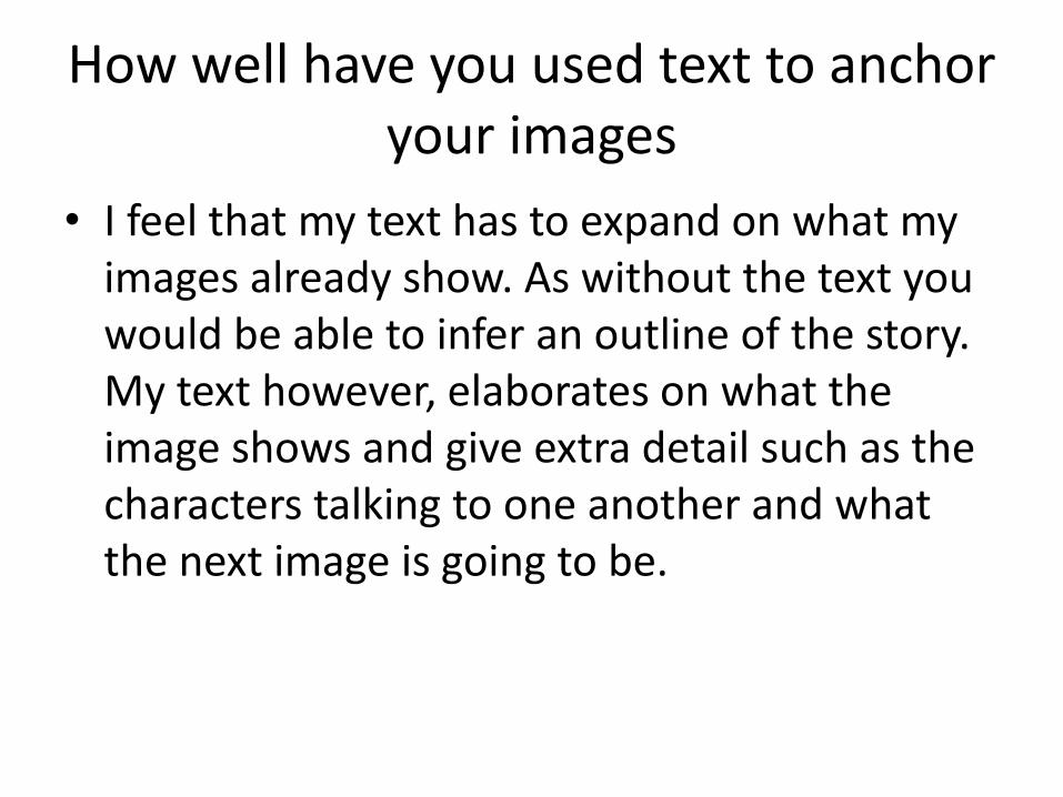
• I feel that my text has to expand on what my images already show. As without the text you would be able to infer an outline of the story. My text however, elaborates on what the image shows and give extra detail such as the characters talking to one another and what the next image is going to be.
Is your product suitable for your audience?
• “My target audience for my book is boys aged 9-11. I feel that superheroes and action is more stereotyped to boys and that girls like princess, especially as my target audience is very young, parents are more likely to stick to these stereotypes. The social class of my target audience will be middle class, however I do not think this effects my target audience as this book is aimed at children. My book will be written in English so its geodemographic it is limited to English speaking countries.”
• I feel that my product is suitable to my target audience stated in my proposal as my story is easy to understand but does contain a small amount of violence, when Batman throws the batarang to knock over the Joker, that is not suitable for a younger audience.
• I also feel that my book is most suited to boys as there is not female characters in my book and is not typically in the interest of girls due to stereotypes of colour and the types of role models for children. Typically princesses are for girls and superheroes are for boys.
• My story could be suitable for a younger age range if a parent or career helps to child to read and understand the story.
What do you like/dislike about the techniques you have used?
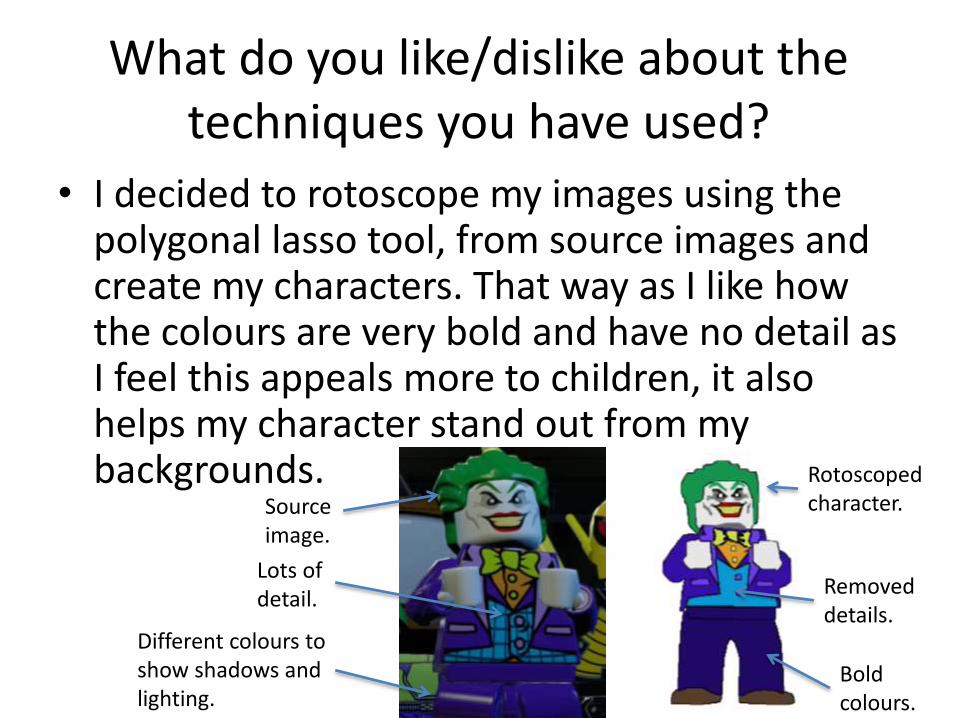
• I decided to rotoscope my images using the polygonal lasso tool, from source images and create my characters. That way as I like how the colours are very bold and have no detail as I feel this appeals more to children, it also helps my character stand out from my backgrounds.
Source image.
Rotoscopedcharacter.
Removed details.
Bold colours.
Lots of detail.
Different colours to show shadows and lighting.
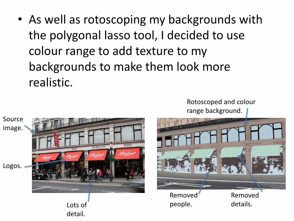
• As well as rotoscoping my backgrounds with the polygonal lasso tool, I decided to use colour range to add texture to my backgrounds to make them look more realistic.
Source image.
Lots of detail.
Rotoscoped and colourrange background.
Removed details.
Removed people.
Logos.

• I decided to use the polygonal lasso tool instead of the shape tool as I wanted to make the characters look human and life like so I needed to make different shapes.
• I also decided not to use the comic book style for my characters as they would not look as cartoon like as I wanted. I did however use some of the photo filters on my backgrounds.
Source image. Background with rotoscope, colour range and filter.
What do you like/dislike about how your final product looks?
• I like how my background and characters have turned out for my children's book as I like the use of the bright and dark colours and how the characters stand out from the backgrounds. I also like the size of my images as they are quite big which makes it easier to see all the small details and colour range.
• I also like my range of different characters and how they all have a different look despite all being made by rotoscoping.
• I do not like how my text is laid out on my pages as I feel it looks squished as it is very small and some pages have a lot of information. Also, my text on my pages are all different shapes and sizes. I would have preferred to put my text on a separate blank page from my image as it would allow the audience to concentrate on the text as well as the image. I would also make the text the same size and shape.
Why did you include the content you used?
• I decided the use the range of images I chose to create my backgrounds as I wanted my backgrounds to look realistic apart from the Jokers lair. I wanted those backgrounds to have a more cartoon style and be more dark to reflect the Jokers personality and persona.
• I also used pictures of real items such as the car and toys for rotoscoping as I wanted to make them look realistic and bold and again, stand out from the background.
• I changed the font I used for my book 3 times as the first font only had capital letters and was very small. My second font was to tall in terms of the proportions of capital and lower case letters. This made it hard to read and was unsuitable for children. My final font is bold and has a balanced proportion of text. Some of the letters also use serif which makes it easier for children to read.
What signs, symbols or codes have your used in your work?
• All of my characters in my story are male which did not realise and was completely accidental. However, this adds to the appeal to a male audience as young children find the opposite sex disgusting and like to play in same gender groups.
• I made the backgrounds of the Jokers lair very dark to symbolise that he is a bad character and the other backgrounds bright to symbolise the good characters. The Joker is also referred to as a “weird man” to symbolise his unstable personality that is show in the films such as, The Dark Knight, produced for an adult audience.
• I created Batman to be a very tall and muscular man to show his strength and bravery as a superhero. Where as I created the Joker as a small man with face paint and eccentric clothing to show his kooky behaviour and unstable personality. I created Jace to be a small boy with everyday looking clothes so that my audience could relate to this character.
• I used everyday locations as my backgrounds for the street and toy store as I wanted it to feel realistic to a child even though it does not feel realistic to an adult.
What representations can be found in your work?
• All of my characters are male in my story which I did not realise until I had finished my book. However, this helps to appeal to my audience. I did not feature any different races in my story other than white males as I did not think it was relevant to my story. Batman is typically a strong white male and the Joker wears face paint so you don’t know his race. Jace is the only characters race I could have changed but I did not think about it when I was creating my character.
• I wanted Jace to be a strong character as well as Batman is. Jace is the main character and who the target audience will look up to and want to be like so I wanted to make him heroic. I also wanted to show them the difference between right and wrong with the issue of stealing as Batman and Jace are looking to find the robot 300 and return it which is the right thing to do.
What style have you employed in your products?
• I employed the Batman characters and items into my story as I wanted my story to be about a superhero. I felt it was easier to use an existing superhero and their enemy. There are many different stories of Batman but are aimed at an older audience. I wanted to create a story that was aimed at a younger audience and I could expand my audience as parents who are fans of Batman are more likely to buy the book for their child.
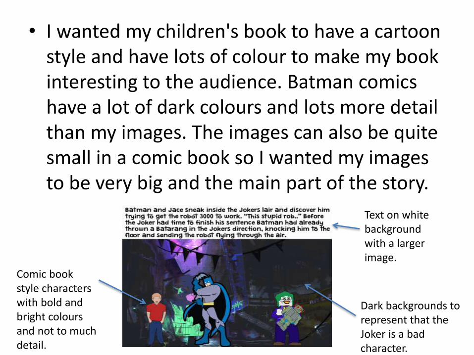
• I wanted my children's book to have a cartoon style and have lots of colour to make my book interesting to the audience. Batman comics have a lot of dark colours and lots more detail than my images. The images can also be quite small in a comic book so I wanted my images to be very big and the main part of the story.
Text on white background with a larger image.
Comic book style characters with bold and bright coloursand not to much detail.
Dark backgrounds to represent that the Joker is a bad character.
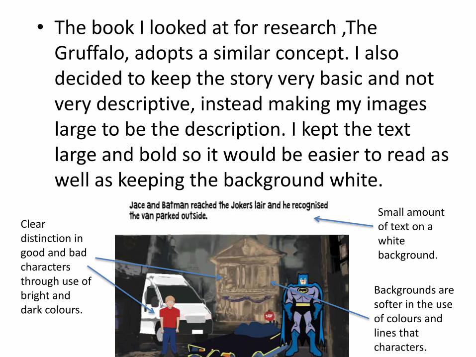
• The book I looked at for research ,The Gruffalo, adopts a similar concept. I also decided to keep the story very basic and not very descriptive, instead making my images large to be the description. I kept the text large and bold so it would be easier to read as well as keeping the background white.
Small amount of text on a white background.
Clear distinction in good and bad characters through use of bright and dark colours.
Backgrounds are softer in the use of colours and lines that characters.
• I decided to keep the backgrounds of my images more softer in the use of lines and colours so that they did not distract from the characters. The characters and items that they use are a lot brighter than the backgrounds and are lined with a black stroke to make them stand out even more.
What were the strengths and weaknesses of the pre-production and planning
• Strengths of my planning helped me to keep on time with my children's book and keep up to date. Having a goal for the end of each session was also good to motivate me to get my work done. Going into a lot of depth planning the layout and script of the book helped me to create my book as I knew how everything was going to be done.
• Another strength is the test page I created as it allowed me to get use to the different tools in Photoshop and how I wanted my page/ style of my book to look.
• Weaknesses of the planning process is that it it took me a while to work out how I wanted to present my book and was slightly confusing as I did not have the right size page. I did end up changing my layout in production anyway but it was good to give me different ideas for my layout.
• I feel I managed my time very well in production as I was never behind at any time but I was ahead of my schedule which gave me time to change and create a new Batman character as I was not happy with my first attempt.
Historical and cultural context
• Batman has a large franchise of films, TV shows and toys etc which all started from the Batman comics. I feel that my work is aimed at a younger audience than the comics as they can be very elaborate and hard to follow as well as including a lot of violence.
• Batman has been made in a children's TV series and has a Lego version film and games. There is not many books of Batman for children however so I feel my product is unique despite having a large subject.