Embed Size (px)
Citation preview
Graphic Narrative Evaluation
Does your final product reflect your original intentions?
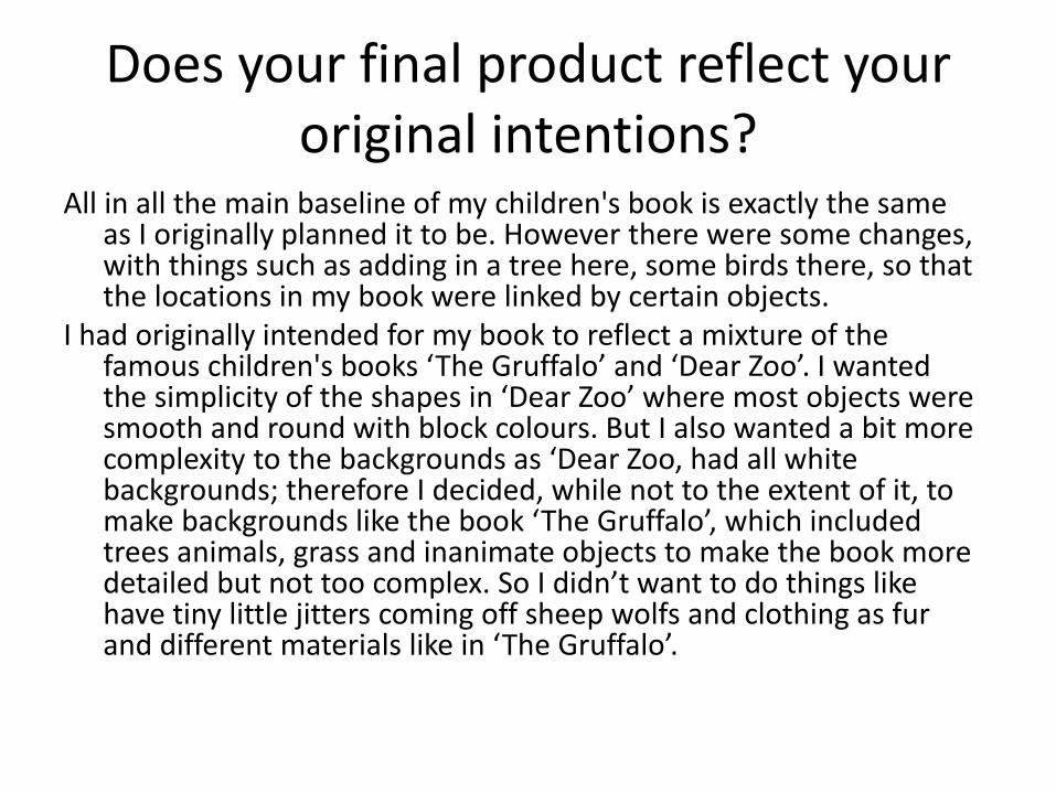
All in all the main baseline of my children's book is exactly the same as I originally planned it to be. However there were some changes, with things such as adding in a tree here, some birds there, so that the locations in my book were linked by certain objects.
I had originally intended for my book to reflect a mixture of the famous children's books ‘The Gruffalo’ and ‘Dear Zoo’. I wanted the simplicity of the shapes in ‘Dear Zoo’ where most objects were smooth and round with block colours. But I also wanted a bit more complexity to the backgrounds as ‘Dear Zoo, had all white backgrounds; therefore I decided, while not to the extent of it, to make backgrounds like the book ‘The Gruffalo’, which included trees animals, grass and inanimate objects to make the book more detailed but not too complex. So I didn’t want to do things like have tiny little jitters coming off sheep wolfs and clothing as fur and different materials like in ‘The Gruffalo’.
Virtually the same layouts
How well have you constructed your images?
I like the way that I have constructed all my images. I have used the shape tool for all of my characters and most of the background in my children's book. But I have gone over them with a colour range style to give different things texture and additional detail but its still all in the basic shapes I intended. Because my book is for children I didn’t want it to be dark or dystopian, so I reflected that in my colour scheme by generally having bright colours and a consistent set-up throughout the book.
The images in the book of “The Gruffalo’ are all painted so it gives a very distinctive and memorable appearance in the way it is constructed. While I want to replicate some of the texture in my book I don’t want to go to the distance of actually painting it myself or spending hours trying to create it digitally. Likewise in ‘Dear Zoo, I wanted to replicate the bright colour scheme as it sent out a friendly vibe that even I can remember from my childhood, so that is why I have done the same in my children's book.

normal
-10% brightness
Colorful, yet bright and friendly.
Fur texture, that sticks out of characterFur texture that stays within
the limits of the character
Darker and more dystopian

How well have you used text to anchor your images
Individually have made sure that none of my words are to complex for my target audience as they are just starting to read themselves, hence it would not be a good idea to have long complex words that they wont understand. The font of my text is not a well known one, that is why I went with it. Because it gives the story a little more style than if I had just used Calibri, but I have made sure that it is still easily readable by young children.
I have made sure to only put text in areas of low concentration, so that it is easier to read and you don’t get distracted by the things immediately around. Plus I have made sure to have all of my text in the same place, so it is always in the centre of the bottom of the page.
This is the same story for both ‘The Gruffalo’ and ‘Dear Zoo’, they both have there text in areas of low concentration so it is easy to read, and while the amount of text and size of text is different in both books, they are both meant for different audiences.

The text is large enough to easily read, and is done in a unique style (Grandstander clean)
In a area of low concentration
Simple text in areas of low concentration
I have tried, and I think I have succeeded, in making sure that the images explain everything that is said in the text and visa versa.

Is your product suitable for your audience?
In my proposal I intended for my book to be best suited for 2-5 year olds as it would be detailed but not complex images that could be easily seen and understood for children of that age, and the wording would not be to complex either.
Now that I have finished my book, I have to say I still think it suits my original target market. While I added a bit more detail to the pages than I intended, it still is easily readable and simple so it still works with the target audience, and it is the same story with my text options, changed but still simple.
While I am not in contact with the creators of ‘Dear Zoo’ or ‘The Gruffalo’ I am sure that they would have done exactly the same, with both their content and their target audience.
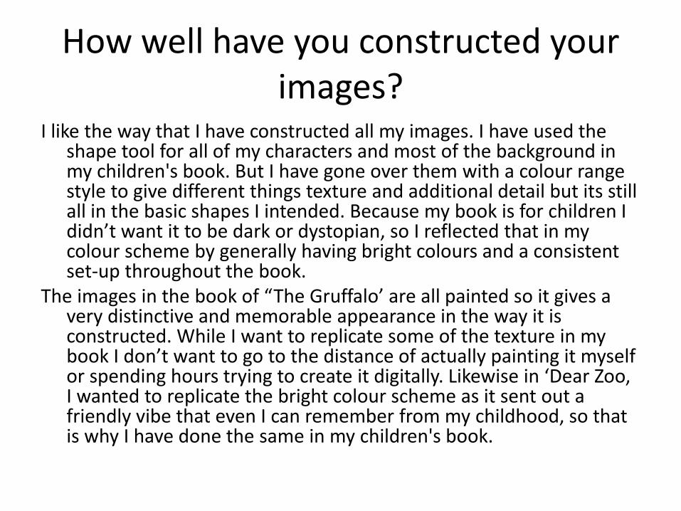
Large picture and little text- for beginning reader. It is also suitable for children in the characters, the sheep, while in this scene are trying to look alarmed, are generally cute, and the fox, while meant to be a threat is still friendly. Lots of text, few pictures- older
readers

What do you like/dislike about the techniques you have used?
• Reference specific tools you used with imagesI like the designs of the characters that I have used with the shape tools, they
are mix of, the eclipse, rounded rectangle and custom tool. I also used the colour range tool a lot as well, to give my characters and animals and objects some textures.
I really like the sheep and the way that they turned out, they have a really good shape and as all sheep do, have a face shared by all the other sheep around them, except when they have seen the fox and are freaking out.
However, while I think the colour range has made the design more detailed, I am still not sure if the book would have been better with a more simple design of having block colours rather than trying to give textures to the villagers clothing and wool on the white bit of the sheep. Along with this I used the transparency tool which gave more detail on things like hair and fur.
I also don’t like the repetitiveness of the pages. How there is always green and blue without much variation. If I get time I think I might have different colours for different locations and times of day.

With wool
Without wool
With textures
Without textures
With fur
Without fur
I think that with the textures it gives a more detailed look to it. Because of the way it is done I don’t think it would look more realistic. I think the reason I went to add more texture is because the style of my book was a little to plain, at least it was for me.

What do you like/dislike about how your final product looks?
I like the way that the villagers turned out. They all showed the same general character personality but in different forms. This is because of the way that they are made and the way they look. I also am glad that I decided to go with the brighter colour scheme than I intended because it looks a lot better. I really like the outcome of the animals, I think I did the sheep in a very nice style and the wolf looked unthreatening to a child but still looked like it could cause trouble.
However I don’t like the plainness of the sky, I tried giving it different tones, adding clouds and birds but it just seemed to remain empty. I also would have liked to spend more time on the boy as he is the main character of the book, yet he isn’t very detailed and some of his features are a bit unusual.

Why did you include the content you used?
• Images, fonts, effects, coloursI included the images that I did, because they needed to be
there for my target audience, as it is made for 2-5 year olds, there would need to be lots of images and little writing. Which is what I have done.
I wanted to make sure that the text I used was very easily readable but not common like Calibri, or sans/serif. Fortunately I found ‘Grandstander Clean’ which is slightly stylised in a child like manner yet is still very easy to read by all.
I went with brighter colours again for my target audience, because young children respond better to bright colours. And I didn’t want to set a Childs book as being dark and dystopian.

Children's books have many more drawn, painted and basic characters in there books. And the books are full of images of them from start to finish
Books for adults generally only have pictures on the front cover, and when it is a character it is usually a photograph of a person.
My book involves many animated characters all over the book, which is perfect for my target audience, kids.

What signs, symbols or codes have your used in your work?
Generally most colours have a typically associated mood with them, so I needed to make sure that I didn’t put to much of the wrong colour and tone in here and there. But the main colours I have used are green, light blue and brown plus white and a little bits of others here and there. These are all typically associated as being good colours.
My book is done in a rounded style with no sharp edges indicating that it is safe and kind unlike things with spikes and edges. This is because every tool I used was either eclipses tool or something that was rounded.
The location was a fields and hills, which is a common theme location in children's books all over the world as it is typically associated with a nice area.
As is probably clear I wanted my book to be a child friendly as possible, which is why a lot of the signs, symbols and codes are nice friendly or well rounded.

The one with soft edges naturally looks more safe
Nice area with fields and hills
Darker sand greyer area looks less safe

What representations can be found in your work?
I do realise that I have been subconsciously sexist in the character creation of my book. All of the characters are male. I suppose while the boy who cried wolf has to be a boy because it is in the title. But the villagers I assumed would be male, because generally it is the men that would prepare themselves for battle or to kill/chase away a wolf.
And I suppose I have done this again in the fact that all my characters are white, this is just because I imagined the time period in this book to be Victorian/medieval English and I don’t imagine any other races in that time.
However there is a clear split of the child vs. adult representation. The child is stereotypically a nuisance and wont listen to the adults. And the adults while seemingly strict and no fun are only trying to do things for the best.
Usually When you have the wolf as a spirit animal, it could be an expression of your sharp intelligence and strong instincts. So in this book the wolf is there to show that we should make the lesson of not lying to become instinct, because that is the intelligent thing to do.

Kids' stories over the past 100 years have featured male characters in the title nearly twice as often as female characters, and male main characters outnumber female main characters by 1.6 to 1, the researchers found. - http://www.livescience.com/14078-males-
dominate-childrens-books.html
Research shows that while any form of media with children usually include both male and female characters, the most memorable and well known characters are male. For example:
KEY:M- maleF- femaleU- unknown
FM M M
M M M M
M M M
U

What style have you employed in your products?
I wanted the simplicity of the shapes in ‘Dear Zoo’ where most objects were smooth and round with block colours in my book. I decided, while not to the extent of it, to make backgrounds like the book ‘The Gruffalo’, which included trees animals, grass and inanimate objects to make the book more detailed but not too complex. I wanted to for a mix of these, so I have smooth rounded characters and locations but with added textures on top of the shapes made up of the character.
This is the same story for both ‘The Gruffalo’ and ‘Dear Zoo’ in the context of my text, both ‘The Gruffalo’ and ‘Dear Zoo’ have text in areas of low concentration so it is easy to read, and while the amount of text and size of text is different in both books, they are both meant for different audiences.

Generally everything is rounded to look safer with exception to a few things like swords pitchforks and so forth.

What were the strengths and weaknesses of the pre-production and planning
I personally found that the research really helped. It allowed me to see and take into consideration what makes a children's book successful. I could the storylines that worked the sizes that most books were how the text was done in relation to the images, and it helped me to create my children’s book.
However the planning booklet was not quite as helpful. I was slightly ahead and I had already completed a couple of pages of my book before we started, so my planning schedule didn’t fit in with the work I was doing. Nonetheless I still used it as reference to see what needed doing and when I should be doing it, while it wasn’t what I had already planned I fell into a more condensed and odd schedule based off the original.
Because of this my I managed my time very well, meaning I finished before the end of the second week and I could start on some improvements to make my work even better.

The detail into which I planned the type and style of story I wanted via mind maps.
A detailed look in to the story ‘The boy that cried wolf’ and other techniques and ideas that I had

Historical and cultural context
• How does your work compare to what has come before? What other similar products have existed in the past? What current products exist?
• The original ‘Boy that cried wolf was very brutal. It is essentially the same story as the one I have produced, and in that fact my version is very historically accurate. However in the original it involved a lot of blood, with the sheep being torn apart by the wolf and in some other early renditions the boy also gets killed.
• Evidently I can not include this content in my book ,as it is for children, so while I have kept the base storyline and the same lesson, I have left out some of the more brutal and gory scenes which would be unsuitable for children.
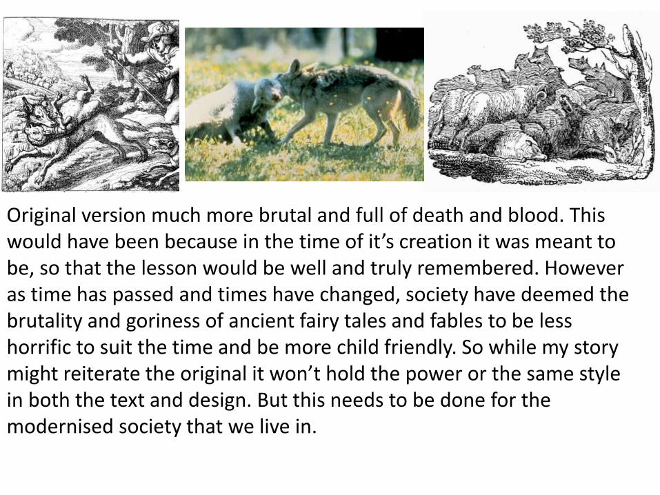
Original version much more brutal and full of death and blood. This would have been because in the time of it’s creation it was meant to be, so that the lesson would be well and truly remembered. However as time has passed and times have changed, society have deemed the brutality and goriness of ancient fairy tales and fables to be less horrific to suit the time and be more child friendly. So while my story might reiterate the original it won’t hold the power or the same style in both the text and design. But this needs to be done for the modernised society that we live in.

Peer Feedback
• Summarise peer feedback and discuss
– Responses you agree with
– Responses you disagree with