Embed Size (px)
Citation preview
How has my digi-pak used, developed or challenged conventions of real media products
By: Ollie Green
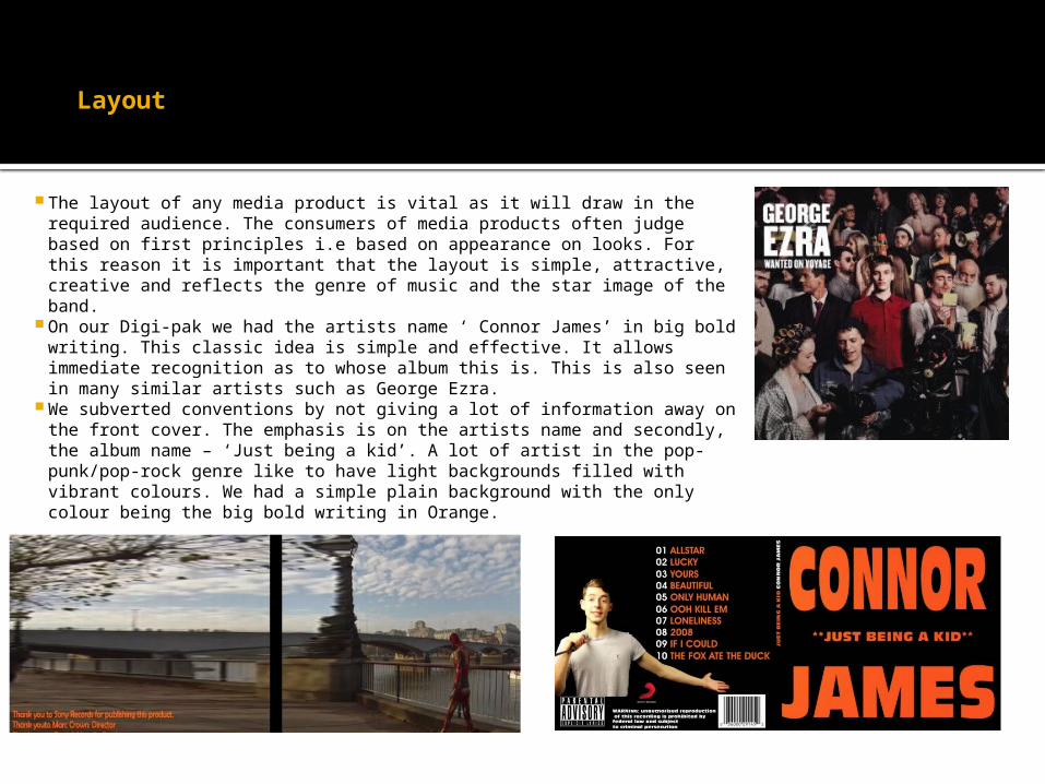
Layout
The layout of any media product is vital as it will draw in the required audience. The consumers of media products often judge based on first principles i.e based on appearance on looks. For this reason it is important that the layout is simple, attractive, creative and reflects the genre of music and the star image of the band.
On our Digi-pak we had the artists name ‘ Connor James’ in big bold writing. This classic idea is simple and effective. It allows immediate recognition as to whose album this is. This is also seen in many similar artists such as George Ezra.
We subverted conventions by not giving a lot of information away on the front cover. The emphasis is on the artists name and secondly, the album name – ‘Just being a kid’. A lot of artist in the pop-punk/pop-rock genre like to have light backgrounds filled with vibrant colours. We had a simple plain background with the only colour being the big bold writing in Orange.

colour
The colour scheme of the album cover can give the audience a lot of information about the content of the album, the overall style of music and any recurring themes. Olly Murs, a similar artist uses lots of bright colours to reflect his style of music.
Although we had a plain background the bright, bold, orange font is reminiscent of a movie poster and draws the audiences attention due to its size and brightness

font
The font of a media text can tell the audience a lot about the artist and their genre of music. We conformed to conventions of a young male artist by having a clear, capital lettered font, slightly styled to give a trade mark edge.
This is essential to making our artist recognisable and stands out on the shelves.
We used the same font throughout the album cover keeping it uniform throughout – another convention that we have matched
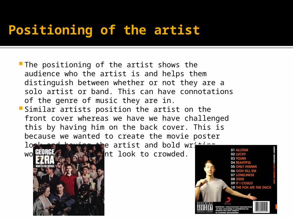
Positioning of the artist
The positioning of the artist shows the audience who the artist is and helps them distinguish between whether or not they are a solo artist or band. This can have connotations of the genre of music they are in.
Similar artists position the artist on the front cover whereas we have we have challenged this by having him on the back cover. This is because we wanted to create the movie poster look and having the artist and bold writing would make the front look to crowded.


![Summer I Course Eval - Howard College HC... · 2018-10-09 · Summer I Course Eval Course Evaluation -Summer I 2018. Q1 -In your experience with this class, [Field-Course] [Field-Title],](https://img.pdfslide.us/doc/110x75/5f0475997e708231d40e12d5/summer-i-course-eval-howard-college-hc-2018-10-09-summer-i-course-eval.jpg)