JURNAL DEKAVE VOL.8, NO.2, 2015 67
The Principles of Layout and How Those Apply to Digital Electronic Book Publication
Yusuf Hendra Yulianto
Lecturer of Visual Communication Visual Studied Program Universitas Kristen Petra, Surabaya
Abstract. When designing a layout, the designer must be aware of fundamental principles so as to make the design structured and consistent. When planning layout, a designer cannot be random and must consider essential factors, such as the media type, the readers, the design elements and so on. Electronic media, like web pages and electronic books, is a newer media than the print media, and is different in several aspects. Yet, the basic principles of the design are still identical. A solid layout is a great tool in communicating messages visually.
Keywords: Layout, electronic book.
INTRODUCTION
Book is a powerful media. Haslam
(2006, p.12) says that the printed book has
been one of the most forceful means of
disseminating ideas, that have changed the
course of intellectual, cultural, and economic
development.
In the 21st century, digitalization has
overtaken the print media, almost every book
has an electronic version. However, the book
retains its basic format even though the e-
book has had a great impact through
dissemination via the World Wide Web. In
fact, the appearance of electronic book has
not displaced the circulation of printed books.
Printed books still exists alongside the
development of the e-book. It can be said that
both formats have their own advantages and
it seems their own target market.
Gates (2001, p.17) says that e-book will
revolutionize the way the world reads,
because of the interactivity features, making a
significant difference between e-book design
and printed book design. For example, the
installation of interactive interface and
multimedia like videos and motion graphics.
Despite these interactive and multimedia
design elements, the basic of e-book design
comes from traditional book design. The
layout design of electronic book uses the same
principle as a traditional book.
The Principles of Layout and How Those Apply to Digital Electronic Book Publication
68 JURNAL DEKAVE VOL.8, NO.2, 2015
ANALYSIS
E-book
Basically, according to Clyde (2005, p.
45), there are 4 different types of electronic
book. They are:
1. E-books that require a computer and CD-
ROM drive for access, or a computer with
network access if the CD-ROM is on the
network.
2. Downloadable E-books available for free or
with a fee in the Internet, that can be
opened with standard software.
3. Downloadable E-books available for free or
with a fee in the Internet, that need special
software to open it.
4. E-books that require a dedicated e-book
reader.
Clyde (2005, p.45) explains the
advantages of e-books: easy referencing links
to another articles and the variations in the
content (sound and still/moving images).
Lately, e-book also make a great progression
in its accessibility. A lot of gadget applications
dedicated for publications are emerged. The
readers can easily purchase or subscribe to
one/some publications by electronic
transactions, and get the publications sent to
their hardware via Internet connections.
But, despite the e-books advantages, it
also has its disadvantages, for example, not all
e-books are represented in the same way. The
earlier e-books use CD_ROM, and nowadays
they are downloadable from the Internet, or
need a special hardware device to be read
(Clyde 2005, p.45). Although, the last
disadvantage is not becoming a matter now,
since most communication hardwares
(smartphones and tablets) are widely used
and supporting electronic publications.
The Layout Principles
As people know, there are numerous
book types and different book types need
different design approaches, because of the
difference in target market. There are
countless different approaches to book layout
design and this presents a challenge to
designers. Williams and Tollett (2001, p.53-
63) divides design approaches into seven
different types:
1. The generic look
This type of look is the most commonly used,
conservative, unimaginative and boring,
having no personality.
2. The corporate look
This approach is exceptionally neat,
organized, and predictable, giving an
impression of trust and dependability.

Yusuf Hendra Yulianto
JURNAL DEKAVE VOL.8, NO.2, 2015 69
3. The visual-vow look
This approach is useful if the designer’s main
goal is to get the reader’s attention with visual
elements like images, photographs, or
illustrations.
4. The info-heavy look
This kind of approach is very useful for
presenting detailed information to create a
formal and professional impression.
5. The omnibus look
The “omnibus” term refers to dealing with
numerous items or elements at once.
Commonly consists of image variety
combined with short blurbs of design, being
fun to create and read.
6. The typographic look
This design approach depends on the power
of type. A right type choice can be eye-
catching and delivers a message with just a
glance.
7. The trendy look
The term “trendy” means getting down to the
mainstream. Trendy look gets the audience’s
attention by showing the current trends.
The important thing when designing a
publication is to make sure that all of the
elements are arranged in a design that makes
all of them speak in one visual voice (Samara
2007, p.12). The design of a publication must
be consistent. It is called as hierarchy.
Haslam (2006, p.140) divides the layout
design approaches into two types: based on
the text and based on the page as the picture.
Layout Based On The Text
This is the most basic approach in most
of the books. These books are read normally
from the top left to the bottom right (Haslam
2006, p.148) .
1. TEXT-DRIVEN BOOKS
Text-driven books use texts as their main
focus. Some of them also use images as the
supporting elements.
2. IMAGE-DRIVEN BOOKS
Image-driven books use images as their main
focus. Haslam (2006, p.146) says that the
complexity of the spread and the order in
which it is read is determined far more by the
designer’s layout than with many text-based
spreads.
Layout Based On The Page As The Picture
When text-based layout is created to be
‘read normally’, image-based pages designed
to be ‘viewed’ (Haslam 2006, p.148). In this
layout, text can also be the pictorial element

The Principles of Layout and How Those Apply to Digital Electronic Book Publication
70 JURNAL DEKAVE VOL.8, NO.2, 2015
(Haslam 2006, p.148), creating a balance with
the picture.
Grid
Ambrose and Harris (2008, p.6)
describe grid as the foundation upon which a
design is constructed, allowing the designer to
organize all the design elements effectively.
Grid is like a frame that support and guide the
layout design of a publication. Haslam (2006,
p.42) also explains that grids provide the
mechanism in the relationship between the
elements of a design, be they text or images.
When making the grid template, the designer
take into consideration the way most people
read a book.
How People Normally Read a Book and
View A Screen Taking into account cultural
differences, normally when faced with a new
page of information, readers habitually looks
for an entrance at the top left and scans down
and across to the bottom right corner
(Ambrose & Harris 2008, p.14). When facing
a page in electronic format (web page for
example), people read it almost the same way
they read a printed page, to search for
keywords and points of interest (Ambrose &
Harris 2008, p. 19). However, the situation
changes slightly when the viewers face the
screen, although the basics is still the same.
Ambrose and Harris (2008, p.19) note
that research has shown that people read a
web page in a pattern called “F-pattern”.
People start scanning the page from the top
left of the page, going to the right in two
stripes (shaped like “F” letter), and then scan
down the page. It means that the point of
interests and key points must be put in that F-
pattern, the spot where the readers put most
of their attention.
For the case of electronic book itself, it
is quite unique. Although the format of e-
book is on the screen, it is still called as ‘book’.
It means people use the same way or pattern
in reading books, whether it is a printed book
or an electronic book. The basic of the layout
design for both of them is still the same, since
the printed book is the base of electronic book
design. The only main issues that differentiate
electronic book from printed book are that
the e-book has a different legibility on the
screen and more alternatives in its content.
Form Follows Function
When designing a page layout, the grid
choice must be suited with the function of the
design and the target audience. Ambrose and
Harris (2008, p.22) also note that it is essential
to view a grid as something adaptable and
flexible, rather than something prescriptive
and inviolable. However, the designers must

Yusuf Hendra Yulianto
JURNAL DEKAVE VOL.8, NO.2, 2015 71
aware of the target audience of the design, so
they can choose the grids wisely and
accurately.
Grid In The Electronic Publication
Since electronic book basics are
improved from printed book, the basics in the
grid design are identical. Designing a screen-
based media still needs the grid to arrange the
elements.
Image
Image is one of the essential in the print
media design. Picture books, documentary
books, photographic books,
illustrated/graphic novels, magazines, and
comics are some of the media that rely on
images as their main contents. The book that
uses images or pictures as its main focus is
called the visual-vow look.
Images, as the contents of a book, must
be able to communicate the message to the
readers. Bhaskaran (2006, p. 74) notes that the
usage of images within a publication depends
on a number of factors. The two basic factors
are the aim of the publication and the
function of the images themselves in the
publication.
The principles and functions of images
in electronic media are still the same with the
print media. The designers are still using the
same way in placing the images in the
electronic publication. Images placements,
together with the typography, form the
hierarchy of the book.
Type
Typography refers to the way in which
written ideas are given a visual form, and can
radically affect how a design is perceived
(Bhaskaran 2006, p. 68). It is a very powerful
element in a publication. A designer must
create a hierarchy that is strong and
consistent, containing all of the contents in a
well-organized design.
A typeface design must be used for a
particular reason. It must suitable with the
layout design and the purpose of the
publication itself. It must be legible for the
reader.
In electronic publication, the legibility is
different with the print publication. Nielsen
(1998) says that normally people read about
25% slower from the screen than from print
media. That statement showed up at the time
when the screen technologies have not been
very advanced like today. However, Nielsen
(1998) also notes that, even the screen
technology keeps advancing and e-books gain
the same reading speed as the print, an
electronic book with the same format as
printed book will be a bad idea. The designer

The Principles of Layout and How Those Apply to Digital Electronic Book Publication
72 JURNAL DEKAVE VOL.8, NO.2, 2015
can modify the use of type by using larger
types, bold text, highlighted text, bulleted
lists, and image captions to increase the
legibility on screen (Wilson, Landoni, & Gibb
2002, p. 326).
Format
The definition of format is how the
publication is presented and relates to the
width and the height of the publication
(Haslam 2006, p.30). Haslam (2006, p.30)
notes that there are three basic characters of
book format:
• Portrait: the height is greater than the
width
• Landscape: the width is greater than the
height
• Square: the height and the width have
the same size
Essentially, there is no difference in the
format principles for both print and
electronic publication. The only issues are,
the designer must be aware with the screen
size and the legibility.
Negative Space/White Space
White space or negative space is
important in book layout design (Samara
2007, p.17). Negative space calls attentions to
the content and separates it from unrelated
information around that content. White space
gives a resting place to the eyes.
The using of negative spaces in
electronic publication is also appropriate and
has the same basics like the print publication.
Navigation
Navigation represents the main
difference between print publication and
electronic publication. While people flip a
printed book manually, electronic books need
navigation interface. The designer must think
about the interface design. The design must
be totally effective and functional to help the
reader to read and search for content in the e-
book. The navigation interface in an
electronic book covers functions, such as
content searching, page flipping, shortcut
buttons, hyperlinks to a web page, and so on.
VISUAL RESEARCH
Visual research was conducted during
the process. National Geographic iPad
magazine and WOWmagz are the e-
publications used in the visual research.
Yusuf Hendra Yulianto
JURNAL DEKAVE VOL.8, NO.2, 2015 73
Figure 1 The basic display of National Geographic iPad magazine
Source: National Geographic 2011
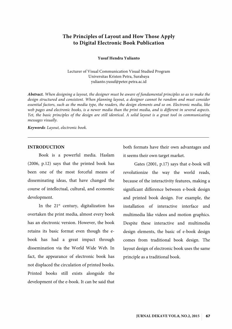
National Geographic applies the
portrait format, similar to its print version, on
the iPad version. The format shows the
contents each two pages on iPad in landscape
mode.
Figure 2 The National Geographic content shows up in 2-pages portrait format
Source: National Geographic 2011
From the National Geographic on the
iPad (National Geographic 2010) video
preview, we can see that on the bottom of the
screen, there are highlights of the previous
and next pages. This kind of navigation is
helpful and effective. The reader can just slide
the page using their finger. National
Geographic also applies various contents in
the publication, from the conventional ones
(text and image) to the electronic ones (video,
animation / motion graphics). It also includes
the links to the other contents like NatGeo
website, atlas map, and games.
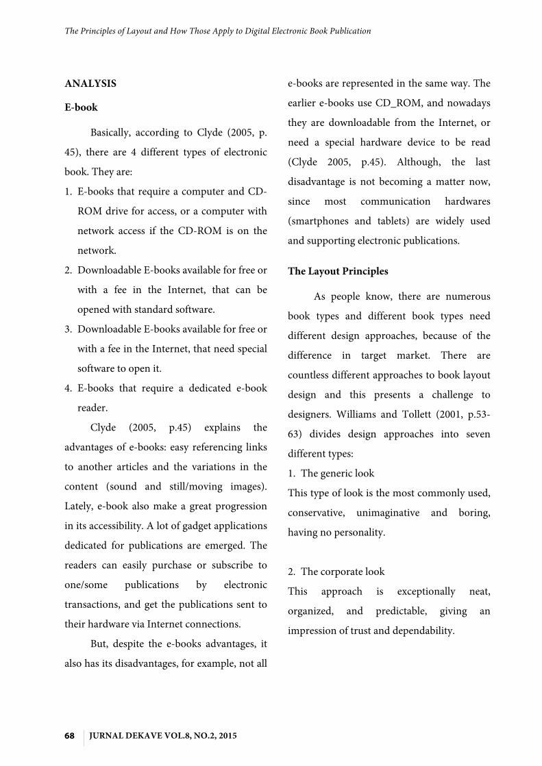
Figure 3 The cover of WOWMAGZ. It use more function buttons than NatGeo
WOWMAGZ, an art and design e-
publication makes their publication in a more
flexible way. The publication can be viewed
by just using standard personal computer,
and possibly can be opened to with iPad.
Since personal computer operational is
different with iPad, WOWMAGZ is designed
with more action buttons to be clicked. It
provides two ways to flip the page. The reader
can flip by dragging the page edge, or clicking
the ‘previous’ and ‘next’ buttons. Besides
buttons, there are also shortcut buttons to get
into the key contents like cover, backcover,
contents table, and contact. WOWMAGZ
also provides buttons for autoflip and link

The Principles of Layout and How Those Apply to Digital Electronic Book Publication
74 JURNAL DEKAVE VOL.8, NO.2, 2015
buttons to social media such as, Facebook,
Twitter, and Deviantart.
Figure 4 The contents table comes simple, showing clickable thumbnails
Figure 5 The contents sample page, with orange circles as the clickable links
WOWMAGZ comes with portrait
format, with an artistic background as its
unique feature, a strong point of the content
is the links. WOWMAGZ inputs the links in
their articles. For examples, if it is a designer
article, it includes the designer’s portfolio
website. If it is a collector’s item review, there
will be a link to the website. This is a good
method for both reviewing and promoting a
designer and product.
CONCLUSIONS
Electronic publication has some clear
differences against print publication.
However, the basic principles of the design
are still identical. Since the basic of the
electronic publication is developed from print
publication, they share some of the rules in
design. Some of the layout principles of
electronic publication, like the grid system,
image, and format, are identical with print
design principles.
If there are some differences, it is
because of the difference in the media. For
example, reading on the screen is different
from reading a print media. That makes
electronic book must use different typeface
approach. Electronic book also need
navigation interface that makes it needs more
advanced approach than print publication.
REFERENCES
[1] Ambrose, Gavin & Harris, Paul 2008, Grids, AVA Publishing SA, Switzerland.
[2] Anderson, J, Jain, K, Mayes, E 2010, ‘Introduction: Anderson’, in The New Big Books of Layouts, Collins Design, New York.
[3] Bashkaran, Lakshmi 2006, What Is Publication Design?, RotoVision SA, Switzerland.
[4] Clyde, Laurel A. 2005, "Electronic Books", Teacher Librarian, vol. 32, no. 5, pp. 45
[5] Feldman, Tony 1990, ‘Key Issues In Multi-Media’, Electronic Publishing Perspectives: Present and Future, Chapman and Hall, London, pp. 197-207
Yusuf Hendra Yulianto
JURNAL DEKAVE VOL.8, NO.2, 2015 75
[6] Gates, Bill 2001, ‘E-books’, Executive Exellence, vol. 18, no. 4, pp.17
[7] Goldberg, D & Kjellberg, T 2003, ‘Are Electronic Books “Books”?’, Publishing Research Quarterly, vol. 19, issue 3, p. 13-20
[8] Haslam, Andrew 2006, Book and Design, Laurence King Publishing Ltd, London.
[9] Hochuli, Jost & Kinross, Robin 1996, Designing Books: Practice and Theory, Hyphen Press, London.
[10] Jensen, Michael 1996, ‘Digital Structure, Digital Design: Issues in Designing Electronic Publications: [1]’, Journal of Scholarly Publishing, vol. 28, issue 1, viewed 29 May 2011, <
http://iii.library.uow.edu.au/search~S0?/sJournal+of+Scholarly+Publ...6~b1488802&FF=sjournal+of+scholarly+publishing&1,1,,1,0/indexsort=->.
[11] Joukhadar, Kristina 2004, ‘The 8 Challenges of Digital Publishing’, Circulation Management, vol. 19, issue 9, p. 26-29.
Website
[1] National Geographic 2010, National Geographic on the iPad, video, Youtube, 16 April, viewed 30 May 2011, <http://www.youtube.com/watch?v=YJEkWzdOypY>.
[2] National Geographic 2011, National Geographic, Washington D.C., viewed 1 June 2011, <http://www.nationalgeographic.com/>.
[3] Nielsen, Jakob 1998, ‘Electronic Books – A Bad Idea’, Alertbox: Current Issues in Web Usabilty, 26 July 1998, viewed 24 October 2011,
[4] http://www.useit.com/alertbox/980726.html.
[5] Samara, Timothy 2007, Design Elements: A Graphic Style Manual, Rockport Publishers, Massachusetts.
[6] Whitbread, David 2001, The Design Manual, University of New South Wales Press Ltd, Sydney.
[7] Williams, Robin & Tollett, John 2001, Robin Williams Design Workshop, Peachpit Press, California.
[8] Wilson, Landoni, & Gibb 2002, ‘A User-Centred Approach to E-book Design’, The Electronic Library, vol. 20, no. 4, p. 322-330.
[9] Wowmagz Indonesia 2011, Wowmagz 12, edition 12, Wowmagz Indonesia, viewed 30 January 2011 <http://wowmagz.com/>
[10] Zappaterra, Yolanda 2007, Editorial Design, Laurence King Publishing Ltd, London.
Recommended