Embed Size (px)
Citation preview
7/28/2019 Xi4sp5 Aa User En
http://slidepdf.com/reader/full/xi4sp5-aa-user-en 1/172
SAP BusinessObjects BI Suite
Document Version: 4.0 Support Package 5 - 2013-04-30
SAP BusinessObjects Analysis, edition for OLAPUser Guide
7/28/2019 Xi4sp5 Aa User En
http://slidepdf.com/reader/full/xi4sp5-aa-user-en 2/172
Table of Contents
1 Document History. . . . . . . . . . . . . . . . . . . . . . . . . . . . . . . . . . . . . . . . . . . . . . . . . . . . . . . . . . . . . . 8
2 Introduction to SAP BusinessObjects Analysis, edition for OLAP. . . . . . . . . . . . . . . . . . . . . . . . . . 9
2.1 What is SAP BusinessObjects Analysis, edition for OLAP?. . . . . . . . . . . . . . . . . . . . . . . . . . . . . . . . . . . 9
2.1.1 Analysis integration with SAP BusinessObjects Business Intelligence platform. . . . . . . . . . . . . 9
2.2 About this guide. . . . . . . . . . . . . . . . . . . . . . . . . . . . . . . . . . . . . . . . . . . . . . . . . . . . . . . . . . . . . . . .10
2.2.1 The documentation set. . . . . . . . . . . . . . . . . . . . . . . . . . . . . . . . . . . . . . . . . . . . . . . . . . . .10
2.2.2 Who should read this guide?. . . . . . . . . . . . . . . . . . . . . . . . . . . . . . . . . . . . . . . . . . . . . . . . 11
2.3 Getting started. . . . . . . . . . . . . . . . . . . . . . . . . . . . . . . . . . . . . . . . . . . . . . . . . . . . . . . . . . . . . . . . . 11
3 Getting Started with Analysis. . . . . . . . . . . . . . . . . . . . . . . . . . . . . . . . . . . . . . . . . . . . . . . . . . . . 12
3.1 Terminology and icons. . . . . . . . . . . . . . . . . . . . . . . . . . . . . . . . . . . . . . . . . . . . . . . . . . . . . . . . . . . 12
3.2 Create an Analysis workspace. . . . . . . . . . . . . . . . . . . . . . . . . . . . . . . . . . . . . . . . . . . . . . . . . . . . . . 16
3.3 Analyze some data. . . . . . . . . . . . . . . . . . . . . . . . . . . . . . . . . . . . . . . . . . . . . . . . . . . . . . . . . . . . . . 18
3.3.1 Add data to the crosstab. . . . . . . . . . . . . . . . . . . . . . . . . . . . . . . . . . . . . . . . . . . . . . . . . . .18
3.3.2 Remove unwanted members. . . . . . . . . . . . . . . . . . . . . . . . . . . . . . . . . . . . . . . . . . . . . . . .19
3.3.3 Sort the data. . . . . . . . . . . . . . . . . . . . . . . . . . . . . . . . . . . . . . . . . . . . . . . . . . . . . . . . . . . 19
3.3.4 Filter the data. . . . . . . . . . . . . . . . . . . . . . . . . . . . . . . . . . . . . . . . . . . . . . . . . . . . . . . . . . 19
3.3.5 Apply conditional formatting (exception highlighting). . . . . . . . . . . . . . . . . . . . . . . . . . . . . . 20
3.3.6 Add a calculation. . . . . . . . . . . . . . . . . . . . . . . . . . . . . . . . . . . . . . . . . . . . . . . . . . . . . . . . 21
3.4 Add charts and more crosstabs. . . . . . . . . . . . . . . . . . . . . . . . . . . . . . . . . . . . . . . . . . . . . . . . . . . . 22
3.4.1 Adding a chart or crosstab to the sheet. . . . . . . . . . . . . . . . . . . . . . . . . . . . . . . . . . . . . . . . 22
3.5 Save a workspace. . . . . . . . . . . . . . . . . . . . . . . . . . . . . . . . . . . . . . . . . . . . . . . . . . . . . . . . . . . . . . 25
3.6 Open another Analysis workspace. . . . . . . . . . . . . . . . . . . . . . . . . . . . . . . . . . . . . . . . . . . . . . . . . . .26
4 Analyses. . . . . . . . . . . . . . . . . . . . . . . . . . . . . . . . . . . . . . . . . . . . . . . . . . . . . . . . . . . . . . . . . . . . 28
4.1 Analyses and visual components explained. . . . . . . . . . . . . . . . . . . . . . . . . . . . . . . . . . . . . . . . . . . . 28
4.2 To define a new analysis. . . . . . . . . . . . . . . . . . . . . . . . . . . . . . . . . . . . . . . . . . . . . . . . . . . . . . . . . . 29
4.7 Automatic layout updating. . . . . . . . . . . . . . . . . . . . . . . . . . . . . . . . . . . . . . . . . . . . . . . . . . . . . . . . 304.3 Modifying analyses. . . . . . . . . . . . . . . . . . . . . . . . . . . . . . . . . . . . . . . . . . . . . . . . . . . . . . . . . . . . . 30
4.3.1 To modify an analysis using the Layout panel. . . . . . . . . . . . . . . . . . . . . . . . . . . . . . . . . . . . 30
4.4 Adding analyses. . . . . . . . . . . . . . . . . . . . . . . . . . . . . . . . . . . . . . . . . . . . . . . . . . . . . . . . . . . . . . . 32
4.5 Nesting hierarchies to create complex analyses. . . . . . . . . . . . . . . . . . . . . . . . . . . . . . . . . . . . . . . . . 33
4.6 Deleting analyses. . . . . . . . . . . . . . . . . . . . . . . . . . . . . . . . . . . . . . . . . . . . . . . . . . . . . . . . . . . . . . 33
5 Crosstabs. . . . . . . . . . . . . . . . . . . . . . . . . . . . . . . . . . . . . . . . . . . . . . . . . . . . . . . . . . . . . . . . . . . 34
5.1 Overview of Analysis crosstabs. . . . . . . . . . . . . . . . . . . . . . . . . . . . . . . . . . . . . . . . . . . . . . . . . . . . . 34
5.2 Adding a crosstab. . . . . . . . . . . . . . . . . . . . . . . . . . . . . . . . . . . . . . . . . . . . . . . . . . . . . . . . . . . . . . 35
5.3 Adding data to a crosstab. . . . . . . . . . . . . . . . . . . . . . . . . . . . . . . . . . . . . . . . . . . . . . . . . . . . . . . . .35
2 © 2013 SAP AG or an SAP affiliate company. All rights reserved.
SAP BusinessObjects Analysis, edition for OLAP User Guide
Table of Contents
7/28/2019 Xi4sp5 Aa User En
http://slidepdf.com/reader/full/xi4sp5-aa-user-en 3/172
6 Charts. . . . . . . . . . . . . . . . . . . . . . . . . . . . . . . . . . . . . . . . . . . . . . . . . . . . . . . . . . . . . . . . . . . . . . 36
6.1 Overview of Analysis charts. . . . . . . . . . . . . . . . . . . . . . . . . . . . . . . . . . . . . . . . . . . . . . . . . . . . . . . 36
6.2 Adding a chart. . . . . . . . . . . . . . . . . . . . . . . . . . . . . . . . . . . . . . . . . . . . . . . . . . . . . . . . . . . . . . . . . 37
6.3 Adding data to a chart. . . . . . . . . . . . . . . . . . . . . . . . . . . . . . . . . . . . . . . . . . . . . . . . . . . . . . . . . . . 38
6.3.1 Defining an analysis using an empty chart component. . . . . . . . . . . . . . . . . . . . . . . . . . . . . 38
6.4 Chart types. . . . . . . . . . . . . . . . . . . . . . . . . . . . . . . . . . . . . . . . . . . . . . . . . . . . . . . . . . . . . . . . . . . 39
6.4.1 Bar and column charts. . . . . . . . . . . . . . . . . . . . . . . . . . . . . . . . . . . . . . . . . . . . . . . . . . . . 40
6.4.2 Multi line charts. . . . . . . . . . . . . . . . . . . . . . . . . . . . . . . . . . . . . . . . . . . . . . . . . . . . . . . . .40
6.4.3 Multi pie charts. . . . . . . . . . . . . . . . . . . . . . . . . . . . . . . . . . . . . . . . . . . . . . . . . . . . . . . . . 41
6.4.4 Other charts. . . . . . . . . . . . . . . . . . . . . . . . . . . . . . . . . . . . . . . . . . . . . . . . . . . . . . . . . . . 41
6.4.5 To change the chart type. . . . . . . . . . . . . . . . . . . . . . . . . . . . . . . . . . . . . . . . . . . . . . . . . . 43
6.5 Scrolling through charts. . . . . . . . . . . . . . . . . . . . . . . . . . . . . . . . . . . . . . . . . . . . . . . . . . . . . . . . . .43
6.6 Customizing charts. . . . . . . . . . . . . . . . . . . . . . . . . . . . . . . . . . . . . . . . . . . . . . . . . . . . . . . . . . . . . 44
6.6.1 Sub-analysis name and description. . . . . . . . . . . . . . . . . . . . . . . . . . . . . . . . . . . . . . . . . . . 44
6.6.2 Chart styles. . . . . . . . . . . . . . . . . . . . . . . . . . . . . . . . . . . . . . . . . . . . . . . . . . . . . . . . . . . 45
6.6.3 Chart color palettes. . . . . . . . . . . . . . . . . . . . . . . . . . . . . . . . . . . . . . . . . . . . . . . . . . . . . . 45
6.6.4 Display font. . . . . . . . . . . . . . . . . . . . . . . . . . . . . . . . . . . . . . . . . . . . . . . . . . . . . . . . . . . .46
6.6.5 Displaying totals in charts. . . . . . . . . . . . . . . . . . . . . . . . . . . . . . . . . . . . . . . . . . . . . . . . . 46
6.6.6 Displaying hierarchical chart labels. . . . . . . . . . . . . . . . . . . . . . . . . . . . . . . . . . . . . . . . . . . 46
6.6.7 Hiding the chart legend. . . . . . . . . . . . . . . . . . . . . . . . . . . . . . . . . . . . . . . . . . . . . . . . . . . 47
6.6.8 Chart axis labels. . . . . . . . . . . . . . . . . . . . . . . . . . . . . . . . . . . . . . . . . . . . . . . . . . . . . . . . 47
6.6.9 Y axis scale and symbol. . . . . . . . . . . . . . . . . . . . . . . . . . . . . . . . . . . . . . . . . . . . . . . . . . . 476.6.10 Scatter chart and bubble chart measures. . . . . . . . . . . . . . . . . . . . . . . . . . . . . . . . . . . . . . 48
6.6.11 Configuring pie chart labels. . . . . . . . . . . . . . . . . . . . . . . . . . . . . . . . . . . . . . . . . . . . . . . . 48
7 Sub-analyses. . . . . . . . . . . . . . . . . . . . . . . . . . . . . . . . . . . . . . . . . . . . . . . . . . . . . . . . . . . . . . . . .50
7.1 To create a sub-analysis. . . . . . . . . . . . . . . . . . . . . . . . . . . . . . . . . . . . . . . . . . . . . . . . . . . . . . . . . .50
7.2 Displaying a subset of data in a sub-analysis. . . . . . . . . . . . . . . . . . . . . . . . . . . . . . . . . . . . . . . . . . . .51
7.2.1 To focus your analysis on a subset of data. . . . . . . . . . . . . . . . . . . . . . . . . . . . . . . . . . . . . . 51
7.3 To pause sub-analysis updating. . . . . . . . . . . . . . . . . . . . . . . . . . . . . . . . . . . . . . . . . . . . . . . . . . . . .51
7.4 Unlinking a sub-analysis. . . . . . . . . . . . . . . . . . . . . . . . . . . . . . . . . . . . . . . . . . . . . . . . . . . . . . . . . . 52
8 Filtering Data. . . . . . . . . . . . . . . . . . . . . . . . . . . . . . . . . . . . . . . . . . . . . . . . . . . . . . . . . . . . . . . . 53
8.1 Filtering by measure. . . . . . . . . . . . . . . . . . . . . . . . . . . . . . . . . . . . . . . . . . . . . . . . . . . . . . . . . . . . 53
8.1.1 Filter types. . . . . . . . . . . . . . . . . . . . . . . . . . . . . . . . . . . . . . . . . . . . . . . . . . . . . . . . . . . . 55
8.1.3 To modify an existing filter. . . . . . . . . . . . . . . . . . . . . . . . . . . . . . . . . . . . . . . . . . . . . . . . . 56
8.1.4 Removing a filter. . . . . . . . . . . . . . . . . . . . . . . . . . . . . . . . . . . . . . . . . . . . . . . . . . . . . . . . 57
8.1.5 Removing a sort. . . . . . . . . . . . . . . . . . . . . . . . . . . . . . . . . . . . . . . . . . . . . . . . . . . . . . . . 57
8.2 Filtering by member. . . . . . . . . . . . . . . . . . . . . . . . . . . . . . . . . . . . . . . . . . . . . . . . . . . . . . . . . . . . .58
8.2.1 To remove or add individual members. . . . . . . . . . . . . . . . . . . . . . . . . . . . . . . . . . . . . . . . . 59
8.2.2 Finding members. . . . . . . . . . . . . . . . . . . . . . . . . . . . . . . . . . . . . . . . . . . . . . . . . . . . . . . 59
8.2.3 To select a range of members. . . . . . . . . . . . . . . . . . . . . . . . . . . . . . . . . . . . . . . . . . . . . . .62
SAP BusinessObjects Analysis, edition for OLAP User Guide
Table of Contents © 2013 SAP AG or an SAP affiliate company. All rights reserved. 3
7/28/2019 Xi4sp5 Aa User En
http://slidepdf.com/reader/full/xi4sp5-aa-user-en 4/172
8.2.4 Showing only selected members. . . . . . . . . . . . . . . . . . . . . . . . . . . . . . . . . . . . . . . . . . . . .62
8.2.5 To change the display of member keys and text. . . . . . . . . . . . . . . . . . . . . . . . . . . . . . . . . . 62
8.2.6 Displaying parent names. . . . . . . . . . . . . . . . . . . . . . . . . . . . . . . . . . . . . . . . . . . . . . . . . . 63
8.2.7 Hierarchy view and leaf members view. . . . . . . . . . . . . . . . . . . . . . . . . . . . . . . . . . . . . . . . 63
8.2.8 Favorite filters. . . . . . . . . . . . . . . . . . . . . . . . . . . . . . . . . . . . . . . . . . . . . . . . . . . . . . . . . . 63
8.2.9 Removing displayed members. . . . . . . . . . . . . . . . . . . . . . . . . . . . . . . . . . . . . . . . . . . . . . 65
8.3 Background filters. . . . . . . . . . . . . . . . . . . . . . . . . . . . . . . . . . . . . . . . . . . . . . . . . . . . . . . . . . . . . . 65
8.4 Removing null and zero values. . . . . . . . . . . . . . . . . . . . . . . . . . . . . . . . . . . . . . . . . . . . . . . . . . . . . 66
9 Sorting. . . . . . . . . . . . . . . . . . . . . . . . . . . . . . . . . . . . . . . . . . . . . . . . . . . . . . . . . . . . . . . . . . . . . 68
9.1 Sorting values. . . . . . . . . . . . . . . . . . . . . . . . . . . . . . . . . . . . . . . . . . . . . . . . . . . . . . . . . . . . . . . . . 68
9.2 Sorting member names. . . . . . . . . . . . . . . . . . . . . . . . . . . . . . . . . . . . . . . . . . . . . . . . . . . . . . . . . . 69
9.3 Removing a sort. . . . . . . . . . . . . . . . . . . . . . . . . . . . . . . . . . . . . . . . . . . . . . . . . . . . . . . . . . . . . . . 70Automatically removed sorts and filters. . . . . . . . . . . . . . . . . . . . . . . . . . . . . . . . . . . . . . . .70
9.3.3 Removing a sort. . . . . . . . . . . . . . . . . . . . . . . . . . . . . . . . . . . . . . . . . . . . . . . . . . . . . . . . . 71
10 Conditional Formatting (Highlighting Exceptions). . . . . . . . . . . . . . . . . . . . . . . . . . . . . . . . . . . . . 72
10.1 Applying conditional formatting. . . . . . . . . . . . . . . . . . . . . . . . . . . . . . . . . . . . . . . . . . . . . . . . . . . . 72
10.2 Editing conditional formatting. . . . . . . . . . . . . . . . . . . . . . . . . . . . . . . . . . . . . . . . . . . . . . . . . . . . . .74
10.3 Removing conditional formatting. . . . . . . . . . . . . . . . . . . . . . . . . . . . . . . . . . . . . . . . . . . . . . . . . . . 75
11 Calculations. . . . . . . . . . . . . . . . . . . . . . . . . . . . . . . . . . . . . . . . . . . . . . . . . . . . . . . . . . . . . . . . . 76
11.1 Overview of calculations. . . . . . . . . . . . . . . . . . . . . . . . . . . . . . . . . . . . . . . . . . . . . . . . . . . . . . . . . .7611.2 Creating calculations. . . . . . . . . . . . . . . . . . . . . . . . . . . . . . . . . . . . . . . . . . . . . . . . . . . . . . . . . . . . 77
11.2.4 To edit a calculation. . . . . . . . . . . . . . . . . . . . . . . . . . . . . . . . . . . . . . . . . . . . . . . . . . . . . . 79
11.2.5 To delete a calculation. . . . . . . . . . . . . . . . . . . . . . . . . . . . . . . . . . . . . . . . . . . . . . . . . . . . 79
11.3 Calculations with sorts. . . . . . . . . . . . . . . . . . . . . . . . . . . . . . . . . . . . . . . . . . . . . . . . . . . . . . . . . . . 79
11.4 Calculation descriptions. . . . . . . . . . . . . . . . . . . . . . . . . . . . . . . . . . . . . . . . . . . . . . . . . . . . . . . . . .80
12 Totals, Parents, and Aggregations. . . . . . . . . . . . . . . . . . . . . . . . . . . . . . . . . . . . . . . . . . . . . . . . .85
12.1 Understanding aggregations. . . . . . . . . . . . . . . . . . . . . . . . . . . . . . . . . . . . . . . . . . . . . . . . . . . . . . .85
13 Exploring Your Analysis. . . . . . . . . . . . . . . . . . . . . . . . . . . . . . . . . . . . . . . . . . . . . . . . . . . . . . . . .88
13.1 Expanding and collapsing parent members. . . . . . . . . . . . . . . . . . . . . . . . . . . . . . . . . . . . . . . . . . . . 88
13.2 Swapping hierarchies. . . . . . . . . . . . . . . . . . . . . . . . . . . . . . . . . . . . . . . . . . . . . . . . . . . . . . . . . . . .89
13.3 Pivoting hierarchies . . . . . . . . . . . . . . . . . . . . . . . . . . . . . . . . . . . . . . . . . . . . . . . . . . . . . . . . . . . . 90
13.4 Removing hierarchies. . . . . . . . . . . . . . . . . . . . . . . . . . . . . . . . . . . . . . . . . . . . . . . . . . . . . . . . . . . .91
13.5 Nesting hierarchies. . . . . . . . . . . . . . . . . . . . . . . . . . . . . . . . . . . . . . . . . . . . . . . . . . . . . . . . . . . . . 91
13.5.2 To compact the display of nested hierarchies. . . . . . . . . . . . . . . . . . . . . . . . . . . . . . . . . . . . 93
13.6 Changing the background filter (changing the slice). . . . . . . . . . . . . . . . . . . . . . . . . . . . . . . . . . . . . . 93
13.7 Hiding hierarchy levels. . . . . . . . . . . . . . . . . . . . . . . . . . . . . . . . . . . . . . . . . . . . . . . . . . . . . . . . . . . 93
13.8 Reordering members. . . . . . . . . . . . . . . . . . . . . . . . . . . . . . . . . . . . . . . . . . . . . . . . . . . . . . . . . . . .94
13.9 Resizing and moving components. . . . . . . . . . . . . . . . . . . . . . . . . . . . . . . . . . . . . . . . . . . . . . . . . . . 95
4 © 2013 SAP AG or an SAP affiliate company. All rights reserved.
SAP BusinessObjects Analysis, edition for OLAP User Guide
Table of Contents
7/28/2019 Xi4sp5 Aa User En
http://slidepdf.com/reader/full/xi4sp5-aa-user-en 5/172
13.10 Copying a component. . . . . . . . . . . . . . . . . . . . . . . . . . . . . . . . . . . . . . . . . . . . . . . . . . . . . . . . . . . 95
13.11 Undo and Redo. . . . . . . . . . . . . . . . . . . . . . . . . . . . . . . . . . . . . . . . . . . . . . . . . . . . . . . . . . . . . . . . 96
14 Display Attributes. . . . . . . . . . . . . . . . . . . . . . . . . . . . . . . . . . . . . . . . . . . . . . . . . . . . . . . . . . . . . 98
14.1 To add or remove display attributes. . . . . . . . . . . . . . . . . . . . . . . . . . . . . . . . . . . . . . . . . . . . . . . . . 98
14.2 Filtering with display attributes. . . . . . . . . . . . . . . . . . . . . . . . . . . . . . . . . . . . . . . . . . . . . . . . . . . . . 99
15 Formatting Data. . . . . . . . . . . . . . . . . . . . . . . . . . . . . . . . . . . . . . . . . . . . . . . . . . . . . . . . . . . . . 100
15.1 Formatting data in the crosstab. . . . . . . . . . . . . . . . . . . . . . . . . . . . . . . . . . . . . . . . . . . . . . . . . . . 100
15.2 Resizing columns. . . . . . . . . . . . . . . . . . . . . . . . . . . . . . . . . . . . . . . . . . . . . . . . . . . . . . . . . . . . . . 102
15.3 Resizing rows. . . . . . . . . . . . . . . . . . . . . . . . . . . . . . . . . . . . . . . . . . . . . . . . . . . . . . . . . . . . . . . . 102
16 Sheets. . . . . . . . . . . . . . . . . . . . . . . . . . . . . . . . . . . . . . . . . . . . . . . . . . . . . . . . . . . . . . . . . . . . . 103
16.1 Inserting, deleting, and renaming sheets. . . . . . . . . . . . . . . . . . . . . . . . . . . . . . . . . . . . . . . . . . . . . 103
17 Saving and Sharing Workspaces. . . . . . . . . . . . . . . . . . . . . . . . . . . . . . . . . . . . . . . . . . . . . . . . . 105
17.1 Saving Analysis workspaces for sharing with others. . . . . . . . . . . . . . . . . . . . . . . . . . . . . . . . . . . . . 105
17.1.1 To save your workspace in a public folder. . . . . . . . . . . . . . . . . . . . . . . . . . . . . . . . . . . . . . 105
17.2 Sending an Analysis workspace to another user. . . . . . . . . . . . . . . . . . . . . . . . . . . . . . . . . . . . . . . . 105
17.2.1 Sending an Analysis workspace to another BI platform user. . . . . . . . . . . . . . . . . . . . . . . . . 106
17.2.2 Sending a workspace to an email recipient. . . . . . . . . . . . . . . . . . . . . . . . . . . . . . . . . . . . . 106
17.3 Using URLs to share workspaces. . . . . . . . . . . . . . . . . . . . . . . . . . . . . . . . . . . . . . . . . . . . . . . . . . . 107
18 Printing and PDF Files. . . . . . . . . . . . . . . . . . . . . . . . . . . . . . . . . . . . . . . . . . . . . . . . . . . . . . . . . 108
18.1 Print a sheet. . . . . . . . . . . . . . . . . . . . . . . . . . . . . . . . . . . . . . . . . . . . . . . . . . . . . . . . . . . . . . . . . 108
18.2 Print data. . . . . . . . . . . . . . . . . . . . . . . . . . . . . . . . . . . . . . . . . . . . . . . . . . . . . . . . . . . . . . . . . . . 109
18.3 To export to PDF. . . . . . . . . . . . . . . . . . . . . . . . . . . . . . . . . . . . . . . . . . . . . . . . . . . . . . . . . . . . . . 109
18.4 Print options. . . . . . . . . . . . . . . . . . . . . . . . . . . . . . . . . . . . . . . . . . . . . . . . . . . . . . . . . . . . . . . . . 109
19 Exporting Data. . . . . . . . . . . . . . . . . . . . . . . . . . . . . . . . . . . . . . . . . . . . . . . . . . . . . . . . . . . . . . . 111
19.1 Exporting data to Excel. . . . . . . . . . . . . . . . . . . . . . . . . . . . . . . . . . . . . . . . . . . . . . . . . . . . . . . . . . 111
19.2 Exporting data to comma-separated-values (.csv) files. . . . . . . . . . . . . . . . . . . . . . . . . . . . . . . . . . . 112
20 Connecting to OLAP Data Sources. . . . . . . . . . . . . . . . . . . . . . . . . . . . . . . . . . . . . . . . . . . . . . . . 113
20.1 OLAP data source objects. . . . . . . . . . . . . . . . . . . . . . . . . . . . . . . . . . . . . . . . . . . . . . . . . . . . . . . . 113
20.2 Adding data sources. . . . . . . . . . . . . . . . . . . . . . . . . . . . . . . . . . . . . . . . . . . . . . . . . . . . . . . . . . . . 113
20.2.2 Viewing OLAP data in the workspace. . . . . . . . . . . . . . . . . . . . . . . . . . . . . . . . . . . . . . . . . 115
20.3 Changing data sources. . . . . . . . . . . . . . . . . . . . . . . . . . . . . . . . . . . . . . . . . . . . . . . . . . . . . . . . . . 115
20.4 Removing a data source. . . . . . . . . . . . . . . . . . . . . . . . . . . . . . . . . . . . . . . . . . . . . . . . . . . . . . . . . 116
20.5 Disabled data source connections. . . . . . . . . . . . . . . . . . . . . . . . . . . . . . . . . . . . . . . . . . . . . . . . . . 116
21 Linking to Reports. . . . . . . . . . . . . . . . . . . . . . . . . . . . . . . . . . . . . . . . . . . . . . . . . . . . . . . . . . . . 117
21.1 To create a jumplink to a report. . . . . . . . . . . . . . . . . . . . . . . . . . . . . . . . . . . . . . . . . . . . . . . . . . . . 117
21.2 To view a linked report. . . . . . . . . . . . . . . . . . . . . . . . . . . . . . . . . . . . . . . . . . . . . . . . . . . . . . . . . . 117
21.3 To delete a jumplink to a report. . . . . . . . . . . . . . . . . . . . . . . . . . . . . . . . . . . . . . . . . . . . . . . . . . . . 118
SAP BusinessObjects Analysis, edition for OLAP User Guide
Table of Contents © 2013 SAP AG or an SAP affiliate company. All rights reserved. 5
7/28/2019 Xi4sp5 Aa User En
http://slidepdf.com/reader/full/xi4sp5-aa-user-en 6/172
21.4 Reports available for linking. . . . . . . . . . . . . . . . . . . . . . . . . . . . . . . . . . . . . . . . . . . . . . . . . . . . . . . 118
22 Using Analyses in Other SAP BusinessObjects Applications. . . . . . . . . . . . . . . . . . . . . . . . . . . . .119
22.1 To export an analysis view. . . . . . . . . . . . . . . . . . . . . . . . . . . . . . . . . . . . . . . . . . . . . . . . . . . . . . . . 119
22.2 To import an analysis view. . . . . . . . . . . . . . . . . . . . . . . . . . . . . . . . . . . . . . . . . . . . . . . . . . . . . . . .119
23 SAP BW Data Sources. . . . . . . . . . . . . . . . . . . . . . . . . . . . . . . . . . . . . . . . . . . . . . . . . . . . . . . . . 120
23.1 Prompts for SAP BW data sources. . . . . . . . . . . . . . . . . . . . . . . . . . . . . . . . . . . . . . . . . . . . . . . . . .120
23.1.1 Mandatory and optional prompts. . . . . . . . . . . . . . . . . . . . . . . . . . . . . . . . . . . . . . . . . . . .120
23.1.2 Prompt types. . . . . . . . . . . . . . . . . . . . . . . . . . . . . . . . . . . . . . . . . . . . . . . . . . . . . . . . . . 121
23.1.3 To enter prompt values. . . . . . . . . . . . . . . . . . . . . . . . . . . . . . . . . . . . . . . . . . . . . . . . . . .122
23.1.4 To change prompt values. . . . . . . . . . . . . . . . . . . . . . . . . . . . . . . . . . . . . . . . . . . . . . . . . 123
23.2 Key figures and formatted values. . . . . . . . . . . . . . . . . . . . . . . . . . . . . . . . . . . . . . . . . . . . . . . . . . .124
23.2.1 Formatting with no key figures. . . . . . . . . . . . . . . . . . . . . . . . . . . . . . . . . . . . . . . . . . . . . 124
23.3 Hierarchy display settings. . . . . . . . . . . . . . . . . . . . . . . . . . . . . . . . . . . . . . . . . . . . . . . . . . . . . . . .124
23.4 Mutually exclusive hierarchies. . . . . . . . . . . . . . . . . . . . . . . . . . . . . . . . . . . . . . . . . . . . . . . . . . . . . 124
23.5 Unbalanced and ragged hierarchies. . . . . . . . . . . . . . . . . . . . . . . . . . . . . . . . . . . . . . . . . . . . . . . . . 125
23.6 Scaling factors. . . . . . . . . . . . . . . . . . . . . . . . . . . . . . . . . . . . . . . . . . . . . . . . . . . . . . . . . . . . . . . . 125
23.7 Restricted characteristics with default values in the Background filter area . . . . . . . . . . . . . . . . . . . . . 125
23.8 Formatting dates for SAP BW data. . . . . . . . . . . . . . . . . . . . . . . . . . . . . . . . . . . . . . . . . . . . . . . . . .126
24 SAP HANA Data Sources. . . . . . . . . . . . . . . . . . . . . . . . . . . . . . . . . . . . . . . . . . . . . . . . . . . . . . . 127
24.1 Prompt types for SAP HANA data sources. . . . . . . . . . . . . . . . . . . . . . . . . . . . . . . . . . . . . . . . . . . . 127
24.2 To enter values for SAP HANA prompts. . . . . . . . . . . . . . . . . . . . . . . . . . . . . . . . . . . . . . . . . . . . . . 127
24.3 Display settings for SAP HANA hierarchies. . . . . . . . . . . . . . . . . . . . . . . . . . . . . . . . . . . . . . . . . . . . 128
24.4 Time hierarchies in SAP HANA data sources. . . . . . . . . . . . . . . . . . . . . . . . . . . . . . . . . . . . . . . . . . .129
25 Microsoft Analysis Services Data Sources. . . . . . . . . . . . . . . . . . . . . . . . . . . . . . . . . . . . . . . . . . 130
26 Accessibility. . . . . . . . . . . . . . . . . . . . . . . . . . . . . . . . . . . . . . . . . . . . . . . . . . . . . . . . . . . . . . . . 132
27 Understanding OLAP. . . . . . . . . . . . . . . . . . . . . . . . . . . . . . . . . . . . . . . . . . . . . . . . . . . . . . . . . . 134
27.1 OLAP Overview. . . . . . . . . . . . . . . . . . . . . . . . . . . . . . . . . . . . . . . . . . . . . . . . . . . . . . . . . . . . . . . 134
27.2 Multi-dimensional data cubes. . . . . . . . . . . . . . . . . . . . . . . . . . . . . . . . . . . . . . . . . . . . . . . . . . . . . 134
27.3 Hierarchical data. . . . . . . . . . . . . . . . . . . . . . . . . . . . . . . . . . . . . . . . . . . . . . . . . . . . . . . . . . . . . . 136
28 User Interface Reference. . . . . . . . . . . . . . . . . . . . . . . . . . . . . . . . . . . . . . . . . . . . . . . . . . . . . . . 137
28.1 Workspace reference. . . . . . . . . . . . . . . . . . . . . . . . . . . . . . . . . . . . . . . . . . . . . . . . . . . . . . . . . . . 137
28.2 Analysis window reference. . . . . . . . . . . . . . . . . . . . . . . . . . . . . . . . . . . . . . . . . . . . . . . . . . . . . . . 138
28.3 Layout panel reference. . . . . . . . . . . . . . . . . . . . . . . . . . . . . . . . . . . . . . . . . . . . . . . . . . . . . . . . . . 138
28.3.1 Drop zones in the Layout panel. . . . . . . . . . . . . . . . . . . . . . . . . . . . . . . . . . . . . . . . . . . . . 138
28.3.2 Hierarchy functions in the Layout panel. . . . . . . . . . . . . . . . . . . . . . . . . . . . . . . . . . . . . . . 139
28.3.3 Custom aggregates and multiple members in a background filter. . . . . . . . . . . . . . . . . . . . . 139
28.4 Task panel reference. . . . . . . . . . . . . . . . . . . . . . . . . . . . . . . . . . . . . . . . . . . . . . . . . . . . . . . . . . . 140
6 © 2013 SAP AG or an SAP affiliate company. All rights reserved.
SAP BusinessObjects Analysis, edition for OLAP User Guide
Table of Contents
7/28/2019 Xi4sp5 Aa User En
http://slidepdf.com/reader/full/xi4sp5-aa-user-en 7/172
28.4.1 Data panel. . . . . . . . . . . . . . . . . . . . . . . . . . . . . . . . . . . . . . . . . . . . . . . . . . . . . . . . . . . .140
28.4.2 Properties panel. . . . . . . . . . . . . . . . . . . . . . . . . . . . . . . . . . . . . . . . . . . . . . . . . . . . . . . .145
28.4.3 Outline panel. . . . . . . . . . . . . . . . . . . . . . . . . . . . . . . . . . . . . . . . . . . . . . . . . . . . . . . . . . 146
28.5 Toolbar reference. . . . . . . . . . . . . . . . . . . . . . . . . . . . . . . . . . . . . . . . . . . . . . . . . . . . . . . . . . . . . 146
28.5.1 Toolbar overview. . . . . . . . . . . . . . . . . . . . . . . . . . . . . . . . . . . . . . . . . . . . . . . . . . . . . . . 147
28.5.2 Application buttons. . . . . . . . . . . . . . . . . . . . . . . . . . . . . . . . . . . . . . . . . . . . . . . . . . . . . 147
28.5.3 Analyze tab buttons. . . . . . . . . . . . . . . . . . . . . . . . . . . . . . . . . . . . . . . . . . . . . . . . . . . . . 151
28.5.4 Insert tab buttons. . . . . . . . . . . . . . . . . . . . . . . . . . . . . . . . . . . . . . . . . . . . . . . . . . . . . . 154
28.5.5 Display tab buttons. . . . . . . . . . . . . . . . . . . . . . . . . . . . . . . . . . . . . . . . . . . . . . . . . . . . . 155
28.6 Crosstab component reference. . . . . . . . . . . . . . . . . . . . . . . . . . . . . . . . . . . . . . . . . . . . . . . . . . . . 157
28.6.1 Drop zones in the crosstab. . . . . . . . . . . . . . . . . . . . . . . . . . . . . . . . . . . . . . . . . . . . . . . . 158
28.6.2 Hierarchy functions in the crosstab. . . . . . . . . . . . . . . . . . . . . . . . . . . . . . . . . . . . . . . . . . 159
28.6.3 Crosstab grid. . . . . . . . . . . . . . . . . . . . . . . . . . . . . . . . . . . . . . . . . . . . . . . . . . . . . . . . . .159
28.6.4 Crosstab display options. . . . . . . . . . . . . . . . . . . . . . . . . . . . . . . . . . . . . . . . . . . . . . . . . . 161
28.6.5 Crosstab tooltips. . . . . . . . . . . . . . . . . . . . . . . . . . . . . . . . . . . . . . . . . . . . . . . . . . . . . . . 163
28.7 Charts reference. . . . . . . . . . . . . . . . . . . . . . . . . . . . . . . . . . . . . . . . . . . . . . . . . . . . . . . . . . . . . . 163
28.7.1 Chart range slider. . . . . . . . . . . . . . . . . . . . . . . . . . . . . . . . . . . . . . . . . . . . . . . . . . . . . . 163
28.7.2 Chart graphic. . . . . . . . . . . . . . . . . . . . . . . . . . . . . . . . . . . . . . . . . . . . . . . . . . . . . . . . . .165
28.7.3 Chart display options. . . . . . . . . . . . . . . . . . . . . . . . . . . . . . . . . . . . . . . . . . . . . . . . . . . . 166
SAP BusinessObjects Analysis, edition for OLAP User Guide
Table of Contents © 2013 SAP AG or an SAP affiliate company. All rights reserved. 7
7/28/2019 Xi4sp5 Aa User En
http://slidepdf.com/reader/full/xi4sp5-aa-user-en 8/172
1 Document History
The following table provides an overview of the most important document changes.
Version Date Description
SAP BusinessObjects Analysis, edition
for OLAP 4.0
November 2010 Initial release.
SAP BusinessObjects Analysis, edition
for OLAP 4.0 Feature Pack 3
March 2012Added focused analysis. Displaying a
subset of data in a sub-analysis [page
51]
Added Pivot With feature. Pivoting
hierarchies [page 90]
Added support for display attributes.Display Attributes [page 98]
Added compact axis display. Nesting
hierarchies [page 91]
Added display of scaling factor. Scaling
factors [page 125]
SAP BusinessObjects Analysis, edition
for OLAP 4.0 Support Package 4
June 2012 Added SAP HANA data sources. SAP
HANA Data Sources [page 127]
SAP BusinessObjects Analysis, edition
for OLAP 4.0 Support Package 5
November 2012 Updated SAP BW and SAP HANA
prompts sections. Prompts for SAP BW data sources [page 120]; Prompt types
for SAP HANA data sources [page 127]
Updated null and zero filtering section.
Removing null and zero values [page
66]
Updated drilling section. Expanding and
collapsing parent members [page 88]
Added support for displaying restricted
SAP BW characteristics in the
Background filter area. Restricted characteristics with default values in the
Background filter area [page 125]
Added support for changing date
formats for SAP BW data. Formatting
dates for SAP BW data [page 126]
8 © 2013 SAP AG or an SAP affiliate company. All rights reserved.
SAP BusinessObjects Analysis, edition for OLAP User Guide
Document History
7/28/2019 Xi4sp5 Aa User En
http://slidepdf.com/reader/full/xi4sp5-aa-user-en 9/172
2 Introduction to SAP BusinessObjectsAnalysis, edition for OLAP
● What is SAP BusinessObjects Analysis, edition for OLAP
● The documentation set
● Who should read this guide
● Getting Started with Analysis
● Access our product documentation online at: http://help.sap.com .
2.1 What is SAP BusinessObjects Analysis, edition for OLAP?
SAP BusinessObjects Analysis, edition for OLAP is a powerful, web-based OLAP analysis tool that can help you to
gain insight into business data and make intelligent decisions that impact corporate performance.
OLAP data is displayed in the analysis window with crosstabs and charts. You create a workspace, add crosstab
and chart objects to the analysis window, connect those objects to OLAP data sources, and then interactively
define analyses to explore your data.
Analysis is intuitive and easy to use, while providing unique analysis capabilities, including the ability to
simultaneously view data from different cubes and providers. For example, you can view sales data from a
Microsoft Analysis Services cube on the same sheet as finance data from an SAP BW cube.
Analysis, edition for OLAP is accessed from the BI launch pad in a web browser. All you need is a connection to anSAP BusinessObjects Business Intelligence platform system that has Analysis, edition for OLAP installed. You do
not need to install Analysis, edition for OLAP on your local machine.
An edition of SAP BusinessObjects Analysis for Microsoft Office is also available, which integrates Analysis with
Microsoft Excel and PowerPoint.
2.1.1 Analysis integration with SAP BusinessObjectsBusiness Intelligence platform
Analysis, edition for OLAP is accessed from the BI launch pad of the SAP BusinessObjects Business Intelligence
platform, and Analysis workspaces and data source connections are managed in the BI platform Central
Management Console.
● Anyone with web access and the appropriate permissions in the BI platform can access Analysis.
● Analysis workspaces can be published to the Web with SAP BusinessObjects Business Intelligence platform.
SAP BusinessObjects Analysis, edition for OLAP User Guide
Introduction to SAP BusinessObjects Analysis, edition for OLAP © 2013 SAP AG or an SAP affiliate company. All rights reserved. 9
7/28/2019 Xi4sp5 Aa User En
http://slidepdf.com/reader/full/xi4sp5-aa-user-en 10/172
Publishing Analysis workspaces to the Web
The BI platform has a multi-tier server architecture that enables you to distribute Analysis workspaces to a largenumber of users, across and beyond your organization, over the Web.
By publishing workspaces to the Web, you can make your analyses accessible to everyone in your organization
with the required permissions.
2.2 About this guide
2.2.1 The documentation set
The documentation set comprises these guides and online help information:
SAP BusinessObjects Analysis, edition for OLAP Administrator Guide
This guide contains detailed information that is useful to a system administrator when installing, configuring, and
administering Analysis.
SAP BusinessObjects Analysis, edition for OLAP User Guide
This guide contains the conceptual information, procedures, and reference material required to use Analysis.
SAP BusinessObjects Analysis, edition for OLAP Online Help
The online help is optimized to provide quick answers for everyday tasks in Analysis.
Note
SAP BusinessObjects Analysis, edition for Microsoft Office, although related very closely to SAP
BusinessObjects Analysis, edition for OLAP, has its own documentation set, including its own user guide and
online help.
10 © 2013 SAP AG or an SAP affiliate company. All rights reserved.
SAP BusinessObjects Analysis, edition for OLAP User Guide
Introduction to SAP BusinessObjects Analysis, edition for OLAP
7/28/2019 Xi4sp5 Aa User En
http://slidepdf.com/reader/full/xi4sp5-aa-user-en 11/172
2.2.2 Who should read this guide?
The documentation system is tailored to the specific needs of the user. This User Guide is intended for dataanalysts who will use SAP BusinessObjects Analysis to work with OLAP data.
2.3 Getting started
To start working with Analysis workspaces and analyzing data immediately, see Getting Started with Analysis
[page 12]. If you're not familiar with OLAP concepts and terminology though, you may want to first read a brief
overview of OLAP technology: Understanding OLAP .
SAP BusinessObjects Analysis, edition for OLAP User Guide
Introduction to SAP BusinessObjects Analysis, edition for OLAP © 2013 SAP AG or an SAP affiliate company. All rights reserved. 11
7/28/2019 Xi4sp5 Aa User En
http://slidepdf.com/reader/full/xi4sp5-aa-user-en 12/172
3 Getting Started with Analysis
In SAP BusinessObjects Analysis, edition for OLAP, these are some of the tasks you will perform when you workwith your OLAP data:
● Create an Analysis workspace
● Analyze some data
● Add charts and more crosstabs
● Save a workspace
Or, if you want to open and edit an existing workspace, see Open another Analysis workspace .
Related Links
Terminology and icons [page 12]
Understanding OLAP [page 134]
3.1 Terminology and icons
Before you read any further in the documentation, it would be useful to understand some basic OLAP and Analysis
terminology.
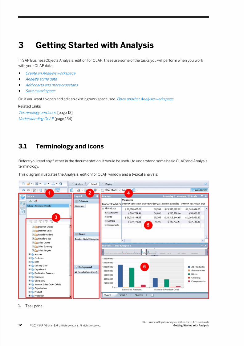
This diagram illustrates the Analysis, edition for OLAP window and a typical analysis:
1. Task panel
12 © 2013 SAP AG or an SAP affiliate company. All rights reserved.
SAP BusinessObjects Analysis, edition for OLAP User Guide
Getting Started with Analysis
7/28/2019 Xi4sp5 Aa User En
http://slidepdf.com/reader/full/xi4sp5-aa-user-en 13/172
2. Layout panel
3. Metadata explorer
4. Analysis window
5. Crosstab
6. Chart
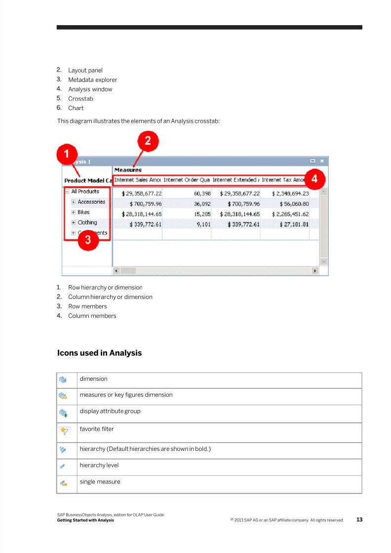
This diagram illustrates the elements of an Analysis crosstab:
1. Row hierarchy or dimension
2. Column hierarchy or dimension
3. Row members
4. Column members
Icons used in Analysis
dimension
measures or key figures dimension
display attribute group
favorite filter
hierarchy (Default hierarchies are shown in bold.)
hierarchy level
single measure
SAP BusinessObjects Analysis, edition for OLAP User Guide
Getting Started with Analysis © 2013 SAP AG or an SAP affiliate company. All rights reserved. 13
7/28/2019 Xi4sp5 Aa User En
http://slidepdf.com/reader/full/xi4sp5-aa-user-en 14/172
individual display attribute (Default attributes are shown in bold.)
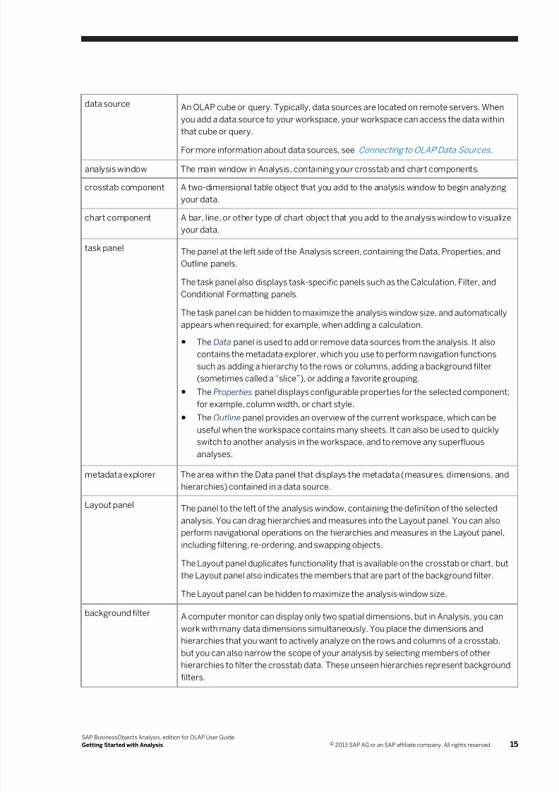
Terms used in Analysis
cube A multi-dimensional or OLAP database in which data is summarized, consolidated, and
stored in dimensions, each representing information such as customer, or product line.
dimension A collection of hierarchies, or a collection of measures.
hierarchy A collection of related data members, usually organized in a hierarchical structure. For
example, in a <Geography> hierarchy, countries would comprise one level in the
hierarchy, and cities would comprise a lower level.
member A base unit of data, representing an entity in a multi-dimensional OLAP database. For
example, in a <Geography> hierarchy, some members could be <Antarctica> ,
<Stockholm> , and <Tibet> .
A member in a hierarchy can have parent and child members. <Sweden> would be the
parent member of <Stockholm> .
Members are represented in a crosstab by columns and rows, and in a chart by pie
slices, risers, lines, or other visualizations.
measures dimension A dimension that represents the actual data; that is, the numbers. For example, a
measures dimension could contain measures such as <Sales> , <Cost> , and
<Profit> .
fact dimension A dimension that represents a characteristic of the data and not the data itself. For
example, <Customers> or <Products> could be fact dimensions.
attribute, or display
attribute
A property of a member, which provides an alternate way of categorizing the member.
For example, attributes for a <Product> hierarchy might include color, manufacturer
name, case size, and country of origin.
workspace An Analysis data-analysis document.
analysis A specific subset of OLAP data. May contain hierarchies, measures, and filters, as well
as visual highlighting and user-defined calculations.
For more information about analyses, see Analyses and visual components explained .
analysis view A saved navigation state of an analysis. The saved information includes applied filters,
hierarchies, and available metadata. An analysis view can be shared among
applications such as SAP BusinessObjects Analysis (both the edition for OLAP and the
edition for Microsoft Office), SAP Crystal Reports, and SAP BusinessObjects Web
Intelligence.
For more information about analysis views, see Using Analyses in Other SAP
Applications .
14 © 2013 SAP AG or an SAP affiliate company. All rights reserved.
SAP BusinessObjects Analysis, edition for OLAP User Guide
Getting Started with Analysis
7/28/2019 Xi4sp5 Aa User En
http://slidepdf.com/reader/full/xi4sp5-aa-user-en 15/172
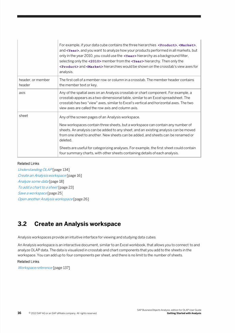
data source An OLAP cube or query. Typically, data sources are located on remote servers. When
you add a data source to your workspace, your workspace can access the data within
that cube or query.
For more information about data sources, see Connecting to OLAP Data Sources .
analysis window The main window in Analysis, containing your crosstab and chart components.
crosstab component A two-dimensional table object that you add to the analysis window to begin analyzing
your data.
chart component A bar, line, or other type of chart object that you add to the analysis window to visualize
your data.
task panel The panel at the left side of the Analysis screen, containing the Data, Properties, and
Outline panels.
The task panel also displays task-specific panels such as the Calculation, Filter, and
Conditional Formatting panels.
The task panel can be hidden to maximize the analysis window size, and automatically
appears when required; for example, when adding a calculation.
● The Data panel is used to add or remove data sources from the analysis. It also
contains the metadata explorer, which you use to perform navigation functions
such as adding a hierarchy to the rows or columns, adding a background filter
(sometimes called a “slice”), or adding a favorite grouping.
● The Properties panel displays configurable properties for the selected component;
for example, column width, or chart style.
● The Outline panel provides an overview of the current workspace, which can beuseful when the workspace contains many sheets. It can also be used to quickly
switch to another analysis in the workspace, and to remove any superfluous
analyses.
metadata explorer The area within the Data panel that displays the metadata (measures, dimensions, and
hierarchies) contained in a data source.
Layout panel The panel to the left of the analysis window, containing the definition of the selected
analysis. You can drag hierarchies and measures into the Layout panel. You can also
perform navigational operations on the hierarchies and measures in the Layout panel,
including filtering, re-ordering, and swapping objects.
The Layout panel duplicates functionality that is available on the crosstab or chart, but
the Layout panel also indicates the members that are part of the background filter.
The Layout panel can be hidden to maximize the analysis window size.
background filter A computer monitor can display only two spatial dimensions, but in Analysis, you can
work with many data dimensions simultaneously. You place the dimensions and
hierarchies that you want to actively analyze on the rows and columns of a crosstab,
but you can also narrow the scope of your analysis by selecting members of other
hierarchies to filter the crosstab data. These unseen hierarchies represent background
filters.
SAP BusinessObjects Analysis, edition for OLAP User Guide
Getting Started with Analysis © 2013 SAP AG or an SAP affiliate company. All rights reserved. 15
7/28/2019 Xi4sp5 Aa User En
http://slidepdf.com/reader/full/xi4sp5-aa-user-en 16/172
For example, if your data cube contains the three hierarchies <Product> , <Market> ,
and <Year> , and you want to analyze how your products performed in all markets, but
only in the year 2010, you could use the <Year> hierarchy as a background filter,
selecting only the <2010> member from the <Year> hierarchy. Then only the
<Product> and <Market> hierarchies would be shown on the crosstab's view axes for
analysis.
header, or member
header
The first cell of a member row or column in a crosstab. The member header contains
the member text or key.
axis Any of the spatial axes on an Analysis crosstab or chart component. For example, a
crosstab appears as a two-dimensional table, similar to an Excel spreadsheet. The
crosstab has two "view" axes, similar to Excel's vertical and horizontal axes. The two
view axes are called the row axis and column axis.
sheet Any of the screen pages of an Analysis workspace.
New workspaces contain three sheets, but a workspace can contain any number of
sheets. An analysis can be added to any sheet, and an existing analysis can be moved
from one sheet to another. New sheets can be added, and sheets can be renamed or
deleted.
Sheets are useful for categorizing analyses. For example, the first sheet could contain
four summary charts, with other sheets containing details of each analysis.
Related Links
Understan ding OLAP [page 134]
Create an Analysis workspac e [page 16]
Analyze so me data [page 18]
To add a c hart to a sheet [page 23]
Save a wo rkspace [page 25]
Open anot her Analysis workspa ce [page 26]
3.2 Create an Analysis workspace
Analysis workspaces provide an intuitive interface for viewing and studying data cubes.
An Analysis workspace is an interactive document, similar to an Excel workbook, that allows you to connect to and
analyze OLAP data. The data is visualized in crosstab and chart components that you add to the sheets in the
workspace. You can add up to four components per sheet, and there is no limit to the number of sheets.
Related Links
Workspace reference [page 137]
16 © 2013 SAP AG or an SAP affiliate company. All rights reserved.
SAP BusinessObjects Analysis, edition for OLAP User Guide
Getting Started with Analysis
7/28/2019 Xi4sp5 Aa User En
http://slidepdf.com/reader/full/xi4sp5-aa-user-en 17/172
3.2.1 To create an Analysis workspace from the BI launchpad
1. Start the BI launch pad and log on.
For information about logging on to the BI launch pad, see the BI Launch Pad User Guide.
2. In the My Applications area, click the Analysis, edition for OLAP icon.
The Open Data Source dialog box appears, showing all data sources that are available for you to access data
from. Analysis also creates an empty workspace, containing an undefined analysis.
Note
If no data sources have been defined, you will not be able to add any data to the workspace. Your system
administrator must define data sources before you can analyze data with Analysis.
3. Select a data source from the list.
○ If you selected a cube, click OK to add it to your workspace.
○ If you selected a query, click OK to add it to your workspace.
○ If you selected a system, click Next to see the cubes and queries available from that system. Select a
cube or query, or click the Find tab to find a cube or query, and then click OK to add the data source to
your workspace.
4. If the data source requires authentication, type your credentials in the logon dialog box and click OK.
5. If you selected an SAP BW or SAP HANA data source that contains prompts, the Prompts dialog box opens.
Select values for the prompts.
For more information about SAP BW prompts, see Prompts for SAP BW data sources [page 120]. For more
information about SAP HANA prompts, see SAP HANA Data Sources [page 127].
If authentication succeeds, the data source appears in the list at the top of the Data panel, and the metadata
explorer displays the data objects (metadata) contained in the data source.
If authentication fails, first verify that you entered your credentials correctly. If authentication continues to fail,
see your system administrator. Your credentials may not be set up properly in the Central Management Console,
or the OLAP server may be offline.
Related Links
Open another Analysis workspace [page 26]
Terminology and icons [page 12]
Analyze some data [page 18]
Add charts and more crosstabs [page 22]
Save a workspace [page 25]
Open another Analysis workspace [page 26]
Connecting to OLAP Data Sources [page 113]
SAP BusinessObjects Analysis, edition for OLAP User Guide
Getting Started with Analysis © 2013 SAP AG or an SAP affiliate company. All rights reserved. 17
7/28/2019 Xi4sp5 Aa User En
http://slidepdf.com/reader/full/xi4sp5-aa-user-en 18/172
3.3 Analyze some data
Once you have created a workspace and connected a data source, your next step is to define an analysis and
begin working with your data in the analysis window.
An analysis is a specific subset of data from the OLAP cube. You create an analysis by adding OLAP data to the
crosstab, and then manipulating the data; for example, by sorting and filtering.
● Add data to the crosstab
The following tasks introduce some of the analysis features available in Analysis. You can choose to perform or
omit each task, perform the tasks in any order, and experiment with the different options available in each task:
● Remove unwanted members
● Sort the data
● Filter the data
● Apply conditional formatting (exception highlighting)
● Add a calculation
Related Links
Analyses [page 28]
Terminology and icons [page 12]
Create an Analysis workspace [page 16]
Add charts and more crosstabs [page 22]
Save a workspace [page 25]
Open another Analysis workspace [page 26]
3.3.1 Add data to the crosstab
The first step in defining an analysis is to add data to the crosstab. Because data is represented by dimensions
and hierarchies, you populate a crosstab with data by adding hierarchies.
1. Click a hierarchy on the Data panel to select it.
If necessary, expand a dimension to reveal its hierarchies.
2. Click the Add to Columns button to add the selected hierarchy to the columns on the crosstab.
Alternatively, you can drag the hierarchy to the Columns area in the Layout panel, or to the Drop Columns area
on the crosstab.
3. Repeat those steps to add more hierarchies to the crosstab.
In addition to the columns, you can add hierarchies to the rows or to the background filter, using the
Add to Rows and Add to Background Filter buttons.
Note
The crosstab displays numbers only after you add measures.
18 © 2013 SAP AG or an SAP affiliate company. All rights reserved.
SAP BusinessObjects Analysis, edition for OLAP User Guide
Getting Started with Analysis
7/28/2019 Xi4sp5 Aa User En
http://slidepdf.com/reader/full/xi4sp5-aa-user-en 19/172
4. Explore the members within the hierarchies by expanding the hierarchies.
3.3.2 Remove unwanted members
You can remove or filter members so that you can focus on the data that most interests you.
1. On the crosstab, right-click a member and select Remove to remove that member from your analysis.
If you later want to add the member back to the crosstab, you can add it by using the Filter panel.
2. On the Layout panel, double-click one of the hierarchies.
The Filter panel opens. The panel displays the contents of the hierarchy you chose, with all members initially
selected.
3. Select only the members that you want to include in your analysis.
4. Click OK to update the crosstab.
Related Links
Filtering Data [page 53]
3.3.3 Sort the data
Right-click a member header, point to Sort, and select Ascending or Descending.
Related Links
Sorting [page 68]
3.3.4 Filter the data
Filtering is one of the central workflows in Analysis. Filtering is the action of selecting only the data that is
important to you. For example, if you were interested in the poorest-performing sales regions for your company's
ice hockey equipment, you might select countries such as Kenya and Indonesia.
1. Right-click a hierarchy on the Layout panel, point to Filter, and then select By measure.
Note
Filtering by measure is available only with SAP BW data sources.
For example, if your data source contains ice hockey equipment sales figures, you might want to select the
<Geography> hierarchy to choose Kenya and Indonesia.
On the Filter panel, you define the conditions for your filter. You can define a filter with a single condition, such
as Less than 1000, or a complex filter containing multiple conditions.
2. If the hierarchy you selected contains multiple levels, choose a hierarchy level to filter.
SAP BusinessObjects Analysis, edition for OLAP User Guide
Getting Started with Analysis © 2013 SAP AG or an SAP affiliate company. All rights reserved. 19
7/28/2019 Xi4sp5 Aa User En
http://slidepdf.com/reader/full/xi4sp5-aa-user-en 20/172
A hierarchy can have several levels of members, but a filter is applied to a single level within the hierarchy. For
example, if the <Geography> hierarchy contains <countries> at level 1, <states> at level 2, and <cities>
at level 3, you would choose the <countries> level to select Kenya and Indonesia.
3. Choose a measure to filter on.
For example, if you want to include countries with low sales numbers, you could select a measure such as
<Sales Orders> .
4. Define the condition by adding an operator and operand.
For example, you can define a condition to be Bottom 10 by selecting the Bottom N operator and typing 10
as the operand. Then, only those ten countries with the lowest numbers of sales orders will be included in the
analysis.
5. Click Add to add the condition to your filter.
6. Add more filter conditions until you have finished defining your filter.
7. If you created multiple conditions, select AND or OR, depending on how you want your conditions to affect the
filtered data.
8. Click OK.
The crosstab display is updated to show you the filtered data.
Note
Filtering by defining filter conditions is called “filtering by measure”. Filtering by selecting and removing
individual members from a list is called “filtering by member”, as described in the section Remove
unwanted members [page 19]. You can filter by member by double-clicking a hierarchy in the Layout panel.
Related Links
Filtering Data [page 53]
3.3.5 Apply conditional formatting (exception highlighting)
You may want to highlight data that matches some specified criteria. For example, you could highlight negative
numbers by applying a red background color to the cells. To do this, you apply conditional formatting.
1. Select a member header, click the Analyze toolbar tab, and then click Conditional Formatting.
Alternatively, you can right-click a member header, point to Conditional Formatting, and click New.
2. On the Conditional Formatting panel, type a name to identify the formatting that you are applying, or accept
the default name.
3. Choose a measure to base the formatting on.
For example, if you want to highlight any negative numbers in your inventory, you would select the
<Inventory> measure.
4. Choose a formatting type.
You can add a background color to the highlighted cells, or change the text color in those cells, or add a
symbol to those cells.
5. Choose a color or symbol.
6. Select the conditional operator and the threshold value.
For example, to highlight any negative numbers, you would select the Less Than operator and type 0 (zero)
for the value.
20 © 2013 SAP AG or an SAP affiliate company. All rights reserved.
SAP BusinessObjects Analysis, edition for OLAP User Guide
Getting Started with Analysis
7/28/2019 Xi4sp5 Aa User En
http://slidepdf.com/reader/full/xi4sp5-aa-user-en 21/172
7. Click Add and then OK to add the formatting.
Related Links
Conditional Formatting (Highlighting Exceptions) [page 72]
3.3.6 Add a calculation
1. Select two member headers from a measures dimension.
To select multiple member headers, hold down the Ctrl key as you click member headers.
Note
Members of a measures dimension are called “measure members” or simply “measures”.
2. Click the arrow beside the Calculations button.
3. Choose one of the simple calculations: Add, Subtract, Multiply, or Divide.
The calculation is added to the crosstab.
Note
When you use the Subtract and Divide calculations, the calculation is defined based on the order in which
you selected the members.
TipThe calculation equation appears in a tooltip when you point to the calculation header.
4. Select any measure member header.
5. On the Analyze tab, click Calculations.
6. On the Calculation panel, type a name to identify the calculation that you are adding.
7. Select a hierarchy to base the calculation on.
For example, select Measures.
8. Choose where you want to insert your calculation.
9. Define the calculation using the Function and Add Member buttons.
For example, you could add a simple division calculation like this:
a) Click Function to add an operator.
b) Choose the DIVISION operator.
c) Select the operand1 text, including the quotation marks.
d) Click Add Member to select the first operand for the division calculation.
e) Select the operand2 text.
f) Click Add Member again to select the second operand.
10. Click Validate to verify that you have defined your calculation correctly.
If validation fails, the Status field explains why it failed. Correct any errors in your calculation, and click
Validate again.
11. If the validation is successful, click OK to add the calculation to the crosstab.
SAP BusinessObjects Analysis, edition for OLAP User Guide
Getting Started with Analysis © 2013 SAP AG or an SAP affiliate company. All rights reserved. 21
7/28/2019 Xi4sp5 Aa User En
http://slidepdf.com/reader/full/xi4sp5-aa-user-en 22/172
Related Links
Calculations [page 76]
3.4 Add charts and more crosstabs
In Analysis, you'll typically create a workspace and then begin analyzing data in a crosstab. However, you may
soon discover that using a crosstab, while vital to your analysis, can be a rather abstract way of looking at
business performance, and can lack visual impact. Adding one or more charts to your analysis can greatly
enhance the impact of your analysis, making it more interesting and easier to understand.
You can also add more crosstab components to the analysis, to compare different arrangements of the same
data. (If you want to compare different data, see Adding analyses [page 32].)
You can place up to four components on a sheet, and you can add more sheets to your workspace as required.
Related Links
Overview of Analysis charts [page 36]
Charts reference [page 163]
Crosstabs [page 34]
Crosstab component reference [page 157]
3.4.1 Adding a chart or crosstab to the sheet
Once you've created a workspace and defined an analysis on the crosstab, you can add a chart to the sheet simply
by clicking any chart button on the Insert tab. If there are multiple analyses on the sheet, the added chart is linked
to the selected analysis. Typically, the chart is linked to an analysis defined in a crosstab, and therefore displays
the same data as the crosstab.
The original component, in this case a crosstab, represents the main analysis, while the added chart represents a
sub-analysis, linked to the main analysis. Changes that you make to the main analysis are reflected in the sub-
analysis, but changes that you make directly to the sub-analysis are not reflected in the main analysis.
You can add another crosstab to a sheet as a sub-analysis, if you want to explore an alternate arrangement of
your data. Or, you can add a crosstab to a sheet as a new analysis, if you want to analyze multiple sets of data.
You can also copy an existing component and make changes to the copy.
Focused analysis
You can set an analysis to focused analysis mode, so that if you select members in the main analysis, the sub-
analysis components display only the selected members. This feature allows you to temporarily focus on different
parts of your analysis without having to redefine the analysis many times.
For example, if you are analyzing worldwide sales figures for snowboard equipment, you might find an interesting
anomaly in the figures from Saudi Arabia. You can then add a chart, turn on focused analysis mode, and select
22 © 2013 SAP AG or an SAP affiliate company. All rights reserved.
SAP BusinessObjects Analysis, edition for OLAP User Guide
Getting Started with Analysis
7/28/2019 Xi4sp5 Aa User En
http://slidepdf.com/reader/full/xi4sp5-aa-user-en 23/172
just the data for Saudi Arabia in your analysis. The chart will then show just the Saudi Arabia data, while your
crosstab still shows worldwide data.
If you don't want the added chart or crosstab component to be linked with the main analysis, you can unlink the
component from the main analysis to create a new analysis. Using the preceding example, you might decide that
the Saudi Arabia situation deserves special attention. You could then unlink the chart from the main analysis, and
continue analyzing both worldwide snowboard sales (in the original crosstab), as well as sales within Saudi Arabia.
Related Links
Terminology and icons [page 12]
Create an Analysis workspace [page 16]
Analyze some data [page 18]
Save a workspace [page 25]
Open another Analysis workspace [page 26]
Resizing and moving components [page 95]
Sub-analyses [page 50]
Unlinking a sub-analysis [page 52]
Adding analyses [page 32]
Copying a component [page 95]
3.4.1.1 To add a chart to a sheet
1. In the analysis window, select the component that you want the chart to be linked to.2. Click one of the chart buttons on the Insert tab.
The chart is added as a sub-analysis, linked to the component that you selected. The added chart is placed
below or to the right of existing components on the sheet.
Note
Some of the chart buttons represent families of charts. You can click the button to add the default chart
type from that family to the sheet, or click the arrow beside the button to select from the available chart
types within that family.
○ Column chart family
○ Multi line chart
○ Multi pie chart
○ Bar chart family
○ Other charts
Alternatively, you can drag a chart from the Insert tab into the analysis window, to the position you select.
Note
SAP BusinessObjects Analysis, edition for OLAP User Guide
Getting Started with Analysis © 2013 SAP AG or an SAP affiliate company. All rights reserved. 23
7/28/2019 Xi4sp5 Aa User En
http://slidepdf.com/reader/full/xi4sp5-aa-user-en 24/172
If you drag a chart family button to the analysis window, the default type from that chart family is added to
the analysis window. You can change the chart type later if you wish.
To enlarge the view of a component when there are multiple components on a sheet, you can maximize
and restore the component using the Maximize/Restore button in the component's title bar.
Related Links
Resizing and moving components [page 95]
3.4.1.2 To add a crosstab to a sheet as a sub-analysis
This procedure describes how to add a crosstab as a sub-analysis. To add a crosstab as a new analysis, see
Adding analyses [page 32].
1. In the analysis window, select the component that you want the crosstab to be linked to.
2. On the Insert tab, click the arrow beside the Crosstab button and select Insert a sub-analysis.
The crosstab is added as a sub-analysis, linked to the component that you selected. The added crosstab is
placed below or to the right of existing components on the sheet.
Alternatively, you can drag a crosstab from the Insert tab into the analysis window, to the position you select.
To enlarge the view of a component when there are multiple components on a sheet, you can maximize
and restore the component using the Maximize/Restore button in the component's title bar.
3.4.1.3 To copy an existing crosstab or chart
1. In the analysis window, select the crosstab or chart that you want to copy by clicking anywhere within the
component.
2. On the toolbar, click the Copy button.
3. If you want to add the copied component to the same sheet, click the Paste button.
Or, if you want to add the copied component to a different sheet, first select the other sheet tab, and then
click the Paste button.
The copy is added to the sheet, below or to the right of existing components.
3.4.1.4 To delete a component from the sheet
Click the Delete button on the right side of the component's title bar.
24 © 2013 SAP AG or an SAP affiliate company. All rights reserved.
SAP BusinessObjects Analysis, edition for OLAP User Guide
Getting Started with Analysis
7/28/2019 Xi4sp5 Aa User En
http://slidepdf.com/reader/full/xi4sp5-aa-user-en 25/172
3.5 Save a workspace
Analysis saves its workspaces to the BI platform repository. From the repository, you can open your workspaces
via the web, from any machine that has an internet connection.
You can choose to save your changes to the existing workspace, or to save the modified workspace as a new
workspace in the repository.
Note
To save a workspace to the BI platform repository, you must have sufficient rights. See your system
administrator if you are not sure whether you have such rights.
If you leave your workspace idle, the workspace is automatically saved to your Favorites folder as an “autosave”
file, before your session terminates. Typically, a session is terminated after approximately 20 minutes of
inactivity, unless your system administrator has set the timeout duration to a different value.
Note
Because the autosave workspace is overwritten every time a workspace is automatically saved, you should
manually save workspaces that you want to keep, with unique filenames.
In addition to saving workspaces, you can also export data from workspaces to Microsoft Excel or to a comma-
separated-values file.
Related Links
Terminology and ico ns [page 12]Create an Analysis w orkspace [page 16]
Analyze some data [page 18]
Add charts and more crosstabs [page 22]
Open another Analysis workspace [page 26]
Exporting Data [page 111]
3.5.1 To save a newly created workspace
1. On the toolbar, click Save.
2. In the folder tree, browse to the folder where you want to save your workspace.
3. Type a filename for your workspace.
4. Click Save.
3.5.2 To save changes to your existing workspace
On the toolbar, click Save.
SAP BusinessObjects Analysis, edition for OLAP User Guide
Getting Started with Analysis © 2013 SAP AG or an SAP affiliate company. All rights reserved. 25
7/28/2019 Xi4sp5 Aa User En
http://slidepdf.com/reader/full/xi4sp5-aa-user-en 26/172
Related Links
Sending an Analysis workspace to another user [page 105]
3.5.3 To save your changes as a new workspace
1. On the toolbar, click the arrow beside the Save button, and choose Save As.
2. In the folder tree, browse to the folder where you want to save your workspace.
3. Type a filename for your workspace.
4. Click Save.
3.5.4 Automatically saved workspaces
When your workspace has been idle for several minutes, a copy of the workspace is automatically saved to your
Favorites folder before your session terminates.
If you then return to your session before the session is terminated, the auto-save cycle is reset, and your
workspace is auto-saved again the next time your workspace becomes idle for several minutes.
3.6 Open another Analysis workspace
When you've finished with your current workspace, you can start a new workspace without returning to the BI
launch pad.
Or, if you've already saved workspaces to the BI platform repository, you can open any of these workspaces for
further editing. If other analysts have saved workspaces to public folders in the repository, you can open these
workspaces as well.
Related Links
Terminology and icons [page 12]
Create an Analysis workspace [page 16]
Analyze some data [page 18]
Add charts and more crosstabs [page 22]
Save a workspace [page 25]
3.6.1 To create a new Analysis workspace from withinAnalysis
1. On the toolbar, click the New Workspace button.
26 © 2013 SAP AG or an SAP affiliate company. All rights reserved.
SAP BusinessObjects Analysis, edition for OLAP User Guide
Getting Started with Analysis
7/28/2019 Xi4sp5 Aa User En
http://slidepdf.com/reader/full/xi4sp5-aa-user-en 27/172
2. Confirm that you want to create a new workspace, losing any unsaved changes in your current workspace.
Just as when you create a new workspace from the BI launch pad, the Open Data Source dialog box is
displayed, showing all data sources that are available for you to access data from.
Related Links
Create an Analysis workspace [page 16]
3.6.2 To open an existing Analysis workspace
1. On the toolbar, click the Open button.
2. Select a workspace from the folder list, and click Open.
You can also open an existing workspace from the Documents tab in the BI launch pad.
If none of the data sources used on the current sheet of the workspace require you to enter your
authentication credentials, the workspace opens at the current sheet.
If any of the data sources used on the current sheet require your authentication credentials, you are
prompted for your logon credentials. Type your credentials and click OK to log on to each data source. Or, if
you have more than one data source and you want to log on with the same credentials for all data sources on
the current sheet, select "Apply these credentials to all data sources on the same sheet" before you click OK.
If authentication fails, see Disabled data source connections [page 116], or see your system administrator.
Your credentials may not be set up properly in the Central Management Console, or the OLAP server may be
offline.
Note
When you navigate to other sheets in the workspace, you may be prompted for your credentials again if
components on those sheets are linked to other data sources that require authentication.
3. If the workspace contains SAP BW or SAP HANA data sources that contain prompts, the Prompts dialog box
opens. Select values for the prompts.
For more information about SAP BW prompts, see Prompts for SAP BW data sources [page 120]. For more
information about SAP HANA prompts, see SAP HANA Data Sources [page 127].
SAP BusinessObjects Analysis, edition for OLAP User Guide
Getting Started with Analysis © 2013 SAP AG or an SAP affiliate company. All rights reserved. 27
7/28/2019 Xi4sp5 Aa User En
http://slidepdf.com/reader/full/xi4sp5-aa-user-en 28/172
4 Analyses
In Analysis, you connect to a data source, and then use the available analysis features to obtain useful informationfrom your data.
You define an analysis by populating a crosstab with data. Start by choosing hierarchies to add to the row and
column axes of the crosstab, and to the background filter. Then you can expand and refine the analysis using the
many tools that Analysis provides.
You can also define an analysis using a chart component if you prefer.
Related Links
Adding data to a chart [page 38]
Crosstab component reference [page 157]
Charts reference [page 163]
4.1 Analyses and visual components explained
Analyses
An analysis defines a specific subset of data from the OLAP cube that you want to analyze. This subset of data is
often referred to as a "slice" because it represents a two-dimensional "slice" of a multi-dimensional cube. For
example, if you want to analyze data in a Sales cube, you could define an analysis for Store Costs by Year.
To define an analysis, you specify the measures and hierarchies that you want to include. You do this by adding
the hierarchies or members that you want to analyze to the crosstab or chart component. In the preceding
example, <Store Costs> and <Year> are the two hierarchies that you would use when defining this analysis.
Although Analysis workspaces can contain multiple sheets, an analysis is valid only on a single sheet. Therefore,
an analysis on sheet 1 does not affect the contents of sheet 2.
It is important to understand that the analysis stores the structure and values of the data but the crosstab and
chart visual components display the data.
Visual components
You can display an analysis in different types of visual components: for example a crosstab or a horizontal bar
chart.
A crosstab and chart belonging to the same analysis can be thought of as linked because they display the same
set of cube data. If you modify the analysis in any way on one visual component, the equivalent action is
performed on any of the linked components. For example, if you expand a country member to display data for its
provinces on the crosstab component, any linked charts also update to display data for the provinces.
When you add a new crosstab or chart component to a sheet as a sub-analysis, the added component is linked to
the active analysis. You can also add a crosstab as a new analysis.
28 © 2013 SAP AG or an SAP affiliate company. All rights reserved.
SAP BusinessObjects Analysis, edition for OLAP User Guide
Analyses
7/28/2019 Xi4sp5 Aa User En
http://slidepdf.com/reader/full/xi4sp5-aa-user-en 29/172
Once hierarchies or members have been added to a component, the analysis and visual components are fixed to
the data source. You cannot add members from a different data source into this component.
Related Links
Sub-analyses [page 50]
Understanding OLAP [page 134]
4.2 To define a new analysis
1. On the Data panel, select the hierarchy that you want to add to the first axis in your crosstab.
You can also select just one or more hierarchy levels, instead of the entire hierarchy.
2. Drag the hierarchy from the Data panel to the Layout panel:
○ To add the selected hierarchy to the crosstab's rows, drag it to the Rows area.
○ To add the selected hierarchy to the crosstab's columns, drag it to the Columns area.
○ To add the hierarchy to the crosstab's background filter, drag it to the Background filter area.
○ If you are placing members of a measures dimension onto a crosstab, you can also drag them to the main
grid of the crosstab component.
You can also use the buttons above the metadata explorer on the Data panel to populate your crosstab. First,
select a component in the analysis window, and then click one of these buttons to add the hierarchies to the
crosstab:
○ Click Add to Rows to add the selected hierarchy to the rows on the crosstab.
○ Click Add to Columns to add the selected hierarchy to the columns on the crosstab.
○ Click Add to Background Filter to add the selected hierarchy to the background filter.
3. Repeat step 2 for the other crosstab axes.
Tip
You may want to turn off automatic layout updating while you define your analysis. When automatic
updating is turned on, the crosstab and chart components update as you add each hierarchy to the Layout
panel, causing short delays. To turn off automatic updating, click Auto Update on the toolbar.
Note
You cannot add members from the same hierarchy to two axes.
Note
When you place a hierarchy on an axis, the default member is automatically selected.
Note
With SAP BW data sources, hierarchies that belong to the same dimension are mutually exclusive. For
example, consider a cube that contains a dimension <Customer> that contains two hierarchies:
SAP BusinessObjects Analysis, edition for OLAP User Guide
Analyses © 2013 SAP AG or an SAP affiliate company. All rights reserved. 29
7/28/2019 Xi4sp5 Aa User En
http://slidepdf.com/reader/full/xi4sp5-aa-user-en 30/172
<Country_1> and <Country_2> . You cannot specify <Country_1> on the row axis and <Country_2> in
the background filter in the same analysis.
4.7 Automatic layout updating
By default, all crosstab and chart components associated with an analysis automatically update whenever you
make changes to the layout. For example, if you add a hierarchy to the rows, or apply a filter, a crosstab
associated with that analysis automatically updates to show the added hierarchy and the applied filter.
Automatic updating can cause momentary delays, however, as data is retrieved from the data source. If you are
defining a complex analysis involving many hierarchies and filters, you may want to temporarily disable the
automatic layout updating. Then when your analysis definition is complete, you can enable the automatic
updating as you begin to analyze the data.
4.7.1 To toggle automatic layout updating
1. Select a crosstab or chart component.
2. On the toolbar, click Auto Update.
All crosstab and chart components associated with the analysis are temporarily disabled.
4.3 Modifying analyses
You can modify an analysis in several ways:
● Apply or modify filtering on the hierarchies.
● Apply sorting, conditional formatting, and other functions from the toolbar.
● Add new hierarchies from the same data source to the Layout panel, or move hierarchies between axes, or
remove hierarchies from the Layout panel.
Related Links
Filtering by member [page 58]
Toolbar reference [page 146]
Expanding and collapsing parent members [page 88]
4.3.1 To modify an analysis using the Layout panel
1. On the Data panel, select the hierarchy that you want to add to the first axis in your crosstab or chart.
You can also select just one or more hierarchy levels, instead of the entire hierarchy.
30 © 2013 SAP AG or an SAP affiliate company. All rights reserved.
SAP BusinessObjects Analysis, edition for OLAP User Guide
Analyses
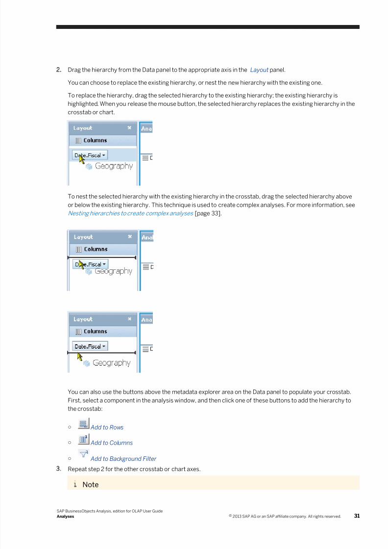
7/28/2019 Xi4sp5 Aa User En
http://slidepdf.com/reader/full/xi4sp5-aa-user-en 31/172
2. Drag the hierarchy from the Data panel to the appropriate axis in the Layout panel.
You can choose to replace the existing hierarchy, or nest the new hierarchy with the existing one.
To replace the hierarchy, drag the selected hierarchy to the existing hierarchy; the existing hierarchy ishighlighted. When you release the mouse button, the selected hierarchy replaces the existing hierarchy in the
crosstab or chart.
To nest the selected hierarchy with the existing hierarchy in the crosstab, drag the selected hierarchy above
or below the existing hierarchy. This technique is used to create complex analyses. For more information, see
Nesting hierarchies to create complex analyses [page 33].
You can also use the buttons above the metadata explorer area on the Data panel to populate your crosstab.
First, select a component in the analysis window, and then click one of these buttons to add the hierarchy to
the crosstab:
○ Add to Rows
○ Add to Columns
○ Add to Background Filter
3. Repeat step 2 for the other crosstab or chart axes.
Note
SAP BusinessObjects Analysis, edition for OLAP User Guide
Analyses © 2013 SAP AG or an SAP affiliate company. All rights reserved. 31
7/28/2019 Xi4sp5 Aa User En
http://slidepdf.com/reader/full/xi4sp5-aa-user-en 32/172
You cannot add members from the same hierarchy to two axes.
Note
When you place a hierarchy on a row or column axis, or in the background filter, the default member is
automatically selected. With Microsoft Analysis Services, the default member can be set on the OLAP
server. For other OLAP providers, the default member is the first member on the top level of the hierarchy.
Note
If you add a hierarchy to an analysis that already contains that same hierarchy, any sorts, filters, and
conditional formats that were previously applied to the hierarchy are removed.
4.4 Adding analyses
When you create a workspace and connect a data source, one analysis is created, linked to that data source. For
some analysis purposes, one analysis is all you'll need, but in some cases, you may need to add analyses; for
example, if you want to compare two different sets of data on one sheet.
Analyses can be added in a few ways:
● Add a crosstab to the sheet. By default, adding a new crosstab creates a new analysis. The new analysis is
connected to the data source that is currently selected on the Data panel.
● Add a new data source to the workspace, and then add a crosstab to the sheet. The new analysis is connectedto the new data source.
● Add another crosstab or chart component to the sheet as a sub-analysis. The sub-analysis is linked to the
original analysis, but you can unlink the new component from the original analysis, creating a separate
analysis.
After adding analyses, you define those analyses by adding hierarchies and members to crosstabs or charts.
Related Links
Sub-analyses [page 50]
Unlinking a sub-analysis [page 52]
4.4.1 To add an analysis to a sheet
On the toolbar, select Insert, and then click the Insert Crosstab button to add an analysis to the current
sheet.
The new analysis is connected to the currently selected data source, and is added to the Outline panel with an
automatically assigned name.
Note
You can also add the crosstab as a sub-analysis, by clicking the arrow beside the Insert Crosstab button.
32 © 2013 SAP AG or an SAP affiliate company. All rights reserved.
SAP BusinessObjects Analysis, edition for OLAP User Guide
Analyses
7/28/2019 Xi4sp5 Aa User En
http://slidepdf.com/reader/full/xi4sp5-aa-user-en 33/172
4.5 Nesting hierarchies to create complex analyses
OLAP cubes can contain many hierarchies. When you want to include data from multiple hierarchies in your
analyses, you nest them.
“Nesting hierarchies” means placing two or more hierarchies on the same axis. For example, you may want to
view sales figures over different fiscal years, from different geographical locations. You could nest the
<Date.Fiscal> and <Geography> hierarchies on one axis.
Related Links
Nesting hierarchies [page 91]
4.6 Deleting analyses
You can delete a disused analysis and all of its associated chart and crosstab components.
4.6.1 To delete an analysis
1. Select the analysis on the Outline panel.
2. On the Outline panel, click Delete.
SAP BusinessObjects Analysis, edition for OLAP User Guide
Analyses © 2013 SAP AG or an SAP affiliate company. All rights reserved. 33
7/28/2019 Xi4sp5 Aa User En
http://slidepdf.com/reader/full/xi4sp5-aa-user-en 34/172
5 Crosstabs
5.1 Overview of Analysis crosstabs
The crosstab component is a grid, similar to a spreadsheet, that displays data from a cube. You will usually
perform most of your data-analysis tasks using crosstabs. For example, you can sort data in a crosstab, add
calculations, add conditional formatting, and filter out data that is irrelevant to your analysis.
The crosstab comprises three axes, although only two can be displayed on the screen.
● Row axis: the vertical axis that displays rows of data.
● Column axis: the horizontal axis that displays columns of data.
● Background filter axis, or slice axis: the axis that is perpendicular to the two-dimensional crosstab display.
Hierarchies that are placed on the row axis are called row hierarchies. Similarly, you also use column hierarchies
and background filter hierarchies in your analyses.
With row and column hierarchies, you can see several members simultaneously on the crosstab. With the
background filter hierarchy however, you fix a slice of the data in the crosstab at any one time. The member you
select in the background filter hierarchy is called the background filter member or slice member. For example, if
<Week> is a background filter hierarchy, you can select any week as the background filter member.
With some OLAP providers, for example SAP BW and Microsoft Analysis Services, you can select multiple
members of a hierarchy as a background filter. However, you cannot select multiple members of a measures
dimension as a background filter.
For all hierarchies in the cube that are not used on the row, column, or background filter axes, the default memberis used to generate data in the crosstab. Therefore, you can generate a valid analysis by placing hierarchies on
only the row and column axes because the default member is used for all other hierarchies. If you place a
hierarchy in the background filter and leave the default member unchanged, the data in the crosstab is also
unchanged.
You can also display more than one dimension or hierarchy on a row or column axis; for example, you can place
both a <Measures> dimension and a <Years> hierarchy on the same axis to show data from the <Measures>
dimension over several years. This is called “nesting hierarchies”.
Related Links
Adding a crosstab [page 35]
Adding data to a crosstab [page 35]Analyses [page 28]
Understanding OLAP [page 134]
Custom aggregates and multiple members in a background filter [page 140]
Nesting hierarchies [page 91]
34 © 2013 SAP AG or an SAP affiliate company. All rights reserved.
SAP BusinessObjects Analysis, edition for OLAP User Guide
Crosstabs
7/28/2019 Xi4sp5 Aa User En
http://slidepdf.com/reader/full/xi4sp5-aa-user-en 35/172
5.2 Adding a crosstab
Visual components, such as a crosstab or any of the chart types, are added to the analysis window by using the
toolbar. You can add a crosstab by clicking the crosstab button, or by dragging the crosstab button to the analysis
window.
Related Links
Adding data to a cro sstab [page 35]
Analyses [page 28]
5.2.1 To add a crosstab to the analysis window
Click the Crosstab button on the toolbar.
The component is added to the sheet, below or to the right of existing components. You can later reposition or
resize the component if you wish.
Alternatively, you can place a crosstab at a specific location in the analysis window by dragging the crosstab
button from the toolbar.
Note
Before your crosstab will show any data, you must add a data source to the sheet, and add data to the
crosstab.
Related Links
Connecting to OLAP Data Sources [page 113]
Adding data to a crosstab [page 35]
Resizing and moving components [page 95]
5.3 Adding data to a crosstab
When you create a new Analysis workspace, it contains an empty crosstab. To add some data, you add
dimensions and hierarchies from the metadata explorer to the crosstab.
Once you've placed at least one measure on the crosstab, the crosstab is populated with data. You can then
proceed to perform your analysis.
Related Links
Add data to the cros stab [page 18]
Adding a crosstab [page 35]
Analyses [page 28]
SAP BusinessObjects Analysis, edition for OLAP User Guide
Crosstabs © 2013 SAP AG or an SAP affiliate company. All rights reserved. 35
7/28/2019 Xi4sp5 Aa User En
http://slidepdf.com/reader/full/xi4sp5-aa-user-en 36/172
6 Charts
This section explains how you can present your business data visually by using the available chart types.
6.1 Overview of Analysis charts
You can add charts to your workspaces to present your data graphically. Charts can often emphasize
irregularities or trends in your data, and help you focus your business analysis on those areas.
Several chart types are available to help you visualize data:
● Cluster bar charts
● Stacked charts
● Stacked percentage charts
● 3D bar charts
● Multi-series line charts
● Multi-series pie charts
● Scatter charts
● Box plot charts
● Bubble charts
● Radar charts
Chart and crosstab components are linked to analyses. A common analysis scenario is to first create a crosstab
component, and then add a chart component as a sub-analysis, linked to the main analysis. Both components
display the same data, and both components update simultaneously whenever you make changes to either
component. This interaction allows you to repeatedly define and refine your analyses, and see the graphical
results of your changes in real time.
Or, if you turn on focused analysis, the sub-analysis displays only a subset of the data in the main analysis. For
example, you can use a crosstab for your main analysis, and use a chart for the focused sub-analysis. As a result,
when you select data in the crosstab, the chart displays only the selected subset of data.
You can also unlink, or disconnect, a chart sub-analysis from its current analysis, converting it to a new, separate
analysis.
Charts can be easily customized. You can change the chart type, or change the appearance of the chart to
increase clarity. You can also expand data in the chart to examine the data in more detail. Swapping the chart axes
can sometimes improve the presentation as well.
This section describes each of the chart types, how to add a chart to a sheet, how to add data to a chart, and how
to customize a chart's appearance.
Related Links
Analyses [page 28]
Sub-analyses [page 50]
Adding a chart [page 37]
Adding data to a chart [page 38]
Chart types [page 39]
36 © 2013 SAP AG or an SAP affiliate company. All rights reserved.
SAP BusinessObjects Analysis, edition for OLAP User Guide
Charts
7/28/2019 Xi4sp5 Aa User En
http://slidepdf.com/reader/full/xi4sp5-aa-user-en 37/172
Scrolling through charts [page 43]
Customizing charts [page 44]
6.2 Adding a chart
Visual components, such as a crosstab or any of the chart types, are added to the analysis window by using the
toolbar. You can add a chart by clicking a chart button, or in some cases by dragging a chart button to the analysis
window. Some chart buttons represent families of individual chart types. For example, the column chart family
includes charts such as stacked column and 3D column.
Related Links
Adding data to a chart [page 38]Chart types [page 39]
Scrolling through large data sets in charts [page 43]
Customizing charts [page 44]
6.2.1 To add a chart to the analysis window
Click one of the chart buttons on the toolbar.
Note
Some of the chart buttons represent families of charts. You can click the button to add the default chart
type from that family to the sheet, or click the arrow beside the button to select from the available chart
types within that family.
For example, click the arrow beside the Bar charts button to see the list of available bar chart types,
and then select one of the types to add it to the analysis window.
The component is added to the sheet, below or to the right of existing components. You can later reposition or
resize the component if you wish.
Alternatively, you can place a chart at a specific location in the analysis window by dragging a chart button
from the toolbar. The cursor indicates whether or not you can place the chart component at the position of
the mouse pointer. When the mouse pointer is inside a valid drop zone, the drop zone is highlighted.
Note
If you drag a chart family button to the analysis window, the default type from that chart family is added to
the analysis window. You can change the chart type later if you wish.
Note
Before your chart will show any data, you must add a data source to the sheet, and add data to the chart.
SAP BusinessObjects Analysis, edition for OLAP User Guide
Charts © 2013 SAP AG or an SAP affiliate company. All rights reserved. 37
7/28/2019 Xi4sp5 Aa User En
http://slidepdf.com/reader/full/xi4sp5-aa-user-en 38/172
Related Links
Connecting to OLAP data sources [page 113]
Adding data to a chart [page 38]
To change the chart type [page 43]
Resizing and moving components [page 95]
6.3 Adding data to a chart
When you add a chart to a sheet, the chart is added as a sub-analysis, linked to the selected analysis. Therefore,
the chart is automatically populated with data if the analysis has been previously defined.
For example, if a sheet contains only a single crosstab, and if that crosstab has been used to define an analysis
(data has been added to the crosstab), then when you add a new chart to the sheet, the chart is populated with
the same data that is in the crosstab.
If you add a chart to a new sheet that contains only an empty crosstab and an undefined analysis, you will need to
define the analysis to add data to the chart.
You can also use the chart component to define an analysis.
Related Links
Adding a chart [page 37]
Analyses [page 28]
Sub-analyses [page 50]
Chart type s [page 39]
Scrolling t hrough charts [page 43]
Customizi ng charts [page 44]
6.3.1 Defining an analysis using an empty chart component
If you want to create a sheet that contains only a chart component, you can use an empty chart component to
create an analysis, without first having to define the analysis in a crosstab component.
6.3.1.1 To create an analysis using a chart component
1. Ensure that the workspace has at least one data source added to it.
2. In a new sheet or existing sheet, delete all crosstab and chart components.
3. Place a chart component on the empty sheet.
4. In the metadata explorer, select a dimension or hierarchy that you want to add to your chart.
5. Drag the hierarchy into the appropriate area in the Layout panel.
6. Repeat steps 4 and 5 until you have placed all the hierarchies you want to analyze into the Layout panel.
38 © 2013 SAP AG or an SAP affiliate company. All rights reserved.
SAP BusinessObjects Analysis, edition for OLAP User Guide
Charts
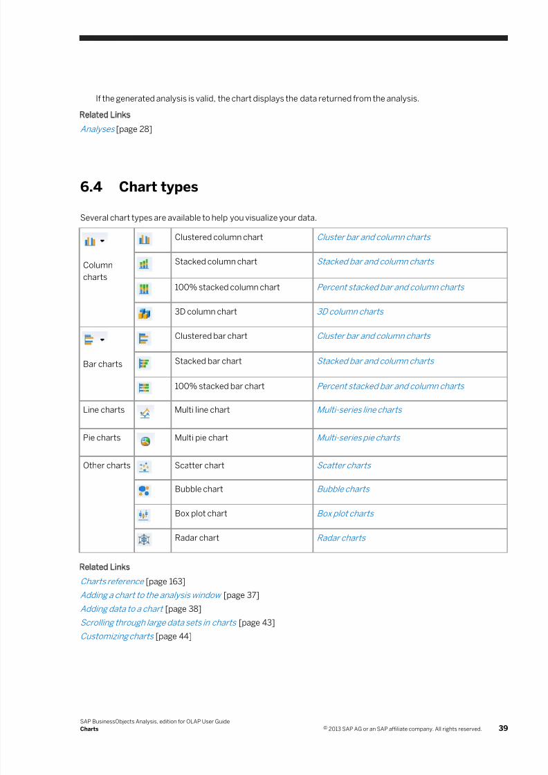
7/28/2019 Xi4sp5 Aa User En
http://slidepdf.com/reader/full/xi4sp5-aa-user-en 39/172
If the generated analysis is valid, the chart displays the data returned from the analysis.
Related Links
Analyses [page 28]
6.4 Chart types
Several chart types are available to help you visualize your data.
Column
charts
Clustered column chart Cluster bar and column charts
Stacked column chart Stacked bar and column charts
100% stacked column chart Percent stacked bar and column charts
3D column chart 3D column charts
Bar charts
Clustered bar chart Cluster bar and column charts
Stacked bar chart Stacked bar and column charts
100% stacked bar chart Percent stacked bar and column charts
Line charts Multi line chart Multi-series line charts
Pie charts Multi pie chart Multi-series pie charts
Other charts Scatter chart Scatter charts
Bubble chart Bubble charts
Box plot chart Box plot charts
Radar chart Radar charts
Related Links
Charts reference [page 163]
Adding a chart to the analysis window [page 37]
Adding data to a chart [page 38]
Scrolling through large data sets in charts [page 43]
Customizing charts [page 44]
SAP BusinessObjects Analysis, edition for OLAP User Guide
Charts © 2013 SAP AG or an SAP affiliate company. All rights reserved. 39
7/28/2019 Xi4sp5 Aa User En
http://slidepdf.com/reader/full/xi4sp5-aa-user-en 40/172
6.4.1 Bar and column charts
6.4.1.1 Clustered bar and column charts
Clustered bar and column charts show values compared across categories or over time; for example, sales for
each region by month. Several values (a "cluster") are shown grouped together in each category or time period.
6.4.1.2 Stacked bar and column charts
Stacked bar and column charts show how related sets of values compare to each other and contribute to a total.
Stacked charts are similar to 100% stacked charts except that stacked charts show the absolute contributions of
members to a total while 100% stacked charts show the relative contributions of members to a total.
For example, if you create a column chart that illustrates sales per product, you can use a stacked column chart to
show data from several years, one year on top of another.
6.4.1.3 100% stacked bar and column charts
100% stacked bar and column charts show visually what percentage a member contributes to a total. 100%
stacked charts are similar to stacked charts except that all bars or columns are the same length and represent
100% of a total. 100% stacked charts show the relative contributions of members to a total, while stacked charts
show the absolute contributions of members to a total. The size of each segment of a 100% stacked bar
represents the percentage that a member contributes to the total.
6.4.1.4 3D column charts
3D column charts are used to compare data visually in three dimensions. Typically, a 3D chart would show a
series of data across categories and over time.
6.4.2 Multi line charts
Line charts are used to show trends in data over time or categories. Markers are shown at each point in the line
where a data value exists.
40 © 2013 SAP AG or an SAP affiliate company. All rights reserved.
SAP BusinessObjects Analysis, edition for OLAP User Guide
Charts
7/28/2019 Xi4sp5 Aa User En
http://slidepdf.com/reader/full/xi4sp5-aa-user-en 41/172
6.4.3 Multi pie charts
Pie charts display the sizes of items that compose a data series, proportional to the sum of the items. A pie chartis used to show the relative contributions of values, and is useful when you want to emphasize a significant
element in the data.
To make your pie charts more legible, you can suppress the labels for small pie slices. You can also set the pie
slice labels to display either percentages or actual values.
Related Links
Configuring pie chart labels [page 48]
6.4.4 Other charts
6.4.4.1 Scatter charts
Scatter charts may be used to show possible correlations between two variables or measures. Data is displayed
as a set of points, with their x-y coordinates in the chart specified by the values of the two measures. For example,
if a scatter chart shows data points grouped roughly in a straight line from the lower-left corner to the upper-right
corner of the chart, a positive correlation is indicated.
While line charts treat one set of values as non-numeric labels, scatter charts treat both sets of values as numeric
data. Therefore, scatter charts require two measures (and only two). If the analysis subsequently changes so that
the chart contains fewer than two measures, the scatter chart cannot display any data.
You can specify on the Properties panel which of the available measures are to be plotted on the X and Y axes.
6.4.4.2 Bubble charts
Bubble charts compare three variables or measures. They are similar to scatter charts, with the bubble sizes
representing the third measure. For example, a bubble chart would be very effective for illustrating the number of
products sold in a certain region; the larger the bubble, the greater the number of products sold in that region.
While line charts treat only one set of values as numeric data, and scatter charts treat two sets of values asnumeric data, bubble charts treat three sets of values as numeric data. Therefore, bubble charts require at least
three measures. If the analysis subsequently changes so that the chart contains fewer than three measures, the
bubble chart cannot display any data.
You can specify on the Properties panel which of the available measures are to be plotted on the X and Y axes, and
which measure is to be represented by the bubble sizes.
SAP BusinessObjects Analysis, edition for OLAP User Guide
Charts © 2013 SAP AG or an SAP affiliate company. All rights reserved. 41
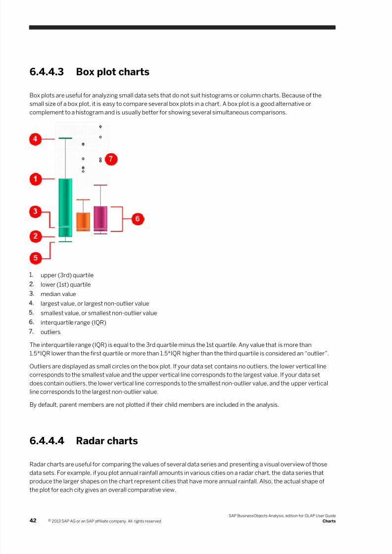
7/28/2019 Xi4sp5 Aa User En
http://slidepdf.com/reader/full/xi4sp5-aa-user-en 42/172
6.4.4.3 Box plot charts
Box plots are useful for analyzing small data sets that do not suit histograms or column charts. Because of thesmall size of a box plot, it is easy to compare several box plots in a chart. A box plot is a good alternative or
complement to a histogram and is usually better for showing several simultaneous comparisons.
1. upper (3rd) quartile
2. lower (1st) quartile
3. median value
4. largest value, or largest non-outlier value
5. smallest value, or smallest non-outlier value
6. interquartile range (IQR)
7. outliers
The interquartile range (IQR) is equal to the 3rd quartile minus the 1st quartile. Any value that is more than
1.5*IQR lower than the first quartile or more than 1.5*IQR higher than the third quartile is considered an “outlier”.
Outliers are displayed as small circles on the box plot. If your data set contains no outliers, the lower vertical line
corresponds to the smallest value and the upper vertical line corresponds to the largest value. If your data set
does contain outliers, the lower vertical line corresponds to the smallest non-outlier value, and the upper vertical
line corresponds to the largest non-outlier value.
By default, parent members are not plotted if their child members are included in the analysis.
6.4.4.4 Radar charts
Radar charts are useful for comparing the values of several data series and presenting a visual overview of those
data sets. For example, if you plot annual rainfall amounts in various cities on a radar chart, the data series that
produce the larger shapes on the chart represent cities that have more annual rainfall. Also, the actual shape of
the plot for each city gives an overall comparative view.
42 © 2013 SAP AG or an SAP affiliate company. All rights reserved.
SAP BusinessObjects Analysis, edition for OLAP User Guide
Charts
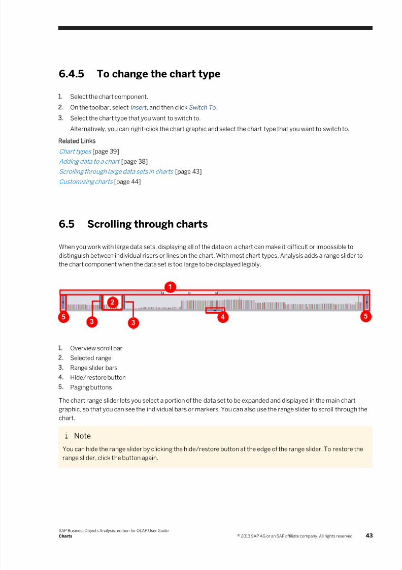
7/28/2019 Xi4sp5 Aa User En
http://slidepdf.com/reader/full/xi4sp5-aa-user-en 43/172
6.4.5 To change the chart type
1. Select the chart component.2. On the toolbar, select Insert, and then click Switch To.
3. Select the chart type that you want to switch to.
Alternatively, you can right-click the chart graphic and select the chart type that you want to switch to.
Related Links
Chart types [page 39]
Adding data to a chart [page 38]
Scrolling through large data sets in charts [page 43]
Customizing charts [page 44]
6.5 Scrolling through charts
When you work with large data sets, displaying all of the data on a chart can make it difficult or impossible to
distinguish between individual risers or lines on the chart. With most chart types, Analysis adds a range slider to
the chart component when the data set is too large to be displayed legibly.
1. Overview scroll bar
2. Selected range
3. Range slider bars
4. Hide/restore button
5. Paging buttons
The chart range slider lets you select a portion of the data set to be expanded and displayed in the main chartgraphic, so that you can see the individual bars or markers. You can also use the range slider to scroll through the
chart.
Note
You can hide the range slider by clicking the hide/restore button at the edge of the range slider. To restore the
range slider, click the button again.
SAP BusinessObjects Analysis, edition for OLAP User Guide
Charts © 2013 SAP AG or an SAP affiliate company. All rights reserved. 43
7/28/2019 Xi4sp5 Aa User En
http://slidepdf.com/reader/full/xi4sp5-aa-user-en 44/172
Defining the size of the selected range
First, define the size of the selected range by dragging the range slider bars in the range slider.
The selected range is shown with a white background in the range slider when using the Default or Shadow chart
styles, or with a black background when using the Presentation styles.
Moving the selected range within the range slider
Drag the selected range within the range slider to view different subsets of the data that are currently represented
in the range slider. Alternatively, you can use the paging buttons at the ends of the range slider to move the
selected range.
Scrollin g the range slider within the full data set
When the data set is very large, the range slider may not show the entire data set. In that case, use the overview
scroll bar to scroll the range slider within the full data set.
Related Links
Chart range slider [page 163]
Adding a chart to the analysis window [page 37]
Adding data to a chart [page 38]
Chart types [page 39]
Customizi ng charts [page 44]
6.6 Customizing charts
Several options are available for customizing the appearance of your charts. All these options are available from
the Properties panel.
Related Links
Adding a chart to the analysis window [page 37]
Adding data to a chart [page 38]
Chart types [page 39]
Scrolling through charts [page 43]
6.6.1 Sub-analysis name and description
The name of the sub-analysis appears on the title bar of the chart component and can be included in print output.
The description can also be included in print output.
44 © 2013 SAP AG or an SAP affiliate company. All rights reserved.
SAP BusinessObjects Analysis, edition for OLAP User Guide
Charts
7/28/2019 Xi4sp5 Aa User En
http://slidepdf.com/reader/full/xi4sp5-aa-user-en 45/172
Related Links
Chart display options [page 166]
6.6.1.1 To set name and description properties for a chart
1. On the task panel, click the Properties button to display the Properties panel.
2. Click the chart to select it.
3. On the Properties panel, type a name for your chart in the Sub Analysis Name field.
The name that you type here appears on the chart's title bar, and is used to identify the chart on the Outline
panel.
4. If you want any text to be included when you print the chart, type your comments in the Description field.
5. Click Apply.
6.6.2 Chart styles
You can choose from several predefined styles for displaying your charts.
Related Links
Chart display options [page 163]
6.6.2.1 To change the style of your chart
1. On the task panel, click the Properties button to display the Properties panel.
2. Click the chart to select it.
3. On the Properties panel, choose a value for the Style property, and then click Apply.
6.6.3 Chart color palettes
You can choose from several predefined color palettes for displaying your charts.
Related Links
Chart display options [page 163]
6.6.3.1 To change the color palette of your chart
1. On the task panel, click the Properties button to display the Properties panel.
SAP BusinessObjects Analysis, edition for OLAP User Guide
Charts © 2013 SAP AG or an SAP affiliate company. All rights reserved. 45
7/28/2019 Xi4sp5 Aa User En
http://slidepdf.com/reader/full/xi4sp5-aa-user-en 46/172
2. Click the chart to select it.
3. On the Properties panel, choose a value for the Palette property, and then click Apply.
6.6.4 Display font
You can set the character font used in your charts.
Related Links
Charts reference [page 163]
6.6.4.1 To change the font used on your chart
1. On the task panel, click the Properties button to display the Properties panel.
2. Click the chart to select it.
3. On the Properties panel, choose a font for the Font property, and then click Apply.
6.6.5 Displaying totals in charts
If you have totals displayed on the crosstab, you can choose to show those totals in charts that are linked to the
same analysis.
Related Links
Totals, Parents, and Aggregations [page 85]
6.6.5.1 To display totals on the chart
1. On the task panel, click the Properties button to display the Properties panel.
2. Click the chart to select it.
3. On the Properties panel, select the Show Totals check box, and then click Apply.
6.6.6 Displaying hierarchical chart labels
Hierarchical chart labels show you the parent-child relationships between members on the chart.
46 © 2013 SAP AG or an SAP affiliate company. All rights reserved.
SAP BusinessObjects Analysis, edition for OLAP User Guide
Charts
7/28/2019 Xi4sp5 Aa User En
http://slidepdf.com/reader/full/xi4sp5-aa-user-en 47/172
6.6.6.1 To display hierarchical labels on the chart
1. On the task panel, click the Properties button to display the Properties panel.
2. Click the chart to select it.
3. On the Properties panel, select the Show Hierarchical Labeling check box, and then click Apply.
6.6.7 Hiding the chart legend
You can control whether the chart legend is visible.
6.6.7.1 To hide the chart legend
1. On the task panel, click the Properties button to display the Properties panel.
2. Click the chart to select it.
3. On the Properties panel, clear the Show Legend check box, and then click Apply.
6.6.8 Chart axis labels
You can add labels to the chart axes.
Related Links
Descriptions of chart display options [page 163]
6.6.8.1 To add labels to the chart axes
1. On the task panel, click the Properties button to display the Properties panel.
2. Click the chart to select it.
3. On the Properties panel, type labels in any of these fields:
○ X Axis Label
○ Y Axis Label
○ Z Axis Label
4. Click Apply.
6.6.9 Y axis scale and symbol
You can change the scale of the Y axis.
SAP BusinessObjects Analysis, edition for OLAP User Guide
Charts © 2013 SAP AG or an SAP affiliate company. All rights reserved. 47
7/28/2019 Xi4sp5 Aa User En
http://slidepdf.com/reader/full/xi4sp5-aa-user-en 48/172
Related Links
Descriptions of chart display options [page 163]
6.6.9.1 To set the Y axis scale and symbol
1. On the task panel, click the Properties button to display the Properties panel.
2. Click the chart to select it.
3. On the Properties panel, choose a value for the Y Axis Scale property, and then click Apply.
You can also type a symbol to use for the Y Axis Scale Symbol property.
6.6.10 Scatter chart and bubble chart measures
A scatter chart needs sets of values for the X and Y axes for data to be displayed. A bubble chart needs a third set
of values, represented by the sizes of the bubbles. You can select which of the available measures in the analysis
are to be plotted on the X and Y axes, and which measure is to be used for the bubble sizes.
6.6.10.1 To define the measures for scatter charts and bubble
charts
1. On the task panel, click the Properties button to display the Properties panel.
2. Click the chart to select it.
3. On the Properties panel, select the measures that you want to apply to the X and Y axes.
4. For bubble charts, you can also select the measure that will be represented by the sizes of the bubbles.
5. Click Apply.
6.6.11 Configuring pie chart labels
When a pie chart contains several small slices, you may want to suppress the labeling of the smallest slices.
Pie chart labels display percentage values by default. You can change the labels to display actual values.
6.6.11.1 To configure pie slice labels
1. On the task panel, click the Properties button to display the Properties panel.
2. Click the chart to select it.
48 © 2013 SAP AG or an SAP affiliate company. All rights reserved.
SAP BusinessObjects Analysis, edition for OLAP User Guide
Charts
7/28/2019 Xi4sp5 Aa User En
http://slidepdf.com/reader/full/xi4sp5-aa-user-en 49/172
3. If you want to hide labels for small pie slices, select the Manually Hide Chart Labels check box on the
Properties panel.
The Hide Labels Less Than property is enabled.
4. Type a percentage value between 0 and 100 into the Hide Labels Less Than field.
Pie slices smaller than this percentage have their labels hidden.
5. If you want pie slice labels to display actual values instead of percentages, select Show actual values on the
Properties panel.
6. Click Apply.
SAP BusinessObjects Analysis, edition for OLAP User Guide
Charts © 2013 SAP AG or an SAP affiliate company. All rights reserved. 49
7/28/2019 Xi4sp5 Aa User En
http://slidepdf.com/reader/full/xi4sp5-aa-user-en 50/172
7 Sub-analyses
When you analyze data, typically a crosstab component is the main focus of your analysis. Other components, for
example a chart, support your analysis, helping to visualize the data in a different form. Additional crosstab
components can also support your analysis, allowing you to focus on specific areas of your analysis while your
original crosstab presents a broad view of the data.
These supporting components represent sub-analyses. When you add sub-analyses, they are linked to a main
analysis. For example, if you add a chart sub-analysis, the chart represents the same data as the main analysis.
Changes that you make to the main analysis are reflected in the chart. Therefore, if you remove members from an
analysis, those same members are automatically removed from the chart sub-analysis.
Changes that you make to the sub-analysis though, are not reflected in the main analysis. For example, if you
swap the rows and columns in a sub-analysis, the rows and columns in the main analysis do not change.
Focused analysis
Instead of the sub-analysis showing the same data as the main analysis, you might want the sub-analysis to show
just a subset of the data. For example, if you are analyzing worldwide sales, and you find something interesting in
the data from one country, you can turn on “focused analysis” mode to explore just the data from that country in a
sub-analysis.
Pausing or freezing a sub-analysis
As you perform your analysis, you might find some data that you wish to explore further, so you add a sub-
analysis to accomplish that task. But during your exploration of the sub-analysis, you might want to return to the
main analysis briefly, while maintaining the sub-analysis in its current state. To accomplish this, you can freeze or
pause the sub-analysis.
7.1 To create a sub-analysis
1. Select an analysis in your workspace by clicking anywhere in a crosstab or chart.
2. On the toolbar, select the Insert tab.
3. To insert a crosstab sub-analysis, click the arrow beside the Insert Crosstab button, and select Insert a
sub-analysis. To insert a chart sub-analysis, click one of the chart buttons.
The sub-analysis is created, and is linked to the selected analysis.
50 © 2013 SAP AG or an SAP affiliate company. All rights reserved.
SAP BusinessObjects Analysis, edition for OLAP User Guide
Sub-analyses
7/28/2019 Xi4sp5 Aa User En
http://slidepdf.com/reader/full/xi4sp5-aa-user-en 51/172
7.2 Displaying a subset of data in a sub-analysis
You can turn on focused analysis mode if you want to explore just a subset of data in a sub-analysis.
In focused analysis mode, when you select members or a range of cells in an analysis, the linked sub-analyses
update to display only the selected members or cells. This feature allows you to temporarily focus on different
parts of your analysis without having to redefine the analysis many times. For example, if your analysis involves all
countries in Europe, you could select the Switzerland member in the analysis, to explore only Switzerland's data in
the sub-analysis.
Or, you may have a crosstab that contains sales figures, and you want to add a chart that depicts those figures
graphically, but only for the fourth quarter of the year. To accomplish that goal, you could create a new analysis
and select only the fourth-quarter member for that analysis. Or, you could accomplish the same goal more quickly
by adding a chart sub-analysis, linked to the crosstab. Then in the crosstab, you would select the members or
range of cells that represent the fourth quarter of the year, and the sub-analysis chart would automatically update
to display only the fourth quarter data.
Related Links
Unlinking a sub-analysis [page 52]
7.2.1 To focus your analysis on a subset of data
1. Click a crosstab or chart that represents an analysis, or select an analysis in the Outline panel.
2. On the toolbar, select Display, and then click Focused Analysis.Linked sub-analyses now display only the selected data in the main analysis.
3. In the main analysis, select the range of members that you want to display in the sub-analysis.
You can click and drag to select a range, or use SHIFT + CLICK to select a range. Also, if the members you
want to view with focused analysis are not adjacent to each other, you can reorder the members to place
them together.
7.3 To pause sub-analysis updating
1. Click a crosstab or chart that represents an analysis, or select an analysis in the Outline panel.
2. On the toolbar, select Display, and then click Update Sub-Analysis.
Linked sub-analyses no longer update automatically. Click Update Sub-Analysis again to resume automatic
updating.
SAP BusinessObjects Analysis, edition for OLAP User Guide
Sub-analyses © 2013 SAP AG or an SAP affiliate company. All rights reserved. 51
7/28/2019 Xi4sp5 Aa User En
http://slidepdf.com/reader/full/xi4sp5-aa-user-en 52/172
7/28/2019 Xi4sp5 Aa User En
http://slidepdf.com/reader/full/xi4sp5-aa-user-en 53/172
8 Filtering Data
In Analysis, you will often want to narrow the scope of your analysis to focus on important data, by including inyour crosstabs and charts only those members that are relevant to your analysis. This action is called filtering.
You can filter members by manually selecting and deselecting them from a list. This is called filtering by
member. Or, you can filter members by specifying filter conditions; for example by specifying a condition such as
“Greater than 1000”. This is called filtering by measure.
8.1 Filtering by measure
If you want to dynamically select members for your analysis, based on rules you define, you can filter a hierarchy
by measure.
For example, if you are analyzing worldwide bicycle sales, and you want your analysis to include only those
<Country> members whose bicycle sales are above a certain threshold, then you could define a filter on the
<Country> hierarchy to include members whose bicycle sales exceed 100,000.
Unlike filtering by member, filtering by measure is dynamic; that is, whenever you change the view of your data,
the filter is reapplied. For example, if you add a “Top 5” filter on a hierarchy, five members are shown. If you then
add some members that you had previously removed from the analysis, some of those added members could
displace some of the five previously shown members.
You define a filter by creating one or more filter conditions, or rules. For example, if you wanted to increase youradvertising in large countries where bicycle sales are not as high as expected, you could define a filter that
comprises these rules:
● Bottom 5
● Greater than 100,000
Applying such a filter to a <Country> hierarchy would result in the crosstab displaying only the five countries with
the lowest bicycle sales greater than 100,000.
Note
Filtering by measure is available only with SAP BW data sources.
Note
Filtering is performed on the original, unformatted values of cells. Adding formatting to cell data can lead to
apparent small discrepancies in excluding or including cells. For example, a value displayed as 100.00 would be
excluded after a filter has been applied excluding only numbers greater than 100, if its original value were
100.005.
SAP BusinessObjects Analysis, edition for OLAP User Guide
Filtering Data © 2013 SAP AG or an SAP affiliate company. All rights reserved. 53
7/28/2019 Xi4sp5 Aa User En
http://slidepdf.com/reader/full/xi4sp5-aa-user-en 54/172
Target level
When you define a filter on a hierarchy, you select which level in the hierarchy the filter is applied to. For example,
if you apply a filter to a <Geography> hierarchy, you could select the <Country> , <State> , or <City> level.
Selecting the <City> level would result in some cities being included in your analysis, but states and countries
would not be affected.
The default target level is the highest level in the hierarchy.
Note
For SAP BW data sources, and for dimensions that comprise a flat list of members, the level-selection field is
not available when you define the filter.
Example
Filtering out poor performers
You want to analyze your company's worldwide bicycle sales, and you want to focus your analysis on the cities
where bicycles sell well. You could apply a filter to include in your analysis those cities that represent the top
50% of bicycle sales. To apply such a filter, you could follow this sequence of steps:
1. Place the <Products> hierarchy on the row axis.
2. Filter the <Products> hierarchy so that only the <Bicycles> member appears in the crosstab.
3. Nest the <Countries> hierarchy within the <Products> hierarchy.
4. Place the <Sales> measure on the column axis.
5. Filter the <Countries> hierarchy by measure.
6. Set the target level to be the <Cities> level.
7. Set the measure that the filter is based on to <Sales> .
8. Set the filter condition to include the top 50% of cities.
Multiple filter rules
You can create filters with multiple rules. For example, you could create a filter that combines Top 30% and
Bottom 5 rules to determine the five poorest-selling products amongst the products in the top 30% of your sales.
When you add two or more rules to your filter, you need to choose either the AND or OR operator to define how
the filter rules work together.
● When you use the AND operator, only the data that matches all filter rules is displayed in the crosstab.
● When you use the OR operator, data that matches any of the filter rules is displayed in the crosstab.
Filters on nested hierarchies
You can apply filters to multiple hierarchies on an axis. For example, if you place two hierarchies on the row axis,
and add a filter to each hierarchy, the two result sets are cross-joined.
54 © 2013 SAP AG or an SAP affiliate company. All rights reserved.
SAP BusinessObjects Analysis, edition for OLAP User Guide
Filtering Data
7/28/2019 Xi4sp5 Aa User En
http://slidepdf.com/reader/full/xi4sp5-aa-user-en 55/172
8.1.1 Filter types
The following condition types can be used to define a filter:
Condition type Description
Top N Displays the top N members for the selected level, per parent. (Available for
SAP BW flat lists, but not for SAP BW hierarchies.)
Top % Displays the top contributors to N percent of the parent for the selected level.
(Available for SAP BW flat lists, but not for SAP BW hierarchies.)
Top Sum N Displays the top members whose cumulative sum is greater than or equal to
N. (Available for SAP BW flat lists, but not for SAP BW hierarchies.)
Bottom N Displays the bottom N members for the selected level, per parent. (Available
for SAP BW flat lists, but not for SAP BW hierarchies.)
Bottom % Displays the bottom contributors to N percent of the parent for the selected
level. (Available for SAP BW flat lists, but not for SAP BW hierarchies.)
Bottom Sum N Displays the bottom members whose cumulative sum is greater than or equal
to N. (Available for SAP BW flat lists, but not for SAP BW hierarchies.)
Greater than ● SAP BW: Displays members that are greater than a specified numeric
value.
● MSAS: Displays members that are greater than a specified numeric value
for the selected level.
Greater than or equal to ● SAP BW: Displays members that are greater than or equal to a specifiednumeric value.
● MSAS: Displays members that are greater than or equal to a specified
numeric value for the selected level.
Less than ● SAP BW: Displays members that are less than a specified numeric value.
● MSAS: Displays members that are less than a specified numeric value for
the selected level.
Less than or equal to ● SAP BW: Displays members that are less than or equal to a specified
numeric value.
● MSAS: Displays members that are less than or equal to a specified
numeric value for the selected level.
Equal to ● SAP BW: Displays members that are equal to a specified numeric value.
● MSAS: Displays members that are equal to a specified numeric value for
the selected level.
Not equal to ● SAP BW: Displays members that are not equal to a specified numeric
value.
● MSAS: Displays members that are not equal to a specified numeric value
for the selected level.
SAP BusinessObjects Analysis, edition for OLAP User Guide
Filtering Data © 2013 SAP AG or an SAP affiliate company. All rights reserved. 55
7/28/2019 Xi4sp5 Aa User En
http://slidepdf.com/reader/full/xi4sp5-aa-user-en 56/172
Condition type Description
Outside ● SAP BW: Displays members that are not within the range specified by two
numeric values. Members that are equal to either of the numeric valuesare not displayed.
● MSAS: Displays members that are not within the range specified by two
numeric values for the selected level. Members that are equal to either of
the numeric values are not displayed.
Between ● SAP BW: Displays members that are between two specified numeric
values, including members that are equal to either of the numeric values.
● MSAS: Displays members that are between two specified numeric values
for the selected level, including members that are equal to either of the
numeric values.
8.1.2 To filter by measure
1. In the Layout panel, right-click the hierarchy that you want to filter, point to Filter, and select By measure.
2. In the Settings area on the Filter panel, select the target level for this filter.
3. In the Definition area, select a measure from the Based on list.
For example, if you want to filter the <Product> hierarchy based on sales figures, you would select the
<Sales> measure from the Based on list.
4. Next, define a rule for your filter by selecting a condition type and entering an operand.
For example, if you want to add a Top 5 rule to the filter, select the Top N condition type, and type 5 into the
operand field. For details on the types of conditions you can apply, see Filter types .
5. Click Add.
6. If you want to define a filter with multiple rules, repeat the preceding steps to add more rules to your filter, and
then select either AND or OR to determine how the multiple rules will be evaluated.
For information about the AND and OR operators, see “Multiple filter rules” in Filtering by measure [page 53].
7. Click OK to apply the filter.
The target hierarchy is filtered, and a Filter icon appears beside the hierarchy name in the Layout panel.
8.1.3 To modify an existing filter
You can modify an existing filter by adding and deleting rules.
1. In the Layout panel, right-click the hierarchy whose filter you want to modify, and select Filter By measure
Edit .
The existing filter rules are displayed in the Filter panel.
2. Add and delete rules to define your modified filter.
You cannot directly edit an existing rule; to change a rule, delete it and then add the modified rule.
56 © 2013 SAP AG or an SAP affiliate company. All rights reserved.
SAP BusinessObjects Analysis, edition for OLAP User Guide
Filtering Data
7/28/2019 Xi4sp5 Aa User En
http://slidepdf.com/reader/full/xi4sp5-aa-user-en 57/172
3. Click OK to apply the modified filter to the hierarchy.
8.1.4 Removing a filter
You can manually remove a filter, or Analysis can remove filters automatically. Whenever you replace hierarchies
on the row or column axes, filters are automatically removed from the analysis. However, filters are not
automatically removed if you nest hierarchies or perform a “swap axes” operation.
Related Links
Automatically removed sorts and filters [page 58]
8.1.4.1 To manually remove a filter
In the Layout panel, right-click the hierarchy whose filter you want to remove, and select Filter By
measure Delete .
8.1.5 Removing a sort
You can manually remove a sort, or Analysis can remove sorts automatically. Whenever you replace or nest
hierarchies on the row or column axes, value sorts (but not member name sorts) are automatically removed from
the analysis. However, sorts are not automatically removed if you perform a "swap axes" operation.
Related Links
Automatically removed sorts and filters [page 58]
9.3.1 To remove a value sort
1. In the crosstab, select the row or column member header that you want to remove a sort from.
2. On the toolbar, select Analyze, then click the arrow beside the Sort button, and then click Delete.
Alternatively, you can right-click the member header, point to Sort, and then click Remove sort, or right-click
the Sort icon beside the sorted member's name and click Remove sort.
Note
If the crosstab contains a sort on the other axis, that sort remains in effect.
SAP BusinessObjects Analysis, edition for OLAP User Guide
Filtering Data © 2013 SAP AG or an SAP affiliate company. All rights reserved. 57
7/28/2019 Xi4sp5 Aa User En
http://slidepdf.com/reader/full/xi4sp5-aa-user-en 58/172
9.3.2 To remove a member sort
On the Layout panel or Analysis window, right-click the dimension or hierarchy that you want to remove a
member sort from and click Sort Remove sort .
Note
Alternatively, you can right-click the sort icon and click Remove sort.
Automatically removed sorts and filters
When any of the following actions is performed, sorts and filters that are applied to that axis (the "target" axis)
may be removed:
● Swapping hierarchies, removing a hierarchy, or adding a hierarchy: sorts and filters are removed.
● Nesting hierarchies: value sorts are removed, but member name sorts remain. Filters are not affected.
Swapping the positions of the row and column hierarchies with the Swap Axes button does not remove sorts or
filters from the analysis.
8.2 Filtering by member
If you want to include members in your analysis by selecting them from a list, you can filter a hierarchy by
member.
For example, if you are analyzing worldwide ski equipment sales, and you want to remove African countries from
your analysis, you could open the Filter panel and deselect African country members. Or, if you want to analyze
only European countries, you would first deselect the Select Everything check box, and then select the <Europe>
member.
On the Filter panel, you can select individual members, or find members by using a search string. With SAP BW
flat list data, you can also select ranges of members.
Unlike filtering by measure, filtering by member is static; that is, once you've included or removed members from
your analysis, they remain included or removed unless you use the Filter panel again to manually remove or
include them.
You can also quickly remove members that are currently displayed in a crosstab or chart, by using the right-click
menu.
Note
In the Filter panel, the same member may be displayed in different places. For example, a measure member
might appear in multiple measure groups in SQL Server Analysis Services. In Analysis, selecting or deselecting
any of these members selects or deselects the first visual instance, which may not be the same instance that
you selected or deselected. This behavior does not cause any analysis issues because all linked members refer
to the same member.
58 © 2013 SAP AG or an SAP affiliate company. All rights reserved.
SAP BusinessObjects Analysis, edition for OLAP User Guide
Filtering Data
7/28/2019 Xi4sp5 Aa User En
http://slidepdf.com/reader/full/xi4sp5-aa-user-en 59/172
Related Links
Filtering with display attributes [page 99]
8.2.1 To remove or add individual members
If you want to remove or add a small number of members, not according to any pattern or parameters, you can
accomplish that using the Filter panel.
1. In the Layout panel, double-click the hierarchy whose members you want to remove or add.
Alternatively, you can right-click the hierarchy, and select Filter By member . The Filter panel opens, in
Hierarchy view.
2. Select or clear the member check boxes as desired.
○ Click individual members to select and deselect them.
○ Hold down the Shift key as you click members, to select or deselect ranges of members.
3. Click OK to apply your changes to the crosstab or chart.
Note
If you deselect all members, the OK button is disabled because you must select at least one member for
each hierarchy on the crosstab.
Related Links
Showing only selected members [page 62]To change the displa y of member keys and text [page 62]
Displaying parent na mes [page 63]
To remove or add ind ividual members [page 59]
8.2.2 Finding members
Because hierarchies can contain thousands of members, you may want to find members by using a search string
instead of trying to locate them in a long hierarchical list. To find members, you initiate a “filter by member”, andenter a search string.
Use the Return to Member List button to clear the search results and return to the full member list. Any
members that you selected from the search results remain selected.
Analysis uses search techniques similar to popular internet search engines:
Search String Search Result
bookSelects all members that contain the word book, such as book, book store, and
booklet.
"glass bowls" Selects only members that contain the exact text inside the quotation marks.
SAP BusinessObjects Analysis, edition for OLAP User Guide
Filtering Data © 2013 SAP AG or an SAP affiliate company. All rights reserved. 59
7/28/2019 Xi4sp5 Aa User En
http://slidepdf.com/reader/full/xi4sp5-aa-user-en 60/172
Search String Search Result
In this example, the search would find glass bowls but not glass soup bowls.
glass bowls Multiple terms include an implicit AND, so in this example, the search would select all
members that contain both the words glass and bowls:
● glass bowls
● glass soup bowls
glass OR bowlsSelects members which contain either the word glass or the word bowls.
The OR must be capitalized.
In this example, the search would find members with these names:
● glass bowls
● glass soup bowls
● soup bowls
● glass
Note
If OR is one of the words you want to search for, you must enclose the OR in quotation
marks: "OR" OR CA (to find the states Oregon and California).
Note
Search terms are not case-sensitive. Searching for book is the same as searching for Book or BOOK or boOk.
Using wildcards in your search
You can use the asterisk wildcard character in your search string. For example, if you search for book, you could
get this search result:
● book
● book store
● library book
● booklet
● textbook
● textbooks
Or, if you search for book*, you could get this search result:
● book
● book store
● booklet
● textbooks
60 © 2013 SAP AG or an SAP affiliate company. All rights reserved.
SAP BusinessObjects Analysis, edition for OLAP User Guide
Filtering Data
7/28/2019 Xi4sp5 Aa User En
http://slidepdf.com/reader/full/xi4sp5-aa-user-en 61/172
● library book
● textbook
Or, if you search for*book
, you could get this search result:
● book
● library book
● textbook
● textbooks
● book store
● booklet
Related Links
To change the display of member keys and text [page 62]
8.2.2.1 To find members
1. In the Layout panel, double-click the hierarchy whose members you want to find.
2. Type a search string in the text box at the top of the Filter panel.
3. Click the Find Members button, or press Enter.
With SAP BW data, you can search by either member text or member key, regardless of the current display
mode in the Filter panel. For example, if the display mode is set to Key, the search is performed on the keys by
default, but you can still search by member text. To search member text, click the arrow beside the Find
Members button, select Text, and then click the Find Members button.
Note
If the display mode is set to Key : Text, the search is performed on the keys by default, and if the display
mode is set to Text : Key, the search is performed on the text by default.
4. Select or clear the member check boxes as desired.
○ Click individual members to select and deselect them.
○ Hold down the Shift key as you click members, to select or deselect ranges of members.
Note
Clicking the Return to Member List button returns you to the complete member list. All selected
members remain selected.
5. Click OK to apply your changes to the crosstab or chart.
Note
If you deselect all members, the OK button is disabled because you must select at least one member for
each hierarchy on the crosstab.
SAP BusinessObjects Analysis, edition for OLAP User Guide
Filtering Data © 2013 SAP AG or an SAP affiliate company. All rights reserved. 61
7/28/2019 Xi4sp5 Aa User En
http://slidepdf.com/reader/full/xi4sp5-aa-user-en 62/172
8.2.3 To select a range of members
With SAP BW flat hierarchies, you can select a range of members in the Filter panel.
1. In the Layout panel, double-click the hierarchy whose members you want to remove or add.
2. Select Range Selection.
3. Choose an operator such as Between or Greater Than, and then select members to define the range.
If you know the key numbers for the members, type the key numbers into the member fields. If you do not
know the key numbers, you can open a table of member keys and the corresponding member text by clicking
the Select Member button.
4. Click Add Range to add the range to the selection.
5. Repeat steps 3 and 4 to add more ranges to the selection.
6. Click OK to apply your changes to the crosstab or chart.
Note
If you deselect all members, the OK button is disabled because you must select at least one member for
each hierarchy on the crosstab.
8.2.4 Showing only selected members
The Filter panel can either show the entire list of members within a hierarchy, or show only the members that have
been selected for display in the crosstab or chart.
8.2.4.1 To display only the members that have been selected
Click Show Selected to see only those members that are currently selected.
Click Show All to toggle the display back to the entire list of members.
8.2.5 To change the display of member keys and text
With SAP BW data, the Filter panel can display member text, keys, descriptions, or a combination of text, keys,
and descriptions.
Click Display, and select one of the available display modes.
62 © 2013 SAP AG or an SAP affiliate company. All rights reserved.
SAP BusinessObjects Analysis, edition for OLAP User Guide
Filtering Data
7/28/2019 Xi4sp5 Aa User En
http://slidepdf.com/reader/full/xi4sp5-aa-user-en 63/172
8.2.6 Displaying parent names
The Filter panel does not initially display the member parent information, but you can choose to have the panelappend parent names to the members.
For example, if the member text is “Wednesday”, and its parents are “2002”, “Qtr 2”, “June”, and “Wk 1”, the
member is displayed like this:
Wednesday (2002 > Qtr 2 > June > Wk 1)
8.2.6.1 To toggle the display of member parent names
On the Filter panel, click Display Show Parent Information .
8.2.7 Hierarchy view and leaf members view
When you open the Filter panel, the member list is shown initially in hierarchy view: all hierarchy levels are shown
in the member list.
You can also choose the Leaf Members option in the list box, to show all leaf members, independent of their levels
in the hierarchy. Leaf members are members that do not have any child members.
Note
The leaf members view is available only with SAP BW data sources.
8.2.8 Favorite filters
You may find that you use the same members of a hierarchy repeatedly. Instead of manually selecting those
members every time you use that hierarchy in an analysis, you can define a favorite filter for the hierarchy.
You select the members for the filter, and save the filter with an appropriate name. The filter is saved as a
relationship between a user and a data source. Therefore, the same user can apply the same favorite filter to any
analysis that uses the same data source.
The favorite filter is shown in the metadata explorer, within the hierarchy that it filters.
Example
You are analyzing boat sales at your Italian and Swiss locations. You save the Italy and Switzerland members as
a favorite filter. Later, you are analyzing your boat inventories, and you want to again compare your Italian and
Swiss locations. Instead of adding the Country hierarchy to the analysis and selecting the Italy and Switzerland
members, you simply add your saved favorite filter to the analysis.
SAP BusinessObjects Analysis, edition for OLAP User Guide
Filtering Data © 2013 SAP AG or an SAP affiliate company. All rights reserved. 63
7/28/2019 Xi4sp5 Aa User En
http://slidepdf.com/reader/full/xi4sp5-aa-user-en 64/172
You can add multiple favorite filters to a hierarchy, and add favorite filters to multiple hierarchies in a cube. You
can also apply the same favorite filter to multiple analyses if they use the same cube.
If you delete a favorite filter, the crosstabs and charts retain the members that were defined in the favorite filter.
8.2.8.1 To create a favorite filter
You can create a favorite filter on the Filter panel or in the metadata explorer on the Data panel.
1. Open the member list:
○ To open the member list on the Filter panel, double-click a hierarchy or dimension in the Layout panel.
○Or, to use the metadata explorer, select a hierarchy or dimension, and click the Create Favorite Filter
button.
2. Select the members that you want to save as a favorite filter.
You can find members by entering a search string.
3. Save the favorite filter:
○ On the Filter panel, click Save Filter, type a name for your favorite filter, and click OK.
○ Or in the Favorite Filter dialog box, type a name for your favorite filter and click OK.
The favorite filter is added to the hierarchy or dimension, and marked with a special icon in the metadata
explorer.
8.2.8.2 To edit a favorite filter
1. Select the favorite filter in the metadata explorer on the Data panel.
Favorite filters are shown in the Favorite Filters node under the hierarchy or dimension name.
2. Click the Edit Favorite Filter button above the metadata explorer.
3. Select and deselect members to redefine the favorite filter.
You can find members by entering a search string.
4. Click OK to save the updated favorite filter.
8.2.8.3 To remove a favorite filter
1. Select the favorite filter in the metadata explorer on the Data panel.
Favorite filters are shown in the Favorite Filters node under the hierarchy or dimension name.
2. Click the Remove Favorite Filter button above the metadata explorer.
64 © 2013 SAP AG or an SAP affiliate company. All rights reserved.
SAP BusinessObjects Analysis, edition for OLAP User Guide
Filtering Data
7/28/2019 Xi4sp5 Aa User En
http://slidepdf.com/reader/full/xi4sp5-aa-user-en 65/172
8.2.9 Removing displayed members
Usually, you open the Filter panel to remove members from or add members to your analysis. However, when youwant to remove a few members that are currently displayed in your analysis, you can remove them directly from
the analysis window:
1. Select one or more members in the crosstab or chart, right-click one of the selected members, and click
Remove.
To select multiple individual members, hold down the Ctrl key while selecting members. To select a range of
members, select one end point of the range, hold down the Shift key, and then select the second end point.
Note
Removing members in a chart is possible only if the chart represents an analysis, and not a sub-analysis.
If you want to restore the removed members, use the Filter panel to select the removed members.
8.3 Background filters
A computer monitor can display only two spatial dimensions, but in Analysis, you can work with many data
dimensions simultaneously. You place the dimensions and hierarchies that you want to actively analyze on therows and columns of a crosstab, but you can also narrow the scope of your analysis by selecting members of
other hierarchies to filter the crosstab data. These unseen hierarchies represent background filters.
For example, if your data cube contains the three hierarchies <Product> , <Market> , and <Year> , and you want
to analyze how your products performed in all markets, but only in the year 2010, you could use the <Year>
hierarchy as a background filter, selecting only the <2010> member from the <Year> hierarchy. Then only the
<Product> and <Market> hierarchies would be shown on the crosstab's view axes for analysis.
You can specify either a single member or multiple members for your background filter hierarchies, depending on
which data source you're using, and which type of hierarchy you are using as a background filter:
● If your data source is from a cube provider that supports custom aggregation, you can specify multiple
members for a background filter. Microsoft Analysis Services and SAP BW support custom aggregates.● You can specify only a single member from a measures dimension for a background filter.
Note
A background filter is sometimes referred to as a slice, because the view you see in the crosstab is a two-
dimensional "slice" of a multi-dimensional cube.
Related Links
Custom aggregates and multiple members in a background filter [page 139]
Restricted characteristics with default values in the Background filter area [page 125]
SAP BusinessObjects Analysis, edition for OLAP User Guide
Filtering Data © 2013 SAP AG or an SAP affiliate company. All rights reserved. 65
7/28/2019 Xi4sp5 Aa User En
http://slidepdf.com/reader/full/xi4sp5-aa-user-en 66/172
7/28/2019 Xi4sp5 Aa User En
http://slidepdf.com/reader/full/xi4sp5-aa-user-en 67/172
8.4.1 To filter out null & zero rows and columns
1. On the toolbar, click Display Nulls & Zeros or Display Nulls .
The available option depends on the data source. Some data sources do not support filtering out zero values.
2. Choose one of these options:
Option Description
Hide in row Remove rows containing only nulls or zeros.
Hide in column Remove columns containing only nulls or zeros.
Hide all Remove both rows and columns containing only nulls or zeros.
To restore the removed rows and columns, click Display Nulls & Zeros Show All or Display Nulls
Show All .
SAP BusinessObjects Analysis, edition for OLAP User Guide
Filtering Data © 2013 SAP AG or an SAP affiliate company. All rights reserved. 67
7/28/2019 Xi4sp5 Aa User En
http://slidepdf.com/reader/full/xi4sp5-aa-user-en 68/172
9 Sorting
You can sort crosstab values in ascending or descending order. You can also sort member names.
9.1 Sorting values
These sorting options are available:
● Ascending
● Descending
You can place one value sort on each axis. An ascending sort arranges your data with the smaller values at the top
or to the left. A descending sort arranges your data with larger values at the top or to the left. Cells that are
uninitialized (null) or invalid are ranked in value below any other cells; they appear last in a descending and first in
an ascending sort.
By default, data is sorted in descending order, and within hierarchy levels; parent members are sorted in order,
and child members below the parents are sorted in their own order.
Note
A value sort can be added only to an innermost column or row hierarchy.
Note
Value sorts take precedence over member sorts. If you add a value sort to a hierarchy that already has a
member sort, the member sort is replaced by the value sort. If a hierarchy with a member sort is dragged to the
innermost row or column hierarchy, such that it would negate an existing value sort, the member sort is
removed.
Note
Measure dimensions cannot be sorted, because measures can be different quantities specified in differentunits, such as dollars and percentages.
Note
Replacing a hierarchy or adding a nested hierarchy to an axis that already has a sort applied causes the sort to
be removed.
Related Links
Sorting member names [page 69]
68 © 2013 SAP AG or an SAP affiliate company. All rights reserved.
SAP BusinessObjects Analysis, edition for OLAP User Guide
Sorting
7/28/2019 Xi4sp5 Aa User En
http://slidepdf.com/reader/full/xi4sp5-aa-user-en 69/172
9.1.1 To sort values
1. In the crosstab, select the row or column member header that you want to sort.2. On the toolbar, select Analyze, and then click the arrow beside the Sort button.
3. Choose a sort option:
Option Description
Ascending Arranges your data with the smaller values at the top or to the left.
Descending Arranges your data with the larger values at the top or to the left.
An icon appears beside the member, indicating the direction of the sort.
9.1.2 To reverse the sort direction
In the crosstab, click the Sort icon beside the member name.
The icon changes to indicate the new sort direction.
9.2 Sorting member names
In addition to being able to sort crosstab data by values, you can sort crosstab member names alphanumerically.
With SAP BW data sources, you can also sort by display attributes.
Although you can place only one value sort on an axis, you can place multiple member name or attribute sorts on
an axis.
Note
Alphanumeric sorting is always performed within hierarchical levels.
Related Links
Sorting values [page 68]
Display Attributes [page 98]
9.2.1 To sort members alphanumerically
1. Right-click a dimension or hierarchy in the Columns or Rows areas of the Layout panel.
2. Point to Sort, and then choose either A - Z or Z - A.
3. If the dimension or hierarchy contains both member text and keys, you can sort by either text or key by
repeating the preceding steps and selecting Text or Key.
SAP BusinessObjects Analysis, edition for OLAP User Guide
Sorting © 2013 SAP AG or an SAP affiliate company. All rights reserved. 69
7/28/2019 Xi4sp5 Aa User En
http://slidepdf.com/reader/full/xi4sp5-aa-user-en 70/172
9.3 Removing a sort
You can manually remove a sort, or Analysis can remove sorts automatically. Whenever you replace or nest
hierarchies on the row or column axes, value sorts (but not member name sorts) are automatically removed from
the analysis. However, sorts are not automatically removed if you perform a "swap axes" operation.
Related Links
Automatically removed sorts and filters [page 58]
9.3.1 To remove a value sort
1. In the crosstab, select the row or column member header that you want to remove a sort from.
2. On the toolbar, select Analyze, then click the arrow beside the Sort button, and then click Delete.
Alternatively, you can right-click the member header, point to Sort, and then click Remove sort, or right-click
the Sort icon beside the sorted member's name and click Remove sort.
Note
If the crosstab contains a sort on the other axis, that sort remains in effect.
9.3.2 To remove a member sort
On the Layout panel or Analysis window, right-click the dimension or hierarchy that you want to remove a
member sort from and click Sort Remove sort .
Note
Alternatively, you can right-click the sort icon and click Remove sort.
Automatically removed sorts and filters
When any of the following actions is performed, sorts and filters that are applied to that axis (the "target" axis)
may be removed:
● Swapping hierarchies, removing a hierarchy, or adding a hierarchy: sorts and filters are removed.
● Nesting hierarchies: value sorts are removed, but member name sorts remain. Filters are not affected.
Swapping the positions of the row and column hierarchies with the Swap Axes button does not remove sorts or
filters from the analysis.
70 © 2013 SAP AG or an SAP affiliate company. All rights reserved.
SAP BusinessObjects Analysis, edition for OLAP User Guide
Sorting
7/28/2019 Xi4sp5 Aa User En
http://slidepdf.com/reader/full/xi4sp5-aa-user-en 71/172
9.3.3 Removing a sort
You can manually remove a sort, or Analysis can remove sorts automatically. Whenever you replace or nesthierarchies on the row or column axes, value sorts (but not member name sorts) are automatically removed from
the analysis. However, sorts are not automatically removed if you perform a "swap axes" operation.
Related Links
Automatically removed sorts and filters [page 58]
9.3.1 To remove a value sort
1. In the crosstab, select the row or column member header that you want to remove a sort from.
2. On the toolbar, select Analyze, then click the arrow beside the Sort button, and then click Delete.
Alternatively, you can right-click the member header, point to Sort, and then click Remove sort, or right-click
the Sort icon beside the sorted member's name and click Remove sort.
Note
If the crosstab contains a sort on the other axis, that sort remains in effect.
9.3.2 To remove a member sort
On the Layout panel or Analysis window, right-click the dimension or hierarchy that you want to remove a
member sort from and click Sort Remove sort .
Note
Alternatively, you can right-click the sort icon and click Remove sort.
Automatically removed sorts and filters
When any of the following actions is performed, sorts and filters that are applied to that axis (the "target" axis)
may be removed:
● Swapping hierarchies, removing a hierarchy, or adding a hierarchy: sorts and filters are removed.
● Nesting hierarchies: value sorts are removed, but member name sorts remain. Filters are not affected.
Swapping the positions of the row and column hierarchies with the Swap Axes button does not remove sorts or
filters from the analysis.
SAP BusinessObjects Analysis, edition for OLAP User Guide
Sorting © 2013 SAP AG or an SAP affiliate company. All rights reserved. 71
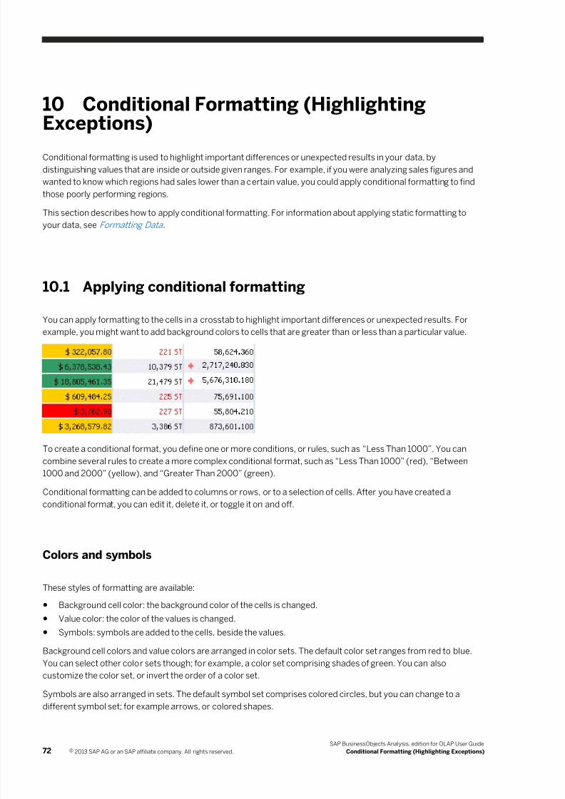
7/28/2019 Xi4sp5 Aa User En
http://slidepdf.com/reader/full/xi4sp5-aa-user-en 72/172
10 Conditional Formatting (HighlightingExceptions)
Conditional formatting is used to highlight important differences or unexpected results in your data, by
distinguishing values that are inside or outside given ranges. For example, if you were analyzing sales figures and
wanted to know which regions had sales lower than a certain value, you could apply conditional formatting to find
those poorly performing regions.
This section describes how to apply conditional formatting. For information about applying static formatting to
your data, see Formatting Data .
10.1 Applying conditional formatting
You can apply formatting to the cells in a crosstab to highlight important differences or unexpected results. For
example, you might want to add background colors to cells that are greater than or less than a particular value.
To create a conditional format, you define one or more conditions, or rules, such as “Less Than 1000”. You can
combine several rules to create a more complex conditional format, such as “Less Than 1000” (red), “Between
1000 and 2000” (yellow), and “Greater Than 2000” (green).
Conditional formatting can be added to columns or rows, or to a selection of cells. After you have created a
conditional format, you can edit it, delete it, or toggle it on and off.
Colors and symbols
These styles of formatting are available:
● Background cell color: the background color of the cells is changed.
● Value color: the color of the values is changed.
● Symbols: symbols are added to the cells, beside the values.
Background cell colors and value colors are arranged in color sets. The default color set ranges from red to blue.
You can select other color sets though; for example, a color set comprising shades of green. You can also
customize the color set, or invert the order of a color set.
Symbols are also arranged in sets. The default symbol set comprises colored circles, but you can change to a
different symbol set; for example arrows, or colored shapes.
72 © 2013 SAP AG or an SAP affiliate company. All rights reserved.
SAP BusinessObjects Analysis, edition for OLAP User Guide
Conditional Formatting (Highlighting Exceptions)
7/28/2019 Xi4sp5 Aa User En
http://slidepdf.com/reader/full/xi4sp5-aa-user-en 73/172
Rule priority
If you apply multiple conditional formats to the same cells, or if you apply multiple rules to the same values withinone conditional format, the priority levels assigned to the rules determine which conditional formatting is
displayed. For example, you can apply these rules within one conditional format:
● Between 500 and 2500
● Greater Than 2000
If a cell contains the value 2200, then both rules apply, but the rule with the higher priority controls how the cell is
displayed.
If two conditional formats are applied to the same cells, and both conditional formats contain rules with the same
priority, then the conditional format that was added first takes precedence.
“Outside” and “Between” operators
If you use the “Outside” or “Between” operators, the conditional format includes the threshold values that you
specify. For example, if you create the rule “Between 1000 and 2000”, the conditional formatting is applied to the
values 1000 and 2000, and all values in between. If you create the rule “Outside 1000 and 2000”, the conditional
formatting is applied to all values less than or equal to 1000, and all values greater than or equal to 2000.
Toggling conditional formats
You can define a conditional format, then disable it without deleting it, and re-enable it at a later date. For
example, in fiscal quarter 1, you might define a conditional format to find unusual data, and then disable the
format when you no longer need that data highlighted. In fiscal quarter 2, you could enable the conditional format
again because the data in the cube has changed, and you want to apply the same conditional formatting to the
new data.
Inactive conditional formats
If you apply a conditional format, and later change the analysis in such a way that the condition rules become
invalid, the conditional format is deactivated. If the analysis is subsequently changed so that the condition rules
become valid again, the conditional format is reactivated.
10.1.1 To apply conditional formatting
1. Select the members in the crosstab that you want to apply conditional formatting to.
You can select a row or column, or a group of cells.
SAP BusinessObjects Analysis, edition for OLAP User Guide
Conditional Formatting (Highlighting Exceptions) © 2013 SAP AG or an SAP affiliate company. All rights reserved. 73
7/28/2019 Xi4sp5 Aa User En
http://slidepdf.com/reader/full/xi4sp5-aa-user-en 74/172
2. On the toolbar, select Analyze, and then click Conditional Formatting.
Alternatively, you can right-click the selected cells and choose Conditional Formatting New .
3. On the Conditional Formatting panel, type a name for the conditional format.
Specifying a unique name, instead of accepting the default name, helps you to identify the conditional formats
in a list, if you add several formats to an analysis.
4. In the Based on field, select a measure.
The conditions are evaluated using the measure you select. In step 1, if you selected cells belonging to a
measure, the Based on field is already populated, but you can select any other measure in the analysis.
5. Choose a style from the Format field.
6. Select the settings for your first condition rule.
○ Click the Priority button to choose a priority and color for this rule. If you apply multiple conditional
formats to the same cells, or define multiple overlapping rules within a conditional format, select priority
levels for the rules so that you achieve the desired results. Priority level 1 is the highest priority. You can
use the default color set, or invert the color set, or click Edit to choose custom colors for the priority
levels.
○ Choose an operator and enter a threshold value. The Outside and Between operators require two values.
7. Click Add to add the rule to the conditional format.
To see the formatting applied to the selected cells, select the Preview check box. You can clear all formatting
rules by clicking Reset.
8. Repeat the preceding steps if you want to add more rules to the conditional format, and click OK when
finished.
10.2 Editing conditional formatting
After you create a conditional format, you may want to change some of its settings. You can edit a conditional
format by deleting individual rules and adding new ones.
Related Links
Removing conditional formatting [page 75]
10.2.1 To edit conditional formatting
1. Click the arrow beside the Conditional Formatting button, point to the conditional format that you want to edit,
and click Edit.
2. On the Conditional Formatting panel, add new rules, and delete any rules that you no longer want to include in
the conditional format.
74 © 2013 SAP AG or an SAP affiliate company. All rights reserved.
SAP BusinessObjects Analysis, edition for OLAP User Guide
Conditional Formatting (Highlighting Exceptions)
7/28/2019 Xi4sp5 Aa User En
http://slidepdf.com/reader/full/xi4sp5-aa-user-en 75/172
10.3 Removing conditional formatting
You can remove conditional formatting to restore your original view of the data. You can also temporarily disable
conditional formats if you need to reuse them in the future.
10.3.1 To remove conditional formatting
1. Click the arrow beside the Conditional Formatting button.
2. Point to the conditional format that you want to remove, and click Delete.
10.3.2 To toggle conditional formatting
1. Click the arrow beside the Conditional Formatting button.
2. Click the conditional format that you want to toggle on or off.
SAP BusinessObjects Analysis, edition for OLAP User Guide
Conditional Formatting (Highlighting Exceptions) © 2013 SAP AG or an SAP affiliate company. All rights reserved. 75
7/28/2019 Xi4sp5 Aa User En
http://slidepdf.com/reader/full/xi4sp5-aa-user-en 76/172
11 Calculations
This section describes the calculation types available to help you analyze your data.
11.1 Overview of calculations
Crosstabs that contain raw multidimensional data are not always easy to read or understand. The data may hide
trends, which can be revealed only when new information is derived from it. Calculations provide a way to reveal
these trends.
You can add multiple calculations, to enhance your analysis further or to highlight different aspects of the data.
When you add a calculation to your analysis, the calculation is added as an additional member. The calculation
also behaves like a member; for example, you can filter or apply conditional formatting to all types of calculated
members, except for dynamic calculations.
The following calculation types are available:
Simple calculations
Simple calculations are calculations involving two or more members and one of the basic arithmetical or
percentage operators. Simple calculations can involve just two members and an operator; for example <Product
Price - Product Cost> , but you can also add multiple members; for example <Price * Sales Tax *
Quantity> . If you select more than two members or measures, only the addition and multiplication calculations
are enabled.
For subtraction, division, and percentage calculations, the calculation is defined in the order in which you select
the members. That is, if you click the <Food> member first, and then the <Drink> member, the resulting
subtraction calculation would be <Food - Drink> .
If you want to create more complex arithmetic calculations, create a custom calculation instead.
You can access these simple calculations quickly from the Calculations toolbar button, without using theCalculation panel.
Custom calculations
Custom calculations are calculations that you define, by creating formulas in the Calculation panel. Custom
calculations can be as simple as an addition of two members, or can be a complex combination of functions and
members. For example, you could create this custom calculation:
TRUNC(ABS("Member1") + ABS("Member2"))
76 © 2013 SAP AG or an SAP affiliate company. All rights reserved.
SAP BusinessObjects Analysis, edition for OLAP User Guide
Calculations
7/28/2019 Xi4sp5 Aa User En
http://slidepdf.com/reader/full/xi4sp5-aa-user-en 77/172
You can compose a custom calculation by typing a formula into the Calculation panel, or by selecting members
and functions from lists.
Dynamic calculations
Dynamic calculations are a special type of calculation that recalculates when the data changes in its associated
members. For example, if you add a Rank Number calculation, members are assigned a numerical rank. If you
then remove the member ranked 3rd, the member that was previously ranked 4th is now ranked 3rd.
Unlike the other calculation types, dynamic calculations cannot be used as operands in other calculations and
cannot have filters applied to them.
NoteDynamic calculations can be initially applied only to visible measures on an axis. However, removing the
measure from the axis does not remove the dynamic calculation.
Related Links
Creating calculations [page 77]
Calculation descriptions [page 80]
Totals, Parents, and Aggregations [page 85]
11.2 Creating calculations
There are several ways to create a calculation:
● You can click the Calculations button on the toolbar to create a custom calculation with the Calculation panel.
● You can click the arrow beside the Calculations button to access simple arithmetic calculations, dynamic
calculations, and the Calculation panel.
● You can right-click a member on the crosstab to access dynamic calculations and the Calculation panel.
NoteDynamic calculations are available only when you right-click a measure.
Note
When working with SAP BW data sources, calculations can be applied only to measure dimensions and to
dimensions that are defined in a characteristic structure.
Related Links
Calculation descriptions [page 80]
Understanding aggregations [page 85]
Totals, Parents, and Aggregations [page 85]
SAP BusinessObjects Analysis, edition for OLAP User Guide
Calculations © 2013 SAP AG or an SAP affiliate company. All rights reserved. 77
7/28/2019 Xi4sp5 Aa User En
http://slidepdf.com/reader/full/xi4sp5-aa-user-en 78/172
11.2.1 To add a simple calculation
1. Select two or more members on the crosstab.
For subtraction, division, and percentage calculations, the calculation is defined in the order in which you
select the members. That is, if you click the <Food> member first, and then the <Drink> member, the
resulting subtraction calculation would be <Food - Drink> .
Note
With SAP BW data, calculations are based on measures, so you will need to select two or more measures.
Note
If you select more than two members or measures, only the addition and multiplication calculations are
enabled.
2. On the toolbar, select Analyze, and then click the arrow beside the Calculations button.
3. Select one of the operators from the list.
The calculation is added as a new column or row member to the right of or beneath the selected members. A
default name is applied, but you can change the name in the Properties panel.
11.2.2 To add a custom calculation
1. On the toolbar, select Analyze and then click Calculations to open the Calculation panel.
2. In the Name field, type a name for your custom calculation.
3. From the Based on list, select the hierarchy or dimension to apply the calculation to.
Note
With SAP BW data, you can apply calculations only to measure dimensions.
4. Click the Member Selector icon beside the Place After field, and choose where you want the calculated
member to be added.
If you selected member headers prior to opening the Calculation panel, this field is already populated.
5. Enter your calculation formula.
○ To insert a function, click Function.
○ To insert members, click Add Member.
If you are familiar with the required syntax, you can also manually type in your calculation formula, or adjust a
formula that you created using the Function and Add Member buttons.
As you create your formula, you can check for errors by clicking Validate.
6. When finished, click OK.
The formula is validated, and if error-free, the calculation is added to the crosstab. If the validation fails, the
calculation is not added to the crosstab. A default name is applied, but you can change the name in the
Properties panel.
78 © 2013 SAP AG or an SAP affiliate company. All rights reserved.
SAP BusinessObjects Analysis, edition for OLAP User Guide
Calculations
7/28/2019 Xi4sp5 Aa User En
http://slidepdf.com/reader/full/xi4sp5-aa-user-en 79/172
11.2.3 To add a dynamic calculation
1. Select a measure on the crosstab.2. On the toolbar, select Analyze, click the arrow beside the Calculations button, and then point to Dynamic
Calculation.
3. Select one of the dynamic calculations from the list.
The calculation is added as a new column or row member to the right of or beneath the selected measure. A
default name is applied, but you can change the name in the Properties panel.
11.2.4 To edit a calculation
1. On the toolbar, select Analyze, and then click the arrow beside the Calculations button.
2. From the menu, choose the calculation that you want to edit, and then click Edit.
Alternatively, you can click the Calculation icon in the header of the calculated member.
3. In the Calculation panel, make changes to the calculation.
Note
For dynamic calculations, you can edit only the Name, Based on, and Place After fields.
11.2.5 To delete a calculation
1. On the toolbar, select Analyze, and then click the arrow beside the Calculations button.
2. From the menu, choose the calculation that you want to edit, and then click Delete.
Alternatively, you can right-click the Calculation icon in the header of the calculated member, and select
Delete calculation.
11.3 Calculations with sorts
When you add a calculation, you can specify whether the calculation is to be placed after a particular member. If
you add a calculation to a set of sorted members, one of two behaviors is possible:
● If you add the calculation by right-clicking a member, or by clicking the Calculations button on the toolbar with
a member already selected in the crosstab, then the Place After field in the Calculation panel is automatically
populated with the name of the selected member. The calculation is added to the crosstab immediately
following the selected member, and the sort is removed.
● If you add the calculation by clicking the Calculations button on the toolbar, without selecting a member first,
then the Place After field in the Calculation panel is empty. The calculation is added to the crosstab, and is
sorted along with the other members.
SAP BusinessObjects Analysis, edition for OLAP User Guide
Calculations © 2013 SAP AG or an SAP affiliate company. All rights reserved. 79
7/28/2019 Xi4sp5 Aa User En
http://slidepdf.com/reader/full/xi4sp5-aa-user-en 80/172
Note
When working with SAP BW data sources, calculations can be applied only to measure dimensions and to
dimensions that are defined in a characteristic structure. You cannot sort across measure dimensions becausemeasures can be different quantities specified in different units, such as dollars and percentages.
11.4 Calculation descriptions
The following calculations are available:
Simple calculations
Simple calculations Description
Add Adds the values in two or more rows or columns.
Subtract Subtracts the values in one row or column from the values in another row or column.
Multiply Multiplies the values in two or more rows or columns.
Divide Divides the values in one row or column by the values in another row or column.
Percentage Difference
(same as the custom
calculation function
PERCENT)
Returns the percentage deviation of operand1 from operand2. If operand1 is less
than operand2, then the result is negative.
Examples:
● 1 % 2 is -50% (1 is 50% less than 2)
● 2 % 1 is 100% (2 is 100% more than 1)
● 3 % 1 is 200% (3 is 200% more than 1)
Percentage Share
(same as the custom
calculation function
PERCENT_A)
Returns the percentage of operand1 to operand2.
Examples:
● 1 %_A 2 is 50% (1 is 50% of 2)● 2 %_A 1 is 200% (2 is 200% of 1)
● 3 %_A 1 is 300% (3 is 300% of 1)
Dynamic calculations
Dynamic calculations Description
Moving Minimum Value Returns the current minimum value, within a hierarchy level, compared
to the previous values.
80 © 2013 SAP AG or an SAP affiliate company. All rights reserved.
SAP BusinessObjects Analysis, edition for OLAP User Guide
Calculations
7/28/2019 Xi4sp5 Aa User En
http://slidepdf.com/reader/full/xi4sp5-aa-user-en 81/172
Dynamic calculations Description
Moving Maximum Value Returns the current maximum value, within a hierarchy level,
compared to the previous values.
Accumulative Sum Returns the accumulative sum, within a hierarchy level, of all the
previous values. This is based on the server-formatted value.
Accumulative Sum of Rounded Values Returns the accumulative sum, within a hierarchy level, of all the
previous values. This is based on the displayed value.
Accumulative Count of All Detailed
Values
Returns the accumulative count, within a hierarchy, of all previous
values.
Accumulative Count of All Detailed
Values that are Not Zero, Null, or Error
Returns the accumulative count, within a hierarchy, of all previous
values that are not 0, null, or error values.
Moving Average Returns the moving average, within a hierarchy, of the previous values.
Moving Average of All Detailed Values
that are Not Zero, Null, or Error
Returns the moving average, within a hierarchy, of the previous values
that are not 0, null, or error values.
Rank Number Returns the rank order for each value, with the largest value having a
rank of 1. Items with the same value will have the same rank.
Olympic Rank Number Returns the rank order for each value, with the largest value having a
rank of 1. Items with the same value will have the same rank, but the
rank of the following item will assume the previous values were
different. For example, 100 = Rank 1, 90 = Rank 2, 90 = Rank 2, 80 =
Rank 4.
Percentage Contribution to Parent Returns the percentage contribution of each value to its parent value.
Percentage Contribution to Overall
Result
Returns the percentage contribution of each value to the overall result
value.
Custom calculation functions
Percentage
calculations
Syntax Description
PERCENT
(same as the
simple calculation
Percentage
Difference)
"operand1" %
"operand2"Returns the percentage deviation of operand1 from operand2. If
operand1 is less than operand2, then the result is negative.
Examples:
● 1 % 2 is -50% (1 is 50% less than 2)
● 2 % 1 is 100% (2 is 100% more than 1)
● 3 % 1 is 200% (3 is 200% more than 1)
PERCENT_A
(same as the
simple calculation
"operand1" %_A
"operand2"Returns the percentage of operand1 to operand2.
Examples:
SAP BusinessObjects Analysis, edition for OLAP User Guide
Calculations © 2013 SAP AG or an SAP affiliate company. All rights reserved. 81
7/28/2019 Xi4sp5 Aa User En
http://slidepdf.com/reader/full/xi4sp5-aa-user-en 82/172
Percentage
calculations
Syntax Description
Percentage
Share)
● 1 %_A 2 is 50% (1 is 50% of 2)
● 2 %_A 1 is 200% (2 is 200% of 1)
● 3 %_A 1 is 300% (3 is 300% of 1)
Data
calculations
Syntax Description
NODIM NODIM(<expression>) Returns purely numerical values for <expression>, and
suppresses units and currencies.
DATE DATE("operand1") The value is seen as the number of days from 01.01.0000
onwards, and is output as a date. The value can be between 0
and one million, which results in a date between 01.01.0000
and 27.11.2738.
TIME TIME("operand1") The TIME operator takes any measure and creates a measure
of type TIME. This function is designed for offset calculations.
For example, if you have time measures and want to deduct 4
hours, you can use the TIME operator.
NOERR NOERR(<expression>) Returns 0 if the calculation of <expression> leads to an
arithmetical error. Otherwise, the result is the value of the
expression. This is used to avoid error messages so that you
can continue to calculate with a defined result.
NDIV0 NDIV0(<expression>) Returns 0 if the calculation of <expression> causes a division
by 0. Otherwise, the result is the value of the expression. This is
used to avoid error messages so that you can continue to
calculate with a defined result.
Mathematical
calculations
Syntax Description
SUMMATION "operand1" +
"operand2"
Sum the values of operand1 and operand2.
DIVISION "operand1" /
"operand2"
Divide the value of operand1 by the value of operand2.
MULTIPLICATION "operand1" *
"operand2"
Multiply the value of operand1 with the value of operand2.
SUBTRACTION "operand1" -
"operand2"
Subtract the value of operand2 from the value of operand1.
EXP EXP("operand1") Exponential function. It equates to e ** operand1, where e =
2.7182818284590452.
LOG LOG("operand1") Natural logarithm is the logarithm to the base e, where e =
2.7182818284590452. LOG is the inverse of EXP.
MOD "operand1" MOD
"operand2"
Returns the remainder of the division of operand1 by
operand2.
82 © 2013 SAP AG or an SAP affiliate company. All rights reserved.
SAP BusinessObjects Analysis, edition for OLAP User Guide
Calculations
7/28/2019 Xi4sp5 Aa User En
http://slidepdf.com/reader/full/xi4sp5-aa-user-en 83/172
Mathematical
calculations
Syntax Description
SQRT SQRT("operand1") Returns the square root of operand1.
LOG10 LOG10("operand1") Returns the logarithm, to base 10, of operand1.
ABS ABS("operand1") Returns the absolute numerical value of operand1 without
regard to its sign. For example ABS(-1) will return 1 and
ABS(1) will also return 1.
CEIL CEIL("operand1") Returns the smallest whole value that is not smaller than
operand1. For example CEIL(-2.7) will return -2, but CEIL(2.7)
will return 3.
DIV DIV("operand1",
"operand2")
Returns the whole number of operand1 divided by operand2
and ignores the remainder.
FLOOR FLOOR("operand1") Returns the largest whole value that is not larger than
operand1. For example FLOOR(-2.7) will return -3, but
FLOOR(2.7) will return 2.
FRAC FRAC("operand1") Returns the decimal part of operand1. For example FRAC(2.7)
will return 0.7.
MAX MAX("operand1",
"operand2")
Compares operand1 and operand2 and returns the maximum
value.
MAX0 MAX0("operand1") Returns the maximum of 0 and operand1. This means all
negative values will be treated as 0.
MIN MIN("operand1","operand2")
Compares operand1 and operand2 and returns the minimumvalue.
MIN0 MIN0("operand1") Returns the minimum of 0 and operand1. This means all
positive values will be treated as 0.
TRUNC TRUNC("operand1") Returns the whole number part of operand1. For example
TRUNC(2.7) will return 2.
POWER "operand1" **
"operand2"
Raise operand1 to the power of operand2.
Other
calculations
Syntax Description
SIN SIN("operand1") Returns the sine of an angle, represented by operand1,
specified in radians.
COS COS("operand1") Returns the cosine of an angle, represented by operand1,
specified in radians.
TAN TAN("operand1") Returns the tangent of an angle, represented by operand1,
specified in radians.
ASIN ASIN("operand1") Returns the arcsine of operand1 (between -pi/2 and pi/2),
when the value of operand1 is between -1, and 1.
SAP BusinessObjects Analysis, edition for OLAP User Guide
Calculations © 2013 SAP AG or an SAP affiliate company. All rights reserved. 83
7/28/2019 Xi4sp5 Aa User En
http://slidepdf.com/reader/full/xi4sp5-aa-user-en 84/172
Other
calculations
Syntax Description
ACOS ACOS("operand1") Returns the arccosine of operand1 (between 0 and pi), when
the value of operand1 is between -1, and 1.
ATAN ATAN("operand1") Returns the arctangent of operand1 (between -pi/2 and pi/2).
SINH SINH("operand1") Returns the hyperbolic sine of an angle, represented by
operand1, specified in radians.
COSH COSH("operand1") Returns the hyperbolic cosine of an angle, represented by
operand1, specified in radians.
TANH TANH("operand1") Returns the hyperbolic tangent of an angle, represented by
operand1, specified in radians.
AND <expression1> AND
<expression2>
Returns 1 if both <expression1> and <expression2> do not
equal 0. Otherwise the result is 0. Only the numerical values of
<expression1> and <expression2> are considered, without
taking units into account.
OR <expression1> OR
<expression2>
Returns 1 if either <expression1> or <expression2> does not
equal 0. Otherwise the result is 0. Only the numerical values of
<expression1> and <expression2> are considered, without
taking units into account.
XOR <expression1> XOR
<expression2>
Returns 1 if either <expression1> or <expression2> (but not
both) does not equal 0. Otherwise the result is 0. Only the
numerical values of <expression1> and <expression2> are
considered, without taking units into account.
NOT NOT(<expression>) Returns 1 if <expression> is 0, otherwise the result is 0. Only
the numerical value of <expression> is considered, without
taking units into account.
84 © 2013 SAP AG or an SAP affiliate company. All rights reserved.
SAP BusinessObjects Analysis, edition for OLAP User Guide
Calculations
7/28/2019 Xi4sp5 Aa User En
http://slidepdf.com/reader/full/xi4sp5-aa-user-en 85/172
12 Totals, Parents, and Aggregations
You can toggle the display of grand totals and subtotals in rows and columns of a crosstab based on SAP BW
data. Subtotals are aggregations of member values within an inner hierarchy, while grand totals are
aggregations of member values of the outermost hierarchy. The default aggregation type is Sum, but you can
change the aggregation type; for example, to Minimum or Average.
Subtotals and grand totals are added as additional rows or columns in the crosstab, named “Result” and “Overall
Result”, respectively.
Parent members also display aggregated values. For example, the value of the parent member Europe could be
the sum of the values of its child members France, Germany, and Italy. Parent members can also display
aggregation types other than sums, however.
Parent members are normally displayed above or to the left of child members, and totals below or to the right of
child members. Thus, the parent member Europe would be shown above child members France, Germany, and
Italy. You can change the positions of totals and parents though.
For example, if you are analyzing sales figures for European countries, and if the Europe member represents the
sum of the country members France, Germany, and Italy, you may want the Europe member to be displayed
below the country members.
You can also choose to show parents and totals differently on the columns and rows.
12.1 Understanding aggregations
Aggregations are summaries of members. In a hierarchy, parent member values represent summaries of child
member values. For example, if you have a parent member <Africa> , and three child members <Egypt> ,
<Morocco> , and <South Africa> , the value of the <Africa> member represents a summary of the values of
the child members <Egypt> , <Morocco> , and <South Africa> . Often, the parent member value is the sum of
the child member values. However, the parent member value can be a different summary, such as the average of
the child member values, or the count of the number of child members. These summary values are called
aggregations.
With flat lists, there are no parent members. Therefore, to display an aggregation, you would turn on the display oftotals. When you set the aggregation type for a measure, the selected type is applied to both totals and parent
members, if there are parent members in the hierarchy.
Each measure member can have one aggregation; if there are multiple measures in the analysis, each member
can have a different aggregation. For example, you can choose a Sum aggregation for quantity measures, an
Average aggregation for percentage measures, and a Minimum or Maximum aggregation for cost measures.
The following aggregations are supported:
Aggregation Description
Default The aggregation value is set to the default aggregation
defined on the query.
SAP BusinessObjects Analysis, edition for OLAP User Guide
Totals, Parents, and Aggregations © 2013 SAP AG or an SAP affiliate company. All rights reserved. 85
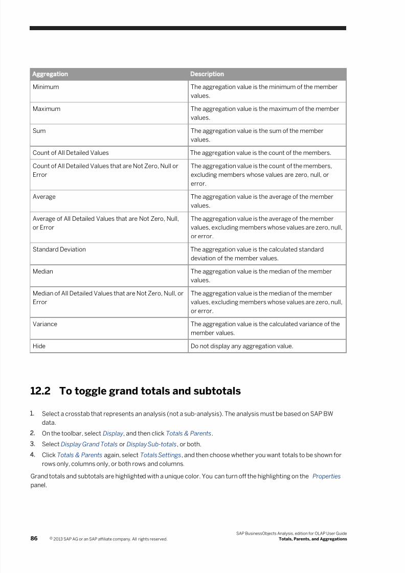
7/28/2019 Xi4sp5 Aa User En
http://slidepdf.com/reader/full/xi4sp5-aa-user-en 86/172
Aggregation Description
Minimum The aggregation value is the minimum of the member
values.
Maximum The aggregation value is the maximum of the member
values.
Sum The aggregation value is the sum of the member
values.
Count of All Detailed Values The aggregation value is the count of the members.
Count of All Detailed Values that are Not Zero, Null or
Error
The aggregation value is the count of the members,
excluding members whose values are zero, null, or
error.
Average The aggregation value is the average of the member
values.
Average of All Detailed Values that are Not Zero, Null,
or Error
The aggregation value is the average of the member
values, excluding members whose values are zero, null,
or error.
Standard Deviation The aggregation value is the calculated standard
deviation of the member values.
Median The aggregation value is the median of the member
values.
Median of All Detailed Values that are Not Zero, Null, or
Error
The aggregation value is the median of the member
values, excluding members whose values are zero, null,or error.
Variance The aggregation value is the calculated variance of the
member values.
Hide Do not display any aggregation value.
12.2 To toggle grand totals and subtotals
1. Select a crosstab that represents an analysis (not a sub-analysis). The analysis must be based on SAP BW
data.
2. On the toolbar, select Display, and then click Totals & Parents.
3. Select Display Grand Totals or Display Sub-totals, or both.
4. Click Totals & Parents again, select Totals Settings, and then choose whether you want totals to be shown for
rows only, columns only, or both rows and columns.
Grand totals and subtotals are highlighted with a unique color. You can turn off the highlighting on the Properties
panel.
86 © 2013 SAP AG or an SAP affiliate company. All rights reserved.
SAP BusinessObjects Analysis, edition for OLAP User Guide
Totals, Parents, and Aggregations
7/28/2019 Xi4sp5 Aa User En
http://slidepdf.com/reader/full/xi4sp5-aa-user-en 87/172
12.3 To set the positions of totals and parents
You can set the positions of totals and parents independently.
1. Select a crosstab that represents an analysis (not a sub-analysis).
2. On the toolbar, select Display, and then click Totals & Parents.
3. Select Totals Settings or Parent Settings, and then choose After or Before.
12.4 To change the aggregation type
1. Right-click a measure member header.
2. Click Totals & Sub-totals Calculate Totals As , and select an aggregation type.
Note
The aggregation type is applied to both totals and parent members.
Note
If you are working with a flat list hierarchy (and therefore, there are no parent members), and if totals are
not turned on, you cannot change the aggregation type, because aggregations are shown in parent
members and totals.
Note
To see the aggregation type applied to a measure, right-click the measure member header, and click
Totals & Sub-totals Calculate Totals As . The selected aggregation type is shown in the list.
Note
In this release of Analysis, changing the aggregation type is not supported for analyses based on an SAP
HANA data source. If your analysis includes a calculated member, only the default aggregation type can be
displayed.
SAP BusinessObjects Analysis, edition for OLAP User Guide
Totals, Parents, and Aggregations © 2013 SAP AG or an SAP affiliate company. All rights reserved. 87
7/28/2019 Xi4sp5 Aa User En
http://slidepdf.com/reader/full/xi4sp5-aa-user-en 88/172
7/28/2019 Xi4sp5 Aa User En
http://slidepdf.com/reader/full/xi4sp5-aa-user-en 89/172
13.1.2 To collapse a parent member in a crosstab
Click the minus sign next to the member name.
13.1.3 To expand a parent member in a chart
1. Right-click a member in the chart.
Note
Expanding and collapsing members in a chart is possible only if the chart represents an analysis, and not asub-analysis.
Depending on the type of chart, the member could be represented by a marker such as a pie slice or column
chart riser, or by a name in the chart legend, or by a caption.
2. Select Expand to display the child members.
13.1.4 To collapse a parent member in a chart
1. Right-click a member in the chart.
Note
Expanding and collapsing members in a chart is possible only if the chart represents an analysis, and not a
sub-analysis.
Depending on the type of chart, the member could be represented by a marker such as a pie slice or column
chart riser, or by a name in the chart legend, or by a caption.
2. Select Collapse to display the parent member.
13.2 Swapping hierarchies
You can swap hierarchies with others to reorient the data in the crosstab or chart.
You can swap a row or column hierarchy with one of the background filter hierarchies, or with another row or
column hierarchy.
You can also swap all rows with all columns, both in an analysis and in a sub-analysis.
SAP BusinessObjects Analysis, edition for OLAP User Guide
Exploring Your Analysis © 2013 SAP AG or an SAP affiliate company. All rights reserved. 89
7/28/2019 Xi4sp5 Aa User En
http://slidepdf.com/reader/full/xi4sp5-aa-user-en 90/172
13.2.1 To swap two hierarchies
1. Drag a hierarchy toward the hierarchy that you want to swap it with.2. When the existing hierarchy is highlighted, release the mouse button to swap the two hierarchies.
13.2.2 To swap all rows with all columns
1. Select a crosstab that represents either an analysis or a sub-analysis.
2. On the toolbar, select Display, and then click Swap Axes.
13.2.3 Swapping hierarchies containing sorts and filters
When you swap hierarchies, or add a new hierarchy to a row or column axis, all existing sorts and filters are
removed from the analysis. However, if you swap the positions of the row and column hierarchies using the Swap
Axes button, the sorts and filters are preserved.
Related Links
Sorting [page 68]
Filtering by measure [page 53]
13.3 Pivoting hierarchies
You can pivot hierarchies, to move an item of interest to the background filter and bring another hierarchy into the
crosstab. Pivoting is useful when you want to quickly explore another aspect of your data in detail.
Example
To analyze the performance of your supermarket chain, you define an analysis showing products and a few
measures; for example, Margin and Revenue. You see that the total revenue for Peaches is lower than
expected, so you decide to investigate the revenue for Peaches over time, by pivoting Peaches with the Time
hierarchy. The Products hierarchy moves to the background filter with the Peaches member selected, and the
Time hierarchy moves to the crosstab. Now the crosstab shows the history of revenue for Peaches only, so you
can determine when the revenue falls below expectations.
13.3.1 To pivot hierarchies
1. On the crosstab, right-click a member, and point to Pivot With.
90 © 2013 SAP AG or an SAP affiliate company. All rights reserved.
SAP BusinessObjects Analysis, edition for OLAP User Guide
Exploring Your Analysis
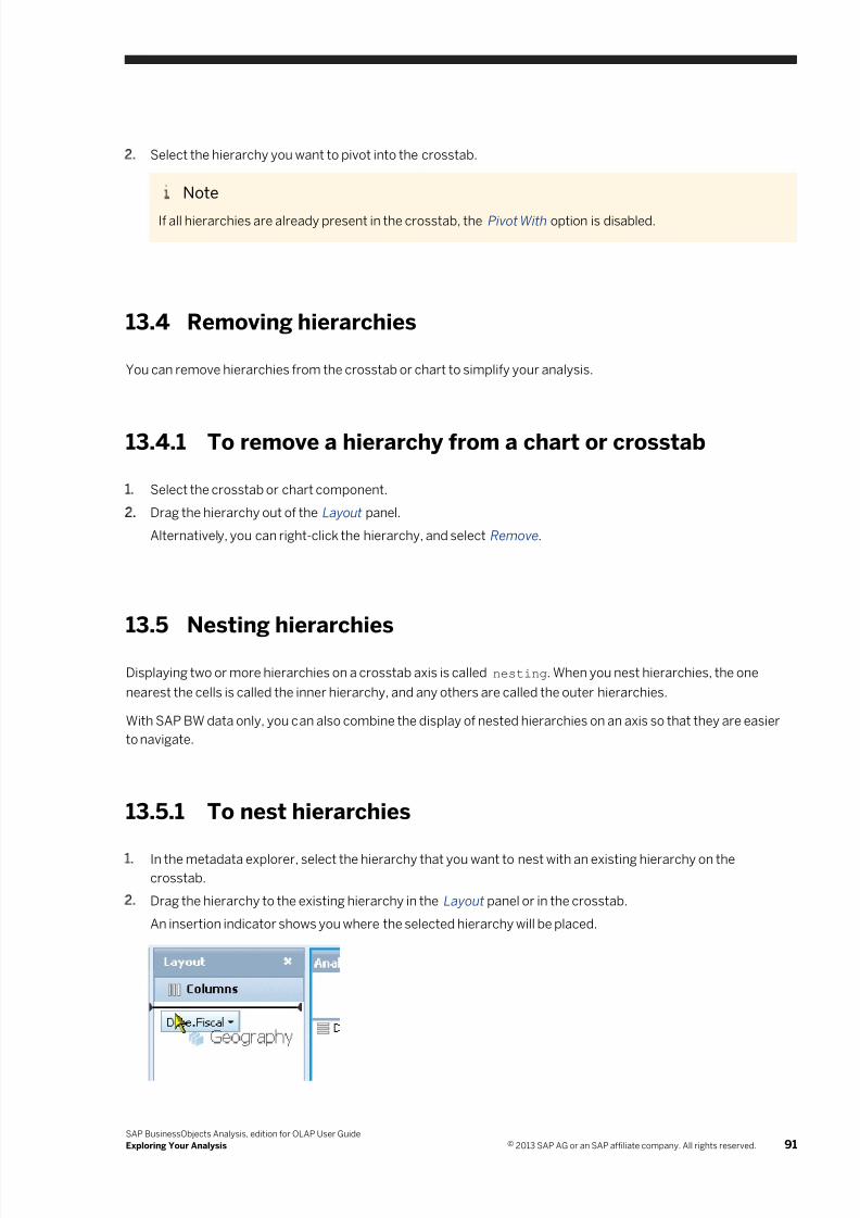
7/28/2019 Xi4sp5 Aa User En
http://slidepdf.com/reader/full/xi4sp5-aa-user-en 91/172
2. Select the hierarchy you want to pivot into the crosstab.
Note
If all hierarchies are already present in the crosstab, the Pivot With option is disabled.
13.4 Removing hierarchies
You can remove hierarchies from the crosstab or chart to simplify your analysis.
13.4.1 To remove a hierarchy from a chart or crosstab
1. Select the crosstab or chart component.
2. Drag the hierarchy out of the Layout panel.
Alternatively, you can right-click the hierarchy, and select Remove.
13.5 Nesting hierarchies
Displaying two or more hierarchies on a crosstab axis is called nesting. When you nest hierarchies, the one
nearest the cells is called the inner hierarchy, and any others are called the outer hierarchies.
With SAP BW data only, you can also combine the display of nested hierarchies on an axis so that they are easier
to navigate.
13.5.1 To nest hierarchies
1. In the metadata explorer, select the hierarchy that you want to nest with an existing hierarchy on the
crosstab.
2. Drag the hierarchy to the existing hierarchy in the Layout panel or in the crosstab.
An insertion indicator shows you where the selected hierarchy will be placed.
SAP BusinessObjects Analysis, edition for OLAP User Guide
Exploring Your Analysis © 2013 SAP AG or an SAP affiliate company. All rights reserved. 91
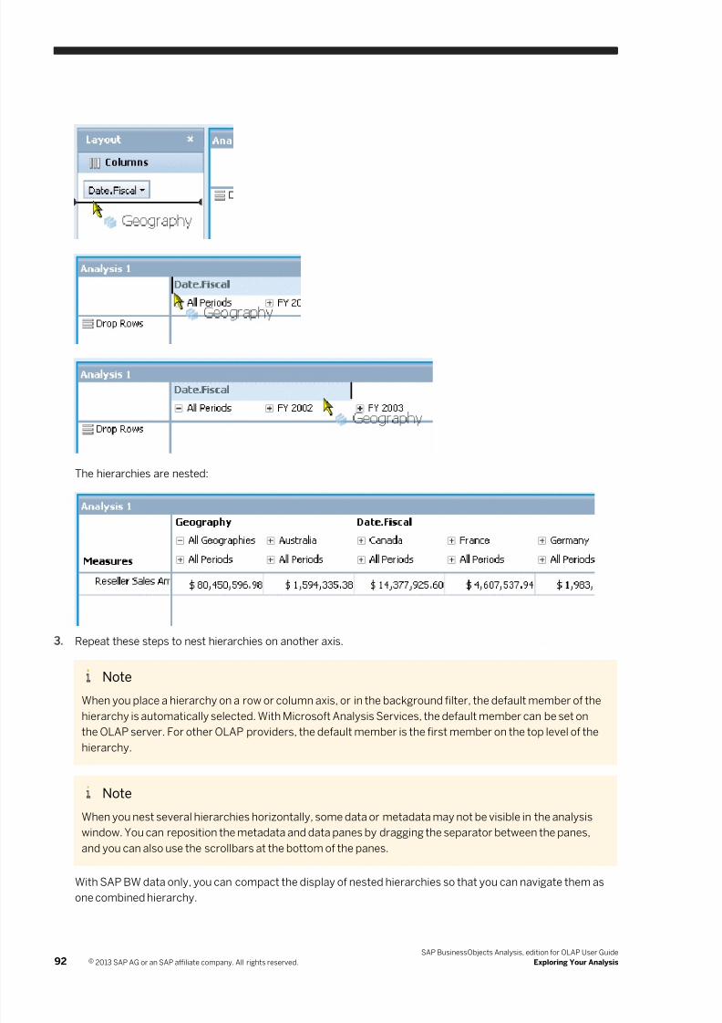
7/28/2019 Xi4sp5 Aa User En
http://slidepdf.com/reader/full/xi4sp5-aa-user-en 92/172
The hierarchies are nested:
3. Repeat these steps to nest hierarchies on another axis.
Note
When you place a hierarchy on a row or column axis, or in the background filter, the default member of the
hierarchy is automatically selected. With Microsoft Analysis Services, the default member can be set onthe OLAP server. For other OLAP providers, the default member is the first member on the top level of the
hierarchy.
Note
When you nest several hierarchies horizontally, some data or metadata may not be visible in the analysis
window. You can reposition the metadata and data panes by dragging the separator between the panes,
and you can also use the scrollbars at the bottom of the panes.
With SAP BW data only, you can compact the display of nested hierarchies so that you can navigate them as
one combined hierarchy.
92 © 2013 SAP AG or an SAP affiliate company. All rights reserved.
SAP BusinessObjects Analysis, edition for OLAP User Guide
Exploring Your Analysis
7/28/2019 Xi4sp5 Aa User En
http://slidepdf.com/reader/full/xi4sp5-aa-user-en 93/172
Related Links
To compact the display of nested hierarchies [page 93]
13.5.2 To compact the display of nested hierarchies
With SAP BW data only, you can compact the display of nested hierarchies.
1. On the toolbar, select Display, and then click Hierarchy.
2. Choose whether you want to compact the row axis or the column axis.
13.5.3 Changing the order of nested hierarchies
You can change the order of nested hierarchies by swapping the hierarchies.
Related Links
Swapping hierarchies [page 89]
13.6 Changing the background filter (changing the slice)
When you place dimensions or hierarchies into the background filter, the default member is automaticallyselected to filter your analysis. However, you can change the selected member if you want to filter different data.
This action is sometimes called “changing the slice”, because you are changing to a different two-dimensional
“slice” of a multi-dimensional cube.
Selecting a background filter member is done in the same way as selecting members for the row and column
hierarchies, except that you can select only one background filter member at a time. Some data sources however,
for example SAP BW and Microsoft Analysis Services, allow you to select multiple background filter members.
13.6.1 To select a background filter member
1. In the Background filter area in the Layout panel, double-click a dimension or hierarchy.
2. Select one or more members, depending on your data source provider.
3. Click OK.
13.7 Hiding hierarchy levels
When working with hierarchies, you may wish to hide hierarchy levels that are not relevant to your analysis. For
example, if you are analyzing annual sales, and your Date hierarchy contains years at the top level, quarters at the
SAP BusinessObjects Analysis, edition for OLAP User Guide
Exploring Your Analysis © 2013 SAP AG or an SAP affiliate company. All rights reserved. 93
7/28/2019 Xi4sp5 Aa User En
http://slidepdf.com/reader/full/xi4sp5-aa-user-en 94/172
second level, and months at the third level, you might want to remove the quarters level and concentrate on the
months.
13.7.1 To toggle a hierarchy level
1. In the analysis window, select the crosstab that contains the hierarchy.
2. In the Layout panel, right-click the hierarchy.
3. Click Show levels.
You can now toggle on and off the display of the levels within the hierarchy.
13.8 Reordering members
You can reorder members to help you compare data. For example, you may have a <Country> hierarchy that
comprises these members:
● Antarctica
● Canada
● France
● India
●Mexico
● Switzerland
If you wanted to compare the populations of different penguin species in Antarctica and Switzerland, you could
move Switzerland directly beside Antarctica.
Note
You can reorder members only within the same parent, but in a ragged hierarchy, the members can be at
different levels.
Note
If the moved members have child members, the child members are moved along with the parent members.
13.8.1 To reorder members
1. In the crosstab, select the members that you want to move.
2. Right-click one of the selected members, and click Reorder Members Move .
3. Right-click the member above or below the position where you want to insert the selected members, and click
Reorder Members Insert Before or Reorder Members Insert After .
94 © 2013 SAP AG or an SAP affiliate company. All rights reserved.
SAP BusinessObjects Analysis, edition for OLAP User Guide
Exploring Your Analysis
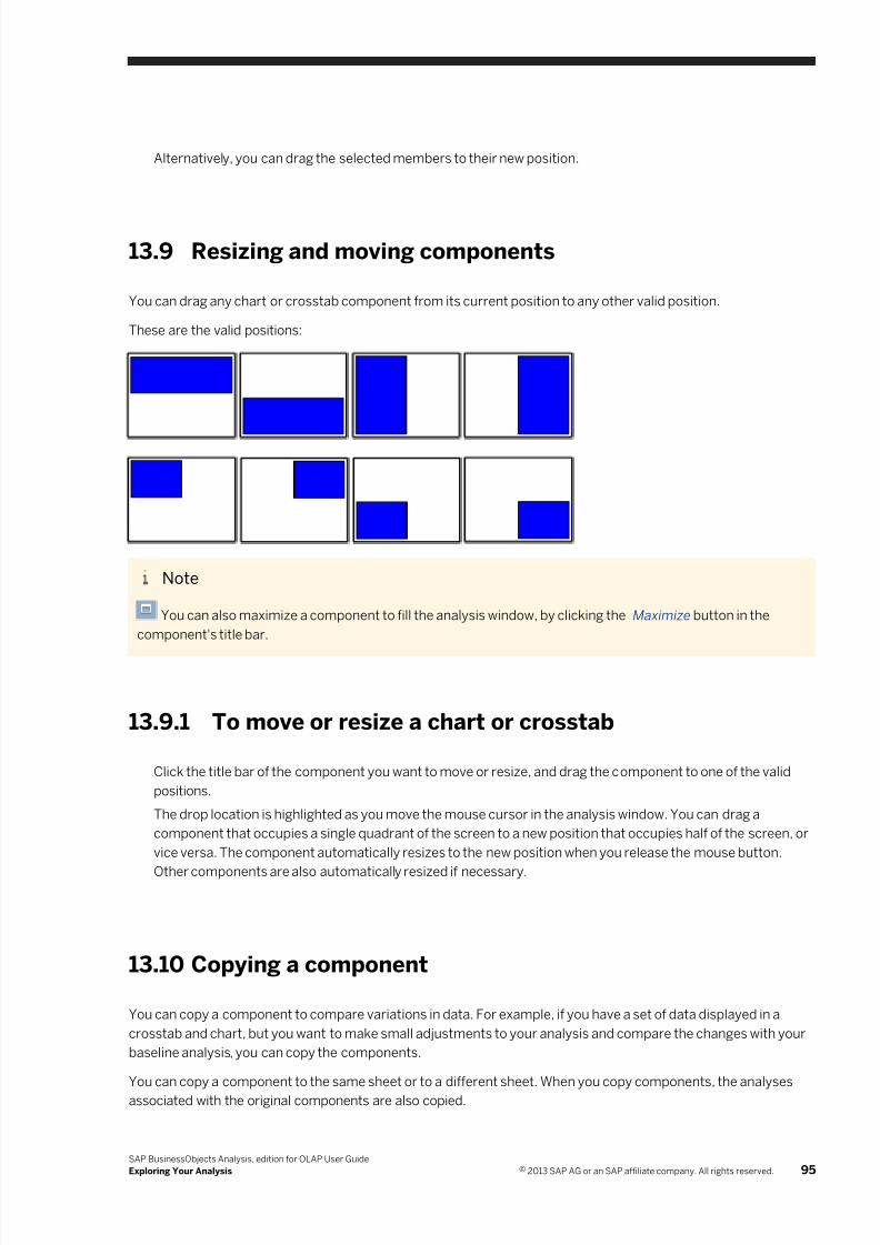
7/28/2019 Xi4sp5 Aa User En
http://slidepdf.com/reader/full/xi4sp5-aa-user-en 95/172
7/28/2019 Xi4sp5 Aa User En
http://slidepdf.com/reader/full/xi4sp5-aa-user-en 96/172
13.10.1 To copy a component
1. Click anywhere inside the component that you want to copy.
2. On the toolbar, click Copy.
Alternatively, you can press CTRL+C to copy the component.
3. On the toolbar, click Paste to paste a copy of your component onto the current sheet.
Alternatively, you can press CTRL+V to paste the component.
If you want to paste the copied component onto another sheet, change to a different sheet before you paste
the component.
The copied component is added below or to the right of existing components on the sheet.
13.11 Undo and Redo
Analysis includes multiple levels of undo. With multiple levels of undo, you can undo changes to a workspace, in
reverse order, until you have your workspace in the condition you want it.
You can also undo all of your changes in one step, to restore the original state of the workspace when you opened
it, even if you've saved the workspace after opening it.
The redo feature reverses an undo. If you move or resize a component, for example, and do not like its newposition, you can click Undo to move it back to its original position. If you then change your mind, you can click
Redo to restore the latest change. Redo does not reverse a Discard Changes action.
● To undo an action, click Undo on the toolbar.
The first time the button is clicked, it reverses the most recent change made to the workspace. Each
additional time the button is clicked, it reverses the next most recent change.
● To undo all changes and revert to the original workspace, click the Discard Changes button on the
toolbar.
● To redo a change after you have undone it, click Redo on the toolbar.
The Undo and Redo buttons are disabled whenever there is nothing to undo/redo, or when you have made achange that cannot be reversed.
Note
You can only undo or redo actions in order from the most recent backward. You cannot undo an action without
undoing more recent actions.
Note
Deleting a data source or a sheet clears the Undo/Redo history.
Related Links
96 © 2013 SAP AG or an SAP affiliate company. All rights reserved.
SAP BusinessObjects Analysis, edition for OLAP User Guide
Exploring Your Analysis

7/28/2019 Xi4sp5 Aa User En
http://slidepdf.com/reader/full/xi4sp5-aa-user-en 97/172
Undo button [page 149]
SAP BusinessObjects Analysis, edition for OLAP User Guide
Exploring Your Analysis © 2013 SAP AG or an SAP affiliate company. All rights reserved. 97
7/28/2019 Xi4sp5 Aa User En
http://slidepdf.com/reader/full/xi4sp5-aa-user-en 98/172
14 Display Attributes
Display attributes are properties of members, which provide an alternate way of categorizing the members. Forexample, attributes for a <Product> hierarchy might include color, manufacturer name, case size, and country of
origin.
Note
Display attributes are available only with SAP BW data sources.
You can add display attributes to your analysis to provide additional information about the members in the
crosstab. You can also sort by display attribute.
Example
Anne works for a film distributor, and has expanded her <Product> hierarchy to view the many films available
from her company. Anne has also added display attributes associated with that hierarchy to her view. To help
her identify the movies that would be suitable for resale by a supermarket chain, Anne applies an alphanumeric
sort on the <Movie Classification> display attribute.
Default display attributes appear in bold in the metadata explorer.
Note
If you add a display attribute to the Layout panel, but no hierarchy from its associated dimension is present in
the Layout panel, the default hierarchy for that dimension is added along with the display attribute.
Note
The first time you add a hierarchy or display attribute to the row or column axis, the default display attributes
are also added.
14.1 To add or remove display attributes
To add display attributes, drag them from the metadata explorer to the Layout panel or to the row or column
axis on the crosstab.
To remove attributes, drag them out of the Layout panel or crosstab.
Alternatively, you can right-click a hierarchy in the Layout panel or in the crosstab, point to Attributes, and
select or deselect display attributes.
Note
When you add several display attributes to the row axis, some data or metadata may not be visible in the
analysis window. You can reposition the metadata and data panes by dragging the separator between the
panes, and you can also use the scrollbars at the bottom of the panes.
98 © 2013 SAP AG or an SAP affiliate company. All rights reserved.
SAP BusinessObjects Analysis, edition for OLAP User Guide
Display Attributes
7/28/2019 Xi4sp5 Aa User En
http://slidepdf.com/reader/full/xi4sp5-aa-user-en 99/172
14.2 Filtering with display attributes
The first time you filter a hierarchy by member, the display attributes that appear in the crosstab with that
hierarchy also appear in the Filter panel. Using the Display button in the Filter panel, you can add other display
attributes to the Filter panel, or remove currently displayed attributes. These display attributes can help when
filtering members.
Note
Each subsequent time that you filter that same hierarchy by member, the previous display attribute settings in
the Filter panel are remembered.
Note
The display attributes that you add to the Filter panel are not automatically added to the crosstab. To add
display attributes to the crosstab, drag them from the metadata explorer to the crosstab.
Example
Your crosstab contains the Products hierarchy, and is also showing the “Country of Origin” display attribute
associated with that hierarchy. You open the Filter panel to filter the Products hierarchy by member, and the
“Country of Origin” display attribute also appears in the Filter panel. For your analysis, you are interested in
only those products that are colored red, so you add the “Color” display attribute to the Filter panel. Now you
can select all red members in the Filter panel.
Related Links
Filtering by member [page 58]
SAP BusinessObjects Analysis, edition for OLAP User Guide
Display Attributes © 2013 SAP AG or an SAP affiliate company. All rights reserved. 99
7/28/2019 Xi4sp5 Aa User En
http://slidepdf.com/reader/full/xi4sp5-aa-user-en 100/172
15 Formatting Data
This section describes how to change the appearance of your data by adding static formatting and by resizingrows and columns. For information about conditional formatting, see Conditional Formatting (Highlighting
Exceptions) [page 72].
15.1 Formatting data in the crosstab
You can format your data to suit your analysis or presentation requirements. Formatting options include the
following:
● Decimal places
● Thousands separator
● Appearance of negative values
● Scale
Note on formatting
Formatting alters only the appearance of the data, not the value of the data itself. For example, displayed data
may be rounded off. To see the real values of the data, clear the Show formatted cell values check box on theProperties panel.
Thousands separator
You can display or suppress the thousands separator. For example, a value of 1000 can be displayed as 1,000.
Negative values
You can configure how negative values are displayed. For example, you can display a negative value of 1000 as
-1000 or (1000).
Decimal places
Although the default number of decimal places is 2, you can set this number to be anything from 0 (show
numbers as integers) to 99. Remember that changing the number of displayed decimal places does not affect the
value of the data.
100 © 2013 SAP AG or an SAP affiliate company. All rights reserved.
SAP BusinessObjects Analysis, edition for OLAP User Guide
Formatting Data
7/28/2019 Xi4sp5 Aa User En
http://slidepdf.com/reader/full/xi4sp5-aa-user-en 101/172
Scale
You can scale the displayed values to make them easier to read in the crosstab. For example, if a column containsseveral values between 5,000,000 and 20,000,000, you can select the Millions scale to display those values as
5M to 20M.
Note
If you are analyzing SAP BW data that includes scaling factors, the scaling factors are automatically displayed
in the crosstab.
15.1.1 To set the format of displayed data
1. On the toolbar, select Display, and then click Measure Format.
Note
Data must be present on the row and column axes before the Measure Format button is enabled.
2. On the Measures list, select all measures that you want to apply formatting to.
3. On the Type list, click the number format that you want to use.
The formatting options depend on the type that you selected:
Server Analysis uses the display format defined on the server.
Number You can set the number of decimal places, include a thousands separator, choose how
negative values are displayed, or scale values.
Percentage You can show values as percentages and set the number of decimal places.
Scientific You can show values in scientific notation and set the number of decimal places.
4. Set the options and then click OK to apply the formatting to the data.
15.1.2 To remove data formatting
1. On the toolbar, select Display, and then click Measure Format.
2. On the Measures list, select all measures that you want to remove formatting from.
3. On the Type list, select Server.
4. Click OK.
The data is shown without formatting.
SAP BusinessObjects Analysis, edition for OLAP User Guide
Formatting Data © 2013 SAP AG or an SAP affiliate company. All rights reserved. 101
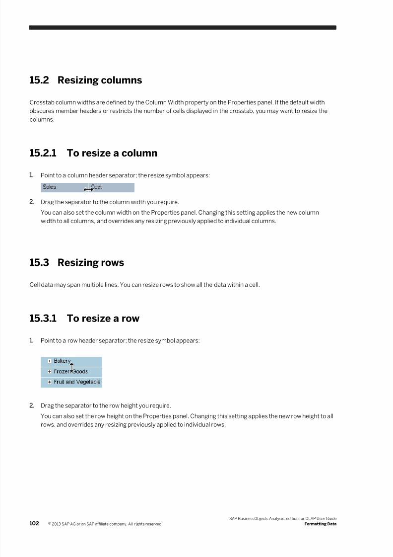
7/28/2019 Xi4sp5 Aa User En
http://slidepdf.com/reader/full/xi4sp5-aa-user-en 102/172
15.2 Resizing columns
Crosstab column widths are defined by the Column Width property on the Properties panel. If the default width
obscures member headers or restricts the number of cells displayed in the crosstab, you may want to resize the
columns.
15.2.1 To resize a column
1. Point to a column header separator; the resize symbol appears:
2. Drag the separator to the column width you require.
You can also set the column width on the Properties panel. Changing this setting applies the new column
width to all columns, and overrides any resizing previously applied to individual columns.
15.3 Resizing rows
Cell data may span multiple lines. You can resize rows to show all the data within a cell.
15.3.1 To resize a row
1. Point to a row header separator; the resize symbol appears:
2. Drag the separator to the row height you require.
You can also set the row height on the Properties panel. Changing this setting applies the new row height to all
rows, and overrides any resizing previously applied to individual rows.
102 © 2013 SAP AG or an SAP affiliate company. All rights reserved.
SAP BusinessObjects Analysis, edition for OLAP User Guide
Formatting Data
7/28/2019 Xi4sp5 Aa User En
http://slidepdf.com/reader/full/xi4sp5-aa-user-en 103/172
16 Sheets
A workspace can contain multiple sheets. Sheets are useful for grouping related analyses together in oneworkspace. For example, a workspace might represent the solution to a particular problem, with each sheet
representing a step in the solution.
When you create a new workspace, three sheets are included, but you can add or remove sheets to suit your
analysis. You navigate between sheets by using the sheet tabs at the bottom of the analysis window.
The Outline panel, in the task panel to the left of the analysis window, displays the high-level structure of your
workspace. Each sheet is shown along with the crosstab and chart components it contains.
Note
Each sheet has its own set of analyses and components, which are not shared and which cannot be linked
across sheets. Analyses and components on one sheet can therefore have the same names as analyses andcomponents on other sheets.
Related Links
Outline panel [page 146]
16.1 Inserting, deleting, and renaming sheets
Although a workspace always contains at least one sheet, you can add as many sheets as you want, and deleteany sheets that you no longer want.
Sheet captions appear in the sheet tabs at the bottom of the analysis window. When you create a new workspace
or add new sheets to a workspace, the sheets are assigned default names, but you can change the names.
16.1.1 To insert a sheet
1. Right-click a sheet tab.
2. Select Insert New.
A new sheet is created and a new sheet tab is inserted to the right of the sheet tab that you clicked. The new
sheet becomes the active sheet.
16.1.2 To delete a sheet
1. Right-click the sheet tab corresponding to the sheet you want to remove.
2. Select Delete.
If the sheet to be deleted contains a crosstab or chart component, a confirmation dialog box appears. Click
Yes to confirm the sheet deletion.
SAP BusinessObjects Analysis, edition for OLAP User Guide
Sheets © 2013 SAP AG or an SAP affiliate company. All rights reserved. 103
7/28/2019 Xi4sp5 Aa User En
http://slidepdf.com/reader/full/xi4sp5-aa-user-en 104/172
16.1.3 To rename a sheet
1. Right-click the sheet tab and select Rename.2. Type a new caption for the sheet.
Note
The maximum length of a caption is 60 characters.
3. Click outside the sheet tab, or press Enter to save the changed caption.
104 © 2013 SAP AG or an SAP affiliate company. All rights reserved.
SAP BusinessObjects Analysis, edition for OLAP User Guide
Sheets
7/28/2019 Xi4sp5 Aa User En
http://slidepdf.com/reader/full/xi4sp5-aa-user-en 105/172
17 Saving and Sharing Workspaces
This section shows you how to share your workspaces with other users.
17.1 Saving Analysis workspaces for sharing with others
If you want to share your Analysis workspaces over the web with other analysts and end users, you can save your
workspaces to a public folder in the BI platform repository.
Note
To save a workspace to a public folder in the BI platform repository, you must have sufficient rights. See your
system administrator if you are not sure whether you have such rights.
Related Links
Save a workspace [page 25]
17.1.1 To save your workspace in a public folder
1. On the toolbar, click the arrow beside the Save button, and choose Save As.
2. In the folder tree, expand the Public Folders folder and browse to the folder where you want to save your
workspace.
3. Type a filename for your workspace.
4. Click Save.
Related Links
Save a workspace [page 25]
Sending an Analysis workspace to another user [page 105]
17.2 Sending an Analysis workspace to another user
You can send a workspace to another BI platform user or to an email recipient.
If you have any unsaved changes in your workspace, the workspace is first saved with a unique name in your
Favorites folder. That saved workspace is then sent to the BI platform user or email recipient, either as an
attachment or as a link.
Related Links
Save a workspace [page 25]
SAP BusinessObjects Analysis, edition for OLAP User Guide
Saving and Sharing Workspaces © 2013 SAP AG or an SAP affiliate company. All rights reserved. 105
7/28/2019 Xi4sp5 Aa User En
http://slidepdf.com/reader/full/xi4sp5-aa-user-en 106/172
17.2.1 Sending an Analysis workspace to another BI platformuser
You can send a workspace to another BI platform user's Inbox. You can send either a copy of the workspace file
itself, or a shortcut to the workspace in the BI platform repository.
Note
Before you can send a workspace to another user's Inbox, your administrator will need to grant specific rights
to you.
17.2.1.1 To send a workspace to a BI platform user
1. On the toolbar, click the Send To button.
2. If you want to send the workspace to the default Inboxes, select the Use default settings option, and then skip
to step 6.
Or, if you want to specify the Inboxes to send the workspace to, clear the Use default settings option.
3. Add recipients to the Selected Recipients list.
4. Select a target name for the workspace.
5. Select the Shortcut option to send the workspace as a hyperlink, or select the Copy option to send the
workspace as a file.6. Click Send to send the workspace.
You can also send workspaces to BI platform users from the BI launch pad. For more information, see the BI
Launch Pad User Guide.
17.2.2 Sending a workspace to an email recipient
You can send your workspace to an email recipient by including a hyperlink to the workspace in the email.
17.2.2.1 To send a workspace to an email recipient
1. On the toolbar, click the arrow beside the Send To button, and then click Email.
Note
If you receive this error message: "The destination plugin required for this action is disabled. If you require
this functionality, please contact your system administrator", inform your system administrator that the BI
platform Adaptive Job Server has not been configured for email destinations.
106 © 2013 SAP AG or an SAP affiliate company. All rights reserved.
SAP BusinessObjects Analysis, edition for OLAP User Guide
Saving and Sharing Workspaces
7/28/2019 Xi4sp5 Aa User En
http://slidepdf.com/reader/full/xi4sp5-aa-user-en 107/172
2. If you want to send the workspace to the default email addresses, select the Use default settings option, and
then skip to step 5.
Or, if you want to specify the email addresses to send the workspace to, clear the Use default settings option.
3. Enter the From, To, and Cc addresses, and a subject.
4. Add the Viewer Hyperlink placeholder to the Message field.
5. Click Send to send the email.
You can also send workspaces to email addresses from the BI launch pad. For more information, see the BI
Launch Pad User Guide.
17.3 Using URLs to share workspaces
In some types of SAP BusinessObjects documents, for example SAP Crystal Reports and SAP BusinessObjects
Web Intelligence documents, you can create links to Analysis workspaces so that users of those documents can
access Analysis workspaces quickly, without having to start Analysis. To create a link, you embed the URL for an
Analysis workspace into a document.
You can also embed the workspace URL into an email or other office document.
17.3.1 To get the URL for a workspace
1. With a workspace open, click the arrow beside the Send To button.
2. Select Document Link.
The URL for the current workspace is shown.
3. Copy this URL to your Crystal report, Web Intelligence document, or other office document.
SAP BusinessObjects Analysis, edition for OLAP User Guide
Saving and Sharing Workspaces © 2013 SAP AG or an SAP affiliate company. All rights reserved. 107
7/28/2019 Xi4sp5 Aa User En
http://slidepdf.com/reader/full/xi4sp5-aa-user-en 108/172
18 Printing and PDF Files
This section shows you how to export your workspaces to PDF files, which you can print or send to colleagues.
After performing your analysis, you may want to share your findings by exporting your workspace to a PDF file, or
by printing your data. Using the printing capability in Analysis, you can do the following:
● Print a sheet
● Print data
A PDF representing the data or sheet that you want to print is created, and opened in a new browser window using
your default PDF viewer. You can then send the PDF file to colleagues, or print hard copies of the data from the
PDF viewer.
Note
If a sheet contains two or more components, and you want to print only one of the components, you can
maximize the component in the analysis window, and then print the sheet.
Crosstab and charts are printed as they appear on screen, with minor exceptions. Also, member headers that do
not fit within the column widths may be truncated differently from how they are truncated on screen.
Formatted values or actual values
From the Properties panel, you can control whether formatted values or actual values are displayed in the
crosstab. When you print a crosstab, the formatting of the cell values in the print output matches the on-screen
display.
If your SAP BW data is displayed in the crosstab with scaling factors, the scaling factors are preserved in the PDF
output.
Related Links
Saving and Sharing Workspaces [page 105]
Exporting Data [page 111]
18.1 Print a sheet
You can print only the sheet that is currently open.
When you print a sheet, all components on the sheet are printed together, as they appear on the screen. Only the
data visible on the screen is printed; if instead you want all the data in your analysis printed, use the data printing
option instead.
The sheet is sized to fit the paper size and orientation print options that you select, and the aspect ratio is
preserved.
108 © 2013 SAP AG or an SAP affiliate company. All rights reserved.
SAP BusinessObjects Analysis, edition for OLAP User Guide
Printing and PDF Files
7/28/2019 Xi4sp5 Aa User En
http://slidepdf.com/reader/full/xi4sp5-aa-user-en 109/172
18.2 Print data
You can choose to print raw data instead of the crosstab or chart representations of your data. When you choose
the data printing option, all the filtered data in an analysis is printed; not just the data visible on the screen. If you
choose to print the data from a crosstab, the cell formatting applied to the crosstab is retained. Data is formatted
to fit the paper size and orientation print options that you select.
18.3 To export to PDF
1. On the toolbar, click Print.
2. Select Sheet or Data.
For more information about sheet printing and data printing, see Print a sheet [page 108] and Print data [page
109].
3. If you chose data printing, select an analysis to be printed. If you select a crosstab, any cell formatting applied
to the crosstab is retained in the print output. You can also apply either of the options Fit to Page Width or
Repeat Headings.
For descriptions of the available print options, see Print options .
4. Select a paper size and print orientation.
5. Choose the information fields you want to display in the header and footer.
If you choose the Custom Text field, type your custom text into the text boxes.
6. Click OK.
Your data is converted to a PDF and opened in a new browser window using your default PDF viewer. You can
then print hard copies of the data from the PDF viewer.
18.4 Print options
These print options are available:
Option Description
Sheet or Data Choose Sheet if you want to print the current sheet of your workspace. Choose Data if
you want to print all of the data from an analysis.
Fit to Page Width Select this option to scale the printed output so that all columns fit within a page.
This option is available only when printing data.
Repeat Headings Select this option if you want row and column headers to be repeated on each printed
page.
SAP BusinessObjects Analysis, edition for OLAP User Guide
Printing and PDF Files © 2013 SAP AG or an SAP affiliate company. All rights reserved. 109
7/28/2019 Xi4sp5 Aa User En
http://slidepdf.com/reader/full/xi4sp5-aa-user-en 110/172
Option Description
This option is available only when printing data.
Paper Size Choose from these paper sizes: Letter, Legal, A4, and A3.
Page Orientation Select Landscape or Portrait orientation.
The following information fields are available for you to add to the headers and footers of the printed pages. Some
fields are available only with data printing and some only with sheet printing.
Header and Footer
fields
Description
Sheet Name The name of the workspace sheet, defined on the sheet tabs at the bottom of the
analysis window.
Analysis Name The name of the analysis, as defined on the Properties panel.
Component Name The name of the crosstab or chart component that you select when printing data.
Component
Comments
The contents of the Description field for the crosstab or chart component, on the
Properties panel.
Workspace Name The name assigned to the workspace when saved.
Page Number The printed page number.
Today's Date The current date.
Refresh Date The date that the data source was last refreshed.
Custom Text Select this option and then type your own text into the text field.
110 © 2013 SAP AG or an SAP affiliate company. All rights reserved.
SAP BusinessObjects Analysis, edition for OLAP User Guide
Printing and PDF Files
7/28/2019 Xi4sp5 Aa User En
http://slidepdf.com/reader/full/xi4sp5-aa-user-en 111/172
19 Exporting Data
This section describes how to export data to Microsoft Excel or to comma-separated values (.csv) files.
19.1 Exporting data to Excel
You can export data from your analyses to Microsoft Excel, to allow Excel users to share your data. The data can
either be viewed immediately in Excel, or saved to an .xls file that can be opened with Excel or third-party
applications. To view your data immediately in Excel, you must have Excel already installed on your machine.
If the exported analysis has both crosstab and chart components associated with it, the data is exported to anExcel worksheet, and the chart is exported as a static image. If the analysis has only a chart component
associated with it, only the static chart image is exported.
When you export multiple components, the data from each component is exported to a separate sheet within the
same Excel workbook.
Sorts, filters, scaling factors (for SAP BW data only), and conditional formatting are preserved in the exported
data. Conditional formatting also makes use of the native Excel conditional formatting. Calculated data is
exported, but the calculation formulas are not preserved.
19.1.1 To export data to Excel
1. On the toolbar, click Export.
Note
The Export button is disabled until the current sheet contains a valid analysis.
2. In the dialog box, select the crosstab or chart component whose data you want to export.
You can also select the component in the analysis window or on the Outline panel before you click the Export
button. If you select multiple components to export, the data from each component is exported to a separate
sheet within the same Excel workbook.
3. If your analysis contains nested hierarchies, and you want to repeat the outer hierarchy member header for
each inner hierarchy member, select the Repeat outer header members option.
4. If your analysis has multiple linked components, and you want to export data from those linked components
as well, select the Include linked crosstabs and charts option.
5. Click OK to export the data.
If you have Microsoft Excel installed on your machine, you can save the file to disk, or open the file
immediately.
If you do not have Excel installed, save the file to disk with an .xls extension. You can then install Excel or a
3rd-party application to open the saved file.
SAP BusinessObjects Analysis, edition for OLAP User Guide
Exporting Data © 2013 SAP AG or an SAP affiliate company. All rights reserved. 111
7/28/2019 Xi4sp5 Aa User En
http://slidepdf.com/reader/full/xi4sp5-aa-user-en 112/172
19.2 Exporting data to comma-separated-values (.csv) files
You can export data from your analyses to comma-separated-value format, to allow users of other applications to
share your data. The comma-separated values can either be viewed immediately in an application such as Excel,
or saved to a .csv file.
Data is exported in the orientation displayed in the crosstab. If the analysis has only a chart component associated
with it, data from that analysis is exported but the chart visualization is not.
Sorts and filters are preserved in the exported data. Calculated data is exported, but the calculation formulas are
not preserved.
19.2.1 To export data to a .csv file
1. On the toolbar, click the arrow beside the Export button, and then click CSV .
Note
The Export button is disabled until the current sheet contains a valid analysis.
2. In the dialog box, select the crosstab or chart component whose data you want to export.
You can also select the component in the analysis window or on the Outline panel before you click the Export
button.
3. If your analysis contains nested hierarchies, and you want to repeat the outer hierarchy member header for
each inner hierarchy member, select the Repeat outer header members option.
4. Click OK to export the data.
If you have a .csv file viewer such as Microsoft Excel installed on your machine, you can save the file to disk,
or open the file immediately.
If you do not have a .csv file viewer installed, save the file to disk with a .csv extension. You can then install
Microsoft Excel or another application to open the saved file.
112 © 2013 SAP AG or an SAP affiliate company. All rights reserved.
SAP BusinessObjects Analysis, edition for OLAP User Guide
Exporting Data
7/28/2019 Xi4sp5 Aa User En
http://slidepdf.com/reader/full/xi4sp5-aa-user-en 113/172
20 Connecting to OLAP Data Sources
This section describes how to connect to OLAP data sources.
20.1 OLAP data source objects
Before you can begin working with data in Analysis, you must add a data source to the workspace.
A data source is a repository object, created by your system administrator, that contains all the information that is
required for Analysis to connect to an OLAP server.
The administrator creates data source objects for as many different OLAP data providers as you and your fellow
analysts require. Analysts then have all of these data sources available to add to their workspaces.
These types of data source objects can be defined by the administrator:
Icon Data source type Description
Cube The data source object points directly to a single OLAP cube on the OLAP
server.
Query The data source object points directly to a single OLAP query on the OLAP
server.
System The data source object points to an OLAP server, which can contain manycubes and queries.
Related Links
Adding data sources [page 113]
Changing data sources [page 115]
Removing a data source [page 116]
Disabled data source connections [page 116]
SAP BW Data Sources [page 120]
20.2 Adding data sources
After your administrator has created data source objects, you can add data sources to your workspace. You can
add a single data source if you need to analyze data from just one database, or you can add several data sources,
and use a different data source with each analysis in your workspace. However, once you have begun to design
your analysis, the analysis and its crosstab and chart components are fixed to the data source. You cannot add
metadata from one data source to an analysis that already contains metadata from another data source.
When adding a data source to your workspace, if you select a cube or query, the data is connected immediately to
the workspace. If you select a system, you must first choose a cube or query within that system.
SAP BusinessObjects Analysis, edition for OLAP User Guide
Connecting to OLAP Data Sources © 2013 SAP AG or an SAP affiliate company. All rights reserved. 113
7/28/2019 Xi4sp5 Aa User En
http://slidepdf.com/reader/full/xi4sp5-aa-user-en 114/172
Finding a data source
In the Open Data Source dialog box, you can either choose a data source from a list, or find a data source. Findingfollows these rules:
● In SAP BW systems, the find is performed on both the keys and text of data source objects. In other systems,
the find is performed only on cube names.
● To find only those data sources whose text or key exactly matches your search string, enclose your search
string in quotation marks.
● To find data sources whose text or key includes your search string, do not enclose your search string in
quotation marks.
● If your search string comprises multiple words separated by spaces, a separate find is executed for each
word, and the results are aggregated.
● You can use an asterisk (*) as a wildcard character. To include an asterisk as a regular character within the
search string, enclose the search string in quotation marks.
● If exactly one matching data source is found, and either the text or key exactly matches the search string,
then the data source is automatically selected.
20.2.1 To add a data source to a workspace
1. On the Data panel, click the Connect to a data source button.
The Open Data Source dialog box appears, showing all data sources that are available for you to access data
from.
2. Select a data source from the list.
○ If you selected a cube, click OK to add it to your workspace.
○ If you selected a query, click OK to add it to your workspace.
○ If you selected a system, click Next to see the cubes and queries available from that system. Select a
cube or query, or click the Find tab to find a cube or query, and then click OK to add the data source to
your workspace.
3. If the data source requires authentication, type your credentials in the logon dialog box and click OK.
4. If you selected an SAP BW or SAP HANA data source that contains prompts, the Prompts dialog box opens.
Select values for the prompts.
For more information about SAP BW prompts, see Prompts for SAP BW data sources [page 120]. For more
information about SAP HANA prompts, see SAP HANA Data Sources [page 127].
If authentication succeeds, the data source appears in the list at the top of the Data panel, and the metadata
explorer displays the data objects (metadata) contained in the data source.
If authentication fails, first verify that you entered your credentials correctly. If authentication continues to fail,
see your system administrator. Your credentials may not be set up properly in the Central Management Console,
or the OLAP server may be offline.
114 © 2013 SAP AG or an SAP affiliate company. All rights reserved.
SAP BusinessObjects Analysis, edition for OLAP User Guide
Connecting to OLAP Data Sources
7/28/2019 Xi4sp5 Aa User En
http://slidepdf.com/reader/full/xi4sp5-aa-user-en 115/172
20.2.2 Viewing OLAP data in the workspace
Once you have a data source added to your workspace, you can define an analysis and begin working with yourdata in the analysis window.
Related Links
Analyses [page 28]
OLAP data source objects [page 113]
Changing data sources [page 115]
Removing a data source [page 116]
Disabled data source connections [page 116]
20.3 Changing data sources
If you are currently working with one data source, but want to work with a different data source, you can change to
a different data source on the Data panel. However, you cannot use data from the second data source in a
component that already contains data from the first data source. You must add a new analysis, and add the data
from the second data source to that new component.
20.3.1 To change to a different data source
1. If the data source that you want to change to has not yet been added to your workspace, click the
Connect to a data source button on the Data panel.
Or, if the data source that you want to change to has already been added to your workspace, select the data
source from the list on the Data panel. The contents of the metadata explorer change to reflect the new data
source. Skip to step 4 of this procedure.
2. In the Open Data Source dialog box, select the desired data source and click OK.
3. If the data source requires authentication, type your credentials in the logon dialog box and click OK.
If authentication succeeds, the data source appears in the list at the top of the Data panel, and the metadata
explorer displays the data objects (metadata) contained in the data source.
If authentication fails, first verify that you entered your credentials correctly. If authentication continues to
fail, see your system administrator. Your credentials may not be set up properly in the Central Management
Console, or the OLAP server may be offline.
4. On the toolbar, select Insert, and then click the Insert Crosstab button to add a new analysis to the
analysis window.
You can now add data from the new data source to the new analysis.
Note
SAP BusinessObjects Analysis, edition for OLAP User Guide
Connecting to OLAP Data Sources © 2013 SAP AG or an SAP affiliate company. All rights reserved. 115
7/28/2019 Xi4sp5 Aa User En
http://slidepdf.com/reader/full/xi4sp5-aa-user-en 116/172
You cannot add data from the new data source to a component that already contains data from another
data source.
Related LinksOLAP data source objects [page 113]
Adding data sources [page 113]
Removing a data source [page 116]
Disabled data source connections [page 116]
20.4 Removing a data source
On the Data panel, you can remove OLAP data sources from your workspace.
20.4.1 To remove a data source from a workspace
1. In the data source area on the Data panel, select the data source that you want to remove from your
workspace.
2. Click Remove Data Source.
If any analyses currently use that data source, a warning message appears.
Related Links
OLAP data source objects [page 113]
Adding data sources [page 113]
Changing data sources [page 115]
Disabled data source connections [page 116]
20.5 Disabled data source connections
Data source connections in your Analysis workspaces can be disabled for several reasons:
● You cancel the connection logon dialog box deliberately.
● Authentication fails with the credentials you provided. For example, the password you provided does not
match the password stored in the Central Management Console.
● Authentication fails for reasons that are beyond your control. For example, the OLAP server has been
restarted, disconnected from the database, or shut down for maintenance.
If any of your data source connections are disabled, the analyses that are based on the disabled data sources are
not executed. The disabled data sources still appear in the active data source list, but are unavailable. Your
system administrator can help you to re-establish the disabled connections.
116 © 2013 SAP AG or an SAP affiliate company. All rights reserved.
SAP BusinessObjects Analysis, edition for OLAP User Guide
Connecting to OLAP Data Sources
7/28/2019 Xi4sp5 Aa User En
http://slidepdf.com/reader/full/xi4sp5-aa-user-en 117/172
21 Linking to Reports
When you analyze OLAP data in Analysis, you may find interesting information that you would like to explore in arelated SAP Crystal Reports report. Typically, a power user or report designer creates these Crystal reports, and
makes them available to Analysis users. To access a report, you create a jumplink to it within your Analysis
workspace.
When you open a linked report, contextual information, such as row and column member text, is passed as
parameters to the report. These parameters enable the report to display more information related to those
members.
For example, while analyzing your data in Analysis, you discover that many of your loyalty customers have
purchased generic coffee beans from the Seattle store in 2010. You decide to run a promotion to encourage those
customers to try premium coffee beans instead. A report designer has provided you with a Crystal report that
retrieves the names and addresses of your loyalty customers from a database. You create a jumplink from your
analysis to the Crystal report, and select the parameters “generic coffee beans”, “Seattle”, and “2010” to send to
the linked Crystal report. The report queries the relational database and returns the names and addresses of the
loyalty customers who bought generic coffee beans from the Seattle store in 2010.
The report that you link to can contain transactional data related to the OLAP cube's data. When this is the case,
linking is similar to drill through. However, the linked report can contain any type of data; it is only necessary that
the report accepts at least one parameter from the workspace.
Once defined, the jumplinks are stored in the workspace until manually deleted. You can therefore share the
workspace with other users, enabling them to explore the information in the linked report as well.
21.1 To create a jumplink to a report
1. Right-click the row header, column header, or cell that represents the parameter or parameters that you want
to pass to the report, and select Jumplink New .
If you right-click a row or column header, that parameter is made available to pass to the report. If you right-
click a crosstab cell, then the cell value, the row and column headers, and any background filter members are
made available to pass to the report.
2. Click Change to select a report from the BI platform repository.
3. Select the parameter or parameters that you would like to pass to the report, and click OK.
The jumplink is created, and the report is opened in your browser. The jumplink is saved with the workspace,
so that other users of the workspace can follow the jumplink later.
21.2 To view a linked report
1. Right-click a row header, column header, or cell, and select Jumplink.
2. Select the linked report name from the list of options.
SAP BusinessObjects Analysis, edition for OLAP User Guide
Linking to Reports © 2013 SAP AG or an SAP affiliate company. All rights reserved. 117
7/28/2019 Xi4sp5 Aa User En
http://slidepdf.com/reader/full/xi4sp5-aa-user-en 118/172
The linked report is opened in your browser, and the parameters corresponding to the member header or cell
that you right-clicked are passed from Analysis to the report.
21.3 To delete a jumplink to a report
1. Right-click a cell, row header, or column header in your crosstab.
2. Select Jumplink Clear .
Because jumplinks are associated with analyses, not with members or crosstab cells, you can right-click any
cell or member in the crosstab to access a jumplink. If any jumplink is associated with the current analysis, it
appears in the list when you right-click.
21.4 Reports available for linking
Your administrator may have defined associations between Analysis data source connections and universes. If
the data source connection you're using has been associated with a universe, the Display only reports based on
the associated Universe checkbox in the Repository Explorer is selected. When you create a new jumplink to a
report, the list of reports initially shown in the Repository Explorer includes only the reports that use the universe
associated with your Analysis data source connection.
If you want to access reports based on a different universe, clear the Display only reports based on the associatedUniverse check box.
118 © 2013 SAP AG or an SAP affiliate company. All rights reserved.
SAP BusinessObjects Analysis, edition for OLAP User Guide
Linking to Reports
7/28/2019 Xi4sp5 Aa User En
http://slidepdf.com/reader/full/xi4sp5-aa-user-en 119/172
22 Using Analyses in Other SAPBusinessObjects Applications
After you perform an analysis, you may want to use other SAP BusinessObjects applications to communicate your
findings and share the analysis. For example, you can use SAP Crystal Reports to create highly formatted reports
for broad distribution. Or you can use the edition of SAP BusinessObjects Analysis for use with Microsoft Office to
share your analysis with Finance department users.
To use an analysis in other applications, you export it as an analysis view. An analysis view is a saved
navigation state of an analysis, that includes applied filters, hierarchies, and available metadata. It represents the
data definition, not how it is visualized.
Analysis views can be shared among applications such as SAP BusinessObjects Analysis (both the edition for
OLAP and the edition for Microsoft Office), SAP Crystal Reports, and SAP BusinessObjects Web Intelligence. Both
editions of SAP BusinessObjects Analysis can import and export analysis views, but other applications can only
import analysis views. Users of these applications can choose how to visualize the data.
Like workspaces, analysis views are saved to the BI platform repository. While a workspace can encompass
several analyses, an analysis view encompasses only one analysis.
22.1 To export an analysis view
1. In the analysis window, select the crosstab or chart component that you want to export as an analysis view.
2. On the toolbar, click the arrow beside the Export button, and click Analysis View.
3. Select a location to save your analysis view to.
4. Type a filename for the analysis view.
5. Click Save.
The analysis view is exported to the repository.
22.2 To import an analysis view
1. In your Analysis workspace, navigate to the sheet where you want to import the analysis view.
2. On the toolbar, click the arrow beside the Open button, and click Analysis View.
3. In the folder list, select an analysis view, and click OK.
If the analysis view represents SAP BW data containing prompts, you may need to select prompt values
before the analysis view can be opened. The imported analysis view is added below or to the right of existing
components on the sheet.
SAP BusinessObjects Analysis, edition for OLAP User Guide
Using Analyses in Other SAP BusinessObjects Applications © 2013 SAP AG or an SAP affiliate company. All rights reserved. 119
7/28/2019 Xi4sp5 Aa User En
http://slidepdf.com/reader/full/xi4sp5-aa-user-en 120/172
23 SAP BW Data Sources
Analysis can connect to SAP BW data sources and take advantage of features such as prompts and displayattributes.
When working with SAP BW data, note that some Analysis features behave differently than with other data
sources:
● When connecting to an SAP BW data source, you may be prompted to enter prompt values.
● Calculations can be applied only to measures.
● Members can be displayed with either their keys or text.
23.1 Prompts for SAP BW data sources
When you connect to an SAP BW query that has prompts, the Prompts dialog box opens so that you can specify
their values.
You can also specify prompt values when you perform any of the following tasks with an SAP BW data source that
contains prompts:
● Opening a saved workspace.
● Navigating to a sheet for the first time in an open workspace.
You can also click Edit SAP variable values to change the prompt values.
The Prompts dialog box contains one row for each prompt set up by the SAP BW administrator in the SAP BW
query. Specifying values for the prompts has the effect of filtering the data that is returned and displayed.
If default prompt values are set up in the SAP BW query, rows of the Prompts dialog box may already contain
values. You can accept these values, or you can specify different values.
When you open a workspace that contains prompt values that were previously entered and saved, then the saved
prompt values are used instead of the SAP BW default values.
For more information about SAP BW queries and prompts, see the documentation for the SAP Business Explorer
Query Designer, in the SAP NetWeaver Library, at the SAP Help Portal: http://help.sap.com .
23.1.1 Mandatory and optional prompts
Prompts may be mandatory or optional, depending on how they are configured in the query.
Mandatory prompts are prompts that you must provide a value for when the Prompts dialog box opens.
Mandatory prompts are denoted with asterisks in the Prompts dialog box. If allowed, an initial value, denoted with
a number sign ("#") can be selected in the Prompts dialog box. This explicitly selects all data records, including
those which do not correspond to a member of the hierarchy.
Optional prompts are prompts which you do not have to select values for when prompted. Queries with optional
prompts that you do not select values for return data based on default values.
120 © 2013 SAP AG or an SAP affiliate company. All rights reserved.
SAP BusinessObjects Analysis, edition for OLAP User Guide
SAP BW Data Sources
7/28/2019 Xi4sp5 Aa User En
http://slidepdf.com/reader/full/xi4sp5-aa-user-en 121/172
23.1.2 Prompt types
Analysis supports many, but not all, of the SAP BW prompt types:
Key date prompts
Key date prompts are single-value prompt types where you can indicate a specific date for the data you want to
see (provided that data is configured in the cube to be time-dependent). Time-dependent metadata is filtered
based on the key date prompt.
The value for the key date prompt must be specified first, because it limits the data available to other prompts.
Single value prompts
Single value prompts allow you to specify a single member in the Prompts dialog box to be returned from the
default flat hierarchy for a dimension.
Multiple single value prompts
Multi-single value prompts allow you to specify one or more members in the Prompts dialog box to be returned
from the default flat hierarchy for a dimension.
Range prompts
Range prompts consist of two members that you specify in the Prompts dialog box. The two members create a
range which is used as a filter for the data returned and displayed in Analysis.
When specifying members, you must ensure that you create a valid range by specifying a second member that
occurs after the first specified member in the hierarchy.
Complex selection prompts
Complex selection prompts allow you to specify one or more conditions from the Prompts dialog box, which are
then used to filter the data returned and displayed in Analysis.
SAP BusinessObjects Analysis, edition for OLAP User Guide
SAP BW Data Sources © 2013 SAP AG or an SAP affiliate company. All rights reserved. 121
7/28/2019 Xi4sp5 Aa User En
http://slidepdf.com/reader/full/xi4sp5-aa-user-en 122/172
Hierarchy prompts
Dimensions contain a hierarchy or multiple hierarchies grouped together into a single logical collection.
The hierarchy you select in the Prompts dialog box restricts the hierarchies you can use on that dimension to the
chosen hierarchy.
Hierarchy prompts often come paired with hierarchy node prompts, where both prompts apply to the same
dimension. The hierarchy node prompt can dynamically apply to whichever hierarchy has been specified for the
hierarchy prompt. In these cases, you specify the hierarchy prompt before specifying the hierarchy node prompt.
Hierarchy node prompts
Hierarchy node prompts may be single-value or multiple-value, depending on how they are set up in the SAP BW
query. In the Prompts dialog box, you specify one or more members to be returned from the hierarchy.
Formula prompts
Formulas are calculations that may have been defined by an administrator on the key figures (or measures)
dimension.
If Analysis requires you to enter a value for a formula prompt, you must enter a numerical value only. The valueyou enter is then used to complete the formula, and the data returned is the result of the formula.
Currency prompts
A currency prompt is a special type of prompt used to convert values based on an exchange rate table. The
exchange rates used to perform the conversion are set at the data source, and are not visible from Analysis.
23.1.3 To enter prompt values
When you perform a task that requires SAP BW prompt values to be set, the Prompts dialog box opens. Perform
the following steps for each mandatory prompt, and any optional prompts that you want to select values for.
1. Select a prompt from the Prompt Summary list.
2. Define the prompt value:
Prompt type Steps to define the prompt value
Key date Click the date field. Type a date in the format yyyymmdd or click the icon beside the date field and
select a date from the calendar.
122 © 2013 SAP AG or an SAP affiliate company. All rights reserved.
SAP BusinessObjects Analysis, edition for OLAP User Guide
SAP BW Data Sources
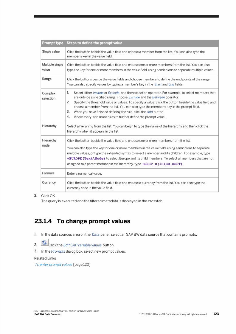
7/28/2019 Xi4sp5 Aa User En
http://slidepdf.com/reader/full/xi4sp5-aa-user-en 123/172
Prompt type Steps to define the prompt value
Single value Click the button beside the value field and choose a member from the list. You can also type the
member's key in the value field.
Multiple single
value
Click the button beside the value field and choose one or more members from the list. You can also
type the key for one or more members in the value field, using semicolons to separate multiple values.
Range Click the buttons beside the value fields and choose members to define the end points of the range.
You can also specify values by typing a member's key in the Start and End fields.
Complex
selection
1. Select either Include or Exclude, and then select an operator. For example, to select members that
are outside a specified range, choose Exclude and the Between operator.
2. Specify the threshold value or values. To specify a value, click the button beside the value field and
choose a member from the list. You can also type the member's key in the prompt field.
3. When you have finished defining the rule, click the Add button.
4. If necessary, add more rules to further define the prompt value.
Hierarchy Select a hierarchy from the list. You can begin to type the name of the hierarchy and then click the
hierarchy when it appears in the list.
Hierarchy
node
Click the button beside the value field and choose one or more members from the list.
You can also type the key for one or more members in the value field, using semicolons to separate
multiple values, or type the extended syntax to select a member and its children. For example, type
+EUROPE(Text\Node) to select Europe and its child members. To select all members that are not
assigned to a parent member in the hierarchy, type +REST_H(1HIER_REST).
Formula Enter a numerical value.
Currency Click the button beside the value field and choose a currency from the list. You can also type the
currency code in the value field.
3. Click OK.
The query is executed and the filtered metadata is displayed in the crosstab.
23.1.4 To change prompt values
1. In the data sources area on the Data panel, select an SAP BW data source that contains prompts.
2. Click the Edit SAP variable values button.
3. In the Prompts dialog box, select new prompt values.
Related Links
To enter prompt values [page 122]
SAP BusinessObjects Analysis, edition for OLAP User Guide
SAP BW Data Sources © 2013 SAP AG or an SAP affiliate company. All rights reserved. 123
7/28/2019 Xi4sp5 Aa User En
http://slidepdf.com/reader/full/xi4sp5-aa-user-en 124/172
23.2 Key figures and formatted values
By default, Analysis retrieves and displays formatted cell values. Key figures (measures dimensions) that have
been formatted to display a specific unit on the cube are displayed with the correct unit formatting in Analysis.
23.2.1 Formatting with no key figures
The SAP BW administrator can create an SAP BW query that has no visible key figures (no visible measures
dimension). There is no measure formatting for these queries because they contain no measures (or the
measures are not visible).
23.3 Hierarchy display settings
Members have several string properties, which are visible in Analysis:
● Key
● Text
● Short description● Key and Text
● Key and short description
● Text and key
These string properties can be viewed and changed by right-clicking a hierarchy name on the crosstab, and
selecting Display As.
Note
When displaying the key and text, or key and description, the properties are concatenated into a single string,
and are therefore displayed in a single column or row. They do not appear as separate columns or rows.
23.4 Mutually exclusive hierarchies
In SAP BW data sources, hierarchies that belong to the same dimension are mutually exclusive. For example,
consider an SAP BW cube that contains a dimension <Customer> that contains three hierarchies: <Country_1> ,
<Country_2> , and <Country_3> . Only one of these hierarchies can be included in a single crosstab or chart
analysis. You cannot specify <Country_1> on the row axis and <Country_3> in the background filter in the same
analysis.
124 © 2013 SAP AG or an SAP affiliate company. All rights reserved.
SAP BusinessObjects Analysis, edition for OLAP User Guide
SAP BW Data Sources
7/28/2019 Xi4sp5 Aa User En
http://slidepdf.com/reader/full/xi4sp5-aa-user-en 125/172
23.5 Unbalanced and ragged hierarchies
Analysis supports unbalanced and ragged hierarchies.
23.6 Scaling factors
If your SAP BW query was designed with scaling factors included, those scaling factors are displayed in the
crosstab. For example, a value may be displayed as follows:
1234 * 10000
These scaling factors are supported in Analysis:
● 1
● 10
● 100
● k
● 10,000
● 100,000
● M
● 10,000,000
●
100,000,000● G
Note that common abbreviations are displayed instead of numeric scaling factors for thousands, millions, and
billions.
If scaling factors appear in the crosstab, they also appear in data exported to Excel or to PDF files.
23.7 Restricted characteristics with default values in the
Background filter area
In the BEx Query Designer, SAP BW data sources can be filtered by restricting one or more characteristics to
certain default values. If such a characteristic is added to the Free Characteristics area in SAP BEx Query
Designer, it will be added to the Background filter area in Analysis when you connect to the data source.
Like any background filter, you can change the members or remove the filter from your analysis.
For more information on restricting characteristics, refer to the documentation for BEx Query Designer available
on the SAP Help Portal at http://help.sap.com .
Related Links
Background filters [page 65]
Changing the background filter (changing the slice) [page 93]
SAP BusinessObjects Analysis, edition for OLAP User Guide
SAP BW Data Sources © 2013 SAP AG or an SAP affiliate company. All rights reserved. 125
7/28/2019 Xi4sp5 Aa User En
http://slidepdf.com/reader/full/xi4sp5-aa-user-en 126/172
23.8 Formatting dates for SAP BW data
When you connect to an SAP BW data source, the format for displaying dates in the analysis window is
determined by a setting on the SAP BW server for the user profile that you used to connect to the data source.
If you want to change the format for dates in your workspaces, you can use the SU01 transaction on the SAP BW
server to configure this setting. For more information, see the documentation for SAP NetWeaver available on the
SAP Help Portal at http://help.sap.com .
Analysis uses the same date format for displaying all date values and members in a workspace. If you connect to
multiple SAP BW data sources with different date format settings, all dates are displayed using the format for the
first SAP BW data source that you connected to. If you want to use the date format for a different SAP BW data
source, you must create a new workspace and connect to that data source first.
Note
The date format setting on the SAP BW server applies to all date values and members in the analysis window.
However, Analysis requires that all prompt values in the Prompts dialog box be entered in the format
yyyymmdd. Dates in the Prompts dialog box are always displayed in this format, and you must follow this
format when manually typing values for date prompts.
Related Links
To enter prompt values [page 122]
126 © 2013 SAP AG or an SAP affiliate company. All rights reserved.
SAP BusinessObjects Analysis, edition for OLAP User Guide
SAP BW Data Sources
7/28/2019 Xi4sp5 Aa User En
http://slidepdf.com/reader/full/xi4sp5-aa-user-en 127/172
24 SAP HANA Data Sources
Analysis can connect to SAP HANA data sources to take advantage of the reliability and performance of in-memory computing. SAP HANA data sources behave like SAP BW sources, with features such as prompts and
hierarchy display attributes. For more information on these features, see SAP BW Data Sources [page 120].
This section describes behavior that is unique to SAP HANA data sources.
Documentation for SAP HANA is also available on the SAP Help Portal at http://help.sap.com .
24.1 Prompt types for SAP HANA data sources
Most SAP HANA prompts types supported by Analysis function the same way as SAP BW prompts. However,
hierarchy and hierarchy node prompts are not applicable to SAP HANA data sources, and two additional prompt
types are available: multiple range prompts and single complex selection prompts.
Multiple range prompts
Multiple range prompts for SAP HANA data sources consist of one or more ranges that you specify in the Prompts
dialog box. The ranges filter the data that is returned and displayed in Analysis.
You define the ranges by specifying two members for each range, and you can add or remove ranges as
necessary. When selecting members, you must ensure that you create a valid range by specifying a second
member that occurs after the first selected member in the hierarchy.
Single complex selection prompts
This prompt type functions like a complex selection prompt, except that you can specify only one condition from
the Prompts dialog box. This condition is used to filter the data returned and displayed in Analysis.
24.2 To enter values for SAP HANA prompts
When you perform a task that requires SAP HANA prompt values to be set, the Prompts dialog box opens.
Perform the following steps for each mandatory prompt, and any optional prompts that you want to select values
for.
1. Select a prompt from the Prompt Summary list.
2. Define the prompt value:
SAP BusinessObjects Analysis, edition for OLAP User Guide
SAP HANA Data Sources © 2013 SAP AG or an SAP affiliate company. All rights reserved. 127
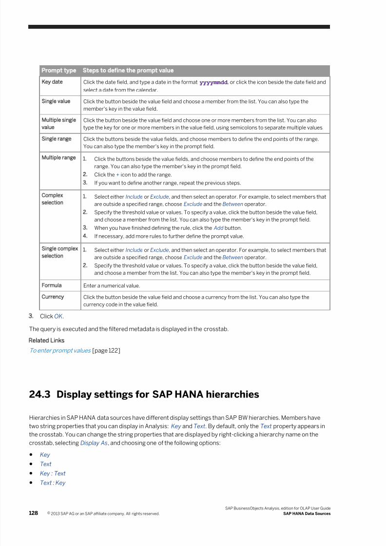
7/28/2019 Xi4sp5 Aa User En
http://slidepdf.com/reader/full/xi4sp5-aa-user-en 128/172
Prompt type Steps to define the prompt value
Key date Click the date field, and type a date in the format yyyymmdd , or click the icon beside the date field and
select a date from the calendar.
Single value Click the button beside the value field and choose a member from the list. You can also type the
member's key in the value field.
Multiple single
value
Click the button beside the value field and choose one or more members from the list. You can also
type the key for one or more members in the value field, using semicolons to separate multiple values.
Single range Click the buttons beside the value fields, and choose members to define the end points of the range.
You can also type the member's key in the prompt field.
Multiple range 1. Click the buttons beside the value fields, and choose members to define the end points of the
range. You can also type the member's key in the prompt field.
2. Click the + icon to add the range.
3. If you want to define another range, repeat the previous steps.
Complex
selection1. Select either Include or Exclude, and then select an operator. For example, to select members that
are outside a specified range, choose Exclude and the Between operator.
2. Specify the threshold value or values. To specify a value, click the button beside the value field,
and choose a member from the list. You can also type the member's key in the prompt field.
3. When you have finished defining the rule, click the Add button.
4. If necessary, add more rules to further define the prompt value.
Single complex
selection1. Select either Include or Exclude, and then select an operator. For example, to select members that
are outside a specified range, choose Exclude and the Between operator.
2. Specify the threshold value or values. To specify a value, click the button beside the value field,
and choose a member from the list. You can also type the member's key in the prompt field.
Formula Enter a numerical value.
Currency Click the button beside the value field and choose a currency from the list. You can also type the
currency code in the value field.
3. Click OK.
The query is executed and the filtered metadata is displayed in the crosstab.
Related Links
To enter prompt values [page 122]
24.3 Display settings for SAP HANA hierarchies
Hierarchies in SAP HANA data sources have different display settings than SAP BW hierarchies. Members have
two string properties that you can display in Analysis: Key and Text. By default, only the Text property appears in
the crosstab. You can change the string properties that are displayed by right-clicking a hierarchy name on the
crosstab, selecting Display As, and choosing one of the following options:
● Key
● Text
● Key : Text
● Text : Key
128 © 2013 SAP AG or an SAP affiliate company. All rights reserved.
SAP BusinessObjects Analysis, edition for OLAP User Guide
SAP HANA Data Sources
7/28/2019 Xi4sp5 Aa User En
http://slidepdf.com/reader/full/xi4sp5-aa-user-en 129/172
Note
When displaying the key and text, or key and description, the properties are concatenated into a single string,
and are therefore displayed in a single column or row. They do not appear as separate columns or rows.
24.4 Time hierarchies in SAP HANA data sources
Time is an attribute view in SAP HANA that can be configured to include time attributes such as year, quarter,
month, and day. These attributes can be organized in a hierarchy with multiple levels.
However, such hierarchies are not supported in this release of Analysis. If a time hierarchy has multiple levels, you
cannot add it to an analysis. Flat time hierarchies, with all attributes on the same level, are supported.
SAP BusinessObjects Analysis, edition for OLAP User Guide
SAP HANA Data Sources © 2013 SAP AG or an SAP affiliate company. All rights reserved. 129
7/28/2019 Xi4sp5 Aa User En
http://slidepdf.com/reader/full/xi4sp5-aa-user-en 130/172
25 Microsoft Analysis Services Data Sources
Analysis can connect to Microsoft SQL Server Analysis Services data sources and can take advantage of featuresin Analysis Services such as perspectives and display folders. This section describes these features and shows
you how to use them in your workspaces. Some definitions are included to help you understand Analysis Services
terminology.
Note
For supported versions of Microsoft SQL Server Analysis Services, see the Product Availability Matrix (PAM)
for SAP BusinessObjects BI 4.0 on the SAP Support Portal.
Dimensions
Dimensions in Analysis Services are collections of hierarchies.
Hierarchies
Attributes are the building blocks of dimensions, and are used in Analysis Services to organize measures
contained in a cube.
In Analysis Services, a dimension is a collection of attributes that describe the data that is provided by the tables
in a data source view.
A business user cannot see the attributes in a dimension from a client application such as Analysis. The attributes
must first be organized into hierarchies before their members can be navigated in a cube.
Two types of hierarchies can be created from attributes: attribute hierarchies and user hierarchies.
● An attribute hierarchy is created for every attribute in a dimension, and has the same name as the attribute.
The attribute hierarchy enables users to browse the members of an attribute.
An attribute hierarchy has only one level. Attribute hierarchies ensure that a cube's cells can be referenced
without relying on user hierarchies, so that security and calculations are independent of a cube's navigation
paths. To the business user, an attribute hierarchy appears no different from hierarchies that you create, andallows business users to browse members of an attribute.
Attribute hierarchies replace the concept of virtual dimensions found in earlier versions of Analysis Services.
● A user hierarchy is any hierarchy other than an attribute hierarchy. A user hierarchy is composed of attributes
that are organized into levels that provide navigation paths in a cube. The member structures of user
hierarchies can take one of four basic forms, depending on how members are related to each other:
○ Balanced hierarchies
○ Unbalanced hierarchies
○ Ragged hierarchies
○ Parent-child hierarchies
Because user hierarchies, unlike attribute hierarchies, can contain many levels, they are often referred to as
multilevel hierarchies.
130 © 2013 SAP AG or an SAP affiliate company. All rights reserved.
SAP BusinessObjects Analysis, edition for OLAP User Guide
Microsoft Analysis Services Data Sources
7/28/2019 Xi4sp5 Aa User En
http://slidepdf.com/reader/full/xi4sp5-aa-user-en 131/172
Fact tables
A fact table is a database table that contains measures or metrics of a business process. For example, a fact tablefor a grocery store might include measures such as <Sales> , <Inventory> , and <Profit> .
Dimension tables
A dimension table is a database table that contains attributes that describe the business entities of an enterprise.
The attributes are used by data analysts to constrain and group database queries. For example, a <Store> table
might include store locations and sizes.
Measure groups
A measure group contains one or more measures from the same fact table. All Analysis Services cubes and
perspectives contain at least one measure group.
In Analysis, measure groups are shown on the Data panel, and in the Filter panel when you filter by member.
Display folders
Display folders are optional folders that can be configured on the Analysis Services server to organize hierarchies
into folder structures. The folder structures make it easier for users to navigate the hierarchies grouped under a
single dimension from a client application.
In Analysis, display folders are shown on the Data panel only; they do not appear in the Filter panel. Also, you
cannot select a display folder; only the hierarchies within the display folders.
Perspectives
Cubes can be very large and thus difficult to navigate in SQL Server Analysis Services. A single cube can represent
the contents of an entire data warehouse, with each measure group in a cube representing a single fact table, and
each dimension representing a dimension table in the data warehouse. This prospect can be daunting to users,
who often need to interact with only a small portion of a cube to satisfy their business intelligence and reporting
requirements.
In Analysis Services, a perspective can reduce the perceived complexity of a cube by allowing you to define a
viewable subset of the cube. The perspective's definition controls which objects in a cube are visible to a business
intelligence application.
Analysis treats perspectives as regular cubes. For example, perspectives appear as regular cubes when you
create a new data source connection in the Central Management Console.
SAP BusinessObjects Analysis, edition for OLAP User Guide
Microsoft Analysis Services Data Sources © 2013 SAP AG or an SAP affiliate company. All rights reserved. 131
7/28/2019 Xi4sp5 Aa User En
http://slidepdf.com/reader/full/xi4sp5-aa-user-en 132/172
26 Accessibility
Accessibility mode
Analysis provides an accessibility mode for users with visual or motor impairments. To enable accessibility mode,
perform these steps:
1. Open the Preferences page in the SAP BusinessObjects BI launch pad.
2. Click Analysis, edition for OLAP.
3. Select the Accessibility Mode check box.
4. Log off the BI launch pad, and log back on.
In accessibility mode, tooltips contain more verbose text for screen reader support. Also, the keyboard actions
described later in this section are available in accessibility mode.
Color schemes and fonts
To assist users, Analysis provides several color schemes and font choices. These options are available from the
Properties panel.
Keyboard shortcuts
Keys Action
Tab Move the focus to the next region in the crosstab.
These are the regions that you can access by pressing the Tab key:
● Column members area
● Row members area
● Cell area
Arrow keys In the crosstab, move the focus one cell up, down, left, or right. In the metadata
explorer, move the focus up or down, or expand and collapse objects.
Spacebar Select the cell or object that has focus.
Shift + Spacebar Extend the cell selection from the existing selected cells to the currently selected
cell.
Ctrl + Spacebar Select multiple member headers.
+ Expand a parent member or object.
- Collapse a parent member or object.
Shift + arrow keys Extend the selection to include more cells.
132 © 2013 SAP AG or an SAP affiliate company. All rights reserved.
SAP BusinessObjects Analysis, edition for OLAP User Guide
Accessibility
7/28/2019 Xi4sp5 Aa User En
http://slidepdf.com/reader/full/xi4sp5-aa-user-en 133/172
Keys Action
Ctrl + F4 Close a crosstab or chart component.
Shift + F10 Select the cell that has focus, and then display the context (right-click) menu.
Ctrl + F10 Maximize or Restore a crosstab or chart component.
Esc Perform any of these actions:
● Close the context menu
● Close the drop-down list
● Close or end other actions
SAP BusinessObjects Analysis, edition for OLAP User Guide
Accessibility © 2013 SAP AG or an SAP affiliate company. All rights reserved. 133
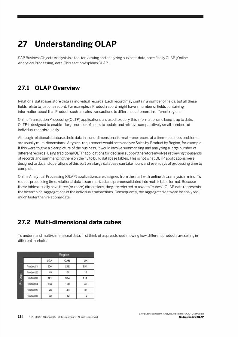
7/28/2019 Xi4sp5 Aa User En
http://slidepdf.com/reader/full/xi4sp5-aa-user-en 134/172
27 Understanding OLAP
SAP BusinessObjects Analysis is a tool for viewing and analyzing business data, specifically OLAP (OnlineAnalytical Processing) data. This section explains OLAP.
27.1 OLAP Overview
Relational databases store data as individual records. Each record may contain a number of fields, but all these
fields relate to just one record. For example, a Product record might have a number of fields containing
information about that Product, such as sales transactions to different customers in different regions.
Online Transaction Processing (OLTP) applications are used to query this information and keep it up to date.
OLTP is designed to enable a large number of users to update and retrieve comparatively small numbers of
individual records quickly.
Although relational databases hold data in a one-dimensional format—one record at a time—business problems
are usually multi-dimensional. A typical requirement would be to analyze Sales by Product by Region, for example.
If this were to give a clear picture of the business, it would involve summarizing and analyzing a large number of
different records. Using traditional OLTP applications for decision support therefore involves retrieving thousands
of records and summarizing them on the fly to build database tables. This is not what OLTP applications were
designed to do, and operations of this sort on a large database can take hours and even days of processing time to
complete.
Online Analytical Processing (OLAP) applications are designed from the start with online data analysis in mind. Toreduce processing time, relational data is summarized and pre-consolidated into matrix table format. Because
these tables usually have three (or more) dimensions, they are referred to as data "cubes". OLAP data represents
the hierarchical aggregations of the individual transactions. Consequently, the aggregated data can be analyzed
much faster than relational data.
27.2 Multi-dimensional data cubes
To understand multi-dimensional data, first think of a spreadsheet showing how different products are selling indifferent markets:
134 © 2013 SAP AG or an SAP affiliate company. All rights reserved.
SAP BusinessObjects Analysis, edition for OLAP User Guide
Understanding OLAP
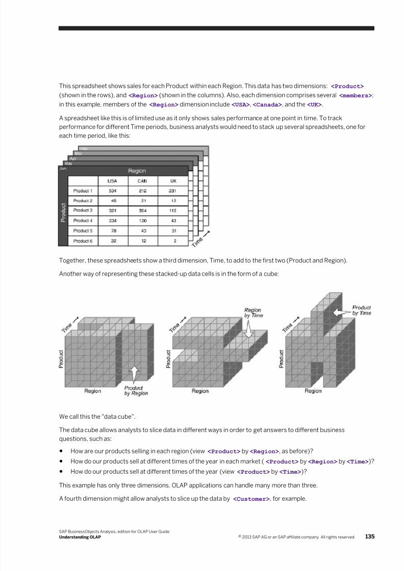
7/28/2019 Xi4sp5 Aa User En
http://slidepdf.com/reader/full/xi4sp5-aa-user-en 135/172
This spreadsheet shows sales for each Product within each Region. This data has two dimensions: <Product>
(shown in the rows), and <Region> (shown in the columns). Also, each dimension comprises several <members> ;
in this example, members of the <Region> dimension include <USA> , <Canada> , and the <UK> .
A spreadsheet like this is of limited use as it only shows sales performance at one point in time. To track
performance for different Time periods, business analysts would need to stack up several spreadsheets, one for
each time period, like this:
Together, these spreadsheets show a third dimension, Time, to add to the first two (Product and Region).
Another way of representing these stacked-up data cells is in the form of a cube:
We call this the "data cube".
The data cube allows analysts to slice data in different ways in order to get answers to different business
questions, such as:
● How are our products selling in each region (view <Product> by <Region> , as before)?
● How do our products sell at different times of the year in each market ( <Product> by <Region> by <Time> )?
● How do our products sell at different times of the year (view <Product> by <Time> )?
This example has only three dimensions. OLAP applications can handle many more than three.
A fourth dimension might allow analysts to slice up the data by <Customer> , for example.
SAP BusinessObjects Analysis, edition for OLAP User Guide
Understanding OLAP © 2013 SAP AG or an SAP affiliate company. All rights reserved. 135
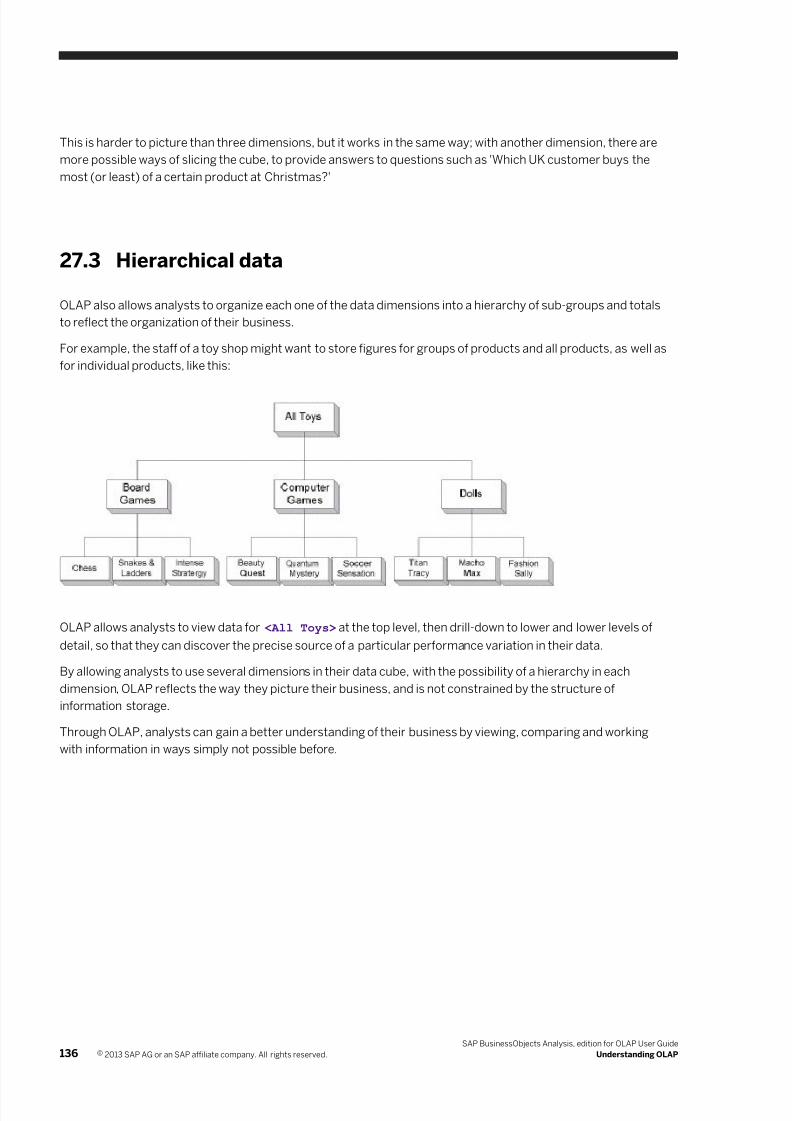
7/28/2019 Xi4sp5 Aa User En
http://slidepdf.com/reader/full/xi4sp5-aa-user-en 136/172
This is harder to picture than three dimensions, but it works in the same way; with another dimension, there are
more possible ways of slicing the cube, to provide answers to questions such as 'Which UK customer buys the
most (or least) of a certain product at Christmas?'
27.3 Hierarchical data
OLAP also allows analysts to organize each one of the data dimensions into a hierarchy of sub-groups and totals
to reflect the organization of their business.
For example, the staff of a toy shop might want to store figures for groups of products and all products, as well as
for individual products, like this:
OLAP allows analysts to view data for <All Toys> at the top level, then drill-down to lower and lower levels of
detail, so that they can discover the precise source of a particular performance variation in their data.
By allowing analysts to use several dimensions in their data cube, with the possibility of a hierarchy in each
dimension, OLAP reflects the way they picture their business, and is not constrained by the structure of
information storage.
Through OLAP, analysts can gain a better understanding of their business by viewing, comparing and working
with information in ways simply not possible before.
136 © 2013 SAP AG or an SAP affiliate company. All rights reserved.
SAP BusinessObjects Analysis, edition for OLAP User Guide
Understanding OLAP
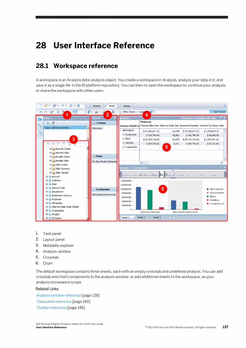
7/28/2019 Xi4sp5 Aa User En
http://slidepdf.com/reader/full/xi4sp5-aa-user-en 137/172
28 User Interface Reference
28.1 Workspace reference
A workspace is an Analysis data-analysis object. You create a workspace in Analysis, analyze your data in it, and
save it as a single file in the BI platform repository. You can then re-open the workspace to continue your analysis,
or share the workspace with other users.
1. Task panel
2. Layout panel
3. Metadata explorer
4. Analysis window
5. Crosstab
6. Chart
The default workspace contains three sheets, each with an empty crosstab and undefined analysis. You can add
crosstab and chart components to the analysis window, or add additional sheets to the workspace, as your
analysis increases in scope.
Related Links
Analysis window reference [page 138]
Task panel reference [page 140]
Toolbar reference [page 146]
SAP BusinessObjects Analysis, edition for OLAP User Guide
User Interface Reference © 2013 SAP AG or an SAP affiliate company. All rights reserved. 137
7/28/2019 Xi4sp5 Aa User En
http://slidepdf.com/reader/full/xi4sp5-aa-user-en 138/172
Crosstab component reference [page 157]
Chart component reference [page 163]
28.2 Analysis window reference
The main work area is called the analysis window. You can add up to four components to each sheet in the
analysis window, in any combination of crosstabs and charts.
Crosstab and chart components can occupy any of the four quadrants in the analysis window, or two adjacent
quadrants, or all four quadrants if you have a single component on the sheet.
The areas in the analysis window where you can drag components to from the toolbar are called drop zones. The
locations of the component drop zones change as you add or reposition components in the analysis window.
Related Links
Workspace reference [page 137]
Task pane l reference [page 140]
Toolbar re ference [page 146]
Crosstab component reference [page 157]
Chart component reference [page 163]
28.3 Layout panel reference
The Layout panel is where you place hierarchies and measures to define your analysis. You can place either a
single hierarchy or measure, or a group of selected measures, in the Rows, Columns, or Background areas in the
Layout panel. You can also nest hierarchies to help you define more complex analyses.
Click this button in the toolbar to toggle the Layout panel on and off.
Related Links
Workspac e reference [page 137]
Analyses [page 28]
Nesting hi erarchies to create co mplex analyses [page 33]
28.3.1 Drop zones in the Layout panel
The Layout panel contains drop zones for placing hierarchies when you define an analysis.
You drag a hierarchy or hierarchy level or measures to the center drop zone to add members to an empty axis, or
to replace existing members on that axis.
You drag a hierarchy or hierarchy level or measures to the upper or lower drop zone to add members to existing
members on that axis. The new members are nested with the existing members.
138 © 2013 SAP AG or an SAP affiliate company. All rights reserved.
SAP BusinessObjects Analysis, edition for OLAP User Guide
User Interface Reference
7/28/2019 Xi4sp5 Aa User En
http://slidepdf.com/reader/full/xi4sp5-aa-user-en 139/172
Related Links
Nesting hierarchies to create complex analyses [page 33]
28.3.2 Hierarchy functions in the Layout panel
You can right-click a hierarchy in the Layout panel to access these functions:
● Filter—filters the hierarchy by member or by measure.
● Sort—selects a sort type.
● Show Levels—selects which hierarchy levels are displayed.
● Display As—selects a format for displaying member names.
● Move To—moves the hierarchy to another axis.
● Move Before—nests the hierarchy before another hierarchy.
● Move After—nests the hierarchy after another hierarchy.
● Swap With—swaps positions with another hierarchy.
● Remove—removes the hierarchy from the crosstab.
Related Links
Filtering Data [page 53]
Sorting [page 68]
Hiding hierarchy levels [page 93]
To change the display of member keys and text [page 62]
28.3.3 Custom aggregates and multiple members in abackground filter
A custom aggregate is a group of members that a user selects, that do not roll up to an existing parent member in
a hierarchy.
For example, if you are interested in sales figures by region, then when you select CA, you see the aggregated
sales for all cities in the state of California. But if you are interested in only the cities of Los Angeles and Portland,
you cannot select one single member in the hierarchy that gives you the aggregated sales for just these two cities.
Or if you are interested in only a few cities in the state of California, but not all of them, again there is no single
member that gives you the aggregated sales for just those cities.
If you connect to a cube provider that supports custom aggregation, you can specify multiple members for a
background filter. Microsoft Analysis Services and SAP BW support custom aggregates.
Note
You cannot select multiple members from a measures dimension for a background filter.
SAP BusinessObjects Analysis, edition for OLAP User Guide
User Interface Reference © 2013 SAP AG or an SAP affiliate company. All rights reserved. 139
7/28/2019 Xi4sp5 Aa User En
http://slidepdf.com/reader/full/xi4sp5-aa-user-en 140/172
28.4 Task panel reference
The task panel, the panel at the left side of the workspace, contains the Data, Properties, and Outline panels.
These panels are used to define analyses, view dimensions and hierarchies, add and change data sources, view
component properties, and view the overall structure of analyses.
Click this icon in the panel title bar to hide the task panel. Click any panel button to open that panel:
Data panel
Properties panel
Outline panel
Related Links
Workspac e reference [page 137]
Analysis w indow reference [page 138]
Toolbar re ference [page 146]
Crosstab component reference [page 157]
Charts reference [page 163]
28.4.1 Data panel
On the Data panel, you add data sources, and view the dimensions, hierarchies, and hierarchy levels defined in
those data sources.
Related Links
Task pane l reference [page 140]
Task pane l reference [page 140]
Task pane l reference [page 140]
28.4.1.1 Data panel data source area
At the top of the Data panel is a list of active data sources that have been added to the workspace. When you
create a new workspace, you are prompted to add the first data source, but you can later add as many data
sources as you want.
Click Add Data Source to see a list of data sources that your system administrator has defined.
For more information about data sources, see OLAP data source objects [page 113]. For information about
defining OLAP data source connections, see "Creating OLAP data source connections" in the Administrator Guide.
140 © 2013 SAP AG or an SAP affiliate company. All rights reserved.
SAP BusinessObjects Analysis, edition for OLAP User Guide
User Interface Reference
7/28/2019 Xi4sp5 Aa User En
http://slidepdf.com/reader/full/xi4sp5-aa-user-en 141/172
Once you have added at least one data source, you can select the data source to view the metadata in the
metadata explorer, and define your analysis in the analysis window.
If any of your data sources are disabled, analyses that are based on the disabled data sources are not executed.
The disabled data sources still appear in the active data source list, but are unavailable.
Related Links
Disabled data source connections [page 116]
Task panel reference [page 140]
Task panel reference [page 140]
Task panel reference [page 140]
Task panel reference [page 140]
Task panel reference [page 140]
Task panel reference [page 140]
28.4.1.2 Data panel data source buttons
Above the data source area on the Data panel are buttons that you can use to add, remove, and refresh data
sources.
For more information about adding and removing data sources , see Adding data sources [page 113] and
Removing a data source [page 116].
Connect to a data source button
Click this button to add a data source to the list of active data sources on the Data panel.
Remove selected data source button
Click this button to remove a data source from the list of active data sources on the Data panel. The button is
enabled when a data source is selected on the list.
Edit SAP variable values button
Click this button to refresh your prompts against the SAP BW data source that your analysis is connected to.
Note
This button is visible only when an SAP BW data source that contains prompts is selected in the data source
area.
SAP BusinessObjects Analysis, edition for OLAP User Guide
User Interface Reference © 2013 SAP AG or an SAP affiliate company. All rights reserved. 141
7/28/2019 Xi4sp5 Aa User En
http://slidepdf.com/reader/full/xi4sp5-aa-user-en 142/172
Related Links
Task panel reference [page 140]
Task panel reference [page 140]
Task panel reference [page 140]
Task panel reference [page 140]
Task panel reference [page 140]
Task pane l reference [page 140]
28.4.1.3 Data panel metadata explorer
The metadata explorer displays cube dimensions and hierarchies in a tree structure.
When you open a data source, any measures dimensions are automatically expanded in the metadata explorer to
show the constituent measure members or measure groups.
Default hierarchies and display attributes are shown in bold.
dimension
measures or key figures dimension
group display attributes
favorite filter
hierarchy (Default hierarchies are shown in bold.)
hierarchy level
single measure
individual display attribute (Default attributes are shown in bold.)
You define analyses using the metadata explorer. You select hierarchies and measures, and add them to a
crosstab or chart in the analysis window.
For information about how to define an analysis, see Analyses [page 28]. For more information about using
crosstabs and charts, see Crosstabs [page 34] and Charts [page 36].
Related Links
Task panel reference [page 140]
Task panel reference [page 140]
Task panel reference [page 140]
Task panel reference [page 140]
Task panel reference [page 140]
Task pane l reference [page 140]
142 © 2013 SAP AG or an SAP affiliate company. All rights reserved.
SAP BusinessObjects Analysis, edition for OLAP User Guide
User Interface Reference
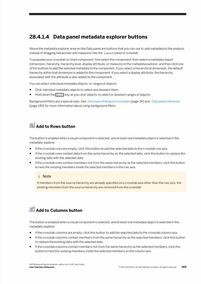
7/28/2019 Xi4sp5 Aa User En
http://slidepdf.com/reader/full/xi4sp5-aa-user-en 143/172
28.4.1.4 Data panel metadata explorer buttons
Above the metadata explorer area on the Data panel are buttons that you can use to add metadata to the analysis,instead of dragging hierarchies and measures into the Layout panel or crosstab.
To populate your crosstab or chart component, first select the component, then select a metadata object
(dimension, hierarchy, hierarchy level, display attribute, or measure) in the metadata explorer, and then click one
of the buttons to add the selected metadata to the component. If you select a hierarchical dimension, the default
hierarchy within that dimension is added to the component. If you select a display attribute, the hierarchy
associated with the attribute is also added to the component.
You can select individual metadata objects, or ranges of objects:
● Click individual metadata objects to select and deselect them.
● Hold down the Shift key as you click objects, to select or deselect ranges of objects.
Background filters are a special case. See Overview of Analysis crosstabs [page 34] and Task panel reference
[page 140] for more information about using background filters.
Add to Rows button
The button is enabled when a visual component is selected, and at least one metadata object is selected in the
metadata explorer.
●If the crosstab rows are empty, click this button to add the selected data to the crosstab row axis.
● If the crosstab rows contain data from the same hierarchy as the selected data, click this button to replace the
existing data with the selected data.
● If the crosstab rows contain members not from the same hierarchy as the selected members, click this button
to nest the existing members inside the selected members in the row axis.
Note
If members from the source hierarchy are already specified on a crosstab axis other than the row axis, the
existing members from the source hierarchy are removed from the crosstab.
Add to Columns button
The button is enabled when a visual component is selected, and at least one metadata object is selected in the
metadata explorer.
● If the crosstab columns are empty, click this button to add the selected data to the crosstab column axis.
● If the crosstab columns contain members from the same hierarchy as the selected members, click this button
to replace the existing data with the selected data.
● If the crosstab columns contain members not from the same hierarchy as the selected members, click this
button to nest the existing members inside the selected members on the column axis.
SAP BusinessObjects Analysis, edition for OLAP User Guide
User Interface Reference © 2013 SAP AG or an SAP affiliate company. All rights reserved. 143
7/28/2019 Xi4sp5 Aa User En
http://slidepdf.com/reader/full/xi4sp5-aa-user-en 144/172
Note
If members from the source hierarchy are already specified on a crosstab axis other than the column axis,
the existing members from the source hierarchy are removed from the crosstab.
Add to Background Filter button
With Microsoft Analysis Services and SAP BW data sources, you can add multiple members to the background
filter.
For information about custom aggregates and using multiple members in a background filter, see Task panel
reference [page 140].
The button is enabled when a visual component is selected, and at least one metadata object is selected in the
metadata explorer.
● If the crosstab background filter area is empty, click this button to add the selected data to the crosstab
background filter.
● If the crosstab background filter contains members from the same hierarchy as the selected members, click
this button to replace the existing data with the selected data.
● If the crosstab background filter contains members not from the same hierarchy as the selected members,
click this button to nest the existing members inside the selected members in the background filter.
Create Favorite Filter button
Click this button to create a favorite filter. After you save the filter, the filter is shown with a special icon in the
metadata explorer.
Edit Favorite Filter button
Click this button to change the members defined in a favorite filter.
Remove Favorite Filter button
Click this button to remove a favorite filter.
Related Links
Task panel reference [page 140]
144 © 2013 SAP AG or an SAP affiliate company. All rights reserved.
SAP BusinessObjects Analysis, edition for OLAP User Guide
User Interface Reference
7/28/2019 Xi4sp5 Aa User En
http://slidepdf.com/reader/full/xi4sp5-aa-user-en 145/172
Task panel reference [page 140]
Task panel reference [page 140]
Task panel reference [page 140]
Task panel reference [page 140]
Task panel reference [page 140]
28.4.2 Properties panel
The Properties panel displays a set of properties for the selected object. You can select a crosstab or chart, and
view the properties for that object on the Properties panel. The properties available to view or modify on the
Properties panel depend on the component selected.
These object properties can be modified on the Properties panel:
Object Properties that can be modified
crosstab ● Analysis Name
● Description
● Column Width
● Row Height
● Wrap Text
● Highlight Totals
● Show Formatted Cell Values
●Display Null Cells As
For information about these properties, see Descriptions of crosstab display options .
chart ● Sub-Analysis Name
● Description
● Style
● Palette
● Font
● Show Visual Totals
● Show Hierarchical Labeling
● Show Legend
● X Axis Label
● Y Axis Label
● Z Axis Label
● Y Axis Scale
● Y Axis Scale Symbol
● X Axis Measure
● Y Axis Measure
● Bubble Size Measure
● Manually Hide Chart Labels
● Hide Labels Less Than
● Show actual values
SAP BusinessObjects Analysis, edition for OLAP User Guide
User Interface Reference © 2013 SAP AG or an SAP affiliate company. All rights reserved. 145
7/28/2019 Xi4sp5 Aa User En
http://slidepdf.com/reader/full/xi4sp5-aa-user-en 146/172
Object Properties that can be modified
For information about these properties, see Descriptions of chart display options .
For descriptions of these properties and how to use them, see Crosstab component reference [page 157] and
Charts reference [page 163].
Related Links
Task pane l reference [page 140]
Task pane l reference [page 140]
Task pane l reference [page 140]
28.4.3 Outline panel
The Outline panel shows the relationships between analyses and visual components (crosstabs and charts) on all
sheets.
Related Links
Task panel reference [page 140]
Task panel reference [page 140]
Task panel reference [page 140]
28.5 Toolbar reference
You can perform most of your data-analysis tasks with the toolbar.
Note
Some of the toolbar buttons may be disabled, depending on the rights that have been assigned to users within
the Central Management Console, and depending on which object or component is selected in the analysis
window.
For more information on rights in the Central Management Console, see your system administrator or the SAP
BusinessObjects Analysis, edition for OLAP Administrator Guide.
For details on using the toolbar, see the following topics:
Related Links
Workspace reference [page 137]
Analysis w indow reference [page 138]
Task pane l reference [page 140]
Crosstab component reference [page 157]
Charts reference [page 163]
146 © 2013 SAP AG or an SAP affiliate company. All rights reserved.
SAP BusinessObjects Analysis, edition for OLAP User Guide
User Interface Reference
7/28/2019 Xi4sp5 Aa User En
http://slidepdf.com/reader/full/xi4sp5-aa-user-en 147/172
28.5.1 Toolbar overview
The toolbar contains buttons for the most commonly used functions, many grouped into tabs.
Several buttons have more than one function associated with them. For example, the Calculation button is used to
perform several types of calculations.
Some of these multi-function buttons have a default action associated with them. For example, clicking the arrow
beside the Sort button displays the sort operations that can be applied to the selected member, but clicking the
Sort button itself applies the default Ascending sort.
A chart button can be clicked to add a chart of that type to the default position in the analysis window, or the
button can be dragged to add the chart at a specific location in the analysis window.
Note
Many of the toolbar functions are also duplicated in context-sensitive right-click menus. For example, if you
right-click a hierarchy or a member header, a menu that contains relevant options appears.
28.5.2 Application buttons
28.5.2.1 New Workspace button
Use this button to create a new Analysis workspace.
Related Links
Create an Analysis workspace [page 16]
28.5.2.2 Open button
Use this button to open an existing workspace from the SAP BusinessObjects repository. Click the Open
button to execute the default Open Workspace function, or click the arrow beside the Open button to display
options for opening workspaces or analysis views.
Related Links
Open another Analysis workspace [page 26]
28.5.2.3 Save button
Use this button to save your workspace to the SAP BusinessObjects repository. Click the Save button to
execute the default Save function, or click the arrow beside the Save button to display options for saving your file.
SAP BusinessObjects Analysis, edition for OLAP User Guide
User Interface Reference © 2013 SAP AG or an SAP affiliate company. All rights reserved. 147
7/28/2019 Xi4sp5 Aa User En
http://slidepdf.com/reader/full/xi4sp5-aa-user-en 148/172
These save options are available:
Option Function
Save Saves the current workspace.
If you have created a new workspace and have not yet saved it, choosing the Save function
executes instead the Save As function.
Save As Saves the current workspace as a new repository object. The workspace can be newly created
or a modification of an existing workspace.
The Save As function allows you to choose the location and name of your new workspace.
Related Links
Save a workspace [page 25]
28.5.2.4 Send To button
Use this button to send a workspace to another BI platform user, or to an email recipient. Click the Send To
button to execute the default “SAP BusinessObjects Inbox” function, or click the arrow beside the Send To button
to display options for sending your workspace.
These options are available:
Option Function
SAP BusinessObjects Inbox Sends the workspace to the Inbox of another BI platform user.
Email Sends the workspace to an email recipient, as a link within an email. After clicking
the link, the recipient must log on to the BI platform to see the workspace.
Document Link Displays the URL for the workspace.
Related Links
Sending an Analysis workspace to another user [page 105]
28.5.2.5 Export button
Use this button to export data from an analysis to any of these destinations:
● Microsoft Excel
● comma-separated-values (.csv) file
● PDF (for distribution or printing)
● analysis view
Click the Export button to export data to Excel, or click the arrow beside the Export button to choose from the
export options.
148 © 2013 SAP AG or an SAP affiliate company. All rights reserved.
SAP BusinessObjects Analysis, edition for OLAP User Guide
User Interface Reference
7/28/2019 Xi4sp5 Aa User En
http://slidepdf.com/reader/full/xi4sp5-aa-user-en 149/172
Related Links
Exporting data to Excel [page 111]
Exporting data to comma-separated-values (.csv) files [page 112]
Printing and PDF Files [page 108]
Using Analyses in Other SAP BusinessObjects Applications [page 119]
28.5.2.6 Print button
Use this button to print your data to a PDF file. When you click this button, the Export to PDF dialog box
opens. From the dialog box, you can choose to print selected sheets or raw data. Within your PDF file viewer, you
can then save your output as a PDF file, or send it to your printer.
Related Links
Printing and PDF Files [page 108]
28.5.2.7 Undo button
Use this button to reverse the most recently performed action.
Note
Deleting a data source, analysis (on the Outline panel), or sheet clears the undo/redo history.
Note
A maximum of ten undo levels are saved.
Related Links
Toolbar reference [page 146]
28.5.2.8 Redo button
Use this button to re-apply the action that was reversed by the Undo button.
Note
A maximum of ten redo levels are saved.
SAP BusinessObjects Analysis, edition for OLAP User Guide
User Interface Reference © 2013 SAP AG or an SAP affiliate company. All rights reserved. 149
7/28/2019 Xi4sp5 Aa User En
http://slidepdf.com/reader/full/xi4sp5-aa-user-en 150/172
28.5.2.9 Discard Changes button
Use this button to discard all changes made to the workspace since it was opened.
28.5.2.10 Copy button
Use this button to copy the currently selected crosstab or chart component. After copying the component,
you can paste the component onto the same sheet or a different sheet.
Note
The Copy button is disabled until you select a crosstab or chart component.
Related Links
Copying a component [page 95]
28.5.2.11 Paste button
Use this button to paste the copied crosstab or chart component to the same sheet or a different sheet.
Note
The Paste button is disabled until you copy a crosstab or chart component.
Related Links
Copying a component [page 95]
28.5.2.12 Delete button
Use this button to delete the selected crosstab or chart from the sheet.
Note
The Delete button is disabled until you select a crosstab or chart component.
150 © 2013 SAP AG or an SAP affiliate company. All rights reserved.
SAP BusinessObjects Analysis, edition for OLAP User Guide
User Interface Reference
7/28/2019 Xi4sp5 Aa User En
http://slidepdf.com/reader/full/xi4sp5-aa-user-en 151/172
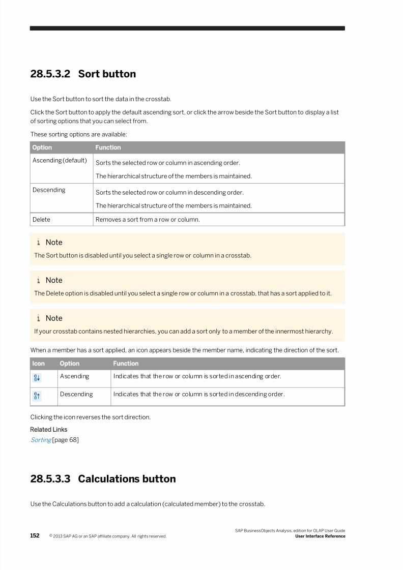
7/28/2019 Xi4sp5 Aa User En
http://slidepdf.com/reader/full/xi4sp5-aa-user-en 152/172
28.5.3.2 Sort button
Use the Sort button to sort the data in the crosstab.
Click the Sort button to apply the default ascending sort, or click the arrow beside the Sort button to display a list
of sorting options that you can select from.
These sorting options are available:
Option Function
Ascending (default) Sorts the selected row or column in ascending order.
The hierarchical structure of the members is maintained.
Descending Sorts the selected row or column in descending order.
The hierarchical structure of the members is maintained.
Delete Removes a sort from a row or column.
Note
The Sort button is disabled until you select a single row or column in a crosstab.
Note
The Delete option is disabled until you select a single row or column in a crosstab, that has a sort applied to it.
Note
If your crosstab contains nested hierarchies, you can add a sort only to a member of the innermost hierarchy.
When a member has a sort applied, an icon appears beside the member name, indicating the direction of the sort.
Icon Option Function
Ascending Indicates that the row or column is sorted in ascending order.
Descending Indicates that the row or column is sorted in descending order.
Clicking the icon reverses the sort direction.
Related Links
Sorting [page 68]
28.5.3.3 Calculations button
Use the Calculations button to add a calculation (calculated member) to the crosstab.
152 © 2013 SAP AG or an SAP affiliate company. All rights reserved.
SAP BusinessObjects Analysis, edition for OLAP User Guide
User Interface Reference
7/28/2019 Xi4sp5 Aa User En
http://slidepdf.com/reader/full/xi4sp5-aa-user-en 153/172
Click the Calculations button to open the Calculation panel if you want to create custom calculations, or click the
arrow beside the Calculations button for more calculation options.
Note
If you select one member before you click the Calculations button, you can access the dynamic calculations. If
you select two members before you click the Calculations button, you can access the simple arithmetic
calculations.
These calculation options are available:
Calculation Description
Add Adds the values in the selected rows or columns.
Subtract Subtracts the values in the selected rows or columns.
The cell values from the second selected row or column are subtracted from the values in
the first selected row or column.
Multiply Multiplies the values in the selected rows or columns.
Divide Divides the values in the selected rows or columns.
The cell values from the first selected member row or column are divided by the values in
the second selected row or column.
Dynamic
Calculation
Opens a list of dynamic calculations.
Custom
Calculation
Opens the Calculation panel so that you can create a calculation by defining a formula.
Related Links
Calculations [page 76]
28.5.3.4 Conditional Formatting button
Use the Conditional Formatting button to apply color to or add symbols to the cells in a crosstab, highlighting
important differences or unexpected results.
For example, you might want to highlight a value that is greater or less than a predetermined value.
Note
The Conditional Formatting button is disabled until you select a member in a crosstab.
Related Links
Conditional Formatting (Highlighting Exceptions) [page 72]
SAP BusinessObjects Analysis, edition for OLAP User Guide
User Interface Reference © 2013 SAP AG or an SAP affiliate company. All rights reserved. 153
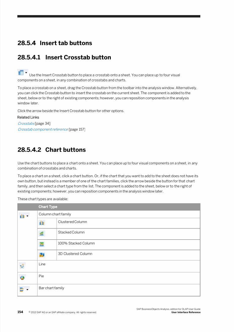
7/28/2019 Xi4sp5 Aa User En
http://slidepdf.com/reader/full/xi4sp5-aa-user-en 154/172
28.5.4 Insert tab buttons
28.5.4.1 Insert Crosstab button
Use the Insert Crosstab button to place a crosstab onto a sheet. You can place up to four visual
components on a sheet, in any combination of crosstabs and charts.
To place a crosstab on a sheet, drag the Crosstab button from the toolbar into the analysis window. Alternatively,
you can click the Crosstab button to insert the crosstab on the current sheet. The component is added to the
sheet, below or to the right of existing components; however, you can reposition components in the analysis
window later.
Click the arrow beside the Insert Crosstab button for other options.
Related Links
Crosstabs [page 34]
Crosstab component reference [page 157]
28.5.4.2 Chart buttons
Use the chart buttons to place a chart onto a sheet. You can place up to four visual components on a sheet, in any
combination of crosstabs and charts.
To place a chart on a sheet, click a chart button. Or, if the chart that you want to add to the sheet does not have its
own button, but instead is a member of one of the chart families, click the arrow beside the button for that chart
family, and then select a chart type from the list. The component is added to the sheet, below or to the right of
existing components; however, you can reposition components in the analysis window later.
These chart types are available:
Chart Type
Column chart family
Clustered Column
Stacked Column
100% Stacked Column
3D Clustered Column
Line
Pie
Bar chart family
154 © 2013 SAP AG or an SAP affiliate company. All rights reserved.
SAP BusinessObjects Analysis, edition for OLAP User Guide
User Interface Reference
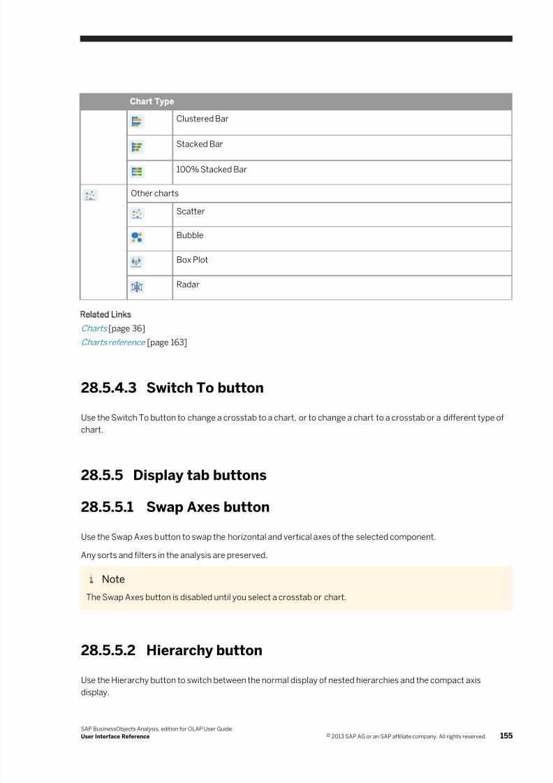
7/28/2019 Xi4sp5 Aa User En
http://slidepdf.com/reader/full/xi4sp5-aa-user-en 155/172
Chart Type
Clustered Bar
Stacked Bar
100% Stacked Bar
Other charts
Scatter
Bubble
Box Plot
Radar
Related Links
Charts [page 36]
Charts reference [page 163]
28.5.4.3 Switch To button
Use the Switch To button to change a crosstab to a chart, or to change a chart to a crosstab or a different type of
chart.
28.5.5 Display tab buttons
28.5.5.1 Swap Axes button
Use the Swap Axes button to swap the horizontal and vertical axes of the selected component.
Any sorts and filters in the analysis are preserved.
Note
The Swap Axes button is disabled until you select a crosstab or chart.
28.5.5.2 Hierarchy button
Use the Hierarchy button to switch between the normal display of nested hierarchies and the compact axis
display.
SAP BusinessObjects Analysis, edition for OLAP User Guide
User Interface Reference © 2013 SAP AG or an SAP affiliate company. All rights reserved. 155
7/28/2019 Xi4sp5 Aa User En
http://slidepdf.com/reader/full/xi4sp5-aa-user-en 156/172
Note
The compact axis display is available only with SAP BW data, and therefore the Hierarchy button is available
only when using SAP BW data.
28.5.5.3 Measure Format button
Use the Measure Format button to change the appearance of your data by adding formatting.
Some of the types of formatting you can add are:
● The way the numbers in your crosstab are displayed (for example, in scientific notation).
●
The number of decimal places displayed (any number from 0 to 99; the default is 2).● The way negative values are displayed.
Related Links
Formatting Data [page 100]
28.5.5.4 Totals & Parents button
Use the Totals & Parents button to display totals and parents. Totals and parents can be set to show any of the
supported aggregation types.
Related Links
Totals, Pa rents, and Aggregations [page 85]
28.5.5.5 Nulls button
Use the Nulls button to suppress rows and columns that contain only null values from being displayed in the
crosstab.
You can also suppress rows only, columns only, or both.
Related Links
To filter out null & zero rows and columns [page 67]
28.5.5.6 Nulls & Zeros button
Use the Nulls & Zeros button to suppress rows and columns that contain only null or zero values from being
displayed in the crosstab.
You can also suppress rows only, columns only, or both.
Related Links
156 © 2013 SAP AG or an SAP affiliate company. All rights reserved.
SAP BusinessObjects Analysis, edition for OLAP User Guide
User Interface Reference
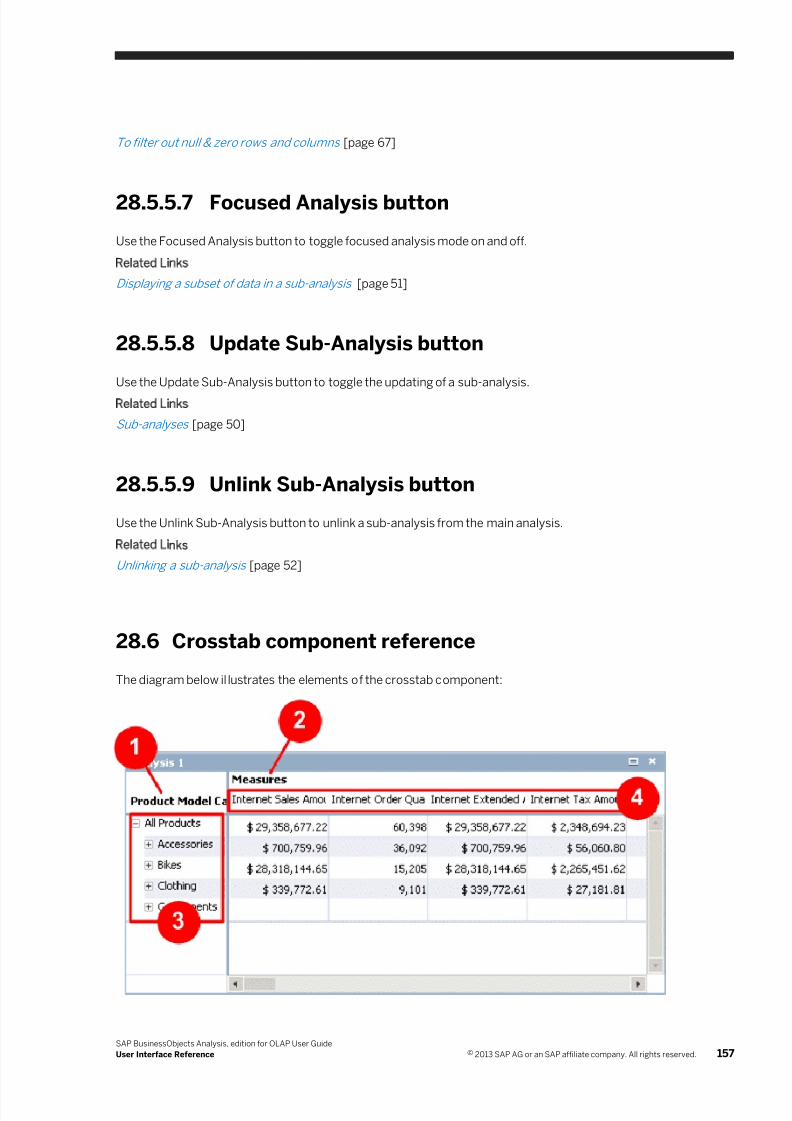
7/28/2019 Xi4sp5 Aa User En
http://slidepdf.com/reader/full/xi4sp5-aa-user-en 157/172
To filter out null & zero rows and columns [page 67]
28.5.5.7 Focused Analysis button
Use the Focused Analysis button to toggle focused analysis mode on and off.
Related Links
Displaying a subset of data in a sub-analysis [page 51]
28.5.5.8 Update Sub-Analysis button
Use the Update Sub-Analysis button to toggle the updating of a sub-analysis.
Related Links
Sub-analyses [page 50]
28.5.5.9 Unlink Sub-Analysis button
Use the Unlink Sub-Analysis button to unlink a sub-analysis from the main analysis.
Related Links
Unlinking a sub-analysis [page 52]
28.6 Crosstab component reference
The diagram below illustrates the elements of the crosstab component:
SAP BusinessObjects Analysis, edition for OLAP User Guide
User Interface Reference © 2013 SAP AG or an SAP affiliate company. All rights reserved. 157
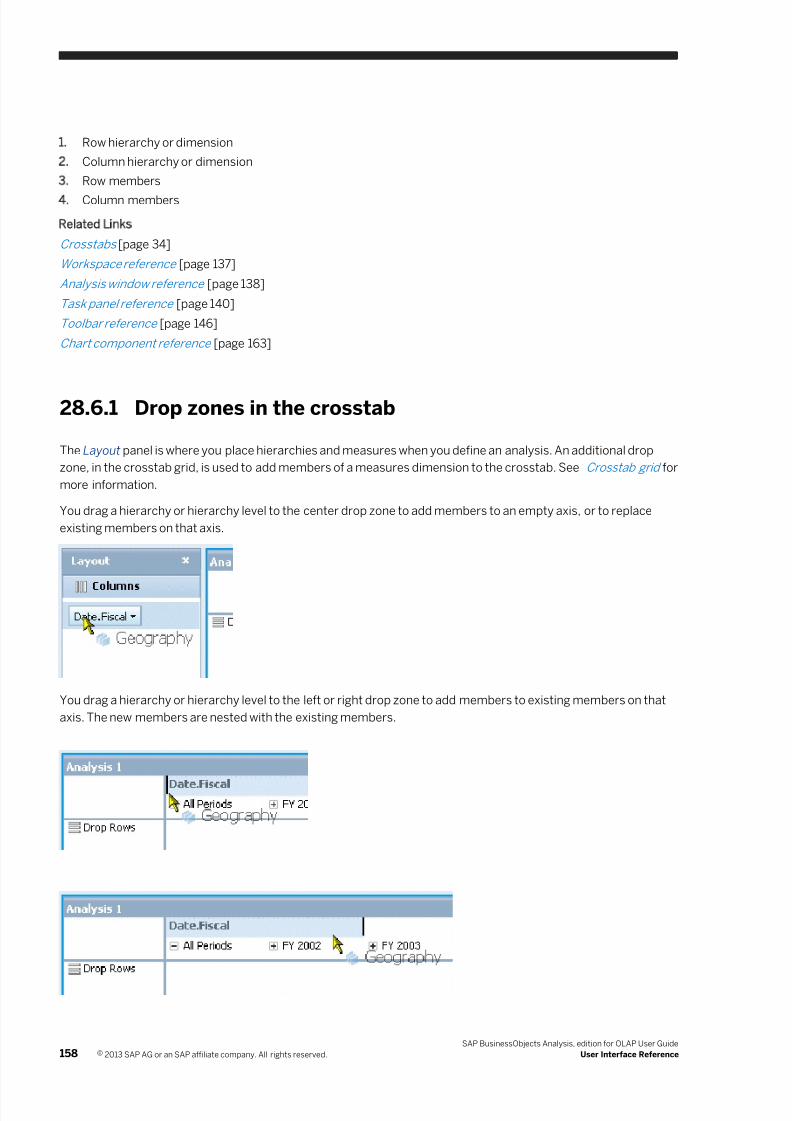
7/28/2019 Xi4sp5 Aa User En
http://slidepdf.com/reader/full/xi4sp5-aa-user-en 158/172
1. Row hierarchy or dimension
2. Column hierarchy or dimension
3. Row members
4. Column members
Related Links
Crosstabs [page 34]
Workspace reference [page 137]
Analysis window reference [page 138]
Task panel reference [page 140]
Toolbar reference [page 146]
Chart component reference [page 163]
28.6.1 Drop zones in the crosstab
The Layout panel is where you place hierarchies and measures when you define an analysis. An additional drop
zone, in the crosstab grid, is used to add members of a measures dimension to the crosstab. See Crosstab grid for
more information.
You drag a hierarchy or hierarchy level to the center drop zone to add members to an empty axis, or to replace
existing members on that axis.
You drag a hierarchy or hierarchy level to the left or right drop zone to add members to existing members on that
axis. The new members are nested with the existing members.
158 © 2013 SAP AG or an SAP affiliate company. All rights reserved.
SAP BusinessObjects Analysis, edition for OLAP User Guide
User Interface Reference
7/28/2019 Xi4sp5 Aa User En
http://slidepdf.com/reader/full/xi4sp5-aa-user-en 159/172
Related Links
Nesting hierarchies to create complex analyses [page 33]
28.6.2 Hierarchy functions in the crosstab
You can right-click a hierarchy in the crosstab to access these functions:
● Filter—filters the hierarchy by member or by measure.
● Sort—selects a sort type.
● Show Levels—selects which hierarchy levels are displayed.
● Display As—selects a format for displaying member names.
● Move To—moves the hierarchy to another axis.
● Move Before—nests the hierarchy before another hierarchy.
● Move After—nests the hierarchy after another hierarchy.
● Swap With—swaps positions with another hierarchy.
● Remove—removes the hierarchy from the crosstab.
Related Links
Filtering Data [page 53]
Sorting [page 68]
Hiding hierarchy leve ls [page 93]
To change the displa y of member k eys and text [page 62]
Crosstab componen t reference [page 157]
Crosstabs [page 34]
Crosstab grid [page 157]
Crosstab display opt ions [page 157]
Crosstab tooltips [page 157]
28.6.3 Crosstab grid
The crosstab grid is where member headers and data are displayed.
Row and column resizing
You can drag the edges of row and column member headers to resize them.
SAP BusinessObjects Analysis, edition for OLAP User Guide
User Interface Reference © 2013 SAP AG or an SAP affiliate company. All rights reserved. 159
7/28/2019 Xi4sp5 Aa User En
http://slidepdf.com/reader/full/xi4sp5-aa-user-en 160/172
Icons in member headers
If you have applied any sorting or calculations to a member, icons are displayed in the member header.
Member functions
You can right-click a member header in the crosstab grid to access these functions:
● Expand/Collapse—For information on expanding and collapsing members, see Expanding and collapsing
parent members .
● Sort—For information on sorting data, see Sorting .
● Totals & Sub-totals—For information on adding totals and subtotals to the crosstab, see Totals, Parents, and
Aggregations .
● Conditional Formatting—For information on adding conditional formatting to data, see Applying conditional
formatting .
● Dynamic Calculation—For information on adding and defining calculations, see Creating calculations .
● Custom Calculation—For information on adding and defining calculations, see Creating calculations .
● Reorder Members—For information on reordering members, see Reordering members .
● Jumplink—For information on creating links to other documents, see Linking to Reports .
● Remove—For information on hiding members, see Removing displayed members .
Cell drop zone
To add measures to the crosstab, you can drag measures to the row or column axis, or to the background filter,
but you can also drag measures to the main cell area. This drop zone is for the purpose of changing or adding
members of a measures dimension only. You cannot drop members of a non-measures dimension on the cell
drop zone, and you cannot drop the entire measures dimension on the cell drop zone.
When you drop measures on the cell drop zone, those measures are placed on the column axis.
If you have already placed some members of a measures dimension on the row or column axis, dropping
additional measures onto the cell drop zone adds those measures to the other measures on the same axis.
If you have already placed a measure member in the background filter, dropping another member onto the celldrop zone swaps the measures dimension to the column axis and adds the new member to the selection.
Cell selection
If you want to apply conditional formatting to just a selection of cells, you can click and drag in the crosstab to
select a range of cells.
Related Links
Crosstab component reference [page 157]
Crosstabs [page 34]
160 © 2013 SAP AG or an SAP affiliate company. All rights reserved.
SAP BusinessObjects Analysis, edition for OLAP User Guide
User Interface Reference
7/28/2019 Xi4sp5 Aa User En
http://slidepdf.com/reader/full/xi4sp5-aa-user-en 161/172
Crosstab display options [page 161]
Crosstab tooltips [page 163]
28.6.4 Crosstab display options
The following options are available to customize the appearance of the crosstab. You can access these options
from the Properties panel. For information about these properties, see Descriptions of crosstab display options .
Option Values
Analysis Name Text string up to 50 characters
Description Text string up to 255 characters
Column Width Numeric value
Row Height Numeric value
Wrap Text Yes, No
Highlight Totals Yes, No
Show Formatted Cell Values Yes, No
Display Null Cells As Text string up to 50 characters
28.6.4.1 Descriptions of crosstab display options
Analysis Name
This option defines the name of the analysis represented by the crosstab component. The name is displayed in
the crosstab's title bar, and is also used to identify the crosstab on the Outline panel. The default value is the name
generated automatically when the crosstab is created.
Description
In addition to the crosstab's name, you can add comments to describe the crosstab, up to a maximum of 255
characters. Descriptions are optional and are not displayed on the crosstab component, but if you print a crosstab
to a PDF document, the description can be added in the page header or footer.
Column Width
This option defines the width of crosstab columns, in pixels. The value you enter applies to all columns in the
crosstab.
SAP BusinessObjects Analysis, edition for OLAP User Guide
User Interface Reference © 2013 SAP AG or an SAP affiliate company. All rights reserved. 161
7/28/2019 Xi4sp5 Aa User En
http://slidepdf.com/reader/full/xi4sp5-aa-user-en 162/172
The minimum allowed value is 20.
Row Height
This option defines the height of crosstab rows, in pixels. The value you enter applies to all rows in the crosstab.
The minimum allowed value is 20.
Wrap Text
This option defines whether text in crosstab cells wraps.
The default value is No.
Highlight Totals
This option defines whether grand totals and subtotals are highlighted with a unique color in the crosstab.
The default value is Yes.
Show Formatted Cell Values
This option defines whether cell values are displayed with or without the formatting defined in the Measure
Format dialog box. For more information about formatting measures, see Formatting Data .
The default value is Yes.
Display Null Cells As
This option defines how null values are displayed. You can type any text that you want, up to a maximum of 50
characters. The input is always treated as text, even if numeric values are entered.
By default, null values are displayed as empty cells.
Related Links
Properties panel [page 145]
Crosstab component reference [page 157]
Crosstabs [page 34]
Crosstab grid [page 157]
Crosstab tooltips [page 163]
162 © 2013 SAP AG or an SAP affiliate company. All rights reserved.
SAP BusinessObjects Analysis, edition for OLAP User Guide
User Interface Reference
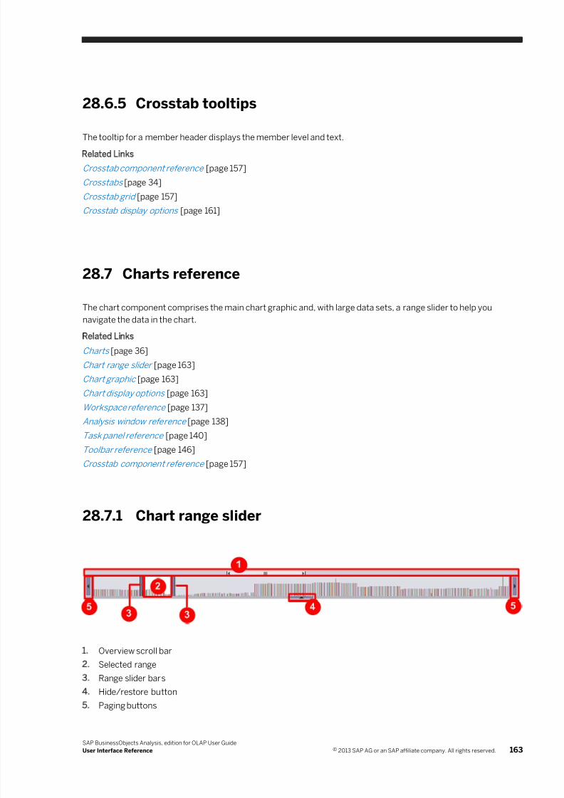
7/28/2019 Xi4sp5 Aa User En
http://slidepdf.com/reader/full/xi4sp5-aa-user-en 163/172
28.6.5 Crosstab tooltips
The tooltip for a member header displays the member level and text.
Related Links
Crosstab component reference [page 157]
Crosstabs [page 34]
Crosstab grid [page 157]
Crosstab display options [page 161]
28.7 Charts reference
The chart component comprises the main chart graphic and, with large data sets, a range slider to help you
navigate the data in the chart.
Related Links
Charts [page 36]
Chart range slider [page 163]
Chart graphic [page 163]
Chart display options [page 163]
Workspace reference [page 137]
Analysis window refe rence [page 138]
Task panel reference [page 140]
Toolbar reference [page 146]
Crosstab componen t reference [page 157]
28.7.1 Chart range slider
1. Overview scroll bar
2. Selected range
3. Range slider bars
4. Hide/restore button
5. Paging buttons
SAP BusinessObjects Analysis, edition for OLAP User Guide
User Interface Reference © 2013 SAP AG or an SAP affiliate company. All rights reserved. 163
7/28/2019 Xi4sp5 Aa User En
http://slidepdf.com/reader/full/xi4sp5-aa-user-en 164/172
The chart range slider lets you scroll through charts that contain large data sets. It appears automatically when
the data set in the chart is too large to be displayed legibly in the main chart graphic. The range slider is available
with these chart types:
● column charts (except 3D clustered column)
● line charts
● pie charts
● bar charts
Range slider bars
The range slider bars let you resize and reposition the selected range within the range slider control. You move the
bars to the approximate positions you want, and when you release the mouse button, the bars are adjusted to thenearest logical data points.
Selected range
The area between the range slider bars is the selected range. This range is expanded in the main chart graphic.
You can also drag the selected range within the range slider to scroll through the chart.
Overview scroll bar
With very large data sets, the range slider cannot display the full data set legibly. Instead, the overview scroll bar
represents the full data set while the range slider represents only a portion of the full data set. The relative size of
the scroll box within the overview scroll bar indicates the percentage of the full data set being displayed in the
range slider.
Use the overview scroll bar to move the range slider to different subsets of the full data set.
Hide/restore button
To allow the main chart graphic to occupy more space in the chart component, you can hide the range slider by
clicking the arrow button at the edge of the range slider. Click the arrow button again to restore the range slider.
Paging buttons
The arrow buttons at the ends of the range slider move the selected range by one "page" of elements within the
range slider. A page is defined as the current size of the selected range.
164 © 2013 SAP AG or an SAP affiliate company. All rights reserved.
SAP BusinessObjects Analysis, edition for OLAP User Guide
User Interface Reference
7/28/2019 Xi4sp5 Aa User En
http://slidepdf.com/reader/full/xi4sp5-aa-user-en 165/172
With very large data sets, the range slider represents only a portion of the full data set. In that case, the arrow
buttons move the selected range by one page of elements as usual, until the selected range reaches the end of the
range slider. Clicking an arrow button again moves the selected range further but also moves the range slider
within the full data set.
Autoscaling in the range slider
In the range slider, the values are scaled automatically to fit the slider. For example, in a column or bar chart, if the
subset of data currently being displayed in the range slider includes values between 1 and 100, the number 2 is
represented by a very short riser. But if you scroll the range slider to a different subset of data that includes values
only between 1 and 2, the values are scaled so that the number 2 is represented by a long riser.
Related Links
Scrolling through large data sets in charts [page 43]
Chart component reference [page 163]
Chart graphic [page 165]
Chart display options [page 166]
28.7.2 Chart graphic
The chart graphic displays the data returned by the defined analysis or sub-analysis.
Member functions
If the chart represents a sub-analysis, you can right-click the chart graphic to change the chart type. If the chart
represents an analysis, you can right-click a member in the chart to access these functions:
● Expand, Collapse—For information on expanding and collapsing members, see Expanding and collapsing
parent members [page 88].
● Remove—For information on removing members, see Hidin g members from view .
● Switch to a different chart type, or to a crosstab—For information on chart types, see Chart types .
Related Links
Chart component reference [page 163]
Chart range slider [page 163]
Chart display options [page 163]
SAP BusinessObjects Analysis, edition for OLAP User Guide
User Interface Reference © 2013 SAP AG or an SAP affiliate company. All rights reserved. 165
7/28/2019 Xi4sp5 Aa User En
http://slidepdf.com/reader/full/xi4sp5-aa-user-en 166/172
28.7.2.1 Charts with large data sets
Elements in charts are automatically sized to fill the available space efficiently, using intelligent display techniquesto fit as much legible member text into the chart as possible. However, if a chart has a large data set, the chart
may not be able to display all elements, or some member text may be omitted from the chart.
Member text in charts
If your chart includes many members on an axis, member text is staggered and reoriented to display as much text
as possible. However, if the number of members is very large, only a subset of the member text is displayed on the
chart, so that the remaining text is legible.
Member text that is omitted from the chart can be viewed in tooltips when you rest the mouse pointer over
members.
Related Links
Chart range slider [page 163]
28.7.2.2 Chart colors and style
Several color palettes and styles are available for displaying your charts.
Related Links
Chart display options [page 163]
28.7.2.3 Data type considerations
The measures defined on a cube might not be based on the same unit of measure or data type. For example,
measures such as Unit Sales, Store Cost, and Store Sales use the data type double, but the Sales Count measure
uses the data type integer. When the chart is rendered, all numeric values are converted to the data type
double.
28.7.3 Chart display options
The following options are available to customize your charts. You can access these options from the Properties
panel. For information about these properties, see Descriptions of chart display options .
Option Values
Analysis Name Text string up to 50 characters
Description Text string up to 255 characters
166 © 2013 SAP AG or an SAP affiliate company. All rights reserved.
SAP BusinessObjects Analysis, edition for OLAP User Guide
User Interface Reference
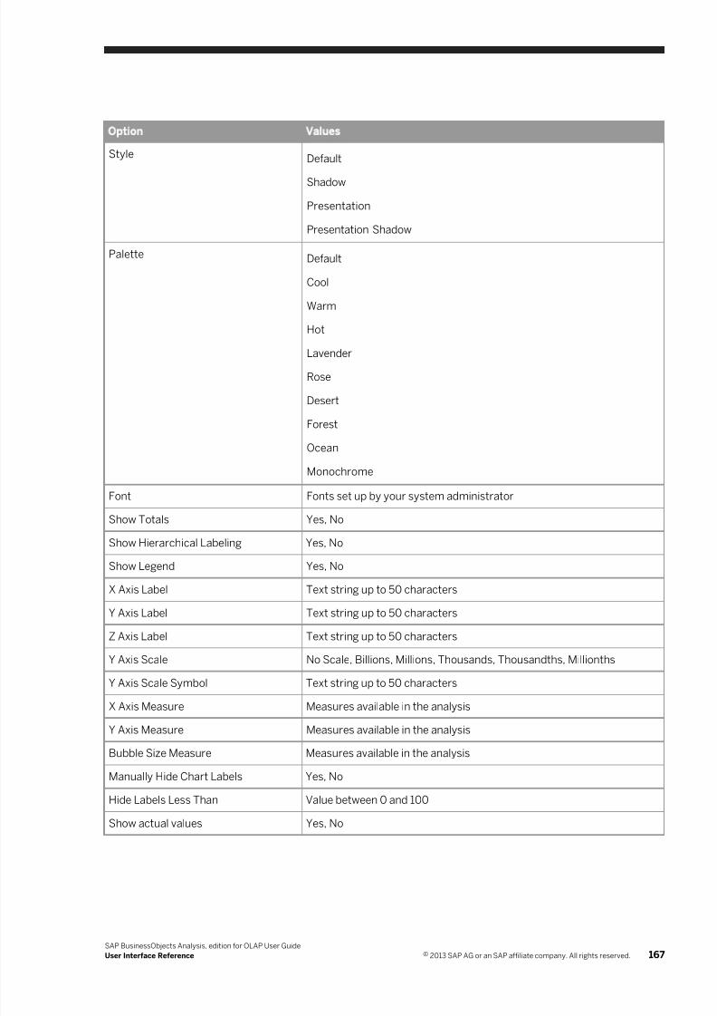
7/28/2019 Xi4sp5 Aa User En
http://slidepdf.com/reader/full/xi4sp5-aa-user-en 167/172
Option Values
Style Default
Shadow
Presentation
Presentation Shadow
Palette Default
Cool
Warm
Hot
Lavender
Rose
Desert
Forest
Ocean
Monochrome
Font Fonts set up by your system administrator
Show Totals Yes, No
Show Hierarchical Labeling Yes, No
Show Legend Yes, No
X Axis Label Text string up to 50 characters
Y Axis Label Text string up to 50 characters
Z Axis Label Text string up to 50 characters
Y Axis Scale No Scale, Billions, Millions, Thousands, Thousandths, Millionths
Y Axis Scale Symbol Text string up to 50 characters
X Axis Measure Measures available in the analysis
Y Axis Measure Measures available in the analysis
Bubble Size Measure Measures available in the analysis
Manually Hide Chart Labels Yes, No
Hide Labels Less Than Value between 0 and 100
Show actual values Yes, No
SAP BusinessObjects Analysis, edition for OLAP User Guide
User Interface Reference © 2013 SAP AG or an SAP affiliate company. All rights reserved. 167
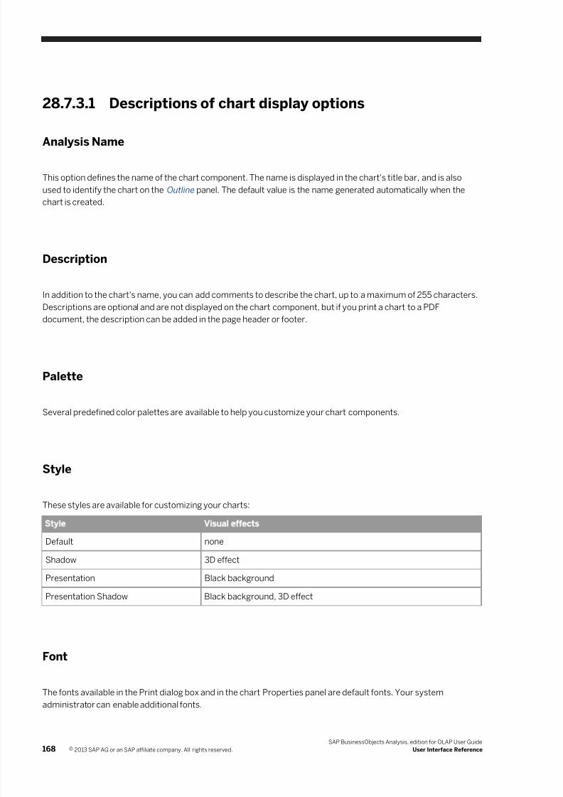
7/28/2019 Xi4sp5 Aa User En
http://slidepdf.com/reader/full/xi4sp5-aa-user-en 168/172
28.7.3.1 Descriptions of chart display options
Analysis Name
This option defines the name of the chart component. The name is displayed in the chart's title bar, and is also
used to identify the chart on the Outline panel. The default value is the name generated automatically when the
chart is created.
Description
In addition to the chart's name, you can add comments to describe the chart, up to a maximum of 255 characters.
Descriptions are optional and are not displayed on the chart component, but if you print a chart to a PDF
document, the description can be added in the page header or footer.
Palette
Several predefined color palettes are available to help you customize your chart components.
Style
These styles are available for customizing your charts:
Style Visual effects
Default none
Shadow 3D effect
Presentation Black background
Presentation Shadow Black background, 3D effect
Font
The fonts available in the Print dialog box and in the chart Properties panel are default fonts. Your system
administrator can enable additional fonts.
168 © 2013 SAP AG or an SAP affiliate company. All rights reserved.
SAP BusinessObjects Analysis, edition for OLAP User Guide
User Interface Reference
7/28/2019 Xi4sp5 Aa User En
http://slidepdf.com/reader/full/xi4sp5-aa-user-en 169/172
Show Totals
If you have totals displayed on the crosstab, you can choose to show those totals in charts that are linked to the
same analysis.
Show Hierarchical Labeling
When hierarchical labeling is on, the chart axis labels show the parent-child relationships of the members. The
default value is No. Hierarchical labeling is applied only when the Show Parents option is set to Yes.
Show Legend
Choose Yes if you want the chart legend to be displayed. The default value is Yes.
Note
If there is limited space available in the chart component, the chart legend is automatically removed.
X Axis Label
The X axis is the horizontal axis.
Y Axis Label
The Y axis is the vertical axis.
Y Axis Scale
You can scale the displayed values. For example, if a chart contains several values between 5,000,000 and
20,000,000, you can select the Millions scale to display those values as 5 to 20.
Y Axis Scale Symbol
You can specify the label applied to the Y axis scaling. For example, if you select the Millions scale, you can add the
label “(in millions of dollars)”.
SAP BusinessObjects Analysis, edition for OLAP User Guide
User Interface Reference © 2013 SAP AG or an SAP affiliate company. All rights reserved. 169
7/28/2019 Xi4sp5 Aa User En
http://slidepdf.com/reader/full/xi4sp5-aa-user-en 170/172
Z Axis Label
The Z axis is the lower-right axis for 3D clustered column charts.
X Axis Measure
For scatter and bubble charts, this option defines which of the measures available in the analysis is plotted on the
chart's X axis.
Y Axis Measure
For scatter and bubble charts, this option defines which of the measures available in the analysis is plotted on the
chart's Y axis.
Bubble Size Measure
For bubble charts, this option defines which of the measures available in the analysis is represented by the sizes of
the bubbles.
Manually Hide Chart Labels
For pie charts, this option allows you to suppress labels for small pie slices. When this option is set to Yes, the
Hide Labels Less Than property is enabled.
Hide Labels Less Than
For pie charts, this option sets the level below which the pie slice labels are suppressed. This option is enabled
only if the Manually Hide Chart Labels property is set to Yes.
Show actual values
Choose Yes if you want pie chart labels to reflect actual values instead of percentages. The default value is No.
Related Links
Task panel reference [page 140]
170 © 2013 SAP AG or an SAP affiliate company. All rights reserved.
SAP BusinessObjects Analysis, edition for OLAP User Guide
User Interface Reference

7/28/2019 Xi4sp5 Aa User En
http://slidepdf.com/reader/full/xi4sp5-aa-user-en 171/172
Chart component reference [page 163]
Chart range slider [page 163]
Chart graphic [page 163]
Chart types [page 39]
SAP BusinessObjects Analysis, edition for OLAP User Guide
User Interface Reference © 2013 SAP AG or an SAP affiliate company. All rights reserved. 171

7/28/2019 Xi4sp5 Aa User En
http://slidepdf.com/reader/full/xi4sp5-aa-user-en 172/172
www.sap.com/contactsap