Embed Size (px)
Citation preview
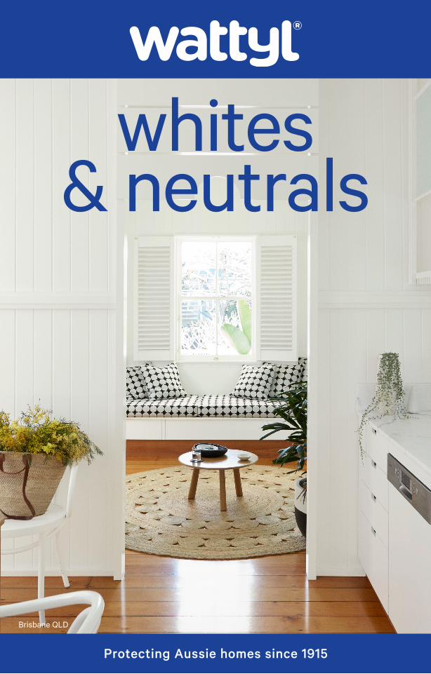
whites & neutrals
Brisbane QLD
Protecting Aussie homes since 1915
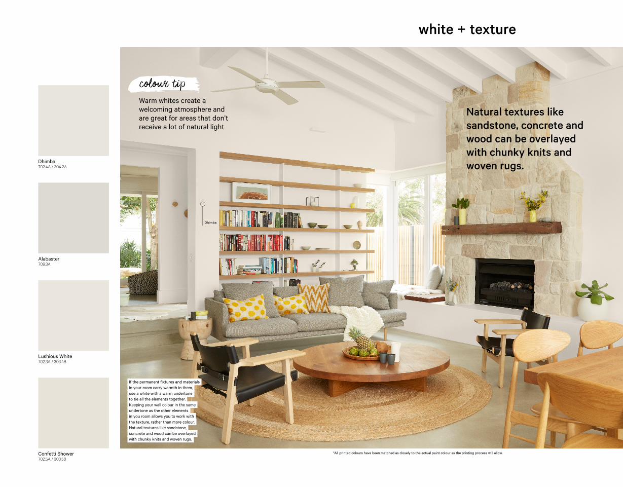
white + texture
If the permanent fixtures and materialsin your room carry warmth in them, use a white with a warm undertone to tie all the elements together. Keeping your wall colour in the same undertone as the other elements in you room allows you to work with the texture, rather than more colour. Natural textures like sandstone, concrete and wood can be overlayed with chunky knits and woven rugs.
Alabaster709.3A
Dhimba702.4A / 304.2A
Lushious White702.3A / 303.4B
Confetti Shower702.5A / 303.5B
Natural textures like sandstone, concrete and wood can be overlayed with chunky knits and woven rugs.
Warm whites create a welcoming atmosphere and are great for areas that don’t receive a lot of natural light
colour tip
*All printed colours have been matched as closely to the actual paint colour as the printing process will allow.
Dhimba
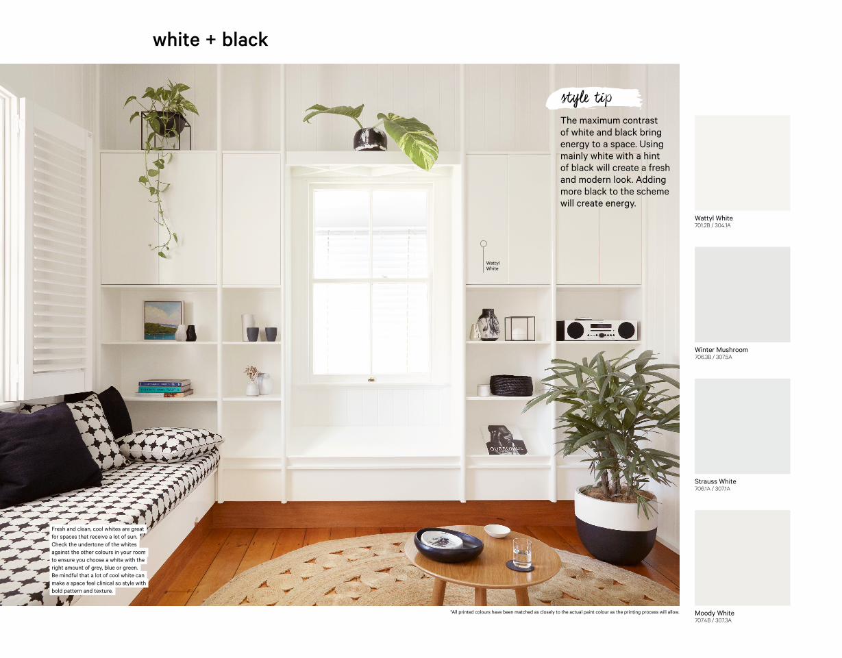
Winter Mushroom706.3B / 307.5A
Wattyl White701.2B / 304.1A
Strauss White706.1A / 307.1A
Moody White707.4B / 307.3A
The maximum contrast of white and black bring energy to a space. Using mainly white with a hint of black will create a fresh and modern look. Adding more black to the scheme will create energy.
style tip
white + black
Fresh and clean, cool whites are great for spaces that receive a lot of sun. Check the undertone of the whites against the other colours in your room to ensure you choose a white with the right amount of grey, blue or green. Be mindful that a lot of cool white can make a space feel clinical so style with bold pattern and texture.
*All printed colours have been matched as closely to the actual paint colour as the printing process will allow.
Wattyl White
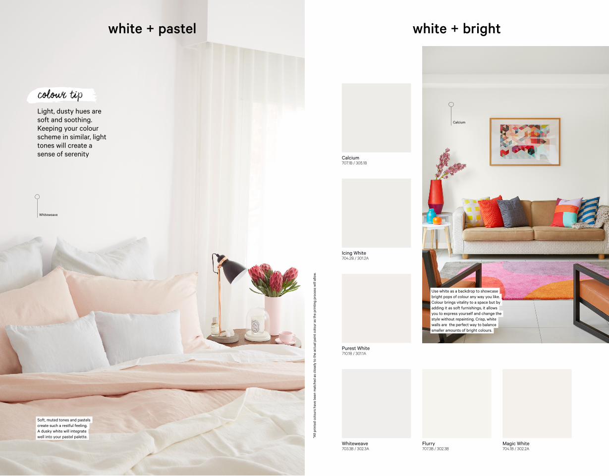
Whiteweave703.3B / 302.3A
Flurry707.3B / 302.3B
Magic White704.1B / 302.2A
Calcium707.1B / 305.1B
Icing White704.2B / 301.2A
Purest White710.1B / 301.1A
Use white as a backdrop to showcase bright pops of colour any way you like. Colour brings vitality to a space but by adding it as soft furnishings, it allows you to express yourself and change the style without repainting. Crisp, white walls are the perfect way to balance smaller amounts of bright colours.
Soft, muted tones and pastels create such a restful feeling. A dusky white will integrate well into your pastel palette.
white + bright
Light, dusty hues are soft and soothing. Keeping your colour scheme in similar, light tones will create a sense of serenity
colour tip
white + pastel
*All
prin
ted
colo
urs
have
bee
n m
atch
ed a
s cl
osel
y to
the
actu
al p
aint
col
our a
s th
e pr
intin
g pr
oces
s w
ill a
llow
.
Whiteweave
Calcium
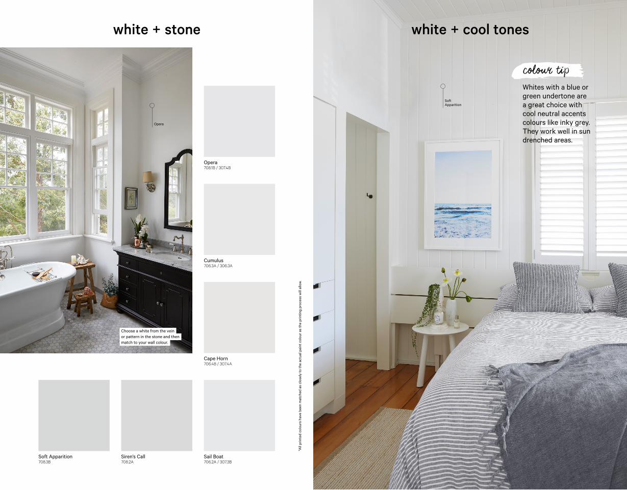
Whites with a blue or green undertone are a great choice with cool neutral accents colours like inky grey. They work well in sun drenched areas.
colour tip
Soft Apparition708.3B
Siren’s Call708.2A
Sail Boat706.2A / 307.3B
Opera708.1B / 307.4B
Cumulus706.3A / 306.3A
Cape Horn706.4B / 307.4A
white + cool toneswhite + stone
*All
prin
ted
colo
urs
have
bee
n m
atch
ed a
s cl
osel
y to
the
actu
al p
aint
col
our a
s th
e pr
intin
g pr
oces
s w
ill a
llow
.
Soft Apparition
Opera
Choose a white from the vein or pattern in the stone and then match to your wall colour.
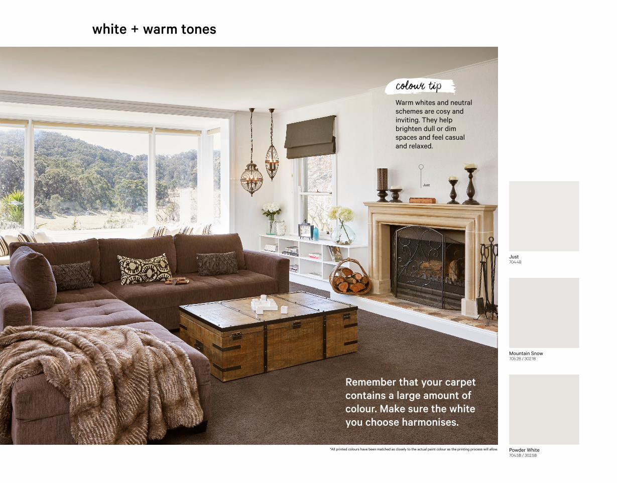
Just704.4B
Mountain Snow705.2B / 302.1B
Powder White704.5B / 302.5B
white + warm tones
*All printed colours have been matched as closely to the actual paint colour as the printing process will allow.
Just
Remember that your carpet contains a large amount of colour. Make sure the white you choose harmonises.
Warm whites and neutral schemes are cosy and inviting. They help brighten dull or dim spaces and feel casual and relaxed.
colour tip
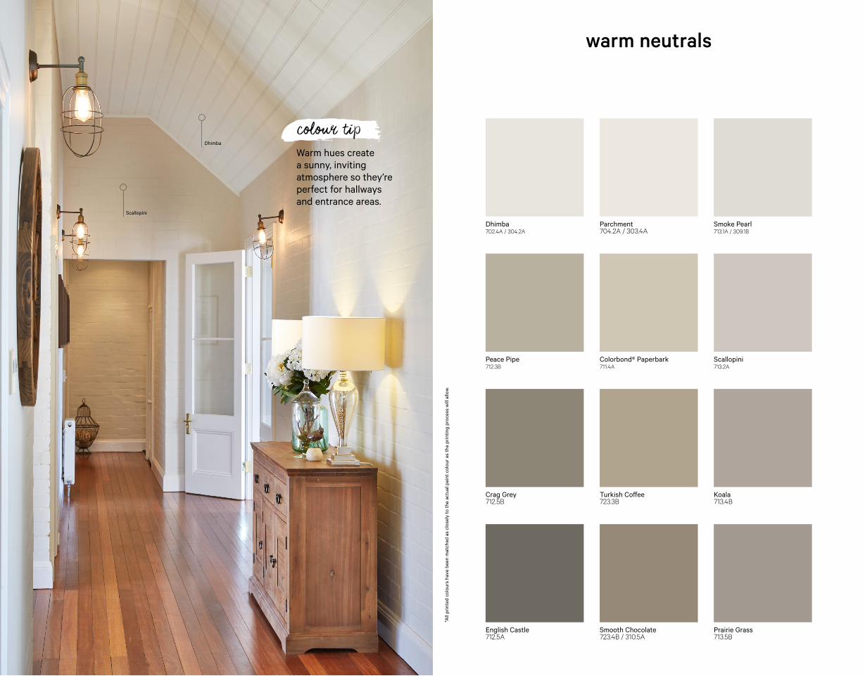
Scallopini
Dhimba702.4A / 304.2A
Parchment704.2A / 303.4A
Smoke Pearl713.1A / 309.1B
Peace Pipe712.3B
Colorbond® Paperbark711.4A
Scallopini713.2A
Crag Grey712.5B
Turkish Coffee723.3B
Koala713.4B
English Castle712.5A
Smooth Chocolate723.4B / 310.5A
Prairie Grass713.5B
warm neutrals
*All
prin
ted
colo
urs
have
bee
n m
atch
ed a
s cl
osel
y to
the
actu
al p
aint
col
our a
s th
e pr
intin
g pr
oces
s w
ill a
llow
.
Warm hues create a sunny, inviting atmosphere so they’re perfect for hallways and entrance areas.
colour tipDhimba
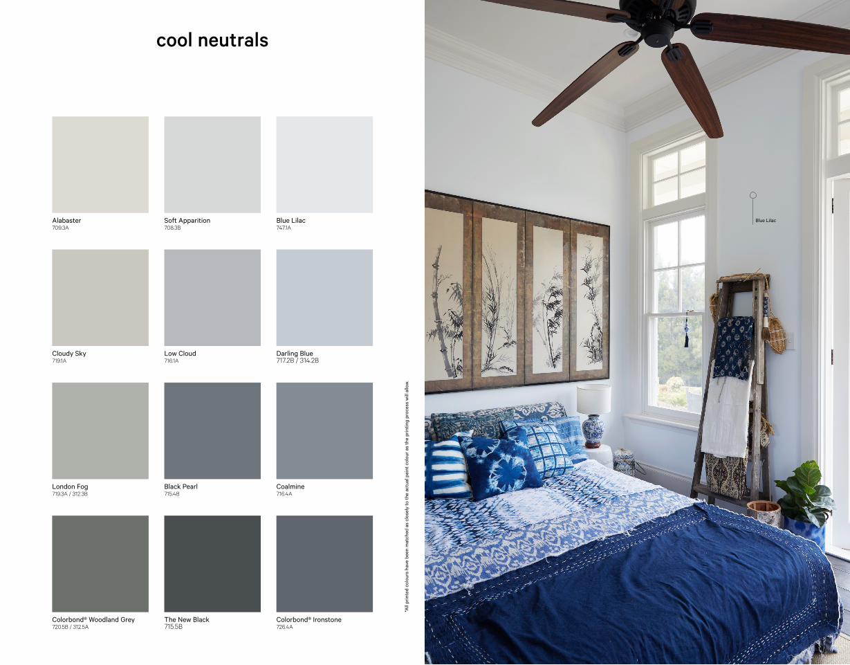
Colorbond® Ironstone726.4A
Alabaster709.3A
Soft Apparition708.3B
Blue Lilac747.1A
Cloudy Sky719.1A
Low Cloud716.1A
Darling Blue717.2B / 314.2B
London Fog719.3A / 312.3B
Black Pearl715.4B
Coalmine716.4A
Colorbond® Woodland Grey720.5B / 312.5A
The New Black715.5B
cool neutrals
Blue Lilac
*All
prin
ted
colo
urs
have
bee
n m
atch
ed a
s cl
osel
y to
the
actu
al p
aint
col
our a
s th
e pr
intin
g pr
oces
s w
ill a
llow
.

All printed colours have been matched as closely to the actual paint colour as the printing process will allow. Slight variations may occur. Photographic and printed images may not represent the true colour. Colorbond® is a registered trademark of BlueScope Steel Limited. Valspar Paint (Australia) Pty Ltd ABN 40 000 035 914
wattylpaint
WAT
1803
8
Don’t worry, whatever you need, we can help.
AUS 132 101wattyl.com.au
NZ 0800 825 7727wattyl.co.nz
WATTYL ASSIST