Embed Size (px)
Citation preview
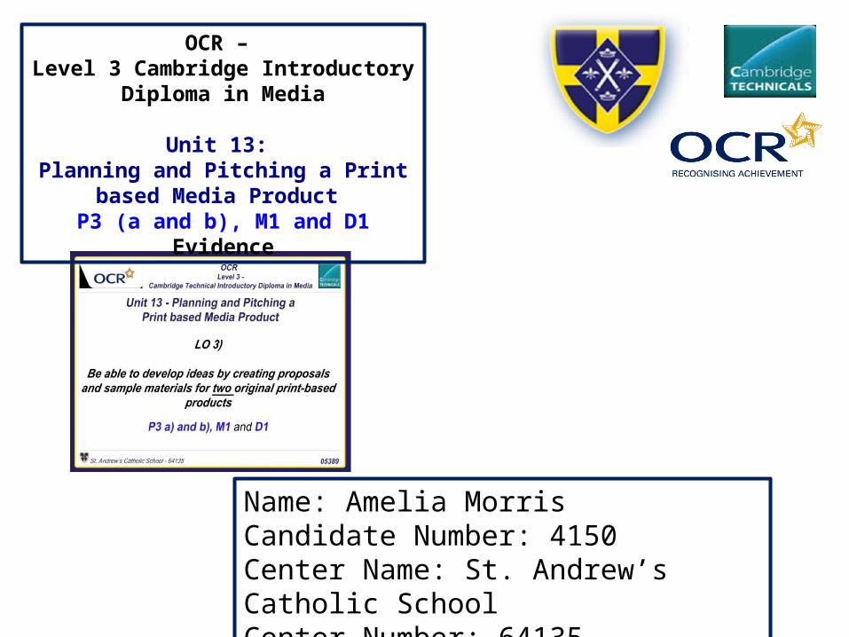
Name: Amelia MorrisCandidate Number: 4150Center Name: St. Andrew’s Catholic SchoolCenter Number: 64135
OCR – Level 3 Cambridge Introductory Diploma in
Media
Unit 13: Planning and Pitching a Print based Media
Product P3 (a and b), M1 and D1 Evidence
ContentsProposal(s): Slide 3
Why did I choose BEATS as my final magazine name/idea?: Slide 4Market place/position: Slide 5&6
Photography plan: Slide 7Photography prop list: Slide 8
Locations Recce: Slide 9-10Test Photography: Slide 11
Hand drawn drafts: Slide 12-17Draft interviews: Slide 18
Audience Profile: Slide 19-20Graphic Layouts: Slide 21House style: Slide 22-23
Sample Materials: Slide 24-25Format of Beats: Slide 26Price of Beats: Slide 27
How will BEATS be distributed: Slide 28Conclusion: Slide 29

Proposal(s)
To see the full versions of the proposals for two magazine check out both magazine ideas “BEATS!” and “Rock Your Music” on my blog page.
Why did I choose Beats as my final magazine name?
From all three name ideas BEATS, Music Matters and Rock your Music. I had to make a very important decision in the pre- production stage. The reason why I named my music magazine BEATS was because it was the most popular choice in my primary research (survey to research my target audience and their needs.) BEATS is also a good music magazine name as it is very conventional phase/word to music because if a track doesn’t have a Beat then what’s the point, there is no music. It also the sound of drum.
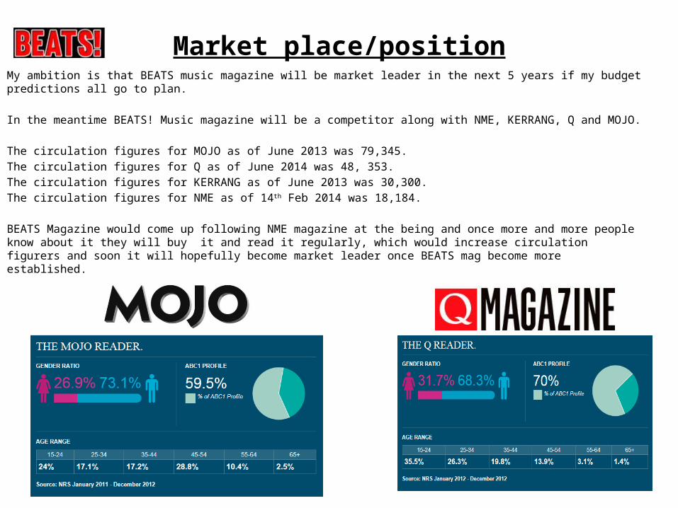
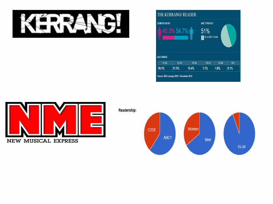
Market place/positionMy ambition is that BEATS music magazine will be market leader in the next 5 years if my budget predictions all go to plan.
In the meantime BEATS! Music magazine will be a competitor along with NME, KERRANG, Q and MOJO.
The circulation figures for MOJO as of June 2013 was 79,345.The circulation figures for Q as of June 2014 was 48, 353.The circulation figures for KERRANG as of June 2013 was 30,300. The circulation figures for NME as of 14th Feb 2014 was 18,184.
BEATS Magazine would come up following NME magazine at the being and once more and more people know about it they will buy it and read it regularly, which would increase circulation figurers and soon it will hopefully become market leader once BEATS mag become more established.

Photography Plan
This is my Photography plan, which outlines the reasons behind choosing “BEATS” as my magazine title, the product description, the photographers details, casting members and reasons for choosing them to feature in the first issue of my magazine, (model requirements) how they should like?, hair and make up and finally where and when the photoshoot is going to take place.

Photography Prop List
This is an in depth list of all the props/equipment and other essentials that will be needed for not only the photoshoot, but of running my business as a whole. It includes Apple macs, printers and printer ink, paper, pens, Adobe Photoshop, Rented office space, office furniture, lighting, cameras, tripods, guitars, stools, SD cards and Tea, Coffee refreshments. Within this I have also included screenshots of the process and the prices.
To view this bigger check out my blog page.
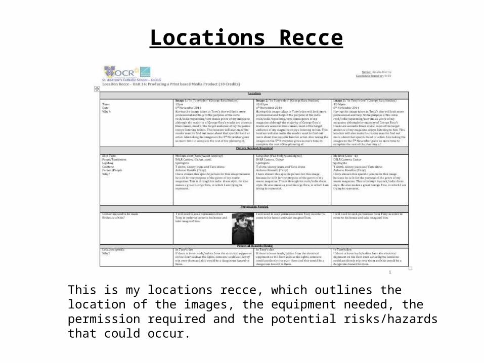
Locations Recce
This is my locations recce, which outlines the location of the images, the equipment needed, the permission required and the potential risks/hazards that could occur.

Locations RecceLocations of the George Ezra photoshoot
This is where I will go to take the photos for the George Ezra photoshoot. Due to technical and privacy issues I am unable to show you pictures inside the location until the day we go to take them.

Test Photography
By taking photos as trial versions is a good way to get the best possible images at the end for my new magazine BEATS! These are photos that I had taken that are not great quality. This is due to many factors such as poor composition, the fact that the second and third image has the guitar cut off, there is other distractions in the background of the image that makes the main subject unimportant.
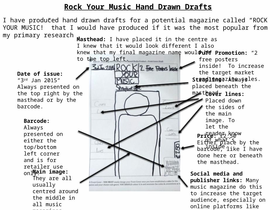
Rock Your Music Hand Drawn Drafts
I have produced hand drawn drafts for a potential magazine called “ROCK YOUR MUSIC!” that I would have produced if it was the most popular from my primary research .
Main image: They are all usually centred around the middle in all music magazines.
Barcode: Always presented on either the top/bottom left corner and is for retailer use only.
Price: £2:50Either place by the barcode, like I have done here or beneath the masthead.
Masthead: I have placed it in the centre as I knew that it would look different I also knew that my final magazine name would be to the top left. Puff Promotion: “2 free
posters inside!” To increase the target market and magazine sales.Date of issue:
“3rd Jan 2015“Always presented on the top right by the masthead or by the barcode.
Cover lines: Placed down the sides of the main image. To let the reader know of what’s inside.
Strapline: Always placed beneath the masthead.
Social media and publisher links: Many music magazine do this to increase the target audience, especially on online platforms like Facebook.

Rock Your Music Hand Drawn DraftsMain headline:Presented in huge, bold font on the left page of the DPS.
Main image and descriptionThis is usually the biggest image and is of the main artist/band or film cast.
Page numbers:To make the magazine look more professional and realistic. It will also link with the contents page to let readers know where to look for a specific page.
Names of those involved in the article: To let the readers aware of who wrote and took the images for the interview/article/review.
Main Body of interview:The most important part of the DPS interview. It provides the main written content.
Pull quote:This is added in to make it more dramatic and interesting. They place it within the main body of text, between two columns.
Smaller image:This a different image that is sometimes added in to break up the large chunks of text, to make it more visually appealing.
Social media links: Many music magazine do this to increase the target audience, especially on online platforms like Facebook.
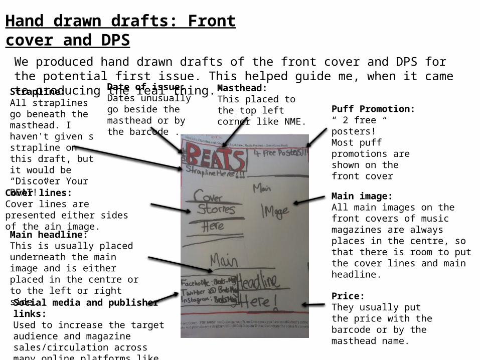
Hand drawn drafts: Front cover and DPS
We produced hand drawn drafts of the front cover and DPS for the potential first issue. This helped guide me, when it came to producing the real thing.
Masthead:This placed to the top left corner like NME.
Date of issue:Dates unusually go beside the masthead or by the barcode .
Puff Promotion:“ 2 free posters!”Most puff promotions are shown on the front cover
Cover lines:Cover lines are presented either sides of the ain image.
Price: They usually put the price with the barcode or by the masthead name.
Main image:All main images on the front covers of music magazines are always places in the centre, so that there is room to put the cover lines and main headline.
Strapline:All straplines go beneath the masthead. I haven't given s strapline on this draft, but it would be “Discover Your BEAT!”
Social media and publisher links:Used to increase the target audience and magazine sales/circulation across many online platforms like Facebook and Twitter
Main headline:This is usually placed underneath the main image and is either placed in the centre or to the left or right side.
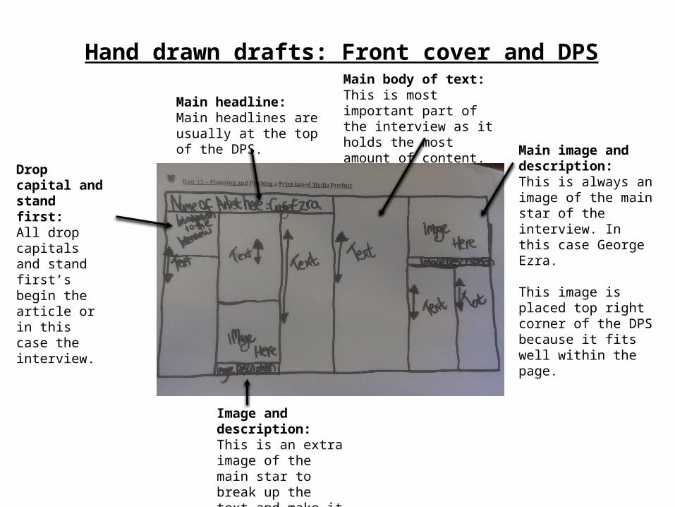
Hand drawn drafts: Front cover and DPS
Main headline:Main headlines are usually at the top of the DPS.
Main image and description:This is always an image of the main star of the interview. In this case George Ezra.
This image is placed top right corner of the DPS because it fits well within the page.
Main body of text:This is most important part of the interview as it holds the most amount of content.
Image and description:This is an extra image of the main star to break up the text and make it more visually appealing.
Drop capital and stand first:All drop capitals and stand first’s begin the article or in this case the interview.
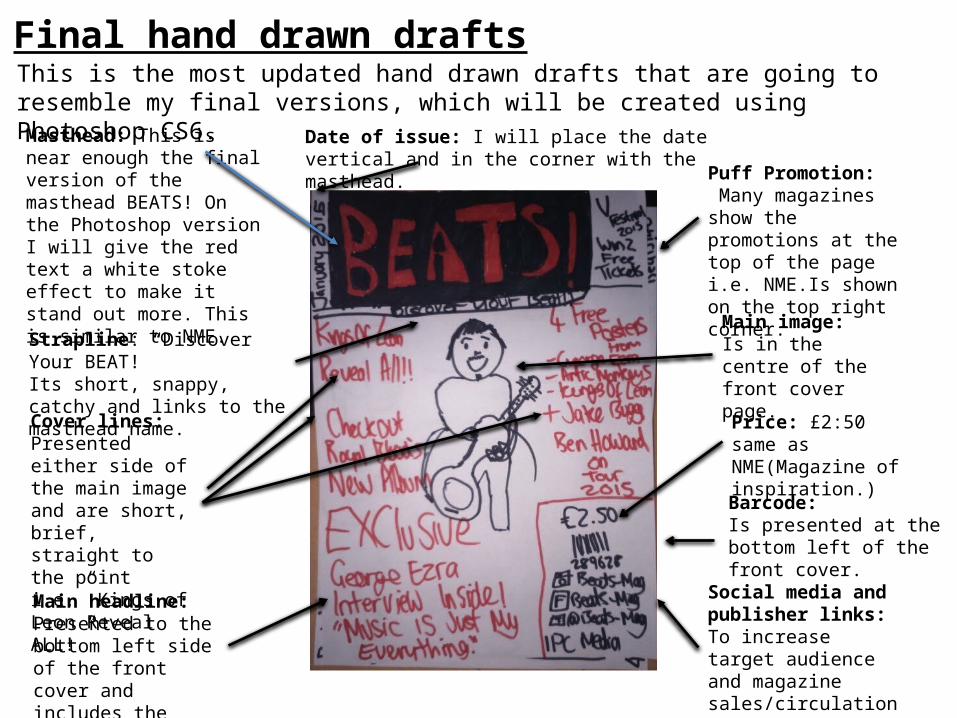
Final hand drawn draftsThis is the most updated hand drawn drafts that are going to resemble my final versions, which will be created using Photoshop CS6.
Masthead: This is near enough the final version of the masthead BEATS! On the Photoshop version I will give the red text a white stoke effect to make it stand out more. This is similar to NME.
Date of issue: I will place the date vertical and in the corner with the masthead.
Strapline: “Discover Your BEAT!”Its short, snappy, catchy and links to the masthead name.
Cover lines:Presented either side of the main image and are short, brief, straight to the point i.e.” Kings of Leon Reveal ALL!”
Social media and publisher links:To increase target audience and magazine sales/circulation.
Barcode:Is presented at the bottom left of the front cover.
Puff Promotion: Many magazines show the promotions at the top of the page i.e. NME.Is shown on the top right corner.
Main headline:Presented to the bottom left side of the front cover and includes the word “Exclusive”.
Main image:Is in the centre of the front cover page.
Price: £2:50 same as NME(Magazine of inspiration.)
Final hand drawn drafts
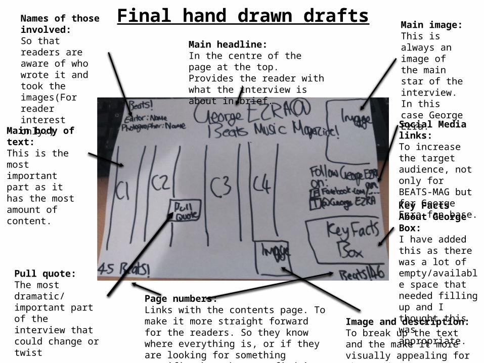
Main body of text:This is the most important part as it has the most amount of content.
Main headline:In the centre of the page at the top. Provides the reader with what the interview is about in brief.
Main image:This is always an image of the main star of the interview. In this case George Ezra.
Social Media links:To increase the target audience, not only for BEATS-MAG but for George Ezra fan base.
Page numbers:Links with the contents page. To make it more straight forward for the readers. So they know where everything is, or if they are looking for something specific then they can find it quickly.
Pull quote:The most dramatic/ important part of the interview that could change or twist
Key Facts About GeorgeBox:I have added this as there was a lot of empty/available space that needed filling up and I thought this was appropriate.
Image and description:To break up the text and the make it more visually appealing for the reader.
Names of those involved:So that readers are aware of who wrote it and took the images(For reader interest only.)

Draft interview
This is my draft interview that I created used Microsoft word. This gives me an idea of how I want it to look when making it on Photoshop, for the Real thing.

Audience ProfileName: Antonio Rossetti
Age: 18
What is their occupation?: Student at Academy of Contemporary Music (ACM) in Guildford, who is studying Music.What is there hobbies?He is in a heavy metal band called Breakout. He love musicHe loves music and playing the guitarLoves being around his friendsHas a part time job at Sainsburys.Where they live? Hometown: Leatherhead but he commutes to university everyday in his VW
What is the social status? He will be most likely be middle class, due to his parents income. We can’t exactly class him in a group due to the fact that he is still a student and he will only have a very some income due to his part time job.

Audience ProfileName: Jessica Monk
Age: 18
What is their occupation?: A Level Student studying Media Studies at Sixth Form
What is there hobbies?Being around her friendsListening to musicWatching filmsCaring for peopleGood at Computers and the media
Where they live?Tadworth, Epson Surrey
What is the social status?Middle Class, although as she is still a student she will not be earning her own income. So this is related to what her parents income is.

Graphic Layouts for BEATS and ROCK YOUR MUSIC Magazine
These are my graphic layouts for both magazine ideas BEATS! and “ROCK YOUR MUSIC” that I created using Photoshop. They show you a clear, straight forward digital layout of how my magazine pages are going to appear on the real versions. These will help me to produce and put together the final versions.
BEATS! Magazine
ROCK YOUR MUSIC Magazine

House Style/Colour schemes
BEATS Magazine (Brand Identity)
BLACK White Red
I will keep to a black white and red colour scheme throughout the whole of BEATS Magazine so that it will reassure the readers of what/who BEATS are as a brand.
It is also very important to keep to the same or similar font style throughout the magazine so that it looks as professional and accurate as possible. So I have decided to keep the sans serif font style like the masthead but also include some Arial, and Times New Roman because they are all very clear, visible and concise to read.
BEATS! = Sans Serif
BEATS! = Arial
BEATS! = Times New Roman

House Style/Colour schemesROCK YOUR MUSIC Magazine (Brand Identity)
BLACK White
If I was to produce this magazine, I would keep to the black and white colour scheme throughout the magazine including the masthead because it is important to keep the reader reassured of what they are reading and to gain a recognition of who the brand/company are.
Sample Materials
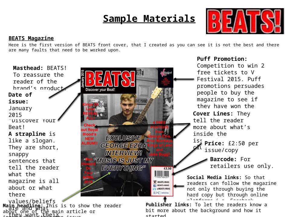
BEATS MagazineHere is the first version of BEATS front cover, that I created as you can see it is not the best and there are many faults that need to be worked upon.
Puff Promotion: Competition to win 2 free tickets to V Festival 2015. Puff promotions persuades people to buy the magazine to see if they have won the tickets or have a free gift.
Cover Lines: They tell the reader more about what’s inside the issue/they are clues?
Barcode: For retailers use only.
Price: £2:50 per issue/copy
Social Media links: So that readers can follow the magazine not only through buying the hard copy but through online platforms i.e. Facebook, Twitter and Instagram.
Publisher links: To let the readers know a bit more about the background and how it started.
Masthead: BEATS!To reassure the reader of the brand’s product.
Strapline:“Discover Your Beat!”A strapline is like a slogan. They are short, snappy sentences that tell the reader what the magazine is all about or what there values/beliefs are and what they want their readers to be like.
Date of issue: January 2015
Main headline: This is to show the reader about one of the main article or interviews within the issue

Sample MaterialsRock Your Music MagazineThis is a sample of the front cover that I created for my other magazine idea called “Rock Your Music”.
Masthead: “Rock Your MUSIC”.
Date of Issue: January 2015
Strapline “The UK’s BEST ROCK MUSIC!”
Cover Lines: They tell the reader more about what’s inside the issue/they are clues?
Main headline: This is to show the reader about one of the main article or interviews within the issue
Puff promotion: Competition to win 2 free tickets to Reading + Leeds Fest 2015
Price: £2.50
Barcode: for retailers use only
Social Media and publisher links

Format of BEATS Magazine
Dimensions (Size)?The size of BEATS magazine will be 283mmX225mm. This is due to the research I did for NME and what there size is for a full page.
http://www.slideshare.net/zlorhenley/nme-media-informationfull-2011
Style/Values?BEATS magazine will be available on both printed copies and online platforms, such as social media websites (Facebook/twitter) and also I will have an official website and an mobile and tablet app. This is so that people can access BEATS! Music news wherever and whenever they like.
Here at BEATS! Magazine, we believe that by providing news about music of the indie/rock genre will get people to come together and discover their beat, their place in music. We also believe that making false statements about an artist/bands is very lawful and immoral and we will always check and proofread our content to check if it is all true and not misleading about an individual because this could potentially lead to offending or discriminating them.

Price of BEATS
The price of a typical print issue of BEATS will be £2:50. This is due to the fact that I want to try and fit into the market within my competitors i.e NME, KERRANG, Q, MOJO.
Subscriptions
Print Subscriptions I am also going to offer subscriptions, so that it will increase the target audience and the magazine sales. This is because of the cheaper deals that people can get instead of buying each issue for £2:50 per issue and because my magazine will be distributed out monthly it will cost them £30.00 for 12 months (1 year). Whereas if I offer a 1 year print subscription of just £20.00 with free postage/ delivery then this is a 10% cheaper than what they are originally paying.
Digital Subscription I am also going to offer a digital subscription, where they can access through the mobile and/or tablet app. Due to the fast changing technology modern society. It is important that company’s keep up to take with it. Choosing a digital subscription is also a more eco-friendly option because your saving the environment and not wasting paper. For a 1 year subscription, I will charge £15.00.

How will be distributed?
Online (Digital) – Technological Convergence
BEATS will be distributed through the mobile/tablet app monthly automatically if you are a member (have a subscription package), or if you are not a subscriber you can buy the latest issue from the app for £2:50.
Print (Hard copy)IPC Media who are going to be the publishers and also the distributors of BEATS Magazine. They will distribute an issue of BEATS monthly.
Conclusion
In this section, I have outlined and produced sample materials and proposals for two print based media products BEATS! Mag and ROCK YOUR MUSIC Magazine! These included market position for my chosen Magazine, photography plans, locations recce test photography, prop list, hand drawn drafts, audience profiles and graphic layouts, house styles, rough Photoshop designs for both magazine ideas, format, style and price of Beats Mag and how will BEATS be distributed?
Due to my primary research results, which I carried out an online survey. I have come to the decision that BEATS! MUSIC Mag is what I will be producing for my new music magazine idea as it was the most popular.