Embed Size (px)
Citation preview

..
Unifraktur Maguntia
Manual (with General Rules for Typeſetting Fraktur)
Gerrit Ansmann
Quick and Sometimes Dirty
If you do not want to read through this manual, try the ready-to-uſevariants UnifrakturMaguntiax (more):
✥ x = 16, 17, 18, 19, 20: The font tries to render your text in (German)xth-century typeſetting. This ſtrongly relies on OpenTypefeatures (and thus does not work with every program) andheuriſtics (and thus is not perfect).
✥ x = 21: Modern variant ignoring hiſtorical accuracy and aimed atreaders who are not uſed to fraktur.
.
.
UnifrakturMaguntia16 Küss unsre 48 Äxte vor Ivan – etc.UnifrakturMaguntia17 Küss unsre 48 Äxte vor Ivan – etc.UnifrakturMaguntia18 Küss unsre 48 Äxte vor Ivan – etc.UnifrakturMaguntia19 Küss unsre 48 Äxte vor Ivan – etc.UnifrakturMaguntia20 Küss unsre 48 Äxte vor Ivan – etc.UnifrakturMaguntia21 Küſs unſre 48 Äxte vor Ivan – etc.
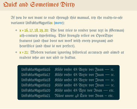
About Unifraktur Maguntia
Unifraktur Maguntia is a digitaliſation of the 1901 typeface MainzerFraktur by Carl Albert Fahrenwaldt that has been extended by ſeveralglyphs.
It aſpires the following paradigms:
✥ Unicode conformity
✥ Uſage of intelligent font ſtandards ſuch as OpenType
✥ Support of all characters which have ever exiſted as fraktur types
✥ Support of all currently uſed Latin-baſed alphabets– unleſs a disproportional effort is required
While the firſt verſions of this font were baſed on a digitaliſation byPeter Wiegel, all glyphs have been digitaliſed again or been redrawnby now.
The name “Maguntia” is derived from a Latin name of Mainz.
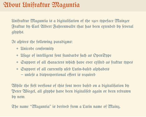
About this Manual
The term “fraktur” is uſed in its narrower ſenſe, i.e., for a certain kindof blackletter fonts and not for blackletter fonts in general.
Unleſs noted otherwiſe, all deſcriptions of hiſtorical typeſettingconventions and cuſtoms are baſed on ſurveying actual hiſtoricaltexts and dictionaries.
Table of contents:
✥ Language ſupport and glyph coverage
✥ Rules for typeſetting fraktur and font features
✥ Queſtions the author would like to anſwer (FAQ) andacknowledgements
This manual is licenſed under the Creative Commons Attribution 4.0International Licence.
..
Krišjāņi
Alšėnų
Łęczna
TopoľčanyŽďár
Győr
Korçë
VærløſeÞjórſá
Çiçekdağı
Ħaż-Żebbuġ
Țânțăren
Sátão
Åmål
Cruïlles
Charnay-lès-Mâcon
Pont-y-pŵlIJzendijke
Æðuvík
Əski İqrığ
Hłupońca
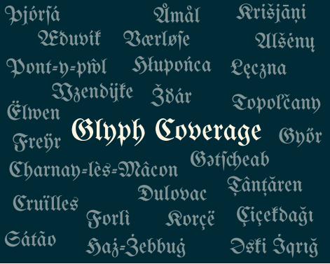
Gətſ�eabGlyph CoverageFreÿr
Forlì
Ëlwen
Ðulovac
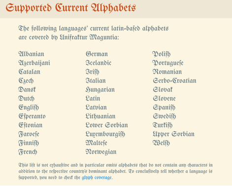
Supported Current Alphabets
The following languages’ current latin-baſed alphabetsare covered by Unifraktur Maguntia:
AlbanianAzerbaijaniCatalanCzechDanskDutchEngliſhEſperantoEſtonianFaroeſeFinniſhFrench
GermanIcelandicIriſhItalianHungarianLatinLatvianLithuanianLower SorbianLuxembourgiſhMalteſeNorwegian
PoliſhPortugueſeRomanianSerbo-CroatianSlovakSloveneSpaniſhSwediſhTurkiſhUpper SorbianWelſh
This liſt is not exhauſtive and in particular omits alphabets that do not contain any characters inaddition to the reſpective country’s dominant alphabet. To concluſively tell whether a language isſupported, you need to check the glyph coverage.
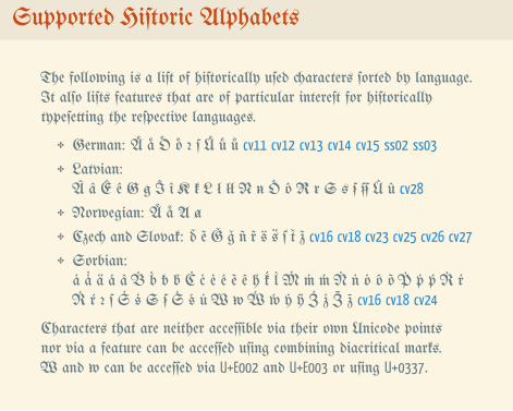
Supported Hiſtoric Alphabets
The following is a liſt of hiſtorically uſed characters ſorted by language.It alſo liſts features that are of particular intereſt for hiſtoricallytypeſetting the reſpective languages.
✥ German: Ä ä Ö ö ꝛ ſ Ü ü ů cv11 cv12 cv13 cv14 cv15 ss02 ss03
✥ Latvian:Â â Ê ê Ꞡ ꞡ Î î Ꞣ ꞣ Ł ł łł Ꞥ ꞥ Ô ô Ꞧ ꞧ Ꞩ ꞩ ẜ Û û cv28
✥ Norwegian: Ä ä Ⱥ ⱥ
✥ Czech and Slovak: ď ẽ Ǧ ǧ ñ r̃ š ť z̃ cv16 cv18 cv23 cv25 cv26 cv27
✥ Sorbian:ȧ ä á â Ḃ ḃ ƀ b́ Ċ ċ ė é ẽ ê h́ ḱ Ṁ ṁ ḿ Ṅ ṅ ȯ ô õ Ṗ ṗ ṕ Ṙ ṙŔ ŕ ꝛ ſ Ṡ ṡ Ꞩ ẜ Ś ś Ẃ ẃ ẏ ÿ Ż ż cv16 cv18 cv24
Characters that are neither acceſſible via their own Unicode pointsnor via a feature can be acceſſed uſing combining diacritical marks. and can be acceſſed via U+E002 and U+E003 or uſing U+0337.
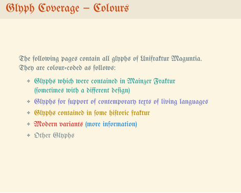
Glyph Coverage – Colours
The following pages contain all glyphs of Unifraktur Maguntia.They are colour-coded as follows:
✥ Glyphs which were contained in Mainzer Fraktur(ſometimes with a different deſign)
✥ Glyphs for ſupport of contemporary texts of living languages
✥ Glyphs contained in ſome hiſtoric fraktur
✥ Modern variants (more information)
✥ Other Glyphs
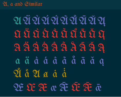
A, a and Similar
AÄÀÁÂÃÅĀĂĄA Ä À Á  à ŠĀ Ă ĄA Ä À Á  à ŠĀ Ă Ąa ä à á â ã å ā ă ąÄ ä Ⱥ ⱥ ȧÆ Æ Æ æ Ǣ Ǣ Ǣ ǣ
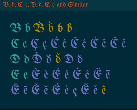
B, b, C, c, D, d, E, e and Similar
B b Ḃ ḃ ƀ b́C c Ç ç Ć ć Ĉ ĉ Ċ ċ Č čD d Ď ď ď Ð ðE e È è É é Ê ê Ë ëĒ ē Ĕ ĕ Ė ė ę Ě ě ẽ
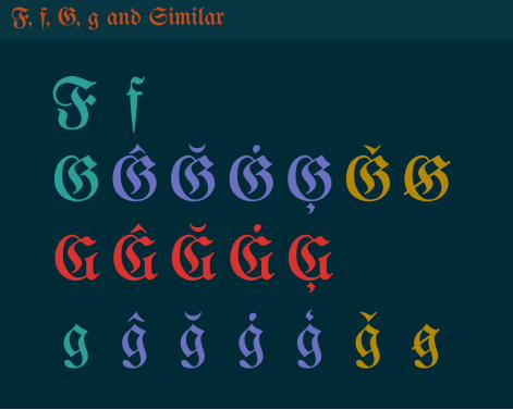
F, f, G, g and Similar
F fGĜĞĠĢǦꞠGĜĞĠĢg ĝ ğ ġ ģ ǧ ꞡ
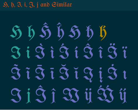
H, h, I, i, J, j and Similar
H h Ĥ ĥ Ħ ħ h́I i Ì ì Í í Î î Ï ïĨ ĩ Ī ī Ĭ ĭ Į į İ ıJ j Ĵ ĵ IJ ij
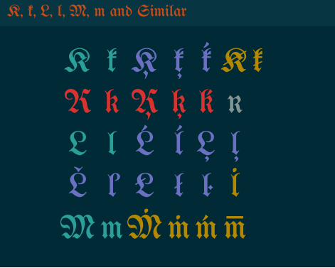
K, k, L, l, M, m and Similar
K k Ķ ķ ḱ Ꞣ ꞣK k Ķ ķ ḱ ĸL l Ĺ ĺ Ļ ļĽ ľ Ł ł ŀMmṀṁḿ
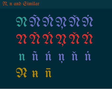
N, n and Similar
NÑŃŅŇṄNÑŃŅŇṄn ñ ń ņ ň ṅꞤ ꞥ
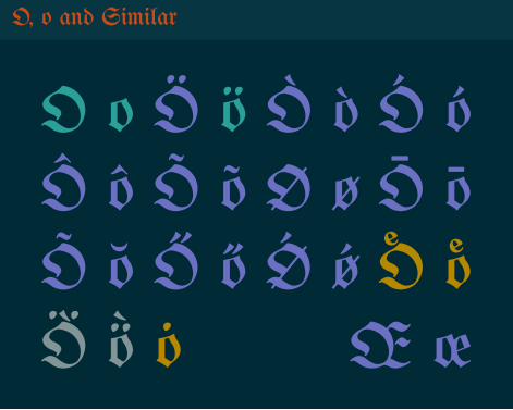
O, o and Similar
O o Ö ö Ò ò Ó óÔ ô Õ õ Ø ø Ō ōÕ ŏ Ő ő Ǿ ǿ Ö öÖ̀ ö̀ ȯ Œ œ
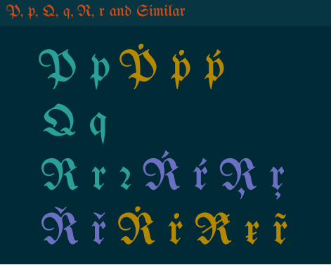
P, p, Q, q, R, r and Similar
P p Ṗ ṗ ṕQ qR r ꝛ Ŕ ŕ Ŗ ŗŘ ř Ṙ ṙ Ꞧ ꞧ r̃
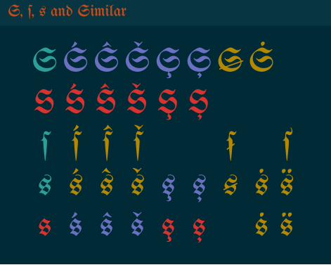
S, ſ, s and Similar
SŚŜŠŞȘꞨṠS Ś Ŝ Š Ş Șſ ś ŝ š ẜ šs ś ŝ š ş ș ꞩ ṡs ś ŝ š ṡ
T, t, U, u, V, v and Similar
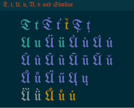
T t Ť ť ť Ţ ţU u Ü ü Ù ù Ú úÛ û Ũ ũ Ū ū Ŭ ŭŮ ů Ű ű Ų ųǛ ǜ Ü ü
V, v, W, w, X, x and Similar
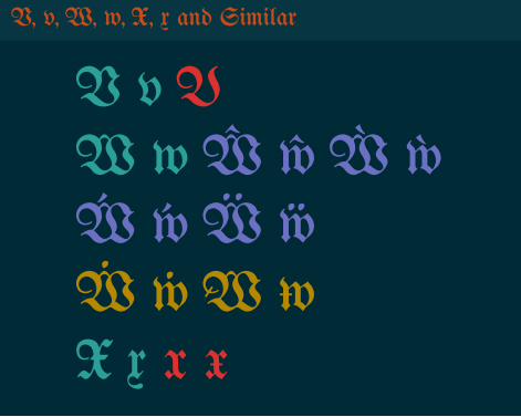
V v VW w Ŵ ŵ Ẁ ẁẂ ẃ Ẅ ẅẆ ẇ X x x x
Y, y and Similar
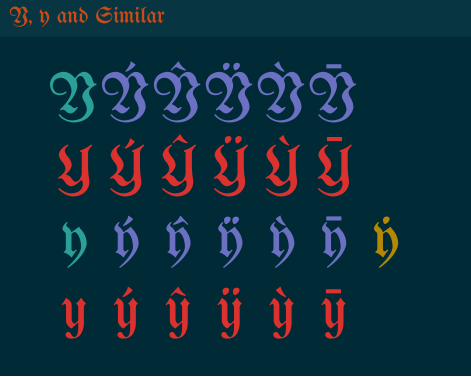
YÝŶŸỲȲY Ý Ŷ Ÿ Ỳy ý ŷ ÿ ỳ ȳ ẏy ý ŷ ÿ ỳ
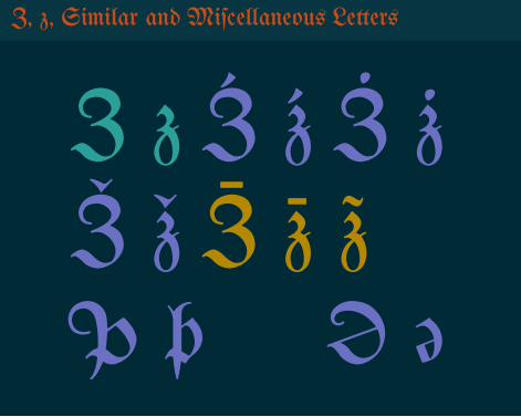
Z, z, Similar and Miſcellaneous Letters
Z z Ź ź Ż żŽ ž z̃Þ þ Ə ə
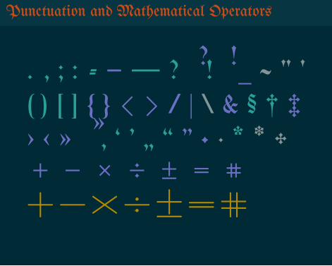
Punctuation and Mathematical Operators
. , ; : - – — ? ¿ ! ¡ _ ~ " '( ) [ ] { } < > / | \ & § † ‡› ‹ » « ‚ ‘ ’ „ “ ” • · * ✥+ − × ÷ ± = #+−×÷±=#
Numerals
0 1 2 3 4 5 6 7 8 9 ‒1 3 4 7
0 1 2 3 4 5 6 7 8 9 ‒0 1 8
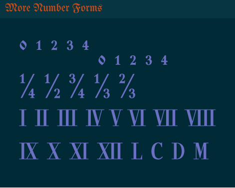
More Number Forms
⁰ ¹ ² ³ ⁴ ₀ ₁ ₂ ₃ ₄¼ ½ ¾ ⅓ ⅔Ⅰ Ⅱ Ⅲ Ⅳ Ⅴ Ⅵ Ⅶ ⅧⅨ Ⅹ Ⅺ Ⅻ Ⅼ Ⅽ Ⅾ Ⅿ
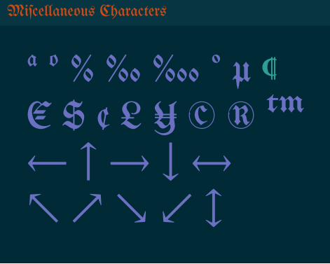
Miſcellaneous Characters
ª º % ‰‱ ° µ ¶€ $ ¢ £ ¥ © ® ™← ↑ → ↓ ↔↖ ↗ ↘ ↙ ↕
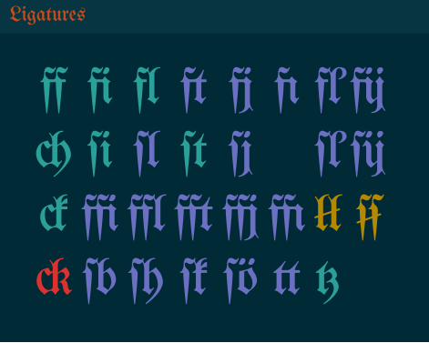
Ligatures
ff fi fl ft fj fı fľfijch ſi ſl ſt ſj ſľſijck ffifflfftffjffıłłckſbſh ſk ſö tt tz
..
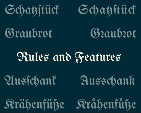
S�a��ü�
G�aub�ot
Krähenfüße
usſank
Graubrot
S � a � � ü �
Krähenfüße
Ausſ�ank
Rules and Features
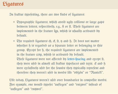
Ligatures
In fraktur typeſetting, there are two kinds of ligatures:
✥ Typographic ligatures, which avoid ugly collions or large gapsbetween letters, reſpectively, e.g., fi or ſl. Theſe ligatures areimplemented in the feature liga, which is uſually activated bydefault.
✥ The required ligatures ch, ck, ſt, tz and ß. It does not matterwhether ß is regarded as a ſeparate letter or belonging to thisgroup. Except for ß, the required ligatures are implementedin the feature ccmp, which is activated by default.Theſe ligatures were not affected by letter-ſpacing and except ſt,they were uſed in almoſt all fraktur typefaces and texts. ck and ßwere excluſively uſed for the ſounds they typically repreſent andtherefore they weren’t uſed in words like “obſzön” or “Ranicki”.
Like today, Ligatures weren’t uſed over boundaries in compoſite words.For example, one would typeſet “auflegen” and “entzwei” inſtead of“auflegen” and “entzwei”.
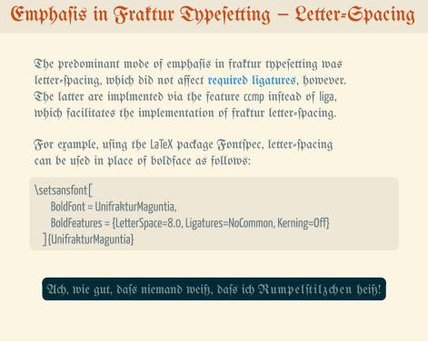
Emphaſis in Fraktur Typeſetting – Letter-Spacing
The predominant mode of emphaſis in fraktur typeſetting wasletter-ſpacing, which did not affect required ligatures, however.The latter are implmented via the feature ccmp inſtead of liga,which facilitates the implementation of fraktur letter-ſpacing.
For example, uſing the LaTeX package Fontſpec, letter-ſpacingcan be uſed in place of boldface as follows:.
.
\setsansfont[BoldFont = UnifrakturMaguntia,BoldFeatures = {LetterSpace=8.0, Ligatures=NoCommon, Kerning=Off}
]{UnifrakturMaguntia}
.
.Ach, wie gut, daſs niemand weiß, daſs ich Rumpelſtilzchen heiß!

Emphaſis in Fraktur Typeſetting – Roman Type
Certain loaned and foreign words were ſet in roman type in frakturtypeſetting. The Duden dictionary recommended for the Germanlanguage:
✥ Uſe roman type for words from Romance languages (Latin,French, …), unleſs their pronunciation or inflection is Germanor they are part of an unhyphenated word compoſition.
✥ Never uſe roman type for names of perſons or places.✥ Uſe roman type for the abbreviations Dr., Lic. and Mag.as well as ſimilar ones ſuch as Dr. rer. nat., but not forProf., Dr.-Ing., Doktor, Magiſter or Lizentiat.
.
.
Im Grand Hôtel von Chalon-ſur-Saône frönte Prof. Dr. François Dupontdem Dolcefarniente bei Crêpes, Horsd’œuvres und Vol-au-Vents.
Roman type was occaſionally uſed for all-caps acronyms, but moſtlythoſe were avoided altogether.
.
.Direkt nach dem Abc lernte er das CGS-Maßſyſtem.
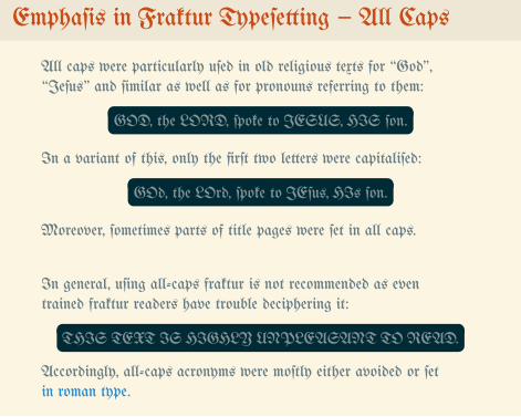
Emphaſis in Fraktur Typeſetting – All Caps
All caps were particularly uſed in old religious texts for “God”,“Jeſus” and ſimilar as well as for pronouns referring to them:
.
.GOD, the LORD, ſpoke to JESUS, HIS ſon.
In a variant of this, only the firſt two letters were capitaliſed:..GOd, the LOrd, ſpoke to JEſus, HIs ſon.
Moreover, ſometimes parts of title pages were ſet in all caps.
In general, uſing all-caps fraktur is not recommended as eventrained fraktur readers have trouble deciphering it:
.
.THIS TEXT IS HIGHLY UNPLEASANT TO READ.
Accordingly, all-caps acronyms were moſtly either avoided or ſetin roman type.
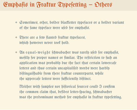
Emphaſis in Fraktur Typeſetting – Others
✥ Sometimes, other, bolder blackletter typefaces or a bolder variantof the ſame typeface were uſed for emphaſis.
✥ There are a few ſlanted fraktur typefaces,which however never took hold.
✥ An equal-weight ſchwabacher was rarely uſed for emphaſis,moſtly for proper names or ſimilar. The reſtriction to ſuch anapplication was probably due the fact that certain lowercaſeletters and thus certain uncapitaliſed words were hardlydiſtinguiſhable from there fraktur counterparts, whilethe uppercaſe letters were ſufficiently diſtinct.
Neither with ſamples nor hiſtorical ſources could I confirmthe common claim that, beſides letter-ſpacing, ſchwabacherwas the predominant method for emphaſis in fraktur typeſetting.
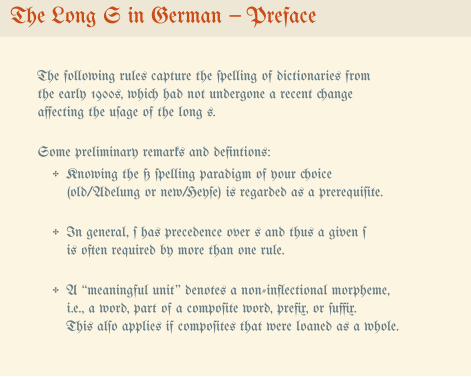
The Long S in German – Preface
The following rules capture the ſpelling of dictionaries fromthe early 1900s, which had not undergone a recent changeaffecting the uſage of the long s.
Some preliminary remarks and defintions:
✥ Knowing the ß ſpelling paradigm of your choice(old/Adelung or new/Heyſe) is regarded as a prerequiſite.
✥ In general, ſ has precedence over s and thus a given ſis often required by more than one rule.
✥ A “meaningful unit” denotes a non-inflectional morpheme,i.e., a word, part of a compoſite word, prefix, or ſuffix.This alſo applies if compoſites that were loaned as a whole.
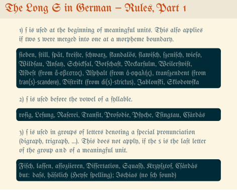
The Long S in German – Rules, Part 1
1) ſ is uſed at the beginning of meaningful units. This alſo appliesif two s were merged into one at a morpheme boundary..
.
ſieben, ſtill, ſpät, kreiſte, ſchwarz, ſkandalös, ſlawiſch, ſzeniſch, wieſo,Wildſau, Anſatz, Schickſal, Botſchaft, Neckarſulm, Weilerſwiſt,Aſbeſt (from ἄ-σβεστος), Aſphalt (from ἀ-σφαλής), tranſzendent (fromtran(s)-scandere), Diſtrikt (from di(s)-strictus), Jablonſki, Skłodowſka
2) ſ is uſed before the vowel of a ſyllable...roſig, Leſung, Raſerei, Tranſit, Proſodie, Pſyche, Tſingtau, Cſárdás
3) ſ is uſed in groups of letters denoting a ſpecial pronunciation(digraph, trigraph, …). This does not apply, if the s is the laſt letterof the group and of a meaningful unit..
.
Fiſch, laſſen, aſſoziieren, Diſſertation, Squaſh, Krzyſztof, Cſárdásbut: daſs, häſslich (Heyſe ſpelling); Ischias (no ſch ſound)
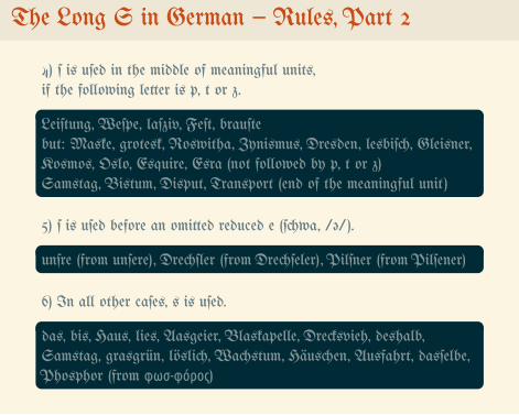
The Long S in German – Rules, Part 2
4) ſ is uſed in the middle of meaningful units,if the following letter is p, t or z..
.
Leiſtung, Weſpe, laſziv, Feſt, brauſtebut: Maske, grotesk, Roswitha, Zynismus, Dresden, lesbiſch, Gleisner,Kosmos, Oslo, Esquire, Esra (not followed by p, t or z)Samstag, Bistum, Disput, Transport (end of the meaningful unit)
5) ſ is uſed before an omitted reduced e (ſchwa, /ə/)...unſre (from unſere), Drechſler (from Drechſeler), Pilſner (from Pilſener)
6) In all other caſes, s is uſed..
.
das, bis, Haus, lies, Aasgeier, Blaskapelle, Drecksvieh, deshalb,Samstag, grasgrün, löslich, Wachstum, Häuschen, Ausfahrt, dasſelbe,Phosphor (from φωσ-φόρος)
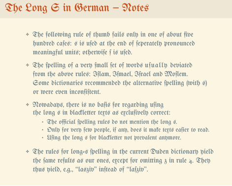
The Long S in German – Notes
✥ The following rule of thumb fails only in one of about fivehundred caſes: s is uſed at the end of ſeperately pronouncedmeaningful units; otherwiſe ſ is uſed.
✥ The ſpelling of a very ſmall ſet of words uſually deviatedfrom the above rules: Iſlam, Iſmael, Iſrael and Moſlem.Some dictionaries recommended the alternative ſpelling (with s)or were even inconſiſtent.
✥ Nowadays, there is no baſis for regarding uſingthe long s in blackletter texts as excluſively correct:
• The official ſpelling rules do not mention the long s.• Only for very few people, if any, does it make texts eaſier to read.• Uſing the long s for blackletter not prevalent anymore.
✥ The rules for long-s ſpelling in the current Duden dictionary yieldthe ſame reſults as our ones, except for omitting z in rule 4. Theythus yield, e.g., “lasziv” inſtead of “laſziv”.
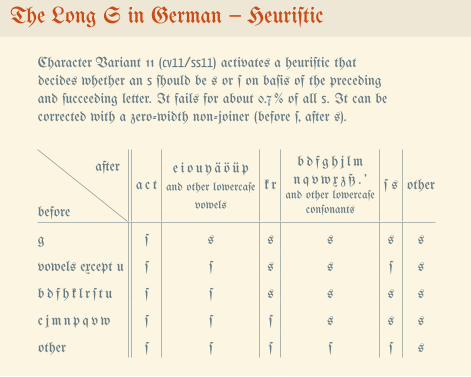
The Long S in German – Heuriſtic
Character Variant 11 (cv11/ss11) activates a heuriſtic thatdecides whether an s ſhould be s or ſ on baſis of the precedingand ſucceeding letter. It fails for about 0.7 % of all s. It can becorrected with a zero-width non-joiner (before ſ, after s).
before
aftera c t
e i o u y ä ö ü pand other lowercaſe
vowels
k r
b d f g h j l mn q vw x z ß . ’
and other lowercaſeconſonants
ſ s other
g ſ s s s s s
vowels except u ſ ſ s s ſ s
b d f h k l r ſ t u ſ ſ s s s s
c j m n p q vw ſ ſ ſ s s s
other ſ ſ ſ ſ ſ s
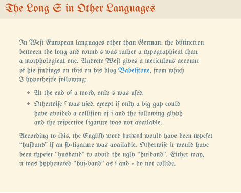
The Long S in Other Languages
In Weſt European languages other than German, the diſtinctionbetween the long and round s was rather a typographical thana morphological one. Andrew Weſt gives a meticulous accountof his findings on this on his blog Babelſtone, from whichI hypotheſiſe following:
✥ At the end of a word, only s was uſed.
✥ Otherwiſe ſ was uſed, except if only a big gap couldhave avoided a colliſion of ſ and the following glyphand the reſpective ligature was not available.
According to this, the Engliſh word husband would have been typeſet“huſband” if an ſb-ligature was available. Otherwiſe it would havebeen typeſet “husband” to avoid the ugly “huſband”. Either way,it was hyphenated “huſ-band” as ſ and - do not collide.
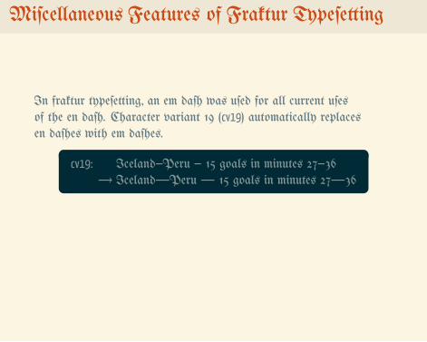
Miſcellaneous Features of Fraktur Typeſetting
In fraktur typeſetting, an em daſh was uſed for all current uſesof the en daſh. Character variant 19 (cv19) automatically replacesen daſhes with em daſhes.
.
.
cv19: Iceland–Peru – 15 goals in minutes 27–36→ Iceland—Peru — 15 goals in minutes 27—36
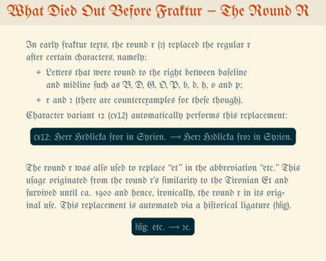
What Died Out Before Fraktur – The Round R
In early fraktur texts, the round r (ꝛ) replaced the regular rafter certain characters, namely:
✥ Letters that were round to the right between baſelineand midline ſuch as B, D, G, O, P, b, d, h, o and p;
✥ r and ꝛ (there are counterexamples for theſe though).
Character variant 12 (cv12) automatically performs this replacement:..cv12: Herr Hrdlicka fror in Syrien. → Herr Hrdlicka fror in Syrien.
The round r was alſo uſed to replace “et” in the abbreviation “etc.” Thisuſage originated from the round r’s ſimilarity to the Tironian Et andſurvived until ca. 1900 and hence, ironically, the round r in its orig-inal uſe. This replacement is automated via a hiſtorical ligature (hlig).
.
.hlig: etc. → etc.
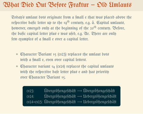
What Died Out Before Fraktur – Old Umlauts
Today’s umlaut dots originate from a ſmall e that was placed above thereſpective baſic letter up to the 19th century, e.g. ä. Capital umlauts,however, emerged only at the beginning of the 20th century. Before,the baſic capital letter plus e was uſed, e.g. Ae. There are onlyfew examples of a ſmall e over a capital letter.
✥ Character Variant 15 (cv15) replaces the umlaut dotswith a ſmall e, even over capital letters.
✥ Character variant 14 (cv14) replaces the capital umlautswith the reſpective baſe letter plus e and has priorityover Character Variant 15.
.
.
cv15: Übergrößengeſchäft → Übergrößengeſchäftcv14: Übergrößengeſchäft → Uebergrößengeſchäftcv14+cv15: Übergrößengeſchäft → Uebergrößengeſchäft
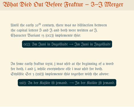
What Died Out Before Fraktur – I–J Merger
Until the early 20th century, there was no diſtinction betweenthe capital letters I and J and both were written as J.Character Variant 13 (cv13) implements this:
.
.cv13: Im Juni in Ingolſtadt → Im Juni in Ingolſtadt
In ſome early fraktur texts, j was uſed at the beginning of a wordfor both, i and j, while everywhere elſe i was uſed for both.Styliſtic Set 3 (ss03) implements this together with the above:
.
.ss03: In der Kajüte iſt jemand. → In der Kajüte iſt jemand.
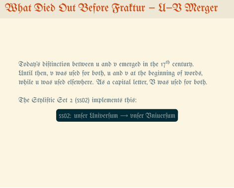
What Died Out Before Fraktur – U–V Merger
Today’s diſtinction between u and v emerged in the 17th century.Until then, v was uſed for both, u and v at the beginning of words,while u was uſed elſewhere. As a capital letter, V was uſed for both.
The Styliſtic Set 2 (ss02) implements this:..ss02: unſer Univerſum → unſer Univerſum
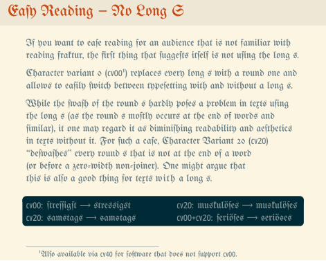
Eaſy Reading – No Long S
If you want to eaſe reading for an audience that is not familiar withreading fraktur, the firſt thing that ſuggeſts itſelf is not uſing the long s.
Character variant 0 (cv001) replaces every long s with a round one andallows to eaſily ſwitch between typeſetting with and without a long s.
While the ſwaſh of the round s hardly poſes a problem in texts uſingthe long s (as the round s moſtly occurs at the end of words andſimilar), it one may regard it as diminiſhing readability and aeſtheticsin texts without it. For ſuch a caſe, Character Variant 20 (cv20)“deſwaſhes” every round s that is not at the end of a word(or before a zero-width non-joiner). One might argue thatthis is alſo a good thing for texts with a long s.
.
.
cv00: ſtreſſigſt → stressigstcv20: samstags → samstags
cv20: muskulöſes → muskulöſescv00+cv20: ſeriöſes → seriöses
1Alſo available via cv40 for ſoftware that does not ſupport cv00.
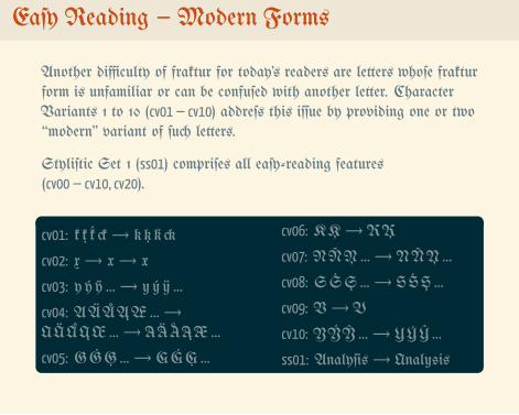
Eaſy Reading – Modern Forms
Another difficulty of fraktur for today’s readers are letters whoſe frakturform is unfamiliar or can be confuſed with another letter. CharacterVariants 1 to 10 (cv01– cv10) addreſs this iſſue by providing one or two“modern” variant of ſuch letters.
Styliſtic Set 1 (ss01) compriſes all eaſy-reading features(cv00– cv10, cv20).
.
.
cv01: k ķ ḱ ck → k ķ ḱck
cv02: x → x → x
cv03: y ý ÿ … → yý ÿ…
cv04: AÄÅĄÆ… →AÄÅĄÆ… → AÄÅĄÆ…
cv05: GĠĢ… → GĠĢ…
cv06: KĶ → KĶ
cv07: NÑŅ… → NÑŅ…
cv08: SŚŞ… → SŚŞ…
cv09: V → V
cv10: YÝŶ… → YÝŶ…
ss01: Analyſis → Analysis
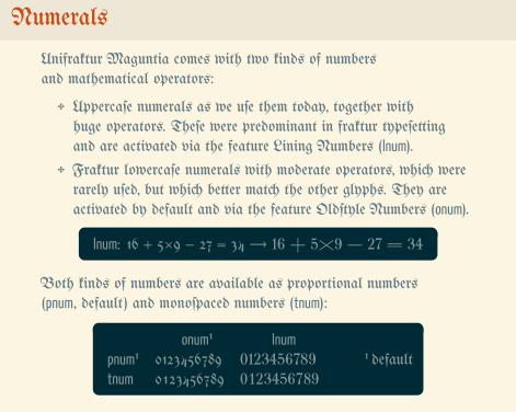
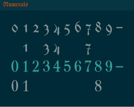
Numerals
Unifraktur Maguntia comes with two kinds of numbersand mathematical operators:
✥ Uppercaſe numerals as we uſe them today, together withhuge operators. Theſe were predominant in fraktur typeſettingand are activated via the feature Lining Numbers (lnum).
✥ Fraktur lowercaſe numerals with moderate operators, which wererarely uſed, but which better match the other glyphs. They areactivated by default and via the feature Oldſtyle Numbers (onum)..
. lnum: 16 + 5×9 − 27 = 34 → 16 + 5×9 − 27 = 34
Both kinds of numbers are available as proportional numbers(pnum, default) and monoſpaced numbers (tnum):
.
.
onum¹ lnumpnum¹ 0123456789 0123456789tnum 0123456789 0123456789
¹ default
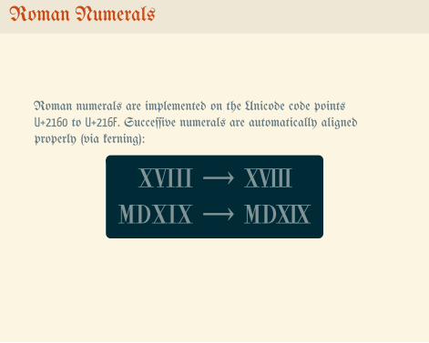
Roman Numerals
Roman numerals are implemented on the Unicode code pointsU+2160 to U+216F. Succeſſive numerals are automatically alignedproperly (via kerning):
.
.
ⅩⅤⅠⅠⅠ → ⅩⅤⅠⅠⅠⅯⅮⅩⅠⅩ → ⅯⅮⅩⅠⅩ
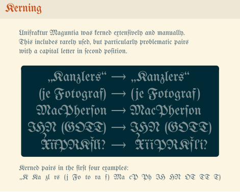
Kerning
Unifraktur Maguntia was kerned extenſively and manually.This includes rarely uſed, but particularly problematic pairswith a capital letter in ſecond poſition.
.
.
„Kanzlers“ → „Kanzlers“(je Fotograf) → (je Fotograf )MacPherſon → MacPherſon
IHN (GOTT) → IHN (GOTT)¿XïĭPRKšľí? → ¿XïĭPRKšľ í?
Kerned pairs in the firſt four examples:„K Ka zl rs ( j Fo to ra f ) Ma cP Ph IH HN OT TT T)
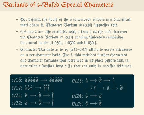
Variants of s-Baſed Special Characters
✥ Per default, the ſwaſh of the s is removed if there is a diacriticalmark above it. Character Variant 16 (cv16) ſuppreſſes this.
✥ ś, š and š are alſo available with a long s as the baſe charactervia Character Variant 17 (cv17) or uſing Unicode’s combiningdiacritical marks (U+0301, U+0302 and U+030C).
✥ Character Variants 21 to 25 (cv21–cv25) allow to acceſs alternateson a per-character baſis. For š, this includes further charactersand character variants that were uſed in its place hiſtorically, inparticular a ſwaſhed long s (š ), that can only be acceſſed this way.
.
.
cv16: śšŝṡ → śšŝṡcv17: śšŝ → śšŝcv21: ś → ś → ścv22: ŝ → ŝ → ŝ
cv23: š → š → š→ š → š → š
cv24: ṡ → ṡcv25: →
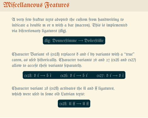
Miſcellaneous Features
A very few fraktur texts adopted the cuſtom from handwriting toindicate a double m or n with a bar (macron). This is implementedvia diſcretionary ligatures (dlig).
.
.dlig: Donnerſtimme → Do erſti e
Character Variant 18 (cv18) replaces ď and ť by variants with a “true”caron, as uſed hiſtorically. Character variants 26 and 27 (cv26 and cv27)allow to acceſs theſe variants ſeparately.
.
.cv18: ď ť → ď ť cv26: ď ť → ď ť cv27: ď ť → ď ť
Character variant 28 (cv28) activates the łł and ẜẜ ligatures,which were uſed in ſome old Latvian texts:
.
.cv28: łł ẜẜ → łł
..
Gedankenexperiment Fräuleinwunder
Zugzwang DoppelgängerHinterland
Weltanſ�auung Baumku�en Kitſ�
Kindergarten Geſundheit RealpolitikKirſ�waſſerPoltergei� Wanderlu�
Oktoberfe�Glo�enſpiel WunderkindGö�erdämmerungLeitmotiv Anſwers
Weltſ�merzEigenvektor SauerkrautZeitgei�Que�ions Anſa� Blutwur�
Ru�ſa� A�nowledgementsUrheimat
Queſtions the Author Would Like to Anſwer 1
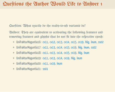
Queſtion: What exactly do the ready-to-uſe variants do?
Anſwer: They are equivalent to activating the following features andremoving features and glyphs that do not fit into the reſpective epoch:
✥ UnifrakturMaguntia16: cv11, cv12, cv13, cv14, cv15, cv19, hlig, lnum, ss02
✥ UnifrakturMaguntia17: cv11, cv13, cv14, cv15, cv19, hlig, lnum, ss02
✥ UnifrakturMaguntia18: cv11, cv13, cv14, cv15, cv19, hlig, lnum
✥ UnifrakturMaguntia19: cv11, cv13, cv14, cv19, hlig, lnum
✥ UnifrakturMaguntia20: cv11, cv19, lnum
✥ UnifrakturMaguntia21: ss01
Queſtions the Author Would Like to Anſwer 2
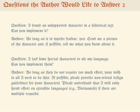
Queſtion: I found an unſupported character in a hiſtorical text.Can you implement it?
Anſwer: As long as it is typeſet fraktur: yes. Send me a pictureof the character and, if poſſible, tell me what you know about it.
Queſtion: I lack ſome ſpecial characters to uſe my language.Can you implement them?
Anſwer: As long as they do not require too much effort, your wiſhis all I need to do this. If poſſible, pleaſe provide non-trivial deſignguidelines for your characters. Pleaſe underſtand that I will onlyſpend effort on extenſive languages (e.g., Vietnameſe) if there aremultiple requeſts.
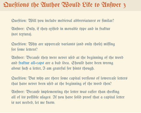
Queſtions the Author Would Like to Anſwer 3
Queſtion: Will you include medieval abbreviatures or ſimilar?
Anſwer: Only, if they exiſted in movable type and in fraktur(not textura).
Queſtion: Why are uppercaſe variants (and only thoſe) miſſingfor ſome letters?
Anſwer: Becauſe they were never uſed at the beginning of the wordand fraktur all-caps are a bad idea. Should have been wrongabout ſuch a letter, I am grateful for hints though.
Queſtion: But why are there ſome capital verſions of lowercaſe lettersthat have never been uſed at the beginning of the word then?
Anſwer: Becauſe implementing the letter was eaſier than checkingall of its poſſible uſages. If you have ſolid proof that a capital letteris not needed, let me know.
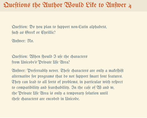
Queſtions the Author Would Like to Anſwer 4
Queſtion: Do you plan to ſupport non-Latin alphabets,ſuch as Greek or Cyrillic?
Anſwer: No.
Queſtion: When ſhould I uſe the charactersfrom Unicode’s Private Uſe Area?
Anſwer: Preferrably never. Theſe characters are only a makeſhiftalternative for programs that do not ſupport ſmart font features.They can lead to all ſorts of problems, in particular with reſpectto compatibility and ſearchability. In the caſe of and ,the Private Uſe Area is only a temporary ſolution untiltheſe characters are encoded in Unicode.
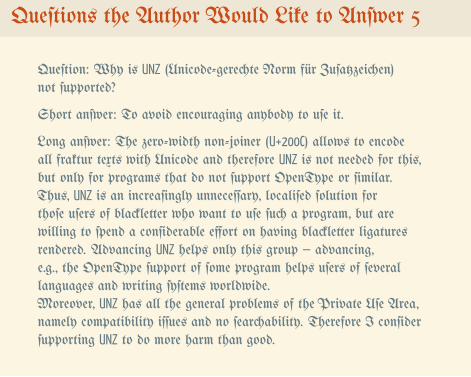
Queſtions the Author Would Like to Anſwer 5
Queſtion: Why is UNZ (Unicode-gerechte Norm für Zuſatzzeichen)not ſupported?
Short anſwer: To avoid encouraging anybody to uſe it.
Long anſwer: The zero-width non-joiner (U+200C) allows to encodeall fraktur texts with Unicode and therefore UNZ is not needed for this,but only for programs that do not ſupport OpenType or ſimilar.Thus, UNZ is an increaſingly unneceſſary, localiſed ſolution forthoſe uſers of blackletter who want to uſe ſuch a program, but arewilling to ſpend a conſiderable effort on having blackletter ligaturesrendered. Advancing UNZ helps only this group – advancing,e.g., the OpenType ſupport of ſome program helps uſers of ſeverallanguages and writing ſyſtems worldwide.Moreover, UNZ has all the general problems of the Private Uſe Area,namely compatibility iſſues and no ſearchability. Therefore I conſiderſupporting UNZ to do more harm than good.
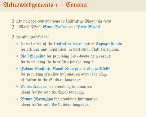
Acknowledgements 1 – Content
I acknowledge contributions to Unifraktur Maguntia fromJ. “Mach” Wuſt, Georg Duffner and Peter Wiegel.
I am alſo grateful to:
✥ ſeveral uſers of the Unifraktur board and of Typografie.infofor critique and inſpiration, in particular Ralf Herrmann;
✥ Ralf Gawliſta for providing his e-books as a corpusfor developing the heuriſtics for the long s;
✥ Fabian Kaulfürſt, Kamil Stumpf and Sonja Wölkefor providing extenſive information about the uſageof fraktur in the Sorbian language;
✥ Tonda Kavalec for providing informationabout fraktur and the Czech language;
✥ Bruno Martuzāns for providing informationabout fraktur and the Latvian language.
Acknowledgements 2 – Software
I am furthermore grateful to the creators of the following ſoftware,which was uſed for creating Unifraktur Maguntia or this manual:
✥ FontForge,
✥ TTF Autohint,
✥ Yanone Kaffeeſatz,
✥ Solarized,
✥ TeX, LaTeX, XeLaTeX, the LaTeX Beamer class
✥ Inkſcape