Embed Size (px)
Citation preview
Typographic layout and first impressions: testing how changes in text layout influence reader's judgments of documents Article
Accepted Version
Moys, J.L. (2014) Typographic layout and first impressions: testing how changes in text layout influence reader's judgments of documents. Visible Language, 48 (1). 881. ISSN 00222224 Available at http://centaur.reading.ac.uk/39859/
It is advisable to refer to the publisher’s version if you intend to cite from the work. Published version at: http://visiblelanguagejournal.com/articles/article/881/
Publisher: University of Cincinnati, School of Design
All outputs in CentAUR are protected by Intellectual Property Rights law, including copyright law. Copyright and IPR is retained by the creators or other copyright holders. Terms and conditions for use of this material are defined in the End User Agreement .
www.reading.ac.uk/centaur

CentAUR
Central Archive at the University of Reading
Reading’s research outputs online
Typographic layout and first impressions – testing how changes in text layout influence readers’ judgments of documents
Dr Jeanne-Louise Moys
Department of Typography & Graphic Communication
The University of Reading
2 Earley Gate
Whiteknights
Reading
RG6 6AU
United Kingdom
Typographic layout and first impressions – testing how changes in text layout influence readers’ judgments of documents
Abstract
This study explores how the typographic layout of information influences readers’ impressions of magazine contents pages. Thirteen descriptors were used in a paired comparison procedure that assessed whether participants’ rhetorical impressions of a set of six controlled documents change in relation to variations in layout. The combinations of layout attributes tested were derived from the structural attributes associated with three patterns of typographic differentiation (high, moderate, and low) described in a previous study (see Moys, 2013). The content and the range of stylistic attributes applied to the test material were controlled in order to focus on layout attributes. Triangulation of the quantitative and qualitative data indicates that, even within the experimental confines of limited stylistic differentiation, the layout attributes associated with patterns of high, moderate, and low typographic differentiation do influence readers’ rhetorical judgments. In addition, the findings emphasize the importance of considering interrelationships between clusters of typographic attributes rather than testing isolated variables.
Typographic layout and first impressions Page 1 27/03/2015
Typographic layout and first impressions – testing how changes in text layout influence readers’ judgments of documents
Abstract
This study explores how the typographic layout of information influences readers’ impressions of magazine contents pages. Thirteen descriptors were used in a paired comparison procedure that assessed whether participants’ rhetorical impressions of a set of six controlled documents change in relation to variations in layout. The combinations of layout attributes tested were derived from the structural attributes associated with three patterns of typographic differentiation (high, moderate, and low) described in a previous study (see Moys, 2013). The content and the range of stylistic attributes applied to the test material were controlled in order to focus on layout attributes. Triangulation of the quantitative and qualitative data indicates that, even within the experimental confines of limited stylistic differentiation, the layout attributes associated with patterns of high, moderate, and low typographic differentiation do influence readers’ rhetorical judgments. In addition, the findings emphasize the importance of considering interrelationships between clusters of typographic attributes rather than testing isolated variables.
Key words
Document design; genre; layout; paired comparisons; typographic differentiation; typography; visual rhetoric
Typographic layout and first impressions Page 2 27/03/2015
1 Introduction
1.1 Typographic organization, layout and document rhetoric
Document designers specify a range of typographic attributes in order to articulate information in meaningful ways. Some of these attributes, such as the choice of typeface and weight, can be considered stylistic. Others, such as the setting of the text within a grid system and the use of white space, can be considered structural. A substantial cross-disciplinary body of research supports the premise that the choice of typeface, for example, influences visual rhetoric in document design (Brumberger, 2001; Shaikh, 2007). In contrast, research into how typographic layout influences readers’ rhetorical impressions is less established – despite theoretical approaches to document analysis that acknowledge the importance of space and arrangement (e.g. Bateman, 2008; Delin, Bateman, et al, 2003; Kostelnick and Roberts, 1998) and the emphasis on white space in designers’ professional discourse.
Findings from early studies, such as Click and Stempel’s (1968) study of newspaper layouts, have limited generalizability due to the possible interference from content and images within the test material. More recent studies tend to focus on the role of layout in relation to usability rather than affect or rhetoric. For example, Comber and Maltby (1996) drew on Bonsiepe’s (1968) measures of orderliness to investigate the interplay between layout complexity and usability and Chaparro, Baker, et al (2004) and Chaparro, Shaikh, et al (2005) focus on how the use of white space and layout affects reading performance. Nevertheless, evidence from studies such as Middlestadt and Barnhurst’s (1999) comparison of horizontal and vertical layouts indicates that typographic layout does influence readers’ rhetorical judgments.
Recently, Waller (2012) has reiterated the importance of typographic organization and layout in communicating graphic argument. The study reported here adopts his emphasis on document layout, but shifts the focus from graphic argument to readers’ initial impressions of document rhetoric. Examining these ‘at a glance’ impressions may help us understand how the visual presentation of information can influence the assumptions readers make about information and the attitude and engagement strategies they may choose to adopt.
1.2 Creating meaning through typographic differentiation
In an earlier study (see Moys, 2013: 102), I described how particular combinations of stylistic and structural typographic attributes tend to occur in relation to the kind of typographic differentiation applied to documents, forming particular “patterns”.
For example, documents exhibiting a high differentiation pattern (see Figure 1) tend to combine the greatest variety of stylistic and structural attributes. They have the most exaggerated level of typographic differentiation, using prominent changes in typeface, size, weight, color and applying effects such as shadows or outlines to differentiate display text. They are most likely to use colored and irregularly shaped or
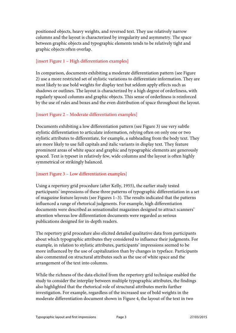
Typographic layout and first impressions Page 3 27/03/2015
positioned objects, heavy weights, and reversed text. They use relatively narrow columns and the layout is characterized by irregularity and asymmetry. The space between graphic objects and typographic elements tends to be relatively tight and graphic objects often overlap.
[insert Figure 1 – High differentiation examples]
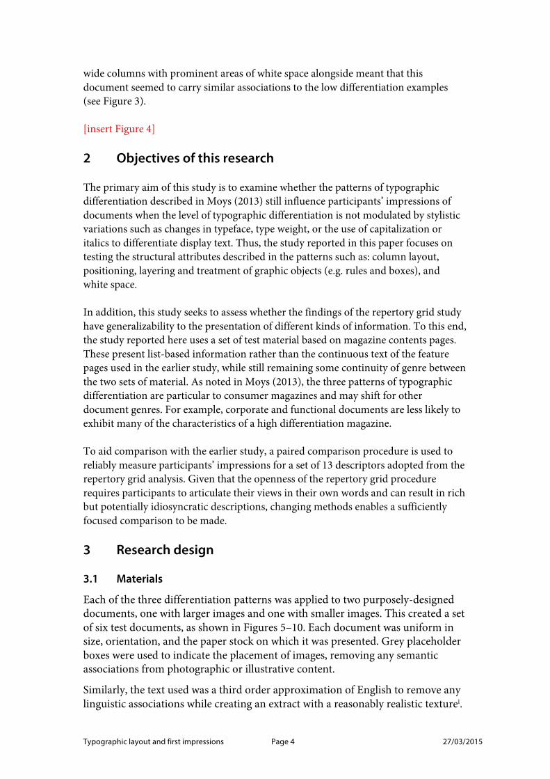
In comparison, documents exhibiting a moderate differentiation pattern (see Figure 2) use a more restricted set of stylistic variations to differentiate information. They are most likely to use bold weights for display text but seldom apply effects such as shadows or outlines. The layout is characterized by a high degree of orderliness, with regularly spaced columns and graphic objects. This sense of orderliness is reinforced by the use of rules and boxes and the even distribution of space throughout the layout.
[insert Figure 2 – Moderate differentiation examples]
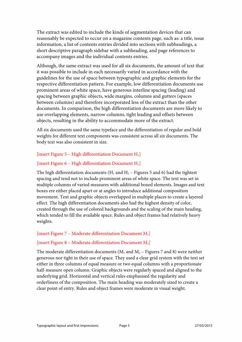
Documents exhibiting a low differentiation pattern (see Figure 3) use very subtle stylistic differentiation to articulate information, relying often on only one or two stylistic attributes to differentiate, for example, a subheading from the body text. They are more likely to use full capitals and italic variants in display text. They feature prominent areas of white space and graphic and typographic elements are generously spaced. Text is typeset in relatively few, wide columns and the layout is often highly symmetrical or strikingly balanced.
[insert Figure 3 – Low differentiation examples]
Using a repertory grid procedure (after Kelly, 1955), the earlier study tested participants’ impressions of these three patterns of typographic differentiation in a set of magazine feature layouts (see Figures 1–3). The results indicated that the patterns influenced a range of rhetorical judgments. For example, high differentiation documents were described as sensationalist magazines designed to attract scanners’ attention whereas low differentiation documents were regarded as serious publications designed for in-depth readers.
The repertory grid procedure also elicited detailed qualitative data from participants about which typographic attributes they considered to influence their judgments. For example, in relation to stylistic attributes, participants’ impressions seemed to be more influenced by the use of capitalization than by changes in typeface. Participants also commented on structural attributes such as the use of white space and the arrangement of the text into columns.
While the richness of the data elicited from the repertory grid technique enabled the study to consider the interplay between multiple typographic attributes, the findings also highlighted that the rhetorical role of structural attributes merits further investigation. For example, regardless of the increased use of bold weights in the moderate differentiation document shown in Figure 4, the layout of the text in two
Typographic layout and first impressions Page 4 27/03/2015
wide columns with prominent areas of white space alongside meant that this document seemed to carry similar associations to the low differentiation examples (see Figure 3).
[insert Figure 4]
2 Objectives of this research
The primary aim of this study is to examine whether the patterns of typographic differentiation described in Moys (2013) still influence participants’ impressions of documents when the level of typographic differentiation is not modulated by stylistic variations such as changes in typeface, type weight, or the use of capitalization or italics to differentiate display text. Thus, the study reported in this paper focuses on testing the structural attributes described in the patterns such as: column layout, positioning, layering and treatment of graphic objects (e.g. rules and boxes), and white space.
In addition, this study seeks to assess whether the findings of the repertory grid study have generalizability to the presentation of different kinds of information. To this end, the study reported here uses a set of test material based on magazine contents pages. These present list-based information rather than the continuous text of the feature pages used in the earlier study, while still remaining some continuity of genre between the two sets of material. As noted in Moys (2013), the three patterns of typographic differentiation are particular to consumer magazines and may shift for other document genres. For example, corporate and functional documents are less likely to exhibit many of the characteristics of a high differentiation magazine.
To aid comparison with the earlier study, a paired comparison procedure is used to reliably measure participants’ impressions for a set of 13 descriptors adopted from the repertory grid analysis. Given that the openness of the repertory grid procedure requires participants to articulate their views in their own words and can result in rich but potentially idiosyncratic descriptions, changing methods enables a sufficiently focused comparison to be made.
3 Research design
3.1 Materials
Each of the three differentiation patterns was applied to two purposely-designed documents, one with larger images and one with smaller images. This created a set of six test documents, as shown in Figures 5–10. Each document was uniform in size, orientation, and the paper stock on which it was presented. Grey placeholder boxes were used to indicate the placement of images, removing any semantic associations from photographic or illustrative content.
Similarly, the text used was a third order approximation of English to remove any linguistic associations while creating an extract with a reasonably realistic texturei.
Typographic layout and first impressions Page 5 27/03/2015
The extract was edited to include the kinds of segmentation devices that can reasonably be expected to occur on a magazine contents page, such as: a title, issue information, a list of contents entries divided into sections with subheadings, a short descriptive paragraph sidebar with a subheading, and page references to accompany images and the individual contents entries.
Although, the same extract was used for all six documents, the amount of text that it was possible to include in each necessarily varied in accordance with the guidelines for the use of space between typographic and graphic elements for the respective differentiation pattern. For example, low differentiation documents use prominent areas of white space, have generous interline spacing (leading) and spacing between graphic objects, wide margins, columns and gutters (spaces between columns) and therefore incorporated less of the extract than the other documents. In comparison, the high differentiation documents are more likely to use overlapping elements, narrow columns, tight leading and offsets between objects, resulting in the ability to accommodate more of the extract.
All six documents used the same typeface and the differentiation of regular and bold weights for different text components was consistent across all six documents. The body text was also consistent in size.
[insert Figure 5 – High differentiation Document H1]
[insert Figure 6 – High differentiation Document H2]
The high differentiation documents (H1 and H2 – Figures 5 and 6) had the tightest spacing and tend not to include prominent areas of white space. The text was set in multiple columns of varied measures with additional boxed elements. Images and text boxes ere either placed apart or at angles to introduce additional composition movement. Text and graphic objects overlapped in multiple places to create a layered effect. The high differentiation documents also had the highest density of color, created through the use of colored backgrounds and the scaling of the main heading, which tended to fill the available space. Rules and object frames had relatively heavy weights.
[insert Figure 7 – Moderate differentiation Document M1]
[insert Figure 8 – Moderate differentiation Document M2]
The moderate differentiation documents (M1 and M2 – Figures 7 and 8) were neither generous nor tight in their use of space. They used a clear grid system with the text set either in three columns of equal measure or two equal columns with a proportionate half-measure open column. Graphic objects were regularly spaced and aligned to the underlying grid. Horizontal and vertical rules emphasised the regularity and orderliness of the composition. The main heading was moderately sized to create a clear point of entry. Rules and object frames were moderate in visual weight.
Typographic layout and first impressions Page 6 27/03/2015
[insert Figure 9 – Low differentiation Document L1]
[insert Figure 10 – Low differentiation Document L2]
The low differentiation documents (L1 and L2 – Figures 9 and 10) were the most generously spaced – both in terms of character and line spacing. They featured the most salient use of white space. Images were grouped together. The composition was either symmetrical or used white space to accentuate the asymmetrical balance. The low differentiation documents had wide columns and generous margins and gutters. The main heading was moderate to large in size with lots of white space around it to create a distinct point of entry (in the case of L1 – Figure 9 this space is accentuated through the layering of the heading and the images). Rules and object frames were light in visual weight, although these features were used sparingly.
3.2 Descriptors
The descriptors used in this study were adopted from the elicited constructs in the repertory grid study described in Moys (2013). Initially, the descriptors that were used by five or moreii participants were identified. However, some of the descriptors were not consistently used to infer the same dimensions. For example, participants used the word ‘easy’ to suggest a range of dimensions, including: “easy on the eye”, “easy to read”, and “easy-going”. Although the word was used repeatedly, its interpretation was not consistent across five or more participants. Similarly, a few descriptors such as “bold” and “light” were used to infer both descriptive and evaluative impressions. To avoid confounding the results through ambiguity of interpretation of the descriptors, such examples were omitted.
The set of remaining descriptors included several adjectives that describe similar dimensions. In this respect, the list needed to be refined to avoid unnecessary testing of repetitive dimensions, while exploring a suitable range of descriptors. For example, “old” and “young” both refer to age and “appealing”, “boring”, “exciting”, and “interesting” all pertain to judgments of visual interest. “Young” and “interesting” were selected because they are the descriptors used by most of the participants.
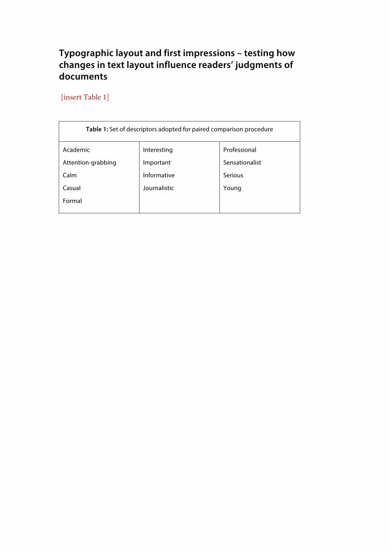
These refinements left a set of 13 evaluative descriptors, which explore readers’ impressions of document address (e.g. ‘attention-grabbing’, ‘formal’) and credibility (e.g. ‘professional’, ‘sensationalist’) as well as associative qualities (e.g. ‘academic’, ‘journalistic’) and mood (e.g. ‘calm’, ‘casual’). The set of 13 descriptors used in the study is included in Table 1.
[insert Table 1]
3.2 Procedure
Twelve volunteers who did not have formal design training or professional experience took part. Participants attended individual interviews in which the primary method of data collection was a paired comparison procedure. During the interview briefing, participants were encouraged to answer as quickly as possible, giving their immediate impression of the documents. They were shown a series of paired documents from the
Typographic layout and first impressions Page 7 27/03/2015
set of six purposely-designed magazine contents pages and asked to identify which document in each pair was more typical of a given descriptor.
Each participant completed 195 trials. The set of six documents (H1, H2, M1, M2, L1, L2) provides 15 different document pairs. These are: H1M1, H1L1, H1H2, H1M2, H1L2, M1L1, M1H2, M1M2, M1L2, L1H2, L1M2, L1L2, H2M2, H2L2, and M2L2. Combined with the 13 descriptors, a set of 195 trials (descriptor and paired document combinations) that does not have any repeats is obtained. Thus, the 15 document pairs were each viewed 13 times, once for each of the 13 descriptors.
For each trial, the participant was required to identify whether the document positioned on the left (label A) or right (label B) was more typical of the specified descriptor (presented on a small card). The presentation order of the trials as well as the placement of the documents (left or right on the table in front of the participant) within the pairs was randomised to counterbalance any order effects.
After all the trials were completed, participants viewed the six documents as a set. At this stage, they were questioned about their interpretation of the descriptors and their overall impressions of the documents. They were also asked if there were any additional descriptors they would like to suggest. This qualitative data helps to contextualise the results of the paired comparisons and provides insight into participants’ interpretation of the descriptors and the visual characteristics that they considered particularly salient or associated with particular qualities.
4 Results
4.1 Analysis of variance
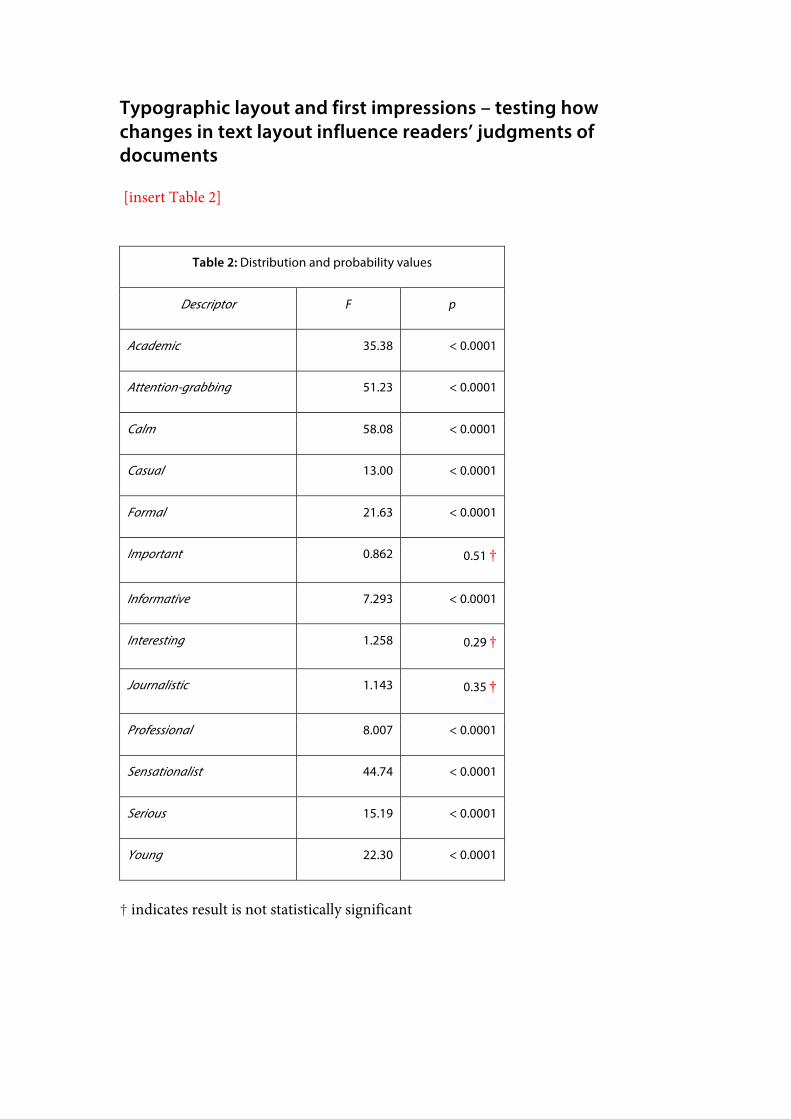
The paired comparison procedure collected quantitative data pertaining to the number of times each document was chosen as more typical of each of the 13 descriptors. For each descriptor, an analysis of variance was performed on this data to obtain probability values (p) that can be used as an indication of whether participants were consistent in their judgments. The ANOVAs yielded the distribution (F) and probability (p) results shown in Table 2. Results for which p < 0.05 can be considered statistically significant and therefore a reliable indication that the documents were not all seen as homogenously ‘sensationalist’, for example.
[insert Table 2]
Although the majority of the descriptors had significant results, the probability values for the descriptors ‘important’, ‘interesting’, and ‘journalistic’ are not statistically significant (indicated by † in Table 2). An explanation for this will be considered in relation to analysis of the qualitative data. For the ten descriptors where p < 0.0001, we can deduce that there is sufficient variation between participants’ impressions of the six documents and analyse these results further to consider relationships between particular descriptors and the test material.
Typographic layout and first impressions Page 8 27/03/2015
4.2 Ranked data
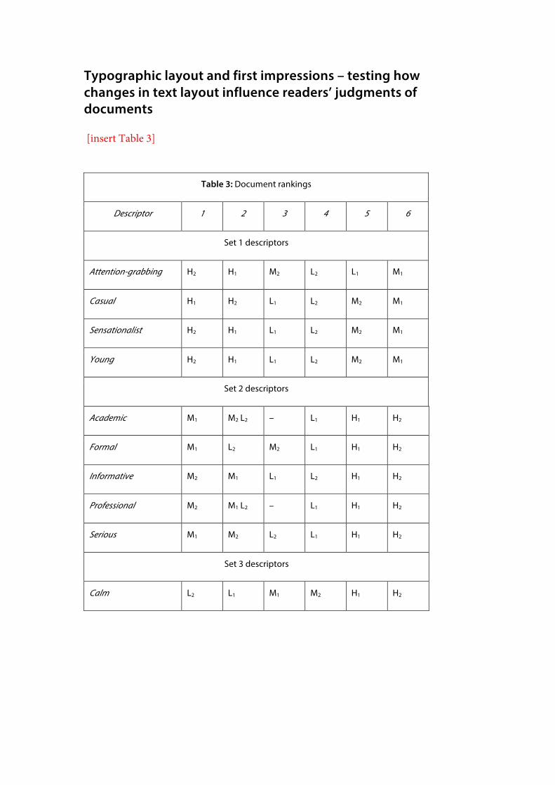
For each descriptor with a significant result, the totals collected for the six documents were ranked in descending order to ascertain if particular patterns emerged across the descriptors. Table 3 shows the document rankings. For ease of comparison, the results are grouped into three sets:
• Set 1: descriptors for which a high differentiation document was most frequently chosen as typical;
• Set 2: descriptors for which a moderate differentiation document was most frequently chosen as typical; and
• Set 3: descriptors for which a low differentiation document was most frequently chosen as typical.
[insert Table 3]
‘Calm’ is the only descriptor where there appears to be a linear relationship between the three patterns of typographic differentiation, with documents ordered from low through moderate to high differentiation documents. For this descriptor, low differentiation structural attributes – such as: increasing the use of white space, decreasing the overall busyness of the composition and reducing the level of typographic differentiation – seem to increase participants’ impressions of ‘calm’.
However, for the majority of descriptors the ranked orders show that the relationship between the patterns of typographic differentiation cannot be reduced to a simple description of increasing/decreasing differentiation or busyness. In the first set, this is particularly clear for descriptors such as ‘casual’, ‘sensationalist’, and ‘young’ where the high and moderate differentiation documents are at opposite ends of the ranked orders.
Similarly, the ranked order of the documents for second set of descriptors suggests that typographic meaning is created through clusters of interrelated attributes, with documents evidencing moderate differentiation attributes and organisational principles communicating qualities such as: ‘academic, ‘formal’, ‘informative’, ‘professional’, and ‘serious’. Document L2 (low) was sometimes perceived in similar ways to the moderate differentiation documents (M1 and M2). In fact, Documents M2 and L2 had identical results for ‘academic’ and Documents M1 and L2 for ‘professional’. Explanations for these findings will be discussed in relation to the qualitative data.
4.3 Pairwise comparisons
For the 10 descriptors that had significant results, pairwise comparisons were performed to ascertain if particular document pairs are sufficiently similar or dissimilar for each descriptor. These comparisons provide evidence to support the hypotheses that:
Typographic layout and first impressions Page 9 27/03/2015
• Documents from the same differentiation pattern are likely to be reasonably similar in the extent to which they are typical or atypical of a particular descriptors (and therefore would not be expected to have a result that is significantly different)
• Documents from contrasting differentiation patterns are not likely to be considered equally typical or atypical of the same descriptors (and therefore are expected to have a result that is significantly different).
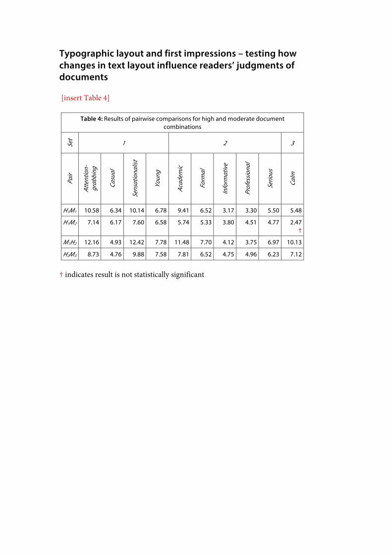
In the tables that follow, the † indicates paired documents that have a t-value that indicates they are not significantly different in relation to the descriptor, for a 95% confidence interval. The t-values are rounded to two decimal places. For ease of comparison, the descriptors are ordered into the three sets adopted in the preceding section. Comparisons between documents of high and moderate differentiation patterns Table 4 shows the results of pairwise comparisons between documents that of high and moderate differentiation patterns.
[insert Table 4]
The pairwise comparisons in Table 4 show that participants consistently judged documents of high and moderate differentiation patterns to form dissimilar impressions, with one exception. No significant difference (†) was found between Document H1 and M2 for the descriptor ‘calm’. Interestingly, Document H2 was never chosen as typical of this descriptor. Thus, the result for Document H1 in relation to ‘calm’ was higher than expected (rather than both Documents H1 and H2 having similar scores). The qualitative data also suggests that the salience of the red header strip may have had a slight influence on participants’ judgments of Document M2 for this descriptor.
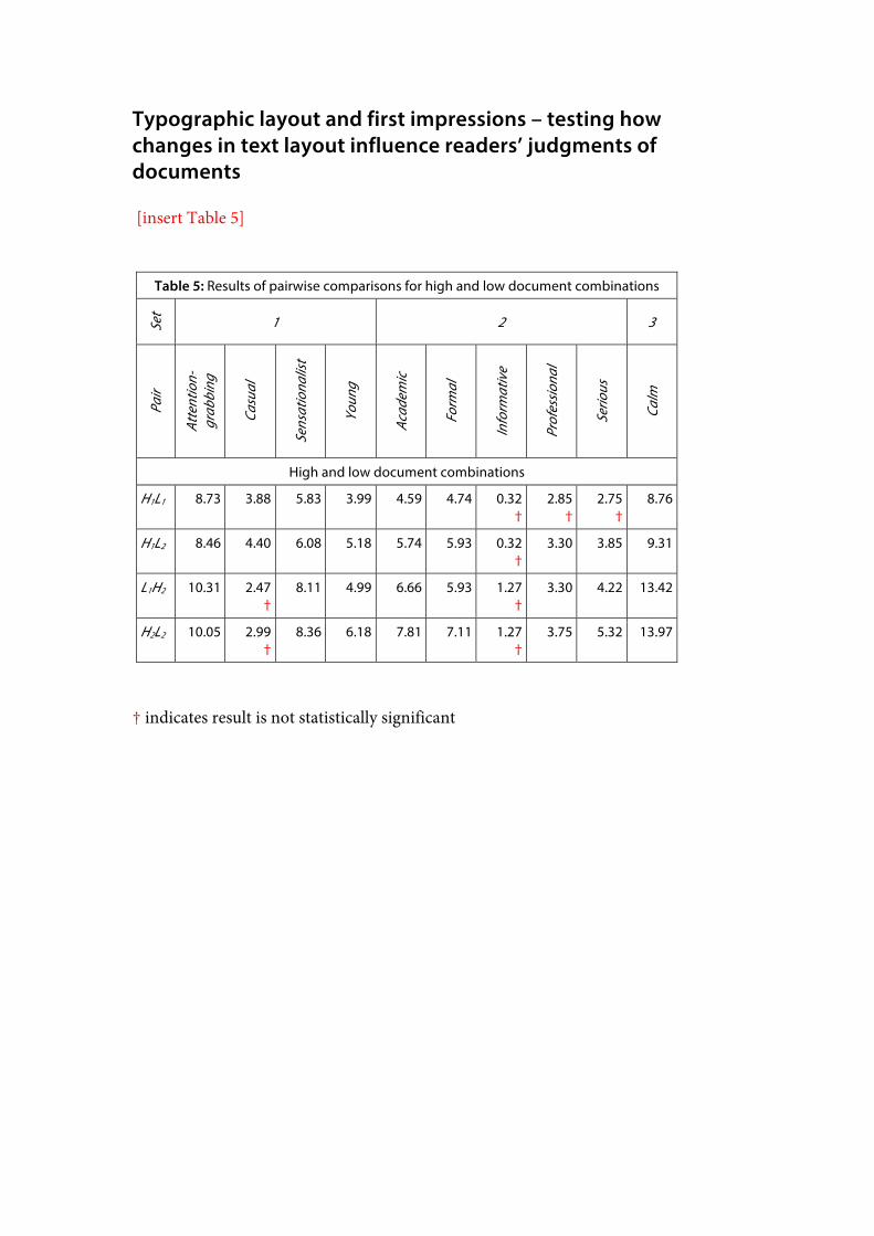
Comparisons between documents of high and low differentiation patterns Table 5 presents the results of the pairwise comparisons for high and low differentiation document combinations.
[insert Table 5]
High and low differentiation documents can be considered to reliably convey different impressions for the following descriptors: ‘academic’, ‘attention-grabbing’, ‘calm’, ‘formal’, ‘sensationalist’, and ‘young’.
For the descriptor ‘casual’, there is no significant difference between Document H2 and either of the low differentiation documents (L1 and L2). Both low differentiation documents are characterized by generous use of white space and wider text columns. In comparison to the highly structured and denser moderate differentiation documents, it is possible that these attributes contribute to a greater sense of casualness. The qualitative data also suggests that the use of overlapping elements in
Typographic layout and first impressions Page 10 27/03/2015
Document L1 (Figure 9) may have influenced how participants judged this document. Participants commented that the overlap in Document L1 made it seem more ‘casual’ and ‘young’ than they would have judged it if the heading and images did not overlap.
The generous use of space in the low differentiation documents sometimes seemed to decrease the extent to which participants were likely to describe low differentiation documents as ‘informative’, ‘professional’ or ‘serious’. No significant difference was found between high and low differentiation documents for ‘informative’ and between Documents H1 and L1 for the descriptors ‘professional’ and ‘serious’. The qualitative data suggests that both the amount of information on the page and the orderliness of the layout affected participants’ impressions of ‘informative’. Although no significant difference was found between Document H1 (high) and Document L1 (low) in relation to ‘professional’ or ‘serious’, the qualitative data suggests that this was possibly due to the layering of the main heading and the images in Document L1. However, the ranked data in Table 3 shows that low differentiation documents are still more likely than high differentiation documents to be described as ‘informative’, ‘professional’ or ‘serious’.
Similarly, the extent to which participants considered documents to be ‘formal’ or ‘serious’, for example, seems to be reduced by either:
• Increasing the density of the information (as in Documents H1 and H2) through:
o Tightening interline spacing; o Including more and visually heavier graphic objects that interrupt the
text flow; and o Decreasing the use of white space; or
• Decreasing the density of the information (as in Documents L1 and L2) through:
o Using more generous leading; o Using fewer graphic objects and reducing the visual weight
of these; and o Increasing the use of white space.
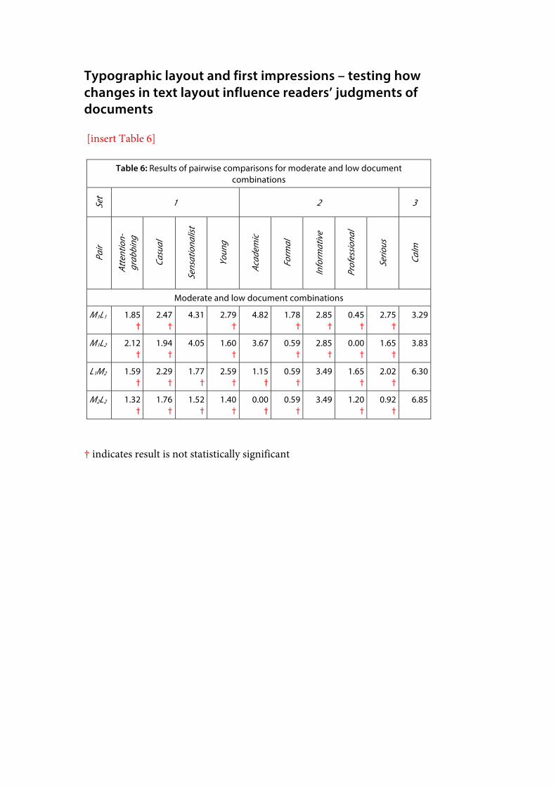
Comparisons between documents of moderate and low differentiation patterns Table 6 presents the results of the pairwise comparisons for moderate and low differentiation document combinations.
[insert Table 6]
The pairwise comparison results in Table 6 indicate that participants formed different judgments of moderate and low document combinations for descriptors such as ‘calm’ (where the low differentiation documents emerged as significantly more typical of this descriptor) and ‘sensationalist’ and ‘academic’ (where Document M1 was significantly less ‘sensationalist’ and more ‘academic’ than either of the low differentiation documents). However, for most of the descriptors, the pairwise
Typographic layout and first impressions Page 11 27/03/2015
comparisons indicate that the ways in which participants discriminated between moderate and low document combinations tended to be more subtle than between moderate and high or high and low document combinations.
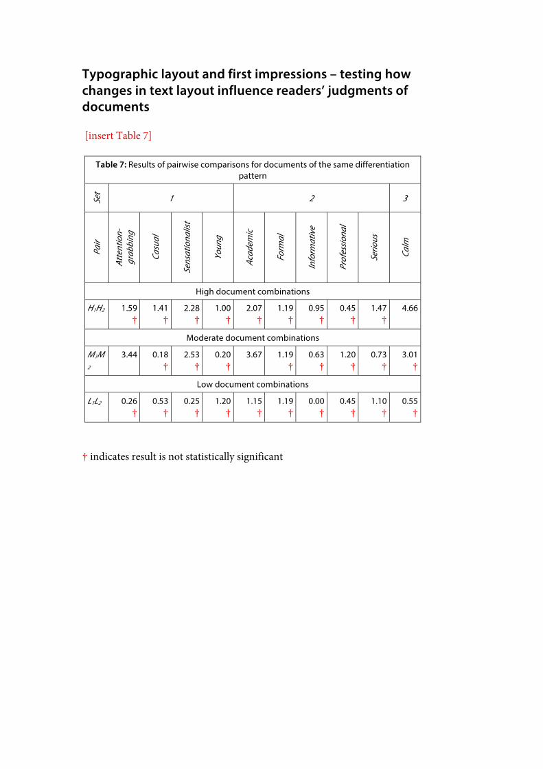
Comparisons between documents of the same differentiation pattern Table 7 shows the results of pairwise comparisons for documents of the same differentiation pattern.
[insert Table 7]
As anticipated, pairwise comparisons for documents of the same differentiation pattern tended not to yield results that show a significant difference. In fact, a significant result occurred in only three instances: between the high differentiation documents for ‘calm’ and between the moderate differentiation documents for ‘academic’ and ‘attention-grabbing’.
For the descriptor ‘calm’, a significant difference was found for the two high differentiation documents. However, this result is possibly due to the fact that Document H2 was never selected as more typical of this descriptor across the whole study, as discussed above. Excluding the times that Document H1 was paired with Document H2, Document H1 was only chosen as typical of this descriptor three times. Thus, both high differentiation documents can be considered atypical of the descriptor ‘calm’, although Document H2 is significantly more so in comparison to Document H1.
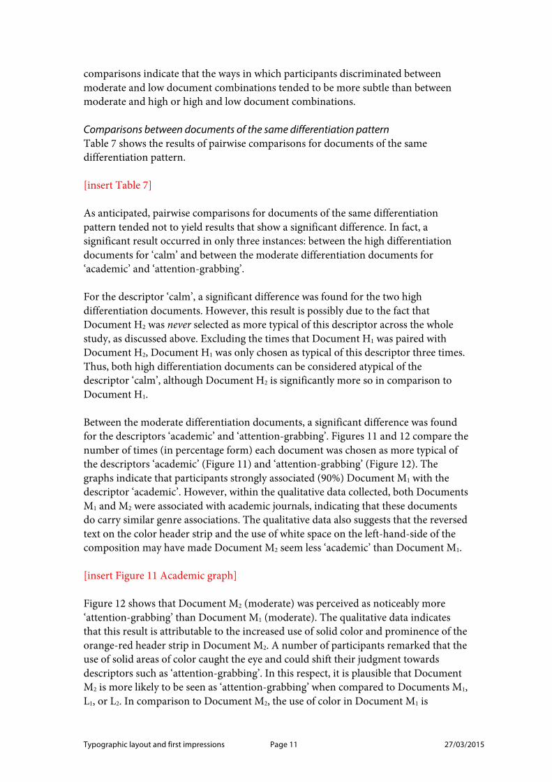
Between the moderate differentiation documents, a significant difference was found for the descriptors ‘academic’ and ‘attention-grabbing’. Figures 11 and 12 compare the number of times (in percentage form) each document was chosen as more typical of the descriptors ‘academic’ (Figure 11) and ‘attention-grabbing’ (Figure 12). The graphs indicate that participants strongly associated (90%) Document M1 with the descriptor ‘academic’. However, within the qualitative data collected, both Documents M1 and M2 were associated with academic journals, indicating that these documents do carry similar genre associations. The qualitative data also suggests that the reversed text on the color header strip and the use of white space on the left-hand-side of the composition may have made Document M2 seem less ‘academic’ than Document M1.
[insert Figure 11 Academic graph]
Figure 12 shows that Document M2 (moderate) was perceived as noticeably more ‘attention-grabbing’ than Document M1 (moderate). The qualitative data indicates that this result is attributable to the increased use of solid color and prominence of the orange-red header strip in Document M2. A number of participants remarked that the use of solid areas of color caught the eye and could shift their judgment towards descriptors such as ‘attention-grabbing’. In this respect, it is plausible that Document M2 is more likely to be seen as ‘attention-grabbing’ when compared to Documents M1, L1, or L2. In comparison to Document M2, the use of color in Document M1 is
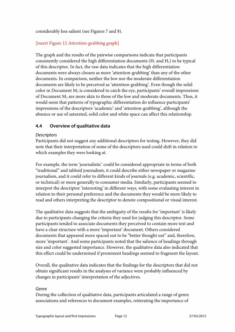
Typographic layout and first impressions Page 12 27/03/2015
considerably less salient (see Figures 7 and 8).
[insert Figure 12 Attention-grabbing graph]
The graph and the results of the pairwise comparisons indicate that participants consistently considered the high differentiation documents (H1 and H2) to be typical of this descriptor. In fact, the raw data indicates that the high differentiation documents were always chosen as more ‘attention-grabbing’ than any of the other documents. In comparison, neither the low nor the moderate differentiation documents are likely to be perceived as ‘attention-grabbing’. Even though the solid color in Document M2 is considered to catch the eye, participants’ overall impressions of Document M2 are more akin to those of the low and moderate documents. Thus, it would seem that patterns of typographic differentiation do influence participants’ impressions of the descriptors ‘academic’ and ‘attention-grabbing’, although the absence or use of saturated, solid color and white space can affect this relationship.
4.4 Overview of qualitative data
Descriptors Participants did not suggest any additional descriptors for testing. However, they did note that their interpretation of some of the descriptors used could shift in relation to which examples they were looking at.
For example, the term ‘journalistic’ could be considered appropriate in terms of both “traditional” and tabloid journalism, it could describe either newspaper or magazine journalism, and it could refer to different kinds of journals (e.g. academic, scientific, or technical) or more generally to consumer media. Similarly, participants seemed to interpret the descriptor ‘interesting’ in different ways, with some evaluating interest in relation to their personal preference and the documents they would be more likely to read and others interpreting the descriptor to denote compositional or visual interest.
The qualitative data suggests that the ambiguity of the results for ‘important’ is likely due to participants changing the criteria they used for judging this descriptor. Some participants tended to associate documents they perceived to contain more text and have a clear structure with a more ‘important’ document. Others considered documents that appeared more spaced out to be “better thought out” and, therefore, more ‘important’. And some participants noted that the salience of headings through size and color suggested importance. However, the qualitative data also indicated that this effect could be undermined if prominent headings seemed to fragment the layout.
Overall, the qualitative data indicates that the findings for the descriptors that did not obtain significant results in the analyses of variance were probably influenced by changes in participants’ interpretation of the adjectives.
Genre During the collection of qualitative data, participants articulated a range of genre associations and references to document examples, reiterating the importance of
Typographic layout and first impressions Page 13 27/03/2015
genre and context to typographic meaning. References to magazine genres and titles were the most frequent, as would be expected given the nature of the test material. The high differentiation documents (H1 and H2) were seen as highly typical of consumer magazines and described as gossip or teen publications. In contrast, the low differentiation documents (L1 and L2) were seen as magazines with a subscriber base and the moderate differentiation documents (M1 and M2) were compared to financial, news, or technical magazines.
Color A few participants indicated that color was particularly striking and made certain elements stand out more, particularly if the text was reversed on a colored background (such as the headline in Document H2 – Figure 6) or if it was positioned at the top of the page (such as the header strip in Document M2 – Figure 8). For example, the qualitative data suggests that the change in rank order for ‘attention-grabbing’ may be due to the salience of the red header strip in Document M2 (moderate).
However, overall, the color header strip in Document M2 did not seem to carry the same connotations as the reversed color headline in Document H2. For example, while the prominence of the reversed headline may carry ‘sensationalist’ connotations in Document H2, the reversed color strip in Document M2 made this document seem more ‘professional’ and ‘serious’. Although the header strip in Document M2 featured reversed type on solid color, the document is still not seen as particularly ‘sensationalist’. Both low differentiation documents (L1 and L2), neither of which use reversed text, were chosen more frequently over Document M2 for this descriptor. Participants described the color header in Document M2 as “very institutional”, “like a memo” and something that “catch(es) your eye in a more ‘professional’ way” (M2) rather than a “more gossipy magazine way” (H2).
Some participants also noted that the orange-red color carried particular genre associations for them and “tipped the balance” towards descriptors such as ‘attention-grabbing’, ‘sensationalist’, and ‘serious’. Others felt that the use of red conventionally signals importance, particularly when used at the top of the page as in the header strip in Document M2 (Figure 8). Yet, for examples such as Document H2, participants remarked that “despite the (use of the) color red” the document did not seem particularly ‘serious’. Across the study, participants’ evaluations of Documents H2 and M2 seem to be based on their overall impression of the typographic layout and structure, rather than simply the use of reversed text on solid color.
These findings lend support to Kunz’s (1998) emphasis on the interconnectedness of attributes in typographic presentation. For most of the descriptors, the strong, uninterrupted column layout and the use of rules and moderate white space meant that participants’ impressions of Document M2 tended to align more closely with those formed in relation to Documents M1 and L2. In comparison, the combination of increased irregularity, the use of layers and rotation, tighter spacing and proximity of a greater number of graphic elements evoked a strong sense of sensationalism in the high differentiation documents. Isolated attributes, such as reversed text, should not
Typographic layout and first impressions Page 14 27/03/2015
be assumed to carry a fixed meaning.
Images Although the use of graphic elements was controlled across the test material, the layering of the text box and image placeholder in Document H2 (Figure 6) seemed to give this object a pictorial quality. Participants commented that this object reminded them of a mobile phone or television screen (see Figure 13). The pictorial nature of this aspect meant that this element became particularly eye-catching. This may have influenced, for example, the association of descriptors such as ‘attention-grabbing’ and ‘young’ with Document H2.
[insert Figure 13 – detail from Document H2]
Participants commented on the use, placement, and rotation of images, particularly where this interrupted the flow of text. While for some participants bigger images or images that broke up the text were seen to make an article easier to read and draw your attention to particular sections, for others the arrangement was considered “distracting”. Regardless of their personal preferences, participants generally considered the documents with a non-uniform arrangement of images to create a more youthful, ‘casual’, and “fun” impression that would likely appeal to younger readers. While Documents H1 and H2 were often considered distracting and younger because of the interruption of the text flow, in Document H1 the integration of text and images was seen as helpful and interesting.
Structural attributes Spatial organisation seemed to play a key role in influencing participants’ impressions. For some participants, documents with fewer columns seemed more ‘professional’ and ‘formal’, in comparison to irregular and split layouts. For example, Documents M1 and L2 (Figures 7 and 10) that presented the main body text in two or three column of equal measure were judged as the most ‘formal’. These two documents also have their main heading positioned just above the start of the main body of text with a text box that is positioned in a corner, minimising the interruption to the text flow. They both use rules to separate columns of text. Documents L1 and M2 that included prominent areas of white space tended to be seen as slightly less ‘formal’ and Documents H1 and H2 with their high irregularity and increased layering and rotation of objects as the least ‘formal’. The influence of overlapping elements has already been noted in relation to participants’ impressions of ‘casual’.
Participants also commented in a variety of ways on the amount of information and how this influenced their judgment. For example, participants noted whether the amount of text would induce them to read and engage with a document or whether too much text would be off-putting and “boring” for the reader. Participants also suggested that documents that appeared to contain a lot of information were more likely to be considered ‘informative’. Yet, they also said the information needs to have a very clear and uninterrupted structure in order to be seen as ‘informative’, rather than as busy or distracting.
Typographic layout and first impressions Page 15 27/03/2015
This could account for why the high and low differentiation combinations have similar results in the pairwise comparison for ‘informative’ – the density and irregularity of the high differentiation documents may have increased the extent to which participants judged these documents to be ‘informative’ while the spaciousness of the low differentiation documents may reduce the extent to which these documents are seen as ‘informative’. These results suggest that typographic attributes are interdependent: the amount of information and the regularity of its presentation interact.
The influence of the positioning of the header at the top of the page in Document M2 has been discussed in relation to color. In addition, the qualitative data also suggests that participants had mixed responses to the placement of headings. Participants noted that salient headings were “what takes you in” and that the absence of prominent headings could make a page dull or “boring”. However, some participants considered large headings to suggest importance, while others suggested that large display type (for example in the high differentiation documents) indicated that the information was less serious or credible. For example, one participant said a “big font” is intended “more for children or (made by) people who don’t know how to present things”.
5 Discussion
5.1 Summary of key findings
The study demonstrates that, even without modifying micro typographic styling, pattern of typographic differentiation do contribute to readers’ impressions of documents. While the high differentiation documents may be more eye-catching, moderate and low differentiation documents are more likely to be taken seriously and considered reputable. Participants associated:
• High differentiation documents with descriptors such as: ‘attention-grabbing’, ‘casual’, ‘sensationalist’, and ‘young’;
• Moderate differentiation documents with ‘academic’, ‘formal’, ‘informative’, ‘professional’, and ‘serious’; and
• Low differentiation documents with the descriptor ‘calm’.
In addition, the study demonstrates that typographic meaning is created through clusters of interrelated attributes. For example, the high differentiation documents feature the most amplified typographic differentiation, the most conservative use of white space, and the greatest overall visual variety. These are the documents that emerged as most typical of descriptors such as ‘casual’, ‘sensationalist’ and ‘young’. Yet, the low differentiation documents which display the least amplified typographic differentiation, the most generous use of white space, and the most restrained overall variety are not the least typical of these descriptors. In particular, Document L1 is perhaps the document that is most unlike the high differentiation documents in its
Typographic layout and first impressions Page 16 27/03/2015
organisation principles and cluster attributes (prominent areas of white space, generous spacing between elements, wide single column of text, no boxed text or rules). Yet, for descriptors such as ‘casual’ it was ranked closer to the high differentiation documents than any of the other moderate or low differentiation documents.
For the three descriptors that did not obtain a significant result in the analysis of variance (‘important’, ‘interesting’ and ‘journalistic’), the qualitative data indicates that this is likely due to variations in the way participants interpreted the descriptors. In particular, the influence of genre on participants’ interpretations of the descriptor ‘journalistic’ highlights the importance of context to typographic meaning.
5.2 Recommendations for future research
Descriptors A few participants reported that their interpretation of the descriptors could shift depending on the genre associations of the documents they were comparing. In this respect, some clarification of the descriptors used could be useful in the participant briefing. Alternatively, phrases such as ‘news journalism’ could be used to contextualise the descriptors and ensure consistency of interpretation. The choice of descriptors for testing different document genres should be considered in future studies.
Given the range of descriptors elicited in the repertory grid study (see Moys, 2013), a greater range of descriptors could be considered for future studies. This study selected descriptors based on their frequency of use as an indication of descriptors that are meaningful to readers. However, different selection criteria could have explored other kinds of descriptions. In particular, credibility and experiential judgments may be of particular interest to industry stakeholders and would therefore be worthy of investigation.
Materials The documents were tested as a set of static, printed materials (for continuity with the preceding study). Accordingly, further investigation is needed to explore how structural attributes convey meaning in fluid layouts or how temporal and behavioural attributes may interact with spatial and structural attributes. Digital versions of the contents pages examined here may, for example, include interactive hypertext elements that enable parts of the ‘layout’ to be expanded, collapsed or extended across multiple frames. Extending the research to digital genres would need to consider how interactive attributes convey particular kinds of “semantic relation(s)” (Askehave and Ellerup Nielsen 2005: 138).
The results indicate that the patterns of typographic differentiation did carry meaning even within the experimental confines of a controlled range of stylistic variations. Nevertheless, testing different descriptors could have different results. For example, low differentiation documents are most likely to feature serif and italic faces and in the earlier study (see Moys, 2013) these documents were most likely to be described as
Typographic layout and first impressions Page 17 27/03/2015
elegant or sophisticated. Further research could investigate whether low differentiation documents consistently convey these qualities regardless of the application of stylistic variations or whether particular stylistic attributes accentuate or shift the way in which documents are perceived.
5.3 Contribution of the research
By controlling the content, the study does not explore specific interactions between layout and content or the creation of graphic argument (c.f. Waller, 2012). Nevertheless, it lends support to the importance of layout in document rhetoric (Kostelnick, 1990; Kostelnick, 1996; Waller, 2012).
The study demonstrates that readers form different judgments of documents in relation to typographic presentation even when stylistic variations are controlled. Overall, the findings generally support those of the earlier study, showing that the described patterns of typographic differentiation can be applied to the presentation of different kinds of information in order to predict the rhetorical impressions readers are likely to form in relation to typographic layout.
Some subtle differences with the findings of the earlier repertory grid study reiterate the importance of space and structure in shaping readers’ judgments of documents, showing that meaning is not simply created through changes in typographic style. For example, in Moys (2013) the low differentiation documents were considered the most ‘academic’. In contrast, in this study (see Figure 11), Document M1 (moderate) emerges distinctly as the most ‘academic’ document (90%). Document M2 (moderate) and Document L2 (low) emerge as equally ‘academic’ (63%), with Document L1 (low) the slightly less academic (55%).
The change in findings for moderate and low documents could be related to the perceived density of the layout. In the earlier study, the same leading was applied to the body text of all nine documents and the amount of copy kept consistent. In contrast, for the study reported in this paper, the low differentiation documents feature more spacious interline spacing, incorporate more white space, and have less text than the moderate differentiation documents. This finding supports the role of typographic organisation and the use of space in creating meaning but simultaneously emphasises the importance of studying interrelationships between typographic attributes (Kunz, 1998).
Most interestingly, the findings reiterate that visual rhetoric is not simply modulated through increasing or decreasing the overall amount of differentiation or space within a document. The results highlight that the level of differentiation, the density of the composition and areas of colour or space, the use of layering, and the relative regularity of the layout work in combination to influence readers’ initial impressions of documents. Patterns of typographic differentiation offer a systematic way of describing these interrelationships rather than reducing visual rhetoric to an over-simplified linear model of increasing or decreasing visual variety.

Typographic layout and first impressions Page 18 27/03/2015
Typographic layout and first impressions Page 19 27/03/2015
Cited works
Askehave, I. and A. Ellerup Nielsen (2005). “Digital genres: a challenge to traditional genre theory.” Information Technology & People 18(2): 120–141. Bateman, J. A. (2008). Multimodality and genre : a foundation for the systematic analysis of multimodal documents. Basingstoke, Palgrave Macmillan.
Bonsiepe, G. (1968). “A method of quantifying order in typographic design.” The Journal of Typographic Research II(3): 203–220. Brumberger, E. (2001). The rhetoric of typography: five experimental studies on typeface personality and its effects on readers and reading, New Mexico State University. PhD. Chaparro, B. S., J. R. Baker, et al. (2004). “Reading Online Text: A Comparison of Four White Space Layouts.” Usability News 6(2). Published online at: http://usabilitynews.org/reading-online-text-a-comparison-of-four-white-space-layouts/ Chaparro, B. S., A. D. Shaikh, et al. (2005). “Reading Online Text with a Poor Layout: Is Performance Worse?” Usability News 7(1). Published online at: http://usabilitynews.org/reading-online-text-with-a-poor-layout-is-performance-worse/ Comber and Maltby (1996). “Investigating layout complexity.” Computer-aided design of user interfaces: proceedings of the 2nd CADUI 1996. J. Van der donckt. Belgium, Presses Universitaires De Namur: 209-228. Delin, J., J. Bateman, et al. (2003). “A model of genre in document layout.” Information Design Journal 11(1): 54–66.
Kelly, G. A. (1955). The psychology of personal constructs. New York, Norton. Kostelnick, C. (1990). “The rhetoric of text design in professional communication.” The Technical Writing Teacher XVII(3): 189–202. Kostelnick, C. (1996). “Supra-textual design: the visual rhetoric of whole documents.” Technical Communication Quarterly 5(1): 9–33. Kostelnick, C. and D. D. Roberts (1998). Designing visual language: strategies for professional communicators. USA, Allyn & Bacon. Kunz, W. (1998). Typography: Macro- and microaesthetics. Switzerland, Niggli. Middlestadt, S. E. and K. G. Barnhurst 1999. The influence of layout on the perceived
Typographic layout and first impressions Page 20 27/03/2015
tone of news articles. Journalism & mass communication quarterly 76.2, 264–276.
Morrison, G. (1986). “Communicability of the emotional connotation of type.” Educational technology research and development 34(4): 235–244. Moys, J-L. (2013). “Investigating readers’ impressions of typographic differentiation using repertory grids.” Visible Language 47(3): 96–123. Shaikh, A. D. (2007). Psychology of on-screen type: investigations regarding typeface personality, appropriateness, and impact on document perception. Department of Psychology, Wichita State University. PhD. Waller, R. (2012). “Graphic literacies for a digital age: the survival of layout.” The Information Society: an international journal 28(4): 236–252. Wendt, D. (1968). “Semantic differentials of typefaces as a method of congeniality research.” The Journal of Typographic Research II(1): 3–25. i Morison (1986) and Shaikh (2007) have used third order approximations in studies of typeface personality. However, the use of third order approximations for typographic test material had been advocated in the 1960s by Wendt (1968). The third order approximations used in this study were created using an online trigram generator (http://zc-trigram-generator.findmysoft.com/, accessed April 2011) and edited to create text fragments of appropriate length. ii Individual participants tended to repeat descriptors within their repertory grids. Thus, ‘the most frequently used adjectives’ was not an appropriate criterion for inclusion.
Captions for typographic differentiation
Figure 1: Examples of high differentiation documents Figure 2: Examples of moderate differentiation documents Figure 3: Examples of low differentiation documents Figure 4: Stylistically, this example is typical of a moderate level of typographic differentiation. However, the use of wide columns and prominent areas of white space is also characteristic of low differentiation examples. Figure 5: High differentiation Document H1 Figure 6: High differentiation Document H2 Figure 7: Moderate differentiation Document M1 Figure 8: Moderate differentiation Document M2 Figure 9: Low differentiation Document L1 Figure 10: Low differentiation Document L2 Figure 11: Results for ‘academic’ Figure 12: Results for ‘attention-grabbing’ Figure 13: Detail from Document H2 [Notes for typesetting/picture editing: Colour images supplied for digital edition but I realize these will be converted to grayscale for print edition. Please do not over-adjust contrast for Figures 1 to 4 – the image on the right-hand-side of these layouts was deliberately darkened for study control purposes so the figure should not be visible but simply a dark silhouette.] [Copyright of all figures is held by the author]
Typographic layout and first impressions – testing how changes in text layout influence readers’ judgments of documents
[insert Table 1]
Table 1: Set of descriptors adopted for paired comparison procedure
Academic
Attention-grabbing
Calm
Casual
Formal
Interesting
Important
Informative
Journalistic
Professional
Sensationalist
Serious
Young
Typographic layout and first impressions – testing how changes in text layout influence readers’ judgments of documents
[insert Table 2]
Table 2: Distribution and probability values
Descriptor F p
Academic 35.38 < 0.0001
Attention-grabbing 51.23 < 0.0001
Calm 58.08 < 0.0001
Casual 13.00 < 0.0001
Formal 21.63 < 0.0001
Important 0.862 0.51 †
Informative 7.293 < 0.0001
Interesting 1.258 0.29 †
Journalistic 1.143 0.35 †
Professional 8.007 < 0.0001
Sensationalist 44.74 < 0.0001
Serious 15.19 < 0.0001
Young 22.30 < 0.0001
† indicates result is not statistically significant
Typographic layout and first impressions – testing how changes in text layout influence readers’ judgments of documents
[insert Table 3]
Table 3: Document rankings
Descriptor 1 2 3 4 5 6
Set 1 descriptors
Attention-grabbing H2 H1 M2 L2 L1 M1
Casual H1 H2 L1 L2 M2 M1
Sensationalist H2 H1 L1 L2 M2 M1
Young H2 H1 L1 L2 M2 M1
Set 2 descriptors
Academic M1 M2 L2 – L1 H1 H2
Formal M1 L2 M2 L1 H1 H2
Informative M2 M1 L1 L2 H1 H2
Professional M2 M1 L2 – L1 H1 H2
Serious M1 M2 L2 L1 H1 H2
Set 3 descriptors
Calm L2 L1 M1 M2 H1 H2
Typographic layout and first impressions – testing how changes in text layout influence readers’ judgments of documents
[insert Table 4]
Table 4: Results of pairwise comparisons for high and moderate document combinations
Set
1 2 3
Pair
Atte
ntio
n-gr
abbi
ng
Casu
al
Sens
atio
nalis
t
Youn
g
Acad
emic
Form
al
Info
rmat
ive
Prof
essio
nal
Serio
us
Calm
H1M1 10.58 6.34 10.14 6.78 9.41 6.52 3.17 3.30 5.50 5.48
H1M2 7.14 6.17 7.60 6.58 5.74 5.33 3.80 4.51 4.77 2.47 †
M1H2 12.16 4.93 12.42 7.78 11.48 7.70 4.12 3.75 6.97 10.13
H2M3 8.73 4.76 9.88 7.58 7.81 6.52 4.75 4.96 6.23 7.12
† indicates result is not statistically significant
Typographic layout and first impressions – testing how changes in text layout influence readers’ judgments of documents
[insert Table 5]
Table 5: Results of pairwise comparisons for high and low document combinations
Set
1 2 3
Pair
Atte
ntio
n-gr
abbi
ng
Casu
al
Sens
atio
nalis
t
Youn
g
Acad
emic
Form
al
Info
rmat
ive
Prof
essio
nal
Serio
us
Calm
High and low document combinations
H1L1 8.73 3.88 5.83 3.99 4.59 4.74 0.32 †
2.85 †
2.75 †
8.76
H1L2 8.46 4.40 6.08 5.18 5.74 5.93 0.32 †
3.30 3.85 9.31
L1H2 10.31 2.47 †
8.11 4.99 6.66 5.93 1.27 †
3.30 4.22 13.42
H2L2 10.05 2.99 †
8.36 6.18 7.81 7.11 1.27 †
3.75 5.32 13.97
† indicates result is not statistically significant
Typographic layout and first impressions – testing how changes in text layout influence readers’ judgments of documents
[insert Table 6]
Table 6: Results of pairwise comparisons for moderate and low document combinations
Set
1 2 3
Pair
Atte
ntio
n-gr
abbi
ng
Casu
al
Sens
atio
nalis
t
Youn
g
Acad
emic
Form
al
Info
rmat
ive
Prof
essio
nal
Serio
us
Calm
Moderate and low document combinations
M1L1 1.85 †
2.47 †
4.31 2.79 †
4.82 1.78 †
2.85 †
0.45 †
2.75 †
3.29
M1L2 2.12 †
1.94 †
4.05 1.60 †
3.67 0.59 †
2.85 †
0.00 †
1.65 †
3.83
L1M2 1.59 †
2.29 †
1.77 †
2.59 †
1.15 †
0.59 †
3.49 1.65 †
2.02 †
6.30
M2L2 1.32 †
1.76 †
1.52 †
1.40 †
0.00 †
0.59 †
3.49 1.20 †
0.92 †
6.85
† indicates result is not statistically significant
Typographic layout and first impressions – testing how changes in text layout influence readers’ judgments of documents
[insert Table 7]
Table 7: Results of pairwise comparisons for documents of the same differentiation pattern
Set
1 2 3
Pair
Atte
ntio
n-gr
abbi
ng
Casu
al
Sens
atio
nalis
t
Youn
g
Acad
emic
Form
al
Info
rmat
ive
Prof
essio
nal
Serio
us
Calm
High document combinations
H1H2 1.59 †
1.41 †
2.28 †
1.00 †
2.07 †
1.19 †
0.95 †
0.45 †
1.47 †
4.66
Moderate document combinations
M1M2
3.44 0.18 †
2.53 †
0.20 †
3.67 1.19 †
0.63 †
1.20 †
0.73 †
3.01 †
Low document combinations
L1L2 0.26 †
0.53 †
0.25 †
1.20 †
1.15 †
1.19 †
0.00 †
0.45 †
1.10 †
0.55 †
† indicates result is not statistically significant
Biographical note
Jeanne-‐Louise Moys is sessional lecturer in the Department of Typography &
Graphic Communication at the University of Reading in the UK and a committee
member of the Information Design Association. She has worked across a range of
design and publishing genres in South Africa and the UK. Her interest in readers’
experiences grew from her early career experience of designing for multicultural
audiences in post-‐apartheid South Africa. Working across a range of text-‐rich genres
led to her professional hunch that typographic meaning is a lot more multifaceted
than the emphasis on typeface personality in design discourse suggests. This hunch
grew into a research question for a PhD that investigated readers’ impressions of
typographic presentation using multivariate materials.