Embed Size (px)
DESCRIPTION
ta
Citation preview
1
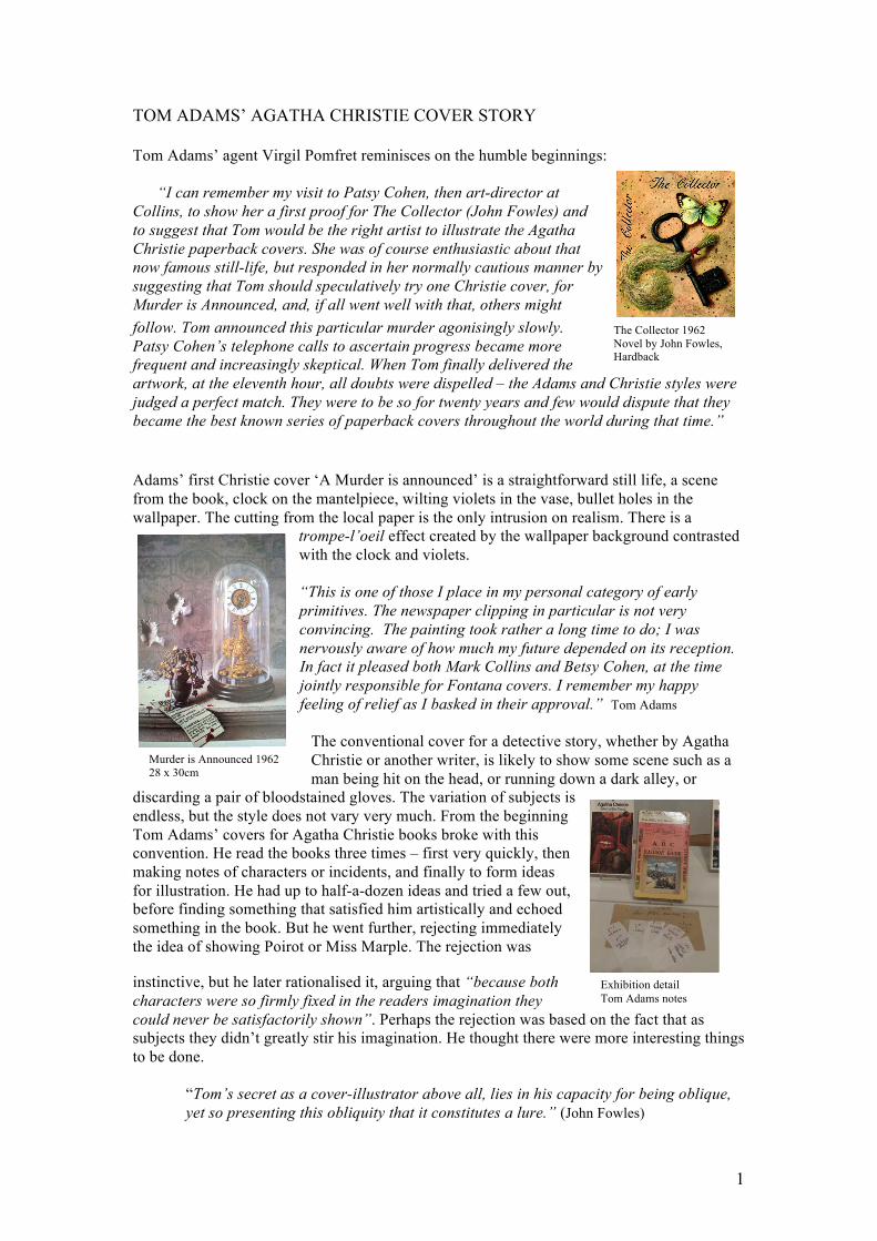
The Collector 1962
Novel by John Fowles, Hardback
Murder is Announced 1962
28 x 30cm
Exhibition detail
Tom Adams notes
TOM ADAMS’ AGATHA CHRISTIE COVER STORY
Tom Adams’ agent Virgil Pomfret reminisces on the humble beginnings:
“I can remember my visit to Patsy Cohen, then art-director at
Collins, to show her a first proof for The Collector (John Fowles) and
to suggest that Tom would be the right artist to illustrate the Agatha
Christie paperback covers. She was of course enthusiastic about that
now famous still-life, but responded in her normally cautious manner by
suggesting that Tom should speculatively try one Christie cover, for
Murder is Announced, and, if all went well with that, others might
follow. Tom announced this particular murder agonisingly slowly.
Patsy Cohen’s telephone calls to ascertain progress became more
frequent and increasingly skeptical. When Tom finally delivered the
artwork, at the eleventh hour, all doubts were dispelled – the Adams and Christie styles were
judged a perfect match. They were to be so for twenty years and few would dispute that they
became the best known series of paperback covers throughout the world during that time.”
Adams’ first Christie cover ‘A Murder is announced’ is a straightforward still life, a scene
from the book, clock on the mantelpiece, wilting violets in the vase, bullet holes in the
wallpaper. The cutting from the local paper is the only intrusion on realism. There is a
trompe-l’oeil effect created by the wallpaper background contrasted
with the clock and violets.
“This is one of those I place in my personal category of early
primitives. The newspaper clipping in particular is not very
convincing. The painting took rather a long time to do; I was
nervously aware of how much my future depended on its reception.
In fact it pleased both Mark Collins and Betsy Cohen, at the time
jointly responsible for Fontana covers. I remember my happy
feeling of relief as I basked in their approval.” Tom Adams
The conventional cover for a detective story, whether by Agatha
Christie or another writer, is likely to show some scene such as a
man being hit on the head, or running down a dark alley, or
discarding a pair of bloodstained gloves. The variation of subjects is
endless, but the style does not vary very much. From the beginning
Tom Adams’ covers for Agatha Christie books broke with this
convention. He read the books three times – first very quickly, then
making notes of characters or incidents, and finally to form ideas
for illustration. He had up to half-a-dozen ideas and tried a few out,
before finding something that satisfied him artistically and echoed
something in the book. But he went further, rejecting immediately
the idea of showing Poirot or Miss Marple. The rejection was
instinctive, but he later rationalised it, arguing that “because both
characters were so firmly fixed in the readers imagination they
could never be satisfactorily shown”. Perhaps the rejection was based on the fact that as
subjects they didn’t greatly stir his imagination. He thought there were more interesting things
to be done.
“Tom’s secret as a cover-illustrator above all, lies in his capacity for being oblique,
yet so presenting this obliquity that it constitutes a lure.” (John Fowles)
2
The Collector 1962
Novel by John Fowles Paperback
Murder at the Vicarage 1962
1st version, 30 x 42cm
Murder at the Vicarage 1968
2nd version, 25 x 32cm
1 2
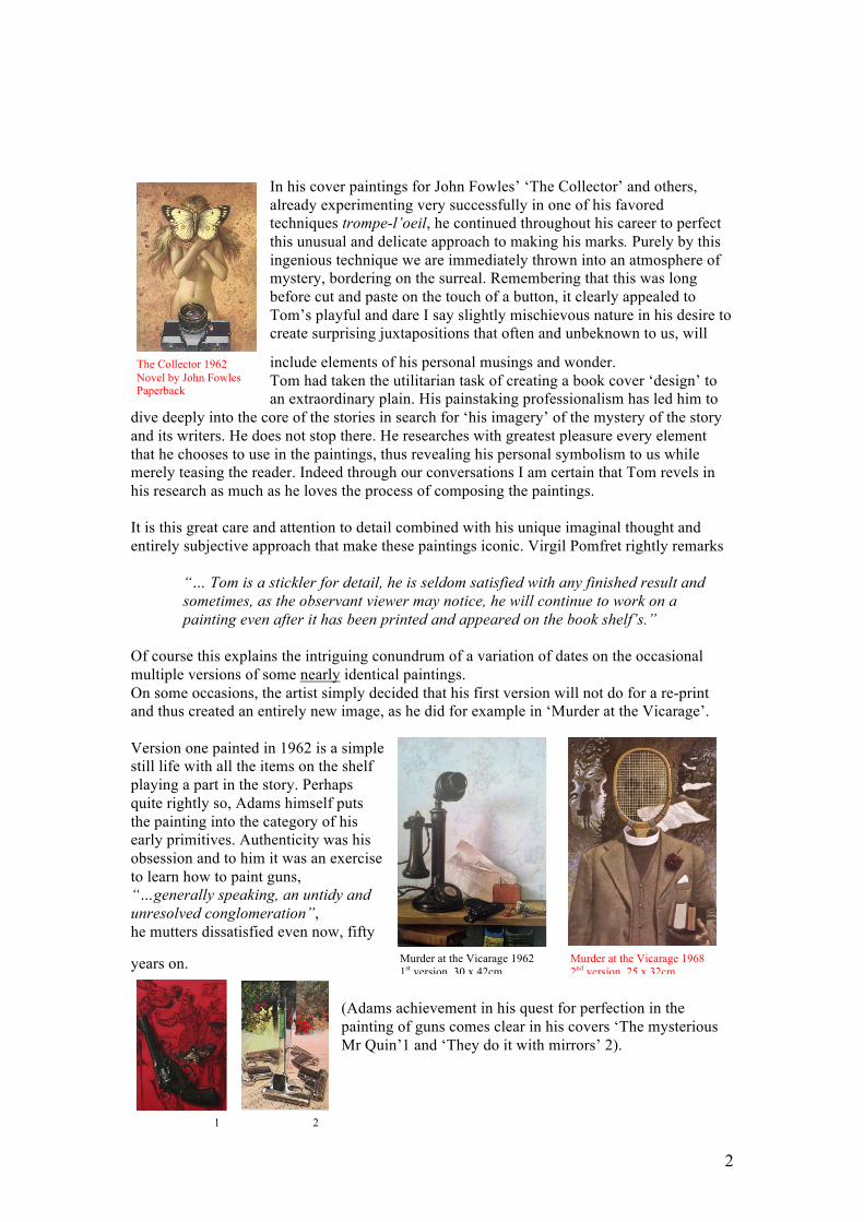
In his cover paintings for John Fowles’ ‘The Collector’ and others,
already experimenting very successfully in one of his favored
techniques trompe-l’oeil, he continued throughout his career to perfect
this unusual and delicate approach to making his marks. Purely by this
ingenious technique we are immediately thrown into an atmosphere of
mystery, bordering on the surreal. Remembering that this was long
before cut and paste on the touch of a button, it clearly appealed to
Tom’s playful and dare I say slightly mischievous nature in his desire to
create surprising juxtapositions that often and unbeknown to us, will
include elements of his personal musings and wonder.
Tom had taken the utilitarian task of creating a book cover ‘design’ to
an extraordinary plain. His painstaking professionalism has led him to
dive deeply into the core of the stories in search for ‘his imagery’ of the mystery of the story
and its writers. He does not stop there. He researches with greatest pleasure every element
that he chooses to use in the paintings, thus revealing his personal symbolism to us while
merely teasing the reader. Indeed through our conversations I am certain that Tom revels in
his research as much as he loves the process of composing the paintings.
It is this great care and attention to detail combined with his unique imaginal thought and
entirely subjective approach that make these paintings iconic. Virgil Pomfret rightly remarks
“… Tom is a stickler for detail, he is seldom satisfied with any finished result and
sometimes, as the observant viewer may notice, he will continue to work on a
painting even after it has been printed and appeared on the book shelf’s.”
Of course this explains the intriguing conundrum of a variation of dates on the occasional
multiple versions of some nearly identical paintings.
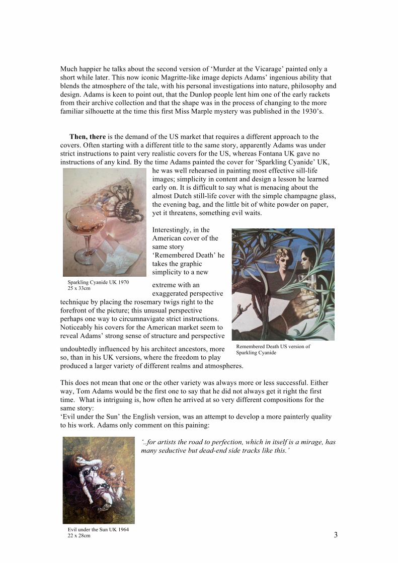
On some occasions, the artist simply decided that his first version will not do for a re-print
and thus created an entirely new image, as he did for example in ‘Murder at the Vicarage’.
Version one painted in 1962 is a simple
still life with all the items on the shelf
playing a part in the story. Perhaps
quite rightly so, Adams himself puts
the painting into the category of his
early primitives. Authenticity was his
obsession and to him it was an exercise
to learn how to paint guns,
“…generally speaking, an untidy and
unresolved conglomeration”,
he mutters dissatisfied even now, fifty
years on.
(Adams achievement in his quest for perfection in the
painting of guns comes clear in his covers ‘The mysterious
Mr Quin’1 and ‘They do it with mirrors’ 2).
3
Sparkling Cyanide UK 1970 25 x 33cm
Remembered Death US version of
Sparkling Cyanide
Evil under the Sun UK 1964 22 x 28cm
Much happier he talks about the second version of ‘Murder at the Vicarage’ painted only a
short while later. This now iconic Magritte-like image depicts Adams’ ingenious ability that
blends the atmosphere of the tale, with his personal investigations into nature, philosophy and
design. Adams is keen to point out, that the Dunlop people lent him one of the early rackets
from their archive collection and that the shape was in the process of changing to the more
familiar silhouette at the time this first Miss Marple mystery was published in the 1930’s.
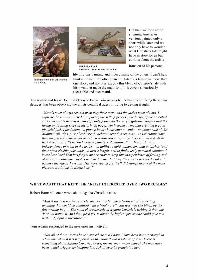
Then, there is the demand of the US market that requires a different approach to the
covers. Often starting with a different title to the same story, apparently Adams was under
strict instructions to paint very realistic covers for the US, whereas Fontana UK gave no
instructions of any kind. By the time Adams painted the cover for ‘Sparkling Cyanide’ UK,
he was well rehearsed in painting most effective sill-life
images; simplicity in content and design a lesson he learned
early on. It is difficult to say what is menacing about the
almost Dutch still-life cover with the simple champagne glass,
the evening bag, and the little bit of white powder on paper,
yet it threatens, something evil waits.
Interestingly, in the
American cover of the
same story
‘Remembered Death’ he
takes the graphic
simplicity to a new
extreme with an
exaggerated perspective
technique by placing the rosemary twigs right to the
forefront of the picture; this unusual perspective
perhaps one way to circumnavigate strict instructions.
Noticeably his covers for the American market seem to
reveal Adams’ strong sense of structure and perspective
undoubtedly influenced by his architect ancestors, more
so, than in his UK versions, where the freedom to play
produced a larger variety of different realms and atmospheres.
This does not mean that one or the other variety was always more or less successful. Either
way, Tom Adams would be the first one to say that he did not always get it right the first
time. What is intriguing is, how often he arrived at so very different compositions for the
same story:
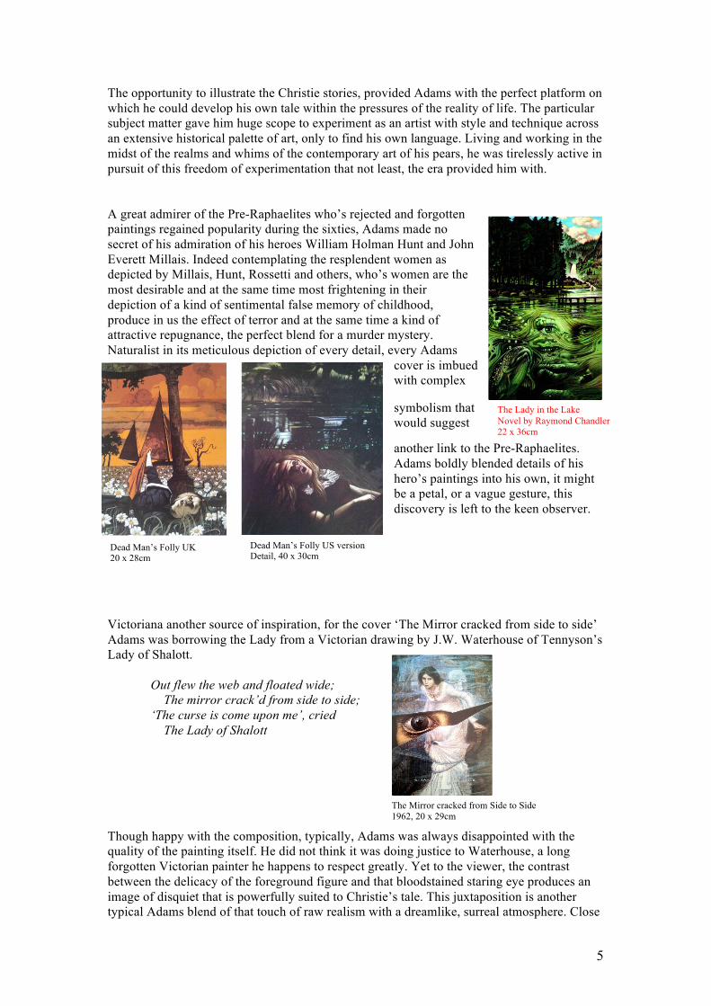
‘Evil under the Sun’ the English version, was an attempt to develop a more painterly quality
to his work. Adams only comment on this paining:
‘..for artists the road to perfection, which in itself is a mirage, has
many seductive but dead-end side tracks like this.’
4
Evil under the Sun US version 40 x 32cm
Exhibition Detail
Driftwood, Tom Adams Collection
But then we look at the
stunning American
version, painted only a
short while later and we
not only have to wonder
what Christie’s tale might
have in store for us but
curious about the artists
infusion of his personal
life into this painting and indeed many of the others. I can’t help
thinking, that more often than not Adams is telling us more than
one story, and that it is exactly this blend of Christie’s tale with
his own, that made the majority of his covers so curiously
accessible and successful.
The writer and friend John Fowles who knew Tom Adams better than most during these two
decades, has been observing the artists continual quest in trying to getting it right:
“Novels must always remain primarily their texts; and the jacket must always, I
suppose, be mainly classed as a part of the selling process, the luring of the potential
customer inside the covers (though only fools and the very highbrow imagine that the
luring and selling stops at the printed page). Yet it seems to me that creating a good
pictorial jacket for fiction – a glance in any bookseller’s window on either side of the
Atlantic will, alas, proof how rare an achievement this remains – is something more
then the purely commercial art which is how too many publishers still view it. At its
best it requires gifts beyond mere ingenuity, calculation, flair. It will show an
independence of mind in the artist – an ability to hold author, text and publisher (and
their often clashing demands) at arm’s length, and to find a truly personal solution. I
know how hard Tom has fought on occasion to keep this independence of feeling and
of vision; an obstinacy that is matched in his studio by the enormous care he takes to
achieve the effects he wants. His work speaks for itself. It belongs to one of the most
pleasant traditions in English art.”
WHAT WAS IT THAT KEPT THE ARTIST INTERESTED OVER TWO DECADES?
Robert Barnard’s once wrote about Agatha Christie’s tales:
“And if she had no desire to elevate her ‘trade’ into a ‘profession’ by writing
anything that could be confused with a ‘real novel’, still less was she bitten by the
fine writing bug…. The main characteristic of Agatha Christie’s writing is that one
does not notice it. And that, perhaps, is about the highest praise one could give to a
writer of popular literature.”
Tom Adams responded to the mysteries instinctively:
“Not all of these stories have inspired me and I hope I have been honest enough to
admit this when it has happened. In the main it was a labour of love. There is
something about Agatha Christie stories, journeyman writer though she may have
been, which trigger my imagination. I shall ever be grateful to her.”
5
The Lady in the Lake
Novel by Raymond Chandler
22 x 36cm
Dead Man’s Folly UK 20 x 28cm
Dead Man’s Folly US version Detail, 40 x 30cm
The Mirror cracked from Side to Side
1962, 20 x 29cm
The opportunity to illustrate the Christie stories, provided Adams with the perfect platform on
which he could develop his own tale within the pressures of the reality of life. The particular
subject matter gave him huge scope to experiment as an artist with style and technique across
an extensive historical palette of art, only to find his own language. Living and working in the
midst of the realms and whims of the contemporary art of his pears, he was tirelessly active in
pursuit of this freedom of experimentation that not least, the era provided him with.
A great admirer of the Pre-Raphaelites who’s rejected and forgotten
paintings regained popularity during the sixties, Adams made no
secret of his admiration of his heroes William Holman Hunt and John
Everett Millais. Indeed contemplating the resplendent women as
depicted by Millais, Hunt, Rossetti and others, who’s women are the
most desirable and at the same time most frightening in their
depiction of a kind of sentimental false memory of childhood,
produce in us the effect of terror and at the same time a kind of
attractive repugnance, the perfect blend for a murder mystery.
Naturalist in its meticulous depiction of every detail, every Adams
cover is imbued
with complex
symbolism that
would suggest
another link to the Pre-Raphaelites.
Adams boldly blended details of his
hero’s paintings into his own, it might
be a petal, or a vague gesture, this
discovery is left to the keen observer.
Victoriana another source of inspiration, for the cover ‘The Mirror cracked from side to side’
Adams was borrowing the Lady from a Victorian drawing by J.W. Waterhouse of Tennyson’s
Lady of Shalott.
Out flew the web and floated wide;
The mirror crack’d from side to side;
‘The curse is come upon me’, cried
The Lady of Shalott
Though happy with the composition, typically, Adams was always disappointed with the
quality of the painting itself. He did not think it was doing justice to Waterhouse, a long
forgotten Victorian painter he happens to respect greatly. Yet to the viewer, the contrast
between the delicacy of the foreground figure and that bloodstained staring eye produces an
image of disquiet that is powerfully suited to Christie’s tale. This juxtaposition is another
typical Adams blend of that touch of raw realism with a dreamlike, surreal atmosphere. Close
6
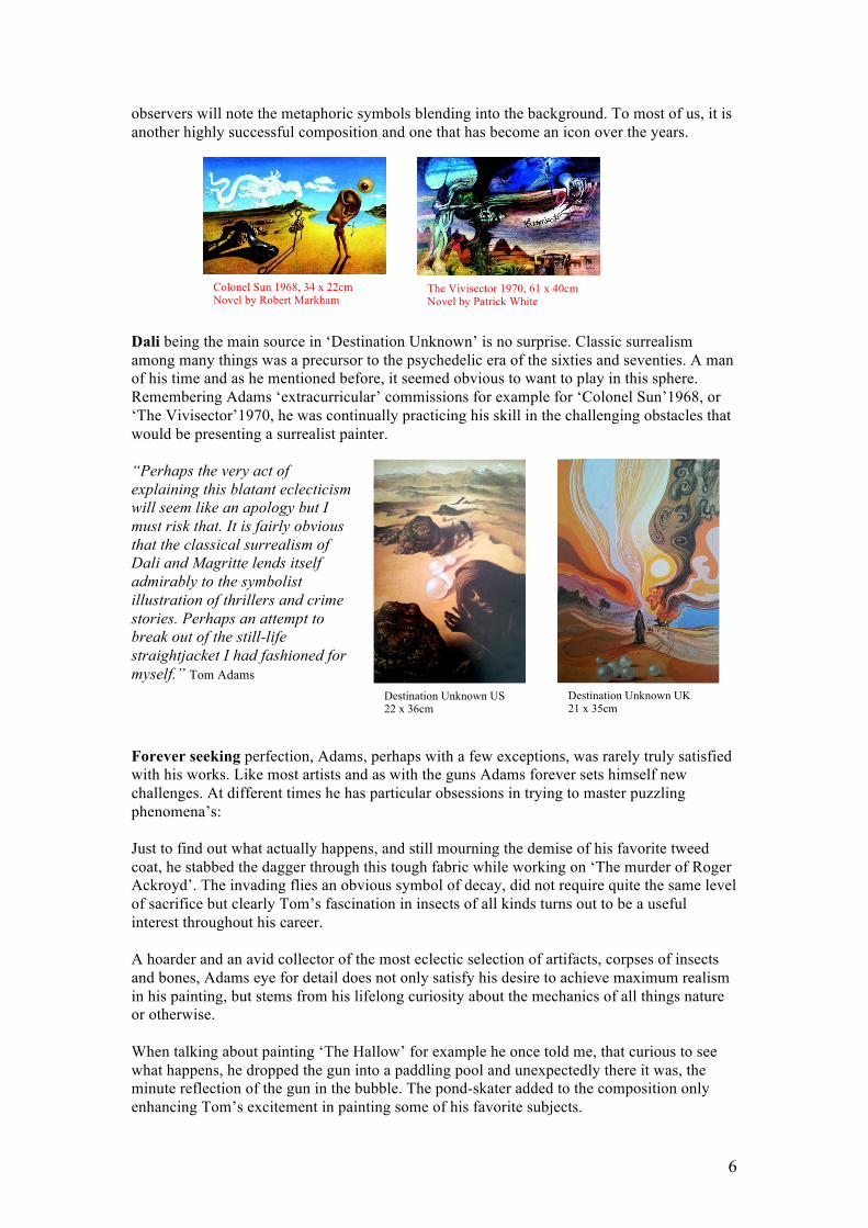
Colonel Sun 1968, 34 x 22cm Novel by Robert Markham
The Vivisector 1970, 61 x 40cm Novel by Patrick White
Destination Unknown US 22 x 36cm
Destination Unknown UK 21 x 35cm
observers will note the metaphoric symbols blending into the background. To most of us, it is
another highly successful composition and one that has become an icon over the years.
Dali being the main source in ‘Destination Unknown’ is no surprise. Classic surrealism
among many things was a precursor to the psychedelic era of the sixties and seventies. A man
of his time and as he mentioned before, it seemed obvious to want to play in this sphere.
Remembering Adams ‘extracurricular’ commissions for example for ‘Colonel Sun’1968, or
‘The Vivisector’1970, he was continually practicing his skill in the challenging obstacles that
would be presenting a surrealist painter.
“Perhaps the very act of
explaining this blatant eclecticism
will seem like an apology but I
must risk that. It is fairly obvious
that the classical surrealism of
Dali and Magritte lends itself
admirably to the symbolist
illustration of thrillers and crime
stories. Perhaps an attempt to
break out of the still-life
straightjacket I had fashioned for
myself.” Tom Adams
Forever seeking perfection, Adams, perhaps with a few exceptions, was rarely truly satisfied
with his works. Like most artists and as with the guns Adams forever sets himself new
challenges. At different times he has particular obsessions in trying to master puzzling
phenomena’s:
Just to find out what actually happens, and still mourning the demise of his favorite tweed
coat, he stabbed the dagger through this tough fabric while working on ‘The murder of Roger
Ackroyd’. The invading flies an obvious symbol of decay, did not require quite the same level
of sacrifice but clearly Tom’s fascination in insects of all kinds turns out to be a useful
interest throughout his career.
A hoarder and an avid collector of the most eclectic selection of artifacts, corpses of insects
and bones, Adams eye for detail does not only satisfy his desire to achieve maximum realism
in his painting, but stems from his lifelong curiosity about the mechanics of all things nature
or otherwise.
When talking about painting ‘The Hallow’ for example he once told me, that curious to see
what happens, he dropped the gun into a paddling pool and unexpectedly there it was, the
minute reflection of the gun in the bubble. The pond-skater added to the composition only
enhancing Tom’s excitement in painting some of his favorite subjects.
7
The Hollow
22 x 36cm
Halloween Party
22 x 27cm
Pouring water over Apple
Archive Photograph
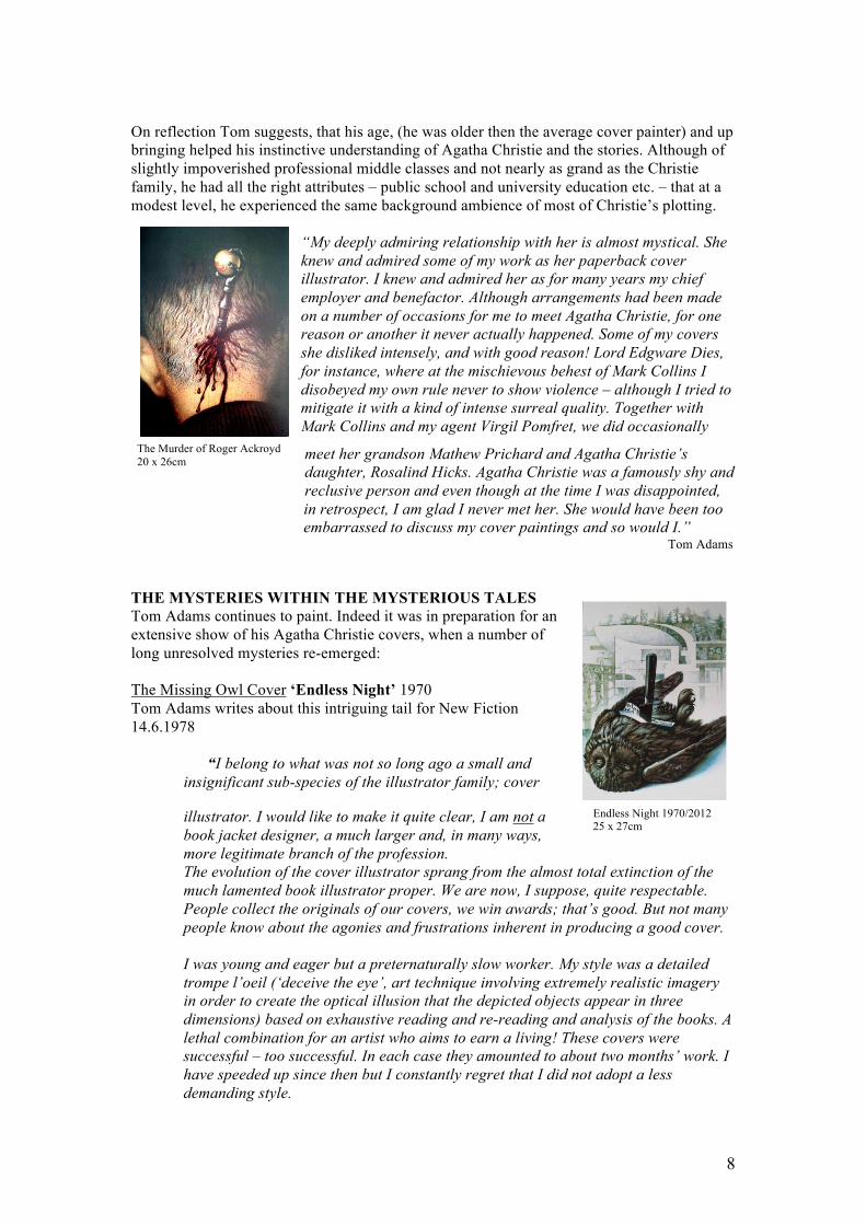
Lord Edgware Dies
20 x 24 cm
“ Like Hockney and other artists I find the distorting effect of water
fascinating. A distorted image is in many ways infinitely more
interesting. Water changes reality and can create an interesting
juxtaposition. A drowned body or anything under water is awful and
terrifying, but at the same time, there is a certain cleansing effect going
on. The water purifies and creates a barrier between you and the
object.”
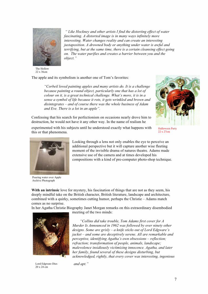
The apple and its symbolism is another one of Tom’s favorites:
“Corbeil loved painting apples and many artists do. It is a challenge
because painting a round object, particularly one that has a lot of
colour on it, is a great technical challenge. What’s more, it is in a
sense a symbol of life because it rots, it gets wrinkled and brown and
disintegrates – and of course there was the whole business of Adam
and Eve. There is a lot in an apple”.
Confessing that his search for perfectionism on occasions nearly drove him to
destruction, he would not have it any other way. In the name of realism he
experimented with his subjects until he understood exactly what happens with
this or that phenomena.
Looking through a lens not only enables the eye to perceive an
additional perspective but it will capture another wise fleeting
moment of the invisible drama of natures theatre. Adams made
extensive use of the camera and at times developed his
compositions with a kind of pre-computer photo-shop technique.
With an intrinsic love for mystery, his fascination of things that are not as they seem, his
deeply mindful take on the British character, British literature, landscape and architecture,
combined with a quirky, sometimes cutting humor, perhaps the Christie – Adams match
comes as no surprise.
In her Agatha Christie Biography Janet Morgan remarks on this extraordinary disembodied
meeting of the two minds:
“Collins did take trouble, Tom Adams first cover for A
Murder Is Announced in 1962 was followed by over ninety other
designs. Some are grisly – a knife sticks out of Lord Edgware’s
jacket – and some are deceptively serene. All are remarkable and
perceptive, identifying Agatha’s own obsessions – reflection;
refraction; transformation of people, animals, landscape;
malevolence insidiously victimizing innocence. Agatha, and later
her family, found several of these designs disturbing, but
acknowledged, rightly, that every cover was interesting, ingenious
and apt.”
8
The Murder of Roger Ackroyd
20 x 26cm
Endless Night 1970/2012 25 x 27cm
On reflection Tom suggests, that his age, (he was older then the average cover painter) and up
bringing helped his instinctive understanding of Agatha Christie and the stories. Although of
slightly impoverished professional middle classes and not nearly as grand as the Christie
family, he had all the right attributes – public school and university education etc. – that at a
modest level, he experienced the same background ambience of most of Christie’s plotting.
“My deeply admiring relationship with her is almost mystical. She
knew and admired some of my work as her paperback cover
illustrator. I knew and admired her as for many years my chief
employer and benefactor. Although arrangements had been made
on a number of occasions for me to meet Agatha Christie, for one
reason or another it never actually happened. Some of my covers
she disliked intensely, and with good reason! Lord Edgware Dies,
for instance, where at the mischievous behest of Mark Collins I
disobeyed my own rule never to show violence – although I tried to
mitigate it with a kind of intense surreal quality. Together with
Mark Collins and my agent Virgil Pomfret, we did occasionally
meet her grandson Mathew Prichard and Agatha Christie’s
daughter, Rosalind Hicks. Agatha Christie was a famously shy and
reclusive person and even though at the time I was disappointed,
in retrospect, I am glad I never met her. She would have been too
embarrassed to discuss my cover paintings and so would I.” Tom Adams
THE MYSTERIES WITHIN THE MYSTERIOUS TALES
Tom Adams continues to paint. Indeed it was in preparation for an
extensive show of his Agatha Christie covers, when a number of
long unresolved mysteries re-emerged:
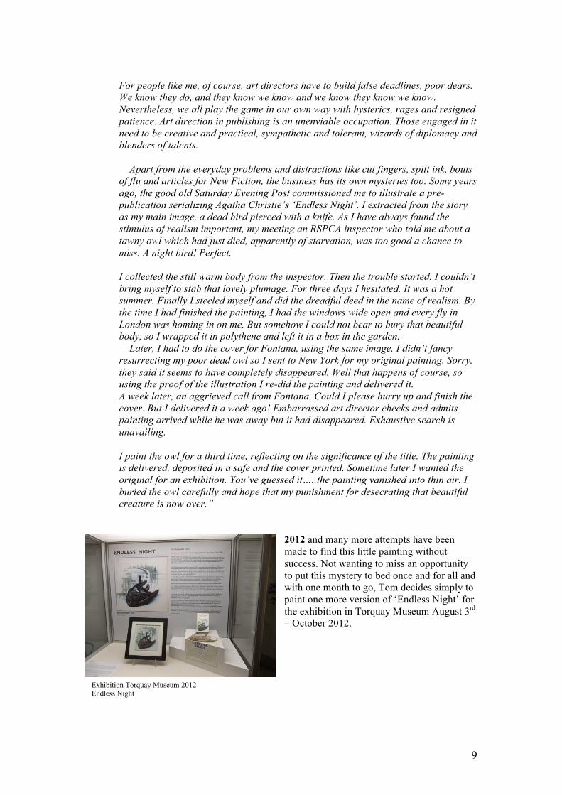
The Missing Owl Cover ‘Endless Night’ 1970
Tom Adams writes about this intriguing tail for New Fiction
14.6.1978
“I belong to what was not so long ago a small and
insignificant sub-species of the illustrator family; cover
illustrator. I would like to make it quite clear, I am not a
book jacket designer, a much larger and, in many ways,
more legitimate branch of the profession.
The evolution of the cover illustrator sprang from the almost total extinction of the
much lamented book illustrator proper. We are now, I suppose, quite respectable.
People collect the originals of our covers, we win awards; that’s good. But not many
people know about the agonies and frustrations inherent in producing a good cover.
I was young and eager but a preternaturally slow worker. My style was a detailed
trompe l’oeil (‘deceive the eye’, art technique involving extremely realistic imagery
in order to create the optical illusion that the depicted objects appear in three
dimensions) based on exhaustive reading and re-reading and analysis of the books. A
lethal combination for an artist who aims to earn a living! These covers were
successful – too successful. In each case they amounted to about two months’ work. I
have speeded up since then but I constantly regret that I did not adopt a less
demanding style.
9
Exhibition Torquay Museum 2012 Endless Night
For people like me, of course, art directors have to build false deadlines, poor dears.
We know they do, and they know we know and we know they know we know.
Nevertheless, we all play the game in our own way with hysterics, rages and resigned
patience. Art direction in publishing is an unenviable occupation. Those engaged in it
need to be creative and practical, sympathetic and tolerant, wizards of diplomacy and
blenders of talents.
Apart from the everyday problems and distractions like cut fingers, spilt ink, bouts
of flu and articles for New Fiction, the business has its own mysteries too. Some years
ago, the good old Saturday Evening Post commissioned me to illustrate a pre-
publication serializing Agatha Christie’s ‘Endless Night’. I extracted from the story
as my main image, a dead bird pierced with a knife. As I have always found the
stimulus of realism important, my meeting an RSPCA inspector who told me about a
tawny owl which had just died, apparently of starvation, was too good a chance to
miss. A night bird! Perfect.
I collected the still warm body from the inspector. Then the trouble started. I couldn’t
bring myself to stab that lovely plumage. For three days I hesitated. It was a hot
summer. Finally I steeled myself and did the dreadful deed in the name of realism. By
the time I had finished the painting, I had the windows wide open and every fly in
London was homing in on me. But somehow I could not bear to bury that beautiful
body, so I wrapped it in polythene and left it in a box in the garden.
Later, I had to do the cover for Fontana, using the same image. I didn’t fancy
resurrecting my poor dead owl so I sent to New York for my original painting. Sorry,
they said it seems to have completely disappeared. Well that happens of course, so
using the proof of the illustration I re-did the painting and delivered it.
A week later, an aggrieved call from Fontana. Could I please hurry up and finish the
cover. But I delivered it a week ago! Embarrassed art director checks and admits
painting arrived while he was away but it had disappeared. Exhaustive search is
unavailing.
I paint the owl for a third time, reflecting on the significance of the title. The painting
is delivered, deposited in a safe and the cover printed. Sometime later I wanted the
original for an exhibition. You’ve guessed it…..the painting vanished into thin air. I
buried the owl carefully and hope that my punishment for desecrating that beautiful
creature is now over.”
2012 and many more attempts have been
made to find this little painting without
success. Not wanting to miss an opportunity
to put this mystery to bed once and for all and
with one month to go, Tom decides simply to
paint one more version of ‘Endless Night’ for
the exhibition in Torquay Museum August 3rd
– October 2012.
10
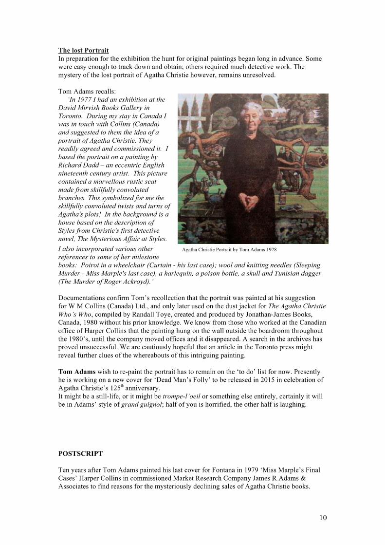
Agatha Christie Portrait by Tom Adams 1978
The lost Portrait
In preparation for the exhibition the hunt for original paintings began long in advance. Some
were easy enough to track down and obtain; others required much detective work. The
mystery of the lost portrait of Agatha Christie however, remains unresolved.
Tom Adams recalls:
‘In 1977 I had an exhibition at the
David Mirvish Books Gallery in
Toronto. During my stay in Canada I
was in touch with Collins (Canada)
and suggested to them the idea of a
portrait of Agatha Christie. They
readily agreed and commissioned it. I
based the portrait on a painting by
Richard Dadd – an eccentric English
nineteenth century artist. This picture
contained a marvellous rustic seat
made from skillfully convoluted
branches. This symbolized for me the
skillfully convoluted twists and turns of
Agatha's plots! In the background is a
house based on the description of
Styles from Christie's first detective
novel, The Mysterious Affair at Styles.
I also incorporated various other
references to some of her milestone
books: Poirot in a wheelchair (Curtain - his last case); wool and knitting needles (Sleeping
Murder - Miss Marple's last case), a harlequin, a poison bottle, a skull and Tunisian dagger
(The Murder of Roger Ackroyd).’
Documentations confirm Tom’s recollection that the portrait was painted at his suggestion
for W M Collins (Canada) Ltd., and only later used on the dust jacket for The Agatha Christie
Who’s Who, compiled by Randall Toye, created and produced by Jonathan-James Books,
Canada, 1980 without his prior knowledge. We know from those who worked at the Canadian
office of Harper Collins that the painting hung on the wall outside the boardroom throughout
the 1980’s, until the company moved offices and it disappeared. A search in the archives has
proved unsuccessful. We are cautiously hopeful that an article in the Toronto press might
reveal further clues of the whereabouts of this intriguing painting.
Tom Adams wish to re-paint the portrait has to remain on the ‘to do’ list for now. Presently
he is working on a new cover for ‘Dead Man’s Folly’ to be released in 2015 in celebration of
Agatha Christie’s 125th
anniversary.
It might be a still-life, or it might be trompe-l’oeil or something else entirely, certainly it will
be in Adams’ style of grand guignol; half of you is horrified, the other half is laughing.
POSTSCRIPT
Ten years after Tom Adams painted his last cover for Fontana in 1979 ‘Miss Marple’s Final
Cases’ Harper Collins in commissioned Market Research Company James R Adams &
Associates to find reasons for the mysteriously declining sales of Agatha Christie books.
11
After months of questioning large numbers of target groups it became clear that Christie was
still considered the Queen of crime and that there was no dramatic decline of people claiming
to buy paperbacks, researchers started to look at cover designs to try and resolve the persistent
mystery. The groups were consistent in their reactions. The covers often featured blood and
gore. The problem had arisen because the book market had changed with the rise in sales of
horror books and designs for Agatha Christie had been influenced by this trend. The situation
was a classic double turn-off. Christie readers turn away from the more gory aspects of crime;
there might be a whole series of violent deaths in her books, but there is no dwelling on the
details. The readers classed her books as having ‘nice murders’. What happened was that
there was conflict on the covers: Christie said one thing, the picture another. Thus the cover
designs following Tom Adams’ were actually inhibiting sales, not helping them. From
discussions about how respondents buy books, it was found that the cover design was
extremely important. Psychologically, it could be the case, that, in situations of conflict or
mismatch, a pictorial image tends to dominate; pictures are processed more quickly then
words. Or it could be that salience could lead to selection attention of the pictorial
information. (The Bookseller, 1989)
Harper Collins reacted swiftly to these findings, changing the covers yet again to more subtle
and intriguing designs, which reflected the way the author wrote. With the impression of
quality regained, the new style, by a new set of artists was welcomed by the readers and sales
soon improved.
=================================