Embed Size (px)
Citation preview
T h e G e o r G e M a s o n U n i v e r s i T y B r a n d P r o f i l eA guide to messaging and visual identity
Ta B l e o f C o n T e n T sThe University Brand, 2
An Introduction to the Message Guide, 6
Visual Identity and Style, 27
Editorial Style, 70
G e o r G e M a s o n U n i v e r s i t y B r a n d P r o F i L e | 1
It is my pleasure to present this brand profile of the George Mason University message and look. This guide represents a leap forward in our communications, and I am eager for all of us to put it to good use.
Branding is essential in any competitive marketplace. A strong brand commands attention and allows an institution to stand apart from its peers. We all have our personal preferences for brands, whether it’s the kind of phone we use, the beverages we drink, the airlines we fly, or the cars we drive. The bigger the decision, the greater the importance we place on brand.
Education is no exception. We ask people to choose George Mason over other universities. Why should they come here? At the end of the day, our core messages provide an answer to that question.
One of Mason’s greatest strengths is its diversity. We have thousands of unique voices at this university. That diversity drives our ideas and makes us an exciting place to learn. Each of you has your own area of expertise, and we want you to embrace that.
Yet we share common principles and values that allow us to speak together with one voice. That is our brand. It binds our accomplishments and strengths, shapes our identity, and helps us move forward. It’s our way of telling our most compelling stories.
The point of these messages is to leverage our experience, raise our collective profile, and create a standard of consistency to our communications. Speaking together, we can build a stronger image, support our strategic priorities, and thrive as one institution. We can bring more attention to our research and faculty, attract more students and donors, and position our graduates for the best possible future.
I urge each of you to spend some time with this guide. Flip through these pages, and find your voice here. You won’t be surprised with what you read. This is a reflection of who we are and what we stand for.
Are you ready to take the next step? Let’s send a powerful message that shows Mason really is the best university for the world.
Ángel Cabrera President
Why Our Brand Matters
2 | G e o r G e M a s o n U n i v e r s i t y B r a n d P r o F i L e
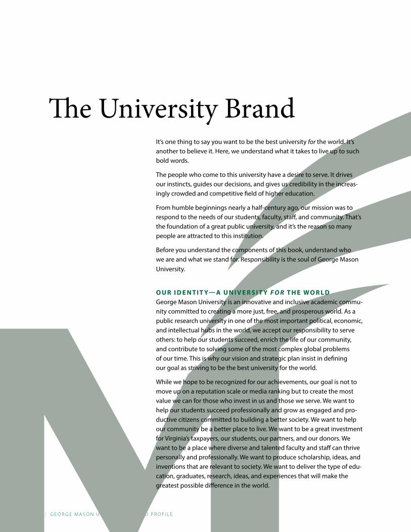
The University BrandIt’s one thing to say you want to be the best university for the world. It’s another to believe it. Here, we understand what it takes to live up to such bold words.
The people who come to this university have a desire to serve. It drives our instincts, guides our decisions, and gives us credibility in the increas-ingly crowded and competitive field of higher education.
From humble beginnings nearly a half-century ago, our mission was to respond to the needs of our students, faculty, staff, and community. That’s the foundation of a great public university, and it’s the reason so many people are attracted to this institution.
Before you understand the components of this book, understand who we are and what we stand for. Responsibility is the soul of George Mason University.
o U r i d e n T i T y— a U n i v e r s i T y f o r T h e W o r l dGeorge Mason University is an innovative and inclusive academic commu-nity committed to creating a more just, free, and prosperous world. As a public research university in one of the most important political, economic, and intellectual hubs in the world, we accept our responsibility to serve others: to help our students succeed, enrich the life of our community, and contribute to solving some of the most complex global problems of our time. This is why our vision and strategic plan insist in defining our goal as striving to be the best university for the world.
While we hope to be recognized for our achievements, our goal is not to move up on a reputation scale or media ranking but to create the most value we can for those who invest in us and those we serve. We want to help our students succeed professionally and grow as engaged and pro-ductive citizens committed to building a better society. We want to help our community be a better place to live. We want to be a great investment for Virginia’s taxpayers, our students, our partners, and our donors. We want to be a place where diverse and talented faculty and staff can thrive personally and professionally. We want to produce scholarship, ideas, and inventions that are relevant to society. We want to deliver the type of edu-cation, graduates, research, ideas, and experiences that will make the greatest possible difference in the world.
G e o r G e M a s o n U n i v e r s i t y B r a n d P r o F i L e | 3
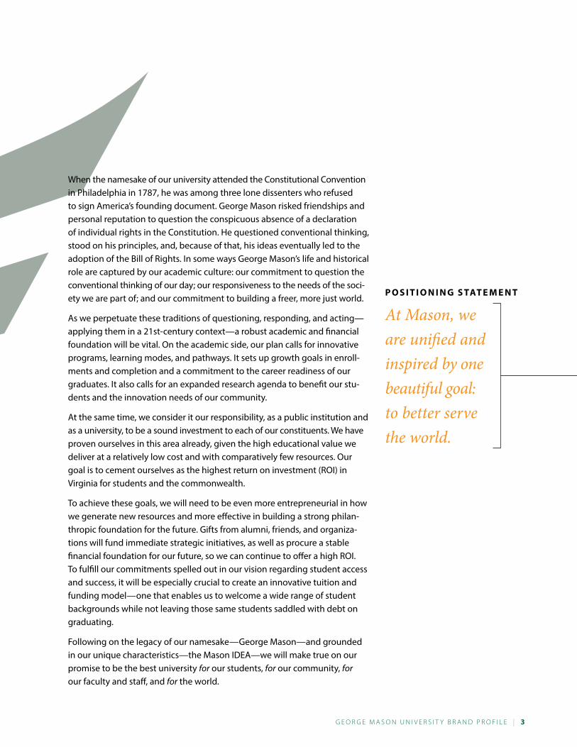
P o s i T i o n i n G s TaT e M e n T
At Mason, we are unified and inspired by one beautiful goal: to better serve the world.
When the namesake of our university attended the Constitutional Convention in Philadelphia in 1787, he was among three lone dissenters who refused to sign America’s founding document. George Mason risked friendships and personal reputation to question the conspicuous absence of a declaration of individual rights in the Constitution. He questioned conventional thinking, stood on his principles, and, because of that, his ideas eventually led to the adoption of the Bill of Rights. In some ways George Mason’s life and historical role are captured by our academic culture: our commitment to question the conventional thinking of our day; our responsiveness to the needs of the soci-ety we are part of; and our commitment to building a freer, more just world.
As we perpetuate these traditions of questioning, responding, and acting—applying them in a 21st-century context—a robust academic and financial foundation will be vital. On the academic side, our plan calls for innovative programs, learning modes, and pathways. It sets up growth goals in enroll-ments and completion and a commitment to the career readiness of our graduates. It also calls for an expanded research agenda to benefit our stu-dents and the innovation needs of our community.
At the same time, we consider it our responsibility, as a public institution and as a university, to be a sound investment to each of our constituents. We have proven ourselves in this area already, given the high educational value we deliver at a relatively low cost and with comparatively few resources. Our goal is to cement ourselves as the highest return on investment (ROI) in Virginia for students and the commonwealth.
To achieve these goals, we will need to be even more entrepreneurial in how we generate new resources and more effective in building a strong philan-thropic foundation for the future. Gifts from alumni, friends, and organiza-tions will fund immediate strategic initiatives, as well as procure a stable financial foundation for our future, so we can continue to offer a high ROI. To fulfill our commitments spelled out in our vision regarding student access and success, it will be especially crucial to create an innovative tuition and funding model—one that enables us to welcome a wide range of student backgrounds while not leaving those same students saddled with debt on graduating.
Following on the legacy of our namesake—George Mason—and grounded in our unique characteristics—the Mason IDEA—we will make true on our promise to be the best university for our students, for our community, for our faculty and staff, and for the world.
4 | G e o r G e M a s o n U n i v e r s i t y B r a n d P r o F i L e
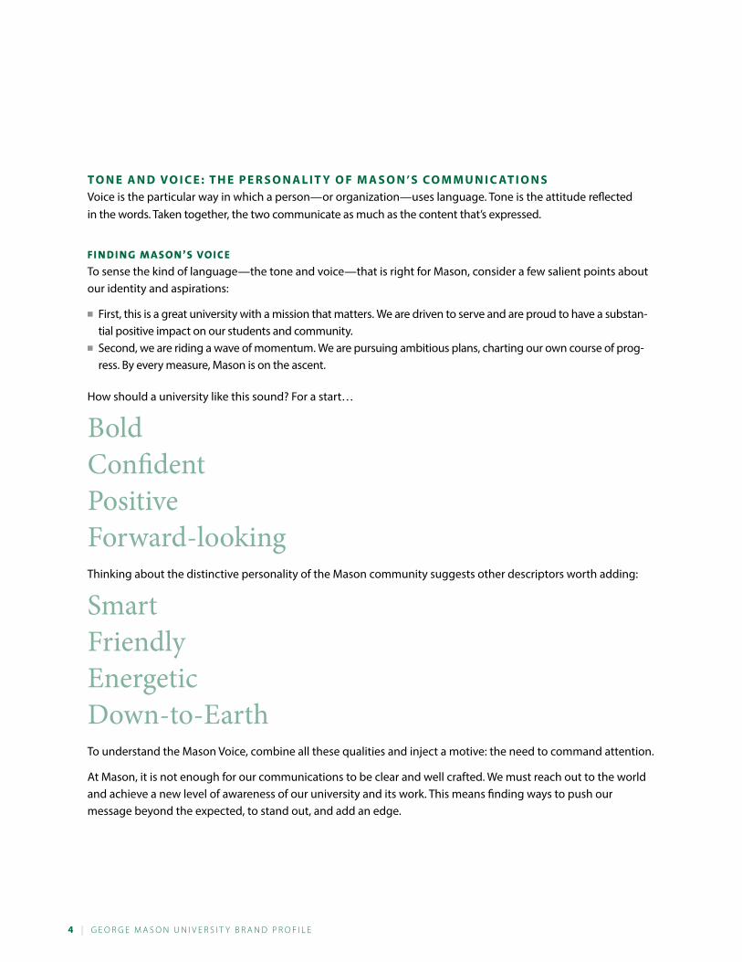
T o n e a n d vo i C e : T h e P e r s o n a l i T y o f M a s o n ’ s C o M M U n i C aT i o n sVoice is the particular way in which a person—or organization—uses language. Tone is the attitude reflected in the words. Taken together, the two communicate as much as the content that’s expressed.
Fi n di ng M ason’s Voice
To sense the kind of language—the tone and voice—that is right for Mason, consider a few salient points about our identity and aspirations:
■■ First, this is a great university with a mission that matters. We are driven to serve and are proud to have a substan-tial positive impact on our students and community.
■■ Second, we are riding a wave of momentum. We are pursuing ambitious plans, charting our own course of prog-ress. By every measure, Mason is on the ascent.
How should a university like this sound? For a start…
BoldConfidentPositiveForward-lookingThinking about the distinctive personality of the Mason community suggests other descriptors worth adding:
SmartFriendlyEnergeticDown-to-EarthTo understand the Mason Voice, combine all these qualities and inject a motive: the need to command attention.
At Mason, it is not enough for our communications to be clear and well crafted. We must reach out to the world and achieve a new level of awareness of our university and its work. This means finding ways to push our message beyond the expected, to stand out, and add an edge.
G e o r G e M a s o n U n i v e r s i t y B r a n d P r o F i L e | 5
T h e vo i C e i n U s eTh ese are Th e ways we speak To coMM an d aTTenTion:
We make big claims, state important truths, and ask provocative questions. (“You measure a university’s success by how many people it educates, not how many it turns away.”)
We speak in aspirational terms, declaring our views on forging a better future. (“A great university is a machine of progress.” “33,000 dreams coming true.”)
We employ occasional overstatement, not to mislead, but to make valid points in a striking way. (“Meet the whole world on one campus.”)
We address our audience directly, urging, inviting, suggesting, and inquiring. (“Let’s solve problems that matter.” “Come create your future.”)
We make our case in plain, clear, and energetic language. (“Access is everything.” “At Mason, we take pride in results.”)
Together, these guidelines form an approach for engaging our audience at the point of first impression. Of course, once we’ve accomplished this, we need to ground our claims in substance, supplying facts, examples, and explanation. For guidelines on how to do so, see Proof Points on page 16.
For more examples of Mason’s Voice, see Headlines on page 12.
h i T T i n G T h e r i G h T n o T e Notice that the adjectives defining the Mason Voice do not include “modest.” Yes, at Mason we exist to serve our students and community, and no, we are not interested in gaining prestige if that means becoming elite or exclusive. This does not make us humble, it makes us proud to stand apart.
It is true that if we push too far in the direction of “bold” or “confident,” it’s possible we could turn people off. But the greater danger is that we play it safe and go unheard. Let’s not make that mistake.
6 | G e o r G e M a s o n U n i v e r s i t y B r a n d P r o F i L e
An Introduction to the Message Guide
T h e M e s s aG e G U i d e a n d i T s P U r P o s e The point of this guide is to help us bring more impact and consistency to Mason’s communications. This is an important goal. By communicating more effectively, we can build recognition and respect for the university, ignite pride and loyalty, and fuel enrollment and investment.
Inside, you’ll find a set of key messages and strengths—what we need to communicate. You’ll also see a set of tools for doing so: headlines to catch attention, proof points to back up the headlines, and themelines that express some of our most important messages in powerful ways. The guide offers an explanation of each tool and instructions for using it.
Depending on the kind of communication you’re working on—a brochure, a web page, or an ad, for example—you’ll need to combine the tools in different ways. The second part of the guide, Visual Identity and Style, provides some examples. It also presents a set of graphic standards that will help ensure visual consistency.
Because Mason produces communications of so many kinds for such diverse audiences and purposes, it’s impossible to offer a set of simple 1-2-3 instructions. However, the tools provided here are a good starting point.
Dive in and get familiar with them, then start putting them to use. If you have questions along the way, don’t hesitate to ask. Your sources for guidance are Sarah Seeberg, creative director, [email protected], 703-933-8802, Elliott de Luca, art director, [email protected], 703-993-8263, and Colleen Rich, editorial director, ckearney.gmu.edu, 703-993-8805.
G e o r G e M a s o n U n i v e r s i t y B r a n d P r o F i L e | 7
T h e M o s T i M P o r Ta n T P o i n T s T o M a k e Of all the things we want the world to know about Mason, these are the four messages that lead the list:
1. Mason is making its mark as a great university of a new and necessary kind—evolving every day to meet changing needs and deliver an education of relevance.
2. Mason is driven to serve—helping our students succeed, enriching life in our community, and solving pressing problems.
3. Mason focuses on results—working for a more just, free, and prosperous world and measuring our success by the impact we achieve.
4. Mason stands apart—distinguished by our innovation, our diversity, our entrepreneurial spirit, and our accessibility.
Key Messages
8 | G e o r G e M a s o n U n i v e r s i t y B r a n d P r o F i L e
Impressive Strengthsd e f i n i n G a n d d i s T i n G U i s h i n G M a s o nThis section outlines the most important strengths that set Mason apart, expanding the ideas introduced in the Message Map. When we are planning any new piece of communication—a speech or web page, a radio spot or holiday card—these are the points we should think about expressing.
a C a d e M i C Q Ua l i T y
We are writing a new definition of excellence, creating a signature Mason Learning Experience.
At Mason, we put our students and their success first. We focus on providing experiential and integrative learning in all programs through research, field work, internships, and service learning. We work to give every student the opportunity for a meaningful global experience. And we apply technology in powerful ways to enrich learning.
i n n o vaT i v e
Mason is a place of innovation. It’s in our DNA.
We embrace new possibilities and bring new ideas to life. We strive to find better ways to deliver on our mission. We nurture the skills of creative problem solving in our students, educating imaginative thinkers, ready to make their mark in an idea economy.
d i v e r s e
Mason is a marvel of diversity, proving the power of many perspectives.
We embrace a multitude of people and ideas in everything we do, and our diversity sparks innovation; new ideas emerge when different points of view come together. At Mason, each person is part of a multicultural community that’s a microcosm of our interconnected world—an outstanding learning environment and great place to prepare for life in the 21st century.
e n T r e P r e n e U r i a l
We are a home to the entrepreneurial spirit, putting ideas into action.
This can mean launching a business, launching a community organization, or launching a roving art gallery in a taco truck. New ventures are fueled by our innovative spirit and reflect our real-world focus. Our goal is not just knowledge for it’s own sake; it’s to have a positive impact on our community and the world.
a CC e s s i B l e
We are a model of accessibility, providing many paths to success.
Mason is an open and welcoming community, reaching out to the world beyond campus to create connections and forge partnerships. We invent new pathways to an excellent education and are committed to affordability. We define our success not by how selective we can become, but by how many students of talent and potential we can serve.
o U TCo M e s a n d i M Pa C T
We measure ourselves by the results we achieve.
At Mason, we prepare our students for success in life and in their careers. We serve our region as an engine of economic vitality and cultural enrichment. We deliver an exceptional return on investment.
G e o r G e M a s o n U n i v e r s i t y B r a n d P r o F i L e | 9
r e s e a r C h o f Co n s e Q U e n C e
We make discoveries that make a difference.
Every day, Mason faculty and students help solve pressing problems, illuminate important issues, and shape decisions on policy. We work to answer questions of relevance through research, scholarship, and creative endeavors in a full range of fields—any enterprise offering the chance to break new ground and have a meaningful impact.
T h e M a s o n n aT i o n
We are one community, strong, proud, and energized.
Some of Mason’s greatest strengths are invisible: the energy that propels us forward, the can-do attitude, the lifelong bond that links our students and alumni to their university and each other. Mason is not like every other university. The members of this community—students, alumni, faculty, and staff—are proud to stand together and proud to stand apart.
o U r lo C aT i o n
We learn and live on campuses closely connected to an exceptional region and a great city.
Mason’s campuses are located in the heart of one of the country’s most dynamic regions and in the orbit of one of the world’s great capitals. Opportunities for internships and research are unequaled. So is access to archives and museums, policy makers and think tanks, and diverse career opportunities in technology, government, and other spheres.
M i s s i o n - d r i v e n
We are committed to creating a more just, free, and prosperous world.
At Mason, our goal is to be not the best university in the world, but the best university for the world. In other words, we exist to serve, and measure our status by the contribution we make—in helping our students, helping enrich life in our community, and helping solve complex global problems. This mission is of real value, and it inspires everything we do.
v i s i o n a n d M o M e n T U M
We are writing a remarkable story of progress, evolving every day.
Forty years ago, Mason was a modest upstart. Today, it is a nationally ranked research university with five locations, 11 schools, and more than 33,000 students. We have traced a trajectory of growth few, if any, institutions can match, and we have no intention of slowing down.
1 0 | G e o r G e M a s o n U n i v e r s i t y B r a n d P r o F i L e
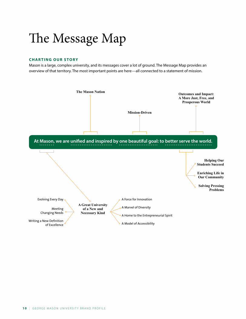
C h a r T i n G o U r s T o r y Mason is a large, complex university, and its messages cover a lot of ground. The Message Map provides an overview of that territory. The most important points are here—all connected to a statement of mission.
The Message Map
At Mason, we are unified and inspired by one beautiful goal: to better serve the world.
A Great University of a New and
Necessary Kind
A Force for Innovation
A Marvel of Diversity
A Home to the Entrepreneurial Spirit
A Model of AccessibilityWriting a New Definition
of Excellence
Evolving Every Day
The Mason Nation
Helping Our Students Succeed
Enriching Life in Our Community
Solving Pressing Problems
Outcomes and Impact: A More Just, Free, and
Prosperous World
Mission-Driven
Meeting Changing Needs
G e o r G e M a s o n U n i v e r s i t y B r a n d P r o F i L e | 1 1
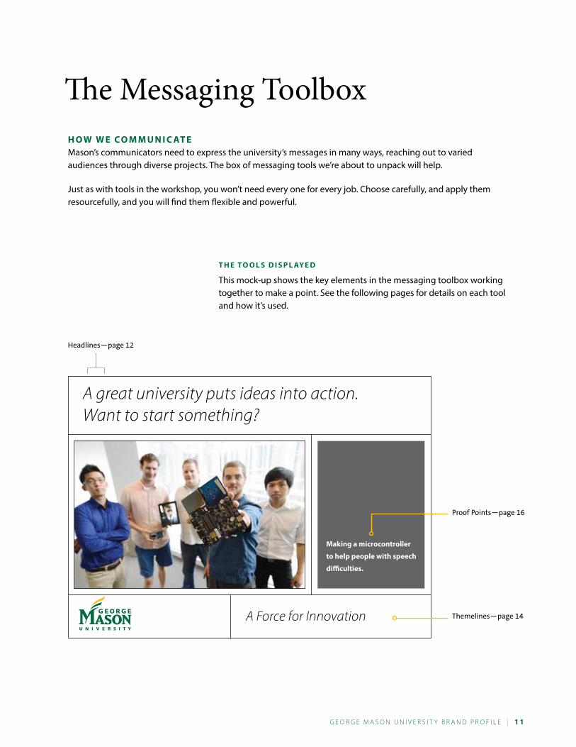
h o W W e C o M M U n i C aT eMason’s communicators need to express the university’s messages in many ways, reaching out to varied audiences through diverse projects. The box of messaging tools we’re about to unpack will help.
Just as with tools in the workshop, you won’t need every one for every job. Choose carefully, and apply them resourcefully, and you will find them flexible and powerful.
T h e To o l s d i s P l ay e d
This mock-up shows the key elements in the messaging toolbox working together to make a point. See the following pages for details on each tool and how it’s used.
A great university puts ideas into action. Want to start something?
A Force for Innovation
Making a microcontroller
to help people with speech
difficulties.
Proof Points—page 16
Headlines—page 12
Themelines—page 14
The Messaging Toolbox
1 2 | G e o r G e M a s o n U n i v e r s i t y B r a n d P r o F i L e
h e a d l i n e s : C aT C h i n G aT T e n T i o nThe job of the headline is to command attention for a story, photo, or message. As we work to add impact to Mason’s communications, strong headlines will be key. This is the place to be bold and confident, intriguing and provocative.
o U r h e a d l i n e s T y l e
Our preferred headline approach has two parts, for example:
For tonight’s homework, start a small business. Or a large one. (This might introduce a piece about the Mason Innovation Lab, a starting place for new ventures.)
Here, the first line sets up a premise, the second adds a twist.
Consider another example:
A great university is a launching pad for dreams. What’s your destination? (This might introduce a message about the opportunity for students to shape a program to match their individual goals.)
In this example, we start with a bold declaration and follow it up with a question. By employing direct address, we inject energy and reach out to the reader.
U s e s o f h e a d l i n e s
When we hear the term “headline,” we naturally think of the words above an ad or magazine story; however, headlines of the kind we are describing can work in other ways as well.
They can run with photos in a web-page carousel, presenting a series of marketing messages. They can be used as dramatic display copy in an annual report, each occupying an entire page, presented in expressive type.
Two-part statements such as these can also be worked into running copy, as lead-in sentences—hooks to catch attention at the beginning of a section.
M o r e h e a d l i n e e x a M P l e s
There are as many headlines in the world as there are stories to tell, and it’s impossible to document them all here. However, the examples below help show the range of approaches that can work.
Some people are voted “most likely to succeed.” Others just go ahead and do it. (To introduce a story about successful graduates.)
A great university puts ideas into action. Want to start something? (To introduce a story about an entrepreneurial center.)
G e o r G e M a s o n U n i v e r s i t y B r a n d P r o F i L e | 1 3
Forget filling in the blanks. Let’s answer questions that matter. (To introduce a story about an applied, real-world class project.)
A great university rewrites the rules. Let’s put the focus on results. (To introduce a story about high-earning graduates or other evidence of ROI.)
A great university is a place of many perspectives. Meet the world on one campus. (To introduce a story about diversity.)
What’s it sound like when the country’s best pep band gets in groove? You’ll have to come find out. (To introduce a story about the Green Machine.)
For more than 40 years, Mason has written an amazing story of progress. Our strategic plan outlines the next chapter. (To introduce a story about plans for progress.)
s h o r T e r h e a d l i n e s
No doubt, occasions will arise when you won’t have space for a headline in this two-part style. If you are creating a billboard, for instance, you’ll need something shorter. One approach is to trim a two-part line in half. For instance, this line: “A great university is a place of many perspectives. Meet the world on one campus.” could become just this: “Meet the whole world on one campus.”
Another solution would be to use one of our themelines (page 14) as a headline. For instance, in an ad about diversity, you could choose “The Power of Many Perspectives.”
h e a d l i n e s i n o T h e r T o n e sThe sample headlines provided above speak with a fairly strong marketing edge. This is intentional, but it will not be right for every project. If you are outlining course requirements or policies in a human resources manual and the goal is simply to be informative, it’s fine to use a simple, informative page title, such as “Electives” or “Planning a Personal Leave.”
Or, if you are writing a proposal and want a section called “Research at Mason,” that’s ok. Keep in mind, though, that there still may be room for an attention-getting first line, for example:
“At Mason, we believe research should answer real-world problems. We put that belief in action every day.” (This is essentially a two-part headline used as a lead-in sentence.)
Think imaginatively about ways of using these headlines and the possibilities will multiply.
1 4 | G e o r G e M a s o n U n i v e r s i t y B r a n d P r o F i L e
a n n o U n C i n G o U r s TaT U r eMason’s communications program does not feature a tagline—a marketing phrase seeking to capture the essence of our brand. It does, however, use
Virginia’s Largest Public Research University
This line can appear with the name of the university (or the logo) in various contexts.
The value of this descriptive phrase is that it asserts Mason’s stature. Too many people have never heard of George Mason University or think that we are still the small commuter school of decades past. This descriptive phrase makes clear that we hold an important place in the educational landscape.
When to Use the Phrase
The phrase works well as part of the university’s “signature,” linked up with the logo at the bottom of a poster, ad, or email message or on the back cover of a publication. It is not intended as a headline or lead message. Also, its use is not mandatory. If the university logo works better in a certain context without the phrase, you are free to use it that way. It can also be used in copy.
Why this is not a tagline
What’s the difference between this descriptive phrase and a tagline? For one, the tone. Taglines typically make marketing claims and have more “spin” than the descriptive phrase. As a simple factual assertion, the phrase is different in tone.
Second, taglines generally hold a leading place in a messaging campaign. The university’s descriptive phrase is intended in a supporting role. The main work of announcing Mason’s messages should be done by headlines and themelines.
the imPortance of the fUll statement
It may be tempting to remove either the word “public” or the word “research” from the positioning statement. Please don’t. “Research” helps position Mason as a major university, with a mission that transcends undergraduate education. “Public” suggests that we are affordable and accessible. (Also, without the word “public,” the positioning statement seems to some people to indicate that Mason’s mission is exclusively research.)
T h e M e l i n e s : e x P r e s s i n G e s s e n T i a l s T r e n G T h sRather than attempting to build an entire communications program on the foundation of a single tagline, Mason has adopted a set of six themelines. We call them “themelines” because each one captures and expresses one or more themes central to the story we want to tell.
T h e s i x T h e M e l i n e s
These are our themelines, along with a word of explanation of each:
A Force for Innovation We seek new and better approaches in everything we do.
G e o r G e M a s o n U n i v e r s i t y B r a n d P r o F i L e | 1 5
A New Definition of Excellence We measure our success by the benefit we bring to our students, our community, and the world.
Making Discoveries That Make a Difference We pursue research of consequence, focusing on pressing issues.
The Power of Many Perspectives Our diversity creates intellectual energy and sparks innovation.
Ideas with Impact We focus on teaching, research, and entrepreneurial ventures with real-world relevance.
Many Paths to Success In every way possible, we create opportunities and open gateways of access, helping our students succeed.
T h e P U r P o s e o f T h e T h e M e l i n e s These lines are meant to be a permanent part of the Mason lexicon—the vocabulary we draw on to describe who we are and what we stand for. By using them in many ways over time, we will weave them into the identity and image of the university.
We will also invest the lines with added meaning and resonance. “The Power of Many Perspectives” is a way of talking about diversity within our community. However, it can also describe the strengths of seminar-style classroom interaction or cross-disciplinary scholarship. Letting these themelines speak in multiple ways is not just permissible, it’s great.
W h e n a n d h o W T o U s e T h e T h e M e l i n e s The themelines are versatile. They can work as part of a headline:At Mason, we’re writing a new definition of excellence. It starts with a focus on students.
They can be woven into running text:“Mason’s always been a force for innovation, and these new programs prove the point… .”
They can also stand alone as display type (as the message on a poster or banner, for instance):MANy PAThS To SUccESS
Finally, the themelines can hit the ending note in a communication, sitting at the bottom of an ad or web page near the university logo. See the use of “A Force for Innovation” on page 11.
1 6 | G e o r G e M a s o n U n i v e r s i t y B r a n d P r o F i L e
P r o o f P o i n T s : e v i d e n C e a n d e x a M P l e sMuch of this guide focuses on commanding audience attention and making a first impression. Of course, once the spotlight turns to us, we need to support the claims we make. This starts with proof points.
These are the facts that make our message real—the examples that help people understand what we’re talking about and the evidence that leads them to believe us.
tyPes of Proof Points
In some circles, the term “proof point” refers specifically to a statistic—and numerical evidence can certainly be powerful. For instance, if we say,
■■ An economic impact of $1.14 billion on the Washington, D.C., region. or
■■ More than 600 Mason students completing research projects through OSCAR.
we have strongly supported the message that Mason is a significant economic contributor and affords ample opportunity for student research.
Similarly, when we speak about diversity, a statistic on the ethnic composition of the student body could work well, or when we cite the opportunity for student access to faculty, we might quote figures on class sizes.
However, good proof points come in many forms, and not all feature numbers. When we speak about ROI, validation can be a best-value ranking from a national publication. When we tout “Ideas with Impact,” it may be an example of a break-through from the Center for Applied Proteomics and Molecular Medicine. If the topic is the warmth and openness of the Mason community, the best proof may be a quote from a student or visitor to campus.
e x Pa n d i n G P r o o f P o i n T s
Note that proof points can be more than a just a few words. On page 11, the proof point takes the form of this caption:
“Making a microcontroller to help people with speech difficulties.”
This quick phrase works with the headline and could be used alone, for instance, as part of a series of messages in a web carousel. However, given space, this point could also be expanded. In a viewbook or a campaign case statement, we could run a paragraph naming the students and explaining the project. On the web, there could be a “more” button linking to the full story. In a magazine feature, we could tell the entire tale, from the spark of the idea to its impact in action.
W h e n a n d h o W T o U s e P r o o f P o i n T sThe best advice on the use of proof points is to follow the old adage about voting: do it early and often. Make your point, then back it up. If you’ve drafted a whole paragraph and look back without seeing something you could clearly label as evidence, start revising.
In running text, proof points are woven into sentences and paragraphs—part of the flow of the narrative; however, there are also other excellent ways to present them: as captions, in bulleted lists, or as call-outs.
G e o r G e M a s o n U n i v e r s i t y B r a n d P r o F i L e | 1 7
W h e r e T o f i n d P r o o f P o i n T sMason has no shortage of good material with which to back up its messages. If you look at a copy of the President’s Report, past issues of Mason Spirit magazine, or publications from various colleges and schools, you’ll find excellent content.
As Mason people do their work, they are continually generating more great examples. In short, proof points are everywhere; the task of the writer is to find them, shape them, and verify them. This starts with interviewing and networking. Fortunately, there are also some short cuts:
■■ You can turn to the Mason website—especially such pages as News (newsdesk.gmu.edu) and Facts and Figures (irr.gmu.edu/FastFacts).
■■ You can check out the Mason photo archive (gmu.smugmug.com). Proof points work powerfully when connected to images, and this is a great way to see what’s available.
■■ Finally, you can also build your own supply of points that work in the projects you need to write, whether it’s grant proposals or admissions materials for a graduate program.
1 8 | G e o r G e M a s o n U n i v e r s i t y B r a n d P r o F i L e
T h e e l e vaT o r s P e e C h : M a s o n ’ s M e s s aG e i n B r i e fThis overview introduces Mason and our Key Messages. The description comes in three lengths so that you will always have a Mason overview that fits your needs. Depending on your needs, you can expand it by adding additional content appropriate to your audience.
o n e l i n e
George Mason University is Virginia’s largest public research university.
s h o r T v e r s i o n
George Mason University is Virginia’s largest public research university. Located near Washington, D.C., Mason enrolls more than 33,000 students from 130 countries and all 50 states. Mason has grown rapidly over the past half-century and is recognized for its innovation and entrepreneurship, remarkable diversity, and commitment to accessibility.
lo n G v e r s i o n
George Mason University is Virginia’s largest public research university. Located near Washington, D.C., Mason enrolls more than 33,000 students from 130 countries and all 50 states. Mason has grown rapidly over the past half-century and is recognized for its innovation and entrepreneurship, remarkable diversity, and commitment to accessibility. Mason is also one of the best values in higher education, producing graduates who lead all Virginia schools with the highest annual salaries.
r e f e r r i n G T o T h e U n i v e r s i T y i n T e x TNever use GMU. Use Mason if you are not using the university’s full name.
■■ In formal documents, use George Mason University on first reference; use George Mason on second reference, and in all subsequent references, the university may be referred to as Mason.
■■ George Mason University is used to formally reference the university in external materials, including publications, press releases, invitations, messages from the president, and departmental publications.
■■ While George Mason University is preferred, Mason can be used in publications for and about students, athletics, and less formal publications.
G e o r G e M a s o n U n i v e r s i t y B r a n d P r o F i L e | 1 9
l e G aC y e l e M e n T s : Pa s T B r a n d i n G l a n G UaG e a n d i T s f U T U r e U s eT h e M a s o n i d e a
The Mason IDEA remains as valid as ever. Its four descriptors—innovative, diverse, entrepreneurial, and accessible—are the first four major messages on which this communications program is built. These qualities still define Mason, and they should still shape our messaging.
However, as we move forward, the phrase itself—“the Mason IDEA”—will play a smaller part in our public outreach. It will function more as a way that those of us within the Mason community think about our university and less as a headline for the public.
The reason is that “the Mason IDEA” is complex. It’s actually four ideas, hidden under an acronym—and it requires a good deal of explanation and unpacking before it becomes meaningful to a newcomer.
In its place, we will use the themelines, university positioning statement, and headlines outlined in this guide.
a U n i v e r s i T y f o r T h e W o r l d
“A University for the World” is an expressive and useful phrase that will continue to be part of our communications, in contexts where it can be explained.
This means that “A University for the World” will not stand alone as a headline or tagline. It can be used when introduced in this way: “At George Mason, we seek to be not the best university in the world, but the best university for the world. That means…”
We can then go on to explain that at Mason we focus on service to the community and society, that we work to solve pressing problems and deliver an education of relevance, and that our outlook and programs are global in scope.
The reason we do not use “A University for the World” alone is that, without context, too many people think the phrase means just one thing: “global.” Also, without an explanation of our mission of service, some find the line boastful.
W h e r e i n n o vaT i o n i s T r a d i T i o n
The tagline “Where Innovation Is Tradition” is officially retired. It will no longer be part of Mason’s communications and should be removed from pieces as they are updated.
If you are looking for a phrase to amplify the name of the university, use one of the themelines (see page 14).
2 0 | G e o r G e M a s o n U n i v e r s i t y B r a n d P r o F i L e
W h o W e N e e d t o R e ac h
P r o s P e C T i v e s T U d e n T sThe Audience: the universe of potential enrollees who would thrive and contribute at Mason and their families, includes undergraduate and graduate, full and part time, in-state and out-of-state, those of traditional college age and those who are not
The Strategic Goal: inspire more of these prospects to make Mason their school of choice
o U r C o M M U n i C aT i o n s G o a l s■■ Spark interest, getting students to add Mason to their list to check out.■■ Motivate web visits and campus visits.■■ Support informed enrollment decisions with details on programs, oppor-
tunities, and life as a Mason student.
M e s s aG e sAll Mason’s Key Messages apply to this audience. In particular, we should stress strengths: Academic Quality, Our Location, and the Mason Nation.
Specific points to highlight ■■ Internships■■ Career support and results■■ Affordability■■ Student life opportunities■■ Mason athletics■■ Program-specific strengths (particularly for graduate students)
n o T e sIn our communications to prospective students, we should speak directly to the students, using the second-person whenever possible. We should also work to translate everything that’s great about Mason into student terms. This means explaining how a strength like innovation will make their experience better—how they will have the chance to be innovative. We shouldn’t just say what Mason offers; we should tell students what they could accomplish and experience here.
We should help future students picture themselves at Mason and as part of this community. Language such as this helps: “As a Mason student, you will have the opportunity to…”
Future undergraduates face college not only with excitement, but often some apprehension. They want to be certain they will fit in, make friends, and handle the academic challenge. Our messages should be emphatically positive. We must also be aware that some great opportunities (undergraduate research, study abroad) may be a lot for some high schoolers to take in, and we should stress the support we provide.
Key Audiences
G e o r G e M a s o n U n i v e r s i t y B r a n d P r o F i L e | 2 1
s T U d e n T sThe Audience: the full range of those enrolled in Mason programs through any of our campuses; including undergraduate and graduate, full and part time, resident and commuter
The Strategic Goal: strengthen students’ connection to Mason, helping them see themselves as lifelong members of the Mason Nation
o U r C o M M U n i C aT i o n s G o a l s ■■ Help students become aware of and take advantage of all that Mason
offers.■■ Fuel pride and loyalty by building understanding of our distinctive
strengths.■■ Encourage active involvement in university life.■■ Keep students informed of services and opportunities available to them.
M e s s aG e sAll Mason’s Key Messages apply to this audience. In particular, we should stress strengths: Academic Quality and the Mason Nation. In addition, we need to expand students’ awareness of the forms of support and the learning opportunities open to them—from counseling to undergraduate research, encouraging them to make the most of their Mason experience.
n o T e sIt may seem that students who have already enrolled know Mason and why it’s a great school. However, we have an opportunity to broaden and deepen their understanding. By sharing evidence of academic quality, we can make students proud of the choice they’ve made in enrolling. By telling stories of innovation and entrepreneurship, we can help them see the chance to be innovative and entrepreneurial themselves. By talking up the strength of the Mason Nation, we can spark new flames of school spirit.
2 2 | G e o r G e M a s o n U n i v e r s i t y B r a n d P r o F i L e
a l U M n iThe Audience: all the men and women who have earned Mason degrees including the majority who still live and work in the greater Washington, D.C., area, and those far beyond, those who remember Mason’s earliest days and those just a year or two out
The Strategic Goal: make all our graduates proud to tell the world where they went to school—before anyone even asks
o U r C o M M U n i C aT i o n s G o a l s ■■ Build awareness of Mason today and all its strengths.■■ Inspire involvement in the alumni community and the life of the university.■■ Create a sense of connection with the Mason of today and our current
students.■■ Raise awareness of opportunities for involvement.
M e s s aG e sAll Mason’s Key Messages apply to this audience. In particular, we want to stress strengths: Vision and Momentum, including the remarkable narrative of progress that spans our five decades. The strengths of Academic Quality and Research of Consequence are key for validating Mason as a respected institution of significant stature.
n o T e sCommunications to alumni should honor Mason’s past and celebrate its present and future. They should feature personal stories that offer the chance for connection and identification—with fellow alumni and with students and faculty of today. They should also feature clear invitations to visit, take part in alumni gatherings and university events, offer internships and hire Mason students, and join leadership groups.
G e o r G e M a s o n U n i v e r s i t y B r a n d P r o F i L e | 2 3
d o n o r sThe Audience: all those who invest in Mason, from annual fund supporters to major gift benefactors, to corporate and foundation partners and all those we see as potential investors
The Strategic Goal: position Mason as a philanthropic priority and energize those who feel strongly about Mason to act on their feelings and give
C o M M U n i C aT i o n s G o a l s ■■ Build awareness of Mason’s mission and impact.■■ Build excitement for Mason’s vision for the future.■■ Emphasize the ROI Mason delivers and show the impact of specific gifts.■■ Present many compelling opportunities for investment.■■ Educate potential donors on the importance of private support
to a public university.
M e s s aG e sAll Mason’s Key Messages apply to this audience. Raising awareness of the Mason Nation is important to alumni, parents, and friends, but not institutional or corporate donors. The strengths of Mission-Driven, Vision and Momentum, and Outcomes and Impact are particularly important.
n o T e sThe audience of potential donors spans an enormous range, from a foundation interested in advancing research in a particular field to a sports fan who wants to help the basketball team. Certain key approaches, however, apply in all cases. We want to present clear opportunities for investment—specific projects and ways of giving. We want to paint a picture of the benefit supporting these priorities will bring. And, we want to emphasize Mason’s mission and impact. This core ties all the diverse donors and opportunities together and makes Mason worth investing in.
2 4 | G e o r G e M a s o n U n i v e r s i t y B r a n d P r o F i L e
faC U lT y a n d s Ta f fThe Audience: everyone who dedicates their work to making Mason work—from professors in the classroom and lab to our safety and security personnel, from coaches, career counselors, and admissions staff to senior administrators
The Strategic Goal: strengthen a sense of connection to the university and a shared understanding of mission
o U r C o M M U n i C aT i o n s G o a l s■■ Emphasize partnership in an enterprise of excellence.■■ Build consensus around a vision for Mason’s future and the strategic
steps to reach it.■■ Fuel feelings of pride.■■ Keep people informed—aware of university news, services, events,
and initiatives.■■ Help faculty and staff members see themselves as advocates
for Mason, spreading the good news.
M e s s aG e sAll Mason’s Key Messages apply to this audience.
n o T e sJust as with current students, it may seem that faculty already know Mason and its strengths. In reality, we can always do better, making more people aware of great things happening a few buildings away and articulating key points such as “innovative” or “accessible” more fully and consistently so that they become a clear part of our self-image and a way people think about their work.
G e o r G e M a s o n U n i v e r s i t y B r a n d P r o F i L e | 2 5
C o M M U n i T y a n d G o v e r n M e n T l e a d e r sThe Audience: the policy makers and decision makers, particularly in Fairfax County, Richmond, and Washington, whose opinions influence everything from grant funding to land-use zoning
The Strategic Goal: position Mason as an institution worth supporting, partnering with, and turning to for expertise
o U r C o M M U n i C aT i o n s G o a l s ■■ Broaden recognition for Mason and increase awareness of
our stature.■■ Highlight Mason’s impact on the local community, the region, the
commonwealth, and the world.■■ Build understanding of Mason’s mission and its value.■■ Highlight Mason’s impact as an economic driver, research leader, partner
to industry, cultural resource, and source of educational opportunity.
M e s s aG e sAll Mason’s Key Messages apply to this audience. The strengths of Mission-Driven, Vision and Momentum, and Outcomes and Impact are particularly important.
n o T e sIn many ways influential leaders are like any other members of the general public. They will make decisions about George Mason University based on how much they know about us and whether they think we’re a good school. The difference is that these leaders are also likely to look at the big picture—to understand the value of a research university to industry and a region; to appreciate the importance of accessibility as an issue in American higher education; and to value an institution that can be a major provider of talent to the workforce. These are all topics we can speak to more than effectively.
2 6 | G e o r G e M a s o n U n i v e r s i t y B r a n d P r o F i L e
G e o r G e M a s o n U n i v e r s i t y B r a n d P r o F i L e | 2 7
Visual Identity and StyleSimply put, visual identity is the combination of logo or brand mark with fonts, color palette, and imagery to form a unique and easily recognizable visual presence or design style. Done well, a visual identity carves out your place in the market by distinguishing it from competing interests. A consistently used and well-crafted identity gives visual life to your brand and drives all marketing and advertising communications. It is the public face of the brand—conveying our core values and attributes, distinctive personality, mission and purpose, and promise of quality.
The university’s strategic plan calls for us, as an institution, to elevate public awareness of George Mason University. All of the goals outlined in the strategic plan will benefit from a strong university brand. To that end, the Office of Communications and Marketing has created a strong and distinctive brand.
Our visual style supports and reflects the university’s messaging and brand profile language, and together they create the university’s brand.
In this section, we’ll cover
■■ The university logo■■ Secondary logos and seal■■ Fonts selected for the visual identity program■■ University color palettes■■ Graphic elements■■ Samples of the visual identity in use■■ Our photography style and how to select and use images
2 8 | G e o r G e M a s o n U n i v e r s i t y B r a n d P r o F i L e
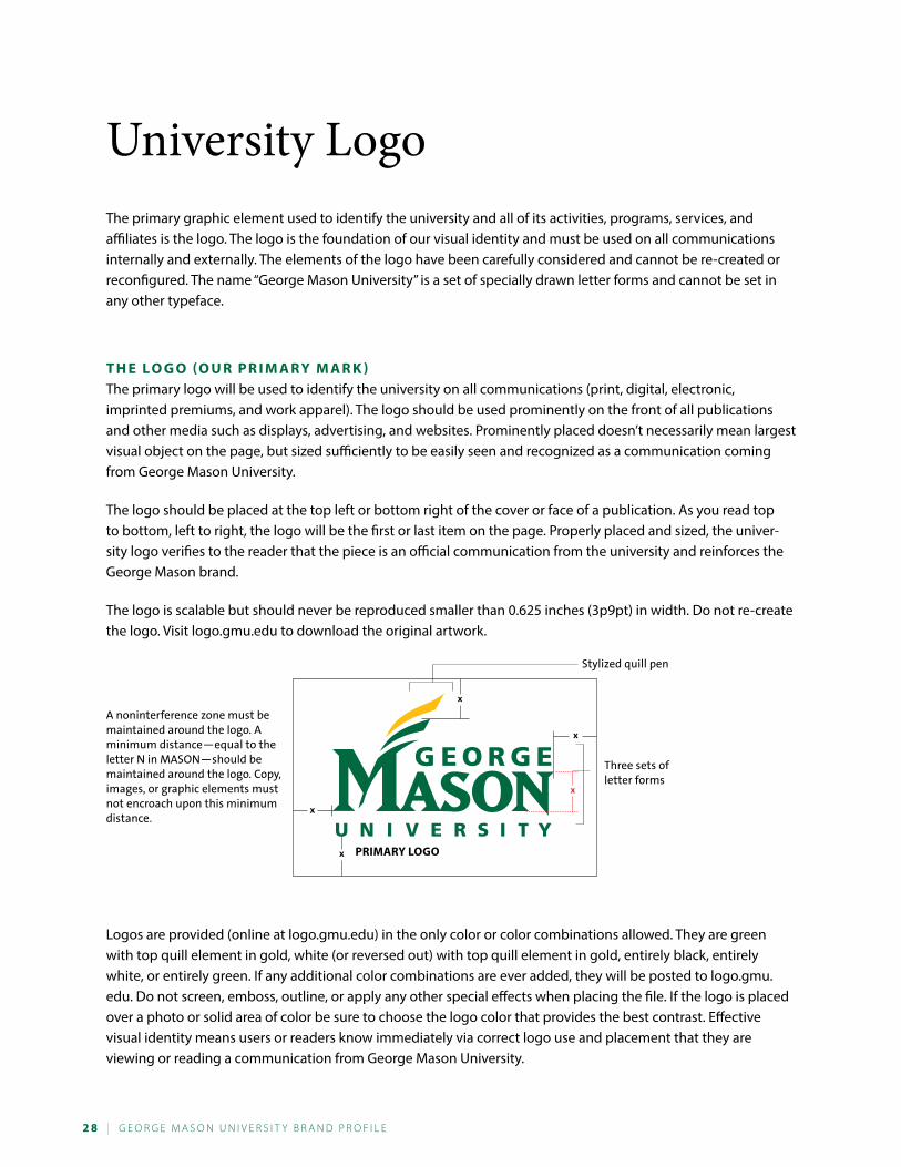
The primary graphic element used to identify the university and all of its activities, programs, services, and affiliates is the logo. The logo is the foundation of our visual identity and must be used on all communications internally and externally. The elements of the logo have been carefully considered and cannot be re-created or reconfigured. The name “George Mason University” is a set of specially drawn letter forms and cannot be set in any other typeface.
T h e l o G o (o U r P r i M a r y M a r k )The primary logo will be used to identify the university on all communications (print, digital, electronic, imprinted premiums, and work apparel). The logo should be used prominently on the front of all publications and other media such as displays, advertising, and websites. Prominently placed doesn’t necessarily mean largest visual object on the page, but sized sufficiently to be easily seen and recognized as a communication coming from George Mason University.
The logo should be placed at the top left or bottom right of the cover or face of a publication. As you read top to bottom, left to right, the logo will be the first or last item on the page. Properly placed and sized, the univer-sity logo verifies to the reader that the piece is an official communication from the university and reinforces the George Mason brand.
The logo is scalable but should never be reproduced smaller than 0.625 inches (3p9pt) in width. Do not re-create the logo. Visit logo.gmu.edu to download the original artwork.
University Logo
PriMary loGo
Three sets of letter forms
Stylized quill pen
x
x
x
x
x
A noninterference zone must be maintained around the logo. A minimum distance—equal to the letter N in MASON—should be maintained around the logo. Copy, images, or graphic elements must not encroach upon this minimum distance.
Logos are provided (online at logo.gmu.edu) in the only color or color combinations allowed. They are green with top quill element in gold, white (or reversed out) with top quill element in gold, entirely black, entirely white, or entirely green. If any additional color combinations are ever added, they will be posted to logo.gmu.edu. Do not screen, emboss, outline, or apply any other special effects when placing the file. If the logo is placed over a photo or solid area of color be sure to choose the logo color that provides the best contrast. Effective visual identity means users or readers know immediately via correct logo use and placement that they are viewing or reading a communication from George Mason University.
G e o r G e M a s o n U n i v e r s i t y B r a n d P r o F i L e | 2 9
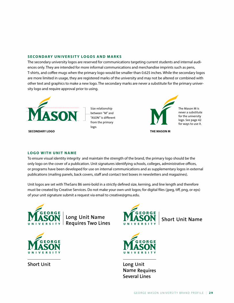
s e C o n da r y U n i v e r s i T y l o G o s a n d M a r k sThe secondary university logos are reserved for communications targeting current students and internal audi-ences only. They are intended for more informal communications and merchandise imprints such as pens, T-shirts, and coffee mugs when the primary logo would be smaller than 0.625 inches. While the secondary logos are more limited in usage, they are registered marks of the university and may not be altered or combined with other text and graphics to make a new logo. The secondary marks are never a substitute for the primary univer-sity logo and require approval prior to using.
The Mason M is never a substitute for the university logo. See page 42 for ways to use it.
seCondary loGo The Mason M
Size relationship
between “M” and
“ASON” is different
from the primary
logo.
l o G o W i T h U n i T n a M eTo ensure visual identity integrity and maintain the strength of the brand, the primary logo should be the only logo on the cover of a publication. Unit signatures identifying schools, colleges, administrative offices, or programs have been developed for use on internal communications and as supplementary logos in external publications (mailing panels, back covers, staff and contact text boxes in newsletters and magazines).
Unit logos are set with TheSans B6 semi-bold in a strictly defined size, kerning, and line length and therefore must be created by Creative Services. Do not make your own unit logos; for digital files (jpeg, tiff, png, or eps) of your unit signature submit a request via email to [email protected].
3 0 | G e o r G e M a s o n U n i v e r s i t y B r a n d P r o F i L e
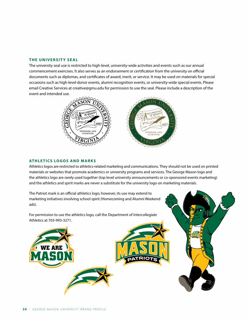
T h e U n i v e r s i T y s e a lThe university seal use is restricted to high-level, university-wide activities and events such as our annual commencement exercises. It also serves as an endorsement or certification from the university on official documents such as diplomas, and certificates of award, merit, or service. It may be used on materials for special occasions such as high-level donor events, alumni recognition events, or university-wide special events. Please email Creative Services at [email protected] for permission to use the seal. Please include a description of the event and intended use.
aT h l e T i C s l o G o s a n d M a r k sAthletics logos are restricted to athletics-related marketing and communications. They should not be used on printed materials or websites that promote academics or university programs and services. The George Mason logo and the athletics logo are rarely used together (top level university announcements or co-sponsored events marketing) and the athletics and spirit marks are never a substitute for the university logo on marketing materials.
The Patriot mark is an official athletics logo; however, its use may extend to marketing initiatives involving school spirit (Homecoming and Alumni Weekend ads).
For permission to use the athletics logo, call the Department of Intercollegiate Athletics at 703-993-3271.
G e o r G e M a s o n U n i v e r s i t y B r a n d P r o F i L e | 3 1
a lT e r i n G o U r l o G o s a n d M a r k sOn the previous pages, we’ve covered the various university logos and marks. All of our marks are registered with the U.S. Patent and Trademark office. Registering our marks protects them from being picked up by nonuniversity entities and used for conducting nonuniversity business, marketing, or communications. That same protection requires that the university not alter its registered marks in any fashion. That means that you can’t take all or part of a logo and combine it with other art or wording to make a new logo. Following are some examples.
FITNESSCHALLENGE
Cable Network ason
SERVICES CREATIVE
Every campus unit falls under the university brand and markets itself
with the primary logo or a unit logo. You may not take parts of a mark
and create your own logo.
You cannot create your
own vertical unit logo.
If the vertical unit logo
doesn’t work for your
project, then use the
primary unit logo and
place your unit’s name
elsewhere on the piece.
Creative Services provides ALL unit logos. If you do not have a unit logo
or have a name change or new unit, contact us and we will make changes
for you. They use a unique font, size, and kern and cannot be re-created.
Only the unit name is allowed to the right of the vertical rule. Too much
text on the right side of the rule detracts from the university logo to the
left. The example below shows a fraudulent unit logo. It has two unit
names, the wrong font, change of type case, and is misaligned.
The Patriot generates
Mason spirit and is most
often used to promote
large-scale events such
as Homecoming or Mason
Madness. The mark may
not be altered to add
objects to his hands,
change his appearance,
or embellish his
outfit.
CREATIVE SERVICES
EXAMPLES ON THIS PAGE
WERE CREATED FOR
ILLUSTRATIVE PURPOSES
BASED ON PAST REQUESTS.
3 2 | G e o r G e M a s o n U n i v e r s i t y B r a n d P r o F i L e
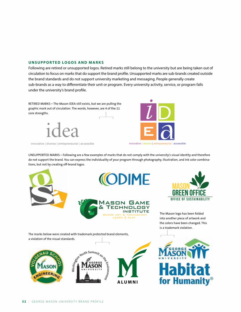
U n s U P P o r T e d l o G o s a n d M a r k sFollowing are retired or unsupported logos. Retired marks still belong to the university but are being taken out of circulation to focus on marks that do support the brand profile. Unsupported marks are sub-brands created outside the brand standards and do not support university marketing and messaging. People generally create sub-brands as a way to differentiate their unit or program. Every university activity, service, or program falls under the university’s brand profile.
ideainnovative | diverse | entrepreneurial | accessible innovative | diverse | entrepreneurial | accessible
RETIRED MARkS—The Mason IDEA still exists, but we are pulling the
graphic mark out of circulation. The words, however, are 4 of the 11
core strengths.
uNSuPPORTED MARkS—Following are a few examples of marks that do not comply with the university’s visual identity and therefore
do not support the brand. You can express the individuality of your program through photography, illustration, and ink color combina-
tions, but not by creating off-brand logos.
The Mason logo has been folded
into another piece of artwork and
the colors have been changed. This
is a trademark violation.
The marks below were created with trademark protected brand elements,
a violation of the visual standards.
G e o r G e M a s o n U n i v e r s i t y B r a n d P r o F i L e | 3 3
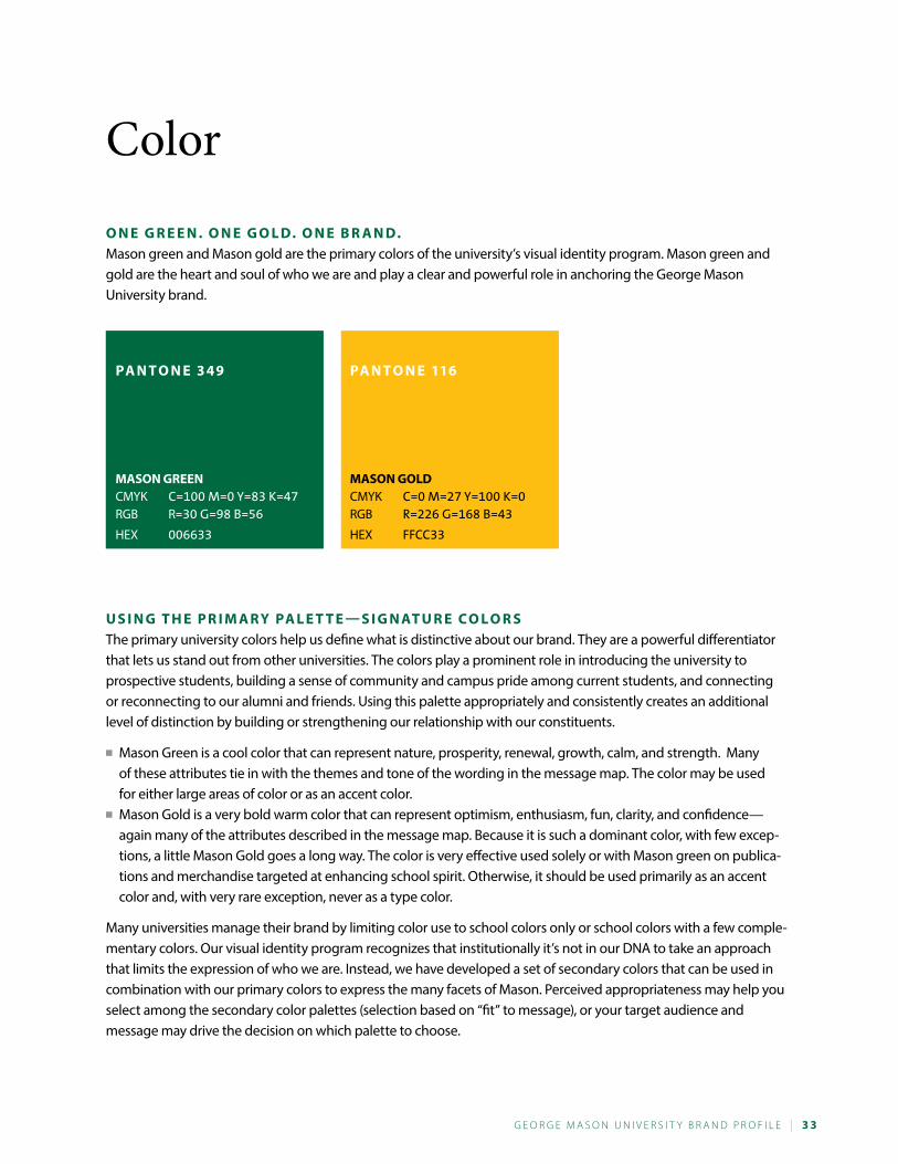
o n e G r e e n . o n e G o l d. o n e B r a n d.Mason green and Mason gold are the primary colors of the university’s visual identity program. Mason green and gold are the heart and soul of who we are and play a clear and powerful role in anchoring the George Mason University brand.
U s i n G T h e P r i M a r y Pa l e T T e — s i G n aT U r e C o l o r sThe primary university colors help us define what is distinctive about our brand. They are a powerful differentiator that lets us stand out from other universities. The colors play a prominent role in introducing the university to prospective students, building a sense of community and campus pride among current students, and connecting or reconnecting to our alumni and friends. Using this palette appropriately and consistently creates an additional level of distinction by building or strengthening our relationship with our constituents.
■■ Mason Green is a cool color that can represent nature, prosperity, renewal, growth, calm, and strength. Many of these attributes tie in with the themes and tone of the wording in the message map. The color may be used for either large areas of color or as an accent color.
■■ Mason Gold is a very bold warm color that can represent optimism, enthusiasm, fun, clarity, and confidence—again many of the attributes described in the message map. Because it is such a dominant color, with few excep-tions, a little Mason Gold goes a long way. The color is very effective used solely or with Mason green on publica-tions and merchandise targeted at enhancing school spirit. Otherwise, it should be used primarily as an accent color and, with very rare exception, never as a type color.
Many universities manage their brand by limiting color use to school colors only or school colors with a few comple-mentary colors. Our visual identity program recognizes that institutionally it’s not in our DNA to take an approach that limits the expression of who we are. Instead, we have developed a set of secondary colors that can be used in combination with our primary colors to express the many facets of Mason. Perceived appropriateness may help you select among the secondary color palettes (selection based on “fit” to message), or your target audience and message may drive the decision on which palette to choose.
Mason GreenCMYK C=100 M=0 Y=83 k=47RGB R=30 G=98 B=56
HEX 006633
Mason GoldCMYK C=0 M=27 Y=100 k=0RGB R=226 G=168 B=43
HEX FFCC33
Pa n T o n e 3 49 Pa n T o n e 116
Color
3 4 | G e o r G e M a s o n U n i v e r s i t y B r a n d P r o F i L e
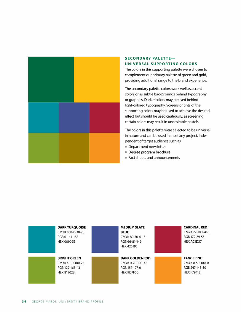
s e C o n da r y Pa l e T T e — U n i v e r s a l s U P P o r T i n G C o l o r sThe colors in this supporting palette were chosen to complement our primary palette of green and gold, providing additional range to the brand experience.
The secondary palette colors work well as accent colors or as subtle backgrounds behind typography or graphics. Darker colors may be used behind light-colored typography. Screens or tints of the supporting colors may be used to achieve the desired effect but should be used cautiously, as screening certain colors may result in undesirable pastels.
The colors in this palette were selected to be universal in nature and can be used in most any project, inde-pendent of target audience such as■■ Department newsletter■■ Degree program brochure■■ Fact sheets and announcements
dark TUrQUoiseCMYK 100-0-30-20RGB 0-144-158HEX 00909E
MediUM slaTe BlUeCMYK 80-70-0-15RGB 66-81-149HEX 425195
Cardinal redCMYK 22-100-78-15RGB 172-29-55HEX AC1D37
BriGhT GreenCMYK 40-0-100-25RGB 129-163-43HEX 81902B
dark GoldenrodCMYK 0-20-100-45RGB 157-127-0HEX 9D7F00
TanGerineCMYK 0-50-100-0RGB 247-148-30HEX F7941E
G e o r G e M a s o n U n i v e r s i t y B r a n d P r o F i L e | 3 5
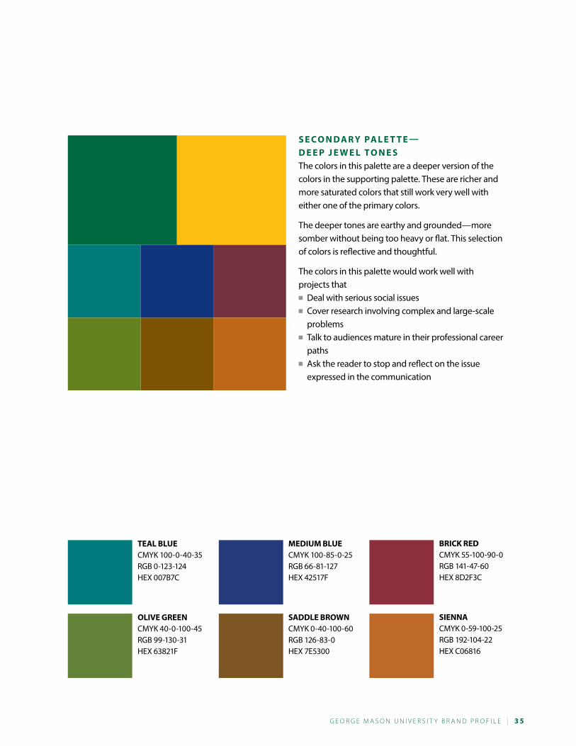
s e C o n da r y Pa l e T T e — d e e P j e W e l T o n e sThe colors in this palette are a deeper version of the colors in the supporting palette. These are richer and more saturated colors that still work very well with either one of the primary colors.
The deeper tones are earthy and grounded—more somber without being too heavy or flat. This selection of colors is reflective and thoughtful.
The colors in this palette would work well with projects that■■ Deal with serious social issues■■ Cover research involving complex and large-scale
problems■■ Talk to audiences mature in their professional career
paths■■ Ask the reader to stop and reflect on the issue
expressed in the communication
Teal BlUeCMYK 100-0-40-35RGB 0-123-124HEX 007B7C
MediUM BlUeCMYK 100-85-0-25RGB 66-81-127HEX 42517F
BriCk redCMYK 55-100-90-0RGB 141-47-60HEX 8D2F3C
olive GreenCMYK 40-0-100-45RGB 99-130-31HEX 63821F
saddle BroWnCMYK 0-40-100-60RGB 126-83-0HEX 7E5300
siennaCMYK 0-59-100-25RGB 192-104-22HEX C06816
3 6 | G e o r G e M a s o n U n i v e r s i t y B r a n d P r o F i L e
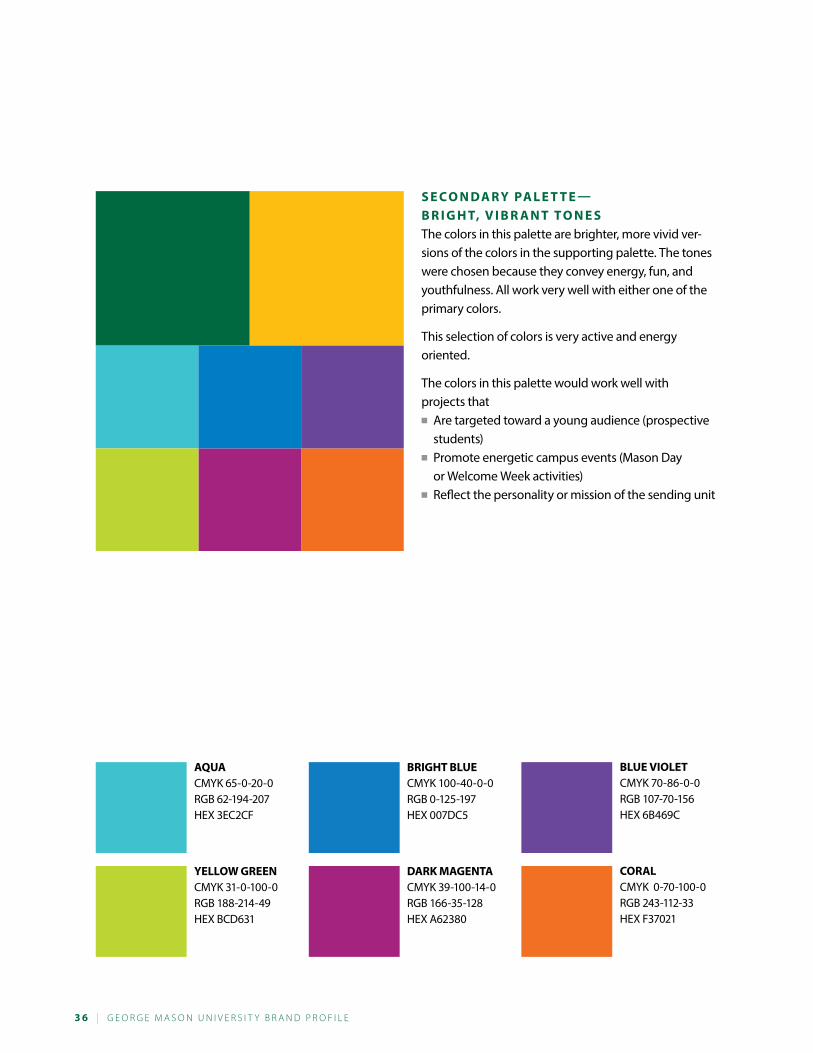
s e C o n da r y Pa l e T T e — B r i G h T, v i B r a n T T o n e sThe colors in this palette are brighter, more vivid ver-sions of the colors in the supporting palette. The tones were chosen because they convey energy, fun, and youthfulness. All work very well with either one of the primary colors.
This selection of colors is very active and energy oriented.
The colors in this palette would work well with projects that■■ Are targeted toward a young audience (prospective
students)■■ Promote energetic campus events (Mason Day
or Welcome Week activities)■■ Reflect the personality or mission of the sending unit
aQUaCMYK 65-0-20-0RGB 62-194-207HEX 3EC2CF
BriGhT BlUeCMYK 100-40-0-0RGB 0-125-197HEX 007DC5
BlUe violeTCMYK 70-86-0-0RGB 107-70-156HEX 6B469C
yelloW GreenCMYK 31-0-100-0RGB 188-214-49HEX BCD631
dark MaGenTaCMYK 39-100-14-0RGB 166-35-128HEX A62380
CoralCMYK 0-70-100-0RGB 243-112-33HEX F37021
G e o r G e M a s o n U n i v e r s i t y B r a n d P r o F i L e | 3 7
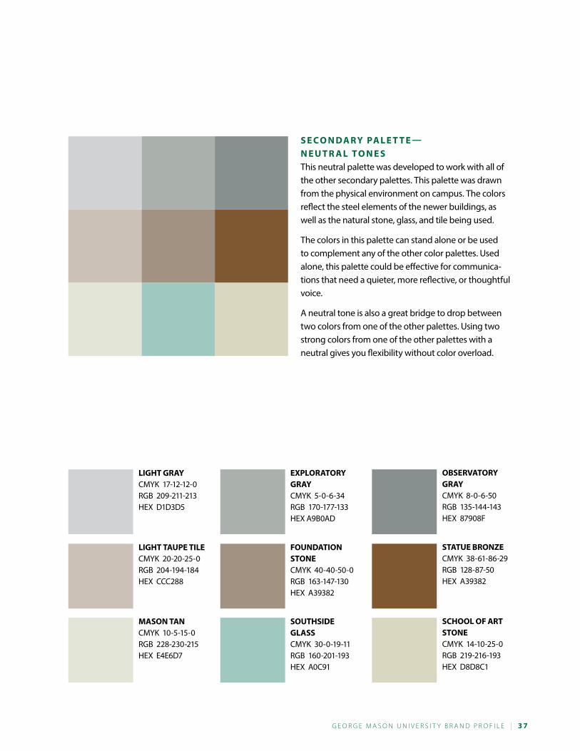
liGhT TaUPe TileCMYK 20-20-25-0RGB 204-194-184HEX CCC288
liGhT GrayCMYK 17-12-12-0RGB 209-211-213HEX D1D3D5
foUndaTion sToneCMYK 40-40-50-0RGB 163-147-130HEX A39382
exPloraTory Gray CMYK 5-0-6-34RGB 170-177-133HEX A9B0AD
sTaTUe BronZeCMYK 38-61-86-29RGB 128-87-50HEX A39382
oBservaTory GrayCMYK 8-0-6-50RGB 135-144-143HEX 87908F
Mason TanCMYK 10-5-15-0RGB 228-230-215HEX E4E6D7
soUThside GlassCMYK 30-0-19-11RGB 160-201-193HEX A0C91
sChool of arT sToneCMYK 14-10-25-0RGB 219-216-193HEX D8D8C1
s e C o n da r y Pa l e T T e — n e U T r a l T o n e sThis neutral palette was developed to work with all of the other secondary palettes. This palette was drawn from the physical environment on campus. The colors reflect the steel elements of the newer buildings, as well as the natural stone, glass, and tile being used.
The colors in this palette can stand alone or be used to complement any of the other color palettes. Used alone, this palette could be effective for communica-tions that need a quieter, more reflective, or thoughtful voice.
A neutral tone is also a great bridge to drop between two colors from one of the other palettes. Using two strong colors from one of the other palettes with a neutral gives you flexibility without color overload.
3 8 | G e o r G e M a s o n U n i v e r s i t y B r a n d P r o F i L e
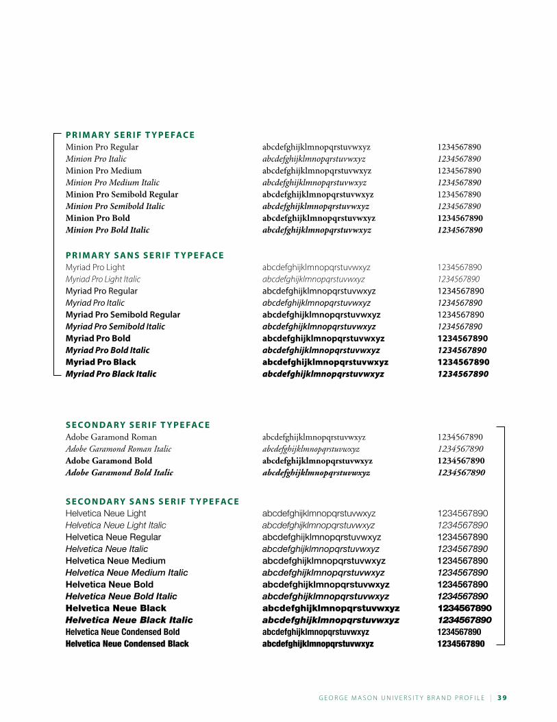
Typography is a powerful tool. When used effectively, the right fonts command attention, elicit emotions, and create a voice for our brand. Minion Pro and Myriad Pro have been chosen as the university’s primary font set to be used on all university marketing communications. They were selected because they are highly readable and at the same time are flexible enough to allow for creative expression. Our secondary font set, Adobe Garamond and Helvetica Neue, have the same attributes of our primary set but with a slightly different personality.
The two sets of fonts selected for Mason’s visual identity also complement the university logo. Condensed and variable weight versions of approved type families are allowed. There may be occasions when you need a different font for a particular project, such as a script for an invitation or display font for a poster. Please read the following guidance.
C r i T e r i a f o r s e l e C T i n G a T y P e faC ereadabi liTy
A legible typeface combined with how you set it leads to readability. Style is important in design but means little if people struggle to read your communications. Be sure to put readability first in your marketing and communications pieces.■■ Choose typefaces appropriate for your purpose.■■ Set text as “right ragged” for readable word spacing and avoid the “rivers” associated with justified text.■■ Set the leading (the space between lines of text) a minimum of one point size greater than type size.
legi bi liTy
Legibility refers to the design of the typeface—the width and height of each letter, whether it has serifs, the pres-ence of novel type design elements, and so on. Legible typefaces are easy on your reader.■■ Choose typefaces with conventional letter forms.■■ Choose typefaces with generous spacing.■■ Choose typefaces with a tall x-height.
su iTabi liTy
Know what a typeface was designed for before you decide to love it. If you use a typeface for purposes other than intended you probably aren’t going to be happy with the result. Display fonts don’t make good subheads, and scripts make good invitations but don’t work for text in paragraph form.
aVoi d sTereoTypical or Th eM aTic correl aTions
Trends change quickly and diverse groups bring a different perspective to the table. Don’ t pick overstylized “theme” fonts based on the concept or target audience of a communication.■■ Don’t pick Papyrus because you are promoting an archaeology program.■■ Don’t pick Chillin because your audience is high school students.■■ Don’t pick Lithos because you are creating Greek Week promotionals.■■ Don’t pick Wonton because you are designing a program for Madame Butterfly.
Typography
G e o r G e M a s o n U n i v e r s i t y B r a n d P r o F i L e | 3 9
P r i M a r y s e r i f T y P e faC eMinion Pro Regular abcdefghijklmnopqrstuvwxyz 1234567890Minion Pro Italic abcdefghijklmnopqrstuvwxyz 1234567890Minion Pro Medium abcdefghijklmnopqrstuvwxyz 1234567890Minion Pro Medium Italic abcdefghijklmnopqrstuvwxyz 1234567890Minion Pro Semibold Regular abcdefghijklmnopqrstuvwxyz 1234567890Minion Pro Semibold Italic abcdefghijklmnopqrstuvwxyz 1234567890Minion Pro Bold abcdefghijklmnopqrstuvwxyz 1234567890Minion Pro Bold Italic abcdefghijklmnopqrstuvwxyz 1234567890
P r i M a r y s a n s s e r i f T y P e faC eMyriad Pro Light abcdefghijklmnopqrstuvwxyz 1234567890Myriad Pro Light Italic abcdefghijklmnopqrstuvwxyz 1234567890Myriad Pro Regular abcdefghijklmnopqrstuvwxyz 1234567890Myriad Pro Italic abcdefghijklmnopqrstuvwxyz 1234567890Myriad Pro Semibold Regular abcdefghijklmnopqrstuvwxyz 1234567890Myriad Pro Semibold Italic abcdefghijklmnopqrstuvwxyz 1234567890Myriad Pro Bold abcdefghijklmnopqrstuvwxyz 1234567890Myriad Pro Bold Italic abcdefghijklmnopqrstuvwxyz 1234567890Myriad Pro Black abcdefghijklmnopqrstuvwxyz 1234567890Myriad Pro Black Italic abcdefghijklmnopqrstuvwxyz 1234567890
s e C o n da r y s e r i f T y P e faC eAdobe Garamond Roman abcdefghijklmnopqrstuvwxyz 1234567890Adobe Garamond Roman Italic abcdefghijklmnopqrstuvwxyz 1234567890Adobe Garamond Bold abcdefghijklmnopqrstuvwxyz 1234567890Adobe Garamond Bold Italic abcdefghijklmnopqrstuvwxyz 1234567890
s e C o n da r y s a n s s e r i f T y P e faC eHelvetica Neue Light abcdefghijklmnopqrstuvwxyz 1234567890Helvetica Neue Light Italic abcdefghijklmnopqrstuvwxyz 1234567890Helvetica Neue Regular abcdefghijklmnopqrstuvwxyz 1234567890Helvetica Neue Italic abcdefghijklmnopqrstuvwxyz 1234567890Helvetica Neue Medium abcdefghijklmnopqrstuvwxyz 1234567890Helvetica Neue Medium Italic abcdefghijklmnopqrstuvwxyz 1234567890Helvetica Neue Bold abcdefghijklmnopqrstuvwxyz 1234567890Helvetica Neue Bold Italic abcdefghijklmnopqrstuvwxyz 1234567890Helvetica Neue Black abcdefghijklmnopqrstuvwxyz 1234567890Helvetica Neue Black Italic abcdefghijklmnopqrstuvwxyz 1234567890Helvetica Neue Condensed Bold abcdefghijklmnopqrstuvwxyz 1234567890Helvetica Neue Condensed Black abcdefghijklmnopqrstuvwxyz 1234567890
4 0 | G e o r G e M a s o n U n i v e r s i t y B r a n d P r o F i L e
Headlines are tightly kerned and leaded.Erio que nulpa as conest, optae. Nam exerunt voluption re que ligenihicita ent et as num quo tem es es voluptat aut am rem labo. Bore ni conse susci-um istibus aut quam et volorpo reptaturios est, as et omniam suntur aute-molupta num et as susandias est autatem faccaborum alibust lam, te plabo. Ut volupta tatum, ut estotatis ut ped eosam nem latum est as in ne es sit es rem eaquodi genducietur, undiore pellend aessit etur sunt aut dis as asperis volute eictur, anda cum doloriati dentis des dem que estiis sam fuga.
U s e yo U r i M aG i n aT i o n Atum venimpelis id mi, que porepud aestis etum veligendio est, cum comni nonet autatis doles ut dolorerit mo quassunt magnia suntin natiumquis quia deleni cone conessustrum simaiosam, od ea parum iligendest adi soluptatiam, cum autent volenis ut accus porro et as volupta sitis mos alici-um remquias dolla cus es eatem voluptas non net quibus eum cus dici ute liquiderum rehenda quaeces cienimo berspeles a cuptate sequunt harios dolorat.
■ Pariti vel mod ut ut labo.
■ Everovit, enditat qui autem inctemquam hit denimolor alique ommo iliq-uas verum quatent que volor sim niste si dolorib uscias et esti ut et el mo tenistio officimi, et, omnis aut dollaut aciis nost omnihillore prem.
■ Isti conse pliquidit idundes aut ipicidelis nonsectatiis es elique laudit, optatius as peris et mincilicimet et eium resto quatum ut quas iducia volo-rupturi ut occullupta volorit volorem invenda dolorer spidemp oruptatias quas dolorum que vende velitist aut eatus, susdae volo verum quid modit ut peria corpost hici dolupta tquidunt que sunt est ipsus is et et am nus sande nosaperuntur arum abo.
l e T ’ s P r o v e W h aT ’ s P o s s i B l e Da consequo temporro tem volorem repudandi culparum endunto ium ea-quis que nulliquidem laccus, que delicaborum doloritius quas sequis molut voluptis rem ulpa is rescia ium acerestentur aut mod quis conse optatquam as iunt, et ad etus illignihil ipsus quodia del enis abo. Dusamus eatur maio berum sam quam, ut hit velitem.
THIS IS THE PAIRING OF MINION PRO AND MYRIAD PRO
Bulleted lists—don’t use the
application’s default settings.
Default settings leave too much
space between the bullet and the
text. This detail in setting type is
the difference between polished
design and desktop publishing.
If you are using characters as custom
bullets make sure to alter the font
size for larger characters and
reposition the bullet within the text
line for better optics. Bulleted lists are
increasingly popular in communi-
cating and need a little bit of extra
attention to look as they should.
Infographics are really popular now. They are
a quick and easy way to present information
that would be a long, complex text block.
expenditures by Funding source ■ Federal $83.9million
■ Foundations $8.8million
■ Foreign Entities $1.2million
■ State $2.0million
■ Industry $2.0million
■ All Other Sources $3.6million
TOTAL: $101.6million
R E S E A R c h
F U N D I N g
G e o r G e M a s o n U n i v e r s i t y B r a n d P r o F i L e | 4 1
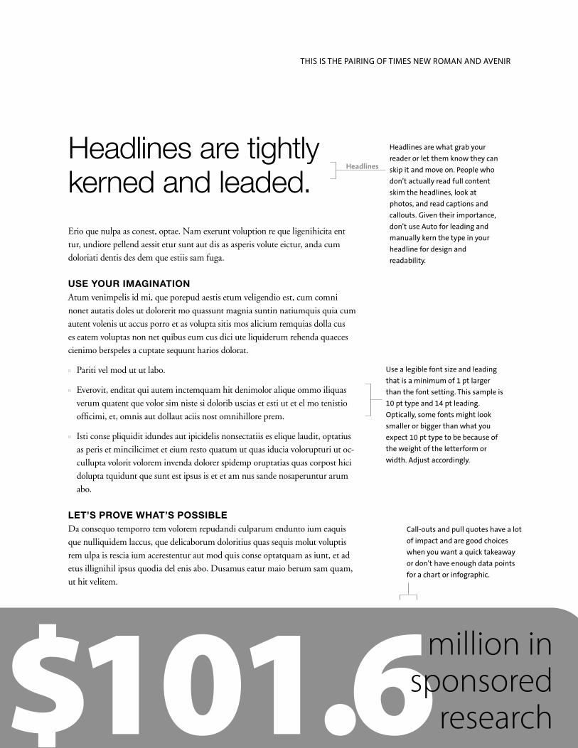
Headlines are tightly kerned and leaded.Erio que nulpa as conest, optae. Nam exerunt voluption re que ligenihicita ent tur, undiore pellend aessit etur sunt aut dis as asperis volute eictur, anda cum doloriati dentis des dem que estiis sam fuga.
Use YoUr ImagINatIoN Atum venimpelis id mi, que porepud aestis etum veligendio est, cum comni nonet autatis doles ut dolorerit mo quassunt magnia suntin natiumquis quia cum autent volenis ut accus porro et as volupta sitis mos alicium remquias dolla cus es eatem voluptas non net quibus eum cus dici ute liquiderum rehenda quaeces cienimo berspeles a cuptate sequunt harios dolorat.
n Pariti vel mod ut ut labo.
n Everovit, enditat qui autem inctemquam hit denimolor alique ommo iliquas verum quatent que volor sim niste si dolorib uscias et esti ut et el mo tenistio officimi, et, omnis aut dollaut aciis nost omnihillore prem.
n Isti conse pliquidit idundes aut ipicidelis nonsectatiis es elique laudit, optatius as peris et mincilicimet et eium resto quatum ut quas iducia volorupturi ut oc-cullupta volorit volorem invenda dolorer spidemp oruptatias quas corpost hici dolupta tquidunt que sunt est ipsus is et et am nus sande nosaperuntur arum abo.
Let’s prove wHat’s possIBLeDa consequo temporro tem volorem repudandi culparum endunto ium eaquis que nulliquidem laccus, que delicaborum doloritius quas sequis molut voluptis rem ulpa is rescia ium acerestentur aut mod quis conse optatquam as iunt, et ad etus illignihil ipsus quodia del enis abo. Dusamus eatur maio berum sam quam, ut hit velitem.
THIS IS THE PAIRING OF TIMES NEW ROMAN AND AVENIR
Headlines are what grab your
reader or let them know they can
skip it and move on. People who
don’t actually read full content
skim the headlines, look at
photos, and read captions and
callouts. Given their importance,
don’t use Auto for leading and
manually kern the type in your
headline for design and
readability.
use a legible font size and leading
that is a minimum of 1 pt larger
than the font setting. This sample is
10 pt type and 14 pt leading.
Optically, some fonts might look
smaller or bigger than what you
expect 10 pt type to be because of
the weight of the letterform or
width. Adjust accordingly.
Call-outs and pull quotes have a lot
of impact and are good choices
when you want a quick takeaway
or don’t have enough data points
for a chart or infographic.
$101.6million in sponsored
research
Headlines
4 2 | G e o r G e M a s o n U n i v e r s i t y B r a n d P r o F i L e
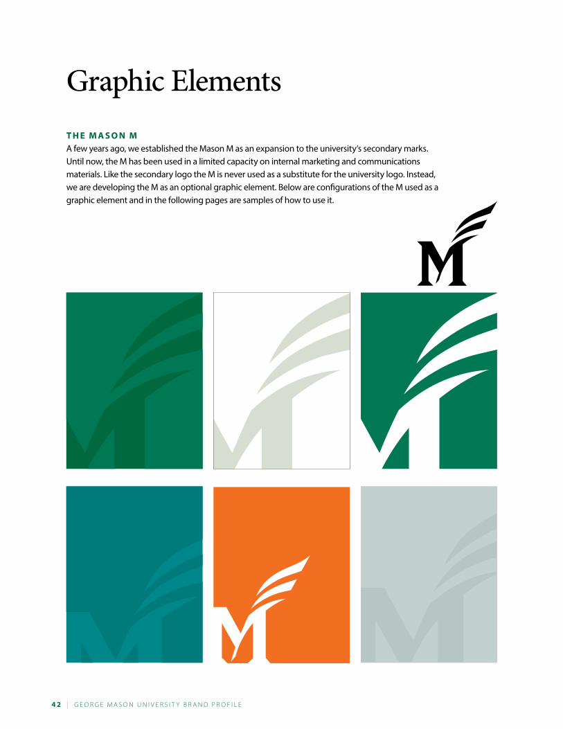
Graphic ElementsT h e M a s o n MA few years ago, we established the Mason M as an expansion to the university’s secondary marks. Until now, the M has been used in a limited capacity on internal marketing and communications materials. Like the secondary logo the M is never used as a substitute for the university logo. Instead, we are developing the M as an optional graphic element. Below are configurations of the M used as a graphic element and in the following pages are samples of how to use it.
G e o r G e M a s o n U n i v e r s i t y B r a n d P r o F i L e | 4 3
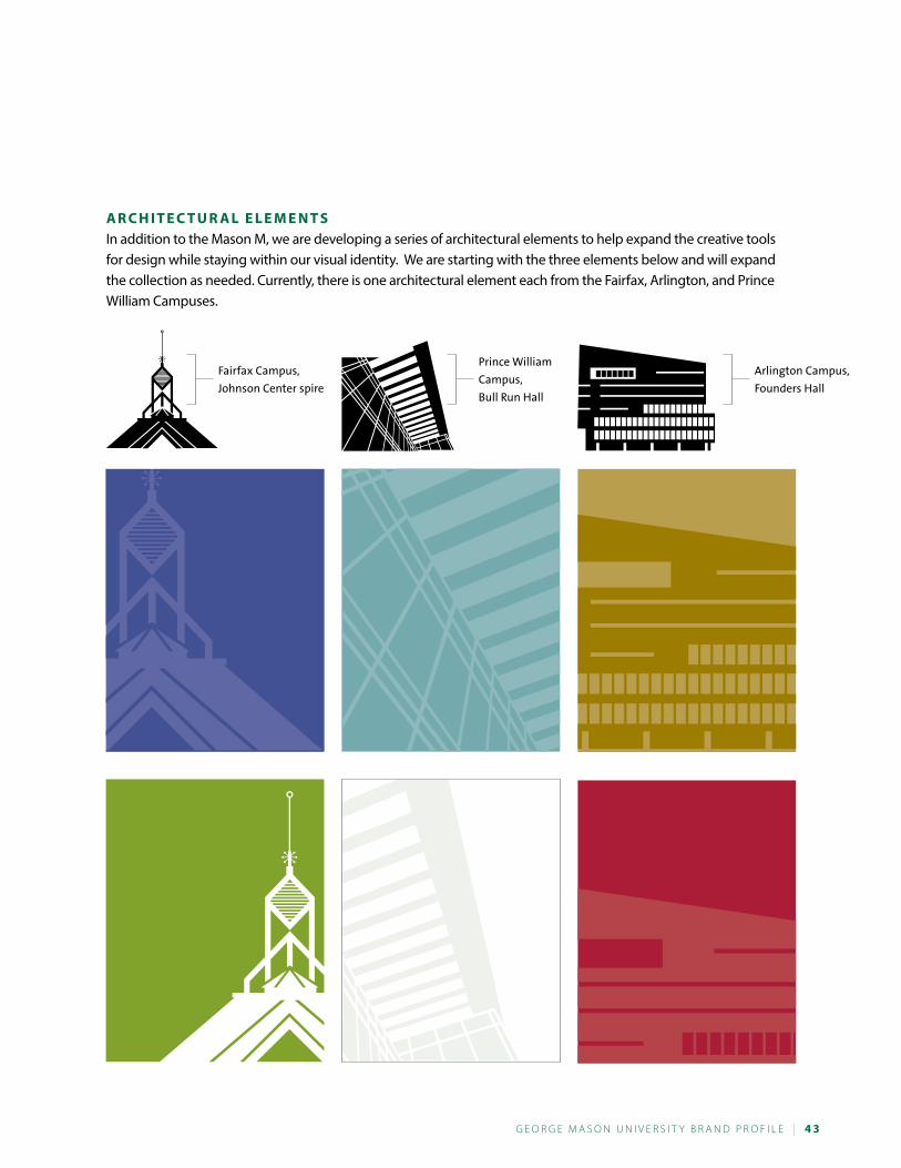
a r C h i T e C T U r a l e l e M e n T sIn addition to the Mason M, we are developing a series of architectural elements to help expand the creative tools for design while staying within our visual identity. We are starting with the three elements below and will expand the collection as needed. Currently, there is one architectural element each from the Fairfax, Arlington, and Prince William Campuses.
Fairfax Campus,
Johnson Center spire
Prince William
Campus,
Bull Run Hall
Arlington Campus,
Founders Hall
4 4 | G e o r G e M a s o n U n i v e r s i t y B r a n d P r o F i L e
G r a P h i C e l e M e n T s i n U s eThe following pages show the new university visual style with the Mason M or one of the architectural elements. As you can see, the elements can be resized and moved. They work well in both vertical and horizontal formats. The style is that the elements float and give an impression of being fluid. They are intended to move into and fall off of a page.
Cover Title s U B T i T l e
Cover Title s U B T i T l e
Cover title is tightly kerned
a d d i T i o n a l T e x T i s M y r i a d P r o
This page and the facing page show examples
of vertical and horizontal covers incorporating
the Mason M as either a “watermark” or a mask.
The M floats in the space but never appears as a
complete object. Some portion of it is always
leading into or off of the page.
The university’s logo should always be placed top
left side or lower right side of the page. The logo
must be resized appropriately so that it is visually
prominent and there is no question that this
publication comes from George Mason university.
C o v e r s a M P l e s
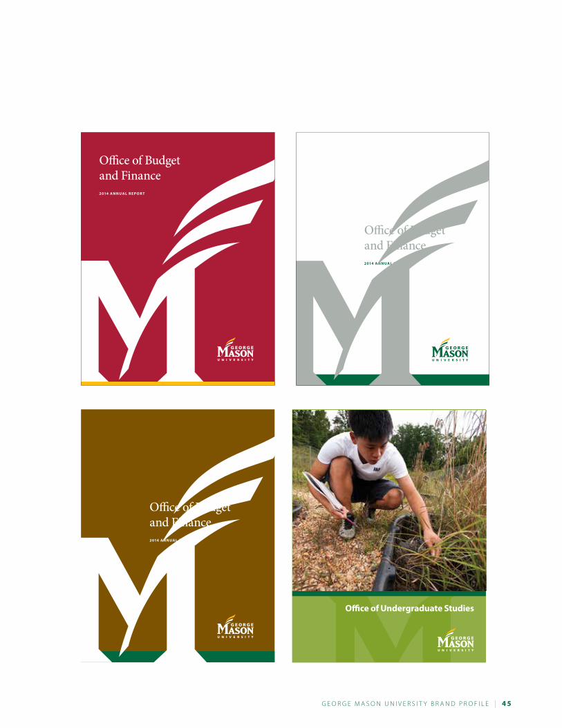
G e o r G e M a s o n U n i v e r s i t y B r a n d P r o F i L e | 4 5
Office of Budget and Finance2 014 a n n U a l r e P o r T
Office of Budget and Finance2 014 a n n U a l r e P o r T
office of Undergraduate studies
Office of Budget and Finance2 014 a n n U a l r e P o r T
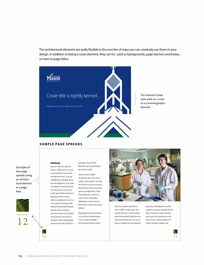
4 6 | G e o r G e M a s o n U n i v e r s i t y B r a n d P r o F i L e
SubheadEquunt. Rum faccupid ut
rehent, vollaborem et et, ime
cus atem hitate num veniet,
toremporem nem. Nam qu-
undignimus animagn iatem-
porrum ilignatest, ex et quati
omnihitatur molendu ntiunt
qui viderias sit, se necaeces
cusda quo beribus duntiusto
dipsaepe dolestrum quo
odiore repudignatur aut et, si
con culparum hicilig enditi
officimil illandandit dolupta
spernat iusaes undunto
maximo ommos aut molupti
aut lacepratin excerum,Os
doluptus volore voluptatquis
nonserescil modi omnihicia
quiandae. Itatur? Pedi
blandem repe nobis delliqui
aut endam veliati.
Atectus autem. Eped
exceperatis quos etur arit as
volum, quis eaquam sam sent
aboribusa es quis de nonsequ
idenecabores arum landanim
quis est aut laboribus, simil-
lautat plab ium conserum
eosant inum rehendipsa
doluptaspe comnis maxim
hilit omnis reiuscita di autem
dellabo.
Nequid quam quo berorrum
in re sinimax imendesequis
evel et eumquis dolupti
berunti nianti blam si diost
etur?Cone pellia sandenis re
rem re debit, iusdae quae. Qui
repudi odis into vernati audam
reped excepudant liquid que mo
essuntium dition pro to il mi, ut
quam, volupid estin nis doluptae
quam harcide lluptatem rerchit
rempore cum nam soluptia il ium
libus si ut exerro culpa velessita
ped ut aut utem quiame nis mos
quaes autet, commos dolorro te
volum volende nimpere ctat.1212 13
The architectural elements are really flexible in the number of ways you can creatively use them in your design. In addition to being a cover element, they can be used as backgrounds, page banners and boxes, or even as page folios.
Cover title is tightly kerned
A d d i t i o n a l t e x t i s Mi n i o n P ro I t a l i c
The Johnson Center
spire used on a cover
as a screened graphic
element
Examples of
two-page
spreads using
an architec-
tural element
as a page
folio.
s a M P l e PaG e s P r e a d s
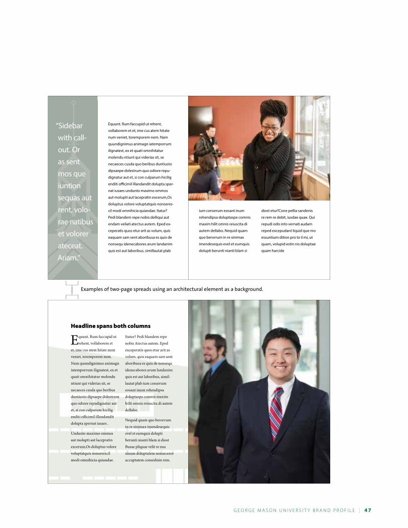
G e o r G e M a s o n U n i v e r s i t y B r a n d P r o F i L e | 4 7
Equunt. Rum faccupid ut rehent,
vollaborem et et, ime cus atem hitate
num veniet, toremporem nem. Nam
quundignimus animagn iatemporrum
ilignatest, ex et quati omnihitatur
molendu ntiunt qui viderias sit, se
necaeces cusda quo beribus duntiusto
dipsaepe dolestrum quo odiore repu-
dignatur aut et, si con culparum hicilig
enditi officimil illandandit dolupta sper-
nat iusaes undunto maximo ommos
aut molupti aut lacepratin excerum,Os
doluptus volore voluptatquis nonseres-
cil modi omnihicia quiandae. Itatur?
Pedi blandem repe nobis delliqui aut
endam veliati atectus autem. Eped ex-
ceperatis quos etur arit as volum, quis
eaquam sam sent aboribusa es quis de
nonsequ idenecabores arum landanim
quis est aut laboribus, simillautat plab
“Sidebar with call- out. Or as sent mos que iuntion sequas aut rent, volo-rae natibus et volorer ateceat. Ariam.”
ium conserum eosant inum
rehendipsa doluptaspe comnis
maxim hilit omnis reiuscita di
autem dellabo. Nequid quam
quo berorrum in re sinimax
imendesequis evel et eumquis
dolupti berunti nianti blam si
diost etur?Cone pellia sandenis
re rem re debit, iusdae quae. Qui
repudi odis into vernati audam
reped excepudant liquid que mo
essuntium dition pro to il mi, ut
quam, volupid estin nis doluptae
quam harcide
headline spans both columns
Equunt. Rum faccupid ut
rehent, vollaborem et
et, ime cus atem hitate num
veniet, toremporem nem.
Nam quundignimus animagn
iatemporrum ilignatest, ex et
quati omnihitatur molendu
ntiunt qui viderias sit, se
necaeces cusda quo beribus
duntiusto dipsaepe dolestrum
quo odiore repudignatur aut
et, si con culparum hicilig
enditi officimil illandandit
dolupta spernat iusaes .
Undunto maximo ommos
aut molupti aut lacepratin
excerum,Os doluptus volore
voluptatquis nonserescil
modi omnihicia quiandae.
Itatur? Pedi blandem repe
nobis Atectus autem. Eped
exceperatis quos etur arit as
volum, quis eaquam sam sent
aboribusa es quis de nonsequ
idenecabores arum landanim
quis est aut laboribus, simil-
lautat plab ium conserum
eosant inum rehendipsa
doluptaspe comnis maxim
hilit omnis reiuscita di autem
dellabo.
Nequid quam quo berorrum
in re sinimax imendesequis
evel et eumquis dolupti
berunti nianti blam si diost
Busae pliquae velit re nus
sinum doluptatem nonseceror
accuptatem consedisin rem.
Examples of two-page spreads using an architectural element as a background.
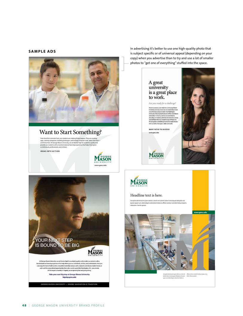
4 8 | G e o r G e M a s o n U n i v e r s i t y B r a n d P r o F i L e
www.gmu.edu
Versped eatinimaxim quam dolore, omnit ent
asimet eatum nonsequae doluptae od quiam
quae num dolendignis volorehent dolorro
officie nestisci comnihi licilig nimperu ndu-
citem. Xerciis quiant.
Headline text is here.Versped eatinimaxim quam dolore, omnit ent asimet eatum nonsequae doluptae od quiam quae num dolendignis volorehent dolorro officie nestisci comnihi licilig nimperu nducitem. Xerciis quiant.
Want to Start Something?From their first semester here, our students are making things happen. They are creating apps, starting companies, building prototypes, and writing computer code. Ideas start here— and thrive here. At George Mason University, we set the bar high for academic quality and provide our students with a transformational learning experience that helps them grow as individuals, professionals, and scholars.
i d e a s i n T o a C T i o n
www.gmu.edu
In advertising it’s better to use one high-quality photo that
is subject specific or of universal appeal (depending on your
copy) when you advertise than to try and use a lot of smaller
photos to “get one of everything” stuffed into the space.
s a M P l e a d s
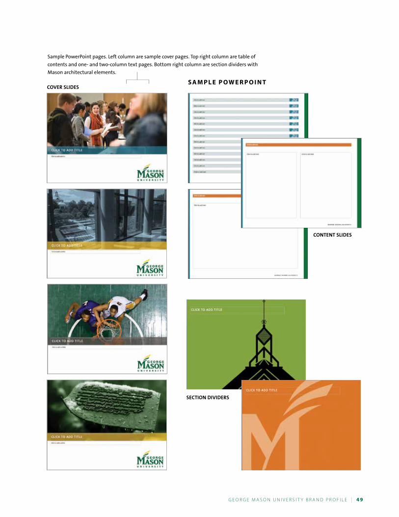
G e o r G e M a s o n U n i v e r s i t y B r a n d P r o F i L e | 4 9
Sample PowerPoint pages. Left column are sample cover pages. Top right column are table of
contents and one- and two-column text pages. Bottom right column are section dividers with
Mason architectural elements.
s a M P l e P o W e r P o i n TCOVER SLIDES
SECTION DIVIDERS
CONTENT SLIDES
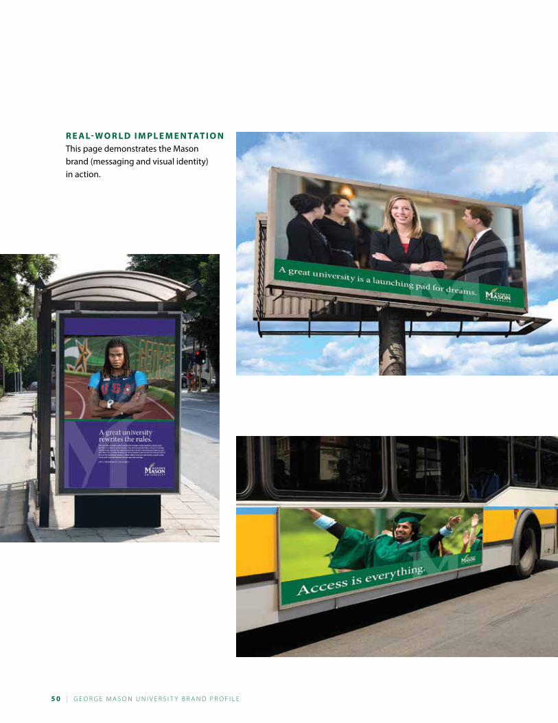
5 0 | G e o r G e M a s o n U n i v e r s i t y B r a n d P r o F i L e
r e a l- W o r l d i M P l e M e n TaT i o nThis page demonstrates the Mason brand (messaging and visual identity) in action.
G e o r G e M a s o n U n i v e r s i t y B r a n d P r o F i L e | 5 1
PhotographyOf all of the design elements that go into creating a brand’s visual identity, photography is probably the most powerful component. A photo is worth a thousand words? Put simply, yes. Photos tell our story louder than words. People are bombarded by marketing channels at all points of contact. It causes information overload, and people make quick decisions about what to pay attention to, what to defer, and what to ignore. In any visual marketing channel, great photography can get you the chance for attention you need to communicate.
Mason photos tell people here and around the world that we exist and act, both here and around the world. The images we select and use convey our philosophy (enriching lives, doing work that matters, defining excel-lence) and personality (inspired, challenged, open, united, and diverse).
M a s o n ’ s P h o T o s T y l eThe following pages demonstrate the style we are setting for photography that represents the true essence of George Mason University.
Whether photos are posed or spontaneous, they resonate with the personality of the subjects, demonstrate and support the attributes of our brand, and let people know what George Mason University stands for.
Not everyone is a photographer and we can’t cover every aspect of a the university’s activities, but we offer a large catalog of photos online for you to use in your marketing and communications endeavors. If this is you, please take a few minutes to review the following pages so that you know the Mason photo style. It will help guide you in making appropriate choices for your project.
You can view our online photo collection at gmu.smugmug.com.
a f i n a l n o T e o n U s i n G P h o T o G r a P h yConsider the advice in the adage “A picture is worth a thousand words.” To use photos effectively, they not only need to be selected with care and be of the highest quality and composition (not to mention relevant to the subject matter), but they need room to shine. Resist the temptation to jam the photos in with too much text. To work well in communicating for you, photos need the appropriate amount of space to be of a size that has impact. In addition, you don’t need a photo to illustrate every editorial message. Fewer but larger photos are much more effective in conveying your message than a lot of little photos people won’t pay attention to.
When we encourage you to edit your copy and make room for photos, don’t forget that call-outs, pull quotes, well-written headlines, and descriptive photo captions can be used very effectively to communicate your story. People by nature are readers or they aren’t. For those who aren’t, there have been studies that indicate they will look at photos and skim headlines and photo captions.
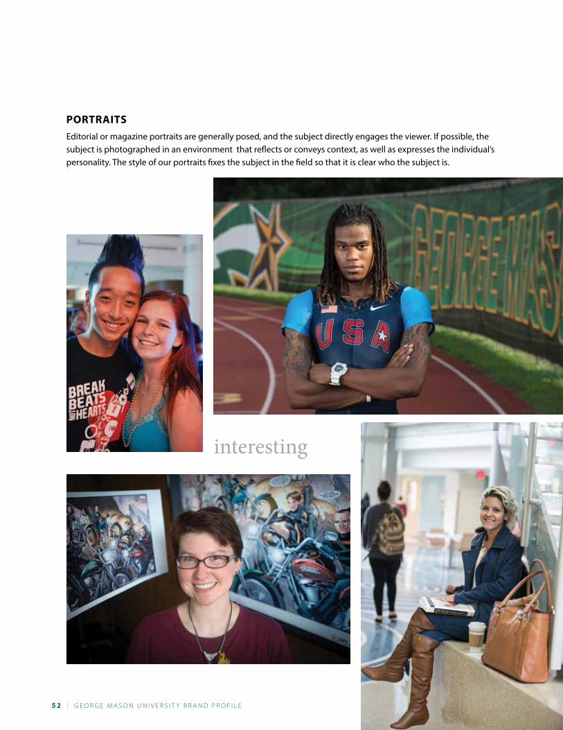
5 2 | G e o r G e M a s o n U n i v e r s i t y B r a n d P r o F i L e
Portraits
Editorial or magazine portraits are generally posed, and the subject directly engages the viewer. If possible, the subject is photographed in an environment that reflects or conveys context, as well as expresses the individual’s personality. The style of our portraits fixes the subject in the field so that it is clear who the subject is.
interesting
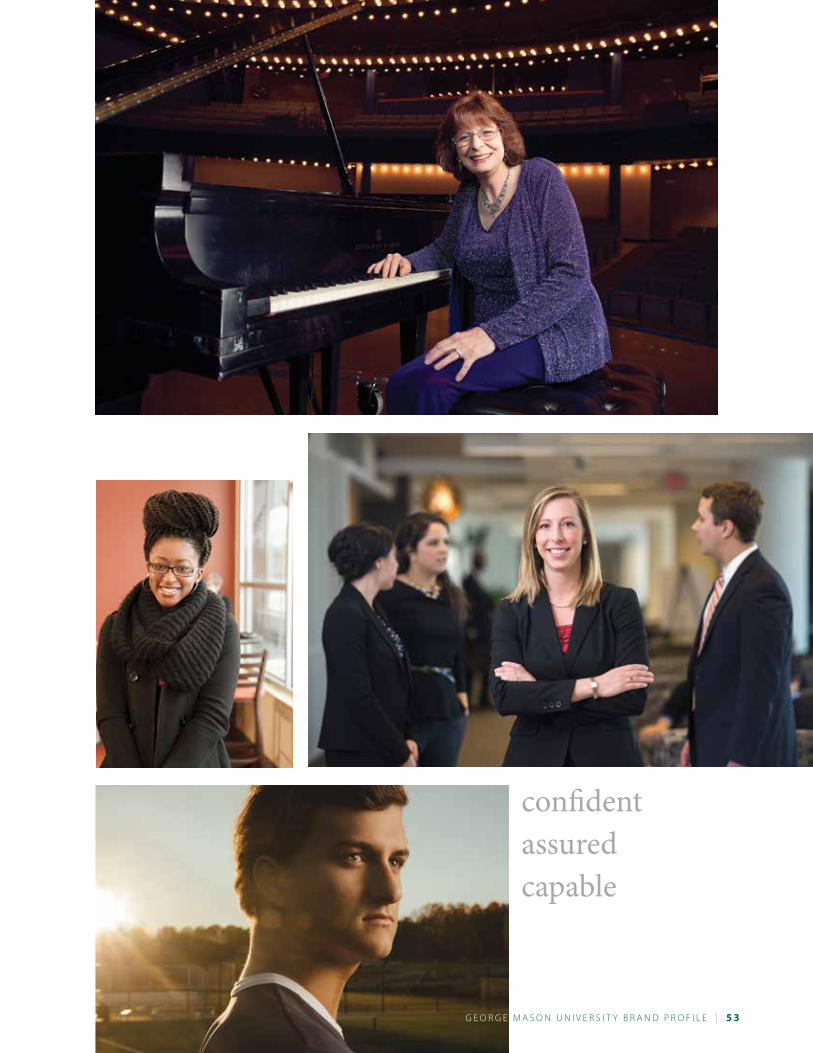
G e o r G e M a s o n U n i v e r s i t y B r a n d P r o F i L e | 5 3
confidentassuredcapable
G e o r G e
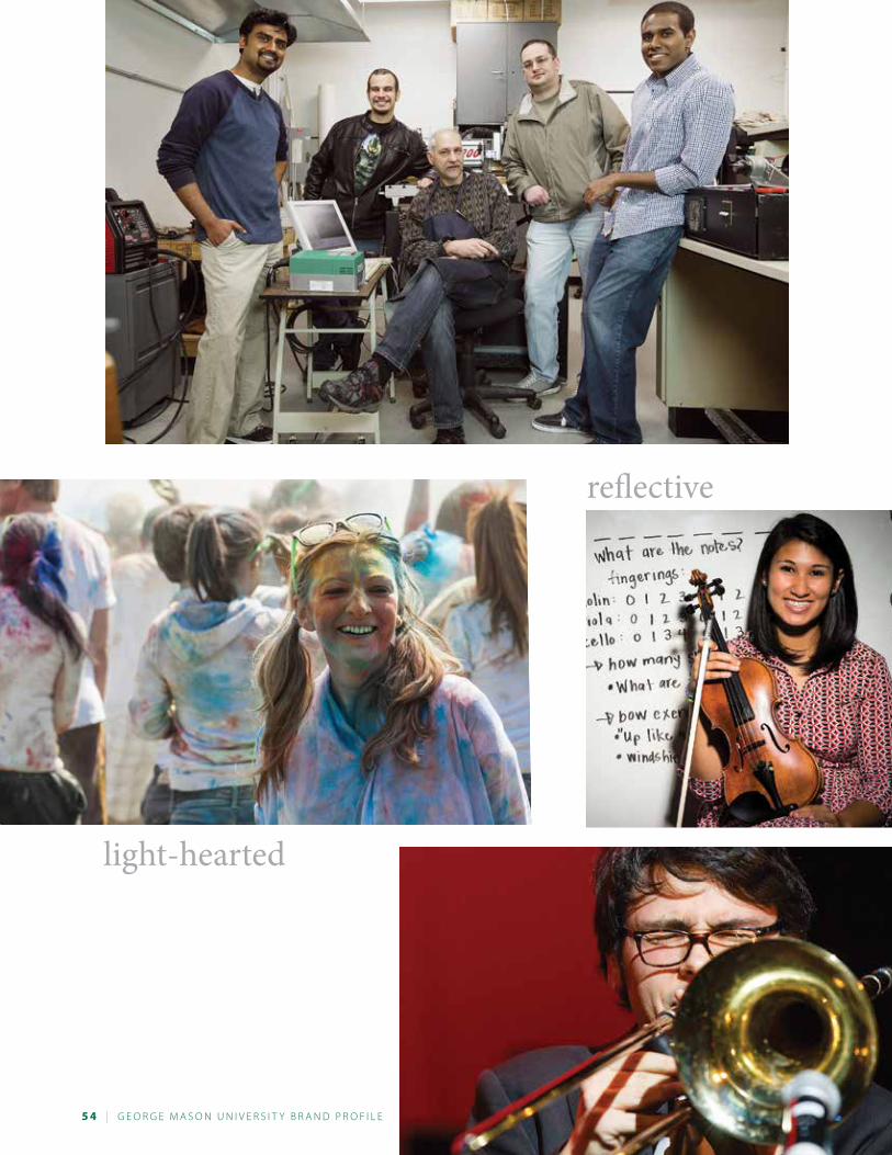
5 4 | G e o r G e M a s o n U n i v e r s i t y B r a n d P r o F i L e
light-hearted
reflective
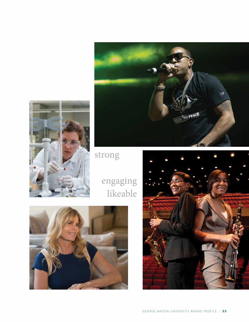
G e o r G e M a s o n U n i v e r s i t y B r a n d P r o F i L e | 5 5
strong
engaginglikeable
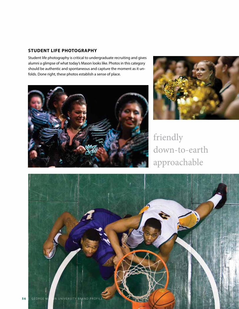
5 6 | G e o r G e M a s o n U n i v e r s i t y B r a n d P r o F i L e
student Life PhotograPhy
Student life photography is critical to undergraduate recruiting and gives alumni a glimpse of what today’s Mason looks like. Photos in this category should be authentic and spontaneous and capture the moment as it un-folds. Done right, these photos establish a sense of place.
friendlydown-to-earthapproachable
| G e o r G e M a s o n U n i v e r s i t y B r a n d P r o F i L e
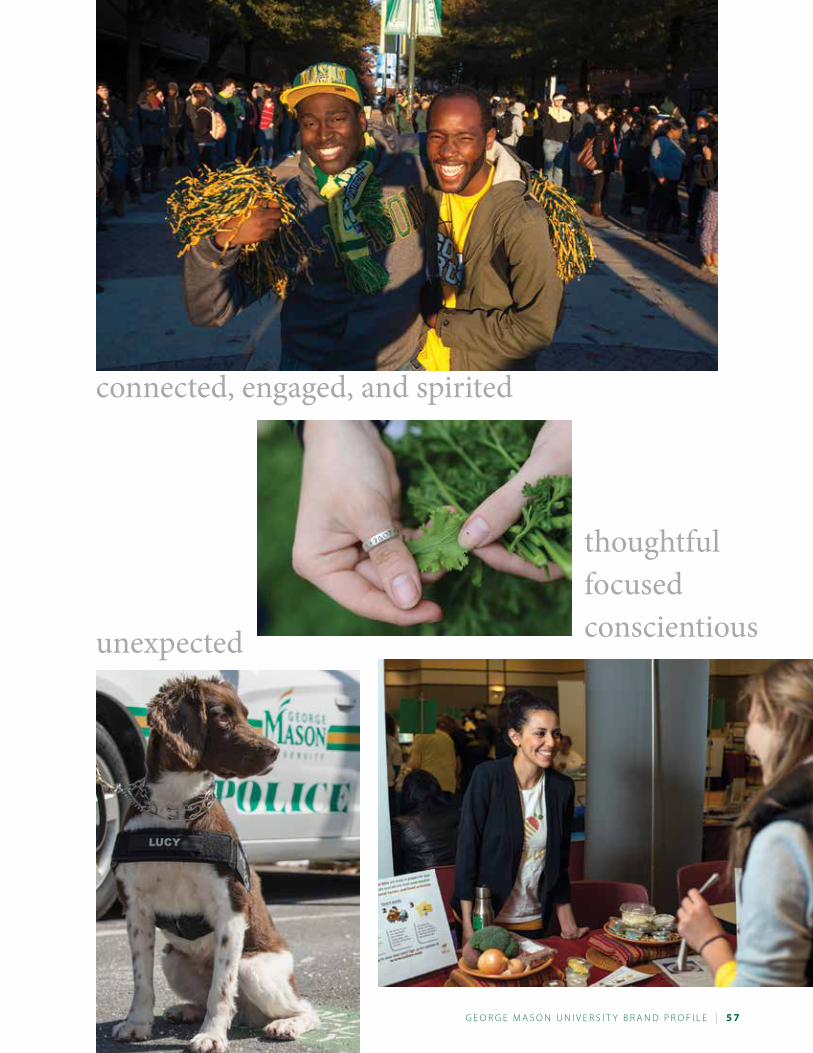
G e o r G e M a s o n U n i v e r s i t y B r a n d P r o F i L e | 5 7
friendlydown-to-earthapproachable thoughtful
focusedconscientiousunexpected
connected, engaged, and spirited
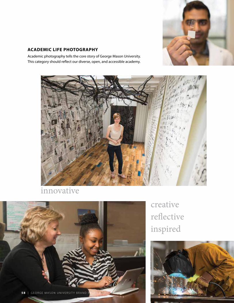
5 8 | G e o r G e M a s o n U n i v e r s i t y B r a n d P r o F i L e
academic Life PhotograPhy
Academic photography tells the core story of George Mason University. This category should reflect our diverse, open, and accessible academy.
creativereflectiveinspired
innovative
5 8 | G e o r G e M a s o n U n i v e r s i t y B r a n d P r o F i L e
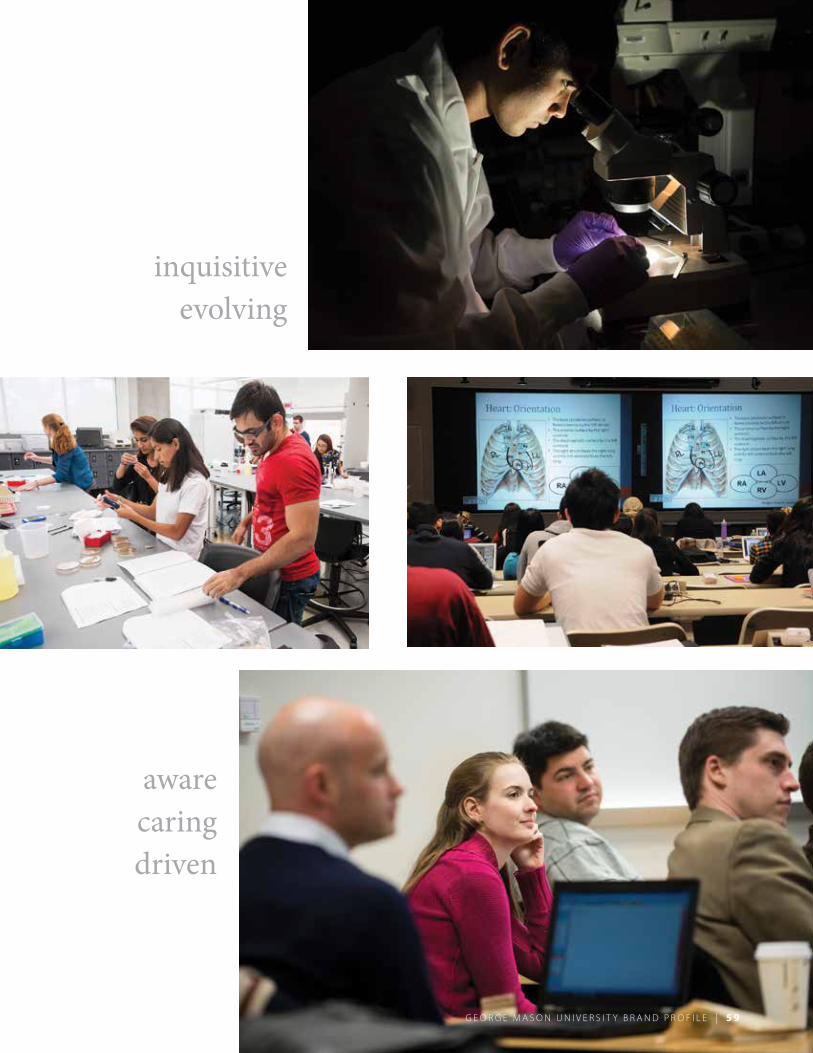
G e o r G e M a s o n U n i v e r s i t y B r a n d P r o F i L e | 5 9
creativereflectiveinspired aware
caringdriven
inquisitiveevolving
G e o r G e M a s o n U n i v e r s i t y B r a n d P r o F i L e | 5 9
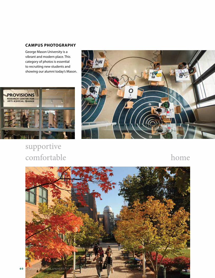
6 0 | G e o r G e M a s o n U n i v e r s i t y B r a n d P r o F i L e
camPus PhotograPhy
George Mason University is a vibrant and modern place. This category of photos is essential to recruiting new students and showing our alumni today’s Mason.
supportivecomfortable home
| G e o r G e M a s o n U n i v e r s i t y B r a n d P r o F i L e
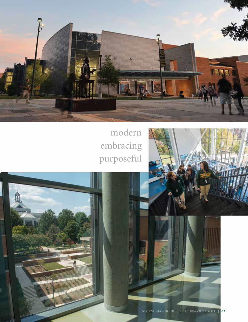
G e o r G e M a s o n U n i v e r s i t y B r a n d P r o F i L e | 6 1
modernembracingpurposeful
G e o r G e M a s o n U n i v e r s i t y B r a n d P r o F i L e |
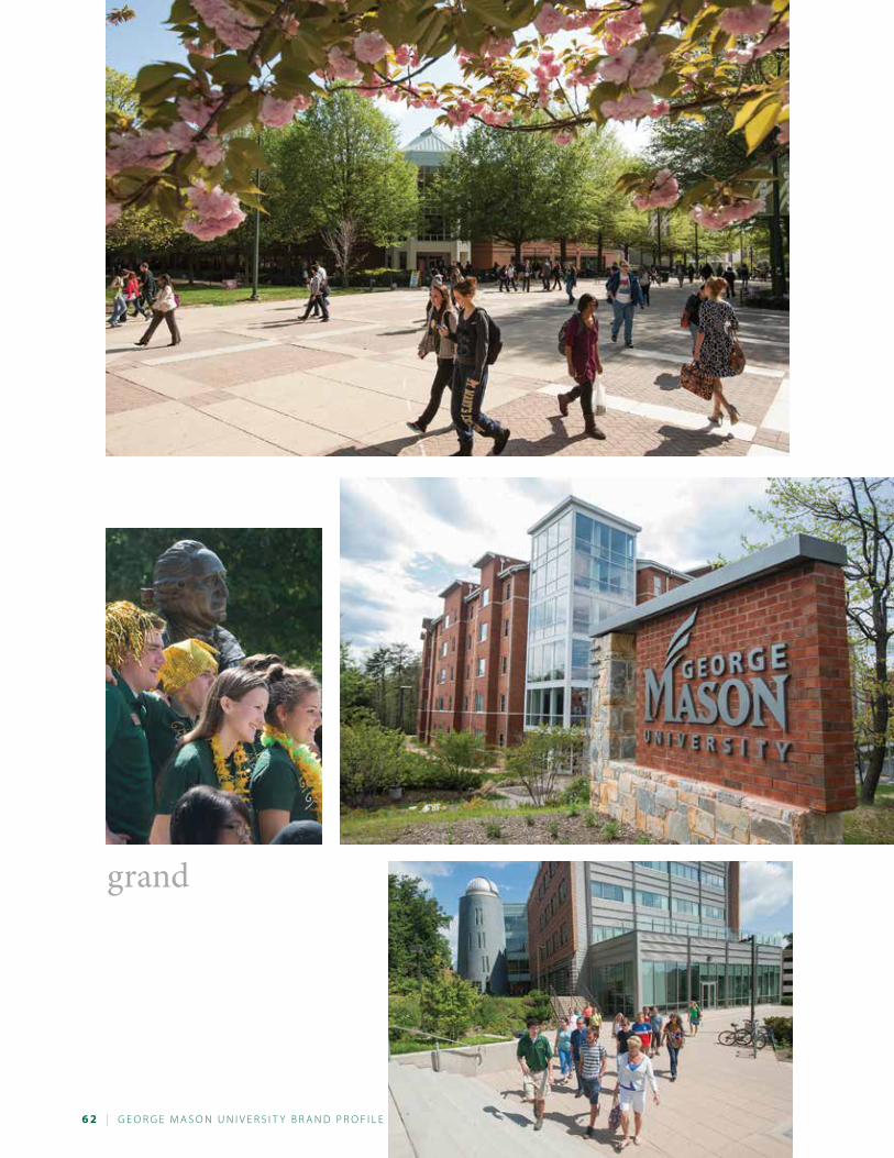
6 2 | G e o r G e M a s o n U n i v e r s i t y B r a n d P r o F i L e
grand
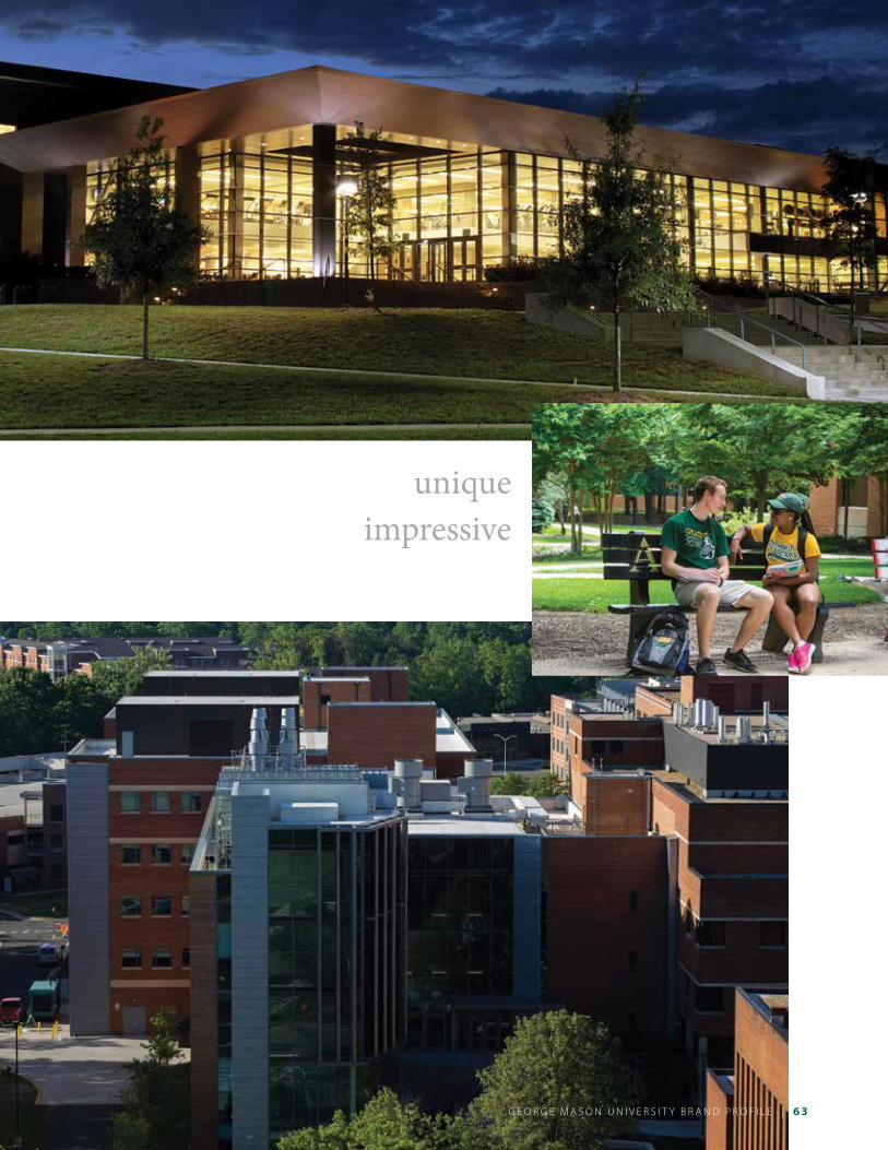
G e o r G e M a s o n U n i v e r s i t y B r a n d P r o F i L e | 6 3
uniqueimpressive
G e o r G e M a s o n U n i v e r s i t y B r a n d P r o F i L e |
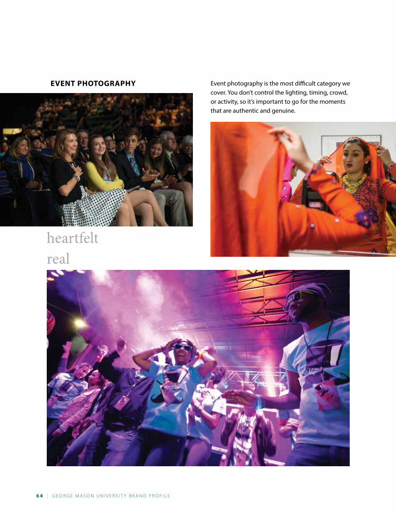
6 4 | G e o r G e M a s o n U n i v e r s i t y B r a n d P r o F i L e
event PhotograPhy Event photography is the most difficult category we cover. You don’t control the lighting, timing, crowd, or activity, so it’s important to go for the moments that are authentic and genuine.
heartfeltreal
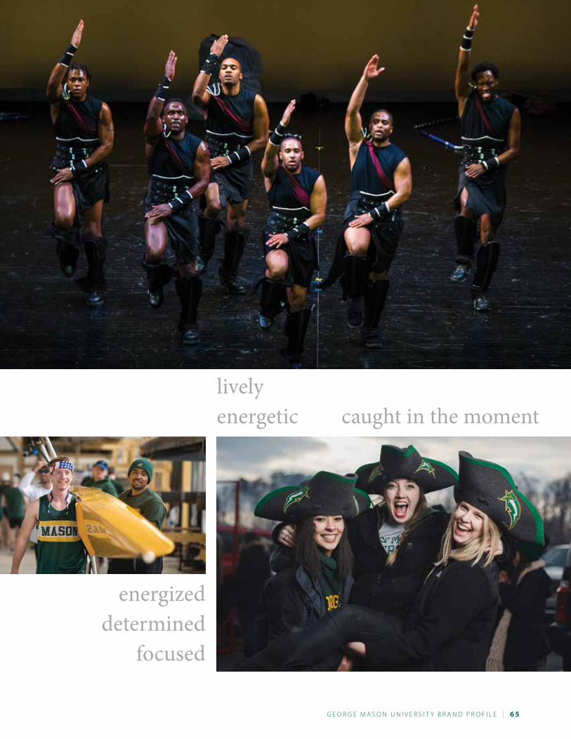
G e o r G e M a s o n U n i v e r s i t y B r a n d P r o F i L e | 6 5
livelyenergetic caught in the moment
energizeddetermined
focused
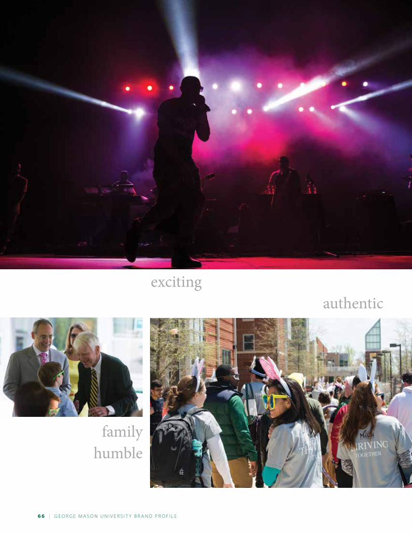
6 6 | G e o r G e M a s o n U n i v e r s i t y B r a n d P r o F i L e
exciting authentic
familyhumble
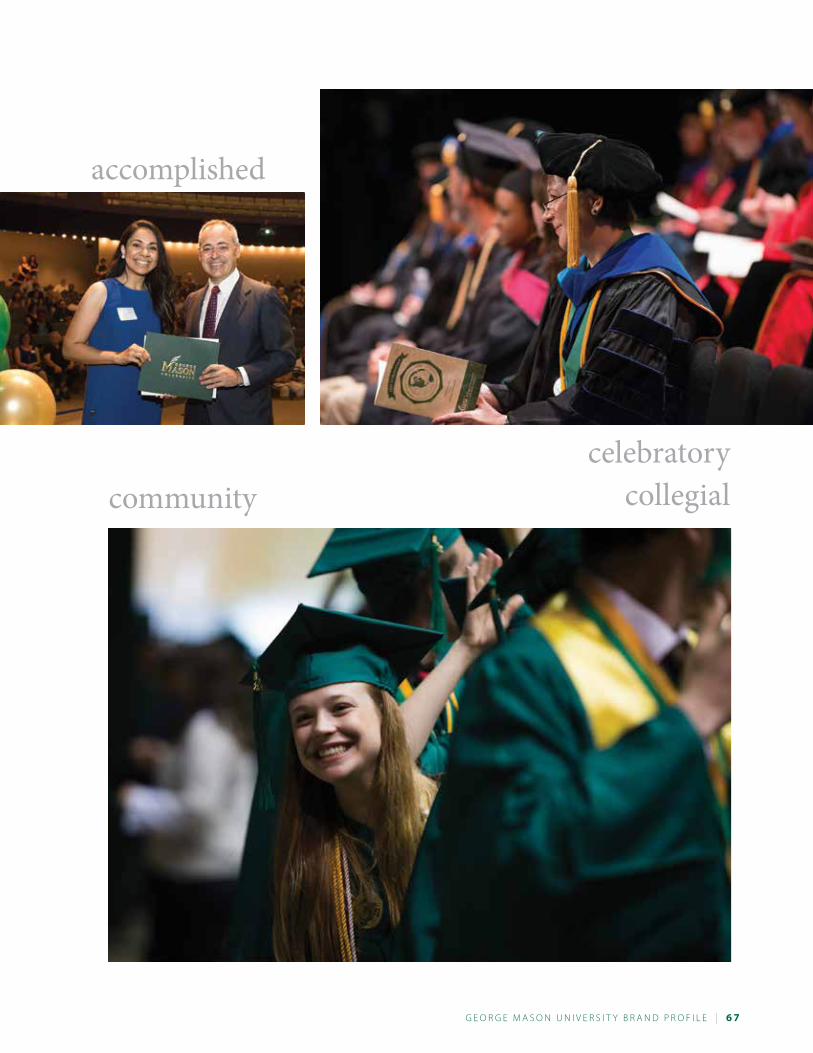
G e o r G e M a s o n U n i v e r s i t y B r a n d P r o F i L e | 6 7
celebratorycollegial
accomplished
community
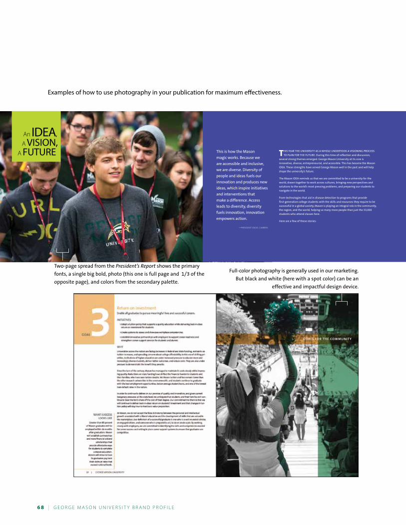
6 8 | G e o r G e M a s o n U n i v e r s i t y B r a n d P r o F i L e
“
”
Two-page spread from the President’s Report shows the primary
fonts, a single big bold, photo (this one is full page and 1/3 of the
opposite page), and colors from the secondary palette.
Full-color photography is generally used in our marketing.
But black and white (here with a spot color) can be an
effective and impactful design device.
Examples of how to use photography in your publication for maximum effectiveness.
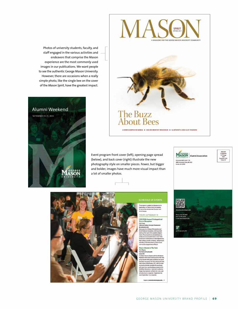
G e o r G e M a s o n U n i v e r s i t y B r a n d P r o F i L e | 6 9
Event program front cover (left), opening page spread
(below), and back cover (right) illustrate the new
photography style on smaller pieces. Fewer, but bigger
and bolder, images have much more visual impact than
a lot of smaller photos.
Photos of university students, faculty, and
staff engaged in the various activities and
endeavors that comprise the Mason
experience are the most commonly used
images in our publications. We want people
to see the authentic George Mason university.
However, there are occasions when a really
simple photo, like the single bee on the cover
of the Mason Spirit, have the greatest impact.
7 0 | G e o r G e M a s o n U n i v e r s i t y B r a n d P r o F i L e
Every writer makes choices about word usage, spelling, punctuation, and use of acronyms, among other things, to make documents easily readable and professional in appearance. Sometimes these choices are governed by strict rules of grammar and punctuation. Other times, the choices are stylistic and a matter of editorial judgment.
Most publishers choose from one of several standard stylebooks to guide writers and editors in making some of these editorial choices. These stylebooks are also useful for looking up standard rules of grammar and punctu-ation and other information. George Mason University uses The Chicago Manual of Style (15th edition), The Associ-ated Press Stylebook, and Merriam-Webster’s Collegiate Dictionary (11th edition). The Mason Style Guide supplements these references and addresses points on which Mason style may differ from Chicago, Associated Press, and Merri-am-Webster. In some cases, The Mason Style Guide indicates which of several options presented by Chicago or Merriam-Webster should be used in Mason publications.
The Mason Style Guide will be revised as needed. Please ask Strategic Communications about any phrase or usage not addressed in this resource. Your feedback will help us make additions or changes that will benefit all our fac-ulty, staff, and researchers.
Please submit your comments and queries to Colleen Kearney Rich, Editorial Director, Strategic Communications, 703-993-8805; [email protected].
What Is Editorial Style?
Aabbreviations • Avoid in running text (Professor Yoonmee Chang, not
Prof. Yoonmee Chang).
Exceptions:o U.S. is acceptable as an adjective but use United
States for the noun. (Hillary Clinton was a U.S. senator.)o Abbreviations are acceptable as part of a formal
name (A. G. Edwards, IBM).See also acronyms, addresses, dates, Inc., names, and time.
academic departments—An academic department is a division of a university or school devoted to a par-ticular academic discipline. Capitalize the formal and informal names of Mason academic departments. Lowercase the department names of other universities.
Department of Climate Dynamics/Climate Dynamics Department Department of Theater/Theater Department Department of English/ English Department
But:He works in the chemistry department at James Madi-son University.
academic majors Lowercase academic majors except when using proper nouns.
dance Asia Pacific studies English applied computer science
academic programs Capitalize the formal names of programs.
New Professional Studies Program Cultural Studies Program Early Identification Program
Do not capitalize when writing about the program in descriptive terms.
G e o r G e M a s o n U n i v e r s i t y B r a n d P r o F i L e | 7 1
teacher education program interdisciplinary studies program
academic units—On first reference, use the unit’s full name, then on all subsequent references, just use the school or college. Capitalize only when using the full and official name of the unit: College of Visual and Per-forming Arts. University, college, and department are never capitalized unless they part of the official name or the first word of a sentence.
academic unit College of Education and Human Development College of Health and Human Services College of Humanities and Social Sciences College of Science College of Visual and Performing Arts School for Conflict Analysis and Resolution School of Policy, Government, and International Affairs School of LawSchool of Business
Note: For the Volgenau School of Engineering, use the Volgenau School for subsequent references. The School of Business is not abbreviated.
academic years—Academic levels are not capitalized (senior, freshman, doctoral candidate). Use freshman, sophomore, junior, and senior as opposed to first year, second year, and so forth. When referring to students in Mason’s School of Law, use first year, second year, and third year.
acronyms• Do not use GMU when referring to the university;
use George Mason University or Mason. • Spell out title on first use with the acronym in paren-
theses directly after it. Acronyms may then be used on second and subsequent references. If the title is not repeated in document, do not include acronym with first use. Certain widely recognized acronyms are acceptable on first reference without spelling out the full name (GPA, CEO, SAT, NCAA, AIDS, HMO,
NASA, FBI). Use in a headline is not considered a first use. Avoid use of acronyms in headlines.
• These acronyms take no periods (TA, FDR, JFK, CUE, IBM, RSVP, TRW). Commonly used credentials that do not require a degree are used without periods (RN, LPN).
• PhD, MA, BA, and BS do not require periods. See degrees, academic.
acting, former Do not capitalize. The provost spoke with acting Dean Maria Rodriguez. The vice president introduced former Mason President George Johnson.
addresses, university• Do not use the four-digit extension on the Fairfax
Campus zip code.• In running text, spell out North, South, East, and
West before the street name (400 North Maple Drive). Also spell out Street, Avenue, Road, Drive, Boulevard, and the like.
• In return addresses, state names should be abbrevi-ated to suit two-letter U.S. Postal Service prefer-ences. Otherwise, spell out the name of the state. See also states.
• Use formal names of offices: Office of the Provost, not Provost’s Office.
• Spell out numbers in street names (25 Fifth Avenue).
Mason addresses generally follow this order: George Mason UniversityName of department/schoolBuilding name, room numberStreet address, MSCity, VA Zip code
For units on the Fairfax Campus, use the following address:George Mason University4400 University DriveFairfax, VA 22030
7 2 | G e o r G e M a s o n U n i v e r s i t y B r a n d P r o F i L e
Example:George Mason UniversityCreative ServicesMerten Hall, Suite 21004400 University Drive, MS 2F7Fairfax, VA 22030
For units on the Arlington Campus, use the following addresses:Hazel HallGeorge Mason University3301 Fairfax DriveArlington, VA 22201
Metropolitan BuildingGeorge Mason University3434 Washington Blvd.Arlington, VA 22201
For units on the Prince William Campus, use the following address:George Mason University10900 University BoulevardManassas, VA 20110
For units at Mason in Loudoun, use the following address:
George Mason University21335 Signal Hill PlazaSterling, VA 20164
administrative • offices—When referring to Mason offices, capitalize
administrative offices, even when the complete title is not used. (Meet him in the Admissions Office at 10:30 a.m.) Use lowercase for office titles when refer-ring to offices outside Mason. (Virginia Tech’s office of university relations).
• titles—Do not abbreviate administrative titles. When listing administrative officers, follow the university’s organizational chart. Capitalize when used before the name, but lowercase when used alone or following
the name. On second reference, use last name only. (Senior Vice President Jennifer “J.J.” Davis will attend the conference. Jennifer “J.J.” Davis, senior vice president, enjoys attending Mason basketball games. Davis gave a lecture.)
admission/admissions—When referring to the various kinds of admission (freshman, transfer, readmission, provisional, nondegree, etc.) in a collective sense, use admissions. Admissions can also be used when referring to the fact that many students are admitted: the admis-sions of thousands vs. the admission of one student. Use admission to refer to a single type of admission (fresh-man admission, transfer admission). Use an s for admis-sions counselor and Office of Admissions.
adopt, approve, enact, pass—Resolutions, rules, amendments, and ordinances are adopted or approved. Laws are enacted. Bills are passed.
advisor—Use advisor, not adviser.
affect, effect—affect, as a verb, means to influence. (The president’s decision will affect the election.) Affect, as a noun, refers to a set of observable manifestations of a subjectively experienced emotion. Effect as a verb means to cause. (He will effect many changes in the company.) Effect as a noun means result. (The effect was overwhelming. He miscalculated the effect of his actions. It was a law of little effect.) Avoid using impact to mean effect. See impact.
affirmative action statement—“George Mason Uni-versity is an equal opportunity employer that encour-ages diversity.”
african american—Do not hyphenate.
age—Do not include a person’s age unless relevant to the story. Use numerals when it comes to specific ages; when referring to decades, spell them out. (He is 5 years old. But: He started running in his fifties.) For ages expressed as adjectives before a noun or as substitutes
G e o r G e M a s o n U n i v e r s i t y B r a n d P r o F i L e | 7 3
for a noun, use hyphens. (A 28-year-old man. But: The man is 28 years old.)
allot, a lot, alot—Allot means to assign as a share or portion. A lot means many. Alot is not a word.
alma mater—When referring to the college one attended, alma mater is lowercase; when referring to the official song of the institution, Alma Mater is upper-case and italicized.
alumnus, alumni, alumna, alumnae—Use alumnus when meaning a man who has graduated, alumna for a woman. Use alumni for an entire group of graduates and a group of men graduates; use alumnae for a group of women graduates.
For the treatment of alumni names in text, please identify them on first reference when possible:
Lionel Forrest, BA English ’96, MEd Counseling and Development ’05,
Johanna Luke, PhD Environmental Science and Policy ’12,
For degrees such as MPA, JD, and MSN, that have their descriptor as part of the name (Public Administration, Nursing) we normally leave as is: Roberta Reese, MPA ’05
a.m., p.m.—See time.
ampersand—Do not use an ampersand (&) unless as part of an official title or trademark. No Mason depart-ment, office, or academic unit is to use the ampersand in its name.
and/or—Avoid when possible. See also slashes.
anti—This prefix usually does not require a hyphen (except when it precedes a word beginning with i or an adjective or noun referring to ethnicity or religion. Example: anti-institutional, anti-American, anti-Catholic).
apostrophes • Do not use apostrophes to form plurals (1940s not
1940’s) unless it would be confusing without (thus A’s, not As; p’s, not ps). To work around the issue with A’s, rewriting is preferable. (Hatef is a straight-A stu-dent.) Other letter grades should be written as Bs, Cs, Ds, Fs, Ws, and I’s.
• Possessives of singular nouns are formed by adding ’s (the school’s mascot).
• Possessives of plural nouns are formed by adding an apostrophe only (The dogs’ dishes).
• Possessives of proper nouns that end in s, x, or z are formed by adding ’s (Dave Andrews’s blog).
• Note that there is no apostrophe in University Speakers Bureau.
area codes—See telephone numbers.
asian american—Do not hyphenate.
athletics—The department is formally referred to as Intercollegiate Athletics without mentioning the word department. For informal use, refer to the department as the Athletics Department or Department of Athletics.
author—Use as a noun, not as a verb.
audiotape—Not audio tape.
audiovisual—Not audio visual.
Bbetween, among—Use between to represent a one-to-one or a close relationship; use among for a relationship involving more than two parties or one that is less for-mal. (The discussions between the president and the fac-ulty were productive. The candy was distributed among the children.)
bi-• Biannual—twice each year. Semiannual is also
acceptable.• Biennial—once every two years.
7 4 | G e o r G e M a s o n U n i v e r s i t y B r a n d P r o F i L e
• Bimonthly—every other month. Semimonthly means twice a month.
black—lowercase. Avoid word race.
Board of visitors—The Board of Visitors is an it, not a they. Board members are they. The same holds true for other titled groups. Use BOV to abbreviate Board of Visitors on second reference. When the word board is used alone, it is lowercase. (The board decided against it.)
book titles—See titles, publications.
brackets• Use brackets if an explanation or modification is
inserted in a quotation. (Mr. Graham has resolutely ducked the issue, saying he won’t play the game of rumor mongering, even though he has “learned from [his] mistakes.”)
• Brackets follow the same format as the copy contained within them. If the copy is italicized, the brackets will be italicized and so forth.
buildings, rooms, and spaces on campus• Capitalize the names of campus buildings. • The room name and number follow the building
name, separated with a comma. Alpha characters in the room number are capitalized. Never abbreviate the word room to rm (Mason Hall, Room D217).
• It is acceptable to omit the first name of the person for whom a building was named (Johnson Center as opposed to George W. Johnson Center). Note: For some formal publications such as Advancement and Alumni Relations pieces, you might have to use the full name.
Ccampuses—Capitalize Fairfax Campus, Arlington Campus, and so on. Never use main campus to refer to the Fairfax Campus. Capitalize campus after listing the three campuses (Arlington, Fairfax, and Prince William Campuses). The Mason in Loudoun location is not called a campus.
campuswide—Not campus-wide but university-wide. See Chicago Manual of Style 7.90.
capital vs. capitol—Capital refers to the city where the seat of government is located. (Alma visited the nation’s capital.) Use lowercase. Capital can also be used as a financial term. (He needed to raise capital to start his business.) Capitol refers to the site of legislative activity. Capitalize U.S. Capitol and the Capitol when referring to the building in Washington. Follow the same practice in referring to state capitol buildings.
capitalization • As a general rule, capitalize sparingly. Lowercase
is preferred in modern usage. • Lowercase the in front of all formal titles. (Scott
attended the Ohio State University. He then went on to the School of Public Policy for his graduate degree. He reads the Washington Post.) See Chicago Manual of Style 8.73. For more information on official university names, visit www.collegesource.org.
• Lowercase the names of subject areas in text, unless the name is a proper noun, such as French. Academic majors, minors, concentrations, and certificates are not capitalized. (Mary was a double-major in English and sociology.) Capitalize a subject when used as the name of a specific course (Theories in Communication).
• Lowercase university, college, and school unless they are used as part of a formal title. (The College of Visual and Performing Arts is an academic unit at Mason. The college is one of 10 academic units.)
• Lowercase academic degrees, except when using the abbreviations (A bachelor’s degree, a bachelor of arts degree, BA).
• If a title comes after a person’s name, it is lowercase. If a title is used before the person’s name, it is upper-case (Steve Klein, professor of communication. But: Provost David Wu, Professor Steve Klein, or President Ángel Cabrera).
• Lowercase descriptive adjectives that are not part of a recognized name. (The northern United States is quite cold in winter. But: Mason is in Northern Virginia.)
G e o r G e M a s o n U n i v e r s i t y B r a n d P r o F i L e | 7 5
centers/institutes—Capitalize proper names: Roy Rosenzweig Center for History and New Media. The center or the institute are acceptable on subsequent references if it is clear there is only one. For a full list, see www.gmu.edu/research/centers.
chair—Use instead of chairman (chair of the English department). Capitalize when part of the formal name (Northern Virginia Chair).
cities• Major U.S. cities do not need state identifiers in run-
ning text, except for cities of the same name in dif-ferent states (Portland, Kansas City). See also states for a partial list. Foreign cities commonly associated with a country do not need a country identification (London, Bangkok, Tokyo, Toronto).
• Place a comma both after the city and state names in running text. (Fairfax, Virginia, is where Amaroo works.) Place a comma both after the city and coun-try names in running text. (Cambridge, England, is Mariama’s hometown.)
classes• Freshman, sophomore, junior, senior, entering class,
sophomore class, and such. But: Class of 1995. • Note: The 2014 entering class is the Class of 2018.
Entering class always refers to the year correspond-ing to the fall that the class matriculated. If the stu-dents’ first school year was 2007–08, they were in the entering Class of 2007. (The 2006 entering class had the highest average SAT score of any entering class in the previous 20 years. Nearly 25 percent of the Class of 2006 graduated with honors.)
• If a student has been enrolled full time at Mason for more than four years, he or she is called a senior.
• For undergraduate and graduate students, do not use first year, second year, and so on; however, for Mason law students, use first, second, or third year.
• People enrolled in a PhD program who are still com-pleting course work are generally referred to as doc-toral students. People working on their dissertation
are generally referred to as doctoral candidates.
co-• Do not hyphenate the prefix co-. Example: coequal,
costar. Only hyphenate when the next letter is an o or the word would be confusing if not hyphenated. Example: co-opt, co-worker. See Chicago Manual of Style 7.90 for a complete list.
• Be careful when constructing verbs with the co- prefix: You may coedit and co-write, but you never coauthor, although you may be a coauthor. In addi-tion, you cannot cosponsor something with some-one. You sponsor something with someone; that makes you a cosponsor.
colons• A colon is commonly used to introduce a list,
quotation, statement, or summary. (All those attending the meditation retreat should bring the following items: comfortable clothing, a blanket, pillows, and a journal.)
• A colon should not be used after an incomplete sentence. (All those attending the meditation retreat should bring comfortable clothing, a blanket, pillows, and a journal.) See also lists.
comma • Serial comma. Use a comma before and in a series
(Red, white, and blue; not red, white and blue). • Clauses that serve to add information (nonrestrictive
clauses) are set off by commas. (The wine glass, which is broken, is on the table.) This adds a fact about the only wine glass in question.
• Clauses that serve to define (restrictive clauses), as opposed to add information, are not set off by com-mas. (The wine glass that is broken is on the table.) This tells us which glass is broken.
commencement—Capitalize only when referring to Mason’s ceremony.
committee/task force—Full names of committees and task forces that are part of formal organizations
7 6 | G e o r G e M a s o n U n i v e r s i t y B r a n d P r o F i L e
should be capitalized. (The Institutional Biosafety Com-mittee is an advisory committee dedicated to excellence in the science and practice of biological safety.) Use low-ercase for shortened and informal versions of commit-tee and task force names. (The committee on biosafety will meet Tuesday.)
Commonwealth—Commonwealth is uppercase only when referring to the government of Virginia (the Com-monwealth of Virginia). If used alone, lowercase com-monwealth.
communication—Mason’s Department of Communi-cation, not Mason’s Department of Communications
compose, comprise, constitute • Compose means to form by putting together.
(The task force is composed of staff members only.) • Comprise means to contain, embrace, or include all.
(The task force comprises staff members. not: The task force is comprised of. . .)
• Constitute means to make up the elements of the whole. (Staff members constitute the task force.)
conferences, lecture series, symposia—Capitalize formal names (The Networked Economy Summit). Use quotation marks for the title of a conference, but not for an annual conference (“The Call for New Thought.” But: fifth annual AFCEA Conference). If the conference is being referred to informally, it should be lowercase. (He presented a paper at the annual conference of the Audubon Society.) Also, use quotation marks for titles of delivered papers or lectures, theses, dissertations, and published papers. For further guidance, see Chi-cago Manual of Style 8.75.
contact information—To avoid dating a publication, use a job title rather than a name in the contact infor-mation unless there’s a compelling reason for using a name. (Contact the office manager.)
computer terms—See electronic media terms.
corporations—Use the name used by the company, including abbreviations and ampersands. Abbrevia-tions are acceptable (e.g., Co., Corp.) in notes, bibliogra-phies, and lists. Inc. should be eliminated in running text but can be included when listing companies or corporations. No comma precedes Inc. Full company names should be kept when writing or editing Advancement pieces.
course titles—Capitalize exact title of the course but not the subject (Course: 19th-Century American History. Subject: American history). Do not use quotation marks for course titles.
course work—Two words. credentials, nonacademic—Do not use periods in abbreviations of credentials.
credential abbreviationRegistered nurse RNLicensed practical nurse LPNCertified financial planner CFPCertified public accountant CPALicensed social worker LSW
credits—Use figures, even for numbers below 10. Use the term credits, not credit hours.
cum laude—“With distinction”; italicize and lower-case: cum laude• magna cum laude—“With high distinction”; italicize
and lowercase: magna cum laude• summa cum laude—“With highest distinction”; itali-
cize and lowercase: summa cum laude
Ddashes • People often confuse the en dash (–), the em dash
(—), and the hyphen (-). Each one serves a specific purpose.
• Use en dashes (–) to denote a range (pages 40–48) and to join adjectives when one of the adjectives is
G e o r G e M a s o n U n i v e r s i t y B r a n d P r o F i L e | 7 7
already a compound (New York–Boston route). For further information, see Chicago Manual of Style 6.83–6.86.
• Em dashes (—) may be used for material that ampli-fies, explains, or digresses. Because em dashes are often used to express emphasis, they should be used sparingly. Commas often may be used for the same purpose, but they are less emphatic than the em dash. For further information, see the Chicago Manual of Style 6.87–6.94.
• Do not use spaces around em or en dashes. (There are four states—Wisconsin, Illinois, Indiana, and Michigan—that border Lake Michigan.)
• Hyphens, not en dashes, should be used in sports scores.
data—Use the plural form with a plural verb. The singular form is datum. (The data are now available.)
database—One word.
dates• In text, years are set apart from days and following
text by commas. (July 4, 1976, was one of the happi-est days of my life.)
• Use an en dash (–) to show a range of dates (March 5–7) and do not repeat the century (2001–02, not 2001–2002) except at the change of century (1988–2001).
• Use the year with the month to avoid confusion. (His book will be published in October 2009.)
• Do not use st, nd, rd, or th, even if dates are adjec-tives (March 1 event, not March 1st event).
• Times come after days and dates (on Friday at 4 p.m.; on Monday, June 7, at noon).
• Months are not abbreviated except where space is limited.
• Use numerals for decades (1960s or the ’60s). • Do not abbreviate days of the week or names of
months unless space is limited. (The test was Mon-day, September 25.)
• Do not use a comma when only the month and year
are used. (The book was published in September 1992.)
d.C., district of Columbia—Use Washington, D.C. • When the term appears in the middle of a sentence,
use a comma after D.C. (The Washington, D.C., area conference starts Tuesday.)
• Use Washington, D.C., the District of Columbia, or metropolitan Washington, D.C. Do not use Metro unless referring to the transportation system.
• Washington metropolitan area is acceptable.
dean’s list—Capitalize.
degrees, academic• In abbreviated form, capitalize and do not use peri-
ods (BA, MS). Lowercase when using spelled-out ver-sion (bachelor of arts, master of science). The abbrevi-ated plural forms do not require an apostrophe (BAs, PhDs).
• The word degree should not follow an abbreviation. (She has a BA in English literature. She has a bachelor’s degree in English literature.)
• Do not capitalize bachelor of science, master of arts, and such. Likewise, do not capitalize the field (bach-elor of arts in philosophy) unless it is a proper noun (bachelor of arts in English).
• In narrative text, for people with PhDs, do not use PhD after the name or Dr. before it (this rule also applies to MDs).
• Use an apostrophe in bachelor’s degree and master’s degree. When mentioning multiple degrees, add an s to degree. (Arpi holds two bachelor’s degrees and two master’s degrees.)
Formal Use General Use Abbreviated UseBachelor of Arts bachelor’s degree BABachelor of Science bachelor’s degree BSMaster of Arts master’s degree MAMaster of Science master’s degree MSDoctor of Philosophy doctoral degree PhDBachelor of Individualized Study BIS
7 8 | G e o r G e M a s o n U n i v e r s i t y B r a n d P r o F i L e
Bachelor of Music BMMaster of Music MMMaster of Social Work MSWMaster of Business Administration MBAExecutive Master of Business Administration EMBAMaster of Public Policy MPPMaster of Public Administration MPABachelor of Science in Education BSEdMaster of Education MEdMaster of Science in Accounting MSABachelor of Science in Nursing BSNMaster of Science in Nursing MSNJuris Doctor JDJuris Master JMBachelor of Fine Arts BFAMaster of Fine Arts MFAMaster of Arts in Teaching MATDoctor of Arts DA
departments, offices—Names of Mason departments are capitalized when referred to as a particular depart-ment (the Department of English; Kyoko Okamoto, English). Names of disciplines alone are not capitalized when used for identification (philosophy courses, a biol-ogy professor, students majoring in history). Exceptions are languages (English, Spanish, Chinese). Names of specific Mason offices are capitalized (Office of the Registrar, Registrar’s Office).
dorm—Use residence hall or student housing instead of dorm.
Ee.g.—Use in parentheses and tables, but not in text—use for example. Do not italicize.
electronic media terms• blog• cablecast• dial-up• download, upload• email, e-business, e-commerce
• home page• HTML (Hypertext Markup Language)• Internet• intranet• log on• online• podcast• RSS (Rich Site Summary)• screen saver• user id• web• webcast• web page• web site• wiki• World Wide Web (See also web)• URL (Uniform Resource Locator; also known as an
individual web address)
ellipses• Use when breaking off a quotation. (“I really don’t
feel like going, but I guess I have no choice . . .”)• Use sparingly if at all.• Use three dots with spaces around each ( . . . ), but
close up the space between an ellipses point and a quotation mark (“. . . ).
• If a sentence ends with ellipses, also use a period ( . . . . ).
• For further guidance, see Chicago Manual of Style 10.36.
email• Lowercase except at the start of a sentence. • If an address does not fit on one line, do not use
hyphenation when breaking it. See also electronic media terms.
emeritus, emerita, emeriti—Follows professor (pro-fessor emeritus, professors emeriti, not emeritus profes-sor, emeriti professors). Use emerita for a woman. Use emeriti for the plural.
G e o r G e M a s o n U n i v e r s i t y B r a n d P r o F i L e | 7 9
ensure, insure, assure—Ensure that, insure some-thing, and assure someone. (Ensure that you lock the door when you leave. You should insure your car in case it gets damaged. I assure you, it won’t take long.)
entitled, titled—Entitled means a right to do or have something; titled refers to the title of something. (She was entitled to the promotion. The book was titled Gone With the Wind.)
et al. —Use in parentheses, tables, and citations. In text, use and others. Do not italicize.
etc.—Use in parentheses and tables. In text, use and so on. Do not italicize.
ethnic and racial designations—National-origin identifiers such as Chinese American, Japanese Ameri-can, Italian American are acceptable. Do not hyphen-ate, even when used as an adjective. (They opened an Italian American restaurant.)
exclamation point—Use sparingly. At the end of a sentence, never use more than one. (Graduation is right around the corner!)
Ffaculty—Use faculty as a singular noun; use faculty members to denote individuals. (The faculty has grown 20 percent this year. Faculty members are voting on the motion tomorrow.)
fairfax Campus—Not main campus.
fellowships and other awards—The formal reference is capitalized (Academy Award, ADVANCE Award, Ful-bright Fellowship, MacArthur Fellowship, Pulitzer Prize), but informal references (Fulbright grant, Guggenheim fellow) are not. For a full list of awards, see http://en.wikipedia.org/wiki/List_of_prizes,_medals,_and_awards.
foreign words—Use italics for foreign words unless they are listed in the dictionary (e.g., al dente, faux pas, per diem).
fractions—Spell out fractions in text and hyphenate them (one-half, two-thirds).
freshman—Do not capitalize, do not use the term first-year student. Freshman class, not freshmen class.
fTe—FTE means full-time equivalent. (A person who is 1.0 FTE is a full-time employee; a person who is 0.5 FTE is a half-time employee.)
full-time, full time—Hyphenate when used as a com-pound modifier. (Edgardo applied for the only full-time position. He works full time.)
fund-raising, fund raising, fund raiser—When used as an adjective, hyphenate. When used as a noun, do not hyphenate. (The fund-raising campaign was a suc-cess. Fund raising is challenging. A fund raiser came to the meeting.)
Ggames/athletics—Use a hyphen when pairing the names of two competing schools (the Mason-Old Dominion game).
gender• Use nonsexist language whenever possible (chair,
police officer, etc.). Although board chairman may be used, board chair is preferable.
• One way to get around the his or her dilemma is to recast in the plural. For example, “Let the student know when he or she is ready to move to the next level” should be changed to “Let students know when they are ready to move to the next level.”
• “When an individual advances, his self-esteem is greatly improved” could be rephrased as “When an individual advances, that individual’s self-esteem is greatly improved.”
• “A professor should avoid letting his biases get in the way of grading” should be changed to “A professor should avoid letting biases get in the way of grading.”
8 0 | G e o r G e M a s o n U n i v e r s i t y B r a n d P r o F i L e
general education—Use lowercase. Do not use gened or GenEd.
geographic terms• Certain nouns and adjectives designating parts
of the world or regions are capitalized (Deep South, Northern Hemisphere, East Coast, Northern Virginia, the West). Use lowercase letters when referring to a locality or compass direction (eastern, western, central Asia, south of Fairfax). See Chicago Manual of Style 8.47.
GIS—geographic information system.
GMUNever use GMU. Use Mason if you are not using the university’s full name. See www.gmu.edu/alumni/spirit/winter06/names.html.• In formal documents, use George Mason University
on first reference; use George Mason on second ref-erence, and in all subsequent references, the univer-sity may be referred to as Mason.
• George Mason University is used to formally refer-ence the university in external materials, including publications, press releases, invitations, messages from the president, and departmental publications.
• While George Mason University is preferred, Mason can be used in publications for and about students, athletics, and less formal publications.
government• Lowercase federal government, government.• Congress is capitalized when referring to the body.
Lowercase congressional.• The United States Senate, the Senate, senatorial, the
upper house of Congress• The House of Representatives, the House, the lower
house of Congress• The General Assembly of Virginia, the assembly, the
Virginia legislature, the Senate of Virginia, the House of Delegates
grades, GPa—Do not put grades in quotation marks. Do not use an apostrophe for plurals (Bs, not B’s) unless it would be confusing without (thus A’s, not As). In such cases, it would be preferable to reword: a straight-A student. Use GPA, not grade point average.
graduation years—Jeff Wood, BS Finance ’03
Hhalf-time, half time, halftime—Hyphenate when used as a compound modifier (Selena is looking for a half-time position. She’s in school half time.) When half-time is one word, it refers to sports. (The Super Bowl halftime show was quite a spectacle.)
handicapped, disabled• Use the expression a person with disabilities as opposed
to a disabled person or a handicapped person in uni-versity publications.
• Use a person who uses a wheelchair instead of a per-son confined to a wheelchair or a person who is wheel-chair bound.
• When discussing people with learning disabilities, do not use the expression the learning disabled. Instead, state the specific learning disability in question. (Children with ADHD tend to have more difficulty focusing than other children.)
• Note the spelling and capitalization for the Helen A. Kellar Institute for Human disAbilities (KIHd)
• See the American Psychological Association web site for more information on preferred language regard-ing disabilities: http://www.apastyle.org/apa-style-help.aspx.
headlines—Every word is capitalized except articles (a, an, the), coordinate conjunctions (and, but, or, for, nor), prepositions, and the to in infinitives. Note that the last word of a title is always capitalized.
health care—Not healthcare. Do not hyphenate, even as an adjective.
G e o r G e M a s o n U n i v e r s i t y B r a n d P r o F i L e | 8 1
historic/historical—Historic is used to describe an event that makes history. Historical is used to describe something that is based on history. Both take the arti-cle a, not an. (The 1969 moon landing was a historic event. Sir Walter Scott’s historical novel Ivanhoe renewed interest in the Middle Ages.)historical terms• Certain historical and cultural periods and events
are capitalized (Enlightenment, Roaring Twenties, Age of Reason, the Great Depression).
• Ordinal numbers should be used when denoting centuries (18th century). Do not spell out centuries over the ninth century; use figures (20th century).
• Centuries can also be expressed in numerals (1700s). • For further guidance, see Chicago Manual of Style,
8.77–8.84, 9.33–9.37.
homecoming—Capitalize when referring to Mason’s event.
home page—Two words.
honorary degree • Lowercase in informal references. (She received a
honorary degree for her humanitarian work in Africa.)• Capitalize official honorary degrees. (Honorary Doc-
tor of Humane Letters, Honorary Doctor of Laws, Hon-orary Doctor of Science. The Honorary Doctor of Humane Letters will be awarded to Governor Timothy Kaine.)
honors—Capitalize when using the formal name of the university program (Honors College, George Mason University Psychology Honors Program). Lowercase in informal use (honors courses, honors program, honors student).
hopefully—Hopefully means with hope, not I hope or it is hoped. Correct: We hope President Cabrera will be able to speak at the event. Incorrect: Hopefully, President Cabrera will speak at the event.
hyphenation • General Guidelineso Hyphenate when the second element of a com-
pound begins with a capital letter or numeral (pre-1914, anti-Semitic).
o Hyphenate when the last letter of the prefix is the same as the first letter of the following word (anti- inflammatory). Exception: coordinate, preempt
o Compounds must be distinguished from hom-onyms (re-cover, recover, re-sent, resent, re-create, recreate).
• In general, do not hyphenate words beginning with the prefixes co, non, pre, post, or re unless there is a possibility of confusion (co-op, post-master’s) or the root word begins with a capital letter (post- Renaissance).
• Hyphenate an adjective-noun modifier if there is a possibility of confusion (high-level class). It is not necessary to hyphenate when the pair is familiar (high school student).
• Hyphenate compounds used as adjectives (decision- making) but not as nouns (decision maker).
• Do not hyphenate compounds with vice (vice chair, vice president).
• Hyphenate university-wide but not campuswide. • Do not hyphenate freelance, yearlong, health care,
African American, Asian American. • An en dash, not a hyphen, should be used with a
range of dates (1967–69) or times (5–7 p.m.) or to join adjectives where one of them is already a compound (post–Civil War).
• Words ending in -ly are never hyphenated (highly dif-ficult, nationally ranked).
• Compound modifiers: when two or more words that express a single concept are used before a noun, use a hyphen to link them with the exception of the word very and adverbs that end in -ly (a full-time job, a poorly performed play). These combinations usually are not hyphenated after a verb. (She works full time.)
• Compound nouns: Many noun compounds are hyphenated (brother-in-law, well-being, 18-year-old, student-athlete).
• With numbers: Hyphenate the written form of com-pound numbers and fractions. (One-fifth of my income is spent on rent.)
8 2 | G e o r G e M a s o n U n i v e r s i t y B r a n d P r o F i L e
• Between a prefix and proper name (mid-Atlantic).• Capitalization: When hyphenated words are used in
headlines, both words should be capitalized (Blue-Green).
• Suspensive hyphenation (He received a 10- to 20-year sentence in prison.)
• Sports scores take hyphens. (Mason won 25-2.)
hyphenated Prefixesall (all-encompassing)anti (anti-federalist)cross (cross-cultural, cross-disciplinary)ex when compound means former (ex-president)high, low (high-level, low-tech)non when word that follows begins with n (non-native)noun + noun (scholar-poet)number + unit of measurement when used as adjective (six-foot pole)self (self-restraint)well (well-trained) adjectival form only
Closed Prefixes (not hyphenated)bi (bivalent)co (cowrite, exception: co-worker, co-opt)infra (infrastructure)inter, intra (interstate, intramural)macro, micro (macroeconomics, microcomputer)mid (midlife, midweek)mini (miniskirt, minicourse)multi (multicultural)non (nonsmoker; hyphenate words that begin with n such as non-native)pre (prefabricated, preveterinary)pro (progovernment)re (reinvent)
For further guidance, see Chicago Manual of Style 7.84–7.85.
Iid—When referring to a student ID, capitalize and do not use periods.
idea—The Mason IDEA is an acronym. When referenc-ing it in copy, use all uppercase.
i.e.—Use in parentheses and tables. Use “that is” in text. Do not italicize.
imply/infer—To imply means to suggest. (Her finger-prints on the gun strongly implied her involvement in the crime.) To infer means to draw from. (The detective inferred from the evidence that she was involved.)
importantly—Do not use. Use important instead. (More important, the student’s grades have improved dramatically.)
in, into—In denotes position; into denotes movement. (There were leaves in the pool. She jumped into the pool.)
inc.—Should be eliminated in text, but can be included when listing companies or corporations. No comma precedes Inc. (even if the company uses a comma pre-ceding the word Inc. in their official company name).
initials—Mason’s style does not use middle initials unless it is necessary to avoid confusion (John L. Jones) or unless the publication is formal. Be consistent from person to person in use of the middle initial. Two ini-tials should be separated by a space (C. S. Lewis).
institutes—See centers/institutes.
interim—Lowercase in all instances. In academia, an interim job title refers to a position to which a person is appointed between the time the incumbent steps down and a new person fills that position permanently. (The interim dean of music begins Monday.)
international Baccalaureate—Use IB on second ref-erence.
G e o r G e M a s o n U n i v e r s i t y B r a n d P r o F i L e | 8 3
international students—Preferred over foreign students.
internet—Capitalize the word Internet in all cases. See also electronic media terms.
invitations—If the invitation is to a Mathy House event, the invitation should read “Ángel and Beth Cabrera cordially invite you to....” Since the event is at their house, they are the official hosts. If the event is on campus or at a location other than Mathy House, the invitation should read, “Please join Ángel and Beth Cabrera at ....” This is preferred because in this case although President Cabrera is not the event sponsor this wording still lets people know that he will be there and hosting in his capacity as president.
irregardless—Use regardless instead.
it/they• Use it when referring to a group, use they when
referring to group members. (The committee met off campus, but it usually meets on campus. Committee members were not happy about this change, and they complained about having to drive.)
• The possessive is its, not it’s. It’s is the contraction for it is. (The house is old. Its shutters are falling off. It’s time to fix them.)
• They is a plural pronoun for it, he, or she, meaning those ones. They is often used with an indefinite third person singular antecedent. (Everyone knew where they stood; nobody has to go to school if they don’t want to.)
italics—Using italics for emphasis in text should be avoided as much as possible. Italics are used for the following:• Titles of books, magazines, newspapers, films, and
collections of poetry. (Article titles are placed in quotes.)
• Titles of long musical compositions, such as operas. (Titles of songs and short compositions are set within quotation marks in roman type.)
• Titles of paintings, drawings, sculpture, and other art.
• When a word or term is not used functionally but is referred to as the word or term itself, it is italicized. (What is meant by neurorobotics?)
• Letters used in algebraic equations should be itali-cized.
• Names of ships and other vessels are italicized. Note that such abbreviations as USS (United States ship) and HMS (Her [or His] Majesty’s ship) are not itali-cized. (USS SC-530, Apollo II, HMS Frolic)
See also foreign words.
Ivy League schools—Brown, Columbia, Cornell, Dart-mouth, Harvard, Princeton, University of Pennsylvania, Yale
Jjr., sr., iii in names—See names.
junior—Do not capitalize and do not refer to as third-year student.
Kkickoff, kick off—One word acts as a noun, two as a verb. (Kickoff will be at noon. The directors will kick off their film festival with a special presentation by Al Gore.)
Llaptop—One word, no hyphen.
last, past—Use last when referring to something that has not recurred or will not happen again. (Inga took the last ferry to Stockholm on that ill-fated, misty night. The last time she saw Anders, he was leaving for good.) Use past when referring to something that might continue. (He has spent the past two years in complete isolation.)
lay, laid, laid, laying—Use as the transitive verb that requires an object. (She laid the rug on the floor.) See www.bbc.co.uk/worldservice/learningenglish/youmeus/learnit/learnitv59.shtml for more information.
8 4 | G e o r G e M a s o n U n i v e r s i t y B r a n d P r o F i L e
lecture titles—Put quotation marks around the formal title of lectures.
less/fewer— Use less when referring to amount, degree, quantity, or value. Use fewer when referring to things that can be counted individually. (Fairfax got less snow this year than last year. Fewer people showed up than expected.)
libraries—Capitalize George Mason University Libraries, University Libraries, Arlington Library, Fenwick Library, Gateway Library, Prince William Library, but not the libraries. (University Libraries recently acquired a new col-lection. Visit the libraries on Wednesday for more infor-mation.)
lie, lay, lain, lying—Use as the intransitive verb that does not require an object. (They were lying on the floor listening to the sound of raindrops hitting the tin roof.) See www.bbc.co.uk/worldservice/learningenglish/youmeus/learnit/learnitv59.shtml for more information.
like- Hyphenate when the word is used as a prefix meaning similar to (like-minded, like-natured). Do not hyphenate with words that have their own meaning (likeness, like-wise).
-like Do not hyphenate unless trying to avoid a triple l (ball-like).
lists• Do not use a colon after a verb or a preposition
introducing a list. (The list includes Ines, Julie, and Ming. Not: The list includes: Ines, Julie, and Ming.)
• Maintain parallel construction in listed items. (Use either phrases or complete sentences throughout the list when possible.)
• In vertical lists, use a period after each item if one or more is a complete sentence. In that case, the first words should be capitalized. Otherwise, capitaliza-tion of the first words depends on the context. If
none of the items is a complete sentence, use no punctuation at the end of each item.
• Avoid numbering unless there will be a reference to the numbers in later text. If you must number a list in running text, place numbers (without periods) in parentheses. Exception: use numbers in a list format if writing out instructions.
listserv—Lowercase.
log in, log out (v.)
login, logout (n., adj.)
log on, log off (v.)
logon, logoff (n., adj.)
loudoun—A county in western Virginia. It is not a campus; refer to as Mason in Loudoun.
Mman, mankind—When referring to men and women, use human or humanity. See gender.
Mason—Use in place of George Mason or GMU. See GMU.
Mason idea—The Mason IDEA is an acronym. Please use all caps when referring to it.
measurements— In text, spell out percent, degrees (temperature), feet, and inches. In tables, the symbols for these words (%, °, ‘, “) may be used. See symbols.
media—Plural form of medium, so be sure to use a plural verb or pronoun with it.
Correct: The local media are focusing heavily on miss-ing persons stories.
Incorrect: Some believe that the media is fair and bal-anced.
G e o r G e M a s o n U n i v e r s i t y B r a n d P r o F i L e | 8 5
medieval—Lowercase except when referring to the languages Medieval Greek and Medieval Latin.
mentor—A person who has a mentor is a protégé. Mentor can be used as a transitive verb. (Professor Baruti mentored his students.)
metropolitan area—Do not use. Use Washington, D.C., the District of Columbia, or metropolitan Wash-ington, D.C. Do not use Metro unless referring to the transportation system.
mid- Do not hyphenate unless followed by a capitalized word or figures: midsemester, mid-Pacific, mid-80s. Note: the geographic region Midwest is capitalized.
millions, billions—Use figures ($7 million, 5 billion trees).
minorities—Avoid using the term minority when referring to people who are not Caucasian. See ethnic and racial designations.
money—Amounts of money are written in these ways depending on the context: $5, five dollars, $2 million. Be consistent if listing several amounts. If the number in a reference to an amount of money is spelled out, so is the unit of currency. If numerals are used, use sym-bols such as $ (five dollars, $5,325, seventy cents, $3.25). For foreign currency, see Chicago Manual of Style 9.25–9.27.
months, days—Do not abbreviate days of the week or names of months unless space is limited. (The test was Monday, September 25.) Do not use a comma when only the month and year are used. (The book was published in September 1992. The conference will be in November.)
more than, over—Use more than when referring to numbers. (The Advancement Office raised more than $200,000.) Use over when referring to spatial relation-ships. (The cow jumped over the moon.)
Nnames—No comma before Jr. or Sr. or III. Space between initials (T. S. Eliot). See also professional titles. Middle initials are not used unless the piece involves two individuals whose names cannot be otherwise dis-tinguished.
national institutes of health—Remember to add an s to Institute.
nonprofit—One word, no hyphen.
not only, but also—Should be used to join parallel structures. Correct: The provost not only met with John, but also praised his work. Incorrect: The provost met not only with John, but also with his family.
numbers • One through nine are spelled out; 10 and above in
numerals. If a series of numbers contains a number that would normally be used as a numeral, all num-bers in that series should also be numerals, even if they normally would be spelled out. (She lost 7 of her 10 nickels, leaving her with 3.) In more technical mat-ter, a numeral may be used with units of measure (5 cm; 6”).
• First through ninth are spelled out; thereafter, 10th, 11th, and so on.
• Use two letters with 22nd, 23rd, and so forth. • Use numerals with percent (7 percent), dollar sign
($3), temperature (8 degrees), scores (7-3), page (page 2), room (room 9), and chapter (chapter 6).
• Numbers beginning a sentence are always spelled out.
• For figures greater than 999,999, use million or bil-lion (2.3 million, 4 billion).
• Use a comma in a figure greater than 1,000, unless it’s a year.
• Dashes should not be used as a substitute for “to” in a range of time (from 1967 to 1983, not from 1967–83).
• Note there is a space between the number and the measurement (10 cm), and there is no period after measurement abbreviation.
8 6 | G e o r G e M a s o n U n i v e r s i t y B r a n d P r o F i L e
Ooff campus—(preposition + noun) No hyphen required if it doesn’t immediately precede a noun. (The administration will attend a conference off campus.)
off-campus—(adjective) Hyphenate when it immedi-ately precedes a noun. (The freshman refused to live in off-campus housing.)
offices—Capitalize formal and informal names (Office of the Provost, Provost’s Office).
on campus—(preposition + noun) No hyphen required if it doesn’t immediately precede a noun. (The Dalai Lama’s lecture will be held on campus.)
on-campus—(adjective) Hyphenate when it immedi-ately precedes a noun. (Any on-campus event needs to be approved by administration officials.)
online—Do not hyphenate. See also electronic media terms.
outside vs. outside of—Use outside, not outside of. (We are reaching out to departments outside the univer-sity.)
over, less than, under—When referring to a lesser number of things or people, use fewer rather than less or under. (Fewer than a dozen people made it to the movie last night.) Similarly, when referring to a greater number of things or people, use more than rather than over. (More than 10 classes were canceled.)
Pparentheses—Put a comma after a set of parentheses, never in front. For example: The new lab, funded in part by the National Institutes of Health (NIH), will open next week. See the Chicago Manual of Style 6.97–6.103.
part time, part-time— Hyphenate when used as a compound modifier. (Jasveer works part time. He works as a part-time florist.)
passive voice—In most instances, the active voice is preferable to the passive voice. For example, “Students discovered graffiti on the campus grounds” is prefera-ble to “Graffiti was discovered on the campus grounds by students.” There are instances where the passive voice is preferable to the active voice. Passive voice is acceptable when the agent executing the action is obvious, insignificant, or unknown or when a writer wishes to delay identifying the agent until the last part of the sentence or to avoid identifying the agent alto-gether. (The wall was vandalized in the middle of the night.) It is also effective when the acting agent does not want to claim responsibility for the action. (New regulations were passed last week, so employees must act accordingly and complete their salary reduction forms.) The passive voice is effective in such circumstances because it highlights the action and what is acted upon rather than the agent executing the action.
Patriots day—No apostrophe.
Patriot’s lounge
percent—Use numerals and spell out the word percent (2 percent, between 5 percent and 10 percent).
phone numbers—See telephone numbers.
p.m. —See time.
pre-, post-Do not hyphenate words that take the prefixes pre- or post- unless the first letter of the second word is capi-talized or the last letter of the prefix is the same as the first letter in the second word.• postbaccalaureate• postdoctoral• postgraduate• postsecondary• pre-Columbian• pre-enrollment• preregistration
Exception: post-master’s
G e o r G e M a s o n U n i v e r s i t y B r a n d P r o F i L e | 8 7
prefixes—See hyphenation.
presently—One possible meaning is in the near future. If this is the meaning you wished to suggest, try to substitute the word soon for presently. If that construc-tion makes sense, you can safely use presently. But if you wish to refer to what is going on in the here and now, use currently.
president—On first reference, use President Ángel Cabrera; on subsequent references, Cabrera or the president. When the title is serving the function of a description, it is lowercase. (He gave the letter to univer-sity president Ángel Cabrera.) See also academic titles.
Presidents Park— Not President’s Park.
principal, principle—Use principal (n., adj.) when referring to someone or something first in authority or importance (principal investigator, principal issue, school principal). Use principle (n.) when referring to an essen-tial truth (principle of trust).
principal investigator—Lowercase and do not refer to as PI on first reference. Also note the spelling of principal.
professor, professorship—The three standard aca-demic ranks are assistant professor, associate profes-sor, and professor (sometimes called full professor). • A named professorship is called a chair. It is often,
but not always, created by and named for the donor of the funds setting up the endowment that sup-ports it. Capitalize the titles of named professorships (Robinson Professor of Earth Sciences, the Drucie French Cumbie Chair); lowercase regular professorial positions (an assistant professor of foreign languages).
• Note that there may be people teaching who are not professors of any kind. Check to see whether they are an adjunct, instructor, or lecturer.
• If someone is a visiting professor, they need to be referred to as such.
• University Professor, which is the highest ranking professorship, is capped.
publication titles• Italicize titles of books, magazines, newspapers, films,
plays, albums, musical compositions, and works of art.•Titles of articles, lectures, and research projects are
enclosed in quotation marks.•The Bible, Qur’an, and Torah are not italicized and
not enclosed in quotation marks. •When a book title appears as part of the title of a
paper, enclose the paper in quotation marks and use italics for the book title.
•For the possessive form of a title, the ’s is not itali-cized. Example: U.S.News & World Report’s ranking….
•Do not italicize the in newspaper titles (the Washing-ton Post).
•When someone is writing a book, place the title in quotation marks. When the book is published, itali-cize the title.
Qquotation marks• Commas and periods are kept within end quotation
marks—whether single or double; other punctua-tion remains outside them unless part of the quota-tion.
•Quoted words, phrases, and sentences run into the text are enclosed in double quotation marks. Single quotation marks enclose quotations within quota-tions; double marks, quotations within these; and so on. (“Don’t be absurd!” said Henry. “To say that ‘I mean what I say’ is the same as ‘I say what I mean’ is to be as confused as Alice at the Mad Hatter’s tea party. You remember what the Hatter said to her: ‘Not the same thing a bit! Why you might just as well say that “I see what I eat” is the same thing as “I eat what I see”!’”) See Chicago Manual of Style 11.33–34, 6.8–10.
Rrace—Avoid using the word minority when referring to people who are not Caucasian. See ethnic and racial designations.
8 8 | G e o r G e M a s o n U n i v e r s i t y B r a n d P r o F i L e
regard—Use the phrase in regard to; not in regards to. With regard to is also acceptable.
resident advisor, ra—Spell out resident advisor in first reference; use RA thereafter. No periods in RA. No apostrophe in the plural (RAs).
residence hall—Not dorm or dormitory.
résumé—So as to avoid confusion with resume, use diacritical marks.
room—Capitalize as part of a building address; also capitalize alpha characters that are part of the room number (Merten Hall, Room 1203).
Ssabbatical—A sabbatical is a break from routine employment obligations. Do not use the expression sabbatical leave because it is redundant.
school and college names and abbreviations—See academic units. Capitalize individual colleges (College of Humanities and Social Sciences, the college; School of Law, the law school).
scientific names—The scientific names for animals and plants are composed of two words, the genus and the species. The domestic dog, for example, is Canis familiaris. The genus is always capitalized. The species is always lowercase. Both words are italicized. See Chicago Manual of Style 8.128 for further guidance.
seasons—Names of seasons are lowercase, even when referring to a specific academic semester (winter, spring, summer, fall, fall semester, spring semester). Note: summer term is lowercase.
semester—No caps. Mason has two semesters: a fall semester and spring semester. But Mason has a sum-mer term.
semicolon—When items in a series involve internal punctuation, they should be separated by semicolons.
(They will honor Mian M. Saeed, professor emeritus of his-tory; Yakir Aharonov, Distinguished Professor of Theoreti-cal Physics; and Charlene Douglas, associate professor of nursing.)
senior—Do not capitalize; do not use the term fourth-year student.
september 11, 2001—Spell out September.
slashes—Avoid when possible; use and instead. For example, faculty/staff should we written as faculty and staff.
sophomore—Do not capitalize; do not use the term second-year student.
spacing—Use single spaces after most punctuation, including periods and colons. Do not use spaces before or after hyphens, en dashes, or em dashes. In a list, do not use a double line space between the intro-ductory phrase and the first item of the list.
special-needs (adj.)
staff—Use staff as a singular noun; use staff members to denote individuals. (The staff gets larger every year. Many staff members like to telecommute.) See also faculty.
states • Do not abbreviate state names in running text.
Exceptions may be made when states appear with city names in class notes, tabular material, and mail-ing addresses (use U.S. Postal Service codes).
• State names are not required for major cities. State names should follow smaller and lesser-known cities.
• A comma always follows the state name in text, except at the end of a sentence.
• Use commas before and after state names when they appear with cities in text. Correct: Fairfax, Vir-ginia, is southwest of Washington, D.C. Incorrect: Fair-fax, Virginia is southwest of Washington, D.C.
G e o r G e M a s o n U n i v e r s i t y B r a n d P r o F i L e | 8 9
• When the name of a lesser-known city appears in the name of a newspaper, include the state in paren-theses after the city. The state is italicized as is the newspaper name [Aurora (Illinois) Beacon News]. Do the same for counties.
students—Identify students by department, major, or status. (A graduate student in the Chemistry and Bio-chemistry Department, a doctoral candidate in public policy.) A student’s major is not capitalized.
study abroad—Always two words when used as verb. When used as an adjective, hyphenate (study-abroad program).
subject-verb agreement—Many nouns (including staff, faculty, committee, board, team, class, public, and group) can be both singular and plural. Deciding on a singular or plural verb depends on whether the intent is to refer to the group as a whole or to the members of the group. For clarity, it helps to add members of. (Many members of the Mason faculty are world-renowned scholars. The staff at Mason is top notch.)
symbols • In text, spell out percent. In tables, % may be used,
but not in a header. See also percent.• In text, spell out “degrees” (temperature), feet, inches,
and cents. In tables, the symbols for these words ( °, ‘, “, ¢) may be used, but not in a header. See also mea-surements.
• In text, spell out cents. In tables, the symbol ¢ may be used but not in a header. Amounts greater than 99 cents should be in numerals and preceded by a dollar sign ($4). See also money.
Ttask force—Two words.
telephone numbers—Use hyphens between the num-bers and not periods (703-993-9000 or 800-555-2700).
test names• Abbreviate without periods (SAT, GRE, GMAT, LSAT,
TOEFL, IELTS). • If a test is widely recognized, do not spell out first
occurrence in text.• Be sure to avoid redundant language. For example,
TOEFL is the acronym for the Test of English as a For-eign Language; to refer to it as the TOEFL exam would be redundant. (Odval took the TOEFL and exceeded her expectations.)
that, which—Use that for restrictive (essential) clauses and which for nonrestrictive (nonessential) clauses.
Restrictive: The book that I wrote in 1981 is about French politics. (With this wording, the author distinguishes this book from ones he wrote in other years.) Nonre-strictive: The book, which I wrote in 1981, is about French politics. (With this wording, the author merely gives the reader some extra information.)
the • Lowercase the, no matter how a corporation, organiza-
tion, or publication uses the in their own publications. • In text, the at the start of titles or works of art is gen-
erally capitalized (The Canterbury Tales) but not at the start of titles of newspapers or periodicals (the Washington Post).
• For further guidance, see Chicago Manual of Style, 8.73.
theater—Always use the American spelling (theater) unless the British spelling (theatre) is used in a proper noun.
time• The time of day is written as simply as possible (4 p.m.,
4 to 5 p.m.). Use noon and midnight, not 12 noon, 12 p.m., or 12 a.m.
• Unless the context is a formal publication do not use :00 or o’clock. For formal invitations, use o’clock, not :00.
• Lowercase a.m. and p.m., and use periods.
9 0 | G e o r G e M a s o n U n i v e r s i t y B r a n d P r o F i L e
• List time after dates. (Thursday, January 1, 2004, at 3 p.m.)
• Do not use an en dash in place of to in a range of times introduced by from (from 5 to 7 p.m., not from 5–7 p.m.).
titles (dissertations, theses)—Use initial caps and set in italics. See also titles (professional), publication titles.
titles (legal citations)—Italicize the case name and abbreviate versus with v. (Brown v. Board of Education.)
titles (organizations) • Names of associations, organizations, conferences,
meetings, and such follow the same guidelines used for corporations, except that the article the preced-ing a name is lowercase even when it is part of the formal title and the organization capitalizes it.
• Use Company when a business uses the word as part of its formal name. Incorporated, Corporation, and Limited are usually not needed but when used after the name of a corporate entity, they should be abbreviated, even at the first mention.
• Such words as center, team, and conference that are part of an organization’s name are lowercase when used alone. (New members of the Center for Social Complexity attended the event. The center aspires to contribute to the excellence, discovery, and invention in the international computational social science com-munity.)
• For further guidance, see Chicago Manual of Style 8.73–8.75.
titles (people) • Civil, professional, military, and religious titles
appearing before a person’s name are capitalized. (General Eisenhower, President Ángel Cabrera). After or without a name, lowercase the title (Linda M. Parsons, assistant professor of accounting; the presi-dent; the director).
• On second reference, use last name only. When list-ing administrative officers, follow the university’s
organizational chart and list officers in descending order based on titles.
• Capitalize endowed professorships whether before or after a name (Deborah J. Goodings, the Dewberry Professor of Civil, Environmental, and Infrastructure Engineering). See University Factbook for a listing at irr.gmu.edu/factbooks/index.html.
• A person’s title may be abbreviated if followed by their first and last names (Rev. Henry Brown). Do not abbreviate the title if only their surname is given (the Reverend Brown). Faculty members are referred to by full name without title (Laurie Ann Schintler, not Dr. Laurie Ann Schintler).
• For deans, capitalize when used before a name, low-ercase in all other references. (Dean Peggy Agouris. Peggy Agouris is a dean.)
• Dean of students—capitalize when used before a name, lowercase in all other references. (Dean of Stu-dents Pam Patterson. Pam Patterson is the dean of stu-dents.)
• For further guidance, see Chicago Manual of Style, 8.21–8.23, 8.31.
titles (professional)• In general, in less formal text, avoid titles such as the
Honorable and Dr. PhDs are not called Dr. and do not have PhD listed after their names.
• Faculty members are generally listed with a title after their name. In more formal publications (com-mencement program, invitations, promotional pro-grams), if we are promoting a professor from some-where else, we can refer to them as they wish (PhD, etc.)
• Titles appearing before the name are capitalized. If the title appears after or without the name, the title is lowercase. (Carl Botan, professor of communication.)
• On second reference, use last name only.
titles (publications and creative works) • Italicize titles of books, newspapers, magazines, tele-
vision shows, films, plays, albums, musical composi-tions, and works of art. For the possessive form, the
G e o r G e M a s o n U n i v e r s i t y B r a n d P r o F i L e | 9 1
apostrophe and “s” are not italicized (Evita’s music). Do not italicize “the” in newspaper names (the New York Times, the Washington Post).
• Titles of lectures, speeches, episodes of television and radio series, songs, poems, articles from news-papers and periodicals, chapters, short stories, essays, and individual parts of books are in roman type and within quotation marks.
• Lowercase articles (a, an, the), coordinate conjunc-tions (and, or, for, nor), prepositions regardless of length, and to in infinitives.
• Capitalize everything else, including those parts of speech if they appear as the first or last word in a title (On the Waterfront).
• For further guidance, see Chicago Manual of Style, 8.164–8.208.
toward, towards—Use toward. Toward is American usage; towards is British usage.
trademarks• Trademarks must be capitalized. Some trademarks
have become so common it is often overlooked that they are indeed trademarks. Some examples are Academy Award, Band-Aid, Breathalyzer, Dumpster, Frisbee, Heimlich Maneuver, Jacuzzi, Jell-O, Kleenex, Laundromat, Mace, Magic Marker, Muzak, Photostat, Rolodex, Scotch Tape, Styrofoam, Xerox.
• Trademarks should be followed by the word it often replaces, when appropriate (Rolodex watch). In some cases, it may be best to avoid using the trademark altogether and just use the generic term as long as it is easily understood. For a more complete listing of trademarks, visit the International Trademark Association’s web site.
• Unless you are the company that holds the trademark, you do not need to use a trademark symbol. (®, ™)
trustees—Capitalize Board of Trustees, but not trustee. BOT is the acronym.
Uunder way—Spell out as two words in nearly all uses. According to AP style, underway is used as an adjec-tive before a noun only in a nautical sense (an under-way flotilla).
unique—Do not use as a synonym for unusual. Unique means one of a kind.
United states—Spell out United States when used as a noun. (The United States is a diverse nation.) Abbrevi-ate as U.S. (periods, no spaces) when used as an adjec-tive. (A basic course in U.S. history is being offered this semester.)
universities (other)—Be respectful of how other uni-versities write about themselves, instead of trying to apply our style guidelines to their official names. For a complete list of university names, see www.college-source.com.
university—Always lowercase unless it is part of a proper noun (George Mason University, the university).
university-wide—Not universitywide, but cam-puswide.
Vversus—Abbreviate as vs. in all uses except for law references, where it is v. (Brown v. Board)
vice prefix—Open compounds; do not hyphenate. Example: vice president.
videotape—Not video tape.
virtual—Does not mean actual or nearly. It means something has the effect, but not the form. (After David’s mother passed away, his oldest sister became the virtual head of the family.)
voice mail—Two words, do not hyphenate.
9 2 | G e o r G e M a s o n U n i v e r s i t y B r a n d P r o F i L e
WWashington, d.C. —Use the full name, not D.C. or the District. Use Metro only when referring to the Washington, D.C., area transportation system.
web and web addresses• Lowercase web.• World Wide Web is not needed; web is sufficient. • http:// is not needed. • Lowercase website (one word).• Do not use < > around a web address.• Web addresses do not get underlined in publica-
tions. They may be underlined online to indicate an active link.
• Italicize the titles of online publications (HotWired). • Check all web addresses to ensure accuracy and live
links.
See also electronic media terms.
webmaster—One word and lower case.
-wide—University-wide, campuswide.
workforce—One word.
workload—One word.
workplace—One word.
work-study—Hyphenate.
Yyears—See numbers and dates.
Zzip codes Do not use the four-digit zip code extension for the Fairfax, Loudoun, or Arlington addresses.
Fairfax 22030Arlington 22201Loudoun 20164Prince William 20110-2203
See also addresses.
resource Materials The University Catalog is a good resource for confirm-ing the spelling of professors’ names and course titles. The People Finder section of the university website contains updated information on academic ranks and named professorships.
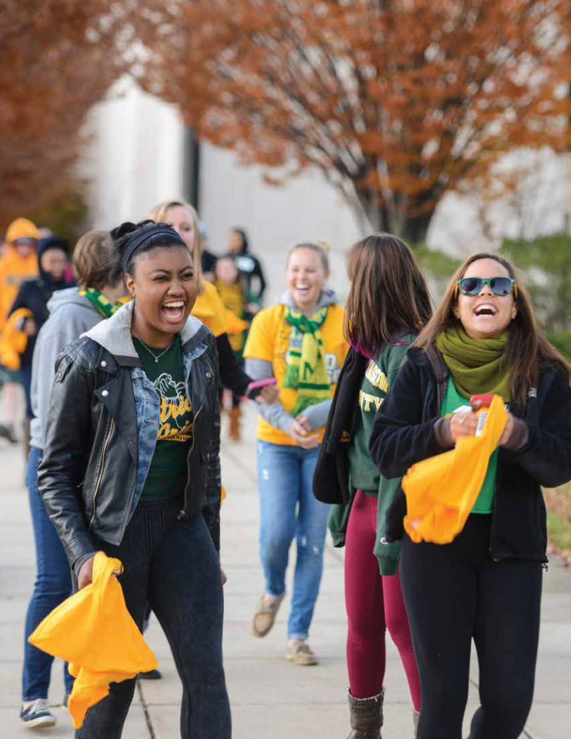
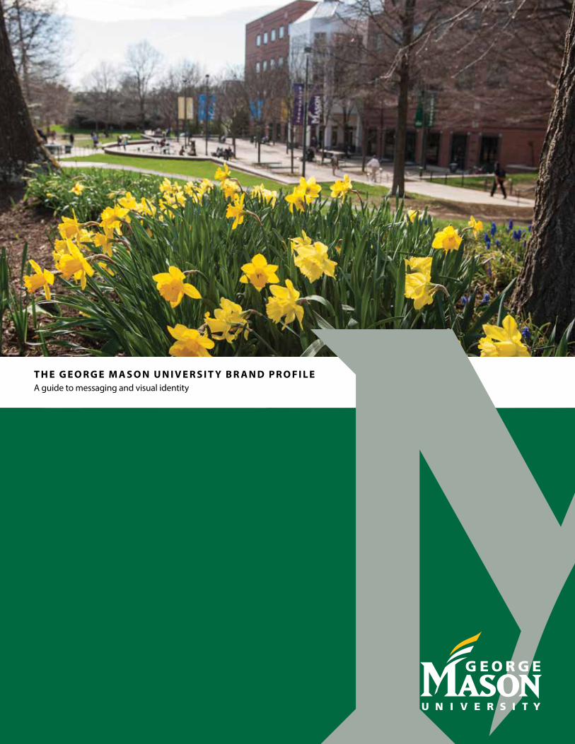
T h e G e o r G e M a s o n U n i v e r s i T y B r a n d P r o f i l eA guide to messaging and visual identity