Embed Size (px)
Citation preview

The Curse of Knowledge in Visual Data Communication
Cindy Xiong, Lisanne van Weelden, and Steven Franconeri
Abstract— A viewer can extract many potential relationships and patterns from any set of visualized data values. Even though two people view the same visualization, they often derive different stories, leading to miscommunication. Here, we show that when people are given background information that leads them to see one pattern in the data as visually salient, they believe that others will experience the same visual salience, even when they are explicitly told that other viewers are naïve to the background information. Participants were told one of three backstories about political events that affected public polling data, before viewing a line or bar graph that depicted those data. One pattern in the data was particularly visually salient to them given the backstory that they heard. They were then asked to predict what naïve viewers with no knowledge of the backstory would find most visually salient on the visualization. They were strongly influenced by their own knowledge, despite explicit instructions to ignore it, predicting that others would find the same patterns to be most visually salient. This result reflects a psychological phenomenon, demonstrated in cognitive reasoning, linguistics, and education, known as the curse of knowledge – a cognitive bias where a content expert struggles to re-create the state of mind of a novice, often resulting in communication failures. The present findings show that the curse of knowledge also plagues the visual perception of data, explaining why presenters, paper authors, and data analysts can fail to connect with audiences when they communicate patterns in data. Index Terms—Information visualization, data communication, cognitive biases, perception and cognition, evaluation, expertise.
INTRODUCTION Imagine a presenter showing data to an audience. It might be a professor showing graphs of experimental results at a conference or colloquium, or a data analyst delivering a report at a company, using snapshots from a dashboard. Anecdotally, these data visualizations tend to be quickly delivered, overly complex, and overwhelming, compared to what the audience can handle. Yet the expert delivering the presentation is typically oblivious to the fact that others do not see the same patterns that they see. We replicated this phenomenon in the lab, providing empirical evidence for a ‘curse of knowledge’ in data visualization – once an expert recognizes a given pattern in data to become visually salient, the expert assumes that it is also visually salient to naïve observers. The curse of knowledge is well-studied in the psychology literature. In one particularly powerful demonstration, people were asked to tap the rhythm of a set of well-known songs, such as “Happy Birthday,” on a table. The listeners had to guess the songs based on the rhythm tapped by the tappers. Tappers were then asked to estimate at what percentage those listeners would be able to correctly identify the songs. The tappers were confident, estimating that around 50% of the songs would be identifiable. In reality, listeners could only identify 2.5% of the songs, revealing a vast overconfidence in tapper estimates [34]. When people tap songs, their percussion does not include pitch, yet the auditory system fills in those pitches based on previous experience and knowledge. Critically, it seems impossible to 'turn off' this filling-in process, and people assume that others will have the same experience [38] such that simulating the experience of being naïve can be literally inconceivable. In another domain, well-informed decision makers fail to predict
the judgments of less-informed decision makers, implicitly allowing their own knowledge to guide those predictions [9]. And people given disambiguating information about ambiguous sentences, like “the daughter of the man and the woman arrived,” assume that the sentence would no longer be ambiguous to other naïve listeners [25]. Similarly, when people read a note stating, “that restaurant was marvelous, just marvelous,” and were additionally told that the comment was intended as sarcastic, they incorrectly predicted that others would perceive the sarcastic intent even without the additional information [14].
This effect is particularly powerful in children, who seem to have even stronger difficulties in inhibiting their own knowledge. In the 'Sally-Ann Task,' children are told a story about Sally, who put her candy in a box before leaving the room. While she was gone, Ann removed the candy from the box and put it in a basket. Where will Sally look for the candy when she returns? Unable to inhibit their own knowledge of the illicit swap, most 4-year old children will assume that Sally will look in the basket [3, 36]. Even adults can make this error in a similar task with a more complex scenario and a more subtle measure [4]. The curse of knowledge can also occur within a single person [30], often known as the hindsight bias. This bias is the irrational belief that an outcome is more predictable after it becomes known [37] because people are unable recreate the feeling of novelty and uncertainty that preceded surprising outcomes in consumer satisfaction, business success, and political strategy [46,11,5].
This curse of knowledge has powerful consequences for communication. People generally do not convey information to others if they assume that it is already shared [15]. This means presenters must have an accurate idea of what their audiences know and do not know. Only then they can include only the information the audiences still need [17]. This potential failure of communication is especially important for education. Teachers influenced by the curse of knowledge can misjudge their students’ abilities and understanding, hindering effective instruction [1,25]. Students and instructors can have different conceptual understandings of classroom demonstrations [39].
While the curse of knowledge is well-studied in the psychology literatures surrounding language, decision making, and reasoning, there are less direct research on potential perceptual consequences. Compared to numerical and textual formats, data visualizations are effective in highlighting the relationships and patterns in data to facilitate understanding [10]. But at the same time, understanding complex visualization can be similar in time an effort to reading a
• Cindy Xiong is with Northwestern University. E-mail:
[email protected]. • Lisanne van Weelden is with Utrecht University, Utrecht, Netherlands. E-
mail: [email protected]. • Steven Franconeri is with Northwestern University. E-mail:
[email protected]. Manuscript received xx xxx. 201x; accepted xx xxx. 201x. Date of Publication xx xxx. 201x; date of current version xx xxx. 201x. For information on obtaining reprints of this article, please send e-mail to: [email protected]. Digital Object Identifier: xx.xxxx/TVCG.201x.xxxxxxx/.

paragraph [41,18,27]. One can also read many possible sentences from the paragraph. Similarly, a graph or figure can be seen in multiple ways depending on where the viewer is fixated on or selectively visually attending [23,43]. Given the primary role visualizations play in the communication of analytic data, across science, education and industry [31,28,26], and the possibilities to see visualizations in multiple ways like visual scenes [44,41], it is important to demonstrate how knowledge influences visual perception of data visualizations and cause communication failures. Communication through visualized data is continually growing in popularity. How successful such communication depends, in part, on the ability to anticipate, avoid and correct communication failures. Information processed identically perceptually can be accounted differently cognitively, but presenters may not be aware of that while preparing their visualizations. This harbours potential for miscommunications between the presenters and the audiences [14]. We suspect that the inability to separate one’s own knowledge and expertise from that of his/her audience can make the visual data communication more difficult and less clear than one realizes. This may be especially true when the visualization entails intricate patterns and features.
The present experiments suggest that such communication failures do exist because the visualization experts cannot take the perspectives of naïve viewers, providing practical significance and theoretical importance to information visualization research. In two studies, we taught participants backstories of graphs and asked them to predict what uninformed viewers of such graphs would notice. We predict that when people are given information that leads them to see one story in the data as visually salient, they would believe that others will experience the same salience. This belief would persist even when they are explicitly told that other viewers are naïve to that information.
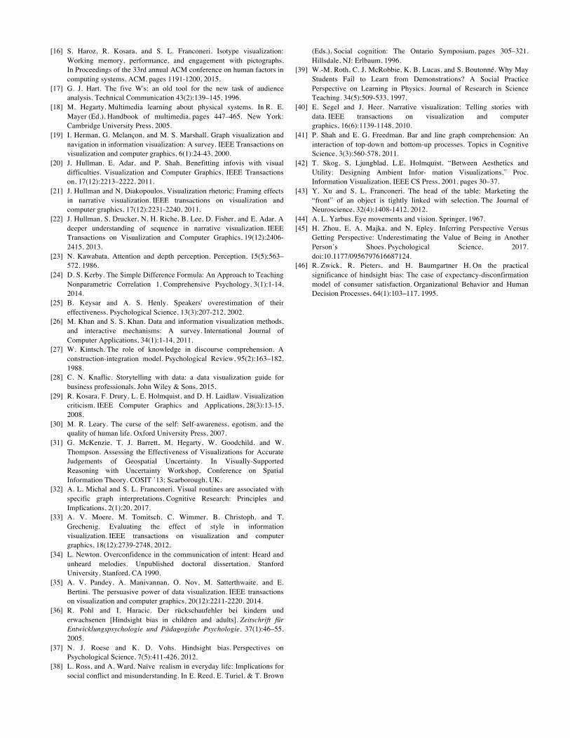
1 GENERAL METHOD The goal of the present experiments is to demonstrate the curse of knowledge in visual perception of data visualizations – whether knowledge biases how an individual views a visualization, and whether they predict that uninformed viewers will share those biases.
1.1 Procedure Participants completed a Qualtrics survey in which they read a story that conveyed background knowledge about a graph depicting political polling data. The participants were told the experiment wanted to see how well crowdsourcing could be used to predict what features people would see in similar graphs to what they have seen. They were told that the experimenters wanted to show the graph they just saw to 100 people with only a short description with no story, with the excuse that the later study had a stricter time limit. They were told that the reason they were given a story was to get a sense of where the data come from. They then predicted what uninformed viewers (with no knowledge of the story) would find to be the most visually salient features or patterns in the graph. The participants did not know how many features they had to predict. They were forced to predict one feature at a time from the most to fifth visually salient so they could not plan ahead which five features they would write down. This best ensured that the order in which these features were written down truly matched how visually salient the participants thought these features stood out to uninformed naïve graph viewers. In contrast, pilot experiments showed that listing all features at once led participants to list features in a routine left-to-right or top-to-bottom order, regardless of what interviews revealed as what they actually found most salient. After writing down each feature they predicted, the participants also circled regions on the graph corresponding to each feature on a physical paper copy of the graph. They then reported how the five predicted features are visually salient to themselves on a scale from one to five, one being not at all visually salient and five being very
visually salient. Finally, they matched their five predictions as best as possible to five pre-determined features presented on the computer screen. To avoid experimenter bias, this matching was done by the participants instead of the experiments.
1.2 Hypotheses We hypothesized that participants would: (1) Among the five pre-determined features, predict (write and circle) the features that were highlighted in the story they read to be more visually salient to uninformed viewers than the ones that were not highlighted in the story, ranking the highlighted features higher than non-highlighted features. (2) Rate the feature predicted to be the most visually salient to an uninformed viewer to also be the most visually salient to themselves. Similarly, they will rate the feature predicted to be the fifth most visually salient to an uninformed viewer to the least visually salient to themselves.
2 LINE GRAPH EXPERIMENT
2.1 Participants
Eighteen Northwestern University students (10 women) participated in this experiment in exchange for course credit in an introductory psychology class. All participants were asked to bring corrective eyewear if needed.
2.2 Design This experiment followed a 3x3 mixed-subjects design. The first independent variable is rankings of the five pre-determined features, which correspond to the priority order the participants think an uninformed graph viewer would describe as the most to fifth-most visually salient features of the graph. The feature predicted to be the most visually salient received the highest rank (one) while the feature predicted to be the fifth-most visually salient received the lowest rank (five). The second independent variable is the how visually salient each participant rated his/her predicted features to themselves, on a scale from one to five.
2.3 Materials
2.3.1 Story The participants read a story describing a presidential election in a small European country between four major parties, Labour, Conservatives, Alliance, and United, shown in Figure 1.
Fig. 1. Snap-shot of the story. The story highlights a competition between two of the four parties, illustrating how citizen voting intentions fluctuated with current events. The stories and data were fictional and did not depict any actual person or event, though that was not told to the participants explicitly. Initially, between the two highlighted parties, one had a

healthy lead in the polls. During an initial debate, the leading party turned voters over to the less popular party and eventually lost the lead. In a later debate, however, the originally leading party was able to take back the votes the candidate lost and take the lead back again after a bad debate performance by his opponent. Participants were assigned into one of three conditions, top-prime, middle-prime, and bottom-prime. Every participant heard the same story, but in each story, the two parties between which the competition is highlighted differed. The top-prime story presented the story between the Labour and Conservative Parties, the middle-prime between the Labour and Alliance Parties, and the bottom-prime between the Alliance and United Parties, shown in Figure 2. Note that in each pair of lines, the party with the higher line cedes votes to the party with the lower line, and then the higher line gains back that ground.
2.3.2 Graph After reading the story, participants were shown a line graph depicting public polling information for the four parties throughout the election period, shown in Figure 2. The Labour Party and the Alliance Party are both green lines, with the Labour Party being light green and the Alliance Party dark green. Similarly, the Conservative Party and the United Party are both blue lines, with the Conservative Party light blue and the United Party dark blue. The graph the participants saw highlighted features important to the story by annotating story points with highlighted data patterns, shown in Figure 2. While the story was always the same, the top, middle, and bottom conditions each highlighted its respective feature on the graph. In all three conditions, the two debates were linked to two fluctuations depicted by the left and right boxed features on each graph respectively. The initial debate led to a decrease of votes for the initially leading party, highlighted by the left box, while the later debate brought back lost votes for the initially leading party, highlighted by the right box.
Fig. 2. Highlighted graph corresponding to three conditions. Before the participants predicted what an uninformed graph viewer will see as the most visually salient feature on the graph, they were shown an unannotated version of the line graph, as depicted by Figure 3. They were told that this unannotated graph with no story, was all that the uninformed graph viewers would see. Paper copies of this non-highlighted graph were provided to the participants to mark down their predictions.
Fig. 3. The unannotated graph of the line graph experiment.
2.3.3 Matching Features
The participants referred to their markings on the paper copies of the unannotated graph when they matched their own predictions to the five pre-determined features, shown in Figure 4. These five features were all features highlighted in the story, but in the three different conditions. Features A and B on top correspond to the features depicted and highlighted in the story of the top-prime condition. Features C and D in the bottom right corner correspond to the features depicted and highlighted in the story of the bottom-prime condition. Feature E pointing towards the center section of the graph
corresponds to the features depicted and highlighted in the story of the middle-prime condition.
Fig. 4. Five pre-determined features in line graph experiment.
2.4 Qualitative Results All stories, experimental stimuli, and data files are available at http://viscog.psych.northwestern.edu/VisualizationCurse2017/ Examining what the participants marked down on their physical copies of the unannotated graph, we find observable differences among the three conditions qualitatively, as shown in Figure 5. The top-prime condition shows the top three predicted features for the six subjects in this condition. The top left corner graphs always correspond to the markings of subject one, the middle left graphs correspond to the markings of subject two, and so on. The second and third rows show the top three predicted features for the six subjects in the middle and bottom-prime conditions respectively. The individual markings can be collapsed for the three top ranked prediction by all six participants in each condition, shown in the first three columns of the fourth row. These three top ranked predictions can be further collapsed for each condition to illustrate their differences, shown in the fourth row. Given that darker colour represents more marking overlaps, we observed that participants in the top-prime condition mostly marked the top features (AB) as their top three visually salient features to uninformed graph viewers; participants in the middle-prime condition mostly marked the mirroring feature E as their predicted top visually salient features; participants in the bottom-prime condition mostly marked the bottom features (CD). Overall, these qualitative results support our first hypothesis such that across all three conditions, participants predicted features that were depicted and highlighted in the story to be among the top visually salient ones to uninformed viewers.
2.5 Quantitative Results In the quantitative analysis, the rankings of predicted features were reverse coded for more intuitive visualizations. The feature predicted to be the most visually salient was given a reverse rank of five, and the fifth most visually salient a reverse rank of one. The ranks were not reverse coded in the statistical calculations.
2.5.1 Feature Ranking by Condition Using the data from the feature matching section of the experiment, rankings were assigned to the five pre-determined features (ABCDE). For example, if a participant matched his/her most visually salient feature to uninformed viewer prediction to feature C, feature C would receive a rank one for this participant. This rank one would be entered in R for statistical calculations and reversed coded as five in the visualizations. Similarly, if a participant matched his/her predicted fourth most feature to feature B, feature B would receive a rank of four. If a participant matched pre-determined features to multiple predictions, then the feature would receive the ranking of the highest rank. For example, if a participant matched his/her predicted second, third and fifth features to feature A, then feature A would receive a ranking of two.

If a participant did not think any of the five pre-determined features matched to one of his/her predictions, that specific prediction would be matched to “N/A.” This prediction then would not be considered in the statistical analysis, and the ranking spot of this prediction would be counted as taken. For example, if a participant matched the predicted second most visually salient feature to feature E, the fourth most visually salient feature to feature D, and every other prediction he/she made did not match to any of the five pre-determined features, feature E would receive a rank of two and feature D would receive a rank of four. If participants matched two features to a predicted feature, the two features would receive the same rank. For example, if a participant wrote down a feature to be the second most visually salient feature to an uninformed viewer and matched both feature A and B to it, then both feature A and B would receive a rank of two.
Fig. 5. Participants’ prediction drawn on the graph. The five pre-determined features (ABCDE) are depicted in the stories of the three conditions. Feature A and B are the set of top features highlighted in the top-prime condition. Feature C and D are the set of bottom features highlighted in the bottom-prime condition. Feature E is a mirror feature highlighted in the middle-prime condition. Since there are two pre-determined features highlighted in the top-prime and bottom-prime conditions, and only one pre-determined feature is highlighted in the middle-prime condition, the rankings of the top features (A and B) were averaged to generate a top feature average ranking. Similarly, the rankings of the bottom features (C and D) were averaged. Figure 6 shows the participant prediction rankings of the top features (AB), mirror feature (E) and bottom feature (CD) in the three separate conditions. We see that the participants rated features that were highlighted in the story, or congruent to their conditions, as more visually salient than other features that are not congruent to their conditions. We can obtain a clearer difference by comparing the features reflected explicitly by the story (congruent) and the features not directly reflected by the story (incongruent) together, instead of separately. Figure 7 shows that the feature that was depicted in the story was thought by the participants to stand out to other naïve viewers, more so than features not depicted in the story.
We combined the three conditions and conducted a within-subject Wilcoxon Signed-Rank Test, comparing the rankings of congruent features depicted by the story they read with that of features not depicted by the story.
Fig. 6. Feature ranking for three conditions.
Fig. 7. Feature ranking for congruent vs incongruent features.
2.5.2 Wilcoxon Signed-Ranked Test We used the non-parametric Wilcoxon Signed-Rank Test and computed the differences between the incongruent feature ranks and the congruent feature ranks [24]. The congruent feature ranks are the average rankings of the features depicted in the story for all three conditions. This includes the top features average rank (AB) in the top-prime condition, the mirror feature rank (E) in the middle-prime condition, and the bottom features average rank (CD) in the bottom-prime condition. The incongruent feature ranks are the average rankings of the features not depicted in the story for all three conditions. This includes mirror and bottom feature average rank (E and CD) for top-prime condition, top and bottom feature average rank (AB and CD) for middle-prime condition and mirror and top feature average (E and AB) for the bottom-prime condition. Any unranked features were assigned a rank of 6 so that it would fall below all the ranked features [24]. The Wilcoxon Signed-Rank test indicates that the overall congruent feature ranks, M = 2.75, were significantly higher compared to the overall incongruent feature ranks, M = 0.81, W = 117, r = 0.76, p < 0.01. Congruent features were given higher priority rankings and were predicted to be more visually salient to other uninformed viewers than incongruent features.
2.5.3 Rating Saliency We also examined self-rated saliency, which is how visually salient these predicted features were to the participants themselves. After marking down a feature they predicted other uninformed graph viewers would find visually salient, participants rated how visually salient that predicted feature was to themselves on a scale from one to five. One means not at all visually salient and five means very visually salient. Feature order represents the rank of each predicted feature, with feature order one meaning this feature was predicted to be the most visually salient to an uninformed graph viewer and feature order five meaning this feature was predicted to be the fifth most visually salient to an uninformed graph viewer.
Fig. 8. Visual saliency rating for line graph replication.

A simple linear regression was calculated to predict self-rated saliency based on feature order, shown in Figure 8. This regression equation is significant, F(1,88) = 30.87, p < 0.001, with an R2 of 0.26, such that with each lower ranking, participants’ self-rated saliency for the feature of that rank decreases by 0.27 units. This means that the participants rated the feature predicted to be the most visually salient to an uninformed viewer to be the most visually salient to themselves.
2.5.4 Discussion Knowledge the participants obtained by reading the story biased their predictions such that, in general, they saw the features depicted in the story as more visually salient than features not depicted in the story. More importantly, after acquiring this background knowledge, participants were biased to predict that other uninformed graph viewers would rate those features as more visually salient as well. Both qualitative and quantitative statistical analyses for this experiment were done post-hoc. To ensure the validity of our findings, we next replicated this line graph experiment on a new set of participants and analysed the data following the same procedures and data analysis method.
3 LINE GRAPH EXPERIMENT REPLICATION
3.1 Participants Twenty-one Northwestern University students (10 women) participated in this experiment in exchange for course credit in an introductory psychology class. All participants were asked to bring corrective eyewear if needed.
Fig. 9. Qualitative Result for line graph experiment replication.
3.2 Modification Previously, participants predicted features with no specific restrictions or requirements, leading some to pick out features irrelevant to the study (e.g., one participant circled the entire graph as being visually salient, another circled the y-axis). In this replication, with hopes of decreasing such interpretable responses, participants were instructed to describe features that involved two or more parties.
3.3 Qualitative Results All data analysis methods were identical to that in the initial line graph experiment. There was an additional participant in each condition, making seven participants per condition. We obtained similar qualitative results compared to the original experiment, shown in Figure 9. To conserve space, only the collapsed prediction for the three conditions are shown. The full data analysis and experimental stimulus can be found at http://viscog.psych.northwestern.edu/VisualizationCurse2017/.
3.4 Quantitative Results
3.4.1 Wilcoxon Signed-Rank Test The Wilcoxon Signed-Rank test indicate that the overall congruent feature ranks, M = 3.29, were statistically significantly higher than the overall incongruent feature ranks, M = 1.62, W = 160, r = 0.69, p < 0.01. Referring to Figure 10 and 11, this result is consistent with the initial experiment such that the congruent features were given more priority rankings and were predicted to be more visually salient to other uninformed viewers than incongruent features.
Fig. 10. Prediction ranking for three conditions in replication.
Fig. 11. Congruent versus incongruent features in replication. The grey lines represent individual participant responses.
3.4.2 Rating Saliency A simple linear regression was calculated to predict self-rated saliency based on feature order, shown in Figure 12. This regression equation is significant, F(1,103) = 25.24, p < 0.001, with an R2 of 0.20, such with each lower ranking, participants’ self-rated saliency for the feature of that rank decreases by 0.21 units.
Fig. 12. Visual saliency regression in line graph replication.
4 BAR GRAPH EXPERIMENT We want to evaluate the generalizability of this curse of knowledge by replicating our findings using a different type of graph with a different story. This modification allowed us to observe the curse of knowledge generalized to different sets and visual features.
4.1 Participants Seventeen Northwestern University students (9 women) participated in this experiment in exchange for course credit in an introductory

psychology class. All participants were asked to bring corrective eyewear if needed.
4.2 Design This bar graph experiment followed the same 3x3 mixed-subjects design as the line graph experiment and its replication. The first independent variable is rankings of five pre-determined features, and the second independent variable is how visually salient the participants rated their predicted features to themselves.
4.3 Materials
4.3.1 Story In all three conditions, participants read different backstories describing events leading to a presidential election in a small European country between the Liberal and the Conservative parties, shown in Figure 13. After the story, they were shown a public polling data highlighting the public opinion that eventually led to the victory of the winning candidate; see Figure 15 for an unannotated graph.
Fig. 13. Snap-shot of bar graph experiment story. In the crime condition, participants read a story about police brutality toward specific minority groups. The Conservative Party leader supported the police, brazenly stating that people in the minority group deserved such punishment, which was an unpopular position to take. Meanwhile, the Liberal party voiced the opposing opinion advocating for reform in police departments and in the treatment of suspected criminals. The graph the participants saw corresponded to the story highlighting the majority’s liberal public opinion of crime, explaining it as the reason behind the Liberal Party’s victory, as shown in the “crime-condition” graph in Figure 14. In the immigration condition, participants were told that two weeks before the election, the country experienced a terrorist attack on its bus system. The conservative candidate had predicted in the past that immigrants posed a threat to the country’s citizens. There was no information whether terrorists were immigrants, but the public was too frightened to care. While the liberal candidate had laughed at his opponent for being too overly paranoid, the frightened public supported the Conservative view on immigration. This led to the victory of the Conservative candidate at the election. The graph the participants saw corresponded to the story highlighting the majority’s conservative public opinion on immigration, explaining it as the reason behind the Conservative Party’s victory, shown in the “immigration-condition” graph in Figure 14. In the education condition, participants read a story about a debate between the Liberal and Conservative Parties on the country’s education system. They were told that the country had not been performing well compared to other EU countries academically. Neither candidate could come up with a clear vision on how to solve this. The public was shocked at their incompetence. This opened an opportunity for a third candidate, who was an expert on education (as well as being female, a salient characteristic), in the election. The graph the participants saw corresponded to the story highlighting the
fact that most people in the country had been undecided (neither liberal nor conservatives) on the issue of education, opening the opportunity for the third candidate, shown in the “education-condition” graph in Figure 14.
Fig. 14. Highlighted feature for three conditions. The purple bars representing liberal public opinion on crime is boxed in the crime condition. The orange bar representing a conservative public opinion on immigration is boxed in the immigration condition. The green bar representing undecided public opinion on education is boxed in the education condition.
4.3.2 Graph Figure 15 shows an unannotated version of the bar graph the participants saw in all three conditions. In the graph, the purple bars represent the public polls representing the Liberal Party. The orange bar represents public polls supporting the Conservative Party. The green bars represent undecided public opinion, neither Conservative nor Liberal. From the top to bottom, the 4 issues the public polls demonstrate correspond to education, defense, immigration, and crime issues. In the top two bars, the areas of purple and orange bars are the same. Between the bottom two bars, the area of the orange bar on the immigration issues equals the area of the purple bar on the crime issue. Similarly, the area of the purple bar on the immigration equals the area of the orange bar on the crime issue. Additionally, the area of the undecided two bars are equal. Overall, the total area of purple bars equals the total area of the orange bars.
Fig. 15. Unannotated bar graph. As in the line graph experiment, before the participants predicted what an uninformed graph viewer would see as the most visually salient feature on the graph, they were shown the unannotated bar graph with no features highlighted. They were told that this unannotated graph was all that the uninformed graph viewers had access to. They were told that there was no background story provided for the uninformed graph viewers. Additionally, paper copies of this unannotated graph were provided to the participants to mark down their predictions.
4.3.3 Matching Features The participants referred to their paper copies of the unannotated graph and matched their own predictions to five pre-determined features, shown in Figure 16. Feature A corresponds to the feature reflected in the crime condition story, highlighting the purple bar in the bottom bar on public opinion on crime issues. Feature B corresponds to the feature reflected in the immigration condition story, highlighting the orange bar in the second to bottom bar on public opinion on immigration
Undecided
Liberal
Conservative

issues. Feature C corresponds to the feature reflected in the education condition story, highlighting the green bar in the top bar on public opinion on education issues. Feature D highlights how the public was equally undecided on the issue of defense, immigration, and crime. Feature E highlights how the defense issue had equal conservative and liberal support. These two features were not directly reflected in any stories, serving as “fillers.”
Fig. 16. Five pre-determined features for bar graph experiment.
4.4 Qualitative Results There are observable differences in the order of feature predictions for the three conditions. In Figure 18, each column represents a different condition. The first and second rows show the most and second most visually salient predicted features for in the three conditions respectively. Participants can circle multiple features to be salient for each of the five predictions. The numbers on the graph represent the number of times the highlighted feature was chosen to be visually salient to another person. Because the predictions are overlapped across all participants of one condition, the darker the shading of a highlighted feature, the more frequently it was chosen to be visually salient. Overall, the participants generally circled the feature that has been highlighted on the graph they saw after the story. This means they generally predict that other uninformed graph viewers think the feature they saw highlighted to also be visually salient.
Fig. 17. Qualitative result of bar graph.
4.5 Quantitative Results We analyzed our data using the same method and criteria as the graph experiments.
4.5.1 Feature Ranking for Each Condition Among the seventeen participants, six were randomly assigned into each the crime condition and the immigration condition. Five were randomly assigned into the education condition. Within each
condition, the feature that is reflected in the story was predicted to be the most visually salient to naïve viewers by the participants, as shown in Figure 18. In the crime condition, the crime feature has the highest average ranking. In the education condition, the education feature has the highest average ranking. In the immigration condition, the immigration feature has the highest average ranking.
Fig. 18. Ranking of crime, immigration and education features.
4.5.2 Wilcoxon Signed-Rank Test Comparing the feature reflected in the story (congruent feature) with the average rankings of all the features not explicitly reflected in the story (incongruent features) as shown in Figure 19, across all three conditions, participants predicted congruent features to be more visually salient than incongruent features to uninformed viewers. For example, in the crime condition, feature A (the crime feature) is specifically reflected by the story and is ranked to be more visually salient to naïve viewers than features BCDE, which were not reflected by the story. The non-parametric Wilcoxon Signed-Rank Test [24] indicated that the overall congruent feature ranks, M = 4.29 were statistically significantly higher than the overall incongruent feature ranks M = 3.34, W = 150, r = 0.98, p < 0.001. This means that the features depicted in the story were given higher priority rankings and thus predicted to be more visually salient to other uninformed viewers than features not depicted in the story. We conducted a more conservative Wilcoxon Signed-Rank Test by only including the feature ranked to be the second-highest in all three conditions, shown in the right most bar in Figure 19. For example, in Figure 18, in the crime condition, the crime feature A was ranked to be the most visually salient while the immigration feature B was ranked to be the next most visually salient. The ranking average of the immigration feature B was then included in the black bar in Figure 19 for the participants in the crime condition. Similarly, in the education condition, the education feature C was ranked to be the most visually salient while the crime feature A was ranked to be the next most visually salient. The ranking average of the crime feature A in this condition was then included in the black bar for participants in the education condition. The Wilcoxon Signed-Rank Test nevertheless revealed congruent feature ratings, M = 4.29, to be significantly higher than best-incongruent feature rankings, M = 3.59, W = 80, r = 0.59, p = 0.03
Fig. 19. Congruent and incongruent feature ratings for bar experiment, including a conservative “best incongruent” ratings for comparison (right most graph). The grey lines represent individual participant responses.
4.5.3 Rating Saliency A simple linear regression was calculated to predict self-rated saliency based on feature order, shown in Figure 20. This regression equation was significant, F(1,83) = 60.40, p < 0.001, with an R2 of 0.42, indicating that with each lower ranking, participants’ self-rated saliency for the feature of that rank decreases by 0.39 units. This again supports that participants predicted features visually salient to themselves were also visually salient to uninformed graph viewers.

Fig. 20. Visual saliency rating for bar graph.
4.6 Discussion The significant group differences between ranking average of features reflected in the story and that of features not reflected in the story speaks in favor of the curse of knowledge bias in viewing bar graphs.
5 CONCLUSION Across three experiments that used two types of graphs,
participants suffered from a 'curse' of knowledge when asked to simulate what others would see in a visualization. When a participant was told one of three possible background stories, each of which made a particular pattern within a graph visually salient to them, that participant assumed that naïve viewers would also see the same pattern as visually salient. This effect occurred despite explicit instructions to ignore what they knew, and to take a naïve perspective. To our knowledge, this is the first empirical demonstration of the curse of knowledge in the realm of visual perception.
These results join other recent findings of the influence of perceptual and cognitive biases on interpretations of patterns in data visualization. Other work has shown an influence of the 'attraction effect' – a cognitive bias where irrelevant information can influence decisions about otherwise equal alternatives – can manifest in the perception of visualized data [12,19]. A preference for salient visuals and distinctive designs can determine whether a data visualization keeps people engaged [2,6,16] and is remembered as being previously viewed [7,8]. Storytelling techniques adapted from those employed for writing and more cognitive tasks can have affect the way that we extract data from visualizations [20,21,32,33,35,40]. The curse of knowledge has been well studied in diverse cognitive domains, but less so in visual perception. We consider data visualization to be an ideal testbed for this possibility, given its importance tool for information exploration, engagement, and understanding.
5.1 Guidelines and Future Directions Presenters, paper authors, and data analysts can fail to connect with audiences when they communicate patterns in data. The present results provide an empirical demonstration that the curse of knowledge may be largely to blame. Critique is critical. The curse of knowledge is tough to detect and inhibit. Critique provides a feedback loop for what is communicated, and what is not. In a strong case of a curse of knowledge, a set of visualization researchers designed a bus schedule visualization in the style of Mondrian painting, and hung it in a school cafeteria. Only after feedback did they realize that many viewers didn't realize that it was a bus schedule visualization at all, instead assuming that it was artwork [29,42].
View data from new angles: The curse of knowledge may also cause viewers to become fixated on given patterns in a dataset,
leaving them less likely to see new or alternative patterns. Because the design of a visualization can strongly influence what comparisons are made (e.g., people are more likely to compare proximal values, or values that are depicted with the same line in a line graph [41], using a variety of designs might help 'kick people out' of a given perspective on patterns in a dataset.
In addition, for communication purposes, research in perspective taking has shown that people predict strangers’ reactions more accurately through projecting themselves onto the stranger [13,45]. Strengthening interactions between presenter and audience may help presenters gauge the most effective way to communicate without overwhelming their audiences [40,21,22].
Knowledge and priming: Did our participants find certain data patterns salient – and assume the same in others – because they knew the story, or because we visually primed the to see a given pattern in a graph? The answer is likely 'both', but future work could tease apart the relative contributions of these factors.
REFERENCES [1] D. W. Allbritton, G. McKoon, and R. Ratcliff. Reliability of prosodic
cues for resolving syntactic ambiguity. Journal of Experimental Psychology: Learning, Memory, and Cognition, 22(3):714–735, 1996.
[2] S. Bateman, R. L. Mandryk, C. Gutwin, A. Genest, D. McDine, and C. Brooks. Useful junk?: the effects of visual embellishment on com- prehension and memorability of charts. In Proceedings of the 28th Inter- national Conference on Human Factors in Computing Systems, CHI ’10, pages 2573–2582. ACM, 2010.
[3] D. M. Bernstein, C. Atance, G. R. Loftus, and A. N. Meltzoff. We saw it all along: Visual hindsight bias in children and adults. Psychological Science, 15(4):264–267, 2004.
[4] S. A. Birch and P. Bloom. The curse of knowledge in reasoning about false beliefs. Psychological Science, 18(5):382-386, 2007.
[5] H. Blank, V. Fischer, and E. Erdfelder. Hindsight bias in political elections. Memory, 11(4-5):491–504, 2003.
[6] R. Borgo, A. Abdul-Rahman, F. Mohamed, P. W. Grant, I. Reppa, L. Floridi, and M. Chen. An empirical study on using visual embellishments in visualization. Visualization and Computer Graphics, IEEE Transactions on, 18(12):2759–2768, 2012.
[7] B M. A. Borkin, A. A. Vo, Z. Bylinskii, P. Isola, S. Sunkavalli, A. Oliva, and H. Pfister. What makes a visualization memorable?. IEEE Transactions on Visualization and Computer Graphics, 19(12):2306- 2315, 2013.
[8] M. A. Borkin, Z. Bylinskii, N. W. Kim, C. M. Bainbridge, C. S. Yeh, D. Borkin, ... and A. Oliva. Beyond memorability: Visualization recognition and recall. IEEE transactions on visualization and computer graphics, 22(1):519-528, 2016.
[9] C. Camerer, G. Loewenstein, and M. Weber. The curse of knowledge in economic settings: An experimental analysis. Journal of political Economy, 97(5):1232-1254, 1989.
[10] S. K. Card, J. D. Mackinlay, and B. Shneiderman, editors. Readings in Information Visualization: Using Vision to Think. Morgan Kaufmann Publishers Inc., San Francisco, CA, USA, 1999.
[11] G. Cassar, J. Craig. An investigation of hindsight bias in nascent venture activity. Journal of Business Venturing, 24(2):149–164, 2009.
[12] E. Dimara, A. Bezerianos, and P. Dragicevic. The attraction effect in information visualization. IEEE Transactions on Visualization and Computer Graphics, 23(1):471-480, 2017.
[13] N. Epley and A. Waytz. Mind perception. In S. T. Fiske, D. T. Gilbert and G. Lindzey (Eds.), The handbook of social psychology (Vol. 2, 5th ed., pages 498–541). New York, NY: Wiley, 2010.
[14] T. Gilovich, K. Savitsky, and V. H. Medvec. The illusion of transparency: Biased assessments of others’ ability to read one’s emotional states. Journal of Personality and Social Psychology, 75(2):332– 346, 1998.
[15] H. P. Grice. Logic and conversation. 41-58, 1975.
[16] S. Haroz, R. Kosara, and S. L. Franconeri. Isotype visualization: Working memory, performance, and engagement with pictographs. In Proceedings of the 33rd annual ACM conference on human factors in computing systems, ACM, pages 1191-1200, 2015.
[17] G. J. Hart. The five W's: an old tool for the new task of audience analysis. Technical Communication 43(2):139–145, 1996.
[18] M. Hegarty. Multimedia learning about physical systems. In R. E. Mayer (Ed.), Handbook of multimedia, pages 447–465. New York: Cambridge University Press, 2005.
[19] I. Herman, G. Melançon, and M. S. Marshall. Graph visualization and navigation in information visualization: A survey. IEEE Transactions on visualization and computer graphics, 6(1):24-43, 2000.
[20] J. Hullman, E. Adar, and P. Shah. Benefitting infovis with visual difficulties. Visualization and Computer Graphics, IEEE Transactions on, 17(12):2213–2222, 2011.
[21] J. Hullman and N. Diakopoulos. Visualization rhetoric: Framing effects in narrative visualization. IEEE transactions on visualization and computer graphics, 17(12):2231-2240, 2011.
[22] J. Hullman, S. Drucker, N. H. Riche, B. Lee, D. Fisher, and E. Adar. A deeper understanding of sequence in narrative visualization. IEEE Transactions on Visualization and Computer Graphics, 19(12):2406-2415, 2013.
[23] N. Kawabata. Attention and depth perception. Perception, 15(5):563–572, 1986.
[24] D. S. Kerby. The Simple Difference Formula: An Approach to Teaching Nonparametric Correlation 1. Comprehensive Psychology, 3(1):1-14, 2014.
[25] B. Keysar and A. S. Henly. Speakers' overestimation of their effectiveness. Psychological Science, 13(3):207-212, 2002.
[26] M. Khan and S. S. Khan. Data and information visualization methods, and interactive mechanisms: A survey. International Journal of Computer Applications, 34(1):1-14, 2011.
[27] W. Kintsch. The role of knowledge in discourse comprehension. A construction-integration model. Psychological Review, 95(2):163–182, 1988.
[28] C. N. Knaflic. Storytelling with data: a data visualization guide for business professionals. John Wiley & Sons, 2015.
[29] R. Kosara, F. Drury, L. E. Holmquist, and D. H. Laidlaw. Visualization criticism. IEEE Computer Graphics and Applications, 28(3):13-15, 2008.
[30] M. R. Leary. The curse of the self: Self-awareness, egotism, and the quality of human life. Oxford University Press, 2007.
[31] G. McKenzie, T. J. Barrett, M. Hegarty, W. Goodchild, and W. Thompson. Assessing the Effectiveness of Visualizations for Accurate Judgements of Geospatial Uncertainty. In Visually-Supported Reasoning with Uncertainty Workshop, Conference on Spatial Information Theory. COSIT ’13; Scarborough, UK.
[32] A. L. Michal and S. L. Franconeri. Visual routines are associated with specific graph interpretations. Cognitive Research: Principles and Implications, 2(1):20, 2017.
[33] A. V. Moere, M. Tomitsch, C. Wimmer, B. Christoph, and T. Grechenig. Evaluating the effect of style in information visualization. IEEE transactions on visualization and computer graphics, 18(12):2739-2748, 2012.
[34] L. Newton. Overconfidence in the communication of intent: Heard and unheard melodies. Unpublished doctoral dissertation, Stanford University, Stanford, CA 1990.
[35] A. V. Pandey, A. Manivannan, O. Nov, M. Satterthwaite, and E. Bertini. The persuasive power of data visualization. IEEE transactions on visualization and computer graphics, 20(12):2211-2220, 2014.
[36] R. Pohl and I. Haracic. Der rückschaufehler bei kindern und erwachsenen [Hindsight bias in children and adults]. Zeitschrift für Entwicklungspsychologie und Pädagogishe Psychologie, 37(1):46–55, 2005.
[37] N. J. Roese and K. D. Vohs. Hindsight bias. Perspectives on Psychological Science, 7(5):411-426, 2012.
[38] L. Ross, and A. Ward. Naïve realism in everyday life: Implications for social conflict and misunderstanding. In E. Reed, E. Turiel, & T. Brown
(Eds.), Social cognition: The Ontario Symposium, pages 305–321. Hillsdale, NJ: Erlbaum, 1996.
[39] W.-M. Roth, C. J. McRobbie, K. B. Lucas, and S. Boutonné. Why May Students Fail to Learn from Demonstrations? A Social Practice Perspective on Learning in Physics. Journal of Research in Science Teaching. 34(5):509-533, 1997.
[40] E. Segel and J. Heer. Narrative visualization: Telling stories with data. IEEE transactions on visualization and computer graphics, 16(6):1139-1148, 2010.
[41] P. Shah and E. G. Freedman. Bar and line graph comprehension: An interaction of top-down and bottom-up processes. Topics in Cognitive Science, 3(3):560-578, 2011.
[42] T. Skog, S. Ljungblad, L.E. Holmquist, “Between Aesthetics and Utility: Designing Ambient Infor- mation Visualizations,” Proc. Information Visualization, IEEE CS Press, 2001, pages 30–37.
[43] Y. Xu and S. L. Franconeri. The head of the table: Marketing the “front” of an object is tightly linked with selection. The Journal of Neuroscience, 32(4):1408-1412, 2012.
[44] A. L. Yarbus. Eye movements and vision. Springer, 1967. [45] H. Zhou, E. A. Majka, and N. Epley. Inferring Perspective Versus
Getting Perspective: Underestimating the Value of Being in Another Person’s Shoes. Psychological Science, 2017. doi:10.1177/0956797616687124.
[46] R. Zwick, R. Pieters, and H. Baumgartner H. On the practical significance of hindsight bias: The case of expectancy-disconfirmation model of consumer satisfaction. Organizational Behavior and Human Decision Processes, 64(1):103–117, 1995.

![The Curse of Knowledge in Economic Settings: An Experimental Analysis ...authors.library.caltech.edu/22171/1/1831894[1].pdf · The Curse of Knowledge in Economic Settings: An Experimental](https://img.pdfslide.us/doc/110x75/5ad1c7ab7f8b9a86158c5d9d/the-curse-of-knowledge-in-economic-settings-an-experimental-analysis-1pdfthe.jpg)