Embed Size (px)
Citation preview

7
Cultura e Scienza del Colore - Color Culture and Science | 09 | 2018 ISSN 2384-9568
1Maria Elisabetta Ruggiero [email protected]
1Dip. DAD, Scuola Politecnica - Università di Genova
The colour of ships: communication and identity
ABSTRACTThe following research investigates the function of colour, within the scope of the naval liveries and the respective historical evolution. Since ancient times, in fact, the use of colour for the outer form of ships has been taking on multiple valences: identification, symbolic, apotropaic aspects. Still today this use remains in its different declinations with forms that often derive from the past tradition.
KEYWORDSColour, ship external view, hull, identity.
CITATION: Ruggiero M. E. (2018) ‘The colour of ships: communication and identity’, Cultura e Scienza del Colore - Color Culture and Science Journal, 09, pp. 7-15, DOI: 10.23738/ccsj.i92018.01
Received 4 March 2018; Revised 14 March 2018; Accepted 19 April 2018
Maria Elisabetta Ruggiero. Born in Leghorn in 1969, Maria Elisabetta Ruggiero is an Architect, graduated at Genoa University (IT), and a PHD on Survey and Representation of Architecture and Landscape, held at Representation Institute – Genoa University. Now she is Associate Professor at Genoa University, Architecture and Design Department, Polytechnic School, working in the field of ‘Representation for Naval Design’.
Italian translation provided: Il colore nei mezzi navali: comunicazione ed identità

8
Cultura e Scienza del Colore - Color Culture and Science | 09 | 2018 | 7 - 15
Ruggiero M. E.
ISSN 2384-9568
DOI: 10.23738/ccsj.i92018.01
1. INTRODUCTION
The tradition of characterizing ships with signs and colours has deep roots, giving them multiple functions.Colour in the naval field has covered a multiplicity of values and functions, from the apotropaic signs introduced by the first sailors, through the colourful liveries of the seventeenth-century warships, to the graphic compositions of contemporary commercial ships and the multitude of colours adopted in today’s megayachts. The lack of graphic documentation of the naval project up to the sixteenth century, as well as the rarity of finds, due to their physiological short life, leads the study of colour in this field to necessarily turn to forms of representation that sometimes can be heterogeneous and not for technical studies. However, the wide iconography that over the centuries has been turning to the representation of the ship in all its forms, is an important source for research on (Ruggiero, 2007).
The possibility of having documents in which the design of the decorative apparatus, and the colour used, are easily recognizable, makes it easier to identify the mode and the design intent, aimed at including one or more chromatic components in the composition. This process is carried out for various reasons: now functional, now celebrative, now commercial. The proposed study aims to investigate the early days of a specific and intentional use of colour in this sector and what were its evolutions in relation to the new painting techniques and the new available materials.
2. FIRST DECORATIVE EXPRESSIONS
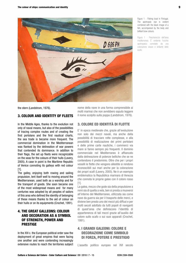
The aura of mystery and adventure that has always characterized travel by sea has pushed the first sailors on unknown routes and with vehicles still not duly sure, to feel the need to decorate the hull with auspicious signs that would help the Fate. The signs that were used were common to many cultures, even distant from one other, and often proposed the image of eyes that could, therefore, help to find the right route and to distinguish in time any obstacles or enemies. The part intended to accommodate these signs was, and still is, the bow, or rather that part of the hull that must first cut the water.In subsequent evolutions this part of the hull hosted real sculptures with the function of good luck and as symbol of the ship itself: the figurehead, with its own shape and with the most varied references, represented the name of the ship in a form understandable to many sailors who could not read the name carved on
1. INTRODUZIONE
La tradizione di connotare i mezzi navali con segni e colori ha radici profonde, attribuendo ad essi molteplici funzioni: dai segni apotropaici introdotti dai primi naviganti, attraverso le livree colorate delle navi da guerra seicentesche fino alle composizioni grafiche delle navi commerciali contemporanee e alla moltitudine di colori adottati nei megayacht di oggi, il colore in ambito navale ha ricoperto una molteplicità di valori e di funzioni.La carenza di documentazione grafica del progetto navale fino al Cinquecento, nonché la rarità di reperti, a causa della loro fisiologica breve vita, porta lo studio del colore in questo campo a doversi rivolgere necessariamente a forme di rappresentazione che, talvolta, possono essere eterogenee e non rivolte a studi di tipo tecnico. Tuttavia l’ampia iconografia che nell’arco dei secoli si è rivolta alla rappresentazione della nave in tutte le sue declinazioni, costituisce un’importante fonte per le ricerche in merito (Ruggiero, 2007).
La possibilità di disporre di documentazioni in cui il disegno dell’apparato decorativo, e del colore utilizzato, siano facilmente riconoscibili, rende più facilmente identificabile la modalità e l’intento progettuale rivolto ad includere nella composizione una o più componenti cromatiche. Questo processo si realizza per ragioni di varia natura: ora funzionale, ora celebrativa ora commerciale. Lo studio proposto vuole indagare quali siano stati gli albori di un uso specifico ed intenzionale del colore in questo settore e quali siano state le sue evoluzioni in relazione anche alle nuove tecniche di pitturazione e ai nuovi materiali disponibili.
2. PRIME FORME DECORATIVE
L’aura di mistero e di avventura che da sempre connota i viaggi per mare ha spinto i primi naviganti, rivolti verso rotte ignote, e con mezzi ancora non debitamente sicuri, a sentire l’esigenza di decorare lo scafo con segni benaugurali che aiutassero la sorte. I segni che venivano utilizzati erano comuni presso molte culture, anche lontane tra loro, e proponevano sovente l’immagine di occhi che potessero, quindi, aiutare a trovare la rotta e a distinguere per tempo eventuali ostacoli o nemici. La parte deputata ad accogliere questi segni era, ed è tuttora, la prua, ovvero proprio quella parte dello scafo che per prima deve fendere le acque.Proprio questa parte dello scafo, nelle evoluzioni successive, ospiterà vere e proprie sculture con la funzione di porta fortuna e simbolo della nave stessa: la polena infatti con la propria forma, e con i più svariati riferimenti, rappresentava il
9
Cultura e Scienza del Colore - Color Culture and Science | 09 | 2018 | 7 - 15
The colour of ships: communication and identity
ISSN 2384-9568
the stern (Landstrom, 1976). 3. COLOUR AND IDENTITY OF FLEETS
In the Middle Ages, thanks to the evolution not only of naval means, but also of the possibilities of tracing complex routes and of creating the first portolans and the first nautical charts, the sea trade is became more frequent. The commercial domination in the Mediterranean was flanked by the delineation of war powers that contended its dominance. In addition to their flags, the set up fleets were recognizable on the seas for the colours of their hulls (Lavery, 2005). A case in point is the Maritime Republic of Venice connoting its galleys with red colour [1].The galley, enjoying both rowing and sailing propulsion, lent itself well to moving around the Mediterranean, used both as a warship and for the transport of goods. She soon became one of the most widespread means and for many centuries was adopted by all peoples of sailors of this area who defined the identity of belonging of these means thanks to the aid of colour on their hulls or on its equipments (Crochet, 1991).
4. THE GREAT GALLEONS: COLOUR AND DECORATION AS A SYMBOL OF STRENGTH, POWER AND PRESTIGE
In the XVI c. the European political order saw the deployment of great empires that were facing one another and were contending increasingly extensive routes to reach the territories subject
nome della nave in una forma comprensibile ai molti marinai che non avrebbero saputo leggere il nome scolpito sulla poppa (Landstrom, 1976).
3. COLORE ED IDENTITÀ DI FLOTTE
E’ in epoca medievale che, grazie all’evoluzione non solo dei mezzi navali, ma anche della possibilità di tracciare rotte complesse, e alla possibilità di realizzazione dei primi portolani e delle prime carte nautiche, i commerci via mare si fanno sempre più frequenti. Il dominio commerciale nel Mediterraneo è affiancato dalla delineazione di potenze belliche che se ne contendono il predominio. Oltre che per i propri vessilli le flotte che vengono allestite si rendono riconoscibili sui mari anche per la colorazione dei propri scafi (Lavery, 2005). Ne è un esempio emblematico la Repubblica marinara di Venezia che connota le proprie galee con il colore rosso [1]. La galea, mezzo che gode sia della propulsione a remi sia di quella a vela, ben si presta a muoversi all’interno del Mediterraneo, utilizzata sia come nave da guerra sia per il trasporto delle merci, e diviene ben presto uno dei mezzi più diffusi e per molti secoli adottato da tutti popoli di naviganti di quest’area che definiscono l’identità di appartenenza di tali mezzi grazie all’ausilio del colore sullo scafo o sui suoi apparati (Crochet, 1991).
4. I GRANDI GALEONI: COLORE E DECORAZIONE COME SIMBOLO DI FORZA, POTERE E PRESTIGIO
L’assetto politico europeo nel XVI secolo
Figure 1 - Fishing boat in Portugal. The apotropaic eye is evident combined with the black image of a fish, accompanied by the lively and brilliant bow colours.
Figura 1 - Peschereccio dell’area mediterranea. È’ evidente l’occhio apotropaico corredato da una colorazione vivace e brillante dello scafo.

10
Cultura e Scienza del Colore - Color Culture and Science | 09 | 2018 | 7 - 15
Ruggiero M. E.
ISSN 2384-9568
DOI: 10.23738/ccsj.i92018.01
to domination, marking a substantial change in the evolution of naval vessels (Guerout - Campodonico - Giannino, 2000). In order to secure affordable merchant traffic Spain, England, France, the Netherlands and Portugal were making great economic efforts to set up ever larger and increasingly wealthy ships fit to bloody naval battles. The need for supremacy on the sea urged the rulers to develop the art of building ships according to principles that gradually were breaking away from the millenary practices of the master carpenters, to make room for real designers who could optimize the performances of these vessels (Campodonico, 2002). The light and fast galleys that well lent themselves to furrow the closed basin of the Mediterranean, were no longer suitable for new challenges to reach new lands overseas for which the great galleons were more suitable.Goods, sailors and cannons found their places in the immense holds of galleons who then were relying on impressive sailing surfaces and had completely abandoned the propulsion with oars. The efforts necessary for their preparations found a figurative expression in the decorative apparatus of the hulls, which was entrusted with the task of representing the splendour and power of the ship-owners. Artists, engravers and famous decorators were hired to create the apparatus of friezes, iconography and colours that would have characterized the ship. The most frequent subjects were taken from the mythology and the heraldic symbols of the ship-owning family: these were flanked by the colours of the coats of arms and the profusion of gilding (Guilmartin J., 2002).Le Soleil Royal, for which Antoine Coysevox and Jean Bérain, authors of many of the decorations and stage apparatuses of the Palace of Versailles,
vede lo schieramento di grandi imperi che si fronteggiano e si contendono rotte sempre più estese per raggiungere i territori oggetto di dominio, segnando una svolta sostanziale nella evoluzione dei mezzi navali (Guerout - Campodonico - Giannino, 2000). Per garantirsi traffici mercantili convenienti Spagna, Inghilterra, Francia, Olanda e Portogallo compiono sforzi economici grandiosi per allestire navi sempre più grandi, e sempre più ricche di armamento, così da poter affrontare cruente battaglie navali. La necessità di supremazia sul mare spinge i regnanti a sviluppare l’arte di costruire le navi secondo principi che poco a poco si distacchino dalla pratica millenaria dei maestri d’ascia, per lasciare spazio a veri e propri progettisti che sappiano ottimizzare le prestazioni di questi mezzi (Campodonico, 2002). Le leggere e veloci galee che ben si prestavano a solcare il bacino chiuso del Mediterraneo, non sono più idonee alle nuove sfide per raggiungere le nuove terre oltre oceano per le quali risultano più adatti i grandi galeoni. Merci, marinai e cannoni trovano posto nelle immense stive dei galeoni che si affidano ora a superfici veliche impressionanti, abbandonata del tutto la propulsione a remi. Lo sforzo necessario al loro allestimento trova una espressione figurativa nell’apparato decorativo dello scafo a cui è demandato il compito di rappresentare lo splendore e la potenza dell’armatore. Artisti, intagliatori e decoratori famosi vengono ingaggiati per creare l’apparato dei fregi, dell’iconografia e dei colori che avrebbero caratterizzato la nave. I soggetti più frequenti sono tratti dalla mitologia e dai simboli araldici della casata armatrice: a questi si affiancano i colori del blasone e la profusione di dorature (Guilmartin J., 2002).La Soleil Royal per la quale vengono ingaggiati
Figure 2 - Gouache for the stern and the bow of Le Soleil Royal, Jean Bérain and Antoine Coysevox, XVII c., Louvre Museum, Paris (FR).
Figura 2 - Disegni per la poppa e la prua della Soleil Royal, Jean Bérain e Antoine Coysevox, XVII secolo, Museo del Louvre, Parigi (FR).

11
Cultura e Scienza del Colore - Color Culture and Science | 09 | 2018 | 7 - 15
The colour of ships: communication and identity
ISSN 2384-9568
were commissioned by the King, was the ship that Louis XIV wanted to represent the King and his Splendour. We can admire golden friezes on a blue field, balustrades, pilasters and swirls that marked the various orders of bridges visible at the stern, with a wealth of details. The Roi Soleil had always chosen as a parade a Galea, called La Réale, where the pomp and the insignia of France merged to give life to an unusual composition.The contemporary Sovereign of the Seas, commissioned by Charles I of England, with rich and complex sculptural apparatus on a black background ,appeared in a different style as if to underline the austerity and the bellicosity of the British fleet. Another example of decoration of the stern of a galleon is the one offered by the Dutch ship Beurs Van Amsterdam where the architecture of the stock exchange building, financed by the fleet, is represented with a pictorial narrative, on the transom. The Dutch galleons often brought in that position not only heraldic symbols, but also real representations related to the name of the ship.
5. IRON AND STEEL IN NAVAL CARPENTRY: BLACK AND GREY AS AN EXPRESSION OF INNOVATION AND ROBUSTNESS
In modern times the possibility of propulsion and construction techniques with the industrial revolution undergo a considerable range of changes in the naval field. Structures and plating in metal replace the wood that had characterized the previous centuries and thus start a new era (Galliani - Pescarini, 1985).
Antoine Coysevox e Jean Bérain, autori di molte delle decorazioni e degli apparati scenici della reggia di Versailles, è la nave che Luigi XIV commissiona per rappresentare il Re ed il suo Splendore. Fregi dorati su campo blu, balaustre, lesene e volute che scandiscono i vari ordini di ponti visibili a poppa sono raffigurati, nei disegni a noi pervenuti, con dovizia di particolari. Sempre Re Sole aveva scelto come mezzo da parata una Galea, chiamata La Réale, dove lo sfarzo e le insegne di Francia si fondevano per dare vita ad una composizione fuori dal comune. Di diverso stile invece appare la contemporanea Sovereign of The Seas voluta da Carlo I d’Inghilterra che qui commissiona ricchissimi e complessi apparati scultorei su fondo nero come a sottolineare l’austerità e la bellicosità della flotta britannica.Ulteriore esempio di decorazione della poppa di un galeone è quello offerto dalla nave Olandese Beurs Van Amsterdam dove l’architettura del palazzo della Borsa, finanziatrice della flotta, è rappresentato con una narrazione pittorica, sullo specchio di poppa. Sovente i galeoni olandesi recavano in quella posizione non solo simboli araldici ma anche vere e proprie rappresentazioni correlate al nome della nave.
5. FERRO E ACCIAIO NELLA CARPENTERIA NAVALE: IL NERO ED IL GRIGIO COME ESPRESSIONE DI INNOVAZIONE E ROBUSTEZZA
La possibilità di propulsione e le tecniche costruttive con la a rivoluzione industriale
Figure 3 - Advertising images of the French fleets and Lloyd Sabaudo, where the black colour of the hull stands out in contrast with the white hull. In the Italian Fleet the waterline and the crowning of the funnels show the colours of the Company.
Figura 3 - Immagini pubblicitarie delle flotte francesi e Lloyd Sabaudo in cui spicca la colorazione nera dello scafo a contrasto con lo scafo bianco. Nella flotta italiana la linea di galleggiamento ed il coronamento dei fumaioli riportano i colori della compagnia.

12
Cultura e Scienza del Colore - Color Culture and Science | 09 | 2018 | 7 - 15
Ruggiero M. E.
ISSN 2384-9568
DOI: 10.23738/ccsj.i92018.01
Phenomena of corrosion and rust for the metal in contact with water need a specific treatment, generally characterized by the red colour. The dark colour of the hulls proposes the dark tones of iron and gives origin to a new generation of naval vessels where the decorative apparatus disappears almost completely to make room for criteria of greater functionality. Imposing dark hulls characterize merchant ships, warships and even transatlantic ships, in contrast with the generally coloured white superstructures. It is important to underline that one additional criterion for selecting a colour must consider
subiscono una notevole gamma di cambiamenti in ambito navale. Strutture e fasciame in metallo sostituiscono il legno che aveva caratterizzato i secoli precedenti ed avviano così una nuova era (Galliani - Pescarini, 1985).Fenomeni di corrosione e ruggine per il metallo a contatto con l’acqua, così come il legno suo predecessore, rendono necessario uno specifico trattamento, generalmente caratterizzato dal colore rosso, tuttavia la colorazione scura degli scafi ripropone i toni scuri del ferro e nasce quindi una nuova generazione di mezzi navali in cui l’apparato decorativo scompare quasi del
Figure 4 - Moto Nave Michelangelo, launched in 1962, entirely painted white
Figura 4 - Moto Nave Michelangelo, prima metà XX secolo, la nave si presenta interamente colorata di bianco.
Figure 5 - (Top) M/Y Anastasia: the black hull contrasting the white superstructure echoes the first transatlantic dark iron structures. (Bottom) M/Y Eclipse: The all-white Motor Yacht collects the legacy of the great 20th-century transatlantic liners.
Figura 5 - (In alto) M/Y Anastasia: lo scafo nero a contrasto con la sovrastruttura bianca riecheggia i primi transatlantici con struttura e fasciamo in ferro dalla colorazione scura. (In basso) M/Y Eclipse: Il Motor Yacht completamente bianco raccoglie l’eredità dei grandi transatlantici de XX secolo

13
Cultura e Scienza del Colore - Color Culture and Science | 09 | 2018 | 7 - 15
The colour of ships: communication and identity
ISSN 2384-9568
how colour affects temperature. For example a deck painted white dramatically drops the temperature in comparison to light grey or any other colour. The colours of the shipping companies, when they appear, get the shape of thin lines of colour or the logos are directly painted on the funnels. After the II World War, trying to change the evocative image of the black and white combination, the first transatlantic liners will introduce the white colour also for the hulls, thus creating a less austere effect [2].
6. TRANSATLANTICS, PASSENGER SHIPS AND YACHTS TODAY: THE COLOUR AS AN ELEMENT OF UNIQUENESS AND IDENTITY
Today, pleasure crafts, as well as merchant and passenger ships, collect the centuries-old tradition of colour as a symbol applied to the image of naval vessels. The majesty of the great transatlantic liners is imitated by the bigger and bigger yachts often becoming more and more real ships, with the choice either of the white-black contrast or total white (Eliseo - Piccione, 2001). The lines of the designers take turns with ever more complex shapes that, to be opportunely subjected to painting cycles, must be suitably plastered to offer perfectly smooth surfaces on which to lay colours with different ranges of finishes.And always in the wake of tradition, colour becomes an element of uniqueness, becoming the object of experimentation as in the case of Jeff Koons’s intervention on M/Y Guilty, where he proposes the practice of camouflage on all surfaces as if to dematerialize the yacht and not get the true forms perceived. Or as for the Yacht R.C., where the hull has been entirely treated with iridescent painting that allows the vessel to always perceive a different colour depending on the angle of incidence of the light. Similarly, shipping companies turn to colours and designs to make their fleet immediately distinguishable and to communicate the playful spirit that animates its services.
7. CONCLUSIONS
The determination of the colour of a naval vessel, which can appear as an aspect entrusted to purely subjective or occasional choice processes, reveals, on the contrary, to be the result of a process in which a multiplicity of
tutto per lasciare spazio a criteri di maggiore funzionalità. Imponenti scafi scuri connotano navi mercantili, navi da guerra e perfino i transatlantici, a cui fa contrasto la sovrastruttura colorata generalmente di bianco. I colori delle compagnie armatrici, quando compaiono, lo fanno sotto forma di sottili linee di colore o direttamente nei loghi dipinti sui fumaioli.Proprio per cercare di cambiare l’immagine evocativa dell’abbinamento bianco e nero, i primi transatlantici costruiti dopo la seconda guerra mondiale, introdurranno il colore bianco anche per lo scafo creando così un effetto meno austero [2].
6. TRANSATLANTICI, NAVI PASSEGGERI E YACHT OGGI: IL COLORE COME ELEMENTO DI UNICITÁ E DI IDENTITÁ
Oggi sia nei mezzi da diporto sia nelle navi mercantili come nelle navi passeggeri raccolgono la tradizione secolare del colore come simbolo applicato all’immagine dei mezzi navali. La maestosità dei grandi transatlantici viene riproposta dai grandi yacht, sempre più grandi e sempre più vere e proprie navi, con la scelta del contrasto bianco – nero o del total white (Eliseo - Piccione, 2001). Le linee dei designer si sbizzarriscono con forme sempre più complesse che, per essere poi opportunamente sottoposte a cicli di pitturazione, devono essere opportunamente stuccate per offrire superfici perfettamente lisce su cui stendere colori con differenti gamme di finiture.E sempre nella scia della tradizione il colore diventa elemento di unicità, diventando oggetto di sperimentazioni come nel caso dell’intervento di Jeff Koons sul M/Y Guilty in cui ripropone la pratica del camouflage su tutte le superfici come a voler smaterializzare lo yacht e a non farne percepire le vere forme. O ancora come per lo Yacht R.C. in cui lo scafo è stato interamente trattato con una pitturazione cangiante che permette di percepire la nave sempre di colore diverso a seconda dell’angolo di incidenza della luce.Analogamente compagnie armatrici si rivolgono a colori e disegni per rendere immediatamente distinguibile la propria flotta e per voler comunicare lo spirito ludico che anima i propri servizi.
Figure 6 - Cruise vessel of the Moby Lines Company with a hull characterized by images taken from the world of cartoons
Figura 6 - Moto navi della compagnia Moby lines con scafo caratterizzato da immagini tratte dal mondo dei cartoons
14
Cultura e Scienza del Colore - Color Culture and Science | 09 | 2018 | 7 - 15
Ruggiero M. E.
ISSN 2384-9568
DOI: 10.23738/ccsj.i92018.01
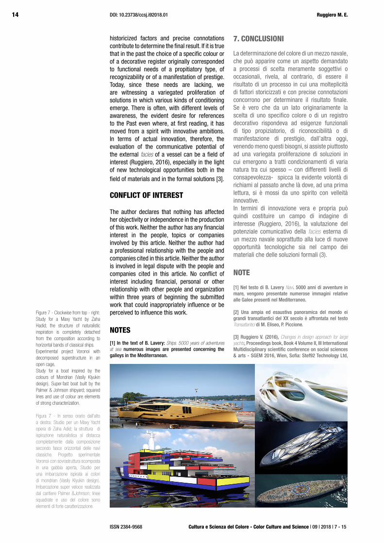
historicized factors and precise connotations contribute to determine the final result. If it is true that in the past the choice of a specific colour or of a decorative register originally corresponded to functional needs of a propitiatory type, of recognizability or of a manifestation of prestige. Today, since these needs are lacking, we are witnessing a variegated proliferation of solutions in which various kinds of conditioning emerge. There is often, with different levels of awareness, the evident desire for references to the Past even where, at first reading, it has moved from a spirit with innovative ambitions. In terms of actual innovation, therefore, the evaluation of the communicative potential of the external facies of a vessel can be a field of interest (Ruggiero, 2016), especially in the light of new technological opportunities both in the field of materials and in the formal solutions [3].
CONFLICT OF INTEREST
The author declares that nothing has affected her objectivity or independence in the production of this work. Neither the author has any financial interest in the people, topics or companies involved by this article. Neither the author had a professional relationship with the people and companies cited in this article. Neither the author is involved in legal dispute with the people and companies cited in this article. No conflict of interest including financial, personal or other relationship with other people and organization within three years of beginning the submitted work that could inappropriately influence or be perceived to influence this work.
NOTES
[1] In the text of B. Lavery: Ships. 5000 years of adventures at sea numerous images are presented concerning the galleys in the Mediterranean.
7. CONCLUSIONI
La determinazione del colore di un mezzo navale, che può apparire come un aspetto demandato a processi di scelta meramente soggettivi o occasionali, rivela, al contrario, di essere il risultato di un processo in cui una molteplicità di fattori storicizzati e con precise connotazioni concorrono per determinare il risultato finale. Se è vero che da un lato originariamente la scelta di uno specifico colore o di un registro decorativo rispondeva ad esigenze funzionali di tipo propiziatorio, di riconoscibilità o di manifestazione di prestigio, dall’altra oggi, venendo meno questi bisogni, si assiste piuttosto ad una variegata proliferazione di soluzioni in cui emergono a tratti condizionamenti di varia natura tra cui spesso – con differenti livelli di consapevolezza- spicca la evidente volontà di richiami al passato anche là dove, ad una prima lettura, si è mossi da uno spirito con velleità innovative.In termini di innovazione vera e propria può quindi costituire un campo di indagine di interesse (Ruggiero, 2016), la valutazione del potenziale comunicativo della facies esterna di un mezzo navale soprattutto alla luce di nuove opportunità tecnologiche sia nel campo dei materiali che delle soluzioni formali (3).
NOTE
[1] Nel testo di B. Lavery Navi. 5000 anni di avventure in mare, vengono presentate numerose immagini relative alle Galee presenti nel Mediterraneo.
[2] Una ampia ed esaustiva panoramica del mondo ei grandi transatlantici del XX secolo è affrontata nel testo Transatlantici di M. Eliseo, P. Piccione.
[3] Ruggiero V. (2016), Changes in design approach for large yachts, Proceedings book, Book 4 Volume II, III International Multidisciplinary scientific conference on social sciences & arts - SGEM 2016, Wien, Sofia: Stef92 Technology Ltd,
Figure 7 - Clockwise from top - right: Study for a Maxy Yacht by Zaha Hadid; the structure of naturalistic inspiration is completely detached from the composition according to horizontal bands of classical ships. Experimental project Voronoi with decomposed superstructure in an open cage, Study for a boat inspired by the colours of Mondrian (Vasily Klyukin design). Super-fast boat built by the Palmer & Johnson shipyard; squared lines and use of colour are elements of strong characterization.
Figura 7 - In senso orario dall’alto a destra: Studio per un Maxy Yacht opera di Zaha Adid; la struttura di ispirazione naturalistica si distacca completamente dalla composizione secondo fasce orizzontali delle navi classiche. Progetto sperimentale Voronoi con sovrastruttura scomposta in una gabbia aperta, Studio per una imbarcazione ispirata ai colori di mondrian (Vasily Klyukin design). Imbarcazione super veloce realizzata dal cantiere Palmer &Johnson; linee squadrate e uso del colore sono elementi di forte caratterizzazione.

15
Cultura e Scienza del Colore - Color Culture and Science | 09 | 2018 | 7 - 15
The colour of ships: communication and identity
ISSN 2384-9568
[2] A wide and comprehensive overview of the world and the Great transatlantic liners of the XX c. is addressed in M. Eliseo, P. Piccione. Transatlantici.
[3] Ruggiero V. (2016), Changes in design approach for large yachts, Proceedings book, Book 4 Volume II, III International Multidisciplinary Scientific Conference on Social Sciences & Arts-SGEM 2016, Wien, Sofia: Stef 92 Technology Ltd, pp. 155-164. The quoted text illustrates the technical evolution applied to stylistic shapes and choices in the construction of large recreational ships.
BIBLIOGRAPHY
Campodonico, P. (2002). ‘Dalla galea al transatlantico’. Genova: Tormena.
Crochet B. (1991). ‘Navi di tutti i tempi’. Bologna: Edison
Eliseo M. Piccione P. (2001) ‘Transatlantici’. Genova: Tormena.
Galliani G.V. Pescarini P. (1985). ‘La didattica del costruire nell’800. I politecnici di Torino Milano e la regia Scuola Superiore Navale di Genova’. Genova: Sagep.
Guerout M., Campodonico P., Giannino A., (2000). ‘Le grandi navi del Rinascimento’. Genova: Tormena.
Guilmartin J. Jr, (2002). ‘Galleons and Galleys’. London: Casel &co.
Landstrom B. (1976). ‘La nave’. Milano: Martello-Giunti.
Lavery B. (2005). ‘Navi. 5000 anni di avventure in mare’. Novara: De Agostini.
Ruggiero M.E. (2007). ‘Note sull’evoluzione del disegno nel progetto navale’. Officine Grafiche Canessa, Rapallo.
Ruggiero V. (2016). ‘Changes in design approach for large yachts’, Proceedings book, Book 4 Volume II, III International Multidisciplinary Scientific Conference on Social Sciences & Arts - SGEM 2016, Wien, Sofia: Stef 92 Technology Ltd.
Verge Franceschi M. (2002). ‘Dictionnaire d’histoire maritime’. Paris: Ed. Laffont.
pp 155-164. Nel testo citato viene illustrata l’evoluzione tecnica applicata a forme e scelte stilistiche nella costruzione di grandi navi da diporto.


![Home []€¦ · Manual swinging fire hose reel Requisito essenziale/ Essential requirement: 4.2 Distribuzione dei mezzi estinguenti 4.2 Distribution of extinguishing media - Diametro](https://img.pdfslide.us/doc/110x75/5f71a560d0f41534fc60f65f/home-manual-swinging-fire-hose-reel-requisito-essenziale-essential-requirement.jpg)