Embed Size (px)
Citation preview

1
The Basics of Using SAS® Excel Add-in Jennifer Davies, Z Inc, Silver Spring, MD
ABSTRACT As data gets bigger and bigger, users need to find new ways to manage it. Oftentimes,
the person that needs to use the data is not a programmer and can become overwhelmed trying to make sense of pulling their own data. This paper will show the user who is more comfortable in Microsoft Excel® how to utilize SAS® in a simple and easy way and still get all the complex data that they need. This paper will be geared towards the non-SAS user or beginner. I will be using MS Excel 2003 and SAS 9.2 for my examples.
I will be covering how to pull the data into excel and page it into manageable groups of data, which will include filtering and sorting data as it comes in. I will also cover the basic functions such as creating a pivot table or graphs directly from the SAS data. INTRODUCTION As part of the SAS Enterprise Business Intelligence (EBI) suite of applications, the SAS® Microsoft Office® Add-ins offer users a more robust method for accessing data than previously available. This paper will discuss the benefits of the Add-in to the users, the basics of using the Add-in and touch on some of the advanced features. The Add-in will work in Microsoft Excel, Word, Power Point and Outlook. This paper will use Microsoft Excel 2003 for all examples and SAS Add-in 4.3. The Microsoft Add-in is purchased as part of the EBI suite from SAS. Installs are included in the general EBI install. Once the software is installed, the SAS tools will be available as a ribbon on the Excel application or as a menu drop down option.
The example data used will be from the SASHELP.CARS dataset. We will discuss the different methods for bringing the data into the SAS tools, creating a pivot table directly from the data pull and creating graphs with the data. The main benefit to the Add-in is that it allows the robust data querying functions available to SAS for the users with limited SAS knowledge who are more comfortable in MS Excel. No longer will a programmer have to dump data into Excel for a user to do further analysis on. Large data sets can also be brought into Excel through the paging method SAS utilizes. This removes the row limitations that users often had in Excel. Perhaps the best benefit to using the Add-in is that the file can refresh the source data without requiring the data be completely brought in new or the file needed to be recreated. PULLING IN DATA There are three main methods for bringing data into Excel with the use of the SAS Add-in; data can be used directly from Excel, from a stored SAS dataset or using a metadata connection previously established. The analysis functions available are the same for all data sources. At the time of accessing the data, options are given which allow the user to detail how the data is retrieved and viewed. There are two different methods for accessing the data. The SAS datasets, whether they are locally stored or metadata connected, use one method while Excel data uses a different method. It is important to remember that data can only be read by the Add-in. SAS datasets cannot be created by the Add-in. Any of the results from the queries will remain in Excel.

2
However, those results can easily be read into SAS at a later time using any of the SAS applications. ACCESSING SAS DATASETS The process for accessing data begins the same for the two different types of SAS datasets, locally stored datasets and metadata connected datasets. The user will first click on the Open Data Source icon (or click SAS Open Data Source on the toolbar).
After connecting to the SAS workspace server, the View SAS Data screen will appear. The first box allows the user to select the data source by clicking on Browse and navigating to the correct subfolder. The metadata connections can be accessed via Servers and to the correct subfolder. These are previously registered datasets that can be on a variety of different servers. For example, some of the datasets may be connected to Oracle tables, SQL tables or SAS datasets on internal servers. The dataset used in this paper is the SASHELP.CARS dataset which is open via a connection to the registered metadata table. The user will not see a difference in the look of the dataset between a local dataset and metadata dataset. The only way the user will be able to differentiate between the two is if the user accesses the dataset by going to a local or network drive (local dataset) or to a pre-established library (metadata dataset).
3
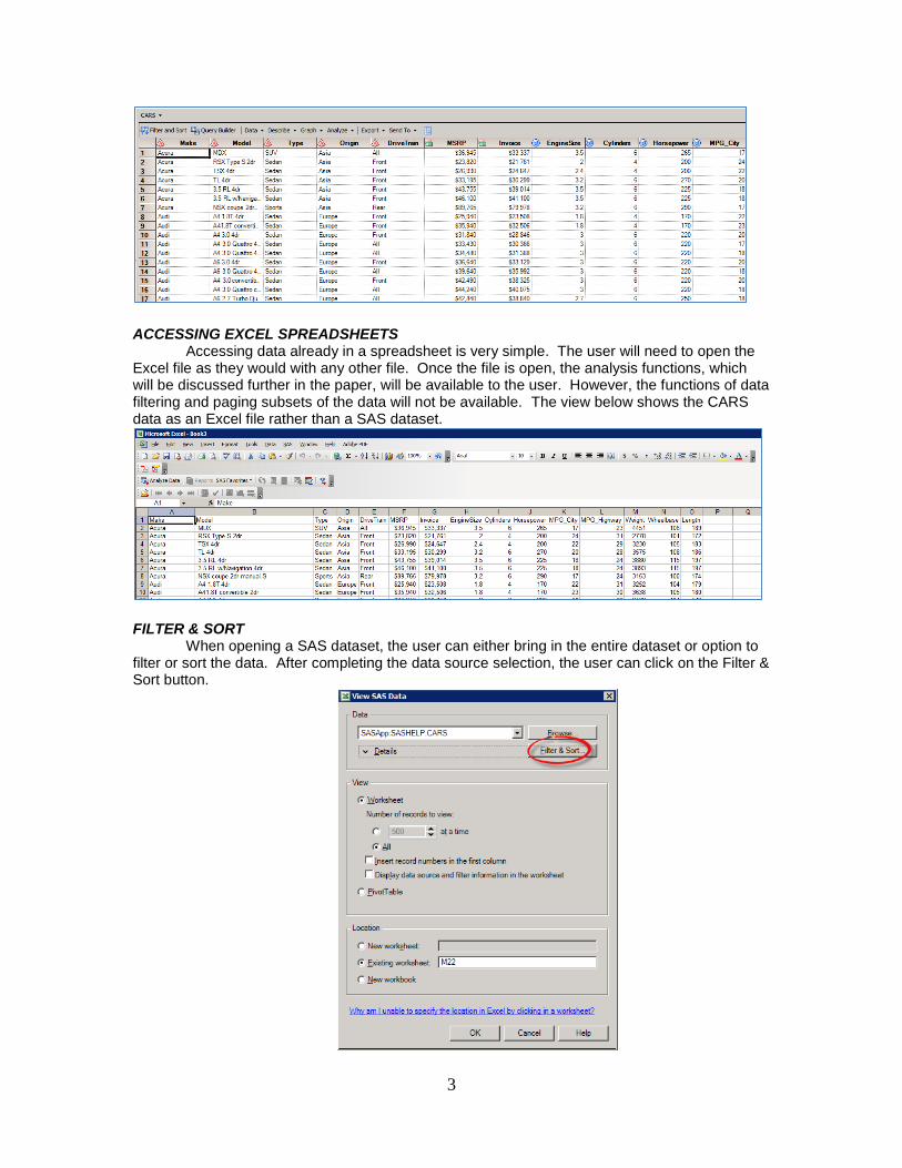
ACCESSING EXCEL SPREADSHEETS Accessing data already in a spreadsheet is very simple. The user will need to open the Excel file as they would with any other file. Once the file is open, the analysis functions, which will be discussed further in the paper, will be available to the user. However, the functions of data filtering and paging subsets of the data will not be available. The view below shows the CARS data as an Excel file rather than a SAS dataset.
FILTER & SORT When opening a SAS dataset, the user can either bring in the entire dataset or option to filter or sort the data. After completing the data source selection, the user can click on the Filter & Sort button.
4
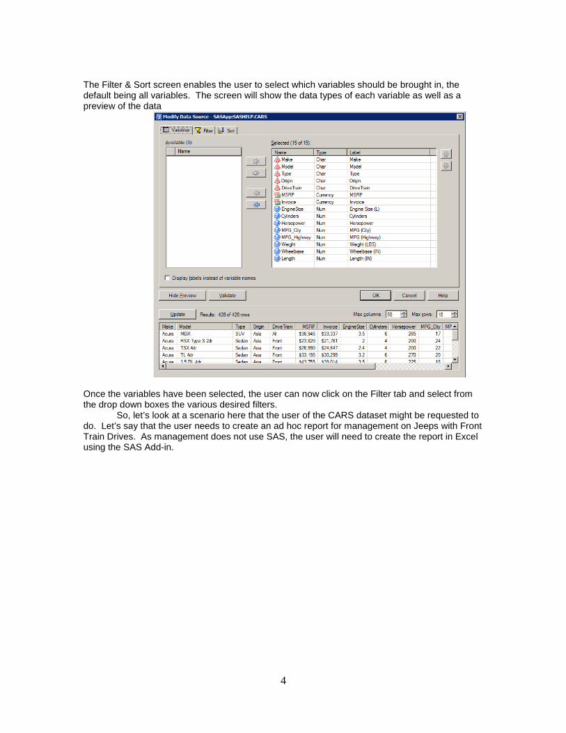
The Filter & Sort screen enables the user to select which variables should be brought in, the default being all variables. The screen will show the data types of each variable as well as a preview of the data
Once the variables have been selected, the user can now click on the Filter tab and select from the drop down boxes the various desired filters.
So, let’s look at a scenario here that the user of the CARS dataset might be requested to do. Let’s say that the user needs to create an ad hoc report for management on Jeeps with Front Train Drives. As management does not use SAS, the user will need to create the report in Excel using the SAS Add-in.
5
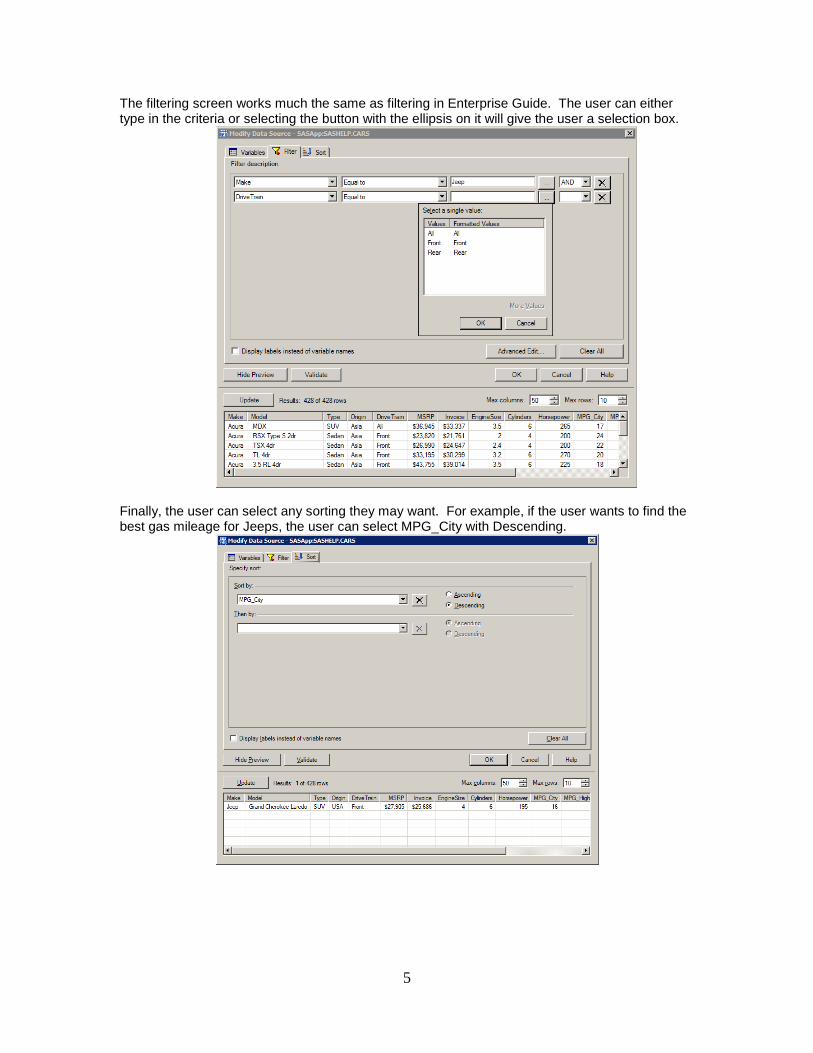
The filtering screen works much the same as filtering in Enterprise Guide. The user can either type in the criteria or selecting the button with the ellipsis on it will give the user a selection box.
Finally, the user can select any sorting they may want. For example, if the user wants to find the best gas mileage for Jeeps, the user can select MPG_City with Descending.
6
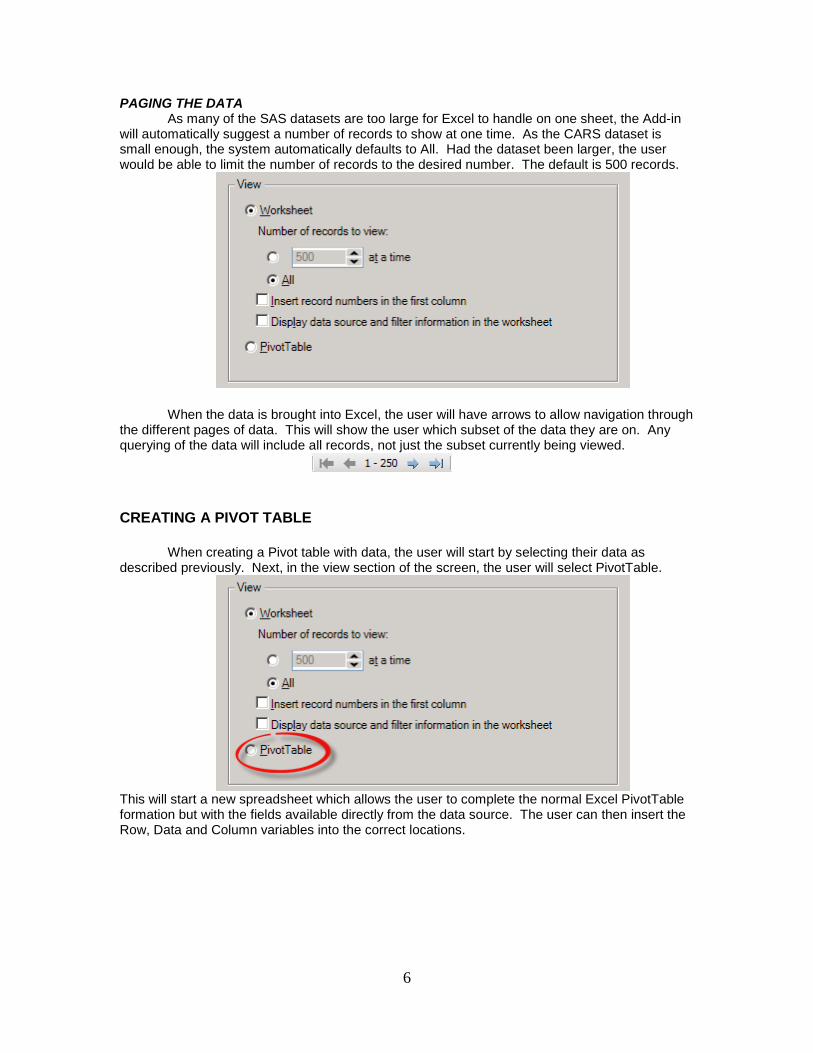
PAGING THE DATA As many of the SAS datasets are too large for Excel to handle on one sheet, the Add-in
will automatically suggest a number of records to show at one time. As the CARS dataset is small enough, the system automatically defaults to All. Had the dataset been larger, the user would be able to limit the number of records to the desired number. The default is 500 records.
When the data is brought into Excel, the user will have arrows to allow navigation through the different pages of data. This will show the user which subset of the data they are on. Any querying of the data will include all records, not just the subset currently being viewed.
CREATING A PIVOT TABLE
When creating a Pivot table with data, the user will start by selecting their data as described previously. Next, in the view section of the screen, the user will select PivotTable.
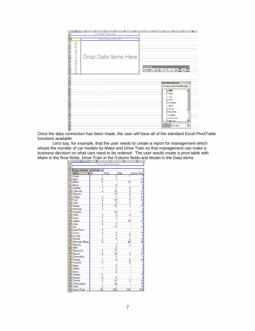
This will start a new spreadsheet which allows the user to complete the normal Excel PivotTable formation but with the fields available directly from the data source. The user can then insert the Row, Data and Column variables into the correct locations.
7
Once the data connection has been made, the user will have all of the standard Excel PivotTable functions available.
Let’s say, for example, that the user needs to create a report for management which shows the number of car models by Make and Drive Train so that management can make a business decision on what cars need to be ordered. The user would create a pivot table with Make in the Row fields, Drive Train in the Column fields and Model in the Data Items.

8
CREATING GRAPHS WITH THE DATA To start a Graph using the Add-in, the user can either start with the data already in the Excel spreadsheets or bring it in fresh. This example will be bringing the SASHELP.CARS data into the graph as a fresh load. To start, the user will click on the Analyze Data button on the toolbar. In this final scenario, the user is again making a report for management. This time, they are looking to see in a graph the number of cars by Make and which type the cars can be classified as (Hybrid, SUV and so on). In this way, management will know which of the inventory is running low for the most popular types of cars.
Next, the user will be able to select what type of data analysis is required. The list of SAS Tasks should be familiar to SAS Enterprise Guide users. After selecting Graph, and Bar Chart, the user will be requested to select the data source.
9
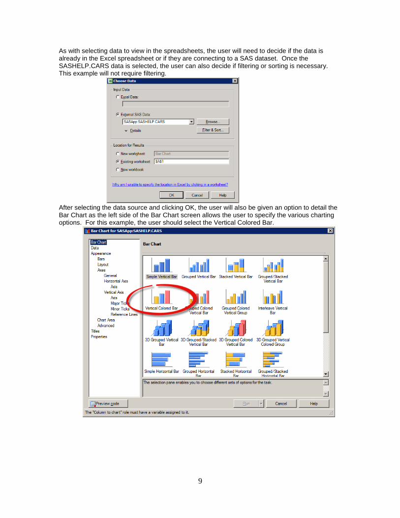
As with selecting data to view in the spreadsheets, the user will need to decide if the data is already in the Excel spreadsheet or if they are connecting to a SAS dataset. Once the SASHELP.CARS data is selected, the user can also decide if filtering or sorting is necessary. This example will not require filtering.
After selecting the data source and clicking OK, the user will also be given an option to detail the Bar Chart as the left side of the Bar Chart screen allows the user to specify the various charting options. For this example, the user should select the Vertical Colored Bar.
10
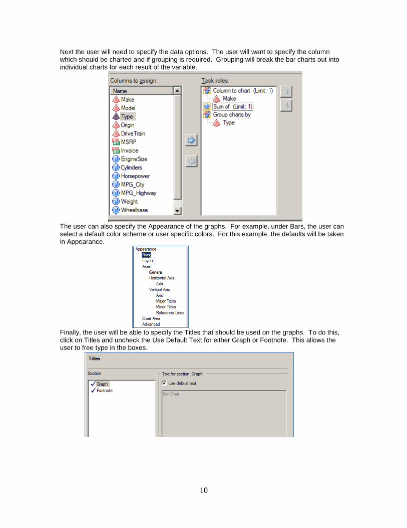
Next the user will need to specify the data options. The user will want to specify the column which should be charted and if grouping is required. Grouping will break the bar charts out into individual charts for each result of the variable.
The user can also specify the Appearance of the graphs. For example, under Bars, the user can select a default color scheme or user specific colors. For this example, the defaults will be taken in Appearance.
Finally, the user will be able to specify the Titles that should be used on the graphs. To do this, click on Titles and uncheck the Use Default Text for either Graph or Footnote. This allows the user to free type in the boxes.
11
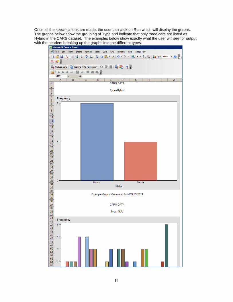
Once all the specifications are made, the user can click on Run which will display the graphs. The graphs below show the grouping of Type and indicate that only three cars are listed as Hybrid in the CARS dataset. The examples below show exactly what the user will see for output with the headers breaking up the graphs into the different types.
12
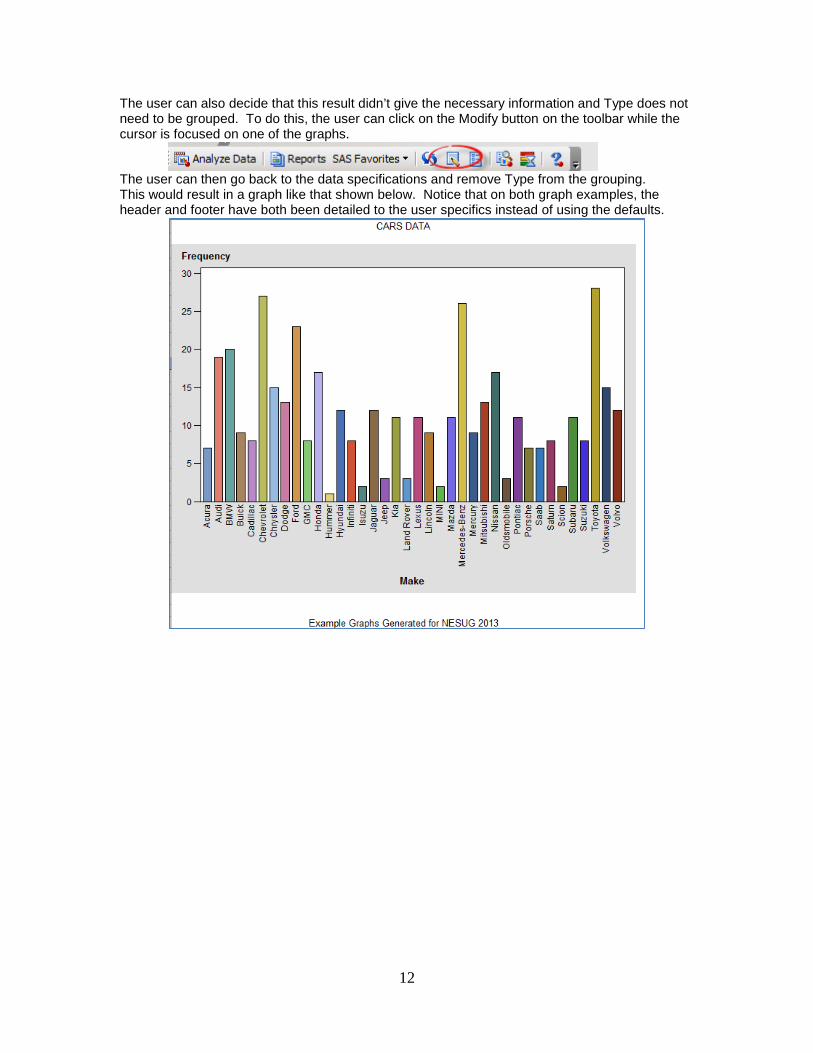
The user can also decide that this result didn’t give the necessary information and Type does not need to be grouped. To do this, the user can click on the Modify button on the toolbar while the cursor is focused on one of the graphs.
The user can then go back to the data specifications and remove Type from the grouping. This would result in a graph like that shown below. Notice that on both graph examples, the header and footer have both been detailed to the user specifics instead of using the defaults.

13
ADDITIONAL FUNCTIONS TO THE ADD-IN In addition to the PivotTables and Graphing, the user can also complete more complex analysis. When the user clicks on Analyze Data, a list of data options is given. The user can select to do any of the analysis options from the simple frequency option given in the Describe option to more complex analysis such as ANOVA or Regression. The benefit to these options being available is that the user can not only perform this analysis on existing SAS datasets but also on the data in any Excel Spreadsheet. Many of these analysis options are not available in Excel without complex programming.
CONCLUSION This paper has briefly gone over how to use the SAS Add-In for MS Excel. It has illustrated how a user with very little SAS knowledge can successfully query SAS datasets, create pivot tables or graphs without having to first export SAS data to Excel. It has shown the user how to filter and sort the data as needed before it is brought into Excel or how to handle large datasets. Finally, this paper touched on the complex analysis the user has available to them on any set of data, be it Excel or SAS datasets.
14
REFERENCES: Recommended reading sources:
“SAS® Add-In for Microsoft Office” - http://support.sas.com/software/products/addin/
Richardson, Kari and Eric Rossland. SAS® Hands-On Workshop: Business Intelligence – Course Notes. Cary, NC. SAS Institute Inc. 2008.
ACKNOWLEDGMENTS
In addition to the references found on the web, I would like to acknowledge my co-workers Virginia Blum, Gil Smith, Randy Spell and Sujith Krishnan for their editing skills and support.
TRADEMARKS SAS and all other SAS Institute Inc. product or service names are registered trademarks or trademarks of SAS Institute Inc. in the USA and other countries. ® indicates USA registration.
Other brand and product names are registered trademarks or trademarks of their respective companies.
CONTACT INFORMATION Contact the author at:
Jennifer Davies Z, Inc Email: [email protected]