Embed Size (px)
Citation preview
STUDENT STUDENT STUDENT STUDENT BOOKBOOKBOOKBOOKLETLETLETLET 1111
PHOTOGRAPHIC COMPOSITION For Beginners
STUDENT BOOKLET
Name _______________________
STUDENT STUDENT STUDENT STUDENT BOOKBOOKBOOKBOOKLETLETLETLET 2222
INTRODUCTION ______________________________________________________________________________
Any photographer can benefit from systematic exposure to the concepts and
principles of good composition. Composition is knowable, and it is learnable.
Tom Grill & Mark Scanlon
Why are some photographs more appealing and eye-catching than others? What is the secret
behind an effective composition? This Photographic Composition for Beginners teaches you the
basic principles and the design elements that are used to compose a photograph. These will act as
guidelines to help make your composition more harmonious and pleasing to the eye.
WHAT IS PHOTOGRAPHIC COMPOSITION?
Composition is the arrangement of subjects or elements within the photographic frame. How the
subjects are selected and arranged can make a big difference to your photograph. As a
photographer, you control the arrangement and the look of the image. You decide what the focal
point of interest is and where to place it within the frame so that the viewer will be drawn to the
picture. Design elements such as line, shape, pattern and color have a dual function. Firstly, their
presence helps to create a stronger image. Secondly, each element has intrinsic and symbolic
attributes which can evoke certain emotions and feelings in the viewer. For example, curved
lines give the feeling of gracefulness and calmness; diagonal lines can be dramatic and powerful;
patterns can be repetitive and structured.
STUDENT STUDENT STUDENT STUDENT BOOKBOOKBOOKBOOKLETLETLETLET 3333
The learning objectives of the unit are:
1. Principles of Design in Photographic Composition. Given a series of photographs, learners
will identify and apply the three golden principles (rule of thirds, golden triangle and golden
spiral).
2. Elements of Design in Photographic Composition. Given photographs, learners will explain
how the three design elements (line, shape and pattern) contribute to a good photographic
composition.
3. Color. Learners will identify the use of complementary colors in photographs.
STUDENT STUDENT STUDENT STUDENT BOOKBOOKBOOKBOOKLETLETLETLET 4444
LESSON 1 PRINCIPLES OF DESIGN IN PHOTOGRAPHIC COMPOSITION
______________________________________________________________________________
For a space divided into equal parts to be agreeable and aesthetic, between the
smallest and largest parts there must be the same relationship as between this
larger part and the whole space.
Vitruvius
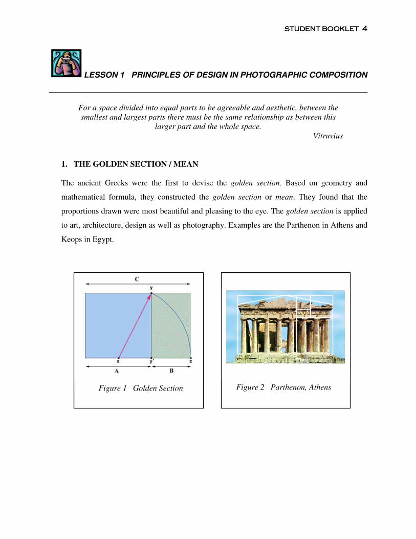
1. THE GOLDEN SECTION / MEAN
The ancient Greeks were the first to devise the golden section. Based on geometry and
mathematical formula, they constructed the golden section or mean. They found that the
proportions drawn were most beautiful and pleasing to the eye. The golden section is applied
to art, architecture, design as well as photography. Examples are the Parthenon in Athens and
Keops in Egypt.
Figure 2 Parthenon, Athens
Figure 1 Golden Section
STUDENT STUDENT STUDENT STUDENT BOOKBOOKBOOKBOOKLETLETLETLET 5555
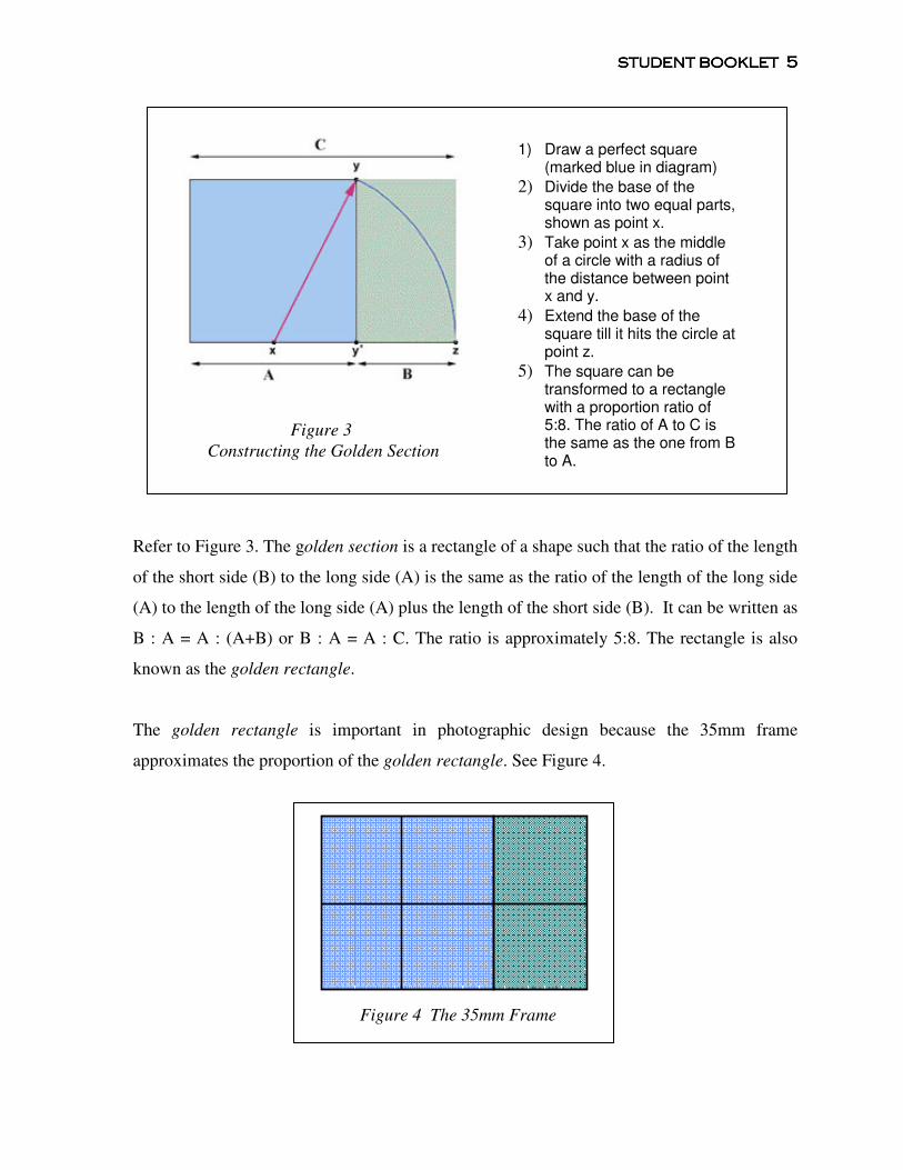
Refer to Figure 3. The golden section is a rectangle of a shape such that the ratio of the length
of the short side (B) to the long side (A) is the same as the ratio of the length of the long side
(A) to the length of the long side (A) plus the length of the short side (B). It can be written as
B : A = A : (A+B) or B : A = A : C. The ratio is approximately 5:8. The rectangle is also
known as the golden rectangle.
The golden rectangle is important in photographic design because the 35mm frame
approximates the proportion of the golden rectangle. See Figure 4.
Figure 4 The 35mm Frame
Figure 3
Constructing the Golden Section
1) Draw a perfect square (marked blue in diagram)
2) Divide the base of the square into two equal parts, shown as point x.
3) Take point x as the middle of a circle with a radius of the distance between point x and y.
4) Extend the base of the square till it hits the circle at point z.
5) The square can be transformed to a rectangle with a proportion ratio of 5:8. The ratio of A to C is the same as the one from B to A.
STUDENT STUDENT STUDENT STUDENT BOOKBOOKBOOKBOOKLETLETLETLET 6666
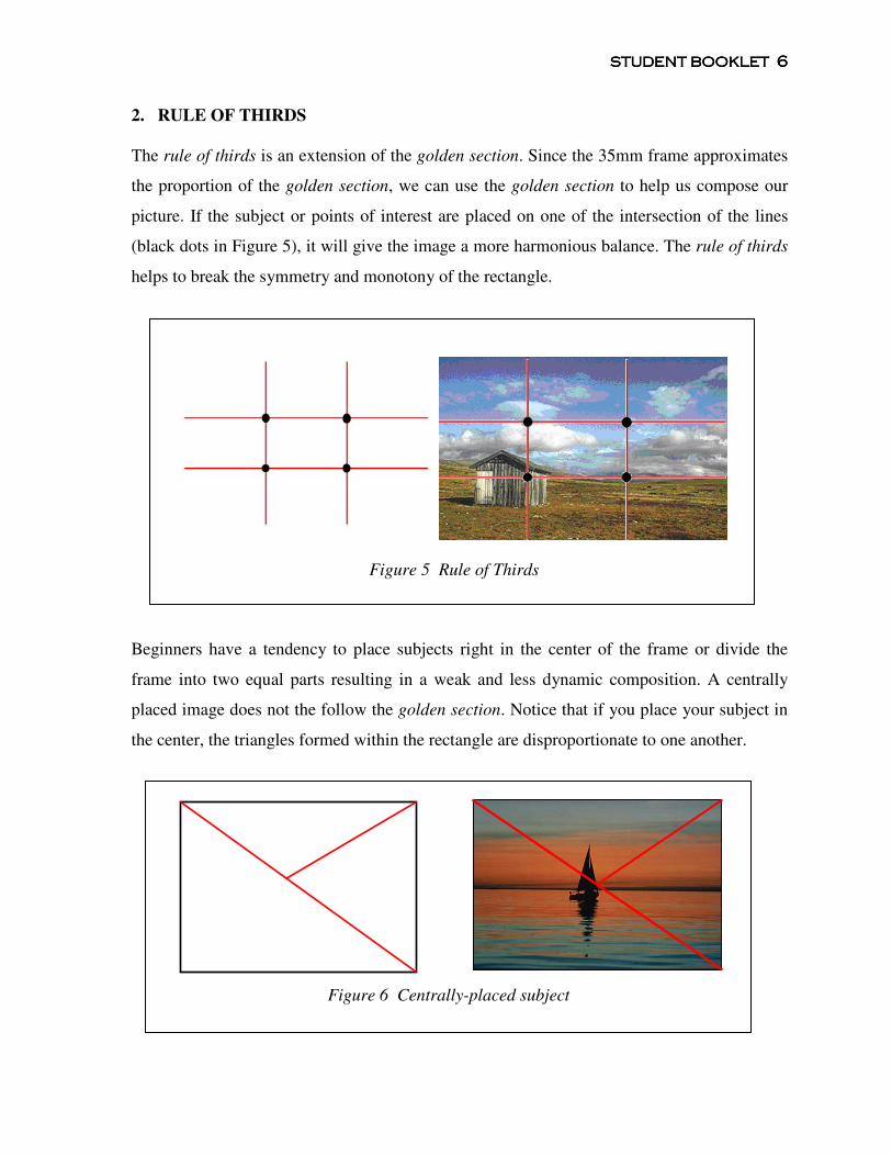
2. RULE OF THIRDS
The rule of thirds is an extension of the golden section. Since the 35mm frame approximates
the proportion of the golden section, we can use the golden section to help us compose our
picture. If the subject or points of interest are placed on one of the intersection of the lines
(black dots in Figure 5), it will give the image a more harmonious balance. The rule of thirds
helps to break the symmetry and monotony of the rectangle.
Beginners have a tendency to place subjects right in the center of the frame or divide the
frame into two equal parts resulting in a weak and less dynamic composition. A centrally
placed image does not the follow the golden section. Notice that if you place your subject in
the center, the triangles formed within the rectangle are disproportionate to one another.
Figure 6 Centrally-placed subject
Figure 5 Rule of Thirds
STUDENT STUDENT STUDENT STUDENT BOOKBOOKBOOKBOOKLETLETLETLET 7777
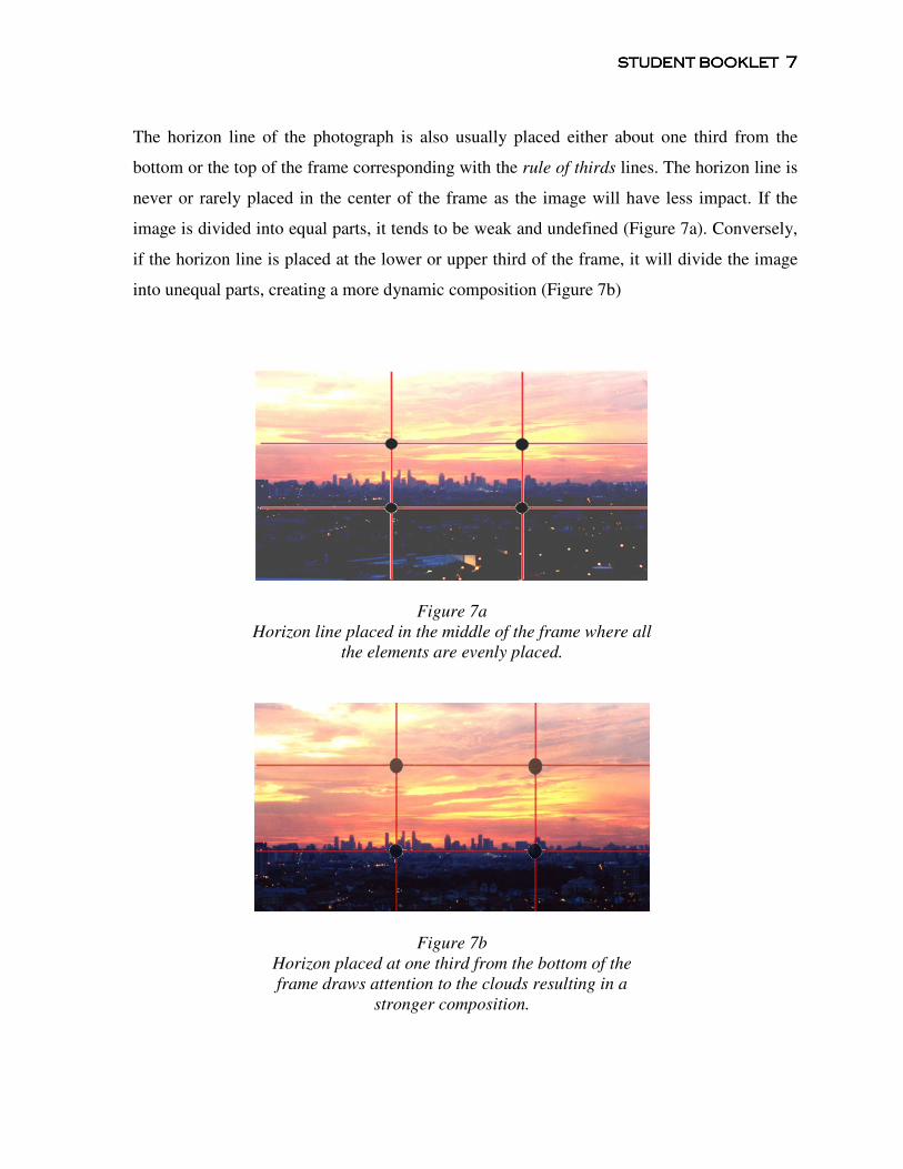
The horizon line of the photograph is also usually placed either about one third from the
bottom or the top of the frame corresponding with the rule of thirds lines. The horizon line is
never or rarely placed in the center of the frame as the image will have less impact. If the
image is divided into equal parts, it tends to be weak and undefined (Figure 7a). Conversely,
if the horizon line is placed at the lower or upper third of the frame, it will divide the image
into unequal parts, creating a more dynamic composition (Figure 7b)
Figure 7a
Horizon line placed in the middle of the frame where all
the elements are evenly placed.
Figure 7b
Horizon placed at one third from the bottom of the
frame draws attention to the clouds resulting in a
stronger composition.
STUDENT STUDENT STUDENT STUDENT BOOKBOOKBOOKBOOKLETLETLETLET 8888
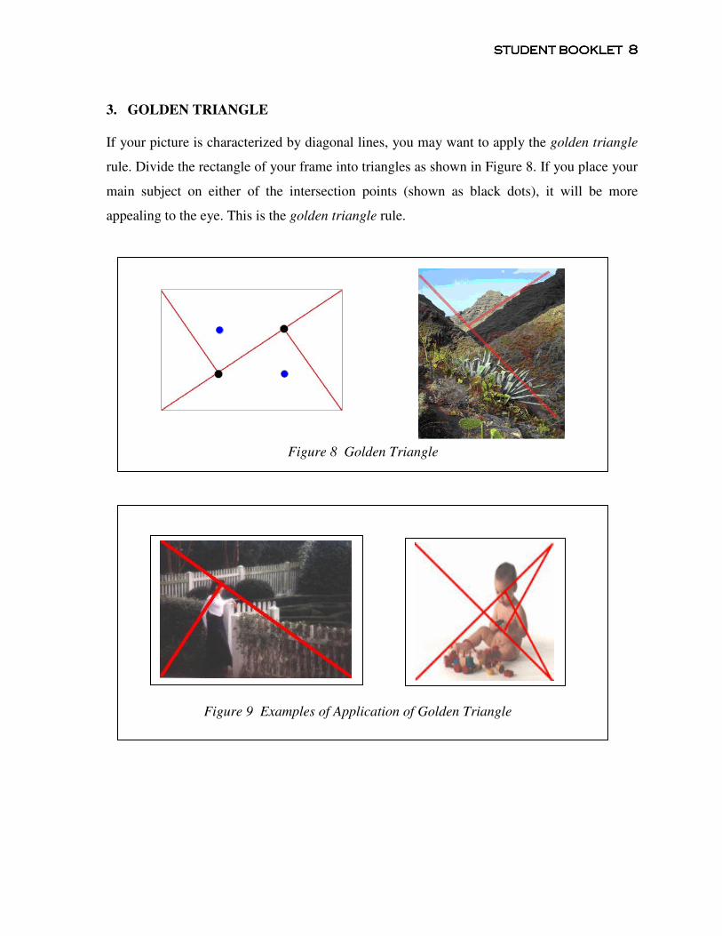
3. GOLDEN TRIANGLE
If your picture is characterized by diagonal lines, you may want to apply the golden triangle
rule. Divide the rectangle of your frame into triangles as shown in Figure 8. If you place your
main subject on either of the intersection points (shown as black dots), it will be more
appealing to the eye. This is the golden triangle rule.
Figure 9 Examples of Application of Golden Triangle
Figure 8 Golden Triangle
STUDENT STUDENT STUDENT STUDENT BOOKBOOKBOOKBOOKLETLETLETLET 9999
4. GOLDEN SPIRAL
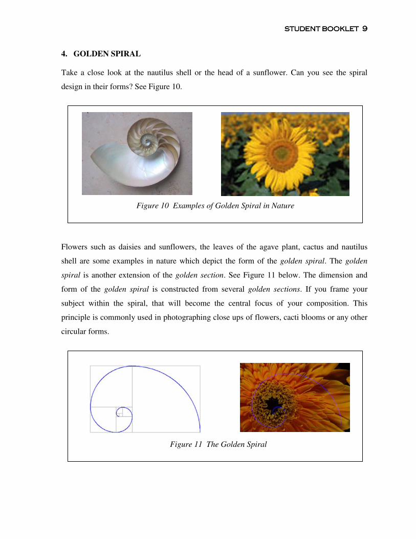
Take a close look at the nautilus shell or the head of a sunflower. Can you see the spiral
design in their forms? See Figure 10.
Flowers such as daisies and sunflowers, the leaves of the agave plant, cactus and nautilus
shell are some examples in nature which depict the form of the golden spiral. The golden
spiral is another extension of the golden section. See Figure 11 below. The dimension and
form of the golden spiral is constructed from several golden sections. If you frame your
subject within the spiral, that will become the central focus of your composition. This
principle is commonly used in photographing close ups of flowers, cacti blooms or any other
circular forms.
Figure 10 Examples of Golden Spiral in Nature
Figure 11 The Golden Spiral
STUDENT STUDENT STUDENT STUDENT BOOKBOOKBOOKBOOKLETLETLETLET 10101010
EXERCISE 1
Before you begin on the exercise, the instructor will demonstrate how to use the photo
adjuster.
1) Using the photo adjuster, choose one photograph and select one design principle that is
appropriate. Crop the photograph accordingly to arrive at a good composition. You have
to do three photographs, one for each design principle.
Discuss in class why you crop your photograph in a particular manner and which design
principle you use.
Instructions on using the photo adjuster:
a) Go to the photo adjuster website:
http://photoinf.com/Golden_Mean/photo-adjuster.html
b) Begin by clicking on browse. Go to desktop and look for the folder Photographic
Composition.
c) Open the folder and look for the folder Practice 1: Golden Principles.
d) Select one photograph from folder and click open. The photograph will appear in the
photo-adjuster viewer.
e) Choose one of the golden principles - the golden mean, golden spiral or golden triangles.
Click on the appropriate circle on the photo-adjuster. You can orientate the lines by using
the horizontal / vertical flip and rotation options.
f) Crop the photograph by adjusting the left, right, top and bottom of the frame. The point
of interest or subject should be placed according to the selected design principle.
g) Once completed, print screen and save in a word document.
STUDENT STUDENT STUDENT STUDENT BOOKBOOKBOOKBOOKLETLETLETLET 11111111
SUMMARY
In Lesson 1, you have learnt the four golden principles in composition: the golden section, rule
of thirds, the golden triangle and the golden spiral. These principles will help you decide where
to place the subject within the frame that will be appealing to the viewer. Do remember that these
principles serve as useful guidelines. They are not rules to be followed blindly. There are always
exceptions to the rules depending on the circumstances, the overall effect and the message you
wish to convey in your photographs.
PHOTO TIP
Take an empty slide frame. Take four pieces of string and place it like a grid following the lines
of the rule of thirds. When you are out on the field, look through the frame to guide you where to
position your subject or point of interest. With enough practice, you will be able to do this
instinctively.
ADDITIONAL RESOURCES
• History and the mathematical foundation of the golden section:
http://en.wikipedia.org/wiki/Golden_mean
• Article on construction of the golden section and its variants:
http://www.mcs.surrey.ac.uk/Personal/R.Knott/Fibonacci/phi2DGeomTrig.html
• Golden spiral and nature:
http://www.mcs.surrey.ac.uk/Personal/R.KNott/Fibonacci/fibnat.html
• Livio, Mario (2003). The Golden Ratio: The Story of PHI, the World's Most Astonishing
Number. Broadway Books.
STUDENT STUDENT STUDENT STUDENT BOOKBOOKBOOKBOOKLETLETLETLET 12121212
LESSON 2 ELEMENTS OF DESIGN IN PHOTOGRAPHIC COMPOSITION
______________________________________________________________________________
Line, shape and pattern are some of the design elements that you can use to compose your
photographs, whether they are landscape, close-ups, architectural or action images. Most
photographs will contain at least one or a combination of these elements. Being aware of the
design elements and being able to identify and isolate them in your images will help you improve
your composition.
In addition, all the elements have a symbolic representation. They indirectly convey a message to
your viewer. For example, vertical lines depict strength and height while horizontal lines give a
calm and expansive feel to the picture.
1. LINE
Lines are the strongest and most powerful visual element in design and photography. They
draw the attention of your viewer into the photograph and direct the eye across the
photographic space. They lead the viewers to the portions you want them to see. Lines also
define and divide the areas within the frame and give a spatial relationship to the various
elements in the photograph.
There are two types of lines: straight and curved lines. Straight lines can be horizontal,
vertical or diagonal.
1.1. LINES AND THEIR MEANINGS
Another function of lines is that they can convey emotion and give meaning to your
photographs. For example, thick lines give a sense of stability while thin lines are weak and
have less impact. As a photographer, you can choose the type of lines (straight or curved) as
well as the orientation of the lines (horizontal, diagonal, vertical, converging or diverging) to
evoke different moods and feelings in your photographs.
Straight lines appear to be more stable, reliable and rigid while curved lines are softer and
convey a relaxed feeling.
STUDENT STUDENT STUDENT STUDENT BOOKBOOKBOOKBOOKLETLETLETLET 13131313
Here are examples of the different types of lines and the expressive qualities and meanings
they add to the image.
1.2. STRAIGHT LINES
a) Horizontal Lines
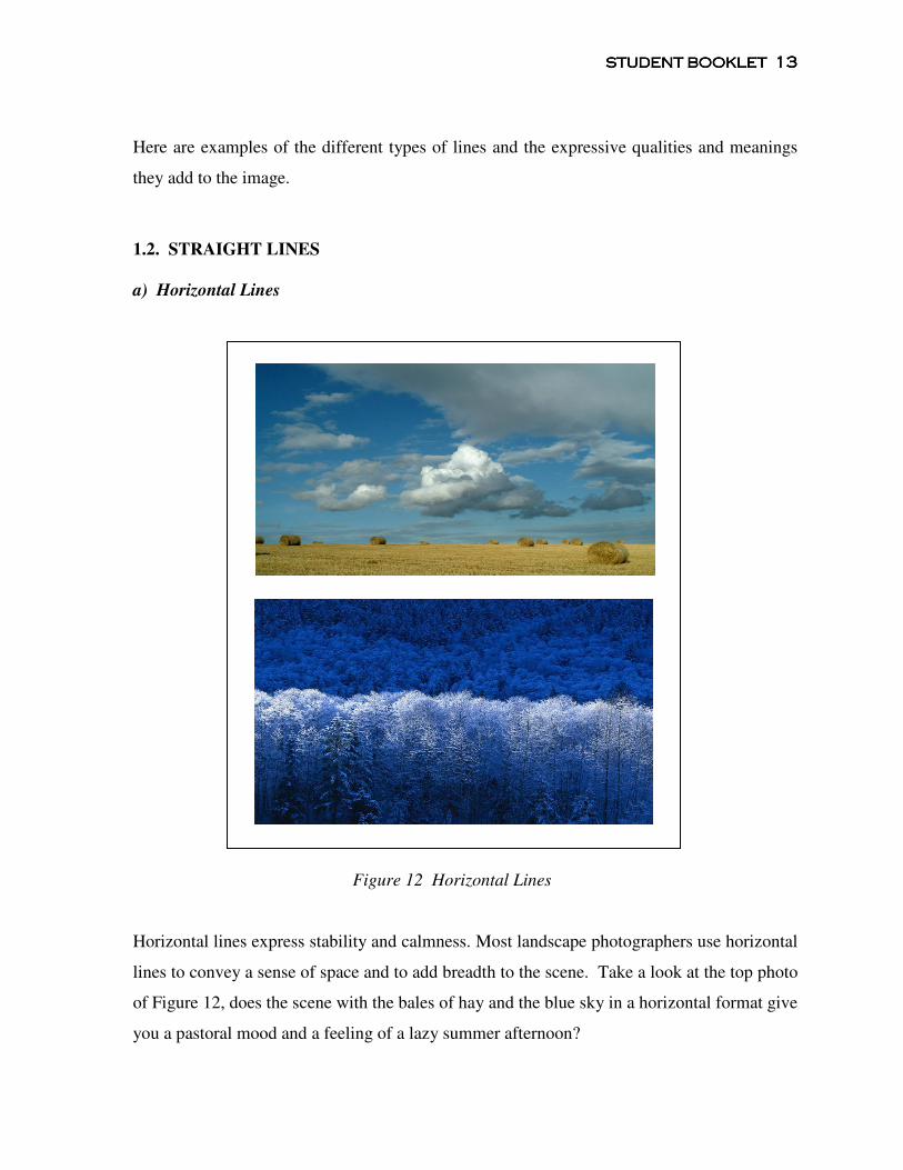
Figure 12 Horizontal Lines
Horizontal lines express stability and calmness. Most landscape photographers use horizontal
lines to convey a sense of space and to add breadth to the scene. Take a look at the top photo
of Figure 12, does the scene with the bales of hay and the blue sky in a horizontal format give
you a pastoral mood and a feeling of a lazy summer afternoon?
STUDENT STUDENT STUDENT STUDENT BOOKBOOKBOOKBOOKLETLETLETLET 14141414
b) Vertical Lines
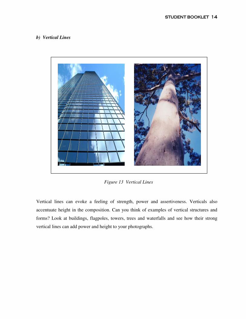
Figure 13 Vertical Lines
Vertical lines can evoke a feeling of strength, power and assertiveness. Verticals also
accentuate height in the composition. Can you think of examples of vertical structures and
forms? Look at buildings, flagpoles, towers, trees and waterfalls and see how their strong
vertical lines can add power and height to your photographs.
STUDENT STUDENT STUDENT STUDENT BOOKBOOKBOOKBOOKLETLETLETLET 15151515
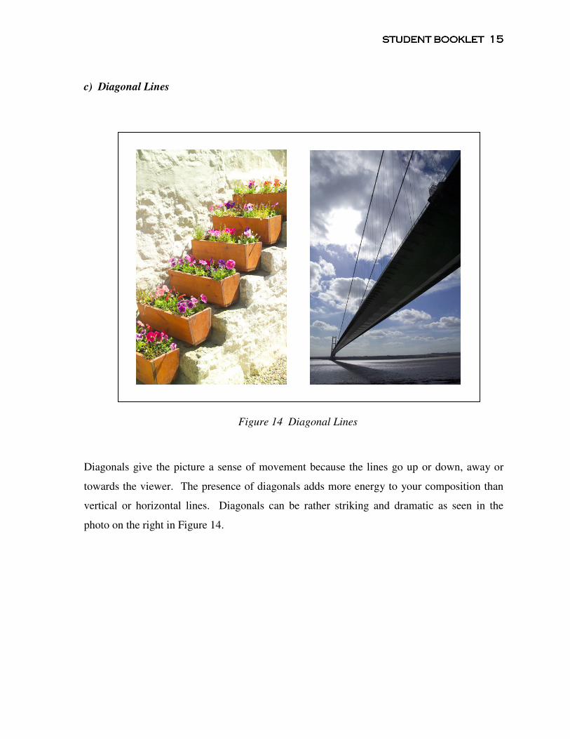
c) Diagonal Lines
Figure 14 Diagonal Lines
Diagonals give the picture a sense of movement because the lines go up or down, away or
towards the viewer. The presence of diagonals adds more energy to your composition than
vertical or horizontal lines. Diagonals can be rather striking and dramatic as seen in the
photo on the right in Figure 14.
STUDENT STUDENT STUDENT STUDENT BOOKBOOKBOOKBOOKLETLETLETLET 16161616
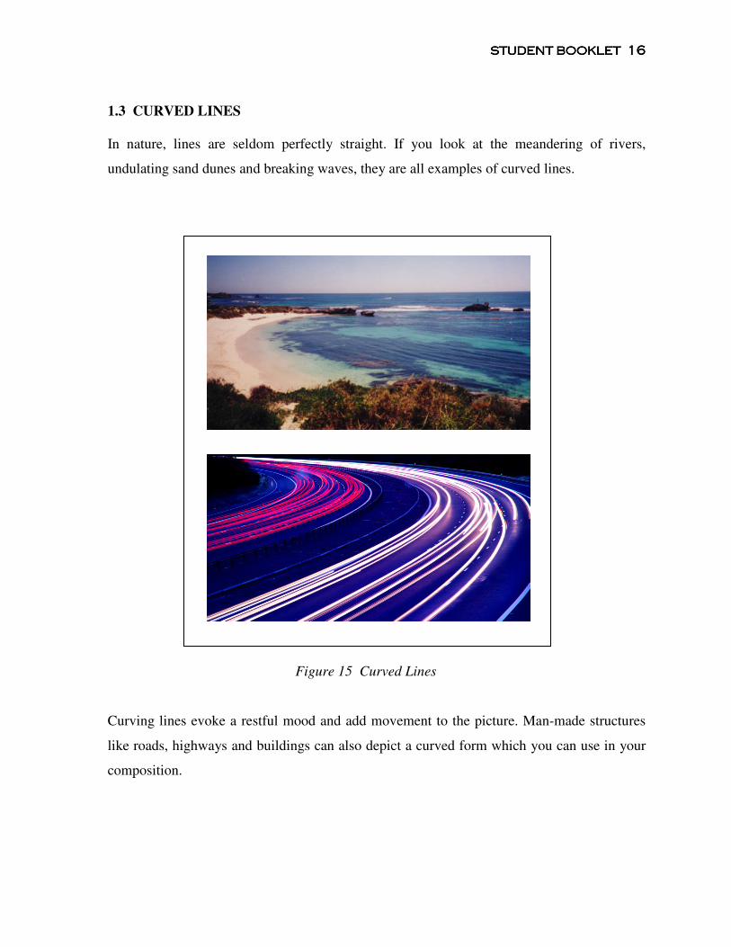
1.3 CURVED LINES
In nature, lines are seldom perfectly straight. If you look at the meandering of rivers,
undulating sand dunes and breaking waves, they are all examples of curved lines.
Figure 15 Curved Lines
Curving lines evoke a restful mood and add movement to the picture. Man-made structures
like roads, highways and buildings can also depict a curved form which you can use in your
composition.
STUDENT STUDENT STUDENT STUDENT BOOKBOOKBOOKBOOKLETLETLETLET 17171717
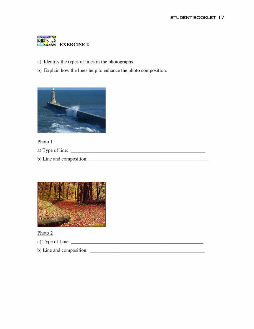
EXERCISE 2
a) Identify the types of lines in the photographs.
b) Explain how the lines help to enhance the photo composition.
Photo 1
a) Type of line: ______________________________________________________
b) Line and composition: ________________________________________________
Photo 2
a) Type of Line: _____________________________________________________
b) Line and composition: ______________________________________________
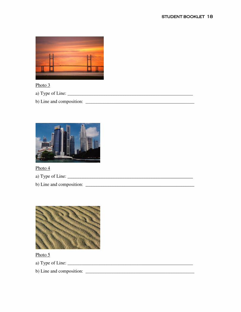
STUDENT STUDENT STUDENT STUDENT BOOKBOOKBOOKBOOKLETLETLETLET 18181818
Photo 3
a) Type of Line: _____________________________________________________
b) Line and composition: ______________________________________________
Photo 4
a) Type of Line: _____________________________________________________
b) Line and composition: ______________________________________________
Photo 5
a) Type of Line: _____________________________________________________
b) Line and composition: ______________________________________________

STUDENT STUDENT STUDENT STUDENT BOOKBOOKBOOKBOOKLETLETLETLET 19191919
2. SHAPE
Shape is the most fundamental element of design. If you look at a photograph and take away
its pattern and color, you will be left with just the basic shape or outline of the objects in the
scene. You can identify the object just by its shape alone.
Most photographers use frontlighting or backlighting to define and emphasize the shapes in
their images. Backlighting creates a silhouette which eliminates the texture and pattern of
the photograph leaving behind a stark outline and shape.
Figure 16 Shapes and Silhouettes
STUDENT STUDENT STUDENT STUDENT BOOKBOOKBOOKBOOKLETLETLETLET 20202020
2.1. SHAPES AND THEIR MEANINGS
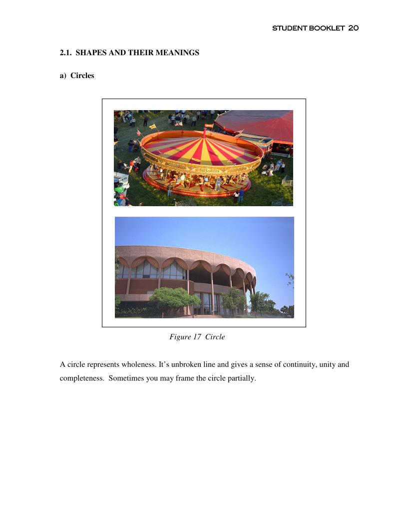
a) Circles
Figure 17 Circle
A circle represents wholeness. It’s unbroken line and gives a sense of continuity, unity and
completeness. Sometimes you may frame the circle partially.
STUDENT STUDENT STUDENT STUDENT BOOKBOOKBOOKBOOKLETLETLETLET 21212121
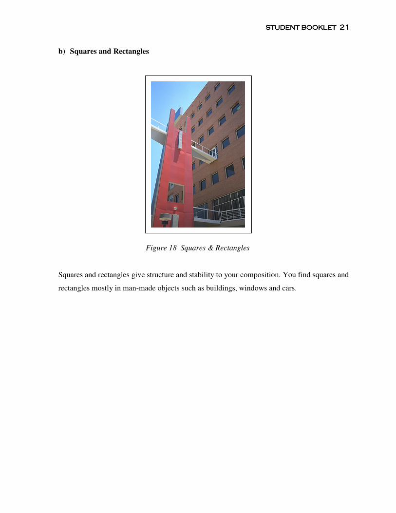
b) Squares and Rectangles
Figure 18 Squares & Rectangles
Squares and rectangles give structure and stability to your composition. You find squares and
rectangles mostly in man-made objects such as buildings, windows and cars.
STUDENT STUDENT STUDENT STUDENT BOOKBOOKBOOKBOOKLETLETLETLET 22222222
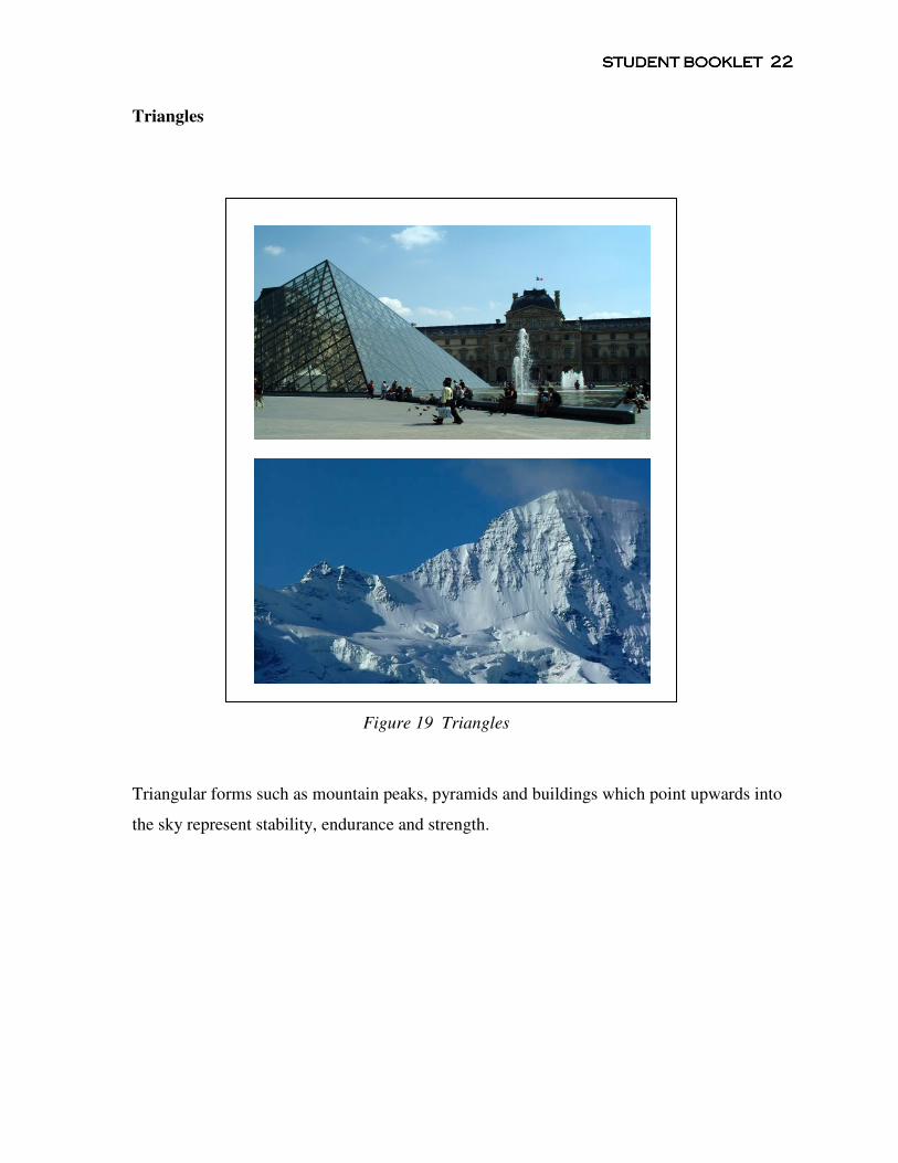
Triangles
Figure 19 Triangles
Triangular forms such as mountain peaks, pyramids and buildings which point upwards into
the sky represent stability, endurance and strength.
STUDENT STUDENT STUDENT STUDENT BOOKBOOKBOOKBOOKLETLETLETLET 23232323
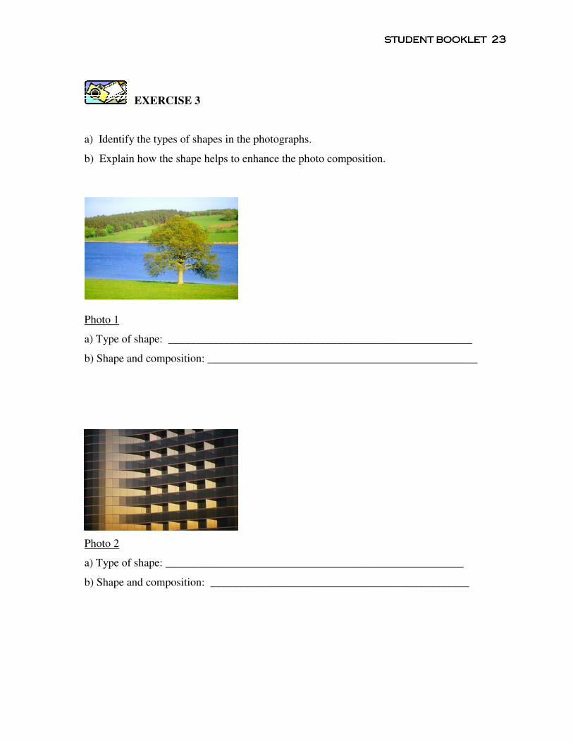
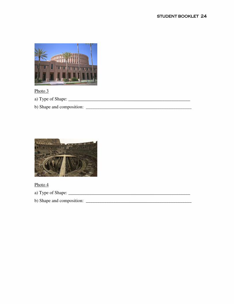
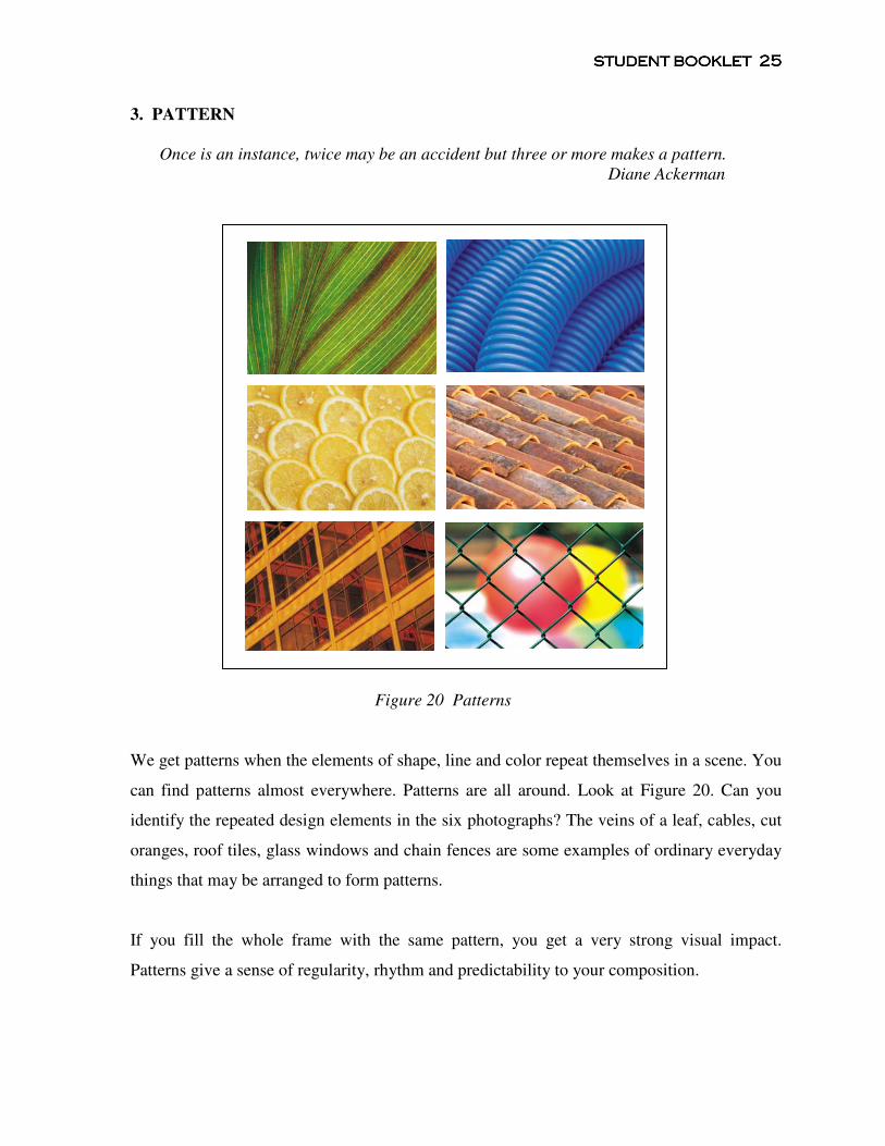
EXERCISE 3
a) Identify the types of shapes in the photographs.
b) Explain how the shape helps to enhance the photo composition.
Photo 1
a) Type of shape: ______________________________________________________
b) Shape and composition: ________________________________________________
Photo 2
a) Type of shape: _____________________________________________________
b) Shape and composition: ______________________________________________
STUDENT STUDENT STUDENT STUDENT BOOKBOOKBOOKBOOKLETLETLETLET 24242424
Photo 3
a) Type of Shape: _____________________________________________________
b) Shape and composition: ______________________________________________
Photo 4
a) Type of Shape: _____________________________________________________
b) Shape and composition: ______________________________________________
STUDENT STUDENT STUDENT STUDENT BOOKBOOKBOOKBOOKLETLETLETLET 25252525
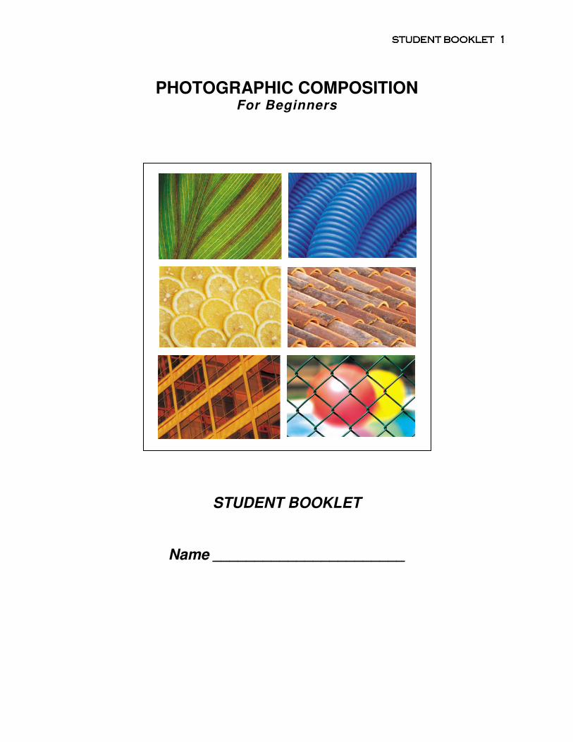
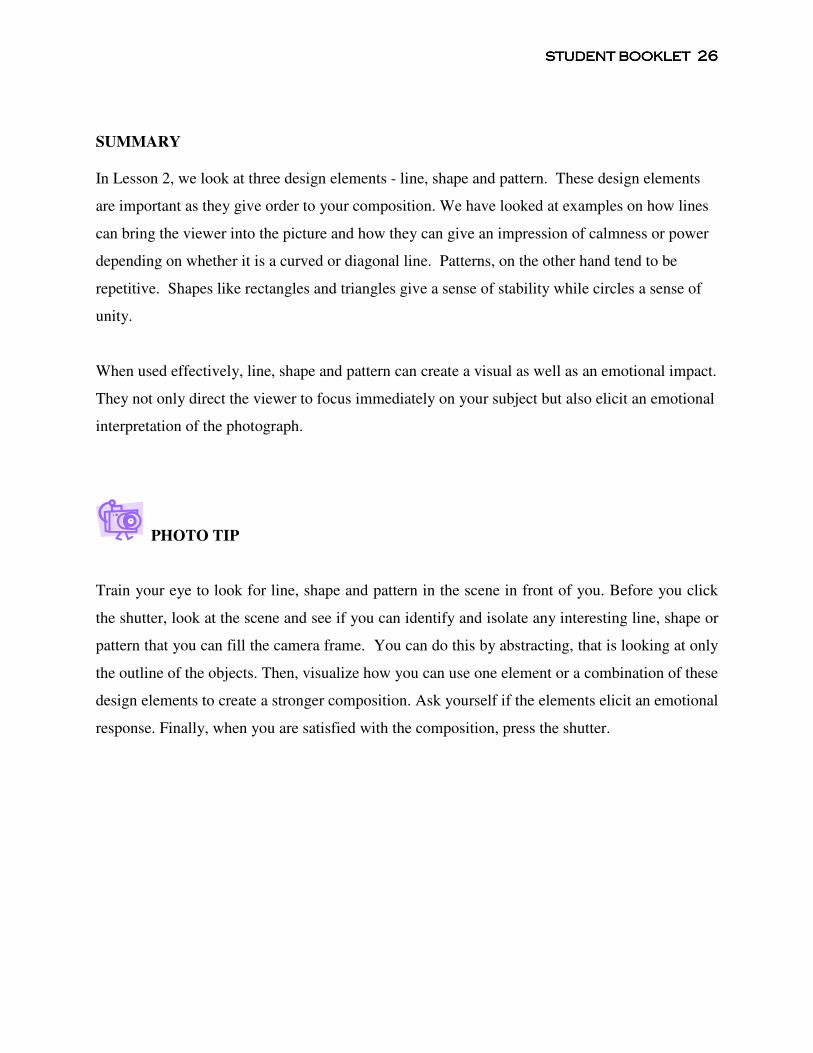
3. PATTERN
Once is an instance, twice may be an accident but three or more makes a pattern.
Diane Ackerman
Figure 20 Patterns
We get patterns when the elements of shape, line and color repeat themselves in a scene. You
can find patterns almost everywhere. Patterns are all around. Look at Figure 20. Can you
identify the repeated design elements in the six photographs? The veins of a leaf, cables, cut
oranges, roof tiles, glass windows and chain fences are some examples of ordinary everyday
things that may be arranged to form patterns.
If you fill the whole frame with the same pattern, you get a very strong visual impact.
Patterns give a sense of regularity, rhythm and predictability to your composition.
STUDENT STUDENT STUDENT STUDENT BOOKBOOKBOOKBOOKLETLETLETLET 26262626
SUMMARY
In Lesson 2, we look at three design elements - line, shape and pattern. These design elements
are important as they give order to your composition. We have looked at examples on how lines
can bring the viewer into the picture and how they can give an impression of calmness or power
depending on whether it is a curved or diagonal line. Patterns, on the other hand tend to be
repetitive. Shapes like rectangles and triangles give a sense of stability while circles a sense of
unity.
When used effectively, line, shape and pattern can create a visual as well as an emotional impact.
They not only direct the viewer to focus immediately on your subject but also elicit an emotional
interpretation of the photograph.
PHOTO TIP
Train your eye to look for line, shape and pattern in the scene in front of you. Before you click
the shutter, look at the scene and see if you can identify and isolate any interesting line, shape or
pattern that you can fill the camera frame. You can do this by abstracting, that is looking at only
the outline of the objects. Then, visualize how you can use one element or a combination of these
design elements to create a stronger composition. Ask yourself if the elements elicit an emotional
response. Finally, when you are satisfied with the composition, press the shutter.
STUDENT STUDENT STUDENT STUDENT BOOKBOOKBOOKBOOKLETLETLETLET 27272727
LESSON 3 COLOR ______________________________________________________________________________
Color is a language by itself.
Ernst Haas
We don’t live in a black and white world. Our world is filled with colors – blue skies, green
grass, white clouds, yellow sunsets, red roses and pink flamingoes. Colors can attract and draw
attention. Have you noticed that images of red flowers among green ferns, or a field of orange-
yellow sunflowers shot against the blue sky are more appealing? Why? In this lesson you will
learn about colors and how they can be combined to create an effective composition. This lesson
will focus on primary and secondary colors, complementary colors and color harmony.
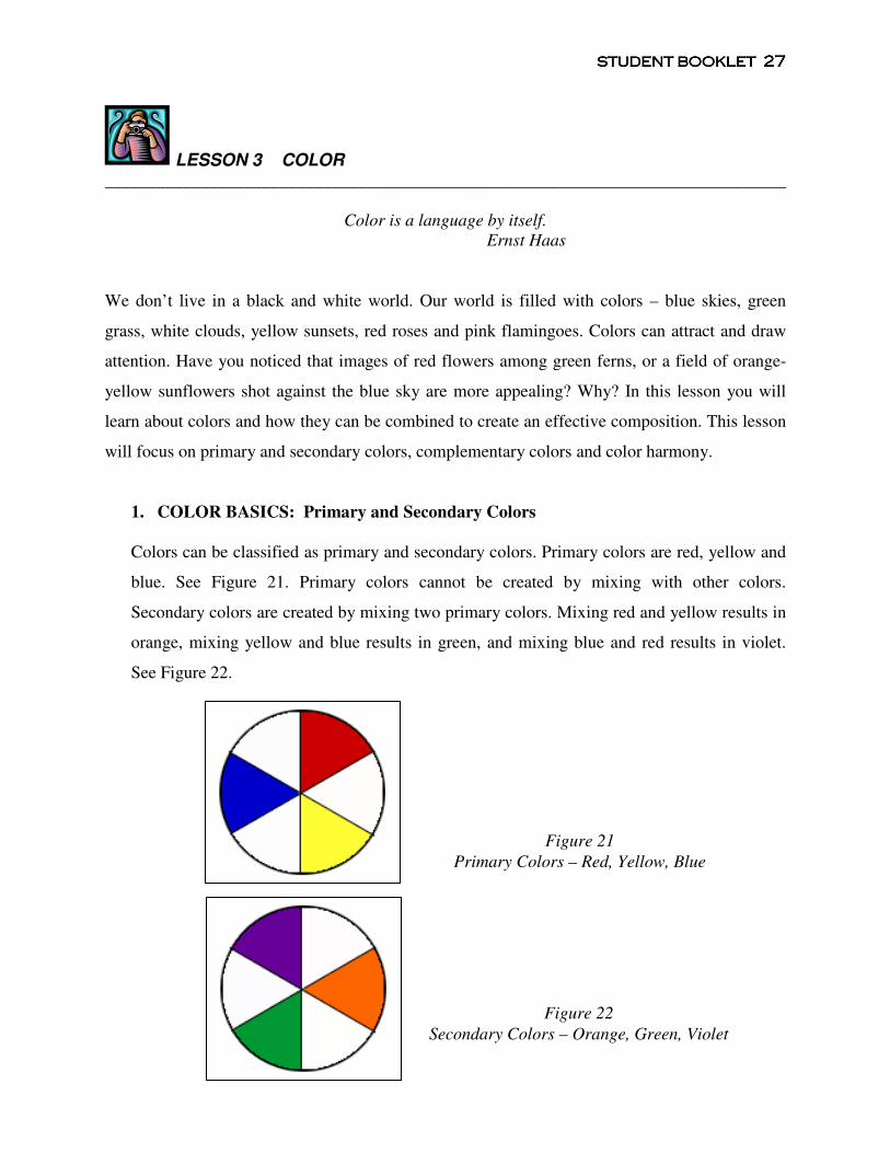
1. COLOR BASICS: Primary and Secondary Colors
Colors can be classified as primary and secondary colors. Primary colors are red, yellow and
blue. See Figure 21. Primary colors cannot be created by mixing with other colors.
Secondary colors are created by mixing two primary colors. Mixing red and yellow results in
orange, mixing yellow and blue results in green, and mixing blue and red results in violet.
See Figure 22.
Figure 22
Secondary Colors – Orange, Green, Violet
Figure 21
Primary Colors – Red, Yellow, Blue
STUDENT STUDENT STUDENT STUDENT BOOKBOOKBOOKBOOKLETLETLETLET 28282828
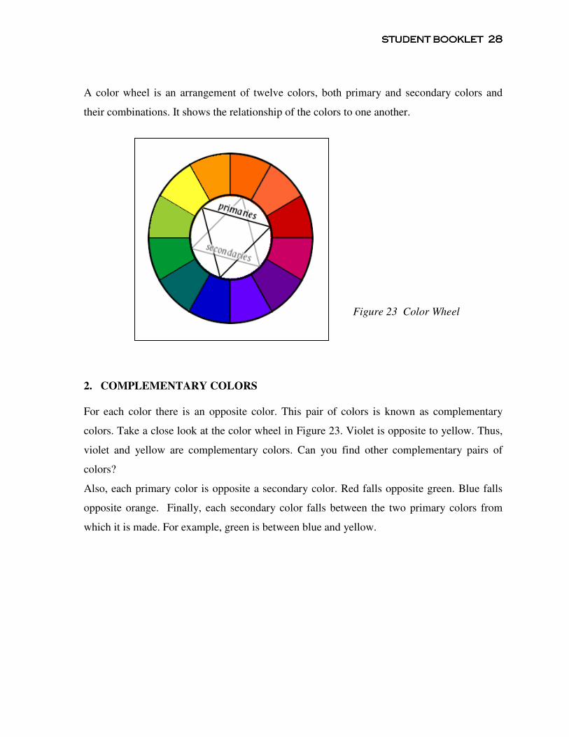
A color wheel is an arrangement of twelve colors, both primary and secondary colors and
their combinations. It shows the relationship of the colors to one another.
2. COMPLEMENTARY COLORS
For each color there is an opposite color. This pair of colors is known as complementary
colors. Take a close look at the color wheel in Figure 23. Violet is opposite to yellow. Thus,
violet and yellow are complementary colors. Can you find other complementary pairs of
colors?
Also, each primary color is opposite a secondary color. Red falls opposite green. Blue falls
opposite orange. Finally, each secondary color falls between the two primary colors from
which it is made. For example, green is between blue and yellow.
Figure 23 Color Wheel
STUDENT STUDENT STUDENT STUDENT BOOKBOOKBOOKBOOKLETLETLETLET 29292929
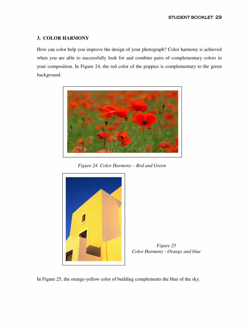
3. COLOR HARMONY
How can color help you improve the design of your photograph? Color harmony is achieved
when you are able to successfully look for and combine pairs of complementary colors in
your composition. In Figure 24, the red color of the poppies is complementary to the green
background.
In Figure 25, the orange-yellow color of building complements the blue of the sky.
Figure 25
Color Harmony - Orange and blue
Figure 24 Color Harmony – Red and Green
STUDENT STUDENT STUDENT STUDENT BOOKBOOKBOOKBOOKLETLETLETLET 30303030
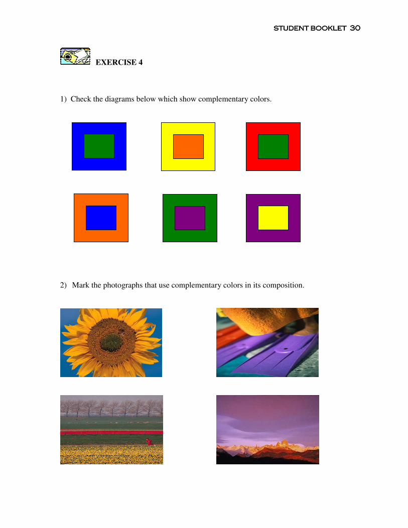
EXERCISE 4
1) Check the diagrams below which show complementary colors.
2) Mark the photographs that use complementary colors in its composition.
STUDENT STUDENT STUDENT STUDENT BOOKBOOKBOOKBOOKLETLETLETLET 31313131
SUMMARY
In this lesson on color, you learn about primary and secondary colors and how they relate to
one another. You find that the combination of some colors work better than others. If you
are able to identify the various pairs of complementary colors, for example, red and green,
blue and orange, yellow and violet, and use them in your photograph, you will achieve a
sense of harmony in your composition.
PHOTO TIP
When you are out on photography field trips, try to look for complementary colors. If you
find a red object, survey the surroundings and look for a green color and see if you can
combine both colors within the frame. With practice and experience, you will learn how to
make the colors work in your images. Remember as a photographer you are in control and
can select what you want to shoot.