Embed Size (px)
Citation preview
BMJ
Statistics And Ethics In Medical Research: VI: Presentation Of ResultsAuthor(s): Douglas G. AltmanSource: The British Medical Journal, Vol. 281, No. 6254 (Dec. 6, 1980), pp. 1542-1544Published by: BMJStable URL: http://www.jstor.org/stable/25442371 .
Accessed: 25/06/2014 01:08
Your use of the JSTOR archive indicates your acceptance of the Terms & Conditions of Use, available at .http://www.jstor.org/page/info/about/policies/terms.jsp
.JSTOR is a not-for-profit service that helps scholars, researchers, and students discover, use, and build upon a wide range ofcontent in a trusted digital archive. We use information technology and tools to increase productivity and facilitate new formsof scholarship. For more information about JSTOR, please contact [email protected].
.
Digitization of the British Medical Journal and its forerunners (1840-1996) was completed by the U.S. NationalLibrary of Medicine (NLM) in partnership with The Wellcome Trust and the Joint Information SystemsCommittee (JISC) in the UK. This content is also freely available on PubMed Central.
BMJ is collaborating with JSTOR to digitize, preserve and extend access to The British Medical Journal.
http://www.jstor.org
This content downloaded from 195.34.79.20 on Wed, 25 Jun 2014 01:08:10 AMAll use subject to JSTOR Terms and Conditions
1542 BRITISH MEDICAL JOURNAL VOLUME 281 6 DECEMBER 1980
Medicine and Mathematics
Statistics and ethics in medical research
VI?Presentation of results
DOUGLAS G ALTMAN
A very important aspect of statistical method is the clear
numerical and graphical presentation of results. Although many
statistical textbooks and courses discuss simple visual methods
such as histograms, bar charts, pie charts, and so on, they are
usually introduced as descriptive or investigative techniques. It
is uncommon to find discussion of how best to present the
results of statistical analyses. This is surprising, since the
interpretation of the results, both by the researcher and by later
readers of the paper, may be critically dependent on the methods
used to present the results.
Little need be said here about the simple visual methods
already mentioned?they are well covered by Huff.1 The
problems associated with graphs, however, are rather more
important.
Graphical presentation
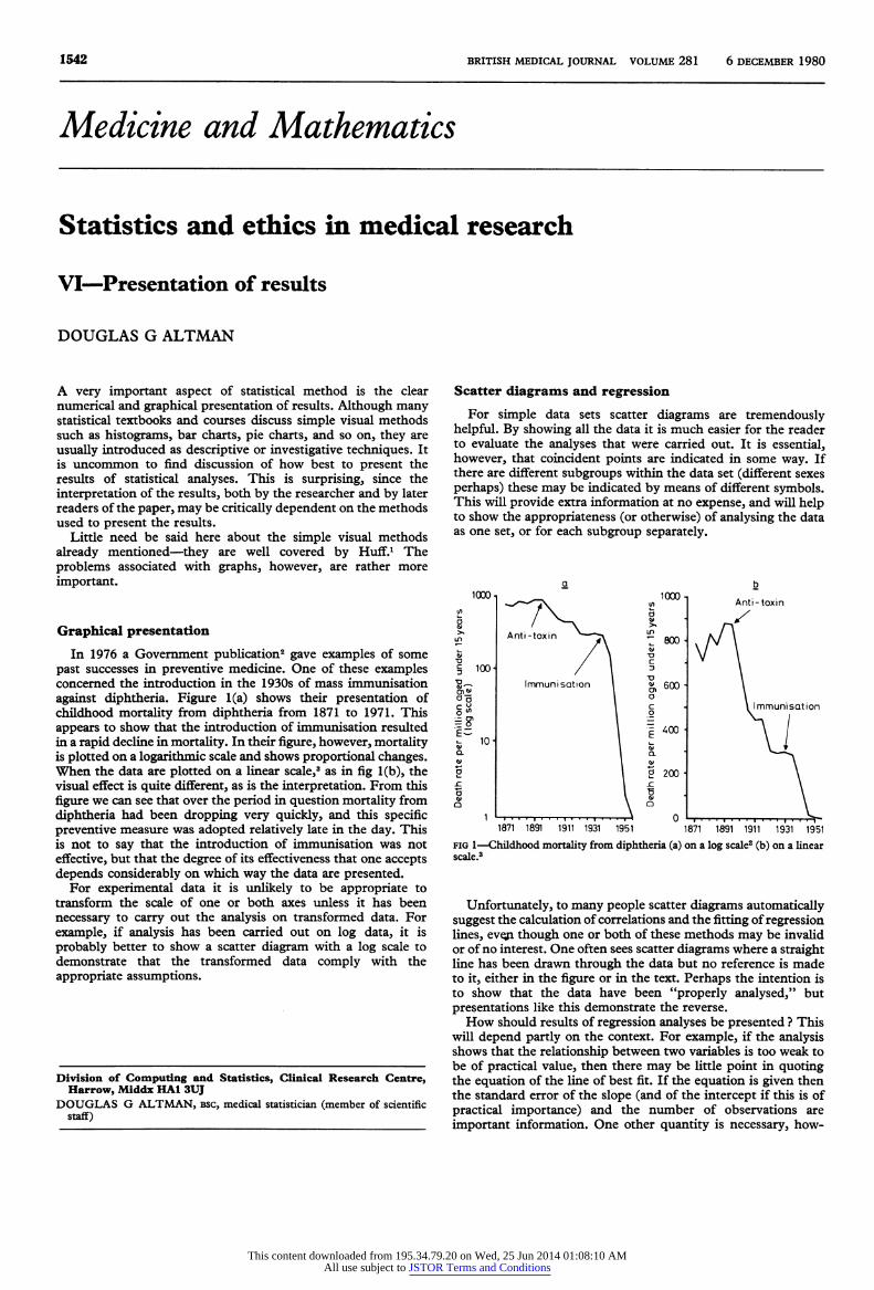
In 1976 a Government publication2 gave examples of some
past successes in preventive medicine. One of these examples concerned the introduction in the 1930s of mass immunisation
against diphtheria. Figure 1(a) shows their presentation of childhood mortality from diphtheria from 1871 to 1971. This appears to show that the introduction of immunisation resulted
in a rapid decline in mortality. In their figure, however, mortality is plotted on a logarithmic scale and shows proportional changes.
When the data are plotted on a linear scale,3 as in fig 1(b), the visual effect is quite different, as is the interpretation. From this
figure we can see that over the period in question mortality from
diphtheria had been dropping very quickly, and this specific preventive measure was adopted relatively late in the day. This
is not to say that the introduction of immunisation was not
effective, but that the degree of its effectiveness that one accepts
depends considerably on which way the data are presented. For experimental data it is unlikely to be appropriate to
transform the scale of one or both axes unless it has been
necessary to carry out the analysis on transformed data. For
example, if analysis has been carried out on log data, it is
probably better to show a scatter diagram with a log scale to
demonstrate that the transformed data comply with the
appropriate assumptions.
Division of Computing and Statistics, Clinical Research Centre, Harrow, Middx HAI 3UJ
DOUGLAS G ALTMAN, bsc, medical statistician (member of scientific
staff)
Scatter diagrams and regression
For simple data sets scatter diagrams are tremendously
helpful. By showing all the data it is much easier for the reader to evaluate the analyses that were carried out. It is essential,
however, that coincident points are indicated in some way. If
there are different subgroups within the data set (different sexes
perhaps) these may be indicated by means of different symbols. This will provide extra information at no expense, and will help to show the appropriateness (or otherwise) of analysing the data
as one set, or for each subgroup separately.
1000 1000
Z 800 1
600
c 400 H
2 200 1
o
Anti-toxin
Immunisation
1871 1951
fig 1?Childhood mortality from diphtheria (a) on a log scale2 (b) on a linear scale.3
Unfortunately, to many people scatter diagrams automatically
suggest the calculation of correlations and the fitting of regression
lines, eveji though one or both of these methods may be invalid or of no interest. One often sees scatter diagrams where a straight line has been drawn through the data but no reference is made
to it, either in the figure or in the text. Perhaps the intention is
to show that the data have been "properly analysed," but
presentations like this demonstrate the reverse.
How should results of regression analyses be presented ? This will depend partly on the context. For example, if the analysis shows that the relationship between two variables is too weak to
be of practical value, then there may be little point in quoting the equation of the line of best fit. If the equation is given then the standard error of the slope (and of the intercept if this is of
practical importance) and the number of observations are
important information. One other quantity is necessary, how
This content downloaded from 195.34.79.20 on Wed, 25 Jun 2014 01:08:10 AMAll use subject to JSTOR Terms and Conditions
BRITISH MEDICAL JOURNAL VOLUME 281 6 DECEMBER 1980 1543
ever, before one can make full use of a regression equation. The
equation can be used to estimate the variable Y for any new
value of the variable X. Such an estimate is, however, of limited
value without some measure of its uncertainty, for which it is
additionally necessary to have the residual standard deviation.4
This is a useful quantity in its own right, as it is a measure of the
variability of the discrepancies (residuals) between the observa
tions and the values predicted by the equation and is thus a
measure of the "goodness of fit" of the regression line to the
data. The residual standard deviation is rarely supplied in
papers, so that it is impossible to know what uncertainty is
attached to the use of the regression line for estimating Y from
X.
Whatever information is presented, it is vital that it is
unambiguous. The following equation may be meant to give much of the information but the meaning of the last term is
unclear :
TBN(g) = (28-8*FFM(kg)+288)?8-5%.
The paper5 from which this example comes also includes an
example of a type of incorrect visual presentation of a regression
equation?namely, the extension of the line well beyond the
range of the data. This practice is extremely unreliable and
potentially misleading, and can rarely be justified.
Variability
Despite its obvious importance and its almost universal
presence in scientific papers, the presentation of variability in
medical journals is a shambles. It is quite clear that some prac tices are now considered obligatory purely because they are
widely used and accepted, not because they are particularly informative.
Much of the confusion may arise from imperfect appreciation of the difference between the standard deviation and the
standard error. In simple terms the standard deviation is a
measure of the variability of a set of observations, whereas the
standard error is a measure of the precision of an estimate
(mean, mean difference, regression slope, etc) in relation to its
unknown true value. Despite this clear distinction in meaning, many people seem to have an innate preference fpx one or the
other; some time ago I looked at all the issues of the BMJ, Lancet y and New England Journal of Medicine for October 1977 and found only three papers that used both, although 50 used
either one or the other. Similar results were found in a much
larger study.6 It has been suggested that perhaps the standard
error of the mean is more popular because it is always much
smaller,8 7
and this may well be so.
STANDARD DEVIATION
The standard deviation, which describes the variability of raw
data, is often presented by attaching it to the corresponding mean using a ? sign: "The mean .. . was 30 mg (SD?4-6
mg)," or something similar. This presentation suggests that the
standard deviation is ?4-6 mg, but the standard deviation is
always a positive number.8 More importantly, it also suggests that the range from mean ?
SD to mean +SD (25-4 to 34-6 mg) is meaningful, but this is not so unless one is genuinely interested
in the range encompassing about 68% of the observations. In
general, the most useful range is probably the mean ?2 SD, within which about 95% of the observations lie. This range is 20-8 to 39-2, which is twice as wide as that implied by "?4-6
mg." Such ranges apply only if the observations are approxi
mately Normally distributed. Otherwise, although the standard deviation can be calculated, it may not convey much information
about the spread of the data. In such cases the median and two
centiles (say the 10th and 90th or the 5th and 95th for larger samples) will provide better information.910 The range of values
may also be of interest, but it is highly dependent on the number
of observations and is very sensitive to extreme or outlying
observations. Alternatively, the omission of the ? sign leads to
an unambiguous although much less informative presentation: "The mean was 30 mg (SD 4-6 mg)."
STANDARD ERRORS
Similar comments apply to the presentation of standard
errors. Here the most often quoted range of ?SE around an
estimate is that within which we can be about 68% sure that the true value lies, whereas the 95% range is twice as wide. (For
practical purposes these "confidence intervals" apply even when
the data are not Normally distributed.) The presentation most
usually used (mean ? SE) is thus misleading in giving the impression of greater precision than has been achieved. Quoting the range mean?2 SE is much better, but this is rarely seen.
Much confusion would be eliminated if the sign ? was used only when referring to a range.
ERROR BARS
Error bars are a popular way of displaying means and standard
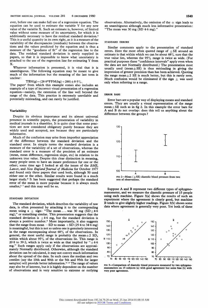
errors. They are usually a visual representation of the range mean ? SE such as in fig 2. In this example the error bars for A and B do not overlap: does this tell us anything about the difference between the groups ?
130
120
110
100
I
A B fig 2?Mean (?SE) diastolic blood pressure from two sets of observations.
Suppose A and B represent two different types of sphygmo manometer, and we measure the diastolic pressure of 15 people
using each machine. Figure 3(a) shows the results of such an experiment where the agreement is clearly good, but machine
B tends to give slightly higher readings. Figure 3(b) shows some data where agreement is generally very poor. Yet both of these
70 80 90 100 1K) 120 130 KO 150 70 80 90 100 110 120 130 KO 150 A A
fig 3?Comparison of diastolic blood pressures measured by two sphygmo manometers on 15 subjects (a) with good agreement but some bias (b) with very poor agreement.
This content downloaded from 195.34.79.20 on Wed, 25 Jun 2014 01:08:10 AMAll use subject to JSTOR Terms and Conditions
1544 BRITISH MEDICAL JOURNAL VOLUME 281 6 DECEMBER 1980
sets of data can be described exactly by the means and SEs in
fig 2. This is because fig 2 tells us nothing about differences between machines for each subject. Error bars are thus useless
in the case of paired observations.
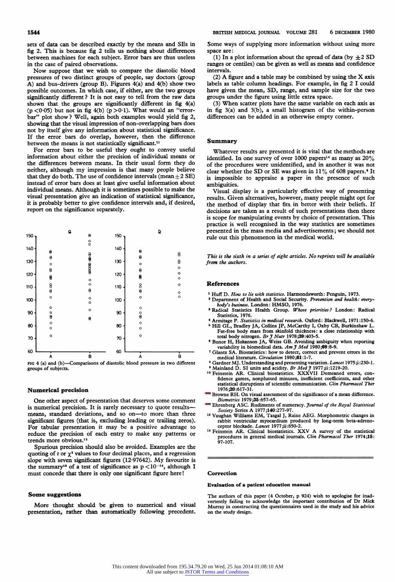
Now suppose that we wish to compare the diastolic blood
pressures of two distinct groups of people, say doctors (group
A) and bus-drivers (group B). Figures 4(a) and 4(b) show two
possible outcomes. In which case, if either, are the two groups
significantly different ? It is not easy to tell from the raw data shown that the groups are significantly different in fig 4(a) (p<005) but not in fig 4(b) (p>01). What would an "error
bar" plot show ? Well, again both examples would yield fig 2, showing that the visual impression of non-overlapping bars does
not by itself give any information about statistical significance. If the error bars do overlap, however, then the difference
between the means is not statistically significant.11 For error bars to be useful they ought to convey useful
information about either the precision of individual means or
the differences between means. In their usual form they do
neither, although my impression is that many people believe
that they do both. The use of confidence intervals (mean?2 SE) instead of error bars does at least give useful information about
individual means. Although it is sometimes possible to make the visual presentation give an indication of statistical significance, it is probably better to give confidence intervals and, if desired, report on the significance separately.
150,
140
130
120
110
100
90
80
70 A
60
150
140
130 H
120
110
100
90
80
70
60
fig 4 (a) and (b)?Comparisons of diastolic blood pressure in two different
groups of subjects.
Numerical precision
One other aspect of presentation that deserves some comment
is numerical precision. It is rarely necessary to quote results?
means, standard deviations, and so on?to more than three
significant figures (that is, excluding leading or trailing zeros). For tabular presentation it may be a positive advantage to
reduce the precision of each entry to make any patterns or
trends more obvious.12
Spurious precision should also be avoided. Examples are the
quoting of t or x2 values to four decimal places, and a regression
slope with seven significant figures (12-97642). My favourite is the summary18 of a test of significance as p <10-54, although I
must concede that there is only one significant figure here !
Some suggestions
More thought should be given to numerical and visual
presentation, rather than automatically following precedent.
Some ways of supplying more information without using more
space are:
(1) In a plot information about the spread of data (by ?2 SD
ranges or centiles) can be given as well as means and confidence
intervals.
(2) A figure and a table may be combined by using the X axis labels as table column headings. For example, in fig 2 I could
have given the mean, SD, range, and sample size for the two
groups under the figure using little extra space.
(3) When scatter plots have the same variable on each axis as
in fig 3(a) and 3(b), a small histogram of the within-person differences can be added in an otherwise empty corner.
Summary
Whatever results are presented it is vital that the methods are
identified. In one survey of over 1000 papers14 as many as 20% of the procedures were unidentified, and in another it was not
clear whether the SD or SE was given in 11% of 608 papers.6 It is impossible to appraise a paper in the presence of such
ambiguities. Visual display is a particularly effective way of presenting
results. Given alternatives, however, many people might opt for
the method of display that fita in better with their beliefs. If decisions are taken as a result of such presentations then there
is scope for manipulating events by choice of presentation. This
practice is well recognised in the way statistics are sometimes
presented in the mass media and advertisements ; we should not
rule out this phenomenon in the medical world.
This is the sixth in a series of eight articles. No reprints will be available
from the authors.
References
1 Huff D. How to lie with statistics. Harmondsworth : Penguin, 1973. 2 Department of Health and Social Security. Prevention and health: every
body's business. London: HMSO, 1976. 8 Radical Statistics Health Group. Whose priorities ? London : Radical
Statistics, 1976. 4 Armitage P. Statistics in medical research. Oxford: Blackwell, 1971:150-6.
5 Hill GL, Bradley JA, Collins JP, McCarthy I, Oxby CB, Burkinshaw L. Fat-free body mass from skinfold thickness: a close relationship with total body nitrogen. BrJ Nutr 1978;39:403-5.
6 Bunce H, Hokanson JA, Weiss GB. Avoiding ambiguity when reporting variability in biom?dical data. AmJMed 1980;69:8-9.
7 Glantz SA. Biostatistics : how to detect, correct and prevent errors in the medical literature. Circulation 1980;61:1-7.
8 Gardner MJ. Understanding and presenting variation. Lancet 1975 ;i :230-l. 9 Mainland D. SI units and acidity. Br MedJ 1977;ii: 1219-20.
10 Feinstein AR. Clinical biostatistics. XXXVII Demeaned errors, con
fidence games, nonplussed minuses, inefficient coefficients, and other statistical disruptions of scientific communication. Clin Pharmacol Ther
1976;20:617-31. 11 Browne RH. On visual assessment of the significance of a mean difference.
Biometrics 1979 ;35:657-65. 12
Ehrenberg ASC. Rudiments of numeracy. Journal of the Royal Statistical
Society Series A 1977;140:277-97. 13
Vaughan Williams EM, Tasgal J, Raine AEG. Morphometric changes in rabbit ventricular myocardium produced by long-term beta-adreno
ceptor blockade. Lancet 1977;ii:850-2. 14 Feinstein AR. Clinical biostatistics. XXV A survey of the statistical
procedures in general medical journals. Clin Pharmacol Ther 1974 ;15: 97-107.
Correction
Evaluation of a patient education manual
The authors of this paper (4 October, p 924) wish to apologise for inad
vertently failing to acknowledge the important contribution of Dr Mick
Murray in constructing the questionnaires used in the study and his advice on the study design.
This content downloaded from 195.34.79.20 on Wed, 25 Jun 2014 01:08:10 AMAll use subject to JSTOR Terms and Conditions


![Modern Computational Statistics [1em] Lecture 16: Advanced VI · Modern Computational Statistics Lecture 16: Advanced VI Cheng Zhang School of Mathematical Sciences, Peking University](https://img.pdfslide.us/doc/110x75/5ed85651ff358d5a140c97b1/modern-computational-statistics-1em-lecture-16-advanced-vi-modern-computational.jpg)