Embed Size (px)
Citation preview
HAL Id: hal-02931257https://hal.archives-ouvertes.fr/hal-02931257v2
Submitted on 7 Sep 2020
HAL is a multi-disciplinary open accessarchive for the deposit and dissemination of sci-entific research documents, whether they are pub-lished or not. The documents may come fromteaching and research institutions in France orabroad, or from public or private research centers.
L’archive ouverte pluridisciplinaire HAL, estdestinée au dépôt et à la diffusion de documentsscientifiques de niveau recherche, publiés ou non,émanant des établissements d’enseignement et derecherche français ou étrangers, des laboratoirespublics ou privés.
Showing Data about People: A Design Space ofAnthropographics
Luiz Morais, Yvonne Jansen, Nazareno Andrade, Pierre Dragicevic
To cite this version:Luiz Morais, Yvonne Jansen, Nazareno Andrade, Pierre Dragicevic. Showing Data about People:A Design Space of Anthropographics. IEEE Transactions on Visualization and Computer Graphics,Institute of Electrical and Electronics Engineers, In press. �hal-02931257v2�
ACCEPTED TO TRANSACTIONS OF VISUALIZATION AND COMPUTER GRAPHICS (AUTHORS’ VERSION) 1
Showing Data about People:A Design Space of Anthropographics
Luiz Morais, Yvonne Jansen, Nazareno Andrade, and Pierre Dragicevic
Abstract—When showing data about people, visualization designers and data journalists often use design strategies that presumablyhelp the audience relate to those people. The term anthropographics has been recently coined to refer to this practice and the resultingvisualizations. Anthropographics is a rich and growing area, but the work so far has remained scattered. Despite preliminary empiricalwork and a few web essays written by practitioners, there is a lack of clear language for thinking about and communicating aboutanthropographics. We address this gap by introducing a conceptual framework and a design space for anthropographics. Our designspace consists of seven elementary design dimensions that can be reasonably hypothesized to have some effect on prosocial feelings orbehavior. It extends a previous design space and is informed by an analysis of 105 visualizations collected from newspapers, websites,and research papers. We use our conceptual framework and design space to discuss trade-offs, common design strategies, as well asfuture opportunities for design and research in the area of anthropographics.
Index Terms—Anthropographics, design space, empathy, compassion, prosocial behavior.
F
1 INTRODUCTION
WHEN communicating data about people, informationdesigners and data journalists regularly create visual-
izations1 meant to foster an emotional connection with thepersons whose data are represented. Figure 1 shows oneexample where the reader can see the story and personalinformation of each person who died in a public massshooting in the USA. Meanwhile, the visualization in Figure2 conveys the hardship of the life of refugees by narratingthe story of S.W.G., a 26 years old refugee who left Pakistanand spent 651 days before arriving at his final destination.Both visualizations were crafted to bring readers closer tothe persons whose data are visualized.
The practice of visualizing data about people in a way thathelps the audience relate has been called anthropographics [1],[2]. Boy and colleagues [1] coined this term as an abbrevia-tion for anthropomorphized data graphics—visualizations withhuman-shaped symbols. The meaning was then extendedto “visual strategies to make the connection between data andthe humans behind them more direct and, hopefully, more em-pathic” [2]. Similarly, the term data humanism was coined torefer to a range of visualization design practices intended topromote humanistic values [3]. In this article, we reconcilethese different views by defining anthropographics as:
visualizations that represent data about people in away that is intended to promote prosocial feelings(e.g., compassion or empathy) or prosocial behavior(e.g., donating or helping).
• Luiz Morais is with Universidade Federal de Campina Grande,Brazil, and Inria and Universite Paris-Saclay, France. E-mail:[email protected]
• Yvonne Jansen is with CNRS and Sorbonne Universite, France.• Nazareno Andrade is with Universidade Federal de Campina Grande.• Pierre Dragicevic is with Inria and Universite Paris-Saclay, France.
Manuscript received August 15 2019; revised September 1, 2020.1. In this article, we employ visualization in a broad sense that also
includes infographics.
Like Boy and colleagues [1], this definition refers to aclass of visualizations rather than a set of design strategies,and like Bertini [2], it generalizes beyond the use of human-shaped symbols. Based on findings that empathy is notnecessarily conducive to helping behavior [4], the definitionconsiders prosocial behavior as a potential design goal, aswell as other prosocial feelings such as compassion, which ispresumably more directly connected to prosocial behavior [4].Prosocial feelings and behavior can be directed towards thevery people represented in the visualization, or towards otherpeople who share a connection with them (e.g., survivors,descendants, or people sharing identity characteristics).
Visualization designers have explored many strategiesfor creating anthropographics. A popular strategy is to usehuman-shaped symbols [1] (such as in Figure 1). Otherstrategies include the use of text annotations to make eachperson appear unique [1] (for example, see the top left ofFigure 2), the use of visual metaphors (such as a red bar chartto symbolize blood or death), or the representation of personsas individual marks rather than aggregated data [5], [6] (suchas in Figure 1). So far, only a few of these strategies havebeen empirically tested, and even though initial studies havebeen mostly inconclusive [1], [7], [8], there is an enormouspotential for information visualization research.
Anthropographics is a rich and growing area, but thework so far has been scattered. As such, the visualizationcommunity presently lacks a precise language for discussinganthropographics, as well as an overview of design strategiesand opportunities for design. The goal of this paper is tocontribute to fill this gap by proposing a design space andconceptual framework that are meant to help researchersand practitioners reason and communicate about anthropo-graphics. We aim at providing conceptual foundations and alanguage to facilitate the design, critique, comparison, andempirical evaluation of anthropographics.
ACCEPTED TO TRANSACTIONS OF VISUALIZATION AND COMPUTER GRAPHICS (AUTHORS’ VERSION) 2
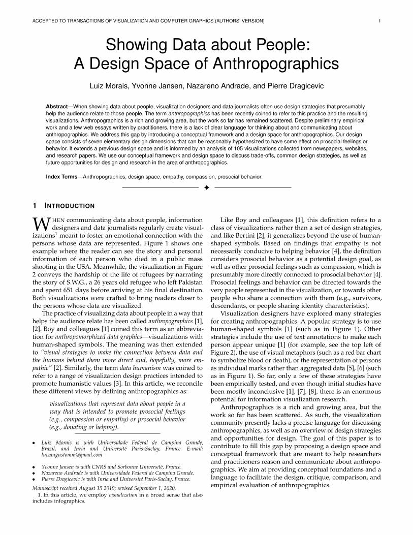
Fig. 1: How Many People Have Been Killed by Guns in USASince Newtown’s attack. This visualization shows people whodied due to a gun shot between the Newtown attack in 2012,and December, 2013. Each icon is a person. Sex and ageare shown through the icon’s shape. Additional informationabout each person can be obtained by clicking on their icon.Source: Slate [9].
Our framework extends a previously proposed designspace [1]. The primary focus of this previous work was,however, on reporting empirical studies. In contrast, thepresent article is fully dedicated to laying out a compre-hensive design space of anthropographics. Specifically, weintroduce useful basic terminology, extend and refine theearlier design space, and provide and discuss a range ofillustrations and examples.
Our design space consists of seven design dimensionsthat can be reasonably believed to have some effect onprosocial feelings or behavior, namely: granularity, specificity,coverage, authenticity, realism, physicality, and situatedness.These dimensions were identified by examining a collectionof 105 communicative visualizations that convey data aboutpeople, some of which are anthropographics and some ofwhich are not (that is, some are conventional statisticalcharts). After describing the design space and the conceptualframework it is based on, we identify recurrent combinationsof dimensions (that is, families of visualization designs), anddiscuss opportunities for future research and design.
Our conceptual framework is meant to be descriptive,generative and evaluative [10]: it has been devised to helpdesigners think more clearly about existing and possible newdesigns. However, it is not meant to be prescriptive [10]: itcannot help predict what designs will work best, and cannotprescribe what designs to use. More studies are needed beforeany such predictive attempts can be made. Frameworks suchas ours are, however, important to:
• help researchers design empirical studies to estimate theeffects that such charts have on people, and
• help designers consider different alternative designs bymaking design dimensions explicit and by emphasizingdifferences across the continuum of each dimension.
While we conceived the design space by analyzing a corpusof anthropographic visualizations, we believe its designdimensions are also relevant to consider in the context of anyvisualization design problem in which data about people areto be visualized.
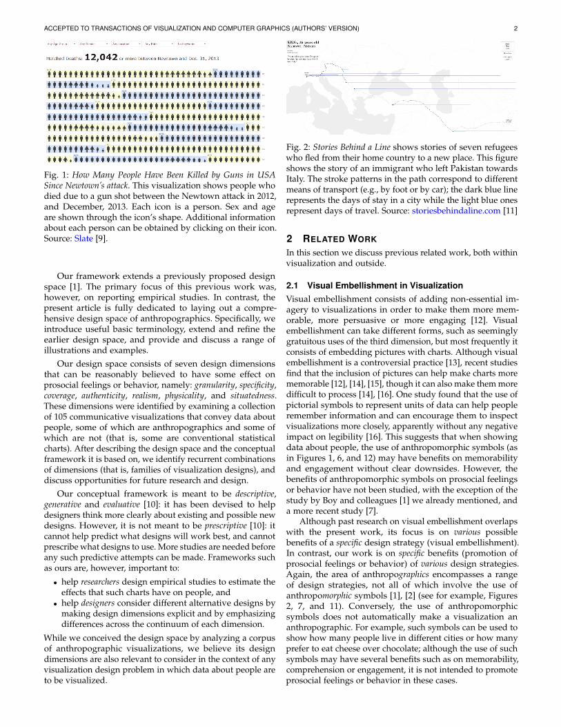
Fig. 2: Stories Behind a Line shows stories of seven refugeeswho fled from their home country to a new place. This figureshows the story of an immigrant who left Pakistan towardsItaly. The stroke patterns in the path correspond to differentmeans of transport (e.g., by foot or by car); the dark blue linerepresents the days of stay in a city while the light blue onesrepresent days of travel. Source: storiesbehindaline.com [11]
2 RELATED WORK
In this section we discuss previous related work, both withinvisualization and outside.
2.1 Visual Embellishment in VisualizationVisual embellishment consists of adding non-essential im-agery to visualizations in order to make them more mem-orable, more persuasive or more engaging [12]. Visualembellishment can take different forms, such as seeminglygratuitous uses of the third dimension, but most frequently itconsists of embedding pictures with charts. Although visualembellishment is a controversial practice [13], recent studiesfind that the inclusion of pictures can help make charts morememorable [12], [14], [15], though it can also make them moredifficult to process [14], [16]. One study found that the use ofpictorial symbols to represent units of data can help peopleremember information and can encourage them to inspectvisualizations more closely, apparently without any negativeimpact on legibility [16]. This suggests that when showingdata about people, the use of anthropomorphic symbols (asin Figures 1, 6, and 12) may have benefits on memorabilityand engagement without clear downsides. However, thebenefits of anthropomorphic symbols on prosocial feelingsor behavior have not been studied, with the exception of thestudy by Boy and colleagues [1] we already mentioned, anda more recent study [7].
Although past research on visual embellishment overlapswith the present work, its focus is on various possiblebenefits of a specific design strategy (visual embellishment).In contrast, our work is on specific benefits (promotion ofprosocial feelings or behavior) of various design strategies.Again, the area of anthropographics encompasses a rangeof design strategies, not all of which involve the use ofanthropomorphic symbols [1], [2] (see for example, Figures2, 7, and 11). Conversely, the use of anthropomorphicsymbols does not automatically make a visualization ananthropographic. For example, such symbols can be used toshow how many people live in different cities or how manyprefer to eat cheese over chocolate; although the use of suchsymbols may have several benefits such as on memorability,comprehension or engagement, it is not intended to promoteprosocial feelings or behavior in these cases.
ACCEPTED TO TRANSACTIONS OF VISUALIZATION AND COMPUTER GRAPHICS (AUTHORS’ VERSION) 3
2.2 Narrative Visualization and Storytelling
Narrative media such as newspaper articles and live presen-tations are increasingly mixed with visualizations, be theystatic, animated, or interactive [17], [18], [19], [20]. Therehas been considerable interest in visualization research intrying to map strategies for telling stories with visualizations.An early study examined existing practices and identifiedseven genres of narrative visualization (i.e., magazine style,annotated chart, partitioned poster, flow chart, comic strip,slide show, and video) [17]. Subsequent research discussednarrative visualizations in terms of the rhetorical [21] andcinematographic [22] techniques employed, sequences andtransitions [23], types of presentation they are used in [18],general design patterns [20], and workflows involved increating them [24]. Other contributions include novel typesof narrative visualizations [25], empirical studies [26] andauthoring tools (e.g., [27]).
One clear area of overlap between this previous body ofwork and the present article is the focus on communicativevisualizations. However, because not all communicativevisualizations are narrative visualizations [24], our focusis in one sense broader. Our focus is also much narrowerin other respects, as we are interested in visualizations thatconvey data about people and in techniques that are thoughtto promote prosocial feelings or behavior. Another area ofoverlap is methodological — much of the previous work onnarrative visualization analyzes existing designs to derivea conceptual framework, taxonomy, or design space. Thepresent article does this too, but again with a different focus.Our design space is also at a lower level of descriptionthan most design spaces on narrative visualization, whichtypically focus on rhetorical and narrative techniques.
A special case within the area of narrative visualizationis the use of personal narrative visualizations [28]. Whereaspersonal visualizations in general are concerned with tools tohelp people understand data about themselves [29], personalnarrative visualizations are “visual data representations thattell stories about personal experiences from the point ofview of the narrator” [28]. They may be used either asmemorabilia and tools of self-reflection, or with the intentto share personal information and stories with others, asdone by Perin [30], [31]. Such visualizations are about peopleand can share some design strategies with anthropographics.However, they are only anthropographics according to ourdefinition if their authors created them with the intent toinstill compassion for themselves in others.
2.3 Work in Psychology
Although empathy and compassion have been the subject ofa lot of research in psychology, they have no widely accepteddefinition. Most previous work however considers thatempathy and compassion are different constructs [32], [33],[34]. Empathy has been defined as “the act of experiencing whatyou believe others are experiencing” [33], while compassion hasbeen defined as “the feeling that arises in witnessing another’ssuffering and that motivates a subsequent desire to help” [35]. Weadopt these two definitions in the present article. While mostvisualization researchers and practitioners only use the term“empathy” in the context of anthropographics, they are likely
also concerned about compassion, and probably often usethe term “empathy” to refer to compassion.
Research suggests that empathy tends to lead to behaviorsto reduce one’s own suffering, while compassion tendsto produce behaviors that reduce others’ suffering [35].Similarly, compassion is a positive predictor of prosocialbehavior [36], while empathy “is either not predictive ornegatively predictive of prosocial actions” [34]. One findingfrom psychology that is directly relevant to our work is the“identifiable victim effect”, according to which people tendto empathize and donate more to vividly identifiable victimsthan for less identifiable individuals [37]. A related findingis the “compassion fade effect”, according to which the levelof compassion towards people decreases as the number ofsuffering individuals increases [38]. These findings and theirimplications for anthropographics design will be discussedfurther as we introduce the dimensions of our design space.
2.4 Studies in HCI and Visualization
The field of virtual reality (VR) has explored whether im-mersive environments can affect people’s prosocial feelingsand behavior. Calvert and colleagues [39] have examinedwhether showing a story using a VR technology vs. a monitorcould affect empathy. Kandaurova and Lee [40] conducted asimilar experiment in the context of charitable giving. Theymeasured empathy, prosocial behavior (donation of time andmoney), and other factors such as guilt and responsibility.Overall, VR studies suggest that immersive environmentscan promote prosocial feelings and behavior. Closer toinformation visualization, Ivanov and colleagues [41] arguedthat showing victims of a tragedy as people in a virtualreality environment could promote empathy since “the levelof fidelity [of such environments] has the potential to enable akind of direct face-to-face relationship with visualizations”. Inrobot-human interaction research, anthropomorphism hasalso been shown to facilitate empathy [42].
In information visualization, only a handful of studieshave investigated prosocial feelings or behavior. Kennedyand Hill [43] explored emotional engagement with data andvisualizations, and observed that participants became com-passionate with migrants after seeing a visualization aboutthe topic. Erlandsson and colleagues [44] investigated to whatextent people allocate money according to the visualizationthat is presented. Participants were shown different datasetson cancer death risks, and results suggest that people tend todonate more to projects when the data is worrisome. To thebest of our knowledge, only three recent studies investigatedhow visualization design affects prosocial feelings [1], [7],[8]. Although different anthropographic design strategieswere tested, the results were mostly inconclusive. We willdiscuss these studies in more detail in section 6.2, using theterminology from our design space.
3 METHODOLOGY
The starting point of our work was the design space ofanthropographics by Boy and colleagues [1]. We extendedthis design space based on an analysis of a corpus of visu-alizations, and based on data visualization and psychologyresearch, as well as blog posts from practitioners. This section
ACCEPTED TO TRANSACTIONS OF VISUALIZATION AND COMPUTER GRAPHICS (AUTHORS’ VERSION) 4
describes how we collected our corpus of visualizations, andhow we used this corpus to inform our design space.
3.1 Scope
We collected a total of 105 visualizations that convey dataabout people (see a static version of our corpus on OSF2 orthe interactive website3 for an updated list). The collectionprocess started with visualization repositories (e.g., flowing-data.com and dataphys.org/list) and proceeded through asnowball sampling to include blogs and newspapers. Wealso included visualizations from the additional materialprovided by Boy et al. [1]. Finally, the collection wascomplemented by charts found in social media, and byvisualizations from our own practice. Three criteria wereconsidered to include a visualization:
1) The visualization shows data about people: examples includestatistics about people who died due to a gunshot,the path taken by refugees to escape from war, or thecharacteristics of women who fought breast cancer.
2) The data visualized is about real people. This condition ledus to exclude, for example, simulation-based visualiza-tions where imaginary individuals are created to conveylife expectancy data or causes of death.4
3) The visualization was published with a communicative intent.This criterion includes infographics from newspapers,for example, but excludes visualizations produced forpurely analytic purposes, for which there is no commu-nicative intent.
The resulting set of 105 visualizations was compiledbetween October 5, 2018, and July 30, 2019. Among allvisualizations, 29% are from blog posts, 27% from news-papers or magazines, 21% from project web pages, 10% frompublic exhibitions, 10% from books or reports, and 3% fromacademic papers. The collection includes both interactive andstatic visualizations. It also includes both anthropographicsand non-anthropographics (i.e., visualizations that werelikely not designed to promote prosocial feelings or behavior).Doing so allowed us to lay out a more comprehensivedesign space, by considering the full continuum betweenanthropographics and non-anthropographics.
3.2 Development of the Design Space
We started with the set of dimensions proposed by Boy etal. [1], and progressively iterated over them by characterizingeach visualization from our collection according to eachof the dimensions. This process helped us establish thecharacteristics and boundaries of each of the dimensions,and identify gaps. In parallel to defining and refining thedimensions of the design space, we developed a conceptualframework and set of elementary definitions (described inSections 4.1 and 4.2) in order to have a firm conceptualground on which to rest our final design space.
As our corpus contains a broader range of visualiza-tions than initially considered by Boy and colleagues, thedimensions that could not properly fit the corpus or could
2. Supplementary material on OSF: osf.io/wfgmp3. Corpus: luizaugustomm.github.io/anthropographics4. See, for example, Visualizing smoking risk:
www.stubbornmule.net/2010/10/visualizing-smoking-risk/
not be easily operationalized (in the sense of being difficultto define) were removed. For example, we removed unitgrouping which only applies to unit visualizations and thuswould not be applicable to many visualizations in our corpus(see the justifications in section 4.7). During the process, wealso came up with new dimensions, partly inspired frompast literature in psychology and data visualization.
After a seemingly stable set of definitions and dimensionswas established and the corpus of visualizations had beenfully categorized by the first author, we performed a multi-coder evaluation. We collectively wrote a code book, whichthe last three authors used to classify a random sample of 17visualizations. This partial coding made apparent that someof the dimensions and their levels could be interpreted indifferent ways. We computed Fleiss Kappa coefficients foreach dimension and found that for four out of eight initialdimensions, these were below 0.56 (moderate agreement).Consequently, we discussed difficulties and discrepanciesin the coding and iterated one last time on the designspace which led to the removal of one dimension andupdated concept definitions. The first author then recodedall visualizations in the corpus. The codebook, the codes andthe Kappa scores are available on OSF.2
The resulting design space has a total of seven dimensions.It shares three dimensions with Boy and colleagues [1](see section 4.7 for more details), and includes four newdimensions.
4 DESIGN SPACE
In the next sections, we first introduce basic terminologyand a conceptual framework that will serve as a foundationfor our design space, and then describe and motivate eachdesign space dimension.
4.1 General Visualization Concepts
We assume for simplicity that all datasets are flat tables [45].A data item (or simply item) is “an individual entity that isdiscrete”, and which corresponds to a row in the table [45].In our framework, a data item always corresponds either toa person or a group of persons. Meanwhile, a data attribute(or simply attribute) is “some specific property that can bemeasured, observed, or logged” [45]. Examples include thesalary, height, or name of a person, or the average salary orheight of a group of persons.
Visualizations are human-readable representations ofdata items and data attributes. Here too, our terminologylargely follows previous literature. The main building blockof a visualization is the mark, which is an element thatrepresents a data item [45], [46], [47], [48]. A mark can eitherconsist of a single graphical primitive (e.g., a point, line,or area [49]) or a combination thereof (e.g., a glyph or anicon) [50]. Meanwhile, perceptual channels5 are propertiesof a mark that can be varied to convey the value of dataattributes. Common examples include elementary graphicalattributes such as size, value, color or shape [49].
5. This term generalizes the notion of visual channel [45] or visualvariable [51] to non-visual data representations [52].
ACCEPTED TO TRANSACTIONS OF VISUALIZATION AND COMPUTER GRAPHICS (AUTHORS’ VERSION) 5
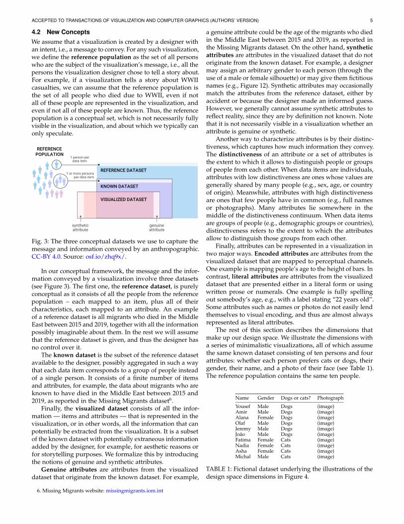
4.2 New ConceptsWe assume that a visualization is created by a designer withan intent, i.e., a message to convey. For any such visualization,we define the reference population as the set of all personswho are the subject of the visualization’s message, i.e., all thepersons the visualization designer chose to tell a story about.For example, if a visualization tells a story about WWIIcasualties, we can assume that the reference population isthe set of all people who died due to WWII, even if notall of these people are represented in the visualization, andeven if not all of these people are known. Thus, the referencepopulation is a conceptual set, which is not necessarily fullyvisible in the visualization, and about which we typically canonly speculate.
REFERENCE DATASET
REFERENCE POPULATION
KNOWN DATASET
VISUALIZED DATASET
synthetic attribute
1 person per data item
1 or more persons per data item
genuine attribute
Fig. 3: The three conceptual datasets we use to capture themessage and information conveyed by an anthropographic.CC-BY 4.0. Source: osf.io/zhq9x/.
In our conceptual framework, the message and the infor-mation conveyed by a visualization involve three datasets(see Figure 3). The first one, the reference dataset, is purelyconceptual as it consists of all the people from the referencepopulation – each mapped to an item, plus all of theircharacteristics, each mapped to an attribute. An exampleof a reference dataset is all migrants who died in the MiddleEast between 2015 and 2019, together with all the informationpossibly imaginable about them. In the rest we will assumethat the reference dataset is given, and thus the designer hasno control over it.
The known dataset is the subset of the reference datasetavailable to the designer, possibly aggregated in such a waythat each data item corresponds to a group of people insteadof a single person. It consists of a finite number of itemsand attributes, for example, the data about migrants who areknown to have died in the Middle East between 2015 and2019, as reported in the Missing Migrants dataset6.
Finally, the visualized dataset consists of all the infor-mation — items and attributes — that is represented in thevisualization, or in other words, all the information that canpotentially be extracted from the visualization. It is a subsetof the known dataset with potentially extraneous informationadded by the designer, for example, for aesthetic reasons orfor storytelling purposes. We formalize this by introducingthe notions of genuine and synthetic attributes.
Genuine attributes are attributes from the visualizeddataset that originate from the known dataset. For example,
6. Missing Migrants website: missingmigrants.iom.int
a genuine attribute could be the age of the migrants who diedin the Middle East between 2015 and 2019, as reported inthe Missing Migrants dataset. On the other hand, syntheticattributes are attributes in the visualized dataset that do notoriginate from the known dataset. For example, a designermay assign an arbitrary gender to each person (through theuse of a male or female silhouette) or may give them fictitiousnames (e.g., Figure 12). Synthetic attributes may occasionallymatch the attributes from the reference dataset, either byaccident or because the designer made an informed guess.However, we generally cannot assume synthetic attributes toreflect reality, since they are by definition not known. Notethat it is not necessarily visible in a visualization whether anattribute is genuine or synthetic.
Another way to characterize attributes is by their distinc-tiveness, which captures how much information they convey.The distinctiveness of an attribute or a set of attributes isthe extent to which it allows to distinguish people or groupsof people from each other. When data items are individuals,attributes with low distinctiveness are ones whose values aregenerally shared by many people (e.g., sex, age, or countryof origin). Meanwhile, attributes with high distinctivenessare ones that few people have in common (e.g., full namesor photographs). Many attributes lie somewhere in themiddle of the distinctiveness continuum. When data itemsare groups of people (e.g., demographic groups or countries),distinctiveness refers to the extent to which the attributesallow to distinguish those groups from each other.
Finally, attributes can be represented in a visualization intwo major ways. Encoded attributes are attributes from thevisualized dataset that are mapped to perceptual channels.One example is mapping people’s age to the height of bars. Incontrast, literal attributes are attributes from the visualizeddataset that are presented either in a literal form or usingwritten prose or numerals. One example is fully spellingout somebody’s age, e.g., with a label stating “22 years old”.Some attributes such as names or photos do not easily lendthemselves to visual encoding, and thus are almost alwaysrepresented as literal attributes.
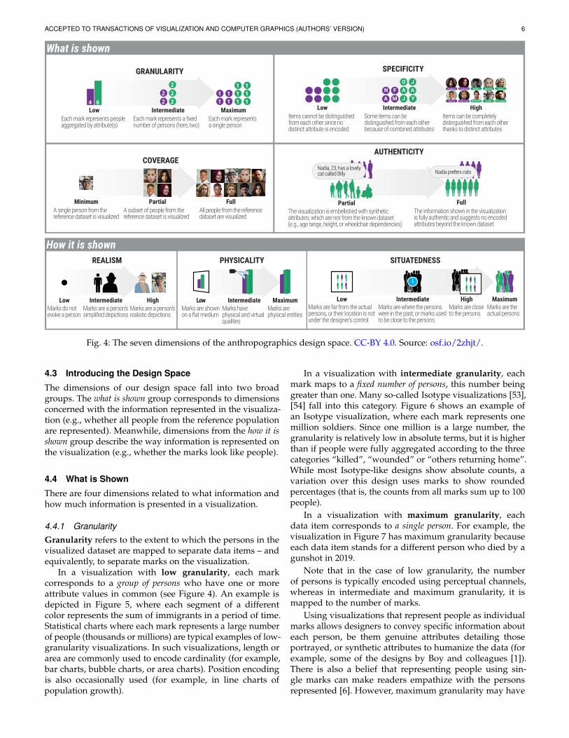
The rest of this section describes the dimensions thatmake up our design space. We illustrate the dimensions witha series of minimalistic visualizations, all of which assumethe same known dataset consisting of ten persons and fourattributes: whether each person prefers cats or dogs, theirgender, their name, and a photo of their face (see Table 1).The reference population contains the same ten people.
Name Gender Dogs or cats? Photograph
Yousef Male Dogs (image)Amir Male Dogs (image)Alana Female Dogs (image)Olaf Male Dogs (image)Jeremy Male Dogs (image)Joao Male Dogs (image)Fatima Female Cats (image)Nadia Female Cats (image)Asha Female Cats (image)Michal Male Cats (image)
TABLE 1: Fictional dataset underlying the illustrations of thedesign space dimensions in Figure 4.
ACCEPTED TO TRANSACTIONS OF VISUALIZATION AND COMPUTER GRAPHICS (AUTHORS’ VERSION) 6
What is shown
GRANULARITY
LowEach mark represents people aggregated by attribute(s)
IntermediateEach mark represents a fixed number of persons (here, two)
MaximumEach mark represents a single person
SPECIFICITY
LowItems cannot be distinguished from each other since no distinct attribute is encoded
HighItems can be completely distinguished from each other thanks to distinct attributes
IntermediateSome items can be distinguished from each other because of combined attributes
A MFN
J YAAJO
AUTHENTICITY
FullThe information shown in the visualization is fully authentic and suggests no encoded attributes beyond the known dataset
Nadia prefers cats
PartialThe visualization is embellished with synthetic attributes, which are not from the known dataset (e.g., age range, height, or wheelchair dependencies)
Nadia, 23, has a lovelycat called Billy
COVERAGE
MinimumA single person from the reference dataset is visualized
PartialA subset of people from the reference dataset is visualized
FullAll people from the reference dataset are visualized
How it is shownREALISM
LowMarks do not evoke a person
HighMarks are a person’s realistic depictions
IntermediateMarks are a person’s simplified depictions
PHYSICALITY
LowMarks are shown on a flat medium
MaximumMarks are physical entities
IntermediateMarks have physical and virtual qualities
SITUATEDNESS
MaximumMarks are the actual persons
HighMarks are close to the persons
LowMarks are far from the actual persons, or their location is not under the designer’s control
IntermediateMarks are where the persons were in the past; or marks used to be close to the persons
Fig. 4: The seven dimensions of the anthropographics design space. CC-BY 4.0. Source: osf.io/2zhjt/.
4.3 Introducing the Design Space
The dimensions of our design space fall into two broadgroups. The what is shown group corresponds to dimensionsconcerned with the information represented in the visualiza-tion (e.g., whether all people from the reference populationare represented). Meanwhile, dimensions from the how it isshown group describe the way information is represented onthe visualization (e.g., whether the marks look like people).
4.4 What is Shown
There are four dimensions related to what information andhow much information is presented in a visualization.
4.4.1 GranularityGranularity refers to the extent to which the persons in thevisualized dataset are mapped to separate data items – andequivalently, to separate marks on the visualization.
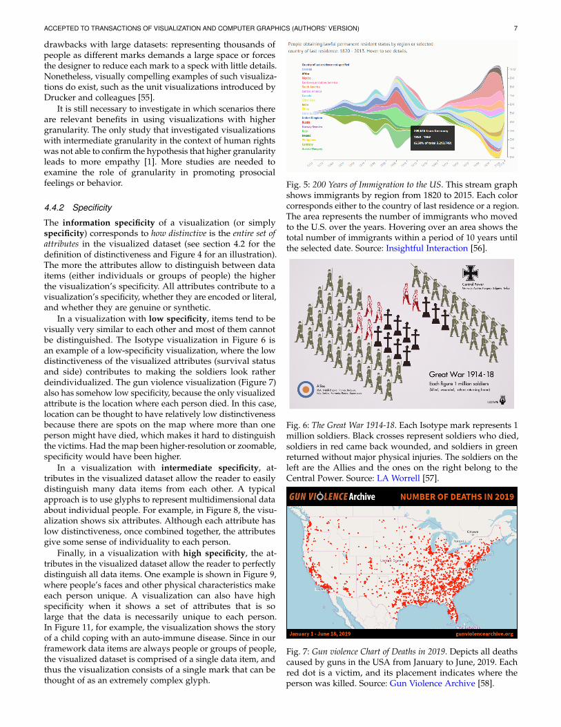
In a visualization with low granularity, each markcorresponds to a group of persons who have one or moreattribute values in common (see Figure 4). An example isdepicted in Figure 5, where each segment of a differentcolor represents the sum of immigrants in a period of time.Statistical charts where each mark represents a large numberof people (thousands or millions) are typical examples of low-granularity visualizations. In such visualizations, length orarea are commonly used to encode cardinality (for example,bar charts, bubble charts, or area charts). Position encodingis also occasionally used (for example, in line charts ofpopulation growth).
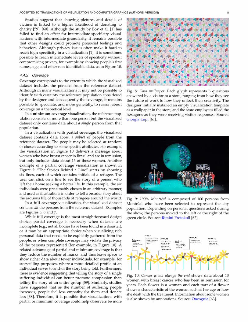
In a visualization with intermediate granularity, eachmark maps to a fixed number of persons, this number beinggreater than one. Many so-called Isotype visualizations [53],[54] fall into this category. Figure 6 shows an example ofan Isotype visualization, where each mark represents onemillion soldiers. Since one million is a large number, thegranularity is relatively low in absolute terms, but it is higherthan if people were fully aggregated according to the threecategories “killed”, “wounded” or “others returning home”.While most Isotype-like designs show absolute counts, avariation over this design uses marks to show roundedpercentages (that is, the counts from all marks sum up to 100people).
In a visualization with maximum granularity, eachdata item corresponds to a single person. For example, thevisualization in Figure 7 has maximum granularity becauseeach data item stands for a different person who died by agunshot in 2019.
Note that in the case of low granularity, the numberof persons is typically encoded using perceptual channels,whereas in intermediate and maximum granularity, it ismapped to the number of marks.
Using visualizations that represent people as individualmarks allows designers to convey specific information abouteach person, be them genuine attributes detailing thoseportrayed, or synthetic attributes to humanize the data (forexample, some of the designs by Boy and colleagues [1]).There is also a belief that representing people using sin-gle marks can make readers empathize with the personsrepresented [6]. However, maximum granularity may have
ACCEPTED TO TRANSACTIONS OF VISUALIZATION AND COMPUTER GRAPHICS (AUTHORS’ VERSION) 7
drawbacks with large datasets: representing thousands ofpeople as different marks demands a large space or forcesthe designer to reduce each mark to a speck with little details.Nonetheless, visually compelling examples of such visualiza-tions do exist, such as the unit visualizations introduced byDrucker and colleagues [55].
It is still necessary to investigate in which scenarios thereare relevant benefits in using visualizations with highergranularity. The only study that investigated visualizationswith intermediate granularity in the context of human rightswas not able to confirm the hypothesis that higher granularityleads to more empathy [1]. More studies are needed toexamine the role of granularity in promoting prosocialfeelings or behavior.
4.4.2 Specificity
The information specificity of a visualization (or simplyspecificity) corresponds to how distinctive is the entire set ofattributes in the visualized dataset (see section 4.2 for thedefinition of distinctiveness and Figure 4 for an illustration).The more the attributes allow to distinguish between dataitems (either individuals or groups of people) the higherthe visualization’s specificity. All attributes contribute to avisualization’s specificity, whether they are encoded or literal,and whether they are genuine or synthetic.
In a visualization with low specificity, items tend to bevisually very similar to each other and most of them cannotbe distinguished. The Isotype visualization in Figure 6 isan example of a low-specificity visualization, where the lowdistinctiveness of the visualized attributes (survival statusand side) contributes to making the soldiers look ratherdeindividualized. The gun violence visualization (Figure 7)also has somehow low specificity, because the only visualizedattribute is the location where each person died. In this case,location can be thought to have relatively low distinctivenessbecause there are spots on the map where more than oneperson might have died, which makes it hard to distinguishthe victims. Had the map been higher-resolution or zoomable,specificity would have been higher.
In a visualization with intermediate specificity, at-tributes in the visualized dataset allow the reader to easilydistinguish many data items from each other. A typicalapproach is to use glyphs to represent multidimensional dataabout individual people. For example, in Figure 8, the visu-alization shows six attributes. Although each attribute haslow distinctiveness, once combined together, the attributesgive some sense of individuality to each person.
Finally, in a visualization with high specificity, the at-tributes in the visualized dataset allow the reader to perfectlydistinguish all data items. One example is shown in Figure 9,where people’s faces and other physical characteristics makeeach person unique. A visualization can also have highspecificity when it shows a set of attributes that is solarge that the data is necessarily unique to each person.In Figure 11, for example, the visualization shows the storyof a child coping with an auto-immune disease. Since in ourframework data items are always people or groups of people,the visualized dataset is comprised of a single data item, andthus the visualization consists of a single mark that can bethought of as an extremely complex glyph.
Fig. 5: 200 Years of Immigration to the US. This stream graphshows immigrants by region from 1820 to 2015. Each colorcorresponds either to the country of last residence or a region.The area represents the number of immigrants who movedto the U.S. over the years. Hovering over an area shows thetotal number of immigrants within a period of 10 years untilthe selected date. Source: Insightful Interaction [56].
Fig. 6: The Great War 1914-18. Each Isotype mark represents 1million soldiers. Black crosses represent soldiers who died,soldiers in red came back wounded, and soldiers in greenreturned without major physical injuries. The soldiers on theleft are the Allies and the ones on the right belong to theCentral Power. Source: LA Worrell [57].
Fig. 7: Gun violence Chart of Deaths in 2019. Depicts all deathscaused by guns in the USA from January to June, 2019. Eachred dot is a victim, and its placement indicates where theperson was killed. Source: Gun Violence Archive [58].
ACCEPTED TO TRANSACTIONS OF VISUALIZATION AND COMPUTER GRAPHICS (AUTHORS’ VERSION) 8
Studies suggest that showing pictures and details ofvictims is linked to a higher likelihood of donating tocharity [59], [60]. Although the study by Boy et al. [1] hasfailed to find an effect for intermediate-specificity visual-izations with intermediate granularity, it remains possiblethat other designs could promote prosocial feelings andbehaviors. Although privacy issues often make it hard toreach high specificity in a visualization [1], it is sometimespossible to reach intermediate levels of specificity withoutcompromising privacy, for example by showing people’s firstnames, age, and other non-identifiable data, as in Figure 10.
4.4.3 CoverageCoverage corresponds to the extent to which the visualizeddataset includes the persons from the reference dataset.Although in many visualizations it may not be possible toidentify with certainty the reference population consideredby the designer and consequently the coverage, it remainspossible to speculate, and more generally, to reason aboutcoverage on a theoretical level.
In a minimum coverage visualization, the reference pop-ulation consists of more than one person but the visualizeddataset only contains data about a single person from thatpopulation.
In a visualization with partial coverage, the visualizeddataset contains data about a subset of people from thereference dataset. The people may be selected at randomor chosen according to some specific attributes. For example,the visualization in Figure 10 delivers a message aboutwomen who have breast cancer in Brazil and are in remission,but only includes data about 13 of these women. Anotherexample of a partial coverage visualization is shown inFigure 2: “The Stories Behind a Line” starts by showingsix lines, each of which contains initials of a refugee. Theuser can click on a line to see the story of a person wholeft their home seeking a better life. In this example, the sixindividuals were presumably chosen in an arbitrary manner,and used as illustrations in order to tell a broader story aboutthe arduous life of thousands of refugees around the world.
In a full coverage visualization, the visualized datasetcontains all the persons from the reference dataset. Examplesare Figures 5, 6 and 7.
While full coverage is the most straightforward designchoice, partial coverage is necessary when datasets areincomplete (e.g., not all bodies have been found in a disaster),or it may be an appropriate choice when visualizing richpersonal data that needs to be explicitly gathered from thepeople, or when complete coverage may violate the privacyof the persons represented (for example, in Figure 10). Arelated advantage of partial and minimum coverage is thatthey reduce the number of marks, and thus leave space toshow richer data about fewer individuals, for example, forstorytelling purposes, where a more detailed profile of anindividual serves to anchor the story being told. Furthermore,there is evidence suggesting that telling the story of a singlesuffering individual can better promote compassion thantelling the story of an entire group [59]. Similarly, studieshave suggested that as the number of suffering peopleincreases, people feel less empathy for them and donateless [38]. Therefore, it is possible that visualizations withpartial or minimum coverage could help observers be more
Fig. 8: Data wallpaper. Each glyph represents 6 questionsanswered by a visitor to a store, ranging from how they seethe future of work to how they unlock their creativity. Thedesigner initially installed an empty visualization templateas a wallpaper in the store, and the store employees filled thehexagons as they were receiving visitor responses. Source:Giorgia Lupi [61].
Fig. 9: 100% Montreal is composed of 100 persons fromMontreal who have been selected to represent the citypopulation. Depending on personal questions asked duringthe show, the persons moved to the left or the right of thegreen circle. Source: Rimini Protokoll [62].
Fig. 10: Cancer is not always the end shows data about 13women with breast cancer who has been in remission foryears. Each flower is a woman and each part of a flowershows a characteristic of the woman such as her age or howshe dealt with the treatment. Information about some womenis also shown by annotations. Source: Oncoguia [63].
ACCEPTED TO TRANSACTIONS OF VISUALIZATION AND COMPUTER GRAPHICS (AUTHORS’ VERSION) 9
compassionate about suffering populations. However, itremains necessary to test this hypothesis empirically.
4.4.4 Authenticity
Authenticity refers to the proportion of genuine attributesin the visualized dataset.
A visualization with partial authenticity contains bothgenuine and synthetic attributes (terms are defined in sec-tion 4.2). The more visualized attributes are synthetic, the lessauthentic a visualization is. The illustration of authenticityin Figure 4 shows a visualization with partial authenticitywhere the designer gave the marks different silhouettes tomake them look unique: we can see, for example, a child,and a person in a wheelchair. The designer also annotated anindividual with personal information. However, none of thisinformation is in the known dataset (shown in Table 1) whichmakes these attributes synthetic. A real world example of apartially authentic visualization is shown in Figure 12. Theonly genuine attribute is whether a person lived above orbelow the poverty line in 2010, whereas the name and genderof the persons are synthetic attributes that were probablyused to increase information specificity and make the personslook more unique, or to increase the visual appeal of thevisualization.
In a visualization with full authenticity, all visualizedattributes are genuine. In Figure 4 (authenticity dimension),the visualization with full authenticity uses realistic silhou-ettes like the visualization with partial authenticity. However,only two types of silhouettes are used in the fully authenticvisualization, which serve to encode gender, an attributethat is in the known dataset. We will see in section 4.5.1 thatrealistic silhouettes like these cannot be fully authentic unlessthey are those of the people represented, but in this case theycan be considered as (almost) fully authentic.
While full or close-to-full authenticity is the most obviousdesign choice, designers sometimes use synthetic attributesin visualizations about people such as in Figure 12 or invisualization 67 in the corpus. In those examples, the de-signers used anthropomorphic marks with different gendersand ages that likely do not originate from the known dataset,possibly as an attempt to promote compassion. However, it ispossible that this technique can backfire as a result of readersfeeling manipulated, possibly causing them to doubt eventhe genuine information and the visualization as a whole.As far as we know, this technique and its possible trade-offs have never been explicitly discussed in the informationvisualization literature.
4.5 How it is shown
This section describes design dimensions that capture howinformation is represented. All of the dimensions hereare properties of marks. The properties of marks are oftencoherent across a visualization, and thus a visualizationcan be characterized with respect to how its marks arerepresented.
4.5.1 Realism
Realism refers to the degree of resemblance of the visualiza-tion’s marks to actual persons.
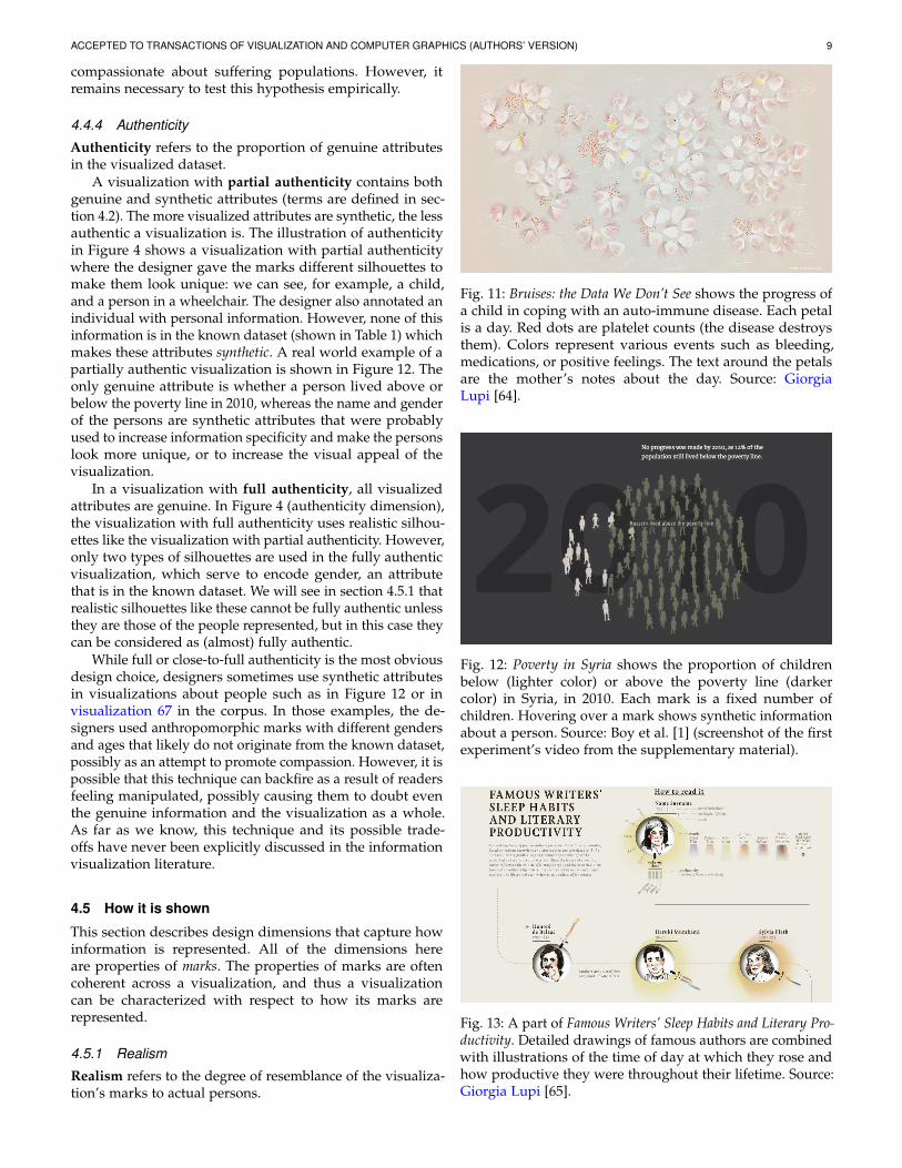
Fig. 11: Bruises: the Data We Don’t See shows the progress ofa child in coping with an auto-immune disease. Each petalis a day. Red dots are platelet counts (the disease destroysthem). Colors represent various events such as bleeding,medications, or positive feelings. The text around the petalsare the mother’s notes about the day. Source: GiorgiaLupi [64].
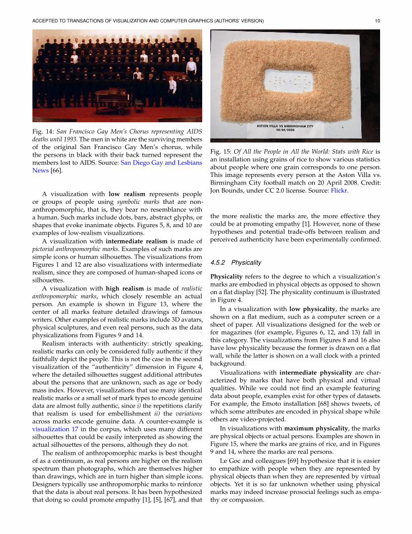
Fig. 12: Poverty in Syria shows the proportion of childrenbelow (lighter color) or above the poverty line (darkercolor) in Syria, in 2010. Each mark is a fixed number ofchildren. Hovering over a mark shows synthetic informationabout a person. Source: Boy et al. [1] (screenshot of the firstexperiment’s video from the supplementary material).
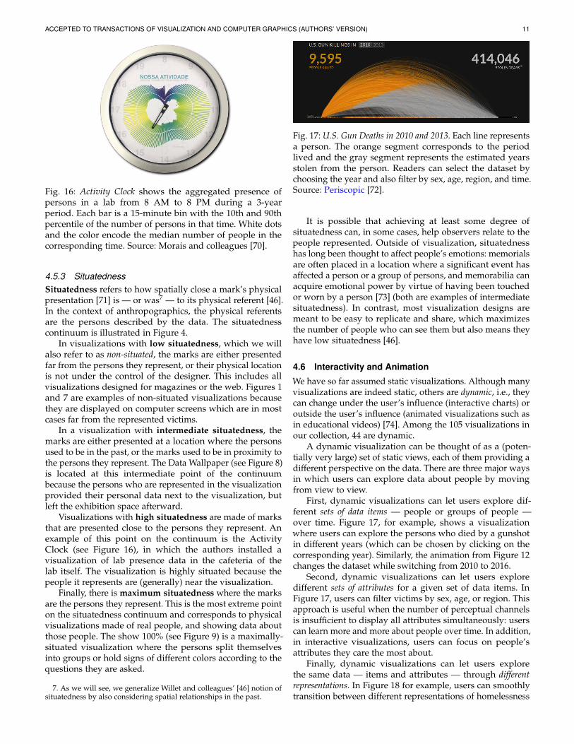
Fig. 13: A part of Famous Writers’ Sleep Habits and Literary Pro-ductivity. Detailed drawings of famous authors are combinedwith illustrations of the time of day at which they rose andhow productive they were throughout their lifetime. Source:Giorgia Lupi [65].
ACCEPTED TO TRANSACTIONS OF VISUALIZATION AND COMPUTER GRAPHICS (AUTHORS’ VERSION) 10
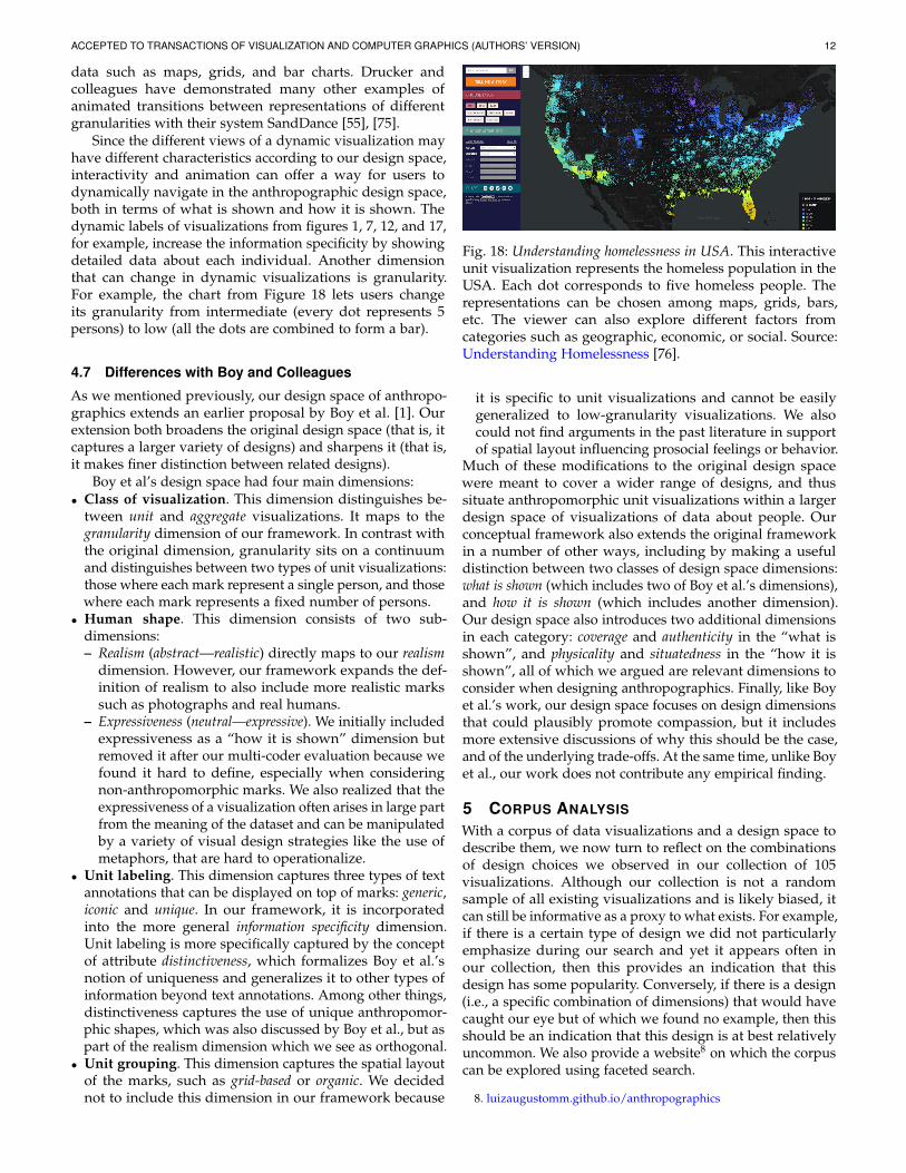
Fig. 14: San Francisco Gay Men’s Chorus representing AIDSdeaths until 1993. The men in white are the surviving membersof the original San Francisco Gay Men’s chorus, whilethe persons in black with their back turned represent themembers lost to AIDS. Source: San Diego Gay and LesbiansNews [66].
A visualization with low realism represents peopleor groups of people using symbolic marks that are non-anthropomorphic, that is, they bear no resemblance witha human. Such marks include dots, bars, abstract glyphs, orshapes that evoke inanimate objects. Figures 5, 8, and 10 areexamples of low-realism visualizations.
A visualization with intermediate realism is made ofpictorial anthropomorphic marks. Examples of such marks aresimple icons or human silhouettes. The visualizations fromFigures 1 and 12 are also visualizations with intermediaterealism, since they are composed of human-shaped icons orsilhouettes.
A visualization with high realism is made of realisticanthropomorphic marks, which closely resemble an actualperson. An example is shown in Figure 13, where thecenter of all marks feature detailed drawings of famouswriters. Other examples of realistic marks include 3D avatars,physical sculptures, and even real persons, such as the dataphysicalizations from Figures 9 and 14.
Realism interacts with authenticity: strictly speaking,realistic marks can only be considered fully authentic if theyfaithfully depict the people. This is not the case in the secondvisualization of the “authenticity” dimension in Figure 4,where the detailed silhouettes suggest additional attributesabout the persons that are unknown, such as age or bodymass index. However, visualizations that use many identicalrealistic marks or a small set of mark types to encode genuinedata are almost fully authentic, since i) the repetitions clarifythat realism is used for embellishment ii) the variationsacross marks encode genuine data. A counter-example isvisualization 17 in the corpus, which uses many differentsilhouettes that could be easily interpreted as showing theactual silhouettes of the persons, although they do not.
The realism of anthropomorphic marks is best thoughtof as a continuum, as real persons are higher on the realismspectrum than photographs, which are themselves higherthan drawings, which are in turn higher than simple icons.Designers typically use anthropomorphic marks to reinforcethat the data is about real persons. It has been hypothesizedthat doing so could promote empathy [1], [5], [67], and that
Fig. 15: Of All the People in All the World: Stats with Rice isan installation using grains of rice to show various statisticsabout people where one grain corresponds to one person.This image represents every person at the Aston Villa vs.Birmingham City football match on 20 April 2008. Credit:Jon Bounds, under CC 2.0 license. Source: Flickr.
the more realistic the marks are, the more effective theycould be at promoting empathy [1]. However, none of thesehypotheses and potential trade-offs between realism andperceived authenticity have been experimentally confirmed.
4.5.2 Physicality
Physicality refers to the degree to which a visualization’smarks are embodied in physical objects as opposed to shownon a flat display [52]. The physicality continuum is illustratedin Figure 4.
In a visualization with low physicality, the marks areshown on a flat medium, such as a computer screen or asheet of paper. All visualizations designed for the web orfor magazines (for example, Figures 6, 12, and 13) fall inthis category. The visualizations from Figures 8 and 16 alsohave low physicality because the former is drawn on a flatwall, while the latter is shown on a wall clock with a printedbackground.
Visualizations with intermediate physicality are char-acterized by marks that have both physical and virtualqualities. While we could not find an example featuringdata about people, examples exist for other types of datasets.For example, the Emoto installation [68] shows tweets, ofwhich some attributes are encoded in physical shape whileothers are video-projected.
In visualizations with maximum physicality, the marksare physical objects or actual persons. Examples are shown inFigure 15, where the marks are grains of rice, and in Figures9 and 14, where the marks are real persons.
Le Goc and colleagues [69] hypothesize that it is easierto empathize with people when they are represented byphysical objects than when they are represented by virtualobjects. Yet it is so far unknown whether using physicalmarks may indeed increase prosocial feelings such as empa-thy or compassion.
ACCEPTED TO TRANSACTIONS OF VISUALIZATION AND COMPUTER GRAPHICS (AUTHORS’ VERSION) 11
Fig. 16: Activity Clock shows the aggregated presence ofpersons in a lab from 8 AM to 8 PM during a 3-yearperiod. Each bar is a 15-minute bin with the 10th and 90thpercentile of the number of persons in that time. White dotsand the color encode the median number of people in thecorresponding time. Source: Morais and colleagues [70].
4.5.3 SituatednessSituatedness refers to how spatially close a mark’s physicalpresentation [71] is — or was7 — to its physical referent [46].In the context of anthropographics, the physical referentsare the persons described by the data. The situatednesscontinuum is illustrated in Figure 4.
In visualizations with low situatedness, which we willalso refer to as non-situated, the marks are either presentedfar from the persons they represent, or their physical locationis not under the control of the designer. This includes allvisualizations designed for magazines or the web. Figures 1and 7 are examples of non-situated visualizations becausethey are displayed on computer screens which are in mostcases far from the represented victims.
In a visualization with intermediate situatedness, themarks are either presented at a location where the personsused to be in the past, or the marks used to be in proximity tothe persons they represent. The Data Wallpaper (see Figure 8)is located at this intermediate point of the continuumbecause the persons who are represented in the visualizationprovided their personal data next to the visualization, butleft the exhibition space afterward.
Visualizations with high situatedness are made of marksthat are presented close to the persons they represent. Anexample of this point on the continuum is the ActivityClock (see Figure 16), in which the authors installed avisualization of lab presence data in the cafeteria of thelab itself. The visualization is highly situated because thepeople it represents are (generally) near the visualization.
Finally, there is maximum situatedness where the marksare the persons they represent. This is the most extreme pointon the situatedness continuum and corresponds to physicalvisualizations made of real people, and showing data aboutthose people. The show 100% (see Figure 9) is a maximally-situated visualization where the persons split themselvesinto groups or hold signs of different colors according to thequestions they are asked.
7. As we will see, we generalize Willet and colleagues’ [46] notion ofsituatedness by also considering spatial relationships in the past.
Fig. 17: U.S. Gun Deaths in 2010 and 2013. Each line representsa person. The orange segment corresponds to the periodlived and the gray segment represents the estimated yearsstolen from the person. Readers can select the dataset bychoosing the year and also filter by sex, age, region, and time.Source: Periscopic [72].
It is possible that achieving at least some degree ofsituatedness can, in some cases, help observers relate to thepeople represented. Outside of visualization, situatednesshas long been thought to affect people’s emotions: memorialsare often placed in a location where a significant event hasaffected a person or a group of persons, and memorabilia canacquire emotional power by virtue of having been touchedor worn by a person [73] (both are examples of intermediatesituatedness). In contrast, most visualization designs aremeant to be easy to replicate and share, which maximizesthe number of people who can see them but also means theyhave low situatedness [46].
4.6 Interactivity and Animation
We have so far assumed static visualizations. Although manyvisualizations are indeed static, others are dynamic, i.e., theycan change under the user’s influence (interactive charts) oroutside the user’s influence (animated visualizations such asin educational videos) [74]. Among the 105 visualizations inour collection, 44 are dynamic.
A dynamic visualization can be thought of as a (poten-tially very large) set of static views, each of them providing adifferent perspective on the data. There are three major waysin which users can explore data about people by movingfrom view to view.
First, dynamic visualizations can let users explore dif-ferent sets of data items — people or groups of people —over time. Figure 17, for example, shows a visualizationwhere users can explore the persons who died by a gunshotin different years (which can be chosen by clicking on thecorresponding year). Similarly, the animation from Figure 12changes the dataset while switching from 2010 to 2016.
Second, dynamic visualizations can let users exploredifferent sets of attributes for a given set of data items. InFigure 17, users can filter victims by sex, age, or region. Thisapproach is useful when the number of perceptual channelsis insufficient to display all attributes simultaneously: userscan learn more and more about people over time. In addition,in interactive visualizations, users can focus on people’sattributes they care the most about.
Finally, dynamic visualizations can let users explorethe same data — items and attributes — through differentrepresentations. In Figure 18 for example, users can smoothlytransition between different representations of homelessness
ACCEPTED TO TRANSACTIONS OF VISUALIZATION AND COMPUTER GRAPHICS (AUTHORS’ VERSION) 12
data such as maps, grids, and bar charts. Drucker andcolleagues have demonstrated many other examples ofanimated transitions between representations of differentgranularities with their system SandDance [55], [75].
Since the different views of a dynamic visualization mayhave different characteristics according to our design space,interactivity and animation can offer a way for users todynamically navigate in the anthropographic design space,both in terms of what is shown and how it is shown. Thedynamic labels of visualizations from figures 1, 7, 12, and 17,for example, increase the information specificity by showingdetailed data about each individual. Another dimensionthat can change in dynamic visualizations is granularity.For example, the chart from Figure 18 lets users changeits granularity from intermediate (every dot represents 5persons) to low (all the dots are combined to form a bar).
4.7 Differences with Boy and Colleagues
As we mentioned previously, our design space of anthropo-graphics extends an earlier proposal by Boy et al. [1]. Ourextension both broadens the original design space (that is, itcaptures a larger variety of designs) and sharpens it (that is,it makes finer distinction between related designs).
Boy et al’s design space had four main dimensions:• Class of visualization. This dimension distinguishes be-
tween unit and aggregate visualizations. It maps to thegranularity dimension of our framework. In contrast withthe original dimension, granularity sits on a continuumand distinguishes between two types of unit visualizations:those where each mark represent a single person, and thosewhere each mark represents a fixed number of persons.
• Human shape. This dimension consists of two sub-dimensions:– Realism (abstract—realistic) directly maps to our realism
dimension. However, our framework expands the def-inition of realism to also include more realistic markssuch as photographs and real humans.
– Expressiveness (neutral—expressive). We initially includedexpressiveness as a “how it is shown” dimension butremoved it after our multi-coder evaluation because wefound it hard to define, especially when consideringnon-anthropomorphic marks. We also realized that theexpressiveness of a visualization often arises in large partfrom the meaning of the dataset and can be manipulatedby a variety of visual design strategies like the use ofmetaphors, that are hard to operationalize.
• Unit labeling. This dimension captures three types of textannotations that can be displayed on top of marks: generic,iconic and unique. In our framework, it is incorporatedinto the more general information specificity dimension.Unit labeling is more specifically captured by the conceptof attribute distinctiveness, which formalizes Boy et al.’snotion of uniqueness and generalizes it to other types ofinformation beyond text annotations. Among other things,distinctiveness captures the use of unique anthropomor-phic shapes, which was also discussed by Boy et al., but aspart of the realism dimension which we see as orthogonal.
• Unit grouping. This dimension captures the spatial layoutof the marks, such as grid-based or organic. We decidednot to include this dimension in our framework because
Fig. 18: Understanding homelessness in USA. This interactiveunit visualization represents the homeless population in theUSA. Each dot corresponds to five homeless people. Therepresentations can be chosen among maps, grids, bars,etc. The viewer can also explore different factors fromcategories such as geographic, economic, or social. Source:Understanding Homelessness [76].
it is specific to unit visualizations and cannot be easilygeneralized to low-granularity visualizations. We alsocould not find arguments in the past literature in supportof spatial layout influencing prosocial feelings or behavior.
Much of these modifications to the original design spacewere meant to cover a wider range of designs, and thussituate anthropomorphic unit visualizations within a largerdesign space of visualizations of data about people. Ourconceptual framework also extends the original frameworkin a number of other ways, including by making a usefuldistinction between two classes of design space dimensions:what is shown (which includes two of Boy et al.’s dimensions),and how it is shown (which includes another dimension).Our design space also introduces two additional dimensionsin each category: coverage and authenticity in the “what isshown”, and physicality and situatedness in the “how it isshown”, all of which we argued are relevant dimensions toconsider when designing anthropographics. Finally, like Boyet al.’s work, our design space focuses on design dimensionsthat could plausibly promote compassion, but it includesmore extensive discussions of why this should be the case,and of the underlying trade-offs. At the same time, unlike Boyet al., our work does not contribute any empirical finding.
5 CORPUS ANALYSIS
With a corpus of data visualizations and a design space todescribe them, we now turn to reflect on the combinationsof design choices we observed in our collection of 105visualizations. Although our collection is not a randomsample of all existing visualizations and is likely biased, itcan still be informative as a proxy to what exists. For example,if there is a certain type of design we did not particularlyemphasize during our search and yet it appears often inour collection, then this provides an indication that thisdesign has some popularity. Conversely, if there is a design(i.e., a specific combination of dimensions) that would havecaught our eye but of which we found no example, then thisshould be an indication that this design is at best relativelyuncommon. We also provide a website8 on which the corpuscan be explored using faceted search.
8. luizaugustomm.github.io/anthropographics
ACCEPTED TO TRANSACTIONS OF VISUALIZATION AND COMPUTER GRAPHICS (AUTHORS’ VERSION) 13
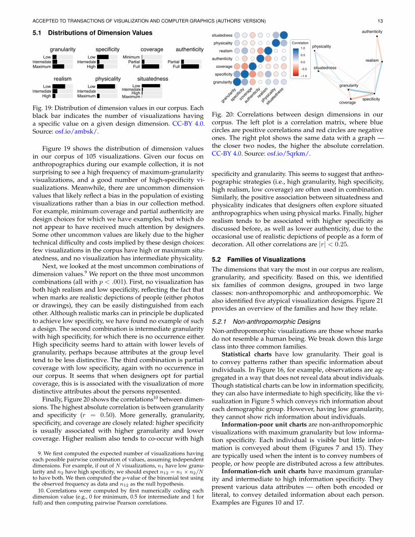
5.1 Distributions of Dimension Values
MaximumIntermediate
Low
HighIntermediate
Low
FullPartial
Minimum
FullPartial
HighIntermediate
Low
MaximumIntermediate
Low
MaximumHigh
IntermediateLow
granularity specificity coverage authenticity
realism physicality situatedness
Fig. 19: Distribution of dimension values in our corpus. Eachblack bar indicates the number of visualizations havinga specific value on a given design dimension. CC-BY 4.0.Source: osf.io/ambsk/.
Figure 19 shows the distribution of dimension valuesin our corpus of 105 visualizations. Given our focus onanthropographics during our example collection, it is notsurprising to see a high frequency of maximum-granularityvisualizations, and a good number of high-specificity vi-sualizations. Meanwhile, there are uncommon dimensionvalues that likely reflect a bias in the population of existingvisualizations rather than a bias in our collection method.For example, minimum coverage and partial authenticity aredesign choices for which we have examples, but which donot appear to have received much attention by designers.Some other uncommon values are likely due to the highertechnical difficulty and costs implied by these design choices:few visualizations in the corpus have high or maximum situ-atedness, and no visualization has intermediate physicality.
Next, we looked at the most uncommon combinations ofdimension values.9 We report on the three most uncommoncombinations (all with p < .001). First, no visualization hasboth high realism and low specificity, reflecting the fact thatwhen marks are realistic depictions of people (either photosor drawings), they can be easily distinguished from eachother. Although realistic marks can in principle be duplicatedto achieve low specificity, we have found no example of sucha design. The second combination is intermediate granularitywith high specificity, for which there is no occurrence either.High specificity seems hard to attain with lower levels ofgranularity, perhaps because attributes at the group leveltend to be less distinctive. The third combination is partialcoverage with low specificity, again with no occurrence inour corpus. It seems that when designers opt for partialcoverage, this is is associated with the visualization of moredistinctive attributes about the persons represented.
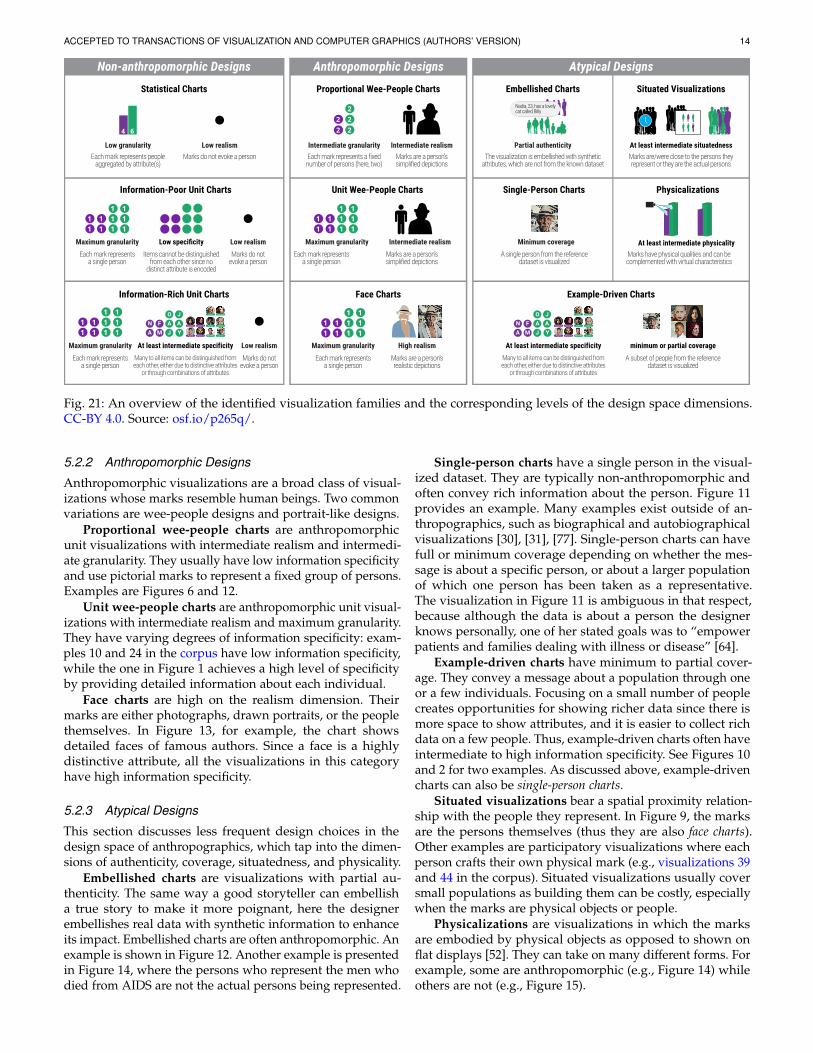
Finally, Figure 20 shows the correlations10 between dimen-sions. The highest absolute correlation is between granularityand specificity (r = 0.50). More generally, granularity,specificity, and coverage are closely related: higher specificityis usually associated with higher granularity and lowercoverage. Higher realism also tends to co-occur with high
9. We first computed the expected number of visualizations havingeach possible pairwise combination of values, assuming independentdimensions. For example, if out of N visualizations, n1 have low granu-larity and n2 have high specificity, we should expect n12 = n1 × n2/Nto have both. We then computed the p-value of the binomial test usingthe observed frequency as data and n12 as the null hypothesis.
10. Correlations were computed by first numerically coding eachdimension value (e.g., 0 for minimum, 0.5 for intermediate and 1 forfull) and then computing pairwise Pearson correlations.
granularity
specificity
coverage
authenticity
realism
physicality
situatedness
granu
larity
spec
ificity
cove
rage
authe
nticity
realism
physi
cality
situate
dnes
s
Correlation
−1.0
−0.5
0.0
0.5
1.0
granularity
specificitycoverage
authenticity
realism
physicality
situatedness
Fig. 20: Correlations between design dimensions in ourcorpus. The left plot is a correlation matrix, where bluecircles are positive correlations and red circles are negativeones. The right plot shows the same data with a graph —the closer two nodes, the higher the absolute correlation.CC-BY 4.0. Source: osf.io/5qrkm/.
specificity and granularity. This seems to suggest that anthro-pographic strategies (i.e., high granularity, high specificity,high realism, low coverage) are often used in combination.Similarly, the positive association between situatedness andphysicality indicates that designers often explore situatedanthropographics when using physical marks. Finally, higherrealism tends to be associated with higher specificity asdiscussed before, as well as lower authenticity, due to theoccasional use of realistic depictions of people as a form ofdecoration. All other correlations are |r| < 0.25.
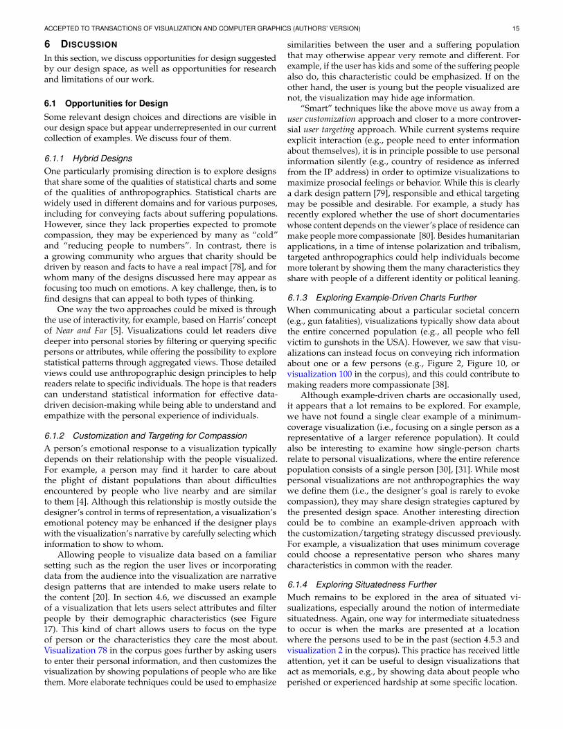
5.2 Families of VisualizationsThe dimensions that vary the most in our corpus are realism,granularity, and specificity. Based on this, we identifiedsix families of common designs, grouped in two largeclasses: non-anthropomorphic and anthropomorphic. Wealso identified five atypical visualization designs. Figure 21provides an overview of the families and how they relate.
5.2.1 Non-anthropomorphic DesignsNon-anthropomorphic visualizations are those whose marksdo not resemble a human being. We break down this largeclass into three common families.
Statistical charts have low granularity. Their goal isto convey patterns rather than specific information aboutindividuals. In Figure 16, for example, observations are ag-gregated in a way that does not reveal data about individuals.Though statistical charts can be low in information specificity,they can also have intermediate to high specificity, like the vi-sualization in Figure 5 which conveys rich information abouteach demographic group. However, having low granularity,they cannot show rich information about individuals.
Information-poor unit charts are non-anthropomorphicvisualizations with maximum granularity but low informa-tion specificity. Each individual is visible but little infor-mation is conveyed about them (Figures 7 and 15). Theyare typically used when the intent is to convey numbers ofpeople, or how people are distributed across a few attributes.
Information-rich unit charts have maximum granular-ity and intermediate to high information specificity. Theypresent various data attributes — often both encoded orliteral, to convey detailed information about each person.Examples are Figures 10 and 17.
ACCEPTED TO TRANSACTIONS OF VISUALIZATION AND COMPUTER GRAPHICS (AUTHORS’ VERSION) 14
Anthropomorphic Designs
Unit Wee-People Charts
Face Charts
Maximum granularityEach mark represents
a single person
Maximum granularity
Each mark represents a single person
High realism
Marks are a person’s realistic depictions
Intermediate realismMarks are a person’s simplified depictions
Proportional Wee-People Charts
Intermediate granularityEach mark represents a fixed number of persons (here, two)
Intermediate realismMarks are a person’s simplified depictions
Non-anthropomorphic Designs
Statistical Charts
Low granularityEach mark represents people
aggregated by attribute(s)
Low realismMarks do not evoke a person
Information-Poor Unit Charts
Maximum granularityEach mark represents
a single person
Low specificityItems cannot be distinguished
from each other since no distinct attribute is encoded
Low realismMarks do not
evoke a person
Information-Rich Unit Charts
Maximum granularity
Each mark represents a single person
Low realism
Marks do not evoke a person
At least intermediate specificityMany to all items can be distinguished from each other, either due to distinctive attributes
or through combinations of attributes
A MFN
J YAAJO
Atypical Designs
Single-Person Charts
Example-Driven Charts
Physicalizations
At least intermediate physicalityMinimum coverageA single person from the reference
dataset is visualizedMarks have physical qualities and can be complemented with virtual characteristics
Embellished Charts Situated Visualizations
At least intermediate situatednessPartial authenticityThe visualization is embellished with synthetic
attributes, which are not from the known dataset
Nadia, 23, has a lovelycat called Billy
Marks are/were close to the persons they represent or they are the actual persons
minimum or partial coverage
A subset of people from the reference dataset is visualized
At least intermediate specificityMany to all items can be distinguished from each other, either due to distinctive attributes
or through combinations of attributes
A MFN
J YAAJO
Fig. 21: An overview of the identified visualization families and the corresponding levels of the design space dimensions.CC-BY 4.0. Source: osf.io/p265q/.
5.2.2 Anthropomorphic Designs
Anthropomorphic visualizations are a broad class of visual-izations whose marks resemble human beings. Two commonvariations are wee-people designs and portrait-like designs.
Proportional wee-people charts are anthropomorphicunit visualizations with intermediate realism and intermedi-ate granularity. They usually have low information specificityand use pictorial marks to represent a fixed group of persons.Examples are Figures 6 and 12.
Unit wee-people charts are anthropomorphic unit visual-izations with intermediate realism and maximum granularity.They have varying degrees of information specificity: exam-ples 10 and 24 in the corpus have low information specificity,while the one in Figure 1 achieves a high level of specificityby providing detailed information about each individual.
Face charts are high on the realism dimension. Theirmarks are either photographs, drawn portraits, or the peoplethemselves. In Figure 13, for example, the chart showsdetailed faces of famous authors. Since a face is a highlydistinctive attribute, all the visualizations in this categoryhave high information specificity.
5.2.3 Atypical Designs
This section discusses less frequent design choices in thedesign space of anthropographics, which tap into the dimen-sions of authenticity, coverage, situatedness, and physicality.
Embellished charts are visualizations with partial au-thenticity. The same way a good storyteller can embellisha true story to make it more poignant, here the designerembellishes real data with synthetic information to enhanceits impact. Embellished charts are often anthropomorphic. Anexample is shown in Figure 12. Another example is presentedin Figure 14, where the persons who represent the men whodied from AIDS are not the actual persons being represented.
Single-person charts have a single person in the visual-ized dataset. They are typically non-anthropomorphic andoften convey rich information about the person. Figure 11provides an example. Many examples exist outside of an-thropographics, such as biographical and autobiographicalvisualizations [30], [31], [77]. Single-person charts can havefull or minimum coverage depending on whether the mes-sage is about a specific person, or about a larger populationof which one person has been taken as a representative.The visualization in Figure 11 is ambiguous in that respect,because although the data is about a person the designerknows personally, one of her stated goals was to “empowerpatients and families dealing with illness or disease” [64].
Example-driven charts have minimum to partial cover-age. They convey a message about a population through oneor a few individuals. Focusing on a small number of peoplecreates opportunities for showing richer data since there ismore space to show attributes, and it is easier to collect richdata on a few people. Thus, example-driven charts often haveintermediate to high information specificity. See Figures 10and 2 for two examples. As discussed above, example-drivencharts can also be single-person charts.
Situated visualizations bear a spatial proximity relation-ship with the people they represent. In Figure 9, the marksare the persons themselves (thus they are also face charts).Other examples are participatory visualizations where eachperson crafts their own physical mark (e.g., visualizations 39and 44 in the corpus). Situated visualizations usually coversmall populations as building them can be costly, especiallywhen the marks are physical objects or people.
Physicalizations are visualizations in which the marksare embodied by physical objects as opposed to shown onflat displays [52]. They can take on many different forms. Forexample, some are anthropomorphic (e.g., Figure 14) whileothers are not (e.g., Figure 15).
ACCEPTED TO TRANSACTIONS OF VISUALIZATION AND COMPUTER GRAPHICS (AUTHORS’ VERSION) 15
6 DISCUSSION
In this section, we discuss opportunities for design suggestedby our design space, as well as opportunities for researchand limitations of our work.
6.1 Opportunities for DesignSome relevant design choices and directions are visible inour design space but appear underrepresented in our currentcollection of examples. We discuss four of them.
6.1.1 Hybrid DesignsOne particularly promising direction is to explore designsthat share some of the qualities of statistical charts and someof the qualities of anthropographics. Statistical charts arewidely used in different domains and for various purposes,including for conveying facts about suffering populations.However, since they lack properties expected to promotecompassion, they may be experienced by many as “cold”and “reducing people to numbers”. In contrast, there isa growing community who argues that charity should bedriven by reason and facts to have a real impact [78], and forwhom many of the designs discussed here may appear asfocusing too much on emotions. A key challenge, then, is tofind designs that can appeal to both types of thinking.
One way the two approaches could be mixed is throughthe use of interactivity, for example, based on Harris’ conceptof Near and Far [5]. Visualizations could let readers divedeeper into personal stories by filtering or querying specificpersons or attributes, while offering the possibility to explorestatistical patterns through aggregated views. Those detailedviews could use anthropographic design principles to helpreaders relate to specific individuals. The hope is that readerscan understand statistical information for effective data-driven decision-making while being able to understand andempathize with the personal experience of individuals.
6.1.2 Customization and Targeting for CompassionA person’s emotional response to a visualization typicallydepends on their relationship with the people visualized.For example, a person may find it harder to care aboutthe plight of distant populations than about difficultiesencountered by people who live nearby and are similarto them [4]. Although this relationship is mostly outside thedesigner’s control in terms of representation, a visualization’semotional potency may be enhanced if the designer playswith the visualization’s narrative by carefully selecting whichinformation to show to whom.
Allowing people to visualize data based on a familiarsetting such as the region the user lives or incorporatingdata from the audience into the visualization are narrativedesign patterns that are intended to make users relate tothe content [20]. In section 4.6, we discussed an exampleof a visualization that lets users select attributes and filterpeople by their demographic characteristics (see Figure17). This kind of chart allows users to focus on the typeof person or the characteristics they care the most about.Visualization 78 in the corpus goes further by asking usersto enter their personal information, and then customizes thevisualization by showing populations of people who are likethem. More elaborate techniques could be used to emphasize
similarities between the user and a suffering populationthat may otherwise appear very remote and different. Forexample, if the user has kids and some of the suffering peoplealso do, this characteristic could be emphasized. If on theother hand, the user is young but the people visualized arenot, the visualization may hide age information.
“Smart” techniques like the above move us away from auser customization approach and closer to a more controver-sial user targeting approach. While current systems requireexplicit interaction (e.g., people need to enter informationabout themselves), it is in principle possible to use personalinformation silently (e.g., country of residence as inferredfrom the IP address) in order to optimize visualizations tomaximize prosocial feelings or behavior. While this is clearlya dark design pattern [79], responsible and ethical targetingmay be possible and desirable. For example, a study hasrecently explored whether the use of short documentarieswhose content depends on the viewer’s place of residence canmake people more compassionate [80]. Besides humanitarianapplications, in a time of intense polarization and tribalism,targeted anthropographics could help individuals becomemore tolerant by showing them the many characteristics theyshare with people of a different identity or political leaning.
6.1.3 Exploring Example-Driven Charts FurtherWhen communicating about a particular societal concern(e.g., gun fatalities), visualizations typically show data aboutthe entire concerned population (e.g., all people who fellvictim to gunshots in the USA). However, we saw that visu-alizations can instead focus on conveying rich informationabout one or a few persons (e.g., Figure 2, Figure 10, orvisualization 100 in the corpus), and this could contribute tomaking readers more compassionate [38].
Although example-driven charts are occasionally used,it appears that a lot remains to be explored. For example,we have not found a single clear example of a minimum-coverage visualization (i.e., focusing on a single person as arepresentative of a larger reference population). It couldalso be interesting to examine how single-person chartsrelate to personal visualizations, where the entire referencepopulation consists of a single person [30], [31]. While mostpersonal visualizations are not anthropographics the waywe define them (i.e., the designer’s goal is rarely to evokecompassion), they may share design strategies captured bythe presented design space. Another interesting directioncould be to combine an example-driven approach withthe customization/targeting strategy discussed previously.For example, a visualization that uses minimum coveragecould choose a representative person who shares manycharacteristics in common with the reader.
6.1.4 Exploring Situatedness FurtherMuch remains to be explored in the area of situated vi-sualizations, especially around the notion of intermediatesituatedness. Again, one way for intermediate situatednessto occur is when the marks are presented at a locationwhere the persons used to be in the past (section 4.5.3 andvisualization 2 in the corpus). This practice has received littleattention, yet it can be useful to design visualizations thatact as memorials, e.g., by showing data about people whoperished or experienced hardship at some specific location.
ACCEPTED TO TRANSACTIONS OF VISUALIZATION AND COMPUTER GRAPHICS (AUTHORS’ VERSION) 16
In visualization 105 in the corpus, 7,000 pairs of shoeswere placed on the lawn of the U.S. Capitol to symbolize thechildren killed during the 2012 Newtown shooting. Althoughthe installation is emotionally powerful, it is located 300miles away from Newtown. Would have it carried evenmore emotional power had it been placed exactly where theshooting occurred? Many existing memorials are situated,although they rarely visualize rich data about the people. Itis possible that doing so would help people relate, althoughpractices exist in memorial design that paradoxically dothe exact opposite. For example, the tomb of the unknownsoldier at Arlington has been designed to convey as littleinformation as possible, so that anyone could relate andentertain the possibility that the soldier is a lost relative [81].
The second way intermediate situatedness can occur iswhen the marks used to be in proximity to the persons theyrepresent (e.g., Figure 8). This approach also opens up a vastarea of untapped possibilities. For example, anthropographicvisualizations could be explored that tap into the psycho-logical power of memorabilia that were owned, touched, orworn by people [73]. For example, would the 2012 Newtownshooting installation discussed above carry more emotionalweight had it used objects that personally belonged to thevictims? Because all these examples shorten the causal and(sometimes) symbolic distance between the people the datais about and the data representation [82], [83], they have thepotential to make readers feel more connected to the people.
Finally, many wearable visualizations such as data jewelryand data clothing items11 convey data about the people whowear them and thus they are fully situated [46]. Perhapsthere are ways in which such objects can be used to promoteprosocial feelings and behavior. For example, assuming it ispossible to invent a standard visual language for conveyingpersonal histories, persons in need may be able to share theirhardships through wearable visualizations that everyonecould understand at a glance. Personal wearable visualiza-tions do, however, pose ethical issues, including privacyissues. If such visualizations become common, even thechoice not to wear them could convey personal information.
6.2 Opportunities for ResearchNone of the design dimensions described in this article hasbeen thoroughly explored in the visualization literature. Thissection underlines opportunities for empirical research.
6.2.1 Testing Basic Design DimensionsBoy et al. [1] conducted several experiments to explorethe effectiveness of design choices to promote prosocialfeelings. Their experiments mostly compared proportionalwee-people charts — intermediate granularity and realism— with classical statistical charts — low granularity andrealism. More recently, Liem et al. [7] empirically testedanthropographic designs with maximum granularity, highspecificity and partial coverage, while Morais et al. [8]tested an anthropographic design with maximum granularity,maximum physicality and intermediate situatedness.
Though the results of all three studies are largely in-conclusive, it does not follow that anthropographics are
11. See dataphys.org/list/tag/data-jewellery anddataphys.org/list/tag/data-clothing for examples.
ineffective. First, the effects may be small and may needmore statistical power to be detected [84]. Second, manyother designs remain to be tested, some of which could provemore effective. For example, many of the designs used in Boyet al. [1] and Liem et al. [7] had partial authenticity, whichcould have affected how people trusted the information.
There is a clear need for more empirical studies thatinvestigate the effect of basic design dimensions, namely,granularity, specificity, authenticity, and realism. The isolatedeffects of these dimensions as well as their interactions willneed be tested. For example, a strong sense of individualitycan only be conveyed if a visualization has both maximumgranularity and high information specificity, so it will beinteresting to test whether this combination is particularlybeneficial. Also, it will be crucial to control for authenticityand study it separately, as its effects are poorly understood.
6.2.2 Understanding CoverageOnce the effectiveness of basic design dimensions starts tobe understood, it will be useful to study more elaboratestrategies such as coverage. As we mentioned before, weknow from psychology that that as the number of identifiablevictims in a narrative increases, prosocial feelings andbehavior tend to decrease [38]. Until now, no study has beenconducted to test whether this so-called “compassion fade”can also occur in the context of data visualization. Keepingthe reference dataset constant and manipulating the coveragedimension can be an effective way of empirically exploringcompassion fade in the context of data visualization.
6.2.3 Studying Situatedness and PhysicalitySituatedness and physicality may also be relevant to anthro-pographics and deserve attention, even though empiricallystudying them will likely be less practical. For example,does an intermediate-situatedness visualization that showsvictims in-place evoke more compassion than a non-situatedvisualization that shows the data elsewhere? Can physicalityadd to the emotional impact or memorability of a design strat-egy, and in turn promote compassion? Designs like “people-as-mark” (Figure 9) and wearable physicalizations would beparticularly interesting to test since they are maximum inboth the situatedness and physicality dimensions. Anotherinteresting strategy to explore is the use of objects such asshoes or backpacks to represent people, as in visualizations105 and 112 in the corpus.
6.2.4 Investigating AmbiguityIt could be interesting to explore the effect of ambiguityon prosocial feelings and behavior. For example, when adesigner does not make explicit how many persons arerepresented by each mark — as opposed to Figure 6, whereeach mark explicitly represents 1 million soldiers — coverageand granularity become ambiguous. In Figure 9, for example,each mark can either be interpreted as standing for (A) aproportion or (B) a subset of the Parisian population. If onechooses A as interpretation, the visualization would haveintermediate granularity and full coverage. Conversely, if theinterpretation is based on B, the visualization would havemaximum granularity and partial coverage. Can the samevisualization have different effects on prosocial feelings orbehavior depending on how it is interpreted?
ACCEPTED TO TRANSACTIONS OF VISUALIZATION AND COMPUTER GRAPHICS (AUTHORS’ VERSION) 17
6.2.5 Ethical Considerations
An important future direction will be to better understandthe ethical issues behind different anthropographic designstrategies, and the trade-offs involved. For example, isthe misleading use of synthetic attributes justified if itincreases charitable donations and helping behavior? Similarquestions arise about the use of user targeting as discussedin section 6.1.2, or of ambiguity as discussed previously. Amore nuanced understanding of the different ways syntheticattributes can mislead will also be helpful. For example,a partially authentic visualization like in Figure 12 coulduse demographic data to derive silhouettes (including sexand age distribution) and personal information (e.g., names)that are as plausible as possible. Such a design would beless misleading than a visualization where demographicsand names misrepresent the target population, but more sothan a visualization where each mark conveys informationabout a real person whose privacy needs also to be takeninto account. As another example, briefly discussed insection 4.5.1, a visualization that adds decorative detailsto anthropomorphic marks is likely less misleading if thosedetails are kept constant across all marks than if they vary.A deeper understanding of ethical considerations will needto rely on empirical studies, both to understand how peopleinterpret possibly misleading visualizations, and what peopleconsider ethically justifiable [85]. Other aspects of ethicsbeyond persuasion and deception [86] will also need beexamined in the context of anthropographics.
6.2.6 Understanding the Importance of Data
Our design space does not capture properties that areinherent to the data being visualized, even though theymay have a considerable impact on how compassionatereaders can feel. Personal connection with the data, inparticular, has a dramatic impact on how people experiencevisualizations [87]. A visualization designer may be ableto manipulate personal connection to some extent if theyhave control over the visualized dataset — i.e., if they canchoose which persons or which attributes to visualize fromthe known dataset (see section 6.1.2). A designer can evenexercise some control over the known dataset, since theymay be able to decide which information to collect aboutthe reference dataset and how much effort to dedicate to theprocess. However, if we assume the reference dataset to begiven, its characteristics (such as degree of connection withthe reader) are out of the designer’s control and thus do notbelong to a design space of visualizations.
Nevertheless, there are important questions to considerbeyond visualization design, such as what reference datasetsare visualized and why, and what known datasets are madeavailable and why. Certain populations or topics may beomitted or underrepresented in available datasets, eitherbecause data does not exist or because the is a lack of interestfrom analysts and visualization designers [88], [89]. Conse-quently, readers do not have access to the underrepresenteddata, which might generate a cycle where it becomes less andless important [89]. Therefore, some critical approaches suchas the ones proposed by Dork and colleagues [90] may alsobe relevant to the design of anthropographics and should beinvestigated in the future.
6.2.7 Generative Use of This Design Space
Finally, to assess the generative power of our design spaceand assess its generative power, it would be valuable to use itto conceive new kinds of visualizations. This could be done,for example, through a study where designers are asked togenerate visualizations based on the design space.
6.3 Limitations
Our goal was to identify elementary dimensions in the vastdesign space of anthropographics and propose a conceptualframework and terminology that can help both researchersand practitioners reflect on and communicate about essentialaspects of anthropographics design. Nevertheless, this designspace is far from complete.
First, our conceptual framework currently only coversflat tables (see section 4.1). Although tables are likely themost common data model, other types of datasets exist suchas networks [45]. Excluding such datasets excludes all socialnetwork visualizations, for example.
Second, we restricted our scope to datasets where eachitem is a person or a group (see section 3). There existdatasets that contain information that can profoundly affectpeople, despite not containing information about people. Forexample, datasets on how diseases spread geographically, ordata about global warming. But since there is no one in thesedatasets with which to empathize or feel compassion about,they may be outside the realm of anthropographics.
We also excluded other datasets and visualizations fromour investigation in order to keep the scope manageable,although they could be relevant to anthropographics. In par-ticular, we excluded datasets involving simulated people (seesection 3), but these may be useful to consider in the future.Also, although our focus was on people, many non-humananimals experience suffering and may need compassion aswell as help [91], [92]. Our conceptual framework can beeasily generalized by considering that data items can refer toother sentient beings than humans.
In choosing the seven dimensions of our design space, wefocused on elementary visualization characteristics that areeasy to define, manipulate in studies, and apply as a designer.Many other factors can contribute into making a visualizationeffective in promoting prosocial feelings, although they aremore difficult to operationalize. These including aesthetics,the use of visual metaphors, and the use of accompanyingstories (see, e.g., Figure 11). The space of possibilities is vastand our design space is only a starting point.
ACKNOWLEDGMENTS
We thank our reviewers for their insightful suggestions. Thefirst author gratefully acknowledges the financial support ofthe Conselho Nacional de Desenvolvimento Cientıfico e Tec-nologico (CNPq) and the Coordenacao de Aperfeicoamentode Pessoal de Nıvel Superior (CAPES), grant number88881.188888/2018-01. This work was partly supported bythe Agence Nationale de la Recherche (ANR), grant numberANR-19-CE33-0012.
ACCEPTED TO TRANSACTIONS OF VISUALIZATION AND COMPUTER GRAPHICS (AUTHORS’ VERSION) 18
REFERENCES
[1] J. Boy, A. V. Pandey, J. Emerson, M. Satterthwaite, O. Nov, andE. Bertini, “Showing people behind data: Does anthropomorphizingvisualizations elicit more empathy for human rights data?” inProceedings of the 2017 CHI Conference on Human Factors in ComputingSystems. ACM, 2017, pp. 5462–5474.
[2] E. Bertini, “Can Visualization Elicit Empathy? Our Experimentswith ”Anthropographics”,” https : / / web . archive . org / web /20191113054644 / https : / / medium . com / @FILWD / can -visualization - elicit - empathy - our - experiments - with -anthropographics - 7e13590be204, 2017, [Online; accessed 13-November-2019].
[3] G. Lupi, “Data humanism, the revolution will be visualized,”https://web.archive.org/web/20190915123530/https://www.printmag.com/information-design/data-humanism-future-of-data-visualization/, 2017, [Online; accessed 15-September-2019.
[4] P. Bloom, Against empathy: The case for rational compassion. RandomHouse, 2017.
[5] J. Harris, “Connecting with the dots,” https://web.archive.org/web/20190706114742/https://source.opennews.org/articles/connecting-dots/, 2015, [Online; accessed 6-July-2019].
[6] L. C. Rost, “A data point moves into a bar,” https://web.archive.org/web/20200318143617/https://lab.dsst.io/slides/33c3/7999.html, 2016, [Online; accessed 18-March-2020].
[7] J. Liem, C. Perin, and J. Wood, “Structure and empathy invisual data storytelling: Evaluating their influence on attitude,”in Computer Graphics Forum, 2020.
[8] L. Morais, D. Sousa, and N. Andrade, “Evaluating a situatedand physical anthropographic: An in-the-wild study,” 2020,unpublished pre-print. [Online]. Available: http://rgdoi.net/10.13140/RG.2.2.10719.69283
[9] C. Kirk and D. Kois, “How many people have been killedby guns since newtown?” https : / / web . archive . org / web /20200305065626/http ://www.slate .com/articles/news andpolitics/crime/2012/12/gun death tally every american gundeath since newtown sandy hook shooting.html, 2013, [Online;accessed 17-July-2019].
[10] M. Beaudouin-Lafon, “Designing interaction, not interfaces,” inProceedings of the working conference on Advanced visual interfaces.ACM, 2004, pp. 15–22.
[11] F. Fragapane and A. Piacentini, “Stories behind a line,”https://web.archive.org/web/20190719064902/http://www.storiesbehindaline.com/, 2019, [Online; accessed 19-July-2019].
[12] S. Bateman, R. L. Mandryk, C. Gutwin, A. Genest, D. McDine, andC. Brooks, “Useful junk?: the effects of visual embellishment oncomprehension and memorability of charts,” in Proceedings of theSIGCHI Conference on Human Factors in Computing Systems. ACM,2010, pp. 2573–2582.
[13] S. Few and P. Edge, “The chartjunk debate,” Visual BusinessIntelligence Newsletter, no. June, pp. 1–11, 2011.
[14] R. Borgo, A. Abdul-Rahman, F. Mohamed, P. W. Grant, I. Reppa,L. Floridi, and M. Chen, “An empirical study on using visualembellishments in visualization,” IEEE Transactions on Visualizationand Computer Graphics, vol. 18, no. 12, pp. 2759–2768, 2012.
[15] M. A. Borkin, A. A. Vo, Z. Bylinskii, P. Isola, S. Sunkavalli, A. Oliva,and H. Pfister, “What makes a visualization memorable?” IEEETransactions on Visualization and Computer Graphics, vol. 19, no. 12,pp. 2306–2315, 2013.
[16] S. Haroz, R. Kosara, and S. L. Franconeri, “Isotype visualization:Working memory, performance, and engagement with pictographs,”in Proceedings of the 33rd annual ACM conference on human factors incomputing systems. ACM, 2015, pp. 1191–1200.
[17] E. Segel and J. Heer, “Narrative visualization: Telling stories withdata,” IEEE transactions on visualization and computer graphics, vol. 16,no. 6, pp. 1139–1148, 2010.
[18] R. Kosara and J. Mackinlay, “Storytelling: The next step forvisualization,” Computer, vol. 46, no. 5, pp. 44–50, 2013.
[19] C. D. Stolper, B. Lee, N. H. Riche, and J. Stasko, “Emerging andrecurring data-driven storytelling techniques: Analysis of a curatedcollection of recent stories,” Microsoft Research, Washington, USA,2016.
[20] B. Bach, M. Stefaner, J. Boy, S. Drucker, L. Bartram, J. Wood, P. Ciuc-carelli, Y. Engelhardt, U. Koeppen, and B. Tversky, “arrative designpatterns for data-driven storytelling,” in Data-Driven Storytelling.AK Peters/CRC Press, 2018, pp. 125–152.
[21] J. Hullman and N. Diakopoulos, “Visualization rhetoric: Framingeffects in narrative visualization,” IEEE transactions on visualizationand computer graphics, vol. 17, no. 12, pp. 2231–2240, 2011.
[22] F. Amini, N. Henry Riche, B. Lee, C. Hurter, and P. Irani, “Under-standing data videos: Looking at narrative visualization throughthe cinematography lens,” in Proceedings of the 33rd Annual ACMConference on Human Factors in Computing Systems. ACM, 2015, pp.1459–1468.
[23] J. Hullman, S. Drucker, N. H. Riche, B. Lee, D. Fisher, and E. Adar,“A deeper understanding of sequence in narrative visualization,”IEEE Transactions on visualization and computer graphics, vol. 19,no. 12, pp. 2406–2415, 2013.
[24] B. Lee, N. Henry Riche, P. Isenberg, and S. Carpendale, “Morethan Telling a Story: A Closer Look at the Process of TransformingData into Visually Shared Stories,” IEEE Computer Graphics andApplications, vol. 35, no. 5, pp. 84–90, Sep. 2015. [Online]. Available:https://hal.inria.fr/hal-01158445
[25] B. Bach, N. Kerracher, K. W. Hall, S. Carpendale, J. Kennedy, andN. Henry Riche, “Telling stories about dynamic networks withgraph comics,” in Proceedings of the 2016 CHI Conference on HumanFactors in Computing Systems. ACM, 2016, pp. 3670–3682.
[26] J. Boy, F. Detienne, and J.-D. Fekete, “Storytelling in informationvisualizations: Does it engage users to explore data?” in Proceedingsof the 33rd Annual ACM Conference on Human Factors in ComputingSystems. ACM, 2015, pp. 1449–1458.
[27] A. Satyanarayan and J. Heer, “Authoring narrative visualizationswith ellipsis,” in Computer Graphics Forum, vol. 33, no. 3. WileyOnline Library, 2014, pp. 361–370.
[28] S. Carpendale, A. Thudt, C. Perin, and W. Willett, “Subjectivity inpersonal storytelling with visualization,” Information Design Journal,vol. 23, no. 1, pp. 48–64, 2017.
[29] D. Huang, M. Tory, B. A. Aseniero, L. Bartram, S. Bateman,S. Carpendale, A. Tang, and R. Woodbury, “Personal visualizationand personal visual analytics,” IEEE Transactions on Visualizationand Computer Graphics, vol. 21, no. 3, pp. 420–433, 2014.
[30] C. Perin, “The symmetry of my life: An autobiographical visual-ization,” in IEEE VIS 2017 Electronic Conference Proceedings [Poster],2017.
[31] ——, “The symmetry of my life ii,” in IEEE VIS 2018 ElectronicConference Proceedings [Poster], 2018.
[32] D. DeSteno, “Compassion and altruism: How our minds determinewho is worthy of help,” Current opinion in behavioral Sciences, vol. 3,pp. 80–83, 2015.
[33] P. Bloom, “Empathy and its discontents,” Trends in cognitive sciences,vol. 21, no. 1, pp. 24–31, 2017.
[34] M. R. Jordan, D. Amir, and P. Bloom, “Are empathy and concernpsychologically distinct?” Emotion, vol. 16, no. 8, p. 1107, 2016.
[35] J. L. Goetz, D. Keltner, and E. Simon-Thomas, “Compassion: anevolutionary analysis and empirical review.” Psychological bulletin,vol. 136, no. 3, p. 351, 2010.
[36] M. O. Wilhelm and R. Bekkers, “Helping behavior, dispositionalempathic concern, and the principle of care,” Social PsychologyQuarterly, vol. 73, no. 1, pp. 11–32, 2010.
[37] A. Genevsky, D. Vastfjall, P. Slovic, and B. Knutson, “Neural under-pinnings of the identifiable victim effect: Affect shifts preferencesfor giving,” Journal of Neuroscience, vol. 33, no. 43, pp. 17 188–17 196,2013.
[38] D. Vastfjall, P. Slovic, M. Mayorga, and E. Peters, “Compassionfade: Affect and charity are greatest for a single child in need,” PloSone, vol. 9, no. 6, p. e100115, 2014.
[39] J. Calvert, R. Abadla, and S. M. Tauseef, “Design and testing of avirtual reality enabled experience that enhances engagement andsimulates empathy for historical events and characters,” in 2019IEEE Conference on Virtual Reality and 3D User Interfaces (VR). IEEE,2019, pp. 868–869.
[40] M. Kandaurova and S. H. M. Lee, “The effects of virtual reality (vr)on charitable giving: The role of empathy, guilt, responsibility, andsocial exclusion,” Journal of Business Research, vol. 100, pp. 571–580,2019.
[41] A. Ivanov, K. T. Danyluk, and W. Willett, “Exploration & anthropo-morphism in immersive unit visualizations,” in Extended Abstractsof the 2018 CHI Conference on Human Factors in Computing Systems.ACM, 2018, p. LBW008.
[42] L. D. Riek, T.-C. Rabinowitch, B. Chakrabarti, and P. Robinson,“How anthropomorphism affects empathy toward robots,” inProceedings of the 4th ACM/IEEE international conference on Humanrobot interaction. ACM, 2009, pp. 245–246.
ACCEPTED TO TRANSACTIONS OF VISUALIZATION AND COMPUTER GRAPHICS (AUTHORS’ VERSION) 19
[43] H. Kennedy and R. L. Hill, “The feeling of numbers: Emotions ineveryday engagements with data and their visualisation,” Sociology,vol. 52, no. 4, pp. 830–848, 2018.
[44] A. Erlandsson, S. M. Hohle, E. Løhre, and D. Vastfjall, “The riseand fall of scary numbers: The effect of perceived trends on futureestimates, severity ratings, and help-allocations in a cancer context,”Journal of Applied Social Psychology, vol. 48, no. 11, pp. 618–633, 2018.
[45] T. Munzner, Visualization analysis and design. AK Peters/CRC Press,2014.
[46] W. Willett, Y. Jansen, and P. Dragicevic, “Embedded data repre-sentations,” IEEE transactions on visualization and computer graphics,vol. 23, no. 1, pp. 461–470, 2017.
[47] S. R. Dos Santos, “A framework for the visualization of multidi-mensional and multivariate data,” Ph.D. dissertation, University ofLeeds, 2004.
[48] A. Satyanarayan, D. Moritz, K. Wongsuphasawat, and J. Heer,“Vega-lite: A grammar of interactive graphics,” IEEE transactions onvisualization and computer graphics, vol. 23, no. 1, pp. 341–350, 2017.
[49] J. Bertin, Semiologie graphique: Les diagrammes-Les reseaux-Les cartes.Paris: Gauthier-VillarsMouton & Cie, 1973.
[50] H. Senay and E. Ignatius, Rules and principles of scientific datavisualization. Institute for Information Science and Technology,Department of Electrical Engineering, 1990.
[51] R. E. Roth, “Visual variables,” International Encyclopedia of Geography:People, the Earth, Environment and Technology: People, the Earth,Environment and Technology, pp. 1–11, 2016.
[52] Y. Jansen, P. Dragicevic, P. Isenberg, J. Alexander, A. Karnik,J. Kildal, S. Subramanian, and K. Hornbæk, “Opportunities andChallenges for Data Physicalization,” in Proceedings of the ACMConference on Human Factors in Computing Systems (CHI). NewYork, NY, United States: ACM, Apr. 2015. [Online]. Available:https://hal.inria.fr/hal-01120152
[53] O. Neurath, International picture language: The first rules of isotype.Basic English Publ., 1936.
[54] M. Neurath, “Isotype,” Instructional science, vol. 3, no. 2, pp. 127–150, 1974.
[55] S. Drucker and R. Fernandez, “A unifying frameworkfor animated and interactive unit visualizations,” MicrosoftResearch, Tech. Rep. MSR-TR-2015-65, August 2015. [Online].Available: http://web.archive.org/web/20200318142741/https://www.microsoft.com/en-us/research/publication/a-unifying-framework-for-animated-and-interactive-unit-visualizations/
[56] T. Bronshtein, “200 years of immigration to the us,” https://web.archive.org/web/20200112065959/http://insightfulinteraction.com / immigration200years . html, 2017, [Online; accessed 12-January-2020].
[57] L. A. Worrell, “The great war,” https://web.archive.org/web/20200214140655/http://www.laworrell.com/blog/2015/1/14/isotype-international-system-of-typographic-picture-education,2019, [Online; accessed 14-February-2020].
[58] Gun Violence Archive, “Gun violence chart of deaths in 2019,”https://web.archive.org/web/20190714172038/https://www.gunviolencearchive.org/, 2019, [Online; accessed 14-July-2019].
[59] T. Kogut and I. Ritov, “The “identified victim” effect: An identifiedgroup, or just a single individual?” Journal of Behavioral DecisionMaking, vol. 18, no. 3, pp. 157–167, 2005.
[60] S. Lee and T. H. Feeley, “The identifiable victim effect: A meta-analytic review,” Social Influence, vol. 11, no. 3, pp. 199–215, 2016.
[61] G. Lupi, “Collaborative data wallpaper for story,” https ://web.archive.org/web/20200214141001/http://giorgialupi.com/collaborative-data-wallpaper-for-story/, 2019, [Online; accessed17-July-2019].
[62] H. Haug, S. Kaegi, and D. Wetzel, “100% Montreal,” https://web.archive.org/web/20200214141952/https://www.rimini-protokoll.de/website/en/project/100-montreal, 2015, [Online;accessed 14-February-2020].
[63] L. Morais and N. Andrade, “Small data e o cancer de mama: a jor-nada da paciente,” https://web.archive.org/web/20200214140327/http://www.oncoguia.org.br/conteudo/small-data-e-o-cancer-de-mama-a- jornada- da- paciente/12899/1195/, 2019, [Online;accessed 14-February-2020].
[64] G. Lupi, “Bruises: The data we don’t see,” https://web.archive.org/web/20191219033917/http://giorgialupi.com/bruises-the-data-we-dont-see, 2018, [Online; accessed 19-December-2019].
[65] G. Lupi, M. Popova, and W. MacNaughton, “Famous writers’ sleephabits and literary productivity,” https://web.archive.org/web/
20200219160913/http://giorgialupi.com/famous-writers-sleep-habit-and-productivity, 2014, [Online; accessed 19-February-2020].
[66] T. Rawles, “Picture from 1993 reminds people of the loss of lifedue to aids,” https://web.archive.org/web/20190331193218/https://sdgln.com/causes/2017/11/28/picture-1993-reminds-people-loss-life-due-aids, 2017, [Online; accessed 31-March-2019].
[67] S. Campbell, “Feeling numbers the rhetoric of pathos in visualiza-tion,” Master’s thesis, Northeastern University, 2018.
[68] M. Stefaner, D. Hemment, and S. Nand, “Emoto: Visualizing theonline response to london 2012,” http://web.archive.org/web/20200323155639/http://archive.stefaner.eu/projects/emoto/, 2012,[Online; accessed 23-March-2020.
[69] M. Le Goc, L. H. Kim, A. Parsaei, J.-D. Fekete, P. Dragicevic, andS. Follmer, “Zooids: Building blocks for swarm user interfaces,” inProceedings of the 29th Annual Symposium on User Interface Softwareand Technology. ACM, 2016, pp. 97–109.
[70] L. Morais, N. Andrade, D. Sousa, and L. Ponciano, “Defamiliariza-tion, representation granularity, and user experience: a qualitativestudy with two situated visualizations,” PacificVis, 2019.
[71] B. H. Thomas, G. F. Welch, P. Dragicevic, N. Elmqvist, P. Irani,Y. Jansen, D. Schmalstieg, A. Tabard, N. A. ElSayed, R. T. Smithet al., “Situated analytics,” in Immersive Analytics. Springer, 2018,pp. 185–220.
[72] Periscopic, “U.s. gun deaths in 2010 and 2013,” http://web.archive.org/web/20191204144534/https://guns.periscopic.com/?year=2013, 2013, [Online; accessed 04-December-2019].
[73] G. E. Newman and P. Bloom, “Physical contact influences howmuch people pay at celebrity auctions,” Proceedings of the NationalAcademy of Sciences, vol. 111, no. 10, pp. 3705–3708, 2014.
[74] B. Bach, P. Dragicevic, D. Archambault, C. Hurter, and S. Carpen-dale, “A review of temporal data visualizations based on space-timecube operations,” in Eurographics conference on visualization, 2014.
[75] Microsoft, “Sanddance,” https : / / web . archive . org / web /20200312151709/https://sanddance.js.org/, 2020, [Online; ac-cessed 12-March-2020].
[76] Sasaki, “Understanding homelessness,” http://web.archive.org/web / 20191217013030 / http : / / www. understandhomelessness .com/explore/, 2017, [Online; accessed 17-December-2019].
[77] B. Bach, P. Dragicevic, S. Huron, P. Isenberg, Y. Jansen, C. Perin,A. Spritzer, R. Vuillemot, W. Willett, and T. Isenberg, “Illustrativedata graphics in 18th-19th century style: A case study,” in IEEEConference on Visualization-IEEE VIS 2013, 2013.
[78] W. MacAskill, Doing good better: Effective altruism and a radical newway to make a difference. Guardian Faber Publishing, 2015.
[79] C. M. Gray, Y. Kou, B. Battles, J. Hoggatt, and A. L. Toombs, “Thedark (patterns) side of ux design,” in Proceedings of the 2018 CHIConference on Human Factors in Computing Systems. ACM, 2018, p.534.
[80] S. Concannon, N. Rajan, P. Shah, D. Smith, M. Ursu, and J. Hook,“Brooke leave home: Designing a personalized film to supportpublic engagement with open data,” in Proceedings of the 2020 CHIConference on Human Factors in Computing Systems, 2020, pp. 1–14.
[81] J. Rosenberg, “The known unknown,” https://web.archive.org/web/20191019133523/https://99percentinvisible.org/episode/the-known-unknown/, 2019, episode 344 of The 99% Invisiblepodcast. [Online; accessed 19-October-2019].
[82] D. Offenhuber, “Data by proxy—material traces as autographicvisualizations,” IEEE transactions on visualization and computergraphics, vol. 26, no. 1, pp. 98–108, 2019.
[83] D. Offenhuber and O. Telhan, “Indexical visualization—the data-less information display,” Ubiquitous computing, complexity andculture, vol. 288, 2015.
[84] J. Cohen, “The earth is round (p¡. 05),” in What if there were nosignificance tests? Routledge, 2016, pp. 69–82.
[85] J. Graham, B. A. Nosek, J. Haidt, R. Iyer, S. Koleva, and P. H.Ditto, “Mapping the moral domain,” Journal of personality and socialpsychology, vol. 101, no. 2, p. 366, 2011.
[86] M. Correll, “Ethical dimensions of visualization research,” inProceedings of the 2019 CHI Conference on Human Factors in ComputingSystems, 2019, pp. 1–13.
[87] E. M. Peck, S. E. Ayuso, and O. El-Etr, “Data is personal: Attitudesand perceptions of data visualization in rural pennsylvania,”in Proceedings of the 2019 CHI Conference on Human Factorsin Computing Systems, ser. CHI ’19. New York, NY, USA:Association for Computing Machinery, 2019. [Online]. Available:https://doi.org/10.1145/3290605.3300474
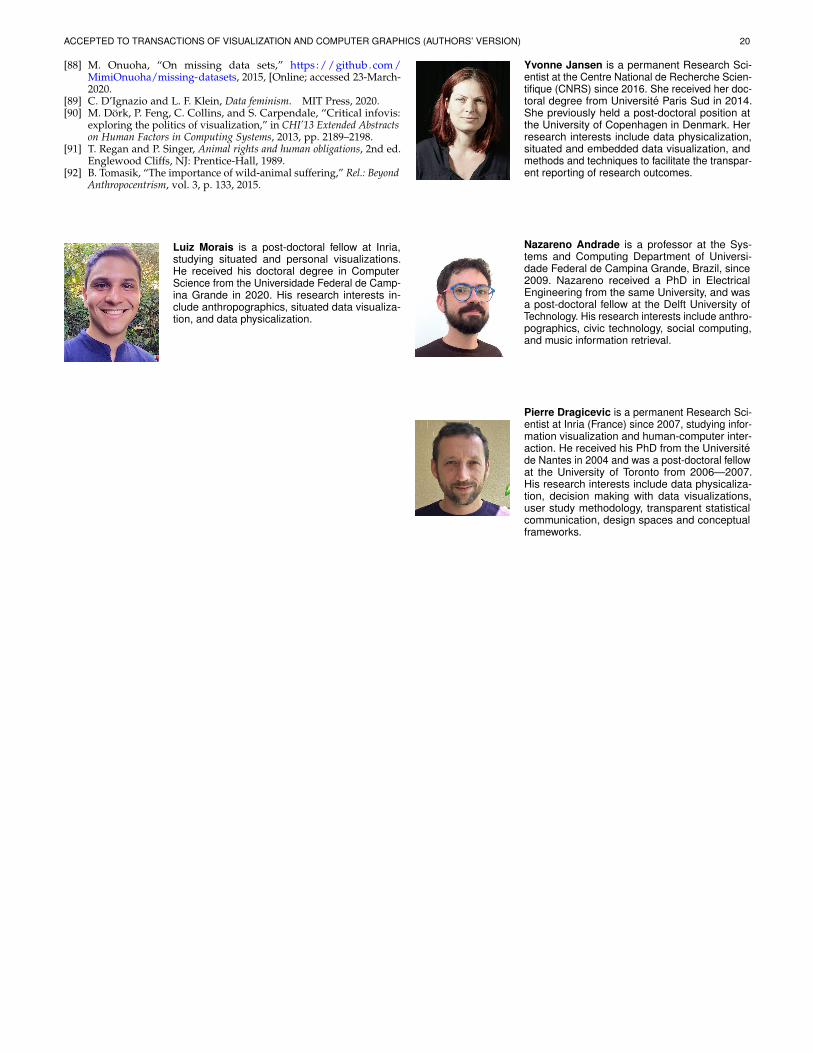
ACCEPTED TO TRANSACTIONS OF VISUALIZATION AND COMPUTER GRAPHICS (AUTHORS’ VERSION) 20
[88] M. Onuoha, “On missing data sets,” https ://github.com/MimiOnuoha/missing-datasets, 2015, [Online; accessed 23-March-2020.
[89] C. D’Ignazio and L. F. Klein, Data feminism. MIT Press, 2020.[90] M. Dork, P. Feng, C. Collins, and S. Carpendale, “Critical infovis:
exploring the politics of visualization,” in CHI’13 Extended Abstractson Human Factors in Computing Systems, 2013, pp. 2189–2198.
[91] T. Regan and P. Singer, Animal rights and human obligations, 2nd ed.Englewood Cliffs, NJ: Prentice-Hall, 1989.
[92] B. Tomasik, “The importance of wild-animal suffering,” Rel.: BeyondAnthropocentrism, vol. 3, p. 133, 2015.
Luiz Morais is a post-doctoral fellow at Inria,studying situated and personal visualizations.He received his doctoral degree in ComputerScience from the Universidade Federal de Camp-ina Grande in 2020. His research interests in-clude anthropographics, situated data visualiza-tion, and data physicalization.
Yvonne Jansen is a permanent Research Sci-entist at the Centre National de Recherche Scien-tifique (CNRS) since 2016. She received her doc-toral degree from Universite Paris Sud in 2014.She previously held a post-doctoral position atthe University of Copenhagen in Denmark. Herresearch interests include data physicalization,situated and embedded data visualization, andmethods and techniques to facilitate the transpar-ent reporting of research outcomes.
Nazareno Andrade is a professor at the Sys-tems and Computing Department of Universi-dade Federal de Campina Grande, Brazil, since2009. Nazareno received a PhD in ElectricalEngineering from the same University, and wasa post-doctoral fellow at the Delft University ofTechnology. His research interests include anthro-pographics, civic technology, social computing,and music information retrieval.
Pierre Dragicevic is a permanent Research Sci-entist at Inria (France) since 2007, studying infor-mation visualization and human-computer inter-action. He received his PhD from the Universitede Nantes in 2004 and was a post-doctoral fellowat the University of Toronto from 2006—2007.His research interests include data physicaliza-tion, decision making with data visualizations,user study methodology, transparent statisticalcommunication, design spaces and conceptualframeworks.