Embed Size (px)
Citation preview
SE 350 Software Process & Product Quality 1
Seven Basic Quality Tools
SE 350 Software Process & Product Quality
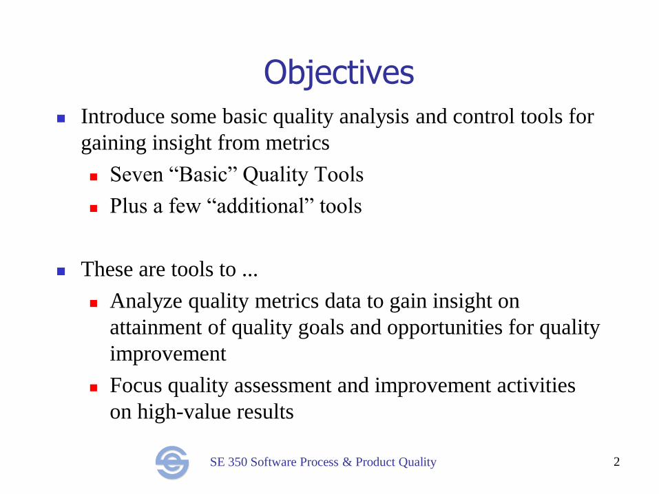
Objectives Introduce some basic quality analysis and control tools for
gaining insight from metrics
Seven “Basic” Quality Tools
Plus a few “additional” tools
These are tools to ...
Analyze quality metrics data to gain insight on
attainment of quality goals and opportunities for quality
improvement
Focus quality assessment and improvement activities
on high-value results
2
SE 350 Software Process & Product Quality
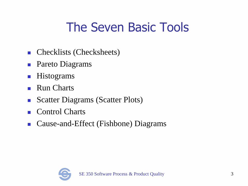
The Seven Basic Tools
Checklists (Checksheets)
Pareto Diagrams
Histograms
Run Charts
Scatter Diagrams (Scatter Plots)
Control Charts
Cause-and-Effect (Fishbone) Diagrams
3
SE 350 Software Process & Product Quality
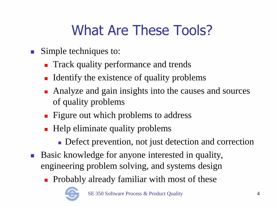
What Are These Tools?
Simple techniques to:
Track quality performance and trends
Identify the existence of quality problems
Analyze and gain insights into the causes and sources
of quality problems
Figure out which problems to address
Help eliminate quality problems
Defect prevention, not just detection and correction
Basic knowledge for anyone interested in quality,
engineering problem solving, and systems design
Probably already familiar with most of these
4
SE 350 Software Process & Product Quality
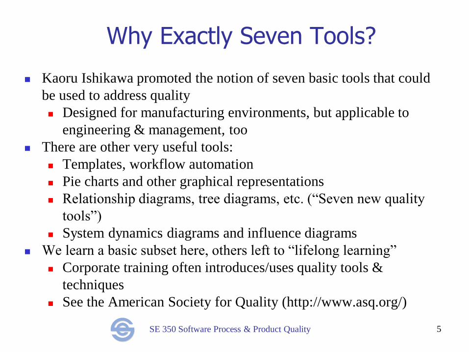
Why Exactly Seven Tools?
Kaoru Ishikawa promoted the notion of seven basic tools that could
be used to address quality
Designed for manufacturing environments, but applicable to
engineering & management, too
There are other very useful tools:
Templates, workflow automation
Pie charts and other graphical representations
Relationship diagrams, tree diagrams, etc. (“Seven new quality
tools”)
System dynamics diagrams and influence diagrams
We learn a basic subset here, others left to “lifelong learning”
Corporate training often introduces/uses quality tools &
techniques
See the American Society for Quality (http://www.asq.org/)
5
SE 350 Software Process & Product Quality
What to Learn About Each Tool
What is the tool?
How is it used?
For what purposes is it useful?
What value does it add?
What are its limitations?
How can it be used effectively?
6
SE 350 Software Process & Product Quality
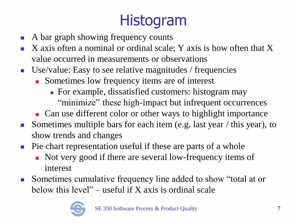
Histogram A bar graph showing frequency counts
X axis often a nominal or ordinal scale; Y axis is how often that X
value occurred in measurements or observations
Use/value: Easy to see relative magnitudes / frequencies
Sometimes low frequency items are of interest
For example, dissatisfied customers: histogram may
“minimize” these high-impact but infrequent occurrences
Can use different color or other ways to highlight importance
Sometimes multiple bars for each item (e.g. last year / this year), to
show trends and changes
Pie chart representation useful if these are parts of a whole
Not very good if there are several low-frequency items of
interest
Sometimes cumulative frequency line added to show “total at or
below this level” – useful if X axis is ordinal scale
7
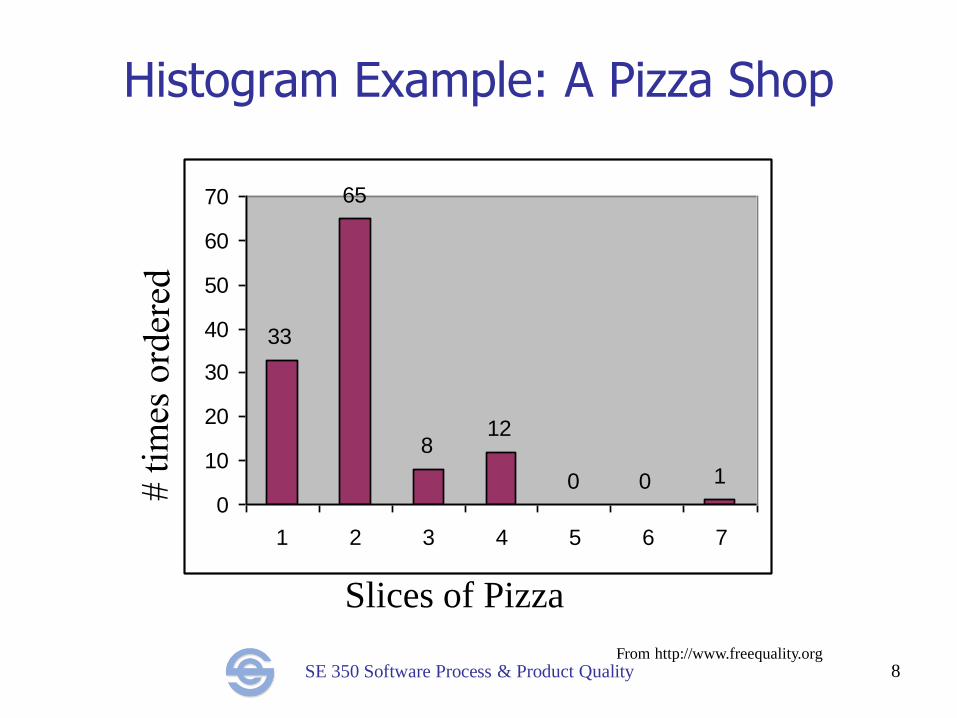
SE 350 Software Process & Product Quality 8
Histogram Example: A Pizza Shop
33
65
812
0 0 1
0
10
20
30
40
50
60
70
1 2 3 4 5 6 7
Slices of Pizza
From http://www.freequality.org
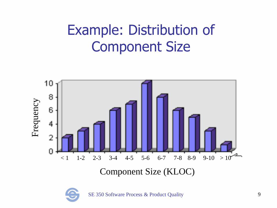
SE 350 Software Process & Product Quality
Example: Distribution of Component Size
9
Component Size (KLOC)
< 1 1-2 2-3 3-4 4-5 5-6 6-7 7-8 9-10 8-9 > 10
Fre
quen
cy
SE 350 Software Process & Product Quality
Run Charts Plot of some measurement/metric vs. (usually) time
Use this when X axis is interval or ratio scale, such as
project time, component size, team size, etc.
Often used to show trends over time
Easier to spot overall upward or downward trend, or
cyclical variations and other patterns
Visually separate random from significant variation
Major spikes or valleys are triggers for explanation,
investigation, or action
Value: Identification of problems, trends, unexpected
good results (may learn a lot from these)
10
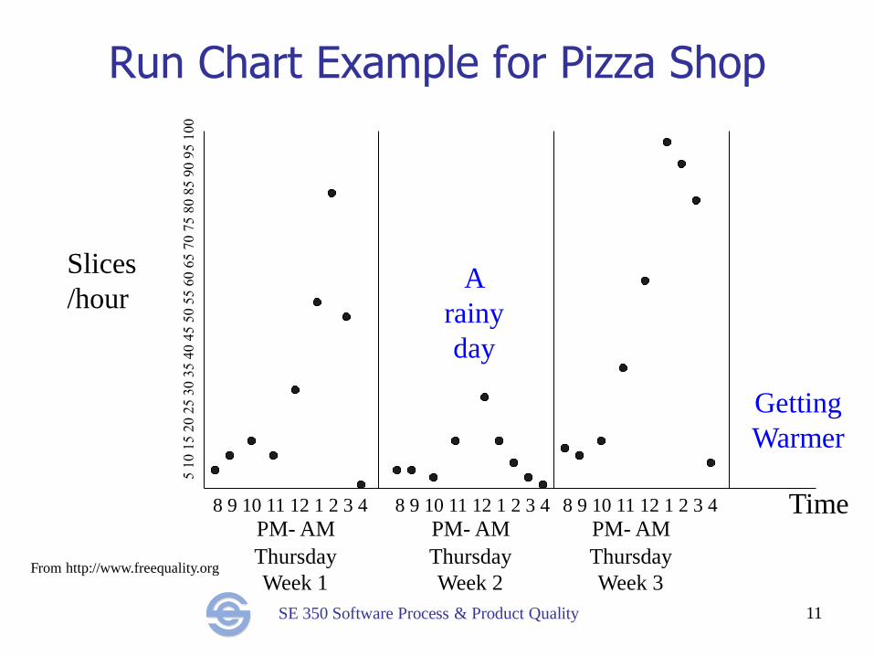
SE 350 Software Process & Product Quality 11
Run Chart Example for Pizza Shop
8 9 10 11 12 1 2 3 4 8 9 10 11 12 1 2 3 4 8 9 10 11 12 1 2 3 4
PM- AM PM- AM PM- AM
Thursday
Week 1
Thursday
Week 2
Thursday
Week 3
Slices
/hour
Time
From http://www.freequality.org
A
rainy
day
Getting
Warmer
SE 350 Software Process & Product Quality
Cause-And-Effect (Fishbone) Diagram
Diagram showing hierarchical structure of causes that
contribute to a problem or outcome:
Problem of interest forms the backbone
Spines are causes that contribute to the problem
Spines may have bones that represent its contributory
factors and so on
Used in brainstorming to diagram and identify various
possible factors contributing to a problem, and to identify
causal sequences (A causes B causes C) and root causes
Very simple but extraordinarily useful tool
Initially both minor factors (that occur rarely or contribute
very little) and major causes may all get listed
12
SE 350 Software Process & Product Quality
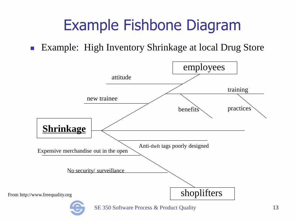
Example Fishbone Diagram
Example: High Inventory Shrinkage at local Drug Store
13
Shrinkage
shoplifters
Anti-theft tags poorly designed Expensive merchandise out in the open
No security/ surveillance
employees attitude
new trainee
training
benefits practices
From http://www.freequality.org
SE 350 Software Process & Product Quality
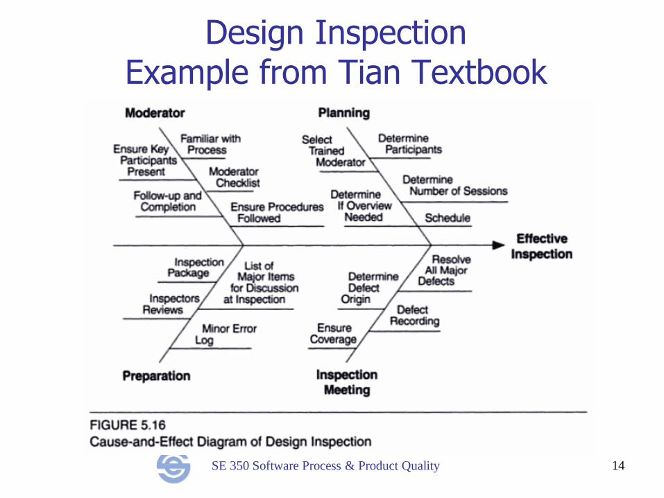
Design Inspection Example from Tian Textbook
14
SE 350 Software Process & Product Quality
Pareto Diagram Histogram arranged by decreasing frequency
Used to identify causes that contribute most to the problem
After fishbone analysis, may do data gathering to figure out the
frequency with which each cause contributes to the problem
In software, review reports are good data sources
Plot histogram, identify the major causes
Based on Juran’s Pareto Principle – the 80/20 rule
“80% of the effects come from 20% of the causes”
Indicates general principle that some causes likely to be a
lot more significant than others
Highest cost-benefit from addressing the most significant
problems
Less significant problems may barely be worth addressing
15
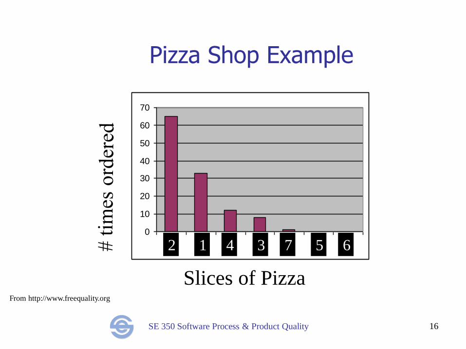
SE 350 Software Process & Product Quality 16
Pizza Shop Example
0
10
20
30
40
50
60
70
1 2 3 4 5 6 7
Slices of Pizza
2 1 4 3 7 5 6
From http://www.freequality.org
SE 350 Software Process & Product Quality 17
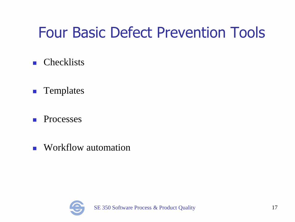
Four Basic Defect Prevention Tools
Checklists
Templates
Processes
Workflow automation
SE 350 Software Process & Product Quality
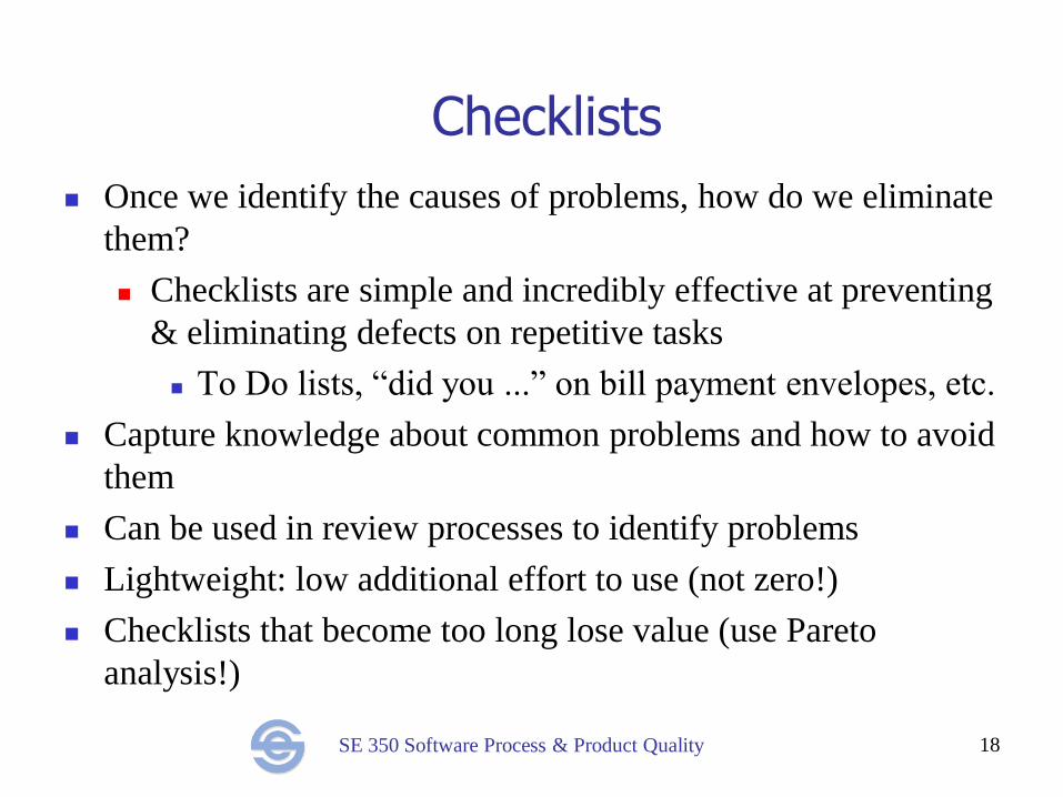
Checklists
Once we identify the causes of problems, how do we eliminate
them?
Checklists are simple and incredibly effective at preventing
& eliminating defects on repetitive tasks
To Do lists, “did you ...” on bill payment envelopes, etc.
Capture knowledge about common problems and how to avoid
them
Can be used in review processes to identify problems
Lightweight: low additional effort to use (not zero!)
Checklists that become too long lose value (use Pareto
analysis!)
18
SE 350 Software Process & Product Quality
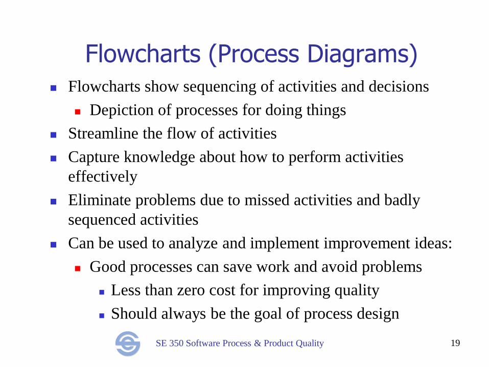
Flowcharts (Process Diagrams) Flowcharts show sequencing of activities and decisions
Depiction of processes for doing things
Streamline the flow of activities
Capture knowledge about how to perform activities
effectively
Eliminate problems due to missed activities and badly
sequenced activities
Can be used to analyze and implement improvement ideas:
Good processes can save work and avoid problems
Less than zero cost for improving quality
Should always be the goal of process design
19
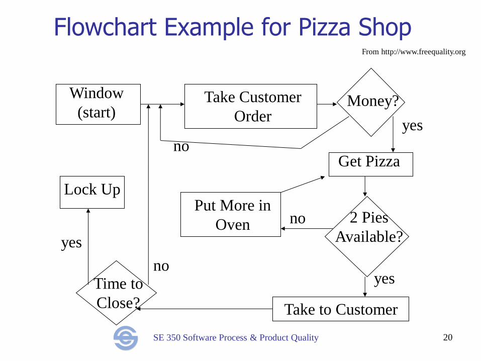
SE 350 Software Process & Product Quality 20
Flowchart Example for Pizza Shop
no
yes
no
yes no
yes
From http://www.freequality.org
Window
(start) Take Customer
Order Money?
Get Pizza
2 Pies
Available?
Put More in
Oven
Lock Up
Time to
Close? Take to Customer
SE 350 Software Process & Product Quality
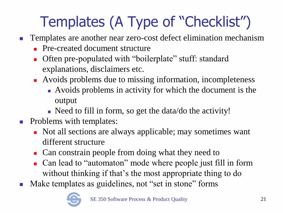
Templates (A Type of “Checklist”) Templates are another near zero-cost defect elimination mechanism
Pre-created document structure
Often pre-populated with “boilerplate” stuff: standard
explanations, disclaimers etc.
Avoids problems due to missing information, incompleteness
Avoids problems in activity for which the document is the
output
Need to fill in form, so get the data/do the activity!
Problems with templates:
Not all sections are always applicable; may sometimes want
different structure
Can constrain people from doing what they need to
Can lead to “automaton” mode where people just fill in form
without thinking if that’s the most appropriate thing to do
Make templates as guidelines, not “set in stone” forms
21
SE 350 Software Process & Product Quality
Are you using the document outline of your project as a checklist?
22
SE 350 Software Process & Product Quality
Workflow Automation
Creation of computerized tools that streamline activities,
such as automated check-in and build, automated testing
Implements process, templates
Eliminates many kinds of defects
Saves effort
Flexibility is often a major problem
If the needs are different from what the tool supports,
can’t do it at all (or significant work-arounds)
Designing flexible tools which automate workflow is a
major technical challenge
23
SE 350 Software Process & Product Quality
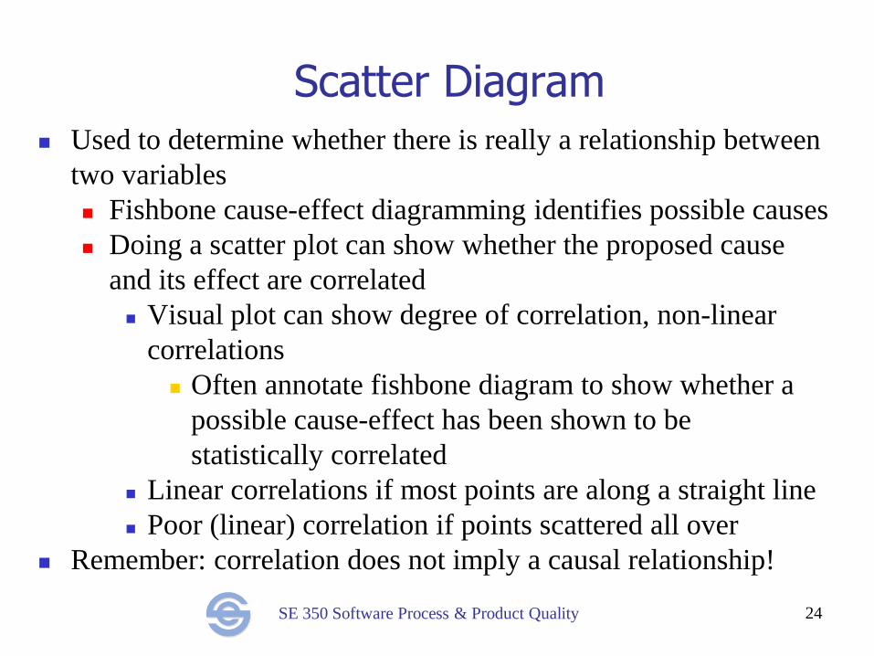
Scatter Diagram Used to determine whether there is really a relationship between
two variables
Fishbone cause-effect diagramming identifies possible causes
Doing a scatter plot can show whether the proposed cause
and its effect are correlated
Visual plot can show degree of correlation, non-linear
correlations
Often annotate fishbone diagram to show whether a
possible cause-effect has been shown to be
statistically correlated
Linear correlations if most points are along a straight line
Poor (linear) correlation if points scattered all over
Remember: correlation does not imply a causal relationship!
24
SE 350 Software Process & Product Quality 25
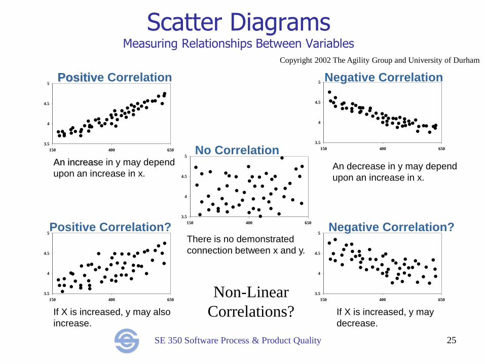
Scatter Diagrams Measuring Relationships Between Variables
3.5
4
4.5
5
150 400 650
3.5
4
4.5
5
150 400 650
3.5
4
4.5
5
150 400 650
3.5
4
4.5
5
150 400 650
3.5
4
4.5
5
150 400 650
Positive Correlation
Positive Correlation?
Negative Correlation
Negative Correlation?
No Correlation An increase in y may depend
upon an increase in x.
If X is increased, y may also
increase.
If X is increased, y may
decrease.
There is no demonstrated
connection between x and y.
An decrease in y may depend
upon an increase in x.
Copyright 2002 The Agility Group and University of Durham
Non-Linear
Correlations?
SE 350 Software Process & Product Quality
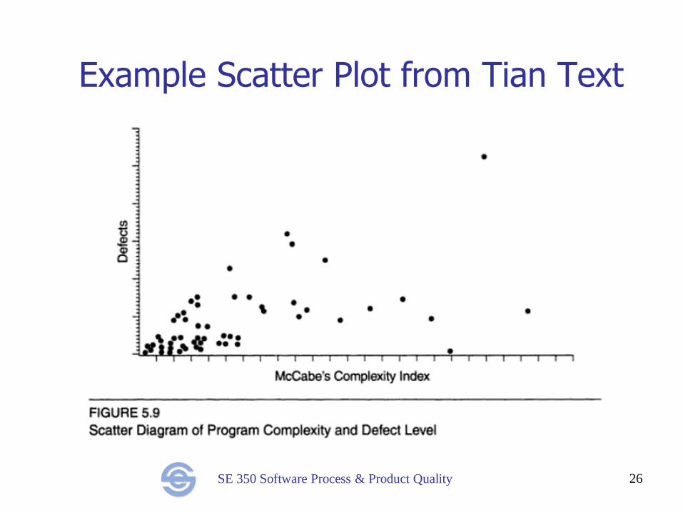
Example Scatter Plot from Tian Text
26
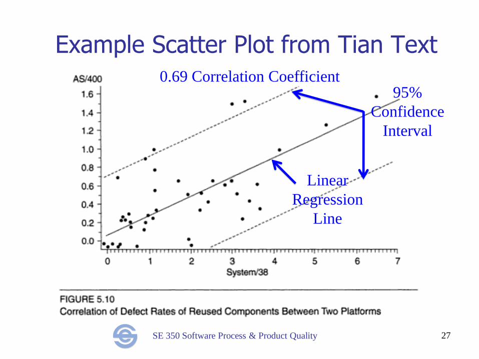
SE 350 Software Process & Product Quality
Example Scatter Plot from Tian Text
27
Linear
Regression
Line
95%
Confidence
Interval
0.69 Correlation Coefficient
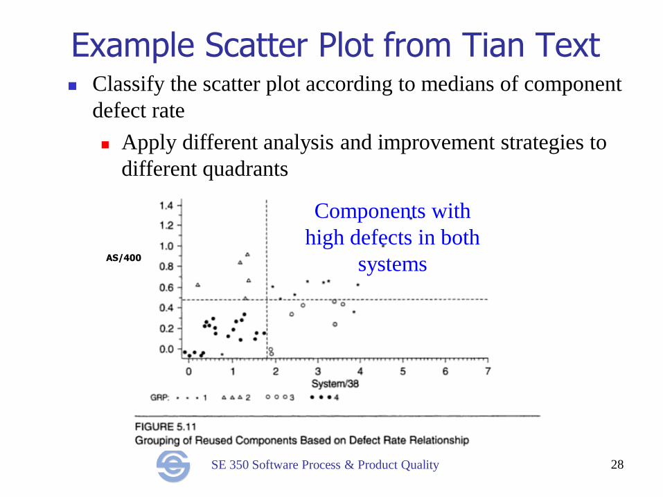
SE 350 Software Process & Product Quality
Example Scatter Plot from Tian Text
28
Classify the scatter plot according to medians of component
defect rate
Apply different analysis and improvement strategies to
different quadrants
Components with
high defects in both
systems AS/400
SE 350 Software Process & Product Quality
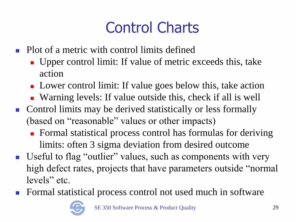
Control Charts
Plot of a metric with control limits defined
Upper control limit: If value of metric exceeds this, take
action
Lower control limit: If value goes below this, take action
Warning levels: If value outside this, check if all is well
Control limits may be derived statistically or less formally
(based on “reasonable” values or other impacts)
Formal statistical process control has formulas for deriving
limits: often 3 sigma deviation from desired outcome
Useful to flag “outlier” values, such as components with very
high defect rates, projects that have parameters outside “normal
levels” etc.
Formal statistical process control not used much in software
29
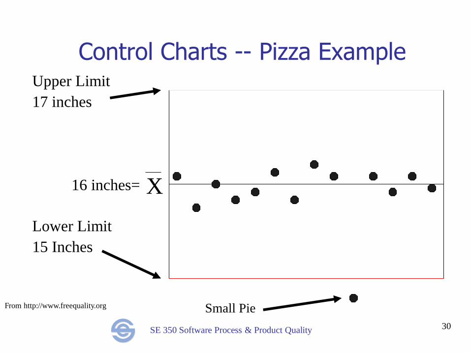
SE 350 Software Process & Product Quality 30
Control Charts -- Pizza Example Upper Limit
17 inches
Lower Limit
15 Inches
Small Pie
X 16 inches=
From http://www.freequality.org
SE 350 Software Process & Product Quality
Conclusion
The quality tools provide a suite of methods for quality
analysis and control:
Histograms, run charts, control charts can identify
problems
Fishbone is used to brainstorm possible causes
Scatter plots can be used to analyze whether
relationships exist
Pareto analysis identifies which causes are most worth
addressing
Checklists, templates, process definition and workflow
automation can prevent problems
31


![- PIERRE]€¦ · Quality Casework U Millwork Since 1953 . hint Name: ... 350-8490 Fax# (909) 350-8477 ... SIEMENS Rob Morby Project Manager](https://img.pdfslide.us/doc/110x75/5b845e257f8b9aec488c13e1/-pierre-quality-casework-u-millwork-since-1953-hint-name-350-8490-fax.jpg)