Embed Size (px)
Citation preview

SECO brandbookBrand strategy &Graphic guidelines
2Brandbook
Purpose of the document
The following pages are the foundations of the SECO brand, designed to unveil its DNA and help to create a consistent and cohesive approach to communication, across every channel.
All SECO trademarks and the intellectual property rights attaching to them are the property of SECO and are used under license.
3Brandbook
Index
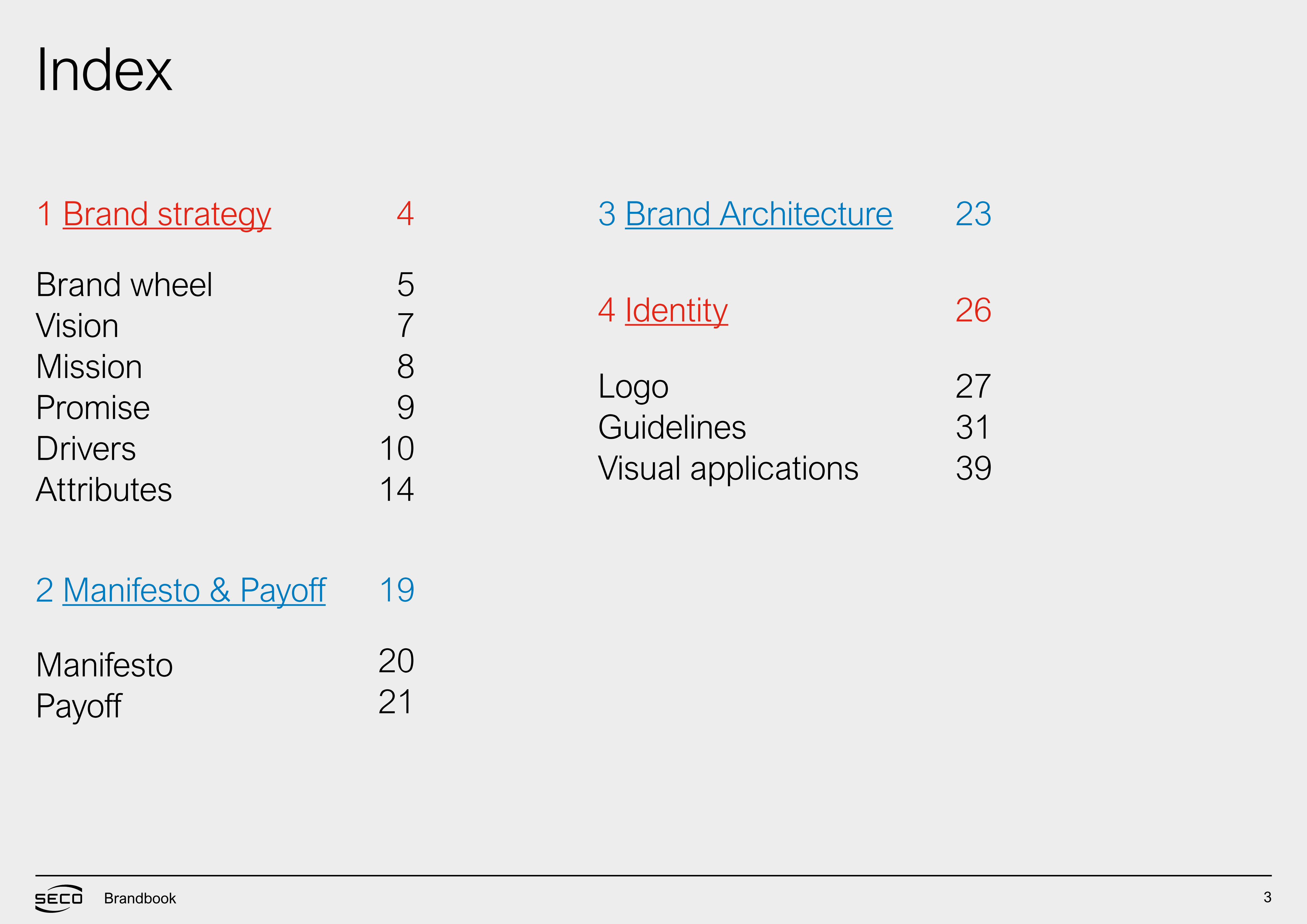
1 Brand strategy
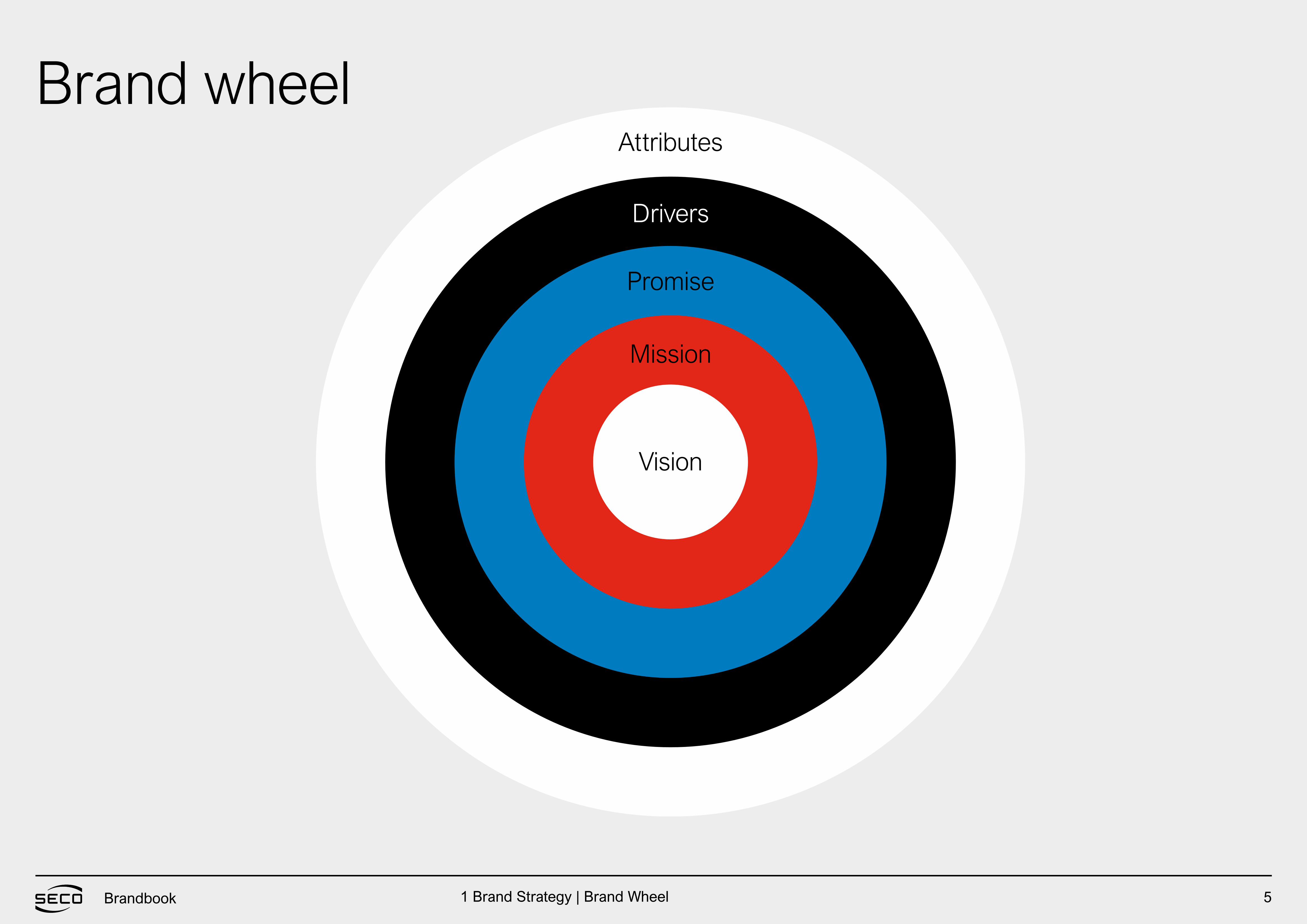
Brand wheelVisionMissionPromiseDrivers Attributes
LogoGuidelinesVisual applications
ManifestoPayoff
5789
10 14
2021
4
192 Manifesto & Payoff
3 Brand Architecture
4 Identity
273139
26
23
BRAND STRATEGY
Brandbook
5Brandbook
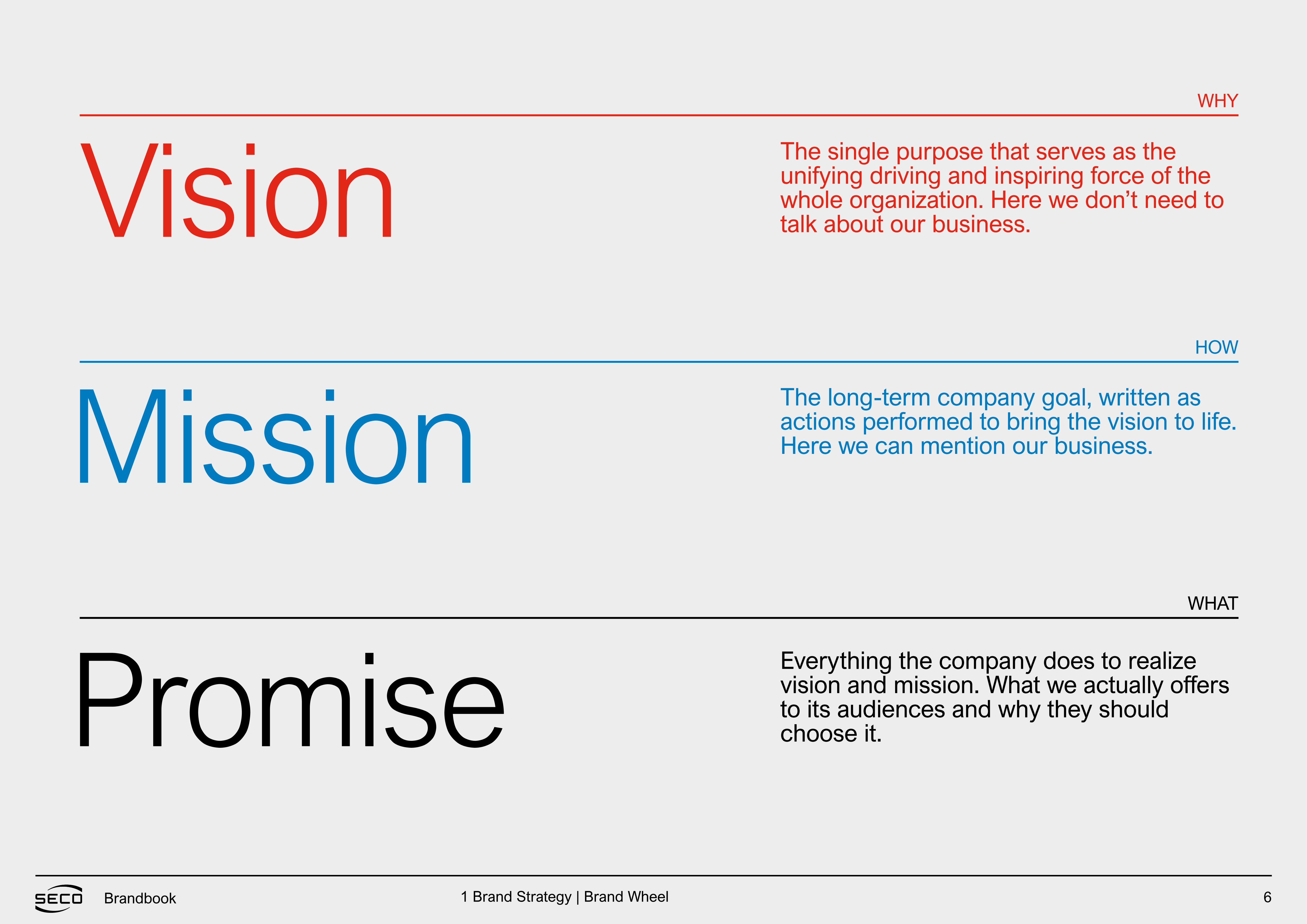
Vision
Mission
Promise
Drivers
Attributes
Brand wheel
1 Brand Strategy | Brand Wheel
6Brandbook
VisionWHY
HOW
WHAT
Mission
Promise
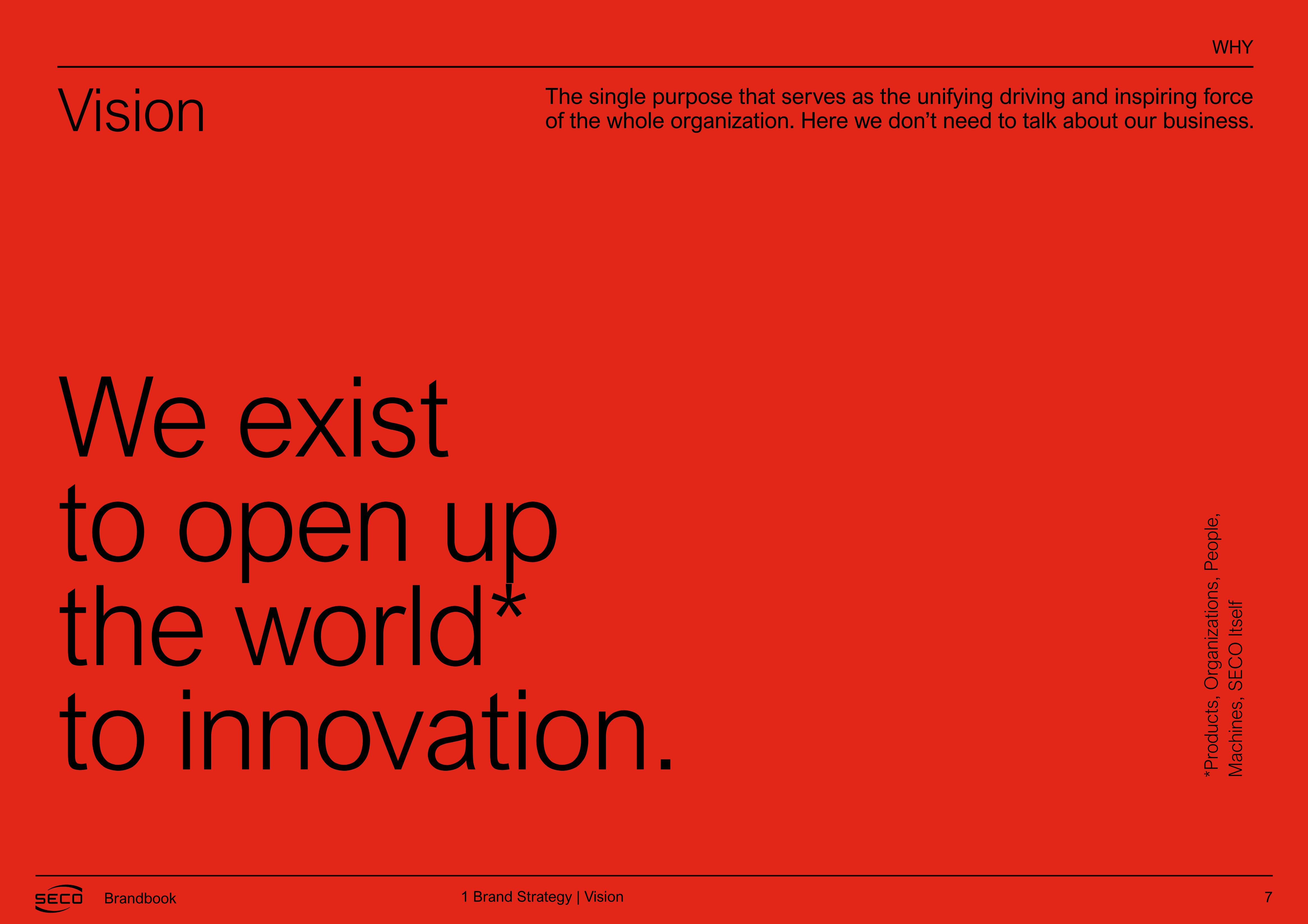
The single purpose that serves as the unifying driving and inspiring force of the whole organization. Here we don’t need to talk about our business.
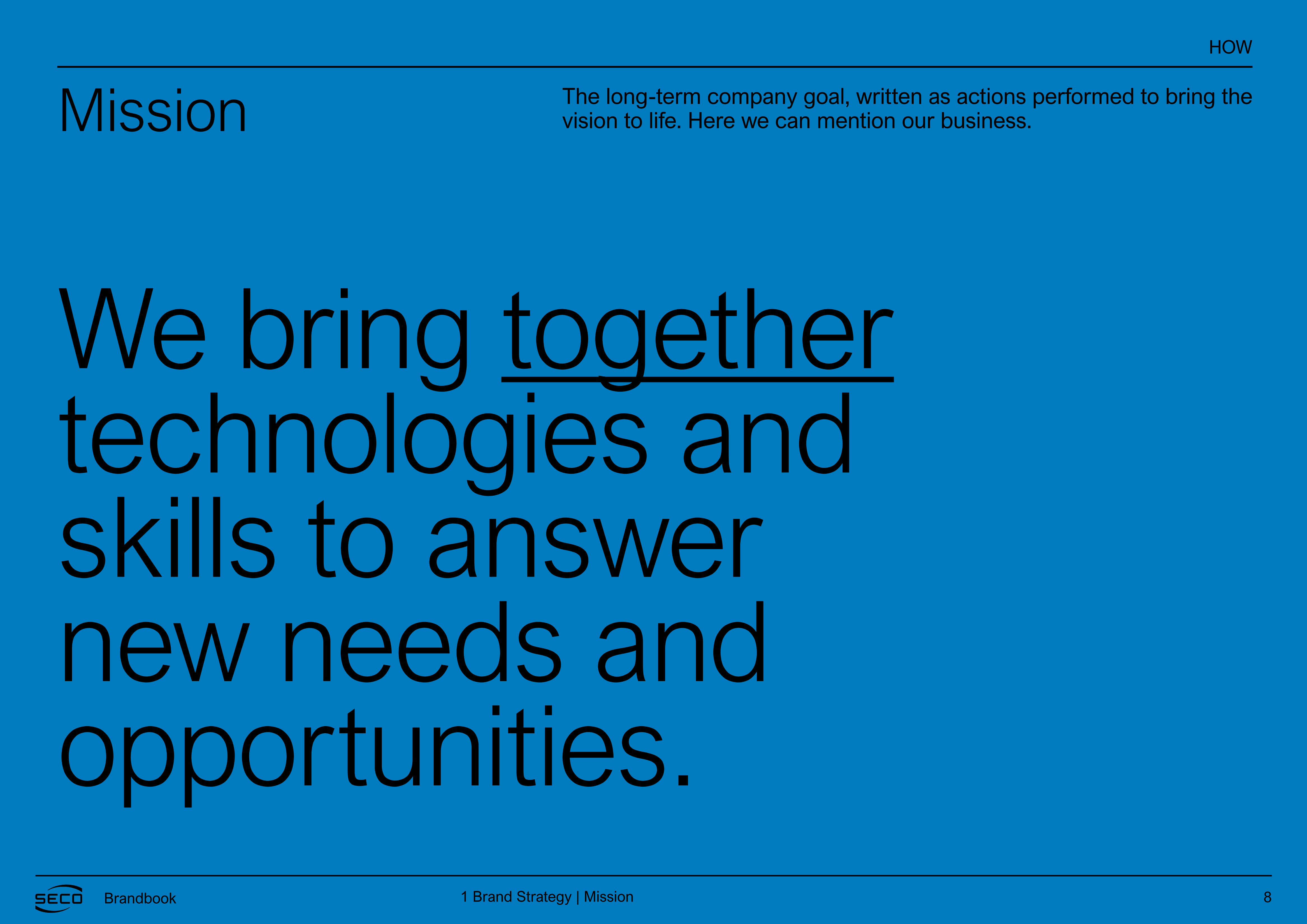
The long-term company goal, written as actions performed to bring the vision to life. Here we can mention our business.
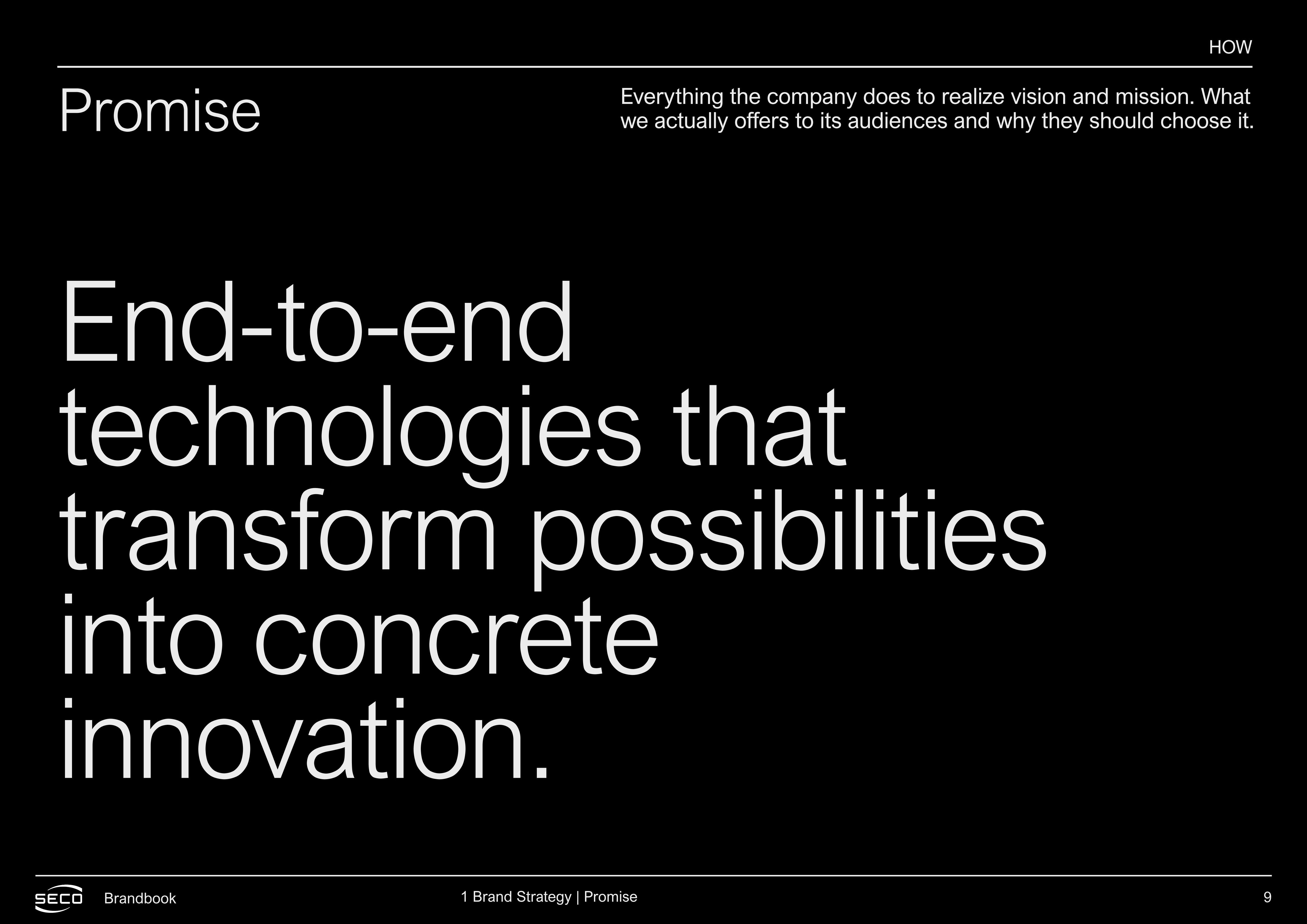
Everything the company does to realize vision and mission. What we actually offers to its audiences and why they should choose it.
1 Brand Strategy | Brand Wheel
7Brandbook
Vision
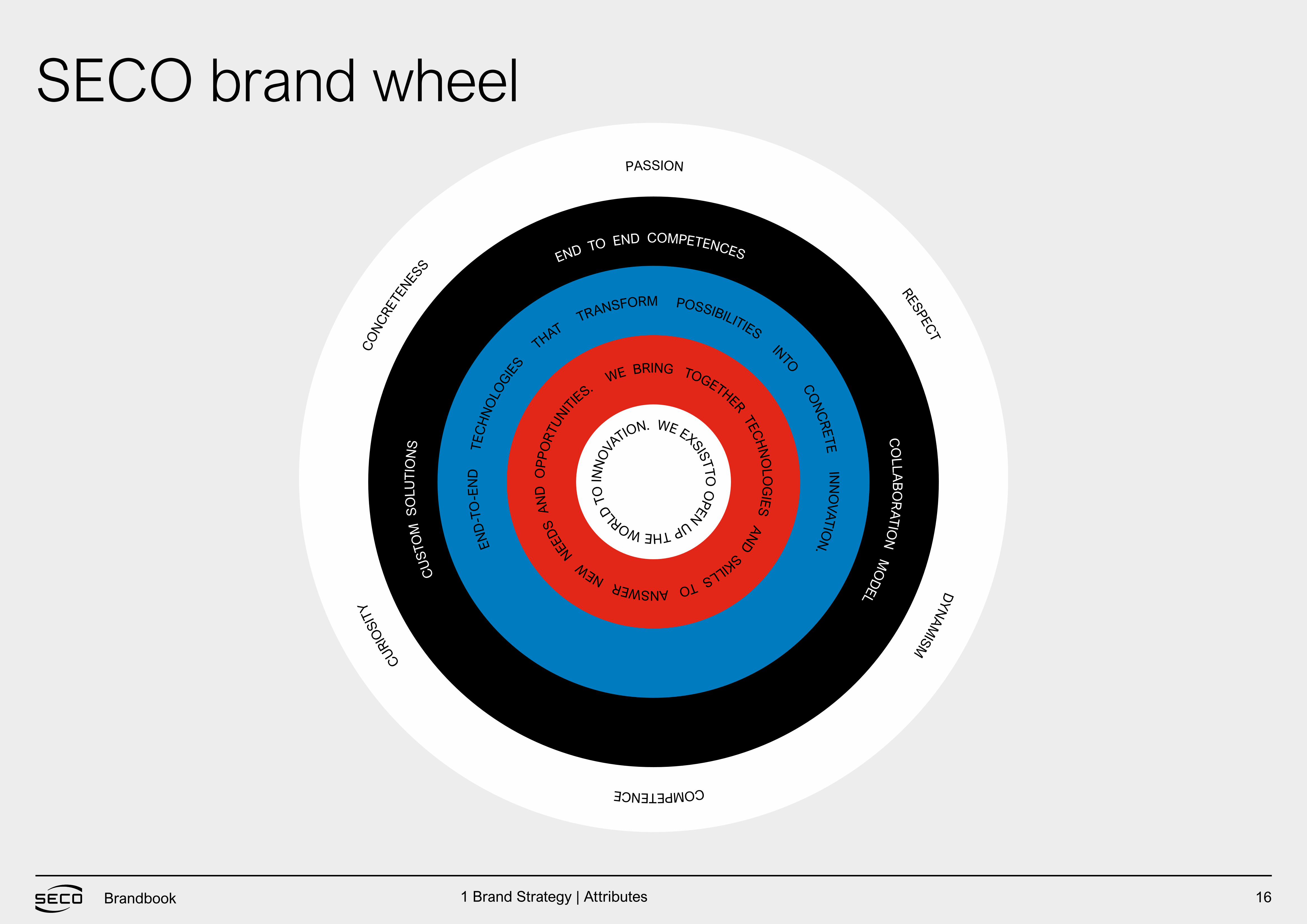
We existto open upthe world*to innovation.
WHY
The single purpose that serves as the unifying driving and inspiring force of the whole organization. Here we don’t need to talk about our business.
*Pro
duct
s, O
rgan
izat
ions
, Peo
ple,
M
achi
nes,
SE
CO
Itse
lf
1 Brand Strategy | Vision
8Brandbook
We bring together technologies and skills to answer new needs and opportunities.
MissionHOW
The long-term company goal, written as actions performed to bring the vision to life. Here we can mention our business.
1 Brand Strategy | Mission
9Brandbook
End-to-end technologies that transform possibilities into concrete innovation.
PromiseHOW
Everything the company does to realize vision and mission. What we actually offers to its audiences and why they should choose it.
1 Brand Strategy | Promise
10Brandbook
The three most important brand assetsthat help realize the promise
Drivers
BRAND STRATEGY
1 Brand Strategy | Drivers
11Brandbook
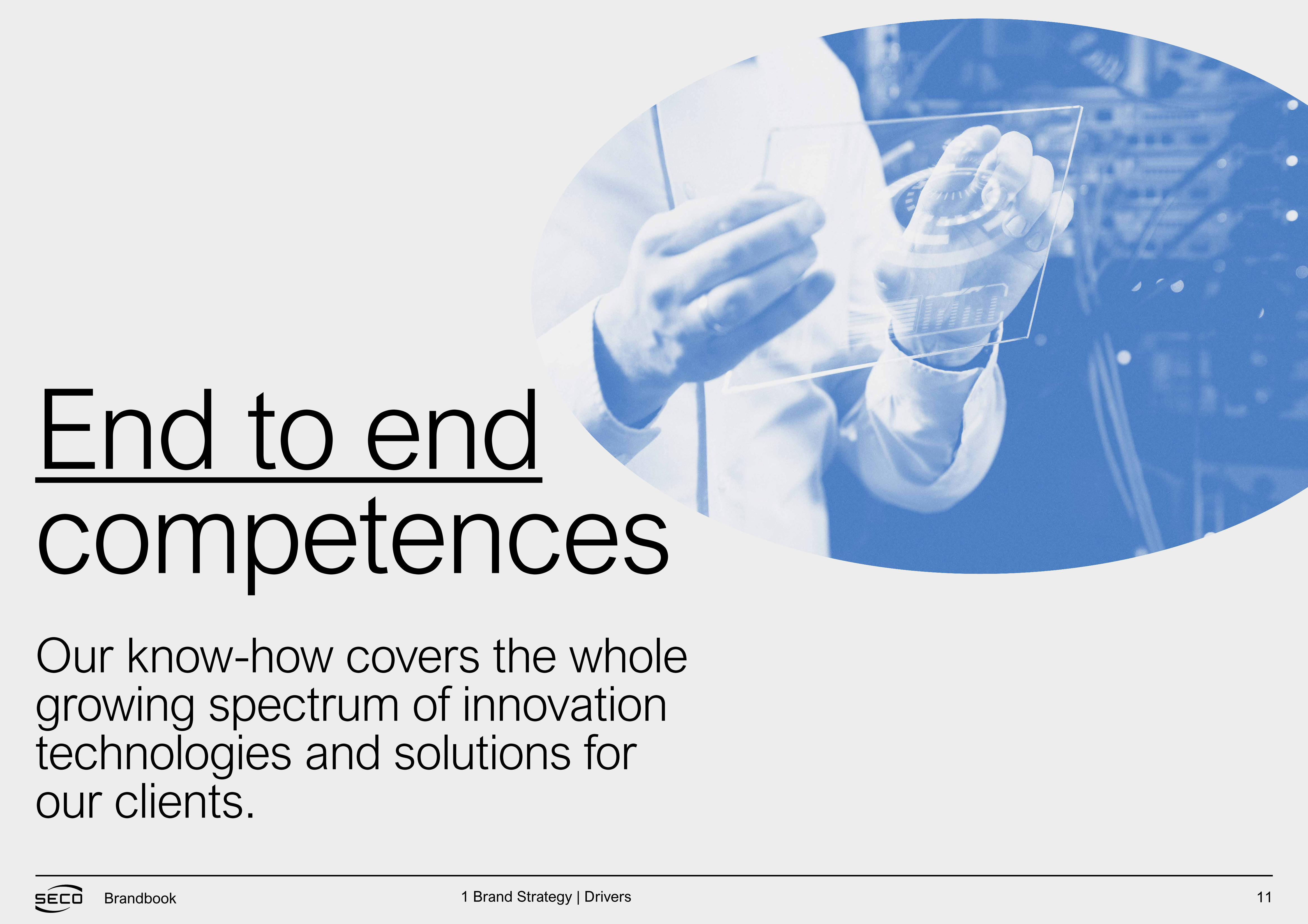
End to endcompetencesOur know-how covers the whole growing spectrum of innovation technologies and solutions for our clients.
1 Brand Strategy | Drivers
12Brandbook
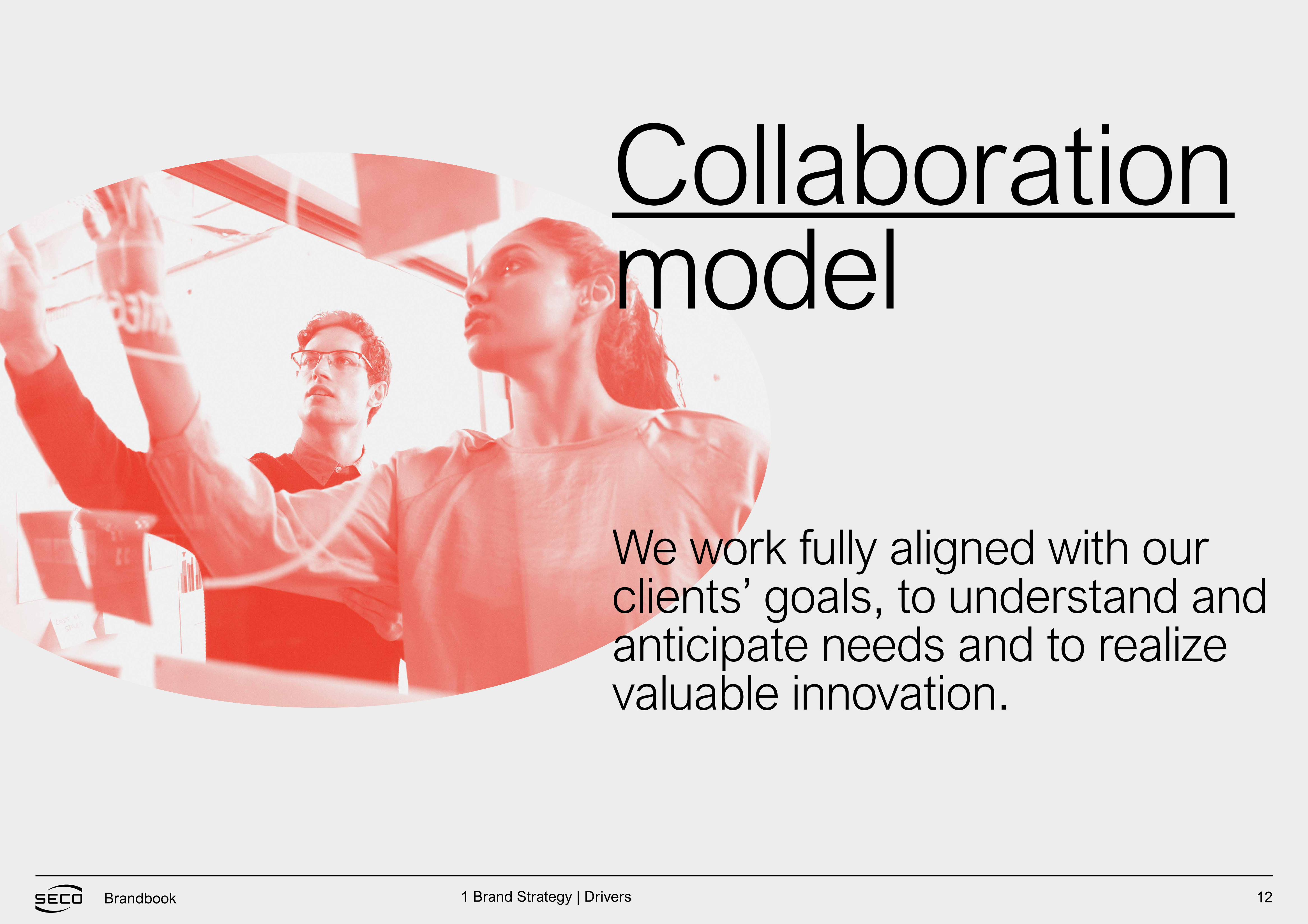
Collaborationmodel
We work fully aligned with our clients’ goals, to understand and anticipate needs and to realize valuable innovation.
1 Brand Strategy | Drivers
13Brandbook
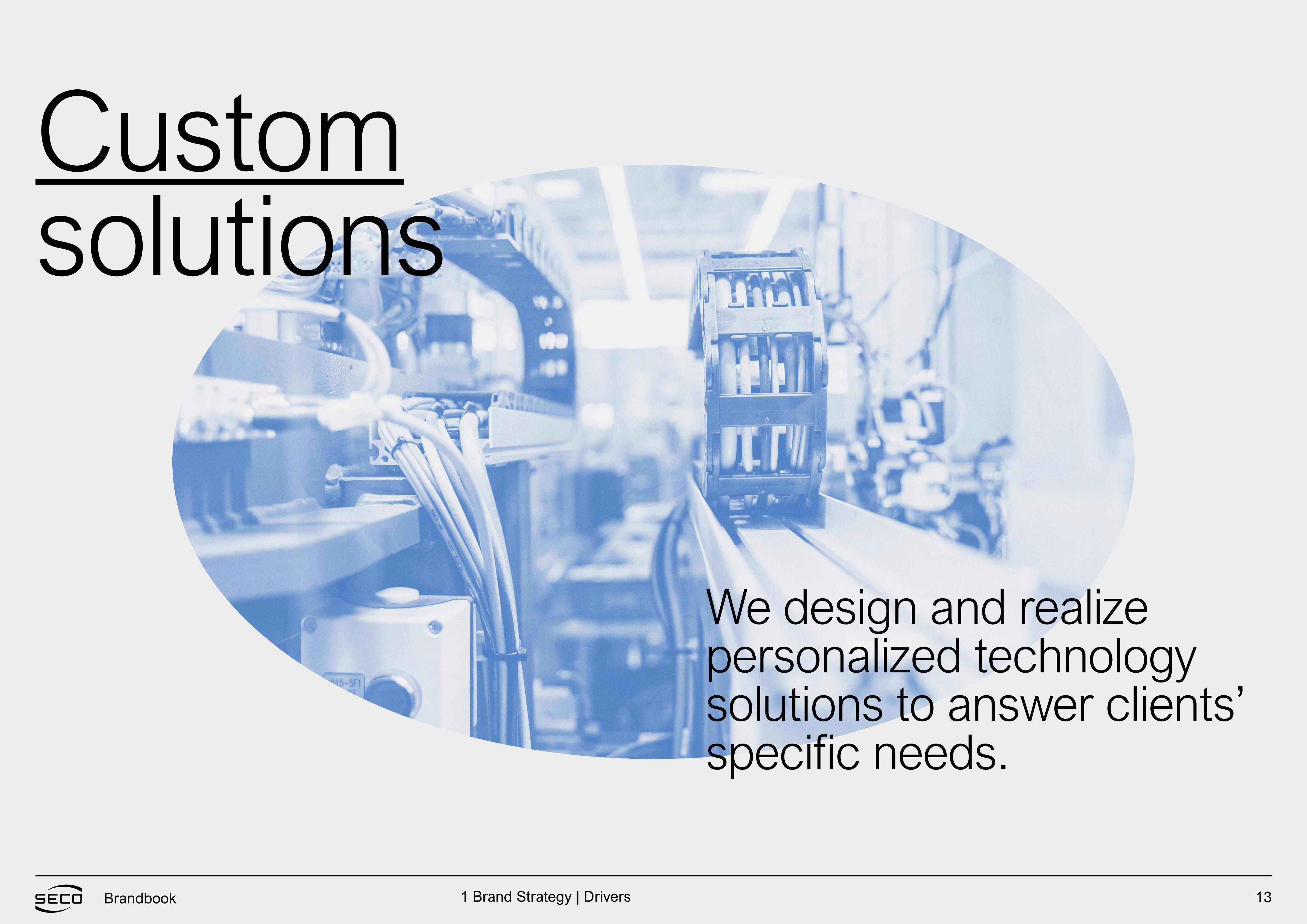
Customsolutions
We design and realize personalized technology solutions to answer clients’ specific needs.
1 Brand Strategy | Drivers
14Brandbook
Brand values or personality traits
Attributes
BRAND STRATEGY
1 Brand Strategy | Attributes
15Brandbook
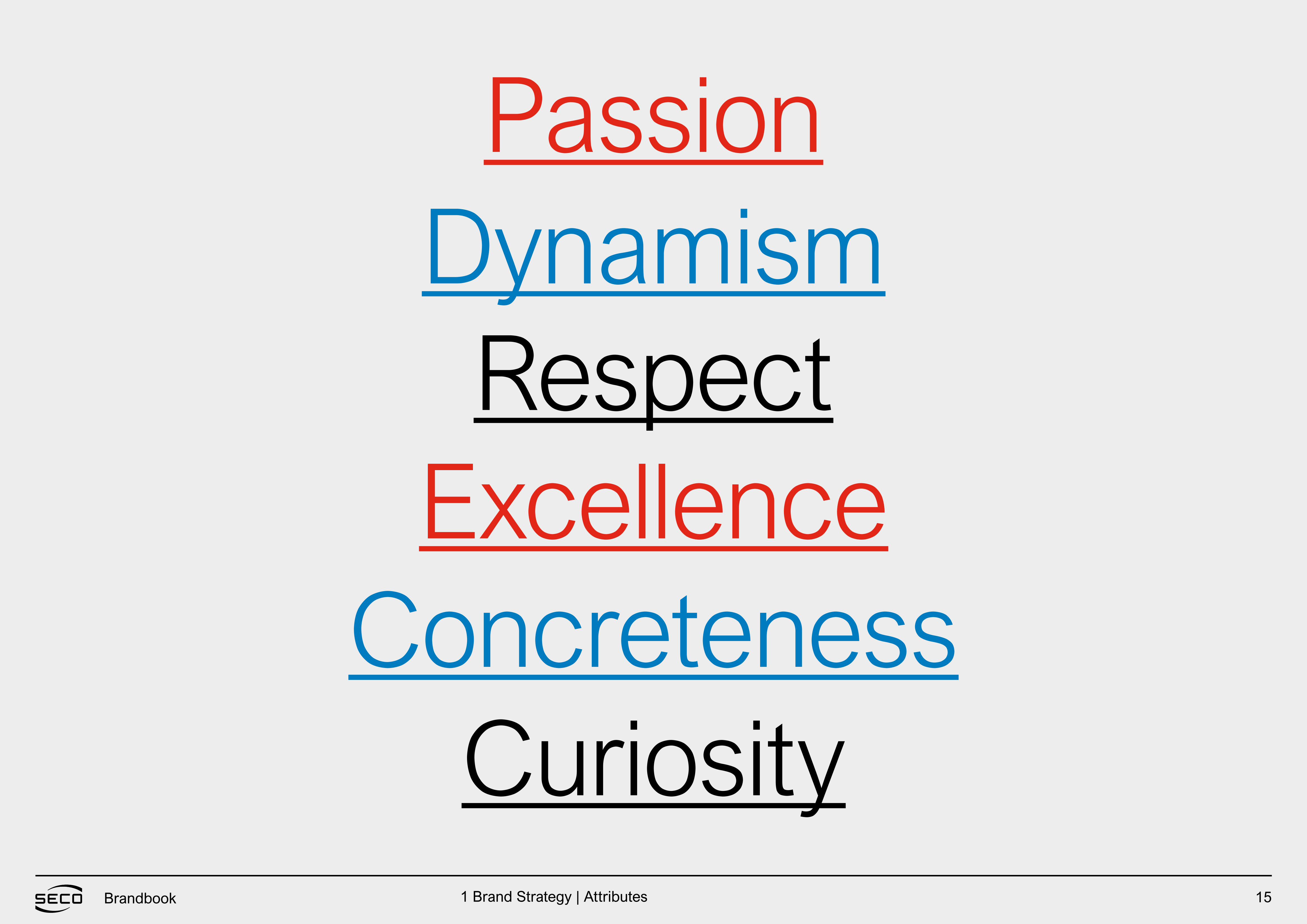
Passion
Excellence
Curiosity
Dynamism
Concreteness
Respect
1 Brand Strategy | Attributes
16Brandbook
END
-TO
-EN
D
TEC
HN
OLO
GIE
S THAT
TRANSFORM POSSIBILITIES INTO C
ON
CR
ETE IN
NO
VATIO
N.
END TO END COMPETENCES
C
OLLA
BO
RA
TIO
N M
OD
EL
CU
STO
M S
OLU
TIO
NS
WE BRING TOGETHER TECH
NO
LOG
IES A
ND SKILLS TO ANSWER N
EW NEE
DS
AN
D O
PP
OR
TUNIT
IES.
WE EXSISTTO O
PEN UP THE WORLD T
O IN
NO
VATION.
PASSION RESPECT D
YN
AM
ISM COMPETENCE
CU
RIO
SIT
Y
CO
NC
RETE
NESS
SECO brand wheel
1 Brand Strategy | Attributes
MANIFESTO & PAYOFF
Brandbook
18Brandbook
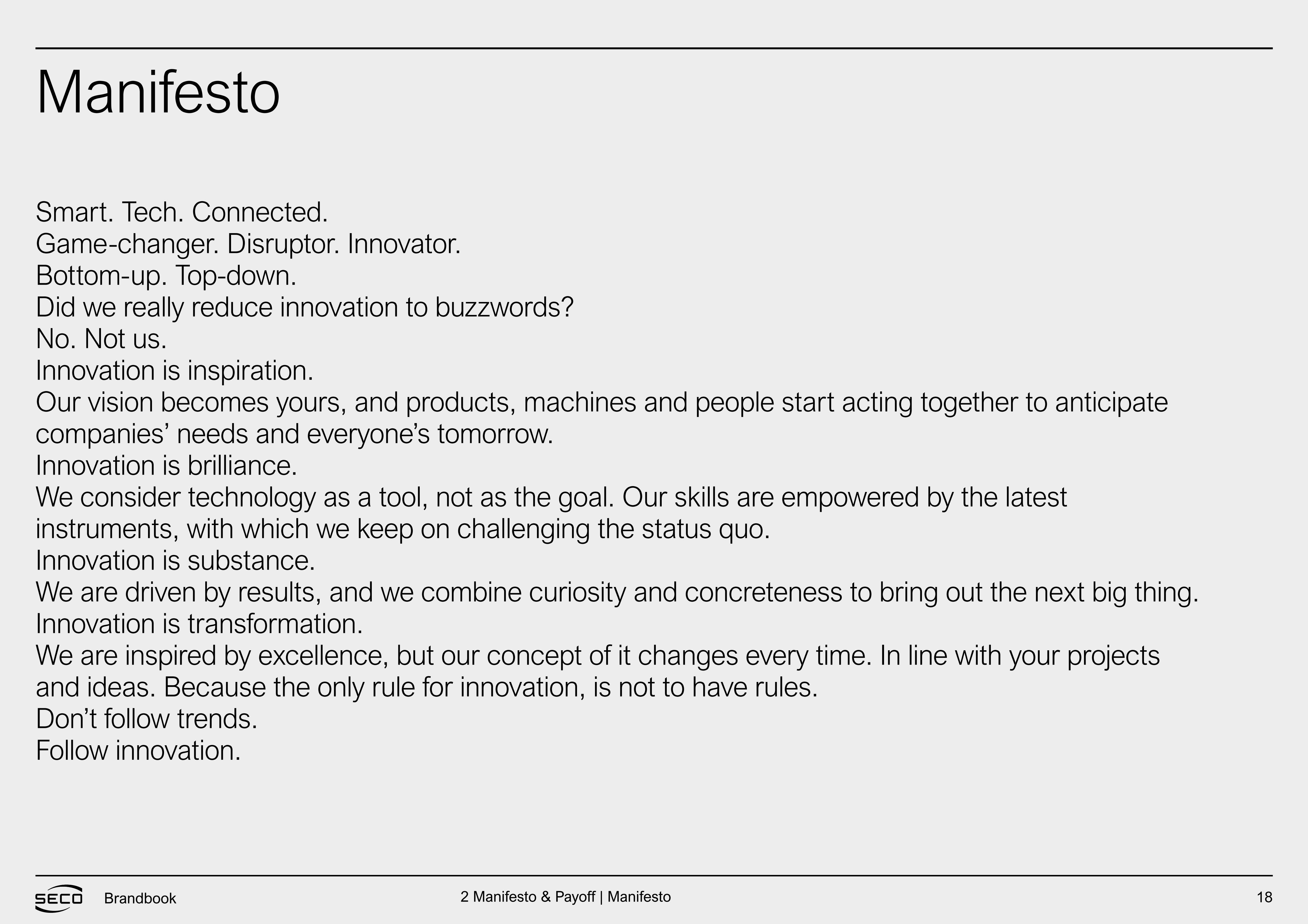
Smart. Tech. Connected.Game-changer. Disruptor. Innovator.Bottom-up. Top-down.Did we really reduce innovation to buzzwords?No. Not us.Innovation is inspiration.Our vision becomes yours, and products, machines and people start acting together to anticipatecompanies’ needs and everyone’s tomorrow.Innovation is brilliance.We consider technology as a tool, not as the goal. Our skills are empowered by the latestinstruments, with which we keep on challenging the status quo.Innovation is substance.We are driven by results, and we combine curiosity and concreteness to bring out the next big thing.Innovation is transformation.We are inspired by excellence, but our concept of it changes every time. In line with your projectsand ideas. Because the only rule for innovation, is not to have rules.Don’t follow trends.Follow innovation.
Manifesto
2 Manifesto & Payoff | Manifesto
19Brandbook
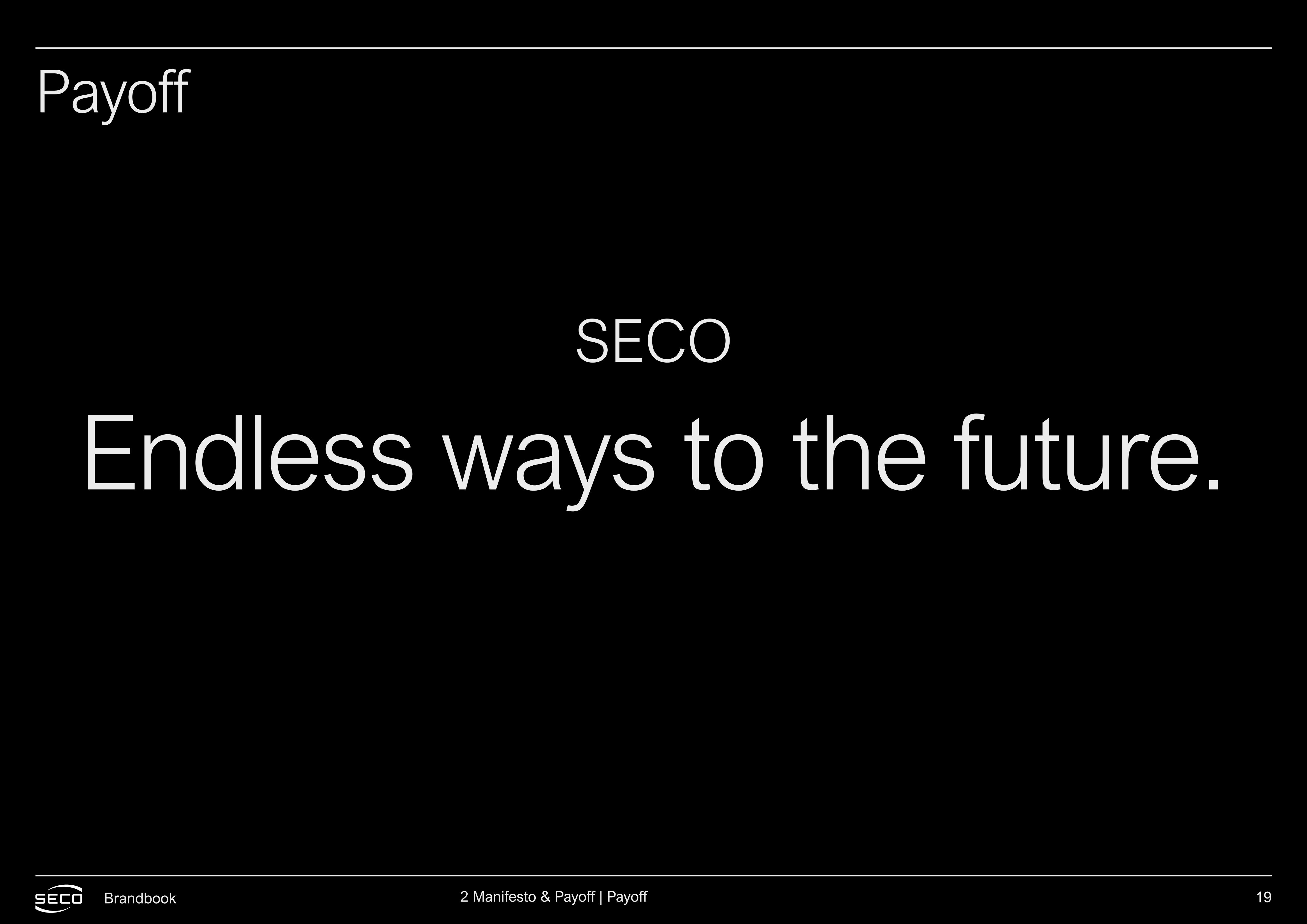
Payoff
SECO
Endless ways to the future.
2 Manifesto & Payoff | Payoff
20Brandbook
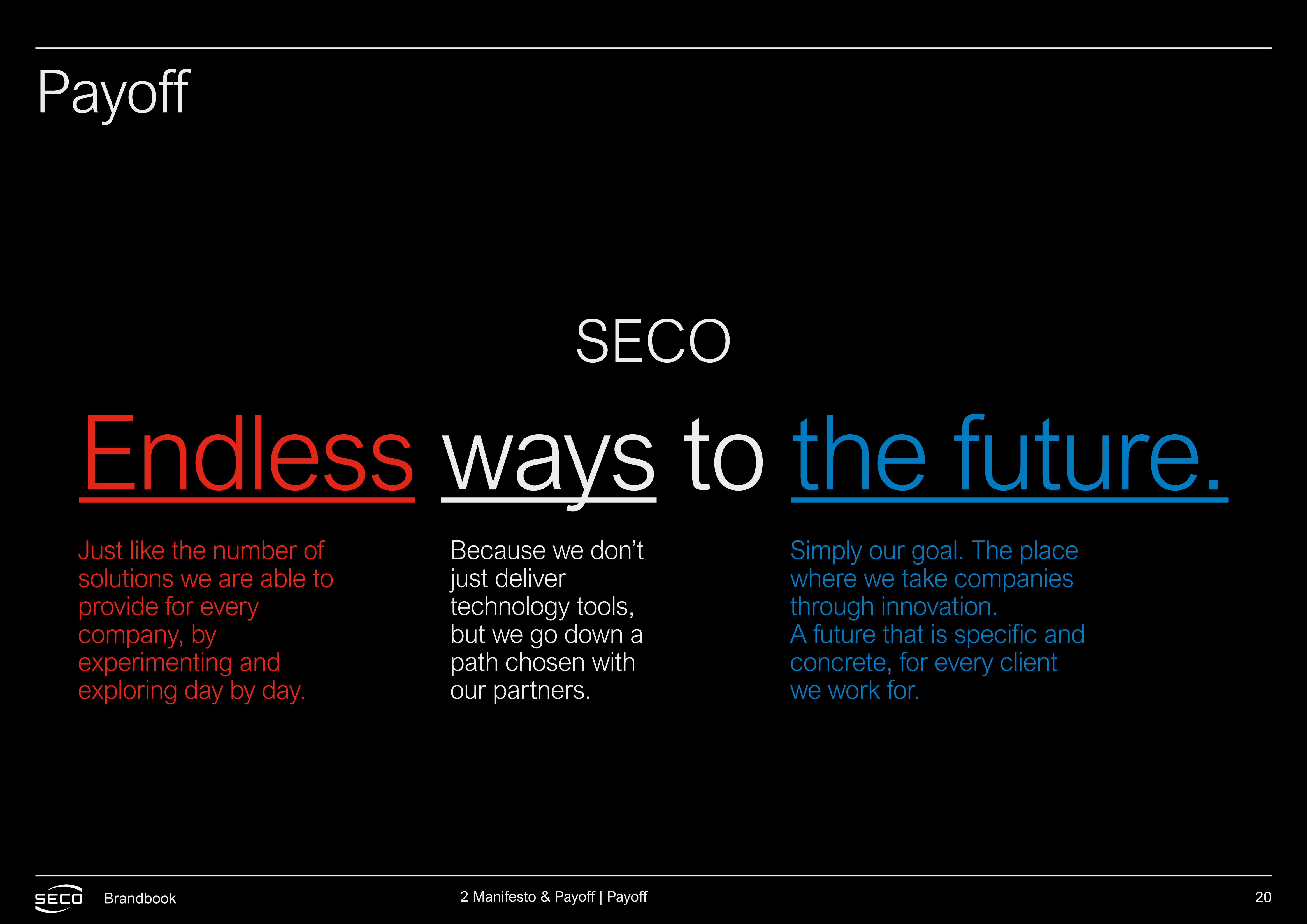
Payoff
SECO
Endless ways to the future.Just like the number ofsolutions we are able toprovide for everycompany, byexperimenting andexploring day by day.
Simply our goal. The place where we take companies through innovation. A future that is specific and concrete, for every client we work for.
Because we don’tjust delivertechnology tools,but we go down apath chosen withour partners.
2 Manifesto & Payoff | Payoff
BRAND ARCHITECTURE
Brandbook
22Brandbook
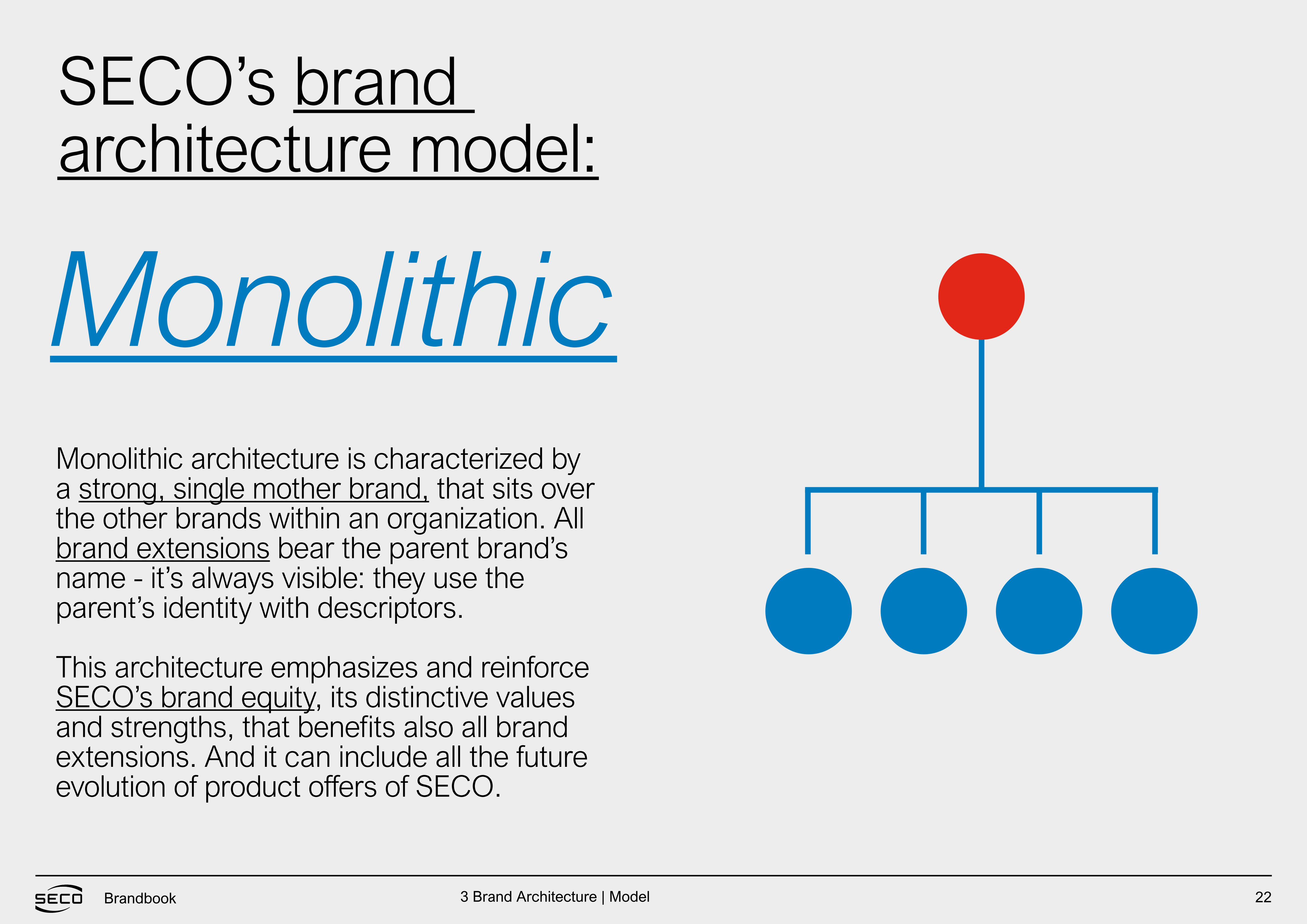
SECO’s brand architecture model:
MonolithicMonolithic architecture is characterized by a strong, single mother brand, that sits over the other brands within an organization. All brand extensions bear the parent brand’s name - it’s always visible: they use the parent’s identity with descriptors.
This architecture emphasizes and reinforce SECO’s brand equity, its distinctive values and strengths, that benefits also all brand extensions. And it can include all the future evolution of product offers of SECO.
3 Brand Architecture | Model

23Brandbook
Mother brand
Offer lines
HARDWARE /SYSTEM INTEGRATION
IOT / DATA SCIENCE AI /DATA ORCHESTRATION
RESEARCH
Embedded board, modules, touch screen, machine parts. Putting intelligence in things and creating human/machine interface.
Software services and platforms. Extracting data, bringing them to the cloud,organizing and analyzing, transforming them inhigh-valuable information for clients.
Advanced research Startup investments,collaborations withuniversities.
SECO offer structure
3 Brand Architecture | Seco offer structure
24Brandbook
SECO’s attitude is practical. It goes making simple what is complicated for the client. So we want to enhance this approach, by reflecting it in the offers narrative. The names become nearly tag-words conveying a wide and evocative meaning, without giving up on immediacy: every word instantly communicates what’s the matter.
Rational To write down offers’ names and descriptions we took inspiration from the main features and values of SECO. We built a story about them, through different semantic fields and creative entry points, developing the narrative throughout five alternative proposals.
3 Brand Architecture | Rational
25Brandbook
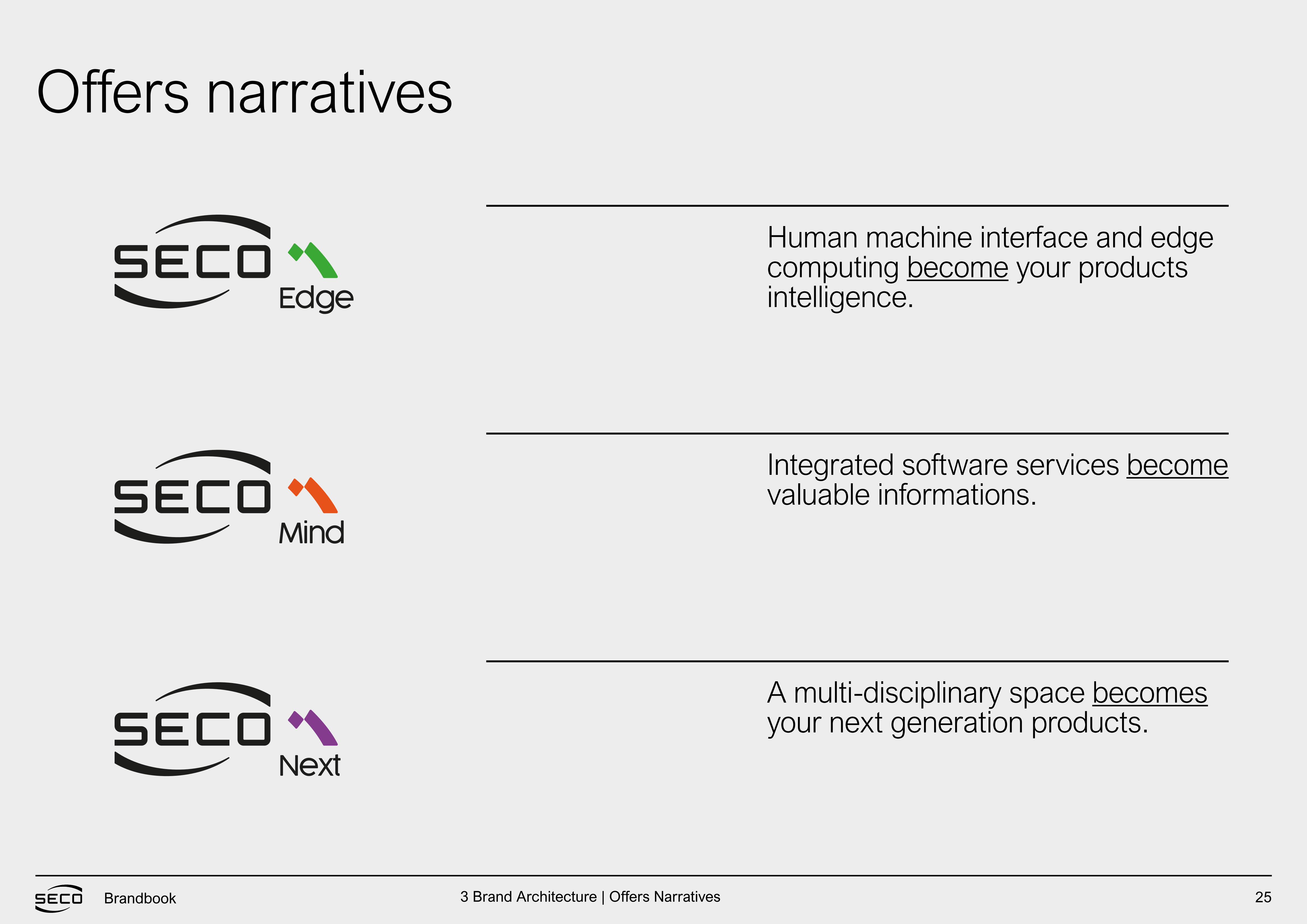
Human machine interface and edge computing become your products intelligence.
Integrated software services become valuable informations.
A multi-disciplinary space becomes your next generation products.
Offers narratives
3 Brand Architecture | Offers Narratives
IDENTITYBrandbook
27Brandbook
Logo
IDENTITY
4 Identity | Logo
28Brandbook
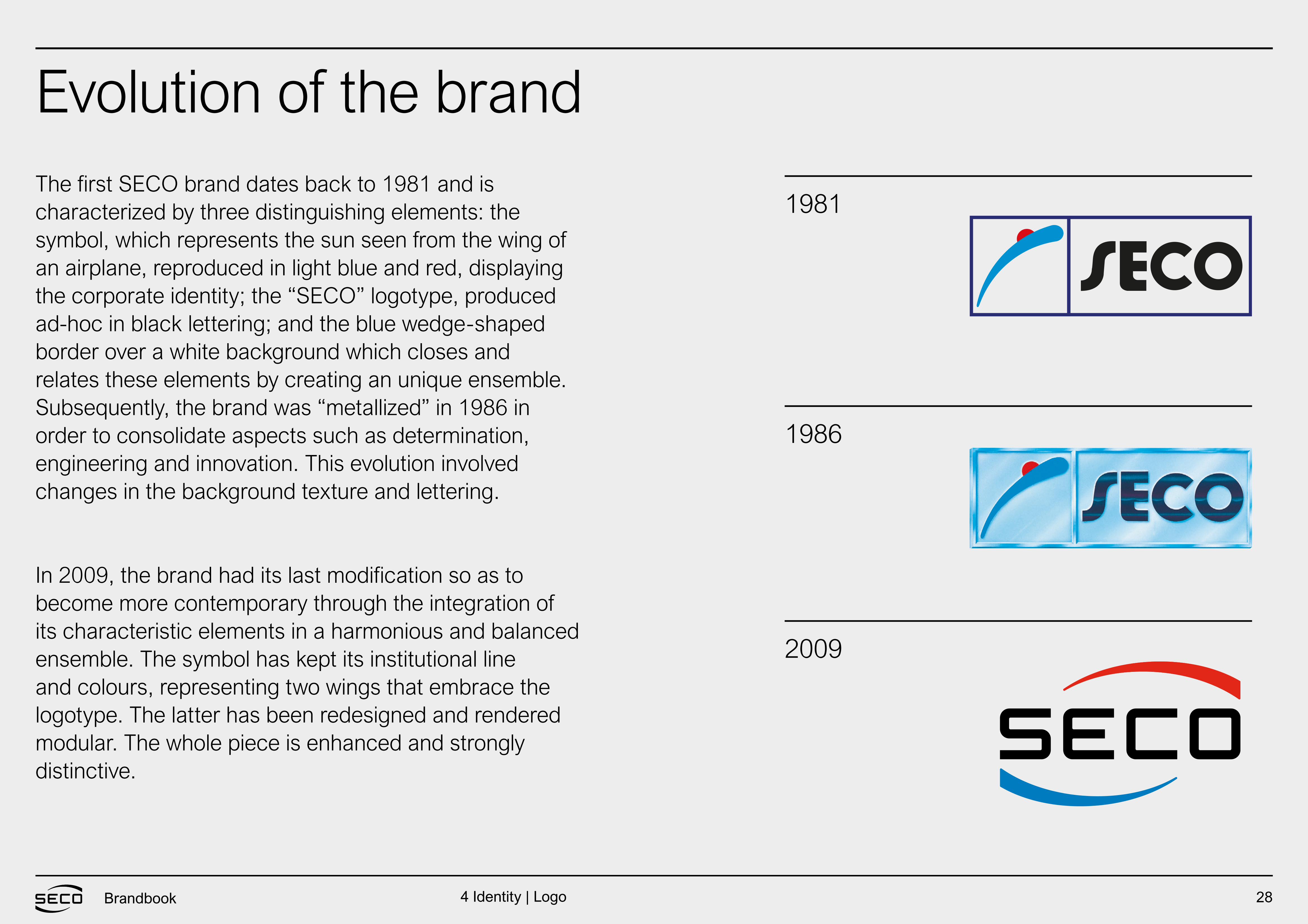
The first SECO brand dates back to 1981 and is characterized by three distinguishing elements: the symbol, which represents the sun seen from the wing of an airplane, reproduced in light blue and red, displaying the corporate identity; the “SECO” logotype, produced ad-hoc in black lettering; and the blue wedge-shaped border over a white background which closes and relates these elements by creating an unique ensemble. Subsequently, the brand was “metallized” in 1986 in order to consolidate aspects such as determination, engineering and innovation. This evolution involved changes in the background texture and lettering. In 2009, the brand had its last modification so as to become more contemporary through the integration of its characteristic elements in a harmonious and balanced ensemble. The symbol has kept its institutional line and colours, representing two wings that embrace the logotype. The latter has been redesigned and rendered modular. The whole piece is enhanced and strongly distinctive.
1981
1986
2009
Evolution of the brand
4 Identity | Logo

29Brandbook
The present day label is characterized by two enclosing wings: at the base we find a blue diminishing line going from the bottom of S up to the closure of C, while above we find a red augmenting line that goes from the start of E to the closure of O (ref. 1). This alternation gives movement and notability to the brand and highlights the logotype enclosed within. The font designed for SECO visibly reinforces the concept of “modularity”. The SECO brand label can be considered as such only if all the elements identified by the image are included (ref.1) and if the reproduction of the same respects the relative weights, colours and proportions as described in this branding guide. Every use differing in any particular way from the image (ref.1) is to be considered an improper or illicit use of the brand label.
Present day logo
Ref. 1
4 Identity | Logo
30Brandbook
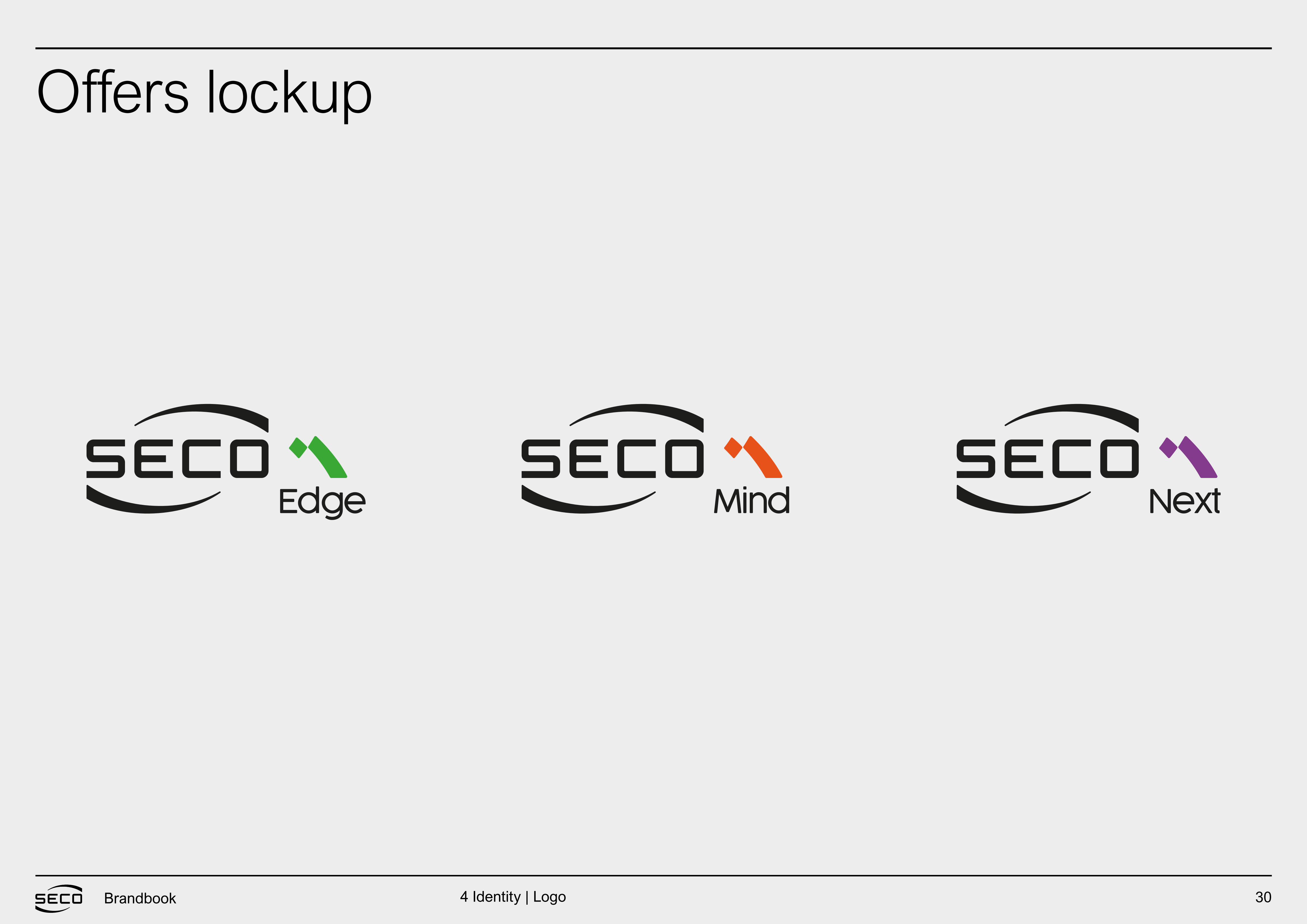
Offers lockup
4 Identity | Logo
31Brandbook
Guidelines
IDENTITY
4 Identity | Guidelines
32Brandbook
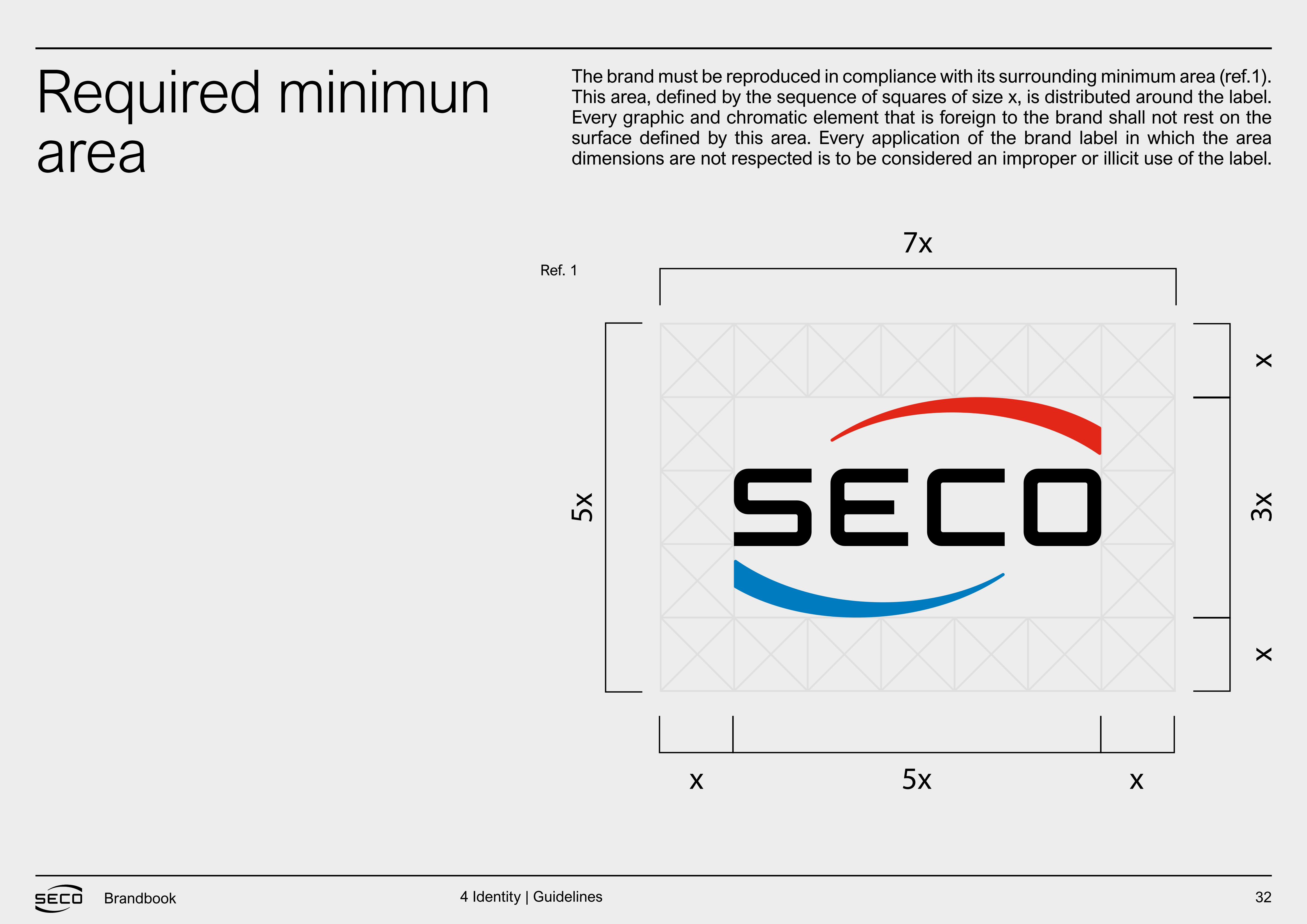
Required minimunarea
The brand must be reproduced in compliance with its surrounding minimum area (ref.1). This area, defined by the sequence of squares of size x, is distributed around the label. Every graphic and chromatic element that is foreign to the brand shall not rest on the surface defined by this area. Every application of the brand label in which the area dimensions are not respected is to be considered an improper or illicit use of the label.
Ref. 1
4 Identity | Guidelines
33Brandbook
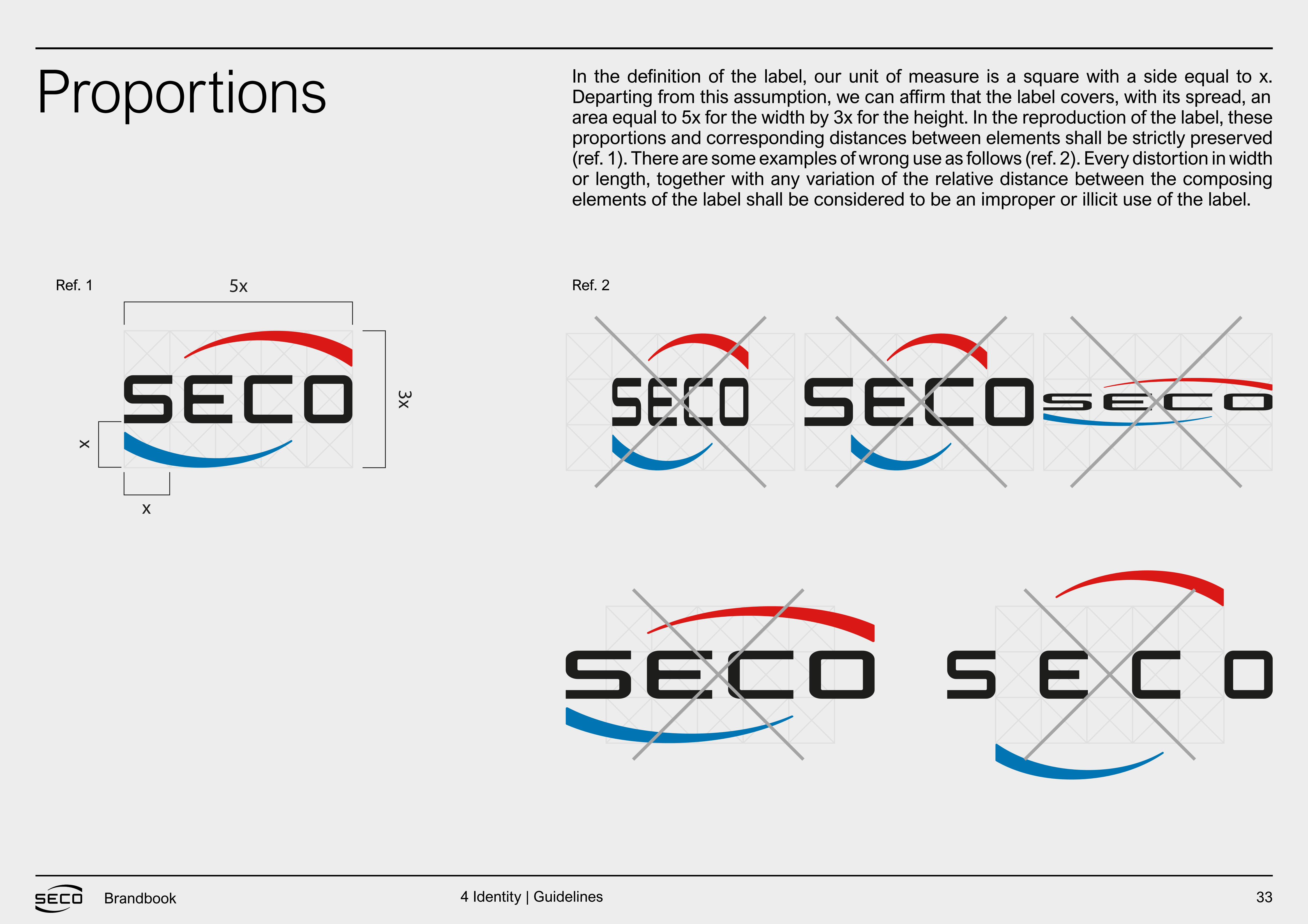
Proportions In the definition of the label, our unit of measure is a square with a side equal to x. Departing from this assumption, we can affirm that the label covers, with its spread, anarea equal to 5x for the width by 3x for the height. In the reproduction of the label, these proportions and corresponding distances between elements shall be strictly preserved(ref. 1). There are some examples of wrong use as follows (ref. 2). Every distortion in width or length, together with any variation of the relative distance between the composing elements of the label shall be considered to be an improper or illicit use of the label.
Ref. 1 Ref. 2
4 Identity | Guidelines
34Brandbook
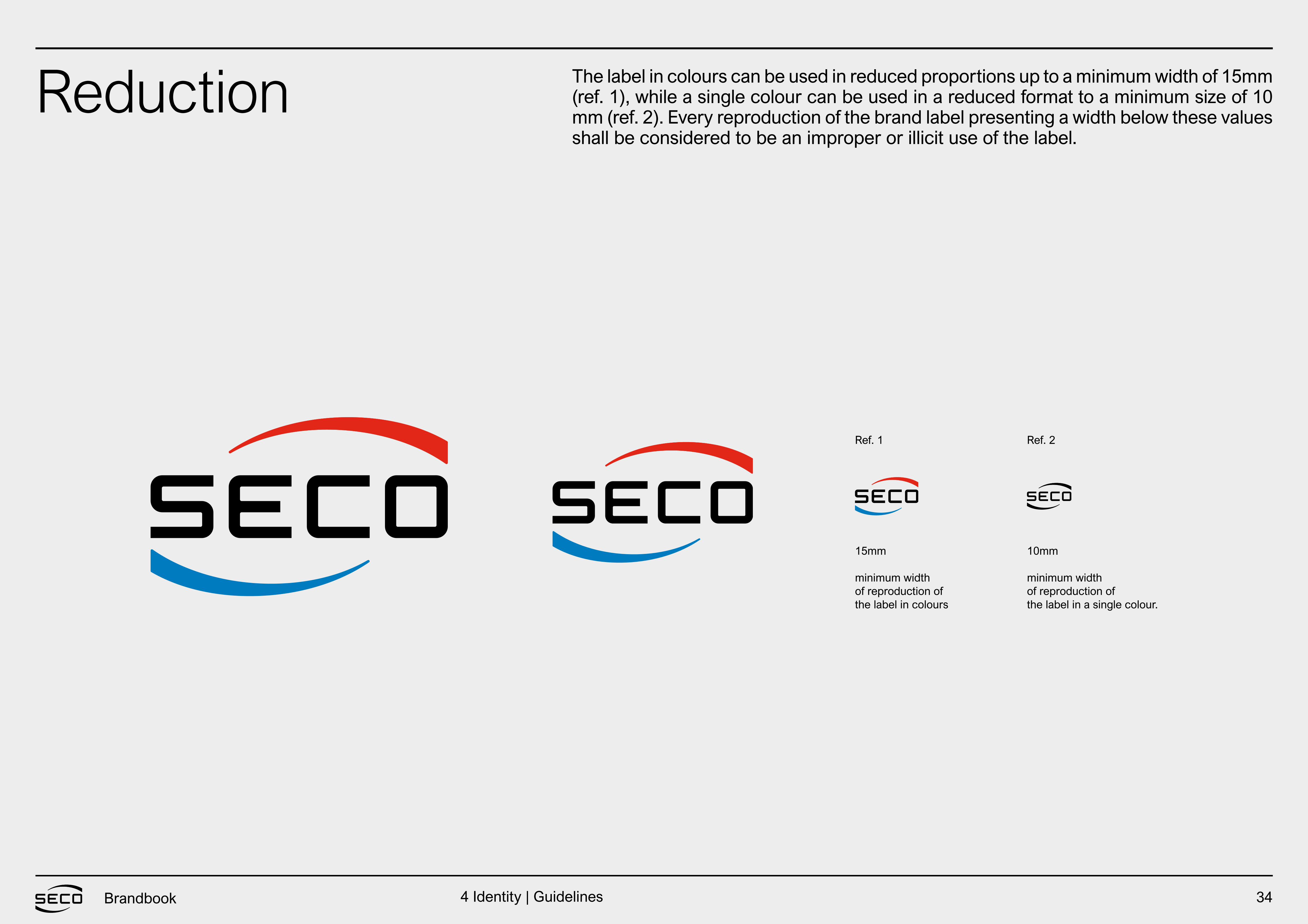
Reduction The label in colours can be used in reduced proportions up to a minimum width of 15mm (ref. 1), while a single colour can be used in a reduced format to a minimum size of 10 mm (ref. 2). Every reproduction of the brand label presenting a width below these values shall be considered to be an improper or illicit use of the label.
15mm
minimum widthof reproduction ofthe label in colours
Ref. 1 Ref. 2
10mm
minimum widthof reproduction ofthe label in a single colour.
4 Identity | Guidelines
35Brandbook
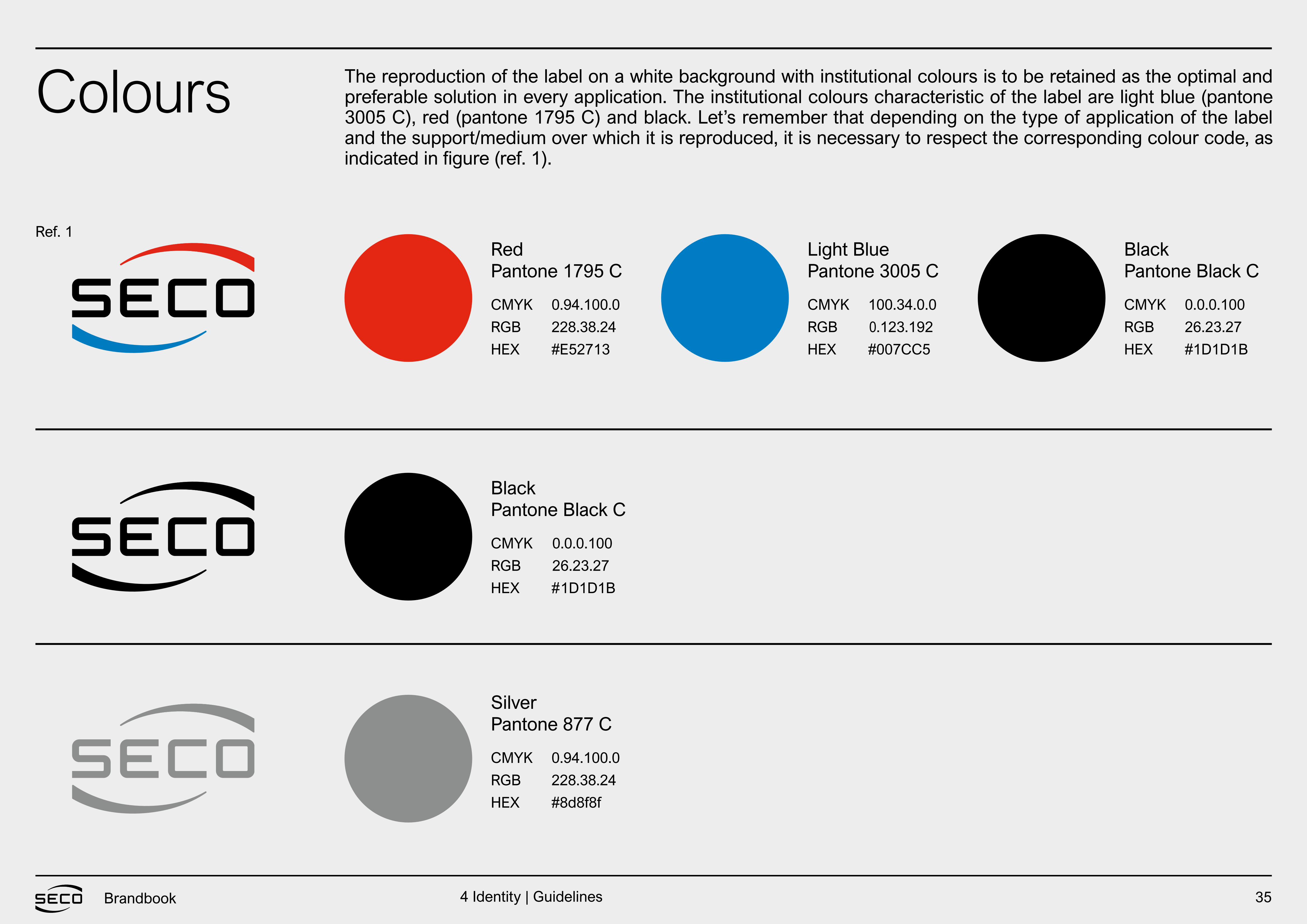
Colours The reproduction of the label on a white background with institutional colours is to be retained as the optimal and preferable solution in every application. The institutional colours characteristic of the label are light blue (pantone 3005 C), red (pantone 1795 C) and black. Let’s remember that depending on the type of application of the label and the support/medium over which it is reproduced, it is necessary to respect the corresponding colour code, as
Pantone 1795 C
Pantone Black C
Pantone 877 C
Pantone 3005 C Pantone Black CRed
Black
Silver
Light Blue Black
CMYK
RGB
HEX
CMYK
RGB
HEX
CMYK
RGB
HEX
CMYK
RGB
HEX
CMYK
RGB
HEX
0.94.100.0
#E52713
0.94.100.0
228.38.24
#8d8f8f
100.34.0.0
0.123.
#007CC5
0.0.0.100
26.23.27
#1D1D1B
Ref. 1
4 Identity | Guidelines
192
#
228.38.24
0.0.0.100
26.23.27
1D1D1B
36Brandbook
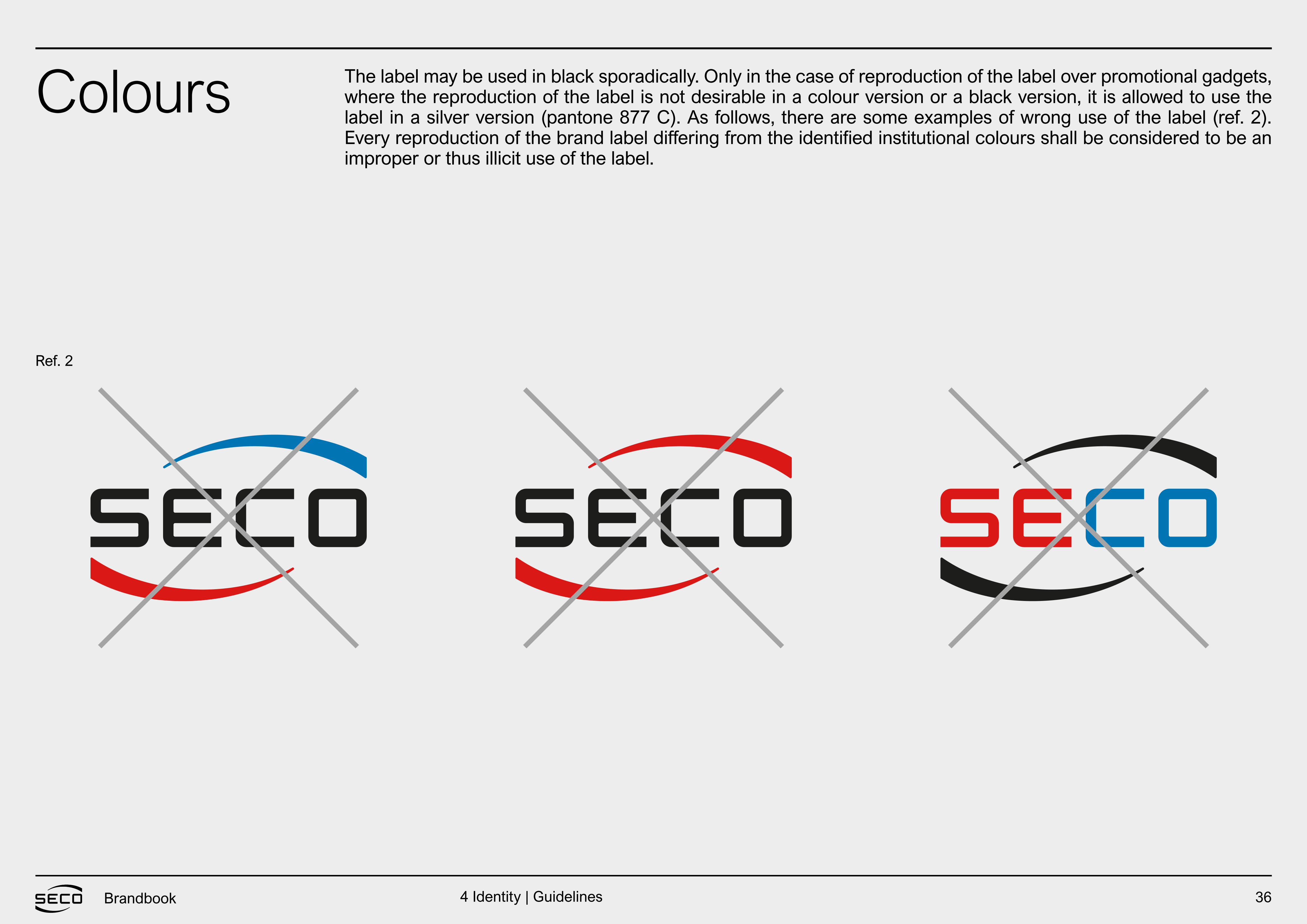
Colours The label may be used in black sporadically. Only in the case of reproduction of the label over promotional gadgets, where the reproduction of the label is not desirable in a colour version or a black version, it is allowed to use the label in a silver version (pantone 877 C). As follows, there are some examples of wrong use of the label (ref. 2). Every reproduction of the brand label differing from the identified institutional colours shall be considered to be an improper or thus illicit use of the label.
Ref. 2
4 Identity | Guidelines
37Brandbook
Positive andnegative
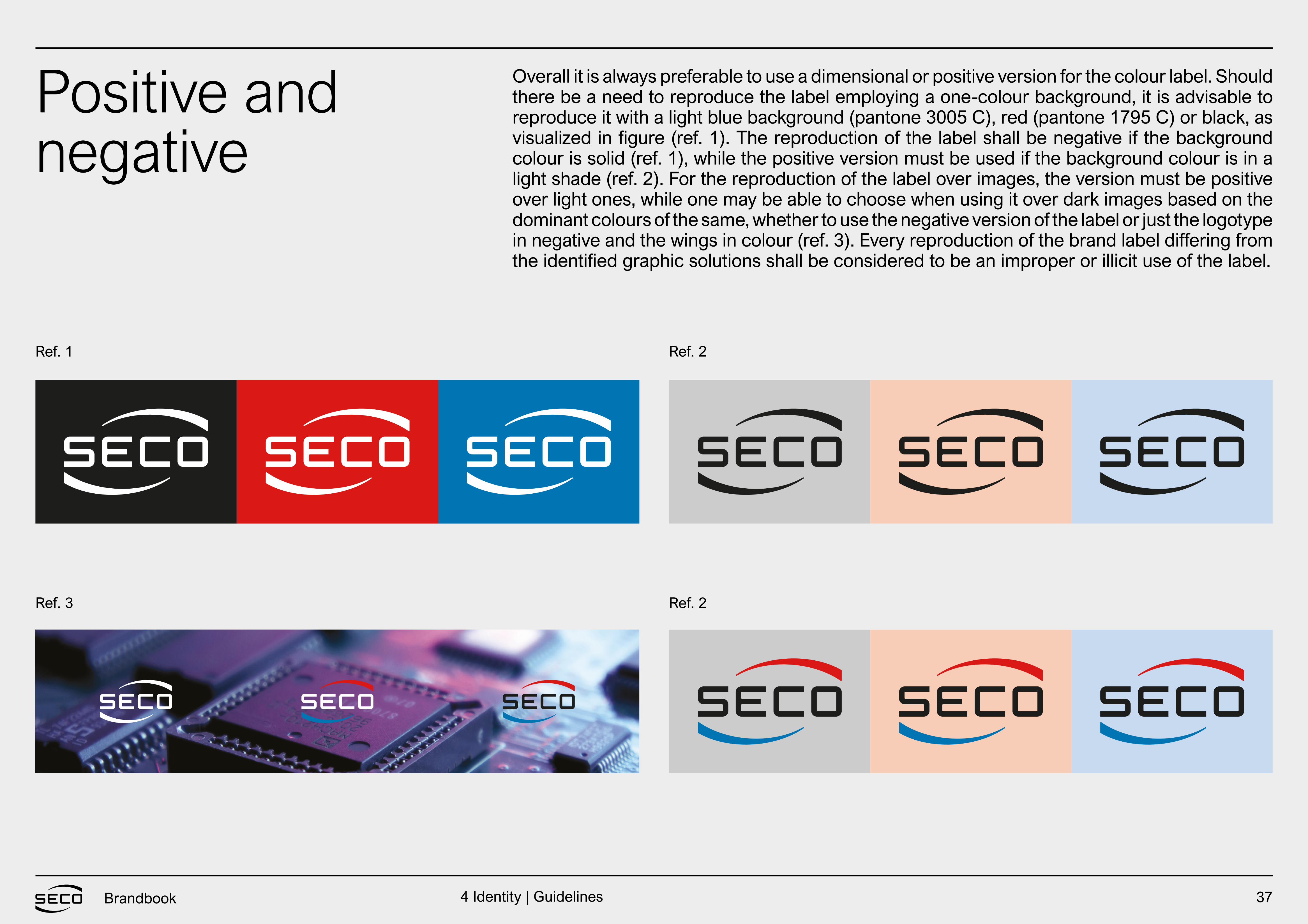
Overall it is always preferable to use a dimensional or positive version for the colour label. Should there be a need to reproduce the label employing a one-colour background, it is advisable to reproduce it with a light blue background (pantone 3005 C), red (pantone 1795 C) or black, as visualized in figure (ref. 1). The reproduction of the label shall be negative if the background colour is solid (ref. 1), while the positive version must be used if the background colour is in a light shade (ref. 2). For the reproduction of the label over images, the version must be positive over light ones, while one may be able to choose when using it over dark images based on the dominant colours of the same, whether to use the negative version of the label or just the logotype in negative and the wings in colour (ref. 3). Every reproduction of the brand label differing from the identified graphic solutions shall be considered to be an improper or illicit use of the label.
Ref. 1
Ref. 3
Ref. 2
Ref. 2
4 Identity | Guidelines
38Brandbook
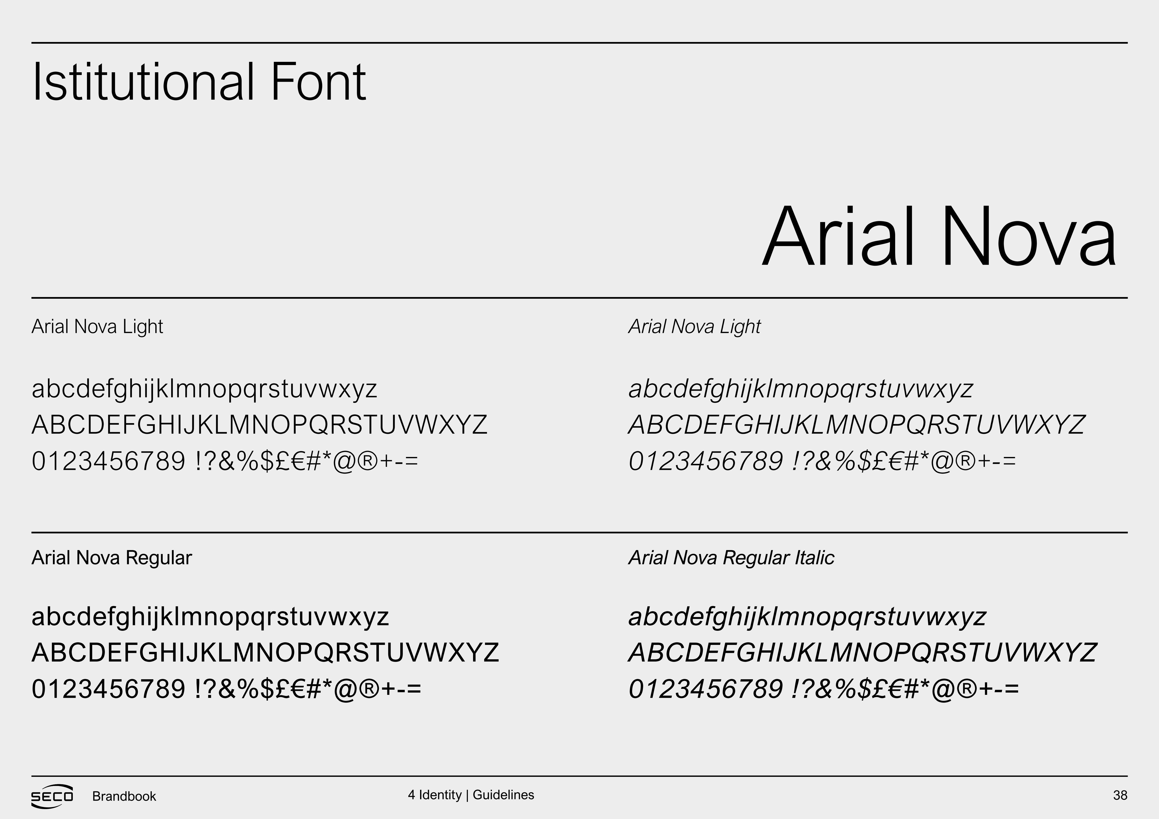
Istitutional Font
Arial Nova
abcdefghijklmnopqrstuvwxyzABCDEFGHIJKLMNOPQRSTUVWXYZ0123456789 !?&%$£€#*@®+-=
abcdefghijklmnopqrstuvwxyzABCDEFGHIJKLMNOPQRSTUVWXYZ0123456789 !?&%$£€#*@®+-=
abcdefghijklmnopqrstuvwxyzABCDEFGHIJKLMNOPQRSTUVWXYZ0123456789 !?&%$£€#*@®+-=
abcdefghijklmnopqrstuvwxyzABCDEFGHIJKLMNOPQRSTUVWXYZ0123456789 !?&%$£€#*@®+-=
Arial Nova Light Arial Nova Light
Arial Nova Regular Arial Nova Regular Italic
4 Identity | Guidelines

39Brandbook
Visual applications
IDENTITY
4 Identity | Visual Applications

40Brandbook
Website
41Brandbook
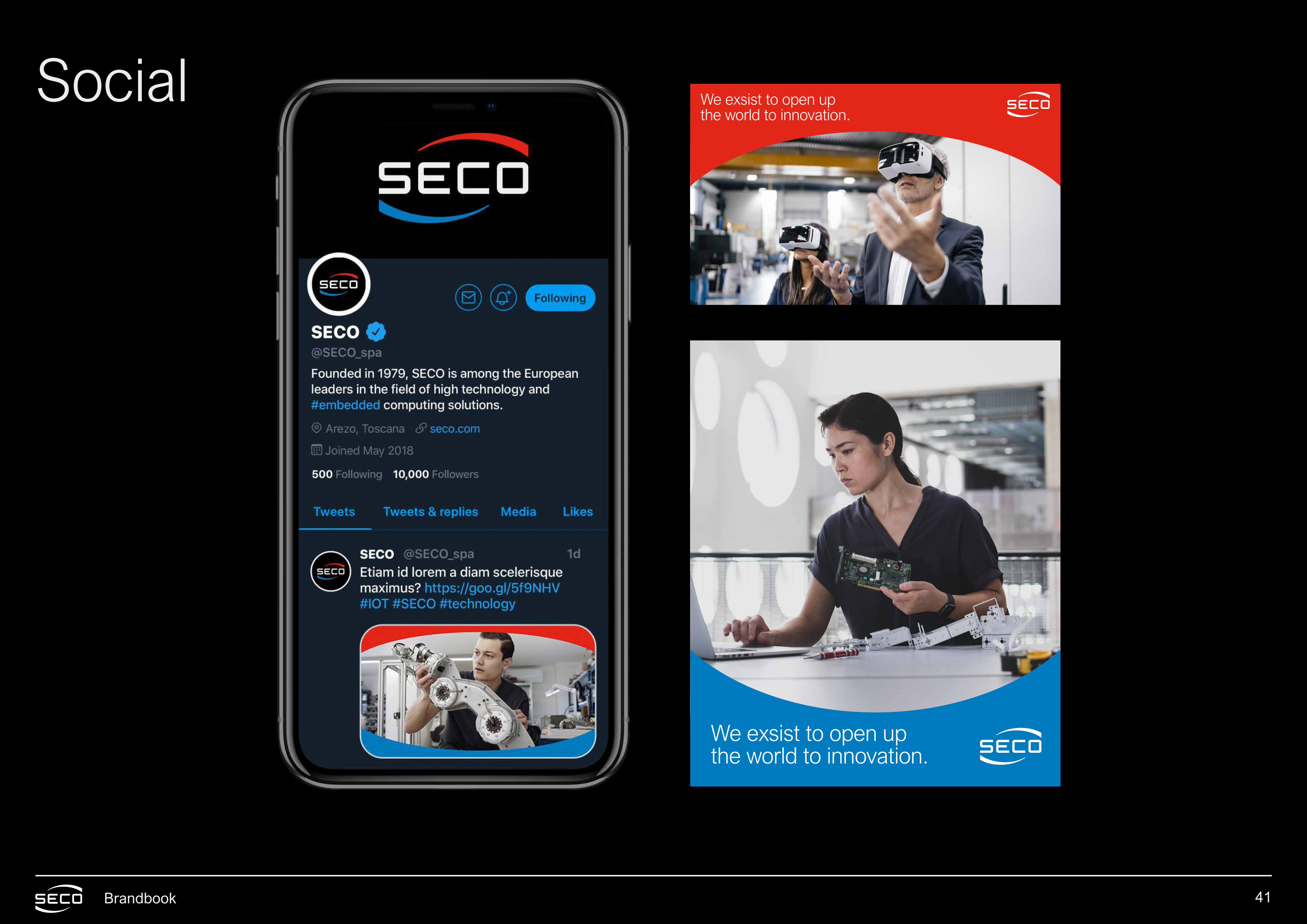
Social
We exsist to open upthe world to innovation.
We exsist to open upthe world to innovation.
42Brandbook
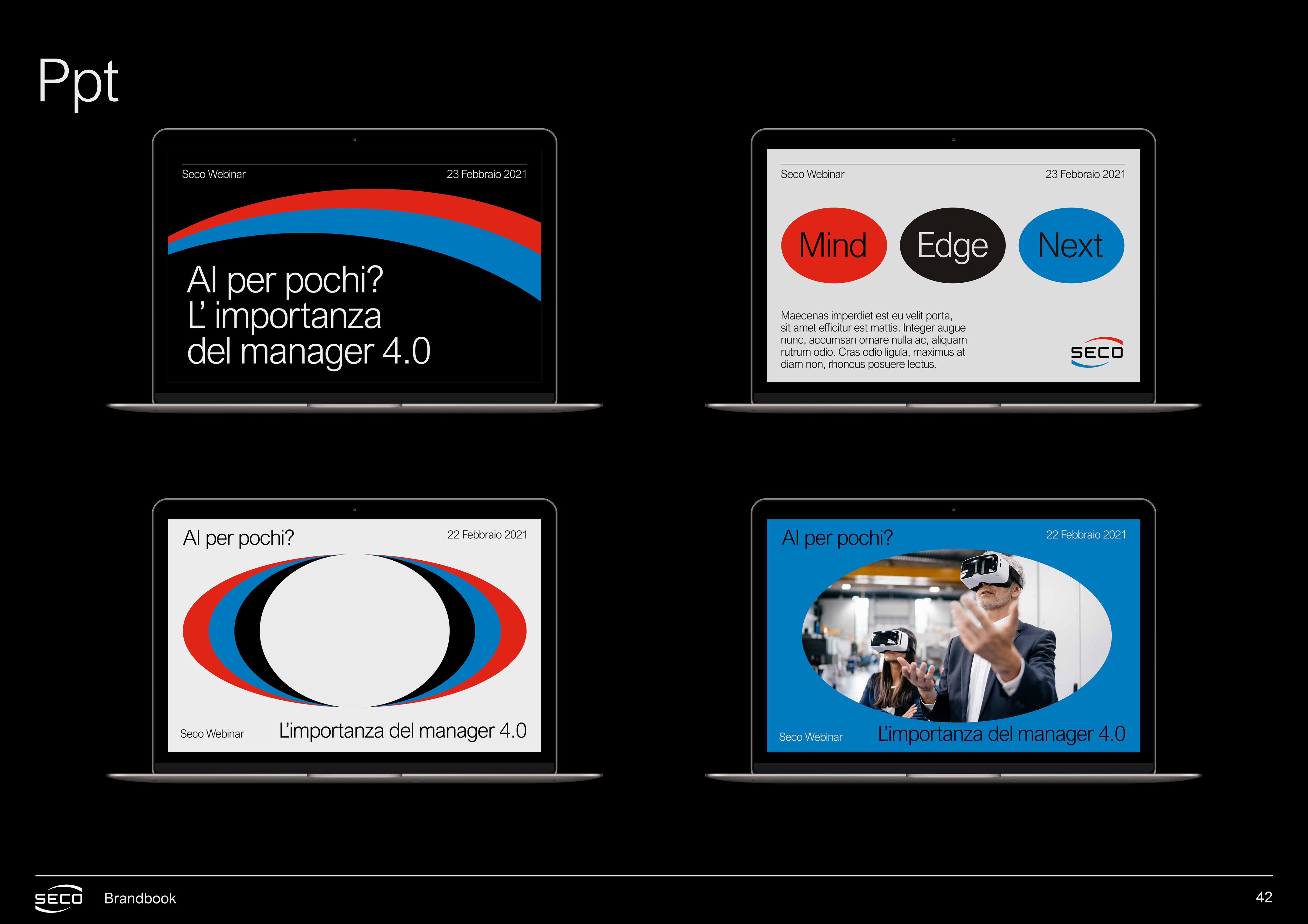
Ppt
43Brandbook 4 Identity | Visual Applications
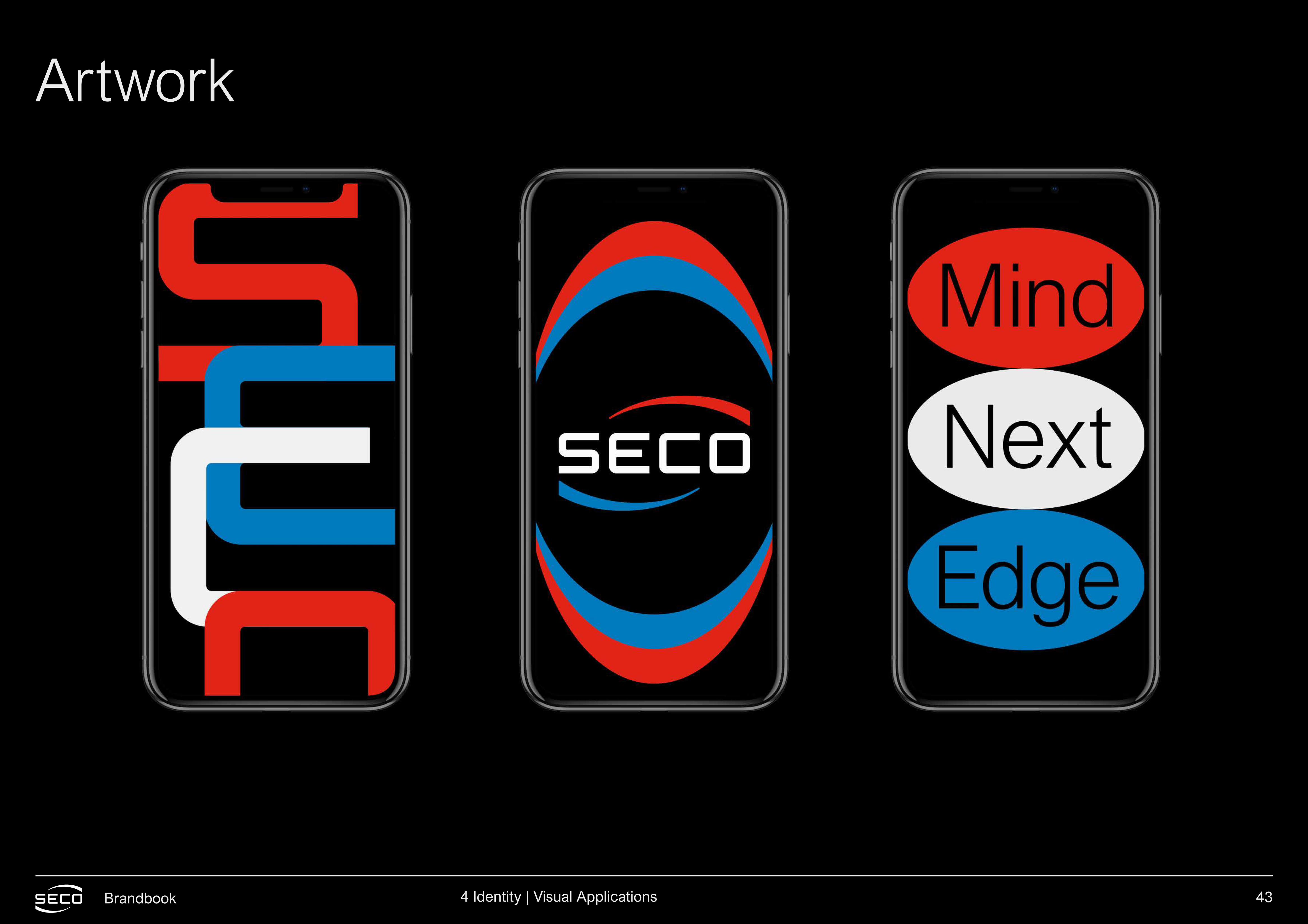
Artwork
44Brandbook 4 Identity | Visual Applications

seco.com