Embed Size (px)
Citation preview

SANDY IDeNtItY StANDArDS
uSINg theSe StANDArDSThese identity standards are intended to provide a brief overview of our brand
identity elements and to facilitate the ongoing application of the Sandy logo.
These identity standards provide guidance for using our name, signature, typography
and color. Implementing these identity standards will require discipline and
commitment from every Sandy City associate and must be followed to ensure
consistency and strength in our brand identity.
PrIMArY SANDY LOgO
SeCONDArY SANDY LOgOThis version of the Sandy logo should be used whenever the logo mark is required
to be smaller than .50” high in print, or used in embroidery. Using this version on
these mediums will help to ensure legibility.
> .5”
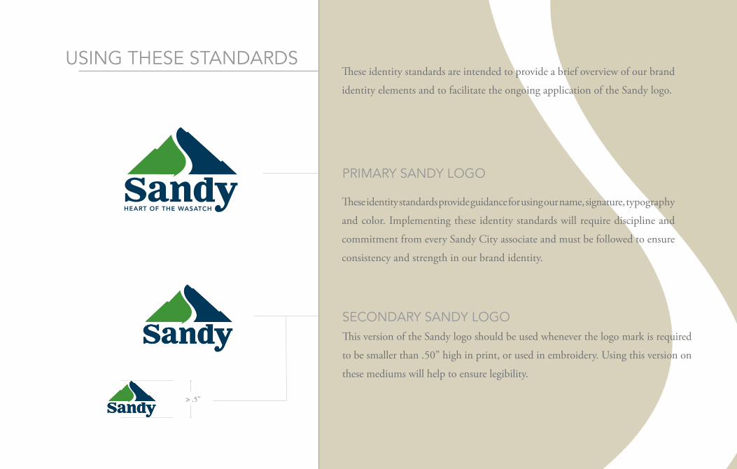
size & space
1.0
.5x
.5x
MiNiMUM & MaXiMUM size
To ensure legibility, the minimum size for reproduction of the corporate logo is
0.50” high for the preferred logo. On the preferred logo, this size is determined
by the distance between the logo icon and the bottom of the word mark.
There are no maximum size restrictions as long as clear space requirements are
met, and the integrity of the letter forms and icons are retained.
cLeaR space ReQUiReMeNT
The Sandy logo must be clearly separated from other elements, including type,
illustration, photography and margins.
The clear space is defined in proportion to the height or width of the Sandy
mark. The height or width of the signature is represented as x, and the clear space
must always be .5x, or 50% of the signature, on all sides of the signature.
The elements of our signature – logotype and symbols – work together to
reflect our brand promise and brand attributes. Color is a powerful means of
visual identification. Consistent use of our colors will help build visibility and
recognition for Sandy City. Over use of the Logo can also be detrimental to
the brand; only use the desired logo once on displayed print media.
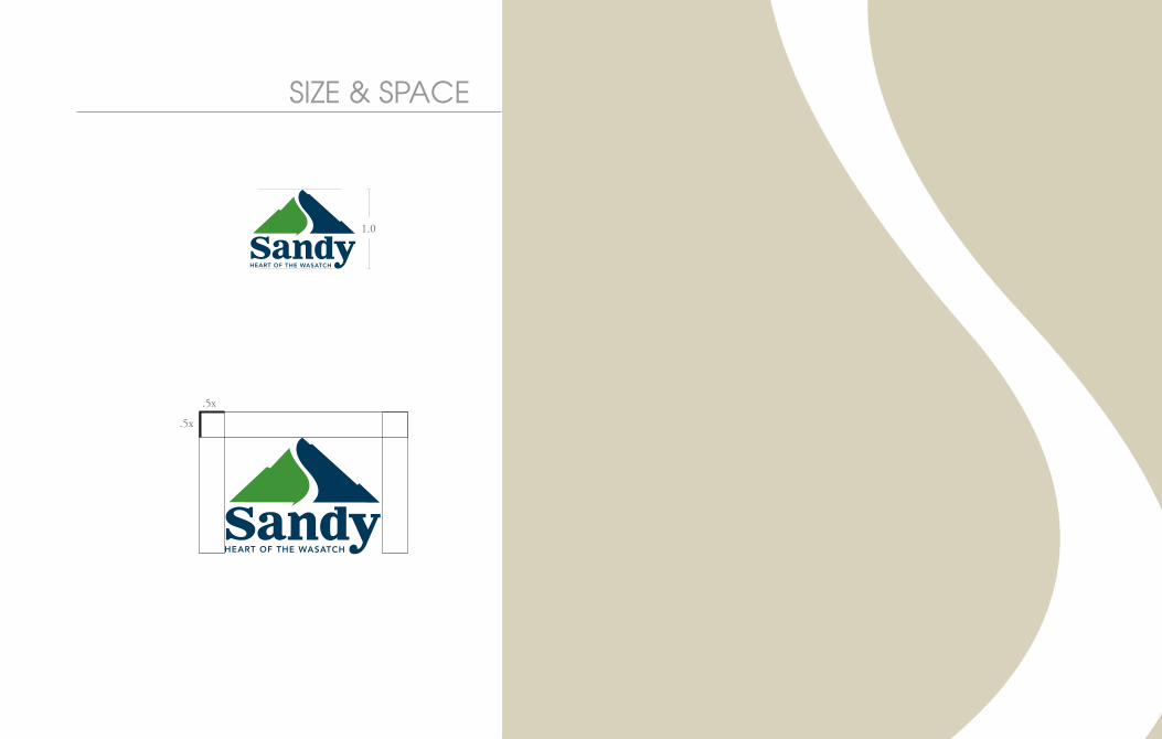
Our PrIMArY SIgNAture
When only 1 Spot color is available this signature may be used in 1-color blue, or 1-color green.
The signature may be reproduced in black on 1-color applications, e.g., newspaper, fax cover sheets, forms.
The signature may be reversed out of only the colors provided on our color palette, as long sufficient contrast ensures legibility.
ONe COLOr SPOt (greeN, BLue)
reVerSeD / FOIL
ONe COLOr ( BLACk)
CMYk
rgB
PANtONe®
COAteD
PANtONe®
COAteD
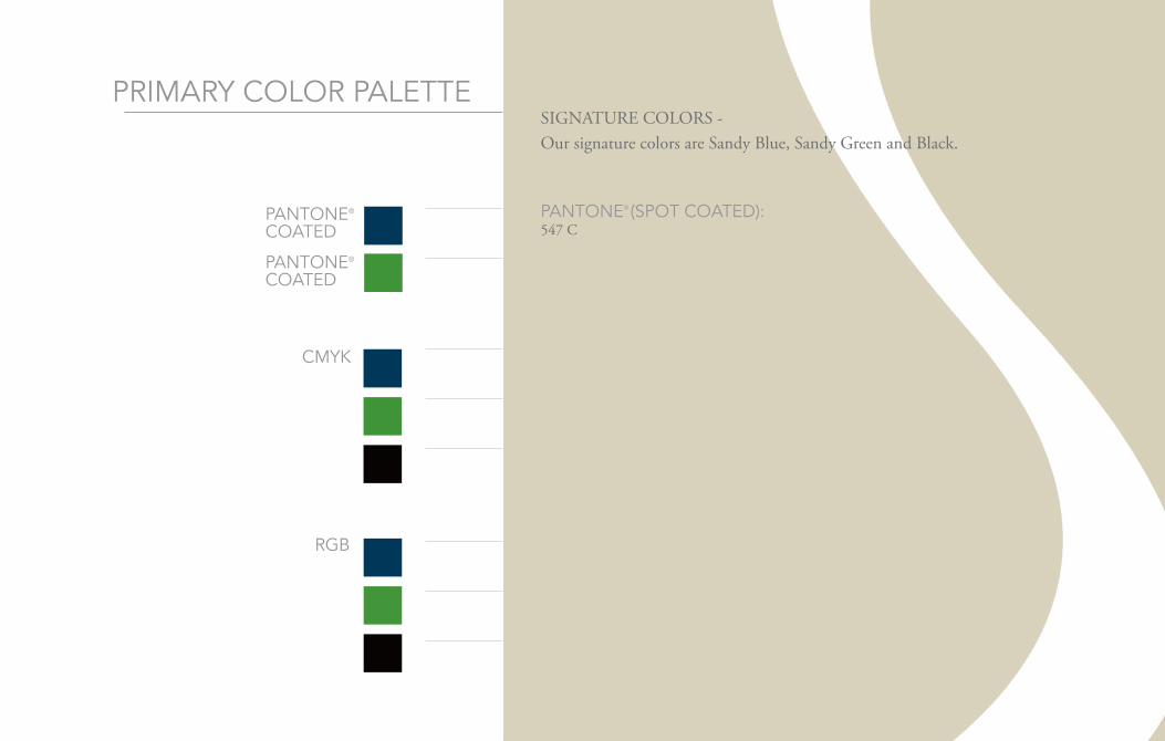
PrIMArY COLOr PALette
BLue:c - 100, m - 19, y - 0, k - 75
greeN:c - 68, m - 0, y - 100, k - 24
BLACk:c - 30, m - 30, y - 30, k - 100
BLue:r - 0, g - 69, b - 124
greeN:r - 67, g - 150, b - 57
BLACk:r - 10, g - 2, b - 4
PANtONe® (SPOt COAteD):363 C
PANtONe® (SPOt COAteD):547 C
SIGNATURE COLORS -Our signature colors are Sandy Blue, Sandy Green and Black.
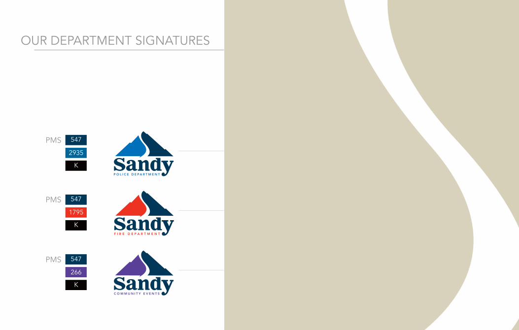
The elements of our departmental signatures – logotypes and symbols – work
together to reflect our brand promise and brand attributes. Consistent use of
our colors will help build visibility and departmental recognition for Sandy
City axillaries. Over use of any Logo can also be detrimental to the brand;
only use the desired logo once on displayed print media.
The signature may be reproduced in black on 1-color applications, e.g., newspaper, fax cover sheets, forms.
POLICe DePArtMeNt
Our DePArtMeNt SIgNAtureS
The signature may be reproduced in black on 1-color applications, e.g., newspaper, fax cover sheets, forms.
FIre DePArtMeNt
The signature may be reproduced in black on 1-color applications, e.g., newspaper, fax cover sheets, forms.
COMMuNItY eVeNtS
PMS
2935
547
k
PMS
1795
547
k
PMS
266
547
k
The signature may be reproduced in black on 1-color applications, e.g., newspaper, fax cover sheets, forms.
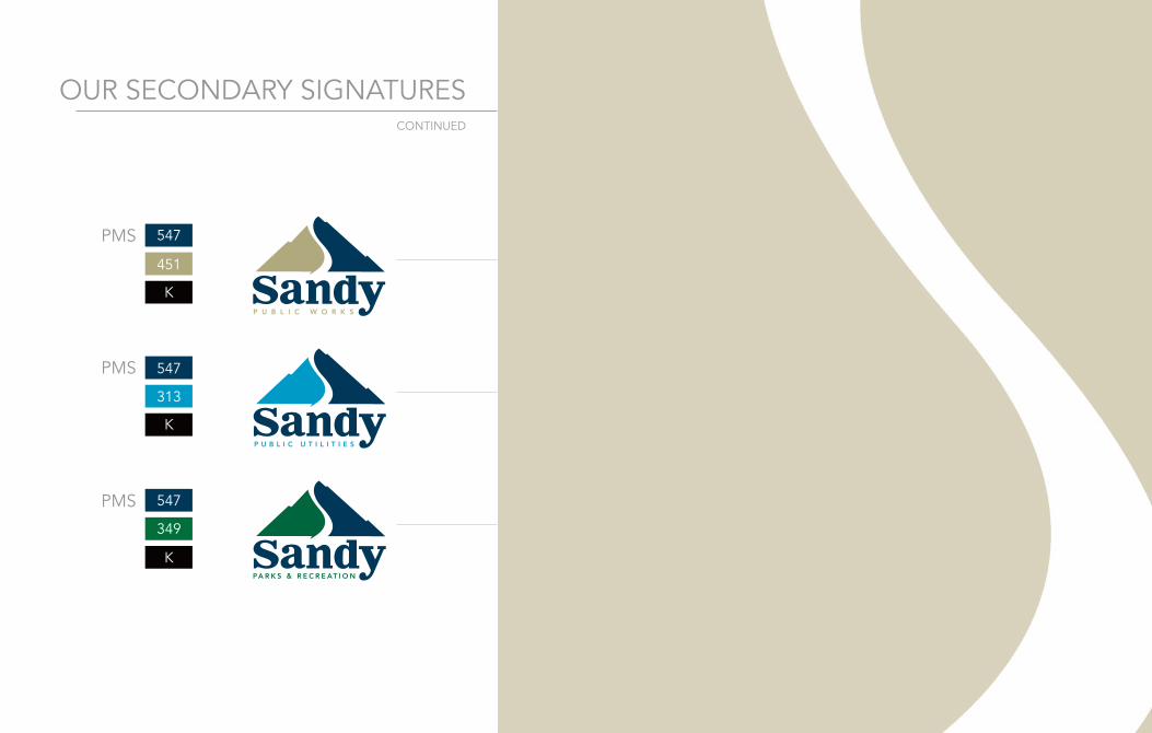
PuBLIC WOrkS
Our SeCONDArY SIgNAtureS
The signature may be reproduced in black on 1-color applications, e.g., newspaper, fax cover sheets, forms.
PuBLIC utILItIeS
The signature may be reproduced in black on 1-color applications, e.g., newspaper, fax cover sheets, forms.
PArkS & reCreAtION
PMS
451
547
k
PMS
313
547
k
PMS
349
547
k
CONtINueD
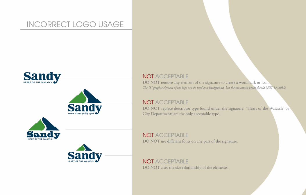
iNcoRRecT LoGo UsaGeThe integrity of the Sandy logo must be respected at all times. Don’t stretch, condense, or otherwise distort the Sandy logo. Any modification of the signa-ture confuses its meaning and diminishes its impact.
Never redraw our signature, translate it into another language, alter its placement or relationship, or modify its color.
Typhography
TyphographyTyphography
Typhography
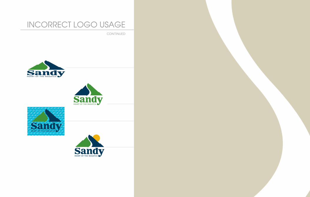
NoT accepTabLeDO NOT remove any element of the signature to create a wordmark or icon.The “S” graphic element of the logo can be used as a background, but the mountain peaks should NOT be visible.
NoT accepTabLeDO NOT replace descriptor type found under the signature. “Heart of the Wasatch” or City Departments are the only acceptable type.
NoT accepTabLeDO NOT use different fonts on any part of the signature.
NoT accepTabLeDO NOT alter the size relationship of the elements.
iNcoRRecT LoGo UsaGe
NoT accepTabLeDO NOT revise, stretch or distort any part of the signature.
NoT accepTabLeDO NOT change any colors of the signature.
NoT accepTabLeDO NOT use our signature on a background with insufficient contrast or complex design.
NoT accepTabLeDO NOT add, remove or place elements onto any part of the signature. -The ONLY exception to this rule is when the secondary mark is needed due to small size.
TyphographyTyphography
CONtINueD
Typhography
Typhography
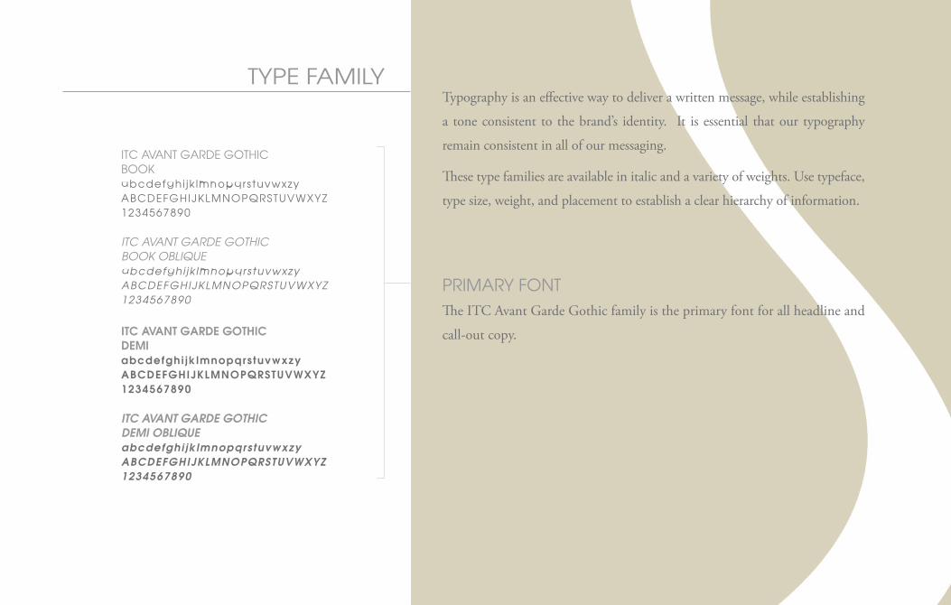
Type faMiLy
iTc avaNT GaRDe GoTHicbooKabcdefghi jk lmnopqrstuvwxzyabcDefGHiJKLMNopQRsTUvWXyz1234567890
ITC AvANT GARDE GOTHICBOOK OBLIQUEabcdefghi jk lmnopqrstuvwxzyABCDEFGHIJKLMNOPQRSTUvWXYZ1234567890
ITC AvANT GARDE GOTHICDEMIabcdefghi jk lmnopqrstuvwxzyABCDEFGHIJKLMNOPQRSTUvWXYZ1234567890
ITC AvANT GARDE GOTHICDEMI OBLIQUEabcdefghi jk lmnopqrstuvwxzyABCDEFGHIJKLMNOPQRSTUvWXYZ1234567890
Typography is an effective way to deliver a written message, while establishing
a tone consistent to the brand’s identity. It is essential that our typography
remain consistent in all of our messaging.
These type families are available in italic and a variety of weights. Use typeface,
type size, weight, and placement to establish a clear hierarchy of information.
pRiMaRy foNT The ITC Avant Garde Gothic family is the primary font for all headline and
call-out copy.
Type faMiLy
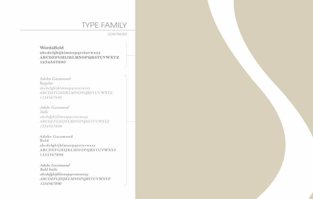
secoNDaRy/boDy copy foNT Adobe Garamond Pro is the body copy for all communications.This can also be used in headline form for collateral communications.
Adobe GaramondRegularabcdefghijklmnopqrstuvwxzyABCDEFGHIJKLMNOPQRSTUVWXYZ1234567890
Adobe GaramondItalicabcdefghijklmnopqrstuvwxzyABCDEFGHIJKLMNOPQRSTUVWXYZ1234567890
Adobe GaramondBoldabcdefghijklmnopqrstuvwxzyABCDEFGHIJKLMNOPQRSTUVWXYZ1234567890
Adobe GaramondBold ItalicabcdefghijklmnopqrstuvwxzyABCDEFGHIJKLMNOPQRSTUVWXYZ1234567890
CONtINueD
HeaDLiNe foNT WordaBold is the Sandy headline font to be used for select headline
communications ONLY.
WordaBoldabcdefghijklmnopqrstuvwxzy
ABCDEFGHIJKLMNOPQRSTUVWXYZ
1234567890