Embed Size (px)
Citation preview

IDENTITY STANDARDS MANUAL 2009
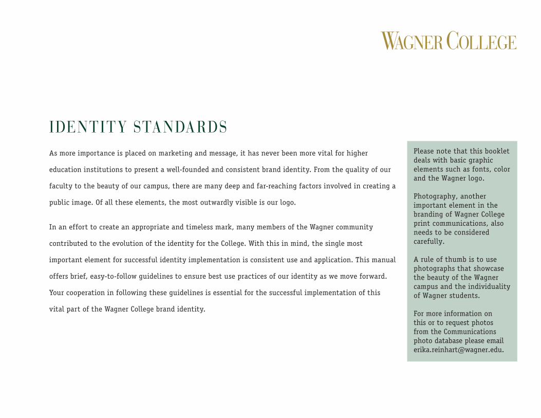
IDENTITY STANDARDSAs more importance is placed on marketing and message, it has never been more vital for higher
education institutions to present a well-founded and consistent brand identity. From the quality of our
faculty to the beauty of our campus, there are many deep and far-reaching factors involved in creating a
public image. Of all these elements, the most outwardly visible is our logo.
In an effort to create an appropriate and timeless mark, many members of the Wagner community
contributed to the evolution of the identity for the College. With this in mind, the single most
important element for successful identity implementation is consistent use and application. This manual
offers brief, easy-to-follow guidelines to ensure best use practices of our identity as we move forward.
Your cooperation in following these guidelines is essential for the successful implementation of this
vital part of the Wagner College brand identity.
Please note that this booklet deals with basic graphic elements such as fonts, color and the Wagner logo.
Photography, another important element in the branding of Wagner College print communications, also needs to be considered carefully.
A rule of thumb is to use photographs that showcase the beauty of the Wagner campus and the individuality of Wagner students.
For more information on this or to request photos from the Communications photo database please email [email protected].

Logo Color and Screens 2Size, Clearance, and Proportion 3Fonts and Usage 4Stationery Package Examples 5Product Examples 7Library of Logo Options 8
table of Contents
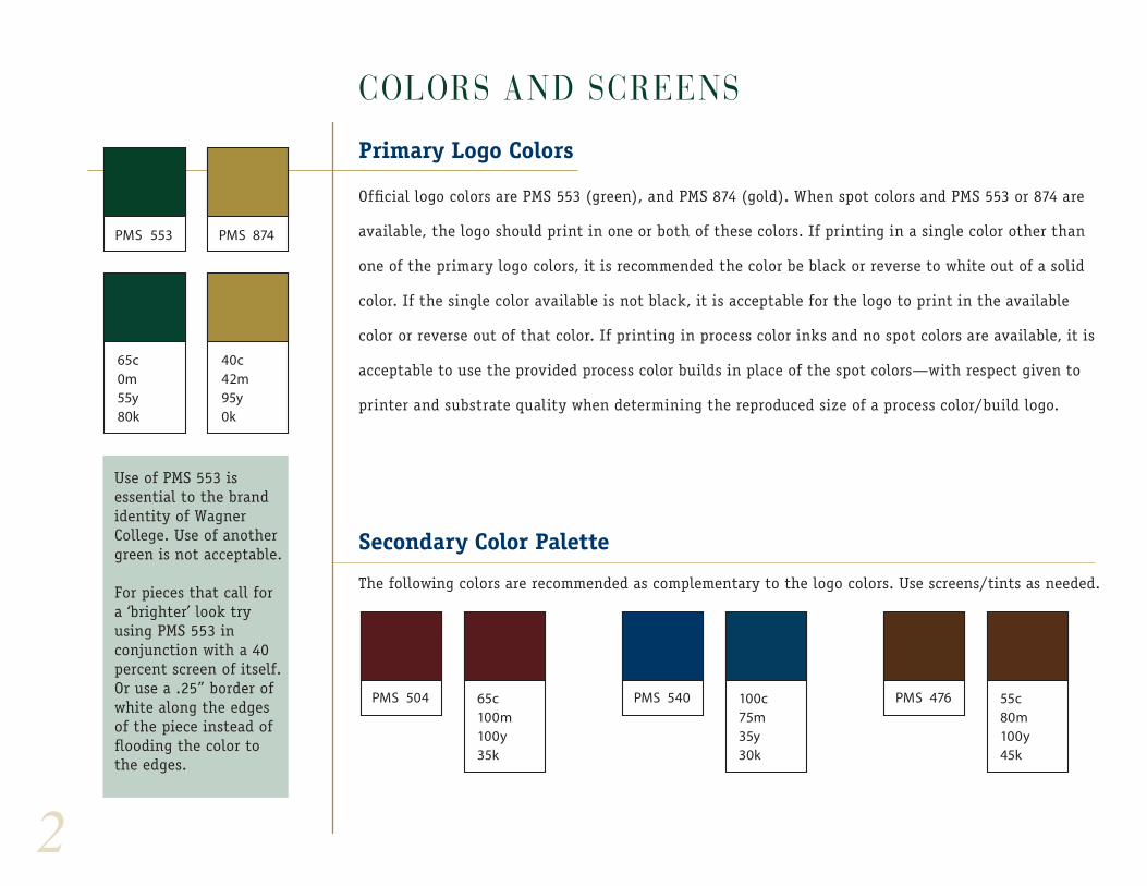
COLORS AND SCREENS
Primary Logo Colors
Official logo colors are PMS 553 (green), and PMS 874 (gold). When spot colors and PMS 553 or 874 are
available, the logo should print in one or both of these colors. If printing in a single color other than
one of the primary logo colors, it is recommended the color be black or reverse to white out of a solid
color. If the single color available is not black, it is acceptable for the logo to print in the available
color or reverse out of that color. If printing in process color inks and no spot colors are available, it is
acceptable to use the provided process color builds in place of the spot colors—with respect given to
printer and substrate quality when determining the reproduced size of a process color/build logo.
Secondary Color Palette
The following colors are recommended as complementary to the logo colors. Use screens/tints as needed.
PMS 553
65c0m55y80k
65c100m100y35k
100c75m35y30k
55c80m100y45k
PMS 504 PMS 540 PMS 476
PMS 874
40c42m95y0k
2
Use of PMS 553 is essential to the brand identity of Wagner College. Use of another green is not acceptable.
For pieces that call for a ‘brighter’ look try using PMS 553 in conjunction with a 40 percent screen of itself. Or use a .25” border of white along the edges of the piece instead of flooding the color to the edges.

3
size, ProPortion, and fonts
Size
The minimum size the standard logo may be displayed is 1 1/4". As vector art, there is virtually no
enlargement size restrictions, however, the logo should generally not be larger than 1/4 of the full
displayed page (see grid below left).
Minimum Safe Zone
When used as a moniker (not screened or as design element), the logo should have a minimum
"safe" zone free of other graphic distractions. This space is variable and is determined by the small
cap height at the displayed logo size (see example left.).
Proportion
The logo should generally not appear larger than 1/4 of the display page. Exception to this rule would be if
logo is being used as page or cover title or being screened back as a design element.
1 1/4" minimum
minimum safe zone equal to reproduced size of small cap height
1/4 overall page size
4
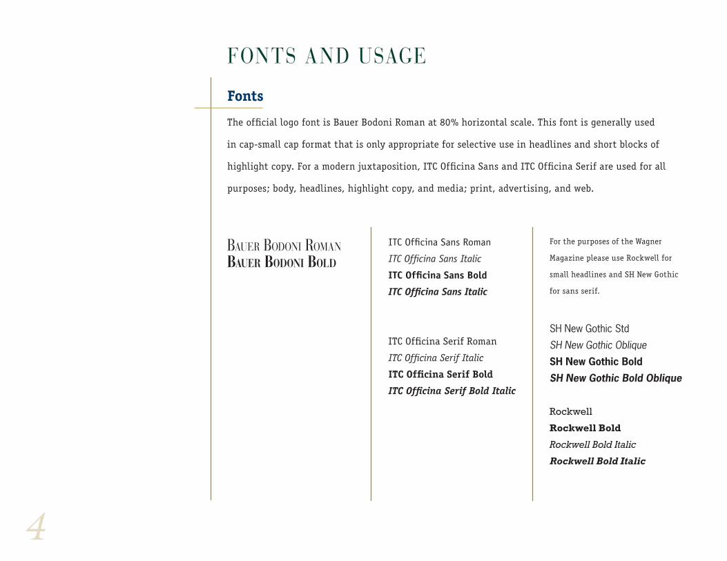
fonts and usage
Fonts
The official logo font is Bauer Bodoni Roman at 80% horizontal scale. This font is generally used
in cap-small cap format that is only appropriate for selective use in headlines and short blocks of
highlight copy. For a modern juxtaposition, ITC Officina Sans and ITC Officina Serif are used for all
purposes; body, headlines, highlight copy, and media; print, advertising, and web.
Bauer Bodoni romanBauer Bodoni Bold
ITC Officina Sans Roman
ITC Officina Sans Italic
ITC Officina Sans Bold
ITC Officina Sans Italic
ITC Officina Serif Roman
ITC Officina Serif Italic
ITC Officina Serif Bold
ITC Officina Serif Bold Italic
For the purposes of the Wagner
Magazine please use Rockwell for
small headlines and SH New Gothic
for sans serif.
SH New Gothic Std
SH New Gothic ObliqueSH New Gothic Bold
SH New Gothic Bold Oblique
Rockwell
Rockwell Bold
Rockwell Bold Italic
Rockwell Bold Italic
5
office of admission
one campus road | staten island, new York 10301
www.wagner.edu
www.wagner.edu
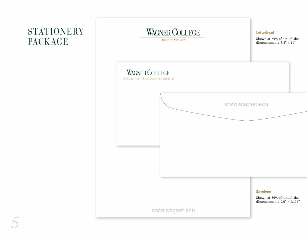
Letterhead
Shown at 65% of actual size, dimensions are 8.5” x 11”
Envelope
Shown at 65% of actual size, dimensions are 9.5” x 4.125”
stationery PaCkage
6
one campus road | staten island, new York 10301
www.wagner.edu
Leigh-Ann Nowickid e a n o f a d m i s s i o n s
ph: 718.390.3411 800.221.1010
email: [email protected]
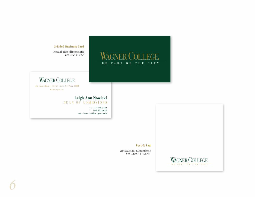
2-Sided Business Card
Actual size, dimensions are 3.5” x 2.5”
Post-It Pad
Actual size, dimensions are 2.875” x 2.875”
7
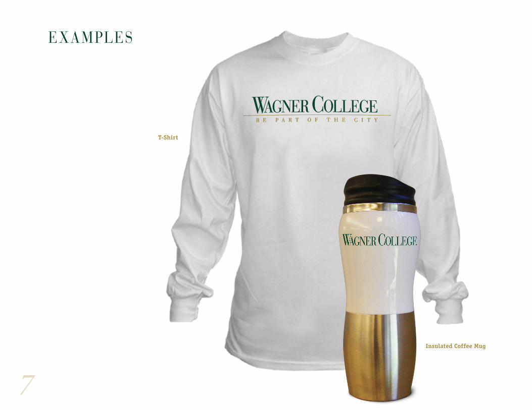
T-Shirt
Insulated Coffee Mug
examPles
8
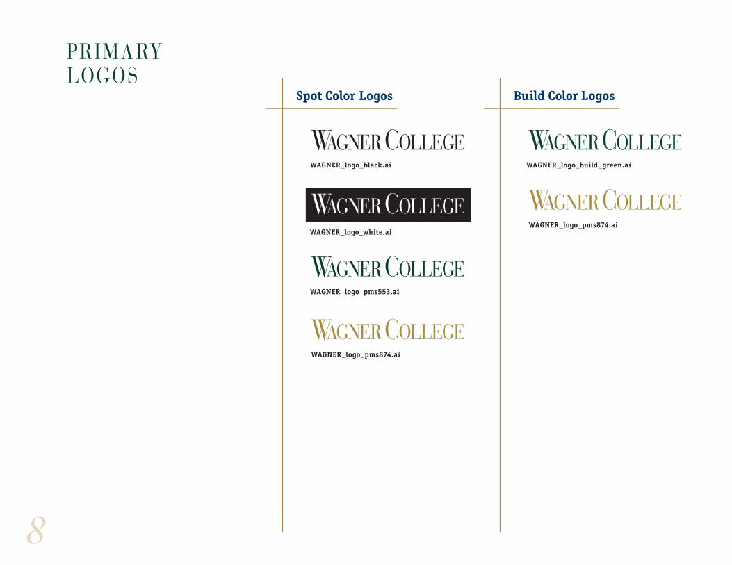
Primary logos
Spot Color Logos Build Color Logos
WAGNER_logo_black.ai WAGNER_logo_build_green.ai
WAGNER_logo_pms553.ai
WAGNER_logo_pms874.ai
WAGNER_logo_pms874.aiWAGNER_logo_white.ai
9
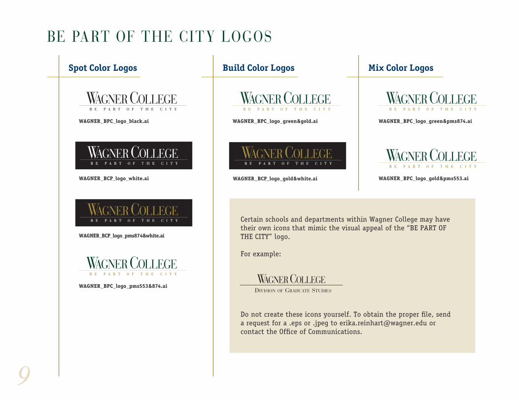
BE PART OF THE CITY LOGOS
Spot Color Logos Build Color Logos Mix Color Logos
WAGNER_BPC_logo_black.ai WAGNER_BPC_logo_green&gold.ai WAGNER_BPC_logo_green&pms874.ai
WAGNER_BPC_logo_pms553&874.ai
WAGNER_BPC_logo_gold&pms553.aiWAGNER_BCP_logo_white.ai
WAGNER_BCP_logo_pms874&white.ai
WAGNER_BCP_logo_gold&white.ai
Certain schools and departments within Wagner College may have their own icons that mimic the visual appeal of the “BE PART OF THE CITY” logo.
For example:
Do not create these icons yourself. To obtain the proper file, send a request for a .eps or .jpeg to [email protected] or contact the Office of Communications.
DIVISION OF GRADUATE STUDIES