Embed Size (px)
Citation preview
PRINCIPLES OF ECONOMICSChapter 6 Consumer Choices
PowerPoint Image Slideshow
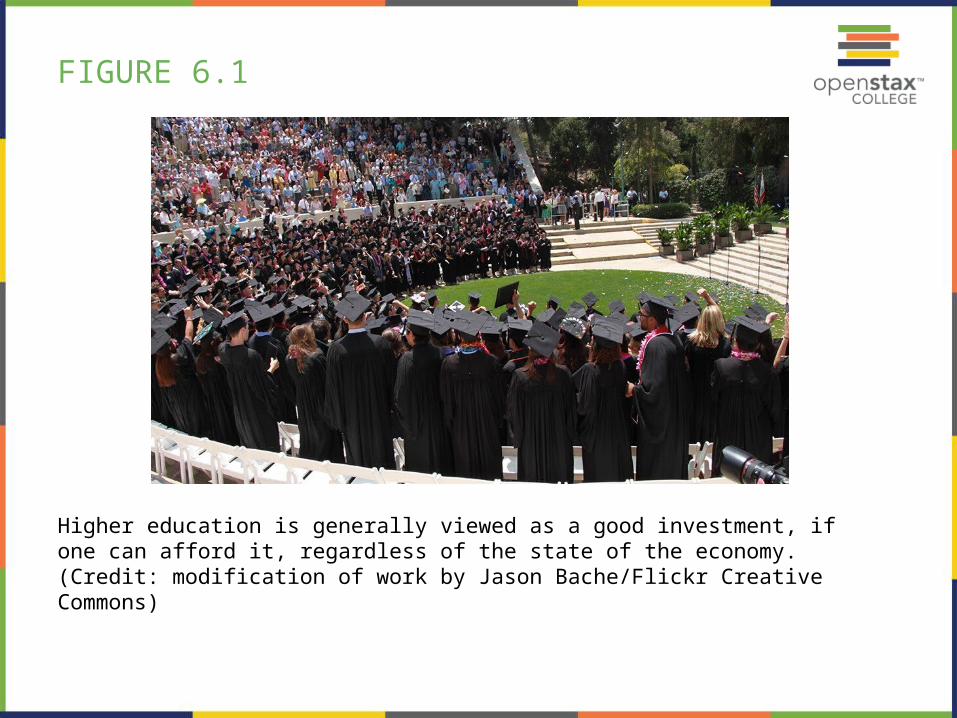
FIGURE 6.1
Higher education is generally viewed as a good investment, if one can afford it, regardless of the state of the economy. (Credit: modification of work by Jason Bache/Flickr Creative Commons)
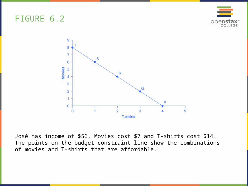
FIGURE 6.2
José has income of $56. Movies cost $7 and T-shirts cost $14. The points on the budget constraint line show the combinations of movies and T-shirts that are affordable.
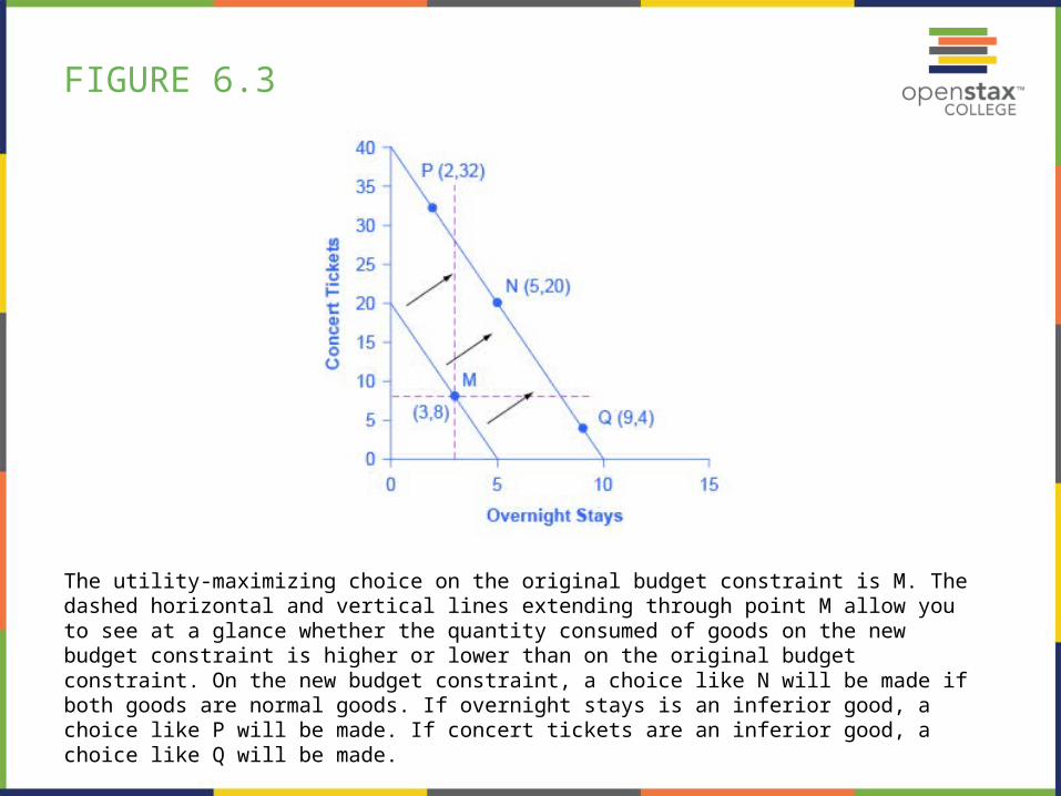
FIGURE 6.3
The utility-maximizing choice on the original budget constraint is M. The dashed horizontal and vertical lines extending through point M allow you to see at a glance whether the quantity consumed of goods on the new budget constraint is higher or lower than on the original budget constraint. On the new budget constraint, a choice like N will be made if both goods are normal goods. If overnight stays is an inferior good, a choice like P will be made. If concert tickets are an inferior good, a choice like Q will be made.
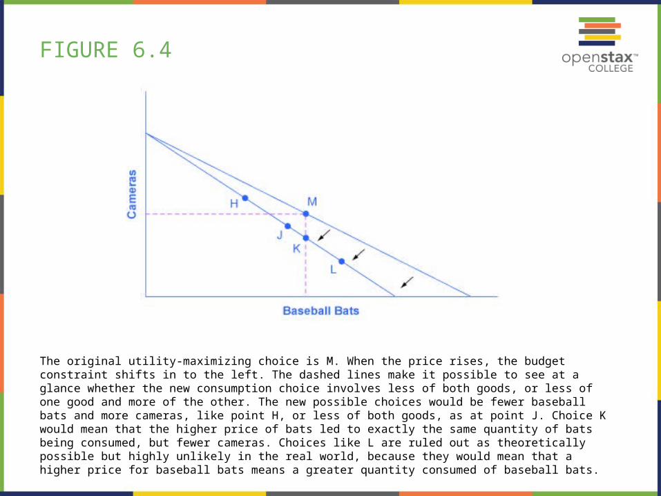
FIGURE 6.4
The original utility-maximizing choice is M. When the price rises, the budget constraint shifts in to the left. The dashed lines make it possible to see at a glance whether the new consumption choice involves less of both goods, or less of one good and more of the other. The new possible choices would be fewer baseball bats and more cameras, like point H, or less of both goods, as at point J. Choice K would mean that the higher price of bats led to exactly the same quantity of bats being consumed, but fewer cameras. Choices like L are ruled out as theoretically possible but highly unlikely in the real world, because they would mean that a higher price for baseball bats means a greater quantity consumed of baseball bats.
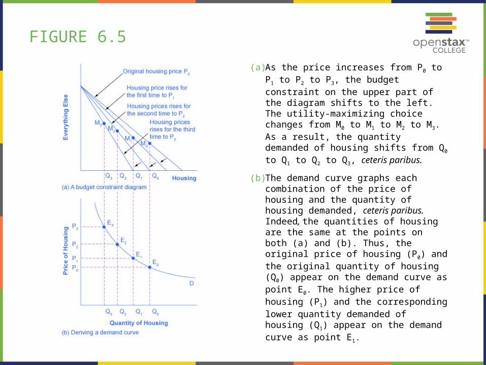
FIGURE 6.5
(a) As the price increases from P0 to P1 to P2 to P3, the budget constraint on the upper part of the diagram shifts to the left. The utility-maximizing choice changes from M0 to M1 to M2 to M3. As a result, the quantity demanded of housing shifts from Q0 to Q1 to Q2 to Q3, ceteris paribus.
(b) The demand curve graphs each combination of the price of housing and the quantity of housing demanded, ceteris paribus. Indeed, the quantities of housing are the same at the points on both (a) and (b). Thus, the original price of housing (P0) and the original quantity of housing (Q0) appear on the demand curve as point E0. The higher price of housing (P1) and the corresponding lower quantity demanded of housing (Q1) appear on the demand curve as point E1.
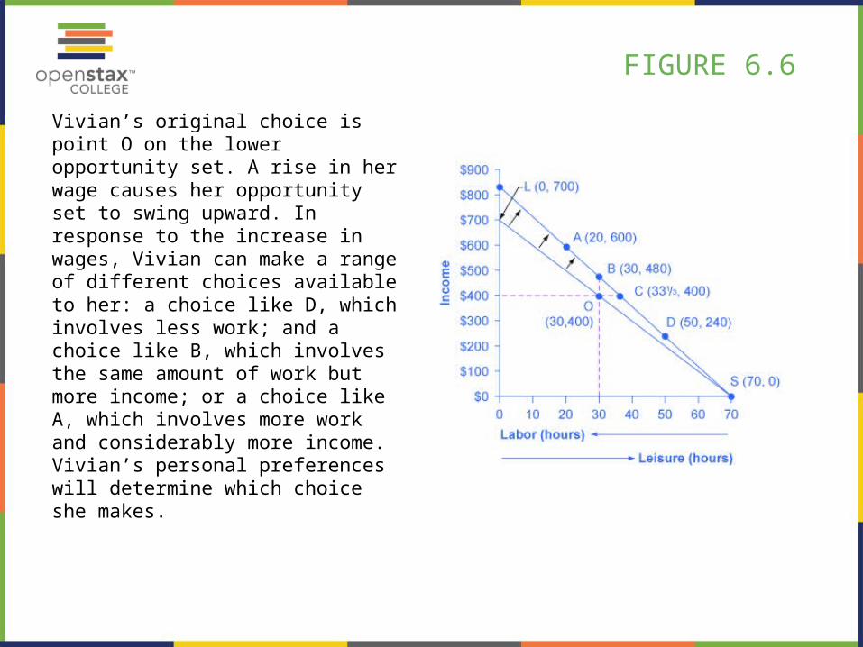
FIGURE 6.6
Vivian’s original choice is point O on the lower opportunity set. A rise in her wage causes her opportunity set to swing upward. In response to the increase in wages, Vivian can make a range of different choices available to her: a choice like D, which involves less work; and a choice like B, which involves the same amount of work but more income; or a choice like A, which involves more work and considerably more income. Vivian’s personal preferences will determine which choice she makes.
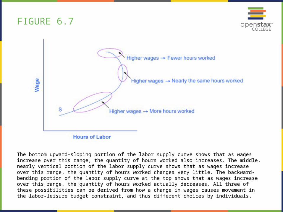
FIGURE 6.7
The bottom upward-sloping portion of the labor supply curve shows that as wages increase over this range, the quantity of hours worked also increases. The middle, nearly vertical portion of the labor supply curve shows that as wages increase over this range, the quantity of hours worked changes very little. The backward-bending portion of the labor supply curve at the top shows that as wages increase over this range, the quantity of hours worked actually decreases. All three of these possibilities can be derived from how a change in wages causes movement in the labor-leisure budget constraint, and thus different choices by individuals.
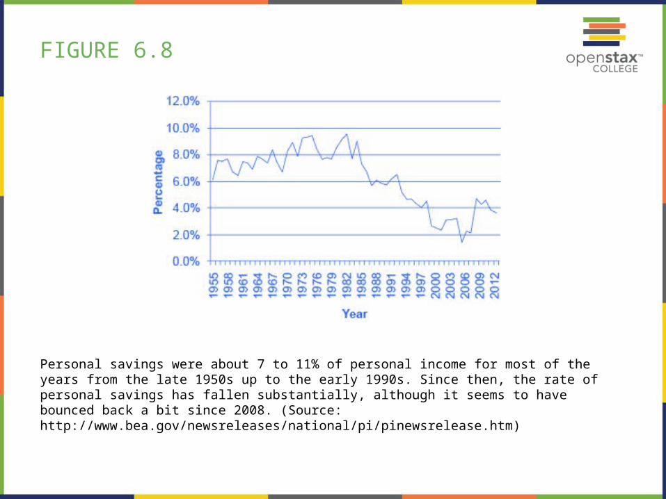
FIGURE 6.8
Personal savings were about 7 to 11% of personal income for most of the years from the late 1950s up to the early 1990s. Since then, the rate of personal savings has fallen substantially, although it seems to have bounced back a bit since 2008. (Source: http://www.bea.gov/newsreleases/national/pi/pinewsrelease.htm)
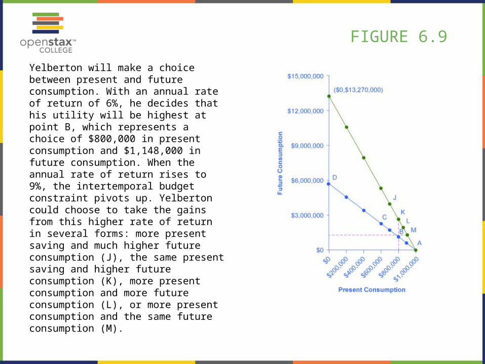
FIGURE 6.9
Yelberton will make a choice between present and future consumption. With an annual rate of return of 6%, he decides that his utility will be highest at point B, which represents a choice of $800,000 in present consumption and $1,148,000 in future consumption. When the annual rate of return rises to 9%, the intertemporal budget constraint pivots up. Yelberton could choose to take the gains from this higher rate of return in several forms: more present saving and much higher future consumption (J), the same present saving and higher future consumption (K), more present consumption and more future consumption (L), or more present consumption and the same future consumption (M).
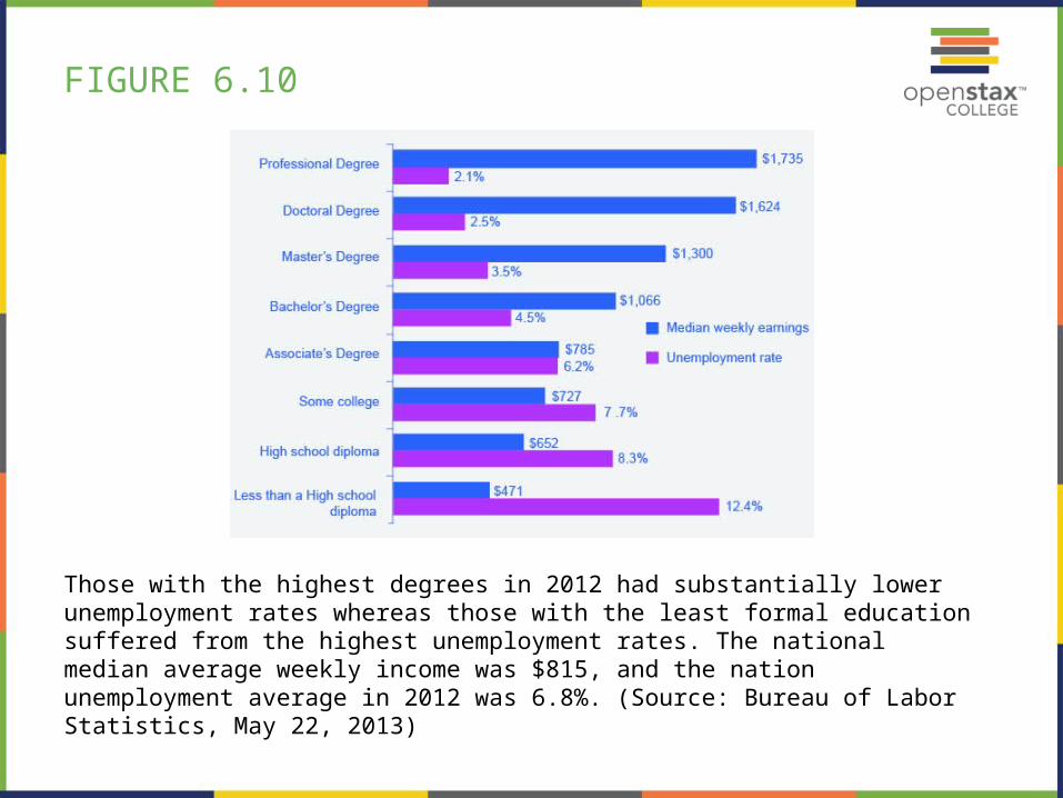
FIGURE 6.10
Those with the highest degrees in 2012 had substantially lower unemployment rates whereas those with the least formal education suffered from the highest unemployment rates. The national median average weekly income was $815, and the nation unemployment average in 2012 was 6.8%. (Source: Bureau of Labor Statistics, May 22, 2013)