Embed Size (px)
Citation preview

PowerPoint™PowerPoint™
The Rules of DesignThe Rules of Design
Copyright © 2003 by The McGraw-Hill Companies. All rights reserved.
By William Earnest

Introduction to PowerPointIntroduction to PowerPoint
Rules of DesignRules of Design good templates high-contrast colors sans serif fonts efficient text choose images wisely appropriate “build” effects visual balance of slide elements
Introduction to PowerPointIntroduction to PowerPoint
Rules of DesignRules of Design good templates high-contrast colors sans serif fonts efficient text choose images wisely appropriate “build” effects visual balance of slide elements
Table of ContentsTable of Contents

To create anew PowerPoint presentation …
launch the program, then …
Go to the Rules of Design Next slide
Introduction to Introduction to PowerPointPowerPoint

choose the “DesignTemplate” optionfrom this menu
and click “OK.”
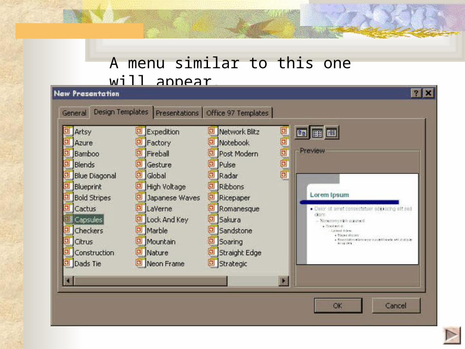
A menu similar to this one will appear.
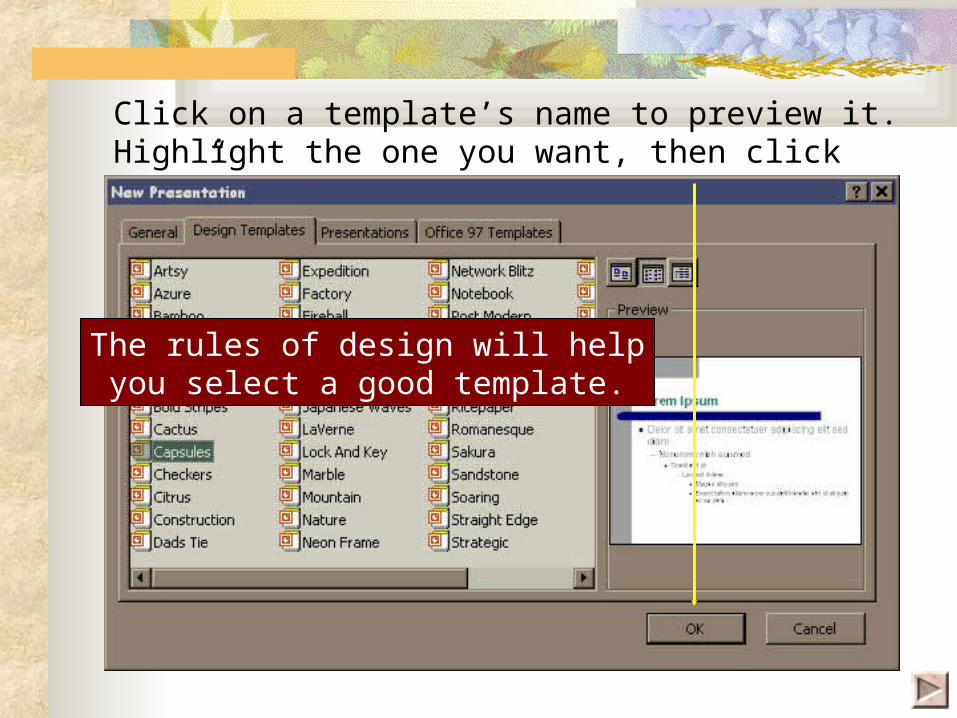
Click on a template’s name to preview it.Highlight the one you want, then click “OK.”
The rules of design will helpyou select a good template.

The “AutoLayout” menu appears automatically.
Use it to choose the kind of slide you need.
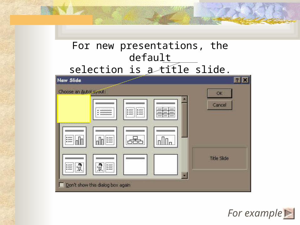
For new presentations, the defaultselection is a title slide.
For example


To create additional slides, use
Insert / New Slide … or the“New Slide”
button.

Choose the kind of slide you want from the “AutoLayout” menu, which includes:
Single bullet listDouble bullet list
Bullet list + graphOrganization chart
Bullet list + clip-art
A few more pointers

There are two basic ways to insert text:
Click in pre-set title or text boxes and start typing.
Use the “Insert / Text Box” command or button, thenposition cursor as desired.

“Slide Sorter View” lets you work with whole slides to
create transitionsbetween slides
make bulleted itemsbuild one at a time
delete, copy, ormove slides

Get to know the “Drawing” toolbar.
draw a line, arrow,
rectangle, or ellipse
insert text
* If the toolbar is not visible, go to “View/Toolbars / Drawing.”
insert Clip Art
object
color
linecolor
text color
Click here toreturn to the
Rules of Design
Click here toreturn to the
Rules of Design

The Seven Rules of The Seven Rules of DesignDesign good templates high-contrast colors sans serif fonts efficient text wisely chosen images appropriate “build” effects visual balance of slide elements
are a matter of using …
Click a bullet to view a specific rule. Otherwise, click to continue.Each slide is fully automated. Click to advance between slides.
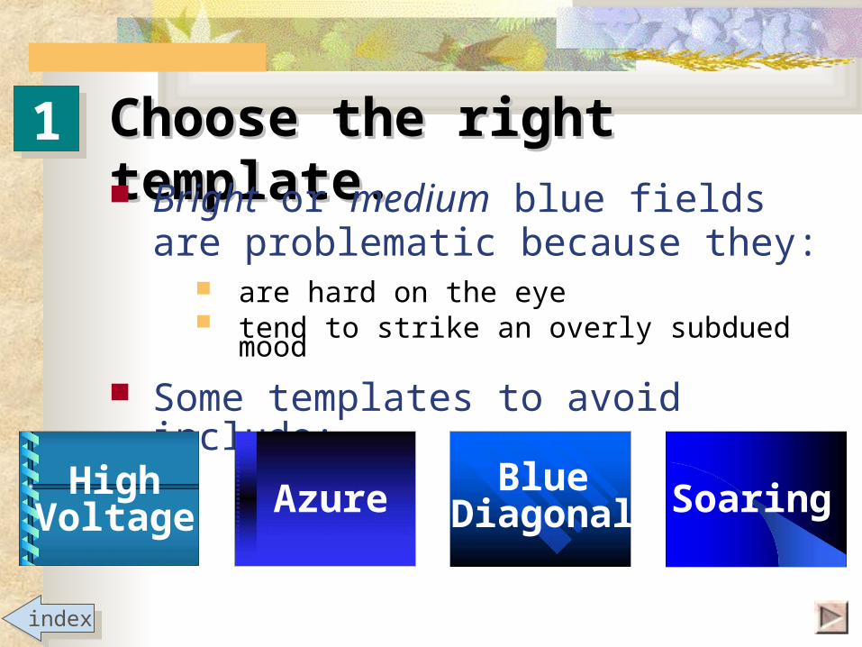
Choose the right Choose the right template.template. Bright or medium blue fields
are problematic because they: are hard on the eye tend to strike an overly subdued mood
Some templates to avoid include:
11
BlueDiagonal SoaringAzureHigh
Voltage
indexindex

Choose the right Choose the right template.template. PowerPoint’s newest templates
are more colorful and theme-specific.
Pick one that matches the mood you’re trying to convey. For example:
11
Blueprint
This template would be appropriate for presentations concerning architecture, engineering, construction, planning, design, etc.
indexindex

Choose the right Choose the right template.template.
11
These templates seem tailor-made for business and
the professions, yet are equally useful elsewhere.
Expedition
PostmodernRicepaper
indexindex
Global

Choose the right Choose the right template.template.
11Templates like these could be used when your subject is scientific or technical in focus.
TechnologyTechnology
indexindex
Straight EdgeStraight Edge
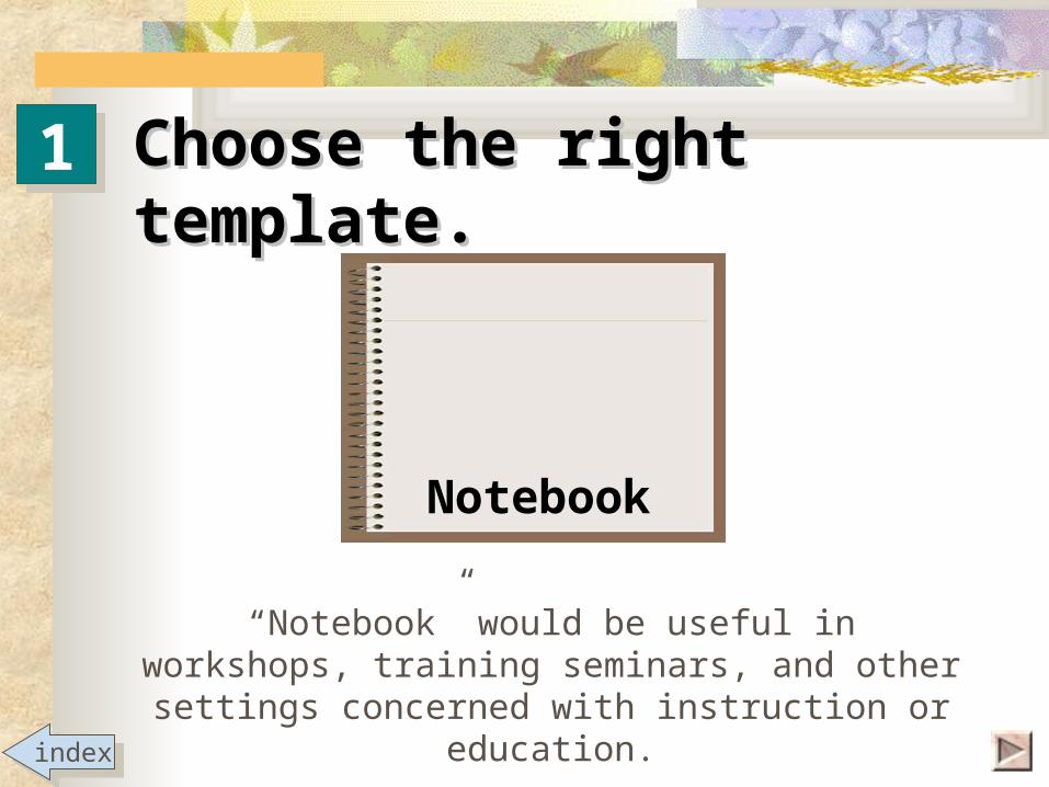
Choose the right Choose the right template.template.
11
“Notebook” would be useful in workshops, training seminars, and other settings
concerned with instruction or education.
Notebook
indexindex

Choose the right Choose the right template.template.
11
indexindex
Gesture
JapaneseWavesPaper
Nature
These templates convey elegance, regardless of the subject.

Choose the right Choose the right template.template. Very dark or very light fields with
simple patterns are often good choices.
11
BrushstrokesBlends
Capsules Artsy
including dark blues
Factory
indexindex
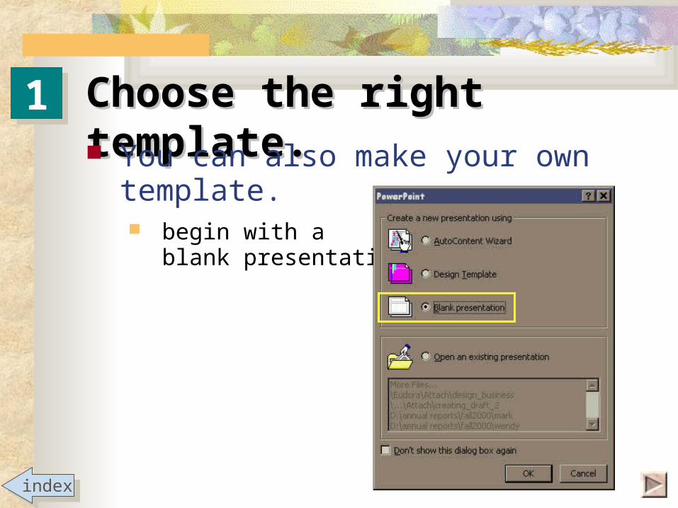
Choose the right Choose the right template.template. You can also make your own
template. begin with a
blank presentation
11
indexindex

Choose the right Choose the right template.template. You can also make your own
template. from the menu, choose:
View / Master / Slide Master
11
indexindex

Choose the right Choose the right template.template. You can also make your own
template. place images (e.g., corporate logos),
objects, etc.
11
indexindex
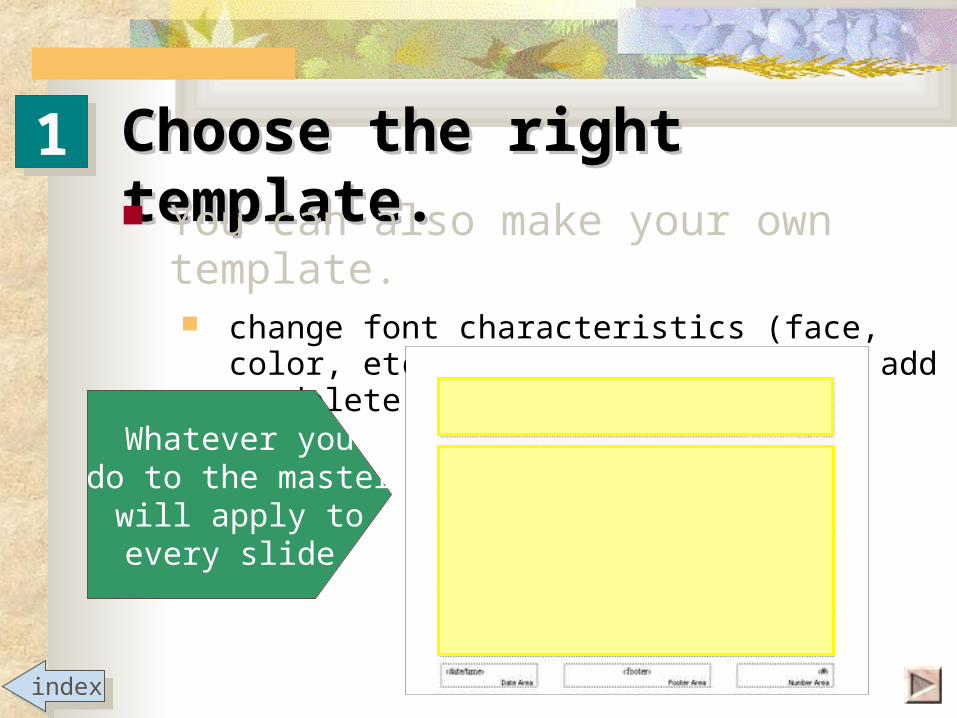
Choose the right Choose the right template.template. You can also make your own
template. change font characteristics (face, color,
etc.); resize, reposition, add or delete text boxes
11
indexindex
Whatever youdo to the master
will apply toevery slide.

Use high-contrast Use high-contrast colors.colors. Dark text on
a light field Light text on
a dark field
22
The Introduction:----------------AttentionInterestPurpose
QualificationsForecast
The Introduction:----------------AttentionInterestPurpose
QualificationsForecast
The Introduction:----------------AttentionInterestPurpose
QualificationsForecast
The Introduction:----------------AttentionInterestPurpose
QualificationsForecast
indexindex

Use high-contrast Use high-contrast colors.colors. Colors of similar luminosity
blend together and make reading difficult.
22
The Introduction:----------------AttentionInterestPurpose
QualificationsForecast
The Introduction:----------------AttentionInterestPurpose
QualificationsForecast
The Introduction:----------------AttentionInterestPurpose
QualificationsForecast
The Introduction:----------------AttentionInterestPurpose
QualificationsForecast
indexindex

Use high-contrast Use high-contrast colors.colors. Apply this rule to objects such
as: text boxes AutoShapes etc.
22
Brainstorming
Finding the topicFinding the topic
and backgrounds:
indexindex
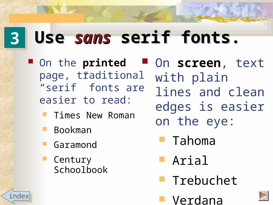
Use Use sanssans serif fonts. serif fonts.33 On screen, text
with plain lines and clean edges is easier on the eye: Tahoma Arial
Trebuchet Verdana
On the printed page, traditional “serif” fonts are easier to read: Times New Roman
Bookman Garamond Century
Schoolbookindexindex

Use Use sanssans serif fonts. serif fonts.
Sans serif:Arial, 24-pt
33
Involvement
The importance of a topic to the speaker.
Serif:Bookman, 24-pt
Involvement
The importance of atopic to the speaker.
indexindex
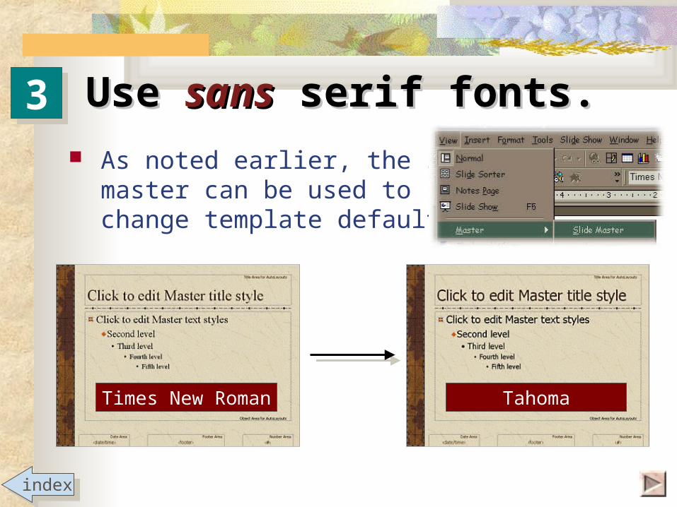
Use Use sanssans serif fonts. serif fonts. As noted earlier, the slide
master can be used tochange template defaults.
33
indexindex
Times New Roman Tahoma

Use Use sanssans serif fonts. serif fonts. There are always exceptions. If desired, use serif fonts for
special emphasis orto add distinction or elegance to someaspect of the slide (e.g., the title).
33
indexindex

Be text-savvy.Be text-savvy.
keywords, not sentences
minimum words, maximum size
no “orphans”
capitalize correctly
44
a
b
c
d
Click to jump directly to a topic, or click to continue to next slide
indexindex

Use keywords for Use keywords for bullets.bullets.
Slides are visual notecards. main ideas not complete thoughts full sentences only when quoting
For every bullet try to eliminate: articles (a, an, the) pronouns that could be implied (you, we) verbs that could be implied
44
If your PowerPoint presentation is meant to function by itself (for example, as a tutorial like this one, or a display at a trade show) then it would be necessary to use full sentences to ensure audience comprehension.
a
indexindex

44 a
Methods of Audience AnalysisMethods of Audience Analysis
Observation Inferences Questionnaires Interviews
Use keywords for Use keywords for bullets.bullets.
indexindex

44 a
Methods of Audience AnalysisMethods of Audience Analysis
Observation Inferences Questionnaires Interviews
Audience getsthe main idea
You providethe details
Audience getsthe main idea
You providethe details
Use keywords for Use keywords for bullets.bullets.
indexindex

44 bMinimum words, maximum Minimum words, maximum
sizesize
Try to keep titles 44 pts. or larger.
Main bullets32 pts.or greater
indexindex

44 b
Keep text toa minimum,
25 words orless per slide.
PowerPoint is more visualthan written.
This is another advantage of using keywords
Minimum words, maximum Minimum words, maximum sizesize
indexindex

44 c No “orphans”No “orphans”
Orphan, n. [Gr. Orphanos, later orphos; L.orbus. Bereaved.] 1. In PowerPoint, when only the last word of a long bullet spills over to the next line.2. It looks goofy and wastes space.3. Fix it by editing the bullet to one line, or by carrying over at least two words.
indexindex

44 c No “orphans”No “orphans”
before
indexindex

44 c No “orphans”No “orphans”after
indexindex

For slide titles: capitalize the first
letter of the line
capitalize proper nouns, other words if desired(but be consistent)
don’t capitalize prepositions
44 d Capitalize correctly.Capitalize correctly.
To capitalize, or not to capitalize: that is the question.
indexindex
Vocal Aspects Bodily Aspects
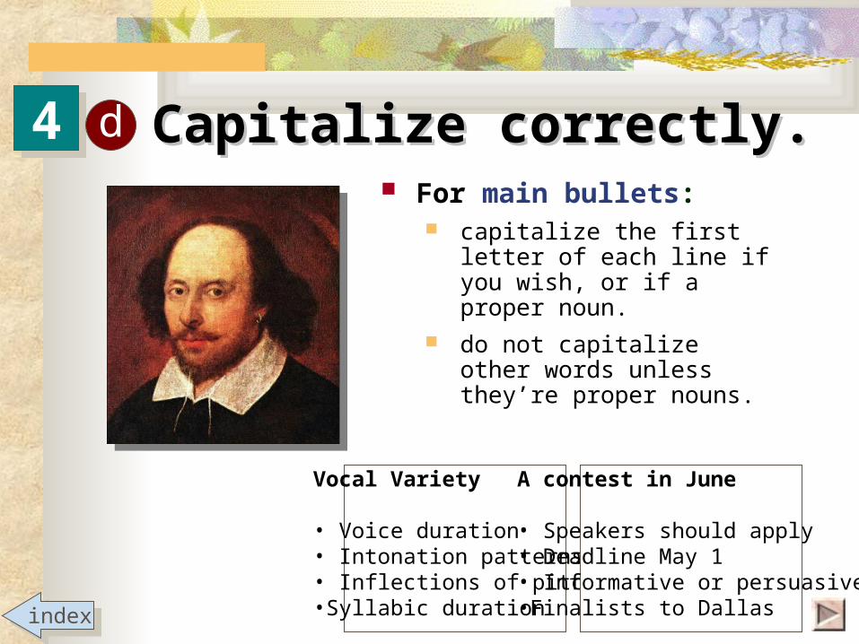
44 d Capitalize correctly.Capitalize correctly. For main bullets:
capitalize the first letter of each line if you wish, or if a proper noun.
do not capitalize other words unless they’re proper nouns.
indexindex
Vocal Variety
• Voice duration• Intonation patterns• Inflections of pitch•Syllabic duration
A contest in June
• Speakers should apply• Deadline May 1• Informative or persuasive•Finalists to Dallas

44 d Capitalize correctly.Capitalize correctly. For sub-bullets:
do not capitalize the first letter of the line, unless a proper noun
capitalize other words only if proper nouns
indexindex
Co-cultures• Marginalized groups
- women- African Americans- Hispanics-gay, lesbian and bisexuals-disabled individuals

Use images wisely.Use images wisely.55
Declarationof Principles
1. Images should predominate over text.
2. Photos should predominate over clip-art.
3. If used, clip-art should be of graphic-artist quality and not look “computer-drawn.”indexindex

Use images wisely.Use images wisely. A picture is worth
a thousand words. Almost every slide
needs an image … but not every slide
needs text.
55
indexindex

Use images wisely.Use images wisely. Frame regular images by applying:
border of 1/4 drop shadow
55
indexindex

Use images wiselyUse images wisely Do not frame irregular images:
i.e., photos and art without straight edges they’re meant to blend into background
55
indexindex

Use images wisely.Use images wisely. Size images properly:
don’t stretch them to the point of graininess
don’t shrink them to be too small to discern
55
Small images may look okay to you, but you know what they’re supposed to be. Will your audience know … from across the room?
indexindex
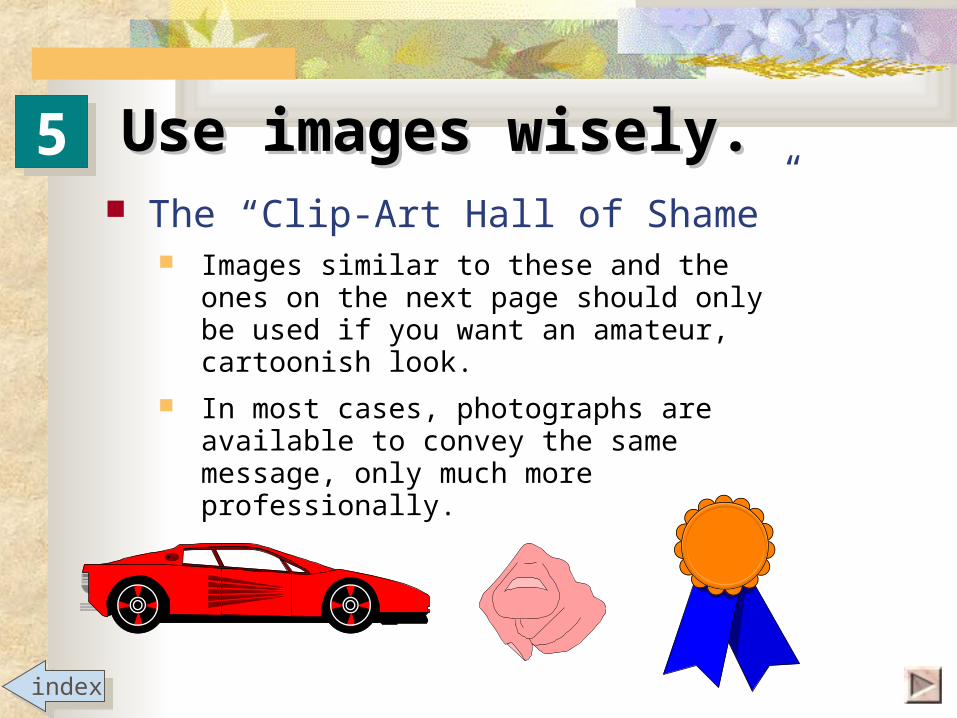
Use images wisely.Use images wisely. The “Clip-Art Hall of Shame”
Images similar to these and the ones on the next page should only be used if you want an amateur, cartoonish look.
In most cases, photographs are available to convey the same message, only much more professionally.
55
indexindex

The Clip-Art The Clip-Art Hall of Hall of ShameShame
55
indexindex
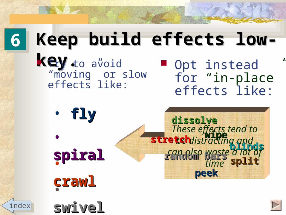
These effects tend to be distracting and can also
waste a lot of time
Keep build effects low-Keep build effects low-key.key. Try to avoid
“moving” or slow effects like:
Opt insteadfor “in-place” effects like:
66
• spiralspiral
• swivelswivel
• crawlcrawl
• flyflywipewipe
random barsrandom barsblindsblinds
peekpeeksplitsplit
stretchstretch
dissolvedissolve
indexindex
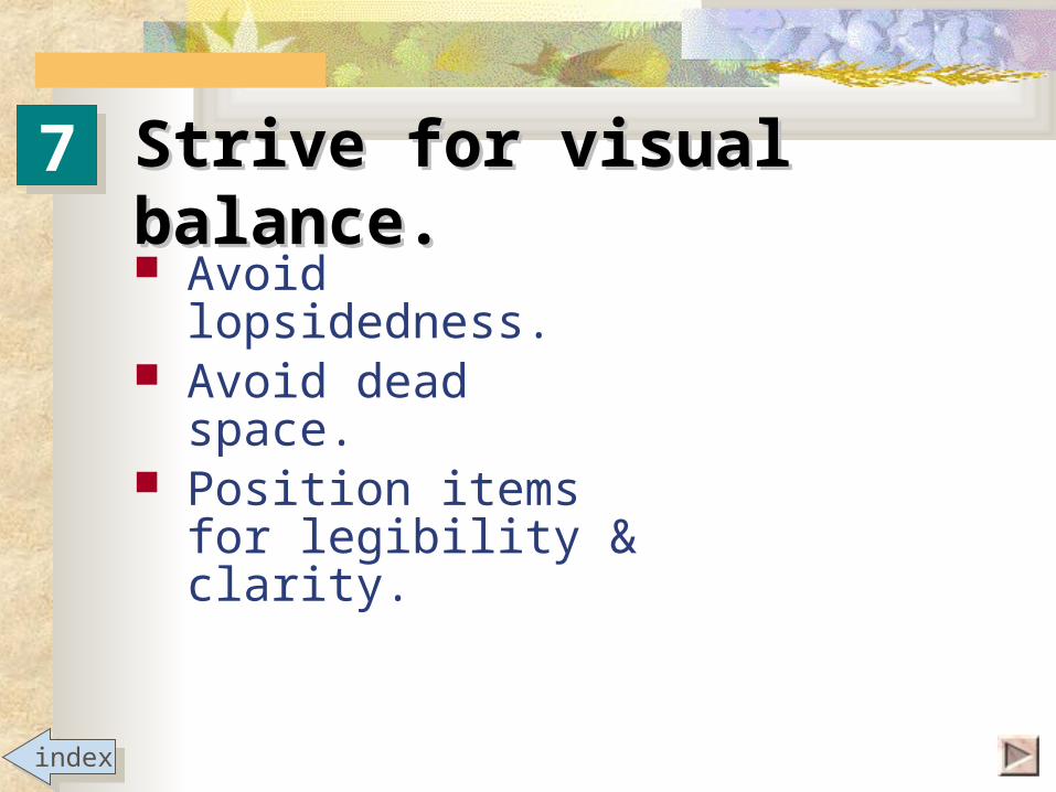
Strive for visual balance.Strive for visual balance.
Avoid lopsidedness. Avoid dead space. Position items for
legibility & clarity.
77
indexindex

Strive for visual balance.Strive for visual balance.
Avoid lopsidedness.
Avoid dead space. Position items for
legibility & clarity.
77
indexindex

Strive for visual balanceStrive for visual balance
Avoid lopsidedness. Avoid dead space. Position items for
legibility & clarity.
77
indexindex

Strive for visual balance.Strive for visual balance.77 Avoid lopsidedness Avoid dead space Position items for
legibility & clarity
Add an imageor two or three
(perhaps one foreach bullet)
Spread bullets out: Increase font size Increase line spacing
between bullets
Drag box down
This slideThis slideclosed forclosed for
remodelingremodeling
indexindex

Strive for visual balanceStrive for visual balance
Avoid dead space.
Avoid lopsidedness.
Position items for legibility & clarity.
77
indexindex

Some final Some final observations:observations: Break any rule if you
have a good reason. Observe copyright laws
on photos and artwork. You control every
aspect of a slide’s design. Have a purpose for everything that happens.
indexindex