Embed Size (px)
Citation preview

Neville
Brody
Biography Born in Southgate, London, Neville Brody is a
designer who mainly focuses on designing album/ magazine covers and varied font styles.
Currently works as the Head of Communication of the Art & Design Department at the Royal College of Art.
He completed a Bachelors degree in Graphics at London College of Printing. He was often criticised for creating
‘uncommercial work’ (Too personal and rough) by his lecturers.
Worked for magazines such as ‘The Face’ and ‘Arena’ from 1981 to 1994.
In 1994, he created ‘Research Studios’ (now Brody Associations.) with business partner FwaRichards, with branches in Barcelona, Paris etc.
They worked with many globally- known brans such as Nike, Coca-Cola, Disney, Channel 4 etc.
His Work- 1 His Work- 2 Created by Neville Brody in 1988 for American
Fashion Apparel NIKE. The campaign was aimed at teenager to
young adults. He used kinetic typography, which is where
single words or phrases are rotated and scaled to create an illusion of depth.
Brody tried to be very simplistic with this campaign in order to a sleek and polished design, with occasional blocks of colour.
IN 1992, Brody produced a font named ‘FF Typeface 4.’
This font was frequently used by Neville Brody for the ‘Cabaret Voltaire’ album covers.
This font was stylised to make the stems of the letters to look like the fret of a guitar.
Influence on the
Industry
Quiz
Encouraged the use of extravagant and original ideas, without being limited by the bias of traditional designs and art forms.
Brody has begun the punk trend in the commercial design and print industry through his magazine work.
1. Why was Brody’s work criticised by his lecturers and tutors?
2. What is the name of Brody’s design company and when was it created?
3. What was the main feature of the NIKE campaign in 1988?
4. What was the inspiration of the font that Brody created in 1992?
5. What are the main ways Brody influenced the design industry through his contribution?
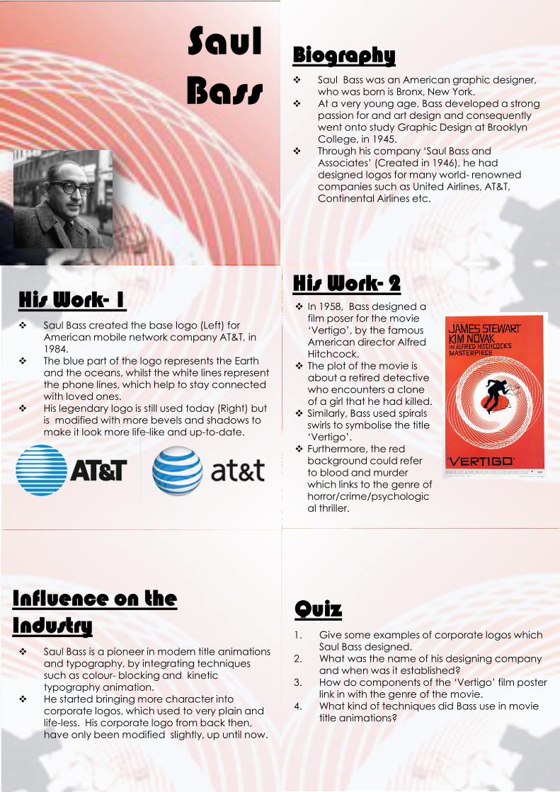
Saul Bass
Biography Saul Bass was an American graphic designer,
who was born is Bronx, New York. At a very young age, Bass developed a strong
passion for and art design and consequently went onto study Graphic Design at Brooklyn College, in 1945.
Through his company ‘Saul Bass and Associates’ (Created in 1946), he had designed logos for many world- renowned companies such as United Airlines, AT&T, Continental Airlines etc.
His Work- 1His Work- 2
Saul Bass created the base logo (Left) for American mobile network company AT&T, in 1984.
The blue part of the logo represents the Earth and the oceans, whilst the white lines represent the phone lines, which help to stay connected with loved ones.
His legendary logo is still used today (Right) but is modified with more bevels and shadows to make it look more life-like and up-to-date.
In 1958, Bass designed a film poser for the movie ‘Vertigo’, by the famous American director Alfred Hitchcock.
The plot of the movie is about a retired detective who encounters a clone of a girl that he had killed.
Similarly, Bass used spirals swirls to symbolise the title ‘Vertigo’.
Furthermore, the red background could refer to blood and murder which links to the genre of horror/crime/psychological thriller.
Influence on the Industry
Quiz
Saul Bass is a pioneer in modern title animations and typography, by integrating techniques such as colour- blocking and kinetic typography animation.
He started bringing more character into corporate logos, which used to very plain and life-less. His corporate logo from back then, have only been modified slightly, up until now.
1. Give some examples of corporate logos which Saul Bass designed.
2. What was the name of his designing company and when was it established?
3. How do components of the ‘Vertigo’ film poster link in with the genre of the movie.
4. What kind of techniques did Bass use in movie title animations?


![Storyboarding [including Saul Bass Psycho]](https://img.pdfslide.us/doc/110x75/55911b601a28ab74758b4777/storyboarding-including-saul-bass-psycho.jpg)