Embed Size (px)
Citation preview
ii
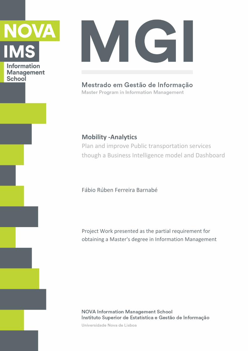
Mobility ‐Analytics
Fábio Rúben Ferreira Barnabé
Plan and improve Public transportation services
though a Business Intelligence model and Dashboard
Project Work presented as the partial requirement for
obtaining a Master's degree in Information Management

ii
NOVA Information Management School
Instituto Superior de Estatística e Gestão de Informação
Universidade Nova de Lisboa
MOBILITY ANALYTICS
Plan and improve Public transportation services though a Business Intelligence model and
Dashboard
Fábio Rúben Ferreira Barnabé
Project Work presented as the partial requirement for obtaining a Master's degree in Information
Management, specialization in Knowledge Management and Business Intelligence
Advisor: Dr. Miguel de Castro Simões Ferreira Neto
June 2020

iii
ABSTRACT
Intelligent traffic planning, the promotion of public transport and the improved interconnectedness
of all road users in a city-wide communication infrastructure comprise the mobility characteristics of
a smart city. Living in an era of Smart Cities emerging, we can make use of all the data available
nowadays to better serve our lives with the best services. All the data generated every day by the
Vehicles can be used to get a better insights to improve the quality of the available service as the
creation of new routes, increase supervision on problematic areas, among others. This document
intends to detail the project carried out at Carris, a public transportation company which operates
Lisbon's buses, trams, and funiculars. The master thesis project aims to create a Business Intelligence
solution to support planning decisions though the use of a Dashboard by presenting information
about all relevant data collected on a bus daily route by the driver in order to get a better
understating of a public transportation service and how can the organization improve them to
rebuild schedules, create or eliminate routes, do some inspection on tickets validations inside the
vehicles, etc. This project is supported by a Microsoft tool called Power BI that enables all the
extraction, transformation and loading of data processes, based on an Azure SQL Data Warehouse
based on Cloud services. The Business Dashboards are divided in 4 main areas inside the organization
and will support Onboard Sales, Ticket validations, Route Planning and Onboard issues reported by
the driver.
KEYWORDS
Business Intelligence; Data Warehouse; Dashboard; Smart Cities; Smart Mobility; Intelligent
Transportation System (ITS)

iv
INDEX
1. Introduction .................................................................................................................. 1
1.1. Problem Identification and Motivation ................................................................. 1
1.2. Objectives .............................................................................................................. 2
1.3. Study Relevance and Importance .......................................................................... 2
1.4. Thesis Methodology .............................................................................................. 3
2. Literature review .......................................................................................................... 5
2.1. Urbanization .......................................................................................................... 5
2.2. Smart Mobility ....................................................................................................... 6
2.3. Public Transportation ............................................................................................ 7
2.3.1. Bus Network ....................................................................................................... 8
3. Conceptual Model Proposal ......................................................................................... 9
3.1. Methodology ......................................................................................................... 9
3.2. Models ................................................................................................................... 9
3.2.1. Conceptual Model .......................................................................................... 9
3.2.2. Model Instantiation ...................................................................................... 10
3.2.3. Proposed Mock-ups ...................................................................................... 11
4. Dashboard Development ............................................................................................ 14
4.1. Resources............................................................................................................. 14
4.1.1. Organization ................................................................................................. 14
4.2. Database Design .................................................................................................. 14
4.2.1. Source Database ........................................................................................... 15
4.3. Data Manipulation ............................................................................................... 17
4.3.1. ELT – Extract, Load, and Transform .............................................................. 17
4.4. Dashboard Design ................................................................................................ 18
4.4.1. Data Model ................................................................................................... 18
4.4.2. Indicators construction and treatment ........................................................ 19
4.4.3. Dashboards ................................................................................................... 24
5. Results......................................................................................................................... 32
6. Limitations and recommendations for future works ................................................. 38
7. Conclusion .................................................................................................................. 40
8. Bibliography ................................................................................................................ 42

v
LIST OF FIGURES
Figure 1 – Design Science Research Methodology Process Model (Nugroho, 2017) ................ 3
Figure 2 – Urban and rural population projected to 2050, Portugal ......................................... 5
Figure 3 – Project Conceptual model ......................................................................................... 9
Figure 4 – Project solution prototype ...................................................................................... 10
Figure 5 – Onboard Issues mock-up proposal .......................................................................... 11
Figure 6 – Onboard Sales mock-up proposal ........................................................................... 12
Figure 7 – Onboard Validations mock-up proposal ................................................................. 12
Figure 8 – Route planning mock-up proposal .......................................................................... 13
Figure 9 – Source Database Diagram ....................................................................................... 15
Figure 10 – Source Database Entity Classification ................................................................... 16
Figure 11 - Data model in Galaxy schema ................................................................................ 18
Figure 12 – Fact Onboard Sales attributes and created measures .......................................... 19
Figure 13 – Onboard Issues attributes and created measures ................................................ 20
Figure 14 - Onboard Validations attributes and created measures ......................................... 21
Figure 15 – Route Planning attributes and created measures ................................................ 22
Figure 16 – Onboard Issues - General Dashboard ................................................................... 25
Figure 17 – Onboard Sales – General Dashboard .................................................................... 26
Figure 18 - Onboard Sales – Geolocation Dashboard .............................................................. 27
Figure 19 – Onboard Validations - General Dashboard ........................................................... 28
Figure 20 - Onboard Validations – Geolocation Dashboard .................................................... 29
Figure 21 – Route Planning KM Dashboard ............................................................................. 30
Figure 22 – Route Planning Journeys Dashboard ..................................................................... 31
Figure 23 – Types of issues reported by bus ............................................................................ 32
Figure 24 – Number of reported issues by weekday ............................................................... 32
Figure 25 – Total Sales Amount (€) by Bus ............................................................................... 33
Figure 26 – Total Sales Amount (€) by Bus Stop ...................................................................... 33
Figure 27 – Top 5 – Ticket validations total by Ticket type ...................................................... 34
Figure 28 – Total Validations by day of a Month ..................................................................... 34
Figure 29 – Total Validations by Day slot ................................................................................. 35
Figure 30 – Total Validations by Bus Route (April 2019) .......................................................... 35
Figure 31 – Total Validations by Bus (April 2019) .................................................................... 36
Figure 32 – Total Accomplished KM vs Total Scheduled KM ................................................... 36
Figure 33 – Total Journeys by Day slot ..................................................................................... 37

vi
LIST OF ABBREVIATIONS AND ACRONYMS
DW Data warehouse
BI Business Intelligence
ITS Intelligent Transport System
OECD Organisation for Economic Co-operation and Development
API Application Programming Interfaces
ACEA European Automobile Manufacturers Association
UITP Union Internationale des Transports Public

1
1. INTRODUCTION
1.1. PROBLEM IDENTIFICATION AND MOTIVATION
In the XXI century’s societies, accessibility is the milestone of progress to industries, businesses, and
people. The ability to go from a distance of 100.000.000 miles away in a shorter period, and in a
more comfortable way, are without any doubt keys to development in every sector.
According with the OECD’s report Economic Benefit of Improving Transportation, despite the global
awareness for the need to improve accessibility worldwide, “the lack of a common framework to
value the importance of accessibility to a large proportion of people can act as a brake on investment
and regulatory decisions that promote better accessibility”. In fact, “progress in this field can be
promoted by applying conventional transport analysis techniques to the estimation of accessibility
benefits, and by strengthening cross-sector research efforts that capture the wide-ranging impacts of
better accessibility” (Burdett, Locke, Scrimgeour, & (OECD), 2017).
This need for accessibility is, actually, a reality that today works in two vectors: offline and online.
Since the world has become more connected through the World Wide Web, the online presence has
been in the spotlight, and this has also a great relevance in today’s connectivity and accessibility
measurements. Due to Application Programming Interfaces (API), Business Intelligence (BI) or the
Internet of Things (IoT), the digital era has brought new tools already transforming the way how we
shape trends.
It is easy to understand that the offline axis resumes everything that exists, as it is, whereas the
digital axis can enclose all the possibilities in which reality can become. This leaves us in a world full
of opportunities to explore, considering that technology can expand accessibility, which
consequently improves processes’ efficiency and ultimately boosts the Economy.
Better accessibility allows industries and businesses to closely monitor trends and to act faster upon
them. It also makes it possible to have more agile and efficient services that do provide what the
industries need when it is required. These are all the advantages that a city’s accessibility brings to
businesses and industries.

2
1.2. OBJECTIVES
Looking at the citizens: it is known that frequently private transportation is preferred because it is
faster and more comfortable, even though, it may not be as economic as public transportation. This
reality is a loud piece in the Economic progress that is mandatory to monitor and invest.
All the properties mentioned above describe the public transportation in Lisbon, and the service
provided by CARRIS, a company specialized in the transportation of passengers within the city of
Lisbon. Therefore, to provide solutions to the current services provided by company, this master
thesis aims to present an extensive analysis of CARRIS’ services, the volume of operations, users’
adherence and efficiency. This evaluation will be done using a BI solution to analyze the collected
data and present actionable information to help decision-makers to take business’ decisions.
Onboard sales’ volumes, more frequent passengers’ routes, validation routines and km scheduled
done by bus, are some of the variables that will be analyzed in this project to give some insights on
where should CARRIS bet to improve the public transportation services in Lisbon and increase the
city’s and its people efficiency.
From this type of analysis, it is possible to have insights on how to improve security by strengthening
the communication between drivers and headquarters, reinforcing surveillance and planning more
effective ‘inspection’ moments, considering the executed route and according to the time, traffic and
expected volume of passengers. Ultimately all of these combined are keys to better planning and
smarter public transportation.
1.3. STUDY RELEVANCE AND IMPORTANCE
In the next few years, we might face a bigger connection between the offline and digital vectors in
Lisbon by using the potentialities hold by the accessibility provided by IoT, and the insights provided
by the BI analytics. This new ecosystem, in which everything is connected and can communicate, will
bring advantages like allowing traffic lights to share relevant traffic information with the nearby cars.
With this information, smart information systems will automatically present alternative solutions
according to the previous BI insights available.
This combination is an example of a mature application of technology in peoples’ and businesses'
lives. An obvious mirror of the digital transformation movement which entered, officially, in Portugal
not that long ago, in 2018 (Bourboun, 2018) but that still has a long way to go until it reaches its full
potential. These interactions assume special relevance in the technologic and economic digital

3
transformation that go hand in hand, allowing the management of different systems based on the
information shared not only by the people but also by the infrastructures once they feel any change
in their baseline patterns throughout the cities. This way, technology shows it's potential bringing
better efficiency, accessibility, easiness, and agility thus giving this way its contribution to people,
businesses, industries and the Economies’ progress.
1.4. THESIS METHODOLOGY
The following model shows us the several steps related to the Methodology Process Model from DSR
presented by (Vaishnavi, Kuechler, & Petter, 2019) which sums up the approach taken into
consideration of this Master Thesis’ development.
Figure 1 – Design Science Research Methodology Process Model (Nugroho, 2017)
The design-science paradigm seeks to extend the boundaries of human and organizational
capabilities by creating new and innovative artifacts (Hevner, March, Park, & Ram, 2004) and such
artifacts may include constructs, models, methods, and instantiations.
The Design Science Research process includes 6 steps which should be followed when applying this
methodology.

4
1. Identify Problem and Motivation
As stated previously, people are using often the public transport and all the data generated every day
by the Vehicles can be used to get a better insights to improve the quality of the available service as
the creation of new routes, increase supervision on problematic areas, among others.
2. Define the objectives of a Solution
Develop a Business Intelligence solution that processes the available data and show it through
visualizations.
3. Design and Development
Data model and Dashboards created under the DSR methodology and through the literature review.
4. Demonstration
Mock-ups will be presented to the stakeholders and validation next to the organization which
indicators and insights get thought the Dashboards.
5. Evaluation
After the conceptual model take place, an evaluation of how good the artifact supports the solution
to the problem, confirming if the dashboards answers all the problems identified or if it is necessary
to redesign them.
6. Communication
Is represented by the present document.

5
2. LITERATURE REVIEW
On this chapter, it is presented the literature review with the theoretical concepts approached in this
thesis, as well as the main references that support this concepts. It starts by exploring the concept of
Urbanization which works as a global assembler of the remaining concepts: Smart Mobility, Public
Transportation and finally the Bus Network concept.
2.1. URBANIZATION
Nowadays we are presented with a historic, however faster Urbanization phenomenon. According to
(Roser, 2020), “By 2050, it’s projected that 68 percent of the world’s population will live in urban
areas” In Portugal, urban areas are projected to reach the 7.13 Million population by 2050 against
6.74 Million reached in 2019.
Figure 2 – Urban and rural population projected to 2050, Portugal (https://ourworldindata.org/urbanization#what-share-of-people-will-live-in-urban-areas-in-the-
future)

6
The large social masses over-populate cities, promoting themes such as smart governance,
sustainability, and mobility. Infrastructures and services must be redesigned to harmonize
overcrowded areas. As cities grow, perhaps we should also be concerned about how can cities
expand out into the surrounding countryside.
The ecosystem of urban centers is itself influenced which leads to new behaviors and social concerns.
A serious consequence of this phenomenon is the congestion and the deterioration of
communication routes and weak public transportation networks that aren’t able to respond
efficiently to demand. Smart mobility themes arise due to the need to respond to these demographic
changes. These solutions include the best of the available technologies to improve mobility within
large urban areas, giving it intelligence that promotes assessment and planning.
2.2. SMART MOBILITY
“Smart mobility is the integration of different modes of transportation and infrastructure to make
traveling safer, cleaner, and more efficient” (“Smart Mobility In Tomorrow’s Smart Cities,” (2020)).
The need to find a better solution for transportation becomes even more urgent and this is where
smart mobility comes into play.
To facilitate communication between modes of transportation, Smart mobility encompasses many
elements, including traffic-reducing measures like ride-sharing and bike-sharing; wireless
communications, real-time data analytics and machine learning used in autonomous vehicles; and
physical infrastructure like parking spaces and traffic signals. Cities use sensors, data platforms, and
software to manage their transport infrastructure and services as a single, coordinated system.
Countless European cities, with flat terrain and bike lanes, bet on bicycle commuting, as it proves to
be a fast and sustainable way for mobility in urban centers. Likewise, we have more and more car-
sharing chains, to reduce costs among drivers and reduce vehicles in circulation. The public transport
networks themselves are a viable bet for the same purpose reducing traffic, polluting gas emissions
and lowering costs for citizens.
Smart mobility is built on the following principles as explained on The Urban Mobility Daily by
(Autonomy, 2018):
i. Flexibility: Multiple modes of transportation allow travelers to choose which ones work best
for a given situation.

7
ii. Efficiency: The trip gets the traveler to their destination with minimal disruption and in as
little time as possible.
iii. Integration: The full route is planned door-to-door, regardless of which modes of
transportation are used.
iv. Clean Technology: Transportation moves away from pollution-causing vehicles to zero-
emission ones.
v. Safety: Fatalities and injuries are drastically reduced.
Lisbon aims to build up a strategic settled in 3 pillars to improve mobility, according to an article
published in Diário de Notícias by (Rodrigues, 2019), which are:
Optimize and decarbonize the company’s fleet;
Promote the collective integration and connectivity, increase the shared mobility and reduce
the congestion on roads
Foster the growth of collective and multimodal transport’s culture.
In an attempt to promote the use of public transportation, many governments have adopted
measures to make prices accessible to all citizens, however, the management of these networks and
the communication between them is impoverished, which makes this promotion difficult. The need
for a public transportation network developed and capable of offering a quality service to the
populations of large cities affected by the phenomenon of exponential urbanization becomes
inevitable.
2.3. PUBLIC TRANSPORTATION
Public transportation plays a vital role in the mitigation of carbon emissions from transportation as
rapid urbanization leads to traffic congestion and air pollution in most cities. To reverse this decline
in the quality of life in cities caused by the rising levels of congestion and air pollution, attempts must
be made to encourage people to use their cars less and public transport more. Union Internationale
des Transports Public says that the economic benefits of public transport are five times higher than

8
the money invested in it and by doubling public transport’s market share worldwide would save
around 170 million of tons of oil and around 550 million of tons of CO2 equivalent (UITP, 2018).
Taking public transportation can free up a significant amount of time and attention, as someone else
is doing the driving, which allows riders to spend their transit time reading, working, studying, or just
enjoying some free time.
One of the most common means of transport in big cities is the bus. Each bus has its circulation
route, with a specific number of stops, its timetable and the capacity to transport a reasonable
number of citizens to all corners of the city.
2.3.1. BUS NETWORK
Buses are particularly a good choice in a vast options in public transportation as they can be adapted
to the local needs and be downsized, being flexible and diverse. Bus transport can also use signals
provided by smart traffic-control systems to provide responsive services.
In 2017, according to ACEA (European Automobile Manufacturers Association), around 892,861
buses were running in Europe and 55.7% of public transport journeys in the EU were made by urban
or suburban buses.
Focusing on the principles of Smart Mobility, making use of information technologies, promoting
clear improvements in public transport networks, is imminent. That said efficient planning and
intervention with the bus networks can have a direct impact on the lives of large cities covered by
the phenomenon of rapid urbanization, as it is the subject of this thesis.

9
3. CONCEPTUAL MODEL PROPOSAL
3.1. METHODOLOGY
Supported by a depth literature review about public transportation, focused on the bus network and
data provided by the public bus transport company, it was developed a conceptual model aimed to
get a better insight into its services and how they behave in time. The research done represents an
important phase by alerting to the need for a better understanding of what a public bus
transportation network needs at a particular city, and how can it be intelligently explored through
Dashboards. The framework used in this project is the Design Science Research Methodology, as
presented previously in the Introduction chapter. Design Science Research can be seen as three
related cycles of activities as Relevance Cycle, Design Cycle, and Rigor Cycle. The Relevance Cycle is
inserted in the Problem Definition and Motivation section of this document and the Design Cycle is
explained in the Dashboard Development chapter. Last, the Rigor Cycle’s view is contextualized in
the chapters Project Relevance and Conclusions, where the applied methods will be explained as well
as the development of this project added knowledge to the community.
3.2. MODELS
For this solution, it is presented the conceptual models for the dashboards development and the
mock-ups’ of how the dashboard will look like.
3.2.1. Conceptual Model
To develop a similar project in other organizations, that requires the same approach, the following
model can be taken into consideration:
Figure 3 – Project Conceptual model
This model can be described in the following steps:
i. Assessment of the available data related to the subject;

10
ii. Data Extraction, Transformation, and Loading;
iii. Final selection of indicators, according to the business criteria;
iv. Design dashboard prototypes;
v. Dashboards design and development;
vi. Dashboards access by the stakeholders.
3.2.2. Model Instantiation
The following model prototype aims to show the steps through the creation of the Business
Intelligence solution to answer the problem identified in the introduction section.
Figure 4 – Project solution prototype

11
This solution can be described in 3 distinct steps to develop the project solution:
Asses the data provided by the organization
Load and store the data into a cloud Database Warehouse
Connect the DB to Power BI tool and handle transformations
3.2.3. Proposed Mock-ups
The initial mock-up concept was thought with no data and as a visual support to the future
dashboards according to each business area.
Figure 5 – Onboard Issues mock-up proposal

12
Figure 6 – Onboard Sales mock-up proposal
Figure 7 – Onboard Validations mock-up proposal

13
Figure 8 – Route planning mock-up proposal

14
4. DASHBOARD DEVELOPMENT
4.1. RESOURCES
Due to some company restrictions, retrieving the data by connecting directly to the organization’s
database was not possible. Instead, all the data was collected, monthly, using a SQL query retrieving
and storing data from the respective database into XLSX and CSV files.
To develop this solution, the practical work will use three products included in a Microsoft Solution,
Microsoft SQL Server, Microsoft Azure SQL Database and Microsoft PowerBI tool.
Due to the huge amount of data processed within the company business, all data stored in XLSX and
CSV files will be uploaded into an Azure SQL Database through the SQL Server after being collected,
to improve the performance in the next steps.
The usual ETL process will be replaced by an ELT process and will be handled in the Microsoft
PowerBI tool, which will be explained in the chapter 4.3.1.
Data analysis will also use the Microsoft PowerBI tool once all the ELT process will be done using this
tool and because of its performance and popularity among BI developers as shown in (“2020 Gartner
Magic Quadrant for BI and Analytics | Sisense,” 2019).
4.1.1. Organization
The organization uses data, extracted manually from their databases that are managed by other
entities, and after being queried, this data is stored in Excel and CSV files. These files are used to feed
reports done in Excel to retrieve insights about the organization’s business.
The organization’s lack of performance and coverage to better understand their Business and
Business needs, make urgent to implement a solution where the analysis response would be faster
and wide-ranging.
4.2. DATABASE DESIGN
This project will house one database.
It is in this database where the XLSX and CSV files extracted from the organization’s database will be
loaded.
15
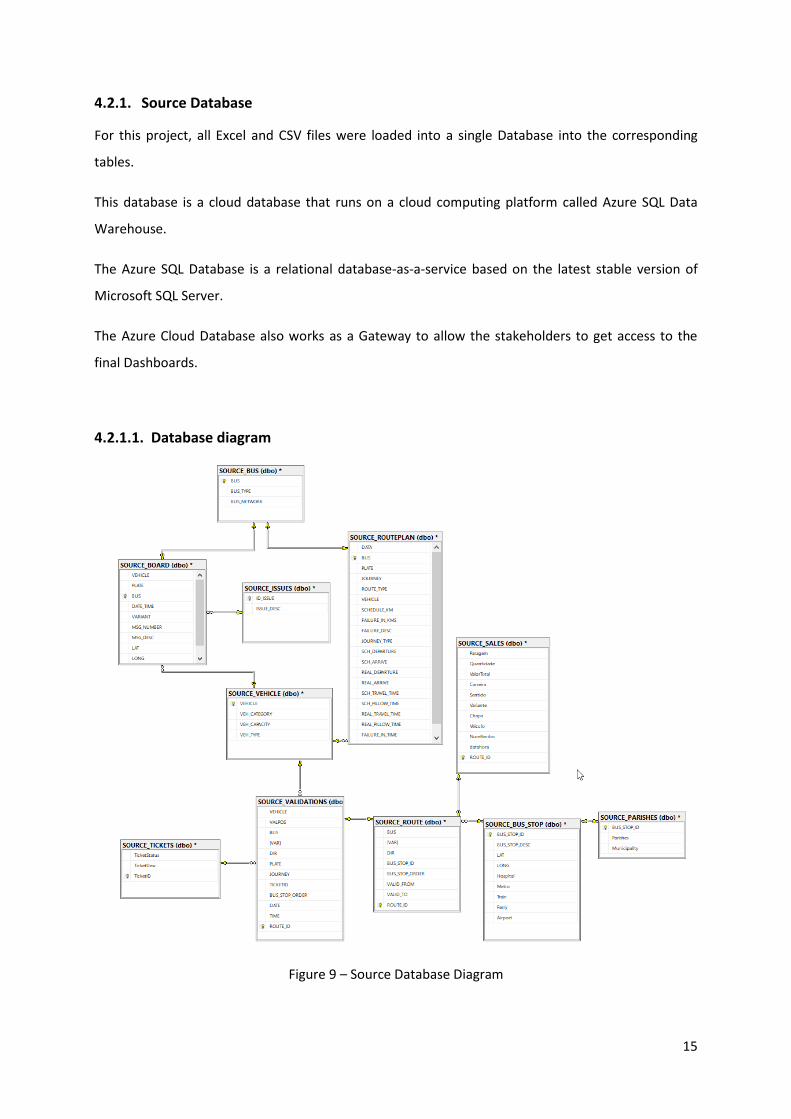
4.2.1. Source Database
For this project, all Excel and CSV files were loaded into a single Database into the corresponding
tables.
This database is a cloud database that runs on a cloud computing platform called Azure SQL Data
Warehouse.
The Azure SQL Database is a relational database-as-a-service based on the latest stable version of
Microsoft SQL Server.
The Azure Cloud Database also works as a Gateway to allow the stakeholders to get access to the
final Dashboards.
4.2.1.1. Database diagram
Figure 9 – Source Database Diagram

16
4.2.1.2. Entity Classification
To come up with a final data model, to know how the relational database in the source is organized
helps us to classify it applying the needed definitions (Kimball & Ross, 10-15).
The source database can be classified as the image bellow.
Figure 10 – Source Database Entity Classification
Legend:
Transactional Entity
Component Entity
Classification Entity

17
4.3. DATA MANIPULATION
The data manipulation was developed using the Microsoft PowerBI tool and will be explained in this
chapter.
All tables were handled on PowerBI except Onboard Validations table due to the huge amount of
data, circa 130 Million rows, being handled before loading it to PowerBI using SQL language though
the Microsoft SQL Server Management Studio tool.
To improve the performance when querying this table, a Clustered Columnstore Index was created.
This manipulation can be seen in Appendix A.
4.3.1. ELT – Extract, Load, and Transform
For this project, instead of a usual ETL process, an ELT process was used.
ELT is a process that involves extracting the data, loading it into the target warehouse, and then
transforming it after it is loaded. In this case, the work of transforming the data is completed by the
target database.
In this process that can be found in Appendix A, all tables loaded in Azure Database were handles
regarding data transformation where some minor twitches were made as split DateTime columns
into Date and Time columns, Trim columns, columns cleansing, etc.
In this process also new tables were created as Dimension Date and Dimension Time.
18
4.4. DASHBOARD DESIGN
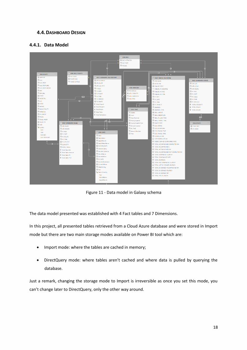
4.4.1. Data Model
Figure 11 - Data model in Galaxy schema
The data model presented was established with 4 Fact tables and 7 Dimensions.
In this project, all presented tables retrieved from a Cloud Azure database and were stored in Import
mode but there are two main storage modes available on Power BI tool which are:
Import mode: where the tables are cached in memory;
DirectQuery mode: where tables aren’t cached and where data is pulled by querying the
database.
Just a remark, changing the storage mode to Import is irreversible as once you set this mode, you
can’t change later to DirectQuery, only the other way around.
19
4.4.2. Indicators construction and treatment
Through the creation of some measures, the end-users can interact with the Dashboards and take
insights from them.
These measures are build using a programming language called DAX (Data Analysis eXpression) and
allow us to analyze the data by creating new columns and measures.
It includes functions from different categories such as Aggregate, Date, Logical, Counting or
Information.
These available functions are also shared with Microsoft Excel.
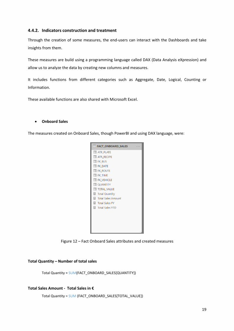
Onboard Sales
The measures created on Onboard Sales, though PowerBI and using DAX language, were:
Figure 12 – Fact Onboard Sales attributes and created measures
Total Quantity – Number of total sales
Total Quantity = SUM(FACT_ONBOARD_SALES[QUANTITY])
Total Sales Amount - Total Sales in €
Total Quantity = SUM (FACT_ONBOARD_SALES[TOTAL_VALUE])

20
Total Sales PY – Total Sales in € from the previous year
Total Sales PY = TOTALYTD(FACT_ONBOARD_SALES[Total Sales Amount], SAMEPERIODLASTYEAR(
DIM_DATE[Date]))
Total Sales YTD – Total Sales Amount in € from the beginning of the year until the current date
Total Sales YTD = TOTALYTD(FACT_ONBOARD_SALES[Total Sales Amount],DIM_DATE[Date])
Onboard Issues
The measures created on Onboard Issues, though PowerBI and using DAX language, were:
Figure 13 – Onboard Issues attributes and created measures
Total Issues – Total number of Issues reported
TOTAL_ISSUES = IF( ISBLANK( COUNT( FACT_ONBOARD_ISSUES [FK_ISSUE])), 0, COUNT(
FACT_ONBOARD_ISSUES[FK_ISSUE]))
Onboard Validations
The measures created on Onboard Validations, though PowerBI and using DAX language, were:

21
Figure 14 - Onboard Validations attributes and created measures
Total Validations – Total number of Ticket’s Validations
Total Validations = COUNT(FACT_ONBOARD_VALIDATIONS[FK_TICKET])
Total Train – Count of the total existing near Train Station within a Bus Route
Total Train = SUM(DIM_ROUTE[TRAIN])
Total Metro – Count of the total existing near Metro within a Bus Route
Total Metro = SUM(DIM_ROUTE[METRO])
Total Airport – Count of the total existing near Airports within a Bus Route
Total Airport = SUM(DIM_ROUTE[AIRPORT])
Total Ferry – Count of the total existing Ferry within a Bus Route
Total Ferry = SUM(DIM_ROUTE[FERRY])

22
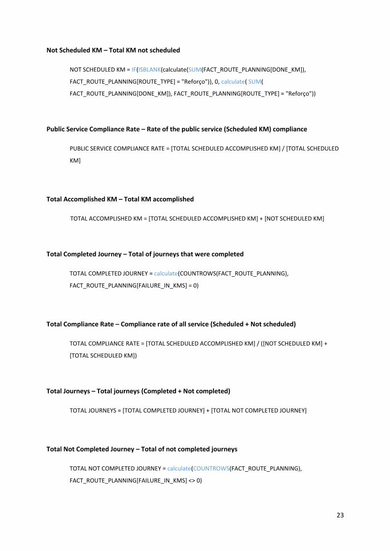
Route Planning
The measures created on Route Planning, though PowerBI and using DAX language, were:
Figure 15 – Route Planning attributes and created measures
23
Not Scheduled KM – Total KM not scheduled
NOT SCHEDULED KM = IF(ISBLANK(calculate(SUM(FACT_ROUTE_PLANNING[DONE_KM]),
FACT_ROUTE_PLANNING[ROUTE_TYPE] = "Reforço")), 0, calculate( SUM(
FACT_ROUTE_PLANNING[DONE_KM]), FACT_ROUTE_PLANNING[ROUTE_TYPE] = "Reforço"))
Public Service Compliance Rate – Rate of the public service (Scheduled KM) compliance
PUBLIC SERVICE COMPLIANCE RATE = [TOTAL SCHEDULED ACCOMPLISHED KM] / [TOTAL SCHEDULED
KM]
Total Accomplished KM – Total KM accomplished
TOTAL ACCOMPLISHED KM = [TOTAL SCHEDULED ACCOMPLISHED KM] + [NOT SCHEDULED KM]
Total Completed Journey – Total of journeys that were completed
TOTAL COMPLETED JOURNEY = calculate(COUNTROWS(FACT_ROUTE_PLANNING),
FACT_ROUTE_PLANNING[FAILURE_IN_KMS] = 0)
Total Compliance Rate – Compliance rate of all service (Scheduled + Not scheduled)
TOTAL COMPLIANCE RATE = [TOTAL SCHEDULED ACCOMPLISHED KM] / ([NOT SCHEDULED KM] +
[TOTAL SCHEDULED KM])
Total Journeys – Total journeys (Completed + Not completed)
TOTAL JOURNEYS = [TOTAL COMPLETED JOURNEY] + [TOTAL NOT COMPLETED JOURNEY]
Total Not Completed Journey – Total of not completed journeys
TOTAL NOT COMPLETED JOURNEY = calculate(COUNTROWS(FACT_ROUTE_PLANNING),
FACT_ROUTE_PLANNING[FAILURE_IN_KMS] <> 0)
24
Total Not Scheduled Journey – Total not scheduled journeys
TOTAL NOT SCHEDULED JOURNEY = IF( NOT( ISBLANK(
calculate(COUNTROWS(FACT_ROUTE_PLANNING), FACT_ROUTE_PLANNING[ROUTE_TYPE] = "Reforço"))),
calculate(COUNTROWS(FACT_ROUTE_PLANNING), FACT_ROUTE_PLANNING[ROUTE_TYPE] = "Reforço"), 0)
Total Scheduled Journey – Total of scheduled journeys
TOTAL SCHEDULED JOURNEY = calculate(COUNTROWS(FACT_ROUTE_PLANNING),
FACT_ROUTE_PLANNING[ROUTE_TYPE] <> "Reforço")
Total Scheduled Accomplished KM – Total scheduled KM accomplished
TOTAL SCHEDULED ACCOMPLISHED KM = calculate(SUM(FACT_ROUTE_PLANNING[DONE_KM]),
FACT_ROUTE_PLANNING[ROUTE_TYPE] <> "Reforço")
Total Scheduled KM – Total of scheduled KM
TOTAL SCHEDULED KM = calculate(SUM(FACT_ROUTE_PLANNING[SCHEDULE_KM]),
FACT_ROUTE_PLANNING[ROUTE_TYPE] <> "Reforço")
Total YTD Journeys – Accumulative journeys
TOTAL YTD JOURNEYS = TOTALYTD([TOTAL JOURNEYS], DIM_DATE[Date])
4.4.3. Dashboards
Dashboards provide business insights by analyzing datasets in several key areas while displaying
aggregated information in a way that is both intuitive and visual.
The visualizations of Dashboards are focused on a subject to be analyzed.
It is important to refer that there are common settings in the dashboards as they were created based
on the same visual format (font and colors) and filters.

25
In the top left of the dashboard, we have the company logo, and on the left side, we have all the
filters where users can check from which Year, Month and Date the dataset is being retrieved and
also the possibility to filter by Time and Bus.
The reports can be seen in Appendix B.
4.4.3.1. Onboard Issues Dashboard
Figure 16 – Onboard Issues - General Dashboard
Onboard Issues Dashboard is designed from an emerging business area and with a lot of potentials to
get a huge quantity of insights about passenger behaviors, but due to the lack of information that
will be explained in chapter 6, those insights are compromised.
It is represented by the information generated inside a bus where the driver has all the power and
duty to register all the events happening inside “his” vehicle.
The Dashboard shows the issues reported by the driver, by bus, which issues occurred, how they are
allocated throughout the week and where they were located.
All the filters can interact with the Dashboard’s charts, except the Total Reported Weekly that
remains the same when it comes to Date filter because we want to present how the issues reported

26
are distributed throughout the week and not only in just one day of the week, so the char remains
the same when selecting a specific day.
4.4.3.2. Onboard Sales Dashboard
Onboard Sales Dashboard represents only the Sales that are collected inside the vehicle, without
accounting the remaining Sales sources (vending machines, partner selling points).
For this business area, two Dashboards were built to better show all the discussed indicators.
The first Dashboard is the Onboard Sales General.
Figure 17 – Onboard Sales – General Dashboard
This Dashboard represents all the Total Sales and Total Sales Amount (in €) accounting for a specific
Year, Month, Date, Time and Bus.
The main focus here is the value sold in Time and a Place.
The values are distributed by Time Slot identified by the organization as important parts of the day to
better understand in which part of the Day they are selling the most. These slots are Pre-Morning,
Morning, Day, Afternoon, Post-Afternoon and Night.

27
Here we can also see the accumulative value from the beginning of the year and how each slice of
the total sales amount is represented in each corresponding month.
It is shown also the business sales volume in terms of bus stops, to better understand and improve
those bus stops.
This last chart, “Total Sales Amount by Bus Stop” should be included in the next Dashboard, once it
represents the Sales in location, but in terms of visual, it was allocated here.
Figure 18 - Onboard Sales – Geolocation Dashboard
Geolocation Dashboard represents the Sales distributed mostly in location but also in time by one
chart “Total Sales by Week” that as explained in the previous Dashboard, it should be swapped with
the chart representing the Total Sales Amount by Stop.
This Dashboard gives us insights about how the company’s Sales are distributed in place, taking
advantage of the Maps visual where it can clearly show us a Bus route marked on the Map.
It is also possible to drill down in Route where we will find at the top of the hierarchy the Bus Stop
and at the bottom it the Bus Stop.

28
4.4.3.3. Onboard Validations Dashboard
Onboard Validations Dashboard is related to all the tickets validations inside a vehicle.
For this business area, two Dashboards were built to better show all the discussed indicators.
All the data generated, every single day, regarding validations, makes this Dashboard the most
difficult to accomplish in terms of performance due to the huge amount of data. This limitations will
explained with more details in chapter 6.
The first Dashboard is the Onboard Validations General.
Figure 19 – Onboard Validations - General Dashboard
This Dashboard was designed to focus on which type of ticket is validated the most and also where it
is validated the most, grouped by type of Bus Network and Municipality.
It is also represented the flow of Total Validations during the Year, Month and Days.

29
Figure 20 - Onboard Validations – Geolocation Dashboard
More focused on Location insights, this Dashboard gives us insights about Validations through a Bus
Route and though Day slots.
It can be observed the Route for the chosen Bus with all the Bus Stops ordered descendent by Total
Validations on the Bar chart.
On the map, it is also possible to observe the Route path, where the Total Validations are
represented in size on each bubble.
On top, we can verify points of interest located through the route for the chosen Bus. Mention that
the number represents the total of Bus Stops that gives access to some of those points.

30
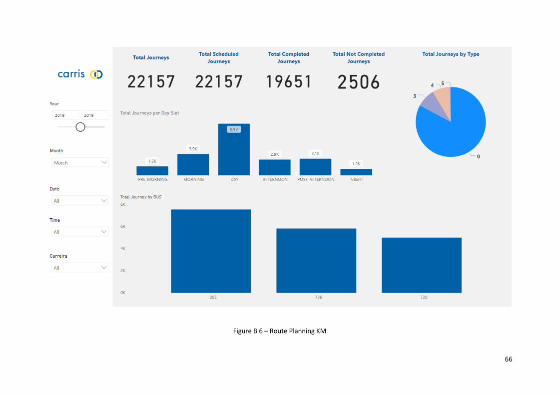
4.4.3.4. Route Planning Dashboard
The Route Planning Dashboard, as the name implies, was created to have insights on Route Planning.
Route Planning Dashboards are divided into two Dashboards, Kilometres (KM Dashboard) and
Journeys (Journey Dashboard).
Figure 21 – Route Planning KM Dashboard
Focused on Kilometres, it is presented Total accomplished KM, Total scheduled KM, Total Scheduled
KM that were accomplished and also KM that were not scheduled but were realized.
It is presented 3 types of comparisons among the 3 bar charts:
Scheduled vs Not scheduled
Accomplished vs Scheduled
Scheduled Accomplished vs Scheduled
31
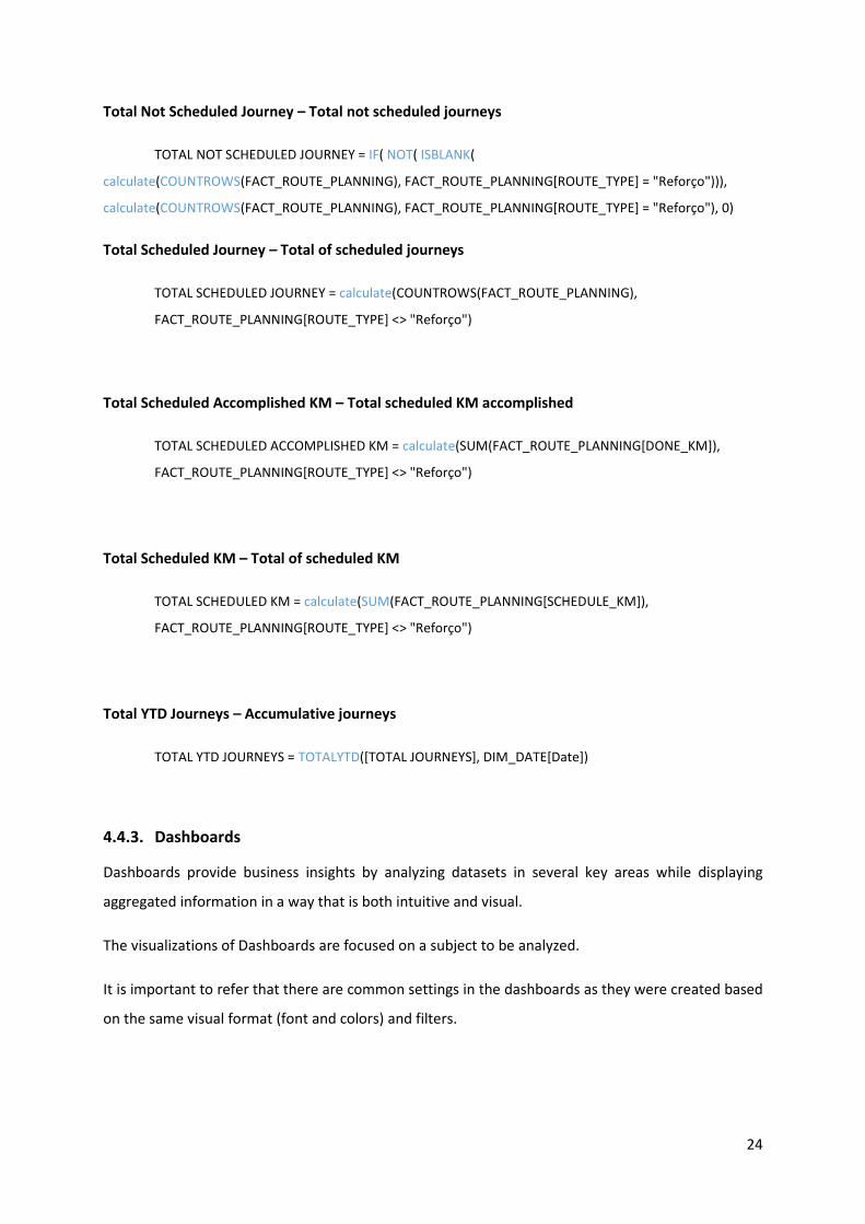
Figure 22 – Route Planning Journeys Dashboard
Focused on Journeys, the Route Planning Journeys Dashboard intends to the total of Journeys
realized and the total scheduled Journeys that were completed and not completed.
Journeys can be categorized into 5 types, which type 0 is the most relevant Journey which represents
the real Journey realized in a Route. All the other 4 types represent routes from the Bus Station to
the terminal, and vice-versa, among other routes needs to start a type 0 Journey.
Those Journeys can be visualized also by Day slot and by BUS.
32
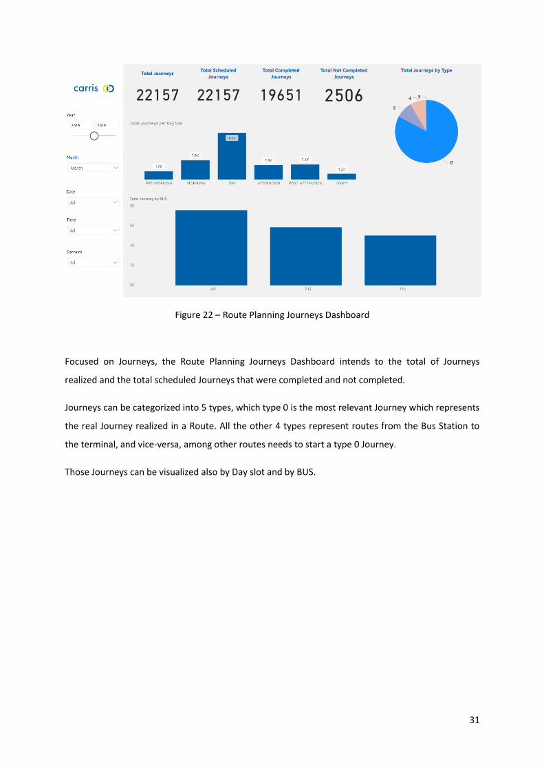
5. RESULTS
The insights obtained by the data exploration on Power BI are represented by maps, charts, and
values.
To improve fiscal supervision, timetable, vehicle frequency, we can analyze the Onboard Issues
Dashboard.
Figure 23 – Types of issues reported by bus
i. By identifying which Bus route by day and time has more infractions in terms of validating
the ticket, an improvement, where supervision should be targeted, can be done.
ii. By identifying which Bus route by day and time is completed frequently, letting other
passengers without a ride.
iii. By identifying which Bus, by day and time, reach other Bus doing the same route, to improve
their timetable or route variants.
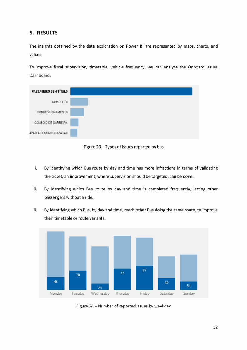
Figure 24 – Number of reported issues by weekday

33
To reduce onboard Sales by improving online services using a mobile app to buy tickets or by
installing more vending machines to improve the quality of service and a faster journey.
Figure 25 – Total Sales Amount (€) by Bus
It is observed which Bus has more onboard Sales and is where more improvements should be done.
It can be concluded that this Bus has a very used Route among all passengers and that’s why an
improvement should be taken into consideration.
Figure 26 – Total Sales Amount (€) by Bus Stop

34
Onboard Validations General Dashboard can be represented by the type of Tickets that passengers
own.
Total Validations measure associated with the Ticket Type category allows the organization to have a
better understanding of how new tickets or old tickets are being used by the passengers and which
one has more impact on their daily lives.
Figure 27 – Top 5 – Ticket validations total by Ticket type
Figure 28 – Total Validations by day of a Month
Analyzing the Total Validations thought each day or time of a specific month for a specific Bus, let the
organization to an improvement on timetables on areas they need the most.

35
Figure 29 – Total Validations by Day slot
Onboard Validations with Geolocation Dashboard represents Total Validations measure in a location
Figure 30 – Total Validations by Bus Route (April 2019)
In this chart, we can observe that Bus 15E, which is a Tram, comes in 6th position on a Top 10 for April
2019, but actually, it should be 3rd in the Ranking, as shown in the next image.
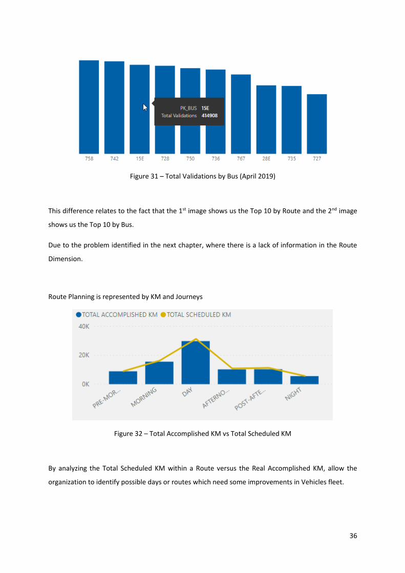
36
Figure 31 – Total Validations by Bus (April 2019)
This difference relates to the fact that the 1st image shows us the Top 10 by Route and the 2nd image
shows us the Top 10 by Bus.
Due to the problem identified in the next chapter, where there is a lack of information in the Route
Dimension.
Route Planning is represented by KM and Journeys
Figure 32 – Total Accomplished KM vs Total Scheduled KM
By analyzing the Total Scheduled KM within a Route versus the Real Accomplished KM, allow the
organization to identify possible days or routes which need some improvements in Vehicles fleet.

37
Figure 33 – Total Journeys by Day slot
Identifying the Total Journeys pattern during the day helps with Route and Timetable planning am
improvement.

38
6. LIMITATIONS AND RECOMMENDATIONS FOR FUTURE WORKS
Three big limitations were found in the development of this work project which can be divided into
the following topics:
1. Data amount
For this work project, 13 months of data were collected from October 2018 until October 2019, in a
total of 5 Million rows for Sales and Route Planning and a total of 130 Million rows for Validations.
Validations dashboards performance suffer in terms of performance as it takes more than expected
to load all the charts within both of the Dashboards created.
In the future, a different approach can be useful as we want to load even more years to compare
business performance throughout the years.
The development of an OLAP Cube because of its rapid analysis of data, the possibility of partitions
and aggregations creation, are the main keys for improvement in terms of performance.
2. Missing data
The data collected regarding the Route Dimension had missing Routes in which some Validations
were done in certain parts of the time, from October 2018 until October 2019. This lack of
information will take into some misunderstandings when it comes to data interpretation. As
mentioned before, a certain Bus that should be in 3rd in the ranking drops 3 positions and appears in
6th in the ranking.
3. Vehicle’s console errors
The biggest problem faced with the development of this project was the missing data due to the
Vehicles’ console errors. These errors’ cost us missing information regarding the Bus Route
attributes.
A Bus Route is composed of the Bus number, Direction (Upward, Downward and Circular), Variant
(represents in which Bus Stops the Vehicle stops by), Bus Stop and Bus Stop Order (in which order a
Bus stops in each “Bus Stop” within a Route).

39
It would be interesting in the future to have a Dashboard for controlling all Vehicles with these kinds
of errors and try to minimize them.

40
7. CONCLUSION
The main goal of this work project was to implement a Business Intelligence solution that could
answer the main issues within the organization identified at the beginning of the chapter Problem
Identification and Motivation.
This project started with the definition of the objectives and establishing the relationship between
those objectives and the accomplished ones
Those objectives were:
i. Analyze the extensive services that CARRIS has in its public transportation monopoly in
Lisbon and surroundings,
ii. Implement a Business Intelligence solution to manage all the data generated by each vehicle
every single day through a year;
iii. Plan and improve a bus network though the creation of Dashboards by analyzing the core
business;
iv. Improve public transportation services while increasing the City and its people's efficiency.
The first objective is defined and explained in Database Design and Data Manipulation chapters
where all the data model was created and later used to feed all the Dashboards created to support
the second objective.
After creating the data model with all data collected from the bus daily routes, the second objective
was elaborated to provide insights about the Business services introduced in the first chapter.
By using visual elements like charts, graphs, and maps, data visualization provides an accessible way
to see and understand data.
To get the stakeholder's attention and have a better understanding of the business needs, all
Dashboards got thought creation and re-creation phases oriented to a uniform and clean final result,
easy to read and understand.
It is necessary to refer, even though the limitations regarding the huge amount of data and the lack
of information of some, and even knowing all the work needed to be done in the future, the project
was concluded with a positive feedback from the organization.

41
It should also be mentioned that the development of this project allowed a better understanding of
the Power BI tool as well as knowing all the CARRIS’ core business by analyzing all the data together
with the organization.

42
8. BIBLIOGRAPHY
2020 Gartner Magic Quadrant for BI and Analytics | Sisense. (2019). Retrieved, from https://www.sisense.com/gartner-magic-quadrant-business-intelligence/
Autonomy. (2018). What is Smart Mobility? Retrieved from https://urbanmobilitydaily.com/what-is-smart-mobility/
Bourboun, M. J. (2018). Expresso | Cisco e Governo assinam parceria para transformar Portugal numa nação digital. Retrieved from https://expresso.pt/economia/2018-03-02-Cisco-e-Governo-assinam-parceria-para-transformar-Portugal-numa-nacao-digital
Burdett, B. R., Locke, S. M., Scrimgeour, F., & (OECD), O. for E. C. and D. (2017). The economics of enhancing accessibility: estimating the benefits and costs of participation. (2017–01), 21p.
Hevner, A. R., March, S. T., Park, J., & Ram, S. (2004). Design science in information systems research. MIS Quarterly: Management Information Systems, 28(1), 75–105. https://doi.org/10.2307/25148625
Kimball, R., & Ross, M. (2013). The Data Warehouse Toolkit (3rd ed.).
Nugroho, H. (2017). Proposed IT Governance at Hospital Based on COBIT 5 Framework. IJAIT (International Journal of Applied Information Technology), 1(02), 52–58. https://doi.org/10.25124/ijait.v1i02.875
Rodrigues, R. (2019). Lisboa promove primeiro Pacto de Mobilidade Empresarial a nível global. Diário de Notícias. Retrieved from https://www.dn.pt/dinheiro/lisboa-promove-primeiro-pacto-de-mobilidade-empresarial-a-nivel-global-11422066.html
Roser, H. R. and M. (2020). Urbanization. Retrieved from Our World in Data website: https://ourworldindata.org/urbanization
Smart Mobility In Tomorrow’s Smart Cities. (2020).
UITP. (2018). PUBLIC TRANSPORT MOVING EUROPE FORWARD. Retrieved from https://www.uitp.org/sites/default/files/cck-focus-papers-files/PUBLIC TRANSPORT - MOVING EUROPE FORWARD.pdf
Vaishnavi, V., Kuechler, W., & Petter, S. (2019). Design Research in Information Systems. Retrieved from http://www.desrist.org/design-research-in-information-systems/

43
APPENDIX A
SQL SERVER MANAGEMENT
Data Manipulation
Figure A 1 - Clustered Columnstore Index creation for OnboardValidations table.
MICROSOFT POWER BI
ELT – EXTRACT, LOAD, AND TRANSFORM

44
Figure A 2 – Dimension BUS

45
Figure A 3 – Dimension Issues

46
Figure A 4 – Dimension Route

47
Figure A 5 – Dimension Bus Tickets

48
Figure A 6 – Dimension Vehicles

49
Figure A 7 –Dim Direction

50
Figure A 8 – Direction Table data

51
Figure A 9 – Source Table Bus Stop

52
Figure A 10 – Source Table Parishes
53
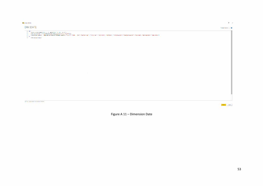
Figure A 11 – Dimension Date

54
Figure A 12 – Dimension Date function

55
Figure A 13 – Dimension Time

56
Figure A 14 – Fact table Onboard Issues

57
Figure A 15 – Fact table Route Planning

58
Figure A 16 – Fact table Onboard Sales

59
Figure A 17 – Fact table Onboard Validations

60
APPENDIX B
Microsoft PowerBI
Dashboards

61
Figure B 1 - Onboard Issues Dashboard

62
Figure B 2 – Onboard Sales - General

63
Figure B 3 – Onboard Sales with Geolocation

64
Figure B 4 – Onboard Validations - General

65
Figure B 5 – Onboard Validations with Geolocation
66
Figure B 6 – Route Planning KM

67
Figure B 7 – Route Planning – Journey

Page | i