Embed Size (px)
Citation preview

Microsoft Tabular Modeling Cookbook
Paulte Braak
Chapter No.10
"Visualizing Data with Power View"

In this package, you will find: A Biography of the author of the book
A preview chapter from the book, Chapter NO.10 "Visualizing Data with Power View"
A synopsis of the book’s content
Information on where to buy this book
About the Author Paulte Braak ( ) is a leading Business Intelligence
Consultant based in Australia. He has been involved in Information Management for over
15 years, with the past 9 years focusing on the Microsoft Business Intelligence stack. His
areas of interest include data modeling, data mining, and visualization. He is an active
participant in the SQL Server community, speaks at various local and international
events, and organizes a regional SQL Server Saturday. His blog can be found at
.
For More Information: www.packtpub.com/sql-server-and-power-pivot-tabular-modeling-
cookbook/book

I would like to thank everyone who has contributed to this book. Like
most projects, there are many behind-the-scenes people who have
assisted me, and I am truly grateful to those people. The book would
never have been complete without your help!
Firstly, I'd like to thank my wife for her understanding and acceptance
during the project when I spent nights and weekends working. I am
sure that my responsibilities at home have decreased (well, they've
been removed), and this has afforded me the time to focus on writing.
I would also like to thank Cathy Dumas for recommending me to
Packt Publishing at the start of the project, and all the reviewers who
have provided their input along the way and looked over my work
with an objective view. I would like to thank the members of the
community who are always willing to participate in events and
forums that help us improve our knowledge.
Finally, I'd like to thank Packt Publishing and all the associated staff
(believe me, there have been quite a few) for the opportunity to write
for them.
For More Information: www.packtpub.com/sql-server-and-power-pivot-tabular-modeling-
cookbook/book
Microsoft Tabular Modeling Cookbook In 2010, Microsoft announced a change to its Business Intelligence environment, and said
it will focus its development efforts on semantic modeling. At that time, the current
technology used for analysis was SQL Server Analysis Server (SSAS), a technology
that relied on disk-based storage and the distinct steps of model development,
deployment, and processing—a function usually under the control of IT. The new
technology will house all its data in memory and allow the user (or model designer) to
change the model in real time and view those changes instantaneously. In addition to this,
the platform sought to remove many of the barriers that had existed in the traditional
Business Intelligence landscape. It offered a uniform platform for data analysis across an
entire organization. The same platform can now be used by an individual user in Excel
deployed to SharePoint (for team Business Intelligence) or directly to a server (for
corporate Business Intelligence). This will remove a large proportion of the rework that
was traditionally involved in Business Intelligence projects and lead to the catchcry "BI
to the masses" (meaning that anyone can model a Business Intelligence solution). A free
add-in was released for Excel 2010, and the 2012 release of Analysis Server (in SQL
Server) included a new storage mode called tabular.
This was an interesting challenge to the traditional methods for implementing Business
Intelligence models. Under that structure, Business Intelligence was essentially controlled
by an IT department, which used a waterfall methodology and there were distinct phases
in an analytical project involving the separation of duties and more importantly, the
separation of people. Those that had to use data models were often involved with a back-
and-forth battle to make the model work as the business user required.
Tabular models were then introduced and overnight Excel users were able to consume
massive amounts of data and create their own analytical models without the need to
involve IT (other than access to the data of course!). The product extended the familiar
pivot table by allowing users to create pivot tables using many different data sources (and
removed the requirements for a pivot table to be sourced from a single data table). More
importantly, the ability to create models for the analysis of data was delivered directly to
those who needed it most—the analytical end user. The restrictions on analysis and data
manipulation that they had previously encountered were removed.
This book is primarily written for those users—individuals who need to answer questions
based on large amounts of data. For this reason, we focus on how these users can use that
technology to build models in Excel using PowerPivot. We simply don't want to exclude
those users who need it the most and do not have access to the more traditional tools
developed for corporate BI. Furthermore, these techniques are also directly applicable to
corporate tabular models.
For More Information: www.packtpub.com/sql-server-and-power-pivot-tabular-modeling-
cookbook/book

Finally, the book looks at how these models can be managed and incorporated into
production environments and corporate systems to provide robust and secure
reporting systems.
What This Book Covers Chapter 1, Getting Started with Excel, covers the basics of the tabular model, that is, how
to get started with modeling and summarizing the data. This chapter includes a basic
overview of how the tabular model works and how the model presents to an end user (we
also look at some general data modeling principles, so that you can better understand the
underlying structure of the datasets that you use). In doing so, we look at the basics of
combining data within the model, calculations, and the control (and formatting) of what
an end user can see.
Chapter 2, Importing Data, examines how different forms of data can be incorporated
and managed within the model. In doing so, we examine some common sources of data
which are used (for example, text fi les) and examine ways that these sources can be
controlled and defined. We also examine some non-traditional sources (for example, data
that is presented in a report).
Chapter 3, Advanced Browsing Features, examines how the model can be structured to
provide an intuitive and desirable user experience. We examine a variety of techniques
that include model properties and configurations, data structures and design styles, which
can be used to control and present data within the model. We also examine how to create
some common analytical features (for example, calculation styles, value bounds, ratios,
and key performance indicators) and how these can be used.
Chapter 4, Time Calculations and Date Functions, explains how time and calendar
calculations are added and used within the model. This chapter looks at defining the
commonly used month-to-date and year-to-date calculations, as well as comparative
calculations (for example, the same period last year). We also look at alternate calendars
(for example, the 445 calendar) running averages and shell calculations.
Chapter 5, Applied Modeling, discusses some advanced modeling functionality and how
the model can be used to manipulate its own data thus presenting new information. For
example, we look at the dynamic generation of bins (that is, the grouping of data),
currency calculations, many-to-many relationships, and stock calculations over time. We
also look at how the model can be used to allocate its own data so that datasets that have
been imported into the model at various levels of aggregation can be presented under a
consistent view.
For More Information: www.packtpub.com/sql-server-and-power-pivot-tabular-modeling-
cookbook/book

Chapter 6, Programmatic Access via Excel, explains how the tabular model can open a
new world of possibilities for analysis in Excel by allowing the creation of interactive
reports and visualizations that combine massive amounts of data. This chapter looks at
how Excel and the tabular model can be used to provide an intuitive reporting
environment through the use of VBA—Visual Basic for Applications is the internal
programming language of Excel.
Chapter 7, Enterprise Design and Features, examines the corporate considerations of the
tabular model design and the additional requirements of the model in that environment.
We look at the various methods of upgrading PowerPivot model, perspectives, and the
application of security.
Chapter 8, Enterprise Management, examines how the model is managed in a corporate
environment (that is on SQL Server Analysis Server). This chapter looks at various
techniques for deploying the tabular model to a SSAS server and the manipulation of
objects once they have been deployed (for example, the addition and reconfiguration of
data sources). We look at the addition of new data to the model through petitions and
the processing of the model data through SQL Server Agent Jobs.
Chapter 9, Querying the Tabular Model with DAX, shows how to query the model using
the language of the tabular model—DAX (Data Analysis Expressions). We look at how
to retrieve data from the model and then go on to combine data from different parts of the
model, create aggregate summaries and calculations, and finally filter data.
Chapter 10, Visualizing Data with Power View, explains how Power View can be used to
analyze data in tabular models. This chapter looks at how to use Power View and how to
configure and design a tabular model for use with Power View.
Appendix, Installing PowerPivot and Sample Databases, shows how to install
PowerPivot in Excel 2010 and install the sample data used in this book.
For More Information: www.packtpub.com/sql-server-and-power-pivot-tabular-modeling-
cookbook/book
10Visualizing Data
with Power View
In this chapter, we will cover:
Creating a Power View report
Creating and manipulating charts
Using tiles (parameters)
Using and showing images
Automating the table fi elds with default fi eld sets
Working with table behavior and card control
Using maps
Using multiples (Trellis Charts)
IntroductionThroughout this book, we have discussed tabular modeling with respect to the models and the client tools that interpret the models and display them to the enduser. Tabular models support MDX-based clients, and therefore, current clients can still be used against tabular models with the same look and feel as they had for multidimensional cubes. Examples of this have been demonstrated in the use of pivot tables, which are shown to the user in a multidimensional format.
For More Information: www.packtpub.com/sql-server-and-power-pivot-tabular-modeling-
cookbook/book
Visualizing Data with Power View
262
However, the tabular model contains some settings that are designed for tabular clients. Exposing these features is the focus of this chapter. Here, we continue with the self-service theme of this book and introduce Power View (based in Excel 2013) as a reporting tool to present information to the enduser. We show how the model can be managed to present information to the user. To this end, the chapter is also an introduction to Power View. Power View has a different approach to traditional reporting. In traditional reporting (tools), the user designs a report (based on a metadata and structure) and then executes (or renders) the report to see the results. In contrast, Power View is designed to be a real-time analysis solution where users interact directly with a canvas. When any change is made to that canvas, the results are immediately refl ected in the report.
Power View is available as a SharePoint (reporting) service or a feature in certain editions of Excel 2013 (Offi ce 365 and Professional Plus).
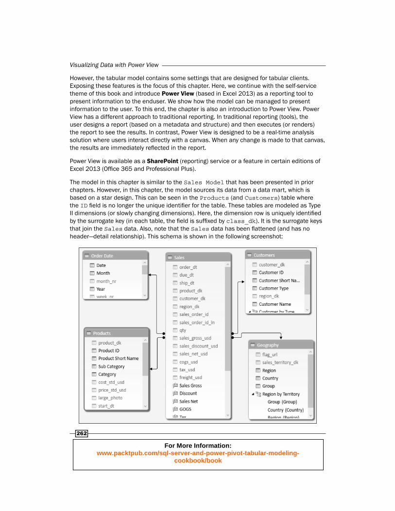
The model in this chapter is similar to the Sales Model that has been presented in prior chapters. However, in this chapter, the model sources its data from a data mart, which is based on a star design. This can be seen in the Products (and Customers) table where the ID fi eld is no longer the unique identifi er for the table. These tables are modeled as Type II dimensions (or slowly changing dimensions). Here, the dimension row is uniquely identifi ed by the surrogate key (in each table, the fi eld is suffi xed by class_dk). It is the surrogate keys that join the Sales data. Also, note that the Sales data has been fl attened (and has no header—detail relationship). This schema is shown in the following screenshot:
For More Information: www.packtpub.com/sql-server-and-power-pivot-tabular-modeling-
cookbook/book
Chapter 10
263
Although there are some subtle changes in the operation of PowerPivot in the Excel 2013 model when compared to the 2010 model (for example, the calculated values are shown with function icons, rather than calculations), the creation of the model and its design is identical to Excel 2010.
Creating a Power View reportThe fi rst recipe examines how to create a Power View report and navigate the reporting surface. Our goal is simple, we have been asked to investigate trends in sales by Product Category, Month, and Country. This is done by creating a grid on the design surface and then manipulating it.
Getting readyThis recipe is based on the PowerPivot model shown above—the model in the workbook (Sales Model 2013.xlsx) is available from the online resources. Once a tabular model has been converted to an Excel 2013 format, the model is no longer compatible with the Excel 2010 add-in (and cannot be opened or used in Excel 2010).
All the tabular modeling features that relate to Power View can be set in Excel 2010 (the same menu paths are used); however, the results are only visible in Excel 2013 (since this is the only version of Excel that has Power View available). An Excel 2010 version of this fi le is also available from the online resources.
The Power View and PowerPivot add-ins may also require activation in Excel 2013 (this needs to be done only once). To check if these add-ins are active (or confi rm if they are available in your version of Excel), perform the following:
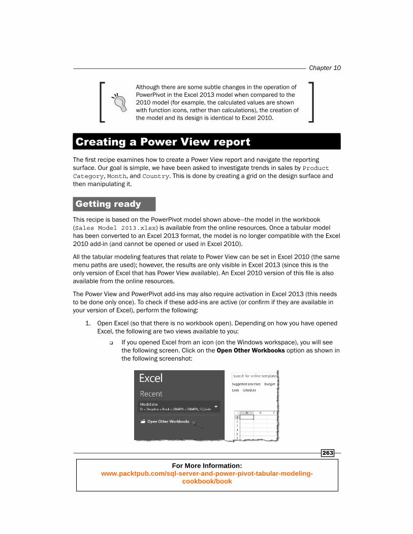
1. Open Excel (so that there is no workbook open). Depending on how you have opened Excel, the following are two views available to you:
If you opened Excel from an icon (on the Windows workspace), you will see the following screen. Click on the Open Other Workbooks option as shown in the following screenshot:
For More Information: www.packtpub.com/sql-server-and-power-pivot-tabular-modeling-
cookbook/book

Visualizing Data with Power View
264
If you closed all the workbooks that you had opened in Excel (and the screen looks like the following), simply click on the FILE option as shown in the following screenshot:
2. Click on Options from the list.
3. Click on Add-Ins from the navigation panel and confi rm that the Power Pivot for Excel add-in and the Power View add-in appears under the Active Application Add-ins (as shown in the following screenshot):
4. If the add-ins do not appear (as active), they have not been activated—they will need to be activated now. Select COM Add-ins from the Manage drop-down list (at the bottom of the window), then click on the GO button.
For More Information: www.packtpub.com/sql-server-and-power-pivot-tabular-modeling-
cookbook/book
Chapter 10
265
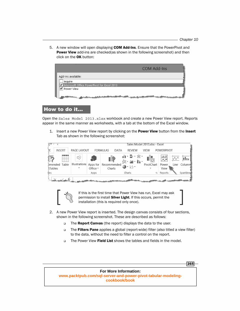
5. A new window will open displaying COM Add-Ins. Ensure that the PowerPivot and Power View add-ins are checked(as shown in the following screenshot) and then click on the OK button:
How to do it…Open the Sales Model 2013.xlsx workbook and create a new Power View report. Reports appear in the same manner as worksheets, with a tab at the bottom of the Excel window.
1. Insert a new Power View report by clicking on the Power View button from the Insert Tab as shown in the following screenshot:
If this is the first time that Power View has run, Excel may ask permission to install Silver Light . If this occurs, permit the installation (this is required only once).
2. A new Power View report is inserted. The design canvas consists of four sections, shown in the following screenshot. These are described as follows:
The Report Canvas (the report) displays the data to the user.
The Filters Pane applies a global (report-wide) filter (also titled a view filter) to the data, without the need to filter a control on the report.
The Power View Field List shows the tables and fields in the model.
For More Information: www.packtpub.com/sql-server-and-power-pivot-tabular-modeling-
cookbook/book

Visualizing Data with Power View
266
The Control Content shows what model fields are used in the active control (that is, the one that is selected on the Report Canvas). The Control Content also allows the user to add and remove fields from the active control and therefore, change the format and appearance of that control (or visualization). The active control is (of course) the control that is selected in the Report Canvas.
It may be helpful to think that anything displaying the data on the Report Canvas is done so through with a control. For example, a grid is a control that groups the data into a single object.
Also, note that the sheet name for the Power View report can be changed just as any Excel sheet—either double-click the name or right-click and select Rename from the pop-up window.
For More Information: www.packtpub.com/sql-server-and-power-pivot-tabular-modeling-
cookbook/book

Chapter 10
267
3. Add a table to the canvas by dragging the Month fi eld from the Order Date table onto the canvas. The months will expand (showing each month of the year). Add the measure Sales Gross (found in the Sales table) to the Reports table (the control) by dragging the fi eld onto the table (when the fi eld hovers over the table, it gets a darker dotted border, as shown in the following screenshot):
4. The table in the canvas has its edges surrounded by a light border. This indicates that the control is active. The control can be deactivated by clicking on any part of the canvas that is not in the control's border area. Activate the table and drag the GOGS measure into the FIELDS section of the Control Content section to add GOGS to the Reports table, as shown in the following screenshot:
5. The active control can be moved and resized by dragging its borders on the canvas. When the mouse hovers over the border boundaries (the gray lines of the border), the mouse pointer changes to an arrow to indicate that the border can be resized. The entire control can be moved when the mouse changes to a hand pointer. Ensure that the control is large enough to cover all the months of the year.
For More Information: www.packtpub.com/sql-server-and-power-pivot-tabular-modeling-
cookbook/book
Visualizing Data with Power View
268
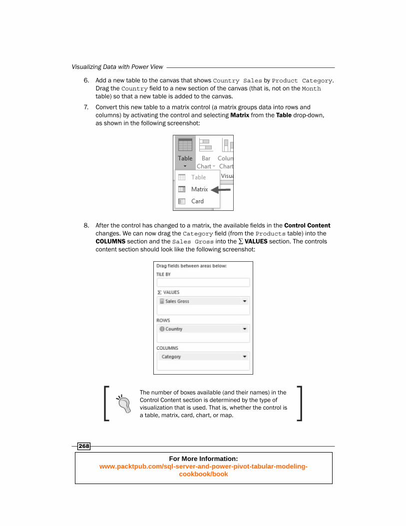
6. Add a new table to the canvas that shows Country Sales by Product Category. Drag the Country fi eld to a new section of the canvas (that is, not on the Month table) so that a new table is added to the canvas.
7. Convert this new table to a matrix control (a matrix groups data into rows and columns) by activating the control and selecting Matrix from the Table drop-down, as shown in the following screenshot:
8. After the control has changed to a matrix, the available fi elds in the Control Content changes. We can now drag the Category fi eld (from the Products table) into the COLUMNS section and the Sales Gross into the ∑ VALUES section. The controls content section should look like the following screenshot:
The number of boxes available (and their names) in the Control Content section is determined by the type of visualization that is used. That is, whether the control is a table, matrix, card, chart, or map.
For More Information: www.packtpub.com/sql-server-and-power-pivot-tabular-modeling-
cookbook/book

Chapter 10
269
9. Resize the control, so that all data fi ts onto the canvas.
10. Name the report by clicking on the grayed heading section (which displays the text Click here to add a title) and name the report Sales Summary by Year.
11. The controls currently show data for all the years in the model. We want to restrict the report to show only specifi c years and want to apply this fi lter to all the controls that are on the canvas. In the Filters pane, click on the VIEW label to apply the fi lter to the entire report (alternatively, you can select any area of the canvas that does not activate a control.). Then, drag the Year fi eld into the Filters section. The section will immediately change and will look like the following screenshot:
12. The fi lter can now be applied to the report by dragging the ends of the slider bar. When this is done, a text description is added to the view (as shown in the following screenshot):
How it works...The addition of controls to the canvas and the application of a (global) fi lter are straightforward and do not require further explanation.
There's more...There are a few additional points that should be included to the recipe concerning the introduction of the report. These are discussed in the following section.
For More Information: www.packtpub.com/sql-server-and-power-pivot-tabular-modeling-
cookbook/book
Visualizing Data with Power View
270
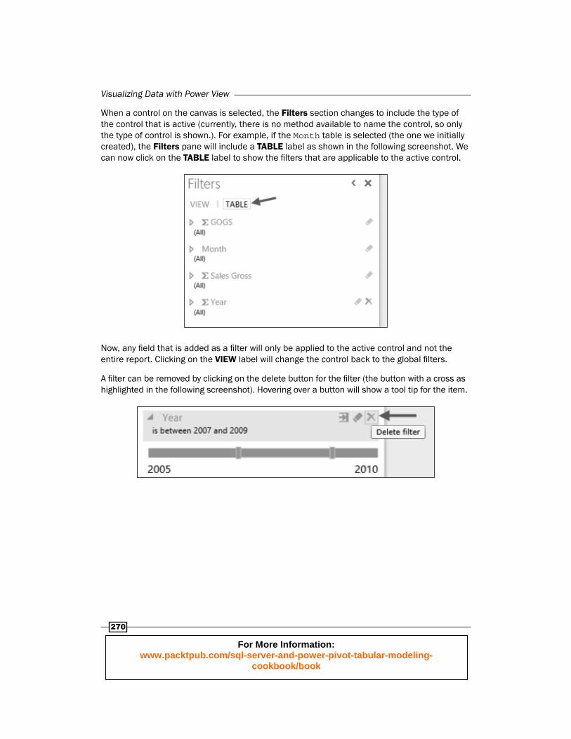
When a control on the canvas is selected, the Filters section changes to include the type of the control that is active (currently, there is no method available to name the control, so only the type of control is shown.). For example, if the Month table is selected (the one we initially created), the Filters pane will include a TABLE label as shown in the following screenshot. We can now click on the TABLE label to show the fi lters that are applicable to the active control.
Now, any fi eld that is added as a fi lter will only be applied to the active control and not the entire report. Clicking on the VIEW label will change the control back to the global fi lters.
A fi lter can be removed by clicking on the delete button for the fi lter (the button with a cross as highlighted in the following screenshot). Hovering over a button will show a tool tip for the item.
For More Information: www.packtpub.com/sql-server-and-power-pivot-tabular-modeling-
cookbook/book

Chapter 10
271
The way that the fi lter is presented in Power View is dependent on the type of data that the fi lter is based on. Since year is a number, Power View expects you to fi lter based on a range. But this need not be the case—you may desire a check-box list or some text based query. Clicking on the fi lter mode will change how the fi lter is presented (and of course, how you interact with it). These choices are shown in the following screenshot:
The controls in Power View work in a similar manner as a pivot table. That is, they hide information when there is no data for the selected view. This can be seen by applying a fi lter to Year for 2010. When this is done, the table control provides a no data message as shown in the following screenshot:
This may be a novel feature for visualization; however, there may be situations where you want to see the range of dimension members available (just like the Show rows with no data feature in a pivot table). To do this (and show all month labels), perform the following steps:
1. Activate the table, so that the Control Content shows the fi elds in the table.
For More Information: www.packtpub.com/sql-server-and-power-pivot-tabular-modeling-
cookbook/book
Visualizing Data with Power View
272
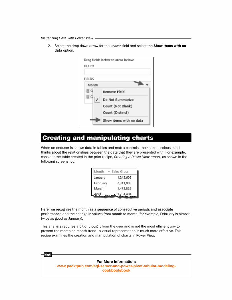
2. Select the drop-down arrow for the Month fi eld and select the Show items with no data option.
Creating and manipulating chartsWhen an enduser is shown data in tables and matrix controls, their subconscious mind thinks about the relationships between the data that they are presented with. For example, consider the table created in the prior recipe, Creating a Power View report, as shown in the following screenshot:
Here, we recognize the month as a sequence of consecutive periods and associate performance and the change in values from month to month (for example, February is almost twice as good as January).
This analysis requires a bit of thought from the user and is not the most effi cient way to present the month-on-month trend—a visual representation is much more effective. This recipe examines the creation and manipulation of charts in Power View.
For More Information: www.packtpub.com/sql-server-and-power-pivot-tabular-modeling-
cookbook/book

Chapter 10
273
Getting readyThis recipe uses the same workbook that was used in the prior recipe (Sales Model 2013.xlsx is available from the online resources). Unlike worksheets, Power View reports cannot be copied with the workbook. They must be created from scratch. Create a new report (titled Charts) and add a table that shows Months and Sales Gross (as in the preceding screenshot).
How to do it…Let's start by converting a table to a chart.
1. Activate the table by selecting any cell in it.
2. Convert the table control to a stacked bar chart by selecting the Stacked Bar option from the Bar Chart button as shown in the following screenshot:
3. When this is done, the control converts to a chart with the same structure as the table (Months on rows), however, the values are now bars of the chart, as can be seen in the following screenshot:
For More Information: www.packtpub.com/sql-server-and-power-pivot-tabular-modeling-
cookbook/book
Visualizing Data with Power View
274
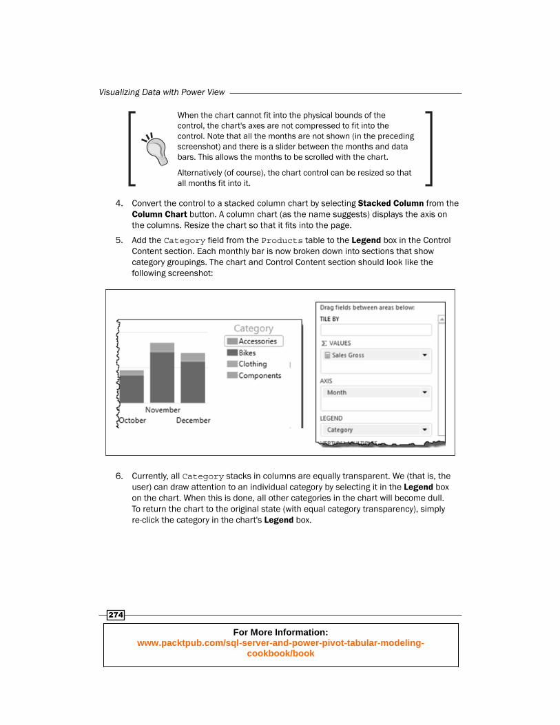
When the chart cannot fit into the physical bounds of the control, the chart's axes are not compressed to fit into the control. Note that all the months are not shown (in the preceding screenshot) and there is a slider between the months and data bars. This allows the months to be scrolled with the chart.
Alternatively (of course), the chart control can be resized so that all months fit into it.
4. Convert the control to a stacked column chart by selecting Stacked Column from the Column Chart button. A column chart (as the name suggests) displays the axis on the columns. Resize the chart so that it fi ts into the page.
5. Add the Category fi eld from the Products table to the Legend box in the Control Content section. Each monthly bar is now broken down into sections that show category groupings. The chart and Control Content section should look like the following screenshot:
6. Currently, all Category stacks in columns are equally transparent. We (that is, the user) can draw attention to an individual category by selecting it in the Legend box on the chart. When this is done, all other categories in the chart will become dull. To return the chart to the original state (with equal category transparency), simply re-click the category in the chart's Legend box.
For More Information: www.packtpub.com/sql-server-and-power-pivot-tabular-modeling-
cookbook/book

Chapter 10
275
7. Convert the chart to a clustered column (chart) by selecting Clustered Column from the Column Chart button. The chart changes so that a data bar is shown for each category by month, as shown in the following screenshot. Individual categories can be emphasized by selecting the category name from the Legend box.
A common use of a stacked chart is to show proportional values within a month. For example, the chart shows how a monthly sales value is broken down by category. However, one flaw of this type of visualization is that the proportions within a month are not comparable between months. A clustered chart is much more suitable for this type of analysis.
8. Hide the title of the chart (which describes the chart as Sales Gross by Month and Category) by selecting the None option from the Title button from the LAYOUT tab, as shown in the following screenshot:
9. Add value labels to the chart by selecting Outside End from the Data Labels button (the Layout tab).
10. Move the Legend box to the bottom of the chart by selecting the Show Legend at Bottom option from the Legend button (the Layout tab).
For More Information: www.packtpub.com/sql-server-and-power-pivot-tabular-modeling-
cookbook/book

Visualizing Data with Power View
276
Using tiles (parameters)Regardless of the reporting tool, the use of parameters is a common feature for allowing user interaction with report data. The typical way that these are implemented is through the population of a control (usually a drop-down list) that allows the user to select a value, and this value dictates what data is seen on the report. When parameters are used, it is often necessary to explicitly defi ne the parameter and its data before it can be used in the report (and subsequent datasets).
Power View does not have parameters in the traditional sense. Instead, the report is based on all of the data within the model. The user can fi lter controls through a special type of control called a tile. The tile lists available values for the fi eld chosen, allowing the user to select a value which is applied to other report controls.
Getting readyThis recipe continues from the Power View report created in the previous recipe, Creating and manipulating charts.
How to do it…Adding a tile can be achieved in a number of ways. In this recipe, we add it to an existing control and then manipulate it.
1. Activate the Reports table so that the Control Content (section) is visible.
2. Drag the Year fi eld (from the table Order Date) into the box labeled TILE BY. The section should look like the following screenshot:
For More Information: www.packtpub.com/sql-server-and-power-pivot-tabular-modeling-
cookbook/book

Chapter 10
277
3. Immediately, the tile is added above the chart. Selecting different years (as shown in the following screenshot) from the tile will change the values:
4. The tile is bound by a blue border (above and below) that covers the area that is applicable to the tile. In the preceding screenshot, we can see the upper bound; the lower bound (which is not shown) is below the chart. Resize the tile control so that it fi lls the canvas. When this happens, the existing chart will also move some of its borders (within the tile's boundary of course).
5. Add a new pie chart to the tile control by dragging the Category fi eld onto the canvas between the tile's boundary lines (that is, place the fi eld under the existing chart).
6. When this is done, a new table will be added to the canvas.
7. Add the Sales Gross measure to the table and convert it to a pie chart by selecting it from the Other Chart button.
8. Resize the pie, so that it is positioned in the center of the page.
9. Select a Category fi eld from the bar chart. Note that the transparency of the segments also changed to refl ect the targeted Category.
10. Change the Year in the tile. Note that the existing (selected) category remains active.
How it works...There is nothing extra to explain here. The tile may be thought of as an additional control that has its own bounds. Any other control placed within those bounds are controlled by the tile.
For More Information: www.packtpub.com/sql-server-and-power-pivot-tabular-modeling-
cookbook/book

Visualizing Data with Power View
278
There's more...There are two positions that the tile can occupy within the canvas. The fi rst (as we have seen) is at the top of the control and is called a Tab Strip. The second is at the bottom with a slightly focused visualization (called a Tile Flow). Change the type by selecting Tile Flow from the Tile Type button as shown in the following screenshot:
Once the previously described steps have been performed, our canvas should now look like the following screenshot:
For More Information: www.packtpub.com/sql-server-and-power-pivot-tabular-modeling-
cookbook/book

Chapter 10
279
Using and showing imagesThere is an old adage that a picture is worth a thousand words. While we can naturally assess data more easily if it is presented in the correct visual format, pictures and images in reports add a style that add recognition to data. Consider the use of KPIs (KPIs were addressed in the Creating and using Key Performance Indicators recipe in Chapter 3, Advanced Browsing Features) that visually display performance. On seeing a set of KPIs, we can immediately assess the position.
Images are an attractive inclusion in reports because they are visually appealing and improve user understanding. This is because an image is immediately identifi able as a symbol—it holds a predetermined meaning for the user.
This recipe looks at what the tabular model requires for displaying data as images in Power View.
Getting readyThis recipe uses the Sales Model 2013.xlsx workbook available from the online content. There is no dependency on prior recipes.
How to do it…The Country table of the model list's sales areas that include a Country fi eld and a Country Flag fi eld. The Country fi eld aggregates regions into countries with the Country Flag, providing a URL image of that country's fl ag.
1. Unhide the Country Flag fi eld from client tools on the Geography table.
2. Observe that the fi eld is actually a fully qualifi ed Uniform Resource Locator (URL) that requests an image (note the .gif extension) as shown in the following screenshot:
For More Information: www.packtpub.com/sql-server-and-power-pivot-tabular-modeling-
cookbook/book
Visualizing Data with Power View
280
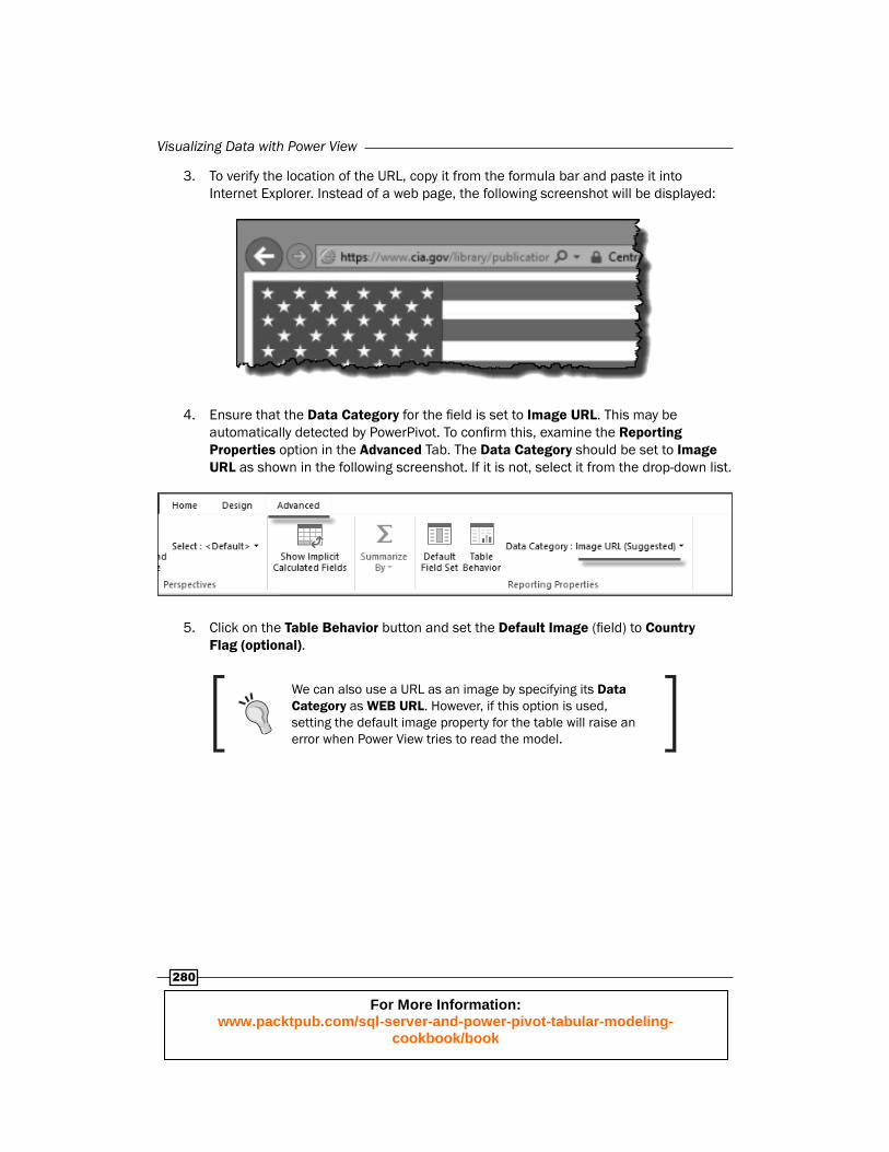
3. To verify the location of the URL, copy it from the formula bar and paste it into Internet Explorer. Instead of a web page, the following screenshot will be displayed:
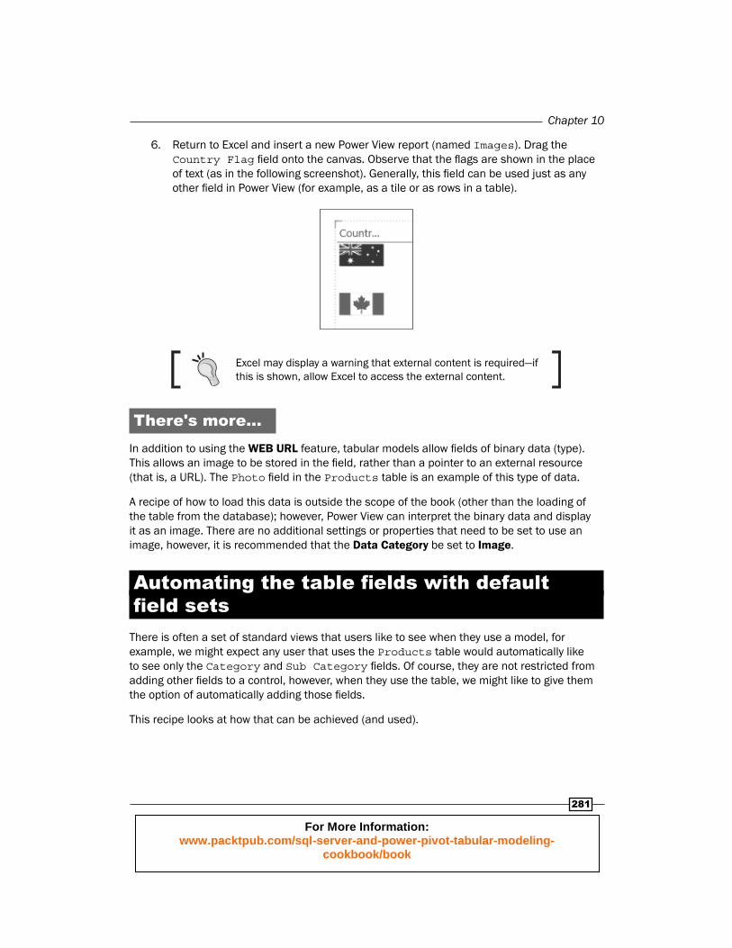
4. Ensure that the Data Category for the fi eld is set to Image URL. This may be automatically detected by PowerPivot. To confi rm this, examine the Reporting Properties option in the Advanced Tab. The Data Category should be set to Image URL as shown in the following screenshot. If it is not, select it from the drop-down list.
5. Click on the Table Behavior button and set the Default Image (fi eld) to Country Flag (optional).
We can also use a URL as an image by specifying its Data Category as WEB URL. However, if this option is used, setting the default image property for the table will raise an error when Power View tries to read the model.
For More Information: www.packtpub.com/sql-server-and-power-pivot-tabular-modeling-
cookbook/book
Chapter 10
281
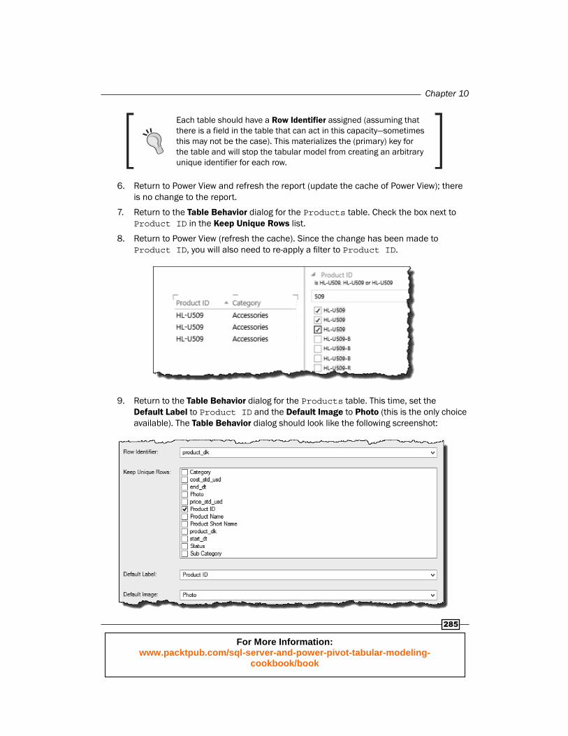
6. Return to Excel and insert a new Power View report (named Images). Drag the Country Flag fi eld onto the canvas. Observe that the fl ags are shown in the place of text (as in the following screenshot). Generally, this fi eld can be used just as any other fi eld in Power View (for example, as a tile or as rows in a table).
Excel may display a warning that external content is required—if this is shown, allow Excel to access the external content.
There's more...In addition to using the WEB URL feature , tabular models allow fi elds of binary data (type). This allows an image to be stored in the fi eld, rather than a pointer to an external resource (that is, a URL). The Photo fi eld in the Products table is an example of this type of data.
A recipe of how to load this data is outside the scope of the book (other than the loading of the table from the database); however, Power View can interpret the binary data and display it as an image. There are no additional settings or properties that need to be set to use an image, however, it is recommended that the Data Category be set to Image.
Automating the table fi elds with default fi eld sets
There is often a set of standard views that users like to see when they use a model, for example, we might expect any user that uses the Products table would automatically like to see only the Category and Sub Category fi elds. Of course, they are not restricted from adding other fi elds to a control, however, when they use the table, we might like to give them the option of automatically adding those fi elds.
This recipe looks at how that can be achieved (and used).
For More Information: www.packtpub.com/sql-server-and-power-pivot-tabular-modeling-
cookbook/book

Visualizing Data with Power View
282
Getting readyThis recipe uses the Sales Model 2013.xlsx workbook available from the online content. There is no dependency on prior recipes.
How to do it…Let's start by examining Power View's behavior before the model is confi gured for this action.
1. Create a new Power View report. Double-click on the Products table (note that nothing happens).
2. Launch the PowerPivot window and activate the Products table.
3. Click the Default Field Set button to launch the Default Field Set dialogue.
4. Add the Category and Sub Category fi elds to the Default fi elds, in order: box by selecting them from the Fields in the table: box and clicking on the Add button as shown in the following screenshot:
You can specify the order in which the fields will be added to the table by specifying the order in the Default fields, in order: box. To change the order, simply highlight the field (in that box) and click on the Move Up or Move Down button.
For More Information: www.packtpub.com/sql-server-and-power-pivot-tabular-modeling-
cookbook/book

Chapter 10
283
5. Close the dialogue by clicking on the OK button.
6. Return to Power View and click on OK to refresh Power View's cache of the data model.
7. Double-click on the Products table. This time, the two fi elds are added to a new table.
You can also use this (double-click) technique to add the default fi elds to an existing control (this does not apply to all controls). Simply ensure that the control is active before you double-click on the table in the Power View fi eld list.
Working with table behavior and card control
PowerPivot is very fl exible for summarizing and aggregating data—most of the time, we want to see that data at an aggregated level and at other times, it may be required at a detailed level. This recipe looks at how to specify table properties so that data is listed distinctively.
Finally, the recipe introduces a Card control that lists data into a distinctive group for display.
Getting readyThis recipe uses the Sales Model 2013.xlsx workbook available from the online content. There is no dependency on prior recipes.
How to do it…This recipe commences on the assumption that there is no table behavior set on the Products table. First, we ensure that any formats from prior recipes are discarded.
1. Launch the PowerPivot window and activate the Products table.
For More Information: www.packtpub.com/sql-server-and-power-pivot-tabular-modeling-
cookbook/book

Visualizing Data with Power View
284
2. Click on the Table Behavior button in the Advanced tab to launch the Table Behavior dialog. Ensure that the table has no behaviors set. It should look like the following screenshot. Click on OK to confi rm the properties.
3. Create a new Power View report using a table control that includes the Product ID, Category, and Sub Category fi elds from the Products table.
4. Add a fi lter to the report so that only product HL-U509 is shown. Drag Product ID to the Filter section, then use a string fi lter for product HL-U509 (searching for product 509 will list similar products to 509). Check the product HL-U509 in the Filter section to check if the details are displayed in one row (as in the following screenshot):
5. Return to the Table Behavior dialogue and set the Row Identifi er fi eld to the product_dk fi eld.
For More Information: www.packtpub.com/sql-server-and-power-pivot-tabular-modeling-
cookbook/book
Chapter 10
285
Each table should have a Row Identifier assigned (assuming that there is a field in the table that can act in this capacity—sometimes this may not be the case). This materializes the (primary) key for the table and will stop the tabular model from creating an arbitrary unique identifier fo r each row.
6. Return to Power View and refresh the report (update the cache of Power View); there is no change to the report.
7. Return to the Table Behavior dialog for the Products table. Check the box next to Product ID in the Keep Unique Rows list.
8. Return to Power View (refresh the cache). Since the change has been made to Product ID, you will also need to re-apply a fi lter to Product ID.
9. Return to the Table Behavior dialog for the Products table. This time, set the Default Label to Product ID and the Default Image to Photo (this is the only choice available). The Table Behavior dialog should look like the following screenshot:
For More Information: www.packtpub.com/sql-server-and-power-pivot-tabular-modeling-
cookbook/book
Visualizing Data with Power View
286
10. Save the changes to the model (by clicking on OK) and return to Power View.
11. Extend the table (control) by adding the Photo fi eld and Gross Sales.
12. Change the table view to a card by selecting Card from the Table drop-down in the Switch Visualization group as shown in the following screenshot:
13. The table control changes to the Card layout. Note the placement and format of the Product ID fi eld in the Card. It has a larger (attention-grabbing) font and is located in the top-left corner of each card, as in the following screenshot:
How it works...The setting of table properties in this recipe is relatively straightforward. Setting a row identifi er explicitly defi nes the unique fi eld for the table.
Once the unique fi eld has been set, the fi elds that require uniqueness can be set—naturally, things must be done in this order. This assigns a one-to-one relationship with the row identifi er, meaning that each Product ID is repeated for each instance of the table's row identifi er.
For More Information: www.packtpub.com/sql-server-and-power-pivot-tabular-modeling-
cookbook/book

Chapter 10
287
Finally, the table's default label is a property which is only applicable to the Card. This specifi es the fi eld that will be used as a label in the Card control. This can be thought of as a unique identifi er for the Card (note duplicates are shown, even though we might not expect that behavior) and the more pronounced formatting.
Setting a default label will force the fi eld to be treated in the same manner as a Keep Unique Rows fl ag and force Product ID to be repeated in a Card (even if the Keep Unique Rows fl ag was not checked).
If you wish to use the Card visualization in Power View, the model needs to be physically structured, so that the Product ID is unique.
Using mapsHumans absorb data more easily if it is presented in a visual format—consider how quickly trends can be assessed when a line chart is used rather than a data table. The same argument applies to maps, where information related to geographic regions is used. The use of maps (or map reports) is an effi cient way to display geography-related information because it adds context to data that would otherwise require thought. For example, imagine a table summarizing the sales by city. When you look at this table, you think about where the city is, and try to make comparisons between the values for each city. This is a lot for the user to do in their subconscious!. To analyze the relationships between cities, a more suitable approach would be to show the data values on a map, so that the user need not think about the location element of their data.
This recipe examines how to confi gure the tabular model for use with maps in Power View.
Getting readyThis recipe uses the Sales Model 2013.xlsx workbook available from the online content. There is no dependency on prior recipes.
How to do it…Let us start by examining fi elds that can be used to refer to geographies.
1. Activate the Customer table in the PowerPivot window.
For More Information: www.packtpub.com/sql-server-and-power-pivot-tabular-modeling-
cookbook/book
Visualizing Data with Power View
288
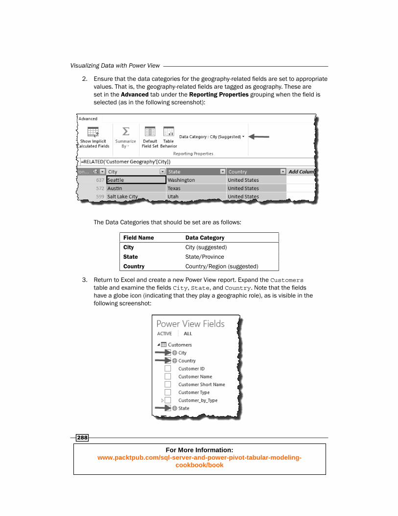
2. Ensure that the data categories for the geography-related fi elds are set to appropriate values. That is, the geography-related fi elds are tagged as geography. These are set in the Advanced tab under the Reporting Properties grouping when the fi eld is selected (as in the following screenshot):
The Data Categories that should be set are as follows:
Field Name Data Category
City City (suggested)
State State/Province
Country Country/Region (suggested)
3. Return to Excel and create a new Power View report. Expand the Customers table and examine the fi elds City, State, and Country. Note that the fi elds have a globe icon (indicating that they play a geographic role), as is visible in the following screenshot:
For More Information: www.packtpub.com/sql-server-and-power-pivot-tabular-modeling-
cookbook/book
Chapter 10
289
4. Create a new table by dragging the City attribute onto the report canvas. Extend the table to include the Sales Gross measure.
5. Convert the table to a map by clicking on the Map button (from the Switch Visualization group).
6. Immediately, the visualization changes. Resize the control so that it fi ts in the entire page.
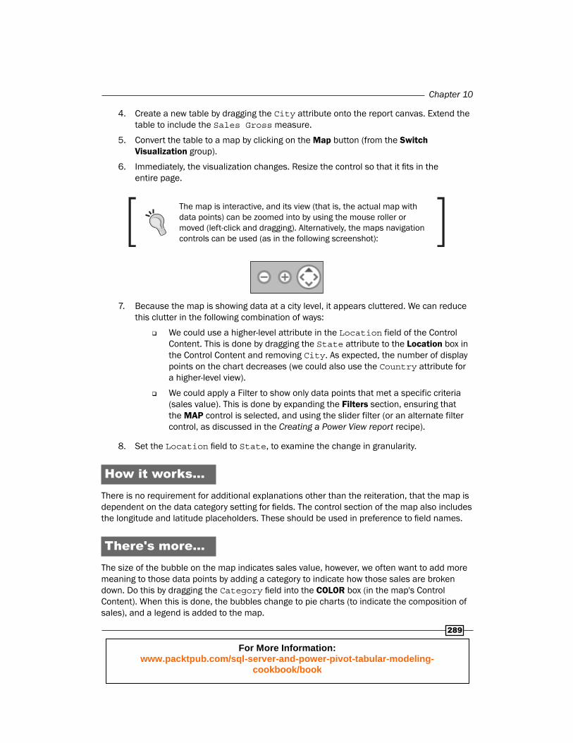
The map is interactive, and its view (that is, the actual map with data points) can be zoomed into by using the mouse roller or moved (left-click and dragging). Alternatively, the maps navigation controls can be used (as in the following screenshot):
7. Because the map is showing data at a city level, it appears cluttered. We can reduce this clutter in the following combination of ways:
We could use a higher-level attribute in the Location field of the Control Content. This is done by dragging the State attribute to the Location box in the Control Content and removing City. As expected, the number of display points on the chart decreases (we could also use the Country attribute for a higher-level view).
We could apply a Filter to show only data points that met a specific criteria (sales value). This is done by expanding the Filters section, ensuring that the MAP control is selected, and using the slider filter (or an alternate filter control, as discussed in the Creating a Power View report recipe).
8. Set the Location fi eld to State, to examine the change in granularity.
How it works...There is no requirement for additional explanations other than the reiteration, that the map is dependent on the data category setting for fi elds. The control section of the map also includes the longitude and latitude placeholders. These should be used in preference to fi eld names.
There's more...The size of the bubble on the map indicates sales value, however, we often want to add more meaning to those data points by adding a category to indicate how those sales are broken down. Do this by dragging the Category fi eld into the COLOR box (in the map's Control Content). When this is done, the bubbles change to pie charts (to indicate the composition of sales), and a legend is added to the map.
For More Information: www.packtpub.com/sql-server-and-power-pivot-tabular-modeling-
cookbook/book

Visualizing Data with Power View
290
The legend is interactive. Selecting an individual entry from the legend will focus on each pie chart's segment in that category. Selecting it again will return the selection to the original state.
Using multiples (Trellis Charts)The use of charts is a common way to understand relationships between data—of course, this is not unique to Power View, but applicable to analytics in general. However, as more data fi elds are added to the chart and the number of fi elds exceeds the axis number of the chart, the chart becomes more complex and diffi cult to read. One solution that has been used to combat this situation, is to reproduce a template chart based on a dimension—for example, we might show various charts with each chart showing data for a specifi c country. When this functionality is included in the charting engine, the output is commonly referred to as trellis charting .
This recipe shows how to implement trellis charting in Power View. This functionality is possible for most Power View charts (including maps).
Getting readyThis recipe uses the Sales Model 2013.xlsx workbook available from the online content. There is no dependency on prior recipes.
How to do it…1. The creation of a Trellis Chart (which is called multiples in Power View) is a
confi guration of the chart control (whether a chart or map). However, this behavior is consistent among all chart types. Create a Clustered Column chart that shows Sales Gross by Category (see the Creating and Manipulating Charts recipe in this chapter for information on how to do this).
It is often preferred to show columns (or bars) in an ordered sequence based on data value (rather than the chart's axis category name). This can be achieved by setting the sort by field of the chart. This option is shown when the mouse hovers over the chart (as in the following screenshot). Set the sort by field to Sales Gross.
For More Information: www.packtpub.com/sql-server-and-power-pivot-tabular-modeling-
cookbook/book
Chapter 10
291
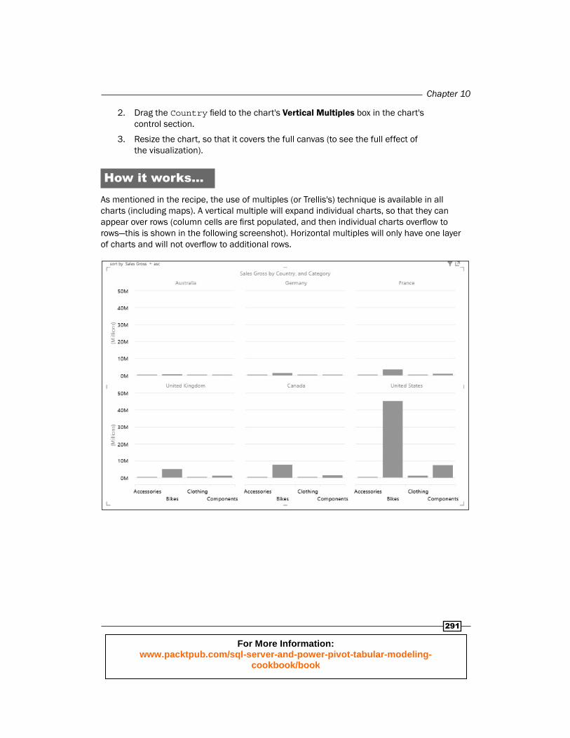
2. Drag the Country fi eld to the chart's Vertical Multiples box in the chart's control section.
3. Resize the chart, so that it covers the full canvas (to see the full effect of the visualization).
How it works...As mentioned in the recipe, the use of multiples (or Trellis's) technique is available in all charts (including maps). A vertical multiple will expand individual charts, so that they can appear over rows (column cells are fi rst populated, and then individual charts overfl ow to rows—this is shown in the following screenshot). Horizontal multiples will only have one layer of charts and will not overfl ow to additional rows.
For More Information: www.packtpub.com/sql-server-and-power-pivot-tabular-modeling-
cookbook/book

Visualizing Data with Power View
292
There's more...Once multiples have been created on a chart, the format of the multiples (that is, the number of charts appearing in each row and column) can be adjusted, so that the Trellis Chart is more visually appealing. This is specifi ed by the Grid Height and Grid Width settings in the LAYOUT tab of Power View (as shown in the following screenshot). Simply set the number of charts to appear in rows (Grid Height) and columns (Grid Width).
For More Information: www.packtpub.com/sql-server-and-power-pivot-tabular-modeling-
cookbook/book

Installing PowerPivot and Sample Databases
In this appendix, we will discuss:
Installing PowerPivot
Creating the database
Installing PowerPivotIn Excel 2010, PowerPivot is an add-in that must be downloaded and installed. In Offi ce 365 Pro and Excel 2013 Pro Plus, the add-in is a part of the default Excel installation setup (which means there is no requirement to install PowerPivot). However, the add-in must be activated before it can be used (see Chapter 10, Visualizing Data with Power View, for details on enabling the add-in in Excel 2013).
The 2010 add-in can be downloaded from the Microsoft download center (free of charge) using the following URL:
http://www.microsoft.com/en-us/download/details.aspx?id=29074
For More Information: www.packtpub.com/sql-server-and-power-pivot-tabular-modeling-
cookbook/book

Installing PowerPivot and Sample Databases
294
Although the installation is relatively straightforward once the installation fi le is obtained, the downloaded fi le must match the installed version of Excel (that is, whether Excel is operating in 32-bit or 64-bit mode). This can be checked by selecting the Help option from the File tab (in Excel), as shown in the following screenshot:
In the About Microsoft Excel section, we can see that this version of Excel is a 64-bit version (and hence, we must install the 64-bit version of PowerPivot).
The download page (from the provided URL) will look like the following screenshot:
When the Download button is clicked, you are prompted to choose the fi le to download, as shown in the following screenshot.
For More Information: www.packtpub.com/sql-server-and-power-pivot-tabular-modeling-
cookbook/book

Appendix
295
The fi le with the name ending with _amd64.msi—the middle one in the following screenshot should be installed for the 64-bit version of Excel and the other fi le (_x86.msi) should be downloaded and installed on systems having the 32-bit version of Excel:
Once the fi le has been downloaded, we can execute it by double-clicking on it, however, Excel must be closed during the installation of PowerPivot. Note that, depending on your user account permissions, you may be prompted to run the installation process as an administrator, or the fi le will change the computer's settings. Run the fi le by simply clicking on the Run button.
For More Information: www.packtpub.com/sql-server-and-power-pivot-tabular-modeling-
cookbook/book
Installing PowerPivot and Sample Databases
296
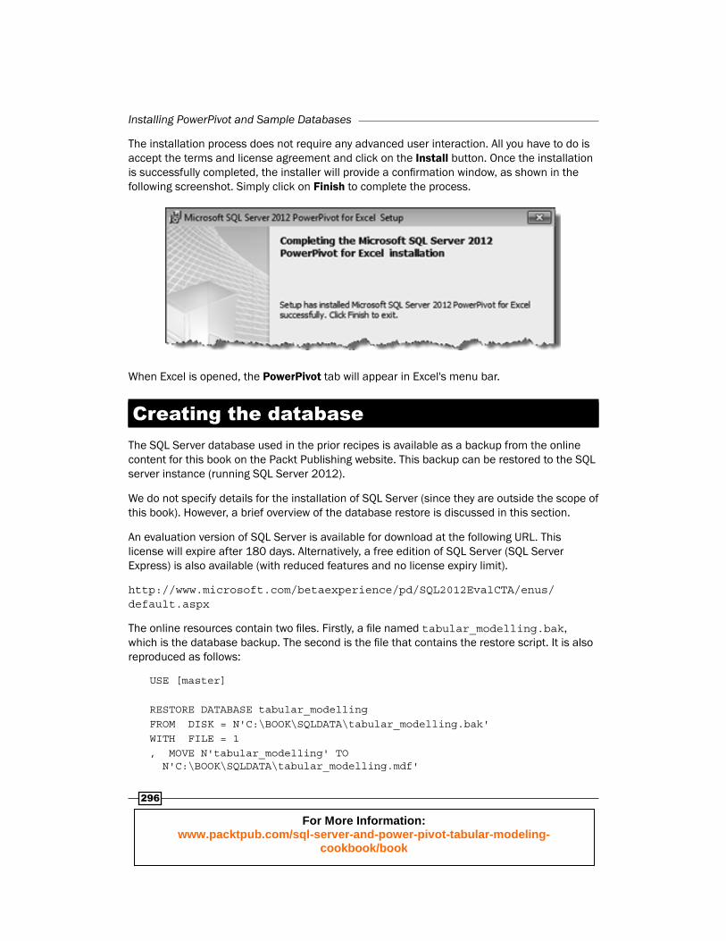
The installation process does not require any advanced user interaction. All you have to do is accept the terms and license agreement and click on the Install button . Once the installation is successfully completed, the installer will provide a confi rmation window, as shown in the following screenshot. Simply click on Finish to complete the process.
When Excel is opened, the PowerPivot tab will appear in Excel's menu bar.
Creating the databaseThe SQL Server database used in the prior recipes is available as a backup from the online content for this book on the Packt Publishing website. This backup can be restored to the SQL server instance (running SQL Server 2012).
We do not specify details for the installation of SQL Server (since they are outside the scope of this book). However, a brief overview of the database restore is discussed in this section.
An evaluation version of SQL Server is available for download at the following URL. This license will expire after 180 days. Alternatively, a free edition of SQL Server (SQL Server Express) is also available (with reduced features and no license expiry limit).
http://www.microsoft.com/betaexperience/pd/SQL2012EvalCTA/enus/default.aspx
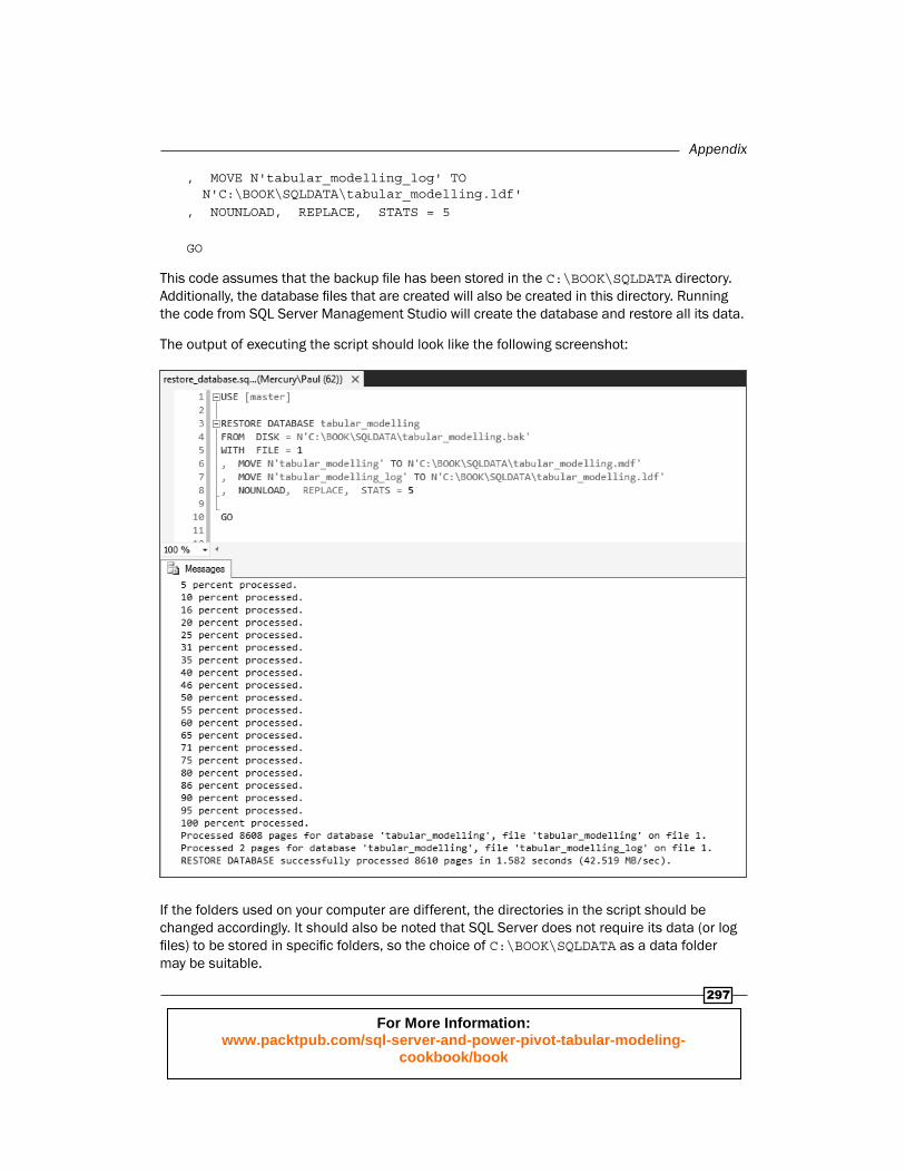
The online resources contain two fi les. Firstly, a fi le named tabular_modelling.bak, which is the database backup. The second is the fi le that contains the restore script. It is also reproduced as follows:
USE [master]
RESTORE DATABASE tabular_modellingFROM DISK = N'C:\BOOK\SQLDATA\tabular_modelling.bak'WITH FILE = 1, MOVE N'tabular_modelling' TO N'C:\BOOK\SQLDATA\tabular_modelling.mdf'
For More Information: www.packtpub.com/sql-server-and-power-pivot-tabular-modeling-
cookbook/book
Appendix
297
, MOVE N'tabular_modelling_log' TO N'C:\BOOK\SQLDATA\tabular_modelling.ldf', NOUNLOAD, REPLACE, STATS = 5
GO
This code assumes that the backup fi le has been stored in the C:\BOOK\SQLDATA directory. Additionally, the database fi les that are created will also be created in this directory. Running the code from SQL Server Management Studio will create the database and restore all its data.
The output of executing the script should look like the following screenshot:
If the folders used on your computer are different, the directories in the script should be changed accordingly. It should also be noted that SQL Server does not require its data (or log fi les) to be stored in specifi c folders, so the choice of C:\BOOK\SQLDATA as a data folder may be suitable.
For More Information: www.packtpub.com/sql-server-and-power-pivot-tabular-modeling-
cookbook/book

Where to buy this book You can buy Microsoft Tabular Modeling Cookbookfrom the Packt Publishing website:
.
Free shipping to the US, UK, Europe and selected Asian countries. For more information, please
read our shipping policy.
Alternatively, you can buy the book from Amazon, BN.com, Computer Manuals and
most internet book retailers.
www.PacktPub.com
For More Information: www.packtpub.com/sql-server-and-power-pivot-tabular-modeling-
cookbook/book