Embed Size (px)
Citation preview

Version 4.0 Method Workbench User’s Guide

MetaCase Document No. MWUG-4.0
Copyright © 2005 by MetaCase Oy. All rights reserved
First Printing, 4th Edition, May 2005.
MetaCase Ylistönmäentie 31 FIN–40500 Jyväskylä Finland Tel: +358 14 4451 400 Fax: +358 14 4451 405 E-mail: [email protected] WWW: www.metacase.com

No part of this manual may be reproduced or transmitted in any form or by any means, electronic or mechanical, including but not limited to photocopying, without express written permission from MetaCase.
You may order additional copies of this manual by contacting MetaCase or your sales representative.
The following trademarks are referred to in this manual: CORBA and XMI are registered trademarks and UML and Unified Modeling Language are trademarks of the Object Management Group. HP and HP-UX are trademarks of Hewlett-Packard Corporation. Linux is a registered trademark of Linus Torvalds. MetaEdit+ is a registered trademark of MetaCase. Microsoft and Windows are registered trademarks of Microsoft Corporation. Motif is a trademark of the Open Software Foundation. Pentium is a trademark of Intel Corporation. Solaris and Sun SPARC are registered trademarks and Java is a trademark of Sun Microsystems. UNIX is a registered trademark of X/OPEN.

Product support
Available to sites with a current maintenance agreement or 90 day limited warranty. If you purchased MetaEdit+ through a distributor, you must contact that distributor for assistance.
For product support please use the following options:
The FAQ pages at www.metacase.com provide answers to the most common questions, and the support pages provide downloadable patches that upgrade your MetaEdit+ environment with new features and corrections.
E-mail: [email protected],
Fax: +358 14 4451 405, or
Telephone: +358 14 4451 401 (6.00–15.00 GMT/UTC)
When you contact our support team please have ready,
Your license number,
Meplus*.err file(s) from your MetaEdit+ directory,
MetaEdit+ version number and patches loaded (use Help | About),
Hardware platform (memory size and disk space),
Operating system and its version,
Network information, if applicable,
Printer information, for printing problems,
Steps that led to the problem, and
Can the problem be reproduced on more than one machine?


Preface
User’s Guide i
Preface
Thank you for purchasing MetaEdit+®, a new generation metaCASE tool. MetaCase sincerely hopes that this tool will offer you the functionality you need for your work.
MetaEdit+ comes in two versions:
MetaEdit+, which is a fully functional CASE environment together with wide modeling language support, documentation reports and code generators. The CASE tool functionality is described in a separate manual ‘MetaEdit+ User’s Guide’ and its additional API components in ‘MetaEdit+ API User’s Guide’.
MetaEdit+ Method Workbench, which offers you metaCASE features allowing you to create CASE tool support for your own methods and generators. This manual describes these features.
In addition, both versions of MetaEdit+ are available for single and multi-user environments. The differences caused by a multi-user environment are explained in this manual, where they affect the normal user. ‘MetaEdit+ System Administrator’s Guide’ explains in more detail how to set up MetaEdit+ for multiple users.
PURPOSE AND ORGANISATION OF MANUAL
This user’s guide provides a thorough introduction to MetaEdit+ Method Workbench as well as an exhaustive reference manual. It covers the complete set of commands, features and concepts needed for building CASE tools with MetaEdit+ Method Workbench.
This manual has five chapters, a glossary and an index:
Chapter 1, Method Engineering with MetaEdit+ Method Workbench, discusses first the basic principles of method engineering and then provides a short introduction to MetaEdit+ as a method engineering tool.
Chapter 2, Conceptual metamodeling tools, describes the elementary metamodeling tools of MetaEdit+ Method Workbench.
Chapter 3, Dialog Editor, covers the tool for customizing property dialogs.
Chapter 4, Symbol Editor, gives a detailed description of the editor used for creating graphical representations for concepts.
Chapter 5, Metamodel management tools, describes the tool set for searching, editing and organizing the elements created by other metamodeling tools.
Glossary of basic terms applied in MetaEdit+ Method Workbench.

Preface
ii MetaEdit+ Method Workbench
Index, containing an alphabetical reference to all MetaEdit+ functions and commands, as well as to some CASE-related concepts discussed throughout the manual.
Together with this ‘MetaEdit+ Method Workbench User’s Guide’, three additional manuals from MetaCase Consulting may be needed:
‘MetaEdit+ User’s Guide’ introduces you to the CASE features of MetaEdit+, and describes how to use them effectively in every-day modeling tasks.
‘MetaEdit+ API User’s Guide’ describes the features of an add-on API product.
‘MetaEdit+ System Administrator’s Guide’ describes tasks related to administration, such as access to the repository, deletion of methods, and creation of new users. It also explains the management of the server and clients in the multi-user version of MetaEdit+.
AUDIENCE
This user’s guide is intended as a reference for MetaEdit+ Method Workbench users, the method engineers. For installation you should have an additional set of instructions.
Please note that in this manual it is assumed that you have a working knowledge of the operating system you use. For an introduction and guidance about your platform and operating system, please see the manuals that came with your system.
RELATED DOCUMENTATION
This document concentrates mainly on the tools of MetaEdit+ Method Workbench and the GOPPRR metamodeling language. Therefore, it has only a limited focus on the general aspects of method engineering and modeling language creation. For more information about these issues, we recommend the following sources:
“Software Product-line Engineering”, Weiss, D., Lai, C. T. R., Addison Wesley Longman, 1999.
“Domain-Specific Application Frameworks: Frameworks Experience by Industry”, Eds. Mohamed E. F., Ralph E. J., Wiley, 1999
"Method Engineering: Principles of Method Construction and Tool Support”, Eds. Brinkkemper S., Lyytinen K., Welke R., Chapman & Hall, 1996.
MetaCase’s web pages at www.metacase.com also provide good pointers for magazine articles, white papers and other resources (follow the ‘Resources’ link to access them).
There are also two tutorials related to the language and modeling environment creation provided by MetaCase as part of your MetaEdit+ distribution. The first one is the ‘Evaluation Tutorial’, which is a walk-through of the creation and use of a small modeling language intended for drawing family trees. You should start familiarizing yourself with MetaEdit+ with this tutorial. The other tutorial, ‘The Watch Example’, is a detailed description of a more complete modeling environment for developing product families of digital wristwatches. The

Preface
User’s Guide iii
motivation of this tutorial is to provide food for thought for experienced practitioners who are about to create such an environment themselves. These tutorials also provide a useful companion for this more tool-oriented manual.
USAGE OF THE MANUAL
Although MetaEdit+ Method Workbench is easy to use, the large number of features may appear overwhelming to new users. This section provides some guidance on how to go about learning MetaEdit+, and how best to use this manual.
GUIDANCE FOR LEARNING
To become familiar with MetaEdit+ Method Workbench:
1) Walk-through the Evaluation tutorial (Family Tree example) to familiarize yourself with the MetaEdit+ environment and its metamodeling and modeling functionality. The material from this tutorial is used extensively as examples throughout this manual.
2) Read Chapters 2 and 6 of ‘MetaEdit+ User’s Guide’ for more information about the basic principles of MetaEdit+.
3) Examine the Watch example to get a full-blooded overview of the possibilities of metamodeling and MetaEdit+ Method Workbench. This material is also used as an example in this manual.
4) Read Chapters 1, 2 and 4 from this manual to learn the usage of those metamodeling tools you need to use the most. These include conceptual modeling tools that are used to create element types and the Symbol Editor that is used to create graphical representations for element types.
5) Read Chapters 3 and 5 to learn to use additional metamodeling tools like the Dialog Editor, Metamodel Browser and Type Manager.
MetaEdit+ Method Workbench is a dynamic product under continual improvement, and there may occasionally be some differences between what is described in the printed manual and what is found in the current version. The latest versions of the manuals are available from MetaCase.
Conventions
Throughout the manual, you will find special notes and comments that point out important features and characteristics of the MetaEdit+ Method Workbench environment. These notes are printed in italics and are marked by an arrow (→) in the left margin. The steps required for performing various functions are indented and numbered: 1), 2), 3) etc.

Preface
iv MetaEdit+ Method Workbench
List dialogs
MetaEdit+ Method Workbench makes extensive use of list dialogs for selecting among elements. To quickly select a known element in the list, simply type the first few letters of that element’s name when the dialog opens. This moves the cursor to the first element whose name begins with those letters. Pressing enter will choose the framed element, closing the dialog. Pressing space selects the framed element, and resets the typed buffer, so you can start typing a different name. You can also double click an element to choose it and close the dialog.
Some dialogs allow multiple selections: use shift-click or shift-space to select a contiguous section of the list, and control-click or control-space to select individual elements. Again, a double click first performs the selection operation (modified by shift or control keys), and then closes the dialog.
The Windows user interface standard prevents resizing of modal dialogs, which can make life difficult if not everything is visible in the default size. To help in such situations, MetaEdit+ Method Workbench includes a triangular resize corner at the bottom right of most dialogs. By clicking and dragging the resize corner, you can resize the dialog window to be larger.

Contents
User’s Guide v
Contents
1 Method engineering with MetaEdit+ Method Workbench .................... 1–1 1.1 Method engineering tools ................................................................1–1 1.2 Important..........................................................................................1–2
2 Conceptual metamodeling tools ............................................................. 2–1 2.1 Object Tool ......................................................................................2–1
2.1.1 Defining new object types.......................................................2–6 2.1.2 Modifying existing object types..............................................2–7
2.2 Relationship Tool.............................................................................2–7 2.3 Role Tool .........................................................................................2–8 2.4 Port Tool ..........................................................................................2–9 2.5 Graph Tool .....................................................................................2–10
2.5.1 Types Tool ............................................................................2–11 2.5.2 Bindings Tool........................................................................2–12 2.5.3 Constraints Tool....................................................................2–14 2.5.4 Subgraph Tools .....................................................................2–17 2.5.5 Defining new graph types .....................................................2–18 2.5.6 Modifying existing graph types ............................................2–19
2.6 Property Tool .................................................................................2–20 2.6.1 Data types..............................................................................2–21 2.6.2 Defining new property types.................................................2–25 2.6.3 Modifying existing property types........................................2–26
3 Dialog Editor.......................................................................................... 3–1 4 Symbol Editor ........................................................................................ 4–1
4.1 Working with the Symbol Editor .....................................................4–1 4.2 Creating symbol elements................................................................4–4
4.2.1 Rectangle.................................................................................4–4 4.2.2 Ellipse .....................................................................................4–7 4.2.3 Line .........................................................................................4–8 4.2.4 Bezier ......................................................................................4–8 4.2.5 Polyline ...................................................................................4–9 4.2.6 Spline ......................................................................................4–9 4.2.7 Text field...............................................................................4–10 4.2.8 Bitmap...................................................................................4–12 4.2.9 Connectable...........................................................................4–12
4.3 Editing symbol elements................................................................4–15 4.3.1 Symbol Editor for Roles .......................................................4–17

Contents
vi MetaEdit+ Method Workbench
5 Metamodel management tools................................................................ 5–1 5.1 Metamodel Browser ........................................................................ 5–1 5.2 Type Manager ................................................................................. 5–3
6 Glossary.................................................................................................. 6–1 7 Index ....................................................................................................... 7–1

Method engineering with MetaEdit+ Method Workbench
User’s Guide 1–1
1 Method engineering with MetaEdit+ Method Workbench
Method engineering is a process in which a new modeling language is defined and implemented. The availability of tool support is often the key success factor for modeling language adoption. Traditionally, building such tool support has been expensive and therefore possible only for large organizations. MetaCASE technology has changed this: with metaCASE tools like MetaEdit+ it is now possible to create the required editing and code generation tool support very quickly and inexpensively, bringing benefits to small and large organizations alike.
The basic requirement for implementing a modeling language with a metaCASE tool is the specification of the language definition. For this purpose, MetaEdit+ uses the GOPPRR metamodeling framework. GOPPRR specifications of the modeling language are made with the metamodeling tools of MetaEdit+ Method Workbench. The metamodels thus made are read by MetaEdit+ to configure itself to provide the support environment for the modeling language.
1.1 METHOD ENGINEERING TOOLS
The modeling language specifications are managed with the MetaEdit+ Method Workbench. Method Workbench provides a simple yet powerful tool suite for creating and modifying language specifications. These method development tools are:
Object Tool for specifying object types like State or Class that are basic components of methods.
Relationship Tool for specifying the connecting components between object types. Examples of these relationship types are Transition between States and inheritance between Classes.
Role Tool for specifying how relationship types are connected to the object types.
Port Tool for specifying additional semantics on how role types are connected to object types.
Graph Tool for managing specifications of whole modeling techniques (e.g. WatchApplication diagram or Class Diagram). Techniques are composed here of Object, Relationship, Role and Port types defined with other tools, and rules defined here on how these can be connected.
Property Tool to create property types, like strings or text fields, used by other method components.

Method engineering with MetaEdit+ Method Workbench
1–2 MetaEdit+ Method Workbench
The following ancillary tools change the way models made with a method can be represented to users, i.e. their symbols, property dialogs and code or report generation.
Symbol Editor to specify and edit the graphical representation of elements in a graph.
Dialog Editor to edit the layout of the dialogs used for editing the properties of design elements.
Report Browser to specify consistency checks, documentation and code generation for a technique. This tool is described in the MetaEdit+ User’s guide (Section 5.1).
In addition to these development tools, there are tools for managing methods and their components.
Metamodel Browser for browsing specifications of techniques by the project they are defined in, showing the types they contain and relations between them.
Type Manager to export method specifications to other MetaEdit+ repositories, and to remove unwanted method specifications.
Info Tool to show information about a given type: which other types it uses, and which types use it.
All of these three sets of tools are also present in the standard version of MetaEdit+. There, however, the first set of tools only allows viewing existing methods, not modification or creation; the other tools may be used freely.
1.2 IMPORTANT
Because changes made to the method definitions also implicitly change the models based on the methods, changing components of a method that is in use can have far-reaching and possibly undesired effects. We have done our best to ensure that no change is possible which would damage old models. However, there are changes that might be desirable in one situation and positively detrimental in another. You should be especially wary of making changes to the predefined methods that were delivered with the MetaEdit+ Method Workbench package, because then you might not be able to use our new versions of the methods. If you want to modify the predefined methods, you could subclass the appropriate components and modify the subclasses.
Because method development also affects existing system descriptions, changing the underlying metamodel on the fly, the method development tools provide very powerful functions for CASE customization. Therefore you should be aware that:
Modifications to types affect all the models that have been made or will be made with all the techniques where the type is used.
The modifications will affect model data on the next access to it. In a multi-user situation, changes to types, like changes to instances, only affect other users after you have committed and they have started a new transaction.
So before any big modification efforts, remember to backup your database! This is particularly important in changes involving adding, moving or removing properties from a type, or changing the data type of a property type.

Method engineering with MetaEdit+ Method Workbench
User’s Guide 1–3
If you are unable to make modifications to methods, check that you are running the Method Workbench version of MetaEdit+, and that your system administrator has included you in the set of users allowed to metamodel. If you are running the multi-user version of MetaEdit+, your system administrator may also have set restrictions about simultaneous metamodelers and modelers, e.g. metamodeling is only allowed when nobody else is logged in (the default), or only one metamodeler (and any number of modelers) is allowed at a time.
Before trying out any of these tools, read these chapters carefully!


Conceptual metamodeling tools
User’s Guide 2–1
2 Conceptual metamodeling tools
Conceptual metamodeling tools allow you to create the atomic method fragments with the GOPPRR metamodeling language. The name GOPPRR is an acronym that stands for the metatypes the language operates on: Graph, Object, Property, Port, Role and Relationship. MetaEdit+ Method Workbench contains a specific tool for creating and maintaining each of these metatypes.
2.1 OBJECT TOOL
The Object Tool provides the functionality to create, view and edit the object types in the system. Examples of these object types are State, Button and Action in WatchApplication diagrams or Class in UML Class Diagram. The Object Tool is described in more detail than the other method engineering tools, because its description covers the features common to all the tools.
To open an Object Tool select Metamodel | Object Tool or press the Object Tool button in the MetaEdit+ Launcher toolbar. As a result, an empty Object Tool window appears (as in Figure 2-1).
Figure 2-1. Object Tool.

Conceptual metamodeling tools
2–2 MetaEdit+ Method Workbench
The Object Tool is basically a form in which the structure of an object type can be defined. This form contains the following fields and related menu commands:
Open
Pressing the Open… button will bring up a list of currently loaded object types. Selecting an object type from the list will show the object type definition in the Object Tool.
The Name field next to the Open button shows the name of the current object type. This field also has a pop-up menu that allows you to open an existing object type (Choose Type…) or create a new one (Make Descendant…, the behavior is similar to the New… button explained below).
New
By default, new object types are sub-typed from the generic Object type. It is also possible, however, to organize individual method components into an inheritance hierarchy. You can build a hierarchy for different kinds of graph types, object types, role types, relationship types and property types. Inheritance is mainly data inheritance, based on the property types in non-property tools (i.e. in Graph Tool, Object Tool, Relationship Tool, and Role Tool) and according to the data type in Property Tool. The new object, relationship, role or port type inherits all of the properties of its ancestor type.
To create a new object type as a subtype of another object type, press the New… button and you will be prompted for the super-type (choose the first type, Object, if you do not want to inherit from an existing type). The name of the ancestor for the current object type will be shown in the read-only Ancestor field next to the New… button.
There is also some inheritance of behavior, e.g. an object can take part in a binding which includes an ancestor of that object’s type (see Section 2.5.2). Similarly a property whose data type is a given non-property type may also contain non-properties whose types are descendants of the given type.
Project
Each method and conceptual method fragment is stored in a certain project in the repository. By default a newly created object type is stored to the current default project. To store it somewhere else, press the Project… button and choose the new project from the list that opens. Please note that you can only choose from those projects that are currently open. The name of the target project is shown in the text field next to the Project… button.
The project can be changed as long as the project button remains enabled. As a type must always be defined or loaded from the repository before its subtype, sub-types of existing types always belong to the same project as their ancestors: otherwise it would be possible to open a project containing a subtype, without having first loaded its super-type.
Properties list
The Properties list shows the defined properties of the object type. For each property the following is shown: the Local name of the property, the type name of the property (Property Name), the Data type of the property and whether the property has unique values (Unique?) within this object type.

Conceptual metamodeling tools
User’s Guide 2–3
The local name of the property is the name that is used for the property within this object type, whereas the property name shows the name of the property type which is used everywhere in the system and shown for example in property sharing dialogs. The data type shows the type of the contents of the property (see Section 2.6.1 for details of data types): it cannot be edited directly from here.
Figure 2-2. Properties list pop-up menu.
The Properties list has a context sensitive pop-up menu (as in Figure 2-2) that is used for defining the properties and also for creating the property dialogs for this object type (see Section 2.6 for the definition of properties and Section 3 for the definition of property dialogs). The Properties list pop-up menu contains the following items — note that depending on various factors not all of them may be available at any given time:
Set as Identifier sets the currently selected property to be the identifier of the object type. The identifier is the property that is shown in all selection dialogs, and which is often unique among the instances of the object type. The choice of identifier can be modified later, but notice that this will have a very visible effect, as the name of the object type’s instances that the user sees will change in many MetaEdit+ tools. The identifying property type is marked in the property list with an asterisk (*) before the local name.
As an alternative to having an identifying property, Set Report Identifier defines a report that is used to generate the identifier for the object type. A separate editor to define the report will be launched when this menu item is selected.
As such reports are normally short, they omit the ‘Report "Report name"’ and ‘EndReport’ keywords. Also, you must avoid using the report id; command on this object during its identifier report: id; will try to output the identifier for this object, which will of course call this same report, leading to an infinite recursion. You can however safely use id; for other objects of this type or others.

Conceptual metamodeling tools
2–4 MetaEdit+ Method Workbench
When the identifier is generated by a report, no asterisk (*) will be shown before any local name in Properties list. If the object type has no identifier at all, the name of the type is returned.
→ As identifiers are calculated to display objects in a textual format in many places in MetaEdit+, errors when running report identifiers are handled by returning the output so far, plus an error message – opening a normal error dialog would be impractical. Infinite recursion when running an identifier report is prevented by a timeout on such reports, returning an error in a similar way.
The Toggle Uniqueness menu item toggles whether values of this property type are unique within this object type. The Unique? field has a value of true or false in it according to this toggle. The default setting for uniqueness is false, and thus normally there can be many objects with the same value in their property fields (unless the property is shared, see Section 6.2.4 in ‘MetaEdit+ User’s Guide’). If this menu item is selected, then the values of this property must be unique within this property type, excepting e.g. empty string fields.
The Local Name… menu item opens a dialog where the local name for the selected property can be given. Usually this can be left the same as the name of the property type, as defined in the Property Tool. If you have used general property names to maximize the possibilities for reuse and want to specialize them here, you can set a different local name here. Users in general see the local name, e.g. in property dialogs. Property sharing uses the type name, as that is the same in all non-properties.
For example you might have a property type called ‘Name’, which you want to use for all object types to allow property sharing between them. You could then use the property in object type ‘State’ in WatchApplication diagrams, giving it the internal name ‘State name’. This would allow you to reuse existing property names anywhere where the ‘Name’ property was used, but still see the familiar ‘State name’ in ‘State’ dialogs.
The Property Definition menu item, or alternatively a double click, opens a Property Tool for the selected property (see Section 2.6 for details on using the Property Tool). The attributes of a property type can be changed in the Property Tool, affecting all types that use that property type.
The Add Property… menu item opens a window containing a list of all the defined property types. Thus if you want to add an existing property type, just select its name from the list and it will be added to the properties of this object type. If you want to define a new property type, select ‘New Property Type’ from the beginning of the property list. This opens a Property Tool where the new property type can be defined. When you generate that new Property type, you will be automatically prompted whether to add it to this Object type.
The Change Property… menu item opens a window containing a list of all property types which have the same data type as the selected one. Thus if you want to change an existing property type, just select it from the properties list, choose Change Property… from the menu, and select the property type with which you want to substitute it.
→ If the property type has not yet been saved (by pressing the Generate/Modify button) the list of properties that can be changed with the selected property type includes all property types.
Move Property… allows you to move the selected property to a different position in the list, altering the order in the default dialog for this object type. Note that inherited property types ⎯ shown with dark red text ⎯ must be moved in the ancestor, and this

Conceptual metamodeling tools
User’s Guide 2–5
change will affect all other descendants. If you want to change the order in only one descendant, you will have to edit the dialog for that type and move the property name and widget manually there.
Remove Property removes the selected property type from this object type. Please note that inherited property types must be deleted from the ancestor, and this change will affect all other descendants. Once the Modify button has been pressed, this action can only be undone by abandoning the transaction; adding the same property type back with the same name will create a new property field, the value of which will be empty in all instances.
Edit Dialog opens a Dialog Editor for the properties of this object type. The default dialog can thus be modified for your needs and taste with this operation. See Section 3 for details.
Default Dialog automatically defines a dialog for this object type. This default dialog contains a label and entry field for each property, arranged vertically in the order in which they appear in the property list. At the bottom of the default dialog are OK, Cancel and Info… buttons.
Description
The Description field shows the textual description of this type. The field should contain the documentation of this type in a form usable as a help text by method users, because this text appears in the help for the method. Basic text formatting (bold etc.) can be applied as in other text fields in MetaEdit+ (see Section 3.3.4 in MetaEdit+ User’s Guide).
Generate/Modify
The Generate/ Modify button saves the changes to the object type. If the object type is new, then the button’s label is Generate, for creating a new object type, but if you are editing an existing object type definition then the button has the label Modify. The button is disabled until the user has changed some field in the Object Tool. Changes to dialogs and symbols are accepted in their respective tools, and thus do not affect the state of this button. In a non-Method Workbench version of MetaEdit+, the button is always disabled.
After pressing Generate/ Modify one of the following messages may appear:
You are not authorized to metamodel!
This means that the current user is not one of the metamodelers set by the system administrator. Contact your system administrator.
Could not obtain the lock for metamodeling for the metatype in project xxx. Lock is held by user xx. Current metamodeling security level is exclusive/single.
This only appears in the multi-user version, and means that someone else is modeling or metamodeling at the same time. If the metamodeling security level is exclusive, then you will have to wait until all other users have logged out, and you have committed or abandoned your transaction, before you can make type changes. If the metamodeling security level is single, then you will have to wait until the other metamodeler has logged out, and you have committed or abandoned your transaction, before you can make changes.

Conceptual metamodeling tools
2–6 MetaEdit+ Method Workbench
Symbol
The Symbol button opens a Symbol Editor where the graphical symbol for the object type can be drawn. Symbols can only be edited for types that already exist, thus this button is not available if the Generate button is active. See Section 4 for details of using the Symbol Editor.
Info
The Info button displays an Info Tool for the type: which types this type uses, and which other types use this type.
Help
The Help button displays help about the Object Tool.
2.1.1 Defining new object types
The Object Tool can be started from various places. To start an empty Object Tool from the MetaEdit+ Launcher select Metamodel | Object Tool or press the Object Tool button in the toolbar. The Object Tool is now ready to define a new object type.
If you want the object type to inherit properties from another type, press the New… button (or select Make Descendant… from the Name field’s pop-up menu) and select the desired ancestor type from the list of available object types.
The process for filling in a new object type is the following:
1) Type the name of the object type into the Name field. Use unique names for the types, because otherwise you might encounter difficulties in selecting the right type from selection lists and dialogs.
2) Select the project for the new object type by pressing the Project button and by selecting it from the list of open projects. If the project you want is not yet open, you can open it from the MetaEdit+ Launcher (Repository | Open Project…).
3) Define the properties of the object type. Property types can be added with Add Property… from the pop-up menu in the Properties list. Select an existing type from the list, or choose ‘New Property Type’ to create and add a new property type. This starts a Property Tool (see Section 2.6). Define the new property type there and press Generate. The newly generated property type will now appear in the Properties list of the Object Tool. You can now close the Property Tool.
4) Document the object type. Describe the object type in the Description field. This is the text that will be shown to the user in the help for the method.
5) Generate the new object type. Press the Generate button to save the definition of the object type. A default dialog for the new object type will be generated automatically at the same time. If, however, you want to modify the default dialog select Edit Dialog from the Property list’s pop-up menu. This operation opens the dialog definition, and you can modify the appearance of the dialog (see Section 3 for details of dialog editing).

Conceptual metamodeling tools
User’s Guide 2–7
6) Define the symbol for the object type. If the object type is to be used in a graphical method, it needs a symbol that will be shown in the Diagram Editor, and optionally in the Matrix Editor (If no symbol is defined, a simple square is used as a default). The symbol can be defined by pressing the Symbol button at the bottom of the Object Tool. The button opens a Symbol Editor where the new symbol can be drawn. See Section 4 for details of using the Symbol Editor.
2.1.2 Modifying existing object types
To open the specification of an existing object and thus fetch its data into an empty Object Tool:
1a) If you have an Object Tool open already, press the Open… button (or select Choose Type… from the pop-up menu for the Name field) and select the desired object type from the list.
1b) To open an Object Tool for a given object type you can select that type from the Metamodel Browser, Type Browser or Graph Tool lists of object types, and double click it. Alternatively you can choose Edit Type from the list’s pop-up menu.
The Object Tool supports all the basic functionality needed for maintaining object types: you can now add new properties, change local names, or even substitute old property types with new ones, through the right button pop-up menu in the properties list.
You can also change the name of the object type: note that the change of the type name affects all places where this object type is used (i.e. to create models, generate code, or document the project with reports). The description, dialog and symbol of the type can also be modified.
2) Press the Modify button after performing the modifications to save the changes to the object type.
Important notice! Before pressing modify and at least before committing the transaction, be sure to know that you want the modifications to take place, because they affect all the models, where this object type is used. Be especially careful about changing the types that were delivered with MetaEdit+ system, because if you modify them, we cannot guarantee that you can use later upgrades to these methods. If you want to modify the existing methods, you could make descendants of the method types instead of changing the types themselves.
2.2 RELATIONSHIP TOOL
The Relationship Tool works similarly to the Object Tool. Its appearance (Figure 2-3) and functions are similar with the obvious exception that it is used only for viewing and editing specifications of relationship types. Examples of relationship types are Transition in WatchApplication diagrams, or Inheritance in UML Class Diagram.

Conceptual metamodeling tools
2–8 MetaEdit+ Method Workbench
Figure 2-3. Relationship Tool.
The fields in the Relationship Tool are the same as the Object Tool. Relationships can have properties and the arrangement of the property dialog can be modified as in the Object Tool. Relationship types can have symbols as well. If no symbol is defined, relationships have no visible component in Diagram and Matrix Editors, just the simple default line (actually defined as part of the Role symbol).
Note that the rules about which objects can be connected by which relationships are not part of the relationship type, but rather are defined by bindings and constraints in the Graph type (see Section 0).
2.3 ROLE TOOL
The Role Tool is used to specify the components that lie at the end of a relationship connected to an object. For example, for the Transition relationship in WatchApplication diagrams we can identify two role types: From and To, or for an Inheritance relationship type in UML Class Diagrams there could be Superclass and Subclass role types.
Roles can have properties of their own, and also symbols. For example, a role in the Association relationship in UML Class Diagrams has a property Cardinality. In a WatchApplication diagram the role To has a symbol as well: the solid line with an arrow head — note that Role symbols also specify the width and color of the line from the object to the relationship. If no symbol is defined, a simple black line with width 1 is used.

Conceptual metamodeling tools
User’s Guide 2–9
Figure 2-4. Role Tool.
2.4 PORT TOOL
The Port Tool is used to define ports that can be used as part of object symbols, and to which roles will attach. Ports allow additional semantics or constraints on how objects can be connected. For example, we can set a requirement for the Family Tree diagram that all parental relationships must connect to the top edge of the Person symbol and all child relationships to its bottom edge.
Ports can also have their own properties, which are used primarily to set port-related constraints (see Section 2.5.3). Ports do not have symbols of their own, but they are visualized by Connectables in object type symbols (for more information about Connectables, see Section 4.2.9).

Conceptual metamodeling tools
2–10 MetaEdit+ Method Workbench
Figure 2-5. Port Tool.
2.5 GRAPH TOOL
The Graph Tool provides the functionality to access, view and modify method specifications at the graph level (e.g. specifications of the Family Tree diagram technique and its elements). From this tool you can also open the other method development tools on a graph type’s components, e.g. open an Object Tool on an object type used in this graph type.
To open a Graph Tool select Metamodel | Graph Tool or press the Graph Tool button in the MetaEdit+ Launcher toolbar. As a result, a Graph Tool window opens. The Graph Tool window includes the same fields as the other tools, thus the basic definition of a graph type consists of defining its name, ancestor, project, properties and description.

Conceptual metamodeling tools
User’s Guide 2–11
Figure 2-6. Graph Tool.
The difference between the Graph Tool and other method development tools (Object, Relationship, and Role tools) is that where the others handle individual components of a method, the graph tool connects these pieces together to form the modeling technique. The components are managed by the various sub-windows that can be opened from the buttons at the bottom of the Graph Tool window.
The Report button opens a Report Browser, described in the User’s Guide (Section 5.1.4), on the report definitions of this Graph type. The other buttons and the tools they open are described in the following.
2.5.1 Types Tool
The Types button opens a Types Tool, which is used to select the Object, Relationship and Role types of the method. The Types Tool has three lists (see Figure 2-7), Relationship, Role and Object lists, each containing items of that type in this graph type. Each list has a menu, which allows you to Add… a new type or Delete the selected type from the graph type. You can also open the appropriate tool for the selected type by double clicking the type, or by selecting Edit Type from the pop-up menu.

Conceptual metamodeling tools
2–12 MetaEdit+ Method Workbench
Figure 2-7. Defining components of the graph.
The types specified here have two functions: firstly, they determine what types are visible in the Types menu and Toolbar of editors. Secondly, while the Types Tool allows you to add any type from any open project, in the Bindings Tool (described below), you can add only those types selected with the Types Tool: this makes the selection dialogs shorter, making defining bindings, constraints, decompositions and explosions easier.
It is, however, possible to have types in bindings that are not in the Types Tool list: add the type in the Types Tool list, add it in a binding, and then remove it from the Types Tool list — it will still remain in the binding. This is particularly useful when you have abstract supertypes: include these in the types list while you use it in definitions of bindings etc., then remove it from the types list to ensure that it does not appear in the toolbar in editors.
2.5.2 Bindings Tool
To specify how the relationships, roles, ports and objects are connected to each other press the Bindings button in the Graph Tool. A window opens showing how the components of the technique are bound together. The tool interface is similar to the Types Tool, but it shows the bindings of the method, each binding showing a possible way of connecting certain object types with role types and relationship types.
Figure 2-8. Specifying bindings.

Conceptual metamodeling tools
User’s Guide 2–13
A binding consists of a relationship type, normally two role types, and for each of these role types a list of object types that may participate in the relationship in that role. The binding is defined by first adding a relationship type to the relations window, selecting that relationship and adding role types for it (usually two for a binary relationship), selecting one of the role types and adding the object types that can take part in this relationship in that role.
If the use of ports is required, a suitable port instance or type is chosen between the role and object. Choosing a port instance requires that specific instance to be in the symbol of the object type; choosing a port type requires any instance of that type. In either case, when creating an instance binding in an editor, the user must attach the role to a matching port in the object.
If no bindings are defined, the default behavior is that no relationships can be created, as there is no way of knowing which role types should be associated with which relationship types. Thus we must define bindings that allow all the relationship-role-object type combinations we want, without allowing any combinations that should be illegal. Note that it is possible to define multiple bindings for each relationship type, and similarly role types and object types may participate in as many bindings as you wish. Types may also participate in several different graph types, with different bindings in each.
The members of a binding are selected from the available types currently in that graph type, defined in the Types Tool (Section 2.5.1). It is, however, possible to add an abstract supertype into the object types for a graph type, add it in a binding, and then remove it from the available types. In this way all subtypes of that supertype are legal in the binding, but instances of the supertype itself cannot be created into graphs of this type, nor is the supertype visible in the Toolbar for graphs of this type. In some exceptional circumstances it may be desirable to specify the supertype of all object types, Object: you can do this by selecting Add… with shift held down, and Object will then be included in the list of types to select from. Note that relationships or roles are always created to be instances of the exact type specified in the bindings.
In the Binding Tool the three lists are chained together, so that a binding is selected by selecting its relationship type in the relationship list. This then changes the contents of the roles list to show the role types used in that binding. We can then select a role type, and that will show us the object types that can participate in that role in that binding.
Role type order
The order of the role types is important for each relationship type, because a user preference allows MetaEdit+’s tools to assume when drawing relationships that the object for the first role is always selected first, that for the second role is selected second etc. Hence you should try to select as the first role type in each binding the type which is most likely to be at the ‘starting’ end of the relationship. You can change the order of role types by choosing Move… from the pop-up menu related to the role types:
1) Select first the role type to be moved.
2) Choose Move… from the menu.
3) Choose the right place for the role type from the list that opens.

Conceptual metamodeling tools
2–14 MetaEdit+ Method Workbench
Role type cardinalities
Another difference between the user interfaces of the Types Tool and Binding Tool is that in the Binding Tool the role list can show cardinalities for each role type in a binding. The cardinality is a range with minimum and maximum values and it defines how many times this role type with its object types can appear in a single binding. An example of cardinality is the Child role in the Family relationship in Family Tree diagrams: as there can be zero to many children in a family, the cardinality for this role should be 0..N.
Cardinalities are set in the Cardinality Dialog, which is shown in Figure 2-9 below.
To set cardinalities:
1) Select the role for which to add a cardinality constraint.
2) Choose Cardinality… from the pop-up menu.
3) Enter minimum and maximum cardinality values and press OK.
The values can be from 0 to infinite, which is entered and shown as an N. If no cardinality is defined, the default is one for minimum and one for maximum, i.e. an obligatory role that can occur only once. If the upper limit is infinite set the maximum to N. You can of course also add the same role twice in the same binding; in general using cardinalities is a better way.
Figure 2-9. Cardinality Dialog.
2.5.3 Constraints Tool
In addition to the rules given in bindings and their role cardinalities, it is possible to define additional constraints on relationship, role, port and object combinations.
To specify the constraints, press the Constraints button in the graph tool. A window opens showing the constraint definitions of this graph type (Figure 2-10).

Conceptual metamodeling tools
User’s Guide 2–15
Figure 2-10. Constraint definitions.
Constraints can be either on object Connectivity, or on the Ports involved in the binding. To create a Connectivity constraint, press Connectivity or select Add Connectivity Constraint… from the Constraints Definer pop-up menu. To create a Port constraint, press Ports or select Add Port Constraint… from the pop-up menu.
To edit an exiting constraint, double-click it in the list of constraints (or select it and press the Edit button). To delete a constraint, select it and press Delete. Edit… and Delete commands are also available in the Constraint Definer’s pop-up menu.
Connectivity constraints
A connectivity constraint is defined for an object type, and limits how many times each instance can take part in a given type of role or relationship. An example of a constraint with a role type is the definition of the Family relationship in Family Tree diagrams. It defines that each Person can be in only one Child role (i.e. each Person can be a Child of only one set of parents). An example of a relationship connectivity constraint would be that a Process in a Data Flow Diagram could be connected to at most 10 Data Flows: a common rule to prevent overly complicated diagrams.
A connectivity constraint applies only within a single graph of this graph type. Hence, an object may be in more than the specified number of roles or relationships in total over the whole repository, e.g. a Person can be in one Parent role in one graph, and another Parent role in another graph.
Conceptual metamodeling tools
2–16 MetaEdit+ Method Workbench
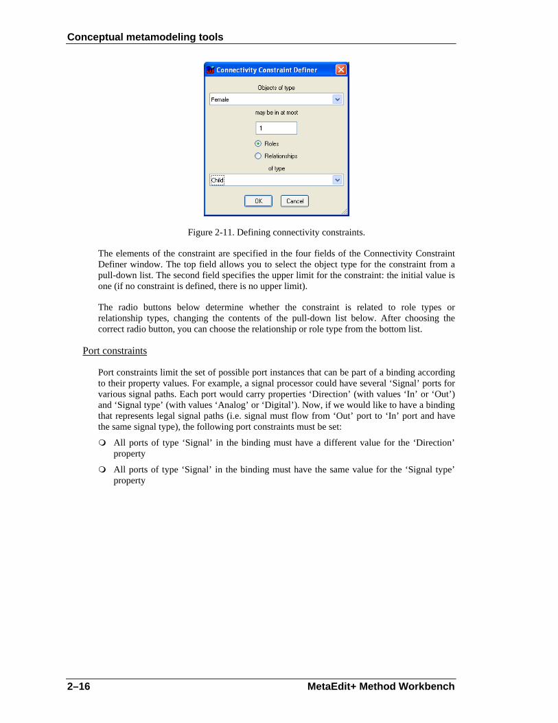
Figure 2-11. Defining connectivity constraints.
The elements of the constraint are specified in the four fields of the Connectivity Constraint Definer window. The top field allows you to select the object type for the constraint from a pull-down list. The second field specifies the upper limit for the constraint: the initial value is one (if no constraint is defined, there is no upper limit).
The radio buttons below determine whether the constraint is related to role types or relationship types, changing the contents of the pull-down list below. After choosing the correct radio button, you can choose the relationship or role type from the bottom list.
Port constraints
Port constraints limit the set of possible port instances that can be part of a binding according to their property values. For example, a signal processor could have several ‘Signal’ ports for various signal paths. Each port would carry properties ‘Direction’ (with values ‘In’ or ‘Out’) and ‘Signal type’ (with values ‘Analog’ or ‘Digital’). Now, if we would like to have a binding that represents legal signal paths (i.e. signal must flow from ‘Out’ port to ‘In’ port and have the same signal type), the following port constraints must be set:
All ports of type ‘Signal’ in the binding must have a different value for the ‘Direction’ property
All ports of type ‘Signal’ in the binding must have the same value for the ‘Signal type’ property
Conceptual metamodeling tools
User’s Guide 2–17
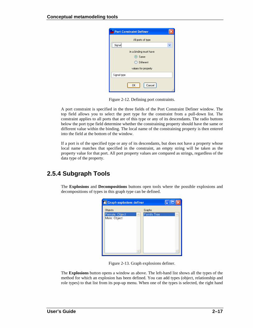
Figure 2-12. Defining port constraints.
A port constraint is specified in the three fields of the Port Constraint Definer window. The top field allows you to select the port type for the constraint from a pull-down list. The constraint applies to all ports that are of this type or any of its descendants. The radio buttons below the port type field determine whether the constraining property should have the same or different value within the binding. The local name of the constraining property is then entered into the field at the bottom of the window.
If a port is of the specified type or any of its descendants, but does not have a property whose local name matches that specified in the constraint, an empty string will be taken as the property value for that port. All port property values are compared as strings, regardless of the data type of the property.
2.5.4 Subgraph Tools
The Explosions and Decompositions buttons open tools where the possible explosions and decompositions of types in this graph type can be defined.
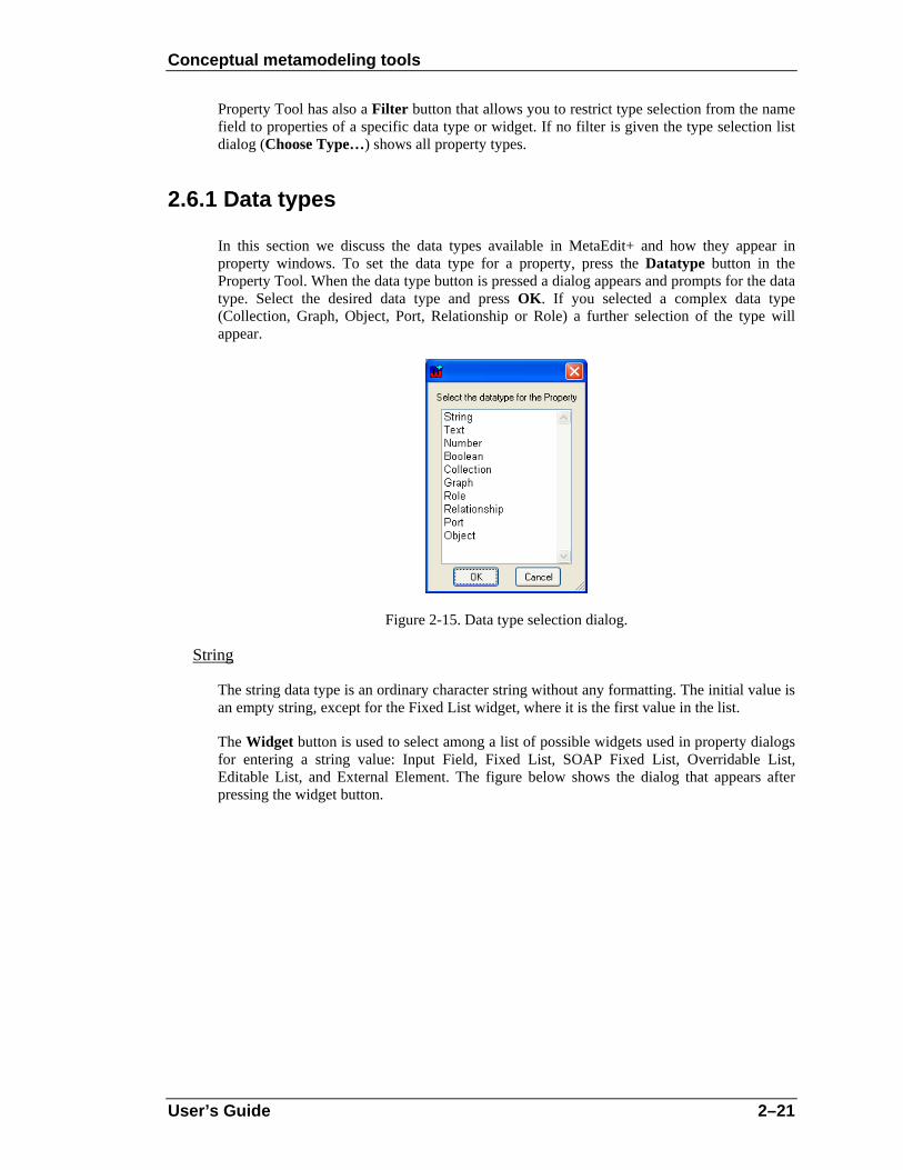
Figure 2-13. Graph explosions definer.
The Explosions button opens a window as above. The left-hand list shows all the types of the method for which an explosion has been defined. You can add types (object, relationship and role types) to that list from its pop-up menu. When one of the types is selected, the right hand

Conceptual metamodeling tools
2–18 MetaEdit+ Method Workbench
list shows the graph types to which that type can explode. New explosions can be added and old ones deleted for the selected type by selecting the appropriate item from the right hand list’s pop-up menu. The Add… menu item presents a list of all available graph types, from which one or several can be selected. Note that selecting a Graph type also allows instances of subtypes of that Graph type to be targets of explosion links. In some exceptional circumstances it may be desirable to specify the super-type of all graph types, Graph: you can do this by selecting Add… with shift held down, and Graph will then be included in the list of types to select from.
Basically, the explosion structure allows you to select one instance from the graph and explode that to a new graph. An instance can have many explosions in a single graph, and a different set of explosions in each graph where it is used.
Explosion is often used between graphs from different methods. A typical example of explosion can be found from UML, in which a class in a Class Diagram can be exploded into a State Transition Diagram to describe the behavior of the object.
The decomposition definition works in the same way as the explosion definition, but the source of the decomposition can only be an object type. Decomposition forms another way to connect elements of a graph to other graphs. The difference from explosion is that explosion creates a simpler link between an element and a graph whereas decomposition also handles the relationships attached to the element. Unlike decomposition, explosion allows you to make links from a design element to several graphs, and different links for the same element used in different graphs, whereas an object can have only one decomposition, which is the same wherever that object is used.
All decomposition structures are defined in Graph Tool and they are always dependent both on the object type and graph type. On the instance level, however, things work a little differently: a given instance State always decomposes to the same graph, wherever it is. Thus the type level defines where it is legal to create new decomposition structures: existing decomposition links are part of the object, and can be followed anywhere.
A typical decomposition structure can be found from WatchApplication diagrams, in which a State can decompose into a new WatchApplication model. Note that on the instance level only one decomposition is allowed for an object, and applied in all graphs containing that object. On the type level, each object type in a graph type can have several possible graph types that it could legally decompose to.
2.5.5 Defining new graph types
To start an empty Graph Tool, select Metamodel | Graph Tool or the Graph Tool button in the MetaEdit+ Launcher toolbar. Now the Graph Tool is ready for accepting the definition of a new graph type.
If you want the graph type to inherit properties from another type than from the current ancestor, either press New… or select Make Descendant… from the pop-up menu of the name field and select the ancestor type from the list of available graph types. In addition to inheriting properties, new Graph types also receive a copy of the type, binding and constraint sets of their super-type. These sets are not truly inherited, but simply copied as initial values for the subtype.

Conceptual metamodeling tools
User’s Guide 2–19
To fill in a new Graph type:
1) Give the name of the graph type in the Name field next to the Open button. Use unique names, because otherwise you might encounter difficulties in selecting the right graph type (i.e. selection lists and dialogs have several methods with the same name).
2) Select the project for the new graph type by pressing the Project button and by selecting it from the list of loaded projects. If the project you want is not in the list, you must first open it from the Launcher with Repository | Open Project….
3) Define the properties of the graph type (see the Section 2.1.1 on the Object Tool for details).
4) Generate the new graph type. Press the Generate button to save the definition of the graph type. This will also generate a default dialog for the graph type. If you want to modify the default dialog select Edit Dialog from the Property list pop-up menu. This operation opens the dialog definition, and you can modify the appearance of the dialog (see Section 3 for details).
5) Define the object, relationship and role types to be used in this graph type. Press the Types button and in the Types Tool use the Add… menu item from each list’s pop-up menu and select the appropriate types to be included in this method.
6) Define the bindings of object, relationship and role types. Press the Bindings button and in the Binding Tool that opens select Add… from the relationship list pop-up menu, and select the appropriate relationship types from the dialog. Each relationship type you selected now has a (partially empty) binding. For each binding add the appropriate role types with Add… in the role list. If necessary, give cardinalities for those role types in this binding. For each of the role types add the ports and object types that can be in this role in this binding. Notice that the selection lists in each of the relationship, role, port and object list are much shorter than in the Types Tool, because only the types selected for this method are available here.
7) Specify the possible connectivity and port constraints. Press the Constraints button to open the Constraints Definer. To add connectivity constraints, press the Connectivity button and to add port constraints, press the Port button.
8) Define the explosions and decompositions of the types in this graph type. Press the Explosions and Decompositions buttons and add for each type the graph types to which it can explode or decompose.
9) Document the graph type. Describe the graph type in the Description field.
10) Press the Modify button to accept the changes. (You can also omit steps 3 and 4 and press Generate now: if you did this, the graph type you are creating is of course not available to decompose or explode to in step 8).
2.5.6 Modifying existing graph types
To open the specification of a graph type, press Open… (or select Choose Type… from the Name field’s pop-up menu).
To view the components that belong to the graph definition, press the Types button in the Graph Tool. As a result, a dialog appears (cf. Figure 2-7) showing three lists that include all the object, relationship and role types of the current graph type.

Conceptual metamodeling tools
2–20 MetaEdit+ Method Workbench
Types can be added, deleted or edited by selecting the type and choosing the appropriate operation from the pop-up menu. The changes are not destructive: if you delete a type, then any instances of that type that are already in existing graphs will remain intact; but new ones cannot be added.
To specify how the relations, roles, ports and objects are connected to each other press the Bindings button. The components of bindings can be added, removed and edited. As with the types, the removal of types from bindings does not destroy existing bindings in graphs, but new bindings must be legal according to the new definition.
2.6 PROPERTY TOOL
All other types (graphs, objects, ports, roles and relationships) have properties that specify what information can be attached to them. The Property Tool is a tool for creating and modifying these properties. The Property Tool can be opened by selecting Metamodel | Property Tool in the MetaEdit+ Launcher, by pressing the Property Tool button in the launcher toolbar, or by adding and viewing property definitions in other metamodeling tools.
Figure 2-14. Property Tool.
Figure 2-14 shows a Property Tool. The structure of the window is similar to that in the Object Tool. The main difference between other tools and the Property Tool is that in place of a property list this tool has a Datatype button, which enables the selection of the type of the contents of the property. The data types are discussed in more detail in the next section. The Widget button and the field next to it are enabled only for string properties and define how the string field will appear in property windows. With string and number data types you can enter a default value for the property in the Default Value field.
Conceptual metamodeling tools
User’s Guide 2–21
Property Tool has also a Filter button that allows you to restrict type selection from the name field to properties of a specific data type or widget. If no filter is given the type selection list dialog (Choose Type…) shows all property types.
2.6.1 Data types
In this section we discuss the data types available in MetaEdit+ and how they appear in property windows. To set the data type for a property, press the Datatype button in the Property Tool. When the data type button is pressed a dialog appears and prompts for the data type. Select the desired data type and press OK. If you selected a complex data type (Collection, Graph, Object, Port, Relationship or Role) a further selection of the type will appear.
Figure 2-15. Data type selection dialog.
String
The string data type is an ordinary character string without any formatting. The initial value is an empty string, except for the Fixed List widget, where it is the first value in the list.
The Widget button is used to select among a list of possible widgets used in property dialogs for entering a string value: Input Field, Fixed List, SOAP Fixed List, Overridable List, Editable List, and External Element. The figure below shows the dialog that appears after pressing the widget button.

Conceptual metamodeling tools
2–22 MetaEdit+ Method Workbench
Figure 2-16. Widget selection dialog.
The default selection is Input Field, which is a single line box of approximately 30 characters by default (it can be resized).
The next four widgets all use pull-down lists, whose initial set of values are defined in the property type. In a Fixed List the user can only select among the predefined values; the default value is the first in the list. The SOAP Fixed List is a special case of a Fixed List. For a SOAP Fixed List, the list values are retrieved from an external source using SOAP calls. This requires the configuration of the SOAP server connection and retrieval message. When SOAP Fixed List widget is selected, the Property Tool appears as in Figure 2-17. Select the SOAP server and method from the pull-down menus.
Figure 2-17. Property Tool with SOAP widget selected.
To define a new SOAP server, press the Edit button next to the SOAP Server pull-down menu. This will open a dialog for SOAP server configuration (Figure 2-18). To define a new SOAP server, enter its name and URLs for the WSDL file and the actual server (e.g. file:///c:/myservices.wsdl and http://localhost/myservice). To finalize the creation of the SOAP server definition, press Add button. The SOAP server now appears in the list on the left. To edit an existing SOAP server definition, select it from the list, edit its values on the

Conceptual metamodeling tools
User’s Guide 2–23
right pane and press the Modify button to confirm the changes. It is also possible to view those property types using a SOAP server definition by selecting it from the list and pressing Info button. To remove a SOAP server definition, select it from the list and press Remove button (remove is not allowed if there are still property types associated with the selected SOAP server definition).
Figure 2-18. SOAP server configuration.
In an Overridable List the user can type a different value from those in the list. In an Editable List new values of the property that are typed in the field will be added into the list. Note that the Editable List’s list contents are based on the values entered into the value list by metamodeler, but each project that uses this property type uses its own copy of the list, and the new items that the modelers add will only appear within that project. Use the Reset Projects button next to the value list to reset these per-project copied lists of Editable List values.
The External Element widget type is used when the string represents a file, resource or command in the operating system. The widget used is identical to that for a normal Input Field, but its menu has an extra Execute item, which sends the contents of the property as a string to be run by the operating system. In Windows, this can be e.g. a text file, a Word document, a URL (e.g. http://www.metacase.com, or mailto:[email protected]), or a command.
For the list types a Value list appears below the widget list. The Value list contains the predefined values for this type. The list pop-up menu allows addition, removal and changing the order of the values. Note that for Editable Lists, this value list is often empty: the contents of the list are built up separately for each project.
Text
Text is used for longer descriptions. The text can contain carriage returns, tabs etc., and also basic text formatting (fonts, bold, italic etc.). The text widget is shown as a multi-line text box with a vertical scroll bar. Text properties can also be opened in a Text Editor, useful for text formatting or longer texts.
Number
Number can contain any integer, scientific or real number. The widget for number is a single line box with initial value 0.

Conceptual metamodeling tools
2–24 MetaEdit+ Method Workbench
Boolean
A Boolean data type holds the value true or false. The widget for Boolean value is a check box: the initial value is false.
Collection
The Collection data type defines a list of strings or objects, initially empty, in which the user can add and delete items. When this data type is selected a dialog appears asking you to specify the data type of the contents of the list. The widget for Collection is a list box with a vertical scroll bar.
An example of a collection can be found from the Watch example in type Display, which includes collections of Icons, UnitZones and Buttons. Each of these has properties of their own and these properties could again be collections themselves. MetaEdit+ does not limit the number of such levels of complex properties.
Selecting the Collection data type adds a List member field to the Property Tool window, showing the data type of the members of this list. The list members can be strings, graphs, objects, roles or relationships.
If one of the latter types is chosen the list members can always be not only of the type specified in the list member field, but also of any type which inherits from that type. In some exceptional circumstances it may be desirable to specify the supertype of all the types of that metatype, e.g. Object: you can do this by selecting the metatype and pressing OK with shift held down, and Object will then be included in the list of types to select from.
Graph, Object, Relationship, Role
An individual graph, object, relationship or role can also be used as the value of a property. In this section we discuss object types, but the same applies for the other non-property types as well.
The Object data type allows you to specify a data type field, whose content will be an object of a selected type. When you select this data type, the tool further asks you to specify the object type, which is the type of the objects that can be attached to this field. Again, instances of subtypes of this type are also allowed as values for this kind of property. In some exceptional circumstances it may be desirable to specify the supertype of all the types of that metatype, e.g. Object: you can do this by selecting the metatype and pressing OK with shift held down, and Object will then be included in the list of types to select from.
The widget for the Object data type is similar to a String property’s Input Field, except that the background is gray, showing that you cannot type directly there. The box shows the identifying property of the currently attached object. In place of the normal text editing operations in the pop-up menu, there are operations for editing the attached object, or opening its representation.

Conceptual metamodeling tools
User’s Guide 2–25
Figure 2-19. Property Tool with a DisplayFn object as the data type.
This data type — containing other non-property instances — is a very powerful tool for several purposes. It can be used for attaching whole objects or graphs into one property of another object or graph type and thus allowing complex data structures.
2.6.2 Defining new property types
If you want to create a new property type:
1) Select Metamodel | Property Tool or press the Property Tool button in the MetaEdit+ Launcher toolbar.
2) Enter the name of the property in the Name field. In Figure 2-19 the name of the property is ‘DisplayFnRef’.
3) Select the project for the new property type by pressing the Project button and selecting it from the list of loaded projects. If the project you want is not yet open, you can open it from the MetaEdit+ Launcher (Repository | Open Project…).
4) Select a data type by pressing the Datatype button and choosing the right type from the list.
5) Enter information about the property type in the Description field.
6) Press the Generate button.

Conceptual metamodeling tools
2–26 MetaEdit+ Method Workbench
2.6.3 Modifying existing property types
The Property Tool works similarly to other method development tools. For example, to view specifications of a property type, press the Open… button (or select Choose Type… from the Name field pop-up menu) and then select the property type you want to view from the dialog.
Property types have limited modification possibilities. Their type name can be changed afterwards, and list members can be added and removed from lists, but otherwise the property types cannot be changed much.
For example, modifying the data type could lead to some instances of the property being strings, and others being collections of objects. Similarly, changing the data type or widget will invalidate any existing custom property dialogs for non-property types that use this property. Default property dialogs will adjust automatically, but you must change others yourself: see Section 3.
However, it is possible to change the data type of the property if there are no instances of that property type, and no non-property types using it with custom property dialogs. Whilst MetaEdit+ will check and warn you if there are any such instances or types loaded, it cannot check instances or types in unopened projects, or instances that have not yet been loaded. You are therefore responsible for knowing whether such instances or types exist.

Dialog Editor
User’s Guide 3–1
3 Dialog Editor
The Object, Relationship, Role and Graph Tools allow you to open a Dialog Editor to modify the layout of the dialog used to edit the properties of an instance of that type. To edit the dialog layout:
1) Open a pop-up menu from the Properties field with the right mouse button.
2) Select Edit Dialog.
As a result a dialog editor opens (as in Figure 3-1), showing the layout and contents of a dialog for the type. In other words, it shows the appearance of a dialog that a CASE tool user uses when creating or editing an instance of this type.
Each widget in the dialog is determined by the data type and widget type of its property type (a string is a single line field, text is a text box, list is a list box etc.). The labels are the local names of the properties in this object type.
Figure 3-1. Dialog Editor.
Setting the font for a dialog component
The font used for displaying text in dialog component widgets can be changed by selecting the component and choosing Font… from its pop-up menu. This opens a list of platform-independent text styles to pick from, e.g. pixelFixed is a good choice for a fixed width font for editing program code. Choose the desired style and accept the selection by pressing OK.
Location of dialog components
The location of any field or label can be changed by selecting the item and dragging it to the desired location with the mouse (as in Figure 3-1). Several items can be selected for moving as one unit by keeping the shift button down while selecting the items from the window. When moving the selection, it is possible to constrain the movement to happen only either

Dialog Editor
3–2 MetaEdit+ Method Workbench
vertically or horizontally by holding shift as you begin the move: the axis along which movement is restricted is taken from the direction in which you first move the selection.
Setting resize factors for dialog components
If the location of dialog components is changed you usually must also set resizing information for dialog components. This is needed to specify how individual property fields, labels and buttons are resized when the whole dialog is resized. For this purpose MetaEdit+ offers the Position Settings Tool for each dialog component (as in Figure 3-2). To open a Position Settings Tool, select a component and either select Position… from the component’s pop-up menu or press Esc-L.
Figure 3-2. Position Settings Tool.
The Position Settings Tool has a Proportion column and an Offset column for each edge of a component, Left, Top, Right and Bottom. For components whose width and height is calculated automatically, i.e. text labels, fields show the origin’s X and Y co-ordinates, and the position of the origin point within the component: normally 0 and 0, for the top left corner, but could be 1 and 1 to make the bottom right corner the origin.
The proportion value for a dialog component’s edge controls how much that side moves relative to the size of the property dialog window. Values can be between 0 and 1: 0 is the left or top of the window and 1 is the right or bottom of the window. Thus setting it to 0 causes the dialog component’s side to remain a fixed distance from the top or left side of the dialog, and setting it to 0.5 will make the side remain a fixed distance from the middle of the dialog.
Offset sets the desired distance to offset the component’s side from the value given by the proportion. It may be positive or negative. For example, a left proportion value of 0.5 and offset value 50 means that the dialog element is located 50 pixels right of the middle of the window. Thus the pixel position of the side is equal to the window’s extent in that direction (width or height) multiplied by the proportion value, plus the offset value.
The most common use for the Position Settings Tool is for customized dialogs where you want dialog components to expand or shrink with the window. This is done by setting the component’s right proportion to be different from its left proportion, and/or by setting its bottom proportion to be different from the top proportion. The latter is useful for dialog elements like list and text fields which can use the additional height when the dialog is resized vertically: input fields and other single-line fields normally have the same proportion value for top and bottom sides.

Dialog Editor
User’s Guide 3–3
By default, MetaEdit+ creates dialogs where all fields have a left proportion of 0 and a right proportion of 1: thus resizing a dialog horizontally makes each field grow to fill the extra width. Similarly, top and bottom proportions of fields higher than a single line are set to different values. Thus resizing a dialog vertically makes each field with more than a single line grow to fill the extra height; the extra height is shared equally among these fields. Each label is given the same top proportion as that of its field, so it moves with that field. Finally, the buttons are always centered at the bottom of the dialog.
To layout dialog components to resize with the window as you wish, you should first get the layout right for a given size of the window:
1) Drag from the top left corner to nearly the bottom right corner to select all the labels and fields, but not the buttons.
2) Press Esc-f. This changes all of the components to have a fixed position, i.e. sets their proportion fields to zero, but without changing their visible positions. Having fixed positions makes getting the basic layout right easier.
3) Resize the whole dialog to be twice as wide (assuming you want to place the fields in two columns). Move the desired fields and their labels into the space on the right to make two columns. Resize the dialog again to be the right height (the buttons will follow the bottom edge of the dialog). Now you should have the dialog elements in their intended location for this size of dialog: adjust their positions if necessary.
Now that you have the layout right in this size, you can set the proportion values for the components so that they will move and resize appropriately when the window is resized:
4) Select a dialog component, open its Position Settings Tool with Esc-L.
5) Clear all the offset values by clicking the small buttons on the right hand side of the offset fields. This means that when you make a setting in the proportion field, the value in the offset is automatically adjusted so that the component side remains in the same position as it is currently. Thus you can safely adjust the proportion values, without the component moving around the dialog away from its desired position.
6) If the component is in the left column, set its left proportion to 0, and its right proportion to 0.5. Similarly, if it is in the right column set its left proportion to 0.5 and its right proportion to 1.
7) Set the bottom proportion (B) to a value that is larger than the top proportion (T). If you have four fields that could be relative above each other, set the first one’s top proportion to 0 and its bottom proportion to 0.25, and the second one’s top proportion to 0.25 and bottom proportion to 0.5 etc.
8) The offsets are calculated automatically once you press the Apply or OK button. Alternatively, you may set the exact pixel distance from the imaginary proportion line by hand.
The resulting setting is shown immediately in the dialog, and you can test it by resizing the dialog window: the component should behave as expected, but other components that have not yet been set will not move. You may continue in this way to select and position other dialog elements.

Dialog Editor
3–4 MetaEdit+ Method Workbench
Aligning dialog components
Sometimes several components need to be aligned or distributed relative to each other. These operations can be performed by selecting first the components and then the appropriate commands from the pop-up menu.
To align a group of widgets, select them keeping the shift key pressed and select Align… from the pop-up menu. In the Align dialog (see Figure 3-3) select the On Vertical Line option to align widgets in a column. To align widgets side by side, select On Horizontal Line. Select First Selection to align widgets with the first widget that was selected. Select Merged Box to align the widgets on a line halfway between the most extreme positions within the group of widgets. To align the edges of the widgets select either Left Edges, or Right Edges, or Centers.
Figure 3-3. Alignment dialog.
Distributing dialog components
After making modifications it is often necessary to equalize spaces between a group of widgets. This can be done by selecting Distribute… from the pop-up menu. In the distribute dialog (Figure 3-4), select Left To Right for widgets that are to be evenly spaced horizontally. Select Top to Bottom for an even vertical spacing. The type of spacing can be set either as Equal Spacing Between Centers or Edges, which distribute all elements between the outermost two, or as Constant Spacing Between Edges. If you choose constant spacing, you have to specify the constant, the number of pixels between each pair of widgets. The widgets are then spaced using that constant, starting from the top or leftmost widget.
Figure 3-4. Spacing dialog.

Dialog Editor
User’s Guide 3–5
Equalizing dimensions
Series of widgets can be forced to adopt the same width, height or both by choosing Equalize… from the pop-up menu. The size can be equalized using the first of the selected objects as the size for others, or then you can set the minimum or maximum of the sizes to be used for all. If you want the size to be a certain number of pixels, that can be set in the Constant box.
Figure 3-5. Equalize dialog.
Order of fields
When a user opens a property dialog for an instance, the cursor is initially in a certain field (by default, the first property of that type). By pressing Tab, the user can advance through all the fields, and finally to the OK, Cancel and Info… buttons. This tab order of the fields can be set by keeping the shift key pressed and selecting the widgets, in the order in which the tabbing should advance the focus, and selecting Tab Order from the pop-up menu.
Dialog size
By default each dialog has a fixed size in which it opens in modeling tools. This size is determined automatically after ordering the property fields and related labels below each other.
If the opening size of the default dialog is not suitable you may change it by simply resizing the window with the mouse, and closing it, accepting changes. You may also set the minimum and maximum sizes for the property dialog, by scaling the window to the required size and then selecting either Set Minimum Size or Set Maximum Size. Normally, the minimum size is set to be the smallest size at which all components are visible, and components with more than one line of text are showing roughly two lines. The maximum size is not normally set. After setting minimum or maximum sizes, remember to return the window to an appropriate default size before saving your changes.
Scroll bars
If the window’s height is such that it would not fit on the current display, the system automatically turns on the vertical scroll bar. If the scroll bar is not needed it can be turned off by selecting Toggle Vertical Scroll Bar from the pop-up menu.
In some cases you might also want to use horizontal scroll bar: for example to hide some rarely needed design information and to make the size of property dialogs smaller. To turn it on or off, select Toggle Horizontal Scroll Bar from the window’s pop-up menu.

Dialog Editor
3–6 MetaEdit+ Method Workbench
Removing, cutting and pasting components
In some circumstances, for example when using subclasses of existing types, there may be a need to delete a field from the dialog. The field can be deleted by selecting the field and pressing the delete button from keyboard. Note that the users can not give values for a property whose input field has been removed, but the property is still stored, with its current value (or default empty value for new objects).
The most recently deleted selection can be added back into the window with Ctrl-J. This allows even multiple selections to be cut and pasted between dialog editors. Be aware however that property entry fields are specific to a given type. They can only be copied for a given property in a given non-property type if they are defined in the same type (this type or a common super-type), and that property in that type does not change between the cut and paste. Labels and buttons can be cut from any dialog editor, and pasted into any other dialog editor, regardless of which type the dialog represents.
Cutting and pasting dialog elements is most useful when building a custom dialog that extends an existing custom dialog with new properties. This can happen when sub-typing an existing type and adding a new property, or adding a new property to an existing type.
1) Open a Dialog Editor for the existing super-type, or the type before the property addition.
2) Select all the elements in the dialog by clicking and dragging to define an area totally enclosing them all.
3) Leave this dialog editor open while you perform your change to the existing type or create a subtype, making sure you generate a new default dialog for that type.
4) Open a Dialog Editor for the new or changed type.
5) Select all the components of the new default dialog, except the labels and widgets for the new properties.
6) Press the Delete key to cut these elements of the new default dialog.
7) Resize the second dialog editor to the right size and shape to accommodate the old custom layout plus the new properties. Move the new properties to their desired place.
8) In the first dialog editor, press Delete to cut the corresponding elements. This overwrites the contents of the cut buffer from step 6 above.
9) In the second dialog editor, press Ctrl-J to paste the elements from the buffer. Finalize the layout, and close this dialog editor, installing this new definition.
10) Close the first dialog editor; do not agree to install the definition.
Care should be taken in this procedure, especially in making sure that the cut property fields are defined in the same type. If incorrect property fields are present in a dialog, that dialog will not be able to open, preventing editing and creation of instances of that type. In this case, you should rebuild the default dialog for the type.
Closing a Dialog Editor
The new window specification can be saved by closing the window and answering yes to the dialog (Figure 3-6) that asks whether or not the changes should be saved.

Dialog Editor
User’s Guide 3–7
Figure 3-6. ‘Save changes to the dialog definition’ dialog.

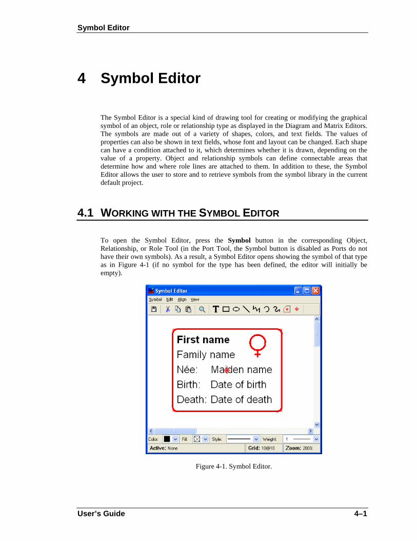
Symbol Editor
User’s Guide 4–1
4 Symbol Editor
The Symbol Editor is a special kind of drawing tool for creating or modifying the graphical symbol of an object, role or relationship type as displayed in the Diagram and Matrix Editors. The symbols are made out of a variety of shapes, colors, and text fields. The values of properties can also be shown in text fields, whose font and layout can be changed. Each shape can have a condition attached to it, which determines whether it is drawn, depending on the value of a property. Object and relationship symbols can define connectable areas that determine how and where role lines are attached to them. In addition to these, the Symbol Editor allows the user to store and to retrieve symbols from the symbol library in the current default project.
4.1 WORKING WITH THE SYMBOL EDITOR
To open the Symbol Editor, press the Symbol button in the corresponding Object, Relationship, or Role Tool (in the Port Tool, the Symbol button is disabled as Ports do not have their own symbols). As a result, a Symbol Editor opens showing the symbol of that type as in Figure 4-1 (if no symbol for the type has been defined, the editor will initially be empty).
Figure 4-1. Symbol Editor.

Symbol Editor
4–2 MetaEdit+ Method Workbench
The Symbol Editor window can be divided into five parts. The usual menu bar can be found from the top of the window. Below the menu bar, there is a toolbar with action buttons for Save, Cut, Copy, Paste and Zoom commands, as well as the tool buttons for creating various symbol element shapes. The largest part of the window, the drawing area that contains the symbol elements, lies in the middle. At the bottom of the window, there is a formatting bar for symbol element properties like color, line style and weight, and a status bar showing information about the currently selected elements and grid and zoom settings.
Creating a new symbol
If the Symbol Editor is opened for a type that has an existing symbol, the symbol is automatically loaded into the editor (if there is no existing symbol definition, the Symbol Editor will initially be empty). To clear the editor and start with an empty symbol, select Symbol | New. Please note that this new symbol is still attached to the currently selected type.
Saving a symbol
To save the symbol definition, select Symbol | Save or press the Save button in toolbar.
Using the Symbol Library
Normally a symbol definition is simply saved as part of the type it belongs to. However, there is often a need to reuse symbols or parts of symbols between types, and therefore the Symbol Editor allows symbol definitions to be stored in the Symbol Library of the current default project. To save the symbol definition into the Symbol Library, select Symbol | Save to Library… and enter the name for the symbol definition when prompted.
Figure 4-2. Symbol Library.
To browse, manage and retrieve symbols in Symbol Library, select Symbol | Browse Library…. This will open the Symbol Library Browser as shown in Figure 4-2. Available symbol definitions are shown in the list on the right and a preview of the selected symbol is displayed on the left. To load the symbol definition from the library, press the Paste & Close button. This will retrieve the symbol elements from the library and place them on the drawing area. Please not that this addition is non-destructive, so the symbol elements possible already

Symbol Editor
User’s Guide 4–3
existing on the drawing area are spared. To remove the selected symbol definition from the symbol library, press the Delete button and select Yes in the confirmation dialog. To exit the Symbol Library Browser, press the Close button or close the browser window.
It is worth noting that property text fields cannot show the names of the properties in the preview (the figure contains only fixed text elements). When pasted, unless into the same symbol or a subtype, you must assign the desired properties to the text fields.
Exiting the Symbol Editor
To exit Symbol Editor, select Symbol | Exit or close the Symbol Editor window. If there are unsaved changes, a dialog as in Figure 4-3 will be shown to prompt whether or not to save them.
Figure 4-3. Confirmation for save on exit.
Using the grid
Using the grid helps you position and scale symbol elements accurately. When the grid is active, elements are not moved or scaled completely freely anymore, but with defined steps. To set the grid step, select View | Choose Grid… to open the grid size dialog (Figure 4-4). In the grid size dialog you can set the grid step values for both axes either by entering them into their respective number fields or by using the sliders. If you want to make sure that the grid for both axes is the same, check the Uniform grid check box. Pressing the Default button will restore the default grid step values.
Figure 4-4. Setting grid step.
To make the grid visible in the drawing area, select View | Show Grid. To activate the grid, choose View | Snap to Grid. Once activated, all further element operations will conform to the grid steps. However, activating the grid does not force symbol elements to align themselves along it. To do this, select View | Align to Grid: this will align the top left of the selected elements (or all elements if none are selected) to the nearest grid point.

Symbol Editor
4–4 MetaEdit+ Method Workbench
Setting zoom
The Symbol Editor is opened with a 200% zoom by default. To change the zoom, select View | Zoom… from the menu bar or press the Zoom button in the toolbar. This will open a Zoom dialog (Figure 4-5) in which you can set the proper zoom value. To zoom so that the symbol fills the whole drawing area, select Fit.
Figure 4-5. Zoom Dialog.
Refreshing window
To refresh the drawing area, either select View | Refresh from the menu or press F5.
4.2 CREATING SYMBOL ELEMENTS
The Symbol Editor provides a set of general graphical shapes that can be used as symbol elements. All symbol elements except bitmaps are vector-based and therefore they can be used with precision and are easy to scale. In this chapter we introduce each shape and provide detailed descriptions of how to create it and how to change such shape specific properties as location, size, colors and line style. Those editing operations that are common for all shapes, like scaling and aligning, are discussed in Section 4.3.
4.2.1 Rectangle
To create a rectangle:
1) Press the Rectangle button in the toolbar.
2) Move the cursor in the drawing area to where you want a corner of the rectangle to be.
3) Press and hold down the left mouse button, drag the cursor into the point where you want to place the opposite corner, and release the mouse button.
The resulting rectangle is displayed in the drawing area. You can drag the yellow handle at the top-left corner towards the center of the rectangle to round the corners of the rectangle.
The default formatting for rectangle is solid, black 1 pixel line and white fill. To change the formatting, select the line, press the right mouse button to open its pop-up menu, and then

Symbol Editor
User’s Guide 4–5
select Format… from the menu. Double-clicking the line or pressing Enter when it is selected will achieve the same result. A Format Dialog as shown in Figure 4-6 will open.
Figure 4-6. Format Dialog for line shape.
There are three tabs in the dialog. The first one, Line and Fill (as shown in Figure 4-6), enables you to change the color, style and weight of the line of the rectangle, and the fill color inside the rectangle. You can pick the line color from the Color menu button. If there is no suitable color available in the pre-defined color palette, choose Select a New Color… and define the color of your choice in the dialog that opens (Figure 4-7). The slider on the left controls the luminance of the colors available in the main area. The columns each have a different hue, with saturation increasing towards the bottom rows.
Figure 4-7. Selecting color.
The line widths from hairline to 10 pixels can be chosen from the Weight menu. The line style (dotted, dashed etc.) can be set from the Style menu, but this is only possible for Line and Polyline elements.
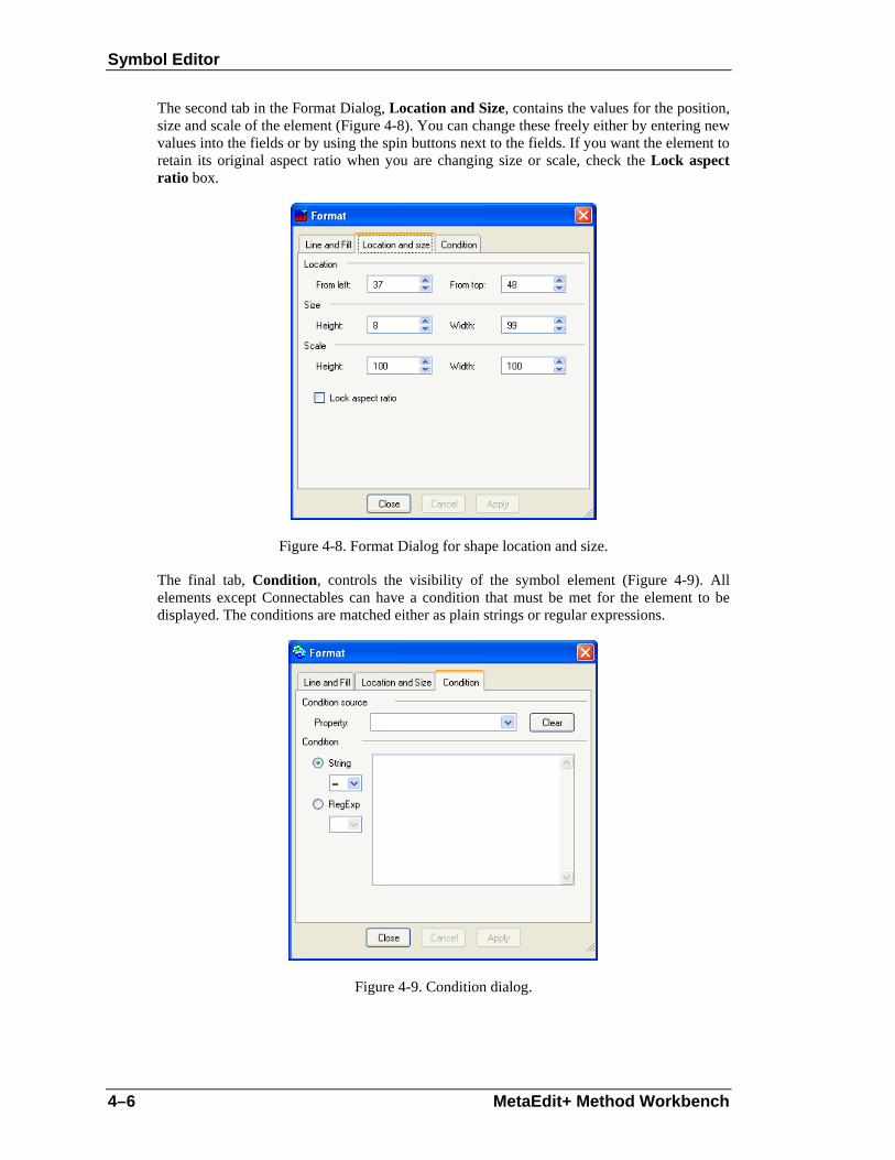
Symbol Editor
4–6 MetaEdit+ Method Workbench
The second tab in the Format Dialog, Location and Size, contains the values for the position, size and scale of the element (Figure 4-8). You can change these freely either by entering new values into the fields or by using the spin buttons next to the fields. If you want the element to retain its original aspect ratio when you are changing size or scale, check the Lock aspect ratio box.
Figure 4-8. Format Dialog for shape location and size.
The final tab, Condition, controls the visibility of the symbol element (Figure 4-9). All elements except Connectables can have a condition that must be met for the element to be displayed. The conditions are matched either as plain strings or regular expressions.
Figure 4-9. Condition dialog.

Symbol Editor
User’s Guide 4–7
The Property list in the upper part of the Condition dialog includes all the property types defined for symbol’s non-property type. The symbol element will be shown if the value of the property selected from this list will be matched with the condition string or regular expression that is entered in Condition text box on the lower part of the dialog. The type of the required match, either String or RegExp, is defined by checking the appropriate radio button and selecting the wanted match operator from the accompanying pull-down menu. The possible match operators for String are =, <>, <, >, <= and >=; for RegExp = and <>.
Condition values are dependent on the data type of the property. Use T for Boolean value true and F for false (i.e. checkbox checked and not checked). In string matches, wildcards # (any single character) and * (0 or more characters) can also be used: a useful condition for a ‘non-empty’ value is #*. More complex partial matches can be done with regular expressions. For more information about how to use regular expression, see http://www.regular-expressions.info.
Note that an empty Value field means this element will only be displayed if the given property is empty. To remove a condition completely, press the Clear button.
4.2.2 Ellipse
Apart from ellipses, the ellipse shape is also used for circles, arcs and wedges.
To create an ellipse:
1) Press the Ellipse button in the toolbar.
2) Move the cursor in the drawing area to a corner of an imaginary rectangle that would enclose the desired ellipse.
3) Press and hold down the left mouse button, drag the cursor until the ellipse has reached the required size, and release the mouse button.
Setting line, fill, location and size properties of an ellipse is the same as for a rectangle, so please see Section 4.2.1 for more information.
It is possible to make an ellipse into an arc or wedge by adjusting its start and stop angles. There are two ways to do this. The first way is to drag the yellow handles that appear to the right of the ellipse when it is selected (they are initially on top of each other, as a full ellipse starts and stops at the same point). Moving them around the perimeter of the ellipse will change the start and stop angles. The other way is to open the Format Dialog and change the values in the Arc properties tab (Figure 4-10). Enter new values in the Start and Stop fields or use the spin buttons. Please note that angle values are presented as degrees, so the proper values are between 0 and 360. 0 degrees is to the right, and the ellipse is drawn anti-clockwise from the start to the stop angle.

Symbol Editor
4–8 MetaEdit+ Method Workbench
Figure 4-10. Arc properties.
4.2.3 Line
To create a single line:
1) Press the Line button in the toolbar.
2) Move the cursor in the drawing area to where you want the line to begin.
3) Press and hold down the left mouse button, drag the line to the desired end point, and release the mouse button.
A line with default formatting (color: black, style: solid, weight: 1) will now appear in the drawing area.
As the basic formatting of a line is similar to that of a rectangle, please see Section 4.2.1 for more information. There are only two differences: firstly, a line has no fill color on the Line and Fill tab in the Format Dialog. Secondly, a line can have any of the line styles (dotted, dashed etc.).
4.2.4 Bezier
A Bezier curve is a single straight line modified into a curve by two control points.
To create a Bezier curve:
1) Press the Bezier button in the toolbar.
2) Move the cursor in the drawing area to where you want the Bezier curve to begin.
Symbol Editor
User’s Guide 4–9
3) Press and hold down the left mouse button, drag the line to the desired end point, and release the mouse button.
A Bezier curve will appear on the drawing area. The default formatting and Format Dialog of Bezier are the same as for a rectangle (see Section 4.2.1), except that a Bezier cannot have a fill color. Please note that by default, Bezier is handled as an atomic shape. If you want to access and change the curve settings, select Edit Points from the Bezier pop-up menu. You will now get a new set of control handles, one for each line end and two control point handles. By moving these control points, you can change the curve settings. To exit point editing mode, either select Exit Edit Points from the pop-up menu or just deselect the Bezier.
4.2.5 Polyline
A polyline is a series of straight lines at different angles joined end to end.
To create a polyline:
1) Press the Polyline button in the toolbar.
2) Click the cursor in the drawing area where you want the polyline to begin. This places the first point for the polyline.
3) Add new breakpoints by clicking in the desired positions.
4) Complete the polyline creation by double-clicking the left mouse button for the end of the last line segment (you can cancel the creation at any time by pressing right mouse button).
The default formatting and Format Dialog for polyline are the same as for a rectangle (see Section 4.2.1), except that a polyline can have any of the line styles (dotted, dashed etc.). Please note that by default, polyline is handled as an atomic shape. If you want to access and change individual breakpoints, select Edit Points from the polyline pop-up menu. This will bring up the control handles for each breakpoint. To exit point editing mode, either select Exit Edit Points from the pop-up menu or just deselect the polyline.
A polyline is always created as an open shape, but you can later make it closed by checking Closed from the pop-up menu. To make it open again, uncheck the Closed pop-up menu element. When a polyline is closed, it can have a fill color in addition to its line color. To set the fill color, open the Format Dialog for the polyline and select the color in Color field in the Fill section of Line and Fill tab. Please note that the Fill section is enabled only when the polyline is closed.
4.2.6 Spline
A spline is like a polyline whose sharp corners are rounded off to make a curve.
To create a spline:
1) Press the Spline button in the toolbar.
2) Click the cursor in the drawing area where you want the spline to begin. This places the first point for the spline.

Symbol Editor
4–10 MetaEdit+ Method Workbench
3) Add new breakpoints by clicking in the desired positions. Note that while the spline is being drawn, it will be drawn with sharp corners like a polyline.
4) Complete the spline creation by double-clicking the left mouse button where you want the end of the spline (you can cancel the creation any time by pressing right mouse button).
As the formatting and editing of splines is similar to that of polylines, please see Section 4.2.5 for more information. The only difference is that a spline can only have the default unbroken line style.
4.2.7 Text field
A text field can contain fixed text, a property value, or the text generated by running a report. It also has a rectangle enclosing the text.
To create a text field:
1) Press the Text button in the toolbar.
2) Move the cursor to the desired position for a corner of the text field.
3) Press and hold down the left mouse button, drag the cursor into the point where you want to place the other corner and release the mouse button (while dragging, the rectangle enclosing the text field is shown in the drawing area).
4) The text field is now created. A Format Dialog opens, prompting for the text content on the Content tab (as in Figure 4-11). You can fill in the values on this and other pages as shown below.
Figure 4-11. Setting content text.
The text content that is shown on the text field can be a property value, a fixed text or a report output. To use a property value as the text content, click the Property radio button and choose the desired property from the list. For fixed text, click the Text radio button and enter

Symbol Editor
User’s Guide 4–11
the text into the editor field. To use a report output as text content, click the Report radio button and enter the report definition into the editor field. See below for more information about reports in symbols.
In addition to the text itself, the text field element also has a text box. The appearance and position of the text box can be controlled by the Line and Fill and Location and Size tabs in Format Dialog (for full information on how to use these, see Section 4.2.1). If you do not want a visible box around the text, set the line color to transparent. If you do not want the background of the text box to cover other elements or symbols, change the fill color from white to transparent.
Figure 4-12. Text settings.
The text itself can be formatted with the options found in Text settings tab in Format Dialog (Figure 4-12). The top part of the dialog contains the font settings. You can choose the font you want from the Font list and set Font style and Size in their respective fields. Please note that all fonts are not necessarily available on all operating systems or platforms. To provide better font interoperability between various environments, MetaEdit+ defines three elementary fonts (‘#sans serif’, ‘#serif’ and ‘#fixed’) that can be expected to display with similar results in all environments. These fonts are always the first ones in the Font list.
The Text settings window allows you to add such text effects as Underline or Strikethrough, define how text is aligned within the text box, choose the text color and set the Wordwrap. A preview of the current text settings is shown in the Text window at the bottom of the dialog. Please note that before a new text content is shown in the Text preview window, it has to be accepted in the Content tab by choosing either Ok or Apply.
Symbol Reports
As reports used in symbol text fields are normally short, they omit the ‘Report "Report name"’ and ‘EndReport’ keywords. The report is run with the current graph and non-property already on the report stack. This allows reports to use loops to navigate from the current non-

Symbol Editor
4–12 MetaEdit+ Method Workbench
property into other objects, relationships, roles, or ports. For more information about creating reports, please refer to Section 5.1 in ‘MetaEdit+ User’s Guide’.
→ Errors when running reports in symbols are handled by returning the output so far, plus an error message – opening a normal error dialog would be impractical. Infinite recursion when running a symbol report is prevented by a timeout on such reports, returning an error in a similar way.
4.2.8 Bitmap
To create a bitmap element:
1) Choose Symbol | Import Bitmap… from the Symbol Editor menu bar.
2) Choose the graphic file to be imported from the file dialog that opens and press Open. File types that can be imported are Windows bitmap (.bmp), GIF (.gif) and JPEG (.jpg).
The imported bitmap element will appear in the drawing area. There are few editable properties for bitmaps: their Format Dialog contains only the Location and Size and Condition tabs. For more information about these options, please see Section 4.2.1.
When using bitmaps it is important to remember that they take much longer to display than normal vector-based elements. Therefore, we advise you to consider carefully their use in symbols that are expected be used extensively in diagrams. The main factor affecting performance is the number of pixels occupied on the screen by the resulting bitmap. Also, even though the Symbol Editor provides the means to scale the bitmaps, it is recommended that you try to import the pictures at the size they are projected to appear within the symbol. For a given on-screen size, the best performance is obtained when there is no overall scaling of the bitmap, taking into account the scaling of the symbol element, the scaling of the non-property representation in a diagram, and the zoom factor of the Diagram Editor. While working with bitmaps in the Symbol Editor, setting the zoom factor to 100% will improve performance.
4.2.9 Connectable
A connectable is a special kind of symbol element that defines an area around the symbol that the incoming role lines connect to. Normally Connectables are not shown as part of the symbol in the editors, but in the Diagram Editor they are shown briefly during the relationship creation, marking the connection possibilities on the objects.
A connectable consists of two parts: a target point and an optional connectable edge. The target point is the position at which the role lines connecting to the symbol are aimed at. The target point is shown as a red circle with a cross hair. The connectable edge is displayed as a red polyline around the target point. Role lines stop where they intersect the connectable edge. If no connectable edge is defined, the role lines stop at the target point. Such point Connectables are mostly used in Relationship symbols that only have text elements, as then all role lines meet in the middle of the relationship.

Symbol Editor
User’s Guide 4–13
Creating Connectables
There are several ways to create Connectables:
To create a connectable with an edge:
1) Press the Connectable button in the toolbar.
2) Define the connectable edge. This is done in the same way as creating polyline elements: click where you want to start the polyline, add breakpoints by clicking at suitable positions, and complete the creation of the edge by double-clicking the left mouse button. You will normally want to check Closed from the Connectable’s pop-up menu. For more information about drawing polylines, see Section 4.2.5.
3) When the connectable edge has been completed, the target point for the connectable is added automatically at the center of the area occupied by the edge polyline.
To create a connectable without an edge:
1) Press the Point Connectable button in the toolbar.
2) Click in the desired position in the drawing area. The target point will appear at the cursor position.
Often Connectables must be defined according to or around a certain symbol element. To do this, select the element and choose Generate Connectable from its pop-up menu. This will create a connectable with an edge that fits around the selected symbol element.
Finally, as each object or relationship symbol must have at least one connectable, a default connectable is generated if no connectable has been defined when symbol is saved.
Editing Connectables
Editing a connectable is also a little different from other symbol elements. To select a connectable, you have to click the left mouse button exactly on top of the target point. To move the target point and the edge, first make sure that the connectable is not selected, then press and hold down the left mouse button on top of the target point and drag the connectable to the new location. If you want to move only the target point, select the connectable first, then press and hold down the left mouse button on top of the target point and drag the target point into the new position. The target point moves, but the edge polyline remains in the original position. It is also possible to move or resize the connectable by changing the settings on the Location and Size tab in the Connectable’s Format Dialog.
For other editing purposes, Connectables follow the behavior of polyline elements. You can make a connectable open or closed by toggling the Close menu item in its pop-up menu. To edit individual breakpoints of the edge polyline, select Edit Points from the pop-up menu. For more information about these commands, see Section 4.2.5.
Target points
The target point of the default connectable is used as the center of objects or relationships when positioning them in a Diagram Editor. For instance, when an object is aligned to a grid, the target point of the default connectable is placed on a grid point. Similarly, when a relationship is straightened, the target point of its connectable is placed at the intersection of its role lines.

Symbol Editor
4–14 MetaEdit+ Method Workbench
On the Connectable tab (as shown in Figure 4-13) in the Format Dialog for Connectables, it is also possible to set two behavioral aspects of target points. The first one is the Sticky targetpoint setting, which controls what happens when the mouse cursor is brought on top of the connectable during the relationship creation in Symbol Editor.
Figure 4-13. Connectable tab in Format Dialog.
With a sticky target point (the default), the role line is locked immediately into the target point and remains there as long as the cursor is on top of the connectable. This is how most symbols work: after creation, the role always points towards the original target point.
A non-sticky target point allows the end of the role line to move freely away from the target point within the area of the connectable during creation, making it possible to position it more freely. This is how the main object symbols work in Sequence Diagrams: the roles are initially created pointing to where the user clicked in the object, rather than the original target point.
The other aspect, Grid sensitive, defines whether or not the grid setting is taken into account while connecting to a connectable with a non-sticky target point.
Connectables and ports
Relationship symbols can have only one connectable. If you try to create more than one, you will be prevented and a warning dialog will be shown. Object symbols can have many Connectables, but each of them must have a unique identifier, provided by ports. Connectables thus serve as visualization for ports in object symbols.
A typical requirement for an object type with several ports is that its symbol should define a separate connection for each port. Rather than enclosing the whole symbol, these Connectables normally enclose a small part of the symbol: e.g. one edge, or a visible ‘plug’ on the edge of the symbol.
To attach a port to a connectable:

Symbol Editor
User’s Guide 4–15
1) Open the Format Dialog for the connectable and go to the Connectable tab (see Figure 4-13).
2) In the Port(s) list, press the right mouse button to open the pop-up menu.
3) Choose Add… if you want to create and add a new port. This will open the property dialog in which you can enter the values for the new port (see Section 2.5.3 for more information on how port property values can be used as constraints).
If you want to add an existing port, choose Add Existing…. A list of existing port instances will be shown and you can pick the one you want.
To remove a port from a connectable, select the port in the Port(s) list in the Connectable tab of the Connectable’s Format Dialog, and select Remove from the pop-up menu. To access and edit port properties, select Properties… from the pop-up menu.
It is possible to attach several ports to one connectable. However, each port may be attached to only one connectable within the same symbol. This is, as stated before, due to the fact that ports are used as connectable identifiers when one symbol contains several Connectables. It is also important to understand that the omission of ports is considered as an identifier also, which means that there can be only one connectable without ports in an object symbol. If you try to save a symbol that breaks these rules, an error message is shown and the symbol is not saved.
4.3 EDITING SYMBOL ELEMENTS
The Symbol Editor provides many editing options for elements. These possibilities are discussed below.
Selecting elements for editing
Individual elements can be selected by clicking them with the left mouse button. To select multiple elements, press and hold down the Shift key and click them with the left mouse button. You can also select multiple elements by defining a selection area with the mouse. Take the mouse to a corner of the area you want to select, press and hold down the left mouse button, drag the cursor to the other corner of the area, and release the mouse button. All elements within the area will now be selected.
To select all the elements in the drawing area, press Ctrl-A or select Edit | Select All from the menu bar.
Deleting elements
To delete the selected element(s), press the Delete key, or select Delete from the pop-up menu or the Edit menu.
Accessing and changing element properties
Element properties like colors, line style and weight, location and size can be accessed and modified in the Format Dialog. To open it, double-click the element. You can also first select

Symbol Editor
4–16 MetaEdit+ Method Workbench
the element then press Enter, or select Format… from the element’s pop-up menu, or select Edit | Format… from the menu bar.
The line and fill colors, line style and weight for an element can also be set from the formatting bar just below the drawing area. Please note, however, that line style settings can only be applied to line and polyline elements.
Cutting, copying and pasting
To copy a symbol element, first select it and then:
press Ctrl-C,
press the Copy button in the Symbol Editor toolbar
select Copy from the pop-up menu, or
select Edit | Copy from the menu bar.
To cut an element, select it and press Ctrl-X. You can also press the Cut button in the toolbar, or select Cut from the pop-up or Edit menu.
To paste the element you copied or cut, press Ctrl-V. You can also press the Paste button in toolbar, select Edit | Paste from the menu bar, or select Paste from the pop-up menu when nothing is selected.
Scaling elements
To scale a symbol element:
1) Select the element first to enable the scaling handles around it.
2) Pick the handle you want to scale the element from and drag it until the element is scaled as required.
While scaling, holding down the Shift key maintains the aspect ratio of the element. Holding down the Control key makes the center of the element remain fixed while scaling: with Control the top left corner of the element remains fixed.
If more precision is required, the scale and size of the element can be fine tuned in the Format Dialog’s Location and Size tab.
Only a single element can be scaled at a time. To scale multiple elements together, first make them into a group.
Grouping elements
To group a set of elements:
1) Select all the elements that are to be grouped.
2) Press Ctrl+G, or select Group from the pop-up menu or Edit | Grouping | Group from the menu bar.
To ungroup elements:
1) Select the group element

Symbol Editor
User’s Guide 4–17
2) Press Ctrl+U, or select Ungroup from the pop-up menu or Edit | Grouping | Ungroup from the menu bar.
Changing the order of elements
By default, any newly created symbol element is placed on top of all other elements. To change the order of elements, first select the affected elements. The commands to change the order are found in both the Edit | Order menu and the pop-up menu’s Order sub-menu.
To move the element(s) on top of all others press Ctrl+F, or select the Bring to Front menu action.
To move the element(s) behind all others press Ctrl+B, or select the Send to Back menu action.
To move the element(s) forward one step press Ctrl+Shift+F, or select the Bring Forward menu action.
To move the element(s) backward one step press Ctrl+Shift+B, or select the Send Backward menu action.
Aligning elements
To align one or more elements relative to another shape:
1) Select the element that you want to use as the basis of alignment (this element will not move).
2) Incrementally select one or more other elements to align relative to the first element, by keeping the shift button pressed while clicking the elements.
3) Select the type of alignment from the Align menu.
Available alignments are: left sides, right sides, bottoms, tops, vertical centers, horizontal centers, centers, left to right, right to left, bottom to top, and top to bottom. For example, Bottom to Top will align the bottom of the other selected elements with the top of the first element: they will effectively sit vertically above the first element.
4.3.1 Symbol Editor for Roles
The Symbol Editor for Roles works similarly to the normal Symbol Editor, except for a few details presented in this chapter.
The Symbol Editor for Roles has a line coming from the left side of the drawing area. This line represents the role line coming from an imaginary relationship left of the picture, and ending at an imaginary object in the center of the picture. The role symbol should be defined relative to the end of the line, because the end represents the position where the role line will stop as it connects to the object symbol. Symbol elements should not normally be placed to the right of the end of the line, as they would then be on top of the object symbol. The symbol should look as it would when pointing horizontally from left to right: role symbols are rotated according to the angle of the role line.

Symbol Editor
4–18 MetaEdit+ Method Workbench
Figure 4-14. Symbol for a ‘To’ role.
There is no need to define Connectables for role symbols, and thus there are no toolbar buttons for them. Otherwise the Symbol Editor for Roles works as an ordinary Symbol Editor.
Setting role line properties
To change the appearance of the role line, select Edit | Format Role Line… from the menu bar or press Ctrl+R. This will open the Format Dialog with a Line and Fill settings tab (see Section 4.2.1 for more information).
Aligning elements according to the role line
To align an element precisely with the end of the role line, select the element and then select Align | To Role Line End (or press Ctrl-L). The midpoint of the right hand side of the element will be aligned with the right end of the role line.
Rotation
When building symbols for roles, you must take into account the rotation of role symbols with their lines. For most elements there are two options for rotating: a true rotation along the role or just moving around the line without rotating. The text fields are an exception to this: as text is only printed horizontally, they can not rotate.
To set the rotation behavior of an element, open the Format Dialog for it. Open the Rotation tab and check or uncheck the Allow element to rotate box as needed.
As an example, imagine a low, wide element above the end of the role line. In a role that points down in a diagram, that element will always be to the right of the role line: its center point has been rotated relative to the end of the role line, just like the role line itself. If the element is set to rotate, it will now be tall and thin. If the element is set not to rotate, it will

Symbol Editor
User’s Guide 4–19
remain low and wide, and thus may even partially cross the role line. Such effects must be taken into account with elements that do not rotate, and are not roughly as wide as they are tall.


Metamodel management tools
User’s Guide 5–1
5 Metamodel management tools
In addition to the conceptual metamodeling tools and the Symbol Editor, MetaEdit+ Method Workbench also provides tools for managing methods and their components. These tools are the Metamodel Browser and the Type Manager.
5.1 METAMODEL BROWSER
The Metamodel Browser is a tool for viewing and editing method specifications. Through the Metamodel Browser the method developer has access to all method specifications available in currently open projects. To open a Metamodel Browser, either activate its tab on the MetaEdit+ Launcher or select Metamodel | Metamodel Browser from the menu.
Figure 5-1. Metamodel Browser.
As Figure 5-1 illustrates, the Metamodel Browser is similar to the other browsers of MetaEdit+. The left-hand list shows all the projects that are currently opened in the MetaEdit+ client. If the project you want is not visible, you can open it explicitly from the list’s pop-up menu.
The middle list shows all the available graph types, filtered by the projects selected in the left-hand list.
The list on the right shows the types contained in the graph type that is selected in the middle list. You may determine which element types of the method are visible in the right hand list

Metamodel management tools
5–2 MetaEdit+ Method Workbench
from the pull-down list labeled Show. In Figure 5-1, all object types of the WatchApplication graph type are shown.
The Metamodel browser also allows you to view the graph types by their explosion and decomposition hierarchies, by viewing both hierarchies simultaneously, or according to the subtype structure of the graph types. This viewing option can be selected from the Tree pull-down list.
As in other browsers of MetaEdit+, you can choose the default project for graph and type creation, and set wildcard string filters for the middle and right-hand list contents.
In addition to browsing the method specifications, you can open them for editing with the method development tools, and view more detailed information about type usage.
Editing is carried out in the method development tools described earlier (Graph, Object, Relationship, Role and Property tools). To open these tools select the method component from the list and double click it, or alternatively choose Edit from the component’s pop-up menu. This opens a method development tool for that type.
The pop-up menu for a type also includes Info, which opens a Type Info tool showing which types use this type, and which types it uses. The Type Info tool is similar to the Info tool for design data, and is illustrated in Figure 5-2.
Figure 5-2. Type Info tool.
The Type Info tool has three fields. The label at the top shows in which project the type is stored. The upper list shows which types use this type, along with the project where they are defined, and the function of this type within the using type. The lower list shows which types are used by this type, along with the project where they are defined.
In Figure 5-2 a Type Info tool has been opened for State [Watch]. This type is defined in the Watch project. It is used in the WatchApplication diagram in the Watch project. State [Watch] itself uses other types as its properties, e.g. the Name [Watch] property type, which is defined in the Watch project.

Metamodel management tools
User’s Guide 5–3
More information about a type shown in the Type Info tool can be seen by selecting that type. From the pop-up menu you can then choose Info… to open it in its own Type Info Tool, or double click the type to open it in the appropriate method development tool.
5.2 TYPE MANAGER
The Type Manager is a tool for exporting and deleting method specifications. It can be opened from the Launcher by choosing Metamodel | Type Manager.
The Type Manager window consists of two lists (Figure 5-3). The list on the left shows the graph types currently loaded into the MetaEdit+ client. The check box below the list allows you to choose whether all subtypes are shown in the list. The list on the right shows the types currently loaded into the MetaEdit+ client. If you want to select or unselect all graph types in the list, use the Select All and Unselect All buttons.
Figure 5-3. Type Manager.
Exporting method specifications
Method specifications (i.e. graph types and the other types they use) can be exported to a file to be transferred to another MetaEdit+ repository.
Method specifications can be exported either as just the set needed for some selected graph types, or as the set needed for all the types in selected projects. To export a set of graph types:
1) Make sure that you do not have uncommitted changes. If necessary, press the Commit button in the main Launcher.
2) Select the desired graph types in the list on the left.

Metamodel management tools
5–4 MetaEdit+ Method Workbench
3) Press the ‘→’ arrow button between the lists to update the selections in the list on the right. All method components necessary for the selected graph types are selected in the list on the right. Loading and calculating the components may take a while.
4) Press the Save as Patch button.
5) Enter a file name *.pat for the exported method specifications.
6) Enter the name of the source database when prompted. This name is used as the reference for the original database if you are exporting types incrementally from one repository to another.
If you want to save some types that are not chosen, you could make a temporary graph type that references them. Alternatively, to export method specifications from a specific project, press the Select All Types in Projects… button. Note that if the types in that project also use types from other projects, the export file will also include these other types. All types to be saved can be seen in the right list.
Method specifications can be imported into MetaEdit+ as a patch file filed in to the repository (see the ‘MetaEdit+ System Administrator’s Guide’ for importing patches).
Type usage information
After selecting some graph types and pressing the ‘→’ arrow button, you can browse the users of a type in the list on the right.
1) Select the type in the list on the right
2) Choose Show Type Users… from its pop-up menu
3) A list dialog opens showing all types which refer to the selected type. From the list you can select one or more referring types to inspect which types in turn use them, or open the types in a method development tool by holding shift down while pressing OK.
Note that the types shown as using this are only those that are currently selected in the list on the right. They are thus possibly only a subset of those that use this type in the whole repository. To see which of the currently loaded types use this type, edit the selected type by selecting Edit Type from its pop-up menu and press Info in its method development tool.
To see all using types in the whole repository, first open all projects (Repository | Open Project… in the Launcher) and then view the Info for the type as above.
Removing types
Method specifications that are not needed can be removed from the repository by opening all projects, choosing the graph types you want to keep, and pressing the Delete Other Types button. See the ‘MetaEdit+ System Administrator’s Guide’ for further details, and before performing this operation.

Glossary
User’s Guide 6–1
6 Glossary
Binding (of types)
Specifies a legal way in which object instances can be connected via a relationship and roles, in a graph of this type. Consists of a relationship type with a collection of role types, each of which has a cardinality and a set of object types.
Cardinality The number of types a given role type in a binding may occur (effectively, be duplicated) in instances based on that binding. Consists of a minimum value (>=0) and a maximum value (>0; may also be N for no upper limit).
Constraint A rule setting an upper limit on the number of times a given instance of an object type may participate in relationships or roles of a given type, within a graph of this type. Consists of an Object type, a maximum value, and a Role or Relationship type.
Decomposition (type definition)
A link from an object type to one or more graph types. An instance of the object type may define at most one graph of one of the types as its decomposition.
Default project Project in which new graphs and types will be stored. New graph representations and design elements are automatically stored into the same project as their graphs.
Explosion (type definition)
A link from an object, relationship or role type in this graph type, to one or more graph types. A given object, relationship or role instance can have several explosions in a given graph, and a different set of explosions in another graph (even of the same type).
Metamodel Specifications of a method, also model of a method
Metatype GOPRR concepts used for metamodeling, i.e. graph, object, relationship, role, property.
Object type An object describes a thing that can exist on its own. Object type names are typically nouns. Examples include Process, Class, and Attribute.
Port A design element that defines or constrains how roles can connect to objects.
Project A group of models and/or metamodels that are used together. Corresponds to an area in the repository. In the standard repository each method has its own project (written with capital letters) and users can create their own projects for storing models.

Glossary
6–2 MetaEdit+ Method Workbench
Property type Properties describe characteristics of instances of other types. Property type names are generally nouns or adverbs. Examples include Class name, Cardinality, and Attributes. Each property type has a basic data type, e.g. string, text, Object or collection of Graphs.
Relationship type
A relationship can exist between objects. It connects objects through roles. Semantically, relationships are usually verbs, but relationship type names are sometimes also nouns or adverbs. Examples include Inheritance, Call, and Usage.
Role type A role specifies how an object participates in a relationship. Semantically, roles are adverbs. Role type names are often prepositional phrases or verbs. Examples include subclass, from, and receives.

Index
User’s Guide 7–1
7 Index
B binding, 2–12, 2–14
first role type, 2–13 Bindings button, 2–19, 2–20 Bindings Tool, 2–12
C cardinality, 2–8, 2–14 Cardinality Dialog, 2–14 Change Property, 2–4 Constraints Tool, 2–14
D Data type, 2–2, 2–20
Boolean, 2–24 Number, 2–23 OrderedCollection, 2–24 String, 2–21 Text, 2–23
Datatype button, 2–25 decomposition, 2–17, 2–18 Default Dialog, 2–5 Description field, 2–5, 2–6, 2–25 Dialog Editor, 3–1
close, 3–6 open, 3–1
E Edit Dialog, 2–5, 2–6, 2–19 Edit type, 2–7 explosion, 2–17 exporting method specifications, 5–3
G Generate button, 2–6, 2–19, 2–25 Graph Tool, 2–10
H Help button, 2–6
I Info button, 2–6
L Local name, 2–2, 2–4
M MetaEdit+, i
versions, i Metamodel Browser, 5–1 Method Workbench, i Modify button, 2–5, 2–7 Move Property, 2–4
N Name field, 2–2, 2–19, 2–25
O Object Tool, 2–1
P Product support, v Properties list, 2–2, 2–3, 2–6 Property Tool, 2–20
R Relationship Tool, 2–7 Remove Property, 2–5 Removing method specifications, 5–4 Resizing fields, 3–2 Role Tool, 2–8
S scroll bar, 3–5 Set identifier, 2–3 Symbol
aligning shapes, 4–17 overlapping symbols, 4–17 scale, 4–16
Symbol button, 2–6, 2–7, 4–1 Symbol Editor, 4–1

Index
7–2 MetaEdit+ Method Workbench
for Roles, 4–17
T Tab order, 3–5 Toggle Uniqueness, 2–4 Type info, 5–2 Type Manager, 5–3 Type Selection Tool, 2–19 Types button, 2–11, 2–19 Types Tool, 2–11, 2–14, 2–19
U Unique values, 2–2, 2–4
V Value list, 2–23 vertical scroll bar, 2–23
W widget, 2–23, 2–24
alignment, 3–4 distribution, 3–4 editable list, 2–23 execute, 2–23 fixed list, 2–22 overridable list, 2–23 sizing, 3–5 Widget button, 2–21