Embed Size (px)
DESCRIPTION
Branding Experience
Citation preview

1
v
LOOP-DEE-LOOPa process.

2

3
LOOP-DEE-LOOPa process

4
EVAN TARRYINSTRUCTOR TAD CARPENTERVISUAL COMMUNICATION CONCEPTS 202FALL 2013

5
CONCEPTS
PART ONE
Initial Sketches 8
Refinements 12
Final Grid 16
PART TWO
Logo Sketches 22
Logo Refinements 24
Final Logo 26
Mood Boards 30
Brand Boards 32
Brand Logo 34
Business Card 36
Menu 38
Food Truck 40
Promotional Poster 42
Carrying Bag 44
Final Brand Board 46
Final Thoughts 48

6
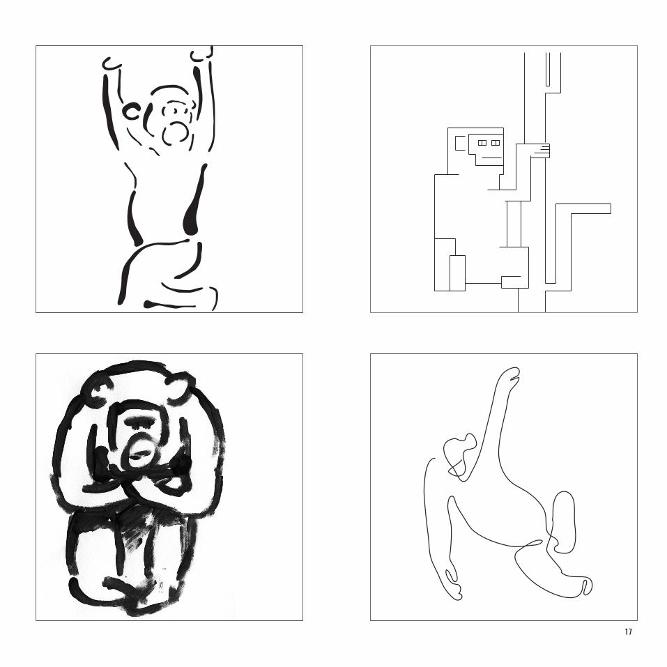
C H I M P A N Z E E

7
C H I M P A N Z E E
8

9

10

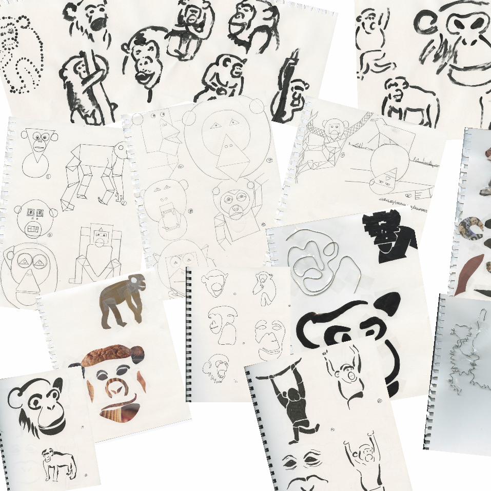
11
12
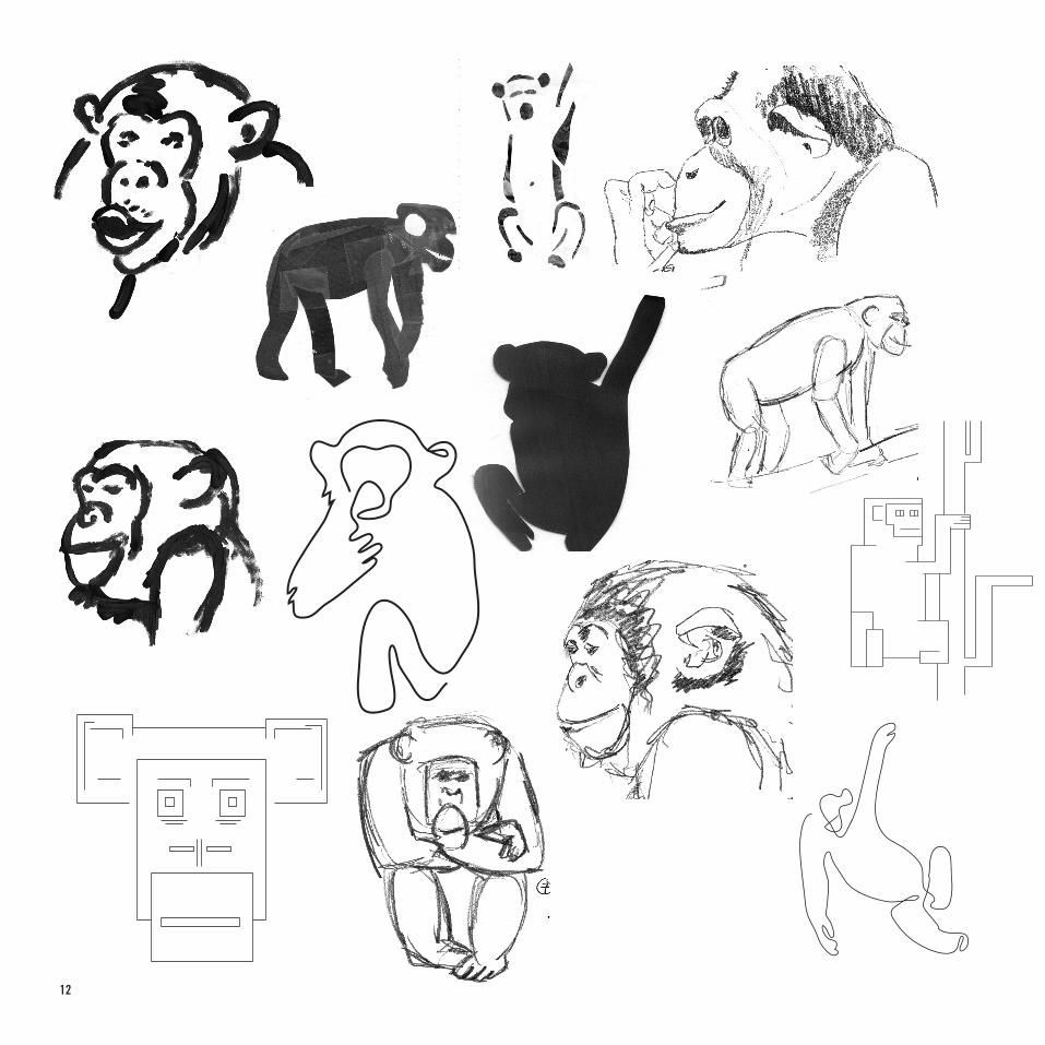
13

14

15
THE FINAL GRID

16
17

18

19

20

21
CRAZY GOOD DONUTS FOUND HERE.

22

23
LOGO EXPLORATION

24

25

26
MAKING THE CONNECTIONOne of the most difficult parts of the project was to create some sort of
connection between our chosen animal and the food we were focusing on for our food truck. I wanted to create a brand that was connected, but I
didn’t want it to be entirely predictable. Yes, chimpanzees eat bananas so I could have done a banana truck, but that would have been dumb. Instead, I tried to create a brand around the idea of swinging and the shapes made
as the animals swing through the trees. This shape made me think of loops, which I thought could relate to donuts. And thus, Loop-dee-Loop was born.

27
This was the original final design I created.
I knew that my truck would be black so this was the logo with inverted colors to show what it would look like.
I experimented with shadow on the logo to create depth and interest, but ultimately decided that it was to distracting, especially when the logo needed to be printed on smaller things.

28

29

30
MOOD BOARDSWhile these mood boards have almost no resemblance to my final product, the process was essential. It provided me with the experience of creating solid concepts that was needed in eventually creating my final brand.

31

32
33
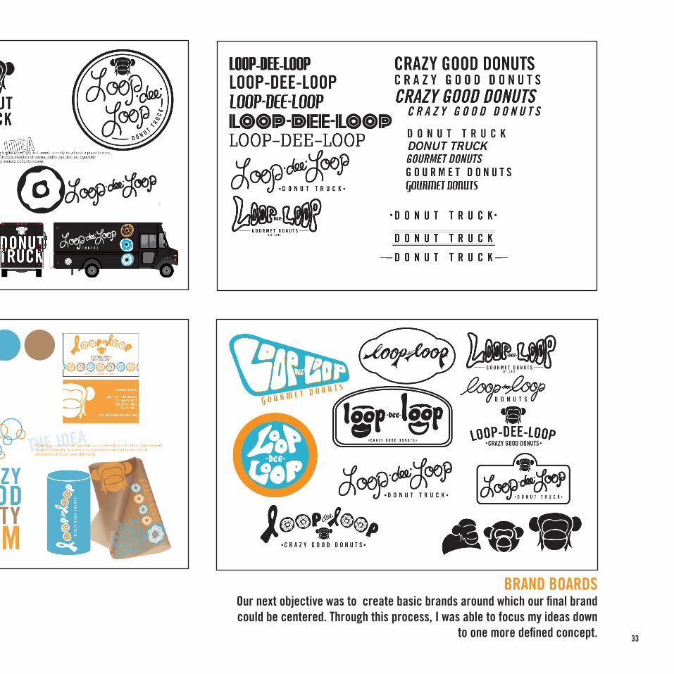
BRAND BOARDSOur next objective was to create basic brands around which our final brand could be centered. Through this process, I was able to focus my ideas down
to one more defined concept.

34

35
THE FINAL LOGOThe final logo was one that I made sure was unified in its appearance, while also conveying the overall purpose and mood of the food truck. Line weight was one of the most essential parts of the logo’s unification, because it re-ally is made up entirely of lines. The final logo shows a unified weight of the letters in relation to the outer circle, and a unified logo with the inner lines.

36
Initial designs

37
BUSINESS CARDSBy now my brand had been fairly thorougly
developed, so layout and overall appearance were what I was able to focus on. I wanted the cards
to be bold and recognizable, so I stuck with solid black with white and use of limited colors as
background.
Personal card
Company card

38

39
MENUI knew roughly the shape of menu I wanted to create, and the way I wanted it to look. Again, I wanted to stick with black as the primary color, with the various sprinkle colors used in the titles of the differ-ent choices. Originally, there was no logo on the back, but I think that helped the back have more of an identity.

40
41
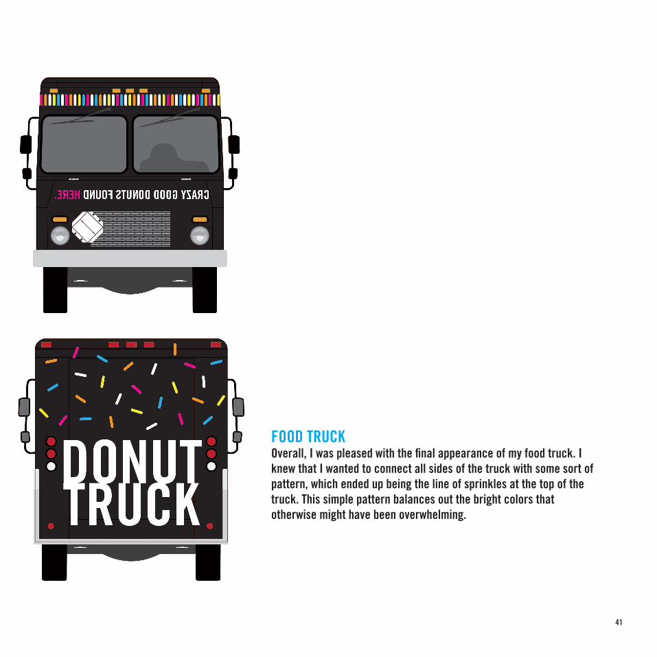
FOOD TRUCKOverall, I was pleased with the final appearance of my food truck. I knew that I wanted to connect all sides of the truck with some sort of pattern, which ended up being the line of sprinkles at the top of the truck. This simple pattern balances out the bright colors that otherwise might have been overwhelming.

42

43
PROMOTIONAL POSTERI created a ‘grand opening’ poster for my food truck, something that could be distributed throughout Denver to promote the truck, as there would be no single spot to find it. I think its mobility was reflected by the widespread publicity this poster could create.
44
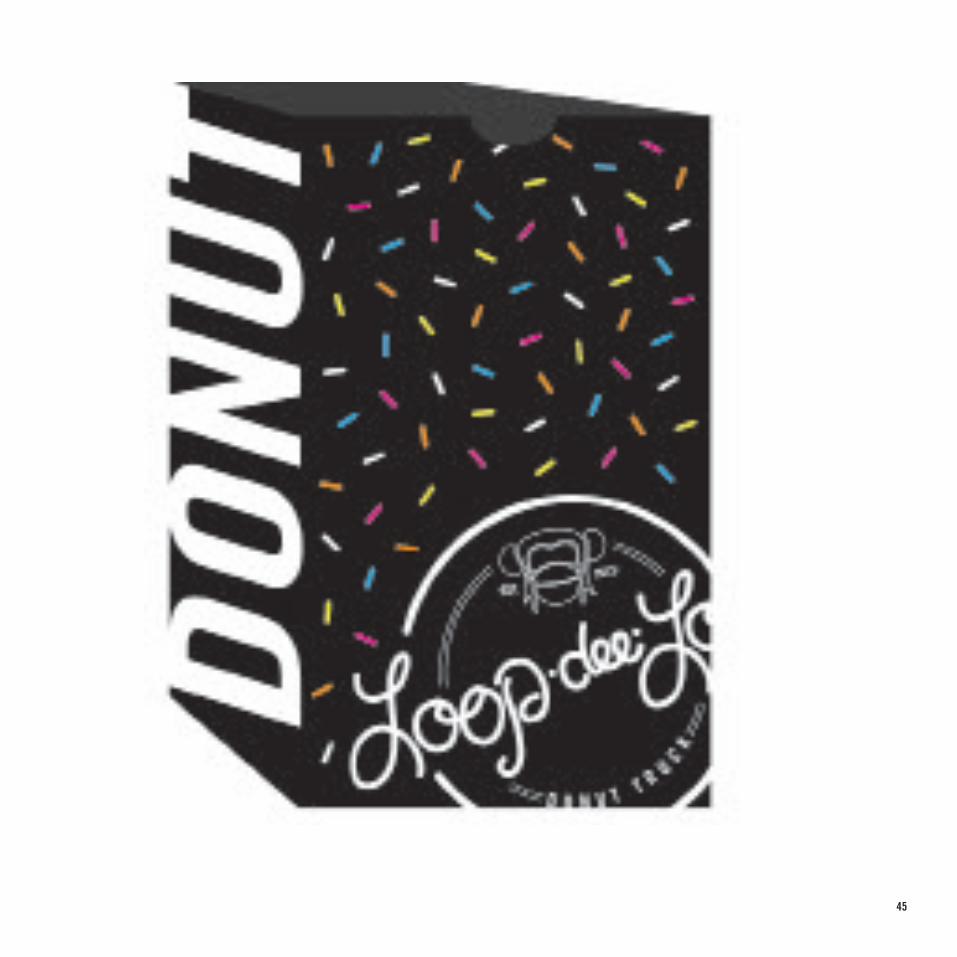
DONUT BAGThere was a need for something simple for people to carry away from the truck when they were buying for others, or needing to leave quickly. This simple brown-paper-bag-style of bag was perfect for quick use. I used the DONUT TRUCK phrase on each side of the bag as a simple pattern, almost, while keeping the front and back simple as well.
45

46

47
FINAL BRAND BOARDThis brand board is presented as a one-sheet collection of all
that creates the brand of Loop-dee-Loop. It shows the patterns, the font, the logo, and the colors used, as well as everything
those elements were applied to.

48
SUMMING IT UPThe first half of the project almost feels separate from the second, likely because I enjoyed the second so much more. While it makes sense and was essential, the first part seemed to have too much time devoted to it, but maybe that’s because the second half was just so much more enjoyable. Looking back, I would have like to have stayed more organized, but I am happy with what I create over the first half of this fall semester. Oh, and I probably would pick a different animal if I had to do it again.

49

50
CRAZY GOOD DONUTS FOUND HERE.

51
CRAZY GOOD DONUTS FOUND HERE.

52
v