Embed Size (px)
Citation preview
©2010L-Soft S
weden AB
Information in this document is subject to change without notice. Companies, names, and data used in examples herein are fictitious unless otherwise noted. L-Soft does not endorse or approve the use of any of the product names or trademarks appearing in this document.
Permission is granted to copy this document, at no charge and in its entirety, if the copies are not used for commercial advantage, the source is cited, and the present copyright notice is included in all copies. Recipients of such copies are equally bound to abide by the present conditions. Prior written permission is required for any commercial use of this document, in whole or in part, and for any partial reproduction of the contents of this document exceeding 50 lines of up to 80 characters, or equivalent. The title page, table of contents, and index, if any, are not considered to be part of the document for the purposes of this copyright notice, and can be freely removed if present.
Copyright 2010 L-Soft Sweden AB All Rights Reserved Worldwide.
LISTSERV is a registered trademark licensed to L-Soft Sweden AB and L-Soft international, Inc.ListPlex, CataList, and EASE are service marks of L-Soft international, Inc.The Open Group, Motif, OSF/1 UNIX and the “X” device are registered trademarks of The Open Group in the United State and other countries.Digital, Alpha AXP, AXP, Digital UNIX, OpenVMS, HP, and HP-UX are trademarks of Hewlett-Packard Company in the United States and other countries.Microsoft, Windows, Windows 2000, Windows XP, and Windows NT are registered trademarks of Microsoft Corporation in the United States and other countries.Sun, Solaris, SunOS, and PMDF are trademarks or registered trademarks of Sun Microsystems, Inc. in the United States and other countries.IRIX is a registered trademark of Silicon Graphics, Inc. in the United States and other countries.Linux is a registered trademark of Linus Torvalds.Intel and Pentium are registered trademarks of Intel Corporation.All other trademarks, both marked and not marked, are the property of their respective owners.
This product includes software developed by the Apache Software Foundation (http://www.apache.org/).
Some portions licensed from IBM are available at http://oss.software.ibm.com/icu4j/
This product includes code licensed from RSA Security, Inc.
Manuals are available in PDFand HTML format at: http://www.lsoft.com/manuals/index.html
L-Soft invites comment on its manual. Please feel free to send your comments by email to: [email protected]
Last Updated: February 16, 2010
. . . . . . . . . . . . . . . . . . . . . . . . . . . . . . . . . . . . . . . . . . . . . . . . . . . . . . . .Table of Contents
Preface - About This Manual . . . . . . . . . . . . . . . . . . . . . . . . . . . . . . . . . . . . . . . . . . . . . . . . . . . . . . vii
What’s New for Customizing LISTSERV® Maestro 4.0 . . . . . . . . . . . . . . . . . . . . . . . . . . . . . . . . ix
Section 1 Why Should I Customize LISTSERV Maestro? . . . . . . . . . . . . . . . . . . . . . . . . . . . . . . . 1
1.1 Who needs to be involved? . . . . . . . . . . . . . . . . . . . . . . . . . . . . . . . . . . . . . . . . . . . . . . . . . . . 3
Section 2 Customizing the Subscriber Interface . . . . . . . . . . . . . . . . . . . . . . . . . . . . . . . . . . . . . . 5
2.1 Accessing the Customization Wizard . . . . . . . . . . . . . . . . . . . . . . . . . . . . . . . . . . . . . . . . . . . . 5
2.2 Using the Membership Area Layout Tab . . . . . . . . . . . . . . . . . . . . . . . . . . . . . . . . . . . . . . . . . 6
2.3 Using the Customization Page Layout Screen . . . . . . . . . . . . . . . . . . . . . . . . . . . . . . . . . . . . . 9
2.4 Editing Templates and Pages . . . . . . . . . . . . . . . . . . . . . . . . . . . . . . . . . . . . . . . . . . . . . . . . 12
2.4.1 The Membership Area Header/Footer Template . . . . . . . . . . . . . . . . . . . . . . . . . . . . . 13
2.4.2 The Membership Area Page . . . . . . . . . . . . . . . . . . . . . . . . . . . . . . . . . . . . . . . . . . . . . 13
2.5 Editing Subscriber Notification Emails . . . . . . . . . . . . . . . . . . . . . . . . . . . . . . . . . . . . . . . . . . 16
2.5.1 Formatting All Notification Emails for a Dataset . . . . . . . . . . . . . . . . . . . . . . . . . . . . . . 18
2.6 Editing Informational and Error Messages . . . . . . . . . . . . . . . . . . . . . . . . . . . . . . . . . . . . . . . 19
2.7 Placeholders . . . . . . . . . . . . . . . . . . . . . . . . . . . . . . . . . . . . . . . . . . . . . . . . . . . . . . . . . . . . . 20
2.7.1 Text, Number, Email, or Password Profile Field Placeholders . . . . . . . . . . . . . . . . . . . 23
2.7.2 Boolean or Tracking Permission Profile Field Placeholders . . . . . . . . . . . . . . . . . . . . . 24
2.7.3 Single-Select Profile Field Placeholders . . . . . . . . . . . . . . . . . . . . . . . . . . . . . . . . . . . . 25
2.7.4 Multiple-Select Profile Field Placeholders . . . . . . . . . . . . . . . . . . . . . . . . . . . . . . . . . . 27
2.7.5 Subscription Status Profile Field Placeholders . . . . . . . . . . . . . . . . . . . . . . . . . . . . . . . 29
2.7.6 Subscription Type Profile Field Placeholders . . . . . . . . . . . . . . . . . . . . . . . . . . . . . . . . 29
2.7.7 Button Profile Field Placeholders . . . . . . . . . . . . . . . . . . . . . . . . . . . . . . . . . . . . . . . . . 30
2.7.8 Clickable Link Profile Field Placeholders . . . . . . . . . . . . . . . . . . . . . . . . . . . . . . . . . . . 30
2.7.9 Quick Login Option Profile Field Placeholders . . . . . . . . . . . . . . . . . . . . . . . . . . . . . . . 30
2.7.10 Acknowledge Style Profile Field Placeholders . . . . . . . . . . . . . . . . . . . . . . . . . . . . . . 30
2.7.11 Mail Header Style Profile Field Placeholders . . . . . . . . . . . . . . . . . . . . . . . . . . . . . . . 31
2.7.12 Hide Subscription Option Profile Field Placeholders . . . . . . . . . . . . . . . . . . . . . . . . . 32
2.7.13 LISTSERV List Topic Profile Field Placeholders . . . . . . . . . . . . . . . . . . . . . . . . . . . . 32
2.8 Setting the Default Display for Data Fields . . . . . . . . . . . . . . . . . . . . . . . . . . . . . . . . . . . . . . 32
2.9 Requesting Profile Field Updates . . . . . . . . . . . . . . . . . . . . . . . . . . . . . . . . . . . . . . . . . . . . . . 34
2.9.1 Customizing the External Profile Edit Page . . . . . . . . . . . . . . . . . . . . . . . . . . . . . . . . . 34
Section 3 User Interface Branding . . . . . . . . . . . . . . . . . . . . . . . . . . . . . . . . . . . . . . . . . . . . . . . . . 37
3.1 Adding Custom Text Strings . . . . . . . . . . . . . . . . . . . . . . . . . . . . . . . . . . . . . . . . . . . . . . . . . 37
Section 4 Using the Resource Translation Tool . . . . . . . . . . . . . . . . . . . . . . . . . . . . . . . . . . . . . . 39
4.1 Requirements . . . . . . . . . . . . . . . . . . . . . . . . . . . . . . . . . . . . . . . . . . . . . . . . . . . . . . . . . . . . . 39
4.2 Translating . . . . . . . . . . . . . . . . . . . . . . . . . . . . . . . . . . . . . . . . . . . . . . . . . . . . . . . . . . . . . . . 40
4.2.1 Navigating the Resources Tree . . . . . . . . . . . . . . . . . . . . . . . . . . . . . . . . . . . . . . . . . . 41
4.2.2 Key/Value Entries . . . . . . . . . . . . . . . . . . . . . . . . . . . . . . . . . . . . . . . . . . . . . . . . . . . . . 42
4.2.3 HTML Code . . . . . . . . . . . . . . . . . . . . . . . . . . . . . . . . . . . . . . . . . . . . . . . . . . . . . . . . . 43
LISTSERV® Maestro, version 4.0 Interface Customization Manual- i -
Table of Contents
4.2.4 Word Replacement . . . . . . . . . . . . . . . . . . . . . . . . . . . . . . . . . . . . . . . . . . . . . . . . . . . . 46
4.2.5 Date and Time Formats . . . . . . . . . . . . . . . . . . . . . . . . . . . . . . . . . . . . . . . . . . . . . . . . 48
4.3 Installing a Translated Language . . . . . . . . . . . . . . . . . . . . . . . . . . . . . . . . . . . . . . . . . . . . . . 52
4.4 Importing a Translated Language from a Previous Version . . . . . . . . . . . . . . . . . . . . . . . . . . 53
4.5 Using a Translated Language . . . . . . . . . . . . . . . . . . . . . . . . . . . . . . . . . . . . . . . . . . . . . . . . 53
4.5.1 Choosing a Language for the Administration Hub and User Interface . . . . . . . . . . . . . 53
4.5.2 Choosing the Language for the Subscriber Interface . . . . . . . . . . . . . . . . . . . . . . . . . . 54
Section 5 Creating Customized Message Templates . . . . . . . . . . . . . . . . . . . . . . . . . . . . . . . . . . 55
5.1 Creating a Copy of a System Template . . . . . . . . . . . . . . . . . . . . . . . . . . . . . . . . . . . . . . . . . 55
5.2 Creating a Plain Text Template . . . . . . . . . . . . . . . . . . . . . . . . . . . . . . . . . . . . . . . . . . . . . . . 57
5.3 Creating HTML Templates . . . . . . . . . . . . . . . . . . . . . . . . . . . . . . . . . . . . . . . . . . . . . . . . . . . 57
5.4 Creating a Template Based on an Existing Job . . . . . . . . . . . . . . . . . . . . . . . . . . . . . . . . . . . 57
5.5 Uploading Pre-Defined Text . . . . . . . . . . . . . . . . . . . . . . . . . . . . . . . . . . . . . . . . . . . . . . . . . . 58
5.6 Creating a Copy of an Existing User-Defined Template . . . . . . . . . . . . . . . . . . . . . . . . . . . . 58
5.7 Defining the Template Content . . . . . . . . . . . . . . . . . . . . . . . . . . . . . . . . . . . . . . . . . . . . . . . 59
5.8 Defining the Template Settings . . . . . . . . . . . . . . . . . . . . . . . . . . . . . . . . . . . . . . . . . . . . . . . 60
5.9 Using Drop-In Content . . . . . . . . . . . . . . . . . . . . . . . . . . . . . . . . . . . . . . . . . . . . . . . . . . . . . . 62
5.10 Using Template Placeholders . . . . . . . . . . . . . . . . . . . . . . . . . . . . . . . . . . . . . . . . . . . . . . . 63
5.10.1 Creating and Inserting Placeholders . . . . . . . . . . . . . . . . . . . . . . . . . . . . . . . . . . . . . 63
5.10.2 Editing Placeholders . . . . . . . . . . . . . . . . . . . . . . . . . . . . . . . . . . . . . . . . . . . . . . . . . . 64
5.10.3 Special Prefix and Suffix Rules for Template Placeholders . . . . . . . . . . . . . . . . . . . . 69
5.10.4 #TITLE# in a Binary Placeholder Prefix/Suffix . . . . . . . . . . . . . . . . . . . . . . . . . . . . . . 70
5.10.5 "Multiple Values" Placeholders with Prefix/Suffix . . . . . . . . . . . . . . . . . . . . . . . . . . . . 70
5.10.6 #INDEX# in a Multiple Values Placeholder Prefix/Suffix . . . . . . . . . . . . . . . . . . . . . . 72
5.10.7 Multi-Placeholder Repeater . . . . . . . . . . . . . . . . . . . . . . . . . . . . . . . . . . . . . . . . . . . . 73
5.11 Managing Existing Templates . . . . . . . . . . . . . . . . . . . . . . . . . . . . . . . . . . . . . . . . . . . . . . . 77
Appendix A: Custom Styles and HTML Tags . . . . . . . . . . . . . . . . . . . . . . . . . . . . . . . . . . . . . . . . . 79
Appendix B: The Default Style Sheet . . . . . . . . . . . . . . . . . . . . . . . . . . . . . . . . . . . . . . . . . . . . . . . 83
Appendix C: Languages Supported for Translation . . . . . . . . . . . . . . . . . . . . . . . . . . . . . . . . . . . 87
Appendix D: Customization Quick Reference Guide . . . . . . . . . . . . . . . . . . . . . . . . . . . . . . . . . . 89
Icons . . . . . . . . . . . . . . . . . . . . . . . . . . . . . . . . . . . . . . . . . . . . . . . . . . . . . . . . . . . . . . . . . . . . . . . 89
Symbols . . . . . . . . . . . . . . . . . . . . . . . . . . . . . . . . . . . . . . . . . . . . . . . . . . . . . . . . . . . . . . . . . . . . 90
Links . . . . . . . . . . . . . . . . . . . . . . . . . . . . . . . . . . . . . . . . . . . . . . . . . . . . . . . . . . . . . . . . . . . . . . . 91
Comments . . . . . . . . . . . . . . . . . . . . . . . . . . . . . . . . . . . . . . . . . . . . . . . . . . . . . . . . . . . . . . . . . . 91
Drop-Down Menus . . . . . . . . . . . . . . . . . . . . . . . . . . . . . . . . . . . . . . . . . . . . . . . . . . . . . . . . . . . . 92
Index . . . . . . . . . . . . . . . . . . . . . . . . . . . . . . . . . . . . . . . . . . . . . . . . . . . . . . . . . . . . . . . . . . . . . . . . . 93
LISTSERV® Maestro, version 4.0 Interface Customization Manual- ii -

. . . . . . . . . . . . . . . . . . . . . . . . . . . . . . . . . . . . . . . . . . . . . . . . . . . . . . . .List of Figures
General Overview of the Membership Area Layout Tab . . . . . . . . . . . . . . . . . . . . . . . . . . 5
The Membership Area Layout Tab for a Dataset . . . . . . . . . . . . . . . . . . . . . . . . . . . . . . . 7
The Membership Area Layout Tab for a List . . . . . . . . . . . . . . . . . . . . . . . . . . . . . . . . . . . 8
Customizing the Membership Area Layout . . . . . . . . . . . . . . . . . . . . . . . . . . . . . . . . . . . 10
Editing the Source Code of a Template . . . . . . . . . . . . . . . . . . . . . . . . . . . . . . . . . . . . . 13
Editing the Membership Area Page . . . . . . . . . . . . . . . . . . . . . . . . . . . . . . . . . . . . . . . . 14
The Membership Area State Tab . . . . . . . . . . . . . . . . . . . . . . . . . . . . . . . . . . . . . . . . . . 15
Customizing a Subscriber Notification Email . . . . . . . . . . . . . . . . . . . . . . . . . . . . . . . . . 17
The Subscriber Pages and Templates Table . . . . . . . . . . . . . . . . . . . . . . . . . . . . . . . . . 18
Changing the Notification Email Forma . . . . . . . . . . . . . . . . . . . . . . . . . . . . . . . . . . . . . 19
Notification Email Format Status . . . . . . . . . . . . . . . . . . . . . . . . . . . . . . . . . . . . . . . . . . . 19
Editing the Source Code of an Error Message . . . . . . . . . . . . . . . . . . . . . . . . . . . . . . . . 20
Defining the Attributes for a Profile Field . . . . . . . . . . . . . . . . . . . . . . . . . . . . . . . . . . . . 33
The Edit Default Attributes Screen . . . . . . . . . . . . . . . . . . . . . . . . . . . . . . . . . . . . . . . . . 33
Customizing the External Profile Edit Page . . . . . . . . . . . . . . . . . . . . . . . . . . . . . . . . . . 35
Resource Translation Tool Startup . . . . . . . . . . . . . . . . . . . . . . . . . . . . . . . . . . . . . . . . . 40
Translation Tool Main Window . . . . . . . . . . . . . . . . . . . . . . . . . . . . . . . . . . . . . . . . . . . . 40
Searching for Text in the Resource Tree . . . . . . . . . . . . . . . . . . . . . . . . . . . . . . . . . . . . 42
New Message Template Options . . . . . . . . . . . . . . . . . . . . . . . . . . . . . . . . . . . . . . . . . . 55
The Create User-Defined Template Based on System Template Screen . . . . . . . . . . . 56
Message Content Type Screen . . . . . . . . . . . . . . . . . . . . . . . . . . . . . . . . . . . . . . . . . . . 57
Create Template From Mail Job . . . . . . . . . . . . . . . . . . . . . . . . . . . . . . . . . . . . . . . . . . . 58
Upload Content Template Screen . . . . . . . . . . . . . . . . . . . . . . . . . . . . . . . . . . . . . . . . . . 58
General Settings on the Template Settings Tab . . . . . . . . . . . . . . . . . . . . . . . . . . . . . . . 61
Template Placeholders Section on the Template Settings Tab . . . . . . . . . . . . . . . . . . . 61
Enabling Drop-In Content for a Message Template . . . . . . . . . . . . . . . . . . . . . . . . . . . . 62
Inserting a Placeholder . . . . . . . . . . . . . . . . . . . . . . . . . . . . . . . . . . . . . . . . . . . . . . . . . . 64
Editing a Template Placeholder . . . . . . . . . . . . . . . . . . . . . . . . . . . . . . . . . . . . . . . . . . . 64
Managing User-Defined Templates . . . . . . . . . . . . . . . . . . . . . . . . . . . . . . . . . . . . . . . . 77
The Default Style Sheet . . . . . . . . . . . . . . . . . . . . . . . . . . . . . . . . . . . . . . . . . . . . . . . . . 83
LISTSERV® Maestro, version 4.0 Interface Customization Manual- iii -
List of Figures
LISTSERV® Maestro, version 4.0 Interface Customization Manual- iv -
. . . . . . . . . . . . . . . . . . . . . . . . . . . . . . . . . . . . . . . . . . . . . . . . . . . . . . . .List of Tables
Text, Number, Email, or Password Profile Filed Placeholder Attributes . . . . . . . . . . . . . 23
Boolean Profile Field Placeholder Attributes . . . . . . . . . . . . . . . . . . . . . . . . . . . . . . . . . . 24
Single-Select Profile Field Placeholder Attributes . . . . . . . . . . . . . . . . . . . . . . . . . . . . . . 25
Multiple-Select Profile Field Placeholder Attributes . . . . . . . . . . . . . . . . . . . . . . . . . . . . 27
Subscription Status Profile Field Placeholder Attributes . . . . . . . . . . . . . . . . . . . . . . . . . 29
Subscription Type Profile Field Placeholder Attributes . . . . . . . . . . . . . . . . . . . . . . . . . . 29
Button Profile Field Placeholder Attributes . . . . . . . . . . . . . . . . . . . . . . . . . . . . . . . . . . . 30
Clickable Link Profile Field Placeholder Attributes . . . . . . . . . . . . . . . . . . . . . . . . . . . . . 30
Quick Login Option Profile Field Placeholder Attributes . . . . . . . . . . . . . . . . . . . . . . . . . 30
Acknowledge Style Profile Field Placeholder Attributes . . . . . . . . . . . . . . . . . . . . . . . . . 31
Mail Header Style Profile Field Placeholder Attributes . . . . . . . . . . . . . . . . . . . . . . . . . . 31
Hide Subscription Option Profile Field Placeholder Attributes . . . . . . . . . . . . . . . . . . . . 32
LISTSERV List Topic Profile Field Placeholder Attributes . . . . . . . . . . . . . . . . . . . . . . . 32
Keyboard Shortcuts for the Resource Translation Tool . . . . . . . . . . . . . . . . . . . . . . . . . 41
Predefined Date Patterns . . . . . . . . . . . . . . . . . . . . . . . . . . . . . . . . . . . . . . . . . . . . . . . . 50
Predefined Time Patterns . . . . . . . . . . . . . . . . . . . . . . . . . . . . . . . . . . . . . . . . . . . . . . . . 51
Custom Styles . . . . . . . . . . . . . . . . . . . . . . . . . . . . . . . . . . . . . . . . . . . . . . . . . . . . . . . . . 79
HTML Tags . . . . . . . . . . . . . . . . . . . . . . . . . . . . . . . . . . . . . . . . . . . . . . . . . . . . . . . . . . . 80
Supported Languages for the User Interface and Administration Hub . . . . . . . . . . . . . . 87
Supported Languages for the Subscriber Interface . . . . . . . . . . . . . . . . . . . . . . . . . . . . 87
LISTSERV® Maestro, version 4.0 Interface Customization Manual- v -

List of Tables
LISTSERV® Maestro, version 4.0 Interface Customization Manual- vi -

. . . . . . . . . . . . . . . . . . . . . . . . . . . . . . . . . . . . . . . . . . . . . . . . . . . . . . . .Preface - About This Manual
Every effort has been made to ensure that this document is an accurate representation of the functionality of LISTSERV® Maestro. As with every software application, development continues after the documentation has gone to press so small inconsistencies may occur. We would appreciate any feedback on this manual. Send comments via email to: [email protected]
The following documentation conventions have been used in this manual:
• Menus, options, icons, fields, and text boxes on the screen will be bold (e.g. the Dataset menu).
• Clickable buttons will be bold and within brackets (e.g. the [OK] button).
• Clickable links will be bold and underlined (e.g. the Edit link).
• Directory names, commands, and examples of editing program files will appear in Courier New font.
• Emphasized words or phrases will be underlined.
• Some screen captures have been cropped and/or edited for emphasis or descriptive purposes.
• Unless otherwise specified, directory paths are for Microsoft Windows installations of LISTSERV Maestro. For Linux or Solaris, substitute the Maestro top-level directory for \Program Files\L-Soft\Application Server.
• This symbol denotes a new feature for LISTSERV Maestro 4.0.
LISTSERV® Maestro, version 4.0 Interface Customization Manual- vii -
Preface - About This Manual
LISTSERV® Maestro, version 4.0 Interface Customization Manual- viii -
. . . . . . . . . . . . . . . . . . . . . . . . . . . . . . . . . . . . . . . . . . . . . . . . . . . . . . . . What’s New for Customizing LISTSERV® Maestro 4.0
This section highlights the new features in LISTSERV® Maestro 4.0.
Reminding the Subscriber to Unregister from a Membership Area
When you unsubscribe from the last list in a Membership Area, a message pops up asking if you would also like to unregister from the entire Membership Area.
Because of this new feature, there are now several new message pages available for customization. The new message pages are: Unregister Confirmation; Unregister Confirmation (for Restricted Dataset); Stay Registered Confirmation, After Unsubscribe from Last List; and Stay Registered Confirmation, After Unsubscribe from Last List (for Restricted Dataset).
For details on customizing these new pages, see Section 2 Customizing the Subscriber Interface.
Requesting Profile Field Updates
When creating the message content for an email job, you can now add a special system drop-in that will direct your subscribers to the External Profile Edit Page. This page will let your subscribers update specific profile fields without logging into the Membership Area. For details on customizing the External Profile Edit Page, see Section 2.9.1 Customizing the External Profile Edit Page.
Sending HTML Notification Emails for a Dataset
All notification email messages for a dataset, such as the welcome or farewell messages, can now be customized and sent as an HTML message with an optional plain text alternative. For details, see Section 2.5 Editing Subscriber Notification Emails.
Placeholder Attribute Updates
Several placeholder attributes have been added and updated to accommodate other LISTSERV Maestro 4.0 enhancements. For details, see section 2.7 Placeholders.
LISTSERV® Maestro, version 3.3 Interface Customization Manual- ix -

What’s New for Customizing LISTSERV® Maestro 4.0
LISTSERV® Maestro, version 3.3 Interface Customization Manual- x -
. . . . . . . . . . . . . . . . . . . . . . . . . . . . . . . . . . . . . . . . . . . . . . . . . . . . . . . .Section 1 Why Should I Customize LISTSERV Maestro?
ne of the great advantages of using LISTSERV Maestro is the ability to customize what you and your subscribers see. The customization available varies depending on the type of user you are (administrator, data administrator,
template manager, end user) and the type of permissions you are granted in LISTSERV Maestro.
If you are an administrator, then you can perform limited customizations to the User Interface and the Administration Hub (see Section 3 User Interface Branding for more information) or you can translate the text in the User Interface to another language using the L-Soft Resource Translation Tool (see Section 4 Using the Resource Translation Tool for more information).
If you are a data administrator, or you have the permission to customize subscriber pages, then you can customize the Subscriber Interface, which means you can modify every page and email that a subscriber will see (see Section 2 Customizing the Subscriber Interface for more information).
If you are a template manager, or you have permission to create message templates, then you can create customized message templates in plain text or HTML using a variety of methods (see Section 5 Creating Customized Message Templates for more information).
There are many situations where customization is beneficial. Below is a list of the most common situations, along with some advice on how to handle each.
1. Customizing the page frame and/or style.
Situation: You are fine with the default layout of the membership area pages, but you do not want to use the default style. Instead of the default blue bar at the top of each page and the default colors and fonts, you want to define a design style of your own, including a common frame for all pages and common styles, fonts, and colors.
Solution: Use the Customization Interface in LISTSERV Maestro to customize the Membership Area Header/Footer Template. This template is inherited by all pages of the membership area; therefore, by defining your own common frame (i.e. header/footer) in this template, and by providing your own HTML styles, you can easily give the pages your own unique design. For an overview of the Customization wizard, see Section 2 Customizing the Subscriber Interface. For information on customizing the Membership Area Header/Footer Template, see Section 2.4.1 The Membership Area Header/Footer Template.
2. Customizing specific text for all of your datasets, all at once.
Situation: In general, you are fine with the appearance of the pages, error messages, and email notifications, but you would like to change the wording of a few sentences or messages. You would like to only make these changes once, allowing your datasets to use the changes and preventing you from having to repeat these same changes for each new dataset.
O
LISTSERV® Maestro, version 4.0 Interface Customization Manual- 1 -

Section 1 Why Should I Customize LISTSERV Maestro?
Solution: Do not use the Customization Interface; instead, use the Resource Translation Tool. The Translation Tool allows you to change some of the default text that LISTSERV Maestro uses for the default layout. By directly modifying the default text, you will influence not only a single dataset but all of the datasets that are using these defaults. For this situation, you are not translating text; instead, you are supplying custom replacement values for parts of the text. Make sure to choose English as your target language when using the Translation Tool for this situation. For information on the Resource Translation Tool, see Section 4 Using the Resource Translation Tool.
3. Translating all text to a different language, for all of your datasets, all at once.
Situation: In general, you are fine with how the pages, error messages, and email notifications look, but you would like them to appear in a different language. Plus, you would like all of your datasets to use this different language for the default pages.
Solution: Use the Resource Translation Tool to customize the default texts that LISTSERV Maestro uses for the default layout. By directly modifying the default text, you will influence not only a single dataset but all of the datasets that are using these defaults. For information on the Resource Translation Tool, see Section 4 Using the Resource Translation Tool.
4. Customizing specific text, for a specific dataset.
Situation: In general, you are fine with how the pages, error messages, and email notifications look, but you would like to change the wording of a specific sentence or message for a specific dataset.
Solution: Use the Customization Interface in LISTSERV Maestro to customize the pages, error messages, or email notifications that contain the sentence/message you would like to change. For information on customizing a specific page, error message, or email notification for a specific dataset, see Section 2.2 Using the Membership Area Layout Tab and 2.3 Using the Customization Page Layout Screen, plus Section 2.4 Editing Templates and Pages, Section 2.5 Editing Subscriber Notification Emails, or Section 2.6 Editing Informational and Error Messages.
5. Customizing the actual layout of a page, for a specific dataset.
Situation: There are certain pages in a specific dataset that you are not satisfied with and you’d like to change how the pages look. For example, you’d like to have a different order of the various elements on the page.
Solution: Use the Customization Interface in LISTSERV Maestro to customize the pages, error messages, or email notifications you are not satisfied with. To do this, simply change the current HTML code to provide your own layout. For more information, see Section 2.2 Using the Membership Area Layout Tab and 2.3 Using the Customization Page Layout Screen, plus Section 2.4 Editing Templates and Pages, Section 2.5 Editing Subscriber Notification Emails, or Section 2.6 Editing Informational and Error Messages.
LISTSERV® Maestro, version 4.0 Interface Customization Manual- 2 -

Section 1 Why Should I Customize LISTSERV Maestro?
6. Creating a customized message template.
Situation: There are certain email jobs that you create on a weekly basis for your newsletter. These email jobs can be very time consuming, and you wish they could look better, but you’re not very good at HTML coding. Or, you know some HTML coding, but you don’t have the time to create what you really want.
Solution: Using LISTSERV Maestro’s template designer will let you easily create professional looking HTML messages with or without the HTML coding. The template designer will save you time and will also give you the opportunity to save templates for future use. For more information, see Section 5 Creating Customized Message Templates.
7. Customizing the notification email layout/style for all emails.
Situation: The default texts of the membership area notification emails are fine, but you’d like a different default style. In other words, rather than a plain default style, a more unique design style is wanted, especially for the HTML versions of the notification emails, including a common header and footer for all emails and common styles, fonts, and colors.
Solution: Use the Customization Interface built into LISTSERV Maestro and customize the notification email header/footer template only. By default, this template is inherited by all notification emails of the membership area; therefore, by defining a common header and footer and by providing custom HTML styles in this template, all emails can be easily given the new design. For more information, see Section 2.5 Editing Subscriber Notification Emails.
8. Customizing a specific notification email.
Situation: For some notification emails of a given dataset (or even all of the available ones), the layout and/or text of the emails is not what you want. For example, various elements in the emails need to be reordered, reworded, or rewritten.
Solution: Use the Customization Interface built into LISTSERV Maestro and customize the email notifications in question to change the current layout by providing custom content for both the HTML and plain text versions. For more information, see Section 2.5 Editing Subscriber Notification Emails.
1.1 Who needs to be involved?
Customizing the Subscriber Pages:
• The Maestro Administrator defines any Data Administrator account in the HUB by defining the The user may administer hosted Recipient Datasets user-right setting.
• The Data Administrator may perform membership area layout customizations or use the Team Collaboration feature to assign permission to another account in the same group to customize the subscriber pages.
LISTSERV® Maestro, version 4.0 Interface Customization Manual- 3 -

Section 1 Why Should I Customize LISTSERV Maestro?
Customizing the LUI and HUB pages headers and footers (User Interface branding):
• A System Administrator with administrative access to the LISTSERV Maestro application folders must create the custom.properties files and place any custom image files on the server.
• A graphic artist may be required to create custom image files of the correct size.
Translating or providing new default text for subscriber pages, LUI, and/or HUB:
• No special access is needed to perform the translation. Anyone can download the translation kit and run the resource translation tool on their own workstation.
• A System Administrator with direct access to the LISTSERV Maestro application folders must make the translation files, produced by the resource translation tool, available to LISTSERV Maestro.
• A System Administrator must make changes to the lui.ini file if a translation is to be the default for datasets belonging to a particular group or for all datasets on the site.
Creating and Customizing the Message Templates
• The Maestro Administrator enables any Template Manager accounts in the HUB by defining the The user may administer Content Templates user-right setting.
• The Template Manager creates, customizes, and enables a template for use when defining a message.
LISTSERV® Maestro, version 4.0 Interface Customization Manual- 4 -

. . . . . . . . . . . . . . . . . . . . . . . . . . . . . . . . . . . . . . . . . . . . . . . . . . . . . . . .Section 2 Customizing the Subscriber Interface
he Customization Wizard for the Subscriber Interface makes it possible for the data administrator to customize every page and email that a subscriber will see. This makes it easier to focus on your subscriber’s “touch points” and convey your
organization’s message. This same customization can be applied to all of the pages related to a single dataset or to each individual page. For example, text for some lists can be in English, while text for others can be in French, or the entire look and feel of the signup page for an individual list can be different from all other lists in the dataset.
Each template in the Customization Wizard maintains two versions – a draft version and a production version. This allows you to test the draft version of the template, using varying conditions, before releasing it into production. Also, each screen of the Customization Wizard contains its own context-sensitive help. These instructions guide you through the Customization Wizard, describing each template or page, listing the placeholders used, and showing you how each template or page relates to the others.
2.1 Accessing the Customization Wizard
To access the Customization Wizard, click on Recipient Warehouse > Datasets from the Toolbar. The Recipient Dataset screen opens. Click on the name of the dataset that you want to customize. The Recipient Dataset Details screen opens. The right pane contains two tabs; click on the Membership Area Layout tab. If you have not customized your subscriber pages, then a general overview and introduction into the topic of membership area customization is displayed.
Note: If the subscriber pages are not customized, then LISTSERV Maestro will use the default setting for the visual layout and text.
Figure 2-1 General Overview of the Membership Area Layout Tab
T
LISTSERV® Maestro, version 4.0 Interface Customization Manual- 5 -

Section 2 Customizing the Subscriber Interface
To start customization, click on either the name of the dataset or the name of the list you want to customize, and then click one of these links:
• Supply a custom membership area header/footer – This link lets you access the Customize Page Layout screen. For more information, see Section 2.3 Using the Customization Page Layout Screen.
In addition, this link takes you directly to the Membership Area Header/Footer Template. This template is (by default) shared by all pages in the membership area; therefore, any changes to it will automatically affect all pages. Because of this, the template is the ideal place to start the customization, providing a common layout for all pages. For more information on customizing this template, see Section 2.4.1 The Membership Area Header/Footer Template.
• Select a page – This link refreshes the Membership Area Layout tab, displaying a list of layout elements available for customization. For more information, see Section 2.2 Using the Membership Area Layout Tab.
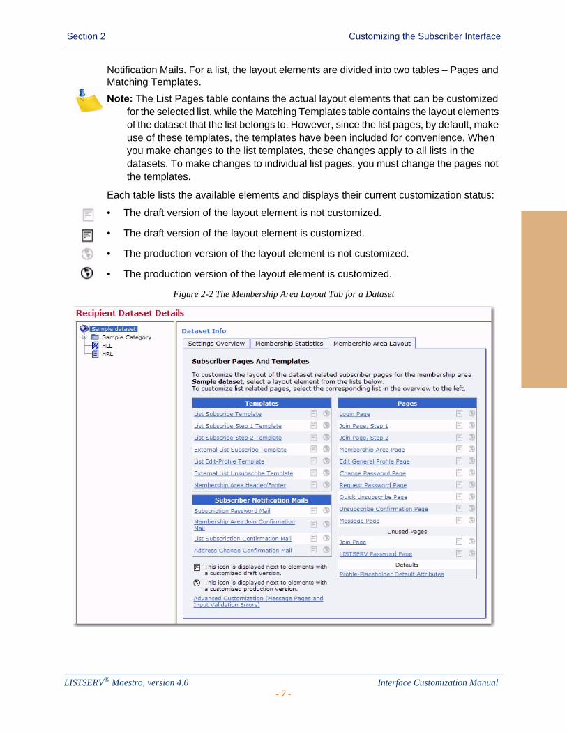
Important: The introductory page is only shown if no customization has been previously performed. If any of the layout elements for the membership area have been customized, then the Membership Area Layout tab is shown with a list of customizable layout elements. For a dataset, the layout elements are divided into three tables – Templates, Pages, and Subscriber Notification Mails. For a list, the layout elements are divided into two tables – Pages and Matching Templates. For more information, see Section 2.2 Using the Membership Area Layout Tab.
2.2 Using the Membership Area Layout Tab
If no customization has been done previously, then clicking on the Membership Area Layout tab displays a general overview, as described in the previous section. To refresh the tab and display a list of layout elements available for customization, click the Select a Page link.
If customization has been done, then clicking on the Membership Area Layout tab takes you directly to the list of layout elements available for customization. The tab is divided into two panes. The left pane displays all of the recipient lists in the dataset in a tree-like structure, the dataset as the root and each list as a node.
A Hosted Recipient List is shown with a node icon that looks like a sheet of paper.
A Hosted LISTSERV List is shown with a node icon that looks like a sheet of paper with the LISTSERV logo.
A Linked LISTSERV List is shown with a node icon that looks like a sheet of paper with the LISTSERV logo and a small arrow in the lower left corner.
A category is represented using a folder icon. Category folders with content (at least one list or subcategory in it) show a little “+” icon (if the folder is closed) or a “-” icon (if the folder is open). Click on the “+” or “-” icon to open or close a category folder. To select a node, simply click on it.
The right pane displays a list of all the customizable layout elements. For a dataset, the layout elements are divided into three tables – Templates, Pages, and Subscriber
LISTSERV® Maestro, version 4.0 Interface Customization Manual- 6 -
Section 2 Customizing the Subscriber Interface
Notification Mails. For a list, the layout elements are divided into two tables – Pages and Matching Templates.
Note: The List Pages table contains the actual layout elements that can be customized for the selected list, while the Matching Templates table contains the layout elements of the dataset that the list belongs to. However, since the list pages, by default, make use of these templates, the templates have been included for convenience. When you make changes to the list templates, these changes apply to all lists in the datasets. To make changes to individual list pages, you must change the pages not the templates.
Each table lists the available elements and displays their current customization status:
• The draft version of the layout element is not customized.
• The draft version of the layout element is customized.
• The production version of the layout element is not customized.
• The production version of the layout element is customized.
Figure 2-2 The Membership Area Layout Tab for a Dataset
LISTSERV® Maestro, version 4.0 Interface Customization Manual- 7 -
Section 2 Customizing the Subscriber Interface
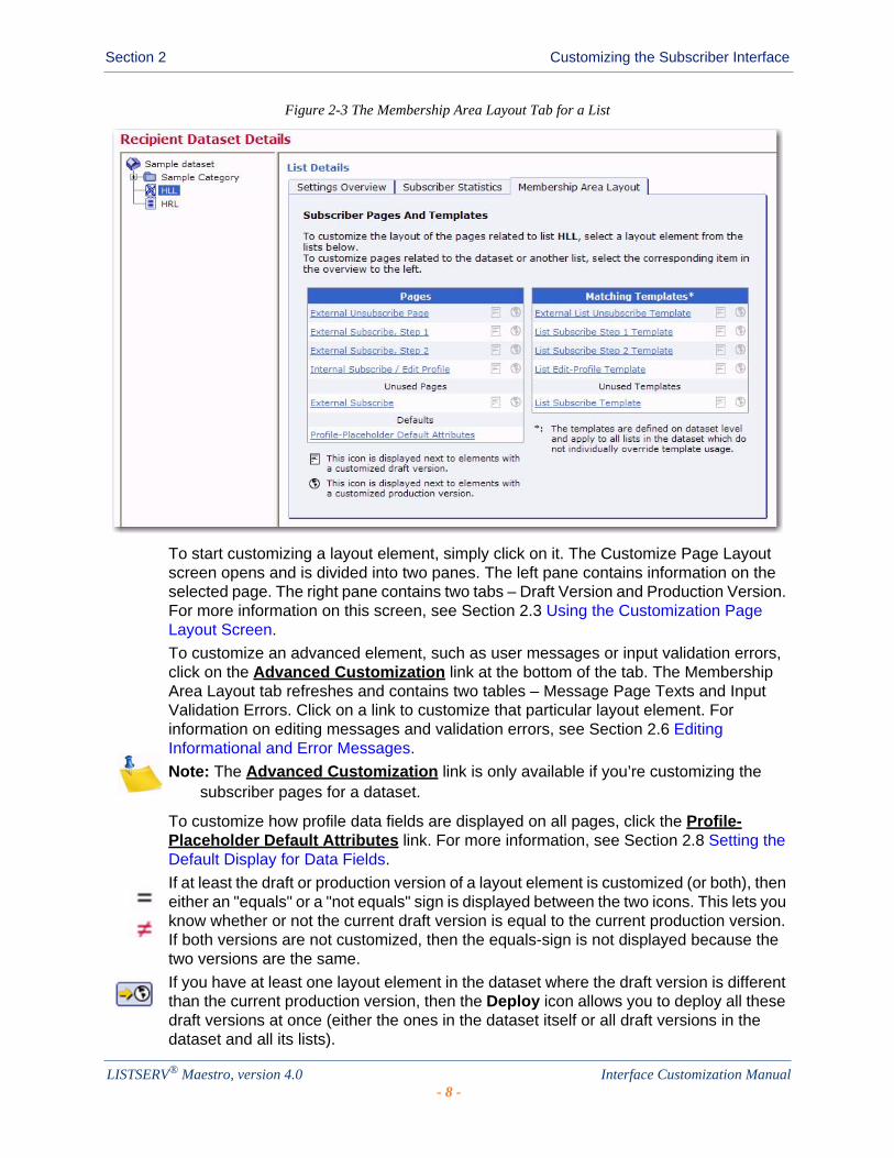
Figure 2-3 The Membership Area Layout Tab for a List
To start customizing a layout element, simply click on it. The Customize Page Layout screen opens and is divided into two panes. The left pane contains information on the selected page. The right pane contains two tabs – Draft Version and Production Version. For more information on this screen, see Section 2.3 Using the Customization Page Layout Screen.
To customize an advanced element, such as user messages or input validation errors, click on the Advanced Customization link at the bottom of the tab. The Membership Area Layout tab refreshes and contains two tables – Message Page Texts and Input Validation Errors. Click on a link to customize that particular layout element. For information on editing messages and validation errors, see Section 2.6 Editing Informational and Error Messages.
Note: The Advanced Customization link is only available if you’re customizing the subscriber pages for a dataset.
To customize how profile data fields are displayed on all pages, click the Profile-Placeholder Default Attributes link. For more information, see Section 2.8 Setting the Default Display for Data Fields.
If at least the draft or production version of a layout element is customized (or both), then either an "equals" or a "not equals" sign is displayed between the two icons. This lets you know whether or not the current draft version is equal to the current production version. If both versions are not customized, then the equals-sign is not displayed because the two versions are the same.
If you have at least one layout element in the dataset where the draft version is different than the current production version, then the Deploy icon allows you to deploy all these draft versions at once (either the ones in the dataset itself or all draft versions in the dataset and all its lists).
LISTSERV® Maestro, version 4.0 Interface Customization Manual- 8 -

Section 2 Customizing the Subscriber Interface
When changes are made to the dataset or lists after customizations have been made, the customized pages may become incompatible with the dataset. For example, if new fields are added to the dataset, then customized pages that do not include placeholders for these new fields are no longer valid. When this happens, the following symbols may be displayed instead of the symbols described above:
• The draft version of the page is customized, but the customized version is no longer compatible with the dataset. Therefore, before you can view (or deploy) the current customized draft version, you will have to make it compatible to the dataset again.
• The production version of the page is customized, but the customized version is no longer compatible with the dataset. Therefore, the system has automatically modified the customized production version to make it compatible again (and has saved a backup copy of the original customized production version).
If the customization of any page is currently incompatible to the matching dataset, then the tab also displays an additional notification message about this and contains a link to a page where you can access all incompatible pages.
2.3 Using the Customization Page Layout Screen
If no customization has been done previously, the Customize Page Layout screen can be accessed by clicking the Supply a custom membership area header/footer link, as described in Section 2.1 Accessing the Customization Wizard.
If customization has been done, then the Customize Page Layout screen can be accessed by clicking on the name of one of the layout elements on the Membership Area Layout Tab. For information on this tab, see Section 2.2 Using the Membership Area Layout Tab.
In the upper right corner of the Customize Page Layout screen, the Currently Customizing drop-down menu allows you to easily switch from customizing a dataset to customizing a list. To customize the membership area layout for the dataset, click the drop-down menu and select Membership Area Layout. This layout is shown by default if this is your first time accessing this screen. To customize the list(s) in the dataset, click the drop-down menu and select the list you want to customize (i.e. if you have a list named XYZ, then select Layout of List XYZ).
The Customize Page Layout screen is divided into two panes. The left pane is where you select the page or template that you want to customize. The default is the Membership Area Header/Footer page. To change, simply click the Selected Page/Template drop-down menu and select a different page or template to work with. From this menu, you can also select to customize notifications, messages, or errors.
Once you make a selection, the area below the drop-down menu displays the following:
• If you selected a template page, normal page, or a notification email, then a short description of the selected layout element is displayed.
• If you selected a message text for a message group, then a list of available messages for that group is displayed. Click on one of the messages to select it as the layout element you want to customize (or view). When you initially select a message group from the drop-down menu, the first message in the group is selected by default.
LISTSERV® Maestro, version 4.0 Interface Customization Manual- 9 -

Section 2 Customizing the Subscriber Interface
• If you selected an input validation error for an error group, then a list of available errors for that group is displayed. Click on one of the errors to select it as the layout element you want to customize (or view). For each error group, there is an Error Group Header/Footer layout element that defines a common opening and closing text that is shared by all of the errors in this group. This header/footer appears first in the list of errors for the group and is selected, by default, when you initially select an error group from the drop-down menu.
Figure 2-4 Customizing the Membership Area Layout
The right pane contains two tabs – the Draft Version tab and the Production Version tab. The production version is the version that subscribers, who access the membership area pages, actually see. The draft version, on the other hand, is not visible to the subscribers. This means that you can safely make any changes to the draft version without them becoming immediately visible. For example, you may want to customize one page after the other by editing their draft versions; but, you want to make the customized versions available all at once, after you have finished with all pages. Or, you may want to experiment a bit with the layout, without disturbing the actual production versions that subscribers see. Only when you finally deploy the draft version as the new production version will your changes become visible to subscribers.
Depending on the type of element you selected, the initial preview of the draft version is displayed in different ways:
• If you selected a template, then the preview displays the page as a normal HTML page, as it would appear in the subscriber’s browser. Since the page being displayed is a template, a rectangular placeholder frame is used at the location where the actual content will appear when the template is used by a page.
• If you selected a normal page, then the preview displays the pages as a normal HTML page, as it would appear in the subscriber’s browser.
LISTSERV® Maestro, version 4.0 Interface Customization Manual- 10 -
Section 2 Customizing the Subscriber Interface
• If you selected a subscriber notification email, then the preview displays the email in text format, and also displays the other email attributes like the From address, Subject line, and language charset that will be used. It also displays the currently used "maximum line length", i.e. the line length used to wrap the text with.
• If you selected a message page text, then the preview of the message page texts is shown by displaying the actual message page (which, by itself, is one of the normal pages, see above) as a HTML page, as it would appear in the browser of the subscriber with the currently selected message in place.
• If you selected an input validation error, then the error is shown by displaying a default page with the selected error message displayed on this default page.
Various action icons may be displayed, letting you execute certain actions on the current draft version of the selected layout element. Not all actions are always available.
• Edit Source – Click to edit the current draft version. For information on editing a specific layout element see the following sections: Section 2.4 Editing Templates and Pages, Section 2.5 Editing Subscriber Notification Emails, and Section 2.6 Editing Informational and Error Messages.
• View Source – Click to view the source of the current production version.
• Deploy as Production Version – Click to deploy the current draft version as the new production version. This will make a copy of the current draft version of the selected layout element and write it into the element's production version, making this the version of the selected element which subscribers actually see. The draft version remains unchanged.
• Copy from Production Version – Click to make a copy of the current production version and use it as the new draft version. This will overwrite all current changes to the draft version. The production version remains unchanged.
• Reset to System Default – Click to reset the current draft version to the LISTSERV Maestro system default. This will overwrite all manual changes to the draft version and will reset it to its default. The production version remains unchanged.
• Show Preview – Click to show the preview of the current production version.
Various comments may also be displayed, depending on the type of layout element you selected to customize.
• Header/Footer Template – This comment shows how many pages (in the dataset and its lists) that are currently using the header/footer template (i.e. pages that do not have a header/footer defined of their own but are inheriting the template). Click the Details link to view a detailed list of pages using this template.
• Any of the List Page Templates – The first comment shows if the template page inherits the header/footer template (see above) or if the header/footer is defined locally on the list page template. The second comment (below the first one) shows how many list pages are currently using the corresponding template (i.e. pages that only define the layout of the actual list profile fields locally, but also inherit the rest of the page layout from this template).
LISTSERV® Maestro, version 4.0 Interface Customization Manual- 11 -
Section 2 Customizing the Subscriber Interface
• Any of the Normal Pages – The comment displays if the page inherits the header/footer template (see above) or if the header/footer is defined locally on the page.
• Any of the Message Page Texts – The comment describes the currently selected message and the circumstances under which it is displayed to the subscriber.
• Any of the Input Validation Errors – The comment describes the currently selected error message and the circumstances under which it may occur. Also, unless the current message is already the error-header/footer of the error group, then it provides a link to select the error-header/footer for the current error group. By editing the error-header/footer, you can provide all errors in one error group with the same opening and closing texts.
Additional controls may also appear, allowing you to simulate certain system states so you can verify their impact on the actual preview. These controls vary depending on the layout element selected, and only a few elements offer them. For information on these controls, please see the online help.
2.4 Editing Templates and Pages
Templates contain the default layout and design for the subscriber pages in the membership area. Templates are used to give a uniform look to your subscriber pages and can help you customize many pages all at once. By inheriting parts from the template, repetitious work can be saved on individual pages, and a change to the template will automatically apply to all pages that use the template.
Pages are specific subscriber pages for the dataset/list. They can be customized individually, with no impact on others, or they can be customized by inheriting parts from a template.
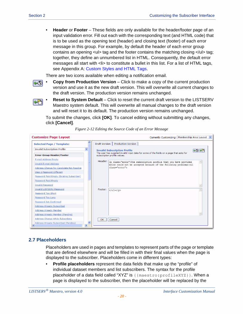
If you choose to edit the current draft version of a template or page (by clicking the Edit Source icon), then you will need to edit the HTML source code. This HTML code also includes the placeholders as specified in the left pane (see Section 2.7 Placeholders). It also defines the general layout of the page as well as the design style (see Appendix A: Custom Styles and HTML Tags). The HTML code is edited in the main edit field in the center. Above the edit field, a drop-down list is used to define what part of the page is to be edited (in the edit field), and which part is to be inherited from the applicable page template (this drop-down list is not available for the Membership Area Header/Footer Template). By inheriting parts from the template, repetitious work can be saved on the individual pages, where the HTML code that is already defined in the template does not need to be included. Also, a change to the template will automatically apply to all pages that use the template. To submit the changes, click [OK]. To cancel editing without submitting any changes, click [Cancel].
There are two icons available when editing a template or page.
• Copy from Production Version – Click to make a copy of the current production version and use it as the new draft version. This will overwrite all current changes to the draft version. The production version remains unchanged.
• Reset to System Default – Click to reset the current draft version to the LISTSERV Maestro system default. This will overwrite all manual changes to the draft version and will reset it to its default. The production version remains unchanged.
LISTSERV® Maestro, version 4.0 Interface Customization Manual- 12 -

Section 2 Customizing the Subscriber Interface
Figure 2-5 Editing the Source Code of a Template
2.4.1 The Membership Area Header/Footer Template
The Membership Area Header/Footer Template is a common template that is shared by all pages in the membership area; therefore, any changes to this template will automatically affect all pages. Because of this, the Membership Area Header/Footer template is the ideal place to start customization, providing a common frame or layout for every page. For example, you can add a common header or footer, or you can define common HTML styles, colors, and fonts.
If you are viewing the Membership Area Header/Footer template in the Customize Page Layout screen, then the Details link is available. Click this link to see a list of the pages that are using this template. To view a specific page in the list, simply click the Open link next to that page. To exit the list and return to the preview of the template, click the Back to Template link.
To edit the template, click the Edit Source icon on the Draft Version tab of the Customize Page Layout screen. Then, enter/edit the HTML source code. This HTML code also includes the placeholders as specified in the left pane (see Section 2.7 Placeholders). When editing the Header/Footer Template, Cascading Style Sheets (CSS) should be used to customize the style of the page. The HTML code for the default pages (pages that are not customized) uses a few common HTML tags as well as custom style classes, whose look can be defined with a customized style sheet. For a list of these custom styles and HTML tags, see Appendix A: Custom Styles and HTML Tags.
2.4.2 The Membership Area Page
The Membership Area Page is the home page of the dataset and is the first page that the subscriber sees after logging in. This page is divided into two sections – My List and My Profile – and contains links that let the subscriber navigate between these two sections.
LISTSERV® Maestro, version 4.0 Interface Customization Manual- 13 -

Section 2 Customizing the Subscriber Interface
Figure 2-6 Editing the Membership Area Page
Under certain circumstances, the Membership Area Page shows additional welcome messages to the subscriber. Normally, there is no welcome message displayed. However, the following situations have their own welcome message:
• For a Confirmed Member (Default) – The page is viewed in its default state as seen by normal confirmed members.
• For a Confirmed Member (LISTSERV not available) – Same as Confirmed Member (Default) (see above); however, this state simulates that LISTSERV is not available (LISTSERV itself or the network is down). This situation may impact the presentation of Linked LISTSERV Lists; therefore, this simulated state is only available if there are any Linked LISTSERV Lists in the dataset.
• For a Confirmed Member with the List-Subscription-Welcome-Message – The page is viewed by a confirmed existing member who has just subscribed to an additional list from outside of the Membership Area (via the special external subscribe pages). At the end of the external subscribe, the member was automatically logged into the Membership Area and was directed to this page, which is the first page the member sees after the system has accepted the external subscription. Therefore, this page takes over the job of informing the member of the success of their external subscribe, and displays a message that they are now freshly subscribed to the given mailing list.
• For a Confirmed Member with List-Subscription-Welcome-Message (LISTSERV not available) – Same as Confirmed Member with List-Subscription-Welcome-Message (see above); however, this state simulates that LISTSERV is not available (LISTSERV itself or the network is down). This situation may impact the presentation of Linked LISTSERV Lists; therefore, this simulated state is only available if there are any Linked LISTSERV Lists in the dataset.
LISTSERV® Maestro, version 4.0 Interface Customization Manual- 14 -

Section 2 Customizing the Subscriber Interface
• For an Unconfirmed Member with Membership-Unconfirmed-Message – The page is viewed by a member who has still not confirmed their membership (via the confirm link in the double opt-in confirmation mail). In this case, a message is displayed reminding the member of the still unconfirmed state of their membership, and how to confirm it.
• For an Unconfirmed Member with Join-Welcome-Message – The page is viewed by a "new" member who has just joined the Membership Area (so they are viewing this page for the very first time) and has not yet confirmed the membership. A similar reminder as above is displayed and a "Welcome to the Membership Area" message is also displayed.
• For an Unconfirmed Member with List-Subscription-Welcome-Message – The page is viewed by a "new" member who has not only just joined the Membership Area (so they are viewing this page for the very first time), but has also subscribed to the first list at the same time and not yet confirmed the membership. A similar reminder and welcome message as above is displayed, but the welcome message is not only a general "Welcome to the Membership Area" message, but a more specific message about the mailing list that the member has just subscribed to.
To simulate these different welcome messages, click the State drop-down menu and select one of the choices described above. In addition, the right pane displays the Membership Area State tab, which lets you define additional settings in order to simulate different subscriber states.
2.4.2.1 The Membership Area State Tab
The Membership Area State tab is a special tab that is only available if the currently selected layout element is the Membership Area Page. The controls on this tab can be used to simulate a certain subscriber and list state, impacting the preview of the Membership Area Page shown when the Draft Version tab or Production Version tab are selected. Using the Membership Area State tab, different states can be experimented with and tested in order to see how each state impacts the membership area page layout.
Figure 2-7 The Membership Area State Tab
The states that can be defined correspond to the lists in the membership area. For each list, the following states can be set:
• Subscribed State – Check the Subscribed option to simulate how the page looks for a member who is subscribed to the given list. Uncheck this option to simulate a member who is not subscribed to the list.
LISTSERV® Maestro, version 4.0 Interface Customization Manual- 15 -
Section 2 Customizing the Subscriber Interface
• Public Access State – Click the drop-down menu and select the access state to simulate for the list. With this, how the page looks to a member can be verified (with the subscription state defined via the Subscribed option, see above) if the list has the selected state. The possible states are Open to everyone, Access for subscribers only, or No public access.
• Maintenance State – Check the Closed for maintenance option to simulate that the given list is currently closed for maintenance. Uncheck this option to simulate that the list is not closed. With this, you can verify how the Membership Area Page looks to a member (with the subscription state defined via the Subscribed option, see above) when the list is closed for maintenance and when it is not.
2.5 Editing Subscriber Notification Emails
To edit a notification email, click the Edit Source icon on the Draft Version tab of the Customize Page Layout screen.
The Draft Version tab now contains a a new drop-down menu appears at the top of the tab. This option gives you the ability to create an HTML version of the email along with a plain text alternative.
To create an HTML message with the plain text alternative created automatically, click the drop-drown menu and select Use HTML below for HTML part and generate the Plain Text version automatically.
To create an HTML message with a separate plain text alternative, click the drop-down menu and select Define separate HTML and Plain Text version. When this option is selected, two tabs will appear for defining the body’s content.
Then, enter/edit the information in the following fields:
• Sender Name – Enter the name that is to be used as the sender name. Do not use an email address; instead, enter a real name. This value is optional; if nothing is supplied, then the List Administrator’s address (from the dataset definition) will be shown in the From: field.
• Subject – Enter the subject line that is to be used for this notification email. In the left pane, there is a list of all placeholders that may be included in the subject line. These placeholders will be replaced with suitable values before delivery. Enter the placeholder manually into the subject line or click on the link to automatically add the placeholder at the current cursor position.
• Body – The main edit field for the email body. When defining the email body content, use the drop-down menu to determine what type of content you’ll be defining. To use the email’s body template and provide your own body content, select Notification mail body template inherited, body define below. To create an all new email (without template), select All content defined below.
Note: When defining the HTML and plain text versions of the email separately, then this drop-down menu is available on both the HTML and Plain Text tabs.
In the left pane, there is a list of all placeholders that may be included in the body. These placeholders will be replaced with suitable values before delivery. Enter the placeholder manually into the body or click on it to automatically add the placeholder at the current cursor position.
LISTSERV® Maestro, version 4.0 Interface Customization Manual- 16 -

Section 2 Customizing the Subscriber Interface
• [Upload HTML] – Click to upload an HTML file into the body of the email.
• [Download HTML] – Click to download the HTML file.
• Language Charset – Select the language charset (character encoding) to use for the email delivery. The charset should match the language (or the special non-ASCII characters, if any) that were used in the body.
There are two icons available when editing a notification email.
• Copy from Production Version – Click to make a copy of the current production version and use it as the new draft version. This will overwrite all current changes to the draft version. The production version remains unchanged.
• Reset to System Default – Click to reset the current draft version to the LISTSERV Maestro system default. This will overwrite all manual changes to the draft version and will reset it to its default. The production version remains unchanged.
To submit the changes, click [OK]. To cancel editing without submitting any changes, click [Cancel].
Figure 2-8 Customizing a Subscriber Notification Email
LISTSERV® Maestro, version 4.0 Interface Customization Manual- 17 -

Section 2 Customizing the Subscriber Interface
2.5.1 Formatting All Notification Emails for a Dataset
To change the format of all notification emails for this dataset, click on the Change link at the bottom of the Subscriber Notification Mails section of the Subscriber Pages and Templates table.
Figure 2-9 The Subscriber Pages and Templates Table
The Notification Mail Format window pops up. From here, you can choose to:
• Send all notification mails in HTML format with a plain text alternative part,
• Send all notification mails in plain text format, or
• Evaluate the following condition to decide if a subscriber receives HTML or plain text. If this is selected, then select the boolean field and its value from the drop-down menus. When selected, then HTML emails will only be sent to those subscriber that meet the requirements of this condition. Those subscribers who do not meet these requirements will receive a plain text email.
LISTSERV® Maestro, version 4.0 Interface Customization Manual- 18 -

Section 2 Customizing the Subscriber Interface
Figure 2-10 Changing the Notification Email Forma
Once you finished, click [OK]. The new format status will be displayed at the bottom of the Subscriber Notification Mails section of the table next to the Change link. This format status will be applied to all notification emails in the dataset.
Figure 2-11 Notification Email Format Status
2.6 Editing Informational and Error Messages
To edit a message text or an input validation error, select the message group or error group you want to edit, and then select the specific message/error from the list of available elements in the left pane of the Customize Page Layout screen. Once you’ve selected the message/error, then click the Edit Source icon on the Draft Version tab. Finally, enter/edit the information in the following fields, if applicable:
• Title – This field is only available for informational messages. Enter the text that is to be used as the title of the message. HTML tags can be used to format it (see Appendix A: Custom Styles and HTML Tags). Below this field there is a list of all placeholders that may be included in the title. These placeholders will be replaced with suitable values. Enter the placeholder manually into the field or click on it to automatically add the placeholder at the current cursor position.
• Text – This field is available for informational messages and input validation errors. Enter the text that is to be used as the actual message. HTML tags can be used to format it (see Appendix A: Custom Styles and HTML Tags). Below this field there is a list of all placeholders that may be included in the message. These placeholders will be replaced with suitable values. Enter the placeholder manually into the message or click on it to automatically add the placeholder at the current cursor position.
LISTSERV® Maestro, version 4.0 Interface Customization Manual- 19 -
Section 2 Customizing the Subscriber Interface
• Header or Footer – These fields are only available for the header/footer page of an input validation error. Fill out each with the corresponding text (and HTML code) that is to be used as the opening text (header) and closing text (footer) of each error message in this group. For example, by default the header of each error group contains an opening <ul> tag and the footer contains the matching closing </ul> tag; together, they define an unnumbered list in HTML. Consequently, the default error messages all start with <li> to constitute a bullet in this list. For a list of HTML tags, see Appendix A: Custom Styles and HTML Tags.
There are two icons available when editing a notification email.
• Copy from Production Version – Click to make a copy of the current production version and use it as the new draft version. This will overwrite all current changes to the draft version. The production version remains unchanged.
• Reset to System Default – Click to reset the current draft version to the LISTSERV Maestro system default. This will overwrite all manual changes to the draft version and will reset it to its default. The production version remains unchanged.
To submit the changes, click [OK]. To cancel editing without submitting any changes, click [Cancel].
Figure 2-12 Editing the Source Code of an Error Message
2.7 Placeholders
Placeholders are used in pages and templates to represent parts of the page or template that are defined elsewhere and will be filled in with their final values when the page is displayed to the subscriber. Placeholders come in different types:
• Profile placeholders represent the data fields that make up the “profile” of individual dataset members and list subscribers. The syntax for the profile placeholder of a data field called “XYZ” is {{maestro:profileXYZ}}. When a page is displayed to the subscriber, then the placeholder will be replaced by the
LISTSERV® Maestro, version 4.0 Interface Customization Manual- 20 -
Section 2 Customizing the Subscriber Interface
value of XYZ for that subscriber. The display name defined for the field is represented by the {{maestro:labelXYZ}} placeholder. Changing the display name in the dataset definition will automatically update all the pages that use this placeholder.
• Structural placeholders represent pages or parts of pages. For example, in the header/footer template, the {{maestro:body}} placeholder represents the “body” part of pages that inherit the header/footer template. In a fully customized page, the {{maestro:body}} placeholder marks the beginning of the body part of the page, and the {{/maestro:body}} placeholder marks the end of the body part. If the page is subsequently changed to inherit the header and footer from the header/footer template, then only the part of the page between these two placeholders will be retained.
• Conditional placeholders mark the beginning and end of parts of the page or template that are displayed under certain conditions. For example, on certain pages and templates, the {{maestro:validationErrorsPresent}} and {{/maestro:validationErrorsPresent}} placeholders surround the text and code that will be used only if validation errors have been detected. The {{maestro:validationErrors}} placeholder, which can only be used within this conditional block, will be replaced by the relevant validation error text, as defined in the error message templates.
When you are editing a template or page, then the placeholder tree structure is displayed. This structure defines the placeholders that can be used for the customization of the selected page or template. Placeholders are divided into two categories – Free Placeholders and Restricted Placeholders. Free Placeholders may appear anywhere on the page; Restricted Placeholders, when used on a page, must conform to the same tree structure that is shown in the left pane.
The placeholder tree structure shows each placeholder by name and uses symbols to denote what type of placeholder it is.
• Free Placeholders – Free placeholders may appear anywhere on the page, even inside other placeholders. They are always optional, which means that you can include them, but do not have to.
• Optional Restricted Placeholders – Restricted placeholders must adhere to their parent-child structure. This means that all top-level restricted placeholders (i.e. the ones without any further parents in the tree structure) can be used anywhere on the page, at top level (not inside other placeholders), while sub-level placeholders can only be used on the page if they appear inside their matching parent placeholder (as defined by the tree structure). An optional restricted placeholder can be included on the page, but does not have to be included. If such a placeholder is omitted, all its children (if any) must be omitted too.
• Mandatory Restricted Placeholders – The same rules about restricted placeholders as already described above for optional restricted placeholders apply here too, but placeholders of this type are mandatory (i.e. they must appear on the page); otherwise, the customization is not accepted by the system. Mandatory placeholders are also marked by using a bold font for their name.
LISTSERV® Maestro, version 4.0 Interface Customization Manual- 21 -

Section 2 Customizing the Subscriber Interface
In the tree structure, placeholders with further children are preceded by a “+” symbol (if the children are currently not visible) or “-” symbol (if the children are currently visible). Click on the “+” or “-“ symbol to make the children visible or to hide them.
If you click on a placeholder (i.e. its symbol or name), then the placeholder is selected and shown inside of a blue box, with an additional short description of the placeholder. Therefore, if you do not remember what a certain placeholder does exactly, or why it is required or not, simply select the placeholder to see this description. If you are editing the draft version, the box also contains a small green arrow icon. When you click the arrow, the placeholder tag for the placeholder will automatically be inserted into the page code (in the right pane) at the current cursor position. This arrow is not available when viewing the source of the production version.
If you want to use a placeholder on the page, then you will need to write it using the special placeholder tag syntax. The syntax is slightly different depending on whether or not the placeholder contains a body or attributes.
• Without Body – The placeholder tag consists of a single tag and looks like this:
{{maestro:NAME}}
where you must replace "NAME" with the placeholder name (as shown in the tree). Placeholder names are case sensitive.
• With Body – The placeholder tag consists of an opening and closing tag, with the placeholder body between the tags, such as:
{{maestro:NAME}}...placeholder body goes here...{{/maestro:NAME}}
where you must replace "NAME" (in both the opening and closing tags) with the placeholder name (as shown in the tree). Placeholder names are case sensitive. The body, which is only outlined in the example above, can be any further HTML code and may also contain linebreaks (i.e. stretch over several lines or paragraphs). Also, the placeholder tags of the placeholder’s children must appear within this body. For example, if you have a tree definition like this:
validationErrorsPresent
validationErrors
then the page must contain a placeholder structure similar to the following:
{{maestro:validationErrorsPresent}}
...this is the validationErrorsPresent-placeholder's body, which contains the child placeholder:
{{maestro:validationErrors}}
...here the body continues, up to the closing tag
{{/maestro:validationErrorsPresent}}
• With Attributes – Some placeholders may additionally contain attributes, using the following syntax:
{{maestro:NAME ATTRIBUTE="VALUE"}}
where "NAME" is to be replaced as shown above, and "ATTRIBUTE" and "VALUE" are to be replaced with the attribute name and value.
LISTSERV® Maestro, version 4.0 Interface Customization Manual- 22 -

Section 2 Customizing the Subscriber Interface
A placeholder may also contain several attributes, like this:
{{maestro::NAME ATTR1="VALUE1" ATTR2="VALUE2" ATTR3="VALUE3"}}
If an attribute is not specified, a suitable default will be assumed.
Placeholders that use attributes are:
Text, Number, Email, or Password Profile Field Placeholders
Boolean or Tracking Permission Profile Field Placeholders
Single-Select Profile Field Placeholders
Multiple-Select Profile Field Placeholders
Subscription Status Profile Field Placeholders
Subscription Type Profile Field Placeholders
Button Profile Field Placeholders
Clickable Link Profile Field Placeholders
Quick Login Option Profile Field Placeholders
Acknowledge Style Profile Field Placeholders
Mail Header Style Profile Field Placeholders
Hide Subscription Option Profile Field Placeholders
LISTSERV List Topic Profile Field Placeholders
2.7.1 Text, Number, Email, or Password Profile Field Placeholders
This table lists the attributes that may be used with text, number, email, or password profile field placeholders.
Table 2-1 Text, Number, Email, or Password Profile Filed Placeholder Attributes
Attribute Name Mandatory Attribute Description
size No Defines the size of the edit field. Default: 60 (for text, email, password) or 10 (for number)
If the placeholder is defined in a context where the enabled/disabled state of the field is the same under all circumstances, then:
styleclass No Defines the name of the CSS style class(es) assigned to the edit field.Default: no style class
If the placeholder is defined in a context where the enabled/disabled state of the field differs according to the circumstances, then:
enabledclass No Defines the name of the CSS style class(es) assigned to the edit field if the field appears in an enabled context.Default: no style class
disabledclass No Defines the name of the CSS style class(es) assigned to the edit field if the field appears in a disabled context.Default: no style class
LISTSERV® Maestro, version 4.0 Interface Customization Manual- 23 -
Section 2 Customizing the Subscriber Interface
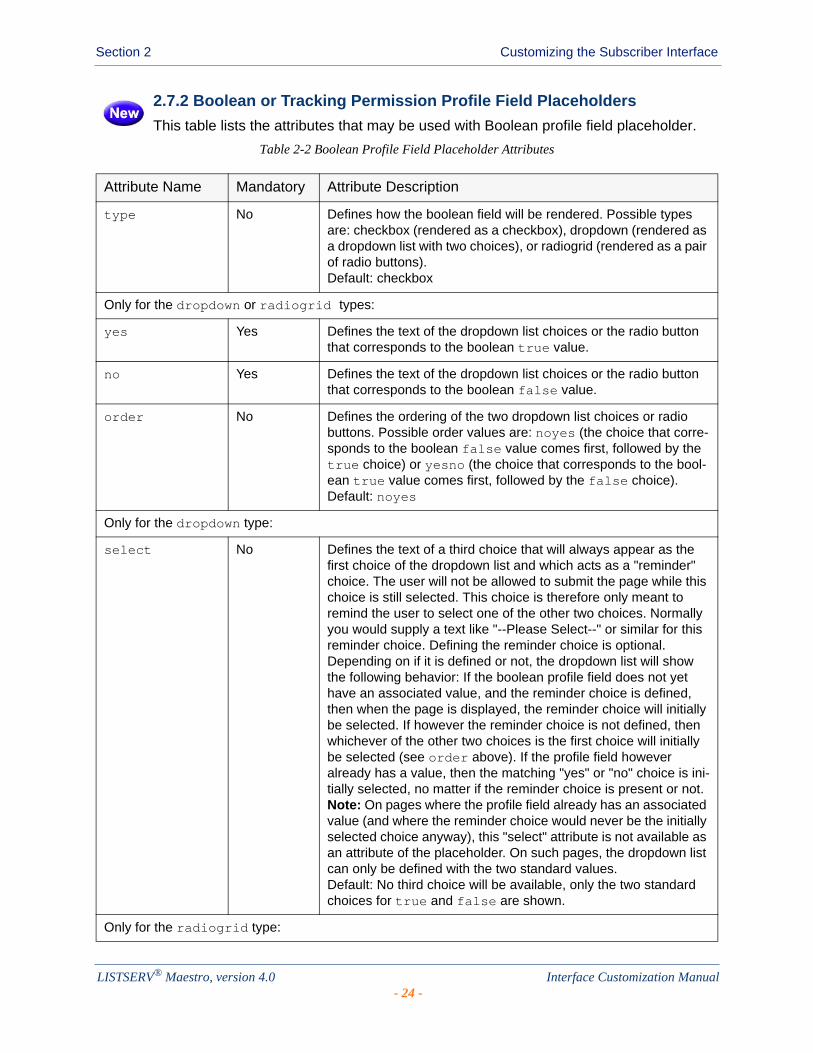
2.7.2 Boolean or Tracking Permission Profile Field Placeholders
This table lists the attributes that may be used with Boolean profile field placeholder.
Table 2-2 Boolean Profile Field Placeholder Attributes
Attribute Name Mandatory Attribute Description
type No Defines how the boolean field will be rendered. Possible types are: checkbox (rendered as a checkbox), dropdown (rendered as a dropdown list with two choices), or radiogrid (rendered as a pair of radio buttons).Default: checkbox
Only for the dropdown or radiogrid types:
yes Yes Defines the text of the dropdown list choices or the radio button that corresponds to the boolean true value.
no Yes Defines the text of the dropdown list choices or the radio button that corresponds to the boolean false value.
order No Defines the ordering of the two dropdown list choices or radio buttons. Possible order values are: noyes (the choice that corre-sponds to the boolean false value comes first, followed by the true choice) or yesno (the choice that corresponds to the bool-ean true value comes first, followed by the false choice).Default: noyes
Only for the dropdown type:
select No Defines the text of a third choice that will always appear as the first choice of the dropdown list and which acts as a "reminder" choice. The user will not be allowed to submit the page while this choice is still selected. This choice is therefore only meant to remind the user to select one of the other two choices. Normally you would supply a text like "--Please Select--" or similar for this reminder choice. Defining the reminder choice is optional.Depending on if it is defined or not, the dropdown list will show the following behavior: If the boolean profile field does not yet have an associated value, and the reminder choice is defined, then when the page is displayed, the reminder choice will initially be selected. If however the reminder choice is not defined, then whichever of the other two choices is the first choice will initially be selected (see order above). If the profile field however already has a value, then the matching "yes" or "no" choice is ini-tially selected, no matter if the reminder choice is present or not.Note: On pages where the profile field already has an associated value (and where the reminder choice would never be the initially selected choice anyway), this "select" attribute is not available as an attribute of the placeholder. On such pages, the dropdown list can only be defined with the two standard values.Default: No third choice will be available, only the two standard choices for true and false are shown.
Only for the radiogrid type:
LISTSERV® Maestro, version 4.0 Interface Customization Manual- 24 -
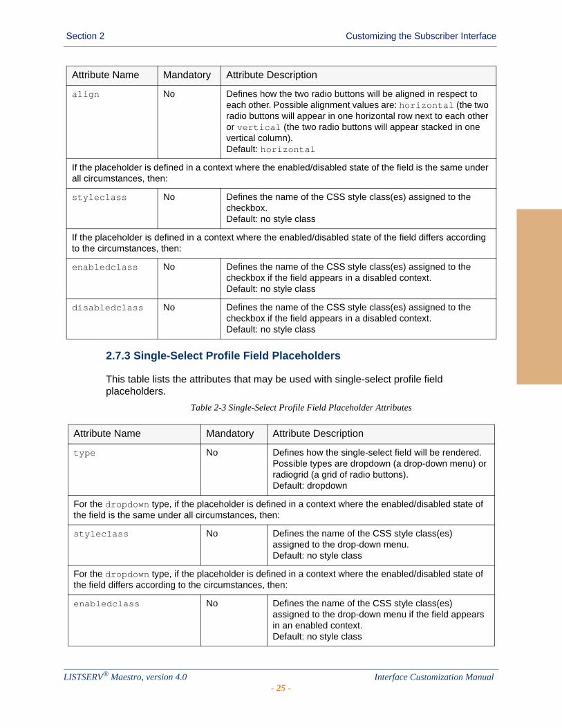
Section 2 Customizing the Subscriber Interface
2.7.3 Single-Select Profile Field Placeholders
This table lists the attributes that may be used with single-select profile field placeholders.
Table 2-3 Single-Select Profile Field Placeholder Attributes
align No Defines how the two radio buttons will be aligned in respect to each other. Possible alignment values are: horizontal (the two radio buttons will appear in one horizontal row next to each other or vertical (the two radio buttons will appear stacked in one vertical column).Default: horizontal
If the placeholder is defined in a context where the enabled/disabled state of the field is the same under all circumstances, then:
styleclass No Defines the name of the CSS style class(es) assigned to the checkbox.Default: no style class
If the placeholder is defined in a context where the enabled/disabled state of the field differs according to the circumstances, then:
enabledclass No Defines the name of the CSS style class(es) assigned to the checkbox if the field appears in a disabled context.Default: no style class
disabledclass No Defines the name of the CSS style class(es) assigned to the checkbox if the field appears in a disabled context.Default: no style class
Attribute Name Mandatory Attribute Description
Attribute Name Mandatory Attribute Description
type No Defines how the single-select field will be rendered. Possible types are dropdown (a drop-down menu) or radiogrid (a grid of radio buttons).Default: dropdown
For the dropdown type, if the placeholder is defined in a context where the enabled/disabled state of the field is the same under all circumstances, then:
styleclass No Defines the name of the CSS style class(es) assigned to the drop-down menu.Default: no style class
For the dropdown type, if the placeholder is defined in a context where the enabled/disabled state of the field differs according to the circumstances, then:
enabledclass No Defines the name of the CSS style class(es) assigned to the drop-down menu if the field appears in an enabled context.Default: no style class
LISTSERV® Maestro, version 4.0 Interface Customization Manual- 25 -

Section 2 Customizing the Subscriber Interface
disabledclass No Defines the name of the CSS style class(es) assigned to the drop-down menu if the field appears in a disabled context.Default: no style class
For the radiogrid type:
order No Defines if the order of the radio buttons in the grid will be horizontal and vertical.Default: horizontal
maxrows No Defines the maximum number of rows in the radio grid. Columns will be added as necessary to be able to include all choices defined by the profile field.Note: Use either maxrows or maxcols, but never use both at the same time.Default: If there are more than four choices: 3If less than four choices, then the column/row count is chosen to create a layout as compact as possible.
maxcols No Defines the maximum number of rows in the radio grid. Rows will be added as necessary to be able to include all choices defined by the profile field.Note: Use either maxrows or maxcols, but never use both at the same time.Default: If there are more than four choices: 3If less than four choices, then the column/row count is chosen to create a layout as compact as possible.
tablestyleclass No Defines the name of the CSS style class(es) assigned to the HTML table surrounding the radio button grid.Default: no style class
rowstyleclass No Defines the name of the CSS style class(es) assigned to each row in the HTML table surrounding the radio button grid.Note: If you use rowstyleclass, then you cannot use evenrowstyleclass or oddrowstyleclass.Default: no style class
evenrowstyleclass No Defines the name of the CSS style class(es) assigned to every even row in the HTML table sur-rounding the radio button grid.Note: If you use evenrowstyleclass, then you must also use oddrowstyleclass, but you cannot use row-styleclass.Default: no style class
Attribute Name Mandatory Attribute Description
LISTSERV® Maestro, version 4.0 Interface Customization Manual- 26 -

Section 2 Customizing the Subscriber Interface
2.7.4 Multiple-Select Profile Field Placeholders
This table lists the attributes that may be used with multiple-select profile field placeholders.
Table 2-4 Multiple-Select Profile Field Placeholder Attributes
oddrowstyleclass No Defines the name of the CSS style class(es) assigned to every odd row in the HTML table surrounding the radio button grid. Note: If you use oddrowstyleclass, then you must also use evenrowstyleclass, but you cannot use rowstyleclass.Default: no style class
cellstyleclass No Defines the name of the CSS style class(es) assigned to each cell in the HTML table surrounding the radio button grid. Default: no style class
For the radiogrid type, if this field is an optional field:
defaultvalueposition No If the profile field is an optional field, then one of the choices is “No Selection”. This attribute defines where the “No Selection” choice will be rendered. The available positions are: first (first radio button in the grid), last (last radio button in the grid), above (first radio button in the grid, which will be rendered in a separate row above all other choices), and below (the last radio button in the grid, which will be ren-dered in a separate row below all other choices).Default: first
Attribute Name Mandatory Attribute Description
Attribute Name Mandatory Attribute Description
type No Defines how the multiple-select field will be rendered. Possible types are list (a selection list) or check-boxgrid (a grid of checkboxes).Default: list
For the list type, if the placeholder is defined in a context where the enabled/disabled state of the field is the same under all circumstances, then:
styleclass No Defines the name of the CSS style class(es) assigned to the selection list.Default: no style class
For the list type, if the placeholder is defined in a context where the enabled/disabled state of the field differs according to the circumstances, then:
enabledclass No Defines the name of the CSS style class(es) assigned to the selection list if the field appears in an enabled context.Default: no style class
LISTSERV® Maestro, version 4.0 Interface Customization Manual- 27 -
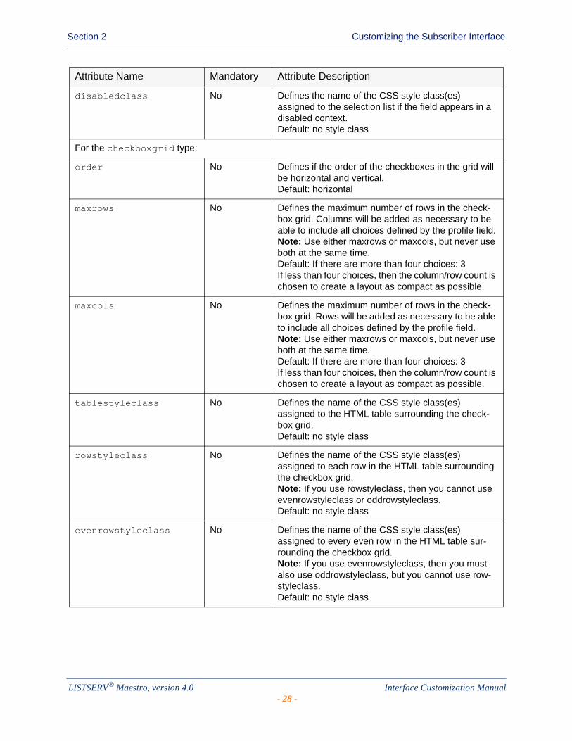
Section 2 Customizing the Subscriber Interface
disabledclass No Defines the name of the CSS style class(es) assigned to the selection list if the field appears in a disabled context.Default: no style class
For the checkboxgrid type:
order No Defines if the order of the checkboxes in the grid will be horizontal and vertical.Default: horizontal
maxrows No Defines the maximum number of rows in the check-box grid. Columns will be added as necessary to be able to include all choices defined by the profile field.Note: Use either maxrows or maxcols, but never use both at the same time.Default: If there are more than four choices: 3If less than four choices, then the column/row count is chosen to create a layout as compact as possible.
maxcols No Defines the maximum number of rows in the check-box grid. Rows will be added as necessary to be able to include all choices defined by the profile field.Note: Use either maxrows or maxcols, but never use both at the same time.Default: If there are more than four choices: 3If less than four choices, then the column/row count is chosen to create a layout as compact as possible.
tablestyleclass No Defines the name of the CSS style class(es) assigned to the HTML table surrounding the check-box grid.Default: no style class
rowstyleclass No Defines the name of the CSS style class(es) assigned to each row in the HTML table surrounding the checkbox grid.Note: If you use rowstyleclass, then you cannot use evenrowstyleclass or oddrowstyleclass.Default: no style class
evenrowstyleclass No Defines the name of the CSS style class(es) assigned to every even row in the HTML table sur-rounding the checkbox grid.Note: If you use evenrowstyleclass, then you must also use oddrowstyleclass, but you cannot use row-styleclass.Default: no style class
Attribute Name Mandatory Attribute Description
LISTSERV® Maestro, version 4.0 Interface Customization Manual- 28 -
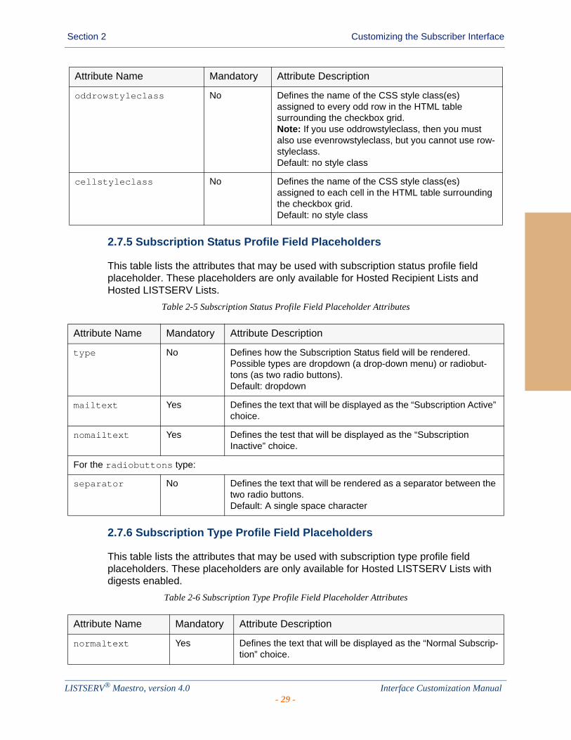
Section 2 Customizing the Subscriber Interface
2.7.5 Subscription Status Profile Field Placeholders
This table lists the attributes that may be used with subscription status profile field placeholder. These placeholders are only available for Hosted Recipient Lists and Hosted LISTSERV Lists.
Table 2-5 Subscription Status Profile Field Placeholder Attributes
2.7.6 Subscription Type Profile Field Placeholders
This table lists the attributes that may be used with subscription type profile field placeholders. These placeholders are only available for Hosted LISTSERV Lists with digests enabled.
Table 2-6 Subscription Type Profile Field Placeholder Attributes
oddrowstyleclass No Defines the name of the CSS style class(es) assigned to every odd row in the HTML table surrounding the checkbox grid. Note: If you use oddrowstyleclass, then you must also use evenrowstyleclass, but you cannot use row-styleclass.Default: no style class
cellstyleclass No Defines the name of the CSS style class(es) assigned to each cell in the HTML table surrounding the checkbox grid. Default: no style class
Attribute Name Mandatory Attribute Description
Attribute Name Mandatory Attribute Description
type No Defines how the Subscription Status field will be rendered. Possible types are dropdown (a drop-down menu) or radiobut-tons (as two radio buttons).Default: dropdown
mailtext Yes Defines the text that will be displayed as the “Subscription Active” choice.
nomailtext Yes Defines the test that will be displayed as the “Subscription Inactive” choice.
For the radiobuttons type:
separator No Defines the text that will be rendered as a separator between the two radio buttons.Default: A single space character
Attribute Name Mandatory Attribute Description
normaltext Yes Defines the text that will be displayed as the “Normal Subscrip-tion” choice.
LISTSERV® Maestro, version 4.0 Interface Customization Manual- 29 -
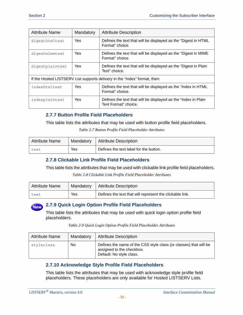
Section 2 Customizing the Subscriber Interface
2.7.7 Button Profile Field Placeholders
This table lists the attributes that may be used with button profile field placeholders.
Table 2-7 Button Profile Field Placeholder Attributes
2.7.8 Clickable Link Profile Field Placeholders
This table lists the attributes that may be used with clickable link profile field placeholders.
Table 2-8 Clickable Link Profile Field Placeholder Attributes
2.7.9 Quick Login Option Profile Field Placeholders
This table lists the attributes that may be used with quick login option profile field placeholders.
Table 2-9 Quick Login Option Profile Field Placeholder Attributes
2.7.10 Acknowledge Style Profile Field Placeholders
This table lists the attributes that may be used with acknowledge style profile field placeholders. These placeholders are only available for Hosted LISTSERV Lists.
digesthtmltext Yes Defines the text that will be displayed as the “Digest in HTML Format” choice.
digestmimetext Yes Defines the text that will be displayed as the “Digest in MIME Format” choice.
digestplaintext Yes Defines the text that will be displayed as the “Digest in Plain Text” choice.
If the Hosted LISTSERV List supports delivery in the “Index” format, then:
indexhtmltext Yes Defines the text that will be displayed as the “Index in HTML Format” choice.
indexplaintext Yes Defines the text that will be displayed as the “Index in Plain Text Format” choice.
Attribute Name Mandatory Attribute Description
Attribute Name Mandatory Attribute Description
text Yes Defines the text label for the button.
Attribute Name Mandatory Attribute Description
text Yes Defines the text that will represent the clickable link.
Attribute Name Mandatory Attribute Description
styleclass No Defines the name of the CSS style class (or classes) that will be assigned to the checkbox. Default: No style class.
LISTSERV® Maestro, version 4.0 Interface Customization Manual- 30 -

Section 2 Customizing the Subscriber Interface
Table 2-10 Acknowledge Style Profile Field Placeholder Attributes
2.7.11 Mail Header Style Profile Field Placeholders
This table lists the attributes that may be used with quick login option profile field placeholders. These placeholders are only available for Hosted LISTSERV Lists.
Table 2-11 Mail Header Style Profile Field Placeholder Attributes
Attribute Name Mandatory Attribute Description
type No Defines how the acknowledge style field will be rendered. Possible types are: dropdown (rendered as a dropdown list) and radiobuttons (rendered as radio buttons). Default: dropdown
none No The value of this attribute defines the text that will be displayed for the "No acknowledgement" choice.Default: A suitable default text.
shortconfirmation No The value of this attribute defines the text that will be displayed for the "Short confirmation message" choice.Default: A suitable default text.
messagecopy No The value of this attribute defines the text that will be displayed for the "Full copy of the posting" choice.Default: A suitable default text.
Only for the radiobuttons type:
separator No The value of this attribute defines the text that will be rendered for a separator between the radio buttons. Default: A linebreak <br>.
Attribute Name Mandatory Attribute Description
type No Defines how the mail header style field will be rendered. Possible types are: dropdown (rendered as a dropdown list) and radiobuttons (rendered as radio buttons). Default: dropdown
normaltext No The value of this attribute defines the text that will be displayed for the "Normal LISTSERV-style header" choice.Default: A suitable default text.
subjecttext No The value of this attribute defines the text that will be displayed for the "LISTSERV-style, with list name in subject" choice.Default: A suitable default text.
full822text No The value of this attribute defines the text that will be displayed for the "Individual To:, full headers" choice.Default: A suitable default text.
dualtext No The value of this attribute defines the text that will be displayed for the "'Dual' (second header in mail body)" choice.Default: A suitable default text.
LISTSERV® Maestro, version 4.0 Interface Customization Manual- 31 -
Section 2 Customizing the Subscriber Interface
2.7.12 Hide Subscription Option Profile Field Placeholders
This table lists the attributes that may be used with quick login option profile field placeholders. These placeholders are only available for Hosted LISTSERV Lists.
Table 2-12 Hide Subscription Option Profile Field Placeholder Attributes
2.7.13 LISTSERV List Topic Profile Field Placeholders
This table lists the attributes that may be used with quick login option profile field placeholders. These placeholders are only available for Hosted LISTSERV Lists.
Table 2-13 LISTSERV List Topic Profile Field Placeholder Attributes
2.8 Setting the Default Display for Data Fields
During customization, certain placeholders may be defined with optional attributes, defining how each profile field will be displayed on the final page.
Since each profile field may appear on several pages (for example, on the External Subscribe pages and on the Internal Edit Profile page), it would become burdensome to have to specify the display attributes for a given profile field on each page that this field appears on. To avoid this, it is possible to define defaults for the attributes of all profile fields of a dataset or list. The default attributes for a given profile field will be used whenever the profile field's placeholder appears on a page, unless that placeholder appearance defines its own attributes. In other words, if a profile field placeholder appears on the page without any attributes, then the default attributes will apply. If the placeholder on the page already contains individual attributes, then the default attributes are not used and the individual attributes apply (but only on this page).
ietftext No The value of this attribute defines the text that will be displayed for the "sendmail-style" choice.Default: A suitable default text.
Only for the radiobuttons type:
separator No The value of this attribute defines the text that will be rendered for a separator between the radio buttons. Default: A linebreak <br>.
Attribute Name Mandatory Attribute Description
Attribute Name Mandatory Attribute Description
styleclass No Defines the name of the CSS style class (or classes) that will be assigned to the checkbox. Default: No style class.
Attribute Name Mandatory Attribute Description
styleclass No Defines the name of the CSS style class (or classes) that will be assigned to the checkbox. Default: No style class.
LISTSERV® Maestro, version 4.0 Interface Customization Manual- 32 -
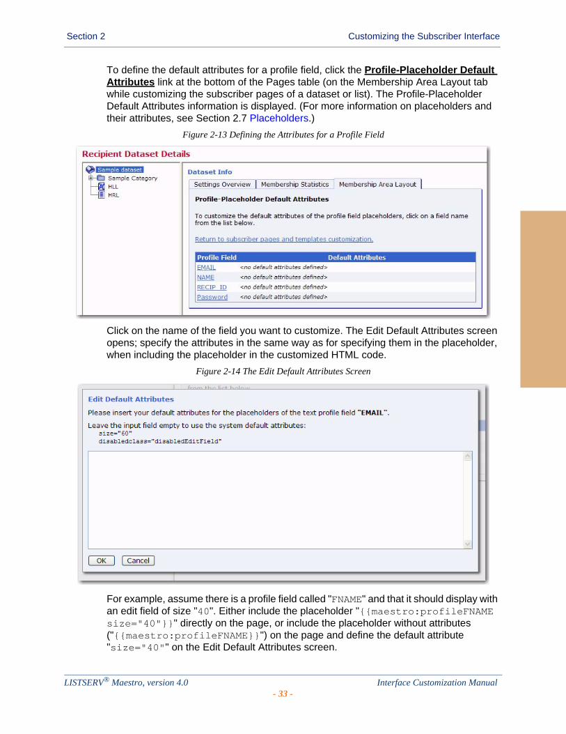
Section 2 Customizing the Subscriber Interface
To define the default attributes for a profile field, click the Profile-Placeholder Default Attributes link at the bottom of the Pages table (on the Membership Area Layout tab while customizing the subscriber pages of a dataset or list). The Profile-Placeholder Default Attributes information is displayed. (For more information on placeholders and their attributes, see Section 2.7 Placeholders.)
Figure 2-13 Defining the Attributes for a Profile Field
Click on the name of the field you want to customize. The Edit Default Attributes screen opens; specify the attributes in the same way as for specifying them in the placeholder, when including the placeholder in the customized HTML code.
Figure 2-14 The Edit Default Attributes Screen
For example, assume there is a profile field called "FNAME" and that it should display with an edit field of size "40". Either include the placeholder "{{maestro:profileFNAME size="40"}}" directly on the page, or include the placeholder without attributes ("{{maestro:profileFNAME}}") on the page and define the default attribute "size="40"" on the Edit Default Attributes screen.
LISTSERV® Maestro, version 4.0 Interface Customization Manual- 33 -
Section 2 Customizing the Subscriber Interface
Note: The default versions of all membership area pages (the versions that are used if no customized versions are provided) all use the profile field placeholders without any individual attributes; therefore, any pages that are displayed in their default state will also use the profile-placeholder default attributes you define.
2.9 Requesting Profile Field Updates
When creating the message content for an email job, you can now add a special system drop-in that will direct your subscribers to the External Profile Edit Page. This page will let your subscribers update specific profile fields without logging into the Membership Area.
Note: For information on using this system drop-in, please refer to the User’s Manual for LISTSERV Maestro.
2.9.1 Customizing the External Profile Edit Page
The External Profile Edit Page is a dynamic page that queries certain profile fields from the subscriber. The fields that are queried by the page during a visit depends on the parameters in the URL by which the page was accessed. And, the parameters in the URL in turn are created by the ProfileEditPageURL system drop-in depending on the field names that you include in the FIELDNAME_LIST of that system drop-in.
Since the External Profile Edit Page is such a dynamic page, there are several features specifically designed for it in the Subscriber Interface:
1. If you select this page for customization, then at the bottom of the screen you see several checkboxes – one checkbox for each available profile field. If you check/uncheck the checkboxes, and then click [Apply], you will then see a preview of this page with exactly these profile fields visible. This lets you simulate the look and feel of this page for each desired profile field combination.
With the examples of above: If you are planning to use {{*ProfileEditPageURL STREET,ZIP_CODE,CITY}} to query the address data of the subscriber, and you first want to check that the page will look correctly if these three profile fields are displayed, then go to the External Profile Edit Page, check the boxes for STREET, ZIP_CODE, and CITY, uncheck all other boxes, and then click [Apply]. The preview will then show the page just as it will look to subscribers if you use the system drop-in with STREET, ZIP_CODE, and CITY.
LISTSERV® Maestro, version 4.0 Interface Customization Manual- 34 -
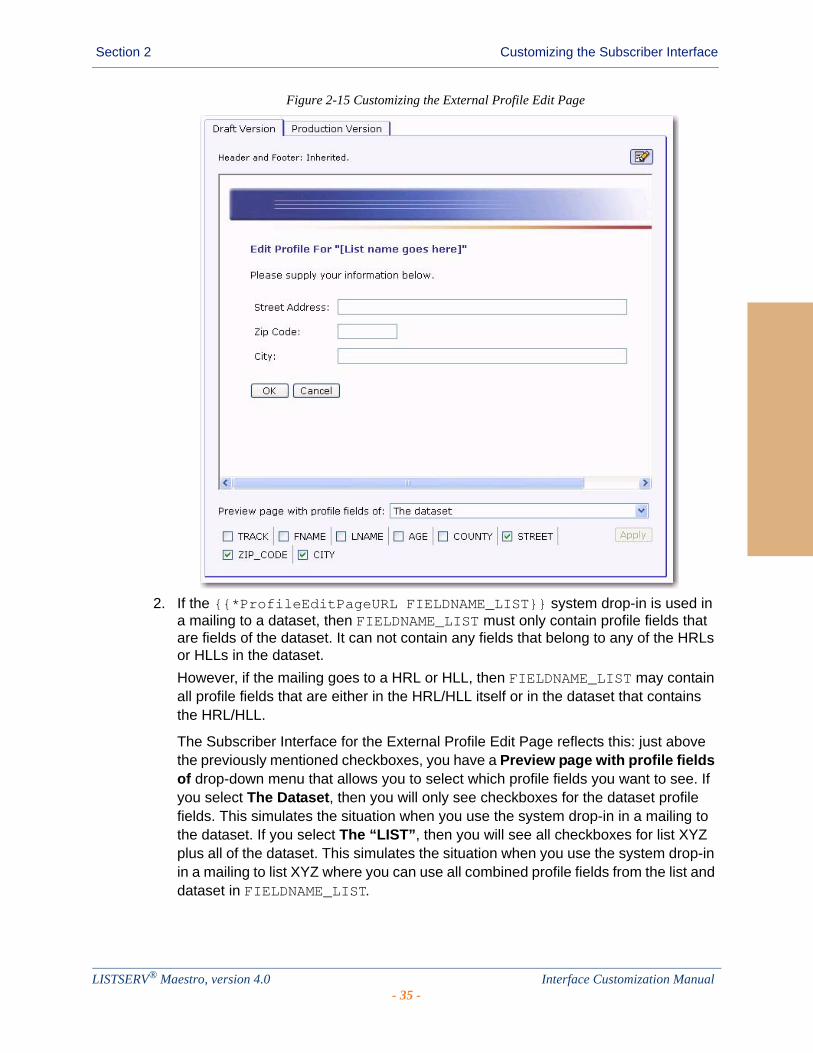
Section 2 Customizing the Subscriber Interface
Figure 2-15 Customizing the External Profile Edit Page
2. If the {{*ProfileEditPageURL FIELDNAME_LIST}} system drop-in is used in a mailing to a dataset, then FIELDNAME_LIST must only contain profile fields that are fields of the dataset. It can not contain any fields that belong to any of the HRLs or HLLs in the dataset.
However, if the mailing goes to a HRL or HLL, then FIELDNAME_LIST may contain all profile fields that are either in the HRL/HLL itself or in the dataset that contains the HRL/HLL.
The Subscriber Interface for the External Profile Edit Page reflects this: just above the previously mentioned checkboxes, you have a Preview page with profile fields of drop-down menu that allows you to select which profile fields you want to see. If you select The Dataset, then you will only see checkboxes for the dataset profile fields. This simulates the situation when you use the system drop-in in a mailing to the dataset. If you select The “LIST”, then you will see all checkboxes for list XYZ plus all of the dataset. This simulates the situation when you use the system drop-in in a mailing to list XYZ where you can use all combined profile fields from the list and dataset in FIELDNAME_LIST.
LISTSERV® Maestro, version 4.0 Interface Customization Manual- 35 -
Section 2 Customizing the Subscriber Interface
LISTSERV® Maestro, version 4.0 Interface Customization Manual- 36 -
. . . . . . . . . . . . . . . . . . . . . . . . . . . . . . . . . . . . . . . . . . . . . . . . . . . . . . . .Section 3 User Interface Branding
he Maestro User Interface and the Administration Hub components permit limited User Interface branding by adding text strings at prominent locations, such as the header and footer of each page.
Note: The Subscriber Interface is fully customizable, see Section 2 Customizing the Subscriber Interface for details. To change the text used in the LUI and HUB interfaces, see Section 4 Using the Resource Translation Tool.
To do this, the administrator must create a text file called custom.properties that must be located in the relevant application folder.
To customize the User Interface component: [maestro_install_folder]/lui
To customize the Administration Hub component: [maestro_install_folder]/hub
This file must be a text file that follows the rules of LISTSERV Maestro INI files (see the LISTSERV Maestro Administrator’s Manual for details). This means that the file must consist of entries of the form key=value, with which the administrator can define customized text strings.
3.1 Adding Custom Text StringsEach custom text string consists of a key=value pair, where the key is as listed below, and the value is the text that is to appear in the User Interface (and follows the INI file rules). The following text string keys are currently available for customization:
app.title.companyName=YOUR_TEXT
Sets YOUR_TEXT to be used in the window title bar of each browser window that is used to access the Maestro User Interface or the Administration Hub component. The text will appear as the first text in the title bar, before the application name. If this key is not included, the text “L-Soft” will be shown. Supply an empty value to not show any text before the application name.
app.msg.headerText=YOUR_TEXT
Adds YOUR_TEXT as a header text at the top of the page. The header text will be drawn so that it will appear on top of the blue header bar shown at the top of each page to the right of the standard title text in that bar. The blue header bar will be the background behind the text, which is drawn with a white, bold-faced, italic font, in the same size as the standard title text in the header bar. If this key is not included, no text will be shown.
app.msg.footerText=YOUR_TEXT
Adds YOUR_TEXT as a footer text at the bottom of the page. The footer text will be drawn at the bottom of each page, with the standard small page font. If this key is not included, no text will be shown.
T
LISTSERV® Maestro, version 4.0 Interface Customization Manual- 37 -
Section 3 User Interface Branding
LISTSERV® Maestro, version 4.0 Interface Customization Manual- 38 -
. . . . . . . . . . . . . . . . . . . . . . . . . . . . . . . . . . . . . . . . . . . . . . . . . . . . . . . .Section 4 Using the Resource Translation Tool
his section gives an overview of how to translate the text of the LISTSERV Maestro User Interface to another language or make changes to the English-language text using the L-Soft Resource Translation Tool. It assumes a good
acquaintance with computers and how to work with files in the file system.
4.1 Requirements
To be able to translate the LISTSERV Maestro User Interface, the following basic requirements must be met:
• You need to have an installation of the L-Soft Resource Translation Tool.
• You need to have a Translation Kit that matches the LISTSERV Maestro version that you have installed.
• You need a good understanding of editing HTML code, plus the meaning of the various HTML tags and how to escape reserved HTML characters.
The Translation Kit for LISTSERV Maestro comes in the form of a ZIP file for each LISTSERV Maestro version. For example, the Maestro-2.1-1-TransKit.zip is for LISTSERV Maestro, version 2.1-1.
Important: You must not use a Translation Kit that is not meant for your LISTSERV Maestro version!
Once you have obtained the Translation Kit for the correct Maestro version, put the ZIP file into the work subfolder of your Resource Translation Tool Installation folder.
The Translation Kit contains several components: one for the Administration Hub, one for the User Interface, and one for the Subscriber Interface. Each component supports a list of target languages.
The Translation Tool does not need to be installed on the same server as LISTSERV Maestro. It may run on the workstation of the person doing the translation. Once the translation is ready to be deployed, a system administrator must copy the translated JAR files to the folders in the appropriate directories on the LISTSERV Maestro server(s).
Prior to beginning the translation:
1. Download the latest version of the Resource Translation Tool from the L-Soft web site, and install it on your workstation or server. Instructions for installing and starting the Translation Tool are found in the installation kit zip file. As instructed, you may need to install a Java Runtime Environment (JRE) or edit the command file to point to the JRE installed with LISTSERV Maestro, for example:
set JAVA_1_5_HOME=c:\program files\l-soft\application server\java
2. Download the Translation Kit for the currently installed build of LISTSERV Maestro from the L-Soft web site and place it in the Translation Tool’s work folder. It is not necessary to unzip it. If you are unsure which build you are running, browse to this web page:
[your LISTSERV Maestro domain]/lui/build
T
LISTSERV® Maestro, version 4.0 Interface Customization Manual- 39 -
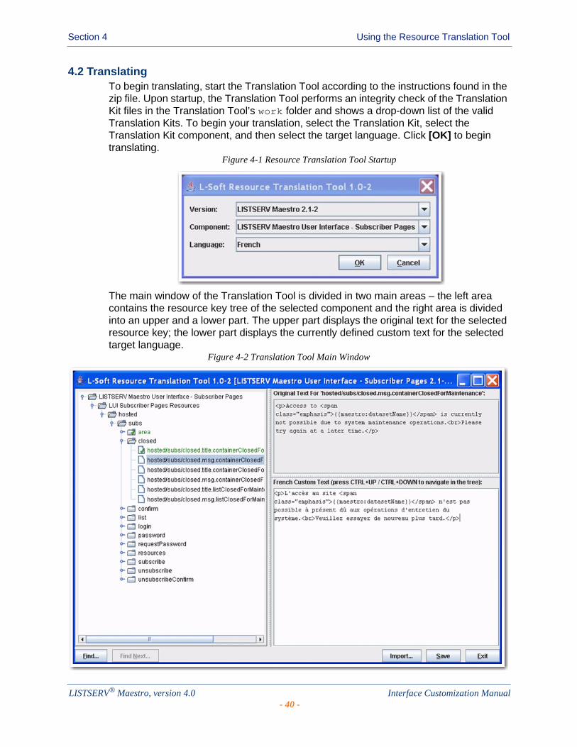
Section 4 Using the Resource Translation Tool
4.2 TranslatingTo begin translating, start the Translation Tool according to the instructions found in the zip file. Upon startup, the Translation Tool performs an integrity check of the Translation Kit files in the Translation Tool’s work folder and shows a drop-down list of the valid Translation Kits. To begin your translation, select the Translation Kit, select the Translation Kit component, and then select the target language. Click [OK] to begin translating.
Figure 4-1 Resource Translation Tool Startup
The main window of the Translation Tool is divided in two main areas – the left area contains the resource key tree of the selected component and the right area is divided into an upper and a lower part. The upper part displays the original text for the selected resource key; the lower part displays the currently defined custom text for the selected target language.
Figure 4-2 Translation Tool Main Window
LISTSERV® Maestro, version 4.0 Interface Customization Manual- 40 -

Section 4 Using the Resource Translation Tool
Clicking the [Save] button prompts the tool to create an appropriate resources jar file, which is named as follows (note that [lang] is replaced with the two-letter ISO code of the selected target language; see Appendix C: Languages Supported for Translation for more information):
• hubResources_[lang].jar (for the HUB)
• luiResources_[lang].jar (for the LUI main application)
• luiSubscriberResources_[lang].jar (for the Subscriber Interface)
These files are written to the translationsV[version] folder of the Translation Tool’s work folder. For example, if you have chosen to translate the Subscriber Interface of LISTSERV Maestro 2.1-1 to German, then the folder is named translationsV2.1-1 and contains (among others) the luiSubscriberResources_de.jar file.
Note: Each component also lists English as a target language. This allows you to use the Translation Tool to customize text without actually performing a translation. All descriptions in this document are applicable without changes to the target language English.
4.2.1 Navigating the Resources Tree
Translating or customizing text for LISTSERV Maestro requires editing text that is distributed over a considerable number of property keys in the Translation Kit. Frequently, the text is only short snippets, which can be translated quickly, each on its own.
4.2.1.1 Navigating with Keyboard Shortcuts
To select a property key for translation, the Translation Tool supports standard mouse navigation. However, if a cluster of text needs to be edited, navigation via keyboard shortcuts can greatly reduce the time required for the translation.
Assume that you are working on the translation for one of the property keys (e.g. in the editor for the custom text of a property key). Use the standard keyboard keys to navigate in the text that is displayed in the editor. If you want to finish editing the text for the current property key and want to edit the text for the next property key, press [Ctrl] + [Enter]. This keyboard shortcut locates the next property key node from the resources tree and automatically selects it for editing (the editor is refreshed with the current custom text for the new property key).
Table 4-1 Keyboard Shortcuts for the Resource Translation Tool
Shortcut Function
[Alt] + [F] Opens the Find screen. If this is already open, then it begins searching.
[Alt] + [C] Closes the Find screen.
[Alt] + [N] Finds the next occurrence of the previous search string.
[Alt] + [S] Saves the changes.
[Alt] + [E] Exits the Translation Tool.
LISTSERV® Maestro, version 4.0 Interface Customization Manual- 41 -
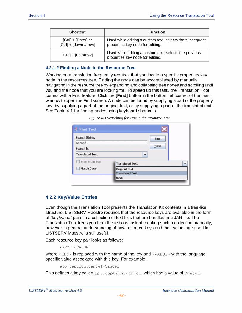
Section 4 Using the Resource Translation Tool
4.2.1.2 Finding a Node in the Resource Tree
Working on a translation frequently requires that you locate a specific properties key node in the resources tree. Finding the node can be accomplished by manually navigating in the resource tree by expanding and collapsing tree nodes and scrolling until you find the node that you are looking for. To speed up this task, the Translation Tool comes with a Find feature. Click the [Find] button in the bottom left corner of the main window to open the Find screen. A node can be found by supplying a part of the property key, by supplying a part of the original text, or by supplying a part of the translated text. See Table 4-1 for finding nodes using keyboard shortcuts.
Figure 4-3 Searching for Text in the Resource Tree
4.2.2 Key/Value Entries
Even though the Translation Tool presents the Translation Kit contents in a tree-like structure, LISTSERV Maestro requires that the resource keys are available in the form of “key/value” pairs in a collection of text files that are bundled in a JAR file. The Translation Tool frees you from the tedious task of creating such a collection manually; however, a general understanding of how resource keys and their values are used in LISTSERV Maestro is still useful.
Each resource key pair looks as follows:
<KEY>=<VALUE>
where <KEY> is replaced with the name of the key and <VALUE> with the language specific value associated with this key. For example:
app.caption.cancel=Cancel
This defines a key called app.caption.cancel, which has a value of Cancel.
[Ctrl] + [Enter] or [Ctrl] + [down arrow]
Used while editing a custom text; selects the subsequent properties key node for editing.
[Ctrl] + [up arrow]Used while editing a custom text; selects the previous properties key node for editing.
Shortcut Function
LISTSERV® Maestro, version 4.0 Interface Customization Manual- 42 -

Section 4 Using the Resource Translation Tool
How it works: Whenever some language dependent text needs to appear in the User Interface, the program simply contains the key for that text and a replacement directive. Therefore, when LISTSERV Maestro needs to display a page containing this text, it finds the “Display the text associated with the key XYZ” directive, looks up the key in the resource bundle, and then displays the value associated with this key. Therefore, by simply changing the value of a key, you can change what LISTSERV Maestro will display.
Important: When making changes to key values, be sure to make the changes correctly in order to preserve the meaning.
If you decide to not supply the value for a key in your translation, LISTSERV Maestro will look up the original value. If you use the Translation Tool to supply custom English text for resource keys, then it is sufficient to supply the values only for the keys that you want to customize and to leave the customizations for the other keys empty. By default, the original values are correctly combined with your custom texts.
If you use the Translation Tool for a translation to a foreign language, leaving any key value empty must be considered carefully. Some resource keys define values that are actually language-independent or can be used with the default English value even for foreign languages. One example of such a value is the value for the hosted/subs/subscribe.msg.charset.confirmMailForMemberAreaJoin key in the Subscriber Interface component of the Translation Kit. The value for this key defines a character set, and the default value ISO-8859-1 is suitable for many Western European languages, which means that the custom value for this key can remain empty in many cases. However, most key values are actual texts that require a translation; therefore, if you leave a key value empty for a non-English translation, then the default English text for this key is shown together with the other translated values, which results in a language mix-up.
To help you distinguish between supplied and un-supplied parts, each supplied key is marked with a green checkmark. This green checkmark is propagated to higher levels of the resource key tree display once all entries in the lower level are marked as “supplied completely”.
4.2.3 HTML Code
LISTSERV Maestro uses a web-based User Interface that consists of HTML pages displayed in a web browser. This means that the largest part of all language dependent text is displayed as part of a HTML page and must follow the rules imposed on HTML.
4.2.3.1 HTML Escape Sequences
In HTML, some characters have special meanings. For example, the “<” and “>” characters are used to enclose special HTML tags that are used to format the HTML page. This type of HTML tag may look like this: <body>
The appearance of a word enclosed in “<” and “>” signals to the browser that this word is not supposed to appear as a visible word; instead, it is a special HTML tag that conveys some special meaning to the browser (e.g. how to render and format the following text).
If you actually want a “<” or “>” character to appear on the page, then you need to “escape” this character in the form of a HTML escape sequence.
Another typical character that needs to be escaped in the form of a HTML escape sequence is the ampersand character, “&”.
LISTSERV® Maestro, version 4.0 Interface Customization Manual- 43 -
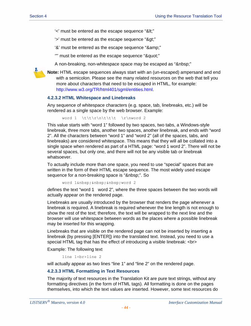
Section 4 Using the Resource Translation Tool
‘<’ must be entered as the escape sequence “<”
‘>’ must be entered as the escape sequence “>”
‘&’ must be entered as the escape sequence “&”
‘"’ must be entered as the escape sequence “"”
A non-breaking, non-whitespace space may be escaped as “ ”
Note: HTML escape sequences always start with an (un-escaped) ampersand and end with a semicolon. Please see the many related resources on the web that tell you more about characters that need to be escaped in HTML, for example: http://www.w3.org/TR/html401/sgml/entities.html.
4.2.3.2 HTML Whitespace and Linebreaks
Any sequence of whitespace characters (e.g. space, tab, linebreaks, etc.) will be rendered as a single space by the web browser. Example:
word 1 \t\t\r\n\t\t\t \r\nword 2
This value starts with “word 1” followed by two spaces, two tabs, a Windows-style linebreak, three more tabs, another two spaces, another linebreak, and ends with “word 2”. All the characters between “word 1” and “word 2” (all of the spaces, tabs, and linebreaks) are considered whitespace. This means that they will all be collated into a single space when rendered as part of a HTML page: “word 1 word 2”. There will not be several spaces, but only one, and there will not be any visible tab or linebreak whatsoever.
To actually include more than one space, you need to use “special” spaces that are written in the form of their HTML escape sequence. The most widely used escape sequence for a non-breaking space is “ ”. So
word 1 word 2
defines the text “word 1 word 2”, where the three spaces between the two words will actually appear on the rendered page.
Linebreaks are usually introduced by the browser that renders the page whenever a linebreak is required. A linebreak is required whenever the line length is not enough to show the rest of the text; therefore, the text will be wrapped to the next line and the browser will use whitespace between words as the places where a possible linebreak may be inserted for this wrapping.
Linebreaks that are visible on the rendered page can not be inserted by inserting a linebreak (by pressing [ENTER]) into the translated text. Instead, you need to use a special HTML tag that has the effect of introducing a visible linebreak: <br>
Example: The following text
line 1<br>line 2
will actually appear as two lines “line 1” and “line 2” on the rendered page.
4.2.3.3 HTML Formatting in Text Resources
The majority of text resources in the Translation Kit are pure text strings, without any formatting directives (in the form of HTML tags). All formatting is done on the pages themselves, into which the text values are inserted. However, some text resources do
LISTSERV® Maestro, version 4.0 Interface Customization Manual- 44 -
Section 4 Using the Resource Translation Tool
contain actual HTML tags, which contain formatting that can not be easily imposed from the outside.
For example, if you have a sentence in which you want to emphasize a single word in the middle by rendering it in a bold font, then you can not do so with an outside formatting directive. Instead, you have to include the corresponding bold-tag right into the text of the sentence itself, bracketing the word you want to emphasize.
If you find a HTML tag (recognizable as being enclosed in “<” and “>”) in a text, then you should see to it that the same tag, with the same semantics, appears in your translated version of the text. Most commonly used are span-tags, “<span>”. A span-tag actually consists of an opening part, “<span>”, and a closing part, “</span>”. These two tags bracket word(s) in the text to which a special formatting shall be applied. The formatting is then included in the opening span-tag, in the form of a class attribute: “<span class="emphasis">”.
Example:
Do you <span class="emphasis">really</span> want to delete this?
This defines a text with a question to the user, where the word “really” is to be emphasized; therefore, it has been bracketed with the opening and closing parts of the span-tag using the “emphasis” class.
You will need to translate this text to a corresponding meaning in your target language, and then employ the opening and closing parts of the span-tag (with the “emphasis” class) to the word that comes closest to the same semantic as the word.
Sample for Swedish:
Skall detta <span class="emphasis">verkligen</span> blir raderat?
Sample for German:
Wollen Sie dies <span class="emphasis">wirklich</span> löschen?
The span-tag is frequently used throughout the text resources of LISTSERV Maestro. Make sure that you transfer them with a similar meaning to your translation, using the same “class” attribute.
For a complete list of the HTML tags and custom styles that are used by LISTSERV Maestro, see Appendix A: Custom Styles and HTML Tags.
4.2.3.4 Non-HTML Exceptions
Even though most of the text is used inside HTML pages, there are some exceptions. Inside of these exceptions, the rules of HTML escape sequences, HTML whitespace, HTML linebreaks, and HTML tags do not apply and you must be careful not to, for example, use a HTML escape sequence in one of these text. If you would do so, and, for example, write “&” instead of “&”, then the user would actually see the “&” text instead of the desired “&”.
The best approach to avoid this is to use HTML markup in translated text only if the original text contained HTML markup. However, in many cases, the original text does not contain HTML markup, but is used inside of an HTML page anyway. For example, the text for the assign.title.page key, which is the title text for the Team Collaboration screen of a LISTSERV Maestro email job. A translation for this text may benefit from additional HTML markup such as an additional “<br>” in the case that the translated version is very long and a linebreak would help achieving a good page layout.
LISTSERV® Maestro, version 4.0 Interface Customization Manual- 45 -

Section 4 Using the Resource Translation Tool
In other cases the text is used in a context where no web browser is involved, meaning that it is sent to the user as a plain text mail or is written to a downloaded text file.
4.2.4 Word Replacement
In some resource texts, LISTSERV Maestro employs word replacement to ease translation. Consider the following example:
“500 duplicates have been removed from the job”.
This text contains a value that may vary at run time. Therefore, you can not simply have a value with this text in the translation; otherwise, you would need an infinite number of texts, one for each number of duplicates that may have been removed. The immediate solution is to specify the text “duplicates have been removed from the job” and let LISTSERV Maestro affix the number of deleted duplicates at runtime. For this to work, the number of deleted duplicates has to be hard coded so that it appears first in the sentence, followed by some text. What if in a different language the syntax of the language would not allow such a sentence? For example, the syntax of that other language may allow only a sentence such as “From the job, 500 duplicates have been removed”, where the variable part appears right in the middle of the sentence. If this occurs, then a “hard coded” solution is not a good idea. To compensate for this, LISTSERV Maestro uses word replacement. In the text resources, whenever there is a variable part, a replacement placeholder is used instead. At runtime, the placeholder will be replaced with the variable value, forming the desired finished sentence.
4.2.4.1 Standard Number Placeholders
Standard numbered placeholders appear in the text as a number that is enclosed in curly brackets, such as “{0}”, “{1}”, “{2}”, etc.
Using the example from the precious section, we could write the text as follows:
“{0} duplicates have been removed from the job”
At runtime, the “{0}” is replaced by the variable number “500”, the desired correct English sentence “500 duplicates have been removed from the job” will be formed. If in another language the other form of the sentence would be required, then the translator can simply relocate the placeholder in the sentence, such as:
“From the job, {0} duplicates have been removed”
This means that whenever you find one of these numbered placeholders in the text string, then you must make sure to:
• Include exactly the same number of placeholders in your translated version, with exactly the same number-indexes.
• Determine the meaning of each placeholder (what will it be replaced with) so you can use the same placeholder with the same meaning even in your translated version.
• Use the correct order of placeholders, which may vary from the order in the original text (see the next section).
4.2.4.2 Placeholder Order
Numbered placeholders can occur in the text in any sequence; the first placeholder in a text (when read from left to right) does not necessarily have to be the one numbered “{0}”.
LISTSERV® Maestro, version 4.0 Interface Customization Manual- 46 -
Section 4 Using the Resource Translation Tool
In most cases, this may very well be so, but it is not a general rule that needs to be followed.
“This {1} contains {0} two placeholders”
is just as valid as
“This {0} contains {1} two placeholders”
More important than the actual 0, 1, 2, ... order is that the semantically correct placeholder is used at each position.
Consider the following sentence: “250 recipients have opened mail XYZ”. This sentence contains two variable values – the number of recipients that have opened the mail (“250”) and the ID of the mail (“XYZ”). Now in another language, the syntax may require this sentence to be written as “The mail XYZ was opened by 250 recipients”. Since we are aware of this, we write the original value with placeholders:
“{0} recipients have opened mail {1}”
This means that “{0}” will be replaced with the number of recipients and “{1}” will be replaced with the ID of the mail. Therefore, in the “other language” version, we would have to make sure to use the correct placeholders in the right positions:
“The mail {1} was opened by {0} recipients”
which effectively reverses the order of the two placeholders (when read from left to right). If we did not reverse the order, and use a text like “The mail {0} was opened by {1} recipients”, then after replacement we would get a nonsense sentence like “The mail 250 was opened by XYZ recipients”. Because of this, whenever there are more than one replacement placeholders in the same text, you need to take extra care and understand the meaning of each placeholder (what will it be replaced with) so that you can use each placeholder at the correct position in your translated text (even if that should change the order of the placeholders).
4.2.4.3 Named Placeholders on the Subscriber Pages
The placeholders on the subscriber pages of the Subscriber Interface may require advanced attributes, and are therefore written as follows:
{{maestro:[placeholder name] [placeholder attributes]}}
The placeholder name conveys the semantics of the placeholder in a self-explanatory way, for example the {{maestro:subscriberAddress}} placeholder is replaced with the email address of a subscriber navigating the subscriber pages.
The placeholder attributes are written as a sequence of key/value pairs and are only needed for advanced placeholders, such as {{maestro:passwordLink text="Click here"}}, which is replaced with a link to the Request Password screen that is rendered with the text “Click here”.
4.2.4.4 Placeholder Validation
Each text that you supply as a translated version for a resource key is checked to ensure it contains exactly the placeholders (numbered or named) that are present in the original text. For example, let’s look at the original text for the hosted/subs/login.title.login key in the Subscriber Interface component of the translation kit:
Login for {{maestro:datasetName}}
LISTSERV® Maestro, version 4.0 Interface Customization Manual- 47 -

Section 4 Using the Resource Translation Tool
The supplied translated text for this key is validated to contain the {{maestro:datasetName}} text. Any other string in the form of {{maestro:myPlaceholder}} or {[number]} (for any number) will be rejected as “placeholder unknown in original text”.
Similarly, consider the original text for the newJobs/authorizeSending/label/clickOnNumberOfLinks key in the LISTSERV Maestro User Interface component of the Translation Kit:
Click on at least one of {0} links
This original text defines that the placeholder {0} is known and supported, any other occurrence of a string that looks like a numbered or a named placeholder will be rejected upon validation as “placeholder unknown in original text”.
4.2.5 Date and Time Formats
Date formats – the order in which day, month, and year appear when printed as a date – differ from country to country. While Americans usually write “month/day/year”, the Swedes write “year month day”, and Germans use “day.month.year”.
The user can specify which output and input formats for date and time is preferred under Preferences > User Interface > General.
If the user has not specified a preference, then dates and times are printed and parsed using default settings. These default settings can be influenced during translation so that the defaults match the target language you are translating to. This means that users without individual preferences set will see dates and times formatted to match the target language. Because of this, there are specific date format keys that you need to take into special consideration.
Note: The following information assumes that you are working on the User Interface Resources. All nodes mentioned here are found in this Translation Kit component.
• Output Format for Date
Whenever LISTSERV Maestro outputs dates (i.e. the send-date of a job) you have two attributes of the output format that you can manipulate:
• The name of the month: Locate the “date” node. Underneath this node, edit the twelve keys called “date.month.1” to “date.month.12”. Assign values to these twelve keys so that they match the name of the months in your target language (starting with January), preferably in an abbreviated textual form. If there is no good abbreviated textual form in your target language, and the full textual form appears as too long, you may also use the numerical values 1 to 12 instead. (The names of the months are independent of any preferences the user sets, meaning that they are always used for date output.)
• Print month or day first: Locate the “date” node. Underneath this node, edit the key called “date.printMonthFirst”. Set the value to “true” to get an output date format of “Month Day, Year” (i.e. American style, as in “Aug. 12, 2002”) or to “false” to get a format of “Day Month Year” (i.e. European style, as in “12 Aug. 2002”). This value defines the default for users without an individual preference setting.
LISTSERV® Maestro, version 4.0 Interface Customization Manual- 48 -

Section 4 Using the Resource Translation Tool
• Output Format for Time
Whenever LISTSERV Maestro outputs times (i.e. the send-time of a job) you have two attributes of the output format that you can manipulate:
• Use AM/PM format or not: Locate the “date” node. Underneath this node, edit the key called “date.useAM/PM”. Set the value to “true” if you want to use a 12 hour format with am/pm or to “false” if you want to use a 24 hour format (military time). This value defines the default for users without an individual preference setting.
• Separator character for hours and minutes: Locate the “date” node. Underneath this node, edit the key called “date.timeSeparator”. Set the value to the character that is to be used to separate hours and minutes. For example, use “:” if the desired output is something like “09:15”. This value defines the default for users without an individual preference setting.
• Report Download Format for Date and Time
Whenever LISTSERV Maestro prepares report results for download, in the form of a ZIP file, it puts a “readme.txt” text file into that ZIP file with some information about the downloaded report. This information also contains date and time information. You can modify the appearance of this date/time format by editing the following four keys (one for each report type):
• Details Report: Locate the “reports/reportDetails” node. Underneath this node, edit the “reports/reportDetails.msg.downloadDateFormat” key.
• Distribution Report: Locate the “reports/reportDistribution” node. Underneath this node, edit the “reports/reportDistribution.msg.downloadDateFormat” key.
• Raw Events Report: Locate the “reports/reportRaw” node. Underneath this node, edit the “reports/reportRaw.msg.downloadDateFormat” key.
• Sum Report: Locate the “reports/reportSum” node. Underneath this node, edit the “reports/reportSum.msg.downloadDateFormat” key.
• Delivered Recipients Statistics: Locate the “hosted/statistics” node. Underneath this node, edit the “hosted/statistics.msg.downloadDateFormat” key.
• Completed Job Statistics: Locate the “hosted/statistics” node. Underneath this node, edit the “hosted/statistics.msg.downloadDateFormat” key.
• Membership/Subscriber Statistics: Locate the “hosted/statistics” node. Underneath this node, edit the “hosted/statistics.msg.downloadDateFormat” key.
Any of these four “reports/XXX.msg.downloadDateFormat” keys must contain a pattern that will be translated into an actual date and time string at runtime. In this pattern, the following pattern fields must appear, but you may switch them around (change their order and insert other fill characters) in order to create a format that suits you. Remember that uppercase and lowercase are important, and that all
LISTSERV® Maestro, version 4.0 Interface Customization Manual- 49 -

Section 4 Using the Resource Translation Tool
pattern fields will be replaced with numerical counterparts (i.e. no textual names of months, etc.).
• MM (two uppercase M-characters) – Replaced with the month of the year 01-12.
• dd (two lowercase d-characters) – Replaced with the day of the month 01-31.
• yyyy (four lowercase y-characters) – Replace with the 4-digit value of the year.
• HH (two uppercase H-characters) – Replaced with the hour of the day 00-23.
• mm (two lowercase m-characters) – Replaced with the minute of the hour 00-59.
Examples: 28th of August 2002, 5 minutes after 3, p.m., will be formatted as follows:
MM/dd/yyyy HH:mm 08/28/2002 15:05
yyyy-MM-dd HH:mm 2002-28-08 15:05
HH:mm [dd.MM.yyyy] 5:05 [28.08.2002]
These settings are independent of any user preferences, meaning that the user cannot influence the date and time formats of these downloaded reports.
• Input Format for Date and Time
Whenever the user needs to input a date and time value for LISTSERV Maestro to understand, then the user must follow a certain pattern.
• Date pattern: To set the input date format, locate the “date” node. Underneath this node, edit the “date.dateFormat.default” key. Set it to a value that is either the numerical pattern number of any of the predefined date patterns (e.g. “1”, “2”, “3”, or “4”, see below) or set it to “custom” if you want to define a custom date pattern for input (see below). This value defines the default for users without an individual preference setting.
You can choose between four pre-defined date patterns or provide your own customized pattern. Each pattern exists as two versions – the pattern used for parsing the user input and the pattern that is displayed to the user – so that the user knows which format to use for the input.
Table 4-2 Predefined Date Patterns
The parse version of the predefined patterns can not be changed; however, you may change the display version. To change the display version, open the LISTSERV User Interface Resources, locate the “date” node, and edit the keys called “date.dateFormat.N.forDisplay”, where “N” stands for the pattern number of the pattern in question.
Pattern Number Display Version Parse Version
1 mm/dd/yyyy MM/dd/yyyy
2 dd.mm.yyyy dd.MM.yyyy
3 dd/mm/yyyy dd/MM/yyyy
4 yyyy-mm-dd yyyy-MM-dd
LISTSERV® Maestro, version 4.0 Interface Customization Manual- 50 -

Section 4 Using the Resource Translation Tool
If none of the predefined patterns match your requirements, then you may define a custom pattern. In that case, you must supply both the display version and the parse version of that pattern.
For the display version, you are free to choose what it looks like; however, you should choose a pattern that makes it easy for the user to understand the formatting that is required. To define the display version, edit the key called “date.dateFormat.custom.forDisplay” (this value is initially empty).
For the parse version, you need to follow strict rules. The pattern string must contain exactly three pattern fields “MM”, “dd”, and “yyyy”. See “Report Download Format for Date and Time” for details of these three fields and examples. You can order them in any way you like and include any separator or fill characters; however, you must be aware that the user has to enter them in exactly the same order with the same separators and fill characters so that LISTSERV Maestro can understand them. Therefore, you should probably choose an order, separators, and fill characters that are most common in the locale matching your target language (and should also provide a similar display version, with the same separators and fill characters). To define the parse version, edit the key called “date.dateFormat.custom.forParsing” (this value is initially empty).
• Time pattern: To set the input time format, locate the “date” node and edit the “date.timeFormat.default” key. Set it to a value that is either the numerical pattern number of any of the predefined time patterns, or set it to “custom” if you want to define a custom time pattern for input. This value defines the default for users without an individual preference setting.
You can choose between two pre-defined time patterns or provide your own customized pattern. Each pattern exists as two versions – the pattern used for parsing the user input and the pattern that is displayed to the user – so that the user knows which format to use for the input.
Table 4-3 Predefined Time Patterns
The parse version of the predefined patterns cannot be changed. However, you may change the display version of the predefined patterns. To change the display version, locate the “date” node and edit the keys called “date.timeFormat.N.forDisplay”, where “N” stands for the pattern number of the pattern in question.
If none of the predefined patterns match your requirements, then you may define a custom pattern. In that case, you must supply both the display version and the parse version of that pattern.
Pattern Number Display Version Parse Version
1 hh:mm HH:mm
2 hh.mm HH.mm
LISTSERV® Maestro, version 4.0 Interface Customization Manual- 51 -

Section 4 Using the Resource Translation Tool
For the display version, you are free to choose what it looks like; however, you should choose a pattern that makes it easy for the user to understand the formatting that is required. To define the display version, locate the “date” node and edit the key called “date.timeFormat.custom.forDisplay” (this value is initially empty).
For the parse version, you need to follow strict rules – the pattern string must contain exactly two pattern fields, “HH” and “mm”. See “Report Download Format for Date and Time” in Section 4.2.5 Date and Time Formats for details of these fields and examples. You can order them in any way you want and include any separator or fill characters; however, you must be aware that the user needs to enter them in exactly the same order with the same separators and fill characters so that LISTSERV Maestro can understand them. Therefore, you should probably choose an order, separators, and fill characters that are most common in the locale matching your target language (and should also provide a similar display version with the same separators and fill characters). To define the parse version, locate the “date” node and edit the key called “date.timeFormat.custom.forParsing” (this value is initially empty).
4.3 Installing a Translated Language
To install a translated language into an existing LISTSERV Maestro installation, simply copy the JAR file that you have created during translation to the lib folder inside of your LISTSERV Maestro Installation folder. It is recommended that you keep the copy of the JAR file in your work folder even if you have completed the translation.
If you are installing the JAR file for the selected component and target language for the first time, you should not find a file with a conflicting name. If you are updating an existing translation JAR file, simply replace the existing file with your new version.
If you have translated only the Subscriber Interface component of the Translation Kit, then you have to copy the JAR file into the lib folder on the server where the LISTSERV Maestro User Interface is installed.
If you have translated the LISTSERV Maestro User Interface component of the Translation Kit, then the JAR file needs to be accessible to both the HUB and LUI. Therefore, if the HUB and LUI are on separate servers, then you will need to copy the file into the lib folder on both the servers where the Administration Hub and the Maestro User Interface are installed. If both components are on the same server, then they will share the same lib folder, which means you only have to copy the JAR file once.
If you have translated the Administration Hub component of the Translation Kit, then you only have to copy the JAR file into the lib folder on the server where the Administration Hub is installed. Do not copy the file to the LISTSERV Maestro User Interface server, if different.
If you installed a translation of the HUB or LUI, then you must restart LISTSERV Maestro on all of the servers where you put the JAR files.
If you installed a translation of the Subscriber Interface, then a restart is not required. Instead, new versions of the JAR files can be reloaded from the Administration HUB. Go to Global Component Settings > Maestro User Interface > General Administration. The General Administration of Maestro User Interface screen opens. In the Subscriber Access Page Translations section, click the [Refresh Translations Now] button.
LISTSERV® Maestro, version 4.0 Interface Customization Manual- 52 -

Section 4 Using the Resource Translation Tool
4.4 Importing a Translated Language from a Previous Version
If the Translation Kit and the output folder for a previous version of LISTSERV Maestro are present in the work folder, and if the corresponding resources JAR file for the selected target language is present for the previous version, then the [Import] button is enabled.
Note: If you upgraded an existing installation of a previous version of the Translation Tool to the current version, and if the work folder of the previous installation is still present, then this requirement is met automatically.
Click the [Import] button to view a list of all the available previous versions for the currently selected Translation Kit component. If, for example, the French translation of the subscriber pages of LISTSERV Maestro is selected, and the Tool work folder contains a subfolder called translationsV2.1-1, which in turn contains a jar file called luiSubscriberResources_fr.jar, then the version 2.1-1 is listed.
Select the desired version and click [OK]. The import transfers the translations for all unchanged properties to the current version. An unchanged property means that the given property existed in the previous version and that its original text has not been changed by L-Soft during the transition from the imported version to the current version. The import uses this criterion to decide if the translation for a property that was present in the previous version can safely be imported to the current version. If, in contrast, L-Soft did change the original text for a property or added a property, then an existing translation for the property is not imported to the current version. Instead, the import marks the property node in the resources tree with a yellow asterisk. When such a node is selected, the right pane shows four texts instead of the usual two. The upper two are the imported versions of the original text and (if present) the imported version of the translation. Next, follow the usual two texts, i.e. the current version’s original text and the editable text field for the current version’s translation. Looking at the upper three texts should assist you in deciding if the imported translation can be used as a translation for the current version and if you want to supply a translation for a key that did not require a translation.
The yellow asterisks remain in place during your current edit session. If you exit the tool and re-open it, the asterisks disappear. By importing the translations from the same version again, the yellow asterisks are once again created. This and all subsequent imports will not overwrite the changes that you have made in your current edit session.
4.5 Using a Translated Language
All languages that are installed are cumulative (they will all be available at the same time, in parallel). This means that on any LISTSERV Maestro installation, the default language, English, will always be available, and, in addition, all other languages that were translated and installed as described above will also be available.
4.5.1 Choosing a Language for the Administration Hub and User Interface
LISTSERV Maestro will automatically determine the correct language for any user accessing the User Interface with a web browser. The web browser sends the locale information of the user to LISTSERV Maestro, and then LISTSERV Maestro presents the User Interface using the language matching this locale. If no matching language is found, then the default language, English, is used.
LISTSERV® Maestro, version 4.0 Interface Customization Manual- 53 -

Section 4 Using the Resource Translation Tool
To choose a language, you need to tell your web browser the language that you want to use. In Internet Explorer 5.0 and later, select Tools > Internet Options. On the General tab, click the [Languages…] button. The Language Preference screen opens. Edit the list of language preferences by adding/removing languages and changing the order of the selected languages.
4.5.2 Choosing the Language for the Subscriber Interface
In contrast to the rest of the LISTSERV Maestro User Interface, the Subscriber Interface of a given dataset ignores the locale information that is sent by the web browser and uses a fixed language that is determined differently:
• To define the server-wide default language for the Subscriber Interface, use the following setting in the lui.ini file:
DefaultCustomizationLanguage=XX
(If not specified, English will be used as the server-wide default language.)
• For datasets owned by a group: To define the default language for the Subscriber Interface of all datasets of a certain group, use the following setting in the lui.ini file:
DefaultCustomizationLanguage&group&GROUPNAME=XX
(If not specified, the server-wide default language will be used.)
• For datasets owned by a non-group single user: To define the default language for the Subscriber Interface of all the datasets of a certain single user, use the following setting in the lui.ini file:
DefaultCustomizationLanguage&account&USER_ID=XX
(If not specified, the server-wide default language will be used.)
• For all of the above, replace the following:
XX – Replace with the two letter lowercase code of the desired language. For example, “en” for “English” or “de” for German.
GROUPNAME – Replace with the name of the group.
USER_ID – Replace with the ID (or SeqNo) of the single-user.
You will need to restart LISTSERV Maestro to make the changes effective.
For individual datasets, the data administrator can choose the default language for use on the Subscriber Pages when defining the General characteristics of the dataset. The Access Pages Language drop-down menu is available to choose among all the languages that have a translation file installed.
LISTSERV® Maestro, version 4.0 Interface Customization Manual- 54 -
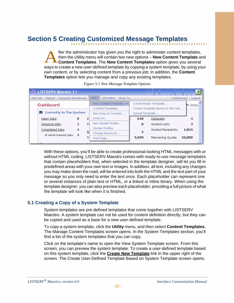
. . . . . . . . . . . . . . . . . . . . . . . . . . . . . . . . . . . . . . . . . . . . . . . . . . . . . . . .Section 5 Creating Customized Message Templates
fter the administrator has given you the right to administer content templates, then the Utility menu will contain two new options – New Content Template and Content Templates. The New Content Templates option gives you several
ways to create a new user-defined template by copying a system template, by using your own content, or by selecting content from a previous job; in addition, the Content Templates option lets you manage and copy any existing templates.
Figure 5-1 New Message Template Options
With these options, you’ll be able to create professional-looking HTML messages with or without HTML coding. LISTSERV Maestro comes with ready-to-use message templates that contain placeholders that, when selected in the template designer, will let you fill in predefined areas with your own text or images. In addition, all text, including any changes you may make down the road, will be entered into both the HTML and the text part of your message so you only need to enter the text once. Each placeholder can represent one or several instances of plain text or HTML, or a linked or inline binary. When using the template designer, you can also preview each placeholder, providing a full picture of what the template will look like when it is finished.
5.1 Creating a Copy of a System Template
System templates are pre-defined templates that come together with LISTSERV Maestro. A system template can not be used for content definition directly, but they can be copied and used as a base for a new user-defined template.
To copy a system template, click the Utility menu, and then select Content Templates. The Manage Content Templates screen opens. In the System Templates section, you’ll find a list of the system templates that you can copy.
Click on the template’s name to open the View System Template screen. From this screen, you can preview the system template. To create a user-defined template based on this system template, click the Create New Template link in the upper right of the screen. The Create User-Defined Template Based on System Template screen opens.
A
LISTSERV® Maestro, version 4.0 Interface Customization Manual- 55 -

Section 5 Creating Customized Message Templates
Figure 5-2 The Create User-Defined Template Based on System Template Screen
The user-defined template will initially be created as an exact copy of the system template, except for the following settings, which you are now asked to provide for the new template:
• User Template Name – Enter the name for the new user-defined template.
• Subject – Enter the subject line for the new user-defined template. This setting is optional and can be left out, in which case the subject line of the user-defined template will remain empty.
• Allow advanced editing of template source during mail job content definition – When a template is used when defining a message, then the user who uses the template only has to "fill in the blanks" that are left by the template placeholders. The user does not have to bother with the actual message body, as this body is already defined by the template.
Therefore, by default, when a template is used to define a message it is not even possible to modify the message body, except by filling out the placeholders.
Under some circumstances, you may want a user to not only fill out the placeholders but to also modify or edit the whole of the message body. This is what this option is for; if checked, then editing of the message body outside of the placeholders is allowed while the template is being used for content definition. If not checked, then only the placeholders can be filled out.
• Enable new template – Only user-defined templates that are in the "enabled" state may be used to define a message. Check this option if you want the new user-defined template to be enabled right from the beginning, or uncheck it if you want to create the new template in the disabled state (this allows you to edit it further before you enable it).
Note: All these settings can later be changed again, so if you are not sure about any setting, just enter what fits best at the moment.
Click the [Create Template] button to create the new user-defined template. The new user-defined template will be displayed in the User-Defined Templates section of the Manage Content Templates screen.
LISTSERV® Maestro, version 4.0 Interface Customization Manual- 56 -
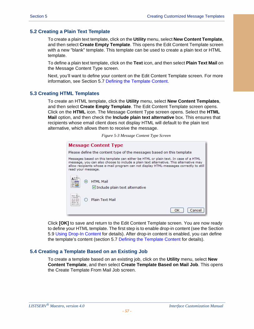
Section 5 Creating Customized Message Templates
5.2 Creating a Plain Text Template
To create a plain text template, click on the Utility menu, select New Content Template, and then select Create Empty Template. This opens the Edit Content Template screen with a new "blank" template. This template can be used to create a plain text or HTML template.
To define a plain text template, click on the Text icon, and then select Plain Text Mail on the Message Content Type screen.
Next, you’ll want to define your content on the Edit Content Template screen. For more information, see Section 5.7 Defining the Template Content.
5.3 Creating HTML Templates
To create an HTML template, click the Utility menu, select New Content Templates, and then select Create Empty Template. The Edit Content Template screen opens. Click on the HTML icon. The Message Content Type screen opens. Select the HTML Mail option, and then check the Include plain text alternative box. This ensures that recipients whose email client does not display HTML will default to the plain text alternative, which allows them to receive the message.
Figure 5-3 Message Content Type Screen
Click [OK] to save and return to the Edit Content Template screen. You are now ready to define your HTML template. The first step is to enable drop-in content (see the Section 5.9 Using Drop-In Content for details). After drop-in content is enabled, you can define the template’s content (section 5.7 Defining the Template Content for details).
5.4 Creating a Template Based on an Existing Job
To create a template based on an existing job, click on the Utility menu, select New Content Template, and then select Create Template Based on Mail Job. This opens the Create Template From Mail Job screen.
LISTSERV® Maestro, version 4.0 Interface Customization Manual- 57 -
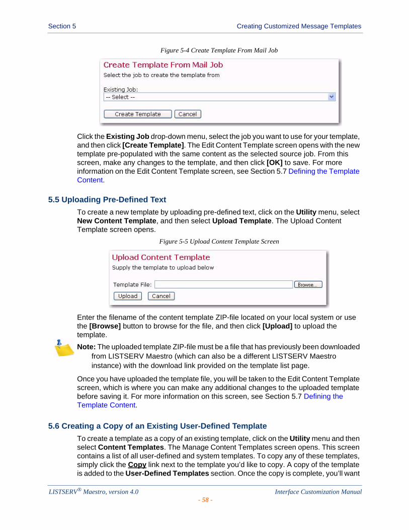
Section 5 Creating Customized Message Templates
Figure 5-4 Create Template From Mail Job
Click the Existing Job drop-down menu, select the job you want to use for your template, and then click [Create Template]. The Edit Content Template screen opens with the new template pre-populated with the same content as the selected source job. From this screen, make any changes to the template, and then click [OK] to save. For more information on the Edit Content Template screen, see Section 5.7 Defining the Template Content.
5.5 Uploading Pre-Defined Text
To create a new template by uploading pre-defined text, click on the Utility menu, select New Content Template, and then select Upload Template. The Upload Content Template screen opens.
Figure 5-5 Upload Content Template Screen
Enter the filename of the content template ZIP-file located on your local system or use the [Browse] button to browse for the file, and then click [Upload] to upload the template.
Note: The uploaded template ZIP-file must be a file that has previously been downloaded from LISTSERV Maestro (which can also be a different LISTSERV Maestro instance) with the download link provided on the template list page.
Once you have uploaded the template file, you will be taken to the Edit Content Template screen, which is where you can make any additional changes to the uploaded template before saving it. For more information on this screen, see Section 5.7 Defining the Template Content.
5.6 Creating a Copy of an Existing User-Defined Template
To create a template as a copy of an existing template, click on the Utility menu and then select Content Templates. The Manage Content Templates screen opens. This screen contains a list of all user-defined and system templates. To copy any of these templates, simply click the Copy link next to the template you’d like to copy. A copy of the template is added to the User-Defined Templates section. Once the copy is complete, you’ll want
LISTSERV® Maestro, version 4.0 Interface Customization Manual- 58 -

Section 5 Creating Customized Message Templates
to rename the template. To do this, click on the name and rename it on the Edit Content Template screen. For more information, see Section 5.7 Defining the Template Content.
5.7 Defining the Template Content
The Edit Content Template screen lets you define th.e content for your HTML template.
The Subject field is the subject line of the message. It is mandatory and must be filled out.
The HTML Preview tab is where you can upload or download the HTML body of your message. Once defined, it also displays the HTML body of the message, with all drop-in elements resolved. If errors have been encountered while LISTSERV Maestro has tried to replace the drop-in placeholders with the drop-in content, then an error message is displayed and the un-replaced drop-in placeholders are highlighted in the HTML preview.
To define the body from this tab, you can upload an HTML file. An uploaded HTML file may contain links to images on a remote server or local (inline) images embedded in the page. To upload an HTML page, click the [Upload HTML] button. This will start a small applet that allows you to select an HTML file from your local disk for upload to the system. You will need to have Java enabled in your browser for the applet to work. Since the applet needs to access your local disk, you will need to grant rights for the applet to function correctly. The applet will load the selected HTML file and will search for all images and other binaries that are referenced in the HTML code. All binaries that are referenced locally (with a local file name and/or path) will be uploaded together with the HTML code.
Once the upload is complete, the applet displays a short summary, listing all locally referenced binaries that were uploaded, as well as all binaries that were referenced as links to files on the Internet (these are not uploaded). All binary references that are found, but could not be resolved, will also be listed.
Confirming the summary will allow the applet to upload the data (HTML and binaries) to the system. The system will display the uploaded page on the HTML tab.
By clicking the [Download HTML] button, a previously uploaded HTML file and its associated binaries can be downloaded to your computer in the form of a ZIP archive. This also applies to any HTML code that has been entered directly into the box on the HTML Code tab.
The HTML page is mandatory and must be filled out, either by uploading an HTML page or by typing the HTML code directly into the box on the HTML Code tab.
The HTML Code tab contains the source code of the HTML body of the message. To define the body, type HTML code directly in the box, cut and paste it from another application, or upload an HTML page. To edit the source code, simply edit the code shown on this tab, and then go back to the HTML Preview tab to view the changes.
To upload an HTML page, click the [Upload HTML] button. To download a previously uploaded HTML file and associated binaries in form of a ZIP archive, click the [Download HTML] button.
The HTML page is mandatory and must be filled out, either by uploading a HTML page or by entering the HTML code directly on the HTML Code tab.
LISTSERV® Maestro, version 4.0 Interface Customization Manual- 59 -
Section 5 Creating Customized Message Templates
The Text Preview tab displays the plain text alternative option for the HTML mail. For this to function properly, the plain text alternative and drop-in content must be enabled for the job.
The alternative text is a plain text body that is an "alternative" for the more elaborate HTML body of the message. Recipients whose email client does not display HTML may default to the plain text alternative allowing them to receive a message. To reach the highest number of recipients, it is generally a good idea to use an alternative text with each HTML message.
This tab is a preview of the alternative plain text body of the HTML email message, with all drop-in elements resolved. If errors have been encountered while LISTSERV Maestro has tried to replace the drop-in placeholders with the drop-in content, an error message is displayed and the un-replaced drop-in placeholders are highlighted in the alternative text preview.
You cannot edit the alternative text on this tab (see the Text tab), but you can upload a new alternative text by clicking the [Upload Text Alternative] button.
The Text tab lets you define the alternative text of your choice. Type the text directly in the box, cut and paste it from another application, or upload a text file by clicking the [Upload Text Alternative] button.
For this to function properly, the plain text alternative and drop-in content must be enabled for the email job.
To test how the current template would behave when used in the content definition of a mail job, click the Test Template link.
To delete the current template, click the Delete Template link.
To leave the screen and store any changes made to the template, click the [OK] button. To leave the screen without storing, click [Cancel].
5.8 Defining the Template Settings
The Template Settings tab on the Edit Content Template screen is available for both plain text and HTML templates.
The General Settings section contains two options:
• Allow Advanced Editing – When a template is used during the content definition of a mail job, then the user who uses the template usually only has to "fill in the blanks" that are left by the template placeholders. The user does not have to bother with the actual message body, as this body is already defined by the template. Therefore, by default, when a template is used to define the message content, it is not even possible to modify the message body, except by filling out the placeholders.
Under certain circumstances, it may be desirable to allow a user to not only fill out the placeholders but to also modify or edit the whole of the message body. This is what this option is for. If checked, then editing of the message body outside of the placeholders is allowed while the template is being used for content definition. If not checked, then only the placeholders can be filled out.
• Highlight Placeholders – When a template is used to define the message content, then the user will have to provide content for all placeholders in the template. To
LISTSERV® Maestro, version 4.0 Interface Customization Manual- 60 -
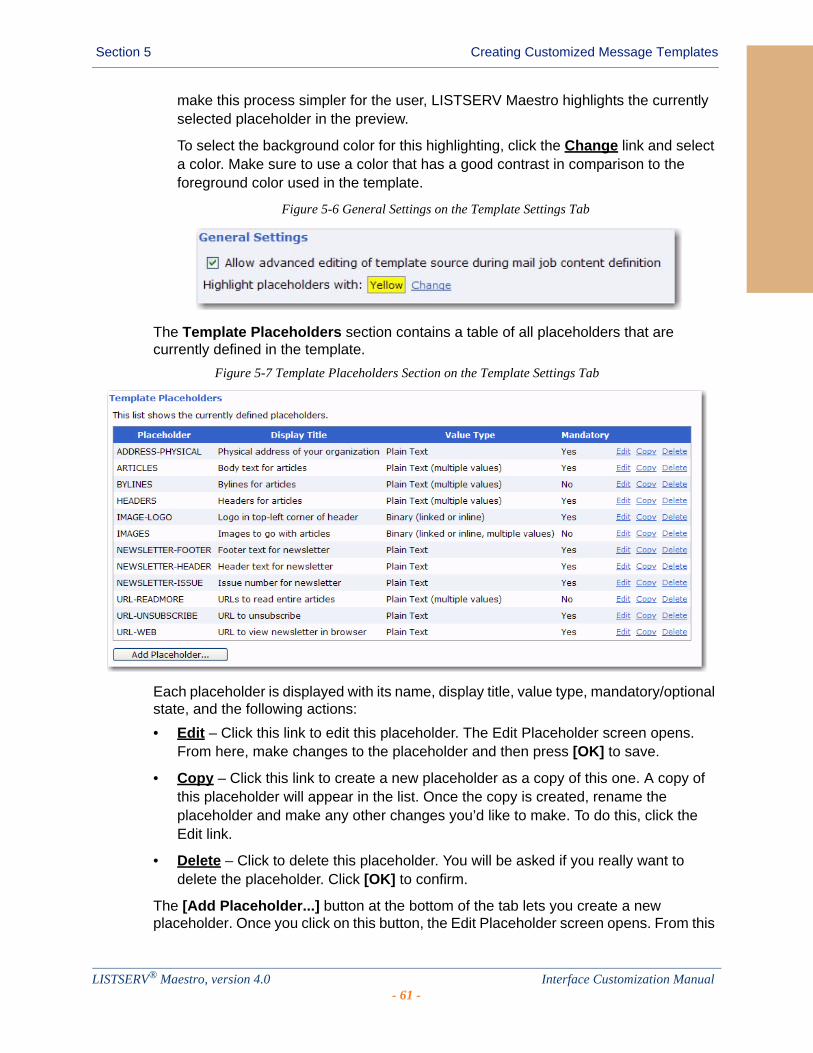
Section 5 Creating Customized Message Templates
make this process simpler for the user, LISTSERV Maestro highlights the currently selected placeholder in the preview.
To select the background color for this highlighting, click the Change link and select a color. Make sure to use a color that has a good contrast in comparison to the foreground color used in the template.
Figure 5-6 General Settings on the Template Settings Tab
The Template Placeholders section contains a table of all placeholders that are currently defined in the template.
Figure 5-7 Template Placeholders Section on the Template Settings Tab
Each placeholder is displayed with its name, display title, value type, mandatory/optional state, and the following actions:
• Edit – Click this link to edit this placeholder. The Edit Placeholder screen opens. From here, make changes to the placeholder and then press [OK] to save.
• Copy – Click this link to create a new placeholder as a copy of this one. A copy of this placeholder will appear in the list. Once the copy is created, rename the placeholder and make any other changes you’d like to make. To do this, click the Edit link.
• Delete – Click to delete this placeholder. You will be asked if you really want to delete the placeholder. Click [OK] to confirm.
The [Add Placeholder...] button at the bottom of the tab lets you create a new placeholder. Once you click on this button, the Edit Placeholder screen opens. From this
LISTSERV® Maestro, version 4.0 Interface Customization Manual- 61 -

Section 5 Creating Customized Message Templates
screen, you can enter the information for the new placeholder. For more information on using this screen, see Section 5.10.2 Editing Placeholders.
5.9 Using Drop-In Content
To use drop-in content in your template, you first need to enable it. Drop-in content is disabled by default for a newly created template. To enable drop-in content, click on the Drop-Ins icon on the Edit Template Content screen. This icon is also used to change the current settings or to disable drop-ins for the template.
Drop-ins use an opening and a closing tag. These tags are used by LISTSERV Maestro to identify the names of the drop-in content. In content templates, the opening and closing tags used for drop-ins must be the same as used for the template placeholders. Therefore, changing the tags for drop-ins also changes the tags for the template placeholders and vice versa. Opening and closing tags can be any characters you like that do not contain any spaces. "{{" and "}}" are suggested as defaults, but you may change them.
To include drop-in content in your template, simply enter the name of the drop-in at the appropriate location, enclosed in the tags you have defined. For example, if your drop-in is called "sample" and you are using the suggested default tags, then you would include the text "{{sample}}" in the location where you want the drop-in content to appear in the final message.
Whenever LISTSERV Maestro finds the opening tag followed by the closing tag, it will interpret all the characters in between first as a template placeholder name. If no placeholder with this name is found, then the name is instead interpreted as the name of a drop-in. LISTSERV Maestro will then look up the list of available drop-ins for a drop-in with this name. If the name is not found, delivery of the mail fails with an error message like "Drop-In with name 'sample' not found".
If drop-in content is disabled, any drop-in placeholder names that might appear in the message will not be replaced with the corresponding content. Instead, the placeholder names will appear verbatim in the body of the message.
Figure 5-8 Enabling Drop-In Content for a Message Template
For more information on drop-ins, see the User’s Manual for LISTSERV Maestro.
LISTSERV® Maestro, version 4.0 Interface Customization Manual- 62 -
Section 5 Creating Customized Message Templates
5.10 Using Template Placeholders
Template placeholders make content templates easy to use and truly customizable, as they define the "blanks" that the user will have to fill out. A template placeholder appears in the template body in the following form:
{{#NAME}}
where "{{" and "}}" are the opening and closing tags, and "NAME" is replaced with the name of the placeholder. The "#" character that prefixes the name must always appear for a template placeholder.
A placeholder with a given name can appear several times throughout the template body and may appear both in the HTML and the plain text part, if the placeholder's type allows this.
The opening and closing tags for the placeholders can be freely defined and can be any characters you like that do not contain any spaces. "{{" and "}}" are suggested as defaults, but you may change them by clicking the Placeholders icon in the icon bar.
Note: The opening and closing tags that are defined for the placeholders will also be used for drop-ins, if drop-ins are enabled for the template. It is important to choose opening and closing tags with care, making sure that they do not otherwise appear in the template. For example, if you decide to use parentheses '(' and ')' for opening and closing tags, any text that appears between any set of parentheses will be interpreted as the name of a template placeholder or drop-in. Since parentheses have a high probability for use in the normal text of a message, using them as tags is not recommended because they may cause an error in placeholder or drop-in name look up, leading to mail delivery failure.
5.10.1 Creating and Inserting Placeholders
There are several ways to create a new placeholder:
• Click the [Add Placeholder] button on the Template Settings tab. For more information, see Section 5.8 Defining the Template Settings.
• Click the Copy link associated with a placeholder on the Template Settings tab. For more information, see Section 5.8 Defining the Template Settings.
• Click the Click here to insert a placeholder link at the top of the Text tab. This will open the Insert Placeholder screen, which allows you to create a new placeholder by selecting the New option in the left list and filling out the placeholder attributes in the right part. The {{#NAME}} tag of the new placeholder will be automatically inserted at the current cursor position in the current text input box.
• Press CTRL+Space while typing in the text box on the Text tab. This will also open the Insert Placeholder screen.
• If you simply want to insert an already existing placeholder somewhere in the current text box, you can either simply type its {{#NAME}} tag or you can open the Insert Placeholder screen by clicking the Click here to insert a placeholder link or pressing CTRL+Space.
LISTSERV® Maestro, version 4.0 Interface Customization Manual- 63 -

Section 5 Creating Customized Message Templates
Figure 5-9 Inserting a Placeholder
In this screen, select an existing placeholder from the list on the left and click [OK], which will automatically insert the placeholder's {{#NAME}} tag at the current cursor position.
5.10.2 Editing Placeholders
Template placeholders have various attributes that determine their appearance and behavior. These attributes can be defined on the Edit Placeholder screen during placeholder creation or by clicking the Edit link of an existing placeholder in the list on the Template Settings tab.
Figure 5-10 Editing a Template Placeholder
The following attributes can be defined from this screen:
• Name – The name of the placeholder. This is the name that you must use as a replacement for NAME in the {{#NAME}} tag. Only the following characters are allowed in a placeholder name: 'a'-'z', 'A'-'Z', '0'-'9', '_' and '-'.
LISTSERV® Maestro, version 4.0 Interface Customization Manual- 64 -

Section 5 Creating Customized Message Templates
• Display Title – This is the title or name of the placeholder that will be displayed to users that employ the template during content definition. Enter a title that makes it easy for the user to understand the purpose of the placeholder.
• Mandatory – Defines if the placeholder is mandatory or not. For a mandatory placeholder, the user must supply a non-empty content. For an optional placeholder, the user may decide to leave the placeholder empty.
• Value Type – Defines the placeholder's content type.
The following Single Value Placeholders are available:
• Plain Text – The placeholder's content will be interpreted literally, as plain text. If the placeholder is used in a HTML part, then any special HTML code characters in the content will be escaped before replacement. Therefore, it will not be possible to include any HTML formatting (like bold, color, font, etc.) in a placeholder of this type. Only the two plain text placeholder types can be used in a plain text template or in the alternative text of a HTML template.
• HTML – The placeholder's content will be interpreted depending on the context.
If the placeholder appears in the HTML part of a message, then the HTML code appears unescaped and will thus be interpreted as normal HTML. This allows the user who employs the template during content definition to include HTML formatting code in the placeholder value (e.g. for attributes like underline, bold, color, font, etc.), but it also requires the user to remember to manually escape any HTML-sensitive characters that are not be supposed to be interpreted as HTML code.
If such a placeholder is used in the plain text part of a message, then the HTML code that the user enters will be converted automatically to plain text (see below).
If the placeholder appears both in the HTML and the plain text part of a message, then each of the above applies for each respective part, i.e. in the HTML part the placeholder's value will be interpreted as HTML, in the plain text part it will automatically be converted to plain text. Therefore, it is, for example, safe for the user to use simple formatting tags (like <b> or <u> for bold or underlined style) so that in the HTML part some special formatting will be applied, even if the same placeholder appears in the plain text part, because there these tags will automatically be removed. However, the user should avoid complicated HTML code in such placeholders, as the rules by which the HTML code is converted into plain text are rather simple: (1) Any HTML entities (for example like "&" or ""e;") will be resolved into the correct replacement character; (2) Any paragraph and linebreak tags (<p>, <br> and similar) will be converted to normal linebreaks; (3) Any occurrences of ordered or unordered lists with list entries (<ol>, <ul> and <li>) will be converted into simple ordered/unordered lists; (4) All other HTML tags will simply be removed.
LISTSERV® Maestro, version 4.0 Interface Customization Manual- 65 -
Section 5 Creating Customized Message Templates
• Binary (linked or inline) – This is a special placeholder that allows the template manager to define a binary (usually an image) in the HTML template of which the actual content is not yet known but will be supplied later by the user who employs the template during content definition.
When doing so, the user who defines the content may decide if the binary data (the image file) is supposed to be linked remotely, from a URL at a web server, or if the binary data shall be bundled into the mail as an inline attachment.
Binary placeholders can be used for images (JPEG, GIF, and PNG) or background sounds (MIDI).
During content definition the placeholder will be replaced with a URL to the image (either a linked or inline URL), which is why this type of placeholder should be used only in a context in the HTML code where such a URL makes sense.
Normally, the placeholder would stand in for an image and would appear in the "src" attribute of an "<img>" tag, like this:
<img src="{{#SampleBinaryPlaceholder}}">
Other valid contexts would be in a style definition where an image URL is required or in a background image or sound attribute of an HTML tag.
This placeholder type can only be used in the HTML part of an HTML template.
• Binary (inline) – Same as the Binary (linked or inline) type above, only with this type, the binary will always be an inline binary. This means that the user who employs the template during content definition will have no choice about this.
• Binary (linked) – Same as the Binary (linked or inline) type above, only with this type, the binary will always be a linked binary, i.e. the user who employs the template during content definition will have no choice about this.
The following Multiple Values Placeholders are available:
• Plain Text (multiple values) – Same as the Plain Text type above, but the user who employs the template during content definition has the option of supplying multiple values for the placeholder. The placeholder will be replaced with the combined multiple values (linked to each other). This is useful when using the multi-placeholder repeater and/or the special placeholder prefix and suffix because the prefix and/or suffix will appear once before/after each of the multiple values before they are concatenated to build the combined replacement value.
From the values in preview drop-down menu, select how many dummy values shall be displayed for this placeholder during preview (when no values
LISTSERV® Maestro, version 4.0 Interface Customization Manual- 66 -
Section 5 Creating Customized Message Templates
have been supplied yet).
Only the two plain text placeholder types (see also above) are allowed to be used in a plain text template or in the alternative text of a HTML template.
• HTML (multiple values) – Same as the HTML type above, but the user who employs the template during content definition has the option of supplying multiple values for the placeholder. The placeholder will be replaced with the combined multiple values (linked to each other). This is useful when using the multi-placeholder repeater and/or the special placeholder prefix and suffix because the prefix and/or suffix will appear once before/after each of the multiple values before they are concatenated to build the combined replacement value.
From the values in preview drop-down menu, select how many dummy values shall be displayed for this placeholder during preview (when no values have been supplied yet).
This placeholder type can only be used in the HTML part of an HTML template.
• Binary (linked or inline, multiple values), Binary (linked, multiple values), Binary (inline, multiple values) – Same as the corresponding Binary types above, but the user who employs the template during content definition has the option of supplying multiple binaries for the placeholder. The placeholder will be replaced with a list of the URLs of all supplied binaries (both linked and inline). This is useful when using the multi-placeholder repeater and/or the special placeholder prefix and suffix because the prefix and/or suffix will appear once before/after each of the multiple URLs before they are linked to build the combined replacement value, which allows you to enclose each of the URLs with its own <img> tag to actually display the image that is represented by the binary.
From the values in preview drop-down menu, select how many dummy images shall be displayed for this placeholder during preview (when no binaries have been supplied yet).
This placeholder type can only be used in the HTML part of an HTML template.
• Sample Preview – There are several situations where the template is supposed to be displayed while the placeholders are not yet filled out with any content. In these situations, LISTSERV Maestro fills out the placeholders with dummy content as a stand-in for the actual content that is yet to be provided. This makes it easier to assess the overall appearance of the template while the placeholders are still empty. The kind of dummy content that is used for this can be defined by the content manager, depending on the type of the placeholder:
• Dummy Text – For Plain Text and HTML placeholders there are several choices to roughly define which kind of dummy text shall be displayed. The choices are:
LISTSERV® Maestro, version 4.0 Interface Customization Manual- 67 -
Section 5 Creating Customized Message Templates
Some / Many WordsSome / Many Sentences Some / Many ParagraphsSome / Many DigitsSome / Many LettersSample URL.
Notes: The Dummy Text should be selected according to the expected kind of content that will be provided by the user for the given placeholder. For example, if the placeholder appears in a context where it will be filled out with a number (like a ZIP-code or phone number), then Some Digits would be the closest match. If the placeholder will be filled out with a lot of text, then Many Paragraphs is probably better.
The Sample URL option is a special choice that will result in a replacement that looks like a dummy "http://" URL. This type is appropriate if the expected content will most likely be a URL (for example, in a context like "Click this URL {{#Placeholder}} to go to...”).
• Dummy Images – For placeholders of the binary types, the following choices are available to display dummy images: No Sample Image Small Square (20x20 Pixel) Medium Square (100x100 Pixel) Large Square (500x500 Pixel) Small Vertical Oblong (10x20 Pixel)Medium Vertical Oblong (50x100 Pixel) Large Vertical Oblong (250x500 Pixel) Small Horizontal Oblong (20x10 Pixel) Medium Horizontal Oblong (100x50 Pixel) Large Horizontal Oblong (500x250 Pixel)
Note: The sizes of the dummy images will only be observed if the <img> tag itself does not have any "width" or "height" attributes. If these attributes are present, then they override the sizes of the selected dummy image and the image will be stretched or shrunk accordingly.
• Disable Placeholder Highlighting in HTML – Only available for Plain Text or HTML placeholders (for binary placeholders, highlighting is always disabled).
In some situations where the template is being displayed to the user, LISTSERV Maestro attempts to highlight the currently selected placeholder with a high contrast background color, making it easier for the user to see which placeholder is selected.
This highlighting is achieved by embedding additional HTML code into the previewed template (embedded during the preview only). In some situations, this additionally embedded HTML code disrupts the actual HTML code of the template that surrounds the placeholder, which causes the template to appear "broken".
In these cases, it is best to disable the highlighting of the placeholder. This can be done with this option. Or more precisely, if this option is checked, then any
LISTSERV® Maestro, version 4.0 Interface Customization Manual- 68 -

Section 5 Creating Customized Message Templates
appearances of the placeholder in the HTML part of the template will no longer be highlighted. Appearances in the plain text part (if any) will always be highlighted.
5.10.3 Special Prefix and Suffix Rules for Template Placeholders
When using optional placeholders in a template, it is sometimes desirable that some content defined in the template will only appear if the placeholder is actually filled out and will not appear if the placeholder is left empty.
For example, consider an HTML template that is supposed to render a bulleted list with up to five bullets, where each list item (except for the first) is optional, i.e. the user who employs the template during content definition can decide how many bullets there are, simply by filling out some and leaving empty the rest, like this:
<ul>
<li>{{#Placeholder_1}}
<li>{{#Placeholder_2}}
<li>{{#Placeholder_3}}
<li>{{#Placeholder_4}}
<li>{{#Placeholder_5}}
</ul>
This would actually not work because if some placeholders are left empty, then their bullets (rendered by the <li> tag) would still be visible, like this (three placeholders filled out, two left empty):
• Content of first placeholder
• Content of second placeholder
• Content of third placeholder
•
•
It would be better if the preceding <li> tag would simply not appear at all, leaving the placeholder empty. To facilitate this, template placeholders in LISTSERV Maestro use a special syntax that allows you to define a prefix and a suffix to the content that will not appear if the user does not enter a content at all (the prefix and suffix are only included if the user actually supplies a non-empty content). An example of this is:
{{#NAME prefix#VALUE#suffix}}
where #NAME is replaced with the actual placeholder name and where you replace "prefix" with the desired prefix text and "suffix" with the desired suffix text, using the following rules:
• The string #VALUE# (including the "#" enclosing characters) must appear between prefix and suffix (if any are present).
• Both prefix and/or suffix may be empty (may be left out).
• Both prefix and suffix may contain linebreaks. The linebreaks will become part of the prefix/suffix.
LISTSERV® Maestro, version 4.0 Interface Customization Manual- 69 -
Section 5 Creating Customized Message Templates
• Any characters after "#NAME" and before "#VALUE#" will be part of the prefix, including all linebreaks (even linebreaks that appear immediately before "#VALUE#"), except for any whitespace that appears immediately after the word "#NAME" and that appears on the same line as the word "#NAME". Such whitespace is ignored. Also, if the first line contains only whitespace after the word "#NAME", then the linebreak at the end of this line will also be ignored and will not be part of the prefix. (See below for examples.)
• Any characters after "#VALUE#" and before the closing tag "}}" (or whatever closing tag is applicable in your template) will be part of the suffix, including all linebreaks, even linebreaks that appear immediately after "#VALUE#" or before the closing tag "}}". (See below for examples.)
If the user does not supply placeholder content, then the whole placeholder (starting with the opening tag and ending with the closing tag) will be replaced with an empty string (i.e. the prefix and suffix will not appear in this case).
If the user supplies a non-empty content, then the whole placeholder (again starting with the opening tag and ending with the closing tag) will be replaced with the text that is built by linking the prefix, content, and suffix. This means that, in the "prefix#VALUE#suffix" string, the "#VALUE#" part (including the enclosing "#" characters) is replaced with the user content, and the resulting string (including prefix and suffix) is used to replace the placeholder.
For examples of placeholders with a prefix and/or suffix, see the online help for the HTML Preview tab.
5.10.4 #TITLE# in a Binary Placeholder Prefix/Suffix
If the placeholder is a placeholder of one of the Binary types, then the special #TITLE# attribute may be used anywhere in the prefix and/or suffix of that placeholder (it may even appear several times).
If the #TITLE# attribute is used, then when the placeholder is filled out during content definition, the user will have the option of not only providing the binary source for the placeholder but also a title text. This title text will then be used to replace the #TITLE# attribute wherever it appears in the prefix or suffix.
The main use for this attribute is to provide the text for the "title" and/or "alt" attribute of the <img> tag that the binary placeholder is used to generate, for example like this (prefix and suffix color coded like above):
{{#BinaryPlaceholder <img src="#VALUE#" title="#TITLE#" alt="#TITLE#"> }
Note: Observe how in the example the <img> tag is opened in the placeholder prefix and closed in the placeholder suffix, and that the #TITLE# attribute appears in the suffix as a stand-in for the yet to be supplied "title" and "alt" attributes.
5.10.5 "Multiple Values" Placeholders with Prefix/Suffix
The prefix and suffix have an especially important role when used together with placeholders that may have multiple values – Plain Text (multiple values) or HTML (multiple values). The multiple values of these placeholders are linked to each other, and the resulting value is used to replace the placeholder. This by itself is not very useful, as the user could just as well have supplied the multiple values already as one combined
LISTSERV® Maestro, version 4.0 Interface Customization Manual- 70 -
Section 5 Creating Customized Message Templates
text in a normal single value placeholder. However, multiple value placeholders become useful when a prefix and/or suffix are employed because the prefix/suffix is added individually to each of the supplied multiple values, and only then are the multiple values linked together to build the final replacement value. This means that if a prefix and/or suffix is defined, and the user later supplies several values for the placeholder, then not only will the prefix appear before and the suffix after the supplied value, but the prefix and/or suffix also appears between the various multiple values. This very useful if the template manager wants to define a list of items without already knowing how many items there are going to be.
Consider the bullet list example above. As the example was defined, the template manager had set up a bulleted list with up to five bullets. Since the bullet definition itself (the <li> tag) was defined in the prefix, any empty bullets were effectively avoided should the user decide not to provide values for some of the placeholders.
So far so good. The only problem is that the maximum number of bullets was predefined as five by the template manager. If the user later would want to add a sixth bullet, then he would have to ask the template manager to change the template. With a multiple values placeholder, this problem is avoided. In this case, the definition of the bulleted list in the template would look something like this:
<ul>
{{#MultiPlaceholder <li>#VALUE#}}
</ul>
And, the "MultiPlaceholder" placeholder would have to be defined as HTML (multiple values). Then, it would be up to the user to decide how many values to supply for this placeholder.
If no value is supplied (only allowed if the placeholder is not mandatory), then the placeholder will be replaced with an empty string and the "<li>" tag will not appear since it is defined in the prefix, which is not rendered for an empty optional placeholder.
If only a single value is supplied, then the placeholder behaves just like a normal placeholder: The value is used to replace the "#VALUE#" part, and the result, including the prefix "<li>" would be used to replace the placeholder, and the resulting HTML code would look something like this:
<ul>
<li>Single value here...
</ul>
But if several values are supplied, then the multi-behavior comes into play. Each of the values would be used individually to replace the "#VALUE#" part, and the prefix "<li>" would be added to each of the values. Then, the result for all values would be linked together and used to replace the placeholder. Therefore, the resulting HTML code would look something like this (sample with four values supplied, linebreaks added for readability):
<ul>
<li>First value here...
LISTSERV® Maestro, version 4.0 Interface Customization Manual- 71 -

Section 5 Creating Customized Message Templates
<li>Second value here...
<li>Third value here...
<li>Fourth value here...
</ul>
The length of this bulleted list would depend only on how many values the user supplies when using the template during a content definition.
5.10.6 #INDEX# in a Multiple Values Placeholder Prefix/Suffix
Another useful feature for multiple values placeholders is the "#INDEX#" attribute that can be used in the prefix and/or suffix. Any appearance of this attribute will be replaced with the index number of the multi-value. For example, assume the following template definition, where "MultiPlaceholder" is of the "HTML (multiple values)" type:
{{#MultiPlaceholder <p>#INDEX#. Paragraph: #VALUE#</p>}}
Now assume that the user fills out this placeholder with four values. Then, the resulting HTML code would look something like this (linebreaks added for readability):
<p>1. Paragraph: First value here...</p>
<p>2. Paragraph: Second value here... </p>
<p>3. Paragraph: Third value here... </p>
<p>4. Paragraph: Fourth value here... </p>
The above is an example of how the #INDEX# attribute can be used to generate a numbered list where a normal ordered list using the <li> tag would not be appropriate, or in a plain text, where this tag can of course not be used.
Another useful case where the #INDEX# attribute can be employed is to generate a unique HTML-ID or unique links and unique link anchor names:
<!-- Example with multi-placeholder that generates a unique HTML-ID, per multi-value: -->
<table>
{{#TableRow <tr><td id="ValueCell-#INDEX#">#VALUE#</td></tr>}}
</table>
<!-- multi-placeholder that generates a unique link anchor, per multi-value: -->
{{#ParagraphWithAnchor <a name="Paragraph-#INDEX#"><p>#VALUE#</p></a>}}
<!-- multi-placeholder that generates a unique link to the above anchor, per multi-value: -->
{{#LinkToAnchor <a href="#Paragraph-#INDEX#">#VALUE#</a><br>}}
Assuming that "TableRow", "ParagraphWithAnchor", and "LinkToAnchor" are defined as multiple value placeholders, and assuming that the user supplies five values for “TableRow”, three values for “ParagraphWithAnchor” and matching three values for "LinkToAnchor", then the resulting HTML would look something like this (linebreaks added for readability):
<!-- Example with multi-placeholder that generates a unique HTML-ID, per multi-value: -->
<table>
LISTSERV® Maestro, version 4.0 Interface Customization Manual- 72 -

Section 5 Creating Customized Message Templates
<tr><td id="ValueCell-1">First cell value here...</td></tr>
<tr><td id="ValueCell-2">Second cell value here...</td></tr>
<tr><td id="ValueCell-3">Third cell value here...</td></tr>
<tr><td id="ValueCell-4">Fourth cell value here...</td></tr>
<tr><td id="ValueCell-5">Fifth cell value here...</td></tr>
</table>
<!-- multi-placeholder that generates a unique link anchor, per multi-value: -->
<a name="Paragraph-1"><p>First paragraph value here...</p></a>
<a name="Paragraph-2"><p>Second paragraph value here...</p></a>
<a name="Paragraph-3"><p>Third paragraph value here...</p></a>
<!-- multi-placeholder that generates a unique link to the above anchor, per multi-value: -->
<a href="#Paragraph-1">Click here to go to the first paragraph...</a><br>
<a href="#Paragraph-2">Click here to go to the second paragraph...</a><br>
<a href="#Paragraph-3">Click here to go to the third paragraph...</a><br>
Note: Observe how each table cell has a unique ID and each paragraph a unique anchor name and how the links at the bottom point to one of these unique anchors.
Of course, if two placeholders are used in this way (one to generate link anchors and one to generate the matching links to those anchors), then this will only work if the user who uses the template during content definition makes sure that both placeholders have the same number of values, and that the ordering of the values in both placeholders matches; otherwise, the links will point to the wrong anchors, or there will be links without anchors or anchors without links pointing to them.
Note: Any appearance of the #INDEX# attribute in the prefix/suffix of a normal (non-multiple value) placeholder will not be replaced. This attribute shows its special behavior only in the prefix/suffix of a multiple value placeholder.
5.10.7 Multi-Placeholder Repeater
As described above, using a placeholder with multiple values, usually together with the placeholder prefix/suffix, is very useful for creating a list of user supplied items, where the number of items is not known in advance. However, this alone does not cover a situation like the following – assume that the template is meant for a newsletter, where each article in the newsletter is supposed to appear with a heading, a sub-heading, and a body, all with different styles:
Article Heading
Article Sub-Heading
Article Body goes here....
where the matching HTML code looks like this:
LISTSERV® Maestro, version 4.0 Interface Customization Manual- 73 -
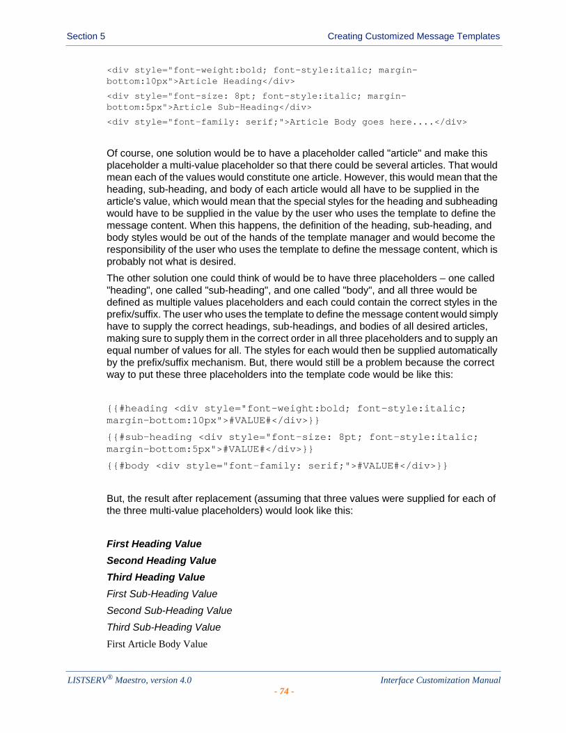
Section 5 Creating Customized Message Templates
<div style="font-weight:bold; font-style:italic; margin-bottom:10px">Article Heading</div>
<div style="font-size: 8pt; font-style:italic; margin-bottom:5px">Article Sub-Heading</div>
<div style="font-family: serif;">Article Body goes here....</div>
Of course, one solution would be to have a placeholder called "article" and make this placeholder a multi-value placeholder so that there could be several articles. That would mean each of the values would constitute one article. However, this would mean that the heading, sub-heading, and body of each article would all have to be supplied in the article's value, which would mean that the special styles for the heading and subheading would have to be supplied in the value by the user who uses the template to define the message content. When this happens, the definition of the heading, sub-heading, and body styles would be out of the hands of the template manager and would become the responsibility of the user who uses the template to define the message content, which is probably not what is desired.
The other solution one could think of would be to have three placeholders – one called "heading", one called "sub-heading", and one called "body", and all three would be defined as multiple values placeholders and each could contain the correct styles in the prefix/suffix. The user who uses the template to define the message content would simply have to supply the correct headings, sub-headings, and bodies of all desired articles, making sure to supply them in the correct order in all three placeholders and to supply an equal number of values for all. The styles for each would then be supplied automatically by the prefix/suffix mechanism. But, there would still be a problem because the correct way to put these three placeholders into the template code would be like this:
{{#heading <div style="font-weight:bold; font-style:italic; margin-bottom:10px">#VALUE#</div>}}
{{#sub-heading <div style="font-size: 8pt; font-style:italic; margin-bottom:5px">#VALUE#</div>}}
{{#body <div style="font-family: serif;">#VALUE#</div>}}
But, the result after replacement (assuming that three values were supplied for each of the three multi-value placeholders) would look like this:
First Heading Value
Second Heading Value
Third Heading Value
First Sub-Heading Value
Second Sub-Heading Value
Third Sub-Heading Value
First Article Body Value
LISTSERV® Maestro, version 4.0 Interface Customization Manual- 74 -
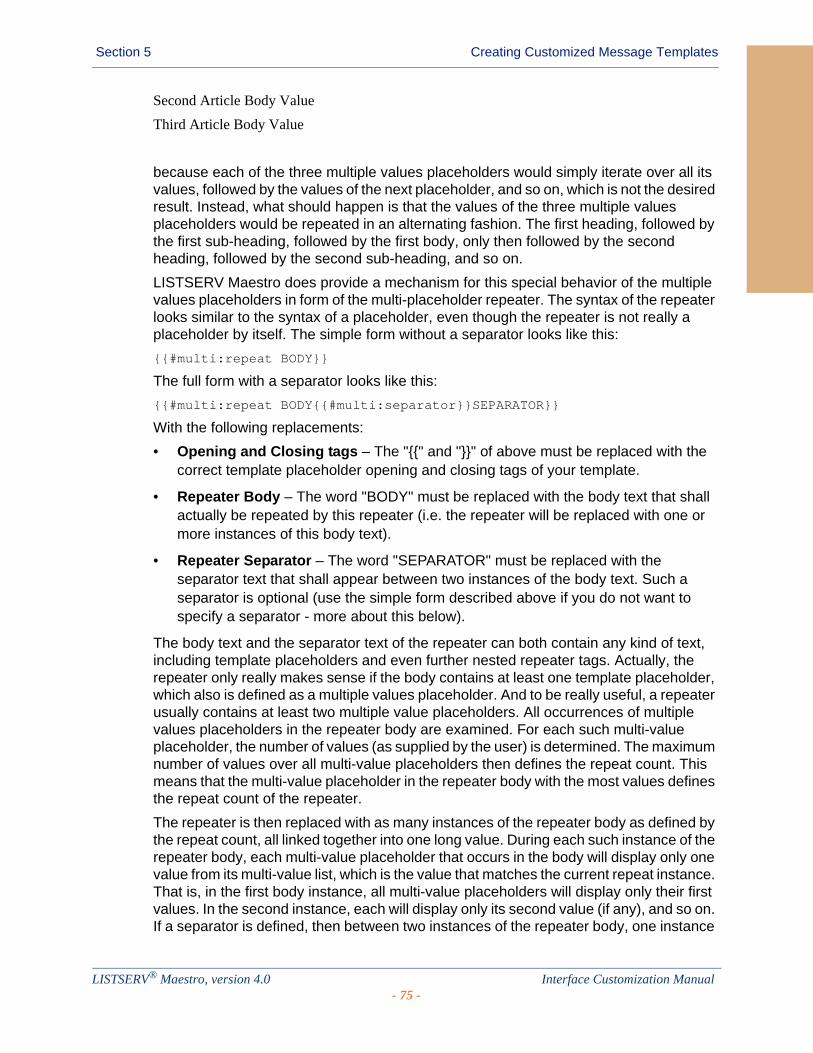
Section 5 Creating Customized Message Templates
Second Article Body Value
Third Article Body Value
because each of the three multiple values placeholders would simply iterate over all its values, followed by the values of the next placeholder, and so on, which is not the desired result. Instead, what should happen is that the values of the three multiple values placeholders would be repeated in an alternating fashion. The first heading, followed by the first sub-heading, followed by the first body, only then followed by the second heading, followed by the second sub-heading, and so on.
LISTSERV Maestro does provide a mechanism for this special behavior of the multiple values placeholders in form of the multi-placeholder repeater. The syntax of the repeater looks similar to the syntax of a placeholder, even though the repeater is not really a placeholder by itself. The simple form without a separator looks like this:
{{#multi:repeat BODY}}
The full form with a separator looks like this:
{{#multi:repeat BODY{{#multi:separator}}SEPARATOR}}
With the following replacements:
• Opening and Closing tags – The "{{" and "}}" of above must be replaced with the correct template placeholder opening and closing tags of your template.
• Repeater Body – The word "BODY" must be replaced with the body text that shall actually be repeated by this repeater (i.e. the repeater will be replaced with one or more instances of this body text).
• Repeater Separator – The word "SEPARATOR" must be replaced with the separator text that shall appear between two instances of the body text. Such a separator is optional (use the simple form described above if you do not want to specify a separator - more about this below).
The body text and the separator text of the repeater can both contain any kind of text, including template placeholders and even further nested repeater tags. Actually, the repeater only really makes sense if the body contains at least one template placeholder, which also is defined as a multiple values placeholder. And to be really useful, a repeater usually contains at least two multiple value placeholders. All occurrences of multiple values placeholders in the repeater body are examined. For each such multi-value placeholder, the number of values (as supplied by the user) is determined. The maximum number of values over all multi-value placeholders then defines the repeat count. This means that the multi-value placeholder in the repeater body with the most values defines the repeat count of the repeater.
The repeater is then replaced with as many instances of the repeater body as defined by the repeat count, all linked together into one long value. During each such instance of the repeater body, each multi-value placeholder that occurs in the body will display only one value from its multi-value list, which is the value that matches the current repeat instance. That is, in the first body instance, all multi-value placeholders will display only their first values. In the second instance, each will display only its second value (if any), and so on. If a separator is defined, then between two instances of the repeater body, one instance
LISTSERV® Maestro, version 4.0 Interface Customization Manual- 75 -
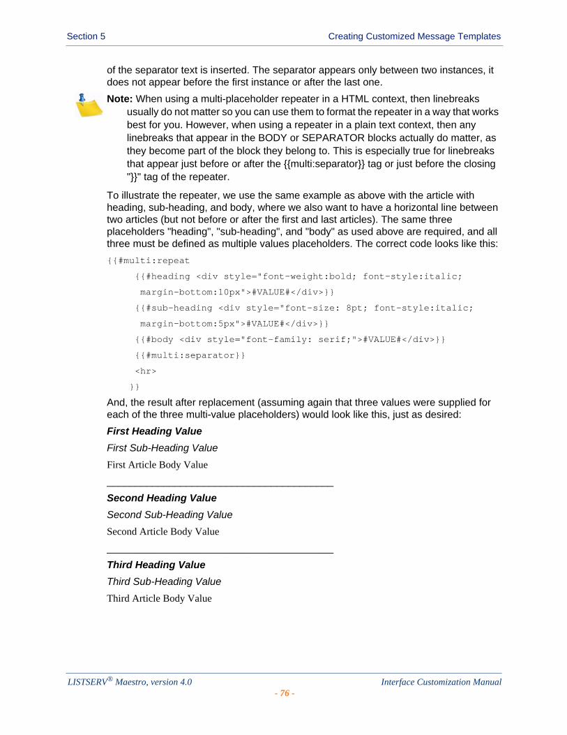
Section 5 Creating Customized Message Templates
of the separator text is inserted. The separator appears only between two instances, it does not appear before the first instance or after the last one.
Note: When using a multi-placeholder repeater in a HTML context, then linebreaks usually do not matter so you can use them to format the repeater in a way that works best for you. However, when using a repeater in a plain text context, then any linebreaks that appear in the BODY or SEPARATOR blocks actually do matter, as they become part of the block they belong to. This is especially true for linebreaks that appear just before or after the {{multi:separator}} tag or just before the closing "}}" tag of the repeater.
To illustrate the repeater, we use the same example as above with the article with heading, sub-heading, and body, where we also want to have a horizontal line between two articles (but not before or after the first and last articles). The same three placeholders "heading", "sub-heading", and "body" as used above are required, and all three must be defined as multiple values placeholders. The correct code looks like this:
{{#multi:repeat
{{#heading <div style="font-weight:bold; font-style:italic;
margin-bottom:10px">#VALUE#</div>}}
{{#sub-heading <div style="font-size: 8pt; font-style:italic;
margin-bottom:5px">#VALUE#</div>}}
{{#body <div style="font-family: serif;">#VALUE#</div>}}
{{#multi:separator}}
<hr>
}}
And, the result after replacement (assuming again that three values were supplied for each of the three multi-value placeholders) would look like this, just as desired:
First Heading Value
First Sub-Heading Value
First Article Body Value
________________________________________
Second Heading Value
Second Sub-Heading Value
Second Article Body Value
________________________________________
Third Heading Value
Third Sub-Heading Value
Third Article Body Value
LISTSERV® Maestro, version 4.0 Interface Customization Manual- 76 -
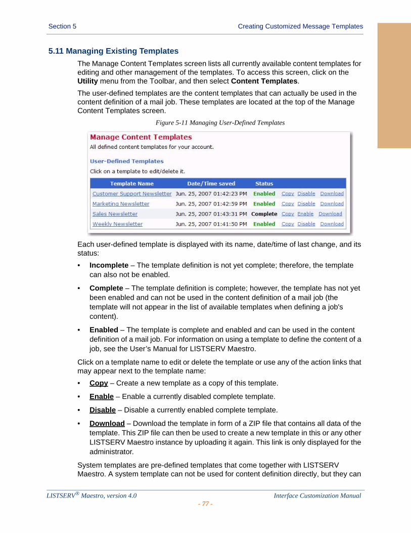
Section 5 Creating Customized Message Templates
5.11 Managing Existing Templates
The Manage Content Templates screen lists all currently available content templates for editing and other management of the templates. To access this screen, click on the Utility menu from the Toolbar, and then select Content Templates.
The user-defined templates are the content templates that can actually be used in the content definition of a mail job. These templates are located at the top of the Manage Content Templates screen.
Figure 5-11 Managing User-Defined Templates
Each user-defined template is displayed with its name, date/time of last change, and its status:
• Incomplete – The template definition is not yet complete; therefore, the template can also not be enabled.
• Complete – The template definition is complete; however, the template has not yet been enabled and can not be used in the content definition of a mail job (the template will not appear in the list of available templates when defining a job's content).
• Enabled – The template is complete and enabled and can be used in the content definition of a mail job. For information on using a template to define the content of a job, see the User’s Manual for LISTSERV Maestro.
Click on a template name to edit or delete the template or use any of the action links that may appear next to the template name:
• Copy – Create a new template as a copy of this template.
• Enable – Enable a currently disabled complete template.
• Disable – Disable a currently enabled complete template.
• Download – Download the template in form of a ZIP file that contains all data of the template. This ZIP file can then be used to create a new template in this or any other LISTSERV Maestro instance by uploading it again. This link is only displayed for the administrator.
System templates are pre-defined templates that come together with LISTSERV Maestro. A system template can not be used for content definition directly, but they can
LISTSERV® Maestro, version 4.0 Interface Customization Manual- 77 -
Section 5 Creating Customized Message Templates
be copied and used as a base for a new user-defined template (see Section 5.1 Creating a Copy of a System Template).
LISTSERV® Maestro, version 4.0 Interface Customization Manual- 78 -
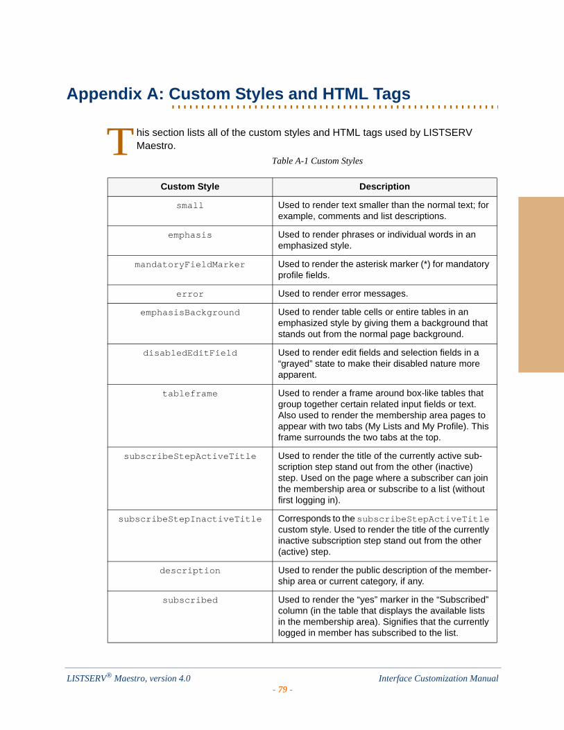
. . . . . . . . . . . . . . . . . . . . . . . . . . . . . . . . . . . . . . . . . . . . . . . . . . . . . . . .Appendix A: Custom Styles and HTML Tags
his section lists all of the custom styles and HTML tags used by LISTSERV Maestro.
Table A-1 Custom Styles
Custom Style Description
small Used to render text smaller than the normal text; for example, comments and list descriptions.
emphasis Used to render phrases or individual words in an emphasized style.
mandatoryFieldMarker Used to render the asterisk marker (*) for mandatory profile fields.
error Used to render error messages.
emphasisBackground Used to render table cells or entire tables in an emphasized style by giving them a background that stands out from the normal page background.
disabledEditField Used to render edit fields and selection fields in a “grayed” state to make their disabled nature more apparent.
tableframe Used to render a frame around box-like tables that group together certain related input fields or text. Also used to render the membership area pages to appear with two tabs (My Lists and My Profile). This frame surrounds the two tabs at the top.
subscribeStepActiveTitle Used to render the title of the currently active sub-scription step stand out from the other (inactive) step. Used on the page where a subscriber can join the membership area or subscribe to a list (without first logging in).
subscribeStepInactiveTitle Corresponds to the subscribeStepActiveTitle custom style. Used to render the title of the currently inactive subscription step stand out from the other (active) step.
description Used to render the public description of the member-ship area or current category, if any.
subscribed Used to render the “yes” marker in the “Subscribed” column (in the table that displays the available lists in the membership area). Signifies that the currently logged in member has subscribed to the list.
T
LISTSERV® Maestro, version 4.0 Interface Customization Manual- 79 -
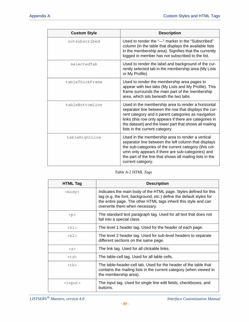
Appendix A Custom Styles and HTML Tags
Table A-2 HTML Tags
notsubscribed Used to render the “---“ marker in the “Subscribed” column (in the table that displays the available lists in the membership area). Signifies that the currently logged in member has not subscribed to the list.
selectedTab Used to render the label and background of the cur-rently selected tab in the membership area (My Lists or My Profile).
tableThickFrame Used to render the membership area pages to appear with two tabs (My Lists and My Profile). This frame surrounds the main part of the membership area, which sits beneath the two tabs.
tableBottomLine Used in the membership area to render a horizontal separator line between the row that displays the cur-rent category and it parent categories as navigation links (this row only appears if there are categories in the dataset) and the lower part that shows all mailing lists in the current category.
tableRightLine Used in the membership area to render a vertical separator line between the left column that displays the sub-categories of the current category (this col-umn only appears if there are sub-categories) and the part of the line that shows all mailing lists in the current category.
HTML Tag Description
<body> Indicates the main body of the HTML page. Styles defined for this tag (e.g. the font, background, etc.) define the default styles for the entire page. The other HTML tags inherit this style and can overwrite them when necessary.
<p> The standard text paragraph tag. Used for all text that does not fall into a special class.
<h1> The level 1 header tag. Used for the header of each page.
<h2> The level 2 header tag. Used for sub-level headers to separate different sections on the same page.
<a> The link tag. Used for all clickable links.
<td> The table-cell tag. Used for all table cells.
<th> The table-header-cell tab. Used for the header of the table that contains the mailing lists in the current category (when viewed in the membership area).
<input> The input tag. Used for single line edit fields, checkboxes, and buttons.
Custom Style Description
LISTSERV® Maestro, version 4.0 Interface Customization Manual- 80 -
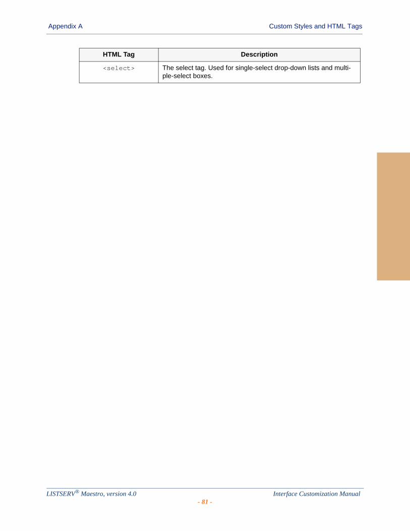
Appendix A Custom Styles and HTML Tags
<select> The select tag. Used for single-select drop-down lists and multi-ple-select boxes.
HTML Tag Description
LISTSERV® Maestro, version 4.0 Interface Customization Manual- 81 -

Appendix A Custom Styles and HTML Tags
LISTSERV® Maestro, version 4.0 Interface Customization Manual- 82 -
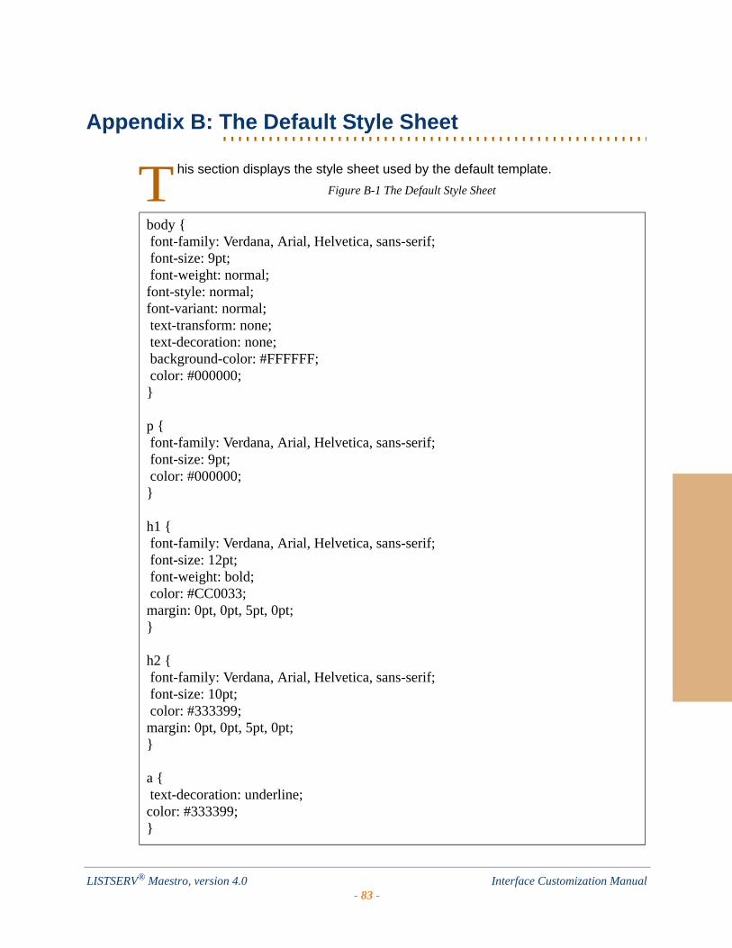
. . . . . . . . . . . . . . . . . . . . . . . . . . . . . . . . . . . . . . . . . . . . . . . . . . . . . . . .Appendix B: The Default Style Sheet
his section displays the style sheet used by the default template.
Figure B-1 The Default Style Sheet
body { font-family: Verdana, Arial, Helvetica, sans-serif; font-size: 9pt; font-weight: normal;font-style: normal;font-variant: normal; text-transform: none; text-decoration: none; background-color: #FFFFFF; color: #000000;}
p { font-family: Verdana, Arial, Helvetica, sans-serif; font-size: 9pt; color: #000000;}
h1 { font-family: Verdana, Arial, Helvetica, sans-serif; font-size: 12pt; font-weight: bold; color: #CC0033;margin: 0pt, 0pt, 5pt, 0pt;}
h2 { font-family: Verdana, Arial, Helvetica, sans-serif; font-size: 10pt; color: #333399;margin: 0pt, 0pt, 5pt, 0pt;}
a { text-decoration: underline;color: #333399;}
T
LISTSERV® Maestro, version 4.0 Interface Customization Manual- 83 -
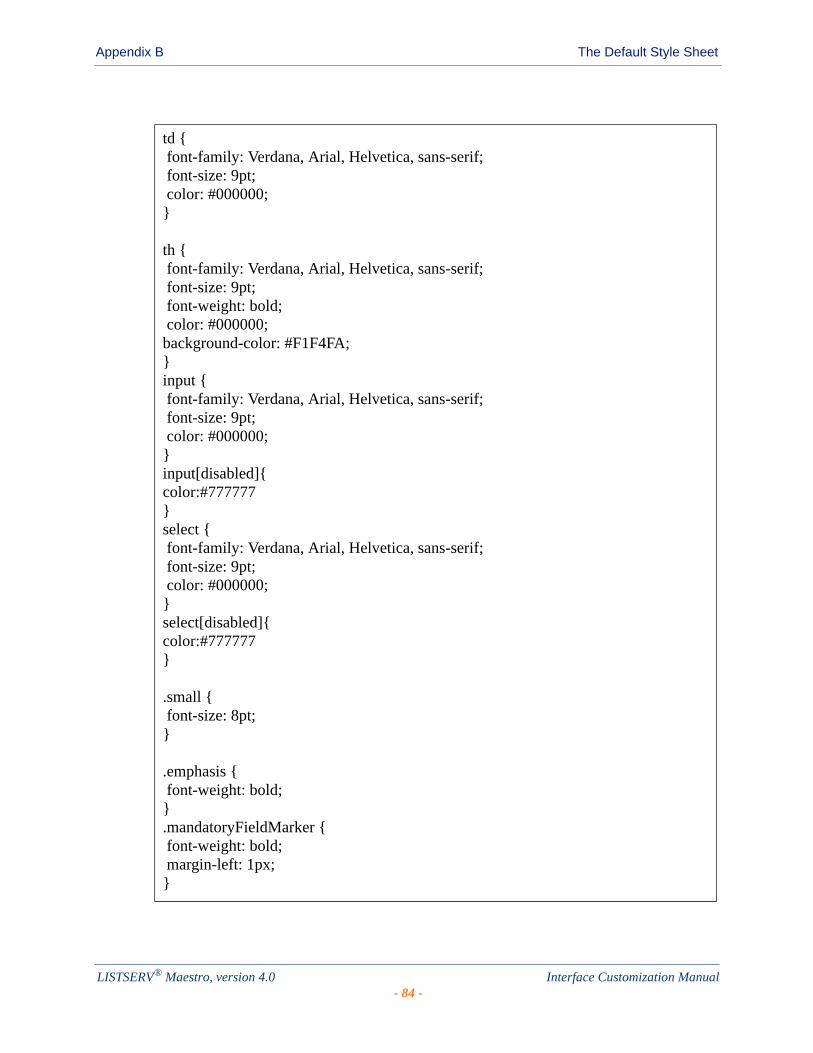
Appendix B The Default Style Sheet
td { font-family: Verdana, Arial, Helvetica, sans-serif; font-size: 9pt; color: #000000;}
th { font-family: Verdana, Arial, Helvetica, sans-serif; font-size: 9pt; font-weight: bold; color: #000000;background-color: #F1F4FA;}input { font-family: Verdana, Arial, Helvetica, sans-serif; font-size: 9pt; color: #000000;}input[disabled]{color:#777777}select { font-family: Verdana, Arial, Helvetica, sans-serif; font-size: 9pt; color: #000000;}select[disabled]{color:#777777}
.small { font-size: 8pt;}
.emphasis { font-weight: bold;}.mandatoryFieldMarker { font-weight: bold; margin-left: 1px;}
LISTSERV® Maestro, version 4.0 Interface Customization Manual- 84 -

Appendix B The Default Style Sheet
.error { color: #CC0033;}
.emphasisBackground {background-color: #F1F4FA;}
.disabledEditField {background-color: #EEEEEE;}
.tableframe {border-color: #333399;border-style: solid;border-width: 1px 1px 1px 1px;}
.subscribeStepActiveTitle { font-family: Verdana, Arial, Helvetica, sans-serif; font-size: 9pt; font-weight: bold; background-color: #333399; color: #FFFFFF;}.subscribeStepInactiveTitle { font-family: Verdana, Arial, Helvetica, sans-serif; font-size: 9pt; background-color: #333399; color: #FFFFFF;}
.description {}
.subscribed {font-weight: bold;color: #009900}.notsubscribed {}
LISTSERV® Maestro, version 4.0 Interface Customization Manual- 85 -

Appendix B The Default Style Sheet
.selectedTab { font-family: Verdana, Arial, Helvetica, sans-serif; font-size: 9pt; font-weight: bold; background-color: #333399; color: #FFFFFF;}
.tableThickFrame {border-color: #333399;border-style: solid;border-width: 4px 3px 3px 3px;}
.tableBottomLine {border-color: #333399;border-style: solid;border-width: 0px 0px 1px 0px;}
.tableRightLine {border-color: #333399;border-style: solid;border-width: 0px 1px 0px 0px;}
LISTSERV® Maestro, version 4.0 Interface Customization Manual- 86 -

. . . . . . . . . . . . . . . . . . . . . . . . . . . . . . . . . . . . . . . . . . . . . . . . . . . . . . . .Appendix C: Languages Supported for Translation
ranslations for the text in the User Interface, the Administration Hub, and the Subscriber Interface are supported by the languages listed in the tables below.
Table C-1 Supported Languages for the User Interface and Administration Hub
Table C-2 Supported Languages for the Subscriber Interface
Language ISO Code
English en
French fr
German de
Spanish es
Swedish sv
Language ISO Code
Arabic ar
Bulgarian bg
Chinese zh
Czech cs
Danish da
Dutch nl
English en
Finnish fi
French fr
German de
Greek el
Hebrew iw
Icelandic is
Italian it
Japanese ja
Korean ko
Norwegian no
T
LISTSERV® Maestro, version 4.0 Interface Customization Manual- 87 -
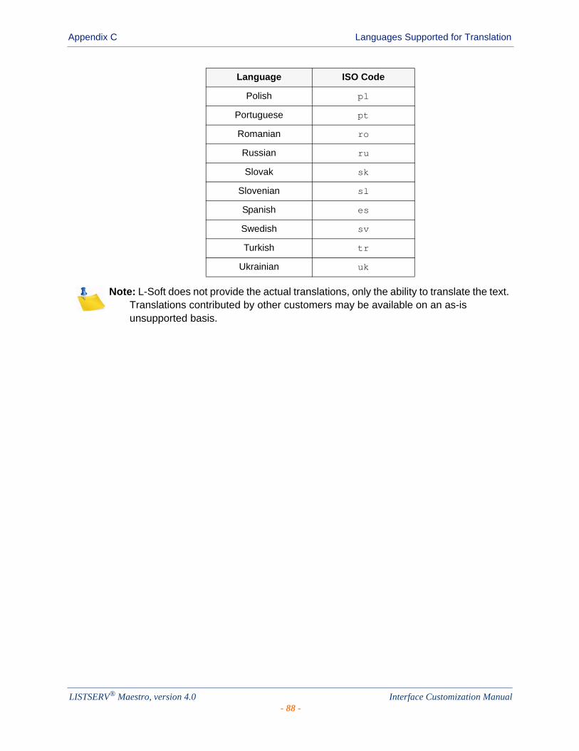
Appendix C Languages Supported for Translation
Note: L-Soft does not provide the actual translations, only the ability to translate the text. Translations contributed by other customers may be available on an as-is unsupported basis.
Polish pl
Portuguese pt
Romanian ro
Russian ru
Slovak sk
Slovenian sl
Spanish es
Swedish sv
Turkish tr
Ukrainian uk
Language ISO Code
LISTSERV® Maestro, version 4.0 Interface Customization Manual- 88 -

. . . . . . . . . . . . . . . . . . . . . . . . . . . . . . . . . . . . . . . . . . . . . . . . . . . . . . . .Appendix D: Customization Quick Reference Guide
his section is meant to be used as a quick reference guide while you are using the Customization Wizard. This guide is by no means a complete list of every icon, symbol, link, comment, or drop-down menu that you will see. Instead, it references
only those important functions that you will frequently use. For a complete reference to the Customization Wizard, see Section 2 Customizing the Subscriber Interface or the online help.
Icons
Various action icons may be displayed while viewing the current draft version or production version of the selected layout element. These icons allow you to perform certain actions on the layout element. Not all actions are always available.
• Copy from Production Version – Click to make a copy of the current production version and use it as the new draft version. This will overwrite all current changes to the draft version. The production version remains unchanged.
• Deploy as Production Version – Click to deploy the current draft version as the new production version. This will make a copy of the current draft version of the selected layout element and write it into the element's production version, making this the version of the selected element which subscribers actually see. The draft version remains unchanged. If you have at least one layout element in the dataset where the draft version is different than the current production version, then the Deploy icon allows you to deploy all these draft versions at once (either the ones in the dataset itself or all draft versions in the dataset and all its lists).
• Edit Source – Click to edit the current draft version.
• Reset to System Default – When this icon is located on the Draft tab, then click it to reset the current draft version to the LISTSERV Maestro system default. This will overwrite all manual changes to the draft version and will reset it to its default. The production version remains unchanged.
When this icon is located on the Production tab, then click it to reset the current production version to the LISTSERV Maestro system default. This will overwrite all manual changes to the production version and will reset it to its default. The draft version remains unchanged.
• Show Preview – Click to show the preview of the current production version.
• View Source – Click to view the source of the current production version.
T
LISTSERV® Maestro, version 4.0 Interface Customization Manual- 89 -

Appendix D Customization Quick Reference Guide
Symbols
Each table on the Membership Area Layout tab lists the available elements and displays their current customization status:
• The draft version of the layout element is not customized.
• The draft version of the layout element is customized.
• The production version of the layout element is not customized.
• The production version of the layout element is customized.
• The draft version of the page is customized, but the customized version is no longer compatible with the dataset. Therefore, before you can view (or deploy) the current customized draft version, you will have to make it compatible with the dataset again.
• The production version of the page is customized, but the customized version is no longer compatible with the dataset. Therefore, the system has automatically modified the customized production version to make it compatible again (and has saved a backup copy of the original customized production version).
• The draft version is the same as the production version.
• The draft version is not the same as the production version.
If neither version is customized, then no comparison symbol is displayed because the two versions are using the default version.
The placeholder tree shows each placeholder by its name using the following symbols:
• Free Placeholder – Free placeholders may appear anywhere on the page, even "inside" other placeholders. They are always optional, which means that you can include them, but do not have to.
• Optional Restricted Placeholders – Restricted placeholders must adhere to their parent-child structure. This means that all top-level restricted placeholders (i.e. the ones without any further parents in the tree structure) can be used anywhere on the page, at top level (not "inside" other placeholders), while sub-level placeholders can only be used on the page if they appear "inside" their matching parent placeholder (as defined by the tree structure). An optional restricted placeholder can be included on the page, but does not have to be included. If such a placeholder is omitted, all its children (if any) must be omitted too.
• Mandatory Restricted Placeholders – The same rules about restricted placeholders as already described above for optional restricted placeholders apply here too, but placeholders of this type are mandatory (i.e. they must appear on the page); otherwise, the customization is not accepted by the system. Mandatory placeholders are also marked by using a bold font for their name.
LISTSERV® Maestro, version 4.0 Interface Customization Manual- 90 -
Appendix D Customization Quick Reference Guide
Links
Links are the most common function in the Customization Wizard. To select a template or page to customize, simply click on the link for that template or page. To perform a specific function, simply click on that link. Some of these links are:
• Advanced Customization – Used to customize an advanced element, such as user messages or input validation errors.
• Profile-Placeholder Default Attributes – Used to customize the placeholders used on customized pages. For more information, see Section 2.8 Setting the Default Display for Data Fields.
• Select a page – In addition to the header/footer template, there are a number of other layout elements which can be customized. This link takes you to a list of all available layout elements.
• Supply a custom membership area header/footer – The header/footer is a common template which is (by default) shared by all pages that constitute the membership area; therefore, any changes to the header/footer will automatically affect all pages. Because of this, the header/footer is the ideal place to start the customization, providing a common layout for all pages.
Comments
Various comments may also be displayed, depending on the type of layout element you selected to customize.
• Header/Footer Template – This comment shows how many pages (in the dataset and its lists) that are currently using the header/footer template (i.e. pages that do not have a header/footer defined of their own but are inheriting the template). Click the Details link to view a detailed list of pages using this template.
• Input Validation Errors – The comment describes the currently selected error message and the circumstances under which it may occur. Also, unless the current message is already the error-header/footer of the error group, then it provides a link to select the error-header/footer for the current error group. By editing the error-header/footer, you can provide all errors in one error group with the same opening and closing texts.
• List Page Templates – The first comment shows if the template page inherits the header/footer template (see above) or if the header/footer is defined locally on the list page template. The second comment (below the first one) shows how many list pages are currently using the corresponding template (i.e. pages that only define the layout of the actual list profile fields locally, but also inherit the rest of the page layout from this template).
• Message Page Texts – The comment describes the currently selected message and the circumstances under which it is displayed to the subscriber.
• Normal Pages – The comment displays if the page inherits the header/footer template (see above) or if the header/footer is defined locally on the page.
LISTSERV® Maestro, version 4.0 Interface Customization Manual- 91 -
Appendix D Customization Quick Reference Guide
Drop-Down Menus
Drop-down menus are a common feature when customizing a template or page. The menus available for customization will vary depending on the template or page you are customizing. Some menus are universal and will help you pick the template or page you to customize. Some of these menus are:
• Currently Customizing – Click the drop-down menu and select Membership Area Layout (to customize the dataset) or Layout of List (to customize a specific list in the dataset).
• Select Page – This menu is shown if you are customizing a list. Click the drop-down menu and select the layout element you want to customize.
Select Page/Template – This menu is shown if you are customizing a dataset. Click the drop-down menu and select the layout element you want to customize.
LISTSERV® Maestro, version 4.0 Interface Customization Manual- 92 -
. . . . . . . . . . . . . . . . . . . . . . . . . . . . . . . . . . . . . . . . . . . . . . . . . . . . . . . . . . . . . . . . . . . . . . . .Index
A
BBranding
adding custom text strings 37introduction 37
CCustom Style 79Customization Page Layout Screen
using 9Customization Wizard
using 5Customizing
all notification emails 3message templates 3specific notification emails 3specific text for a specific dataset 2specific text for all datasets 1the layout of a page for a specific dataset 2the page frame and/or style 1the Subscriber Interface 5using the Customization Wizard 5who needs to be involved 3, 4
DDataset
sending HTML notification emails 16, 18Default Style Sheet 83
EError Messages
editing 19External Profile Edit Page
customizing 34
F
G
HHTML Messages
sending notification emails for a dataset 16, 18
HTML Tags 79
IImporting
a translated language 53
Informational Messagesediting 19
Installinga translated language 52
J
K
LLanguage
choosing for the HUB 53choosing for the Subscriber Interface 54choosing for the User Interface 53importing 53installing a translated language 52translating 39types supported for translation 87using a translated language 53
MMembership Area Footer Template 13Membership Area Header Template 13Membership Area Layout Tab
using 6Membership Area Page 13Membership Area State Tab
using 15Message Templates
creatinga copy of a system template 55a copy of an existing user-defined
template 58based on an existing job 57by uploading pre-defined text 58HTML 57plain text 57
customizing 55defining the content 59defining the template settings 60disabling 77downloading 77enabling 77managing 77placeholders 63
#Index# in multiple values prefix/suffix 72
#Title# in prefix/suffix 70creating 63
LISTSERV® Maestro, version 4.0 Interface Customization Manual- 93 -

Index
editing 64inserting 63multi-placeholder repeater 73multiple values in prefix/suffix 70prefix and suffix rules 69
systemcopying 55defined 77
user-definedcopying 58defined 77
using drop-in content 62Messages
sending HTML notification emails for a dataset 16, 18
N
O
PPages
editing 12Membership Area 13
Placeholder Types 20conditional 21free 21mandatory restricted 21optional restricted 21profile 20structural 21with attributes 22with body 22without body 22
Profile Field Placeholdersacknowledge style 30boolean 24button 30clickable link 30hide subscription option 32LISTSERV List Topic 32mail header style 31multiple-select 27quick login option 30single-select 25subscription status 29subscription type 29text, number, email, password 23tracking permission 24
Q
RResource Translation Tool
choosing a language for the HUB 53choosing a language for the
User Interface 53choosing for the Subscriber Interface 54date and time formats 48finding a node in the Recourse Tree 42HTML code 43importing a translated language 53installing a translated language 52introduction 39key/value entries 42navigating the Resource Tree 41navigating with keyboard shortcuts 41requirements 39translating 40using a translated language 53word replacement 46
SSubscriber Notification Emails
editing 16
TTemplate Placeholders 63
#Index# in multiple values prefix/suffix 72#Title# in prefix/suffix 70creating 63editing 64inserting 63multi-placeholder repeater 73multiple values in prefix/suffix 70prefix and suffix rules 69
Templatesediting 12Membership Area Footer 13Membership Area Header 13
Translatingall text to a different language for all
datasets 2languages supported 87requirements 39starting 40the language 39who needs to be involved 4
U
V
LISTSERV® Maestro, version 4.0 Interface Customization Manual- 94 -
Index
WWhat’s New
requesting profile field updates page ixsending HTML notification emails for a
dataset ixthe External Profile Edit Page ixunregister message pages ixunsubscribe message pages ix
X
Y
Z
LISTSERV® Maestro, version 4.0 Interface Customization Manual- 95 -

Index
LISTSERV® Maestro, version 4.0 Interface Customization Manual- 96 -


![LISTSERV 16.0 Customization Manual - L-Soft · 2010-04-26 · • Clickable buttons will be bold and within brackets (e.g. the [OK] button). • Clickable links will be bold and underlined](https://img.pdfslide.us/doc/110x75/5edb379bad6a402d66654f87/listserv-160-customization-manual-l-soft-2010-04-26-a-clickable-buttons-will.jpg)