Embed Size (px)
Citation preview
Lesson 15: Mobile Design and Layout
Introduction to Adobe Dreamweaver CS6Adobe Certified Associate:
Web Communication using Adobe Dreamweaver CS6
© 2013 John Wiley & Sons, Inc. 2
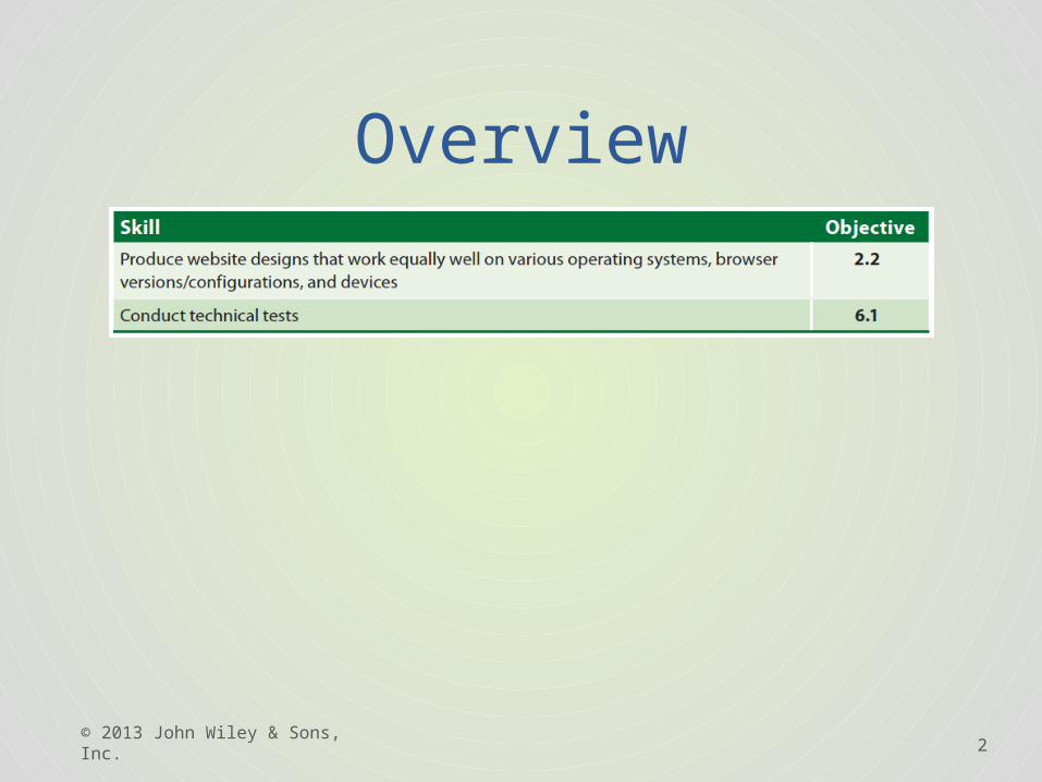
Overview
3
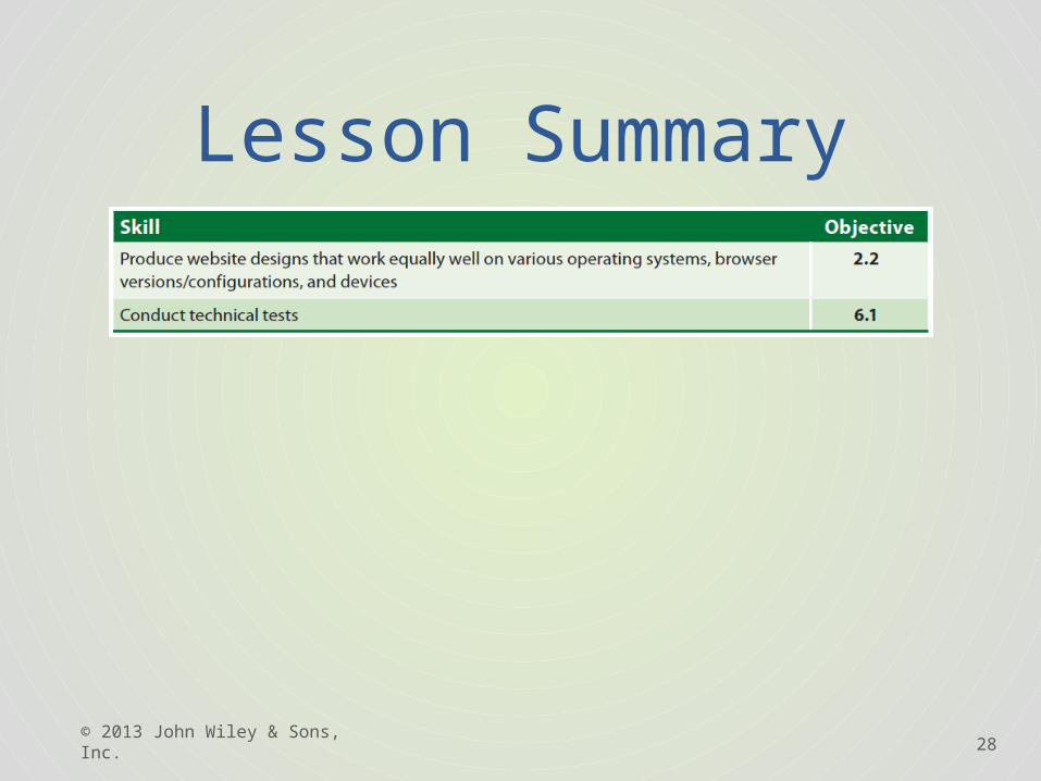
2.2 Designing for Various Browsers and Devices
• The mobile web is a broad definition for the emergence of websites and mobile applications designed to be viewed on portable and typically small screen devices.
• In many cases the keyboard and mouse have dropped in favor of touchscreens’ miniature keyboards.
• Features such as GPS and cameras can also come into play, allowing the user to interact with the Web in new ways.
• With all these benefits come new challenges. Navigation that works well on the desktop may become difficult to click at the smaller size.
• Other challenges include the still-limited bandwidth of a cellular network, the inability to play certain media such as Flash or web video, and web browser incompatibility.
© 2013 John Wiley & Sons, Inc.
4
2.2 Designing for Various Browsers and Devices
This lesson focuses on two methods for creating websites optimized for mobile:1. Multiscreen feature and CSS3 Media Queries. 2. The new Fluid Grid Layout feature in
Dreamweaver CS6. This method also uses CSS3 Media Queries, but in a slightly different and more advanced method.
© 2013 John Wiley & Sons, Inc.
5
6.1 Testing Your Web Pages
• The Multiscreen feature helps you preview pages in different screen sizes. This multiscreen preview displays your design in three different views: one for the desktop, and the other two for the smaller screens found in smartphone and tablet devices.
• Additionally, Dreamweaver takes advantage of CSS3 Media Queries to let you build individual style sheets for each view.
© 2013 John Wiley & Sons, Inc.
6
6.1 Testing Your Web Pages
Follow these steps to view a page with the Multiscreen feature:1. Double-click the media_queries folder and then
double-click 15_index.html. This file and uses floats and clears to create columns.
2. Choose File > Preview in Browser and select a browser. This page has a fixed-width size of 960 pixels and works well on most desktop monitor resolutions.
© 2013 John Wiley & Sons, Inc.
7
6.1 Testing Your Web Pages
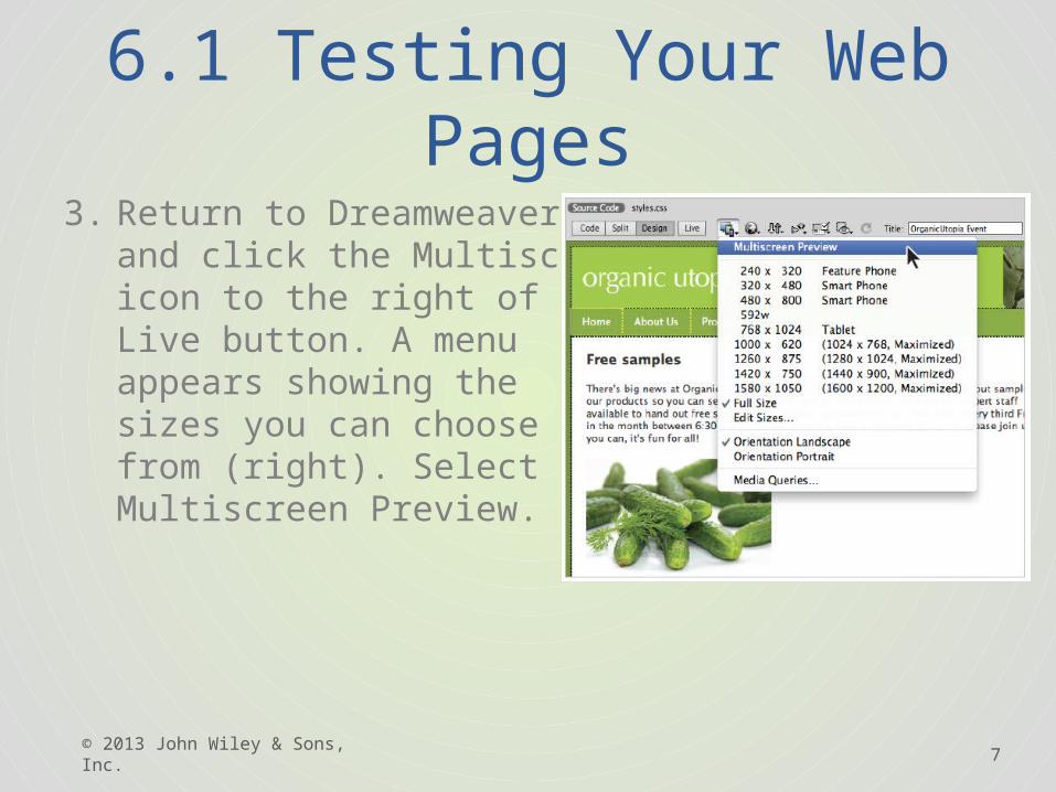
3. Return to Dreamweaver and click the Multiscreen icon to the right of the Live button. A menu appears showing the sizes you can choose from (right). Select Multiscreen Preview.
© 2013 John Wiley & Sons, Inc.
8
6.1 Testing Your Web Pages
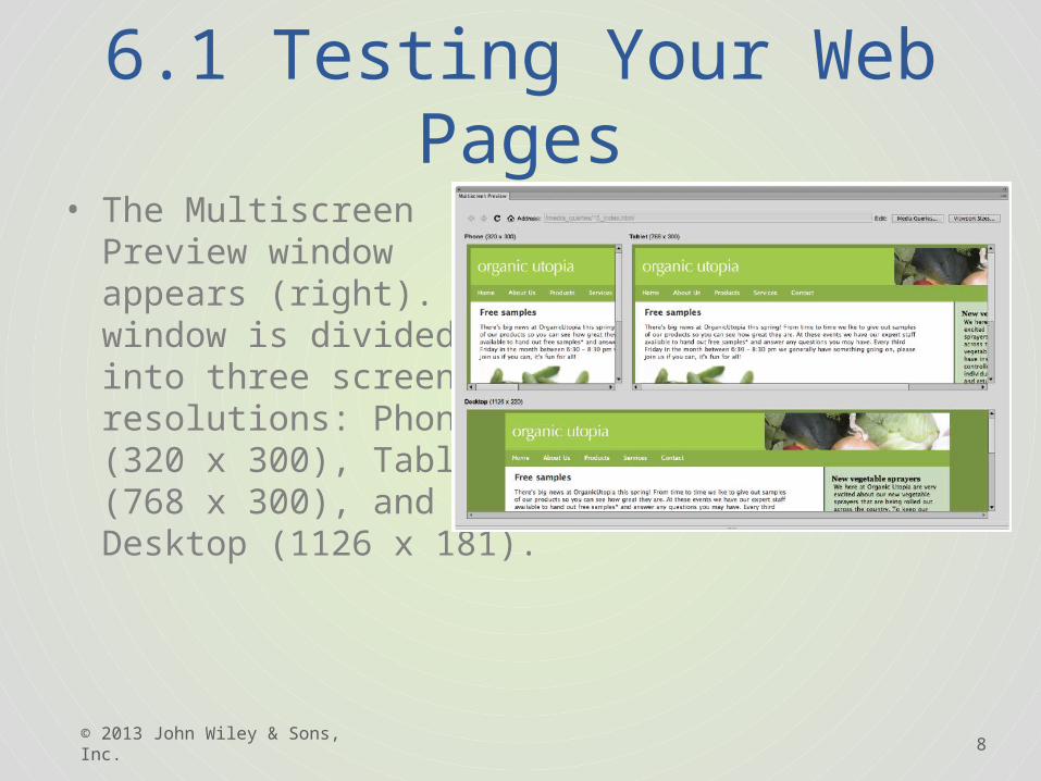
• The Multiscreen Preview window appears (right). This window is divided into three screen resolutions: Phone (320 x 300), Tablet (768 x 300), and Desktop (1126 x 181).
© 2013 John Wiley & Sons, Inc.
9
6.1 Testing Your Web Pages
• The Phone view and the Tablet view are not wide enough to fit your fixed-width page.
4. Click the Viewport Sizes button in the top right corner. The default values for the Phone viewport is 320w by 300h; the default values for the Tablet viewport is 768w by 300h. The default width for the Desktop viewport is 1126w, but no height is defined. (If your sizes are different, click the Reset to Defaults button.)
© 2013 John Wiley & Sons, Inc.
10
6.1 Testing Your Web Pages
5. Click Cancel. Although you can modify the viewport sizes, we recommend you use the defaults. Viewport sizes are important because you can create unique style sheets that will only apply to viewports of a certain size.
6. Keep the Multiscreen Preview window open.
© 2013 John Wiley & Sons, Inc.
11
2.2 Designing for Various Browsers and Devices
• Media Queries take advantage of a feature in the CSS3 specification called CSS3 Media Queries.
• Media Queries are a way of delivering different page layouts to users based on their screen or screens.
• You can think of a CSS3 media query as a combination of HTML and CSS syntax that examines the capability of a user agent, typically a web browser, and lets you send it styles based on certain values.
• The most common capability queried is the width of a screen or a mobile device; other capabilities, such as the device orientation (landscape or portrait), can also be detected.
© 2013 John Wiley & Sons, Inc.
12
2.2 Designing for Various Browsers and Devices
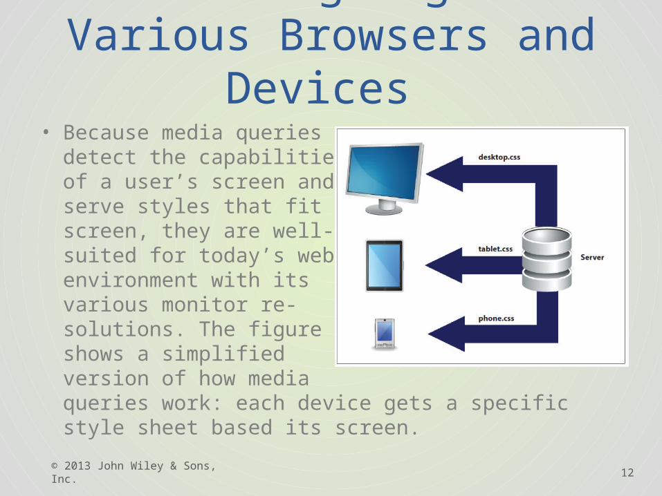
• Because media queries detect the capabilities of a user’s screen and serve styles that fit that screen, they are well-suited for today’s web environment with its various monitor re-solutions. The figure shows a simplified version of how media queries work: each device gets a specific style sheet based its screen.
© 2013 John Wiley & Sons, Inc.
13
2.2 Designing for Various Browsers and Devices
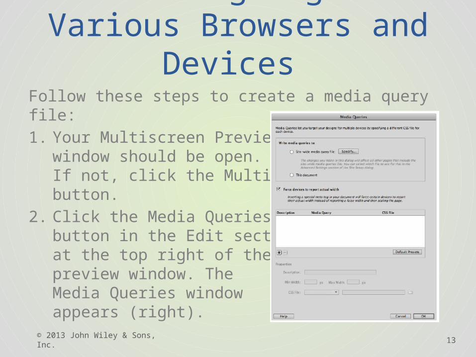
Follow these steps to create a media query file:1. Your Multiscreen Preview
window should be open. If not, click the Multiscreen button.
2. Click the Media Queries button in the Edit section at the top right of the preview window. The Media Queries window appears (right).
© 2013 John Wiley & Sons, Inc.
14
2.2 Designing for Various Browsers and Devices
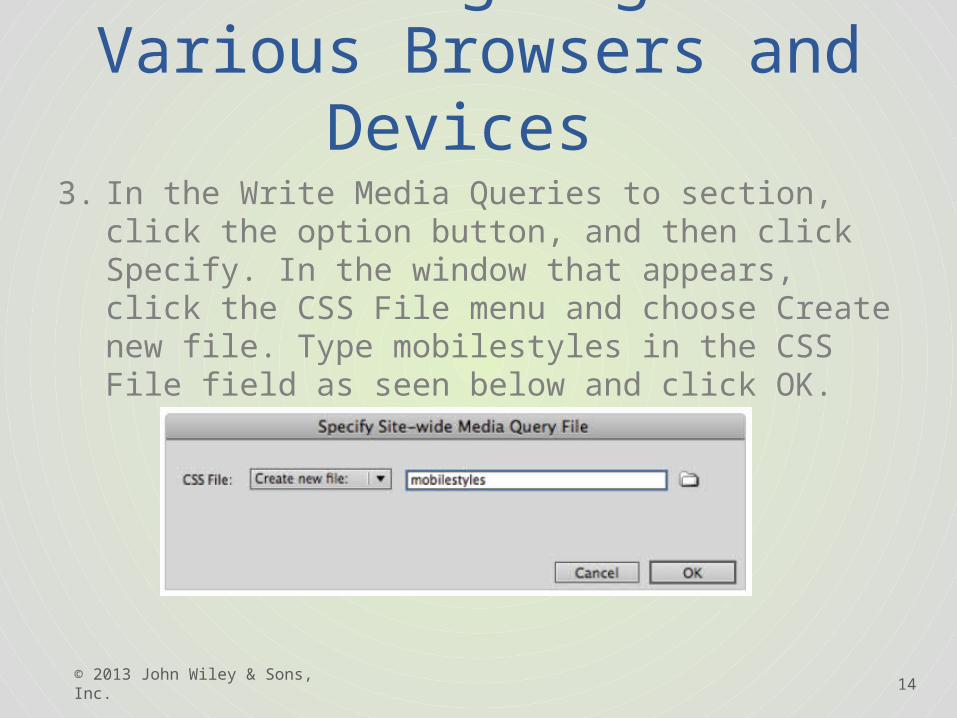
3. In the Write Media Queries to section, click the option button, and then click Specify. In the window that appears, click the CSS File menu and choose Create new file. Type mobilestyles in the CSS File field as seen below and click OK.
© 2013 John Wiley & Sons, Inc.
15
2.2 Designing for Various Browsers and Devices
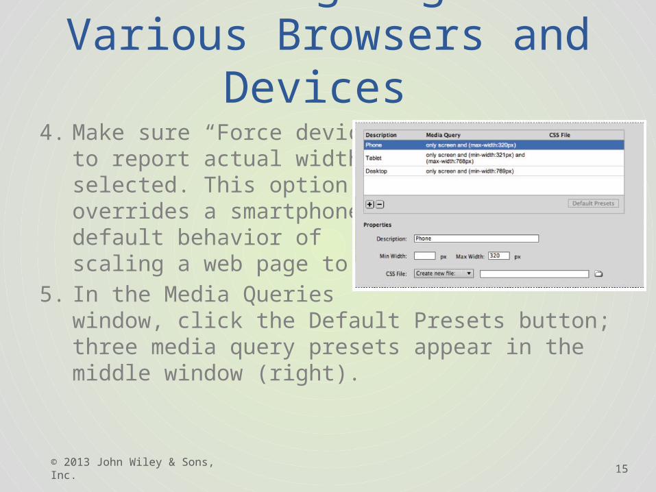
4. Make sure “Force devices to report actual width” is selected. This option overrides a smartphone’s default behavior of scaling a web page to fit.
5. In the Media Queries window, click the Default Presets button; three media query presets appear in the middle window (right).
© 2013 John Wiley & Sons, Inc.
16
2.2 Designing for Various Browsers and Devices
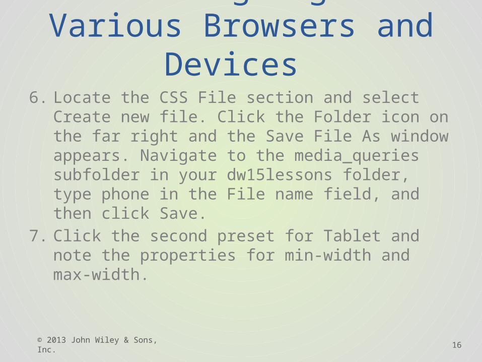
6. Locate the CSS File section and select Create new file. Click the Folder icon on the far right and the Save File As window appears. Navigate to the media_queries subfolder in your dw15lessons folder, type phone in the File name field, and then click Save.
7. Click the second preset for Tablet and note the properties for min-width and max-width.
© 2013 John Wiley & Sons, Inc.
17
2.2 Designing for Various Browsers and Devices
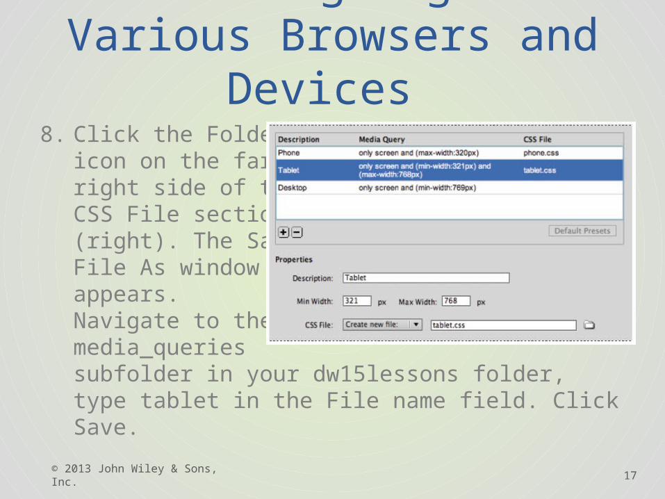
8. Click the Folder icon on the far right side of the CSS File section (right). The Save File As window appears. Navigate to the media_queries subfolder in your dw15lessons folder, type tablet in the File name field. Click Save.
© 2013 John Wiley & Sons, Inc.
18
2.2 Designing for Various Browsers and Devices
9. Click the Desktop preset. This preset has a min-width set to 769; there is no need to add a max-width. Click the CSS File menu and choose Use Existing file. Click the Folder icon, and within your media_queries folder, click the styles.css document. Click OK (Windows) or Open (Mac OS)..
10. Click OK in the Media Queries window, and close the window. Locate the files you just created within the Files panel (mobilestyles.css, phone.css, and tablet.css).
© 2013 John Wiley & Sons, Inc.
19
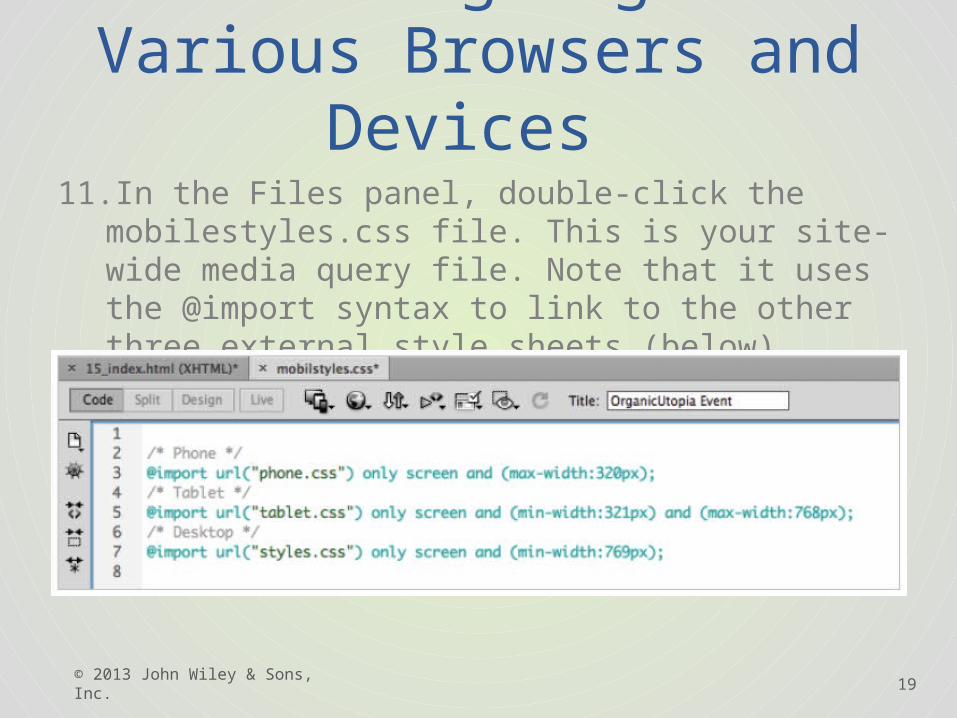
2.2 Designing for Various Browsers and Devices
11.In the Files panel, double-click the mobilestyles.css file. This is your site-wide media query file. Note that it uses the @import syntax to link to the other three external style sheets (below).
© 2013 John Wiley & Sons, Inc.
20
2.2 Designing for Various Browsers and Devices
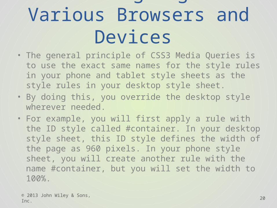
• The general principle of CSS3 Media Queries is to use the exact same names for the style rules in your phone and tablet style sheets as the style rules in your desktop style sheet.
• By doing this, you override the desktop style wherever needed.
• For example, you will first apply a rule with the ID style called #container. In your desktop style sheet, this ID style defines the width of the page as 960 pixels. In your phone style sheet, you will create another rule with the name #container, but you will set the width to 100%.
© 2013 John Wiley & Sons, Inc.
21
2.2 Designing for Various Browsers and Devices
Follow these steps to work with a phone style sheet:1. Click the Multiscreen button to preview your
page, and, focus on the Phone view. From all appearances, the multiscreen preview looks exactly the same. Close your Multiscreen Preview window.
2. In your Related Files toolbar, click the phone.css link. The blank style sheet opens in the Code view.
© 2013 John Wiley & Sons, Inc.
22
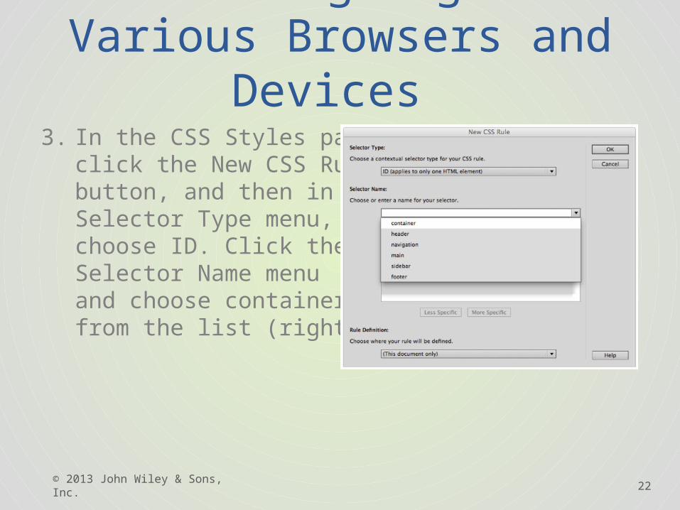
2.2 Designing for Various Browsers and Devices
3. In the CSS Styles panel, click the New CSS Rule button, and then in the Selector Type menu, choose ID. Click the Selector Name menu and choose container from the list (right).
© 2013 John Wiley & Sons, Inc.
23
2.2 Designing for Various Browsers and Devices
4. Click OK. In the CSS rule definition window, click the Box category and type 100 in the width box. Click the menu to the right and change the value from px to %. Click OK.
5. Because you cannot open the Multiscreen Preview when you have a style sheet selected, click the Source Code button in your Related Files toolbar to switch to your HTML page. Now click the MultiScreen button to view your page.
© 2013 John Wiley & Sons, Inc.
24
2.2 Designing for Various Browsers and Devices
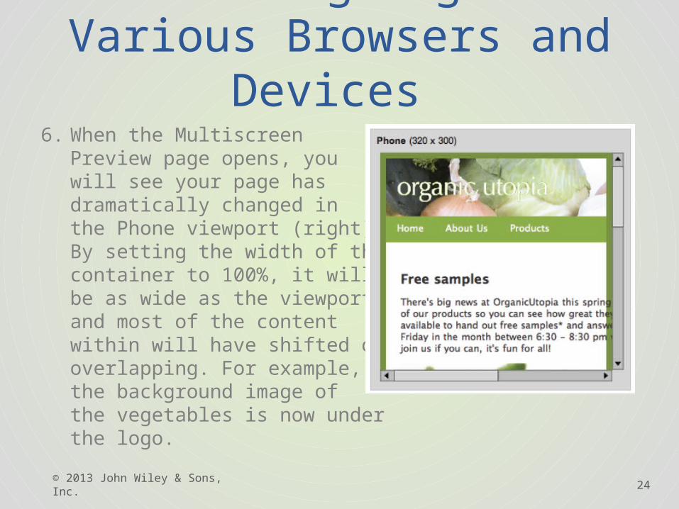
6. When the Multiscreen Preview page opens, you will see your page has dramatically changed in the Phone viewport (right). By setting the width of the container to 100%, it will only be as wide as the viewport and most of the content within will have shifted or is overlapping. For example, the background image of the vegetables is now under the logo.
© 2013 John Wiley & Sons, Inc.
25
2.2 Designing for Various Browsers and Devices
7. Close your Multiscreen Preview.8. Click the phone.css button in the Related Files
toolbar. 9. In the CSS Styles panel, click the New CSS Rule
button, and then in the Selector Type menu, choose ID. In the Selector name box, click the Selector Name menu and choose header.
© 2013 John Wiley & Sons, Inc.
26
2.2 Designing for Various Browsers and Devices
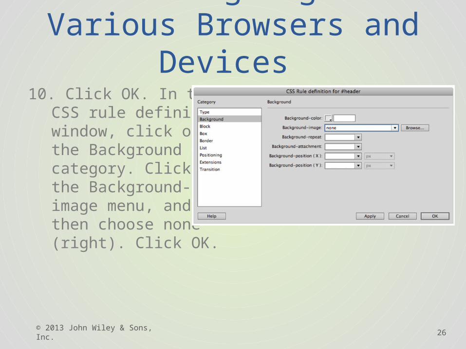
10. Click OK. In the CSS rule definition window, click on the Background category. Click the Background-image menu, and then choose none (right). Click OK.
© 2013 John Wiley & Sons, Inc.
27
2.2 Designing for Various Browsers and Devices
• 11. Choose File > Save all. Choose Source Code and then click the Multiscreen button to see your progress. The background image no longer appears in the header for the Phone viewport. Close your Multiscreen Preview window.
© 2013 John Wiley & Sons, Inc.
© 2013 John Wiley & Sons, Inc. 28
Lesson Summary
Copyright 2013 John Wiley & Sons, Inc.. All rights reserved. Reproduction or translation of this work beyond that named in Section 117 of the 1976 United States Copyright Act without the express written consent of the copyright owner is unlawful. Requests for further information should be addressed to the Permissions Department, John Wiley & Sons, Inc.. The purchaser may make back-up copies for his/her own use only and not for distribution or resale. The Publisher assumes no responsibility for errors, omissions, or damages, caused by the use of these programs or from the use of the information contained herein.