Embed Size (px)
Citation preview
892019 Landing Pages eBook 1
httpslidepdfcomreaderfulllanding-pages-ebook-1 165
wishpond EBOOK
wishpondcom
THE
COMPLETEGUIDE TOLANDING
PAGES
892019 Landing Pages eBook 1
httpslidepdfcomreaderfulllanding-pages-ebook-1 265
TABLE OF CONTENTS
CHAPTER 1
Landing Pages The Fundamentals and Conversion Principles 3
CHAPTER 2
7 Landing Page Mistakes that are Costing you Conversions 11
CHAPTER 3How to AB Test your Landing Page to Maximize Conversions 22
CHAPTER 4
Landing Pages How to Sell your Product without Selling your Product 32
CHAPTER 5
Landing Pages Optimizing your Page for Lead Generation 40
CHAPTER 6
Landing Pages The Science Behind Designing for Conversion 48
CHAPTER 7
3 Landing Page Examples Critiqued to Hell and Back 56
wishpond EBOOK
2
892019 Landing Pages eBook 1
httpslidepdfcomreaderfulllanding-pages-ebook-1 365
Chapter 1
Landing
PagesThe Fundamentalsand ConversionPrinciples
wishpond EBOOK
892019 Landing Pages eBook 1
httpslidepdfcomreaderfulllanding-pages-ebook-1 465
wishpond EBOOK
4
Does your small business struggle for web conversions Have you been putting time and energy into social media and
online marketing but canrsquot quite figure out how to turn that energy into real-world money
Have you created a landing page Is it awesome Does it convert
This article will introduce you to landing pages exactly what they are why you need one and the
fundamentals of making one that results in sales
WHAT EXACTLY IS A LANDING PAGE
A landing page is exactly what it sounds like the page within your website that internet users lsquolandrsquo on when they traffic
from any online source Itrsquos the next page an internet user will see after clicking on a link related to your business This link
could be a Facebook Ad a Google search a link on Twitter a link within your blog the list goes on and on
The amount of landing pages your website has is entirely up to your business Wishpond has somewhere between 25 and
30 You might achieve results with one
The goal of a landing page is to encourage conversion within your sales funnel Itrsquos that simple
892019 Landing Pages eBook 1
httpslidepdfcomreaderfulllanding-pages-ebook-1 565
wishpond EBOOK
5
I highly recommend a single Call to Action for landing pages That action could be
bull Proceeding to checkout
bull Submitting an emaillead generation
bull Subscribing to an RSS feed
bull Starting a free trial
bull Creating an account
bull etc etc etc
WHY DOES YOUR BUSINESS NEED A LANDING PAGE
Your business needs a landing page because they provide a focus point for your sales funnel
892019 Landing Pages eBook 1
httpslidepdfcomreaderfulllanding-pages-ebook-1 665
wishpond EBOOK
6
A landing page is what tells a visitor to your website how
to act on their interest in your business
Itrsquos what turns a common internet user window-shopping
the web into a guy on your shop floor trying on shoes
Letrsquos put the value of a landing page in concrete numbers
Landing pages facilitate conversion Letrsquos say yoursquore
an online retailer with 15000 monthly site-visits Your
customers are spending on average $35 each time they
buy If your online site saw a conversion rate increase
of 1 over that month yoursquod see a $5250 increase in
revenue
If yoursquore not sold let me give you a case study that gives
you a peek into your future
In May ski-resort holiday company Liftopia decided to test
their landing page and see if they could optimize it Using
AB testing website Optimizelycom they increased their
revenue by 24 with the simple addition of a ldquoSimilarProductsrdquo option
HOW DO I CREATE A LANDING PAGE
Creating a landing page is a straightforward process
Get in touch with your businessrsquo web developer (or in
Wordpress do it yourself) Create a new page (with the
variables Irsquove emphasized below) and start pushing web
traffic towards it
I recommend creating different landing pages for
different sources of traffic For instance
bull Create a landing page for each of your free ebooks
with a simple but effective two or three-box entry
form (what we in the biz call lsquoemail-gatingrsquo your
content)
bull Create a landing page for each of your businessrsquo
product genres (the individual tools you offer as a
SaaS company winter apparel or summer apparel)
bull Create a contest landing page directing traffic from
a Facebook Ad
bull Create a landing page within your existing website(like Liftopia did above) Any traffic that clicks on
a certain link on your homepage gets sent to a
landing page specific to that link Make that page
as focused as possible because you already know
exactly what theyrsquore interested in
892019 Landing Pages eBook 1
httpslidepdfcomreaderfulllanding-pages-ebook-1 765
wishpond EBOOK
7
HOW CAN I MAKE A LANDING PAGE THAT
CONVERTS
Wishpondrsquos Facebook Ads Tool landing page below
collects traffic from many sources blog articles search
ads on Facebook and Google whitepapers our own
website and many more Although we continue to test
and optimize this landing page on a monthly basis itrsquos a
great example of a successful landing page that converts
for our business
1 Quick and Obvious USP
Your USP (Unique Selling Point) is what sets your product
or business apart from others Your landing page needs
to communicate this point immediately and obviously
Your USP can be communicated in multiple ways
bull The headline
bull A supporting headline
bull A value proposition
Your landing pagersquos USP along with an image (see
below) is what grabs the attention of a visitor You have
approximately 5 seconds to convince them the page (and
your business) is worth looking into and communicating
the value of that investigation is how you do it
USP and Value Proposition Ideas
1 The monetary value in terms they can understand
2 The word Free - making the risk vs reward ratio
ideal
3 Positive comparison to a well-known brand
4 State the expected ROI
5 Offer success either long-term or immediate
For more information on value propositions and USPs
check out my article 7 Value Proposition Formulas to
Boost Conversion on Ads and Landing Pages
2 Appealing Image or Graphic
Images grab the attention of your landing page traffic
They also communicate ideas much easier than text
Have an attractive product or shop-front Test including a
picture of them in your landing page This increases the
visual appeal of the page and encourages your businessrsquo
892019 Landing Pages eBook 1
httpslidepdfcomreaderfulllanding-pages-ebook-1 865
wishpond EBOOK
8
reputation as personable
I recently examined the psychology of images in advertising and discussed in concrete terms the astonishing effect of
including pictures of people on your website and in landing pages and advertisements
Adroll one of the chief advertising re-targeting tools online uses an image and video of its president Adam Berke to
increase its landing pagersquos effectiveness below
Test the effectiveness of an image for your own businessrsquo audience Your site-visitors may respond more to text color or
even an image of a beach than that of a person
892019 Landing Pages eBook 1
httpslidepdfcomreaderfulllanding-pages-ebook-1 965
wishpond EBOOK
9
3 Solid Call-to-Action
Your CTA is one of the most important variables within your landing page I mentioned above that your landing page is what
focuses an internet userrsquos attention where you want it Your landing pagersquos CTA is the center of that focus It gives them a
single option for action Making it clear contrasting in color and appealing is a vital part of a successful landing page
While you may find success with multiple CTArsquos on the same landing page itrsquos essential that you have them traffic to the
same end point
Your landing page needs to have a single focus as any distraction will increase the pagersquos bounce rate
892019 Landing Pages eBook 1
httpslidepdfcomreaderfulllanding-pages-ebook-1 1065
wishpond EBOOK
10
4 Short but Clear List of Benefits
Providing 3-5 benefits is the second part of your pagersquos
USP Your headline and obvious value proposition grab
their attention in less than 5 seconds They decide to
engage further and itrsquos this short and obvious list of
benefits that really sell them on your desired action
Give the page visitor a l ittle more information about who
you are what theyrsquore in for and what sets your business
or product apart from competitors I recommend sitting
down and establishing the five selling points based
around your business or product Use the most appealing
of these (I like dollar values) for your initial headline
subheader or value proposition The next four write as
single sentence (if not phrases) in list form
I cannot emphasize lsquolist formrsquo enough Itrsquos essential that
this information be bullet-pointed or numbered as any
paragraphs on your landing page will reduce focus and
increase your bounce rate
5 Trust SymbolSocial Endorsement
The simple addition of a trust symbol to a landing page
has been known to increase conversions by 42 Social
endorsements work the same way by providing proof
of the legitimacy of your product or business People
especially social media users (where much of your
landing page traffic will come from) value the word of
their peers or a respected authority
It was the addition
of the symbol to the
left which quickly
and easily increased
conversions by 42and improved sign-up-form fill-outs by 81
I examined the influence of the single word lsquoProvenrsquo in my
article The Psychology Behind a Successful Facebook
Ad Part 3 Text Check it out
Conclusion
Hopefully you now have a solid grounding in landing
pages You know exactly what they are how essential
they are for your business and the five most important
variable best-practices you need to include
892019 Landing Pages eBook 1
httpslidepdfcomreaderfulllanding-pages-ebook-1 1165
Chapter 2
7 Landing
PageMistakesthat are Costing
you Conversions
wishpond EBOOK
892019 Landing Pages eBook 1
httpslidepdfcomreaderfulllanding-pages-ebook-1 1265
So yoursquove built an amazing landing page Is it converting
like yoursquod hoped it would Do you think it could be more
effective
Yes It could
No matter how long yoursquove had a landing page therersquos
always room for improvement
66 of companies test multiple landing
pages on their website only 13 think
theyrsquore doing it well
This comprehensive article will discuss the top 7 landing
page mistakes that are affecting your conversion rate
Irsquoll dive into why these mistakes matter and give you the
proven best practices on how to change them to get the
best possible result from your landing page
TWEETABLE TAKEAWAYS
bull 66 of companies test multiple landing pages on
their website only 13 think theyrsquore doing it well
bull Is your CTA in the right place Fixing it could
increase conversions by 22 Learn more here
bull Changing your CTA text could increase your CTR
by 161 Learn more here
bull Are you making these 7 landing page mistakes
Find out here
Warning
The 7 mistakes Irsquom discussing in this article are the
most frequent I see - the ones I know have hurt my own
conversion rates That said AB testing your landing
pages is the only way to be sure these variables arenrsquot
working for you It could very well be that your businessleads like a page full of text or still convert optimally
with CTAs that donrsquot stand out If yoursquore choosing not
to engage with a third party landing page provider
(like Wishpond) yoursquoll have to test your own landing
pages thoroughly to be sure theyrsquore optimized for your
business
WHY DO YOU NEED TO OPTIMIZE YOUR LANDINGPAGES
Your landing page is meant to drive visitors further down
your sales funnel
Whether the goal of your page is to offer an ebook
wishpond EBOOK
12
892019 Landing Pages eBook 1
httpslidepdfcomreaderfulllanding-pages-ebook-1 1365
download a great discount on your product or entry to
your shopping cart an optimized landing page is what
turns a common internet user window-shopping the web
into a guy on your shop floor trying on shoes
Letrsquos put the value of optimizing your landing page in
concrete numbers
Landing pages facilitate conversion Letrsquos say yoursquore
an online retailer with 15000 monthly site-visits Your
customers are spending on average $35 each time they
buy If your online site saw a conversion rate increase
of 1 over that month yoursquod see a $5250 increase inrevenue
Now remember fixing the mistakes Irsquove included below
can increase your conversion rates by more than 20
MISTAKE 1 TOO MUCH TEXT
One of the most important factors of a successful landingpage is its simplicity This is one of the easiest mistakes
to fall for as well as itrsquos difficult not to want to add more
awesome selling points of your business or product How
can more reasons to buy actually hurt your conversion
rates
Because nobodyrsquos reading them Remember that you
have 5 seconds to convince a landing page visitor to
stay or traffic further Yes this is done through a clear and
impressive USP or value proposition (see mistake 2) but
itrsquos also done by the overall look of your landing page
I recommend you avoid paragraphs and instead use
bullet-point lists
Example below taken from a Salesforce landing pagex
wishpond EBOOK
13
Build customer loyalty Increase first call
resolution and agent productivity Improve
customer satisfaction by 37 All while delivering
amazing customer service from anywhere withService Cloud built on the Salesforce 1 Platform
892019 Landing Pages eBook 1
httpslidepdfcomreaderfulllanding-pages-ebook-1 1465
People skim everything online Communicate to your
market through
bull Bullet-points
bull Bolded words
bull Headings
bull Images
MISTAKE 2 NO UNIQUE SELLING PROPOSITION
983080USP983081 OR VALUE PROPOSITION
The first thing a visitor to your page should see is the
most valuable sales point you have You also want
to make this sales point unique to your business
to communicate quickly and strongly what makes
your business or your product stand out from your
competitors
Whether your USP is specific to the product yoursquore
pushing the promotion yoursquore offering (dollar values are
great) or an awesome statistic from your business is up to
you and your testing process
People sometimes confuse USPs and CTAs Your USP
should be your main and unique selling point while your
CTA turns their interest in your USP into the action you
want
5 USP Formula Examples
bull The easiest way to [product or business purpose]
bull The 1 provider of [service]
bull Save [dollar amount] in [length of time]
bull [Well-known-brand] gives you [thing] we give you
[better thing]
bull Get [your service] Free for [length of trial]
MISTAKE 3 NO IMAGE
For best results make sure your landing page has at least
one image
wishpond EBOOK
14
892019 Landing Pages eBook 1
httpslidepdfcomreaderfulllanding-pages-ebook-1 1565
The image needs to
bull Communicate your content
bull Appeal to the eye
bull Flow easily with the page
bull Stand out without contrasting
too intensely
bull Be evocative to encourage
engagement
I recommend reading my article The Psychology Behind a Successful Facebook Ad Part 2 Images to identify the best
images for your business Studies show a smiling woman encourages the highest conversion rates but test what works
best for your business
Itrsquos important you keep your landing page simple and straightforward with little text The r ight image can communicate anidea or elicit a certain response in your landing pagersquos visitor
wishpond EBOOK
15
892019 Landing Pages eBook 1
httpslidepdfcomreaderfulllanding-pages-ebook-1 1665
5 Landing Page Image Ideas
bull A smiling woman pointing or looking at your USP
bull An image of fireworks or something similar making
your USP an exciting announcement
bull A video still of your CEO or head of marketing
which will open a 30 second to 2 minute video
introducing your product or business
bull An abstract but appealing mix of colors words and
shapes
bull An image of your product or screenshot of your
online tool showing it in action
MISTAKE 4 BAD CALL983085TO983085ACTION
There are three variables in your CTA that might make it
bad Fix these mistakes and yoursquoll be impacting on the
most influential conversion-improver (is that a word)
variable out there
Nobodyrsquos seeing it
A thousand articles have been written about making your
CTA stand out This means contrasting the color of the
button with the landing page It also means making it big
and bold and eye-catching If this isnrsquot already part of your
creation process I have very little time for you
Contrasting the color is perhaps most important
Contrasting color helps your CTA stand out from thelanding page making it easy for people to see what you
want them to do This is common sense Blue or green
landing page Try a red or orange CTA button Any
questions Read my article The Psychology Behind a
Successful Facebook Ad Part 1 Color as it takes an in-
depth look at the effect of color in marketing
Itrsquos in the wrong place
Alongside contrasting your CTA buttonrsquos color itrsquos
essential that you place your CTA where itrsquos visible This
means above-the-fold and on the viewerrsquos immediate
eye-level
wishpond EBOOK
16
892019 Landing Pages eBook 1
httpslidepdfcomreaderfulllanding-pages-ebook-1 1765
Too often I see amateur landing pages with the CTA
button at the bottom Their creator has fallen into the trap
of lsquoIrsquoll put the Call-to-Action at the bottom after theyrsquove
read all the selling-points about my productrsquo
Your CTA should be one of the first things a visitor to your
landing page sees Itrsquos essential that they know the focus
of your page immediately Once they know what theyrsquore
asked to do they can make the decision if the action is
worth it
Think of your CTA and your USP as partners Your CTA
tells the visitor what to do and your USP convinces themto do it
Pro tip If your landing page is longer than a
single page test a scrolling CTA on the left
or right side This encourages click-through
because if at any point of the page the
visitor is lsquosoldrsquo they have easy access to your
desired action
Yoursquore telling people what to do not what they get
Think of your CTA not just as a button for people to click
but an integral part of your sales process itself
Landing pages are a dance and your CTA is leading If
that CTA is too aggressive or demanding theyrsquoll step on
your page visitorrsquos toes and theyrsquoll find a new partner Sell
your CTA and yoursquoll sell the action within it
5 Examples of Persuasive CTArsquos
bull Start your Free Trial
bull Find New Leads Now
bull Get the Free Guide
bull Request a Quote
bull Download yours Now
wishpond EBOOK
17
892019 Landing Pages eBook 1
httpslidepdfcomreaderfulllanding-pages-ebook-1 1865
wishpond EBOOK
18
MISTAKE 5 NO CLEAR LIST OF BENEFITS
Some leads will convert based on their existing interest your ad or lead generator your first USP or your Value Proposition
These are great but some will need a little more convincing Not too much but a bit more
Whenever I give advice on landing page creation I always recommend the person sit down before they start and write
down four or five USP for their landing page
Of those five USPs choose the most appealing for your headline The other three or four put in list form or create four
simple images with the USP inside them Salesforce actually included their three key benefits in the paragraph I included in
1 and once again Irsquod be curious to see if theyrsquod increase conversions by putting them in list format
4 BenefitUSP Examples
1 The ROI from your service or tool
2 The discount or offer yoursquore promoting
3 Customer testimonials
4 The 3-5 main services your business or product
provides
892019 Landing Pages eBook 1
httpslidepdfcomreaderfulllanding-pages-ebook-1 1965
Finding the right balance between not enough
information and too much is a difficult process - one
requiring testing and your own solid judgment You want
your landing page to contain just enough information
to convince a visitor to engage and not too much that
theyrsquore overwhelmed and your bounce-rate increases
MISTAKE 6 NO TRUST SYMBOL OR CUSTOMER
TESTIMONIAL
In the Psychology Behind a Successful Facebook Ad Part
3 Text I took a look at the power of the word lsquoprovenrsquo in
marketing (as in lsquoprovenrsquo success) It affirms a personrsquosinterest It reassures them theyrsquore not being fooled by
tricky advertising shiny colors or flashing lights
Trust symbols and customer testimonials can function in
a similar way If yoursquore using Facebook Ads or collecting
traffic from social media sites in general yoursquore talking to
a lead who cares about social endorsements - thus the
power of customer testimonials The implementation ofa trust symbol money-back-guarantee or promise that
any details collected wonrsquot be sold is simply a comforting
thing to your landing pagersquos visitors They like knowing
theyrsquore engaging with a trustworthy company and not
being taken advantage of
I put a little time and energy into this one as Irsquove found
huge results from this variable in the past I quickly found
a couple different case studies in which adding a trust
symbol or customer testimonial improved conversionrates First the addition of the Verisign trust symbol
above which Blue Fountain Media added to their landing
page increased conversions by 42 and improved sign-
up-form fill-outs by 81 The second was the integration
of a lsquomoney back guaranteersquo badge by the Understand
Quran Academy which improved overall sales by 3257
So give it some thought
MISTAKE 7 ENTRY FORM IS TOO COMPLICATED
If yoursquore going to include an entry form on your landing
page itrsquos important you keep it simple Neil Patel (founder
of QuickSprout and KissMetrics) removed the lsquoRevenuersquo
wishpond EBOOK
19
892019 Landing Pages eBook 1
httpslidepdfcomreaderfulllanding-pages-ebook-1 2065
form field from his landing page and found a 26
increase in conversions
When creating your landing page itrsquos worth keeping in
mind the lsquorisk vs rewardrsquo maxim People measure their
own involvement on the basis of lsquois it worth it to mersquo
Is filling out all these form fields worth what Irsquom getting
from this business Am I comfortable giving away this
information for what Irsquom getting back
The risk vs reward idea is essential when yoursquore writing
your value propositions but itrsquos also important when
deciding on how many form fields yoursquore going to
include You need to decide what information is essential
for your business and what is just getting in the way of a
conversion
People generally have little issue giving you their name
or location but beyond that it becomes a bit more of a
barrier
You need to know your objectives and create an entry
form accordingly
Some landing pages are built for lead generation If this
is the case itrsquos essential you get an email address from
your pagersquos visitor Keep your form simple with only two
or three fields
If yoursquore engaging in email automation it may also be
important to get demographic information (like age and
gender) to optimize your email segmentation If this is the
case and yoursquore not just looking to encourage a sale or a
free trial offer something valuable like an ebook white-
paper or run a lead-generating online contest with an
optimized landing page
wishpond EBOOK
20
892019 Landing Pages eBook 1
httpslidepdfcomreaderfulllanding-pages-ebook-1 2165
Conclusion
You should now have a solid grounding in landing page mistakes you need to avoid Remember to optimize as best you
can and then keep testing to uncover the top-performing CTArsquos images text value propositions and page formats Never
stop optimizing
wishpond EBOOK
21
892019 Landing Pages eBook 1
httpslidepdfcomreaderfulllanding-pages-ebook-1 2265
wishpond EBOOK
Chapter 3
How to AB
Test yourLandingPage
to MaximizeConversions
892019 Landing Pages eBook 1
httpslidepdfcomreaderfulllanding-pages-ebook-1 2365
Yoursquove created a great landing page and you know the mistakes you need to avoid but do you know how to AB test your
landing page for conversions
AB testing is the basis for optimization in online marketing Ads landing pages websites and marketing emails should all
be tested periodically to ensure your business is getting the best ROI you can
This article will jump headfirst into the world of landing page AB testing and leave you still swimming on the far side Irsquoll
break it down into the main variables you need to be testing show you concrete examples of how that test would look and
give you real-world case studies to show how testing these variables can affect your landing pages
AB Testing Recap
For those of you just dipping your toes into the ocean of AB Testing let me give you a quick breakdown of how it works
AB Testing is a strategy in marketing in which two versions A and B (the control and the treatment) are tested against each
other The goal is to identify changes that increase the chance of what you want to occur to occurr
There are many online AB testing tools (Optimizely and CrazyEgg being the most popular) which allow you to send half
your pagersquos traffic to the original (A) version and half to your new treatment (B) version The test is run until one variation is
clearly more successful (with a 95 confidence level)
ORIGINAL LANDING PAGE EXAMPLE
For the purpose of this article Irsquom going to be testing the example landing page below Because I wonrsquot actually be driving
traffic to this page or any of the tested versions all statistics Irsquoll be quoting will be from reputable case studies Irsquoll add up
the possible increase in conversions in my conclusion (you can play along at home if you like as well)
wishpond EBOOK
23
892019 Landing Pages eBook 1
httpslidepdfcomreaderfulllanding-pages-ebook-1 2465
wishpond EBOOK
24
892019 Landing Pages eBook 1
httpslidepdfcomreaderfulllanding-pages-ebook-1 2565
Not the most exciting thing Irsquove ever seen in my l ife Irsquoll
admit But then again Irsquove seen worse It has all of the
primary lead-generation variables USP subtitle image
and a CTA Letrsquos say itrsquos converting at a rate of 5 (the
low end of average)
AB TESTING THE UNIQUE SELLING PROPOSITION
983080USP983081
The landing pagersquos current headline (ldquomaking business
personalrdquo) is not really a USP so much as a slogan The
difficulty with this is that many brands consider their
slogan to be a part of their business identity - especially ifthey have been running for many years Sidelining can be
emotionally very difficult
Get over it This is business For example letrsquos take
McDonaldrsquos whose slogan ldquoIrsquom lovinrsquo itrdquo is perhaps the
most well-known in the world Their landing pagersquos
current headline ldquoThe menu you love plus so much
morerdquo This is a USP Itrsquos a unique salersquos point built onoffering what people already know and like with the
addition of new and exciting options
Our Variation
Anytime your business becomes more impressive than
another use the power of a comparison value proposition
to encourage conversion
AB TESTING THE IMAGE
The existing image of a professional-looking group is
by no means a bad one But of course you know as
an informed digital marketer that a picture of a smiling
woman has proven to be the most effective for customer
engagement
wishpond EBOOK
25
892019 Landing Pages eBook 1
httpslidepdfcomreaderfulllanding-pages-ebook-1 2665
In fact in 2003 a Harvard student worked with a South
African bank sending 50000 letters offering short term
loans They varied the interest rate as well as included
psychologically-influential cues It turned out that having
a picture of a wholesome happy female in a corner of the
letter had as much positive impact on the response rate
as dropping the interest rate by four percentage points
Our Variation
Your landing pagersquos image is one of the most influential
but frustrating variables we can test Irsquove found that asmiling woman is the most reliable - but that other images
(of groups of people abstract images or inanimate
objects) may increase conversions more based on your
businessrsquo audience
Once yoursquove got a great format and text rotate a few
images through your testing cycle to find which gets the
most response Theyrsquore one of the easiest things to test
but one of the more difficult to anticipate
For more information on AB Testing your image check
out my articles The Psychology Behind a Successful
Facebook Ad Part 2 Images and How to AB Test your
Facebook Ad to Maximize ROI for some best practices
AB TESTING THE CTA
Irsquove written before that your landing page is a dance withthe visitor and your CTA is leading I love this metaphor
If your CTA is too aggressive or demanding itrsquoll step on
your page visitorrsquos toes and theyrsquoll find a new partner
Remember to keep your CTArsquos appealing rather than
demanding Use lsquoyoursquo or lsquomyrsquo lsquofreersquo and lsquogetrsquo Tell people
what they stand to gain not what to do
Here are 5 appealing CTA formulas
1 Start yourmy free [trial period]
2 Get your free [focus of landing page]
wishpond EBOOK
26
892019 Landing Pages eBook 1
httpslidepdfcomreaderfulllanding-pages-ebook-1 2765
3 Increase yourmy [beneficial result of your service
tool] today
4 Learn more today
5 Try [servicetool] for free
Our Variation
I hear different results from using lsquoyourrsquo vs lsquomyrsquo in your
CTAs Some businesses have found the small change of
lsquoStart your free trialrsquo to lsquostart my free trialrsquo increases their
landing page CTR some find the opposite As a result
Irsquom not going to tell you which one will work for your
business Yoursquoll have to test it yourself
AB TESTING THE LIST OF BENEFITS
The list of benefits is something that may not necessarily
increase your pagersquos conversions but nor is it likely to
hurt them We include benefit lists to ensure that if a USP
headline subheader or traffic source (like an ad or social
media link) hasnrsquot already sold your lead they get that
little bit more encouragement they need to convert
Your list of benefits could be anything your service
product or tool offers beyond the USP This list gives
more information that people may need like how your
service works or the steps they need to take to get theresult yoursquove quoted them
Remember to keep your list of benefits short and sexy
Include a maximum of five and draw attention to them
with icons small images or a clear and delineated box
wishpond EBOOK
27
892019 Landing Pages eBook 1
httpslidepdfcomreaderfulllanding-pages-ebook-1 2865
Our Variation
AB TESTING THE TRUST SYMBOLCUSTOMER
TESTIMONIALS
Implementing trust symbols or customer testimonials
pretty much improves landing page conversions across-
the-board Blue Fountain Media found adding the
VeriSign logo to their page increased conversion by 42
and sign-up-form entries by 81
Basically yoursquore telling your landing page visitor that
yoursquore trustworthy that yoursquore not trying to cheat them
out of their hard-earned cash that other people have put
their faith in you before and won out
Unless you have a trust symbol from a seriously influential
and recognizable authority Irsquod recommend you use
customer testimonials over trust symbols Not only do
landing page visitors like to see that you have customers
they also trust them more than they do you Use directquotes from the most well-known brands yoursquove worked
with (as their business profile will increase yours)
Our Variation
wishpond EBOOK
28
892019 Landing Pages eBook 1
httpslidepdfcomreaderfulllanding-pages-ebook-1 2965
AB TESTING THE COLORS
Sometimes itrsquos the smallest details that have the largest effect on your conversions Itrsquos changing the color of your CTA
button from light green to yellow (145 conversion increase) Or contrasting the color of two links within a single image
(60 increase in conversions)
To get an idea of how color can affect your business persona elicit an emotion or encourage an action read The
Psychology Behind a Successful Facebook Ad Part 1 Color Or for the people who ate lunch at their desks todayhellip
Here are the psychological impacts of five main colors
1 Blue Blue is across both genders and all age-
groups most peoplersquos favorite color It is said tocreate the sensation of trust and security Lighter
blues are calming while darker blues denote
professionalism and sincerity
2 Green Associated with wealth as well as
environmental subjects green is the easiest color
for the eye to process Green signifies positive
action (thinkrsquogreen means gorsquo) and affirmation
3 Purple Associated with calm femininity and
wealth purple is the second most popular color
among women at 23 On the other hand purple
is the favorite color of 0 of the male population
4 Red The color red is associated with passion
excitement and urgency Itrsquos a dangerous colorin marketing as many people associate red with
negativity and mistakes However it attracts the
eye better than any other color and gives the
impression that time is passing faster than it is (as
it causes our heart to beat faster) causing us to act
when we otherwise wouldnrsquot
5 Orange Eye-catching bright and sunny orange is
one of the most popular colors for landing page
Calls-to-Action While a good tone and amount
of orange is seen as warm and inviting too much
has been associated with naiveteacute and a lack of
professionalism
wishpond EBOOK
29
892019 Landing Pages eBook 1
httpslidepdfcomreaderfulllanding-pages-ebook-1 3065
Our VariationFinal Edit
wishpond EBOOK
30
892019 Landing Pages eBook 1
httpslidepdfcomreaderfulllanding-pages-ebook-1 3165
What do you think Does your gut say the landing page
wersquove created would convert better than the original
Letrsquos do some quick arithmetic
bull AB Testing the USP Possible conversion rate
increase of 127
bull AB Testing the image Possible conversion
increase of 98
bull AB Testing the CTA Possible conversion rate
increase of 161
bull AB Testing the list of benefits Possible conversion
rate increase of 91
bull AB Testing the trust symbol Possible conversion
rate increase of 72
bull AB Testing the colors Possible conversion rate
increase of 21
Total possible increase in landing page conversions
570
Conclusion
AB Testing works And unless yoursquore going to engage
with a 3rd party provider with tested and proven landing
page templates (which Wishpond will be in a week or
two) you need to be doing it yourself Often
The AB Testing process is continuous - not necessarily
because your landing page isnrsquot optimized but because
it wonrsquot stay optimized And honestly itrsquos very likely
your landing page will never be 100 optimized for
conversions anyway Therersquos always small steps you can
take tiny variables to change that will affect the pagersquosconversion rate
wishpond EBOOK
31
892019 Landing Pages eBook 1
httpslidepdfcomreaderfulllanding-pages-ebook-1 3265
Chapter 4
Landing
PagesHow to Sell your
Product without
Selling your
Product
wishpond EBOOK
892019 Landing Pages eBook 1
httpslidepdfcomreaderfulllanding-pages-ebook-1 3365
Do you get solid traffic to your landing page but struggle
to convert a sale
This article will give you five proven strategies of selling
your product without spamming - of pushing a sale
without pushing your customer over
Landing pages are a delicate balance between promoting
enough to encourage a sale and little enough that the
lead doesnrsquot feel pressure and bounce
Letrsquos take a look at five ways you can sell without selling
1 OFFER BENEFITS NOT FEATURES
This is the most important thing to keep in mind when
writing up the sales points of your business or products
People get sold on how a product or business can solve
their problems not on the details
I admit promoting the benefits is harder than promoting
the features of your product Selling benefits means you
have to identify the problems of your target audience and
come up with how your product or service solves those
problems You have to leave the safety of jargon and
technical details and venture into the real world
To help you understand the difference between features
and benefits here are a few examples
Selling Features
1 The AcmeTikon12 has 300 gigabytes of space
2 Our AcmePad2000 has a 17GHz processor
3 Our AcmeWebToolrsquos templates have over 5000
color options
Selling Benefits
1 The AcmeTikon12 has enough space for 75000
songs
2 Our AcmePad2000 is our fastest than ever making
browsing a cinch
3 We guarantee our AcmeWebToolrsquos templates will
have your businessrsquo brand colors
wishpond EBOOK
33
i
892019 Landing Pages eBook 1
httpslidepdfcomreaderfulllanding-pages-ebook-1 3465
wishpond EBOOK
34
Features still have their place on your landing pages To
safely cover all your bases use your product or servicersquos
features to support the benefits to your target audience
Or translate the sexy-sounding (if somewhat obscure)
feature into a concrete benefit for the consumer like
Wishpond has done below
2 USE CUSTOMER TESTIMONIALS AND REVIEWS
Face it to most visitors to your landing page yoursquore not
exactly a trustworthy source They recognize yoursquore
the slightest bit biased when it comes to this particular
subject (your own product)
So donrsquot sell your own product have someone else do
it for you Since Amazon took over online selling about
20 years ago internet users are increasingly trusting the
word of their peers over any other sources
By the way did you know Amazon accounts for more
online sales than the next 12 competitors combined I
didnrsquot
Needless to say reviews have never been more
important nor have customer testimonials Yes visitors
to your landing pages know that these testimonials come
through your business but it doesnrsquot matter Not only do
customer testimonials function to make your audience
trust your business it gives them the assurance that
someone has engaged with you before - so theyrsquore safe
to do so
Herersquos an example from Wishpondrsquos FacebookSweepstakes App landing page - from our friend Josh
Beaty
i h d OO
892019 Landing Pages eBook 1
httpslidepdfcomreaderfulllanding-pages-ebook-1 3565
For ecommerce businesses test offering product reviews like Amazon does AB test stars or a 5-point system or whatever
creative method of reviewing you can think of Be aware though that the review process also opens up the chance of
negative feedback
Whatever you do donrsquot fake reviews If your products arenrsquot awesome enough to earn more positive reviews than negative
pull the review tool until yoursquove stepped it up
3 MAKE IT BEAUTIFUL
This should be an obvious one but I canrsquot tell you how many times I see an appealing product portrayed in an ugly way Put
time and effort into framing your product in the best possible light AB test a model with your product AB test the gender
of your model AB test the colors behind your model AB test no model but a beautiful abstract collage that resembles a
Kandinsky piece I donrsquot care - just make it pretty
To illustrate my point on the most basic level which one of these do you think will sell better Same sunglasses one with a
white background one with a Johnny Depp background
wishpond EBOOK
35
i h d EBOOK
892019 Landing Pages eBook 1
httpslidepdfcomreaderfulllanding-pages-ebook-1 3665
But making it beautiful isnrsquot just about your
picture
Words can also be beautiful and the words we use canmake our products just as appealing as a great picture A
quick look at the Lexus homepage and yoursquoll know what
Irsquom talking about Head to their lsquoAutomobilesrsquo tab (notice
that Lexus makes lsquoautomobilesrsquo not lsquocarsrsquo) Each class of
automobiles has its own slogan from the ISrsquos lsquoDriving in
Every Sensersquo to the GXrsquos lsquoExpand your Possibilitiesrsquo
Do these slogans have any real relevance to the car
they represent No But do these words create a certain
desirable feeling in their reader Absolutely
Lexus also makes it a point to frame their products in
terms of an ideal customer - a customer their customers
want to be For instance their LX (SUV) lsquoenables you
to venture where few others can while surrounded in
unsurpassed interior comfort and refinementrsquo which
sounds like something I might want to do
Words have a huge impact on us Of course putting your
product in the best possible visual light is vital to making
a sale but donrsquot neglect the importance of the words you
use
5 Phrases that Make your Product Sound Desirable
1 Sleek and sophisticated
2 Pinnacle of artistry
3 Premium technology and unparalleled innovation
4 Reinvention of [relevant field-focused term]
5 Faster newer affordable exclusive
4 MAKE YOUR LANDING PAGE CHILL
I was trying to think of a better word than lsquochillrsquo but I think
itrsquos actually the most accurate Donrsquot be needy Donrsquot be
pushy Let your product or service speak for itself through
clear benefits awesome images and appealing text Sit
back a bit If yoursquore ever feeling like lsquool Gil in the header
image up there remember to chill - your customers will
thank you
Keep a personal touch in all the written parts of your
landing page Test out framing your product or service
in terms of lsquoyoursquo or the idealized customer I referred to
above
wishpond EBOOK
36
i h d EBOOK
892019 Landing Pages eBook 1
httpslidepdfcomreaderfulllanding-pages-ebook-1 3765
Converting should be your visitorrsquos idea not yours They should be sold by the value theyrsquore receiving When creating your
optimized landing page keep in mind the ratio of risk over reward Is what yoursquore offering worth what yoursquore asking from
your customer
CTAs
Remember to keep your CTAs appealing rather than demanding Use lsquoyoursquo or lsquomyrsquo lsquofreersquo and lsquogetrsquo Tell people what they
stand to gain not what to do
Here are 5 appealing CTA formulas
1 Start yourmy free [trial period]
2 Get yourmy free [focus of landing page]
3 Increase yourmy [beneficial result of your servicetool] today
4 Learn more today
5 Try [servicetool] for free
wishpond EBOOK
37
wishpond EBOOK
892019 Landing Pages eBook 1
httpslidepdfcomreaderfulllanding-pages-ebook-1 3865
5 SELL THE DEAL NOT THE PRODUCT
Are you one of those people who finds themselves
buying things they donrsquot need just because itrsquos a great
deal I most definitely am (damn you IKEA) Offers andcontests are my favorite strategy for lead generation and
to encourage a sale (genuinely not just because I work
for a company that builds online promotional tools for
small business)
The right offer is sellable simply as an offer - the product
itself is actually secondary to the deal
The best strategy for using offers is to target well with
a Facebook Ad This way the traffic yoursquore generating
to your landing page is already half-nurtured whether
because of their interests job title relationship status
etc A half-nurtured lead will be better informed of how
good a deal theyrsquore getting making conversion more
likely
Remember however deals work best as value
propositions You need to back up your offer with some
substance
Donrsquot necessarily prioritize the offer over visuals benefits
and an awesome overall product An offer wonrsquot always
work entirely on its own (At least unless your deal is just insane I mean who hasnrsquot brought home bean-bag
chairs to their already fully-furnished tiny apartment
They were buy one get two free)
The best strategy is to use great images sell someone
on the product every benefit every facet of the thing
and then wow them with the fact that this amazing state-
of-the-art life-changing product is only $2999 for thismonth only
wishpond EBOOK
38
892019 Landing Pages eBook 1
httpslidepdfcomreaderfulllanding-pages-ebook-1 3965
wishpond EBOOK
892019 Landing Pages eBook 1
httpslidepdfcomreaderfulllanding-pages-ebook-1 4065
Chapter 5
Landing
PagesOptimizing your Page
for Lead Generation
wishpond EBOOK
wishpond EBOOK
892019 Landing Pages eBook 1
httpslidepdfcomreaderfulllanding-pages-ebook-1 4165
Do you have an awesome landing page Is it optimized
for your lead generation objectives
Email leads are the number one concern for online
marketers You need a landing page that converts has alow bounce rate and engages your consumer enough to
get the lucrative contact
In this article Irsquoll show you how to optimize your landing
page for lead generation by
bull optimizing your SEO
bull focusing on value
bull optimizing your entry form for engagement
bull implementing a customer testimonial campaign
Letrsquos check it out
OPTIMIZE IT FOR SEO
The chief source of most leads is still search Increase
the chance of a lead finding your landing page in the first
place by optimizing it with Googlersquos search algorithm in
mind
Optimize your Landing Pagersquos Title
Your landing pagersquos title is what shows up in the tab This
is different than your page headline USP or what shows
in the URL When creating your page in wordpress or withHTML keep in mind the title best practices
bull Keep it short
bull Keep it keyword-centric
bull Use long-tail format
Whatrsquos long-tail format
Since the Hummingbird update Google is prioritizing the
context of a search as much as it is the keywords Long-
tail is this context-centric search format
Think of asking SIRI lsquoWherersquos the best Thai restaurant
in the arearsquo She scurries off with that information and
comes back with a response that makes sense Google is
designing its search to do the same Instead of lsquoLanding
pages 10 steps to Conversionsrsquo test out calling your
landing page something like lsquoHow to Build a Landing
Page that Convertsrsquo as this is what people will ask of
wishpond EBOOK
41
wishpond EBOOK
892019 Landing Pages eBook 1
httpslidepdfcomreaderfulllanding-pages-ebook-1 4265
Your title is what Googlersquos little algorithm bot sees first
when itrsquos sent off by a web userrsquos search Optimize your
landing pagersquos title and that bot will see you first
Social Share Buttons
If yoursquore basing your landing page around a resource
(like an ebook or a whitepaper) that content is highly
shareable And since Googlersquos hummingbird update
earlier this fall social shares are more valuable than ever
In fact Google+1rsquos are now ranked as more important
than link-building (something traditional SEO gurus are
struggling with to say the least)
Encourage social engagement by promoting your landing
page on Facebook Twitter and especially Google+ And
perhaps most importantly (and simply) throw up a few
social share buttons along the side or at the top of your
landing page This has been quoted as increasing the
virality of a blog post for instance by up to 700
5 More Awesome SEO tips
1 Use different headings tags (like lth1gt and lth4gt)
and bold and italicize keywords the Google search
bot sees these more than it does normal text
2 Optimize your copy with keywords dynamically
and fluidly spread throughout
3 Include an image with alt tags - this lets the search
engine know what your image is about Also will
show up in image search
4 Link to your landing page within your own website
5 Syndicate your landing page as much as possible
with link-building on forums and social media
platforms
For more information about optimizing for SEO check
out my article How to Easily Optimize your Blog for SEO
Many of the takeaways apply for landing pages as well
FOCUS ON VALUE
In order to encourage a lead to engage you need to
convince them itrsquos worth it This means value propositions
wishpond EBOOK
42
wishpond EBOOK
892019 Landing Pages eBook 1
httpslidepdfcomreaderfulllanding-pages-ebook-1 4365
and a great USP It also means you keep your landing
page simple You should be convincing quickly and easily
Ask your page visitor to read too much do too much and
theyrsquoll bounce
Be Specific
One of the main strategies in lead generation is limiting
your landing pagersquos bounce rate to the smallest
percentage you can Realistically yoursquoll be jumping for
joy and screaming from the mountaintops if your pagersquos
conversion rate is over 20
A recently-discovered best practice is that people
respond to specific numbers far more than they do round
numbers For instance quoting your business as having
80000 customers is less believable (and therefore less
powerful for conversions) as quoting your business as
having 75250 customers
Also keep your value propositions simple
bull Make the benefit of your business easy to
understand
bull Use dollar values percentages the word lsquofreersquo
bull Donrsquot use too much page space selling the specifics
of your service or your resource
Benefit List
If yoursquore using an email-gated ebook or other resource
for lead-generation think about your benefit list as the
second point of your argument Your Value Proposition
and image draw their attention and your list of benefits
tell them specifically how they stand to benefit from
entering their information and downloading your
resource
3 Benefit Formulas
1 [Number of things] yoursquoll learn in this ebook
2 How this resource will cause a rsquo [desired result]
3 The [number of steps] to [a certain goal]
OPTIMIZE YOUR ENTRY FORM
Your entry form is the focus of a lead-generating landing
page As far as your lead-generation funnel goes that
entry form CTA is the equivalent of lsquoproceed to check
outrsquo So make sure itrsquos optimized for conversions with
wishpond EBOOK
43
wishpond EBOOK
892019 Landing Pages eBook 1
httpslidepdfcomreaderfulllanding-pages-ebook-1 4465
these easy steps
1 Draw the Eye
You want your entry form to be obvious - donrsquot hideit below-the-fold or with small font Not only will this
increase interaction itrsquoll make it clear to visitors what
yoursquore asking of them Web users like things simple
and clear If they feel therersquos any chance theyrsquore being
swindled theyrsquoll bounce
6 Entry Form Design Tips
1 Encapsulate your entry form within a box
2 Draw attention to your entry form with the br ightly-
colored CTA
3 Use a vertical or horizontal line to separate your
entry form from the rest of the page
4 Include an action-oriented headline above your
form fields (like lsquoget your trial startedrsquo or lsquostart
learning nowrsquo)
5 Contrast the colour of your entry form box with the
page around it
6 AB Test including a short descriptive sentence
describing what happens when they click your CTA
wishpond EBOOK
44
wishpond EBOOK
892019 Landing Pages eBook 1
httpslidepdfcomreaderfulllanding-pages-ebook-1 4565
2 Balance Demographic Collection with Bounce
Rate
Optimizing your entry form is about weighing up the
valuable information yoursquore getting from a lead (detailsyou can use to segment the emailsadvertisements they
receive) versus the amount of form fields it takes to
increase bounce rate
Pro Tip Unless itrsquos absolutely necessary
avoid asking for a phone number People
are far more resistant to giving out phone
numbers than they are of an email or even
an address Spam emails are more accepted
than telemarketing calls during dinner
Letrsquos say yoursquore heavily invested in email marketing and
itrsquos working really well for your business It may be more
important to your business to know the demographic
details of 10 leads than to know nothing about 20 Email
marketing works best if yoursquore able to personalize and
segment your emails However this is entirely up to your
business
One of the benefits of email-gating an ebook or other
resource for lead generation is that you know people who
downloaded it are interested in that content Target them
with similar content in the future
For more information on segmenting your emailmarketing campaigns to get the best ROI possible read
my colleague Kristarsquos article 4 Strategies to Optimize your
Email Segmentation
wishpond EBOOK
45
wishpond EBOOK
892019 Landing Pages eBook 1
httpslidepdfcomreaderfulllanding-pages-ebook-1 4665
CUSTOMER TESTIMONIALS OR TRUST SYMBOLS
Irsquove talked about the value of trust symbols before but I
donrsquot want you to think that just because yoursquore no longer
optimizing for a sale you can forget them
Letrsquos say your page is focused around a free ebook or
white-paper This valuable content is email-gated so
therersquos no real proof (apart from what yoursquore saying) that
what yoursquore promising will be delivered
That is unless you include a customer testimonial like a
quote (I recommend including a picture of the customeras it makes it far more trustworthy) or short video clip If
yoursquore asking for a phone number or email address be
sure to let people know - obviously - that you donrsquot sell
these details or spam them
Customer testimonials act as a social endorsement
which have grown in importance in the past few years
This is because since Amazon Yelp and other sites
made customer reviews such a huge part of a successful
product your service needs to do the same
Pro Tip Many businesses have found
their highest conversion rates come from
a landing page built around a photogenic
customerrsquos testimonial Incorporate
an awesome case study for the value
proposition with a large picture and a clear
benefit list of how your page visitor can getthe same result
wishpond EBOOK
46
wishpond EBOOK
892019 Landing Pages eBook 1
httpslidepdfcomreaderfulllanding-pages-ebook-1 4765
Conclusion
Hopefully you now have a better idea of how to optimize your landing page for lead generation Be sure to prioritize your
entry form communicate simply and accurately and use a customer testimonial to convince your possible lead to convert
wishpond EBOOK
47
wishpond EBOOK
892019 Landing Pages eBook 1
httpslidepdfcomreaderfulllanding-pages-ebook-1 4865
Chapter 6
Landing
PagesThe Science
Behind Designing
for Conversion
p
wishpond EBOOK
892019 Landing Pages eBook 1
httpslidepdfcomreaderfulllanding-pages-ebook-1 4965
Is your landing page converting well Is it converting
badly Do you know why I mean do you really know
This article will give you the science and psychology
of why your landing is engaging to visitors or why youmight be getting traffic - but no conversions
Irsquoll take a look at 5 principles of landing
page design that can mean the difference
between a successful page and one thatrsquos
just taking up space (or fumbling around in
the dark)
Letrsquos get started
1 DIRECTIONAL CUES
Directional Cues are key in landing page design as they
tell people what to focus on
The most important thing to remember when designingyour landing page is that people do not view it like they
do a book Itrsquos not left to right top to bottom You have to
tell people how to read your page and directional cues
(as well as encapsulation and contrast below) are how
you do this
My recommendation is to decide two things on your
landing page that you especially want to drive attention
to (say your CTA and your product image or maybe aUSP) Then integrate a couple of the strategies below
into your design and AB test it Maybe your audience
responds well to the overt arrow or maybe the more
subtle eye-gaze Test it for yourself
Therersquos three main ways that we signal a focus point in
landing pages
Arrows and lines
p
49
wishpond EBOOK
892019 Landing Pages eBook 1
httpslidepdfcomreaderfulllanding-pages-ebook-1 5065
The most straightforward way to direct attention at an object or heading is to draw an arrow or line to it Students of art
will know the importance of lines as humans have a natural (subconscious) impulse to follow them to their origin or their
destination This works great to focus peoplersquos gaze on your CTA USP value proposition or product image
Eye-direction
Humans are incredibly good at recognizing the eye-focus point of the people around them I recommend using an eye-
tracking software on your landing page to determine where people are focusing and whether this focus is resulting in an
increased click-through-rate
What Irsquom talking about (thanks to Neil Patel
for the eye-tracking examples)
The red spots indicate the areas which
viewers looked at most Take note of how
the eye direction in the example on the left
draws the viewer`s attention towards the
product
p
50
wishpond EBOOK
892019 Landing Pages eBook 1
httpslidepdfcomreaderfulllanding-pages-ebook-1 5165
Faces are the most eye-attracting image you can use (see
5 below) and the eyes are the most eye-attracting part
of the face
Yoursquoll notice the woman on the left is looking directly atthe camera (or visitor to your page) The woman on the
right is looking at the product that Sunsilk is trying to sell
You can see in concrete terms how the initial gaze goes
to the womanrsquos eyes and then tracks left to the product
whereas the face on the left gets all the attention and the
product none
PointingGesturing
I highly recommend you use an image of a person in your
landing page as itrsquos proven to be the most engaging
picture (more on that later though) Something to test
however is having that model gesturing or pointing
towards something you want to focus attention on
This is a dangerous one though as (in my mind) it can
come across as cheesy if done incorrectly Test what your
audience responds to Irsquove seen this both increase and
decrease conversion rates in many case studies
2 CONTRAST
Color contrast
Contrast is essential when working with landing pagesThe human eye is naturally attracted to contrasting color
I recommend you consider color contrast for your USP
and CTA - perhaps an orange CTA button on a dark blue
background
Blank space
The idea of blank space is well-known in the graphic
design world and no less a vital part of landing page
design The idea is that blank space is extremely
influential in focusing attention on non-blank space For
instance
p
51
wishpond EBOOK
892019 Landing Pages eBook 1
httpslidepdfcomreaderfulllanding-pages-ebook-1 5265
Another way of utilizing blank space is with
encapsulation This can be done by framing a section
of content with a border or a container (filled in with
a background color) Give the encapsulated section
enough space to allow it to function somewhatindependently of the rest of the composition
Will this work better than a directional cue Test it for
yourself and find out
Format contrast
Formatting size (of font for instance) also attracts the eyeIn a 4-week multivariate test in 2010 Paras Chopra tested
the performance of 12 different combinations of a Call-to-
Action and descriptive link
Option 10 with the largest contrast in color hue and size
(as well as the word Free) generated a 60 improvement
in conversion rate
3 COLOR
Color is extremely (though unconsciously) effective
at eliciting emotion in viewers I took an in-depth
look at color psychology in my series on the science
behind a successful Facebook Ad so check it out for a
comprehensive analysis (with science)
For now herersquos a breakdown of how humans areinfluenced by color - and how this knowledge can
improve your conversion rates
Blue Blue is across both genders and all age-groups
most peoplersquos favorite color (35 of women and 57
of men) It is said to create the sensation of trust and
security Lighter blues are calming while darker blues
denote professionalism and sincerity
Orange Eye-catching bright and sunny orange is one of
the most popular colors for landing page Calls-to-Action
While a good tone and amount of orange is seen as warm
and inviting too much has been associated with naivete
52
wishpond EBOOK
892019 Landing Pages eBook 1
httpslidepdfcomreaderfulllanding-pages-ebook-1 5365
and a lack of professionalism
Red The color red is associated with passion excitement
and urgency Itrsquos a dangerous color in advertising as
many people associate red with negativity and mistakesHowever it attracts the eye better than any other color
and gives the impression that time is passing faster than
it is (as it causes our heart to beat faster) causing us to act
when we otherwise wouldnrsquot
Green Associated with wealth as well as environmental
subjects green is the easiest color for the eye to process
Green also signifies positive action (thinkrsquogreen meansgorsquo) and affirmation
Green and teal have also been associated with shoppers
on a budget Itrsquos also the second and third most popular
color among men and women respectively
Purple Associated with calm femininity and wealth
purple is the second most popular color among women
at 23 Interestingly as women get older their liking for
the color purple increases On the other hand purple is
the favorite color of 0 of the male population
Black Powerful sleek and intellectual black signifies
permanence sincerity and sophistication While black
can like red and orange be a dangerous color if used
too much it can communicate professionalism and
sophistication when used in conjunction with a strong
clear white (avoid greys or tans as theyrsquoll wash out yourmessage)
4 IMAGERY
I could discuss the effectiveness of a picture of a smiling
person on your landing page for hours (and I havehellip) but
just trust me that having an image (especially a person)
will likely improve your conversion rates
Something Irsquove seen recently actually is incorporating a
customer testimonial with the main landing page image
Choose a photogenic customer and post it up next to an
awesome-sounding affirmation of how your product or
service made their lives easier
But letrsquos leave that for the moment assuming you
recognize its importance and talk about why it works
bull We respond far more emotionally to people (or pets
though people generally elicit a stronger response)
than we do to words or random images
53
wishpond EBOOK
892019 Landing Pages eBook 1
httpslidepdfcomreaderfulllanding-pages-ebook-1 5465
bull A picture of a person provides subtext to your
landing page - a story which people respond to
bull We completely subconsciously focus on the faces
of people we see (especially the eyes) In everyeye-tracking image Irsquove ever seen the hottest
points are the face and eyes Unless of course
the image is of a woman and wersquore talking about a
male demographic Then the eye-tracking software
shows our attention to behellip elsewhere
In my research for this article I came across an article by
VS Ramachandran (a neuroscientist from Oxford) whowrote that oftentimes a line drawing is more powerful
than a photograph He writes that this is because the
lsquoidearsquo of a person is more appealing than the truth of it
(why so much of art is exaggeration of the human form or
why caricatures are so aesthetically pleasing) Leave out
the details and all yoursquore left is the essence of a thing
Although I havenrsquot yet seen an example of this in a
landing page or incorporated it into my own I believe
that whoever does will see a dramatic increase in click-
throughs Get creative and let me know how it goes
5 TYPOGRAPHY AND STYLE
Yoursquoll think that Irsquom getting too detailed here that
different typographies text formats or styles canrsquot actually
increase or decrease conversion rates enough to matter
Herersquos the thing with AB testing details do matter
Letrsquos say your Ecommerce sitersquos landing page is currently
converting at 23 Yoursquore seeing traffic of around 2000
visitors per week and their average purchase is worth
50 dollars to your business Yoursquore making $23000 per
week
Letrsquos say we change your pagersquos headline length and
change the image from one of a woman looking at
the camera to one looking at the CTA (small changes
yoursquod agree) You see a conversion rate increase of
10 Suddenly yoursquore converting at 253 and yoursquove
increased your weekly income to $25300 Yearly
revenue increase $27600
Typography and style changes to AB test
bull Font size for headings and body copy (and the
difference between them)
54
wishpond EBOOK
892019 Landing Pages eBook 1
httpslidepdfcomreaderfulllanding-pages-ebook-1 5565
bull Heading length (short and succinct vs long and
detailed)
bull Number of different font sizes (too many makes
your landing page confusing - I recommend two orthree)
bull Fonts Keep in mind that different fonts are for
whatever reason viewed as more amateurish than
others We at Wishpond like San Sarif for headlines
and Sarif for body copy Avoid cursive (except
maybe for a header) and comic sans is a no-no for a
professional business
bull More text vs less (I like a simple landing page - get
to the point and leave any extraneous information
for later emails or different tabs But test this for
yourself)
Conclusion
Hopefully you now understand a little more of the
science and psychology behind landing page design best
practices Remember to provide visual clues for whereyou want your visitor to focus Donrsquot forget the details
like typography or eye-direction
And keep testing You can always improve your landing
page conversion rates Trust me
55
wishpond EBOOK
892019 Landing Pages eBook 1
httpslidepdfcomreaderfulllanding-pages-ebook-1 5665
Chapter 7
3 Landing
PageExamplesCritiqued to Hell and
Back
wishpond EBOOK
892019 Landing Pages eBook 1
httpslidepdfcomreaderfulllanding-pages-ebook-1 5765
Howrsquos your landing page doing Is it optimized for
conversions Optimized for lead generation
How about we check out a few pages from around
the web In this article Irsquoll dissect four landing pagesvariable by variable discussing where theyrsquove done it
right and where therersquos room for improvement
Itrsquos all well and good for me to tell you a picture is an
essential part of your landing page but until you see
(pardon the pun) what Irsquom talking about itrsquos just that
talk
So letrsquos do this thing
1 SALESFORCE
Salesforce (for those somehow unfamiliar) is a
Customer Relationship Management (CRM) business
based out of San Fran
Herersquos their current landing page raquo
57
wishpond EBOOK
892019 Landing Pages eBook 1
httpslidepdfcomreaderfulllanding-pages-ebook-1 5865
What I Like About this Page
bull The imagery The first thing that hits you when you
traffic to SalesForcersquos landing page is the visual
representation of what they do Though by nomeans unique the visuals of lsquoconnect everything
with our awesome appsrsquo is clear
bull The image size I like how prominent their visuals
are About 75 of their lsquoabove the foldrsquo landing
page area is taken up by this image
bull The prioritized pages What I mean by this is simple
the three blue buttons on the right side (and also
beneath the benefit list paragraph) will traffic to
equally-optimized landing pages The tabs in gray
at the top are quite clearly subordinate (I know
this because of their color contrast encapsulation
etc) and traffic on them will be substantially less I
like the emphasis being placed on the things most
important to their leads
bull The Value Proposition Salesforce has gone
with two value propositions over a USP for their
header I like the succinct and appealing ldquoConnect
everythingrdquo especially
bull The benefit list Though not in bullet-point form
the below-the-fold paragraph of USPrsquos and value
propositions is still effective lsquoBuild customer loyaltyrsquo
(Boom) lsquoIncrease first call resolution and agent
productivityrsquo (Boom) lsquoImprove customer satisfactionby 37rsquo (Boom)
bull The specificity Perhaps my favorite part of this
entire landing is the sentence lsquoimprove customer
satisfaction by 37rsquo This kind of statistic is
incredibly convincing as itrsquos low enough and
specific enough to be entirely believable It also
shows me that theyrsquore professional enough to havedone their research and (I trust) can back up this
statistic with proof
Where I Think they Could Optimize this Page
bull Contrast the imagery I like the use of multiple
images on landing pages (one primary above-the-
fold and one secondary below it) However to
maximize the appeal of your images I recommend
you make them distinct from each other These two
images accomplish the same visual representation
I mentioned above How about keeping the same
image at the top and changing the below-the-fold
58
wishpond EBOOK
892019 Landing Pages eBook 1
httpslidepdfcomreaderfulllanding-pages-ebook-1 5965
59
image to a satisfied customer instead
bull Customer testimonials Perhaps SalesForce is relying on their substantial reputation as the worldrsquos CRM leader but
Irsquod still recommend they included a picture (and quote) from one of their prominent clients This is a businesses that
regularly works with Facebook General Electric and Delta Airlines Irsquod recommend testing a quote and image fromone of these businesses with the brand namelogo prominently placed
AB Testing Postulation
Irsquod theorize that integrating a customer testimonial with an image into a revolving album below-the-fold (on the right) could
increase conversion rates on this page by 10
2 MAILCHIMP
Mailchimp is the most successful email automation company out there (with more than 5 million users)
View their landing page on the next page
wishpond EBOOK
892019 Landing Pages eBook 1
httpslidepdfcomreaderfulllanding-pages-ebook-1 6065
60
wishpond EBOOK
892019 Landing Pages eBook 1
httpslidepdfcomreaderfulllanding-pages-ebook-1 6165
61
What I Like About this Page
bull The tagline ldquoSend Better Emailrdquo is one of the
simplest and most straightforward of all successful
landing pages Irsquove seen Itrsquos to the point andeffective Mailchimp has also had this tagline since
mid June of 2013 meaning itrsquos working for them
bull The USP ldquoMore than 5 million people use
MailChimphelliprdquo is about as unique as you can get
Peer endorsement is the most powerful USP you
can bring into play
bull The Image Red on a blue background stands out
fantastically and attracts the eye - I also the giving
a snapshot of their tool giving people a glimpse at
what they have to offer
bull The CTA(s) Although not as noticeable as ldquoSign
up Freerdquo (which consistently performs better than
simply ldquoSign Uprdquo) I really like ldquoJoin them todayrdquo in
the small paragraph beneath the tagline This is as
much as CTA as the buttons are and plays to the
peer pressure effectiveness of the page
Where I Think they Could Optimize this Page
bull The color scheme Irsquod be interested to see the
effect of a dark blue background and white taglines
benefits As it stands now the page is somewhatboring
bull The toolbar at the top Such a simple and minimalist
landing page needs to accentuate their ldquoFeaturesrdquo
ldquoPricesrdquo and ldquoSupportrdquo buttons at the top to make
it easy to access these important parts of the
decision-making process
bull The CTA(s) While I like the language used Irsquod be
curious to see the effect of making the CTAs stand
out a bit more with a contrasting color to draw the
eye
bull Irsquod test a customer testimonial rotation Mentioning
the 5 million people who use Mailchimp is all
well and good but Irsquod recommend rotating in a
photogenic former customer with a quote on the
effect that Mailchimp had on their businessrsquo email
marketing ROI
wishpond EBOOK
892019 Landing Pages eBook 1
httpslidepdfcomreaderfulllanding-pages-ebook-1 6265
62
AB Testing Postulation
Irsquod theorize that a customer testimonial addition could increase conversions on this page by up to 10 A concrete number
or percentage taken from a case study would make the page more effective
3 KISSMETRICS
Customer analytics platform
Kissmetrics is entrepreneur Neil
Patelrsquos 2008 baby
Herersquos their current landing page raquo
wishpond EBOOK
892019 Landing Pages eBook 1
httpslidepdfcomreaderfulllanding-pages-ebook-1 6365
63
What I Like About this Page
bull The image If yoursquore unsure exactly what image
you should use for your landing page fall back
on something like this A smiling normal-lookingperson (photogenic but not a model) is your best
bet
bull The simplicity Yes this is the entire landing page
Nothing but lsquoabove-the-foldrsquo It relies entirely on the
USP which is incredibly effective
bull Knowing their market Customer analytics are a field
only interesting to people who know what Google
Analytics is Nobody starts with Kissmetrics and
moves to Google Analytics As such the USP is
incredibly effective
bull Logging in with a Google account Irsquove mentioned
before how an email address is worth so much
more to your business than it is to its owner (and
how a phone number is so much more of an ask)
Well a social platform login is worth even less to
its owner - this allows Kissmetrics to ask for less
from a lead and get exactly the same details (if not
more) than they would were they to ask for an email
address
bull The popup The bottom-right popup (which reads
lsquowhatrsquos preventing you from wanting to start a
free trial of Kissmetricsrsquo) does not appear forevery person that traffics to this landing page
This would mediate the drop in conversion rates
that this popup likely causes However this popup
also provides Kissmetrics with extremely valuable
information namely what they can do to encourage
a sign-up Trading a little conversion rate (especially
if you do this temporarily) can be worth more
information This is a similar trade Irsquove talked aboutbefore where more entry boxes give you better
lead knowledge but can decrease conversion rates
- something you have to balance
Check out my article lsquoValue Proposition Formulas that
Boost Conversion on Ads and Landing Pagesrsquo where I
take an in-depth look at how to use Kissmetricrsquos formula
and 6 others
Where I Think they Could Optimize this Page
bull The Image Okay I really like this image but Irsquod be
curious to see how a landing page with a revolving
wishpond EBOOK
892019 Landing Pages eBook 1
httpslidepdfcomreaderfulllanding-pages-ebook-1 6465
64
album would do How about three different USP
value proposition + image combinations revolving
every 75 seconds (Genuinely I recommend you
test the time lapse you use if you employ revolving
images)
bull Learn More The ldquoLearn Morerdquo link in the bottom
left of this landing page is too quiet Irsquod recommend
a subtle encapsulation and slightly larger font I
think this landing page is incredibly effective but
clearly the issue theyrsquoll have is not offering enough
information about what they do A ldquoLearn Morerdquo
link is an awesome way of doing this but itrsquos notobvious enough for everyone to see and I wonder if
that doesnrsquot increase their bounce rate
bull A Case Studies Tab I donrsquot want to ruin the
contemporary minimalist appeal of this landing
page but I would be interested in testing a lsquocase
studiesrsquo or lsquocustomer storiesrsquo tab next to lsquoSign Inrsquo on
the top bar Like the lsquoLearn Morersquo link this would
make it a little easier for visitors to find the answers
to their questions without cluttering the page with
the customer testimonials benefit list and trust
symbols I usually recommend
AB Testing Postulation
Irsquod theorize that making the lsquoLearn Morersquo link on the
bottom right just slightly more obvious would increase
conversions from this page Herersquos why If someone typesin lsquocustomer analyticsrsquo into Google search theyrsquoll click on
Kissmetrics Irsquod be concerned that at the moment they
may bounce due to lack of ready information A more
visible lsquoLearn Morersquo link could increase conversion by up
to 5
Conclusion
The variables Irsquove discussed and critiqued in this article
encompass most of the optimization strategies I give
our clients Remember that every audience is different
and that (unless yoursquore using an optimized landing page
template) yoursquoll need to AB test your own landing pages
on a monthly basis
wishpond EBOOK
892019 Landing Pages eBook 1
httpslidepdfcomreaderfulllanding-pages-ebook-1 6565
Creating and optimizing your businessrsquo landing pages can be the most influential change you make this year
Wishpondrsquos own landing pages are being constantly updated and optimized - our templates completely customizable Start
a free trial today to check them out and see if wersquore a fit for your business
Thanks for reading

892019 Landing Pages eBook 1
httpslidepdfcomreaderfulllanding-pages-ebook-1 465
wishpond EBOOK
4
Does your small business struggle for web conversions Have you been putting time and energy into social media and
online marketing but canrsquot quite figure out how to turn that energy into real-world money
Have you created a landing page Is it awesome Does it convert
This article will introduce you to landing pages exactly what they are why you need one and the
fundamentals of making one that results in sales
WHAT EXACTLY IS A LANDING PAGE
A landing page is exactly what it sounds like the page within your website that internet users lsquolandrsquo on when they traffic
from any online source Itrsquos the next page an internet user will see after clicking on a link related to your business This link
could be a Facebook Ad a Google search a link on Twitter a link within your blog the list goes on and on
The amount of landing pages your website has is entirely up to your business Wishpond has somewhere between 25 and
30 You might achieve results with one
The goal of a landing page is to encourage conversion within your sales funnel Itrsquos that simple
892019 Landing Pages eBook 1
httpslidepdfcomreaderfulllanding-pages-ebook-1 565
wishpond EBOOK
5
I highly recommend a single Call to Action for landing pages That action could be
bull Proceeding to checkout
bull Submitting an emaillead generation
bull Subscribing to an RSS feed
bull Starting a free trial
bull Creating an account
bull etc etc etc
WHY DOES YOUR BUSINESS NEED A LANDING PAGE
Your business needs a landing page because they provide a focus point for your sales funnel
892019 Landing Pages eBook 1
httpslidepdfcomreaderfulllanding-pages-ebook-1 665
wishpond EBOOK
6
A landing page is what tells a visitor to your website how
to act on their interest in your business
Itrsquos what turns a common internet user window-shopping
the web into a guy on your shop floor trying on shoes
Letrsquos put the value of a landing page in concrete numbers
Landing pages facilitate conversion Letrsquos say yoursquore
an online retailer with 15000 monthly site-visits Your
customers are spending on average $35 each time they
buy If your online site saw a conversion rate increase
of 1 over that month yoursquod see a $5250 increase in
revenue
If yoursquore not sold let me give you a case study that gives
you a peek into your future
In May ski-resort holiday company Liftopia decided to test
their landing page and see if they could optimize it Using
AB testing website Optimizelycom they increased their
revenue by 24 with the simple addition of a ldquoSimilarProductsrdquo option
HOW DO I CREATE A LANDING PAGE
Creating a landing page is a straightforward process
Get in touch with your businessrsquo web developer (or in
Wordpress do it yourself) Create a new page (with the
variables Irsquove emphasized below) and start pushing web
traffic towards it
I recommend creating different landing pages for
different sources of traffic For instance
bull Create a landing page for each of your free ebooks
with a simple but effective two or three-box entry
form (what we in the biz call lsquoemail-gatingrsquo your
content)
bull Create a landing page for each of your businessrsquo
product genres (the individual tools you offer as a
SaaS company winter apparel or summer apparel)
bull Create a contest landing page directing traffic from
a Facebook Ad
bull Create a landing page within your existing website(like Liftopia did above) Any traffic that clicks on
a certain link on your homepage gets sent to a
landing page specific to that link Make that page
as focused as possible because you already know
exactly what theyrsquore interested in
892019 Landing Pages eBook 1
httpslidepdfcomreaderfulllanding-pages-ebook-1 765
wishpond EBOOK
7
HOW CAN I MAKE A LANDING PAGE THAT
CONVERTS
Wishpondrsquos Facebook Ads Tool landing page below
collects traffic from many sources blog articles search
ads on Facebook and Google whitepapers our own
website and many more Although we continue to test
and optimize this landing page on a monthly basis itrsquos a
great example of a successful landing page that converts
for our business
1 Quick and Obvious USP
Your USP (Unique Selling Point) is what sets your product
or business apart from others Your landing page needs
to communicate this point immediately and obviously
Your USP can be communicated in multiple ways
bull The headline
bull A supporting headline
bull A value proposition
Your landing pagersquos USP along with an image (see
below) is what grabs the attention of a visitor You have
approximately 5 seconds to convince them the page (and
your business) is worth looking into and communicating
the value of that investigation is how you do it
USP and Value Proposition Ideas
1 The monetary value in terms they can understand
2 The word Free - making the risk vs reward ratio
ideal
3 Positive comparison to a well-known brand
4 State the expected ROI
5 Offer success either long-term or immediate
For more information on value propositions and USPs
check out my article 7 Value Proposition Formulas to
Boost Conversion on Ads and Landing Pages
2 Appealing Image or Graphic
Images grab the attention of your landing page traffic
They also communicate ideas much easier than text
Have an attractive product or shop-front Test including a
picture of them in your landing page This increases the
visual appeal of the page and encourages your businessrsquo
892019 Landing Pages eBook 1
httpslidepdfcomreaderfulllanding-pages-ebook-1 865
wishpond EBOOK
8
reputation as personable
I recently examined the psychology of images in advertising and discussed in concrete terms the astonishing effect of
including pictures of people on your website and in landing pages and advertisements
Adroll one of the chief advertising re-targeting tools online uses an image and video of its president Adam Berke to
increase its landing pagersquos effectiveness below
Test the effectiveness of an image for your own businessrsquo audience Your site-visitors may respond more to text color or
even an image of a beach than that of a person
892019 Landing Pages eBook 1
httpslidepdfcomreaderfulllanding-pages-ebook-1 965
wishpond EBOOK
9
3 Solid Call-to-Action
Your CTA is one of the most important variables within your landing page I mentioned above that your landing page is what
focuses an internet userrsquos attention where you want it Your landing pagersquos CTA is the center of that focus It gives them a
single option for action Making it clear contrasting in color and appealing is a vital part of a successful landing page
While you may find success with multiple CTArsquos on the same landing page itrsquos essential that you have them traffic to the
same end point
Your landing page needs to have a single focus as any distraction will increase the pagersquos bounce rate
892019 Landing Pages eBook 1
httpslidepdfcomreaderfulllanding-pages-ebook-1 1065
wishpond EBOOK
10
4 Short but Clear List of Benefits
Providing 3-5 benefits is the second part of your pagersquos
USP Your headline and obvious value proposition grab
their attention in less than 5 seconds They decide to
engage further and itrsquos this short and obvious list of
benefits that really sell them on your desired action
Give the page visitor a l ittle more information about who
you are what theyrsquore in for and what sets your business
or product apart from competitors I recommend sitting
down and establishing the five selling points based
around your business or product Use the most appealing
of these (I like dollar values) for your initial headline
subheader or value proposition The next four write as
single sentence (if not phrases) in list form
I cannot emphasize lsquolist formrsquo enough Itrsquos essential that
this information be bullet-pointed or numbered as any
paragraphs on your landing page will reduce focus and
increase your bounce rate
5 Trust SymbolSocial Endorsement
The simple addition of a trust symbol to a landing page
has been known to increase conversions by 42 Social
endorsements work the same way by providing proof
of the legitimacy of your product or business People
especially social media users (where much of your
landing page traffic will come from) value the word of
their peers or a respected authority
It was the addition
of the symbol to the
left which quickly
and easily increased
conversions by 42and improved sign-up-form fill-outs by 81
I examined the influence of the single word lsquoProvenrsquo in my
article The Psychology Behind a Successful Facebook
Ad Part 3 Text Check it out
Conclusion
Hopefully you now have a solid grounding in landing
pages You know exactly what they are how essential
they are for your business and the five most important
variable best-practices you need to include
892019 Landing Pages eBook 1
httpslidepdfcomreaderfulllanding-pages-ebook-1 1165
Chapter 2
7 Landing
PageMistakesthat are Costing
you Conversions
wishpond EBOOK
892019 Landing Pages eBook 1
httpslidepdfcomreaderfulllanding-pages-ebook-1 1265
So yoursquove built an amazing landing page Is it converting
like yoursquod hoped it would Do you think it could be more
effective
Yes It could
No matter how long yoursquove had a landing page therersquos
always room for improvement
66 of companies test multiple landing
pages on their website only 13 think
theyrsquore doing it well
This comprehensive article will discuss the top 7 landing
page mistakes that are affecting your conversion rate
Irsquoll dive into why these mistakes matter and give you the
proven best practices on how to change them to get the
best possible result from your landing page
TWEETABLE TAKEAWAYS
bull 66 of companies test multiple landing pages on
their website only 13 think theyrsquore doing it well
bull Is your CTA in the right place Fixing it could
increase conversions by 22 Learn more here
bull Changing your CTA text could increase your CTR
by 161 Learn more here
bull Are you making these 7 landing page mistakes
Find out here
Warning
The 7 mistakes Irsquom discussing in this article are the
most frequent I see - the ones I know have hurt my own
conversion rates That said AB testing your landing
pages is the only way to be sure these variables arenrsquot
working for you It could very well be that your businessleads like a page full of text or still convert optimally
with CTAs that donrsquot stand out If yoursquore choosing not
to engage with a third party landing page provider
(like Wishpond) yoursquoll have to test your own landing
pages thoroughly to be sure theyrsquore optimized for your
business
WHY DO YOU NEED TO OPTIMIZE YOUR LANDINGPAGES
Your landing page is meant to drive visitors further down
your sales funnel
Whether the goal of your page is to offer an ebook
wishpond EBOOK
12
892019 Landing Pages eBook 1
httpslidepdfcomreaderfulllanding-pages-ebook-1 1365
download a great discount on your product or entry to
your shopping cart an optimized landing page is what
turns a common internet user window-shopping the web
into a guy on your shop floor trying on shoes
Letrsquos put the value of optimizing your landing page in
concrete numbers
Landing pages facilitate conversion Letrsquos say yoursquore
an online retailer with 15000 monthly site-visits Your
customers are spending on average $35 each time they
buy If your online site saw a conversion rate increase
of 1 over that month yoursquod see a $5250 increase inrevenue
Now remember fixing the mistakes Irsquove included below
can increase your conversion rates by more than 20
MISTAKE 1 TOO MUCH TEXT
One of the most important factors of a successful landingpage is its simplicity This is one of the easiest mistakes
to fall for as well as itrsquos difficult not to want to add more
awesome selling points of your business or product How
can more reasons to buy actually hurt your conversion
rates
Because nobodyrsquos reading them Remember that you
have 5 seconds to convince a landing page visitor to
stay or traffic further Yes this is done through a clear and
impressive USP or value proposition (see mistake 2) but
itrsquos also done by the overall look of your landing page
I recommend you avoid paragraphs and instead use
bullet-point lists
Example below taken from a Salesforce landing pagex
wishpond EBOOK
13
Build customer loyalty Increase first call
resolution and agent productivity Improve
customer satisfaction by 37 All while delivering
amazing customer service from anywhere withService Cloud built on the Salesforce 1 Platform
892019 Landing Pages eBook 1
httpslidepdfcomreaderfulllanding-pages-ebook-1 1465
People skim everything online Communicate to your
market through
bull Bullet-points
bull Bolded words
bull Headings
bull Images
MISTAKE 2 NO UNIQUE SELLING PROPOSITION
983080USP983081 OR VALUE PROPOSITION
The first thing a visitor to your page should see is the
most valuable sales point you have You also want
to make this sales point unique to your business
to communicate quickly and strongly what makes
your business or your product stand out from your
competitors
Whether your USP is specific to the product yoursquore
pushing the promotion yoursquore offering (dollar values are
great) or an awesome statistic from your business is up to
you and your testing process
People sometimes confuse USPs and CTAs Your USP
should be your main and unique selling point while your
CTA turns their interest in your USP into the action you
want
5 USP Formula Examples
bull The easiest way to [product or business purpose]
bull The 1 provider of [service]
bull Save [dollar amount] in [length of time]
bull [Well-known-brand] gives you [thing] we give you
[better thing]
bull Get [your service] Free for [length of trial]
MISTAKE 3 NO IMAGE
For best results make sure your landing page has at least
one image
wishpond EBOOK
14
892019 Landing Pages eBook 1
httpslidepdfcomreaderfulllanding-pages-ebook-1 1565
The image needs to
bull Communicate your content
bull Appeal to the eye
bull Flow easily with the page
bull Stand out without contrasting
too intensely
bull Be evocative to encourage
engagement
I recommend reading my article The Psychology Behind a Successful Facebook Ad Part 2 Images to identify the best
images for your business Studies show a smiling woman encourages the highest conversion rates but test what works
best for your business
Itrsquos important you keep your landing page simple and straightforward with little text The r ight image can communicate anidea or elicit a certain response in your landing pagersquos visitor
wishpond EBOOK
15
892019 Landing Pages eBook 1
httpslidepdfcomreaderfulllanding-pages-ebook-1 1665
5 Landing Page Image Ideas
bull A smiling woman pointing or looking at your USP
bull An image of fireworks or something similar making
your USP an exciting announcement
bull A video still of your CEO or head of marketing
which will open a 30 second to 2 minute video
introducing your product or business
bull An abstract but appealing mix of colors words and
shapes
bull An image of your product or screenshot of your
online tool showing it in action
MISTAKE 4 BAD CALL983085TO983085ACTION
There are three variables in your CTA that might make it
bad Fix these mistakes and yoursquoll be impacting on the
most influential conversion-improver (is that a word)
variable out there
Nobodyrsquos seeing it
A thousand articles have been written about making your
CTA stand out This means contrasting the color of the
button with the landing page It also means making it big
and bold and eye-catching If this isnrsquot already part of your
creation process I have very little time for you
Contrasting the color is perhaps most important
Contrasting color helps your CTA stand out from thelanding page making it easy for people to see what you
want them to do This is common sense Blue or green
landing page Try a red or orange CTA button Any
questions Read my article The Psychology Behind a
Successful Facebook Ad Part 1 Color as it takes an in-
depth look at the effect of color in marketing
Itrsquos in the wrong place
Alongside contrasting your CTA buttonrsquos color itrsquos
essential that you place your CTA where itrsquos visible This
means above-the-fold and on the viewerrsquos immediate
eye-level
wishpond EBOOK
16
892019 Landing Pages eBook 1
httpslidepdfcomreaderfulllanding-pages-ebook-1 1765
Too often I see amateur landing pages with the CTA
button at the bottom Their creator has fallen into the trap
of lsquoIrsquoll put the Call-to-Action at the bottom after theyrsquove
read all the selling-points about my productrsquo
Your CTA should be one of the first things a visitor to your
landing page sees Itrsquos essential that they know the focus
of your page immediately Once they know what theyrsquore
asked to do they can make the decision if the action is
worth it
Think of your CTA and your USP as partners Your CTA
tells the visitor what to do and your USP convinces themto do it
Pro tip If your landing page is longer than a
single page test a scrolling CTA on the left
or right side This encourages click-through
because if at any point of the page the
visitor is lsquosoldrsquo they have easy access to your
desired action
Yoursquore telling people what to do not what they get
Think of your CTA not just as a button for people to click
but an integral part of your sales process itself
Landing pages are a dance and your CTA is leading If
that CTA is too aggressive or demanding theyrsquoll step on
your page visitorrsquos toes and theyrsquoll find a new partner Sell
your CTA and yoursquoll sell the action within it
5 Examples of Persuasive CTArsquos
bull Start your Free Trial
bull Find New Leads Now
bull Get the Free Guide
bull Request a Quote
bull Download yours Now
wishpond EBOOK
17
892019 Landing Pages eBook 1
httpslidepdfcomreaderfulllanding-pages-ebook-1 1865
wishpond EBOOK
18
MISTAKE 5 NO CLEAR LIST OF BENEFITS
Some leads will convert based on their existing interest your ad or lead generator your first USP or your Value Proposition
These are great but some will need a little more convincing Not too much but a bit more
Whenever I give advice on landing page creation I always recommend the person sit down before they start and write
down four or five USP for their landing page
Of those five USPs choose the most appealing for your headline The other three or four put in list form or create four
simple images with the USP inside them Salesforce actually included their three key benefits in the paragraph I included in
1 and once again Irsquod be curious to see if theyrsquod increase conversions by putting them in list format
4 BenefitUSP Examples
1 The ROI from your service or tool
2 The discount or offer yoursquore promoting
3 Customer testimonials
4 The 3-5 main services your business or product
provides
892019 Landing Pages eBook 1
httpslidepdfcomreaderfulllanding-pages-ebook-1 1965
Finding the right balance between not enough
information and too much is a difficult process - one
requiring testing and your own solid judgment You want
your landing page to contain just enough information
to convince a visitor to engage and not too much that
theyrsquore overwhelmed and your bounce-rate increases
MISTAKE 6 NO TRUST SYMBOL OR CUSTOMER
TESTIMONIAL
In the Psychology Behind a Successful Facebook Ad Part
3 Text I took a look at the power of the word lsquoprovenrsquo in
marketing (as in lsquoprovenrsquo success) It affirms a personrsquosinterest It reassures them theyrsquore not being fooled by
tricky advertising shiny colors or flashing lights
Trust symbols and customer testimonials can function in
a similar way If yoursquore using Facebook Ads or collecting
traffic from social media sites in general yoursquore talking to
a lead who cares about social endorsements - thus the
power of customer testimonials The implementation ofa trust symbol money-back-guarantee or promise that
any details collected wonrsquot be sold is simply a comforting
thing to your landing pagersquos visitors They like knowing
theyrsquore engaging with a trustworthy company and not
being taken advantage of
I put a little time and energy into this one as Irsquove found
huge results from this variable in the past I quickly found
a couple different case studies in which adding a trust
symbol or customer testimonial improved conversionrates First the addition of the Verisign trust symbol
above which Blue Fountain Media added to their landing
page increased conversions by 42 and improved sign-
up-form fill-outs by 81 The second was the integration
of a lsquomoney back guaranteersquo badge by the Understand
Quran Academy which improved overall sales by 3257
So give it some thought
MISTAKE 7 ENTRY FORM IS TOO COMPLICATED
If yoursquore going to include an entry form on your landing
page itrsquos important you keep it simple Neil Patel (founder
of QuickSprout and KissMetrics) removed the lsquoRevenuersquo
wishpond EBOOK
19
892019 Landing Pages eBook 1
httpslidepdfcomreaderfulllanding-pages-ebook-1 2065
form field from his landing page and found a 26
increase in conversions
When creating your landing page itrsquos worth keeping in
mind the lsquorisk vs rewardrsquo maxim People measure their
own involvement on the basis of lsquois it worth it to mersquo
Is filling out all these form fields worth what Irsquom getting
from this business Am I comfortable giving away this
information for what Irsquom getting back
The risk vs reward idea is essential when yoursquore writing
your value propositions but itrsquos also important when
deciding on how many form fields yoursquore going to
include You need to decide what information is essential
for your business and what is just getting in the way of a
conversion
People generally have little issue giving you their name
or location but beyond that it becomes a bit more of a
barrier
You need to know your objectives and create an entry
form accordingly
Some landing pages are built for lead generation If this
is the case itrsquos essential you get an email address from
your pagersquos visitor Keep your form simple with only two
or three fields
If yoursquore engaging in email automation it may also be
important to get demographic information (like age and
gender) to optimize your email segmentation If this is the
case and yoursquore not just looking to encourage a sale or a
free trial offer something valuable like an ebook white-
paper or run a lead-generating online contest with an
optimized landing page
wishpond EBOOK
20
892019 Landing Pages eBook 1
httpslidepdfcomreaderfulllanding-pages-ebook-1 2165
Conclusion
You should now have a solid grounding in landing page mistakes you need to avoid Remember to optimize as best you
can and then keep testing to uncover the top-performing CTArsquos images text value propositions and page formats Never
stop optimizing
wishpond EBOOK
21
892019 Landing Pages eBook 1
httpslidepdfcomreaderfulllanding-pages-ebook-1 2265
wishpond EBOOK
Chapter 3
How to AB
Test yourLandingPage
to MaximizeConversions
892019 Landing Pages eBook 1
httpslidepdfcomreaderfulllanding-pages-ebook-1 2365
Yoursquove created a great landing page and you know the mistakes you need to avoid but do you know how to AB test your
landing page for conversions
AB testing is the basis for optimization in online marketing Ads landing pages websites and marketing emails should all
be tested periodically to ensure your business is getting the best ROI you can
This article will jump headfirst into the world of landing page AB testing and leave you still swimming on the far side Irsquoll
break it down into the main variables you need to be testing show you concrete examples of how that test would look and
give you real-world case studies to show how testing these variables can affect your landing pages
AB Testing Recap
For those of you just dipping your toes into the ocean of AB Testing let me give you a quick breakdown of how it works
AB Testing is a strategy in marketing in which two versions A and B (the control and the treatment) are tested against each
other The goal is to identify changes that increase the chance of what you want to occur to occurr
There are many online AB testing tools (Optimizely and CrazyEgg being the most popular) which allow you to send half
your pagersquos traffic to the original (A) version and half to your new treatment (B) version The test is run until one variation is
clearly more successful (with a 95 confidence level)
ORIGINAL LANDING PAGE EXAMPLE
For the purpose of this article Irsquom going to be testing the example landing page below Because I wonrsquot actually be driving
traffic to this page or any of the tested versions all statistics Irsquoll be quoting will be from reputable case studies Irsquoll add up
the possible increase in conversions in my conclusion (you can play along at home if you like as well)
wishpond EBOOK
23
892019 Landing Pages eBook 1
httpslidepdfcomreaderfulllanding-pages-ebook-1 2465
wishpond EBOOK
24
892019 Landing Pages eBook 1
httpslidepdfcomreaderfulllanding-pages-ebook-1 2565
Not the most exciting thing Irsquove ever seen in my l ife Irsquoll
admit But then again Irsquove seen worse It has all of the
primary lead-generation variables USP subtitle image
and a CTA Letrsquos say itrsquos converting at a rate of 5 (the
low end of average)
AB TESTING THE UNIQUE SELLING PROPOSITION
983080USP983081
The landing pagersquos current headline (ldquomaking business
personalrdquo) is not really a USP so much as a slogan The
difficulty with this is that many brands consider their
slogan to be a part of their business identity - especially ifthey have been running for many years Sidelining can be
emotionally very difficult
Get over it This is business For example letrsquos take
McDonaldrsquos whose slogan ldquoIrsquom lovinrsquo itrdquo is perhaps the
most well-known in the world Their landing pagersquos
current headline ldquoThe menu you love plus so much
morerdquo This is a USP Itrsquos a unique salersquos point built onoffering what people already know and like with the
addition of new and exciting options
Our Variation
Anytime your business becomes more impressive than
another use the power of a comparison value proposition
to encourage conversion
AB TESTING THE IMAGE
The existing image of a professional-looking group is
by no means a bad one But of course you know as
an informed digital marketer that a picture of a smiling
woman has proven to be the most effective for customer
engagement
wishpond EBOOK
25
892019 Landing Pages eBook 1
httpslidepdfcomreaderfulllanding-pages-ebook-1 2665
In fact in 2003 a Harvard student worked with a South
African bank sending 50000 letters offering short term
loans They varied the interest rate as well as included
psychologically-influential cues It turned out that having
a picture of a wholesome happy female in a corner of the
letter had as much positive impact on the response rate
as dropping the interest rate by four percentage points
Our Variation
Your landing pagersquos image is one of the most influential
but frustrating variables we can test Irsquove found that asmiling woman is the most reliable - but that other images
(of groups of people abstract images or inanimate
objects) may increase conversions more based on your
businessrsquo audience
Once yoursquove got a great format and text rotate a few
images through your testing cycle to find which gets the
most response Theyrsquore one of the easiest things to test
but one of the more difficult to anticipate
For more information on AB Testing your image check
out my articles The Psychology Behind a Successful
Facebook Ad Part 2 Images and How to AB Test your
Facebook Ad to Maximize ROI for some best practices
AB TESTING THE CTA
Irsquove written before that your landing page is a dance withthe visitor and your CTA is leading I love this metaphor
If your CTA is too aggressive or demanding itrsquoll step on
your page visitorrsquos toes and theyrsquoll find a new partner
Remember to keep your CTArsquos appealing rather than
demanding Use lsquoyoursquo or lsquomyrsquo lsquofreersquo and lsquogetrsquo Tell people
what they stand to gain not what to do
Here are 5 appealing CTA formulas
1 Start yourmy free [trial period]
2 Get your free [focus of landing page]
wishpond EBOOK
26
892019 Landing Pages eBook 1
httpslidepdfcomreaderfulllanding-pages-ebook-1 2765
3 Increase yourmy [beneficial result of your service
tool] today
4 Learn more today
5 Try [servicetool] for free
Our Variation
I hear different results from using lsquoyourrsquo vs lsquomyrsquo in your
CTAs Some businesses have found the small change of
lsquoStart your free trialrsquo to lsquostart my free trialrsquo increases their
landing page CTR some find the opposite As a result
Irsquom not going to tell you which one will work for your
business Yoursquoll have to test it yourself
AB TESTING THE LIST OF BENEFITS
The list of benefits is something that may not necessarily
increase your pagersquos conversions but nor is it likely to
hurt them We include benefit lists to ensure that if a USP
headline subheader or traffic source (like an ad or social
media link) hasnrsquot already sold your lead they get that
little bit more encouragement they need to convert
Your list of benefits could be anything your service
product or tool offers beyond the USP This list gives
more information that people may need like how your
service works or the steps they need to take to get theresult yoursquove quoted them
Remember to keep your list of benefits short and sexy
Include a maximum of five and draw attention to them
with icons small images or a clear and delineated box
wishpond EBOOK
27
892019 Landing Pages eBook 1
httpslidepdfcomreaderfulllanding-pages-ebook-1 2865
Our Variation
AB TESTING THE TRUST SYMBOLCUSTOMER
TESTIMONIALS
Implementing trust symbols or customer testimonials
pretty much improves landing page conversions across-
the-board Blue Fountain Media found adding the
VeriSign logo to their page increased conversion by 42
and sign-up-form entries by 81
Basically yoursquore telling your landing page visitor that
yoursquore trustworthy that yoursquore not trying to cheat them
out of their hard-earned cash that other people have put
their faith in you before and won out
Unless you have a trust symbol from a seriously influential
and recognizable authority Irsquod recommend you use
customer testimonials over trust symbols Not only do
landing page visitors like to see that you have customers
they also trust them more than they do you Use directquotes from the most well-known brands yoursquove worked
with (as their business profile will increase yours)
Our Variation
wishpond EBOOK
28
892019 Landing Pages eBook 1
httpslidepdfcomreaderfulllanding-pages-ebook-1 2965
AB TESTING THE COLORS
Sometimes itrsquos the smallest details that have the largest effect on your conversions Itrsquos changing the color of your CTA
button from light green to yellow (145 conversion increase) Or contrasting the color of two links within a single image
(60 increase in conversions)
To get an idea of how color can affect your business persona elicit an emotion or encourage an action read The
Psychology Behind a Successful Facebook Ad Part 1 Color Or for the people who ate lunch at their desks todayhellip
Here are the psychological impacts of five main colors
1 Blue Blue is across both genders and all age-
groups most peoplersquos favorite color It is said tocreate the sensation of trust and security Lighter
blues are calming while darker blues denote
professionalism and sincerity
2 Green Associated with wealth as well as
environmental subjects green is the easiest color
for the eye to process Green signifies positive
action (thinkrsquogreen means gorsquo) and affirmation
3 Purple Associated with calm femininity and
wealth purple is the second most popular color
among women at 23 On the other hand purple
is the favorite color of 0 of the male population
4 Red The color red is associated with passion
excitement and urgency Itrsquos a dangerous colorin marketing as many people associate red with
negativity and mistakes However it attracts the
eye better than any other color and gives the
impression that time is passing faster than it is (as
it causes our heart to beat faster) causing us to act
when we otherwise wouldnrsquot
5 Orange Eye-catching bright and sunny orange is
one of the most popular colors for landing page
Calls-to-Action While a good tone and amount
of orange is seen as warm and inviting too much
has been associated with naiveteacute and a lack of
professionalism
wishpond EBOOK
29
892019 Landing Pages eBook 1
httpslidepdfcomreaderfulllanding-pages-ebook-1 3065
Our VariationFinal Edit
wishpond EBOOK
30
892019 Landing Pages eBook 1
httpslidepdfcomreaderfulllanding-pages-ebook-1 3165
What do you think Does your gut say the landing page
wersquove created would convert better than the original
Letrsquos do some quick arithmetic
bull AB Testing the USP Possible conversion rate
increase of 127
bull AB Testing the image Possible conversion
increase of 98
bull AB Testing the CTA Possible conversion rate
increase of 161
bull AB Testing the list of benefits Possible conversion
rate increase of 91
bull AB Testing the trust symbol Possible conversion
rate increase of 72
bull AB Testing the colors Possible conversion rate
increase of 21
Total possible increase in landing page conversions
570
Conclusion
AB Testing works And unless yoursquore going to engage
with a 3rd party provider with tested and proven landing
page templates (which Wishpond will be in a week or
two) you need to be doing it yourself Often
The AB Testing process is continuous - not necessarily
because your landing page isnrsquot optimized but because
it wonrsquot stay optimized And honestly itrsquos very likely
your landing page will never be 100 optimized for
conversions anyway Therersquos always small steps you can
take tiny variables to change that will affect the pagersquosconversion rate
wishpond EBOOK
31
892019 Landing Pages eBook 1
httpslidepdfcomreaderfulllanding-pages-ebook-1 3265
Chapter 4
Landing
PagesHow to Sell your
Product without
Selling your
Product
wishpond EBOOK
892019 Landing Pages eBook 1
httpslidepdfcomreaderfulllanding-pages-ebook-1 3365
Do you get solid traffic to your landing page but struggle
to convert a sale
This article will give you five proven strategies of selling
your product without spamming - of pushing a sale
without pushing your customer over
Landing pages are a delicate balance between promoting
enough to encourage a sale and little enough that the
lead doesnrsquot feel pressure and bounce
Letrsquos take a look at five ways you can sell without selling
1 OFFER BENEFITS NOT FEATURES
This is the most important thing to keep in mind when
writing up the sales points of your business or products
People get sold on how a product or business can solve
their problems not on the details
I admit promoting the benefits is harder than promoting
the features of your product Selling benefits means you
have to identify the problems of your target audience and
come up with how your product or service solves those
problems You have to leave the safety of jargon and
technical details and venture into the real world
To help you understand the difference between features
and benefits here are a few examples
Selling Features
1 The AcmeTikon12 has 300 gigabytes of space
2 Our AcmePad2000 has a 17GHz processor
3 Our AcmeWebToolrsquos templates have over 5000
color options
Selling Benefits
1 The AcmeTikon12 has enough space for 75000
songs
2 Our AcmePad2000 is our fastest than ever making
browsing a cinch
3 We guarantee our AcmeWebToolrsquos templates will
have your businessrsquo brand colors
wishpond EBOOK
33
i
892019 Landing Pages eBook 1
httpslidepdfcomreaderfulllanding-pages-ebook-1 3465
wishpond EBOOK
34
Features still have their place on your landing pages To
safely cover all your bases use your product or servicersquos
features to support the benefits to your target audience
Or translate the sexy-sounding (if somewhat obscure)
feature into a concrete benefit for the consumer like
Wishpond has done below
2 USE CUSTOMER TESTIMONIALS AND REVIEWS
Face it to most visitors to your landing page yoursquore not
exactly a trustworthy source They recognize yoursquore
the slightest bit biased when it comes to this particular
subject (your own product)
So donrsquot sell your own product have someone else do
it for you Since Amazon took over online selling about
20 years ago internet users are increasingly trusting the
word of their peers over any other sources
By the way did you know Amazon accounts for more
online sales than the next 12 competitors combined I
didnrsquot
Needless to say reviews have never been more
important nor have customer testimonials Yes visitors
to your landing pages know that these testimonials come
through your business but it doesnrsquot matter Not only do
customer testimonials function to make your audience
trust your business it gives them the assurance that
someone has engaged with you before - so theyrsquore safe
to do so
Herersquos an example from Wishpondrsquos FacebookSweepstakes App landing page - from our friend Josh
Beaty
i h d OO
892019 Landing Pages eBook 1
httpslidepdfcomreaderfulllanding-pages-ebook-1 3565
For ecommerce businesses test offering product reviews like Amazon does AB test stars or a 5-point system or whatever
creative method of reviewing you can think of Be aware though that the review process also opens up the chance of
negative feedback
Whatever you do donrsquot fake reviews If your products arenrsquot awesome enough to earn more positive reviews than negative
pull the review tool until yoursquove stepped it up
3 MAKE IT BEAUTIFUL
This should be an obvious one but I canrsquot tell you how many times I see an appealing product portrayed in an ugly way Put
time and effort into framing your product in the best possible light AB test a model with your product AB test the gender
of your model AB test the colors behind your model AB test no model but a beautiful abstract collage that resembles a
Kandinsky piece I donrsquot care - just make it pretty
To illustrate my point on the most basic level which one of these do you think will sell better Same sunglasses one with a
white background one with a Johnny Depp background
wishpond EBOOK
35
i h d EBOOK
892019 Landing Pages eBook 1
httpslidepdfcomreaderfulllanding-pages-ebook-1 3665
But making it beautiful isnrsquot just about your
picture
Words can also be beautiful and the words we use canmake our products just as appealing as a great picture A
quick look at the Lexus homepage and yoursquoll know what
Irsquom talking about Head to their lsquoAutomobilesrsquo tab (notice
that Lexus makes lsquoautomobilesrsquo not lsquocarsrsquo) Each class of
automobiles has its own slogan from the ISrsquos lsquoDriving in
Every Sensersquo to the GXrsquos lsquoExpand your Possibilitiesrsquo
Do these slogans have any real relevance to the car
they represent No But do these words create a certain
desirable feeling in their reader Absolutely
Lexus also makes it a point to frame their products in
terms of an ideal customer - a customer their customers
want to be For instance their LX (SUV) lsquoenables you
to venture where few others can while surrounded in
unsurpassed interior comfort and refinementrsquo which
sounds like something I might want to do
Words have a huge impact on us Of course putting your
product in the best possible visual light is vital to making
a sale but donrsquot neglect the importance of the words you
use
5 Phrases that Make your Product Sound Desirable
1 Sleek and sophisticated
2 Pinnacle of artistry
3 Premium technology and unparalleled innovation
4 Reinvention of [relevant field-focused term]
5 Faster newer affordable exclusive
4 MAKE YOUR LANDING PAGE CHILL
I was trying to think of a better word than lsquochillrsquo but I think
itrsquos actually the most accurate Donrsquot be needy Donrsquot be
pushy Let your product or service speak for itself through
clear benefits awesome images and appealing text Sit
back a bit If yoursquore ever feeling like lsquool Gil in the header
image up there remember to chill - your customers will
thank you
Keep a personal touch in all the written parts of your
landing page Test out framing your product or service
in terms of lsquoyoursquo or the idealized customer I referred to
above
wishpond EBOOK
36
i h d EBOOK
892019 Landing Pages eBook 1
httpslidepdfcomreaderfulllanding-pages-ebook-1 3765
Converting should be your visitorrsquos idea not yours They should be sold by the value theyrsquore receiving When creating your
optimized landing page keep in mind the ratio of risk over reward Is what yoursquore offering worth what yoursquore asking from
your customer
CTAs
Remember to keep your CTAs appealing rather than demanding Use lsquoyoursquo or lsquomyrsquo lsquofreersquo and lsquogetrsquo Tell people what they
stand to gain not what to do
Here are 5 appealing CTA formulas
1 Start yourmy free [trial period]
2 Get yourmy free [focus of landing page]
3 Increase yourmy [beneficial result of your servicetool] today
4 Learn more today
5 Try [servicetool] for free
wishpond EBOOK
37
wishpond EBOOK
892019 Landing Pages eBook 1
httpslidepdfcomreaderfulllanding-pages-ebook-1 3865
5 SELL THE DEAL NOT THE PRODUCT
Are you one of those people who finds themselves
buying things they donrsquot need just because itrsquos a great
deal I most definitely am (damn you IKEA) Offers andcontests are my favorite strategy for lead generation and
to encourage a sale (genuinely not just because I work
for a company that builds online promotional tools for
small business)
The right offer is sellable simply as an offer - the product
itself is actually secondary to the deal
The best strategy for using offers is to target well with
a Facebook Ad This way the traffic yoursquore generating
to your landing page is already half-nurtured whether
because of their interests job title relationship status
etc A half-nurtured lead will be better informed of how
good a deal theyrsquore getting making conversion more
likely
Remember however deals work best as value
propositions You need to back up your offer with some
substance
Donrsquot necessarily prioritize the offer over visuals benefits
and an awesome overall product An offer wonrsquot always
work entirely on its own (At least unless your deal is just insane I mean who hasnrsquot brought home bean-bag
chairs to their already fully-furnished tiny apartment
They were buy one get two free)
The best strategy is to use great images sell someone
on the product every benefit every facet of the thing
and then wow them with the fact that this amazing state-
of-the-art life-changing product is only $2999 for thismonth only
wishpond EBOOK
38
892019 Landing Pages eBook 1
httpslidepdfcomreaderfulllanding-pages-ebook-1 3965
wishpond EBOOK
892019 Landing Pages eBook 1
httpslidepdfcomreaderfulllanding-pages-ebook-1 4065
Chapter 5
Landing
PagesOptimizing your Page
for Lead Generation
wishpond EBOOK
wishpond EBOOK
892019 Landing Pages eBook 1
httpslidepdfcomreaderfulllanding-pages-ebook-1 4165
Do you have an awesome landing page Is it optimized
for your lead generation objectives
Email leads are the number one concern for online
marketers You need a landing page that converts has alow bounce rate and engages your consumer enough to
get the lucrative contact
In this article Irsquoll show you how to optimize your landing
page for lead generation by
bull optimizing your SEO
bull focusing on value
bull optimizing your entry form for engagement
bull implementing a customer testimonial campaign
Letrsquos check it out
OPTIMIZE IT FOR SEO
The chief source of most leads is still search Increase
the chance of a lead finding your landing page in the first
place by optimizing it with Googlersquos search algorithm in
mind
Optimize your Landing Pagersquos Title
Your landing pagersquos title is what shows up in the tab This
is different than your page headline USP or what shows
in the URL When creating your page in wordpress or withHTML keep in mind the title best practices
bull Keep it short
bull Keep it keyword-centric
bull Use long-tail format
Whatrsquos long-tail format
Since the Hummingbird update Google is prioritizing the
context of a search as much as it is the keywords Long-
tail is this context-centric search format
Think of asking SIRI lsquoWherersquos the best Thai restaurant
in the arearsquo She scurries off with that information and
comes back with a response that makes sense Google is
designing its search to do the same Instead of lsquoLanding
pages 10 steps to Conversionsrsquo test out calling your
landing page something like lsquoHow to Build a Landing
Page that Convertsrsquo as this is what people will ask of
wishpond EBOOK
41
wishpond EBOOK
892019 Landing Pages eBook 1
httpslidepdfcomreaderfulllanding-pages-ebook-1 4265
Your title is what Googlersquos little algorithm bot sees first
when itrsquos sent off by a web userrsquos search Optimize your
landing pagersquos title and that bot will see you first
Social Share Buttons
If yoursquore basing your landing page around a resource
(like an ebook or a whitepaper) that content is highly
shareable And since Googlersquos hummingbird update
earlier this fall social shares are more valuable than ever
In fact Google+1rsquos are now ranked as more important
than link-building (something traditional SEO gurus are
struggling with to say the least)
Encourage social engagement by promoting your landing
page on Facebook Twitter and especially Google+ And
perhaps most importantly (and simply) throw up a few
social share buttons along the side or at the top of your
landing page This has been quoted as increasing the
virality of a blog post for instance by up to 700
5 More Awesome SEO tips
1 Use different headings tags (like lth1gt and lth4gt)
and bold and italicize keywords the Google search
bot sees these more than it does normal text
2 Optimize your copy with keywords dynamically
and fluidly spread throughout
3 Include an image with alt tags - this lets the search
engine know what your image is about Also will
show up in image search
4 Link to your landing page within your own website
5 Syndicate your landing page as much as possible
with link-building on forums and social media
platforms
For more information about optimizing for SEO check
out my article How to Easily Optimize your Blog for SEO
Many of the takeaways apply for landing pages as well
FOCUS ON VALUE
In order to encourage a lead to engage you need to
convince them itrsquos worth it This means value propositions
wishpond EBOOK
42
wishpond EBOOK
892019 Landing Pages eBook 1
httpslidepdfcomreaderfulllanding-pages-ebook-1 4365
and a great USP It also means you keep your landing
page simple You should be convincing quickly and easily
Ask your page visitor to read too much do too much and
theyrsquoll bounce
Be Specific
One of the main strategies in lead generation is limiting
your landing pagersquos bounce rate to the smallest
percentage you can Realistically yoursquoll be jumping for
joy and screaming from the mountaintops if your pagersquos
conversion rate is over 20
A recently-discovered best practice is that people
respond to specific numbers far more than they do round
numbers For instance quoting your business as having
80000 customers is less believable (and therefore less
powerful for conversions) as quoting your business as
having 75250 customers
Also keep your value propositions simple
bull Make the benefit of your business easy to
understand
bull Use dollar values percentages the word lsquofreersquo
bull Donrsquot use too much page space selling the specifics
of your service or your resource
Benefit List
If yoursquore using an email-gated ebook or other resource
for lead-generation think about your benefit list as the
second point of your argument Your Value Proposition
and image draw their attention and your list of benefits
tell them specifically how they stand to benefit from
entering their information and downloading your
resource
3 Benefit Formulas
1 [Number of things] yoursquoll learn in this ebook
2 How this resource will cause a rsquo [desired result]
3 The [number of steps] to [a certain goal]
OPTIMIZE YOUR ENTRY FORM
Your entry form is the focus of a lead-generating landing
page As far as your lead-generation funnel goes that
entry form CTA is the equivalent of lsquoproceed to check
outrsquo So make sure itrsquos optimized for conversions with
wishpond EBOOK
43
wishpond EBOOK
892019 Landing Pages eBook 1
httpslidepdfcomreaderfulllanding-pages-ebook-1 4465
these easy steps
1 Draw the Eye
You want your entry form to be obvious - donrsquot hideit below-the-fold or with small font Not only will this
increase interaction itrsquoll make it clear to visitors what
yoursquore asking of them Web users like things simple
and clear If they feel therersquos any chance theyrsquore being
swindled theyrsquoll bounce
6 Entry Form Design Tips
1 Encapsulate your entry form within a box
2 Draw attention to your entry form with the br ightly-
colored CTA
3 Use a vertical or horizontal line to separate your
entry form from the rest of the page
4 Include an action-oriented headline above your
form fields (like lsquoget your trial startedrsquo or lsquostart
learning nowrsquo)
5 Contrast the colour of your entry form box with the
page around it
6 AB Test including a short descriptive sentence
describing what happens when they click your CTA
wishpond EBOOK
44
wishpond EBOOK
892019 Landing Pages eBook 1
httpslidepdfcomreaderfulllanding-pages-ebook-1 4565
2 Balance Demographic Collection with Bounce
Rate
Optimizing your entry form is about weighing up the
valuable information yoursquore getting from a lead (detailsyou can use to segment the emailsadvertisements they
receive) versus the amount of form fields it takes to
increase bounce rate
Pro Tip Unless itrsquos absolutely necessary
avoid asking for a phone number People
are far more resistant to giving out phone
numbers than they are of an email or even
an address Spam emails are more accepted
than telemarketing calls during dinner
Letrsquos say yoursquore heavily invested in email marketing and
itrsquos working really well for your business It may be more
important to your business to know the demographic
details of 10 leads than to know nothing about 20 Email
marketing works best if yoursquore able to personalize and
segment your emails However this is entirely up to your
business
One of the benefits of email-gating an ebook or other
resource for lead generation is that you know people who
downloaded it are interested in that content Target them
with similar content in the future
For more information on segmenting your emailmarketing campaigns to get the best ROI possible read
my colleague Kristarsquos article 4 Strategies to Optimize your
Email Segmentation
wishpond EBOOK
45
wishpond EBOOK
892019 Landing Pages eBook 1
httpslidepdfcomreaderfulllanding-pages-ebook-1 4665
CUSTOMER TESTIMONIALS OR TRUST SYMBOLS
Irsquove talked about the value of trust symbols before but I
donrsquot want you to think that just because yoursquore no longer
optimizing for a sale you can forget them
Letrsquos say your page is focused around a free ebook or
white-paper This valuable content is email-gated so
therersquos no real proof (apart from what yoursquore saying) that
what yoursquore promising will be delivered
That is unless you include a customer testimonial like a
quote (I recommend including a picture of the customeras it makes it far more trustworthy) or short video clip If
yoursquore asking for a phone number or email address be
sure to let people know - obviously - that you donrsquot sell
these details or spam them
Customer testimonials act as a social endorsement
which have grown in importance in the past few years
This is because since Amazon Yelp and other sites
made customer reviews such a huge part of a successful
product your service needs to do the same
Pro Tip Many businesses have found
their highest conversion rates come from
a landing page built around a photogenic
customerrsquos testimonial Incorporate
an awesome case study for the value
proposition with a large picture and a clear
benefit list of how your page visitor can getthe same result
wishpond EBOOK
46
wishpond EBOOK
892019 Landing Pages eBook 1
httpslidepdfcomreaderfulllanding-pages-ebook-1 4765
Conclusion
Hopefully you now have a better idea of how to optimize your landing page for lead generation Be sure to prioritize your
entry form communicate simply and accurately and use a customer testimonial to convince your possible lead to convert
wishpond EBOOK
47
wishpond EBOOK
892019 Landing Pages eBook 1
httpslidepdfcomreaderfulllanding-pages-ebook-1 4865
Chapter 6
Landing
PagesThe Science
Behind Designing
for Conversion
p
wishpond EBOOK
892019 Landing Pages eBook 1
httpslidepdfcomreaderfulllanding-pages-ebook-1 4965
Is your landing page converting well Is it converting
badly Do you know why I mean do you really know
This article will give you the science and psychology
of why your landing is engaging to visitors or why youmight be getting traffic - but no conversions
Irsquoll take a look at 5 principles of landing
page design that can mean the difference
between a successful page and one thatrsquos
just taking up space (or fumbling around in
the dark)
Letrsquos get started
1 DIRECTIONAL CUES
Directional Cues are key in landing page design as they
tell people what to focus on
The most important thing to remember when designingyour landing page is that people do not view it like they
do a book Itrsquos not left to right top to bottom You have to
tell people how to read your page and directional cues
(as well as encapsulation and contrast below) are how
you do this
My recommendation is to decide two things on your
landing page that you especially want to drive attention
to (say your CTA and your product image or maybe aUSP) Then integrate a couple of the strategies below
into your design and AB test it Maybe your audience
responds well to the overt arrow or maybe the more
subtle eye-gaze Test it for yourself
Therersquos three main ways that we signal a focus point in
landing pages
Arrows and lines
p
49
wishpond EBOOK
892019 Landing Pages eBook 1
httpslidepdfcomreaderfulllanding-pages-ebook-1 5065
The most straightforward way to direct attention at an object or heading is to draw an arrow or line to it Students of art
will know the importance of lines as humans have a natural (subconscious) impulse to follow them to their origin or their
destination This works great to focus peoplersquos gaze on your CTA USP value proposition or product image
Eye-direction
Humans are incredibly good at recognizing the eye-focus point of the people around them I recommend using an eye-
tracking software on your landing page to determine where people are focusing and whether this focus is resulting in an
increased click-through-rate
What Irsquom talking about (thanks to Neil Patel
for the eye-tracking examples)
The red spots indicate the areas which
viewers looked at most Take note of how
the eye direction in the example on the left
draws the viewer`s attention towards the
product
p
50
wishpond EBOOK
892019 Landing Pages eBook 1
httpslidepdfcomreaderfulllanding-pages-ebook-1 5165
Faces are the most eye-attracting image you can use (see
5 below) and the eyes are the most eye-attracting part
of the face
Yoursquoll notice the woman on the left is looking directly atthe camera (or visitor to your page) The woman on the
right is looking at the product that Sunsilk is trying to sell
You can see in concrete terms how the initial gaze goes
to the womanrsquos eyes and then tracks left to the product
whereas the face on the left gets all the attention and the
product none
PointingGesturing
I highly recommend you use an image of a person in your
landing page as itrsquos proven to be the most engaging
picture (more on that later though) Something to test
however is having that model gesturing or pointing
towards something you want to focus attention on
This is a dangerous one though as (in my mind) it can
come across as cheesy if done incorrectly Test what your
audience responds to Irsquove seen this both increase and
decrease conversion rates in many case studies
2 CONTRAST
Color contrast
Contrast is essential when working with landing pagesThe human eye is naturally attracted to contrasting color
I recommend you consider color contrast for your USP
and CTA - perhaps an orange CTA button on a dark blue
background
Blank space
The idea of blank space is well-known in the graphic
design world and no less a vital part of landing page
design The idea is that blank space is extremely
influential in focusing attention on non-blank space For
instance
p
51
wishpond EBOOK
892019 Landing Pages eBook 1
httpslidepdfcomreaderfulllanding-pages-ebook-1 5265
Another way of utilizing blank space is with
encapsulation This can be done by framing a section
of content with a border or a container (filled in with
a background color) Give the encapsulated section
enough space to allow it to function somewhatindependently of the rest of the composition
Will this work better than a directional cue Test it for
yourself and find out
Format contrast
Formatting size (of font for instance) also attracts the eyeIn a 4-week multivariate test in 2010 Paras Chopra tested
the performance of 12 different combinations of a Call-to-
Action and descriptive link
Option 10 with the largest contrast in color hue and size
(as well as the word Free) generated a 60 improvement
in conversion rate
3 COLOR
Color is extremely (though unconsciously) effective
at eliciting emotion in viewers I took an in-depth
look at color psychology in my series on the science
behind a successful Facebook Ad so check it out for a
comprehensive analysis (with science)
For now herersquos a breakdown of how humans areinfluenced by color - and how this knowledge can
improve your conversion rates
Blue Blue is across both genders and all age-groups
most peoplersquos favorite color (35 of women and 57
of men) It is said to create the sensation of trust and
security Lighter blues are calming while darker blues
denote professionalism and sincerity
Orange Eye-catching bright and sunny orange is one of
the most popular colors for landing page Calls-to-Action
While a good tone and amount of orange is seen as warm
and inviting too much has been associated with naivete
52
wishpond EBOOK
892019 Landing Pages eBook 1
httpslidepdfcomreaderfulllanding-pages-ebook-1 5365
and a lack of professionalism
Red The color red is associated with passion excitement
and urgency Itrsquos a dangerous color in advertising as
many people associate red with negativity and mistakesHowever it attracts the eye better than any other color
and gives the impression that time is passing faster than
it is (as it causes our heart to beat faster) causing us to act
when we otherwise wouldnrsquot
Green Associated with wealth as well as environmental
subjects green is the easiest color for the eye to process
Green also signifies positive action (thinkrsquogreen meansgorsquo) and affirmation
Green and teal have also been associated with shoppers
on a budget Itrsquos also the second and third most popular
color among men and women respectively
Purple Associated with calm femininity and wealth
purple is the second most popular color among women
at 23 Interestingly as women get older their liking for
the color purple increases On the other hand purple is
the favorite color of 0 of the male population
Black Powerful sleek and intellectual black signifies
permanence sincerity and sophistication While black
can like red and orange be a dangerous color if used
too much it can communicate professionalism and
sophistication when used in conjunction with a strong
clear white (avoid greys or tans as theyrsquoll wash out yourmessage)
4 IMAGERY
I could discuss the effectiveness of a picture of a smiling
person on your landing page for hours (and I havehellip) but
just trust me that having an image (especially a person)
will likely improve your conversion rates
Something Irsquove seen recently actually is incorporating a
customer testimonial with the main landing page image
Choose a photogenic customer and post it up next to an
awesome-sounding affirmation of how your product or
service made their lives easier
But letrsquos leave that for the moment assuming you
recognize its importance and talk about why it works
bull We respond far more emotionally to people (or pets
though people generally elicit a stronger response)
than we do to words or random images
53
wishpond EBOOK
892019 Landing Pages eBook 1
httpslidepdfcomreaderfulllanding-pages-ebook-1 5465
bull A picture of a person provides subtext to your
landing page - a story which people respond to
bull We completely subconsciously focus on the faces
of people we see (especially the eyes) In everyeye-tracking image Irsquove ever seen the hottest
points are the face and eyes Unless of course
the image is of a woman and wersquore talking about a
male demographic Then the eye-tracking software
shows our attention to behellip elsewhere
In my research for this article I came across an article by
VS Ramachandran (a neuroscientist from Oxford) whowrote that oftentimes a line drawing is more powerful
than a photograph He writes that this is because the
lsquoidearsquo of a person is more appealing than the truth of it
(why so much of art is exaggeration of the human form or
why caricatures are so aesthetically pleasing) Leave out
the details and all yoursquore left is the essence of a thing
Although I havenrsquot yet seen an example of this in a
landing page or incorporated it into my own I believe
that whoever does will see a dramatic increase in click-
throughs Get creative and let me know how it goes
5 TYPOGRAPHY AND STYLE
Yoursquoll think that Irsquom getting too detailed here that
different typographies text formats or styles canrsquot actually
increase or decrease conversion rates enough to matter
Herersquos the thing with AB testing details do matter
Letrsquos say your Ecommerce sitersquos landing page is currently
converting at 23 Yoursquore seeing traffic of around 2000
visitors per week and their average purchase is worth
50 dollars to your business Yoursquore making $23000 per
week
Letrsquos say we change your pagersquos headline length and
change the image from one of a woman looking at
the camera to one looking at the CTA (small changes
yoursquod agree) You see a conversion rate increase of
10 Suddenly yoursquore converting at 253 and yoursquove
increased your weekly income to $25300 Yearly
revenue increase $27600
Typography and style changes to AB test
bull Font size for headings and body copy (and the
difference between them)
54
wishpond EBOOK
892019 Landing Pages eBook 1
httpslidepdfcomreaderfulllanding-pages-ebook-1 5565
bull Heading length (short and succinct vs long and
detailed)
bull Number of different font sizes (too many makes
your landing page confusing - I recommend two orthree)
bull Fonts Keep in mind that different fonts are for
whatever reason viewed as more amateurish than
others We at Wishpond like San Sarif for headlines
and Sarif for body copy Avoid cursive (except
maybe for a header) and comic sans is a no-no for a
professional business
bull More text vs less (I like a simple landing page - get
to the point and leave any extraneous information
for later emails or different tabs But test this for
yourself)
Conclusion
Hopefully you now understand a little more of the
science and psychology behind landing page design best
practices Remember to provide visual clues for whereyou want your visitor to focus Donrsquot forget the details
like typography or eye-direction
And keep testing You can always improve your landing
page conversion rates Trust me
55
wishpond EBOOK
892019 Landing Pages eBook 1
httpslidepdfcomreaderfulllanding-pages-ebook-1 5665
Chapter 7
3 Landing
PageExamplesCritiqued to Hell and
Back
wishpond EBOOK
892019 Landing Pages eBook 1
httpslidepdfcomreaderfulllanding-pages-ebook-1 5765
Howrsquos your landing page doing Is it optimized for
conversions Optimized for lead generation
How about we check out a few pages from around
the web In this article Irsquoll dissect four landing pagesvariable by variable discussing where theyrsquove done it
right and where therersquos room for improvement
Itrsquos all well and good for me to tell you a picture is an
essential part of your landing page but until you see
(pardon the pun) what Irsquom talking about itrsquos just that
talk
So letrsquos do this thing
1 SALESFORCE
Salesforce (for those somehow unfamiliar) is a
Customer Relationship Management (CRM) business
based out of San Fran
Herersquos their current landing page raquo
57
wishpond EBOOK
892019 Landing Pages eBook 1
httpslidepdfcomreaderfulllanding-pages-ebook-1 5865
What I Like About this Page
bull The imagery The first thing that hits you when you
traffic to SalesForcersquos landing page is the visual
representation of what they do Though by nomeans unique the visuals of lsquoconnect everything
with our awesome appsrsquo is clear
bull The image size I like how prominent their visuals
are About 75 of their lsquoabove the foldrsquo landing
page area is taken up by this image
bull The prioritized pages What I mean by this is simple
the three blue buttons on the right side (and also
beneath the benefit list paragraph) will traffic to
equally-optimized landing pages The tabs in gray
at the top are quite clearly subordinate (I know
this because of their color contrast encapsulation
etc) and traffic on them will be substantially less I
like the emphasis being placed on the things most
important to their leads
bull The Value Proposition Salesforce has gone
with two value propositions over a USP for their
header I like the succinct and appealing ldquoConnect
everythingrdquo especially
bull The benefit list Though not in bullet-point form
the below-the-fold paragraph of USPrsquos and value
propositions is still effective lsquoBuild customer loyaltyrsquo
(Boom) lsquoIncrease first call resolution and agent
productivityrsquo (Boom) lsquoImprove customer satisfactionby 37rsquo (Boom)
bull The specificity Perhaps my favorite part of this
entire landing is the sentence lsquoimprove customer
satisfaction by 37rsquo This kind of statistic is
incredibly convincing as itrsquos low enough and
specific enough to be entirely believable It also
shows me that theyrsquore professional enough to havedone their research and (I trust) can back up this
statistic with proof
Where I Think they Could Optimize this Page
bull Contrast the imagery I like the use of multiple
images on landing pages (one primary above-the-
fold and one secondary below it) However to
maximize the appeal of your images I recommend
you make them distinct from each other These two
images accomplish the same visual representation
I mentioned above How about keeping the same
image at the top and changing the below-the-fold
58
wishpond EBOOK
892019 Landing Pages eBook 1
httpslidepdfcomreaderfulllanding-pages-ebook-1 5965
59
image to a satisfied customer instead
bull Customer testimonials Perhaps SalesForce is relying on their substantial reputation as the worldrsquos CRM leader but
Irsquod still recommend they included a picture (and quote) from one of their prominent clients This is a businesses that
regularly works with Facebook General Electric and Delta Airlines Irsquod recommend testing a quote and image fromone of these businesses with the brand namelogo prominently placed
AB Testing Postulation
Irsquod theorize that integrating a customer testimonial with an image into a revolving album below-the-fold (on the right) could
increase conversion rates on this page by 10
2 MAILCHIMP
Mailchimp is the most successful email automation company out there (with more than 5 million users)
View their landing page on the next page
wishpond EBOOK
892019 Landing Pages eBook 1
httpslidepdfcomreaderfulllanding-pages-ebook-1 6065
60
wishpond EBOOK
892019 Landing Pages eBook 1
httpslidepdfcomreaderfulllanding-pages-ebook-1 6165
61
What I Like About this Page
bull The tagline ldquoSend Better Emailrdquo is one of the
simplest and most straightforward of all successful
landing pages Irsquove seen Itrsquos to the point andeffective Mailchimp has also had this tagline since
mid June of 2013 meaning itrsquos working for them
bull The USP ldquoMore than 5 million people use
MailChimphelliprdquo is about as unique as you can get
Peer endorsement is the most powerful USP you
can bring into play
bull The Image Red on a blue background stands out
fantastically and attracts the eye - I also the giving
a snapshot of their tool giving people a glimpse at
what they have to offer
bull The CTA(s) Although not as noticeable as ldquoSign
up Freerdquo (which consistently performs better than
simply ldquoSign Uprdquo) I really like ldquoJoin them todayrdquo in
the small paragraph beneath the tagline This is as
much as CTA as the buttons are and plays to the
peer pressure effectiveness of the page
Where I Think they Could Optimize this Page
bull The color scheme Irsquod be interested to see the
effect of a dark blue background and white taglines
benefits As it stands now the page is somewhatboring
bull The toolbar at the top Such a simple and minimalist
landing page needs to accentuate their ldquoFeaturesrdquo
ldquoPricesrdquo and ldquoSupportrdquo buttons at the top to make
it easy to access these important parts of the
decision-making process
bull The CTA(s) While I like the language used Irsquod be
curious to see the effect of making the CTAs stand
out a bit more with a contrasting color to draw the
eye
bull Irsquod test a customer testimonial rotation Mentioning
the 5 million people who use Mailchimp is all
well and good but Irsquod recommend rotating in a
photogenic former customer with a quote on the
effect that Mailchimp had on their businessrsquo email
marketing ROI
wishpond EBOOK
892019 Landing Pages eBook 1
httpslidepdfcomreaderfulllanding-pages-ebook-1 6265
62
AB Testing Postulation
Irsquod theorize that a customer testimonial addition could increase conversions on this page by up to 10 A concrete number
or percentage taken from a case study would make the page more effective
3 KISSMETRICS
Customer analytics platform
Kissmetrics is entrepreneur Neil
Patelrsquos 2008 baby
Herersquos their current landing page raquo
wishpond EBOOK
892019 Landing Pages eBook 1
httpslidepdfcomreaderfulllanding-pages-ebook-1 6365
63
What I Like About this Page
bull The image If yoursquore unsure exactly what image
you should use for your landing page fall back
on something like this A smiling normal-lookingperson (photogenic but not a model) is your best
bet
bull The simplicity Yes this is the entire landing page
Nothing but lsquoabove-the-foldrsquo It relies entirely on the
USP which is incredibly effective
bull Knowing their market Customer analytics are a field
only interesting to people who know what Google
Analytics is Nobody starts with Kissmetrics and
moves to Google Analytics As such the USP is
incredibly effective
bull Logging in with a Google account Irsquove mentioned
before how an email address is worth so much
more to your business than it is to its owner (and
how a phone number is so much more of an ask)
Well a social platform login is worth even less to
its owner - this allows Kissmetrics to ask for less
from a lead and get exactly the same details (if not
more) than they would were they to ask for an email
address
bull The popup The bottom-right popup (which reads
lsquowhatrsquos preventing you from wanting to start a
free trial of Kissmetricsrsquo) does not appear forevery person that traffics to this landing page
This would mediate the drop in conversion rates
that this popup likely causes However this popup
also provides Kissmetrics with extremely valuable
information namely what they can do to encourage
a sign-up Trading a little conversion rate (especially
if you do this temporarily) can be worth more
information This is a similar trade Irsquove talked aboutbefore where more entry boxes give you better
lead knowledge but can decrease conversion rates
- something you have to balance
Check out my article lsquoValue Proposition Formulas that
Boost Conversion on Ads and Landing Pagesrsquo where I
take an in-depth look at how to use Kissmetricrsquos formula
and 6 others
Where I Think they Could Optimize this Page
bull The Image Okay I really like this image but Irsquod be
curious to see how a landing page with a revolving
wishpond EBOOK
892019 Landing Pages eBook 1
httpslidepdfcomreaderfulllanding-pages-ebook-1 6465
64
album would do How about three different USP
value proposition + image combinations revolving
every 75 seconds (Genuinely I recommend you
test the time lapse you use if you employ revolving
images)
bull Learn More The ldquoLearn Morerdquo link in the bottom
left of this landing page is too quiet Irsquod recommend
a subtle encapsulation and slightly larger font I
think this landing page is incredibly effective but
clearly the issue theyrsquoll have is not offering enough
information about what they do A ldquoLearn Morerdquo
link is an awesome way of doing this but itrsquos notobvious enough for everyone to see and I wonder if
that doesnrsquot increase their bounce rate
bull A Case Studies Tab I donrsquot want to ruin the
contemporary minimalist appeal of this landing
page but I would be interested in testing a lsquocase
studiesrsquo or lsquocustomer storiesrsquo tab next to lsquoSign Inrsquo on
the top bar Like the lsquoLearn Morersquo link this would
make it a little easier for visitors to find the answers
to their questions without cluttering the page with
the customer testimonials benefit list and trust
symbols I usually recommend
AB Testing Postulation
Irsquod theorize that making the lsquoLearn Morersquo link on the
bottom right just slightly more obvious would increase
conversions from this page Herersquos why If someone typesin lsquocustomer analyticsrsquo into Google search theyrsquoll click on
Kissmetrics Irsquod be concerned that at the moment they
may bounce due to lack of ready information A more
visible lsquoLearn Morersquo link could increase conversion by up
to 5
Conclusion
The variables Irsquove discussed and critiqued in this article
encompass most of the optimization strategies I give
our clients Remember that every audience is different
and that (unless yoursquore using an optimized landing page
template) yoursquoll need to AB test your own landing pages
on a monthly basis
wishpond EBOOK
892019 Landing Pages eBook 1
httpslidepdfcomreaderfulllanding-pages-ebook-1 6565
Creating and optimizing your businessrsquo landing pages can be the most influential change you make this year
Wishpondrsquos own landing pages are being constantly updated and optimized - our templates completely customizable Start
a free trial today to check them out and see if wersquore a fit for your business
Thanks for reading
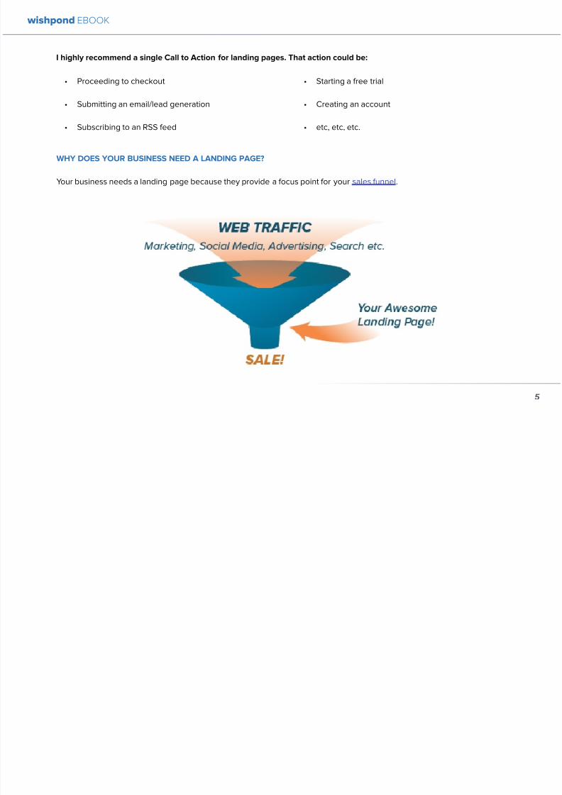
892019 Landing Pages eBook 1
httpslidepdfcomreaderfulllanding-pages-ebook-1 565
wishpond EBOOK
5
I highly recommend a single Call to Action for landing pages That action could be
bull Proceeding to checkout
bull Submitting an emaillead generation
bull Subscribing to an RSS feed
bull Starting a free trial
bull Creating an account
bull etc etc etc
WHY DOES YOUR BUSINESS NEED A LANDING PAGE
Your business needs a landing page because they provide a focus point for your sales funnel
892019 Landing Pages eBook 1
httpslidepdfcomreaderfulllanding-pages-ebook-1 665
wishpond EBOOK
6
A landing page is what tells a visitor to your website how
to act on their interest in your business
Itrsquos what turns a common internet user window-shopping
the web into a guy on your shop floor trying on shoes
Letrsquos put the value of a landing page in concrete numbers
Landing pages facilitate conversion Letrsquos say yoursquore
an online retailer with 15000 monthly site-visits Your
customers are spending on average $35 each time they
buy If your online site saw a conversion rate increase
of 1 over that month yoursquod see a $5250 increase in
revenue
If yoursquore not sold let me give you a case study that gives
you a peek into your future
In May ski-resort holiday company Liftopia decided to test
their landing page and see if they could optimize it Using
AB testing website Optimizelycom they increased their
revenue by 24 with the simple addition of a ldquoSimilarProductsrdquo option
HOW DO I CREATE A LANDING PAGE
Creating a landing page is a straightforward process
Get in touch with your businessrsquo web developer (or in
Wordpress do it yourself) Create a new page (with the
variables Irsquove emphasized below) and start pushing web
traffic towards it
I recommend creating different landing pages for
different sources of traffic For instance
bull Create a landing page for each of your free ebooks
with a simple but effective two or three-box entry
form (what we in the biz call lsquoemail-gatingrsquo your
content)
bull Create a landing page for each of your businessrsquo
product genres (the individual tools you offer as a
SaaS company winter apparel or summer apparel)
bull Create a contest landing page directing traffic from
a Facebook Ad
bull Create a landing page within your existing website(like Liftopia did above) Any traffic that clicks on
a certain link on your homepage gets sent to a
landing page specific to that link Make that page
as focused as possible because you already know
exactly what theyrsquore interested in
892019 Landing Pages eBook 1
httpslidepdfcomreaderfulllanding-pages-ebook-1 765
wishpond EBOOK
7
HOW CAN I MAKE A LANDING PAGE THAT
CONVERTS
Wishpondrsquos Facebook Ads Tool landing page below
collects traffic from many sources blog articles search
ads on Facebook and Google whitepapers our own
website and many more Although we continue to test
and optimize this landing page on a monthly basis itrsquos a
great example of a successful landing page that converts
for our business
1 Quick and Obvious USP
Your USP (Unique Selling Point) is what sets your product
or business apart from others Your landing page needs
to communicate this point immediately and obviously
Your USP can be communicated in multiple ways
bull The headline
bull A supporting headline
bull A value proposition
Your landing pagersquos USP along with an image (see
below) is what grabs the attention of a visitor You have
approximately 5 seconds to convince them the page (and
your business) is worth looking into and communicating
the value of that investigation is how you do it
USP and Value Proposition Ideas
1 The monetary value in terms they can understand
2 The word Free - making the risk vs reward ratio
ideal
3 Positive comparison to a well-known brand
4 State the expected ROI
5 Offer success either long-term or immediate
For more information on value propositions and USPs
check out my article 7 Value Proposition Formulas to
Boost Conversion on Ads and Landing Pages
2 Appealing Image or Graphic
Images grab the attention of your landing page traffic
They also communicate ideas much easier than text
Have an attractive product or shop-front Test including a
picture of them in your landing page This increases the
visual appeal of the page and encourages your businessrsquo
892019 Landing Pages eBook 1
httpslidepdfcomreaderfulllanding-pages-ebook-1 865
wishpond EBOOK
8
reputation as personable
I recently examined the psychology of images in advertising and discussed in concrete terms the astonishing effect of
including pictures of people on your website and in landing pages and advertisements
Adroll one of the chief advertising re-targeting tools online uses an image and video of its president Adam Berke to
increase its landing pagersquos effectiveness below
Test the effectiveness of an image for your own businessrsquo audience Your site-visitors may respond more to text color or
even an image of a beach than that of a person
892019 Landing Pages eBook 1
httpslidepdfcomreaderfulllanding-pages-ebook-1 965
wishpond EBOOK
9
3 Solid Call-to-Action
Your CTA is one of the most important variables within your landing page I mentioned above that your landing page is what
focuses an internet userrsquos attention where you want it Your landing pagersquos CTA is the center of that focus It gives them a
single option for action Making it clear contrasting in color and appealing is a vital part of a successful landing page
While you may find success with multiple CTArsquos on the same landing page itrsquos essential that you have them traffic to the
same end point
Your landing page needs to have a single focus as any distraction will increase the pagersquos bounce rate
892019 Landing Pages eBook 1
httpslidepdfcomreaderfulllanding-pages-ebook-1 1065
wishpond EBOOK
10
4 Short but Clear List of Benefits
Providing 3-5 benefits is the second part of your pagersquos
USP Your headline and obvious value proposition grab
their attention in less than 5 seconds They decide to
engage further and itrsquos this short and obvious list of
benefits that really sell them on your desired action
Give the page visitor a l ittle more information about who
you are what theyrsquore in for and what sets your business
or product apart from competitors I recommend sitting
down and establishing the five selling points based
around your business or product Use the most appealing
of these (I like dollar values) for your initial headline
subheader or value proposition The next four write as
single sentence (if not phrases) in list form
I cannot emphasize lsquolist formrsquo enough Itrsquos essential that
this information be bullet-pointed or numbered as any
paragraphs on your landing page will reduce focus and
increase your bounce rate
5 Trust SymbolSocial Endorsement
The simple addition of a trust symbol to a landing page
has been known to increase conversions by 42 Social
endorsements work the same way by providing proof
of the legitimacy of your product or business People
especially social media users (where much of your
landing page traffic will come from) value the word of
their peers or a respected authority
It was the addition
of the symbol to the
left which quickly
and easily increased
conversions by 42and improved sign-up-form fill-outs by 81
I examined the influence of the single word lsquoProvenrsquo in my
article The Psychology Behind a Successful Facebook
Ad Part 3 Text Check it out
Conclusion
Hopefully you now have a solid grounding in landing
pages You know exactly what they are how essential
they are for your business and the five most important
variable best-practices you need to include
892019 Landing Pages eBook 1
httpslidepdfcomreaderfulllanding-pages-ebook-1 1165
Chapter 2
7 Landing
PageMistakesthat are Costing
you Conversions
wishpond EBOOK
892019 Landing Pages eBook 1
httpslidepdfcomreaderfulllanding-pages-ebook-1 1265
So yoursquove built an amazing landing page Is it converting
like yoursquod hoped it would Do you think it could be more
effective
Yes It could
No matter how long yoursquove had a landing page therersquos
always room for improvement
66 of companies test multiple landing
pages on their website only 13 think
theyrsquore doing it well
This comprehensive article will discuss the top 7 landing
page mistakes that are affecting your conversion rate
Irsquoll dive into why these mistakes matter and give you the
proven best practices on how to change them to get the
best possible result from your landing page
TWEETABLE TAKEAWAYS
bull 66 of companies test multiple landing pages on
their website only 13 think theyrsquore doing it well
bull Is your CTA in the right place Fixing it could
increase conversions by 22 Learn more here
bull Changing your CTA text could increase your CTR
by 161 Learn more here
bull Are you making these 7 landing page mistakes
Find out here
Warning
The 7 mistakes Irsquom discussing in this article are the
most frequent I see - the ones I know have hurt my own
conversion rates That said AB testing your landing
pages is the only way to be sure these variables arenrsquot
working for you It could very well be that your businessleads like a page full of text or still convert optimally
with CTAs that donrsquot stand out If yoursquore choosing not
to engage with a third party landing page provider
(like Wishpond) yoursquoll have to test your own landing
pages thoroughly to be sure theyrsquore optimized for your
business
WHY DO YOU NEED TO OPTIMIZE YOUR LANDINGPAGES
Your landing page is meant to drive visitors further down
your sales funnel
Whether the goal of your page is to offer an ebook
wishpond EBOOK
12
892019 Landing Pages eBook 1
httpslidepdfcomreaderfulllanding-pages-ebook-1 1365
download a great discount on your product or entry to
your shopping cart an optimized landing page is what
turns a common internet user window-shopping the web
into a guy on your shop floor trying on shoes
Letrsquos put the value of optimizing your landing page in
concrete numbers
Landing pages facilitate conversion Letrsquos say yoursquore
an online retailer with 15000 monthly site-visits Your
customers are spending on average $35 each time they
buy If your online site saw a conversion rate increase
of 1 over that month yoursquod see a $5250 increase inrevenue
Now remember fixing the mistakes Irsquove included below
can increase your conversion rates by more than 20
MISTAKE 1 TOO MUCH TEXT
One of the most important factors of a successful landingpage is its simplicity This is one of the easiest mistakes
to fall for as well as itrsquos difficult not to want to add more
awesome selling points of your business or product How
can more reasons to buy actually hurt your conversion
rates
Because nobodyrsquos reading them Remember that you
have 5 seconds to convince a landing page visitor to
stay or traffic further Yes this is done through a clear and
impressive USP or value proposition (see mistake 2) but
itrsquos also done by the overall look of your landing page
I recommend you avoid paragraphs and instead use
bullet-point lists
Example below taken from a Salesforce landing pagex
wishpond EBOOK
13
Build customer loyalty Increase first call
resolution and agent productivity Improve
customer satisfaction by 37 All while delivering
amazing customer service from anywhere withService Cloud built on the Salesforce 1 Platform
892019 Landing Pages eBook 1
httpslidepdfcomreaderfulllanding-pages-ebook-1 1465
People skim everything online Communicate to your
market through
bull Bullet-points
bull Bolded words
bull Headings
bull Images
MISTAKE 2 NO UNIQUE SELLING PROPOSITION
983080USP983081 OR VALUE PROPOSITION
The first thing a visitor to your page should see is the
most valuable sales point you have You also want
to make this sales point unique to your business
to communicate quickly and strongly what makes
your business or your product stand out from your
competitors
Whether your USP is specific to the product yoursquore
pushing the promotion yoursquore offering (dollar values are
great) or an awesome statistic from your business is up to
you and your testing process
People sometimes confuse USPs and CTAs Your USP
should be your main and unique selling point while your
CTA turns their interest in your USP into the action you
want
5 USP Formula Examples
bull The easiest way to [product or business purpose]
bull The 1 provider of [service]
bull Save [dollar amount] in [length of time]
bull [Well-known-brand] gives you [thing] we give you
[better thing]
bull Get [your service] Free for [length of trial]
MISTAKE 3 NO IMAGE
For best results make sure your landing page has at least
one image
wishpond EBOOK
14
892019 Landing Pages eBook 1
httpslidepdfcomreaderfulllanding-pages-ebook-1 1565
The image needs to
bull Communicate your content
bull Appeal to the eye
bull Flow easily with the page
bull Stand out without contrasting
too intensely
bull Be evocative to encourage
engagement
I recommend reading my article The Psychology Behind a Successful Facebook Ad Part 2 Images to identify the best
images for your business Studies show a smiling woman encourages the highest conversion rates but test what works
best for your business
Itrsquos important you keep your landing page simple and straightforward with little text The r ight image can communicate anidea or elicit a certain response in your landing pagersquos visitor
wishpond EBOOK
15
892019 Landing Pages eBook 1
httpslidepdfcomreaderfulllanding-pages-ebook-1 1665
5 Landing Page Image Ideas
bull A smiling woman pointing or looking at your USP
bull An image of fireworks or something similar making
your USP an exciting announcement
bull A video still of your CEO or head of marketing
which will open a 30 second to 2 minute video
introducing your product or business
bull An abstract but appealing mix of colors words and
shapes
bull An image of your product or screenshot of your
online tool showing it in action
MISTAKE 4 BAD CALL983085TO983085ACTION
There are three variables in your CTA that might make it
bad Fix these mistakes and yoursquoll be impacting on the
most influential conversion-improver (is that a word)
variable out there
Nobodyrsquos seeing it
A thousand articles have been written about making your
CTA stand out This means contrasting the color of the
button with the landing page It also means making it big
and bold and eye-catching If this isnrsquot already part of your
creation process I have very little time for you
Contrasting the color is perhaps most important
Contrasting color helps your CTA stand out from thelanding page making it easy for people to see what you
want them to do This is common sense Blue or green
landing page Try a red or orange CTA button Any
questions Read my article The Psychology Behind a
Successful Facebook Ad Part 1 Color as it takes an in-
depth look at the effect of color in marketing
Itrsquos in the wrong place
Alongside contrasting your CTA buttonrsquos color itrsquos
essential that you place your CTA where itrsquos visible This
means above-the-fold and on the viewerrsquos immediate
eye-level
wishpond EBOOK
16
892019 Landing Pages eBook 1
httpslidepdfcomreaderfulllanding-pages-ebook-1 1765
Too often I see amateur landing pages with the CTA
button at the bottom Their creator has fallen into the trap
of lsquoIrsquoll put the Call-to-Action at the bottom after theyrsquove
read all the selling-points about my productrsquo
Your CTA should be one of the first things a visitor to your
landing page sees Itrsquos essential that they know the focus
of your page immediately Once they know what theyrsquore
asked to do they can make the decision if the action is
worth it
Think of your CTA and your USP as partners Your CTA
tells the visitor what to do and your USP convinces themto do it
Pro tip If your landing page is longer than a
single page test a scrolling CTA on the left
or right side This encourages click-through
because if at any point of the page the
visitor is lsquosoldrsquo they have easy access to your
desired action
Yoursquore telling people what to do not what they get
Think of your CTA not just as a button for people to click
but an integral part of your sales process itself
Landing pages are a dance and your CTA is leading If
that CTA is too aggressive or demanding theyrsquoll step on
your page visitorrsquos toes and theyrsquoll find a new partner Sell
your CTA and yoursquoll sell the action within it
5 Examples of Persuasive CTArsquos
bull Start your Free Trial
bull Find New Leads Now
bull Get the Free Guide
bull Request a Quote
bull Download yours Now
wishpond EBOOK
17
892019 Landing Pages eBook 1
httpslidepdfcomreaderfulllanding-pages-ebook-1 1865
wishpond EBOOK
18
MISTAKE 5 NO CLEAR LIST OF BENEFITS
Some leads will convert based on their existing interest your ad or lead generator your first USP or your Value Proposition
These are great but some will need a little more convincing Not too much but a bit more
Whenever I give advice on landing page creation I always recommend the person sit down before they start and write
down four or five USP for their landing page
Of those five USPs choose the most appealing for your headline The other three or four put in list form or create four
simple images with the USP inside them Salesforce actually included their three key benefits in the paragraph I included in
1 and once again Irsquod be curious to see if theyrsquod increase conversions by putting them in list format
4 BenefitUSP Examples
1 The ROI from your service or tool
2 The discount or offer yoursquore promoting
3 Customer testimonials
4 The 3-5 main services your business or product
provides
892019 Landing Pages eBook 1
httpslidepdfcomreaderfulllanding-pages-ebook-1 1965
Finding the right balance between not enough
information and too much is a difficult process - one
requiring testing and your own solid judgment You want
your landing page to contain just enough information
to convince a visitor to engage and not too much that
theyrsquore overwhelmed and your bounce-rate increases
MISTAKE 6 NO TRUST SYMBOL OR CUSTOMER
TESTIMONIAL
In the Psychology Behind a Successful Facebook Ad Part
3 Text I took a look at the power of the word lsquoprovenrsquo in
marketing (as in lsquoprovenrsquo success) It affirms a personrsquosinterest It reassures them theyrsquore not being fooled by
tricky advertising shiny colors or flashing lights
Trust symbols and customer testimonials can function in
a similar way If yoursquore using Facebook Ads or collecting
traffic from social media sites in general yoursquore talking to
a lead who cares about social endorsements - thus the
power of customer testimonials The implementation ofa trust symbol money-back-guarantee or promise that
any details collected wonrsquot be sold is simply a comforting
thing to your landing pagersquos visitors They like knowing
theyrsquore engaging with a trustworthy company and not
being taken advantage of
I put a little time and energy into this one as Irsquove found
huge results from this variable in the past I quickly found
a couple different case studies in which adding a trust
symbol or customer testimonial improved conversionrates First the addition of the Verisign trust symbol
above which Blue Fountain Media added to their landing
page increased conversions by 42 and improved sign-
up-form fill-outs by 81 The second was the integration
of a lsquomoney back guaranteersquo badge by the Understand
Quran Academy which improved overall sales by 3257
So give it some thought
MISTAKE 7 ENTRY FORM IS TOO COMPLICATED
If yoursquore going to include an entry form on your landing
page itrsquos important you keep it simple Neil Patel (founder
of QuickSprout and KissMetrics) removed the lsquoRevenuersquo
wishpond EBOOK
19
892019 Landing Pages eBook 1
httpslidepdfcomreaderfulllanding-pages-ebook-1 2065
form field from his landing page and found a 26
increase in conversions
When creating your landing page itrsquos worth keeping in
mind the lsquorisk vs rewardrsquo maxim People measure their
own involvement on the basis of lsquois it worth it to mersquo
Is filling out all these form fields worth what Irsquom getting
from this business Am I comfortable giving away this
information for what Irsquom getting back
The risk vs reward idea is essential when yoursquore writing
your value propositions but itrsquos also important when
deciding on how many form fields yoursquore going to
include You need to decide what information is essential
for your business and what is just getting in the way of a
conversion
People generally have little issue giving you their name
or location but beyond that it becomes a bit more of a
barrier
You need to know your objectives and create an entry
form accordingly
Some landing pages are built for lead generation If this
is the case itrsquos essential you get an email address from
your pagersquos visitor Keep your form simple with only two
or three fields
If yoursquore engaging in email automation it may also be
important to get demographic information (like age and
gender) to optimize your email segmentation If this is the
case and yoursquore not just looking to encourage a sale or a
free trial offer something valuable like an ebook white-
paper or run a lead-generating online contest with an
optimized landing page
wishpond EBOOK
20
892019 Landing Pages eBook 1
httpslidepdfcomreaderfulllanding-pages-ebook-1 2165
Conclusion
You should now have a solid grounding in landing page mistakes you need to avoid Remember to optimize as best you
can and then keep testing to uncover the top-performing CTArsquos images text value propositions and page formats Never
stop optimizing
wishpond EBOOK
21
892019 Landing Pages eBook 1
httpslidepdfcomreaderfulllanding-pages-ebook-1 2265
wishpond EBOOK
Chapter 3
How to AB
Test yourLandingPage
to MaximizeConversions
892019 Landing Pages eBook 1
httpslidepdfcomreaderfulllanding-pages-ebook-1 2365
Yoursquove created a great landing page and you know the mistakes you need to avoid but do you know how to AB test your
landing page for conversions
AB testing is the basis for optimization in online marketing Ads landing pages websites and marketing emails should all
be tested periodically to ensure your business is getting the best ROI you can
This article will jump headfirst into the world of landing page AB testing and leave you still swimming on the far side Irsquoll
break it down into the main variables you need to be testing show you concrete examples of how that test would look and
give you real-world case studies to show how testing these variables can affect your landing pages
AB Testing Recap
For those of you just dipping your toes into the ocean of AB Testing let me give you a quick breakdown of how it works
AB Testing is a strategy in marketing in which two versions A and B (the control and the treatment) are tested against each
other The goal is to identify changes that increase the chance of what you want to occur to occurr
There are many online AB testing tools (Optimizely and CrazyEgg being the most popular) which allow you to send half
your pagersquos traffic to the original (A) version and half to your new treatment (B) version The test is run until one variation is
clearly more successful (with a 95 confidence level)
ORIGINAL LANDING PAGE EXAMPLE
For the purpose of this article Irsquom going to be testing the example landing page below Because I wonrsquot actually be driving
traffic to this page or any of the tested versions all statistics Irsquoll be quoting will be from reputable case studies Irsquoll add up
the possible increase in conversions in my conclusion (you can play along at home if you like as well)
wishpond EBOOK
23
892019 Landing Pages eBook 1
httpslidepdfcomreaderfulllanding-pages-ebook-1 2465
wishpond EBOOK
24
892019 Landing Pages eBook 1
httpslidepdfcomreaderfulllanding-pages-ebook-1 2565
Not the most exciting thing Irsquove ever seen in my l ife Irsquoll
admit But then again Irsquove seen worse It has all of the
primary lead-generation variables USP subtitle image
and a CTA Letrsquos say itrsquos converting at a rate of 5 (the
low end of average)
AB TESTING THE UNIQUE SELLING PROPOSITION
983080USP983081
The landing pagersquos current headline (ldquomaking business
personalrdquo) is not really a USP so much as a slogan The
difficulty with this is that many brands consider their
slogan to be a part of their business identity - especially ifthey have been running for many years Sidelining can be
emotionally very difficult
Get over it This is business For example letrsquos take
McDonaldrsquos whose slogan ldquoIrsquom lovinrsquo itrdquo is perhaps the
most well-known in the world Their landing pagersquos
current headline ldquoThe menu you love plus so much
morerdquo This is a USP Itrsquos a unique salersquos point built onoffering what people already know and like with the
addition of new and exciting options
Our Variation
Anytime your business becomes more impressive than
another use the power of a comparison value proposition
to encourage conversion
AB TESTING THE IMAGE
The existing image of a professional-looking group is
by no means a bad one But of course you know as
an informed digital marketer that a picture of a smiling
woman has proven to be the most effective for customer
engagement
wishpond EBOOK
25
892019 Landing Pages eBook 1
httpslidepdfcomreaderfulllanding-pages-ebook-1 2665
In fact in 2003 a Harvard student worked with a South
African bank sending 50000 letters offering short term
loans They varied the interest rate as well as included
psychologically-influential cues It turned out that having
a picture of a wholesome happy female in a corner of the
letter had as much positive impact on the response rate
as dropping the interest rate by four percentage points
Our Variation
Your landing pagersquos image is one of the most influential
but frustrating variables we can test Irsquove found that asmiling woman is the most reliable - but that other images
(of groups of people abstract images or inanimate
objects) may increase conversions more based on your
businessrsquo audience
Once yoursquove got a great format and text rotate a few
images through your testing cycle to find which gets the
most response Theyrsquore one of the easiest things to test
but one of the more difficult to anticipate
For more information on AB Testing your image check
out my articles The Psychology Behind a Successful
Facebook Ad Part 2 Images and How to AB Test your
Facebook Ad to Maximize ROI for some best practices
AB TESTING THE CTA
Irsquove written before that your landing page is a dance withthe visitor and your CTA is leading I love this metaphor
If your CTA is too aggressive or demanding itrsquoll step on
your page visitorrsquos toes and theyrsquoll find a new partner
Remember to keep your CTArsquos appealing rather than
demanding Use lsquoyoursquo or lsquomyrsquo lsquofreersquo and lsquogetrsquo Tell people
what they stand to gain not what to do
Here are 5 appealing CTA formulas
1 Start yourmy free [trial period]
2 Get your free [focus of landing page]
wishpond EBOOK
26
892019 Landing Pages eBook 1
httpslidepdfcomreaderfulllanding-pages-ebook-1 2765
3 Increase yourmy [beneficial result of your service
tool] today
4 Learn more today
5 Try [servicetool] for free
Our Variation
I hear different results from using lsquoyourrsquo vs lsquomyrsquo in your
CTAs Some businesses have found the small change of
lsquoStart your free trialrsquo to lsquostart my free trialrsquo increases their
landing page CTR some find the opposite As a result
Irsquom not going to tell you which one will work for your
business Yoursquoll have to test it yourself
AB TESTING THE LIST OF BENEFITS
The list of benefits is something that may not necessarily
increase your pagersquos conversions but nor is it likely to
hurt them We include benefit lists to ensure that if a USP
headline subheader or traffic source (like an ad or social
media link) hasnrsquot already sold your lead they get that
little bit more encouragement they need to convert
Your list of benefits could be anything your service
product or tool offers beyond the USP This list gives
more information that people may need like how your
service works or the steps they need to take to get theresult yoursquove quoted them
Remember to keep your list of benefits short and sexy
Include a maximum of five and draw attention to them
with icons small images or a clear and delineated box
wishpond EBOOK
27
892019 Landing Pages eBook 1
httpslidepdfcomreaderfulllanding-pages-ebook-1 2865
Our Variation
AB TESTING THE TRUST SYMBOLCUSTOMER
TESTIMONIALS
Implementing trust symbols or customer testimonials
pretty much improves landing page conversions across-
the-board Blue Fountain Media found adding the
VeriSign logo to their page increased conversion by 42
and sign-up-form entries by 81
Basically yoursquore telling your landing page visitor that
yoursquore trustworthy that yoursquore not trying to cheat them
out of their hard-earned cash that other people have put
their faith in you before and won out
Unless you have a trust symbol from a seriously influential
and recognizable authority Irsquod recommend you use
customer testimonials over trust symbols Not only do
landing page visitors like to see that you have customers
they also trust them more than they do you Use directquotes from the most well-known brands yoursquove worked
with (as their business profile will increase yours)
Our Variation
wishpond EBOOK
28
892019 Landing Pages eBook 1
httpslidepdfcomreaderfulllanding-pages-ebook-1 2965
AB TESTING THE COLORS
Sometimes itrsquos the smallest details that have the largest effect on your conversions Itrsquos changing the color of your CTA
button from light green to yellow (145 conversion increase) Or contrasting the color of two links within a single image
(60 increase in conversions)
To get an idea of how color can affect your business persona elicit an emotion or encourage an action read The
Psychology Behind a Successful Facebook Ad Part 1 Color Or for the people who ate lunch at their desks todayhellip
Here are the psychological impacts of five main colors
1 Blue Blue is across both genders and all age-
groups most peoplersquos favorite color It is said tocreate the sensation of trust and security Lighter
blues are calming while darker blues denote
professionalism and sincerity
2 Green Associated with wealth as well as
environmental subjects green is the easiest color
for the eye to process Green signifies positive
action (thinkrsquogreen means gorsquo) and affirmation
3 Purple Associated with calm femininity and
wealth purple is the second most popular color
among women at 23 On the other hand purple
is the favorite color of 0 of the male population
4 Red The color red is associated with passion
excitement and urgency Itrsquos a dangerous colorin marketing as many people associate red with
negativity and mistakes However it attracts the
eye better than any other color and gives the
impression that time is passing faster than it is (as
it causes our heart to beat faster) causing us to act
when we otherwise wouldnrsquot
5 Orange Eye-catching bright and sunny orange is
one of the most popular colors for landing page
Calls-to-Action While a good tone and amount
of orange is seen as warm and inviting too much
has been associated with naiveteacute and a lack of
professionalism
wishpond EBOOK
29
892019 Landing Pages eBook 1
httpslidepdfcomreaderfulllanding-pages-ebook-1 3065
Our VariationFinal Edit
wishpond EBOOK
30
892019 Landing Pages eBook 1
httpslidepdfcomreaderfulllanding-pages-ebook-1 3165
What do you think Does your gut say the landing page
wersquove created would convert better than the original
Letrsquos do some quick arithmetic
bull AB Testing the USP Possible conversion rate
increase of 127
bull AB Testing the image Possible conversion
increase of 98
bull AB Testing the CTA Possible conversion rate
increase of 161
bull AB Testing the list of benefits Possible conversion
rate increase of 91
bull AB Testing the trust symbol Possible conversion
rate increase of 72
bull AB Testing the colors Possible conversion rate
increase of 21
Total possible increase in landing page conversions
570
Conclusion
AB Testing works And unless yoursquore going to engage
with a 3rd party provider with tested and proven landing
page templates (which Wishpond will be in a week or
two) you need to be doing it yourself Often
The AB Testing process is continuous - not necessarily
because your landing page isnrsquot optimized but because
it wonrsquot stay optimized And honestly itrsquos very likely
your landing page will never be 100 optimized for
conversions anyway Therersquos always small steps you can
take tiny variables to change that will affect the pagersquosconversion rate
wishpond EBOOK
31
892019 Landing Pages eBook 1
httpslidepdfcomreaderfulllanding-pages-ebook-1 3265
Chapter 4
Landing
PagesHow to Sell your
Product without
Selling your
Product
wishpond EBOOK
892019 Landing Pages eBook 1
httpslidepdfcomreaderfulllanding-pages-ebook-1 3365
Do you get solid traffic to your landing page but struggle
to convert a sale
This article will give you five proven strategies of selling
your product without spamming - of pushing a sale
without pushing your customer over
Landing pages are a delicate balance between promoting
enough to encourage a sale and little enough that the
lead doesnrsquot feel pressure and bounce
Letrsquos take a look at five ways you can sell without selling
1 OFFER BENEFITS NOT FEATURES
This is the most important thing to keep in mind when
writing up the sales points of your business or products
People get sold on how a product or business can solve
their problems not on the details
I admit promoting the benefits is harder than promoting
the features of your product Selling benefits means you
have to identify the problems of your target audience and
come up with how your product or service solves those
problems You have to leave the safety of jargon and
technical details and venture into the real world
To help you understand the difference between features
and benefits here are a few examples
Selling Features
1 The AcmeTikon12 has 300 gigabytes of space
2 Our AcmePad2000 has a 17GHz processor
3 Our AcmeWebToolrsquos templates have over 5000
color options
Selling Benefits
1 The AcmeTikon12 has enough space for 75000
songs
2 Our AcmePad2000 is our fastest than ever making
browsing a cinch
3 We guarantee our AcmeWebToolrsquos templates will
have your businessrsquo brand colors
wishpond EBOOK
33
i
892019 Landing Pages eBook 1
httpslidepdfcomreaderfulllanding-pages-ebook-1 3465
wishpond EBOOK
34
Features still have their place on your landing pages To
safely cover all your bases use your product or servicersquos
features to support the benefits to your target audience
Or translate the sexy-sounding (if somewhat obscure)
feature into a concrete benefit for the consumer like
Wishpond has done below
2 USE CUSTOMER TESTIMONIALS AND REVIEWS
Face it to most visitors to your landing page yoursquore not
exactly a trustworthy source They recognize yoursquore
the slightest bit biased when it comes to this particular
subject (your own product)
So donrsquot sell your own product have someone else do
it for you Since Amazon took over online selling about
20 years ago internet users are increasingly trusting the
word of their peers over any other sources
By the way did you know Amazon accounts for more
online sales than the next 12 competitors combined I
didnrsquot
Needless to say reviews have never been more
important nor have customer testimonials Yes visitors
to your landing pages know that these testimonials come
through your business but it doesnrsquot matter Not only do
customer testimonials function to make your audience
trust your business it gives them the assurance that
someone has engaged with you before - so theyrsquore safe
to do so
Herersquos an example from Wishpondrsquos FacebookSweepstakes App landing page - from our friend Josh
Beaty
i h d OO
892019 Landing Pages eBook 1
httpslidepdfcomreaderfulllanding-pages-ebook-1 3565
For ecommerce businesses test offering product reviews like Amazon does AB test stars or a 5-point system or whatever
creative method of reviewing you can think of Be aware though that the review process also opens up the chance of
negative feedback
Whatever you do donrsquot fake reviews If your products arenrsquot awesome enough to earn more positive reviews than negative
pull the review tool until yoursquove stepped it up
3 MAKE IT BEAUTIFUL
This should be an obvious one but I canrsquot tell you how many times I see an appealing product portrayed in an ugly way Put
time and effort into framing your product in the best possible light AB test a model with your product AB test the gender
of your model AB test the colors behind your model AB test no model but a beautiful abstract collage that resembles a
Kandinsky piece I donrsquot care - just make it pretty
To illustrate my point on the most basic level which one of these do you think will sell better Same sunglasses one with a
white background one with a Johnny Depp background
wishpond EBOOK
35
i h d EBOOK
892019 Landing Pages eBook 1
httpslidepdfcomreaderfulllanding-pages-ebook-1 3665
But making it beautiful isnrsquot just about your
picture
Words can also be beautiful and the words we use canmake our products just as appealing as a great picture A
quick look at the Lexus homepage and yoursquoll know what
Irsquom talking about Head to their lsquoAutomobilesrsquo tab (notice
that Lexus makes lsquoautomobilesrsquo not lsquocarsrsquo) Each class of
automobiles has its own slogan from the ISrsquos lsquoDriving in
Every Sensersquo to the GXrsquos lsquoExpand your Possibilitiesrsquo
Do these slogans have any real relevance to the car
they represent No But do these words create a certain
desirable feeling in their reader Absolutely
Lexus also makes it a point to frame their products in
terms of an ideal customer - a customer their customers
want to be For instance their LX (SUV) lsquoenables you
to venture where few others can while surrounded in
unsurpassed interior comfort and refinementrsquo which
sounds like something I might want to do
Words have a huge impact on us Of course putting your
product in the best possible visual light is vital to making
a sale but donrsquot neglect the importance of the words you
use
5 Phrases that Make your Product Sound Desirable
1 Sleek and sophisticated
2 Pinnacle of artistry
3 Premium technology and unparalleled innovation
4 Reinvention of [relevant field-focused term]
5 Faster newer affordable exclusive
4 MAKE YOUR LANDING PAGE CHILL
I was trying to think of a better word than lsquochillrsquo but I think
itrsquos actually the most accurate Donrsquot be needy Donrsquot be
pushy Let your product or service speak for itself through
clear benefits awesome images and appealing text Sit
back a bit If yoursquore ever feeling like lsquool Gil in the header
image up there remember to chill - your customers will
thank you
Keep a personal touch in all the written parts of your
landing page Test out framing your product or service
in terms of lsquoyoursquo or the idealized customer I referred to
above
wishpond EBOOK
36
i h d EBOOK
892019 Landing Pages eBook 1
httpslidepdfcomreaderfulllanding-pages-ebook-1 3765
Converting should be your visitorrsquos idea not yours They should be sold by the value theyrsquore receiving When creating your
optimized landing page keep in mind the ratio of risk over reward Is what yoursquore offering worth what yoursquore asking from
your customer
CTAs
Remember to keep your CTAs appealing rather than demanding Use lsquoyoursquo or lsquomyrsquo lsquofreersquo and lsquogetrsquo Tell people what they
stand to gain not what to do
Here are 5 appealing CTA formulas
1 Start yourmy free [trial period]
2 Get yourmy free [focus of landing page]
3 Increase yourmy [beneficial result of your servicetool] today
4 Learn more today
5 Try [servicetool] for free
wishpond EBOOK
37
wishpond EBOOK
892019 Landing Pages eBook 1
httpslidepdfcomreaderfulllanding-pages-ebook-1 3865
5 SELL THE DEAL NOT THE PRODUCT
Are you one of those people who finds themselves
buying things they donrsquot need just because itrsquos a great
deal I most definitely am (damn you IKEA) Offers andcontests are my favorite strategy for lead generation and
to encourage a sale (genuinely not just because I work
for a company that builds online promotional tools for
small business)
The right offer is sellable simply as an offer - the product
itself is actually secondary to the deal
The best strategy for using offers is to target well with
a Facebook Ad This way the traffic yoursquore generating
to your landing page is already half-nurtured whether
because of their interests job title relationship status
etc A half-nurtured lead will be better informed of how
good a deal theyrsquore getting making conversion more
likely
Remember however deals work best as value
propositions You need to back up your offer with some
substance
Donrsquot necessarily prioritize the offer over visuals benefits
and an awesome overall product An offer wonrsquot always
work entirely on its own (At least unless your deal is just insane I mean who hasnrsquot brought home bean-bag
chairs to their already fully-furnished tiny apartment
They were buy one get two free)
The best strategy is to use great images sell someone
on the product every benefit every facet of the thing
and then wow them with the fact that this amazing state-
of-the-art life-changing product is only $2999 for thismonth only
wishpond EBOOK
38
892019 Landing Pages eBook 1
httpslidepdfcomreaderfulllanding-pages-ebook-1 3965
wishpond EBOOK
892019 Landing Pages eBook 1
httpslidepdfcomreaderfulllanding-pages-ebook-1 4065
Chapter 5
Landing
PagesOptimizing your Page
for Lead Generation
wishpond EBOOK
wishpond EBOOK
892019 Landing Pages eBook 1
httpslidepdfcomreaderfulllanding-pages-ebook-1 4165
Do you have an awesome landing page Is it optimized
for your lead generation objectives
Email leads are the number one concern for online
marketers You need a landing page that converts has alow bounce rate and engages your consumer enough to
get the lucrative contact
In this article Irsquoll show you how to optimize your landing
page for lead generation by
bull optimizing your SEO
bull focusing on value
bull optimizing your entry form for engagement
bull implementing a customer testimonial campaign
Letrsquos check it out
OPTIMIZE IT FOR SEO
The chief source of most leads is still search Increase
the chance of a lead finding your landing page in the first
place by optimizing it with Googlersquos search algorithm in
mind
Optimize your Landing Pagersquos Title
Your landing pagersquos title is what shows up in the tab This
is different than your page headline USP or what shows
in the URL When creating your page in wordpress or withHTML keep in mind the title best practices
bull Keep it short
bull Keep it keyword-centric
bull Use long-tail format
Whatrsquos long-tail format
Since the Hummingbird update Google is prioritizing the
context of a search as much as it is the keywords Long-
tail is this context-centric search format
Think of asking SIRI lsquoWherersquos the best Thai restaurant
in the arearsquo She scurries off with that information and
comes back with a response that makes sense Google is
designing its search to do the same Instead of lsquoLanding
pages 10 steps to Conversionsrsquo test out calling your
landing page something like lsquoHow to Build a Landing
Page that Convertsrsquo as this is what people will ask of
wishpond EBOOK
41
wishpond EBOOK
892019 Landing Pages eBook 1
httpslidepdfcomreaderfulllanding-pages-ebook-1 4265
Your title is what Googlersquos little algorithm bot sees first
when itrsquos sent off by a web userrsquos search Optimize your
landing pagersquos title and that bot will see you first
Social Share Buttons
If yoursquore basing your landing page around a resource
(like an ebook or a whitepaper) that content is highly
shareable And since Googlersquos hummingbird update
earlier this fall social shares are more valuable than ever
In fact Google+1rsquos are now ranked as more important
than link-building (something traditional SEO gurus are
struggling with to say the least)
Encourage social engagement by promoting your landing
page on Facebook Twitter and especially Google+ And
perhaps most importantly (and simply) throw up a few
social share buttons along the side or at the top of your
landing page This has been quoted as increasing the
virality of a blog post for instance by up to 700
5 More Awesome SEO tips
1 Use different headings tags (like lth1gt and lth4gt)
and bold and italicize keywords the Google search
bot sees these more than it does normal text
2 Optimize your copy with keywords dynamically
and fluidly spread throughout
3 Include an image with alt tags - this lets the search
engine know what your image is about Also will
show up in image search
4 Link to your landing page within your own website
5 Syndicate your landing page as much as possible
with link-building on forums and social media
platforms
For more information about optimizing for SEO check
out my article How to Easily Optimize your Blog for SEO
Many of the takeaways apply for landing pages as well
FOCUS ON VALUE
In order to encourage a lead to engage you need to
convince them itrsquos worth it This means value propositions
wishpond EBOOK
42
wishpond EBOOK
892019 Landing Pages eBook 1
httpslidepdfcomreaderfulllanding-pages-ebook-1 4365
and a great USP It also means you keep your landing
page simple You should be convincing quickly and easily
Ask your page visitor to read too much do too much and
theyrsquoll bounce
Be Specific
One of the main strategies in lead generation is limiting
your landing pagersquos bounce rate to the smallest
percentage you can Realistically yoursquoll be jumping for
joy and screaming from the mountaintops if your pagersquos
conversion rate is over 20
A recently-discovered best practice is that people
respond to specific numbers far more than they do round
numbers For instance quoting your business as having
80000 customers is less believable (and therefore less
powerful for conversions) as quoting your business as
having 75250 customers
Also keep your value propositions simple
bull Make the benefit of your business easy to
understand
bull Use dollar values percentages the word lsquofreersquo
bull Donrsquot use too much page space selling the specifics
of your service or your resource
Benefit List
If yoursquore using an email-gated ebook or other resource
for lead-generation think about your benefit list as the
second point of your argument Your Value Proposition
and image draw their attention and your list of benefits
tell them specifically how they stand to benefit from
entering their information and downloading your
resource
3 Benefit Formulas
1 [Number of things] yoursquoll learn in this ebook
2 How this resource will cause a rsquo [desired result]
3 The [number of steps] to [a certain goal]
OPTIMIZE YOUR ENTRY FORM
Your entry form is the focus of a lead-generating landing
page As far as your lead-generation funnel goes that
entry form CTA is the equivalent of lsquoproceed to check
outrsquo So make sure itrsquos optimized for conversions with
wishpond EBOOK
43
wishpond EBOOK
892019 Landing Pages eBook 1
httpslidepdfcomreaderfulllanding-pages-ebook-1 4465
these easy steps
1 Draw the Eye
You want your entry form to be obvious - donrsquot hideit below-the-fold or with small font Not only will this
increase interaction itrsquoll make it clear to visitors what
yoursquore asking of them Web users like things simple
and clear If they feel therersquos any chance theyrsquore being
swindled theyrsquoll bounce
6 Entry Form Design Tips
1 Encapsulate your entry form within a box
2 Draw attention to your entry form with the br ightly-
colored CTA
3 Use a vertical or horizontal line to separate your
entry form from the rest of the page
4 Include an action-oriented headline above your
form fields (like lsquoget your trial startedrsquo or lsquostart
learning nowrsquo)
5 Contrast the colour of your entry form box with the
page around it
6 AB Test including a short descriptive sentence
describing what happens when they click your CTA
wishpond EBOOK
44
wishpond EBOOK
892019 Landing Pages eBook 1
httpslidepdfcomreaderfulllanding-pages-ebook-1 4565
2 Balance Demographic Collection with Bounce
Rate
Optimizing your entry form is about weighing up the
valuable information yoursquore getting from a lead (detailsyou can use to segment the emailsadvertisements they
receive) versus the amount of form fields it takes to
increase bounce rate
Pro Tip Unless itrsquos absolutely necessary
avoid asking for a phone number People
are far more resistant to giving out phone
numbers than they are of an email or even
an address Spam emails are more accepted
than telemarketing calls during dinner
Letrsquos say yoursquore heavily invested in email marketing and
itrsquos working really well for your business It may be more
important to your business to know the demographic
details of 10 leads than to know nothing about 20 Email
marketing works best if yoursquore able to personalize and
segment your emails However this is entirely up to your
business
One of the benefits of email-gating an ebook or other
resource for lead generation is that you know people who
downloaded it are interested in that content Target them
with similar content in the future
For more information on segmenting your emailmarketing campaigns to get the best ROI possible read
my colleague Kristarsquos article 4 Strategies to Optimize your
Email Segmentation
wishpond EBOOK
45
wishpond EBOOK
892019 Landing Pages eBook 1
httpslidepdfcomreaderfulllanding-pages-ebook-1 4665
CUSTOMER TESTIMONIALS OR TRUST SYMBOLS
Irsquove talked about the value of trust symbols before but I
donrsquot want you to think that just because yoursquore no longer
optimizing for a sale you can forget them
Letrsquos say your page is focused around a free ebook or
white-paper This valuable content is email-gated so
therersquos no real proof (apart from what yoursquore saying) that
what yoursquore promising will be delivered
That is unless you include a customer testimonial like a
quote (I recommend including a picture of the customeras it makes it far more trustworthy) or short video clip If
yoursquore asking for a phone number or email address be
sure to let people know - obviously - that you donrsquot sell
these details or spam them
Customer testimonials act as a social endorsement
which have grown in importance in the past few years
This is because since Amazon Yelp and other sites
made customer reviews such a huge part of a successful
product your service needs to do the same
Pro Tip Many businesses have found
their highest conversion rates come from
a landing page built around a photogenic
customerrsquos testimonial Incorporate
an awesome case study for the value
proposition with a large picture and a clear
benefit list of how your page visitor can getthe same result
wishpond EBOOK
46
wishpond EBOOK
892019 Landing Pages eBook 1
httpslidepdfcomreaderfulllanding-pages-ebook-1 4765
Conclusion
Hopefully you now have a better idea of how to optimize your landing page for lead generation Be sure to prioritize your
entry form communicate simply and accurately and use a customer testimonial to convince your possible lead to convert
wishpond EBOOK
47
wishpond EBOOK
892019 Landing Pages eBook 1
httpslidepdfcomreaderfulllanding-pages-ebook-1 4865
Chapter 6
Landing
PagesThe Science
Behind Designing
for Conversion
p
wishpond EBOOK
892019 Landing Pages eBook 1
httpslidepdfcomreaderfulllanding-pages-ebook-1 4965
Is your landing page converting well Is it converting
badly Do you know why I mean do you really know
This article will give you the science and psychology
of why your landing is engaging to visitors or why youmight be getting traffic - but no conversions
Irsquoll take a look at 5 principles of landing
page design that can mean the difference
between a successful page and one thatrsquos
just taking up space (or fumbling around in
the dark)
Letrsquos get started
1 DIRECTIONAL CUES
Directional Cues are key in landing page design as they
tell people what to focus on
The most important thing to remember when designingyour landing page is that people do not view it like they
do a book Itrsquos not left to right top to bottom You have to
tell people how to read your page and directional cues
(as well as encapsulation and contrast below) are how
you do this
My recommendation is to decide two things on your
landing page that you especially want to drive attention
to (say your CTA and your product image or maybe aUSP) Then integrate a couple of the strategies below
into your design and AB test it Maybe your audience
responds well to the overt arrow or maybe the more
subtle eye-gaze Test it for yourself
Therersquos three main ways that we signal a focus point in
landing pages
Arrows and lines
p
49
wishpond EBOOK
892019 Landing Pages eBook 1
httpslidepdfcomreaderfulllanding-pages-ebook-1 5065
The most straightforward way to direct attention at an object or heading is to draw an arrow or line to it Students of art
will know the importance of lines as humans have a natural (subconscious) impulse to follow them to their origin or their
destination This works great to focus peoplersquos gaze on your CTA USP value proposition or product image
Eye-direction
Humans are incredibly good at recognizing the eye-focus point of the people around them I recommend using an eye-
tracking software on your landing page to determine where people are focusing and whether this focus is resulting in an
increased click-through-rate
What Irsquom talking about (thanks to Neil Patel
for the eye-tracking examples)
The red spots indicate the areas which
viewers looked at most Take note of how
the eye direction in the example on the left
draws the viewer`s attention towards the
product
p
50
wishpond EBOOK
892019 Landing Pages eBook 1
httpslidepdfcomreaderfulllanding-pages-ebook-1 5165
Faces are the most eye-attracting image you can use (see
5 below) and the eyes are the most eye-attracting part
of the face
Yoursquoll notice the woman on the left is looking directly atthe camera (or visitor to your page) The woman on the
right is looking at the product that Sunsilk is trying to sell
You can see in concrete terms how the initial gaze goes
to the womanrsquos eyes and then tracks left to the product
whereas the face on the left gets all the attention and the
product none
PointingGesturing
I highly recommend you use an image of a person in your
landing page as itrsquos proven to be the most engaging
picture (more on that later though) Something to test
however is having that model gesturing or pointing
towards something you want to focus attention on
This is a dangerous one though as (in my mind) it can
come across as cheesy if done incorrectly Test what your
audience responds to Irsquove seen this both increase and
decrease conversion rates in many case studies
2 CONTRAST
Color contrast
Contrast is essential when working with landing pagesThe human eye is naturally attracted to contrasting color
I recommend you consider color contrast for your USP
and CTA - perhaps an orange CTA button on a dark blue
background
Blank space
The idea of blank space is well-known in the graphic
design world and no less a vital part of landing page
design The idea is that blank space is extremely
influential in focusing attention on non-blank space For
instance
p
51
wishpond EBOOK
892019 Landing Pages eBook 1
httpslidepdfcomreaderfulllanding-pages-ebook-1 5265
Another way of utilizing blank space is with
encapsulation This can be done by framing a section
of content with a border or a container (filled in with
a background color) Give the encapsulated section
enough space to allow it to function somewhatindependently of the rest of the composition
Will this work better than a directional cue Test it for
yourself and find out
Format contrast
Formatting size (of font for instance) also attracts the eyeIn a 4-week multivariate test in 2010 Paras Chopra tested
the performance of 12 different combinations of a Call-to-
Action and descriptive link
Option 10 with the largest contrast in color hue and size
(as well as the word Free) generated a 60 improvement
in conversion rate
3 COLOR
Color is extremely (though unconsciously) effective
at eliciting emotion in viewers I took an in-depth
look at color psychology in my series on the science
behind a successful Facebook Ad so check it out for a
comprehensive analysis (with science)
For now herersquos a breakdown of how humans areinfluenced by color - and how this knowledge can
improve your conversion rates
Blue Blue is across both genders and all age-groups
most peoplersquos favorite color (35 of women and 57
of men) It is said to create the sensation of trust and
security Lighter blues are calming while darker blues
denote professionalism and sincerity
Orange Eye-catching bright and sunny orange is one of
the most popular colors for landing page Calls-to-Action
While a good tone and amount of orange is seen as warm
and inviting too much has been associated with naivete
52
wishpond EBOOK
892019 Landing Pages eBook 1
httpslidepdfcomreaderfulllanding-pages-ebook-1 5365
and a lack of professionalism
Red The color red is associated with passion excitement
and urgency Itrsquos a dangerous color in advertising as
many people associate red with negativity and mistakesHowever it attracts the eye better than any other color
and gives the impression that time is passing faster than
it is (as it causes our heart to beat faster) causing us to act
when we otherwise wouldnrsquot
Green Associated with wealth as well as environmental
subjects green is the easiest color for the eye to process
Green also signifies positive action (thinkrsquogreen meansgorsquo) and affirmation
Green and teal have also been associated with shoppers
on a budget Itrsquos also the second and third most popular
color among men and women respectively
Purple Associated with calm femininity and wealth
purple is the second most popular color among women
at 23 Interestingly as women get older their liking for
the color purple increases On the other hand purple is
the favorite color of 0 of the male population
Black Powerful sleek and intellectual black signifies
permanence sincerity and sophistication While black
can like red and orange be a dangerous color if used
too much it can communicate professionalism and
sophistication when used in conjunction with a strong
clear white (avoid greys or tans as theyrsquoll wash out yourmessage)
4 IMAGERY
I could discuss the effectiveness of a picture of a smiling
person on your landing page for hours (and I havehellip) but
just trust me that having an image (especially a person)
will likely improve your conversion rates
Something Irsquove seen recently actually is incorporating a
customer testimonial with the main landing page image
Choose a photogenic customer and post it up next to an
awesome-sounding affirmation of how your product or
service made their lives easier
But letrsquos leave that for the moment assuming you
recognize its importance and talk about why it works
bull We respond far more emotionally to people (or pets
though people generally elicit a stronger response)
than we do to words or random images
53
wishpond EBOOK
892019 Landing Pages eBook 1
httpslidepdfcomreaderfulllanding-pages-ebook-1 5465
bull A picture of a person provides subtext to your
landing page - a story which people respond to
bull We completely subconsciously focus on the faces
of people we see (especially the eyes) In everyeye-tracking image Irsquove ever seen the hottest
points are the face and eyes Unless of course
the image is of a woman and wersquore talking about a
male demographic Then the eye-tracking software
shows our attention to behellip elsewhere
In my research for this article I came across an article by
VS Ramachandran (a neuroscientist from Oxford) whowrote that oftentimes a line drawing is more powerful
than a photograph He writes that this is because the
lsquoidearsquo of a person is more appealing than the truth of it
(why so much of art is exaggeration of the human form or
why caricatures are so aesthetically pleasing) Leave out
the details and all yoursquore left is the essence of a thing
Although I havenrsquot yet seen an example of this in a
landing page or incorporated it into my own I believe
that whoever does will see a dramatic increase in click-
throughs Get creative and let me know how it goes
5 TYPOGRAPHY AND STYLE
Yoursquoll think that Irsquom getting too detailed here that
different typographies text formats or styles canrsquot actually
increase or decrease conversion rates enough to matter
Herersquos the thing with AB testing details do matter
Letrsquos say your Ecommerce sitersquos landing page is currently
converting at 23 Yoursquore seeing traffic of around 2000
visitors per week and their average purchase is worth
50 dollars to your business Yoursquore making $23000 per
week
Letrsquos say we change your pagersquos headline length and
change the image from one of a woman looking at
the camera to one looking at the CTA (small changes
yoursquod agree) You see a conversion rate increase of
10 Suddenly yoursquore converting at 253 and yoursquove
increased your weekly income to $25300 Yearly
revenue increase $27600
Typography and style changes to AB test
bull Font size for headings and body copy (and the
difference between them)
54
wishpond EBOOK
892019 Landing Pages eBook 1
httpslidepdfcomreaderfulllanding-pages-ebook-1 5565
bull Heading length (short and succinct vs long and
detailed)
bull Number of different font sizes (too many makes
your landing page confusing - I recommend two orthree)
bull Fonts Keep in mind that different fonts are for
whatever reason viewed as more amateurish than
others We at Wishpond like San Sarif for headlines
and Sarif for body copy Avoid cursive (except
maybe for a header) and comic sans is a no-no for a
professional business
bull More text vs less (I like a simple landing page - get
to the point and leave any extraneous information
for later emails or different tabs But test this for
yourself)
Conclusion
Hopefully you now understand a little more of the
science and psychology behind landing page design best
practices Remember to provide visual clues for whereyou want your visitor to focus Donrsquot forget the details
like typography or eye-direction
And keep testing You can always improve your landing
page conversion rates Trust me
55
wishpond EBOOK
892019 Landing Pages eBook 1
httpslidepdfcomreaderfulllanding-pages-ebook-1 5665
Chapter 7
3 Landing
PageExamplesCritiqued to Hell and
Back
wishpond EBOOK
892019 Landing Pages eBook 1
httpslidepdfcomreaderfulllanding-pages-ebook-1 5765
Howrsquos your landing page doing Is it optimized for
conversions Optimized for lead generation
How about we check out a few pages from around
the web In this article Irsquoll dissect four landing pagesvariable by variable discussing where theyrsquove done it
right and where therersquos room for improvement
Itrsquos all well and good for me to tell you a picture is an
essential part of your landing page but until you see
(pardon the pun) what Irsquom talking about itrsquos just that
talk
So letrsquos do this thing
1 SALESFORCE
Salesforce (for those somehow unfamiliar) is a
Customer Relationship Management (CRM) business
based out of San Fran
Herersquos their current landing page raquo
57
wishpond EBOOK
892019 Landing Pages eBook 1
httpslidepdfcomreaderfulllanding-pages-ebook-1 5865
What I Like About this Page
bull The imagery The first thing that hits you when you
traffic to SalesForcersquos landing page is the visual
representation of what they do Though by nomeans unique the visuals of lsquoconnect everything
with our awesome appsrsquo is clear
bull The image size I like how prominent their visuals
are About 75 of their lsquoabove the foldrsquo landing
page area is taken up by this image
bull The prioritized pages What I mean by this is simple
the three blue buttons on the right side (and also
beneath the benefit list paragraph) will traffic to
equally-optimized landing pages The tabs in gray
at the top are quite clearly subordinate (I know
this because of their color contrast encapsulation
etc) and traffic on them will be substantially less I
like the emphasis being placed on the things most
important to their leads
bull The Value Proposition Salesforce has gone
with two value propositions over a USP for their
header I like the succinct and appealing ldquoConnect
everythingrdquo especially
bull The benefit list Though not in bullet-point form
the below-the-fold paragraph of USPrsquos and value
propositions is still effective lsquoBuild customer loyaltyrsquo
(Boom) lsquoIncrease first call resolution and agent
productivityrsquo (Boom) lsquoImprove customer satisfactionby 37rsquo (Boom)
bull The specificity Perhaps my favorite part of this
entire landing is the sentence lsquoimprove customer
satisfaction by 37rsquo This kind of statistic is
incredibly convincing as itrsquos low enough and
specific enough to be entirely believable It also
shows me that theyrsquore professional enough to havedone their research and (I trust) can back up this
statistic with proof
Where I Think they Could Optimize this Page
bull Contrast the imagery I like the use of multiple
images on landing pages (one primary above-the-
fold and one secondary below it) However to
maximize the appeal of your images I recommend
you make them distinct from each other These two
images accomplish the same visual representation
I mentioned above How about keeping the same
image at the top and changing the below-the-fold
58
wishpond EBOOK
892019 Landing Pages eBook 1
httpslidepdfcomreaderfulllanding-pages-ebook-1 5965
59
image to a satisfied customer instead
bull Customer testimonials Perhaps SalesForce is relying on their substantial reputation as the worldrsquos CRM leader but
Irsquod still recommend they included a picture (and quote) from one of their prominent clients This is a businesses that
regularly works with Facebook General Electric and Delta Airlines Irsquod recommend testing a quote and image fromone of these businesses with the brand namelogo prominently placed
AB Testing Postulation
Irsquod theorize that integrating a customer testimonial with an image into a revolving album below-the-fold (on the right) could
increase conversion rates on this page by 10
2 MAILCHIMP
Mailchimp is the most successful email automation company out there (with more than 5 million users)
View their landing page on the next page
wishpond EBOOK
892019 Landing Pages eBook 1
httpslidepdfcomreaderfulllanding-pages-ebook-1 6065
60
wishpond EBOOK
892019 Landing Pages eBook 1
httpslidepdfcomreaderfulllanding-pages-ebook-1 6165
61
What I Like About this Page
bull The tagline ldquoSend Better Emailrdquo is one of the
simplest and most straightforward of all successful
landing pages Irsquove seen Itrsquos to the point andeffective Mailchimp has also had this tagline since
mid June of 2013 meaning itrsquos working for them
bull The USP ldquoMore than 5 million people use
MailChimphelliprdquo is about as unique as you can get
Peer endorsement is the most powerful USP you
can bring into play
bull The Image Red on a blue background stands out
fantastically and attracts the eye - I also the giving
a snapshot of their tool giving people a glimpse at
what they have to offer
bull The CTA(s) Although not as noticeable as ldquoSign
up Freerdquo (which consistently performs better than
simply ldquoSign Uprdquo) I really like ldquoJoin them todayrdquo in
the small paragraph beneath the tagline This is as
much as CTA as the buttons are and plays to the
peer pressure effectiveness of the page
Where I Think they Could Optimize this Page
bull The color scheme Irsquod be interested to see the
effect of a dark blue background and white taglines
benefits As it stands now the page is somewhatboring
bull The toolbar at the top Such a simple and minimalist
landing page needs to accentuate their ldquoFeaturesrdquo
ldquoPricesrdquo and ldquoSupportrdquo buttons at the top to make
it easy to access these important parts of the
decision-making process
bull The CTA(s) While I like the language used Irsquod be
curious to see the effect of making the CTAs stand
out a bit more with a contrasting color to draw the
eye
bull Irsquod test a customer testimonial rotation Mentioning
the 5 million people who use Mailchimp is all
well and good but Irsquod recommend rotating in a
photogenic former customer with a quote on the
effect that Mailchimp had on their businessrsquo email
marketing ROI
wishpond EBOOK
892019 Landing Pages eBook 1
httpslidepdfcomreaderfulllanding-pages-ebook-1 6265
62
AB Testing Postulation
Irsquod theorize that a customer testimonial addition could increase conversions on this page by up to 10 A concrete number
or percentage taken from a case study would make the page more effective
3 KISSMETRICS
Customer analytics platform
Kissmetrics is entrepreneur Neil
Patelrsquos 2008 baby
Herersquos their current landing page raquo
wishpond EBOOK
892019 Landing Pages eBook 1
httpslidepdfcomreaderfulllanding-pages-ebook-1 6365
63
What I Like About this Page
bull The image If yoursquore unsure exactly what image
you should use for your landing page fall back
on something like this A smiling normal-lookingperson (photogenic but not a model) is your best
bet
bull The simplicity Yes this is the entire landing page
Nothing but lsquoabove-the-foldrsquo It relies entirely on the
USP which is incredibly effective
bull Knowing their market Customer analytics are a field
only interesting to people who know what Google
Analytics is Nobody starts with Kissmetrics and
moves to Google Analytics As such the USP is
incredibly effective
bull Logging in with a Google account Irsquove mentioned
before how an email address is worth so much
more to your business than it is to its owner (and
how a phone number is so much more of an ask)
Well a social platform login is worth even less to
its owner - this allows Kissmetrics to ask for less
from a lead and get exactly the same details (if not
more) than they would were they to ask for an email
address
bull The popup The bottom-right popup (which reads
lsquowhatrsquos preventing you from wanting to start a
free trial of Kissmetricsrsquo) does not appear forevery person that traffics to this landing page
This would mediate the drop in conversion rates
that this popup likely causes However this popup
also provides Kissmetrics with extremely valuable
information namely what they can do to encourage
a sign-up Trading a little conversion rate (especially
if you do this temporarily) can be worth more
information This is a similar trade Irsquove talked aboutbefore where more entry boxes give you better
lead knowledge but can decrease conversion rates
- something you have to balance
Check out my article lsquoValue Proposition Formulas that
Boost Conversion on Ads and Landing Pagesrsquo where I
take an in-depth look at how to use Kissmetricrsquos formula
and 6 others
Where I Think they Could Optimize this Page
bull The Image Okay I really like this image but Irsquod be
curious to see how a landing page with a revolving
wishpond EBOOK
892019 Landing Pages eBook 1
httpslidepdfcomreaderfulllanding-pages-ebook-1 6465
64
album would do How about three different USP
value proposition + image combinations revolving
every 75 seconds (Genuinely I recommend you
test the time lapse you use if you employ revolving
images)
bull Learn More The ldquoLearn Morerdquo link in the bottom
left of this landing page is too quiet Irsquod recommend
a subtle encapsulation and slightly larger font I
think this landing page is incredibly effective but
clearly the issue theyrsquoll have is not offering enough
information about what they do A ldquoLearn Morerdquo
link is an awesome way of doing this but itrsquos notobvious enough for everyone to see and I wonder if
that doesnrsquot increase their bounce rate
bull A Case Studies Tab I donrsquot want to ruin the
contemporary minimalist appeal of this landing
page but I would be interested in testing a lsquocase
studiesrsquo or lsquocustomer storiesrsquo tab next to lsquoSign Inrsquo on
the top bar Like the lsquoLearn Morersquo link this would
make it a little easier for visitors to find the answers
to their questions without cluttering the page with
the customer testimonials benefit list and trust
symbols I usually recommend
AB Testing Postulation
Irsquod theorize that making the lsquoLearn Morersquo link on the
bottom right just slightly more obvious would increase
conversions from this page Herersquos why If someone typesin lsquocustomer analyticsrsquo into Google search theyrsquoll click on
Kissmetrics Irsquod be concerned that at the moment they
may bounce due to lack of ready information A more
visible lsquoLearn Morersquo link could increase conversion by up
to 5
Conclusion
The variables Irsquove discussed and critiqued in this article
encompass most of the optimization strategies I give
our clients Remember that every audience is different
and that (unless yoursquore using an optimized landing page
template) yoursquoll need to AB test your own landing pages
on a monthly basis
wishpond EBOOK
892019 Landing Pages eBook 1
httpslidepdfcomreaderfulllanding-pages-ebook-1 6565
Creating and optimizing your businessrsquo landing pages can be the most influential change you make this year
Wishpondrsquos own landing pages are being constantly updated and optimized - our templates completely customizable Start
a free trial today to check them out and see if wersquore a fit for your business
Thanks for reading
892019 Landing Pages eBook 1
httpslidepdfcomreaderfulllanding-pages-ebook-1 765
wishpond EBOOK
7
HOW CAN I MAKE A LANDING PAGE THAT
CONVERTS
Wishpondrsquos Facebook Ads Tool landing page below
collects traffic from many sources blog articles search
ads on Facebook and Google whitepapers our own
website and many more Although we continue to test
and optimize this landing page on a monthly basis itrsquos a
great example of a successful landing page that converts
for our business
1 Quick and Obvious USP
Your USP (Unique Selling Point) is what sets your product
or business apart from others Your landing page needs
to communicate this point immediately and obviously
Your USP can be communicated in multiple ways
bull The headline
bull A supporting headline
bull A value proposition
Your landing pagersquos USP along with an image (see
below) is what grabs the attention of a visitor You have
approximately 5 seconds to convince them the page (and
your business) is worth looking into and communicating
the value of that investigation is how you do it
USP and Value Proposition Ideas
1 The monetary value in terms they can understand
2 The word Free - making the risk vs reward ratio
ideal
3 Positive comparison to a well-known brand
4 State the expected ROI
5 Offer success either long-term or immediate
For more information on value propositions and USPs
check out my article 7 Value Proposition Formulas to
Boost Conversion on Ads and Landing Pages
2 Appealing Image or Graphic
Images grab the attention of your landing page traffic
They also communicate ideas much easier than text
Have an attractive product or shop-front Test including a
picture of them in your landing page This increases the
visual appeal of the page and encourages your businessrsquo
892019 Landing Pages eBook 1
httpslidepdfcomreaderfulllanding-pages-ebook-1 865
wishpond EBOOK
8
reputation as personable
I recently examined the psychology of images in advertising and discussed in concrete terms the astonishing effect of
including pictures of people on your website and in landing pages and advertisements
Adroll one of the chief advertising re-targeting tools online uses an image and video of its president Adam Berke to
increase its landing pagersquos effectiveness below
Test the effectiveness of an image for your own businessrsquo audience Your site-visitors may respond more to text color or
even an image of a beach than that of a person
892019 Landing Pages eBook 1
httpslidepdfcomreaderfulllanding-pages-ebook-1 965
wishpond EBOOK
9
3 Solid Call-to-Action
Your CTA is one of the most important variables within your landing page I mentioned above that your landing page is what
focuses an internet userrsquos attention where you want it Your landing pagersquos CTA is the center of that focus It gives them a
single option for action Making it clear contrasting in color and appealing is a vital part of a successful landing page
While you may find success with multiple CTArsquos on the same landing page itrsquos essential that you have them traffic to the
same end point
Your landing page needs to have a single focus as any distraction will increase the pagersquos bounce rate
892019 Landing Pages eBook 1
httpslidepdfcomreaderfulllanding-pages-ebook-1 1065
wishpond EBOOK
10
4 Short but Clear List of Benefits
Providing 3-5 benefits is the second part of your pagersquos
USP Your headline and obvious value proposition grab
their attention in less than 5 seconds They decide to
engage further and itrsquos this short and obvious list of
benefits that really sell them on your desired action
Give the page visitor a l ittle more information about who
you are what theyrsquore in for and what sets your business
or product apart from competitors I recommend sitting
down and establishing the five selling points based
around your business or product Use the most appealing
of these (I like dollar values) for your initial headline
subheader or value proposition The next four write as
single sentence (if not phrases) in list form
I cannot emphasize lsquolist formrsquo enough Itrsquos essential that
this information be bullet-pointed or numbered as any
paragraphs on your landing page will reduce focus and
increase your bounce rate
5 Trust SymbolSocial Endorsement
The simple addition of a trust symbol to a landing page
has been known to increase conversions by 42 Social
endorsements work the same way by providing proof
of the legitimacy of your product or business People
especially social media users (where much of your
landing page traffic will come from) value the word of
their peers or a respected authority
It was the addition
of the symbol to the
left which quickly
and easily increased
conversions by 42and improved sign-up-form fill-outs by 81
I examined the influence of the single word lsquoProvenrsquo in my
article The Psychology Behind a Successful Facebook
Ad Part 3 Text Check it out
Conclusion
Hopefully you now have a solid grounding in landing
pages You know exactly what they are how essential
they are for your business and the five most important
variable best-practices you need to include
892019 Landing Pages eBook 1
httpslidepdfcomreaderfulllanding-pages-ebook-1 1165
Chapter 2
7 Landing
PageMistakesthat are Costing
you Conversions
wishpond EBOOK
892019 Landing Pages eBook 1
httpslidepdfcomreaderfulllanding-pages-ebook-1 1265
So yoursquove built an amazing landing page Is it converting
like yoursquod hoped it would Do you think it could be more
effective
Yes It could
No matter how long yoursquove had a landing page therersquos
always room for improvement
66 of companies test multiple landing
pages on their website only 13 think
theyrsquore doing it well
This comprehensive article will discuss the top 7 landing
page mistakes that are affecting your conversion rate
Irsquoll dive into why these mistakes matter and give you the
proven best practices on how to change them to get the
best possible result from your landing page
TWEETABLE TAKEAWAYS
bull 66 of companies test multiple landing pages on
their website only 13 think theyrsquore doing it well
bull Is your CTA in the right place Fixing it could
increase conversions by 22 Learn more here
bull Changing your CTA text could increase your CTR
by 161 Learn more here
bull Are you making these 7 landing page mistakes
Find out here
Warning
The 7 mistakes Irsquom discussing in this article are the
most frequent I see - the ones I know have hurt my own
conversion rates That said AB testing your landing
pages is the only way to be sure these variables arenrsquot
working for you It could very well be that your businessleads like a page full of text or still convert optimally
with CTAs that donrsquot stand out If yoursquore choosing not
to engage with a third party landing page provider
(like Wishpond) yoursquoll have to test your own landing
pages thoroughly to be sure theyrsquore optimized for your
business
WHY DO YOU NEED TO OPTIMIZE YOUR LANDINGPAGES
Your landing page is meant to drive visitors further down
your sales funnel
Whether the goal of your page is to offer an ebook
wishpond EBOOK
12
892019 Landing Pages eBook 1
httpslidepdfcomreaderfulllanding-pages-ebook-1 1365
download a great discount on your product or entry to
your shopping cart an optimized landing page is what
turns a common internet user window-shopping the web
into a guy on your shop floor trying on shoes
Letrsquos put the value of optimizing your landing page in
concrete numbers
Landing pages facilitate conversion Letrsquos say yoursquore
an online retailer with 15000 monthly site-visits Your
customers are spending on average $35 each time they
buy If your online site saw a conversion rate increase
of 1 over that month yoursquod see a $5250 increase inrevenue
Now remember fixing the mistakes Irsquove included below
can increase your conversion rates by more than 20
MISTAKE 1 TOO MUCH TEXT
One of the most important factors of a successful landingpage is its simplicity This is one of the easiest mistakes
to fall for as well as itrsquos difficult not to want to add more
awesome selling points of your business or product How
can more reasons to buy actually hurt your conversion
rates
Because nobodyrsquos reading them Remember that you
have 5 seconds to convince a landing page visitor to
stay or traffic further Yes this is done through a clear and
impressive USP or value proposition (see mistake 2) but
itrsquos also done by the overall look of your landing page
I recommend you avoid paragraphs and instead use
bullet-point lists
Example below taken from a Salesforce landing pagex
wishpond EBOOK
13
Build customer loyalty Increase first call
resolution and agent productivity Improve
customer satisfaction by 37 All while delivering
amazing customer service from anywhere withService Cloud built on the Salesforce 1 Platform
892019 Landing Pages eBook 1
httpslidepdfcomreaderfulllanding-pages-ebook-1 1465
People skim everything online Communicate to your
market through
bull Bullet-points
bull Bolded words
bull Headings
bull Images
MISTAKE 2 NO UNIQUE SELLING PROPOSITION
983080USP983081 OR VALUE PROPOSITION
The first thing a visitor to your page should see is the
most valuable sales point you have You also want
to make this sales point unique to your business
to communicate quickly and strongly what makes
your business or your product stand out from your
competitors
Whether your USP is specific to the product yoursquore
pushing the promotion yoursquore offering (dollar values are
great) or an awesome statistic from your business is up to
you and your testing process
People sometimes confuse USPs and CTAs Your USP
should be your main and unique selling point while your
CTA turns their interest in your USP into the action you
want
5 USP Formula Examples
bull The easiest way to [product or business purpose]
bull The 1 provider of [service]
bull Save [dollar amount] in [length of time]
bull [Well-known-brand] gives you [thing] we give you
[better thing]
bull Get [your service] Free for [length of trial]
MISTAKE 3 NO IMAGE
For best results make sure your landing page has at least
one image
wishpond EBOOK
14
892019 Landing Pages eBook 1
httpslidepdfcomreaderfulllanding-pages-ebook-1 1565
The image needs to
bull Communicate your content
bull Appeal to the eye
bull Flow easily with the page
bull Stand out without contrasting
too intensely
bull Be evocative to encourage
engagement
I recommend reading my article The Psychology Behind a Successful Facebook Ad Part 2 Images to identify the best
images for your business Studies show a smiling woman encourages the highest conversion rates but test what works
best for your business
Itrsquos important you keep your landing page simple and straightforward with little text The r ight image can communicate anidea or elicit a certain response in your landing pagersquos visitor
wishpond EBOOK
15
892019 Landing Pages eBook 1
httpslidepdfcomreaderfulllanding-pages-ebook-1 1665
5 Landing Page Image Ideas
bull A smiling woman pointing or looking at your USP
bull An image of fireworks or something similar making
your USP an exciting announcement
bull A video still of your CEO or head of marketing
which will open a 30 second to 2 minute video
introducing your product or business
bull An abstract but appealing mix of colors words and
shapes
bull An image of your product or screenshot of your
online tool showing it in action
MISTAKE 4 BAD CALL983085TO983085ACTION
There are three variables in your CTA that might make it
bad Fix these mistakes and yoursquoll be impacting on the
most influential conversion-improver (is that a word)
variable out there
Nobodyrsquos seeing it
A thousand articles have been written about making your
CTA stand out This means contrasting the color of the
button with the landing page It also means making it big
and bold and eye-catching If this isnrsquot already part of your
creation process I have very little time for you
Contrasting the color is perhaps most important
Contrasting color helps your CTA stand out from thelanding page making it easy for people to see what you
want them to do This is common sense Blue or green
landing page Try a red or orange CTA button Any
questions Read my article The Psychology Behind a
Successful Facebook Ad Part 1 Color as it takes an in-
depth look at the effect of color in marketing
Itrsquos in the wrong place
Alongside contrasting your CTA buttonrsquos color itrsquos
essential that you place your CTA where itrsquos visible This
means above-the-fold and on the viewerrsquos immediate
eye-level
wishpond EBOOK
16
892019 Landing Pages eBook 1
httpslidepdfcomreaderfulllanding-pages-ebook-1 1765
Too often I see amateur landing pages with the CTA
button at the bottom Their creator has fallen into the trap
of lsquoIrsquoll put the Call-to-Action at the bottom after theyrsquove
read all the selling-points about my productrsquo
Your CTA should be one of the first things a visitor to your
landing page sees Itrsquos essential that they know the focus
of your page immediately Once they know what theyrsquore
asked to do they can make the decision if the action is
worth it
Think of your CTA and your USP as partners Your CTA
tells the visitor what to do and your USP convinces themto do it
Pro tip If your landing page is longer than a
single page test a scrolling CTA on the left
or right side This encourages click-through
because if at any point of the page the
visitor is lsquosoldrsquo they have easy access to your
desired action
Yoursquore telling people what to do not what they get
Think of your CTA not just as a button for people to click
but an integral part of your sales process itself
Landing pages are a dance and your CTA is leading If
that CTA is too aggressive or demanding theyrsquoll step on
your page visitorrsquos toes and theyrsquoll find a new partner Sell
your CTA and yoursquoll sell the action within it
5 Examples of Persuasive CTArsquos
bull Start your Free Trial
bull Find New Leads Now
bull Get the Free Guide
bull Request a Quote
bull Download yours Now
wishpond EBOOK
17
892019 Landing Pages eBook 1
httpslidepdfcomreaderfulllanding-pages-ebook-1 1865
wishpond EBOOK
18
MISTAKE 5 NO CLEAR LIST OF BENEFITS
Some leads will convert based on their existing interest your ad or lead generator your first USP or your Value Proposition
These are great but some will need a little more convincing Not too much but a bit more
Whenever I give advice on landing page creation I always recommend the person sit down before they start and write
down four or five USP for their landing page
Of those five USPs choose the most appealing for your headline The other three or four put in list form or create four
simple images with the USP inside them Salesforce actually included their three key benefits in the paragraph I included in
1 and once again Irsquod be curious to see if theyrsquod increase conversions by putting them in list format
4 BenefitUSP Examples
1 The ROI from your service or tool
2 The discount or offer yoursquore promoting
3 Customer testimonials
4 The 3-5 main services your business or product
provides
892019 Landing Pages eBook 1
httpslidepdfcomreaderfulllanding-pages-ebook-1 1965
Finding the right balance between not enough
information and too much is a difficult process - one
requiring testing and your own solid judgment You want
your landing page to contain just enough information
to convince a visitor to engage and not too much that
theyrsquore overwhelmed and your bounce-rate increases
MISTAKE 6 NO TRUST SYMBOL OR CUSTOMER
TESTIMONIAL
In the Psychology Behind a Successful Facebook Ad Part
3 Text I took a look at the power of the word lsquoprovenrsquo in
marketing (as in lsquoprovenrsquo success) It affirms a personrsquosinterest It reassures them theyrsquore not being fooled by
tricky advertising shiny colors or flashing lights
Trust symbols and customer testimonials can function in
a similar way If yoursquore using Facebook Ads or collecting
traffic from social media sites in general yoursquore talking to
a lead who cares about social endorsements - thus the
power of customer testimonials The implementation ofa trust symbol money-back-guarantee or promise that
any details collected wonrsquot be sold is simply a comforting
thing to your landing pagersquos visitors They like knowing
theyrsquore engaging with a trustworthy company and not
being taken advantage of
I put a little time and energy into this one as Irsquove found
huge results from this variable in the past I quickly found
a couple different case studies in which adding a trust
symbol or customer testimonial improved conversionrates First the addition of the Verisign trust symbol
above which Blue Fountain Media added to their landing
page increased conversions by 42 and improved sign-
up-form fill-outs by 81 The second was the integration
of a lsquomoney back guaranteersquo badge by the Understand
Quran Academy which improved overall sales by 3257
So give it some thought
MISTAKE 7 ENTRY FORM IS TOO COMPLICATED
If yoursquore going to include an entry form on your landing
page itrsquos important you keep it simple Neil Patel (founder
of QuickSprout and KissMetrics) removed the lsquoRevenuersquo
wishpond EBOOK
19
892019 Landing Pages eBook 1
httpslidepdfcomreaderfulllanding-pages-ebook-1 2065
form field from his landing page and found a 26
increase in conversions
When creating your landing page itrsquos worth keeping in
mind the lsquorisk vs rewardrsquo maxim People measure their
own involvement on the basis of lsquois it worth it to mersquo
Is filling out all these form fields worth what Irsquom getting
from this business Am I comfortable giving away this
information for what Irsquom getting back
The risk vs reward idea is essential when yoursquore writing
your value propositions but itrsquos also important when
deciding on how many form fields yoursquore going to
include You need to decide what information is essential
for your business and what is just getting in the way of a
conversion
People generally have little issue giving you their name
or location but beyond that it becomes a bit more of a
barrier
You need to know your objectives and create an entry
form accordingly
Some landing pages are built for lead generation If this
is the case itrsquos essential you get an email address from
your pagersquos visitor Keep your form simple with only two
or three fields
If yoursquore engaging in email automation it may also be
important to get demographic information (like age and
gender) to optimize your email segmentation If this is the
case and yoursquore not just looking to encourage a sale or a
free trial offer something valuable like an ebook white-
paper or run a lead-generating online contest with an
optimized landing page
wishpond EBOOK
20
892019 Landing Pages eBook 1
httpslidepdfcomreaderfulllanding-pages-ebook-1 2165
Conclusion
You should now have a solid grounding in landing page mistakes you need to avoid Remember to optimize as best you
can and then keep testing to uncover the top-performing CTArsquos images text value propositions and page formats Never
stop optimizing
wishpond EBOOK
21
892019 Landing Pages eBook 1
httpslidepdfcomreaderfulllanding-pages-ebook-1 2265
wishpond EBOOK
Chapter 3
How to AB
Test yourLandingPage
to MaximizeConversions
892019 Landing Pages eBook 1
httpslidepdfcomreaderfulllanding-pages-ebook-1 2365
Yoursquove created a great landing page and you know the mistakes you need to avoid but do you know how to AB test your
landing page for conversions
AB testing is the basis for optimization in online marketing Ads landing pages websites and marketing emails should all
be tested periodically to ensure your business is getting the best ROI you can
This article will jump headfirst into the world of landing page AB testing and leave you still swimming on the far side Irsquoll
break it down into the main variables you need to be testing show you concrete examples of how that test would look and
give you real-world case studies to show how testing these variables can affect your landing pages
AB Testing Recap
For those of you just dipping your toes into the ocean of AB Testing let me give you a quick breakdown of how it works
AB Testing is a strategy in marketing in which two versions A and B (the control and the treatment) are tested against each
other The goal is to identify changes that increase the chance of what you want to occur to occurr
There are many online AB testing tools (Optimizely and CrazyEgg being the most popular) which allow you to send half
your pagersquos traffic to the original (A) version and half to your new treatment (B) version The test is run until one variation is
clearly more successful (with a 95 confidence level)
ORIGINAL LANDING PAGE EXAMPLE
For the purpose of this article Irsquom going to be testing the example landing page below Because I wonrsquot actually be driving
traffic to this page or any of the tested versions all statistics Irsquoll be quoting will be from reputable case studies Irsquoll add up
the possible increase in conversions in my conclusion (you can play along at home if you like as well)
wishpond EBOOK
23
892019 Landing Pages eBook 1
httpslidepdfcomreaderfulllanding-pages-ebook-1 2465
wishpond EBOOK
24
892019 Landing Pages eBook 1
httpslidepdfcomreaderfulllanding-pages-ebook-1 2565
Not the most exciting thing Irsquove ever seen in my l ife Irsquoll
admit But then again Irsquove seen worse It has all of the
primary lead-generation variables USP subtitle image
and a CTA Letrsquos say itrsquos converting at a rate of 5 (the
low end of average)
AB TESTING THE UNIQUE SELLING PROPOSITION
983080USP983081
The landing pagersquos current headline (ldquomaking business
personalrdquo) is not really a USP so much as a slogan The
difficulty with this is that many brands consider their
slogan to be a part of their business identity - especially ifthey have been running for many years Sidelining can be
emotionally very difficult
Get over it This is business For example letrsquos take
McDonaldrsquos whose slogan ldquoIrsquom lovinrsquo itrdquo is perhaps the
most well-known in the world Their landing pagersquos
current headline ldquoThe menu you love plus so much
morerdquo This is a USP Itrsquos a unique salersquos point built onoffering what people already know and like with the
addition of new and exciting options
Our Variation
Anytime your business becomes more impressive than
another use the power of a comparison value proposition
to encourage conversion
AB TESTING THE IMAGE
The existing image of a professional-looking group is
by no means a bad one But of course you know as
an informed digital marketer that a picture of a smiling
woman has proven to be the most effective for customer
engagement
wishpond EBOOK
25
892019 Landing Pages eBook 1
httpslidepdfcomreaderfulllanding-pages-ebook-1 2665
In fact in 2003 a Harvard student worked with a South
African bank sending 50000 letters offering short term
loans They varied the interest rate as well as included
psychologically-influential cues It turned out that having
a picture of a wholesome happy female in a corner of the
letter had as much positive impact on the response rate
as dropping the interest rate by four percentage points
Our Variation
Your landing pagersquos image is one of the most influential
but frustrating variables we can test Irsquove found that asmiling woman is the most reliable - but that other images
(of groups of people abstract images or inanimate
objects) may increase conversions more based on your
businessrsquo audience
Once yoursquove got a great format and text rotate a few
images through your testing cycle to find which gets the
most response Theyrsquore one of the easiest things to test
but one of the more difficult to anticipate
For more information on AB Testing your image check
out my articles The Psychology Behind a Successful
Facebook Ad Part 2 Images and How to AB Test your
Facebook Ad to Maximize ROI for some best practices
AB TESTING THE CTA
Irsquove written before that your landing page is a dance withthe visitor and your CTA is leading I love this metaphor
If your CTA is too aggressive or demanding itrsquoll step on
your page visitorrsquos toes and theyrsquoll find a new partner
Remember to keep your CTArsquos appealing rather than
demanding Use lsquoyoursquo or lsquomyrsquo lsquofreersquo and lsquogetrsquo Tell people
what they stand to gain not what to do
Here are 5 appealing CTA formulas
1 Start yourmy free [trial period]
2 Get your free [focus of landing page]
wishpond EBOOK
26
892019 Landing Pages eBook 1
httpslidepdfcomreaderfulllanding-pages-ebook-1 2765
3 Increase yourmy [beneficial result of your service
tool] today
4 Learn more today
5 Try [servicetool] for free
Our Variation
I hear different results from using lsquoyourrsquo vs lsquomyrsquo in your
CTAs Some businesses have found the small change of
lsquoStart your free trialrsquo to lsquostart my free trialrsquo increases their
landing page CTR some find the opposite As a result
Irsquom not going to tell you which one will work for your
business Yoursquoll have to test it yourself
AB TESTING THE LIST OF BENEFITS
The list of benefits is something that may not necessarily
increase your pagersquos conversions but nor is it likely to
hurt them We include benefit lists to ensure that if a USP
headline subheader or traffic source (like an ad or social
media link) hasnrsquot already sold your lead they get that
little bit more encouragement they need to convert
Your list of benefits could be anything your service
product or tool offers beyond the USP This list gives
more information that people may need like how your
service works or the steps they need to take to get theresult yoursquove quoted them
Remember to keep your list of benefits short and sexy
Include a maximum of five and draw attention to them
with icons small images or a clear and delineated box
wishpond EBOOK
27
892019 Landing Pages eBook 1
httpslidepdfcomreaderfulllanding-pages-ebook-1 2865
Our Variation
AB TESTING THE TRUST SYMBOLCUSTOMER
TESTIMONIALS
Implementing trust symbols or customer testimonials
pretty much improves landing page conversions across-
the-board Blue Fountain Media found adding the
VeriSign logo to their page increased conversion by 42
and sign-up-form entries by 81
Basically yoursquore telling your landing page visitor that
yoursquore trustworthy that yoursquore not trying to cheat them
out of their hard-earned cash that other people have put
their faith in you before and won out
Unless you have a trust symbol from a seriously influential
and recognizable authority Irsquod recommend you use
customer testimonials over trust symbols Not only do
landing page visitors like to see that you have customers
they also trust them more than they do you Use directquotes from the most well-known brands yoursquove worked
with (as their business profile will increase yours)
Our Variation
wishpond EBOOK
28
892019 Landing Pages eBook 1
httpslidepdfcomreaderfulllanding-pages-ebook-1 2965
AB TESTING THE COLORS
Sometimes itrsquos the smallest details that have the largest effect on your conversions Itrsquos changing the color of your CTA
button from light green to yellow (145 conversion increase) Or contrasting the color of two links within a single image
(60 increase in conversions)
To get an idea of how color can affect your business persona elicit an emotion or encourage an action read The
Psychology Behind a Successful Facebook Ad Part 1 Color Or for the people who ate lunch at their desks todayhellip
Here are the psychological impacts of five main colors
1 Blue Blue is across both genders and all age-
groups most peoplersquos favorite color It is said tocreate the sensation of trust and security Lighter
blues are calming while darker blues denote
professionalism and sincerity
2 Green Associated with wealth as well as
environmental subjects green is the easiest color
for the eye to process Green signifies positive
action (thinkrsquogreen means gorsquo) and affirmation
3 Purple Associated with calm femininity and
wealth purple is the second most popular color
among women at 23 On the other hand purple
is the favorite color of 0 of the male population
4 Red The color red is associated with passion
excitement and urgency Itrsquos a dangerous colorin marketing as many people associate red with
negativity and mistakes However it attracts the
eye better than any other color and gives the
impression that time is passing faster than it is (as
it causes our heart to beat faster) causing us to act
when we otherwise wouldnrsquot
5 Orange Eye-catching bright and sunny orange is
one of the most popular colors for landing page
Calls-to-Action While a good tone and amount
of orange is seen as warm and inviting too much
has been associated with naiveteacute and a lack of
professionalism
wishpond EBOOK
29
892019 Landing Pages eBook 1
httpslidepdfcomreaderfulllanding-pages-ebook-1 3065
Our VariationFinal Edit
wishpond EBOOK
30
892019 Landing Pages eBook 1
httpslidepdfcomreaderfulllanding-pages-ebook-1 3165
What do you think Does your gut say the landing page
wersquove created would convert better than the original
Letrsquos do some quick arithmetic
bull AB Testing the USP Possible conversion rate
increase of 127
bull AB Testing the image Possible conversion
increase of 98
bull AB Testing the CTA Possible conversion rate
increase of 161
bull AB Testing the list of benefits Possible conversion
rate increase of 91
bull AB Testing the trust symbol Possible conversion
rate increase of 72
bull AB Testing the colors Possible conversion rate
increase of 21
Total possible increase in landing page conversions
570
Conclusion
AB Testing works And unless yoursquore going to engage
with a 3rd party provider with tested and proven landing
page templates (which Wishpond will be in a week or
two) you need to be doing it yourself Often
The AB Testing process is continuous - not necessarily
because your landing page isnrsquot optimized but because
it wonrsquot stay optimized And honestly itrsquos very likely
your landing page will never be 100 optimized for
conversions anyway Therersquos always small steps you can
take tiny variables to change that will affect the pagersquosconversion rate
wishpond EBOOK
31
892019 Landing Pages eBook 1
httpslidepdfcomreaderfulllanding-pages-ebook-1 3265
Chapter 4
Landing
PagesHow to Sell your
Product without
Selling your
Product
wishpond EBOOK
892019 Landing Pages eBook 1
httpslidepdfcomreaderfulllanding-pages-ebook-1 3365
Do you get solid traffic to your landing page but struggle
to convert a sale
This article will give you five proven strategies of selling
your product without spamming - of pushing a sale
without pushing your customer over
Landing pages are a delicate balance between promoting
enough to encourage a sale and little enough that the
lead doesnrsquot feel pressure and bounce
Letrsquos take a look at five ways you can sell without selling
1 OFFER BENEFITS NOT FEATURES
This is the most important thing to keep in mind when
writing up the sales points of your business or products
People get sold on how a product or business can solve
their problems not on the details
I admit promoting the benefits is harder than promoting
the features of your product Selling benefits means you
have to identify the problems of your target audience and
come up with how your product or service solves those
problems You have to leave the safety of jargon and
technical details and venture into the real world
To help you understand the difference between features
and benefits here are a few examples
Selling Features
1 The AcmeTikon12 has 300 gigabytes of space
2 Our AcmePad2000 has a 17GHz processor
3 Our AcmeWebToolrsquos templates have over 5000
color options
Selling Benefits
1 The AcmeTikon12 has enough space for 75000
songs
2 Our AcmePad2000 is our fastest than ever making
browsing a cinch
3 We guarantee our AcmeWebToolrsquos templates will
have your businessrsquo brand colors
wishpond EBOOK
33
i
892019 Landing Pages eBook 1
httpslidepdfcomreaderfulllanding-pages-ebook-1 3465
wishpond EBOOK
34
Features still have their place on your landing pages To
safely cover all your bases use your product or servicersquos
features to support the benefits to your target audience
Or translate the sexy-sounding (if somewhat obscure)
feature into a concrete benefit for the consumer like
Wishpond has done below
2 USE CUSTOMER TESTIMONIALS AND REVIEWS
Face it to most visitors to your landing page yoursquore not
exactly a trustworthy source They recognize yoursquore
the slightest bit biased when it comes to this particular
subject (your own product)
So donrsquot sell your own product have someone else do
it for you Since Amazon took over online selling about
20 years ago internet users are increasingly trusting the
word of their peers over any other sources
By the way did you know Amazon accounts for more
online sales than the next 12 competitors combined I
didnrsquot
Needless to say reviews have never been more
important nor have customer testimonials Yes visitors
to your landing pages know that these testimonials come
through your business but it doesnrsquot matter Not only do
customer testimonials function to make your audience
trust your business it gives them the assurance that
someone has engaged with you before - so theyrsquore safe
to do so
Herersquos an example from Wishpondrsquos FacebookSweepstakes App landing page - from our friend Josh
Beaty
i h d OO
892019 Landing Pages eBook 1
httpslidepdfcomreaderfulllanding-pages-ebook-1 3565
For ecommerce businesses test offering product reviews like Amazon does AB test stars or a 5-point system or whatever
creative method of reviewing you can think of Be aware though that the review process also opens up the chance of
negative feedback
Whatever you do donrsquot fake reviews If your products arenrsquot awesome enough to earn more positive reviews than negative
pull the review tool until yoursquove stepped it up
3 MAKE IT BEAUTIFUL
This should be an obvious one but I canrsquot tell you how many times I see an appealing product portrayed in an ugly way Put
time and effort into framing your product in the best possible light AB test a model with your product AB test the gender
of your model AB test the colors behind your model AB test no model but a beautiful abstract collage that resembles a
Kandinsky piece I donrsquot care - just make it pretty
To illustrate my point on the most basic level which one of these do you think will sell better Same sunglasses one with a
white background one with a Johnny Depp background
wishpond EBOOK
35
i h d EBOOK
892019 Landing Pages eBook 1
httpslidepdfcomreaderfulllanding-pages-ebook-1 3665
But making it beautiful isnrsquot just about your
picture
Words can also be beautiful and the words we use canmake our products just as appealing as a great picture A
quick look at the Lexus homepage and yoursquoll know what
Irsquom talking about Head to their lsquoAutomobilesrsquo tab (notice
that Lexus makes lsquoautomobilesrsquo not lsquocarsrsquo) Each class of
automobiles has its own slogan from the ISrsquos lsquoDriving in
Every Sensersquo to the GXrsquos lsquoExpand your Possibilitiesrsquo
Do these slogans have any real relevance to the car
they represent No But do these words create a certain
desirable feeling in their reader Absolutely
Lexus also makes it a point to frame their products in
terms of an ideal customer - a customer their customers
want to be For instance their LX (SUV) lsquoenables you
to venture where few others can while surrounded in
unsurpassed interior comfort and refinementrsquo which
sounds like something I might want to do
Words have a huge impact on us Of course putting your
product in the best possible visual light is vital to making
a sale but donrsquot neglect the importance of the words you
use
5 Phrases that Make your Product Sound Desirable
1 Sleek and sophisticated
2 Pinnacle of artistry
3 Premium technology and unparalleled innovation
4 Reinvention of [relevant field-focused term]
5 Faster newer affordable exclusive
4 MAKE YOUR LANDING PAGE CHILL
I was trying to think of a better word than lsquochillrsquo but I think
itrsquos actually the most accurate Donrsquot be needy Donrsquot be
pushy Let your product or service speak for itself through
clear benefits awesome images and appealing text Sit
back a bit If yoursquore ever feeling like lsquool Gil in the header
image up there remember to chill - your customers will
thank you
Keep a personal touch in all the written parts of your
landing page Test out framing your product or service
in terms of lsquoyoursquo or the idealized customer I referred to
above
wishpond EBOOK
36
i h d EBOOK
892019 Landing Pages eBook 1
httpslidepdfcomreaderfulllanding-pages-ebook-1 3765
Converting should be your visitorrsquos idea not yours They should be sold by the value theyrsquore receiving When creating your
optimized landing page keep in mind the ratio of risk over reward Is what yoursquore offering worth what yoursquore asking from
your customer
CTAs
Remember to keep your CTAs appealing rather than demanding Use lsquoyoursquo or lsquomyrsquo lsquofreersquo and lsquogetrsquo Tell people what they
stand to gain not what to do
Here are 5 appealing CTA formulas
1 Start yourmy free [trial period]
2 Get yourmy free [focus of landing page]
3 Increase yourmy [beneficial result of your servicetool] today
4 Learn more today
5 Try [servicetool] for free
wishpond EBOOK
37
wishpond EBOOK
892019 Landing Pages eBook 1
httpslidepdfcomreaderfulllanding-pages-ebook-1 3865
5 SELL THE DEAL NOT THE PRODUCT
Are you one of those people who finds themselves
buying things they donrsquot need just because itrsquos a great
deal I most definitely am (damn you IKEA) Offers andcontests are my favorite strategy for lead generation and
to encourage a sale (genuinely not just because I work
for a company that builds online promotional tools for
small business)
The right offer is sellable simply as an offer - the product
itself is actually secondary to the deal
The best strategy for using offers is to target well with
a Facebook Ad This way the traffic yoursquore generating
to your landing page is already half-nurtured whether
because of their interests job title relationship status
etc A half-nurtured lead will be better informed of how
good a deal theyrsquore getting making conversion more
likely
Remember however deals work best as value
propositions You need to back up your offer with some
substance
Donrsquot necessarily prioritize the offer over visuals benefits
and an awesome overall product An offer wonrsquot always
work entirely on its own (At least unless your deal is just insane I mean who hasnrsquot brought home bean-bag
chairs to their already fully-furnished tiny apartment
They were buy one get two free)
The best strategy is to use great images sell someone
on the product every benefit every facet of the thing
and then wow them with the fact that this amazing state-
of-the-art life-changing product is only $2999 for thismonth only
wishpond EBOOK
38
892019 Landing Pages eBook 1
httpslidepdfcomreaderfulllanding-pages-ebook-1 3965
wishpond EBOOK
892019 Landing Pages eBook 1
httpslidepdfcomreaderfulllanding-pages-ebook-1 4065
Chapter 5
Landing
PagesOptimizing your Page
for Lead Generation
wishpond EBOOK
wishpond EBOOK
892019 Landing Pages eBook 1
httpslidepdfcomreaderfulllanding-pages-ebook-1 4165
Do you have an awesome landing page Is it optimized
for your lead generation objectives
Email leads are the number one concern for online
marketers You need a landing page that converts has alow bounce rate and engages your consumer enough to
get the lucrative contact
In this article Irsquoll show you how to optimize your landing
page for lead generation by
bull optimizing your SEO
bull focusing on value
bull optimizing your entry form for engagement
bull implementing a customer testimonial campaign
Letrsquos check it out
OPTIMIZE IT FOR SEO
The chief source of most leads is still search Increase
the chance of a lead finding your landing page in the first
place by optimizing it with Googlersquos search algorithm in
mind
Optimize your Landing Pagersquos Title
Your landing pagersquos title is what shows up in the tab This
is different than your page headline USP or what shows
in the URL When creating your page in wordpress or withHTML keep in mind the title best practices
bull Keep it short
bull Keep it keyword-centric
bull Use long-tail format
Whatrsquos long-tail format
Since the Hummingbird update Google is prioritizing the
context of a search as much as it is the keywords Long-
tail is this context-centric search format
Think of asking SIRI lsquoWherersquos the best Thai restaurant
in the arearsquo She scurries off with that information and
comes back with a response that makes sense Google is
designing its search to do the same Instead of lsquoLanding
pages 10 steps to Conversionsrsquo test out calling your
landing page something like lsquoHow to Build a Landing
Page that Convertsrsquo as this is what people will ask of
wishpond EBOOK
41
wishpond EBOOK
892019 Landing Pages eBook 1
httpslidepdfcomreaderfulllanding-pages-ebook-1 4265
Your title is what Googlersquos little algorithm bot sees first
when itrsquos sent off by a web userrsquos search Optimize your
landing pagersquos title and that bot will see you first
Social Share Buttons
If yoursquore basing your landing page around a resource
(like an ebook or a whitepaper) that content is highly
shareable And since Googlersquos hummingbird update
earlier this fall social shares are more valuable than ever
In fact Google+1rsquos are now ranked as more important
than link-building (something traditional SEO gurus are
struggling with to say the least)
Encourage social engagement by promoting your landing
page on Facebook Twitter and especially Google+ And
perhaps most importantly (and simply) throw up a few
social share buttons along the side or at the top of your
landing page This has been quoted as increasing the
virality of a blog post for instance by up to 700
5 More Awesome SEO tips
1 Use different headings tags (like lth1gt and lth4gt)
and bold and italicize keywords the Google search
bot sees these more than it does normal text
2 Optimize your copy with keywords dynamically
and fluidly spread throughout
3 Include an image with alt tags - this lets the search
engine know what your image is about Also will
show up in image search
4 Link to your landing page within your own website
5 Syndicate your landing page as much as possible
with link-building on forums and social media
platforms
For more information about optimizing for SEO check
out my article How to Easily Optimize your Blog for SEO
Many of the takeaways apply for landing pages as well
FOCUS ON VALUE
In order to encourage a lead to engage you need to
convince them itrsquos worth it This means value propositions
wishpond EBOOK
42
wishpond EBOOK
892019 Landing Pages eBook 1
httpslidepdfcomreaderfulllanding-pages-ebook-1 4365
and a great USP It also means you keep your landing
page simple You should be convincing quickly and easily
Ask your page visitor to read too much do too much and
theyrsquoll bounce
Be Specific
One of the main strategies in lead generation is limiting
your landing pagersquos bounce rate to the smallest
percentage you can Realistically yoursquoll be jumping for
joy and screaming from the mountaintops if your pagersquos
conversion rate is over 20
A recently-discovered best practice is that people
respond to specific numbers far more than they do round
numbers For instance quoting your business as having
80000 customers is less believable (and therefore less
powerful for conversions) as quoting your business as
having 75250 customers
Also keep your value propositions simple
bull Make the benefit of your business easy to
understand
bull Use dollar values percentages the word lsquofreersquo
bull Donrsquot use too much page space selling the specifics
of your service or your resource
Benefit List
If yoursquore using an email-gated ebook or other resource
for lead-generation think about your benefit list as the
second point of your argument Your Value Proposition
and image draw their attention and your list of benefits
tell them specifically how they stand to benefit from
entering their information and downloading your
resource
3 Benefit Formulas
1 [Number of things] yoursquoll learn in this ebook
2 How this resource will cause a rsquo [desired result]
3 The [number of steps] to [a certain goal]
OPTIMIZE YOUR ENTRY FORM
Your entry form is the focus of a lead-generating landing
page As far as your lead-generation funnel goes that
entry form CTA is the equivalent of lsquoproceed to check
outrsquo So make sure itrsquos optimized for conversions with
wishpond EBOOK
43
wishpond EBOOK
892019 Landing Pages eBook 1
httpslidepdfcomreaderfulllanding-pages-ebook-1 4465
these easy steps
1 Draw the Eye
You want your entry form to be obvious - donrsquot hideit below-the-fold or with small font Not only will this
increase interaction itrsquoll make it clear to visitors what
yoursquore asking of them Web users like things simple
and clear If they feel therersquos any chance theyrsquore being
swindled theyrsquoll bounce
6 Entry Form Design Tips
1 Encapsulate your entry form within a box
2 Draw attention to your entry form with the br ightly-
colored CTA
3 Use a vertical or horizontal line to separate your
entry form from the rest of the page
4 Include an action-oriented headline above your
form fields (like lsquoget your trial startedrsquo or lsquostart
learning nowrsquo)
5 Contrast the colour of your entry form box with the
page around it
6 AB Test including a short descriptive sentence
describing what happens when they click your CTA
wishpond EBOOK
44
wishpond EBOOK
892019 Landing Pages eBook 1
httpslidepdfcomreaderfulllanding-pages-ebook-1 4565
2 Balance Demographic Collection with Bounce
Rate
Optimizing your entry form is about weighing up the
valuable information yoursquore getting from a lead (detailsyou can use to segment the emailsadvertisements they
receive) versus the amount of form fields it takes to
increase bounce rate
Pro Tip Unless itrsquos absolutely necessary
avoid asking for a phone number People
are far more resistant to giving out phone
numbers than they are of an email or even
an address Spam emails are more accepted
than telemarketing calls during dinner
Letrsquos say yoursquore heavily invested in email marketing and
itrsquos working really well for your business It may be more
important to your business to know the demographic
details of 10 leads than to know nothing about 20 Email
marketing works best if yoursquore able to personalize and
segment your emails However this is entirely up to your
business
One of the benefits of email-gating an ebook or other
resource for lead generation is that you know people who
downloaded it are interested in that content Target them
with similar content in the future
For more information on segmenting your emailmarketing campaigns to get the best ROI possible read
my colleague Kristarsquos article 4 Strategies to Optimize your
Email Segmentation
wishpond EBOOK
45
wishpond EBOOK
892019 Landing Pages eBook 1
httpslidepdfcomreaderfulllanding-pages-ebook-1 4665
CUSTOMER TESTIMONIALS OR TRUST SYMBOLS
Irsquove talked about the value of trust symbols before but I
donrsquot want you to think that just because yoursquore no longer
optimizing for a sale you can forget them
Letrsquos say your page is focused around a free ebook or
white-paper This valuable content is email-gated so
therersquos no real proof (apart from what yoursquore saying) that
what yoursquore promising will be delivered
That is unless you include a customer testimonial like a
quote (I recommend including a picture of the customeras it makes it far more trustworthy) or short video clip If
yoursquore asking for a phone number or email address be
sure to let people know - obviously - that you donrsquot sell
these details or spam them
Customer testimonials act as a social endorsement
which have grown in importance in the past few years
This is because since Amazon Yelp and other sites
made customer reviews such a huge part of a successful
product your service needs to do the same
Pro Tip Many businesses have found
their highest conversion rates come from
a landing page built around a photogenic
customerrsquos testimonial Incorporate
an awesome case study for the value
proposition with a large picture and a clear
benefit list of how your page visitor can getthe same result
wishpond EBOOK
46
wishpond EBOOK
892019 Landing Pages eBook 1
httpslidepdfcomreaderfulllanding-pages-ebook-1 4765
Conclusion
Hopefully you now have a better idea of how to optimize your landing page for lead generation Be sure to prioritize your
entry form communicate simply and accurately and use a customer testimonial to convince your possible lead to convert
wishpond EBOOK
47
wishpond EBOOK
892019 Landing Pages eBook 1
httpslidepdfcomreaderfulllanding-pages-ebook-1 4865
Chapter 6
Landing
PagesThe Science
Behind Designing
for Conversion
p
wishpond EBOOK
892019 Landing Pages eBook 1
httpslidepdfcomreaderfulllanding-pages-ebook-1 4965
Is your landing page converting well Is it converting
badly Do you know why I mean do you really know
This article will give you the science and psychology
of why your landing is engaging to visitors or why youmight be getting traffic - but no conversions
Irsquoll take a look at 5 principles of landing
page design that can mean the difference
between a successful page and one thatrsquos
just taking up space (or fumbling around in
the dark)
Letrsquos get started
1 DIRECTIONAL CUES
Directional Cues are key in landing page design as they
tell people what to focus on
The most important thing to remember when designingyour landing page is that people do not view it like they
do a book Itrsquos not left to right top to bottom You have to
tell people how to read your page and directional cues
(as well as encapsulation and contrast below) are how
you do this
My recommendation is to decide two things on your
landing page that you especially want to drive attention
to (say your CTA and your product image or maybe aUSP) Then integrate a couple of the strategies below
into your design and AB test it Maybe your audience
responds well to the overt arrow or maybe the more
subtle eye-gaze Test it for yourself
Therersquos three main ways that we signal a focus point in
landing pages
Arrows and lines
p
49
wishpond EBOOK
892019 Landing Pages eBook 1
httpslidepdfcomreaderfulllanding-pages-ebook-1 5065
The most straightforward way to direct attention at an object or heading is to draw an arrow or line to it Students of art
will know the importance of lines as humans have a natural (subconscious) impulse to follow them to their origin or their
destination This works great to focus peoplersquos gaze on your CTA USP value proposition or product image
Eye-direction
Humans are incredibly good at recognizing the eye-focus point of the people around them I recommend using an eye-
tracking software on your landing page to determine where people are focusing and whether this focus is resulting in an
increased click-through-rate
What Irsquom talking about (thanks to Neil Patel
for the eye-tracking examples)
The red spots indicate the areas which
viewers looked at most Take note of how
the eye direction in the example on the left
draws the viewer`s attention towards the
product
p
50
wishpond EBOOK
892019 Landing Pages eBook 1
httpslidepdfcomreaderfulllanding-pages-ebook-1 5165
Faces are the most eye-attracting image you can use (see
5 below) and the eyes are the most eye-attracting part
of the face
Yoursquoll notice the woman on the left is looking directly atthe camera (or visitor to your page) The woman on the
right is looking at the product that Sunsilk is trying to sell
You can see in concrete terms how the initial gaze goes
to the womanrsquos eyes and then tracks left to the product
whereas the face on the left gets all the attention and the
product none
PointingGesturing
I highly recommend you use an image of a person in your
landing page as itrsquos proven to be the most engaging
picture (more on that later though) Something to test
however is having that model gesturing or pointing
towards something you want to focus attention on
This is a dangerous one though as (in my mind) it can
come across as cheesy if done incorrectly Test what your
audience responds to Irsquove seen this both increase and
decrease conversion rates in many case studies
2 CONTRAST
Color contrast
Contrast is essential when working with landing pagesThe human eye is naturally attracted to contrasting color
I recommend you consider color contrast for your USP
and CTA - perhaps an orange CTA button on a dark blue
background
Blank space
The idea of blank space is well-known in the graphic
design world and no less a vital part of landing page
design The idea is that blank space is extremely
influential in focusing attention on non-blank space For
instance
p
51
wishpond EBOOK
892019 Landing Pages eBook 1
httpslidepdfcomreaderfulllanding-pages-ebook-1 5265
Another way of utilizing blank space is with
encapsulation This can be done by framing a section
of content with a border or a container (filled in with
a background color) Give the encapsulated section
enough space to allow it to function somewhatindependently of the rest of the composition
Will this work better than a directional cue Test it for
yourself and find out
Format contrast
Formatting size (of font for instance) also attracts the eyeIn a 4-week multivariate test in 2010 Paras Chopra tested
the performance of 12 different combinations of a Call-to-
Action and descriptive link
Option 10 with the largest contrast in color hue and size
(as well as the word Free) generated a 60 improvement
in conversion rate
3 COLOR
Color is extremely (though unconsciously) effective
at eliciting emotion in viewers I took an in-depth
look at color psychology in my series on the science
behind a successful Facebook Ad so check it out for a
comprehensive analysis (with science)
For now herersquos a breakdown of how humans areinfluenced by color - and how this knowledge can
improve your conversion rates
Blue Blue is across both genders and all age-groups
most peoplersquos favorite color (35 of women and 57
of men) It is said to create the sensation of trust and
security Lighter blues are calming while darker blues
denote professionalism and sincerity
Orange Eye-catching bright and sunny orange is one of
the most popular colors for landing page Calls-to-Action
While a good tone and amount of orange is seen as warm
and inviting too much has been associated with naivete
52
wishpond EBOOK
892019 Landing Pages eBook 1
httpslidepdfcomreaderfulllanding-pages-ebook-1 5365
and a lack of professionalism
Red The color red is associated with passion excitement
and urgency Itrsquos a dangerous color in advertising as
many people associate red with negativity and mistakesHowever it attracts the eye better than any other color
and gives the impression that time is passing faster than
it is (as it causes our heart to beat faster) causing us to act
when we otherwise wouldnrsquot
Green Associated with wealth as well as environmental
subjects green is the easiest color for the eye to process
Green also signifies positive action (thinkrsquogreen meansgorsquo) and affirmation
Green and teal have also been associated with shoppers
on a budget Itrsquos also the second and third most popular
color among men and women respectively
Purple Associated with calm femininity and wealth
purple is the second most popular color among women
at 23 Interestingly as women get older their liking for
the color purple increases On the other hand purple is
the favorite color of 0 of the male population
Black Powerful sleek and intellectual black signifies
permanence sincerity and sophistication While black
can like red and orange be a dangerous color if used
too much it can communicate professionalism and
sophistication when used in conjunction with a strong
clear white (avoid greys or tans as theyrsquoll wash out yourmessage)
4 IMAGERY
I could discuss the effectiveness of a picture of a smiling
person on your landing page for hours (and I havehellip) but
just trust me that having an image (especially a person)
will likely improve your conversion rates
Something Irsquove seen recently actually is incorporating a
customer testimonial with the main landing page image
Choose a photogenic customer and post it up next to an
awesome-sounding affirmation of how your product or
service made their lives easier
But letrsquos leave that for the moment assuming you
recognize its importance and talk about why it works
bull We respond far more emotionally to people (or pets
though people generally elicit a stronger response)
than we do to words or random images
53
wishpond EBOOK
892019 Landing Pages eBook 1
httpslidepdfcomreaderfulllanding-pages-ebook-1 5465
bull A picture of a person provides subtext to your
landing page - a story which people respond to
bull We completely subconsciously focus on the faces
of people we see (especially the eyes) In everyeye-tracking image Irsquove ever seen the hottest
points are the face and eyes Unless of course
the image is of a woman and wersquore talking about a
male demographic Then the eye-tracking software
shows our attention to behellip elsewhere
In my research for this article I came across an article by
VS Ramachandran (a neuroscientist from Oxford) whowrote that oftentimes a line drawing is more powerful
than a photograph He writes that this is because the
lsquoidearsquo of a person is more appealing than the truth of it
(why so much of art is exaggeration of the human form or
why caricatures are so aesthetically pleasing) Leave out
the details and all yoursquore left is the essence of a thing
Although I havenrsquot yet seen an example of this in a
landing page or incorporated it into my own I believe
that whoever does will see a dramatic increase in click-
throughs Get creative and let me know how it goes
5 TYPOGRAPHY AND STYLE
Yoursquoll think that Irsquom getting too detailed here that
different typographies text formats or styles canrsquot actually
increase or decrease conversion rates enough to matter
Herersquos the thing with AB testing details do matter
Letrsquos say your Ecommerce sitersquos landing page is currently
converting at 23 Yoursquore seeing traffic of around 2000
visitors per week and their average purchase is worth
50 dollars to your business Yoursquore making $23000 per
week
Letrsquos say we change your pagersquos headline length and
change the image from one of a woman looking at
the camera to one looking at the CTA (small changes
yoursquod agree) You see a conversion rate increase of
10 Suddenly yoursquore converting at 253 and yoursquove
increased your weekly income to $25300 Yearly
revenue increase $27600
Typography and style changes to AB test
bull Font size for headings and body copy (and the
difference between them)
54
wishpond EBOOK
892019 Landing Pages eBook 1
httpslidepdfcomreaderfulllanding-pages-ebook-1 5565
bull Heading length (short and succinct vs long and
detailed)
bull Number of different font sizes (too many makes
your landing page confusing - I recommend two orthree)
bull Fonts Keep in mind that different fonts are for
whatever reason viewed as more amateurish than
others We at Wishpond like San Sarif for headlines
and Sarif for body copy Avoid cursive (except
maybe for a header) and comic sans is a no-no for a
professional business
bull More text vs less (I like a simple landing page - get
to the point and leave any extraneous information
for later emails or different tabs But test this for
yourself)
Conclusion
Hopefully you now understand a little more of the
science and psychology behind landing page design best
practices Remember to provide visual clues for whereyou want your visitor to focus Donrsquot forget the details
like typography or eye-direction
And keep testing You can always improve your landing
page conversion rates Trust me
55
wishpond EBOOK
892019 Landing Pages eBook 1
httpslidepdfcomreaderfulllanding-pages-ebook-1 5665
Chapter 7
3 Landing
PageExamplesCritiqued to Hell and
Back
wishpond EBOOK
892019 Landing Pages eBook 1
httpslidepdfcomreaderfulllanding-pages-ebook-1 5765
Howrsquos your landing page doing Is it optimized for
conversions Optimized for lead generation
How about we check out a few pages from around
the web In this article Irsquoll dissect four landing pagesvariable by variable discussing where theyrsquove done it
right and where therersquos room for improvement
Itrsquos all well and good for me to tell you a picture is an
essential part of your landing page but until you see
(pardon the pun) what Irsquom talking about itrsquos just that
talk
So letrsquos do this thing
1 SALESFORCE
Salesforce (for those somehow unfamiliar) is a
Customer Relationship Management (CRM) business
based out of San Fran
Herersquos their current landing page raquo
57
wishpond EBOOK
892019 Landing Pages eBook 1
httpslidepdfcomreaderfulllanding-pages-ebook-1 5865
What I Like About this Page
bull The imagery The first thing that hits you when you
traffic to SalesForcersquos landing page is the visual
representation of what they do Though by nomeans unique the visuals of lsquoconnect everything
with our awesome appsrsquo is clear
bull The image size I like how prominent their visuals
are About 75 of their lsquoabove the foldrsquo landing
page area is taken up by this image
bull The prioritized pages What I mean by this is simple
the three blue buttons on the right side (and also
beneath the benefit list paragraph) will traffic to
equally-optimized landing pages The tabs in gray
at the top are quite clearly subordinate (I know
this because of their color contrast encapsulation
etc) and traffic on them will be substantially less I
like the emphasis being placed on the things most
important to their leads
bull The Value Proposition Salesforce has gone
with two value propositions over a USP for their
header I like the succinct and appealing ldquoConnect
everythingrdquo especially
bull The benefit list Though not in bullet-point form
the below-the-fold paragraph of USPrsquos and value
propositions is still effective lsquoBuild customer loyaltyrsquo
(Boom) lsquoIncrease first call resolution and agent
productivityrsquo (Boom) lsquoImprove customer satisfactionby 37rsquo (Boom)
bull The specificity Perhaps my favorite part of this
entire landing is the sentence lsquoimprove customer
satisfaction by 37rsquo This kind of statistic is
incredibly convincing as itrsquos low enough and
specific enough to be entirely believable It also
shows me that theyrsquore professional enough to havedone their research and (I trust) can back up this
statistic with proof
Where I Think they Could Optimize this Page
bull Contrast the imagery I like the use of multiple
images on landing pages (one primary above-the-
fold and one secondary below it) However to
maximize the appeal of your images I recommend
you make them distinct from each other These two
images accomplish the same visual representation
I mentioned above How about keeping the same
image at the top and changing the below-the-fold
58
wishpond EBOOK
892019 Landing Pages eBook 1
httpslidepdfcomreaderfulllanding-pages-ebook-1 5965
59
image to a satisfied customer instead
bull Customer testimonials Perhaps SalesForce is relying on their substantial reputation as the worldrsquos CRM leader but
Irsquod still recommend they included a picture (and quote) from one of their prominent clients This is a businesses that
regularly works with Facebook General Electric and Delta Airlines Irsquod recommend testing a quote and image fromone of these businesses with the brand namelogo prominently placed
AB Testing Postulation
Irsquod theorize that integrating a customer testimonial with an image into a revolving album below-the-fold (on the right) could
increase conversion rates on this page by 10
2 MAILCHIMP
Mailchimp is the most successful email automation company out there (with more than 5 million users)
View their landing page on the next page
wishpond EBOOK
892019 Landing Pages eBook 1
httpslidepdfcomreaderfulllanding-pages-ebook-1 6065
60
wishpond EBOOK
892019 Landing Pages eBook 1
httpslidepdfcomreaderfulllanding-pages-ebook-1 6165
61
What I Like About this Page
bull The tagline ldquoSend Better Emailrdquo is one of the
simplest and most straightforward of all successful
landing pages Irsquove seen Itrsquos to the point andeffective Mailchimp has also had this tagline since
mid June of 2013 meaning itrsquos working for them
bull The USP ldquoMore than 5 million people use
MailChimphelliprdquo is about as unique as you can get
Peer endorsement is the most powerful USP you
can bring into play
bull The Image Red on a blue background stands out
fantastically and attracts the eye - I also the giving
a snapshot of their tool giving people a glimpse at
what they have to offer
bull The CTA(s) Although not as noticeable as ldquoSign
up Freerdquo (which consistently performs better than
simply ldquoSign Uprdquo) I really like ldquoJoin them todayrdquo in
the small paragraph beneath the tagline This is as
much as CTA as the buttons are and plays to the
peer pressure effectiveness of the page
Where I Think they Could Optimize this Page
bull The color scheme Irsquod be interested to see the
effect of a dark blue background and white taglines
benefits As it stands now the page is somewhatboring
bull The toolbar at the top Such a simple and minimalist
landing page needs to accentuate their ldquoFeaturesrdquo
ldquoPricesrdquo and ldquoSupportrdquo buttons at the top to make
it easy to access these important parts of the
decision-making process
bull The CTA(s) While I like the language used Irsquod be
curious to see the effect of making the CTAs stand
out a bit more with a contrasting color to draw the
eye
bull Irsquod test a customer testimonial rotation Mentioning
the 5 million people who use Mailchimp is all
well and good but Irsquod recommend rotating in a
photogenic former customer with a quote on the
effect that Mailchimp had on their businessrsquo email
marketing ROI
wishpond EBOOK
892019 Landing Pages eBook 1
httpslidepdfcomreaderfulllanding-pages-ebook-1 6265
62
AB Testing Postulation
Irsquod theorize that a customer testimonial addition could increase conversions on this page by up to 10 A concrete number
or percentage taken from a case study would make the page more effective
3 KISSMETRICS
Customer analytics platform
Kissmetrics is entrepreneur Neil
Patelrsquos 2008 baby
Herersquos their current landing page raquo
wishpond EBOOK
892019 Landing Pages eBook 1
httpslidepdfcomreaderfulllanding-pages-ebook-1 6365
63
What I Like About this Page
bull The image If yoursquore unsure exactly what image
you should use for your landing page fall back
on something like this A smiling normal-lookingperson (photogenic but not a model) is your best
bet
bull The simplicity Yes this is the entire landing page
Nothing but lsquoabove-the-foldrsquo It relies entirely on the
USP which is incredibly effective
bull Knowing their market Customer analytics are a field
only interesting to people who know what Google
Analytics is Nobody starts with Kissmetrics and
moves to Google Analytics As such the USP is
incredibly effective
bull Logging in with a Google account Irsquove mentioned
before how an email address is worth so much
more to your business than it is to its owner (and
how a phone number is so much more of an ask)
Well a social platform login is worth even less to
its owner - this allows Kissmetrics to ask for less
from a lead and get exactly the same details (if not
more) than they would were they to ask for an email
address
bull The popup The bottom-right popup (which reads
lsquowhatrsquos preventing you from wanting to start a
free trial of Kissmetricsrsquo) does not appear forevery person that traffics to this landing page
This would mediate the drop in conversion rates
that this popup likely causes However this popup
also provides Kissmetrics with extremely valuable
information namely what they can do to encourage
a sign-up Trading a little conversion rate (especially
if you do this temporarily) can be worth more
information This is a similar trade Irsquove talked aboutbefore where more entry boxes give you better
lead knowledge but can decrease conversion rates
- something you have to balance
Check out my article lsquoValue Proposition Formulas that
Boost Conversion on Ads and Landing Pagesrsquo where I
take an in-depth look at how to use Kissmetricrsquos formula
and 6 others
Where I Think they Could Optimize this Page
bull The Image Okay I really like this image but Irsquod be
curious to see how a landing page with a revolving
wishpond EBOOK
892019 Landing Pages eBook 1
httpslidepdfcomreaderfulllanding-pages-ebook-1 6465
64
album would do How about three different USP
value proposition + image combinations revolving
every 75 seconds (Genuinely I recommend you
test the time lapse you use if you employ revolving
images)
bull Learn More The ldquoLearn Morerdquo link in the bottom
left of this landing page is too quiet Irsquod recommend
a subtle encapsulation and slightly larger font I
think this landing page is incredibly effective but
clearly the issue theyrsquoll have is not offering enough
information about what they do A ldquoLearn Morerdquo
link is an awesome way of doing this but itrsquos notobvious enough for everyone to see and I wonder if
that doesnrsquot increase their bounce rate
bull A Case Studies Tab I donrsquot want to ruin the
contemporary minimalist appeal of this landing
page but I would be interested in testing a lsquocase
studiesrsquo or lsquocustomer storiesrsquo tab next to lsquoSign Inrsquo on
the top bar Like the lsquoLearn Morersquo link this would
make it a little easier for visitors to find the answers
to their questions without cluttering the page with
the customer testimonials benefit list and trust
symbols I usually recommend
AB Testing Postulation
Irsquod theorize that making the lsquoLearn Morersquo link on the
bottom right just slightly more obvious would increase
conversions from this page Herersquos why If someone typesin lsquocustomer analyticsrsquo into Google search theyrsquoll click on
Kissmetrics Irsquod be concerned that at the moment they
may bounce due to lack of ready information A more
visible lsquoLearn Morersquo link could increase conversion by up
to 5
Conclusion
The variables Irsquove discussed and critiqued in this article
encompass most of the optimization strategies I give
our clients Remember that every audience is different
and that (unless yoursquore using an optimized landing page
template) yoursquoll need to AB test your own landing pages
on a monthly basis
wishpond EBOOK
892019 Landing Pages eBook 1
httpslidepdfcomreaderfulllanding-pages-ebook-1 6565
Creating and optimizing your businessrsquo landing pages can be the most influential change you make this year
Wishpondrsquos own landing pages are being constantly updated and optimized - our templates completely customizable Start
a free trial today to check them out and see if wersquore a fit for your business
Thanks for reading

892019 Landing Pages eBook 1
httpslidepdfcomreaderfulllanding-pages-ebook-1 1465
People skim everything online Communicate to your
market through
bull Bullet-points
bull Bolded words
bull Headings
bull Images
MISTAKE 2 NO UNIQUE SELLING PROPOSITION
983080USP983081 OR VALUE PROPOSITION
The first thing a visitor to your page should see is the
most valuable sales point you have You also want
to make this sales point unique to your business
to communicate quickly and strongly what makes
your business or your product stand out from your
competitors
Whether your USP is specific to the product yoursquore
pushing the promotion yoursquore offering (dollar values are
great) or an awesome statistic from your business is up to
you and your testing process
People sometimes confuse USPs and CTAs Your USP
should be your main and unique selling point while your
CTA turns their interest in your USP into the action you
want
5 USP Formula Examples
bull The easiest way to [product or business purpose]
bull The 1 provider of [service]
bull Save [dollar amount] in [length of time]
bull [Well-known-brand] gives you [thing] we give you
[better thing]
bull Get [your service] Free for [length of trial]
MISTAKE 3 NO IMAGE
For best results make sure your landing page has at least
one image
wishpond EBOOK
14
892019 Landing Pages eBook 1
httpslidepdfcomreaderfulllanding-pages-ebook-1 1565
The image needs to
bull Communicate your content
bull Appeal to the eye
bull Flow easily with the page
bull Stand out without contrasting
too intensely
bull Be evocative to encourage
engagement
I recommend reading my article The Psychology Behind a Successful Facebook Ad Part 2 Images to identify the best
images for your business Studies show a smiling woman encourages the highest conversion rates but test what works
best for your business
Itrsquos important you keep your landing page simple and straightforward with little text The r ight image can communicate anidea or elicit a certain response in your landing pagersquos visitor
wishpond EBOOK
15
892019 Landing Pages eBook 1
httpslidepdfcomreaderfulllanding-pages-ebook-1 1665
5 Landing Page Image Ideas
bull A smiling woman pointing or looking at your USP
bull An image of fireworks or something similar making
your USP an exciting announcement
bull A video still of your CEO or head of marketing
which will open a 30 second to 2 minute video
introducing your product or business
bull An abstract but appealing mix of colors words and
shapes
bull An image of your product or screenshot of your
online tool showing it in action
MISTAKE 4 BAD CALL983085TO983085ACTION
There are three variables in your CTA that might make it
bad Fix these mistakes and yoursquoll be impacting on the
most influential conversion-improver (is that a word)
variable out there
Nobodyrsquos seeing it
A thousand articles have been written about making your
CTA stand out This means contrasting the color of the
button with the landing page It also means making it big
and bold and eye-catching If this isnrsquot already part of your
creation process I have very little time for you
Contrasting the color is perhaps most important
Contrasting color helps your CTA stand out from thelanding page making it easy for people to see what you
want them to do This is common sense Blue or green
landing page Try a red or orange CTA button Any
questions Read my article The Psychology Behind a
Successful Facebook Ad Part 1 Color as it takes an in-
depth look at the effect of color in marketing
Itrsquos in the wrong place
Alongside contrasting your CTA buttonrsquos color itrsquos
essential that you place your CTA where itrsquos visible This
means above-the-fold and on the viewerrsquos immediate
eye-level
wishpond EBOOK
16
892019 Landing Pages eBook 1
httpslidepdfcomreaderfulllanding-pages-ebook-1 1765
Too often I see amateur landing pages with the CTA
button at the bottom Their creator has fallen into the trap
of lsquoIrsquoll put the Call-to-Action at the bottom after theyrsquove
read all the selling-points about my productrsquo
Your CTA should be one of the first things a visitor to your
landing page sees Itrsquos essential that they know the focus
of your page immediately Once they know what theyrsquore
asked to do they can make the decision if the action is
worth it
Think of your CTA and your USP as partners Your CTA
tells the visitor what to do and your USP convinces themto do it
Pro tip If your landing page is longer than a
single page test a scrolling CTA on the left
or right side This encourages click-through
because if at any point of the page the
visitor is lsquosoldrsquo they have easy access to your
desired action
Yoursquore telling people what to do not what they get
Think of your CTA not just as a button for people to click
but an integral part of your sales process itself
Landing pages are a dance and your CTA is leading If
that CTA is too aggressive or demanding theyrsquoll step on
your page visitorrsquos toes and theyrsquoll find a new partner Sell
your CTA and yoursquoll sell the action within it
5 Examples of Persuasive CTArsquos
bull Start your Free Trial
bull Find New Leads Now
bull Get the Free Guide
bull Request a Quote
bull Download yours Now
wishpond EBOOK
17
892019 Landing Pages eBook 1
httpslidepdfcomreaderfulllanding-pages-ebook-1 1865
wishpond EBOOK
18
MISTAKE 5 NO CLEAR LIST OF BENEFITS
Some leads will convert based on their existing interest your ad or lead generator your first USP or your Value Proposition
These are great but some will need a little more convincing Not too much but a bit more
Whenever I give advice on landing page creation I always recommend the person sit down before they start and write
down four or five USP for their landing page
Of those five USPs choose the most appealing for your headline The other three or four put in list form or create four
simple images with the USP inside them Salesforce actually included their three key benefits in the paragraph I included in
1 and once again Irsquod be curious to see if theyrsquod increase conversions by putting them in list format
4 BenefitUSP Examples
1 The ROI from your service or tool
2 The discount or offer yoursquore promoting
3 Customer testimonials
4 The 3-5 main services your business or product
provides
892019 Landing Pages eBook 1
httpslidepdfcomreaderfulllanding-pages-ebook-1 1965
Finding the right balance between not enough
information and too much is a difficult process - one
requiring testing and your own solid judgment You want
your landing page to contain just enough information
to convince a visitor to engage and not too much that
theyrsquore overwhelmed and your bounce-rate increases
MISTAKE 6 NO TRUST SYMBOL OR CUSTOMER
TESTIMONIAL
In the Psychology Behind a Successful Facebook Ad Part
3 Text I took a look at the power of the word lsquoprovenrsquo in
marketing (as in lsquoprovenrsquo success) It affirms a personrsquosinterest It reassures them theyrsquore not being fooled by
tricky advertising shiny colors or flashing lights
Trust symbols and customer testimonials can function in
a similar way If yoursquore using Facebook Ads or collecting
traffic from social media sites in general yoursquore talking to
a lead who cares about social endorsements - thus the
power of customer testimonials The implementation ofa trust symbol money-back-guarantee or promise that
any details collected wonrsquot be sold is simply a comforting
thing to your landing pagersquos visitors They like knowing
theyrsquore engaging with a trustworthy company and not
being taken advantage of
I put a little time and energy into this one as Irsquove found
huge results from this variable in the past I quickly found
a couple different case studies in which adding a trust
symbol or customer testimonial improved conversionrates First the addition of the Verisign trust symbol
above which Blue Fountain Media added to their landing
page increased conversions by 42 and improved sign-
up-form fill-outs by 81 The second was the integration
of a lsquomoney back guaranteersquo badge by the Understand
Quran Academy which improved overall sales by 3257
So give it some thought
MISTAKE 7 ENTRY FORM IS TOO COMPLICATED
If yoursquore going to include an entry form on your landing
page itrsquos important you keep it simple Neil Patel (founder
of QuickSprout and KissMetrics) removed the lsquoRevenuersquo
wishpond EBOOK
19
892019 Landing Pages eBook 1
httpslidepdfcomreaderfulllanding-pages-ebook-1 2065
form field from his landing page and found a 26
increase in conversions
When creating your landing page itrsquos worth keeping in
mind the lsquorisk vs rewardrsquo maxim People measure their
own involvement on the basis of lsquois it worth it to mersquo
Is filling out all these form fields worth what Irsquom getting
from this business Am I comfortable giving away this
information for what Irsquom getting back
The risk vs reward idea is essential when yoursquore writing
your value propositions but itrsquos also important when
deciding on how many form fields yoursquore going to
include You need to decide what information is essential
for your business and what is just getting in the way of a
conversion
People generally have little issue giving you their name
or location but beyond that it becomes a bit more of a
barrier
You need to know your objectives and create an entry
form accordingly
Some landing pages are built for lead generation If this
is the case itrsquos essential you get an email address from
your pagersquos visitor Keep your form simple with only two
or three fields
If yoursquore engaging in email automation it may also be
important to get demographic information (like age and
gender) to optimize your email segmentation If this is the
case and yoursquore not just looking to encourage a sale or a
free trial offer something valuable like an ebook white-
paper or run a lead-generating online contest with an
optimized landing page
wishpond EBOOK
20
892019 Landing Pages eBook 1
httpslidepdfcomreaderfulllanding-pages-ebook-1 2165
Conclusion
You should now have a solid grounding in landing page mistakes you need to avoid Remember to optimize as best you
can and then keep testing to uncover the top-performing CTArsquos images text value propositions and page formats Never
stop optimizing
wishpond EBOOK
21
892019 Landing Pages eBook 1
httpslidepdfcomreaderfulllanding-pages-ebook-1 2265
wishpond EBOOK
Chapter 3
How to AB
Test yourLandingPage
to MaximizeConversions
892019 Landing Pages eBook 1
httpslidepdfcomreaderfulllanding-pages-ebook-1 2365
Yoursquove created a great landing page and you know the mistakes you need to avoid but do you know how to AB test your
landing page for conversions
AB testing is the basis for optimization in online marketing Ads landing pages websites and marketing emails should all
be tested periodically to ensure your business is getting the best ROI you can
This article will jump headfirst into the world of landing page AB testing and leave you still swimming on the far side Irsquoll
break it down into the main variables you need to be testing show you concrete examples of how that test would look and
give you real-world case studies to show how testing these variables can affect your landing pages
AB Testing Recap
For those of you just dipping your toes into the ocean of AB Testing let me give you a quick breakdown of how it works
AB Testing is a strategy in marketing in which two versions A and B (the control and the treatment) are tested against each
other The goal is to identify changes that increase the chance of what you want to occur to occurr
There are many online AB testing tools (Optimizely and CrazyEgg being the most popular) which allow you to send half
your pagersquos traffic to the original (A) version and half to your new treatment (B) version The test is run until one variation is
clearly more successful (with a 95 confidence level)
ORIGINAL LANDING PAGE EXAMPLE
For the purpose of this article Irsquom going to be testing the example landing page below Because I wonrsquot actually be driving
traffic to this page or any of the tested versions all statistics Irsquoll be quoting will be from reputable case studies Irsquoll add up
the possible increase in conversions in my conclusion (you can play along at home if you like as well)
wishpond EBOOK
23
892019 Landing Pages eBook 1
httpslidepdfcomreaderfulllanding-pages-ebook-1 2465
wishpond EBOOK
24
892019 Landing Pages eBook 1
httpslidepdfcomreaderfulllanding-pages-ebook-1 2565
Not the most exciting thing Irsquove ever seen in my l ife Irsquoll
admit But then again Irsquove seen worse It has all of the
primary lead-generation variables USP subtitle image
and a CTA Letrsquos say itrsquos converting at a rate of 5 (the
low end of average)
AB TESTING THE UNIQUE SELLING PROPOSITION
983080USP983081
The landing pagersquos current headline (ldquomaking business
personalrdquo) is not really a USP so much as a slogan The
difficulty with this is that many brands consider their
slogan to be a part of their business identity - especially ifthey have been running for many years Sidelining can be
emotionally very difficult
Get over it This is business For example letrsquos take
McDonaldrsquos whose slogan ldquoIrsquom lovinrsquo itrdquo is perhaps the
most well-known in the world Their landing pagersquos
current headline ldquoThe menu you love plus so much
morerdquo This is a USP Itrsquos a unique salersquos point built onoffering what people already know and like with the
addition of new and exciting options
Our Variation
Anytime your business becomes more impressive than
another use the power of a comparison value proposition
to encourage conversion
AB TESTING THE IMAGE
The existing image of a professional-looking group is
by no means a bad one But of course you know as
an informed digital marketer that a picture of a smiling
woman has proven to be the most effective for customer
engagement
wishpond EBOOK
25
892019 Landing Pages eBook 1
httpslidepdfcomreaderfulllanding-pages-ebook-1 2665
In fact in 2003 a Harvard student worked with a South
African bank sending 50000 letters offering short term
loans They varied the interest rate as well as included
psychologically-influential cues It turned out that having
a picture of a wholesome happy female in a corner of the
letter had as much positive impact on the response rate
as dropping the interest rate by four percentage points
Our Variation
Your landing pagersquos image is one of the most influential
but frustrating variables we can test Irsquove found that asmiling woman is the most reliable - but that other images
(of groups of people abstract images or inanimate
objects) may increase conversions more based on your
businessrsquo audience
Once yoursquove got a great format and text rotate a few
images through your testing cycle to find which gets the
most response Theyrsquore one of the easiest things to test
but one of the more difficult to anticipate
For more information on AB Testing your image check
out my articles The Psychology Behind a Successful
Facebook Ad Part 2 Images and How to AB Test your
Facebook Ad to Maximize ROI for some best practices
AB TESTING THE CTA
Irsquove written before that your landing page is a dance withthe visitor and your CTA is leading I love this metaphor
If your CTA is too aggressive or demanding itrsquoll step on
your page visitorrsquos toes and theyrsquoll find a new partner
Remember to keep your CTArsquos appealing rather than
demanding Use lsquoyoursquo or lsquomyrsquo lsquofreersquo and lsquogetrsquo Tell people
what they stand to gain not what to do
Here are 5 appealing CTA formulas
1 Start yourmy free [trial period]
2 Get your free [focus of landing page]
wishpond EBOOK
26
892019 Landing Pages eBook 1
httpslidepdfcomreaderfulllanding-pages-ebook-1 2765
3 Increase yourmy [beneficial result of your service
tool] today
4 Learn more today
5 Try [servicetool] for free
Our Variation
I hear different results from using lsquoyourrsquo vs lsquomyrsquo in your
CTAs Some businesses have found the small change of
lsquoStart your free trialrsquo to lsquostart my free trialrsquo increases their
landing page CTR some find the opposite As a result
Irsquom not going to tell you which one will work for your
business Yoursquoll have to test it yourself
AB TESTING THE LIST OF BENEFITS
The list of benefits is something that may not necessarily
increase your pagersquos conversions but nor is it likely to
hurt them We include benefit lists to ensure that if a USP
headline subheader or traffic source (like an ad or social
media link) hasnrsquot already sold your lead they get that
little bit more encouragement they need to convert
Your list of benefits could be anything your service
product or tool offers beyond the USP This list gives
more information that people may need like how your
service works or the steps they need to take to get theresult yoursquove quoted them
Remember to keep your list of benefits short and sexy
Include a maximum of five and draw attention to them
with icons small images or a clear and delineated box
wishpond EBOOK
27
892019 Landing Pages eBook 1
httpslidepdfcomreaderfulllanding-pages-ebook-1 2865
Our Variation
AB TESTING THE TRUST SYMBOLCUSTOMER
TESTIMONIALS
Implementing trust symbols or customer testimonials
pretty much improves landing page conversions across-
the-board Blue Fountain Media found adding the
VeriSign logo to their page increased conversion by 42
and sign-up-form entries by 81
Basically yoursquore telling your landing page visitor that
yoursquore trustworthy that yoursquore not trying to cheat them
out of their hard-earned cash that other people have put
their faith in you before and won out
Unless you have a trust symbol from a seriously influential
and recognizable authority Irsquod recommend you use
customer testimonials over trust symbols Not only do
landing page visitors like to see that you have customers
they also trust them more than they do you Use directquotes from the most well-known brands yoursquove worked
with (as their business profile will increase yours)
Our Variation
wishpond EBOOK
28
892019 Landing Pages eBook 1
httpslidepdfcomreaderfulllanding-pages-ebook-1 2965
AB TESTING THE COLORS
Sometimes itrsquos the smallest details that have the largest effect on your conversions Itrsquos changing the color of your CTA
button from light green to yellow (145 conversion increase) Or contrasting the color of two links within a single image
(60 increase in conversions)
To get an idea of how color can affect your business persona elicit an emotion or encourage an action read The
Psychology Behind a Successful Facebook Ad Part 1 Color Or for the people who ate lunch at their desks todayhellip
Here are the psychological impacts of five main colors
1 Blue Blue is across both genders and all age-
groups most peoplersquos favorite color It is said tocreate the sensation of trust and security Lighter
blues are calming while darker blues denote
professionalism and sincerity
2 Green Associated with wealth as well as
environmental subjects green is the easiest color
for the eye to process Green signifies positive
action (thinkrsquogreen means gorsquo) and affirmation
3 Purple Associated with calm femininity and
wealth purple is the second most popular color
among women at 23 On the other hand purple
is the favorite color of 0 of the male population
4 Red The color red is associated with passion
excitement and urgency Itrsquos a dangerous colorin marketing as many people associate red with
negativity and mistakes However it attracts the
eye better than any other color and gives the
impression that time is passing faster than it is (as
it causes our heart to beat faster) causing us to act
when we otherwise wouldnrsquot
5 Orange Eye-catching bright and sunny orange is
one of the most popular colors for landing page
Calls-to-Action While a good tone and amount
of orange is seen as warm and inviting too much
has been associated with naiveteacute and a lack of
professionalism
wishpond EBOOK
29
892019 Landing Pages eBook 1
httpslidepdfcomreaderfulllanding-pages-ebook-1 3065
Our VariationFinal Edit
wishpond EBOOK
30
892019 Landing Pages eBook 1
httpslidepdfcomreaderfulllanding-pages-ebook-1 3165
What do you think Does your gut say the landing page
wersquove created would convert better than the original
Letrsquos do some quick arithmetic
bull AB Testing the USP Possible conversion rate
increase of 127
bull AB Testing the image Possible conversion
increase of 98
bull AB Testing the CTA Possible conversion rate
increase of 161
bull AB Testing the list of benefits Possible conversion
rate increase of 91
bull AB Testing the trust symbol Possible conversion
rate increase of 72
bull AB Testing the colors Possible conversion rate
increase of 21
Total possible increase in landing page conversions
570
Conclusion
AB Testing works And unless yoursquore going to engage
with a 3rd party provider with tested and proven landing
page templates (which Wishpond will be in a week or
two) you need to be doing it yourself Often
The AB Testing process is continuous - not necessarily
because your landing page isnrsquot optimized but because
it wonrsquot stay optimized And honestly itrsquos very likely
your landing page will never be 100 optimized for
conversions anyway Therersquos always small steps you can
take tiny variables to change that will affect the pagersquosconversion rate
wishpond EBOOK
31
892019 Landing Pages eBook 1
httpslidepdfcomreaderfulllanding-pages-ebook-1 3265
Chapter 4
Landing
PagesHow to Sell your
Product without
Selling your
Product
wishpond EBOOK
892019 Landing Pages eBook 1
httpslidepdfcomreaderfulllanding-pages-ebook-1 3365
Do you get solid traffic to your landing page but struggle
to convert a sale
This article will give you five proven strategies of selling
your product without spamming - of pushing a sale
without pushing your customer over
Landing pages are a delicate balance between promoting
enough to encourage a sale and little enough that the
lead doesnrsquot feel pressure and bounce
Letrsquos take a look at five ways you can sell without selling
1 OFFER BENEFITS NOT FEATURES
This is the most important thing to keep in mind when
writing up the sales points of your business or products
People get sold on how a product or business can solve
their problems not on the details
I admit promoting the benefits is harder than promoting
the features of your product Selling benefits means you
have to identify the problems of your target audience and
come up with how your product or service solves those
problems You have to leave the safety of jargon and
technical details and venture into the real world
To help you understand the difference between features
and benefits here are a few examples
Selling Features
1 The AcmeTikon12 has 300 gigabytes of space
2 Our AcmePad2000 has a 17GHz processor
3 Our AcmeWebToolrsquos templates have over 5000
color options
Selling Benefits
1 The AcmeTikon12 has enough space for 75000
songs
2 Our AcmePad2000 is our fastest than ever making
browsing a cinch
3 We guarantee our AcmeWebToolrsquos templates will
have your businessrsquo brand colors
wishpond EBOOK
33
i
892019 Landing Pages eBook 1
httpslidepdfcomreaderfulllanding-pages-ebook-1 3465
wishpond EBOOK
34
Features still have their place on your landing pages To
safely cover all your bases use your product or servicersquos
features to support the benefits to your target audience
Or translate the sexy-sounding (if somewhat obscure)
feature into a concrete benefit for the consumer like
Wishpond has done below
2 USE CUSTOMER TESTIMONIALS AND REVIEWS
Face it to most visitors to your landing page yoursquore not
exactly a trustworthy source They recognize yoursquore
the slightest bit biased when it comes to this particular
subject (your own product)
So donrsquot sell your own product have someone else do
it for you Since Amazon took over online selling about
20 years ago internet users are increasingly trusting the
word of their peers over any other sources
By the way did you know Amazon accounts for more
online sales than the next 12 competitors combined I
didnrsquot
Needless to say reviews have never been more
important nor have customer testimonials Yes visitors
to your landing pages know that these testimonials come
through your business but it doesnrsquot matter Not only do
customer testimonials function to make your audience
trust your business it gives them the assurance that
someone has engaged with you before - so theyrsquore safe
to do so
Herersquos an example from Wishpondrsquos FacebookSweepstakes App landing page - from our friend Josh
Beaty
i h d OO
892019 Landing Pages eBook 1
httpslidepdfcomreaderfulllanding-pages-ebook-1 3565
For ecommerce businesses test offering product reviews like Amazon does AB test stars or a 5-point system or whatever
creative method of reviewing you can think of Be aware though that the review process also opens up the chance of
negative feedback
Whatever you do donrsquot fake reviews If your products arenrsquot awesome enough to earn more positive reviews than negative
pull the review tool until yoursquove stepped it up
3 MAKE IT BEAUTIFUL
This should be an obvious one but I canrsquot tell you how many times I see an appealing product portrayed in an ugly way Put
time and effort into framing your product in the best possible light AB test a model with your product AB test the gender
of your model AB test the colors behind your model AB test no model but a beautiful abstract collage that resembles a
Kandinsky piece I donrsquot care - just make it pretty
To illustrate my point on the most basic level which one of these do you think will sell better Same sunglasses one with a
white background one with a Johnny Depp background
wishpond EBOOK
35
i h d EBOOK
892019 Landing Pages eBook 1
httpslidepdfcomreaderfulllanding-pages-ebook-1 3665
But making it beautiful isnrsquot just about your
picture
Words can also be beautiful and the words we use canmake our products just as appealing as a great picture A
quick look at the Lexus homepage and yoursquoll know what
Irsquom talking about Head to their lsquoAutomobilesrsquo tab (notice
that Lexus makes lsquoautomobilesrsquo not lsquocarsrsquo) Each class of
automobiles has its own slogan from the ISrsquos lsquoDriving in
Every Sensersquo to the GXrsquos lsquoExpand your Possibilitiesrsquo
Do these slogans have any real relevance to the car
they represent No But do these words create a certain
desirable feeling in their reader Absolutely
Lexus also makes it a point to frame their products in
terms of an ideal customer - a customer their customers
want to be For instance their LX (SUV) lsquoenables you
to venture where few others can while surrounded in
unsurpassed interior comfort and refinementrsquo which
sounds like something I might want to do
Words have a huge impact on us Of course putting your
product in the best possible visual light is vital to making
a sale but donrsquot neglect the importance of the words you
use
5 Phrases that Make your Product Sound Desirable
1 Sleek and sophisticated
2 Pinnacle of artistry
3 Premium technology and unparalleled innovation
4 Reinvention of [relevant field-focused term]
5 Faster newer affordable exclusive
4 MAKE YOUR LANDING PAGE CHILL
I was trying to think of a better word than lsquochillrsquo but I think
itrsquos actually the most accurate Donrsquot be needy Donrsquot be
pushy Let your product or service speak for itself through
clear benefits awesome images and appealing text Sit
back a bit If yoursquore ever feeling like lsquool Gil in the header
image up there remember to chill - your customers will
thank you
Keep a personal touch in all the written parts of your
landing page Test out framing your product or service
in terms of lsquoyoursquo or the idealized customer I referred to
above
wishpond EBOOK
36
i h d EBOOK
892019 Landing Pages eBook 1
httpslidepdfcomreaderfulllanding-pages-ebook-1 3765
Converting should be your visitorrsquos idea not yours They should be sold by the value theyrsquore receiving When creating your
optimized landing page keep in mind the ratio of risk over reward Is what yoursquore offering worth what yoursquore asking from
your customer
CTAs
Remember to keep your CTAs appealing rather than demanding Use lsquoyoursquo or lsquomyrsquo lsquofreersquo and lsquogetrsquo Tell people what they
stand to gain not what to do
Here are 5 appealing CTA formulas
1 Start yourmy free [trial period]
2 Get yourmy free [focus of landing page]
3 Increase yourmy [beneficial result of your servicetool] today
4 Learn more today
5 Try [servicetool] for free
wishpond EBOOK
37
wishpond EBOOK
892019 Landing Pages eBook 1
httpslidepdfcomreaderfulllanding-pages-ebook-1 3865
5 SELL THE DEAL NOT THE PRODUCT
Are you one of those people who finds themselves
buying things they donrsquot need just because itrsquos a great
deal I most definitely am (damn you IKEA) Offers andcontests are my favorite strategy for lead generation and
to encourage a sale (genuinely not just because I work
for a company that builds online promotional tools for
small business)
The right offer is sellable simply as an offer - the product
itself is actually secondary to the deal
The best strategy for using offers is to target well with
a Facebook Ad This way the traffic yoursquore generating
to your landing page is already half-nurtured whether
because of their interests job title relationship status
etc A half-nurtured lead will be better informed of how
good a deal theyrsquore getting making conversion more
likely
Remember however deals work best as value
propositions You need to back up your offer with some
substance
Donrsquot necessarily prioritize the offer over visuals benefits
and an awesome overall product An offer wonrsquot always
work entirely on its own (At least unless your deal is just insane I mean who hasnrsquot brought home bean-bag
chairs to their already fully-furnished tiny apartment
They were buy one get two free)
The best strategy is to use great images sell someone
on the product every benefit every facet of the thing
and then wow them with the fact that this amazing state-
of-the-art life-changing product is only $2999 for thismonth only
wishpond EBOOK
38
892019 Landing Pages eBook 1
httpslidepdfcomreaderfulllanding-pages-ebook-1 3965
wishpond EBOOK
892019 Landing Pages eBook 1
httpslidepdfcomreaderfulllanding-pages-ebook-1 4065
Chapter 5
Landing
PagesOptimizing your Page
for Lead Generation
wishpond EBOOK
wishpond EBOOK
892019 Landing Pages eBook 1
httpslidepdfcomreaderfulllanding-pages-ebook-1 4165
Do you have an awesome landing page Is it optimized
for your lead generation objectives
Email leads are the number one concern for online
marketers You need a landing page that converts has alow bounce rate and engages your consumer enough to
get the lucrative contact
In this article Irsquoll show you how to optimize your landing
page for lead generation by
bull optimizing your SEO
bull focusing on value
bull optimizing your entry form for engagement
bull implementing a customer testimonial campaign
Letrsquos check it out
OPTIMIZE IT FOR SEO
The chief source of most leads is still search Increase
the chance of a lead finding your landing page in the first
place by optimizing it with Googlersquos search algorithm in
mind
Optimize your Landing Pagersquos Title
Your landing pagersquos title is what shows up in the tab This
is different than your page headline USP or what shows
in the URL When creating your page in wordpress or withHTML keep in mind the title best practices
bull Keep it short
bull Keep it keyword-centric
bull Use long-tail format
Whatrsquos long-tail format
Since the Hummingbird update Google is prioritizing the
context of a search as much as it is the keywords Long-
tail is this context-centric search format
Think of asking SIRI lsquoWherersquos the best Thai restaurant
in the arearsquo She scurries off with that information and
comes back with a response that makes sense Google is
designing its search to do the same Instead of lsquoLanding
pages 10 steps to Conversionsrsquo test out calling your
landing page something like lsquoHow to Build a Landing
Page that Convertsrsquo as this is what people will ask of
wishpond EBOOK
41
wishpond EBOOK
892019 Landing Pages eBook 1
httpslidepdfcomreaderfulllanding-pages-ebook-1 4265
Your title is what Googlersquos little algorithm bot sees first
when itrsquos sent off by a web userrsquos search Optimize your
landing pagersquos title and that bot will see you first
Social Share Buttons
If yoursquore basing your landing page around a resource
(like an ebook or a whitepaper) that content is highly
shareable And since Googlersquos hummingbird update
earlier this fall social shares are more valuable than ever
In fact Google+1rsquos are now ranked as more important
than link-building (something traditional SEO gurus are
struggling with to say the least)
Encourage social engagement by promoting your landing
page on Facebook Twitter and especially Google+ And
perhaps most importantly (and simply) throw up a few
social share buttons along the side or at the top of your
landing page This has been quoted as increasing the
virality of a blog post for instance by up to 700
5 More Awesome SEO tips
1 Use different headings tags (like lth1gt and lth4gt)
and bold and italicize keywords the Google search
bot sees these more than it does normal text
2 Optimize your copy with keywords dynamically
and fluidly spread throughout
3 Include an image with alt tags - this lets the search
engine know what your image is about Also will
show up in image search
4 Link to your landing page within your own website
5 Syndicate your landing page as much as possible
with link-building on forums and social media
platforms
For more information about optimizing for SEO check
out my article How to Easily Optimize your Blog for SEO
Many of the takeaways apply for landing pages as well
FOCUS ON VALUE
In order to encourage a lead to engage you need to
convince them itrsquos worth it This means value propositions
wishpond EBOOK
42
wishpond EBOOK
892019 Landing Pages eBook 1
httpslidepdfcomreaderfulllanding-pages-ebook-1 4365
and a great USP It also means you keep your landing
page simple You should be convincing quickly and easily
Ask your page visitor to read too much do too much and
theyrsquoll bounce
Be Specific
One of the main strategies in lead generation is limiting
your landing pagersquos bounce rate to the smallest
percentage you can Realistically yoursquoll be jumping for
joy and screaming from the mountaintops if your pagersquos
conversion rate is over 20
A recently-discovered best practice is that people
respond to specific numbers far more than they do round
numbers For instance quoting your business as having
80000 customers is less believable (and therefore less
powerful for conversions) as quoting your business as
having 75250 customers
Also keep your value propositions simple
bull Make the benefit of your business easy to
understand
bull Use dollar values percentages the word lsquofreersquo
bull Donrsquot use too much page space selling the specifics
of your service or your resource
Benefit List
If yoursquore using an email-gated ebook or other resource
for lead-generation think about your benefit list as the
second point of your argument Your Value Proposition
and image draw their attention and your list of benefits
tell them specifically how they stand to benefit from
entering their information and downloading your
resource
3 Benefit Formulas
1 [Number of things] yoursquoll learn in this ebook
2 How this resource will cause a rsquo [desired result]
3 The [number of steps] to [a certain goal]
OPTIMIZE YOUR ENTRY FORM
Your entry form is the focus of a lead-generating landing
page As far as your lead-generation funnel goes that
entry form CTA is the equivalent of lsquoproceed to check
outrsquo So make sure itrsquos optimized for conversions with
wishpond EBOOK
43
wishpond EBOOK
892019 Landing Pages eBook 1
httpslidepdfcomreaderfulllanding-pages-ebook-1 4465
these easy steps
1 Draw the Eye
You want your entry form to be obvious - donrsquot hideit below-the-fold or with small font Not only will this
increase interaction itrsquoll make it clear to visitors what
yoursquore asking of them Web users like things simple
and clear If they feel therersquos any chance theyrsquore being
swindled theyrsquoll bounce
6 Entry Form Design Tips
1 Encapsulate your entry form within a box
2 Draw attention to your entry form with the br ightly-
colored CTA
3 Use a vertical or horizontal line to separate your
entry form from the rest of the page
4 Include an action-oriented headline above your
form fields (like lsquoget your trial startedrsquo or lsquostart
learning nowrsquo)
5 Contrast the colour of your entry form box with the
page around it
6 AB Test including a short descriptive sentence
describing what happens when they click your CTA
wishpond EBOOK
44
wishpond EBOOK
892019 Landing Pages eBook 1
httpslidepdfcomreaderfulllanding-pages-ebook-1 4565
2 Balance Demographic Collection with Bounce
Rate
Optimizing your entry form is about weighing up the
valuable information yoursquore getting from a lead (detailsyou can use to segment the emailsadvertisements they
receive) versus the amount of form fields it takes to
increase bounce rate
Pro Tip Unless itrsquos absolutely necessary
avoid asking for a phone number People
are far more resistant to giving out phone
numbers than they are of an email or even
an address Spam emails are more accepted
than telemarketing calls during dinner
Letrsquos say yoursquore heavily invested in email marketing and
itrsquos working really well for your business It may be more
important to your business to know the demographic
details of 10 leads than to know nothing about 20 Email
marketing works best if yoursquore able to personalize and
segment your emails However this is entirely up to your
business
One of the benefits of email-gating an ebook or other
resource for lead generation is that you know people who
downloaded it are interested in that content Target them
with similar content in the future
For more information on segmenting your emailmarketing campaigns to get the best ROI possible read
my colleague Kristarsquos article 4 Strategies to Optimize your
Email Segmentation
wishpond EBOOK
45
wishpond EBOOK
892019 Landing Pages eBook 1
httpslidepdfcomreaderfulllanding-pages-ebook-1 4665
CUSTOMER TESTIMONIALS OR TRUST SYMBOLS
Irsquove talked about the value of trust symbols before but I
donrsquot want you to think that just because yoursquore no longer
optimizing for a sale you can forget them
Letrsquos say your page is focused around a free ebook or
white-paper This valuable content is email-gated so
therersquos no real proof (apart from what yoursquore saying) that
what yoursquore promising will be delivered
That is unless you include a customer testimonial like a
quote (I recommend including a picture of the customeras it makes it far more trustworthy) or short video clip If
yoursquore asking for a phone number or email address be
sure to let people know - obviously - that you donrsquot sell
these details or spam them
Customer testimonials act as a social endorsement
which have grown in importance in the past few years
This is because since Amazon Yelp and other sites
made customer reviews such a huge part of a successful
product your service needs to do the same
Pro Tip Many businesses have found
their highest conversion rates come from
a landing page built around a photogenic
customerrsquos testimonial Incorporate
an awesome case study for the value
proposition with a large picture and a clear
benefit list of how your page visitor can getthe same result
wishpond EBOOK
46
wishpond EBOOK
892019 Landing Pages eBook 1
httpslidepdfcomreaderfulllanding-pages-ebook-1 4765
Conclusion
Hopefully you now have a better idea of how to optimize your landing page for lead generation Be sure to prioritize your
entry form communicate simply and accurately and use a customer testimonial to convince your possible lead to convert
wishpond EBOOK
47
wishpond EBOOK
892019 Landing Pages eBook 1
httpslidepdfcomreaderfulllanding-pages-ebook-1 4865
Chapter 6
Landing
PagesThe Science
Behind Designing
for Conversion
p
wishpond EBOOK
892019 Landing Pages eBook 1
httpslidepdfcomreaderfulllanding-pages-ebook-1 4965
Is your landing page converting well Is it converting
badly Do you know why I mean do you really know
This article will give you the science and psychology
of why your landing is engaging to visitors or why youmight be getting traffic - but no conversions
Irsquoll take a look at 5 principles of landing
page design that can mean the difference
between a successful page and one thatrsquos
just taking up space (or fumbling around in
the dark)
Letrsquos get started
1 DIRECTIONAL CUES
Directional Cues are key in landing page design as they
tell people what to focus on
The most important thing to remember when designingyour landing page is that people do not view it like they
do a book Itrsquos not left to right top to bottom You have to
tell people how to read your page and directional cues
(as well as encapsulation and contrast below) are how
you do this
My recommendation is to decide two things on your
landing page that you especially want to drive attention
to (say your CTA and your product image or maybe aUSP) Then integrate a couple of the strategies below
into your design and AB test it Maybe your audience
responds well to the overt arrow or maybe the more
subtle eye-gaze Test it for yourself
Therersquos three main ways that we signal a focus point in
landing pages
Arrows and lines
p
49
wishpond EBOOK
892019 Landing Pages eBook 1
httpslidepdfcomreaderfulllanding-pages-ebook-1 5065
The most straightforward way to direct attention at an object or heading is to draw an arrow or line to it Students of art
will know the importance of lines as humans have a natural (subconscious) impulse to follow them to their origin or their
destination This works great to focus peoplersquos gaze on your CTA USP value proposition or product image
Eye-direction
Humans are incredibly good at recognizing the eye-focus point of the people around them I recommend using an eye-
tracking software on your landing page to determine where people are focusing and whether this focus is resulting in an
increased click-through-rate
What Irsquom talking about (thanks to Neil Patel
for the eye-tracking examples)
The red spots indicate the areas which
viewers looked at most Take note of how
the eye direction in the example on the left
draws the viewer`s attention towards the
product
p
50
wishpond EBOOK
892019 Landing Pages eBook 1
httpslidepdfcomreaderfulllanding-pages-ebook-1 5165
Faces are the most eye-attracting image you can use (see
5 below) and the eyes are the most eye-attracting part
of the face
Yoursquoll notice the woman on the left is looking directly atthe camera (or visitor to your page) The woman on the
right is looking at the product that Sunsilk is trying to sell
You can see in concrete terms how the initial gaze goes
to the womanrsquos eyes and then tracks left to the product
whereas the face on the left gets all the attention and the
product none
PointingGesturing
I highly recommend you use an image of a person in your
landing page as itrsquos proven to be the most engaging
picture (more on that later though) Something to test
however is having that model gesturing or pointing
towards something you want to focus attention on
This is a dangerous one though as (in my mind) it can
come across as cheesy if done incorrectly Test what your
audience responds to Irsquove seen this both increase and
decrease conversion rates in many case studies
2 CONTRAST
Color contrast
Contrast is essential when working with landing pagesThe human eye is naturally attracted to contrasting color
I recommend you consider color contrast for your USP
and CTA - perhaps an orange CTA button on a dark blue
background
Blank space
The idea of blank space is well-known in the graphic
design world and no less a vital part of landing page
design The idea is that blank space is extremely
influential in focusing attention on non-blank space For
instance
p
51
wishpond EBOOK
892019 Landing Pages eBook 1
httpslidepdfcomreaderfulllanding-pages-ebook-1 5265
Another way of utilizing blank space is with
encapsulation This can be done by framing a section
of content with a border or a container (filled in with
a background color) Give the encapsulated section
enough space to allow it to function somewhatindependently of the rest of the composition
Will this work better than a directional cue Test it for
yourself and find out
Format contrast
Formatting size (of font for instance) also attracts the eyeIn a 4-week multivariate test in 2010 Paras Chopra tested
the performance of 12 different combinations of a Call-to-
Action and descriptive link
Option 10 with the largest contrast in color hue and size
(as well as the word Free) generated a 60 improvement
in conversion rate
3 COLOR
Color is extremely (though unconsciously) effective
at eliciting emotion in viewers I took an in-depth
look at color psychology in my series on the science
behind a successful Facebook Ad so check it out for a
comprehensive analysis (with science)
For now herersquos a breakdown of how humans areinfluenced by color - and how this knowledge can
improve your conversion rates
Blue Blue is across both genders and all age-groups
most peoplersquos favorite color (35 of women and 57
of men) It is said to create the sensation of trust and
security Lighter blues are calming while darker blues
denote professionalism and sincerity
Orange Eye-catching bright and sunny orange is one of
the most popular colors for landing page Calls-to-Action
While a good tone and amount of orange is seen as warm
and inviting too much has been associated with naivete
52
wishpond EBOOK
892019 Landing Pages eBook 1
httpslidepdfcomreaderfulllanding-pages-ebook-1 5365
and a lack of professionalism
Red The color red is associated with passion excitement
and urgency Itrsquos a dangerous color in advertising as
many people associate red with negativity and mistakesHowever it attracts the eye better than any other color
and gives the impression that time is passing faster than
it is (as it causes our heart to beat faster) causing us to act
when we otherwise wouldnrsquot
Green Associated with wealth as well as environmental
subjects green is the easiest color for the eye to process
Green also signifies positive action (thinkrsquogreen meansgorsquo) and affirmation
Green and teal have also been associated with shoppers
on a budget Itrsquos also the second and third most popular
color among men and women respectively
Purple Associated with calm femininity and wealth
purple is the second most popular color among women
at 23 Interestingly as women get older their liking for
the color purple increases On the other hand purple is
the favorite color of 0 of the male population
Black Powerful sleek and intellectual black signifies
permanence sincerity and sophistication While black
can like red and orange be a dangerous color if used
too much it can communicate professionalism and
sophistication when used in conjunction with a strong
clear white (avoid greys or tans as theyrsquoll wash out yourmessage)
4 IMAGERY
I could discuss the effectiveness of a picture of a smiling
person on your landing page for hours (and I havehellip) but
just trust me that having an image (especially a person)
will likely improve your conversion rates
Something Irsquove seen recently actually is incorporating a
customer testimonial with the main landing page image
Choose a photogenic customer and post it up next to an
awesome-sounding affirmation of how your product or
service made their lives easier
But letrsquos leave that for the moment assuming you
recognize its importance and talk about why it works
bull We respond far more emotionally to people (or pets
though people generally elicit a stronger response)
than we do to words or random images
53
wishpond EBOOK
892019 Landing Pages eBook 1
httpslidepdfcomreaderfulllanding-pages-ebook-1 5465
bull A picture of a person provides subtext to your
landing page - a story which people respond to
bull We completely subconsciously focus on the faces
of people we see (especially the eyes) In everyeye-tracking image Irsquove ever seen the hottest
points are the face and eyes Unless of course
the image is of a woman and wersquore talking about a
male demographic Then the eye-tracking software
shows our attention to behellip elsewhere
In my research for this article I came across an article by
VS Ramachandran (a neuroscientist from Oxford) whowrote that oftentimes a line drawing is more powerful
than a photograph He writes that this is because the
lsquoidearsquo of a person is more appealing than the truth of it
(why so much of art is exaggeration of the human form or
why caricatures are so aesthetically pleasing) Leave out
the details and all yoursquore left is the essence of a thing
Although I havenrsquot yet seen an example of this in a
landing page or incorporated it into my own I believe
that whoever does will see a dramatic increase in click-
throughs Get creative and let me know how it goes
5 TYPOGRAPHY AND STYLE
Yoursquoll think that Irsquom getting too detailed here that
different typographies text formats or styles canrsquot actually
increase or decrease conversion rates enough to matter
Herersquos the thing with AB testing details do matter
Letrsquos say your Ecommerce sitersquos landing page is currently
converting at 23 Yoursquore seeing traffic of around 2000
visitors per week and their average purchase is worth
50 dollars to your business Yoursquore making $23000 per
week
Letrsquos say we change your pagersquos headline length and
change the image from one of a woman looking at
the camera to one looking at the CTA (small changes
yoursquod agree) You see a conversion rate increase of
10 Suddenly yoursquore converting at 253 and yoursquove
increased your weekly income to $25300 Yearly
revenue increase $27600
Typography and style changes to AB test
bull Font size for headings and body copy (and the
difference between them)
54
wishpond EBOOK
892019 Landing Pages eBook 1
httpslidepdfcomreaderfulllanding-pages-ebook-1 5565
bull Heading length (short and succinct vs long and
detailed)
bull Number of different font sizes (too many makes
your landing page confusing - I recommend two orthree)
bull Fonts Keep in mind that different fonts are for
whatever reason viewed as more amateurish than
others We at Wishpond like San Sarif for headlines
and Sarif for body copy Avoid cursive (except
maybe for a header) and comic sans is a no-no for a
professional business
bull More text vs less (I like a simple landing page - get
to the point and leave any extraneous information
for later emails or different tabs But test this for
yourself)
Conclusion
Hopefully you now understand a little more of the
science and psychology behind landing page design best
practices Remember to provide visual clues for whereyou want your visitor to focus Donrsquot forget the details
like typography or eye-direction
And keep testing You can always improve your landing
page conversion rates Trust me
55
wishpond EBOOK
892019 Landing Pages eBook 1
httpslidepdfcomreaderfulllanding-pages-ebook-1 5665
Chapter 7
3 Landing
PageExamplesCritiqued to Hell and
Back
wishpond EBOOK
892019 Landing Pages eBook 1
httpslidepdfcomreaderfulllanding-pages-ebook-1 5765
Howrsquos your landing page doing Is it optimized for
conversions Optimized for lead generation
How about we check out a few pages from around
the web In this article Irsquoll dissect four landing pagesvariable by variable discussing where theyrsquove done it
right and where therersquos room for improvement
Itrsquos all well and good for me to tell you a picture is an
essential part of your landing page but until you see
(pardon the pun) what Irsquom talking about itrsquos just that
talk
So letrsquos do this thing
1 SALESFORCE
Salesforce (for those somehow unfamiliar) is a
Customer Relationship Management (CRM) business
based out of San Fran
Herersquos their current landing page raquo
57
wishpond EBOOK
892019 Landing Pages eBook 1
httpslidepdfcomreaderfulllanding-pages-ebook-1 5865
What I Like About this Page
bull The imagery The first thing that hits you when you
traffic to SalesForcersquos landing page is the visual
representation of what they do Though by nomeans unique the visuals of lsquoconnect everything
with our awesome appsrsquo is clear
bull The image size I like how prominent their visuals
are About 75 of their lsquoabove the foldrsquo landing
page area is taken up by this image
bull The prioritized pages What I mean by this is simple
the three blue buttons on the right side (and also
beneath the benefit list paragraph) will traffic to
equally-optimized landing pages The tabs in gray
at the top are quite clearly subordinate (I know
this because of their color contrast encapsulation
etc) and traffic on them will be substantially less I
like the emphasis being placed on the things most
important to their leads
bull The Value Proposition Salesforce has gone
with two value propositions over a USP for their
header I like the succinct and appealing ldquoConnect
everythingrdquo especially
bull The benefit list Though not in bullet-point form
the below-the-fold paragraph of USPrsquos and value
propositions is still effective lsquoBuild customer loyaltyrsquo
(Boom) lsquoIncrease first call resolution and agent
productivityrsquo (Boom) lsquoImprove customer satisfactionby 37rsquo (Boom)
bull The specificity Perhaps my favorite part of this
entire landing is the sentence lsquoimprove customer
satisfaction by 37rsquo This kind of statistic is
incredibly convincing as itrsquos low enough and
specific enough to be entirely believable It also
shows me that theyrsquore professional enough to havedone their research and (I trust) can back up this
statistic with proof
Where I Think they Could Optimize this Page
bull Contrast the imagery I like the use of multiple
images on landing pages (one primary above-the-
fold and one secondary below it) However to
maximize the appeal of your images I recommend
you make them distinct from each other These two
images accomplish the same visual representation
I mentioned above How about keeping the same
image at the top and changing the below-the-fold
58
wishpond EBOOK
892019 Landing Pages eBook 1
httpslidepdfcomreaderfulllanding-pages-ebook-1 5965
59
image to a satisfied customer instead
bull Customer testimonials Perhaps SalesForce is relying on their substantial reputation as the worldrsquos CRM leader but
Irsquod still recommend they included a picture (and quote) from one of their prominent clients This is a businesses that
regularly works with Facebook General Electric and Delta Airlines Irsquod recommend testing a quote and image fromone of these businesses with the brand namelogo prominently placed
AB Testing Postulation
Irsquod theorize that integrating a customer testimonial with an image into a revolving album below-the-fold (on the right) could
increase conversion rates on this page by 10
2 MAILCHIMP
Mailchimp is the most successful email automation company out there (with more than 5 million users)
View their landing page on the next page
wishpond EBOOK
892019 Landing Pages eBook 1
httpslidepdfcomreaderfulllanding-pages-ebook-1 6065
60
wishpond EBOOK
892019 Landing Pages eBook 1
httpslidepdfcomreaderfulllanding-pages-ebook-1 6165
61
What I Like About this Page
bull The tagline ldquoSend Better Emailrdquo is one of the
simplest and most straightforward of all successful
landing pages Irsquove seen Itrsquos to the point andeffective Mailchimp has also had this tagline since
mid June of 2013 meaning itrsquos working for them
bull The USP ldquoMore than 5 million people use
MailChimphelliprdquo is about as unique as you can get
Peer endorsement is the most powerful USP you
can bring into play
bull The Image Red on a blue background stands out
fantastically and attracts the eye - I also the giving
a snapshot of their tool giving people a glimpse at
what they have to offer
bull The CTA(s) Although not as noticeable as ldquoSign
up Freerdquo (which consistently performs better than
simply ldquoSign Uprdquo) I really like ldquoJoin them todayrdquo in
the small paragraph beneath the tagline This is as
much as CTA as the buttons are and plays to the
peer pressure effectiveness of the page
Where I Think they Could Optimize this Page
bull The color scheme Irsquod be interested to see the
effect of a dark blue background and white taglines
benefits As it stands now the page is somewhatboring
bull The toolbar at the top Such a simple and minimalist
landing page needs to accentuate their ldquoFeaturesrdquo
ldquoPricesrdquo and ldquoSupportrdquo buttons at the top to make
it easy to access these important parts of the
decision-making process
bull The CTA(s) While I like the language used Irsquod be
curious to see the effect of making the CTAs stand
out a bit more with a contrasting color to draw the
eye
bull Irsquod test a customer testimonial rotation Mentioning
the 5 million people who use Mailchimp is all
well and good but Irsquod recommend rotating in a
photogenic former customer with a quote on the
effect that Mailchimp had on their businessrsquo email
marketing ROI
wishpond EBOOK
892019 Landing Pages eBook 1
httpslidepdfcomreaderfulllanding-pages-ebook-1 6265
62
AB Testing Postulation
Irsquod theorize that a customer testimonial addition could increase conversions on this page by up to 10 A concrete number
or percentage taken from a case study would make the page more effective
3 KISSMETRICS
Customer analytics platform
Kissmetrics is entrepreneur Neil
Patelrsquos 2008 baby
Herersquos their current landing page raquo
wishpond EBOOK
892019 Landing Pages eBook 1
httpslidepdfcomreaderfulllanding-pages-ebook-1 6365
63
What I Like About this Page
bull The image If yoursquore unsure exactly what image
you should use for your landing page fall back
on something like this A smiling normal-lookingperson (photogenic but not a model) is your best
bet
bull The simplicity Yes this is the entire landing page
Nothing but lsquoabove-the-foldrsquo It relies entirely on the
USP which is incredibly effective
bull Knowing their market Customer analytics are a field
only interesting to people who know what Google
Analytics is Nobody starts with Kissmetrics and
moves to Google Analytics As such the USP is
incredibly effective
bull Logging in with a Google account Irsquove mentioned
before how an email address is worth so much
more to your business than it is to its owner (and
how a phone number is so much more of an ask)
Well a social platform login is worth even less to
its owner - this allows Kissmetrics to ask for less
from a lead and get exactly the same details (if not
more) than they would were they to ask for an email
address
bull The popup The bottom-right popup (which reads
lsquowhatrsquos preventing you from wanting to start a
free trial of Kissmetricsrsquo) does not appear forevery person that traffics to this landing page
This would mediate the drop in conversion rates
that this popup likely causes However this popup
also provides Kissmetrics with extremely valuable
information namely what they can do to encourage
a sign-up Trading a little conversion rate (especially
if you do this temporarily) can be worth more
information This is a similar trade Irsquove talked aboutbefore where more entry boxes give you better
lead knowledge but can decrease conversion rates
- something you have to balance
Check out my article lsquoValue Proposition Formulas that
Boost Conversion on Ads and Landing Pagesrsquo where I
take an in-depth look at how to use Kissmetricrsquos formula
and 6 others
Where I Think they Could Optimize this Page
bull The Image Okay I really like this image but Irsquod be
curious to see how a landing page with a revolving
wishpond EBOOK
892019 Landing Pages eBook 1
httpslidepdfcomreaderfulllanding-pages-ebook-1 6465
64
album would do How about three different USP
value proposition + image combinations revolving
every 75 seconds (Genuinely I recommend you
test the time lapse you use if you employ revolving
images)
bull Learn More The ldquoLearn Morerdquo link in the bottom
left of this landing page is too quiet Irsquod recommend
a subtle encapsulation and slightly larger font I
think this landing page is incredibly effective but
clearly the issue theyrsquoll have is not offering enough
information about what they do A ldquoLearn Morerdquo
link is an awesome way of doing this but itrsquos notobvious enough for everyone to see and I wonder if
that doesnrsquot increase their bounce rate
bull A Case Studies Tab I donrsquot want to ruin the
contemporary minimalist appeal of this landing
page but I would be interested in testing a lsquocase
studiesrsquo or lsquocustomer storiesrsquo tab next to lsquoSign Inrsquo on
the top bar Like the lsquoLearn Morersquo link this would
make it a little easier for visitors to find the answers
to their questions without cluttering the page with
the customer testimonials benefit list and trust
symbols I usually recommend
AB Testing Postulation
Irsquod theorize that making the lsquoLearn Morersquo link on the
bottom right just slightly more obvious would increase
conversions from this page Herersquos why If someone typesin lsquocustomer analyticsrsquo into Google search theyrsquoll click on
Kissmetrics Irsquod be concerned that at the moment they
may bounce due to lack of ready information A more
visible lsquoLearn Morersquo link could increase conversion by up
to 5
Conclusion
The variables Irsquove discussed and critiqued in this article
encompass most of the optimization strategies I give
our clients Remember that every audience is different
and that (unless yoursquore using an optimized landing page
template) yoursquoll need to AB test your own landing pages
on a monthly basis
wishpond EBOOK
892019 Landing Pages eBook 1
httpslidepdfcomreaderfulllanding-pages-ebook-1 6565
Creating and optimizing your businessrsquo landing pages can be the most influential change you make this year
Wishpondrsquos own landing pages are being constantly updated and optimized - our templates completely customizable Start
a free trial today to check them out and see if wersquore a fit for your business
Thanks for reading
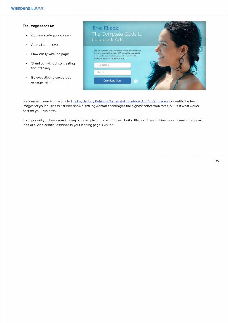
892019 Landing Pages eBook 1
httpslidepdfcomreaderfulllanding-pages-ebook-1 2165
Conclusion
You should now have a solid grounding in landing page mistakes you need to avoid Remember to optimize as best you
can and then keep testing to uncover the top-performing CTArsquos images text value propositions and page formats Never
stop optimizing
wishpond EBOOK
21
892019 Landing Pages eBook 1
httpslidepdfcomreaderfulllanding-pages-ebook-1 2265
wishpond EBOOK
Chapter 3
How to AB
Test yourLandingPage
to MaximizeConversions
892019 Landing Pages eBook 1
httpslidepdfcomreaderfulllanding-pages-ebook-1 2365
Yoursquove created a great landing page and you know the mistakes you need to avoid but do you know how to AB test your
landing page for conversions
AB testing is the basis for optimization in online marketing Ads landing pages websites and marketing emails should all
be tested periodically to ensure your business is getting the best ROI you can
This article will jump headfirst into the world of landing page AB testing and leave you still swimming on the far side Irsquoll
break it down into the main variables you need to be testing show you concrete examples of how that test would look and
give you real-world case studies to show how testing these variables can affect your landing pages
AB Testing Recap
For those of you just dipping your toes into the ocean of AB Testing let me give you a quick breakdown of how it works
AB Testing is a strategy in marketing in which two versions A and B (the control and the treatment) are tested against each
other The goal is to identify changes that increase the chance of what you want to occur to occurr
There are many online AB testing tools (Optimizely and CrazyEgg being the most popular) which allow you to send half
your pagersquos traffic to the original (A) version and half to your new treatment (B) version The test is run until one variation is
clearly more successful (with a 95 confidence level)
ORIGINAL LANDING PAGE EXAMPLE
For the purpose of this article Irsquom going to be testing the example landing page below Because I wonrsquot actually be driving
traffic to this page or any of the tested versions all statistics Irsquoll be quoting will be from reputable case studies Irsquoll add up
the possible increase in conversions in my conclusion (you can play along at home if you like as well)
wishpond EBOOK
23
892019 Landing Pages eBook 1
httpslidepdfcomreaderfulllanding-pages-ebook-1 2465
wishpond EBOOK
24
892019 Landing Pages eBook 1
httpslidepdfcomreaderfulllanding-pages-ebook-1 2565
Not the most exciting thing Irsquove ever seen in my l ife Irsquoll
admit But then again Irsquove seen worse It has all of the
primary lead-generation variables USP subtitle image
and a CTA Letrsquos say itrsquos converting at a rate of 5 (the
low end of average)
AB TESTING THE UNIQUE SELLING PROPOSITION
983080USP983081
The landing pagersquos current headline (ldquomaking business
personalrdquo) is not really a USP so much as a slogan The
difficulty with this is that many brands consider their
slogan to be a part of their business identity - especially ifthey have been running for many years Sidelining can be
emotionally very difficult
Get over it This is business For example letrsquos take
McDonaldrsquos whose slogan ldquoIrsquom lovinrsquo itrdquo is perhaps the
most well-known in the world Their landing pagersquos
current headline ldquoThe menu you love plus so much
morerdquo This is a USP Itrsquos a unique salersquos point built onoffering what people already know and like with the
addition of new and exciting options
Our Variation
Anytime your business becomes more impressive than
another use the power of a comparison value proposition
to encourage conversion
AB TESTING THE IMAGE
The existing image of a professional-looking group is
by no means a bad one But of course you know as
an informed digital marketer that a picture of a smiling
woman has proven to be the most effective for customer
engagement
wishpond EBOOK
25
892019 Landing Pages eBook 1
httpslidepdfcomreaderfulllanding-pages-ebook-1 2665
In fact in 2003 a Harvard student worked with a South
African bank sending 50000 letters offering short term
loans They varied the interest rate as well as included
psychologically-influential cues It turned out that having
a picture of a wholesome happy female in a corner of the
letter had as much positive impact on the response rate
as dropping the interest rate by four percentage points
Our Variation
Your landing pagersquos image is one of the most influential
but frustrating variables we can test Irsquove found that asmiling woman is the most reliable - but that other images
(of groups of people abstract images or inanimate
objects) may increase conversions more based on your
businessrsquo audience
Once yoursquove got a great format and text rotate a few
images through your testing cycle to find which gets the
most response Theyrsquore one of the easiest things to test
but one of the more difficult to anticipate
For more information on AB Testing your image check
out my articles The Psychology Behind a Successful
Facebook Ad Part 2 Images and How to AB Test your
Facebook Ad to Maximize ROI for some best practices
AB TESTING THE CTA
Irsquove written before that your landing page is a dance withthe visitor and your CTA is leading I love this metaphor
If your CTA is too aggressive or demanding itrsquoll step on
your page visitorrsquos toes and theyrsquoll find a new partner
Remember to keep your CTArsquos appealing rather than
demanding Use lsquoyoursquo or lsquomyrsquo lsquofreersquo and lsquogetrsquo Tell people
what they stand to gain not what to do
Here are 5 appealing CTA formulas
1 Start yourmy free [trial period]
2 Get your free [focus of landing page]
wishpond EBOOK
26
892019 Landing Pages eBook 1
httpslidepdfcomreaderfulllanding-pages-ebook-1 2765
3 Increase yourmy [beneficial result of your service
tool] today
4 Learn more today
5 Try [servicetool] for free
Our Variation
I hear different results from using lsquoyourrsquo vs lsquomyrsquo in your
CTAs Some businesses have found the small change of
lsquoStart your free trialrsquo to lsquostart my free trialrsquo increases their
landing page CTR some find the opposite As a result
Irsquom not going to tell you which one will work for your
business Yoursquoll have to test it yourself
AB TESTING THE LIST OF BENEFITS
The list of benefits is something that may not necessarily
increase your pagersquos conversions but nor is it likely to
hurt them We include benefit lists to ensure that if a USP
headline subheader or traffic source (like an ad or social
media link) hasnrsquot already sold your lead they get that
little bit more encouragement they need to convert
Your list of benefits could be anything your service
product or tool offers beyond the USP This list gives
more information that people may need like how your
service works or the steps they need to take to get theresult yoursquove quoted them
Remember to keep your list of benefits short and sexy
Include a maximum of five and draw attention to them
with icons small images or a clear and delineated box
wishpond EBOOK
27
892019 Landing Pages eBook 1
httpslidepdfcomreaderfulllanding-pages-ebook-1 2865
Our Variation
AB TESTING THE TRUST SYMBOLCUSTOMER
TESTIMONIALS
Implementing trust symbols or customer testimonials
pretty much improves landing page conversions across-
the-board Blue Fountain Media found adding the
VeriSign logo to their page increased conversion by 42
and sign-up-form entries by 81
Basically yoursquore telling your landing page visitor that
yoursquore trustworthy that yoursquore not trying to cheat them
out of their hard-earned cash that other people have put
their faith in you before and won out
Unless you have a trust symbol from a seriously influential
and recognizable authority Irsquod recommend you use
customer testimonials over trust symbols Not only do
landing page visitors like to see that you have customers
they also trust them more than they do you Use directquotes from the most well-known brands yoursquove worked
with (as their business profile will increase yours)
Our Variation
wishpond EBOOK
28
892019 Landing Pages eBook 1
httpslidepdfcomreaderfulllanding-pages-ebook-1 2965
AB TESTING THE COLORS
Sometimes itrsquos the smallest details that have the largest effect on your conversions Itrsquos changing the color of your CTA
button from light green to yellow (145 conversion increase) Or contrasting the color of two links within a single image
(60 increase in conversions)
To get an idea of how color can affect your business persona elicit an emotion or encourage an action read The
Psychology Behind a Successful Facebook Ad Part 1 Color Or for the people who ate lunch at their desks todayhellip
Here are the psychological impacts of five main colors
1 Blue Blue is across both genders and all age-
groups most peoplersquos favorite color It is said tocreate the sensation of trust and security Lighter
blues are calming while darker blues denote
professionalism and sincerity
2 Green Associated with wealth as well as
environmental subjects green is the easiest color
for the eye to process Green signifies positive
action (thinkrsquogreen means gorsquo) and affirmation
3 Purple Associated with calm femininity and
wealth purple is the second most popular color
among women at 23 On the other hand purple
is the favorite color of 0 of the male population
4 Red The color red is associated with passion
excitement and urgency Itrsquos a dangerous colorin marketing as many people associate red with
negativity and mistakes However it attracts the
eye better than any other color and gives the
impression that time is passing faster than it is (as
it causes our heart to beat faster) causing us to act
when we otherwise wouldnrsquot
5 Orange Eye-catching bright and sunny orange is
one of the most popular colors for landing page
Calls-to-Action While a good tone and amount
of orange is seen as warm and inviting too much
has been associated with naiveteacute and a lack of
professionalism
wishpond EBOOK
29
892019 Landing Pages eBook 1
httpslidepdfcomreaderfulllanding-pages-ebook-1 3065
Our VariationFinal Edit
wishpond EBOOK
30
892019 Landing Pages eBook 1
httpslidepdfcomreaderfulllanding-pages-ebook-1 3165
What do you think Does your gut say the landing page
wersquove created would convert better than the original
Letrsquos do some quick arithmetic
bull AB Testing the USP Possible conversion rate
increase of 127
bull AB Testing the image Possible conversion
increase of 98
bull AB Testing the CTA Possible conversion rate
increase of 161
bull AB Testing the list of benefits Possible conversion
rate increase of 91
bull AB Testing the trust symbol Possible conversion
rate increase of 72
bull AB Testing the colors Possible conversion rate
increase of 21
Total possible increase in landing page conversions
570
Conclusion
AB Testing works And unless yoursquore going to engage
with a 3rd party provider with tested and proven landing
page templates (which Wishpond will be in a week or
two) you need to be doing it yourself Often
The AB Testing process is continuous - not necessarily
because your landing page isnrsquot optimized but because
it wonrsquot stay optimized And honestly itrsquos very likely
your landing page will never be 100 optimized for
conversions anyway Therersquos always small steps you can
take tiny variables to change that will affect the pagersquosconversion rate
wishpond EBOOK
31
892019 Landing Pages eBook 1
httpslidepdfcomreaderfulllanding-pages-ebook-1 3265
Chapter 4
Landing
PagesHow to Sell your
Product without
Selling your
Product
wishpond EBOOK
892019 Landing Pages eBook 1
httpslidepdfcomreaderfulllanding-pages-ebook-1 3365
Do you get solid traffic to your landing page but struggle
to convert a sale
This article will give you five proven strategies of selling
your product without spamming - of pushing a sale
without pushing your customer over
Landing pages are a delicate balance between promoting
enough to encourage a sale and little enough that the
lead doesnrsquot feel pressure and bounce
Letrsquos take a look at five ways you can sell without selling
1 OFFER BENEFITS NOT FEATURES
This is the most important thing to keep in mind when
writing up the sales points of your business or products
People get sold on how a product or business can solve
their problems not on the details
I admit promoting the benefits is harder than promoting
the features of your product Selling benefits means you
have to identify the problems of your target audience and
come up with how your product or service solves those
problems You have to leave the safety of jargon and
technical details and venture into the real world
To help you understand the difference between features
and benefits here are a few examples
Selling Features
1 The AcmeTikon12 has 300 gigabytes of space
2 Our AcmePad2000 has a 17GHz processor
3 Our AcmeWebToolrsquos templates have over 5000
color options
Selling Benefits
1 The AcmeTikon12 has enough space for 75000
songs
2 Our AcmePad2000 is our fastest than ever making
browsing a cinch
3 We guarantee our AcmeWebToolrsquos templates will
have your businessrsquo brand colors
wishpond EBOOK
33
i
892019 Landing Pages eBook 1
httpslidepdfcomreaderfulllanding-pages-ebook-1 3465
wishpond EBOOK
34
Features still have their place on your landing pages To
safely cover all your bases use your product or servicersquos
features to support the benefits to your target audience
Or translate the sexy-sounding (if somewhat obscure)
feature into a concrete benefit for the consumer like
Wishpond has done below
2 USE CUSTOMER TESTIMONIALS AND REVIEWS
Face it to most visitors to your landing page yoursquore not
exactly a trustworthy source They recognize yoursquore
the slightest bit biased when it comes to this particular
subject (your own product)
So donrsquot sell your own product have someone else do
it for you Since Amazon took over online selling about
20 years ago internet users are increasingly trusting the
word of their peers over any other sources
By the way did you know Amazon accounts for more
online sales than the next 12 competitors combined I
didnrsquot
Needless to say reviews have never been more
important nor have customer testimonials Yes visitors
to your landing pages know that these testimonials come
through your business but it doesnrsquot matter Not only do
customer testimonials function to make your audience
trust your business it gives them the assurance that
someone has engaged with you before - so theyrsquore safe
to do so
Herersquos an example from Wishpondrsquos FacebookSweepstakes App landing page - from our friend Josh
Beaty
i h d OO
892019 Landing Pages eBook 1
httpslidepdfcomreaderfulllanding-pages-ebook-1 3565
For ecommerce businesses test offering product reviews like Amazon does AB test stars or a 5-point system or whatever
creative method of reviewing you can think of Be aware though that the review process also opens up the chance of
negative feedback
Whatever you do donrsquot fake reviews If your products arenrsquot awesome enough to earn more positive reviews than negative
pull the review tool until yoursquove stepped it up
3 MAKE IT BEAUTIFUL
This should be an obvious one but I canrsquot tell you how many times I see an appealing product portrayed in an ugly way Put
time and effort into framing your product in the best possible light AB test a model with your product AB test the gender
of your model AB test the colors behind your model AB test no model but a beautiful abstract collage that resembles a
Kandinsky piece I donrsquot care - just make it pretty
To illustrate my point on the most basic level which one of these do you think will sell better Same sunglasses one with a
white background one with a Johnny Depp background
wishpond EBOOK
35
i h d EBOOK
892019 Landing Pages eBook 1
httpslidepdfcomreaderfulllanding-pages-ebook-1 3665
But making it beautiful isnrsquot just about your
picture
Words can also be beautiful and the words we use canmake our products just as appealing as a great picture A
quick look at the Lexus homepage and yoursquoll know what
Irsquom talking about Head to their lsquoAutomobilesrsquo tab (notice
that Lexus makes lsquoautomobilesrsquo not lsquocarsrsquo) Each class of
automobiles has its own slogan from the ISrsquos lsquoDriving in
Every Sensersquo to the GXrsquos lsquoExpand your Possibilitiesrsquo
Do these slogans have any real relevance to the car
they represent No But do these words create a certain
desirable feeling in their reader Absolutely
Lexus also makes it a point to frame their products in
terms of an ideal customer - a customer their customers
want to be For instance their LX (SUV) lsquoenables you
to venture where few others can while surrounded in
unsurpassed interior comfort and refinementrsquo which
sounds like something I might want to do
Words have a huge impact on us Of course putting your
product in the best possible visual light is vital to making
a sale but donrsquot neglect the importance of the words you
use
5 Phrases that Make your Product Sound Desirable
1 Sleek and sophisticated
2 Pinnacle of artistry
3 Premium technology and unparalleled innovation
4 Reinvention of [relevant field-focused term]
5 Faster newer affordable exclusive
4 MAKE YOUR LANDING PAGE CHILL
I was trying to think of a better word than lsquochillrsquo but I think
itrsquos actually the most accurate Donrsquot be needy Donrsquot be
pushy Let your product or service speak for itself through
clear benefits awesome images and appealing text Sit
back a bit If yoursquore ever feeling like lsquool Gil in the header
image up there remember to chill - your customers will
thank you
Keep a personal touch in all the written parts of your
landing page Test out framing your product or service
in terms of lsquoyoursquo or the idealized customer I referred to
above
wishpond EBOOK
36
i h d EBOOK
892019 Landing Pages eBook 1
httpslidepdfcomreaderfulllanding-pages-ebook-1 3765
Converting should be your visitorrsquos idea not yours They should be sold by the value theyrsquore receiving When creating your
optimized landing page keep in mind the ratio of risk over reward Is what yoursquore offering worth what yoursquore asking from
your customer
CTAs
Remember to keep your CTAs appealing rather than demanding Use lsquoyoursquo or lsquomyrsquo lsquofreersquo and lsquogetrsquo Tell people what they
stand to gain not what to do
Here are 5 appealing CTA formulas
1 Start yourmy free [trial period]
2 Get yourmy free [focus of landing page]
3 Increase yourmy [beneficial result of your servicetool] today
4 Learn more today
5 Try [servicetool] for free
wishpond EBOOK
37
wishpond EBOOK
892019 Landing Pages eBook 1
httpslidepdfcomreaderfulllanding-pages-ebook-1 3865
5 SELL THE DEAL NOT THE PRODUCT
Are you one of those people who finds themselves
buying things they donrsquot need just because itrsquos a great
deal I most definitely am (damn you IKEA) Offers andcontests are my favorite strategy for lead generation and
to encourage a sale (genuinely not just because I work
for a company that builds online promotional tools for
small business)
The right offer is sellable simply as an offer - the product
itself is actually secondary to the deal
The best strategy for using offers is to target well with
a Facebook Ad This way the traffic yoursquore generating
to your landing page is already half-nurtured whether
because of their interests job title relationship status
etc A half-nurtured lead will be better informed of how
good a deal theyrsquore getting making conversion more
likely
Remember however deals work best as value
propositions You need to back up your offer with some
substance
Donrsquot necessarily prioritize the offer over visuals benefits
and an awesome overall product An offer wonrsquot always
work entirely on its own (At least unless your deal is just insane I mean who hasnrsquot brought home bean-bag
chairs to their already fully-furnished tiny apartment
They were buy one get two free)
The best strategy is to use great images sell someone
on the product every benefit every facet of the thing
and then wow them with the fact that this amazing state-
of-the-art life-changing product is only $2999 for thismonth only
wishpond EBOOK
38
892019 Landing Pages eBook 1
httpslidepdfcomreaderfulllanding-pages-ebook-1 3965
wishpond EBOOK
892019 Landing Pages eBook 1
httpslidepdfcomreaderfulllanding-pages-ebook-1 4065
Chapter 5
Landing
PagesOptimizing your Page
for Lead Generation
wishpond EBOOK
wishpond EBOOK
892019 Landing Pages eBook 1
httpslidepdfcomreaderfulllanding-pages-ebook-1 4165
Do you have an awesome landing page Is it optimized
for your lead generation objectives
Email leads are the number one concern for online
marketers You need a landing page that converts has alow bounce rate and engages your consumer enough to
get the lucrative contact
In this article Irsquoll show you how to optimize your landing
page for lead generation by
bull optimizing your SEO
bull focusing on value
bull optimizing your entry form for engagement
bull implementing a customer testimonial campaign
Letrsquos check it out
OPTIMIZE IT FOR SEO
The chief source of most leads is still search Increase
the chance of a lead finding your landing page in the first
place by optimizing it with Googlersquos search algorithm in
mind
Optimize your Landing Pagersquos Title
Your landing pagersquos title is what shows up in the tab This
is different than your page headline USP or what shows
in the URL When creating your page in wordpress or withHTML keep in mind the title best practices
bull Keep it short
bull Keep it keyword-centric
bull Use long-tail format
Whatrsquos long-tail format
Since the Hummingbird update Google is prioritizing the
context of a search as much as it is the keywords Long-
tail is this context-centric search format
Think of asking SIRI lsquoWherersquos the best Thai restaurant
in the arearsquo She scurries off with that information and
comes back with a response that makes sense Google is
designing its search to do the same Instead of lsquoLanding
pages 10 steps to Conversionsrsquo test out calling your
landing page something like lsquoHow to Build a Landing
Page that Convertsrsquo as this is what people will ask of
wishpond EBOOK
41
wishpond EBOOK
892019 Landing Pages eBook 1
httpslidepdfcomreaderfulllanding-pages-ebook-1 4265
Your title is what Googlersquos little algorithm bot sees first
when itrsquos sent off by a web userrsquos search Optimize your
landing pagersquos title and that bot will see you first
Social Share Buttons
If yoursquore basing your landing page around a resource
(like an ebook or a whitepaper) that content is highly
shareable And since Googlersquos hummingbird update
earlier this fall social shares are more valuable than ever
In fact Google+1rsquos are now ranked as more important
than link-building (something traditional SEO gurus are
struggling with to say the least)
Encourage social engagement by promoting your landing
page on Facebook Twitter and especially Google+ And
perhaps most importantly (and simply) throw up a few
social share buttons along the side or at the top of your
landing page This has been quoted as increasing the
virality of a blog post for instance by up to 700
5 More Awesome SEO tips
1 Use different headings tags (like lth1gt and lth4gt)
and bold and italicize keywords the Google search
bot sees these more than it does normal text
2 Optimize your copy with keywords dynamically
and fluidly spread throughout
3 Include an image with alt tags - this lets the search
engine know what your image is about Also will
show up in image search
4 Link to your landing page within your own website
5 Syndicate your landing page as much as possible
with link-building on forums and social media
platforms
For more information about optimizing for SEO check
out my article How to Easily Optimize your Blog for SEO
Many of the takeaways apply for landing pages as well
FOCUS ON VALUE
In order to encourage a lead to engage you need to
convince them itrsquos worth it This means value propositions
wishpond EBOOK
42
wishpond EBOOK
892019 Landing Pages eBook 1
httpslidepdfcomreaderfulllanding-pages-ebook-1 4365
and a great USP It also means you keep your landing
page simple You should be convincing quickly and easily
Ask your page visitor to read too much do too much and
theyrsquoll bounce
Be Specific
One of the main strategies in lead generation is limiting
your landing pagersquos bounce rate to the smallest
percentage you can Realistically yoursquoll be jumping for
joy and screaming from the mountaintops if your pagersquos
conversion rate is over 20
A recently-discovered best practice is that people
respond to specific numbers far more than they do round
numbers For instance quoting your business as having
80000 customers is less believable (and therefore less
powerful for conversions) as quoting your business as
having 75250 customers
Also keep your value propositions simple
bull Make the benefit of your business easy to
understand
bull Use dollar values percentages the word lsquofreersquo
bull Donrsquot use too much page space selling the specifics
of your service or your resource
Benefit List
If yoursquore using an email-gated ebook or other resource
for lead-generation think about your benefit list as the
second point of your argument Your Value Proposition
and image draw their attention and your list of benefits
tell them specifically how they stand to benefit from
entering their information and downloading your
resource
3 Benefit Formulas
1 [Number of things] yoursquoll learn in this ebook
2 How this resource will cause a rsquo [desired result]
3 The [number of steps] to [a certain goal]
OPTIMIZE YOUR ENTRY FORM
Your entry form is the focus of a lead-generating landing
page As far as your lead-generation funnel goes that
entry form CTA is the equivalent of lsquoproceed to check
outrsquo So make sure itrsquos optimized for conversions with
wishpond EBOOK
43
wishpond EBOOK
892019 Landing Pages eBook 1
httpslidepdfcomreaderfulllanding-pages-ebook-1 4465
these easy steps
1 Draw the Eye
You want your entry form to be obvious - donrsquot hideit below-the-fold or with small font Not only will this
increase interaction itrsquoll make it clear to visitors what
yoursquore asking of them Web users like things simple
and clear If they feel therersquos any chance theyrsquore being
swindled theyrsquoll bounce
6 Entry Form Design Tips
1 Encapsulate your entry form within a box
2 Draw attention to your entry form with the br ightly-
colored CTA
3 Use a vertical or horizontal line to separate your
entry form from the rest of the page
4 Include an action-oriented headline above your
form fields (like lsquoget your trial startedrsquo or lsquostart
learning nowrsquo)
5 Contrast the colour of your entry form box with the
page around it
6 AB Test including a short descriptive sentence
describing what happens when they click your CTA
wishpond EBOOK
44
wishpond EBOOK
892019 Landing Pages eBook 1
httpslidepdfcomreaderfulllanding-pages-ebook-1 4565
2 Balance Demographic Collection with Bounce
Rate
Optimizing your entry form is about weighing up the
valuable information yoursquore getting from a lead (detailsyou can use to segment the emailsadvertisements they
receive) versus the amount of form fields it takes to
increase bounce rate
Pro Tip Unless itrsquos absolutely necessary
avoid asking for a phone number People
are far more resistant to giving out phone
numbers than they are of an email or even
an address Spam emails are more accepted
than telemarketing calls during dinner
Letrsquos say yoursquore heavily invested in email marketing and
itrsquos working really well for your business It may be more
important to your business to know the demographic
details of 10 leads than to know nothing about 20 Email
marketing works best if yoursquore able to personalize and
segment your emails However this is entirely up to your
business
One of the benefits of email-gating an ebook or other
resource for lead generation is that you know people who
downloaded it are interested in that content Target them
with similar content in the future
For more information on segmenting your emailmarketing campaigns to get the best ROI possible read
my colleague Kristarsquos article 4 Strategies to Optimize your
Email Segmentation
wishpond EBOOK
45
wishpond EBOOK
892019 Landing Pages eBook 1
httpslidepdfcomreaderfulllanding-pages-ebook-1 4665
CUSTOMER TESTIMONIALS OR TRUST SYMBOLS
Irsquove talked about the value of trust symbols before but I
donrsquot want you to think that just because yoursquore no longer
optimizing for a sale you can forget them
Letrsquos say your page is focused around a free ebook or
white-paper This valuable content is email-gated so
therersquos no real proof (apart from what yoursquore saying) that
what yoursquore promising will be delivered
That is unless you include a customer testimonial like a
quote (I recommend including a picture of the customeras it makes it far more trustworthy) or short video clip If
yoursquore asking for a phone number or email address be
sure to let people know - obviously - that you donrsquot sell
these details or spam them
Customer testimonials act as a social endorsement
which have grown in importance in the past few years
This is because since Amazon Yelp and other sites
made customer reviews such a huge part of a successful
product your service needs to do the same
Pro Tip Many businesses have found
their highest conversion rates come from
a landing page built around a photogenic
customerrsquos testimonial Incorporate
an awesome case study for the value
proposition with a large picture and a clear
benefit list of how your page visitor can getthe same result
wishpond EBOOK
46
wishpond EBOOK
892019 Landing Pages eBook 1
httpslidepdfcomreaderfulllanding-pages-ebook-1 4765
Conclusion
Hopefully you now have a better idea of how to optimize your landing page for lead generation Be sure to prioritize your
entry form communicate simply and accurately and use a customer testimonial to convince your possible lead to convert
wishpond EBOOK
47
wishpond EBOOK
892019 Landing Pages eBook 1
httpslidepdfcomreaderfulllanding-pages-ebook-1 4865
Chapter 6
Landing
PagesThe Science
Behind Designing
for Conversion
p
wishpond EBOOK
892019 Landing Pages eBook 1
httpslidepdfcomreaderfulllanding-pages-ebook-1 4965
Is your landing page converting well Is it converting
badly Do you know why I mean do you really know
This article will give you the science and psychology
of why your landing is engaging to visitors or why youmight be getting traffic - but no conversions
Irsquoll take a look at 5 principles of landing
page design that can mean the difference
between a successful page and one thatrsquos
just taking up space (or fumbling around in
the dark)
Letrsquos get started
1 DIRECTIONAL CUES
Directional Cues are key in landing page design as they
tell people what to focus on
The most important thing to remember when designingyour landing page is that people do not view it like they
do a book Itrsquos not left to right top to bottom You have to
tell people how to read your page and directional cues
(as well as encapsulation and contrast below) are how
you do this
My recommendation is to decide two things on your
landing page that you especially want to drive attention
to (say your CTA and your product image or maybe aUSP) Then integrate a couple of the strategies below
into your design and AB test it Maybe your audience
responds well to the overt arrow or maybe the more
subtle eye-gaze Test it for yourself
Therersquos three main ways that we signal a focus point in
landing pages
Arrows and lines
p
49
wishpond EBOOK
892019 Landing Pages eBook 1
httpslidepdfcomreaderfulllanding-pages-ebook-1 5065
The most straightforward way to direct attention at an object or heading is to draw an arrow or line to it Students of art
will know the importance of lines as humans have a natural (subconscious) impulse to follow them to their origin or their
destination This works great to focus peoplersquos gaze on your CTA USP value proposition or product image
Eye-direction
Humans are incredibly good at recognizing the eye-focus point of the people around them I recommend using an eye-
tracking software on your landing page to determine where people are focusing and whether this focus is resulting in an
increased click-through-rate
What Irsquom talking about (thanks to Neil Patel
for the eye-tracking examples)
The red spots indicate the areas which
viewers looked at most Take note of how
the eye direction in the example on the left
draws the viewer`s attention towards the
product
p
50
wishpond EBOOK
892019 Landing Pages eBook 1
httpslidepdfcomreaderfulllanding-pages-ebook-1 5165
Faces are the most eye-attracting image you can use (see
5 below) and the eyes are the most eye-attracting part
of the face
Yoursquoll notice the woman on the left is looking directly atthe camera (or visitor to your page) The woman on the
right is looking at the product that Sunsilk is trying to sell
You can see in concrete terms how the initial gaze goes
to the womanrsquos eyes and then tracks left to the product
whereas the face on the left gets all the attention and the
product none
PointingGesturing
I highly recommend you use an image of a person in your
landing page as itrsquos proven to be the most engaging
picture (more on that later though) Something to test
however is having that model gesturing or pointing
towards something you want to focus attention on
This is a dangerous one though as (in my mind) it can
come across as cheesy if done incorrectly Test what your
audience responds to Irsquove seen this both increase and
decrease conversion rates in many case studies
2 CONTRAST
Color contrast
Contrast is essential when working with landing pagesThe human eye is naturally attracted to contrasting color
I recommend you consider color contrast for your USP
and CTA - perhaps an orange CTA button on a dark blue
background
Blank space
The idea of blank space is well-known in the graphic
design world and no less a vital part of landing page
design The idea is that blank space is extremely
influential in focusing attention on non-blank space For
instance
p
51
wishpond EBOOK
892019 Landing Pages eBook 1
httpslidepdfcomreaderfulllanding-pages-ebook-1 5265
Another way of utilizing blank space is with
encapsulation This can be done by framing a section
of content with a border or a container (filled in with
a background color) Give the encapsulated section
enough space to allow it to function somewhatindependently of the rest of the composition
Will this work better than a directional cue Test it for
yourself and find out
Format contrast
Formatting size (of font for instance) also attracts the eyeIn a 4-week multivariate test in 2010 Paras Chopra tested
the performance of 12 different combinations of a Call-to-
Action and descriptive link
Option 10 with the largest contrast in color hue and size
(as well as the word Free) generated a 60 improvement
in conversion rate
3 COLOR
Color is extremely (though unconsciously) effective
at eliciting emotion in viewers I took an in-depth
look at color psychology in my series on the science
behind a successful Facebook Ad so check it out for a
comprehensive analysis (with science)
For now herersquos a breakdown of how humans areinfluenced by color - and how this knowledge can
improve your conversion rates
Blue Blue is across both genders and all age-groups
most peoplersquos favorite color (35 of women and 57
of men) It is said to create the sensation of trust and
security Lighter blues are calming while darker blues
denote professionalism and sincerity
Orange Eye-catching bright and sunny orange is one of
the most popular colors for landing page Calls-to-Action
While a good tone and amount of orange is seen as warm
and inviting too much has been associated with naivete
52
wishpond EBOOK
892019 Landing Pages eBook 1
httpslidepdfcomreaderfulllanding-pages-ebook-1 5365
and a lack of professionalism
Red The color red is associated with passion excitement
and urgency Itrsquos a dangerous color in advertising as
many people associate red with negativity and mistakesHowever it attracts the eye better than any other color
and gives the impression that time is passing faster than
it is (as it causes our heart to beat faster) causing us to act
when we otherwise wouldnrsquot
Green Associated with wealth as well as environmental
subjects green is the easiest color for the eye to process
Green also signifies positive action (thinkrsquogreen meansgorsquo) and affirmation
Green and teal have also been associated with shoppers
on a budget Itrsquos also the second and third most popular
color among men and women respectively
Purple Associated with calm femininity and wealth
purple is the second most popular color among women
at 23 Interestingly as women get older their liking for
the color purple increases On the other hand purple is
the favorite color of 0 of the male population
Black Powerful sleek and intellectual black signifies
permanence sincerity and sophistication While black
can like red and orange be a dangerous color if used
too much it can communicate professionalism and
sophistication when used in conjunction with a strong
clear white (avoid greys or tans as theyrsquoll wash out yourmessage)
4 IMAGERY
I could discuss the effectiveness of a picture of a smiling
person on your landing page for hours (and I havehellip) but
just trust me that having an image (especially a person)
will likely improve your conversion rates
Something Irsquove seen recently actually is incorporating a
customer testimonial with the main landing page image
Choose a photogenic customer and post it up next to an
awesome-sounding affirmation of how your product or
service made their lives easier
But letrsquos leave that for the moment assuming you
recognize its importance and talk about why it works
bull We respond far more emotionally to people (or pets
though people generally elicit a stronger response)
than we do to words or random images
53
wishpond EBOOK
892019 Landing Pages eBook 1
httpslidepdfcomreaderfulllanding-pages-ebook-1 5465
bull A picture of a person provides subtext to your
landing page - a story which people respond to
bull We completely subconsciously focus on the faces
of people we see (especially the eyes) In everyeye-tracking image Irsquove ever seen the hottest
points are the face and eyes Unless of course
the image is of a woman and wersquore talking about a
male demographic Then the eye-tracking software
shows our attention to behellip elsewhere
In my research for this article I came across an article by
VS Ramachandran (a neuroscientist from Oxford) whowrote that oftentimes a line drawing is more powerful
than a photograph He writes that this is because the
lsquoidearsquo of a person is more appealing than the truth of it
(why so much of art is exaggeration of the human form or
why caricatures are so aesthetically pleasing) Leave out
the details and all yoursquore left is the essence of a thing
Although I havenrsquot yet seen an example of this in a
landing page or incorporated it into my own I believe
that whoever does will see a dramatic increase in click-
throughs Get creative and let me know how it goes
5 TYPOGRAPHY AND STYLE
Yoursquoll think that Irsquom getting too detailed here that
different typographies text formats or styles canrsquot actually
increase or decrease conversion rates enough to matter
Herersquos the thing with AB testing details do matter
Letrsquos say your Ecommerce sitersquos landing page is currently
converting at 23 Yoursquore seeing traffic of around 2000
visitors per week and their average purchase is worth
50 dollars to your business Yoursquore making $23000 per
week
Letrsquos say we change your pagersquos headline length and
change the image from one of a woman looking at
the camera to one looking at the CTA (small changes
yoursquod agree) You see a conversion rate increase of
10 Suddenly yoursquore converting at 253 and yoursquove
increased your weekly income to $25300 Yearly
revenue increase $27600
Typography and style changes to AB test
bull Font size for headings and body copy (and the
difference between them)
54
wishpond EBOOK
892019 Landing Pages eBook 1
httpslidepdfcomreaderfulllanding-pages-ebook-1 5565
bull Heading length (short and succinct vs long and
detailed)
bull Number of different font sizes (too many makes
your landing page confusing - I recommend two orthree)
bull Fonts Keep in mind that different fonts are for
whatever reason viewed as more amateurish than
others We at Wishpond like San Sarif for headlines
and Sarif for body copy Avoid cursive (except
maybe for a header) and comic sans is a no-no for a
professional business
bull More text vs less (I like a simple landing page - get
to the point and leave any extraneous information
for later emails or different tabs But test this for
yourself)
Conclusion
Hopefully you now understand a little more of the
science and psychology behind landing page design best
practices Remember to provide visual clues for whereyou want your visitor to focus Donrsquot forget the details
like typography or eye-direction
And keep testing You can always improve your landing
page conversion rates Trust me
55
wishpond EBOOK
892019 Landing Pages eBook 1
httpslidepdfcomreaderfulllanding-pages-ebook-1 5665
Chapter 7
3 Landing
PageExamplesCritiqued to Hell and
Back
wishpond EBOOK
892019 Landing Pages eBook 1
httpslidepdfcomreaderfulllanding-pages-ebook-1 5765
Howrsquos your landing page doing Is it optimized for
conversions Optimized for lead generation
How about we check out a few pages from around
the web In this article Irsquoll dissect four landing pagesvariable by variable discussing where theyrsquove done it
right and where therersquos room for improvement
Itrsquos all well and good for me to tell you a picture is an
essential part of your landing page but until you see
(pardon the pun) what Irsquom talking about itrsquos just that
talk
So letrsquos do this thing
1 SALESFORCE
Salesforce (for those somehow unfamiliar) is a
Customer Relationship Management (CRM) business
based out of San Fran
Herersquos their current landing page raquo
57
wishpond EBOOK
892019 Landing Pages eBook 1
httpslidepdfcomreaderfulllanding-pages-ebook-1 5865
What I Like About this Page
bull The imagery The first thing that hits you when you
traffic to SalesForcersquos landing page is the visual
representation of what they do Though by nomeans unique the visuals of lsquoconnect everything
with our awesome appsrsquo is clear
bull The image size I like how prominent their visuals
are About 75 of their lsquoabove the foldrsquo landing
page area is taken up by this image
bull The prioritized pages What I mean by this is simple
the three blue buttons on the right side (and also
beneath the benefit list paragraph) will traffic to
equally-optimized landing pages The tabs in gray
at the top are quite clearly subordinate (I know
this because of their color contrast encapsulation
etc) and traffic on them will be substantially less I
like the emphasis being placed on the things most
important to their leads
bull The Value Proposition Salesforce has gone
with two value propositions over a USP for their
header I like the succinct and appealing ldquoConnect
everythingrdquo especially
bull The benefit list Though not in bullet-point form
the below-the-fold paragraph of USPrsquos and value
propositions is still effective lsquoBuild customer loyaltyrsquo
(Boom) lsquoIncrease first call resolution and agent
productivityrsquo (Boom) lsquoImprove customer satisfactionby 37rsquo (Boom)
bull The specificity Perhaps my favorite part of this
entire landing is the sentence lsquoimprove customer
satisfaction by 37rsquo This kind of statistic is
incredibly convincing as itrsquos low enough and
specific enough to be entirely believable It also
shows me that theyrsquore professional enough to havedone their research and (I trust) can back up this
statistic with proof
Where I Think they Could Optimize this Page
bull Contrast the imagery I like the use of multiple
images on landing pages (one primary above-the-
fold and one secondary below it) However to
maximize the appeal of your images I recommend
you make them distinct from each other These two
images accomplish the same visual representation
I mentioned above How about keeping the same
image at the top and changing the below-the-fold
58
wishpond EBOOK
892019 Landing Pages eBook 1
httpslidepdfcomreaderfulllanding-pages-ebook-1 5965
59
image to a satisfied customer instead
bull Customer testimonials Perhaps SalesForce is relying on their substantial reputation as the worldrsquos CRM leader but
Irsquod still recommend they included a picture (and quote) from one of their prominent clients This is a businesses that
regularly works with Facebook General Electric and Delta Airlines Irsquod recommend testing a quote and image fromone of these businesses with the brand namelogo prominently placed
AB Testing Postulation
Irsquod theorize that integrating a customer testimonial with an image into a revolving album below-the-fold (on the right) could
increase conversion rates on this page by 10
2 MAILCHIMP
Mailchimp is the most successful email automation company out there (with more than 5 million users)
View their landing page on the next page
wishpond EBOOK
892019 Landing Pages eBook 1
httpslidepdfcomreaderfulllanding-pages-ebook-1 6065
60
wishpond EBOOK
892019 Landing Pages eBook 1
httpslidepdfcomreaderfulllanding-pages-ebook-1 6165
61
What I Like About this Page
bull The tagline ldquoSend Better Emailrdquo is one of the
simplest and most straightforward of all successful
landing pages Irsquove seen Itrsquos to the point andeffective Mailchimp has also had this tagline since
mid June of 2013 meaning itrsquos working for them
bull The USP ldquoMore than 5 million people use
MailChimphelliprdquo is about as unique as you can get
Peer endorsement is the most powerful USP you
can bring into play
bull The Image Red on a blue background stands out
fantastically and attracts the eye - I also the giving
a snapshot of their tool giving people a glimpse at
what they have to offer
bull The CTA(s) Although not as noticeable as ldquoSign
up Freerdquo (which consistently performs better than
simply ldquoSign Uprdquo) I really like ldquoJoin them todayrdquo in
the small paragraph beneath the tagline This is as
much as CTA as the buttons are and plays to the
peer pressure effectiveness of the page
Where I Think they Could Optimize this Page
bull The color scheme Irsquod be interested to see the
effect of a dark blue background and white taglines
benefits As it stands now the page is somewhatboring
bull The toolbar at the top Such a simple and minimalist
landing page needs to accentuate their ldquoFeaturesrdquo
ldquoPricesrdquo and ldquoSupportrdquo buttons at the top to make
it easy to access these important parts of the
decision-making process
bull The CTA(s) While I like the language used Irsquod be
curious to see the effect of making the CTAs stand
out a bit more with a contrasting color to draw the
eye
bull Irsquod test a customer testimonial rotation Mentioning
the 5 million people who use Mailchimp is all
well and good but Irsquod recommend rotating in a
photogenic former customer with a quote on the
effect that Mailchimp had on their businessrsquo email
marketing ROI
wishpond EBOOK
892019 Landing Pages eBook 1
httpslidepdfcomreaderfulllanding-pages-ebook-1 6265
62
AB Testing Postulation
Irsquod theorize that a customer testimonial addition could increase conversions on this page by up to 10 A concrete number
or percentage taken from a case study would make the page more effective
3 KISSMETRICS
Customer analytics platform
Kissmetrics is entrepreneur Neil
Patelrsquos 2008 baby
Herersquos their current landing page raquo
wishpond EBOOK
892019 Landing Pages eBook 1
httpslidepdfcomreaderfulllanding-pages-ebook-1 6365
63
What I Like About this Page
bull The image If yoursquore unsure exactly what image
you should use for your landing page fall back
on something like this A smiling normal-lookingperson (photogenic but not a model) is your best
bet
bull The simplicity Yes this is the entire landing page
Nothing but lsquoabove-the-foldrsquo It relies entirely on the
USP which is incredibly effective
bull Knowing their market Customer analytics are a field
only interesting to people who know what Google
Analytics is Nobody starts with Kissmetrics and
moves to Google Analytics As such the USP is
incredibly effective
bull Logging in with a Google account Irsquove mentioned
before how an email address is worth so much
more to your business than it is to its owner (and
how a phone number is so much more of an ask)
Well a social platform login is worth even less to
its owner - this allows Kissmetrics to ask for less
from a lead and get exactly the same details (if not
more) than they would were they to ask for an email
address
bull The popup The bottom-right popup (which reads
lsquowhatrsquos preventing you from wanting to start a
free trial of Kissmetricsrsquo) does not appear forevery person that traffics to this landing page
This would mediate the drop in conversion rates
that this popup likely causes However this popup
also provides Kissmetrics with extremely valuable
information namely what they can do to encourage
a sign-up Trading a little conversion rate (especially
if you do this temporarily) can be worth more
information This is a similar trade Irsquove talked aboutbefore where more entry boxes give you better
lead knowledge but can decrease conversion rates
- something you have to balance
Check out my article lsquoValue Proposition Formulas that
Boost Conversion on Ads and Landing Pagesrsquo where I
take an in-depth look at how to use Kissmetricrsquos formula
and 6 others
Where I Think they Could Optimize this Page
bull The Image Okay I really like this image but Irsquod be
curious to see how a landing page with a revolving
wishpond EBOOK
892019 Landing Pages eBook 1
httpslidepdfcomreaderfulllanding-pages-ebook-1 6465
64
album would do How about three different USP
value proposition + image combinations revolving
every 75 seconds (Genuinely I recommend you
test the time lapse you use if you employ revolving
images)
bull Learn More The ldquoLearn Morerdquo link in the bottom
left of this landing page is too quiet Irsquod recommend
a subtle encapsulation and slightly larger font I
think this landing page is incredibly effective but
clearly the issue theyrsquoll have is not offering enough
information about what they do A ldquoLearn Morerdquo
link is an awesome way of doing this but itrsquos notobvious enough for everyone to see and I wonder if
that doesnrsquot increase their bounce rate
bull A Case Studies Tab I donrsquot want to ruin the
contemporary minimalist appeal of this landing
page but I would be interested in testing a lsquocase
studiesrsquo or lsquocustomer storiesrsquo tab next to lsquoSign Inrsquo on
the top bar Like the lsquoLearn Morersquo link this would
make it a little easier for visitors to find the answers
to their questions without cluttering the page with
the customer testimonials benefit list and trust
symbols I usually recommend
AB Testing Postulation
Irsquod theorize that making the lsquoLearn Morersquo link on the
bottom right just slightly more obvious would increase
conversions from this page Herersquos why If someone typesin lsquocustomer analyticsrsquo into Google search theyrsquoll click on
Kissmetrics Irsquod be concerned that at the moment they
may bounce due to lack of ready information A more
visible lsquoLearn Morersquo link could increase conversion by up
to 5
Conclusion
The variables Irsquove discussed and critiqued in this article
encompass most of the optimization strategies I give
our clients Remember that every audience is different
and that (unless yoursquore using an optimized landing page
template) yoursquoll need to AB test your own landing pages
on a monthly basis
wishpond EBOOK
892019 Landing Pages eBook 1
httpslidepdfcomreaderfulllanding-pages-ebook-1 6565
Creating and optimizing your businessrsquo landing pages can be the most influential change you make this year
Wishpondrsquos own landing pages are being constantly updated and optimized - our templates completely customizable Start
a free trial today to check them out and see if wersquore a fit for your business
Thanks for reading
892019 Landing Pages eBook 1
httpslidepdfcomreaderfulllanding-pages-ebook-1 2265
wishpond EBOOK
Chapter 3
How to AB
Test yourLandingPage
to MaximizeConversions
892019 Landing Pages eBook 1
httpslidepdfcomreaderfulllanding-pages-ebook-1 2365
Yoursquove created a great landing page and you know the mistakes you need to avoid but do you know how to AB test your
landing page for conversions
AB testing is the basis for optimization in online marketing Ads landing pages websites and marketing emails should all
be tested periodically to ensure your business is getting the best ROI you can
This article will jump headfirst into the world of landing page AB testing and leave you still swimming on the far side Irsquoll
break it down into the main variables you need to be testing show you concrete examples of how that test would look and
give you real-world case studies to show how testing these variables can affect your landing pages
AB Testing Recap
For those of you just dipping your toes into the ocean of AB Testing let me give you a quick breakdown of how it works
AB Testing is a strategy in marketing in which two versions A and B (the control and the treatment) are tested against each
other The goal is to identify changes that increase the chance of what you want to occur to occurr
There are many online AB testing tools (Optimizely and CrazyEgg being the most popular) which allow you to send half
your pagersquos traffic to the original (A) version and half to your new treatment (B) version The test is run until one variation is
clearly more successful (with a 95 confidence level)
ORIGINAL LANDING PAGE EXAMPLE
For the purpose of this article Irsquom going to be testing the example landing page below Because I wonrsquot actually be driving
traffic to this page or any of the tested versions all statistics Irsquoll be quoting will be from reputable case studies Irsquoll add up
the possible increase in conversions in my conclusion (you can play along at home if you like as well)
wishpond EBOOK
23
892019 Landing Pages eBook 1
httpslidepdfcomreaderfulllanding-pages-ebook-1 2465
wishpond EBOOK
24
892019 Landing Pages eBook 1
httpslidepdfcomreaderfulllanding-pages-ebook-1 2565
Not the most exciting thing Irsquove ever seen in my l ife Irsquoll
admit But then again Irsquove seen worse It has all of the
primary lead-generation variables USP subtitle image
and a CTA Letrsquos say itrsquos converting at a rate of 5 (the
low end of average)
AB TESTING THE UNIQUE SELLING PROPOSITION
983080USP983081
The landing pagersquos current headline (ldquomaking business
personalrdquo) is not really a USP so much as a slogan The
difficulty with this is that many brands consider their
slogan to be a part of their business identity - especially ifthey have been running for many years Sidelining can be
emotionally very difficult
Get over it This is business For example letrsquos take
McDonaldrsquos whose slogan ldquoIrsquom lovinrsquo itrdquo is perhaps the
most well-known in the world Their landing pagersquos
current headline ldquoThe menu you love plus so much
morerdquo This is a USP Itrsquos a unique salersquos point built onoffering what people already know and like with the
addition of new and exciting options
Our Variation
Anytime your business becomes more impressive than
another use the power of a comparison value proposition
to encourage conversion
AB TESTING THE IMAGE
The existing image of a professional-looking group is
by no means a bad one But of course you know as
an informed digital marketer that a picture of a smiling
woman has proven to be the most effective for customer
engagement
wishpond EBOOK
25
892019 Landing Pages eBook 1
httpslidepdfcomreaderfulllanding-pages-ebook-1 2665
In fact in 2003 a Harvard student worked with a South
African bank sending 50000 letters offering short term
loans They varied the interest rate as well as included
psychologically-influential cues It turned out that having
a picture of a wholesome happy female in a corner of the
letter had as much positive impact on the response rate
as dropping the interest rate by four percentage points
Our Variation
Your landing pagersquos image is one of the most influential
but frustrating variables we can test Irsquove found that asmiling woman is the most reliable - but that other images
(of groups of people abstract images or inanimate
objects) may increase conversions more based on your
businessrsquo audience
Once yoursquove got a great format and text rotate a few
images through your testing cycle to find which gets the
most response Theyrsquore one of the easiest things to test
but one of the more difficult to anticipate
For more information on AB Testing your image check
out my articles The Psychology Behind a Successful
Facebook Ad Part 2 Images and How to AB Test your
Facebook Ad to Maximize ROI for some best practices
AB TESTING THE CTA
Irsquove written before that your landing page is a dance withthe visitor and your CTA is leading I love this metaphor
If your CTA is too aggressive or demanding itrsquoll step on
your page visitorrsquos toes and theyrsquoll find a new partner
Remember to keep your CTArsquos appealing rather than
demanding Use lsquoyoursquo or lsquomyrsquo lsquofreersquo and lsquogetrsquo Tell people
what they stand to gain not what to do
Here are 5 appealing CTA formulas
1 Start yourmy free [trial period]
2 Get your free [focus of landing page]
wishpond EBOOK
26
892019 Landing Pages eBook 1
httpslidepdfcomreaderfulllanding-pages-ebook-1 2765
3 Increase yourmy [beneficial result of your service
tool] today
4 Learn more today
5 Try [servicetool] for free
Our Variation
I hear different results from using lsquoyourrsquo vs lsquomyrsquo in your
CTAs Some businesses have found the small change of
lsquoStart your free trialrsquo to lsquostart my free trialrsquo increases their
landing page CTR some find the opposite As a result
Irsquom not going to tell you which one will work for your
business Yoursquoll have to test it yourself
AB TESTING THE LIST OF BENEFITS
The list of benefits is something that may not necessarily
increase your pagersquos conversions but nor is it likely to
hurt them We include benefit lists to ensure that if a USP
headline subheader or traffic source (like an ad or social
media link) hasnrsquot already sold your lead they get that
little bit more encouragement they need to convert
Your list of benefits could be anything your service
product or tool offers beyond the USP This list gives
more information that people may need like how your
service works or the steps they need to take to get theresult yoursquove quoted them
Remember to keep your list of benefits short and sexy
Include a maximum of five and draw attention to them
with icons small images or a clear and delineated box
wishpond EBOOK
27
892019 Landing Pages eBook 1
httpslidepdfcomreaderfulllanding-pages-ebook-1 2865
Our Variation
AB TESTING THE TRUST SYMBOLCUSTOMER
TESTIMONIALS
Implementing trust symbols or customer testimonials
pretty much improves landing page conversions across-
the-board Blue Fountain Media found adding the
VeriSign logo to their page increased conversion by 42
and sign-up-form entries by 81
Basically yoursquore telling your landing page visitor that
yoursquore trustworthy that yoursquore not trying to cheat them
out of their hard-earned cash that other people have put
their faith in you before and won out
Unless you have a trust symbol from a seriously influential
and recognizable authority Irsquod recommend you use
customer testimonials over trust symbols Not only do
landing page visitors like to see that you have customers
they also trust them more than they do you Use directquotes from the most well-known brands yoursquove worked
with (as their business profile will increase yours)
Our Variation
wishpond EBOOK
28
892019 Landing Pages eBook 1
httpslidepdfcomreaderfulllanding-pages-ebook-1 2965
AB TESTING THE COLORS
Sometimes itrsquos the smallest details that have the largest effect on your conversions Itrsquos changing the color of your CTA
button from light green to yellow (145 conversion increase) Or contrasting the color of two links within a single image
(60 increase in conversions)
To get an idea of how color can affect your business persona elicit an emotion or encourage an action read The
Psychology Behind a Successful Facebook Ad Part 1 Color Or for the people who ate lunch at their desks todayhellip
Here are the psychological impacts of five main colors
1 Blue Blue is across both genders and all age-
groups most peoplersquos favorite color It is said tocreate the sensation of trust and security Lighter
blues are calming while darker blues denote
professionalism and sincerity
2 Green Associated with wealth as well as
environmental subjects green is the easiest color
for the eye to process Green signifies positive
action (thinkrsquogreen means gorsquo) and affirmation
3 Purple Associated with calm femininity and
wealth purple is the second most popular color
among women at 23 On the other hand purple
is the favorite color of 0 of the male population
4 Red The color red is associated with passion
excitement and urgency Itrsquos a dangerous colorin marketing as many people associate red with
negativity and mistakes However it attracts the
eye better than any other color and gives the
impression that time is passing faster than it is (as
it causes our heart to beat faster) causing us to act
when we otherwise wouldnrsquot
5 Orange Eye-catching bright and sunny orange is
one of the most popular colors for landing page
Calls-to-Action While a good tone and amount
of orange is seen as warm and inviting too much
has been associated with naiveteacute and a lack of
professionalism
wishpond EBOOK
29
892019 Landing Pages eBook 1
httpslidepdfcomreaderfulllanding-pages-ebook-1 3065
Our VariationFinal Edit
wishpond EBOOK
30
892019 Landing Pages eBook 1
httpslidepdfcomreaderfulllanding-pages-ebook-1 3165
What do you think Does your gut say the landing page
wersquove created would convert better than the original
Letrsquos do some quick arithmetic
bull AB Testing the USP Possible conversion rate
increase of 127
bull AB Testing the image Possible conversion
increase of 98
bull AB Testing the CTA Possible conversion rate
increase of 161
bull AB Testing the list of benefits Possible conversion
rate increase of 91
bull AB Testing the trust symbol Possible conversion
rate increase of 72
bull AB Testing the colors Possible conversion rate
increase of 21
Total possible increase in landing page conversions
570
Conclusion
AB Testing works And unless yoursquore going to engage
with a 3rd party provider with tested and proven landing
page templates (which Wishpond will be in a week or
two) you need to be doing it yourself Often
The AB Testing process is continuous - not necessarily
because your landing page isnrsquot optimized but because
it wonrsquot stay optimized And honestly itrsquos very likely
your landing page will never be 100 optimized for
conversions anyway Therersquos always small steps you can
take tiny variables to change that will affect the pagersquosconversion rate
wishpond EBOOK
31
892019 Landing Pages eBook 1
httpslidepdfcomreaderfulllanding-pages-ebook-1 3265
Chapter 4
Landing
PagesHow to Sell your
Product without
Selling your
Product
wishpond EBOOK
892019 Landing Pages eBook 1
httpslidepdfcomreaderfulllanding-pages-ebook-1 3365
Do you get solid traffic to your landing page but struggle
to convert a sale
This article will give you five proven strategies of selling
your product without spamming - of pushing a sale
without pushing your customer over
Landing pages are a delicate balance between promoting
enough to encourage a sale and little enough that the
lead doesnrsquot feel pressure and bounce
Letrsquos take a look at five ways you can sell without selling
1 OFFER BENEFITS NOT FEATURES
This is the most important thing to keep in mind when
writing up the sales points of your business or products
People get sold on how a product or business can solve
their problems not on the details
I admit promoting the benefits is harder than promoting
the features of your product Selling benefits means you
have to identify the problems of your target audience and
come up with how your product or service solves those
problems You have to leave the safety of jargon and
technical details and venture into the real world
To help you understand the difference between features
and benefits here are a few examples
Selling Features
1 The AcmeTikon12 has 300 gigabytes of space
2 Our AcmePad2000 has a 17GHz processor
3 Our AcmeWebToolrsquos templates have over 5000
color options
Selling Benefits
1 The AcmeTikon12 has enough space for 75000
songs
2 Our AcmePad2000 is our fastest than ever making
browsing a cinch
3 We guarantee our AcmeWebToolrsquos templates will
have your businessrsquo brand colors
wishpond EBOOK
33
i
892019 Landing Pages eBook 1
httpslidepdfcomreaderfulllanding-pages-ebook-1 3465
wishpond EBOOK
34
Features still have their place on your landing pages To
safely cover all your bases use your product or servicersquos
features to support the benefits to your target audience
Or translate the sexy-sounding (if somewhat obscure)
feature into a concrete benefit for the consumer like
Wishpond has done below
2 USE CUSTOMER TESTIMONIALS AND REVIEWS
Face it to most visitors to your landing page yoursquore not
exactly a trustworthy source They recognize yoursquore
the slightest bit biased when it comes to this particular
subject (your own product)
So donrsquot sell your own product have someone else do
it for you Since Amazon took over online selling about
20 years ago internet users are increasingly trusting the
word of their peers over any other sources
By the way did you know Amazon accounts for more
online sales than the next 12 competitors combined I
didnrsquot
Needless to say reviews have never been more
important nor have customer testimonials Yes visitors
to your landing pages know that these testimonials come
through your business but it doesnrsquot matter Not only do
customer testimonials function to make your audience
trust your business it gives them the assurance that
someone has engaged with you before - so theyrsquore safe
to do so
Herersquos an example from Wishpondrsquos FacebookSweepstakes App landing page - from our friend Josh
Beaty
i h d OO
892019 Landing Pages eBook 1
httpslidepdfcomreaderfulllanding-pages-ebook-1 3565
For ecommerce businesses test offering product reviews like Amazon does AB test stars or a 5-point system or whatever
creative method of reviewing you can think of Be aware though that the review process also opens up the chance of
negative feedback
Whatever you do donrsquot fake reviews If your products arenrsquot awesome enough to earn more positive reviews than negative
pull the review tool until yoursquove stepped it up
3 MAKE IT BEAUTIFUL
This should be an obvious one but I canrsquot tell you how many times I see an appealing product portrayed in an ugly way Put
time and effort into framing your product in the best possible light AB test a model with your product AB test the gender
of your model AB test the colors behind your model AB test no model but a beautiful abstract collage that resembles a
Kandinsky piece I donrsquot care - just make it pretty
To illustrate my point on the most basic level which one of these do you think will sell better Same sunglasses one with a
white background one with a Johnny Depp background
wishpond EBOOK
35
i h d EBOOK
892019 Landing Pages eBook 1
httpslidepdfcomreaderfulllanding-pages-ebook-1 3665
But making it beautiful isnrsquot just about your
picture
Words can also be beautiful and the words we use canmake our products just as appealing as a great picture A
quick look at the Lexus homepage and yoursquoll know what
Irsquom talking about Head to their lsquoAutomobilesrsquo tab (notice
that Lexus makes lsquoautomobilesrsquo not lsquocarsrsquo) Each class of
automobiles has its own slogan from the ISrsquos lsquoDriving in
Every Sensersquo to the GXrsquos lsquoExpand your Possibilitiesrsquo
Do these slogans have any real relevance to the car
they represent No But do these words create a certain
desirable feeling in their reader Absolutely
Lexus also makes it a point to frame their products in
terms of an ideal customer - a customer their customers
want to be For instance their LX (SUV) lsquoenables you
to venture where few others can while surrounded in
unsurpassed interior comfort and refinementrsquo which
sounds like something I might want to do
Words have a huge impact on us Of course putting your
product in the best possible visual light is vital to making
a sale but donrsquot neglect the importance of the words you
use
5 Phrases that Make your Product Sound Desirable
1 Sleek and sophisticated
2 Pinnacle of artistry
3 Premium technology and unparalleled innovation
4 Reinvention of [relevant field-focused term]
5 Faster newer affordable exclusive
4 MAKE YOUR LANDING PAGE CHILL
I was trying to think of a better word than lsquochillrsquo but I think
itrsquos actually the most accurate Donrsquot be needy Donrsquot be
pushy Let your product or service speak for itself through
clear benefits awesome images and appealing text Sit
back a bit If yoursquore ever feeling like lsquool Gil in the header
image up there remember to chill - your customers will
thank you
Keep a personal touch in all the written parts of your
landing page Test out framing your product or service
in terms of lsquoyoursquo or the idealized customer I referred to
above
wishpond EBOOK
36
i h d EBOOK
892019 Landing Pages eBook 1
httpslidepdfcomreaderfulllanding-pages-ebook-1 3765
Converting should be your visitorrsquos idea not yours They should be sold by the value theyrsquore receiving When creating your
optimized landing page keep in mind the ratio of risk over reward Is what yoursquore offering worth what yoursquore asking from
your customer
CTAs
Remember to keep your CTAs appealing rather than demanding Use lsquoyoursquo or lsquomyrsquo lsquofreersquo and lsquogetrsquo Tell people what they
stand to gain not what to do
Here are 5 appealing CTA formulas
1 Start yourmy free [trial period]
2 Get yourmy free [focus of landing page]
3 Increase yourmy [beneficial result of your servicetool] today
4 Learn more today
5 Try [servicetool] for free
wishpond EBOOK
37
wishpond EBOOK
892019 Landing Pages eBook 1
httpslidepdfcomreaderfulllanding-pages-ebook-1 3865
5 SELL THE DEAL NOT THE PRODUCT
Are you one of those people who finds themselves
buying things they donrsquot need just because itrsquos a great
deal I most definitely am (damn you IKEA) Offers andcontests are my favorite strategy for lead generation and
to encourage a sale (genuinely not just because I work
for a company that builds online promotional tools for
small business)
The right offer is sellable simply as an offer - the product
itself is actually secondary to the deal
The best strategy for using offers is to target well with
a Facebook Ad This way the traffic yoursquore generating
to your landing page is already half-nurtured whether
because of their interests job title relationship status
etc A half-nurtured lead will be better informed of how
good a deal theyrsquore getting making conversion more
likely
Remember however deals work best as value
propositions You need to back up your offer with some
substance
Donrsquot necessarily prioritize the offer over visuals benefits
and an awesome overall product An offer wonrsquot always
work entirely on its own (At least unless your deal is just insane I mean who hasnrsquot brought home bean-bag
chairs to their already fully-furnished tiny apartment
They were buy one get two free)
The best strategy is to use great images sell someone
on the product every benefit every facet of the thing
and then wow them with the fact that this amazing state-
of-the-art life-changing product is only $2999 for thismonth only
wishpond EBOOK
38
892019 Landing Pages eBook 1
httpslidepdfcomreaderfulllanding-pages-ebook-1 3965
wishpond EBOOK
892019 Landing Pages eBook 1
httpslidepdfcomreaderfulllanding-pages-ebook-1 4065
Chapter 5
Landing
PagesOptimizing your Page
for Lead Generation
wishpond EBOOK
wishpond EBOOK
892019 Landing Pages eBook 1
httpslidepdfcomreaderfulllanding-pages-ebook-1 4165
Do you have an awesome landing page Is it optimized
for your lead generation objectives
Email leads are the number one concern for online
marketers You need a landing page that converts has alow bounce rate and engages your consumer enough to
get the lucrative contact
In this article Irsquoll show you how to optimize your landing
page for lead generation by
bull optimizing your SEO
bull focusing on value
bull optimizing your entry form for engagement
bull implementing a customer testimonial campaign
Letrsquos check it out
OPTIMIZE IT FOR SEO
The chief source of most leads is still search Increase
the chance of a lead finding your landing page in the first
place by optimizing it with Googlersquos search algorithm in
mind
Optimize your Landing Pagersquos Title
Your landing pagersquos title is what shows up in the tab This
is different than your page headline USP or what shows
in the URL When creating your page in wordpress or withHTML keep in mind the title best practices
bull Keep it short
bull Keep it keyword-centric
bull Use long-tail format
Whatrsquos long-tail format
Since the Hummingbird update Google is prioritizing the
context of a search as much as it is the keywords Long-
tail is this context-centric search format
Think of asking SIRI lsquoWherersquos the best Thai restaurant
in the arearsquo She scurries off with that information and
comes back with a response that makes sense Google is
designing its search to do the same Instead of lsquoLanding
pages 10 steps to Conversionsrsquo test out calling your
landing page something like lsquoHow to Build a Landing
Page that Convertsrsquo as this is what people will ask of
wishpond EBOOK
41
wishpond EBOOK
892019 Landing Pages eBook 1
httpslidepdfcomreaderfulllanding-pages-ebook-1 4265
Your title is what Googlersquos little algorithm bot sees first
when itrsquos sent off by a web userrsquos search Optimize your
landing pagersquos title and that bot will see you first
Social Share Buttons
If yoursquore basing your landing page around a resource
(like an ebook or a whitepaper) that content is highly
shareable And since Googlersquos hummingbird update
earlier this fall social shares are more valuable than ever
In fact Google+1rsquos are now ranked as more important
than link-building (something traditional SEO gurus are
struggling with to say the least)
Encourage social engagement by promoting your landing
page on Facebook Twitter and especially Google+ And
perhaps most importantly (and simply) throw up a few
social share buttons along the side or at the top of your
landing page This has been quoted as increasing the
virality of a blog post for instance by up to 700
5 More Awesome SEO tips
1 Use different headings tags (like lth1gt and lth4gt)
and bold and italicize keywords the Google search
bot sees these more than it does normal text
2 Optimize your copy with keywords dynamically
and fluidly spread throughout
3 Include an image with alt tags - this lets the search
engine know what your image is about Also will
show up in image search
4 Link to your landing page within your own website
5 Syndicate your landing page as much as possible
with link-building on forums and social media
platforms
For more information about optimizing for SEO check
out my article How to Easily Optimize your Blog for SEO
Many of the takeaways apply for landing pages as well
FOCUS ON VALUE
In order to encourage a lead to engage you need to
convince them itrsquos worth it This means value propositions
wishpond EBOOK
42
wishpond EBOOK
892019 Landing Pages eBook 1
httpslidepdfcomreaderfulllanding-pages-ebook-1 4365
and a great USP It also means you keep your landing
page simple You should be convincing quickly and easily
Ask your page visitor to read too much do too much and
theyrsquoll bounce
Be Specific
One of the main strategies in lead generation is limiting
your landing pagersquos bounce rate to the smallest
percentage you can Realistically yoursquoll be jumping for
joy and screaming from the mountaintops if your pagersquos
conversion rate is over 20
A recently-discovered best practice is that people
respond to specific numbers far more than they do round
numbers For instance quoting your business as having
80000 customers is less believable (and therefore less
powerful for conversions) as quoting your business as
having 75250 customers
Also keep your value propositions simple
bull Make the benefit of your business easy to
understand
bull Use dollar values percentages the word lsquofreersquo
bull Donrsquot use too much page space selling the specifics
of your service or your resource
Benefit List
If yoursquore using an email-gated ebook or other resource
for lead-generation think about your benefit list as the
second point of your argument Your Value Proposition
and image draw their attention and your list of benefits
tell them specifically how they stand to benefit from
entering their information and downloading your
resource
3 Benefit Formulas
1 [Number of things] yoursquoll learn in this ebook
2 How this resource will cause a rsquo [desired result]
3 The [number of steps] to [a certain goal]
OPTIMIZE YOUR ENTRY FORM
Your entry form is the focus of a lead-generating landing
page As far as your lead-generation funnel goes that
entry form CTA is the equivalent of lsquoproceed to check
outrsquo So make sure itrsquos optimized for conversions with
wishpond EBOOK
43
wishpond EBOOK
892019 Landing Pages eBook 1
httpslidepdfcomreaderfulllanding-pages-ebook-1 4465
these easy steps
1 Draw the Eye
You want your entry form to be obvious - donrsquot hideit below-the-fold or with small font Not only will this
increase interaction itrsquoll make it clear to visitors what
yoursquore asking of them Web users like things simple
and clear If they feel therersquos any chance theyrsquore being
swindled theyrsquoll bounce
6 Entry Form Design Tips
1 Encapsulate your entry form within a box
2 Draw attention to your entry form with the br ightly-
colored CTA
3 Use a vertical or horizontal line to separate your
entry form from the rest of the page
4 Include an action-oriented headline above your
form fields (like lsquoget your trial startedrsquo or lsquostart
learning nowrsquo)
5 Contrast the colour of your entry form box with the
page around it
6 AB Test including a short descriptive sentence
describing what happens when they click your CTA
wishpond EBOOK
44
wishpond EBOOK
892019 Landing Pages eBook 1
httpslidepdfcomreaderfulllanding-pages-ebook-1 4565
2 Balance Demographic Collection with Bounce
Rate
Optimizing your entry form is about weighing up the
valuable information yoursquore getting from a lead (detailsyou can use to segment the emailsadvertisements they
receive) versus the amount of form fields it takes to
increase bounce rate
Pro Tip Unless itrsquos absolutely necessary
avoid asking for a phone number People
are far more resistant to giving out phone
numbers than they are of an email or even
an address Spam emails are more accepted
than telemarketing calls during dinner
Letrsquos say yoursquore heavily invested in email marketing and
itrsquos working really well for your business It may be more
important to your business to know the demographic
details of 10 leads than to know nothing about 20 Email
marketing works best if yoursquore able to personalize and
segment your emails However this is entirely up to your
business
One of the benefits of email-gating an ebook or other
resource for lead generation is that you know people who
downloaded it are interested in that content Target them
with similar content in the future
For more information on segmenting your emailmarketing campaigns to get the best ROI possible read
my colleague Kristarsquos article 4 Strategies to Optimize your
Email Segmentation
wishpond EBOOK
45
wishpond EBOOK
892019 Landing Pages eBook 1
httpslidepdfcomreaderfulllanding-pages-ebook-1 4665
CUSTOMER TESTIMONIALS OR TRUST SYMBOLS
Irsquove talked about the value of trust symbols before but I
donrsquot want you to think that just because yoursquore no longer
optimizing for a sale you can forget them
Letrsquos say your page is focused around a free ebook or
white-paper This valuable content is email-gated so
therersquos no real proof (apart from what yoursquore saying) that
what yoursquore promising will be delivered
That is unless you include a customer testimonial like a
quote (I recommend including a picture of the customeras it makes it far more trustworthy) or short video clip If
yoursquore asking for a phone number or email address be
sure to let people know - obviously - that you donrsquot sell
these details or spam them
Customer testimonials act as a social endorsement
which have grown in importance in the past few years
This is because since Amazon Yelp and other sites
made customer reviews such a huge part of a successful
product your service needs to do the same
Pro Tip Many businesses have found
their highest conversion rates come from
a landing page built around a photogenic
customerrsquos testimonial Incorporate
an awesome case study for the value
proposition with a large picture and a clear
benefit list of how your page visitor can getthe same result
wishpond EBOOK
46
wishpond EBOOK
892019 Landing Pages eBook 1
httpslidepdfcomreaderfulllanding-pages-ebook-1 4765
Conclusion
Hopefully you now have a better idea of how to optimize your landing page for lead generation Be sure to prioritize your
entry form communicate simply and accurately and use a customer testimonial to convince your possible lead to convert
wishpond EBOOK
47
wishpond EBOOK
892019 Landing Pages eBook 1
httpslidepdfcomreaderfulllanding-pages-ebook-1 4865
Chapter 6
Landing
PagesThe Science
Behind Designing
for Conversion
p
wishpond EBOOK
892019 Landing Pages eBook 1
httpslidepdfcomreaderfulllanding-pages-ebook-1 4965
Is your landing page converting well Is it converting
badly Do you know why I mean do you really know
This article will give you the science and psychology
of why your landing is engaging to visitors or why youmight be getting traffic - but no conversions
Irsquoll take a look at 5 principles of landing
page design that can mean the difference
between a successful page and one thatrsquos
just taking up space (or fumbling around in
the dark)
Letrsquos get started
1 DIRECTIONAL CUES
Directional Cues are key in landing page design as they
tell people what to focus on
The most important thing to remember when designingyour landing page is that people do not view it like they
do a book Itrsquos not left to right top to bottom You have to
tell people how to read your page and directional cues
(as well as encapsulation and contrast below) are how
you do this
My recommendation is to decide two things on your
landing page that you especially want to drive attention
to (say your CTA and your product image or maybe aUSP) Then integrate a couple of the strategies below
into your design and AB test it Maybe your audience
responds well to the overt arrow or maybe the more
subtle eye-gaze Test it for yourself
Therersquos three main ways that we signal a focus point in
landing pages
Arrows and lines
p
49
wishpond EBOOK
892019 Landing Pages eBook 1
httpslidepdfcomreaderfulllanding-pages-ebook-1 5065
The most straightforward way to direct attention at an object or heading is to draw an arrow or line to it Students of art
will know the importance of lines as humans have a natural (subconscious) impulse to follow them to their origin or their
destination This works great to focus peoplersquos gaze on your CTA USP value proposition or product image
Eye-direction
Humans are incredibly good at recognizing the eye-focus point of the people around them I recommend using an eye-
tracking software on your landing page to determine where people are focusing and whether this focus is resulting in an
increased click-through-rate
What Irsquom talking about (thanks to Neil Patel
for the eye-tracking examples)
The red spots indicate the areas which
viewers looked at most Take note of how
the eye direction in the example on the left
draws the viewer`s attention towards the
product
p
50
wishpond EBOOK
892019 Landing Pages eBook 1
httpslidepdfcomreaderfulllanding-pages-ebook-1 5165
Faces are the most eye-attracting image you can use (see
5 below) and the eyes are the most eye-attracting part
of the face
Yoursquoll notice the woman on the left is looking directly atthe camera (or visitor to your page) The woman on the
right is looking at the product that Sunsilk is trying to sell
You can see in concrete terms how the initial gaze goes
to the womanrsquos eyes and then tracks left to the product
whereas the face on the left gets all the attention and the
product none
PointingGesturing
I highly recommend you use an image of a person in your
landing page as itrsquos proven to be the most engaging
picture (more on that later though) Something to test
however is having that model gesturing or pointing
towards something you want to focus attention on
This is a dangerous one though as (in my mind) it can
come across as cheesy if done incorrectly Test what your
audience responds to Irsquove seen this both increase and
decrease conversion rates in many case studies
2 CONTRAST
Color contrast
Contrast is essential when working with landing pagesThe human eye is naturally attracted to contrasting color
I recommend you consider color contrast for your USP
and CTA - perhaps an orange CTA button on a dark blue
background
Blank space
The idea of blank space is well-known in the graphic
design world and no less a vital part of landing page
design The idea is that blank space is extremely
influential in focusing attention on non-blank space For
instance
p
51
wishpond EBOOK
892019 Landing Pages eBook 1
httpslidepdfcomreaderfulllanding-pages-ebook-1 5265
Another way of utilizing blank space is with
encapsulation This can be done by framing a section
of content with a border or a container (filled in with
a background color) Give the encapsulated section
enough space to allow it to function somewhatindependently of the rest of the composition
Will this work better than a directional cue Test it for
yourself and find out
Format contrast
Formatting size (of font for instance) also attracts the eyeIn a 4-week multivariate test in 2010 Paras Chopra tested
the performance of 12 different combinations of a Call-to-
Action and descriptive link
Option 10 with the largest contrast in color hue and size
(as well as the word Free) generated a 60 improvement
in conversion rate
3 COLOR
Color is extremely (though unconsciously) effective
at eliciting emotion in viewers I took an in-depth
look at color psychology in my series on the science
behind a successful Facebook Ad so check it out for a
comprehensive analysis (with science)
For now herersquos a breakdown of how humans areinfluenced by color - and how this knowledge can
improve your conversion rates
Blue Blue is across both genders and all age-groups
most peoplersquos favorite color (35 of women and 57
of men) It is said to create the sensation of trust and
security Lighter blues are calming while darker blues
denote professionalism and sincerity
Orange Eye-catching bright and sunny orange is one of
the most popular colors for landing page Calls-to-Action
While a good tone and amount of orange is seen as warm
and inviting too much has been associated with naivete
52
wishpond EBOOK
892019 Landing Pages eBook 1
httpslidepdfcomreaderfulllanding-pages-ebook-1 5365
and a lack of professionalism
Red The color red is associated with passion excitement
and urgency Itrsquos a dangerous color in advertising as
many people associate red with negativity and mistakesHowever it attracts the eye better than any other color
and gives the impression that time is passing faster than
it is (as it causes our heart to beat faster) causing us to act
when we otherwise wouldnrsquot
Green Associated with wealth as well as environmental
subjects green is the easiest color for the eye to process
Green also signifies positive action (thinkrsquogreen meansgorsquo) and affirmation
Green and teal have also been associated with shoppers
on a budget Itrsquos also the second and third most popular
color among men and women respectively
Purple Associated with calm femininity and wealth
purple is the second most popular color among women
at 23 Interestingly as women get older their liking for
the color purple increases On the other hand purple is
the favorite color of 0 of the male population
Black Powerful sleek and intellectual black signifies
permanence sincerity and sophistication While black
can like red and orange be a dangerous color if used
too much it can communicate professionalism and
sophistication when used in conjunction with a strong
clear white (avoid greys or tans as theyrsquoll wash out yourmessage)
4 IMAGERY
I could discuss the effectiveness of a picture of a smiling
person on your landing page for hours (and I havehellip) but
just trust me that having an image (especially a person)
will likely improve your conversion rates
Something Irsquove seen recently actually is incorporating a
customer testimonial with the main landing page image
Choose a photogenic customer and post it up next to an
awesome-sounding affirmation of how your product or
service made their lives easier
But letrsquos leave that for the moment assuming you
recognize its importance and talk about why it works
bull We respond far more emotionally to people (or pets
though people generally elicit a stronger response)
than we do to words or random images
53
wishpond EBOOK
892019 Landing Pages eBook 1
httpslidepdfcomreaderfulllanding-pages-ebook-1 5465
bull A picture of a person provides subtext to your
landing page - a story which people respond to
bull We completely subconsciously focus on the faces
of people we see (especially the eyes) In everyeye-tracking image Irsquove ever seen the hottest
points are the face and eyes Unless of course
the image is of a woman and wersquore talking about a
male demographic Then the eye-tracking software
shows our attention to behellip elsewhere
In my research for this article I came across an article by
VS Ramachandran (a neuroscientist from Oxford) whowrote that oftentimes a line drawing is more powerful
than a photograph He writes that this is because the
lsquoidearsquo of a person is more appealing than the truth of it
(why so much of art is exaggeration of the human form or
why caricatures are so aesthetically pleasing) Leave out
the details and all yoursquore left is the essence of a thing
Although I havenrsquot yet seen an example of this in a
landing page or incorporated it into my own I believe
that whoever does will see a dramatic increase in click-
throughs Get creative and let me know how it goes
5 TYPOGRAPHY AND STYLE
Yoursquoll think that Irsquom getting too detailed here that
different typographies text formats or styles canrsquot actually
increase or decrease conversion rates enough to matter
Herersquos the thing with AB testing details do matter
Letrsquos say your Ecommerce sitersquos landing page is currently
converting at 23 Yoursquore seeing traffic of around 2000
visitors per week and their average purchase is worth
50 dollars to your business Yoursquore making $23000 per
week
Letrsquos say we change your pagersquos headline length and
change the image from one of a woman looking at
the camera to one looking at the CTA (small changes
yoursquod agree) You see a conversion rate increase of
10 Suddenly yoursquore converting at 253 and yoursquove
increased your weekly income to $25300 Yearly
revenue increase $27600
Typography and style changes to AB test
bull Font size for headings and body copy (and the
difference between them)
54
wishpond EBOOK
892019 Landing Pages eBook 1
httpslidepdfcomreaderfulllanding-pages-ebook-1 5565
bull Heading length (short and succinct vs long and
detailed)
bull Number of different font sizes (too many makes
your landing page confusing - I recommend two orthree)
bull Fonts Keep in mind that different fonts are for
whatever reason viewed as more amateurish than
others We at Wishpond like San Sarif for headlines
and Sarif for body copy Avoid cursive (except
maybe for a header) and comic sans is a no-no for a
professional business
bull More text vs less (I like a simple landing page - get
to the point and leave any extraneous information
for later emails or different tabs But test this for
yourself)
Conclusion
Hopefully you now understand a little more of the
science and psychology behind landing page design best
practices Remember to provide visual clues for whereyou want your visitor to focus Donrsquot forget the details
like typography or eye-direction
And keep testing You can always improve your landing
page conversion rates Trust me
55
wishpond EBOOK
892019 Landing Pages eBook 1
httpslidepdfcomreaderfulllanding-pages-ebook-1 5665
Chapter 7
3 Landing
PageExamplesCritiqued to Hell and
Back
wishpond EBOOK
892019 Landing Pages eBook 1
httpslidepdfcomreaderfulllanding-pages-ebook-1 5765
Howrsquos your landing page doing Is it optimized for
conversions Optimized for lead generation
How about we check out a few pages from around
the web In this article Irsquoll dissect four landing pagesvariable by variable discussing where theyrsquove done it
right and where therersquos room for improvement
Itrsquos all well and good for me to tell you a picture is an
essential part of your landing page but until you see
(pardon the pun) what Irsquom talking about itrsquos just that
talk
So letrsquos do this thing
1 SALESFORCE
Salesforce (for those somehow unfamiliar) is a
Customer Relationship Management (CRM) business
based out of San Fran
Herersquos their current landing page raquo
57
wishpond EBOOK
892019 Landing Pages eBook 1
httpslidepdfcomreaderfulllanding-pages-ebook-1 5865
What I Like About this Page
bull The imagery The first thing that hits you when you
traffic to SalesForcersquos landing page is the visual
representation of what they do Though by nomeans unique the visuals of lsquoconnect everything
with our awesome appsrsquo is clear
bull The image size I like how prominent their visuals
are About 75 of their lsquoabove the foldrsquo landing
page area is taken up by this image
bull The prioritized pages What I mean by this is simple
the three blue buttons on the right side (and also
beneath the benefit list paragraph) will traffic to
equally-optimized landing pages The tabs in gray
at the top are quite clearly subordinate (I know
this because of their color contrast encapsulation
etc) and traffic on them will be substantially less I
like the emphasis being placed on the things most
important to their leads
bull The Value Proposition Salesforce has gone
with two value propositions over a USP for their
header I like the succinct and appealing ldquoConnect
everythingrdquo especially
bull The benefit list Though not in bullet-point form
the below-the-fold paragraph of USPrsquos and value
propositions is still effective lsquoBuild customer loyaltyrsquo
(Boom) lsquoIncrease first call resolution and agent
productivityrsquo (Boom) lsquoImprove customer satisfactionby 37rsquo (Boom)
bull The specificity Perhaps my favorite part of this
entire landing is the sentence lsquoimprove customer
satisfaction by 37rsquo This kind of statistic is
incredibly convincing as itrsquos low enough and
specific enough to be entirely believable It also
shows me that theyrsquore professional enough to havedone their research and (I trust) can back up this
statistic with proof
Where I Think they Could Optimize this Page
bull Contrast the imagery I like the use of multiple
images on landing pages (one primary above-the-
fold and one secondary below it) However to
maximize the appeal of your images I recommend
you make them distinct from each other These two
images accomplish the same visual representation
I mentioned above How about keeping the same
image at the top and changing the below-the-fold
58
wishpond EBOOK
892019 Landing Pages eBook 1
httpslidepdfcomreaderfulllanding-pages-ebook-1 5965
59
image to a satisfied customer instead
bull Customer testimonials Perhaps SalesForce is relying on their substantial reputation as the worldrsquos CRM leader but
Irsquod still recommend they included a picture (and quote) from one of their prominent clients This is a businesses that
regularly works with Facebook General Electric and Delta Airlines Irsquod recommend testing a quote and image fromone of these businesses with the brand namelogo prominently placed
AB Testing Postulation
Irsquod theorize that integrating a customer testimonial with an image into a revolving album below-the-fold (on the right) could
increase conversion rates on this page by 10
2 MAILCHIMP
Mailchimp is the most successful email automation company out there (with more than 5 million users)
View their landing page on the next page
wishpond EBOOK
892019 Landing Pages eBook 1
httpslidepdfcomreaderfulllanding-pages-ebook-1 6065
60
wishpond EBOOK
892019 Landing Pages eBook 1
httpslidepdfcomreaderfulllanding-pages-ebook-1 6165
61
What I Like About this Page
bull The tagline ldquoSend Better Emailrdquo is one of the
simplest and most straightforward of all successful
landing pages Irsquove seen Itrsquos to the point andeffective Mailchimp has also had this tagline since
mid June of 2013 meaning itrsquos working for them
bull The USP ldquoMore than 5 million people use
MailChimphelliprdquo is about as unique as you can get
Peer endorsement is the most powerful USP you
can bring into play
bull The Image Red on a blue background stands out
fantastically and attracts the eye - I also the giving
a snapshot of their tool giving people a glimpse at
what they have to offer
bull The CTA(s) Although not as noticeable as ldquoSign
up Freerdquo (which consistently performs better than
simply ldquoSign Uprdquo) I really like ldquoJoin them todayrdquo in
the small paragraph beneath the tagline This is as
much as CTA as the buttons are and plays to the
peer pressure effectiveness of the page
Where I Think they Could Optimize this Page
bull The color scheme Irsquod be interested to see the
effect of a dark blue background and white taglines
benefits As it stands now the page is somewhatboring
bull The toolbar at the top Such a simple and minimalist
landing page needs to accentuate their ldquoFeaturesrdquo
ldquoPricesrdquo and ldquoSupportrdquo buttons at the top to make
it easy to access these important parts of the
decision-making process
bull The CTA(s) While I like the language used Irsquod be
curious to see the effect of making the CTAs stand
out a bit more with a contrasting color to draw the
eye
bull Irsquod test a customer testimonial rotation Mentioning
the 5 million people who use Mailchimp is all
well and good but Irsquod recommend rotating in a
photogenic former customer with a quote on the
effect that Mailchimp had on their businessrsquo email
marketing ROI
wishpond EBOOK
892019 Landing Pages eBook 1
httpslidepdfcomreaderfulllanding-pages-ebook-1 6265
62
AB Testing Postulation
Irsquod theorize that a customer testimonial addition could increase conversions on this page by up to 10 A concrete number
or percentage taken from a case study would make the page more effective
3 KISSMETRICS
Customer analytics platform
Kissmetrics is entrepreneur Neil
Patelrsquos 2008 baby
Herersquos their current landing page raquo
wishpond EBOOK
892019 Landing Pages eBook 1
httpslidepdfcomreaderfulllanding-pages-ebook-1 6365
63
What I Like About this Page
bull The image If yoursquore unsure exactly what image
you should use for your landing page fall back
on something like this A smiling normal-lookingperson (photogenic but not a model) is your best
bet
bull The simplicity Yes this is the entire landing page
Nothing but lsquoabove-the-foldrsquo It relies entirely on the
USP which is incredibly effective
bull Knowing their market Customer analytics are a field
only interesting to people who know what Google
Analytics is Nobody starts with Kissmetrics and
moves to Google Analytics As such the USP is
incredibly effective
bull Logging in with a Google account Irsquove mentioned
before how an email address is worth so much
more to your business than it is to its owner (and
how a phone number is so much more of an ask)
Well a social platform login is worth even less to
its owner - this allows Kissmetrics to ask for less
from a lead and get exactly the same details (if not
more) than they would were they to ask for an email
address
bull The popup The bottom-right popup (which reads
lsquowhatrsquos preventing you from wanting to start a
free trial of Kissmetricsrsquo) does not appear forevery person that traffics to this landing page
This would mediate the drop in conversion rates
that this popup likely causes However this popup
also provides Kissmetrics with extremely valuable
information namely what they can do to encourage
a sign-up Trading a little conversion rate (especially
if you do this temporarily) can be worth more
information This is a similar trade Irsquove talked aboutbefore where more entry boxes give you better
lead knowledge but can decrease conversion rates
- something you have to balance
Check out my article lsquoValue Proposition Formulas that
Boost Conversion on Ads and Landing Pagesrsquo where I
take an in-depth look at how to use Kissmetricrsquos formula
and 6 others
Where I Think they Could Optimize this Page
bull The Image Okay I really like this image but Irsquod be
curious to see how a landing page with a revolving
wishpond EBOOK
892019 Landing Pages eBook 1
httpslidepdfcomreaderfulllanding-pages-ebook-1 6465
64
album would do How about three different USP
value proposition + image combinations revolving
every 75 seconds (Genuinely I recommend you
test the time lapse you use if you employ revolving
images)
bull Learn More The ldquoLearn Morerdquo link in the bottom
left of this landing page is too quiet Irsquod recommend
a subtle encapsulation and slightly larger font I
think this landing page is incredibly effective but
clearly the issue theyrsquoll have is not offering enough
information about what they do A ldquoLearn Morerdquo
link is an awesome way of doing this but itrsquos notobvious enough for everyone to see and I wonder if
that doesnrsquot increase their bounce rate
bull A Case Studies Tab I donrsquot want to ruin the
contemporary minimalist appeal of this landing
page but I would be interested in testing a lsquocase
studiesrsquo or lsquocustomer storiesrsquo tab next to lsquoSign Inrsquo on
the top bar Like the lsquoLearn Morersquo link this would
make it a little easier for visitors to find the answers
to their questions without cluttering the page with
the customer testimonials benefit list and trust
symbols I usually recommend
AB Testing Postulation
Irsquod theorize that making the lsquoLearn Morersquo link on the
bottom right just slightly more obvious would increase
conversions from this page Herersquos why If someone typesin lsquocustomer analyticsrsquo into Google search theyrsquoll click on
Kissmetrics Irsquod be concerned that at the moment they
may bounce due to lack of ready information A more
visible lsquoLearn Morersquo link could increase conversion by up
to 5
Conclusion
The variables Irsquove discussed and critiqued in this article
encompass most of the optimization strategies I give
our clients Remember that every audience is different
and that (unless yoursquore using an optimized landing page
template) yoursquoll need to AB test your own landing pages
on a monthly basis
wishpond EBOOK
892019 Landing Pages eBook 1
httpslidepdfcomreaderfulllanding-pages-ebook-1 6565
Creating and optimizing your businessrsquo landing pages can be the most influential change you make this year
Wishpondrsquos own landing pages are being constantly updated and optimized - our templates completely customizable Start
a free trial today to check them out and see if wersquore a fit for your business
Thanks for reading

892019 Landing Pages eBook 1
httpslidepdfcomreaderfulllanding-pages-ebook-1 2365
Yoursquove created a great landing page and you know the mistakes you need to avoid but do you know how to AB test your
landing page for conversions
AB testing is the basis for optimization in online marketing Ads landing pages websites and marketing emails should all
be tested periodically to ensure your business is getting the best ROI you can
This article will jump headfirst into the world of landing page AB testing and leave you still swimming on the far side Irsquoll
break it down into the main variables you need to be testing show you concrete examples of how that test would look and
give you real-world case studies to show how testing these variables can affect your landing pages
AB Testing Recap
For those of you just dipping your toes into the ocean of AB Testing let me give you a quick breakdown of how it works
AB Testing is a strategy in marketing in which two versions A and B (the control and the treatment) are tested against each
other The goal is to identify changes that increase the chance of what you want to occur to occurr
There are many online AB testing tools (Optimizely and CrazyEgg being the most popular) which allow you to send half
your pagersquos traffic to the original (A) version and half to your new treatment (B) version The test is run until one variation is
clearly more successful (with a 95 confidence level)
ORIGINAL LANDING PAGE EXAMPLE
For the purpose of this article Irsquom going to be testing the example landing page below Because I wonrsquot actually be driving
traffic to this page or any of the tested versions all statistics Irsquoll be quoting will be from reputable case studies Irsquoll add up
the possible increase in conversions in my conclusion (you can play along at home if you like as well)
wishpond EBOOK
23
892019 Landing Pages eBook 1
httpslidepdfcomreaderfulllanding-pages-ebook-1 2465
wishpond EBOOK
24
892019 Landing Pages eBook 1
httpslidepdfcomreaderfulllanding-pages-ebook-1 2565
Not the most exciting thing Irsquove ever seen in my l ife Irsquoll
admit But then again Irsquove seen worse It has all of the
primary lead-generation variables USP subtitle image
and a CTA Letrsquos say itrsquos converting at a rate of 5 (the
low end of average)
AB TESTING THE UNIQUE SELLING PROPOSITION
983080USP983081
The landing pagersquos current headline (ldquomaking business
personalrdquo) is not really a USP so much as a slogan The
difficulty with this is that many brands consider their
slogan to be a part of their business identity - especially ifthey have been running for many years Sidelining can be
emotionally very difficult
Get over it This is business For example letrsquos take
McDonaldrsquos whose slogan ldquoIrsquom lovinrsquo itrdquo is perhaps the
most well-known in the world Their landing pagersquos
current headline ldquoThe menu you love plus so much
morerdquo This is a USP Itrsquos a unique salersquos point built onoffering what people already know and like with the
addition of new and exciting options
Our Variation
Anytime your business becomes more impressive than
another use the power of a comparison value proposition
to encourage conversion
AB TESTING THE IMAGE
The existing image of a professional-looking group is
by no means a bad one But of course you know as
an informed digital marketer that a picture of a smiling
woman has proven to be the most effective for customer
engagement
wishpond EBOOK
25
892019 Landing Pages eBook 1
httpslidepdfcomreaderfulllanding-pages-ebook-1 2665
In fact in 2003 a Harvard student worked with a South
African bank sending 50000 letters offering short term
loans They varied the interest rate as well as included
psychologically-influential cues It turned out that having
a picture of a wholesome happy female in a corner of the
letter had as much positive impact on the response rate
as dropping the interest rate by four percentage points
Our Variation
Your landing pagersquos image is one of the most influential
but frustrating variables we can test Irsquove found that asmiling woman is the most reliable - but that other images
(of groups of people abstract images or inanimate
objects) may increase conversions more based on your
businessrsquo audience
Once yoursquove got a great format and text rotate a few
images through your testing cycle to find which gets the
most response Theyrsquore one of the easiest things to test
but one of the more difficult to anticipate
For more information on AB Testing your image check
out my articles The Psychology Behind a Successful
Facebook Ad Part 2 Images and How to AB Test your
Facebook Ad to Maximize ROI for some best practices
AB TESTING THE CTA
Irsquove written before that your landing page is a dance withthe visitor and your CTA is leading I love this metaphor
If your CTA is too aggressive or demanding itrsquoll step on
your page visitorrsquos toes and theyrsquoll find a new partner
Remember to keep your CTArsquos appealing rather than
demanding Use lsquoyoursquo or lsquomyrsquo lsquofreersquo and lsquogetrsquo Tell people
what they stand to gain not what to do
Here are 5 appealing CTA formulas
1 Start yourmy free [trial period]
2 Get your free [focus of landing page]
wishpond EBOOK
26
892019 Landing Pages eBook 1
httpslidepdfcomreaderfulllanding-pages-ebook-1 2765
3 Increase yourmy [beneficial result of your service
tool] today
4 Learn more today
5 Try [servicetool] for free
Our Variation
I hear different results from using lsquoyourrsquo vs lsquomyrsquo in your
CTAs Some businesses have found the small change of
lsquoStart your free trialrsquo to lsquostart my free trialrsquo increases their
landing page CTR some find the opposite As a result
Irsquom not going to tell you which one will work for your
business Yoursquoll have to test it yourself
AB TESTING THE LIST OF BENEFITS
The list of benefits is something that may not necessarily
increase your pagersquos conversions but nor is it likely to
hurt them We include benefit lists to ensure that if a USP
headline subheader or traffic source (like an ad or social
media link) hasnrsquot already sold your lead they get that
little bit more encouragement they need to convert
Your list of benefits could be anything your service
product or tool offers beyond the USP This list gives
more information that people may need like how your
service works or the steps they need to take to get theresult yoursquove quoted them
Remember to keep your list of benefits short and sexy
Include a maximum of five and draw attention to them
with icons small images or a clear and delineated box
wishpond EBOOK
27
892019 Landing Pages eBook 1
httpslidepdfcomreaderfulllanding-pages-ebook-1 2865
Our Variation
AB TESTING THE TRUST SYMBOLCUSTOMER
TESTIMONIALS
Implementing trust symbols or customer testimonials
pretty much improves landing page conversions across-
the-board Blue Fountain Media found adding the
VeriSign logo to their page increased conversion by 42
and sign-up-form entries by 81
Basically yoursquore telling your landing page visitor that
yoursquore trustworthy that yoursquore not trying to cheat them
out of their hard-earned cash that other people have put
their faith in you before and won out
Unless you have a trust symbol from a seriously influential
and recognizable authority Irsquod recommend you use
customer testimonials over trust symbols Not only do
landing page visitors like to see that you have customers
they also trust them more than they do you Use directquotes from the most well-known brands yoursquove worked
with (as their business profile will increase yours)
Our Variation
wishpond EBOOK
28
892019 Landing Pages eBook 1
httpslidepdfcomreaderfulllanding-pages-ebook-1 2965
AB TESTING THE COLORS
Sometimes itrsquos the smallest details that have the largest effect on your conversions Itrsquos changing the color of your CTA
button from light green to yellow (145 conversion increase) Or contrasting the color of two links within a single image
(60 increase in conversions)
To get an idea of how color can affect your business persona elicit an emotion or encourage an action read The
Psychology Behind a Successful Facebook Ad Part 1 Color Or for the people who ate lunch at their desks todayhellip
Here are the psychological impacts of five main colors
1 Blue Blue is across both genders and all age-
groups most peoplersquos favorite color It is said tocreate the sensation of trust and security Lighter
blues are calming while darker blues denote
professionalism and sincerity
2 Green Associated with wealth as well as
environmental subjects green is the easiest color
for the eye to process Green signifies positive
action (thinkrsquogreen means gorsquo) and affirmation
3 Purple Associated with calm femininity and
wealth purple is the second most popular color
among women at 23 On the other hand purple
is the favorite color of 0 of the male population
4 Red The color red is associated with passion
excitement and urgency Itrsquos a dangerous colorin marketing as many people associate red with
negativity and mistakes However it attracts the
eye better than any other color and gives the
impression that time is passing faster than it is (as
it causes our heart to beat faster) causing us to act
when we otherwise wouldnrsquot
5 Orange Eye-catching bright and sunny orange is
one of the most popular colors for landing page
Calls-to-Action While a good tone and amount
of orange is seen as warm and inviting too much
has been associated with naiveteacute and a lack of
professionalism
wishpond EBOOK
29
892019 Landing Pages eBook 1
httpslidepdfcomreaderfulllanding-pages-ebook-1 3065
Our VariationFinal Edit
wishpond EBOOK
30
892019 Landing Pages eBook 1
httpslidepdfcomreaderfulllanding-pages-ebook-1 3165
What do you think Does your gut say the landing page
wersquove created would convert better than the original
Letrsquos do some quick arithmetic
bull AB Testing the USP Possible conversion rate
increase of 127
bull AB Testing the image Possible conversion
increase of 98
bull AB Testing the CTA Possible conversion rate
increase of 161
bull AB Testing the list of benefits Possible conversion
rate increase of 91
bull AB Testing the trust symbol Possible conversion
rate increase of 72
bull AB Testing the colors Possible conversion rate
increase of 21
Total possible increase in landing page conversions
570
Conclusion
AB Testing works And unless yoursquore going to engage
with a 3rd party provider with tested and proven landing
page templates (which Wishpond will be in a week or
two) you need to be doing it yourself Often
The AB Testing process is continuous - not necessarily
because your landing page isnrsquot optimized but because
it wonrsquot stay optimized And honestly itrsquos very likely
your landing page will never be 100 optimized for
conversions anyway Therersquos always small steps you can
take tiny variables to change that will affect the pagersquosconversion rate
wishpond EBOOK
31
892019 Landing Pages eBook 1
httpslidepdfcomreaderfulllanding-pages-ebook-1 3265
Chapter 4
Landing
PagesHow to Sell your
Product without
Selling your
Product
wishpond EBOOK
892019 Landing Pages eBook 1
httpslidepdfcomreaderfulllanding-pages-ebook-1 3365
Do you get solid traffic to your landing page but struggle
to convert a sale
This article will give you five proven strategies of selling
your product without spamming - of pushing a sale
without pushing your customer over
Landing pages are a delicate balance between promoting
enough to encourage a sale and little enough that the
lead doesnrsquot feel pressure and bounce
Letrsquos take a look at five ways you can sell without selling
1 OFFER BENEFITS NOT FEATURES
This is the most important thing to keep in mind when
writing up the sales points of your business or products
People get sold on how a product or business can solve
their problems not on the details
I admit promoting the benefits is harder than promoting
the features of your product Selling benefits means you
have to identify the problems of your target audience and
come up with how your product or service solves those
problems You have to leave the safety of jargon and
technical details and venture into the real world
To help you understand the difference between features
and benefits here are a few examples
Selling Features
1 The AcmeTikon12 has 300 gigabytes of space
2 Our AcmePad2000 has a 17GHz processor
3 Our AcmeWebToolrsquos templates have over 5000
color options
Selling Benefits
1 The AcmeTikon12 has enough space for 75000
songs
2 Our AcmePad2000 is our fastest than ever making
browsing a cinch
3 We guarantee our AcmeWebToolrsquos templates will
have your businessrsquo brand colors
wishpond EBOOK
33
i
892019 Landing Pages eBook 1
httpslidepdfcomreaderfulllanding-pages-ebook-1 3465
wishpond EBOOK
34
Features still have their place on your landing pages To
safely cover all your bases use your product or servicersquos
features to support the benefits to your target audience
Or translate the sexy-sounding (if somewhat obscure)
feature into a concrete benefit for the consumer like
Wishpond has done below
2 USE CUSTOMER TESTIMONIALS AND REVIEWS
Face it to most visitors to your landing page yoursquore not
exactly a trustworthy source They recognize yoursquore
the slightest bit biased when it comes to this particular
subject (your own product)
So donrsquot sell your own product have someone else do
it for you Since Amazon took over online selling about
20 years ago internet users are increasingly trusting the
word of their peers over any other sources
By the way did you know Amazon accounts for more
online sales than the next 12 competitors combined I
didnrsquot
Needless to say reviews have never been more
important nor have customer testimonials Yes visitors
to your landing pages know that these testimonials come
through your business but it doesnrsquot matter Not only do
customer testimonials function to make your audience
trust your business it gives them the assurance that
someone has engaged with you before - so theyrsquore safe
to do so
Herersquos an example from Wishpondrsquos FacebookSweepstakes App landing page - from our friend Josh
Beaty
i h d OO
892019 Landing Pages eBook 1
httpslidepdfcomreaderfulllanding-pages-ebook-1 3565
For ecommerce businesses test offering product reviews like Amazon does AB test stars or a 5-point system or whatever
creative method of reviewing you can think of Be aware though that the review process also opens up the chance of
negative feedback
Whatever you do donrsquot fake reviews If your products arenrsquot awesome enough to earn more positive reviews than negative
pull the review tool until yoursquove stepped it up
3 MAKE IT BEAUTIFUL
This should be an obvious one but I canrsquot tell you how many times I see an appealing product portrayed in an ugly way Put
time and effort into framing your product in the best possible light AB test a model with your product AB test the gender
of your model AB test the colors behind your model AB test no model but a beautiful abstract collage that resembles a
Kandinsky piece I donrsquot care - just make it pretty
To illustrate my point on the most basic level which one of these do you think will sell better Same sunglasses one with a
white background one with a Johnny Depp background
wishpond EBOOK
35
i h d EBOOK
892019 Landing Pages eBook 1
httpslidepdfcomreaderfulllanding-pages-ebook-1 3665
But making it beautiful isnrsquot just about your
picture
Words can also be beautiful and the words we use canmake our products just as appealing as a great picture A
quick look at the Lexus homepage and yoursquoll know what
Irsquom talking about Head to their lsquoAutomobilesrsquo tab (notice
that Lexus makes lsquoautomobilesrsquo not lsquocarsrsquo) Each class of
automobiles has its own slogan from the ISrsquos lsquoDriving in
Every Sensersquo to the GXrsquos lsquoExpand your Possibilitiesrsquo
Do these slogans have any real relevance to the car
they represent No But do these words create a certain
desirable feeling in their reader Absolutely
Lexus also makes it a point to frame their products in
terms of an ideal customer - a customer their customers
want to be For instance their LX (SUV) lsquoenables you
to venture where few others can while surrounded in
unsurpassed interior comfort and refinementrsquo which
sounds like something I might want to do
Words have a huge impact on us Of course putting your
product in the best possible visual light is vital to making
a sale but donrsquot neglect the importance of the words you
use
5 Phrases that Make your Product Sound Desirable
1 Sleek and sophisticated
2 Pinnacle of artistry
3 Premium technology and unparalleled innovation
4 Reinvention of [relevant field-focused term]
5 Faster newer affordable exclusive
4 MAKE YOUR LANDING PAGE CHILL
I was trying to think of a better word than lsquochillrsquo but I think
itrsquos actually the most accurate Donrsquot be needy Donrsquot be
pushy Let your product or service speak for itself through
clear benefits awesome images and appealing text Sit
back a bit If yoursquore ever feeling like lsquool Gil in the header
image up there remember to chill - your customers will
thank you
Keep a personal touch in all the written parts of your
landing page Test out framing your product or service
in terms of lsquoyoursquo or the idealized customer I referred to
above
wishpond EBOOK
36
i h d EBOOK
892019 Landing Pages eBook 1
httpslidepdfcomreaderfulllanding-pages-ebook-1 3765
Converting should be your visitorrsquos idea not yours They should be sold by the value theyrsquore receiving When creating your
optimized landing page keep in mind the ratio of risk over reward Is what yoursquore offering worth what yoursquore asking from
your customer
CTAs
Remember to keep your CTAs appealing rather than demanding Use lsquoyoursquo or lsquomyrsquo lsquofreersquo and lsquogetrsquo Tell people what they
stand to gain not what to do
Here are 5 appealing CTA formulas
1 Start yourmy free [trial period]
2 Get yourmy free [focus of landing page]
3 Increase yourmy [beneficial result of your servicetool] today
4 Learn more today
5 Try [servicetool] for free
wishpond EBOOK
37
wishpond EBOOK
892019 Landing Pages eBook 1
httpslidepdfcomreaderfulllanding-pages-ebook-1 3865
5 SELL THE DEAL NOT THE PRODUCT
Are you one of those people who finds themselves
buying things they donrsquot need just because itrsquos a great
deal I most definitely am (damn you IKEA) Offers andcontests are my favorite strategy for lead generation and
to encourage a sale (genuinely not just because I work
for a company that builds online promotional tools for
small business)
The right offer is sellable simply as an offer - the product
itself is actually secondary to the deal
The best strategy for using offers is to target well with
a Facebook Ad This way the traffic yoursquore generating
to your landing page is already half-nurtured whether
because of their interests job title relationship status
etc A half-nurtured lead will be better informed of how
good a deal theyrsquore getting making conversion more
likely
Remember however deals work best as value
propositions You need to back up your offer with some
substance
Donrsquot necessarily prioritize the offer over visuals benefits
and an awesome overall product An offer wonrsquot always
work entirely on its own (At least unless your deal is just insane I mean who hasnrsquot brought home bean-bag
chairs to their already fully-furnished tiny apartment
They were buy one get two free)
The best strategy is to use great images sell someone
on the product every benefit every facet of the thing
and then wow them with the fact that this amazing state-
of-the-art life-changing product is only $2999 for thismonth only
wishpond EBOOK
38
892019 Landing Pages eBook 1
httpslidepdfcomreaderfulllanding-pages-ebook-1 3965
wishpond EBOOK
892019 Landing Pages eBook 1
httpslidepdfcomreaderfulllanding-pages-ebook-1 4065
Chapter 5
Landing
PagesOptimizing your Page
for Lead Generation
wishpond EBOOK
wishpond EBOOK
892019 Landing Pages eBook 1
httpslidepdfcomreaderfulllanding-pages-ebook-1 4165
Do you have an awesome landing page Is it optimized
for your lead generation objectives
Email leads are the number one concern for online
marketers You need a landing page that converts has alow bounce rate and engages your consumer enough to
get the lucrative contact
In this article Irsquoll show you how to optimize your landing
page for lead generation by
bull optimizing your SEO
bull focusing on value
bull optimizing your entry form for engagement
bull implementing a customer testimonial campaign
Letrsquos check it out
OPTIMIZE IT FOR SEO
The chief source of most leads is still search Increase
the chance of a lead finding your landing page in the first
place by optimizing it with Googlersquos search algorithm in
mind
Optimize your Landing Pagersquos Title
Your landing pagersquos title is what shows up in the tab This
is different than your page headline USP or what shows
in the URL When creating your page in wordpress or withHTML keep in mind the title best practices
bull Keep it short
bull Keep it keyword-centric
bull Use long-tail format
Whatrsquos long-tail format
Since the Hummingbird update Google is prioritizing the
context of a search as much as it is the keywords Long-
tail is this context-centric search format
Think of asking SIRI lsquoWherersquos the best Thai restaurant
in the arearsquo She scurries off with that information and
comes back with a response that makes sense Google is
designing its search to do the same Instead of lsquoLanding
pages 10 steps to Conversionsrsquo test out calling your
landing page something like lsquoHow to Build a Landing
Page that Convertsrsquo as this is what people will ask of
wishpond EBOOK
41
wishpond EBOOK
892019 Landing Pages eBook 1
httpslidepdfcomreaderfulllanding-pages-ebook-1 4265
Your title is what Googlersquos little algorithm bot sees first
when itrsquos sent off by a web userrsquos search Optimize your
landing pagersquos title and that bot will see you first
Social Share Buttons
If yoursquore basing your landing page around a resource
(like an ebook or a whitepaper) that content is highly
shareable And since Googlersquos hummingbird update
earlier this fall social shares are more valuable than ever
In fact Google+1rsquos are now ranked as more important
than link-building (something traditional SEO gurus are
struggling with to say the least)
Encourage social engagement by promoting your landing
page on Facebook Twitter and especially Google+ And
perhaps most importantly (and simply) throw up a few
social share buttons along the side or at the top of your
landing page This has been quoted as increasing the
virality of a blog post for instance by up to 700
5 More Awesome SEO tips
1 Use different headings tags (like lth1gt and lth4gt)
and bold and italicize keywords the Google search
bot sees these more than it does normal text
2 Optimize your copy with keywords dynamically
and fluidly spread throughout
3 Include an image with alt tags - this lets the search
engine know what your image is about Also will
show up in image search
4 Link to your landing page within your own website
5 Syndicate your landing page as much as possible
with link-building on forums and social media
platforms
For more information about optimizing for SEO check
out my article How to Easily Optimize your Blog for SEO
Many of the takeaways apply for landing pages as well
FOCUS ON VALUE
In order to encourage a lead to engage you need to
convince them itrsquos worth it This means value propositions
wishpond EBOOK
42
wishpond EBOOK
892019 Landing Pages eBook 1
httpslidepdfcomreaderfulllanding-pages-ebook-1 4365
and a great USP It also means you keep your landing
page simple You should be convincing quickly and easily
Ask your page visitor to read too much do too much and
theyrsquoll bounce
Be Specific
One of the main strategies in lead generation is limiting
your landing pagersquos bounce rate to the smallest
percentage you can Realistically yoursquoll be jumping for
joy and screaming from the mountaintops if your pagersquos
conversion rate is over 20
A recently-discovered best practice is that people
respond to specific numbers far more than they do round
numbers For instance quoting your business as having
80000 customers is less believable (and therefore less
powerful for conversions) as quoting your business as
having 75250 customers
Also keep your value propositions simple
bull Make the benefit of your business easy to
understand
bull Use dollar values percentages the word lsquofreersquo
bull Donrsquot use too much page space selling the specifics
of your service or your resource
Benefit List
If yoursquore using an email-gated ebook or other resource
for lead-generation think about your benefit list as the
second point of your argument Your Value Proposition
and image draw their attention and your list of benefits
tell them specifically how they stand to benefit from
entering their information and downloading your
resource
3 Benefit Formulas
1 [Number of things] yoursquoll learn in this ebook
2 How this resource will cause a rsquo [desired result]
3 The [number of steps] to [a certain goal]
OPTIMIZE YOUR ENTRY FORM
Your entry form is the focus of a lead-generating landing
page As far as your lead-generation funnel goes that
entry form CTA is the equivalent of lsquoproceed to check
outrsquo So make sure itrsquos optimized for conversions with
wishpond EBOOK
43
wishpond EBOOK
892019 Landing Pages eBook 1
httpslidepdfcomreaderfulllanding-pages-ebook-1 4465
these easy steps
1 Draw the Eye
You want your entry form to be obvious - donrsquot hideit below-the-fold or with small font Not only will this
increase interaction itrsquoll make it clear to visitors what
yoursquore asking of them Web users like things simple
and clear If they feel therersquos any chance theyrsquore being
swindled theyrsquoll bounce
6 Entry Form Design Tips
1 Encapsulate your entry form within a box
2 Draw attention to your entry form with the br ightly-
colored CTA
3 Use a vertical or horizontal line to separate your
entry form from the rest of the page
4 Include an action-oriented headline above your
form fields (like lsquoget your trial startedrsquo or lsquostart
learning nowrsquo)
5 Contrast the colour of your entry form box with the
page around it
6 AB Test including a short descriptive sentence
describing what happens when they click your CTA
wishpond EBOOK
44
wishpond EBOOK
892019 Landing Pages eBook 1
httpslidepdfcomreaderfulllanding-pages-ebook-1 4565
2 Balance Demographic Collection with Bounce
Rate
Optimizing your entry form is about weighing up the
valuable information yoursquore getting from a lead (detailsyou can use to segment the emailsadvertisements they
receive) versus the amount of form fields it takes to
increase bounce rate
Pro Tip Unless itrsquos absolutely necessary
avoid asking for a phone number People
are far more resistant to giving out phone
numbers than they are of an email or even
an address Spam emails are more accepted
than telemarketing calls during dinner
Letrsquos say yoursquore heavily invested in email marketing and
itrsquos working really well for your business It may be more
important to your business to know the demographic
details of 10 leads than to know nothing about 20 Email
marketing works best if yoursquore able to personalize and
segment your emails However this is entirely up to your
business
One of the benefits of email-gating an ebook or other
resource for lead generation is that you know people who
downloaded it are interested in that content Target them
with similar content in the future
For more information on segmenting your emailmarketing campaigns to get the best ROI possible read
my colleague Kristarsquos article 4 Strategies to Optimize your
Email Segmentation
wishpond EBOOK
45
wishpond EBOOK
892019 Landing Pages eBook 1
httpslidepdfcomreaderfulllanding-pages-ebook-1 4665
CUSTOMER TESTIMONIALS OR TRUST SYMBOLS
Irsquove talked about the value of trust symbols before but I
donrsquot want you to think that just because yoursquore no longer
optimizing for a sale you can forget them
Letrsquos say your page is focused around a free ebook or
white-paper This valuable content is email-gated so
therersquos no real proof (apart from what yoursquore saying) that
what yoursquore promising will be delivered
That is unless you include a customer testimonial like a
quote (I recommend including a picture of the customeras it makes it far more trustworthy) or short video clip If
yoursquore asking for a phone number or email address be
sure to let people know - obviously - that you donrsquot sell
these details or spam them
Customer testimonials act as a social endorsement
which have grown in importance in the past few years
This is because since Amazon Yelp and other sites
made customer reviews such a huge part of a successful
product your service needs to do the same
Pro Tip Many businesses have found
their highest conversion rates come from
a landing page built around a photogenic
customerrsquos testimonial Incorporate
an awesome case study for the value
proposition with a large picture and a clear
benefit list of how your page visitor can getthe same result
wishpond EBOOK
46
wishpond EBOOK
892019 Landing Pages eBook 1
httpslidepdfcomreaderfulllanding-pages-ebook-1 4765
Conclusion
Hopefully you now have a better idea of how to optimize your landing page for lead generation Be sure to prioritize your
entry form communicate simply and accurately and use a customer testimonial to convince your possible lead to convert
wishpond EBOOK
47
wishpond EBOOK
892019 Landing Pages eBook 1
httpslidepdfcomreaderfulllanding-pages-ebook-1 4865
Chapter 6
Landing
PagesThe Science
Behind Designing
for Conversion
p
wishpond EBOOK
892019 Landing Pages eBook 1
httpslidepdfcomreaderfulllanding-pages-ebook-1 4965
Is your landing page converting well Is it converting
badly Do you know why I mean do you really know
This article will give you the science and psychology
of why your landing is engaging to visitors or why youmight be getting traffic - but no conversions
Irsquoll take a look at 5 principles of landing
page design that can mean the difference
between a successful page and one thatrsquos
just taking up space (or fumbling around in
the dark)
Letrsquos get started
1 DIRECTIONAL CUES
Directional Cues are key in landing page design as they
tell people what to focus on
The most important thing to remember when designingyour landing page is that people do not view it like they
do a book Itrsquos not left to right top to bottom You have to
tell people how to read your page and directional cues
(as well as encapsulation and contrast below) are how
you do this
My recommendation is to decide two things on your
landing page that you especially want to drive attention
to (say your CTA and your product image or maybe aUSP) Then integrate a couple of the strategies below
into your design and AB test it Maybe your audience
responds well to the overt arrow or maybe the more
subtle eye-gaze Test it for yourself
Therersquos three main ways that we signal a focus point in
landing pages
Arrows and lines
p
49
wishpond EBOOK
892019 Landing Pages eBook 1
httpslidepdfcomreaderfulllanding-pages-ebook-1 5065
The most straightforward way to direct attention at an object or heading is to draw an arrow or line to it Students of art
will know the importance of lines as humans have a natural (subconscious) impulse to follow them to their origin or their
destination This works great to focus peoplersquos gaze on your CTA USP value proposition or product image
Eye-direction
Humans are incredibly good at recognizing the eye-focus point of the people around them I recommend using an eye-
tracking software on your landing page to determine where people are focusing and whether this focus is resulting in an
increased click-through-rate
What Irsquom talking about (thanks to Neil Patel
for the eye-tracking examples)
The red spots indicate the areas which
viewers looked at most Take note of how
the eye direction in the example on the left
draws the viewer`s attention towards the
product
p
50
wishpond EBOOK
892019 Landing Pages eBook 1
httpslidepdfcomreaderfulllanding-pages-ebook-1 5165
Faces are the most eye-attracting image you can use (see
5 below) and the eyes are the most eye-attracting part
of the face
Yoursquoll notice the woman on the left is looking directly atthe camera (or visitor to your page) The woman on the
right is looking at the product that Sunsilk is trying to sell
You can see in concrete terms how the initial gaze goes
to the womanrsquos eyes and then tracks left to the product
whereas the face on the left gets all the attention and the
product none
PointingGesturing
I highly recommend you use an image of a person in your
landing page as itrsquos proven to be the most engaging
picture (more on that later though) Something to test
however is having that model gesturing or pointing
towards something you want to focus attention on
This is a dangerous one though as (in my mind) it can
come across as cheesy if done incorrectly Test what your
audience responds to Irsquove seen this both increase and
decrease conversion rates in many case studies
2 CONTRAST
Color contrast
Contrast is essential when working with landing pagesThe human eye is naturally attracted to contrasting color
I recommend you consider color contrast for your USP
and CTA - perhaps an orange CTA button on a dark blue
background
Blank space
The idea of blank space is well-known in the graphic
design world and no less a vital part of landing page
design The idea is that blank space is extremely
influential in focusing attention on non-blank space For
instance
p
51
wishpond EBOOK
892019 Landing Pages eBook 1
httpslidepdfcomreaderfulllanding-pages-ebook-1 5265
Another way of utilizing blank space is with
encapsulation This can be done by framing a section
of content with a border or a container (filled in with
a background color) Give the encapsulated section
enough space to allow it to function somewhatindependently of the rest of the composition
Will this work better than a directional cue Test it for
yourself and find out
Format contrast
Formatting size (of font for instance) also attracts the eyeIn a 4-week multivariate test in 2010 Paras Chopra tested
the performance of 12 different combinations of a Call-to-
Action and descriptive link
Option 10 with the largest contrast in color hue and size
(as well as the word Free) generated a 60 improvement
in conversion rate
3 COLOR
Color is extremely (though unconsciously) effective
at eliciting emotion in viewers I took an in-depth
look at color psychology in my series on the science
behind a successful Facebook Ad so check it out for a
comprehensive analysis (with science)
For now herersquos a breakdown of how humans areinfluenced by color - and how this knowledge can
improve your conversion rates
Blue Blue is across both genders and all age-groups
most peoplersquos favorite color (35 of women and 57
of men) It is said to create the sensation of trust and
security Lighter blues are calming while darker blues
denote professionalism and sincerity
Orange Eye-catching bright and sunny orange is one of
the most popular colors for landing page Calls-to-Action
While a good tone and amount of orange is seen as warm
and inviting too much has been associated with naivete
52
wishpond EBOOK
892019 Landing Pages eBook 1
httpslidepdfcomreaderfulllanding-pages-ebook-1 5365
and a lack of professionalism
Red The color red is associated with passion excitement
and urgency Itrsquos a dangerous color in advertising as
many people associate red with negativity and mistakesHowever it attracts the eye better than any other color
and gives the impression that time is passing faster than
it is (as it causes our heart to beat faster) causing us to act
when we otherwise wouldnrsquot
Green Associated with wealth as well as environmental
subjects green is the easiest color for the eye to process
Green also signifies positive action (thinkrsquogreen meansgorsquo) and affirmation
Green and teal have also been associated with shoppers
on a budget Itrsquos also the second and third most popular
color among men and women respectively
Purple Associated with calm femininity and wealth
purple is the second most popular color among women
at 23 Interestingly as women get older their liking for
the color purple increases On the other hand purple is
the favorite color of 0 of the male population
Black Powerful sleek and intellectual black signifies
permanence sincerity and sophistication While black
can like red and orange be a dangerous color if used
too much it can communicate professionalism and
sophistication when used in conjunction with a strong
clear white (avoid greys or tans as theyrsquoll wash out yourmessage)
4 IMAGERY
I could discuss the effectiveness of a picture of a smiling
person on your landing page for hours (and I havehellip) but
just trust me that having an image (especially a person)
will likely improve your conversion rates
Something Irsquove seen recently actually is incorporating a
customer testimonial with the main landing page image
Choose a photogenic customer and post it up next to an
awesome-sounding affirmation of how your product or
service made their lives easier
But letrsquos leave that for the moment assuming you
recognize its importance and talk about why it works
bull We respond far more emotionally to people (or pets
though people generally elicit a stronger response)
than we do to words or random images
53
wishpond EBOOK
892019 Landing Pages eBook 1
httpslidepdfcomreaderfulllanding-pages-ebook-1 5465
bull A picture of a person provides subtext to your
landing page - a story which people respond to
bull We completely subconsciously focus on the faces
of people we see (especially the eyes) In everyeye-tracking image Irsquove ever seen the hottest
points are the face and eyes Unless of course
the image is of a woman and wersquore talking about a
male demographic Then the eye-tracking software
shows our attention to behellip elsewhere
In my research for this article I came across an article by
VS Ramachandran (a neuroscientist from Oxford) whowrote that oftentimes a line drawing is more powerful
than a photograph He writes that this is because the
lsquoidearsquo of a person is more appealing than the truth of it
(why so much of art is exaggeration of the human form or
why caricatures are so aesthetically pleasing) Leave out
the details and all yoursquore left is the essence of a thing
Although I havenrsquot yet seen an example of this in a
landing page or incorporated it into my own I believe
that whoever does will see a dramatic increase in click-
throughs Get creative and let me know how it goes
5 TYPOGRAPHY AND STYLE
Yoursquoll think that Irsquom getting too detailed here that
different typographies text formats or styles canrsquot actually
increase or decrease conversion rates enough to matter
Herersquos the thing with AB testing details do matter
Letrsquos say your Ecommerce sitersquos landing page is currently
converting at 23 Yoursquore seeing traffic of around 2000
visitors per week and their average purchase is worth
50 dollars to your business Yoursquore making $23000 per
week
Letrsquos say we change your pagersquos headline length and
change the image from one of a woman looking at
the camera to one looking at the CTA (small changes
yoursquod agree) You see a conversion rate increase of
10 Suddenly yoursquore converting at 253 and yoursquove
increased your weekly income to $25300 Yearly
revenue increase $27600
Typography and style changes to AB test
bull Font size for headings and body copy (and the
difference between them)
54
wishpond EBOOK
892019 Landing Pages eBook 1
httpslidepdfcomreaderfulllanding-pages-ebook-1 5565
bull Heading length (short and succinct vs long and
detailed)
bull Number of different font sizes (too many makes
your landing page confusing - I recommend two orthree)
bull Fonts Keep in mind that different fonts are for
whatever reason viewed as more amateurish than
others We at Wishpond like San Sarif for headlines
and Sarif for body copy Avoid cursive (except
maybe for a header) and comic sans is a no-no for a
professional business
bull More text vs less (I like a simple landing page - get
to the point and leave any extraneous information
for later emails or different tabs But test this for
yourself)
Conclusion
Hopefully you now understand a little more of the
science and psychology behind landing page design best
practices Remember to provide visual clues for whereyou want your visitor to focus Donrsquot forget the details
like typography or eye-direction
And keep testing You can always improve your landing
page conversion rates Trust me
55
wishpond EBOOK
892019 Landing Pages eBook 1
httpslidepdfcomreaderfulllanding-pages-ebook-1 5665
Chapter 7
3 Landing
PageExamplesCritiqued to Hell and
Back
wishpond EBOOK
892019 Landing Pages eBook 1
httpslidepdfcomreaderfulllanding-pages-ebook-1 5765
Howrsquos your landing page doing Is it optimized for
conversions Optimized for lead generation
How about we check out a few pages from around
the web In this article Irsquoll dissect four landing pagesvariable by variable discussing where theyrsquove done it
right and where therersquos room for improvement
Itrsquos all well and good for me to tell you a picture is an
essential part of your landing page but until you see
(pardon the pun) what Irsquom talking about itrsquos just that
talk
So letrsquos do this thing
1 SALESFORCE
Salesforce (for those somehow unfamiliar) is a
Customer Relationship Management (CRM) business
based out of San Fran
Herersquos their current landing page raquo
57
wishpond EBOOK
892019 Landing Pages eBook 1
httpslidepdfcomreaderfulllanding-pages-ebook-1 5865
What I Like About this Page
bull The imagery The first thing that hits you when you
traffic to SalesForcersquos landing page is the visual
representation of what they do Though by nomeans unique the visuals of lsquoconnect everything
with our awesome appsrsquo is clear
bull The image size I like how prominent their visuals
are About 75 of their lsquoabove the foldrsquo landing
page area is taken up by this image
bull The prioritized pages What I mean by this is simple
the three blue buttons on the right side (and also
beneath the benefit list paragraph) will traffic to
equally-optimized landing pages The tabs in gray
at the top are quite clearly subordinate (I know
this because of their color contrast encapsulation
etc) and traffic on them will be substantially less I
like the emphasis being placed on the things most
important to their leads
bull The Value Proposition Salesforce has gone
with two value propositions over a USP for their
header I like the succinct and appealing ldquoConnect
everythingrdquo especially
bull The benefit list Though not in bullet-point form
the below-the-fold paragraph of USPrsquos and value
propositions is still effective lsquoBuild customer loyaltyrsquo
(Boom) lsquoIncrease first call resolution and agent
productivityrsquo (Boom) lsquoImprove customer satisfactionby 37rsquo (Boom)
bull The specificity Perhaps my favorite part of this
entire landing is the sentence lsquoimprove customer
satisfaction by 37rsquo This kind of statistic is
incredibly convincing as itrsquos low enough and
specific enough to be entirely believable It also
shows me that theyrsquore professional enough to havedone their research and (I trust) can back up this
statistic with proof
Where I Think they Could Optimize this Page
bull Contrast the imagery I like the use of multiple
images on landing pages (one primary above-the-
fold and one secondary below it) However to
maximize the appeal of your images I recommend
you make them distinct from each other These two
images accomplish the same visual representation
I mentioned above How about keeping the same
image at the top and changing the below-the-fold
58
wishpond EBOOK
892019 Landing Pages eBook 1
httpslidepdfcomreaderfulllanding-pages-ebook-1 5965
59
image to a satisfied customer instead
bull Customer testimonials Perhaps SalesForce is relying on their substantial reputation as the worldrsquos CRM leader but
Irsquod still recommend they included a picture (and quote) from one of their prominent clients This is a businesses that
regularly works with Facebook General Electric and Delta Airlines Irsquod recommend testing a quote and image fromone of these businesses with the brand namelogo prominently placed
AB Testing Postulation
Irsquod theorize that integrating a customer testimonial with an image into a revolving album below-the-fold (on the right) could
increase conversion rates on this page by 10
2 MAILCHIMP
Mailchimp is the most successful email automation company out there (with more than 5 million users)
View their landing page on the next page
wishpond EBOOK
892019 Landing Pages eBook 1
httpslidepdfcomreaderfulllanding-pages-ebook-1 6065
60
wishpond EBOOK
892019 Landing Pages eBook 1
httpslidepdfcomreaderfulllanding-pages-ebook-1 6165
61
What I Like About this Page
bull The tagline ldquoSend Better Emailrdquo is one of the
simplest and most straightforward of all successful
landing pages Irsquove seen Itrsquos to the point andeffective Mailchimp has also had this tagline since
mid June of 2013 meaning itrsquos working for them
bull The USP ldquoMore than 5 million people use
MailChimphelliprdquo is about as unique as you can get
Peer endorsement is the most powerful USP you
can bring into play
bull The Image Red on a blue background stands out
fantastically and attracts the eye - I also the giving
a snapshot of their tool giving people a glimpse at
what they have to offer
bull The CTA(s) Although not as noticeable as ldquoSign
up Freerdquo (which consistently performs better than
simply ldquoSign Uprdquo) I really like ldquoJoin them todayrdquo in
the small paragraph beneath the tagline This is as
much as CTA as the buttons are and plays to the
peer pressure effectiveness of the page
Where I Think they Could Optimize this Page
bull The color scheme Irsquod be interested to see the
effect of a dark blue background and white taglines
benefits As it stands now the page is somewhatboring
bull The toolbar at the top Such a simple and minimalist
landing page needs to accentuate their ldquoFeaturesrdquo
ldquoPricesrdquo and ldquoSupportrdquo buttons at the top to make
it easy to access these important parts of the
decision-making process
bull The CTA(s) While I like the language used Irsquod be
curious to see the effect of making the CTAs stand
out a bit more with a contrasting color to draw the
eye
bull Irsquod test a customer testimonial rotation Mentioning
the 5 million people who use Mailchimp is all
well and good but Irsquod recommend rotating in a
photogenic former customer with a quote on the
effect that Mailchimp had on their businessrsquo email
marketing ROI
wishpond EBOOK
892019 Landing Pages eBook 1
httpslidepdfcomreaderfulllanding-pages-ebook-1 6265
62
AB Testing Postulation
Irsquod theorize that a customer testimonial addition could increase conversions on this page by up to 10 A concrete number
or percentage taken from a case study would make the page more effective
3 KISSMETRICS
Customer analytics platform
Kissmetrics is entrepreneur Neil
Patelrsquos 2008 baby
Herersquos their current landing page raquo
wishpond EBOOK
892019 Landing Pages eBook 1
httpslidepdfcomreaderfulllanding-pages-ebook-1 6365
63
What I Like About this Page
bull The image If yoursquore unsure exactly what image
you should use for your landing page fall back
on something like this A smiling normal-lookingperson (photogenic but not a model) is your best
bet
bull The simplicity Yes this is the entire landing page
Nothing but lsquoabove-the-foldrsquo It relies entirely on the
USP which is incredibly effective
bull Knowing their market Customer analytics are a field
only interesting to people who know what Google
Analytics is Nobody starts with Kissmetrics and
moves to Google Analytics As such the USP is
incredibly effective
bull Logging in with a Google account Irsquove mentioned
before how an email address is worth so much
more to your business than it is to its owner (and
how a phone number is so much more of an ask)
Well a social platform login is worth even less to
its owner - this allows Kissmetrics to ask for less
from a lead and get exactly the same details (if not
more) than they would were they to ask for an email
address
bull The popup The bottom-right popup (which reads
lsquowhatrsquos preventing you from wanting to start a
free trial of Kissmetricsrsquo) does not appear forevery person that traffics to this landing page
This would mediate the drop in conversion rates
that this popup likely causes However this popup
also provides Kissmetrics with extremely valuable
information namely what they can do to encourage
a sign-up Trading a little conversion rate (especially
if you do this temporarily) can be worth more
information This is a similar trade Irsquove talked aboutbefore where more entry boxes give you better
lead knowledge but can decrease conversion rates
- something you have to balance
Check out my article lsquoValue Proposition Formulas that
Boost Conversion on Ads and Landing Pagesrsquo where I
take an in-depth look at how to use Kissmetricrsquos formula
and 6 others
Where I Think they Could Optimize this Page
bull The Image Okay I really like this image but Irsquod be
curious to see how a landing page with a revolving
wishpond EBOOK
892019 Landing Pages eBook 1
httpslidepdfcomreaderfulllanding-pages-ebook-1 6465
64
album would do How about three different USP
value proposition + image combinations revolving
every 75 seconds (Genuinely I recommend you
test the time lapse you use if you employ revolving
images)
bull Learn More The ldquoLearn Morerdquo link in the bottom
left of this landing page is too quiet Irsquod recommend
a subtle encapsulation and slightly larger font I
think this landing page is incredibly effective but
clearly the issue theyrsquoll have is not offering enough
information about what they do A ldquoLearn Morerdquo
link is an awesome way of doing this but itrsquos notobvious enough for everyone to see and I wonder if
that doesnrsquot increase their bounce rate
bull A Case Studies Tab I donrsquot want to ruin the
contemporary minimalist appeal of this landing
page but I would be interested in testing a lsquocase
studiesrsquo or lsquocustomer storiesrsquo tab next to lsquoSign Inrsquo on
the top bar Like the lsquoLearn Morersquo link this would
make it a little easier for visitors to find the answers
to their questions without cluttering the page with
the customer testimonials benefit list and trust
symbols I usually recommend
AB Testing Postulation
Irsquod theorize that making the lsquoLearn Morersquo link on the
bottom right just slightly more obvious would increase
conversions from this page Herersquos why If someone typesin lsquocustomer analyticsrsquo into Google search theyrsquoll click on
Kissmetrics Irsquod be concerned that at the moment they
may bounce due to lack of ready information A more
visible lsquoLearn Morersquo link could increase conversion by up
to 5
Conclusion
The variables Irsquove discussed and critiqued in this article
encompass most of the optimization strategies I give
our clients Remember that every audience is different
and that (unless yoursquore using an optimized landing page
template) yoursquoll need to AB test your own landing pages
on a monthly basis
wishpond EBOOK
892019 Landing Pages eBook 1
httpslidepdfcomreaderfulllanding-pages-ebook-1 6565
Creating and optimizing your businessrsquo landing pages can be the most influential change you make this year
Wishpondrsquos own landing pages are being constantly updated and optimized - our templates completely customizable Start
a free trial today to check them out and see if wersquore a fit for your business
Thanks for reading
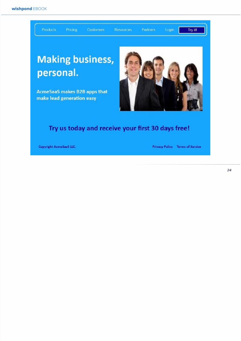
892019 Landing Pages eBook 1
httpslidepdfcomreaderfulllanding-pages-ebook-1 2565
Not the most exciting thing Irsquove ever seen in my l ife Irsquoll
admit But then again Irsquove seen worse It has all of the
primary lead-generation variables USP subtitle image
and a CTA Letrsquos say itrsquos converting at a rate of 5 (the
low end of average)
AB TESTING THE UNIQUE SELLING PROPOSITION
983080USP983081
The landing pagersquos current headline (ldquomaking business
personalrdquo) is not really a USP so much as a slogan The
difficulty with this is that many brands consider their
slogan to be a part of their business identity - especially ifthey have been running for many years Sidelining can be
emotionally very difficult
Get over it This is business For example letrsquos take
McDonaldrsquos whose slogan ldquoIrsquom lovinrsquo itrdquo is perhaps the
most well-known in the world Their landing pagersquos
current headline ldquoThe menu you love plus so much
morerdquo This is a USP Itrsquos a unique salersquos point built onoffering what people already know and like with the
addition of new and exciting options
Our Variation
Anytime your business becomes more impressive than
another use the power of a comparison value proposition
to encourage conversion
AB TESTING THE IMAGE
The existing image of a professional-looking group is
by no means a bad one But of course you know as
an informed digital marketer that a picture of a smiling
woman has proven to be the most effective for customer
engagement
wishpond EBOOK
25
892019 Landing Pages eBook 1
httpslidepdfcomreaderfulllanding-pages-ebook-1 2665
In fact in 2003 a Harvard student worked with a South
African bank sending 50000 letters offering short term
loans They varied the interest rate as well as included
psychologically-influential cues It turned out that having
a picture of a wholesome happy female in a corner of the
letter had as much positive impact on the response rate
as dropping the interest rate by four percentage points
Our Variation
Your landing pagersquos image is one of the most influential
but frustrating variables we can test Irsquove found that asmiling woman is the most reliable - but that other images
(of groups of people abstract images or inanimate
objects) may increase conversions more based on your
businessrsquo audience
Once yoursquove got a great format and text rotate a few
images through your testing cycle to find which gets the
most response Theyrsquore one of the easiest things to test
but one of the more difficult to anticipate
For more information on AB Testing your image check
out my articles The Psychology Behind a Successful
Facebook Ad Part 2 Images and How to AB Test your
Facebook Ad to Maximize ROI for some best practices
AB TESTING THE CTA
Irsquove written before that your landing page is a dance withthe visitor and your CTA is leading I love this metaphor
If your CTA is too aggressive or demanding itrsquoll step on
your page visitorrsquos toes and theyrsquoll find a new partner
Remember to keep your CTArsquos appealing rather than
demanding Use lsquoyoursquo or lsquomyrsquo lsquofreersquo and lsquogetrsquo Tell people
what they stand to gain not what to do
Here are 5 appealing CTA formulas
1 Start yourmy free [trial period]
2 Get your free [focus of landing page]
wishpond EBOOK
26
892019 Landing Pages eBook 1
httpslidepdfcomreaderfulllanding-pages-ebook-1 2765
3 Increase yourmy [beneficial result of your service
tool] today
4 Learn more today
5 Try [servicetool] for free
Our Variation
I hear different results from using lsquoyourrsquo vs lsquomyrsquo in your
CTAs Some businesses have found the small change of
lsquoStart your free trialrsquo to lsquostart my free trialrsquo increases their
landing page CTR some find the opposite As a result
Irsquom not going to tell you which one will work for your
business Yoursquoll have to test it yourself
AB TESTING THE LIST OF BENEFITS
The list of benefits is something that may not necessarily
increase your pagersquos conversions but nor is it likely to
hurt them We include benefit lists to ensure that if a USP
headline subheader or traffic source (like an ad or social
media link) hasnrsquot already sold your lead they get that
little bit more encouragement they need to convert
Your list of benefits could be anything your service
product or tool offers beyond the USP This list gives
more information that people may need like how your
service works or the steps they need to take to get theresult yoursquove quoted them
Remember to keep your list of benefits short and sexy
Include a maximum of five and draw attention to them
with icons small images or a clear and delineated box
wishpond EBOOK
27
892019 Landing Pages eBook 1
httpslidepdfcomreaderfulllanding-pages-ebook-1 2865
Our Variation
AB TESTING THE TRUST SYMBOLCUSTOMER
TESTIMONIALS
Implementing trust symbols or customer testimonials
pretty much improves landing page conversions across-
the-board Blue Fountain Media found adding the
VeriSign logo to their page increased conversion by 42
and sign-up-form entries by 81
Basically yoursquore telling your landing page visitor that
yoursquore trustworthy that yoursquore not trying to cheat them
out of their hard-earned cash that other people have put
their faith in you before and won out
Unless you have a trust symbol from a seriously influential
and recognizable authority Irsquod recommend you use
customer testimonials over trust symbols Not only do
landing page visitors like to see that you have customers
they also trust them more than they do you Use directquotes from the most well-known brands yoursquove worked
with (as their business profile will increase yours)
Our Variation
wishpond EBOOK
28
892019 Landing Pages eBook 1
httpslidepdfcomreaderfulllanding-pages-ebook-1 2965
AB TESTING THE COLORS
Sometimes itrsquos the smallest details that have the largest effect on your conversions Itrsquos changing the color of your CTA
button from light green to yellow (145 conversion increase) Or contrasting the color of two links within a single image
(60 increase in conversions)
To get an idea of how color can affect your business persona elicit an emotion or encourage an action read The
Psychology Behind a Successful Facebook Ad Part 1 Color Or for the people who ate lunch at their desks todayhellip
Here are the psychological impacts of five main colors
1 Blue Blue is across both genders and all age-
groups most peoplersquos favorite color It is said tocreate the sensation of trust and security Lighter
blues are calming while darker blues denote
professionalism and sincerity
2 Green Associated with wealth as well as
environmental subjects green is the easiest color
for the eye to process Green signifies positive
action (thinkrsquogreen means gorsquo) and affirmation
3 Purple Associated with calm femininity and
wealth purple is the second most popular color
among women at 23 On the other hand purple
is the favorite color of 0 of the male population
4 Red The color red is associated with passion
excitement and urgency Itrsquos a dangerous colorin marketing as many people associate red with
negativity and mistakes However it attracts the
eye better than any other color and gives the
impression that time is passing faster than it is (as
it causes our heart to beat faster) causing us to act
when we otherwise wouldnrsquot
5 Orange Eye-catching bright and sunny orange is
one of the most popular colors for landing page
Calls-to-Action While a good tone and amount
of orange is seen as warm and inviting too much
has been associated with naiveteacute and a lack of
professionalism
wishpond EBOOK
29
892019 Landing Pages eBook 1
httpslidepdfcomreaderfulllanding-pages-ebook-1 3065
Our VariationFinal Edit
wishpond EBOOK
30
892019 Landing Pages eBook 1
httpslidepdfcomreaderfulllanding-pages-ebook-1 3165
What do you think Does your gut say the landing page
wersquove created would convert better than the original
Letrsquos do some quick arithmetic
bull AB Testing the USP Possible conversion rate
increase of 127
bull AB Testing the image Possible conversion
increase of 98
bull AB Testing the CTA Possible conversion rate
increase of 161
bull AB Testing the list of benefits Possible conversion
rate increase of 91
bull AB Testing the trust symbol Possible conversion
rate increase of 72
bull AB Testing the colors Possible conversion rate
increase of 21
Total possible increase in landing page conversions
570
Conclusion
AB Testing works And unless yoursquore going to engage
with a 3rd party provider with tested and proven landing
page templates (which Wishpond will be in a week or
two) you need to be doing it yourself Often
The AB Testing process is continuous - not necessarily
because your landing page isnrsquot optimized but because
it wonrsquot stay optimized And honestly itrsquos very likely
your landing page will never be 100 optimized for
conversions anyway Therersquos always small steps you can
take tiny variables to change that will affect the pagersquosconversion rate
wishpond EBOOK
31
892019 Landing Pages eBook 1
httpslidepdfcomreaderfulllanding-pages-ebook-1 3265
Chapter 4
Landing
PagesHow to Sell your
Product without
Selling your
Product
wishpond EBOOK
892019 Landing Pages eBook 1
httpslidepdfcomreaderfulllanding-pages-ebook-1 3365
Do you get solid traffic to your landing page but struggle
to convert a sale
This article will give you five proven strategies of selling
your product without spamming - of pushing a sale
without pushing your customer over
Landing pages are a delicate balance between promoting
enough to encourage a sale and little enough that the
lead doesnrsquot feel pressure and bounce
Letrsquos take a look at five ways you can sell without selling
1 OFFER BENEFITS NOT FEATURES
This is the most important thing to keep in mind when
writing up the sales points of your business or products
People get sold on how a product or business can solve
their problems not on the details
I admit promoting the benefits is harder than promoting
the features of your product Selling benefits means you
have to identify the problems of your target audience and
come up with how your product or service solves those
problems You have to leave the safety of jargon and
technical details and venture into the real world
To help you understand the difference between features
and benefits here are a few examples
Selling Features
1 The AcmeTikon12 has 300 gigabytes of space
2 Our AcmePad2000 has a 17GHz processor
3 Our AcmeWebToolrsquos templates have over 5000
color options
Selling Benefits
1 The AcmeTikon12 has enough space for 75000
songs
2 Our AcmePad2000 is our fastest than ever making
browsing a cinch
3 We guarantee our AcmeWebToolrsquos templates will
have your businessrsquo brand colors
wishpond EBOOK
33
i
892019 Landing Pages eBook 1
httpslidepdfcomreaderfulllanding-pages-ebook-1 3465
wishpond EBOOK
34
Features still have their place on your landing pages To
safely cover all your bases use your product or servicersquos
features to support the benefits to your target audience
Or translate the sexy-sounding (if somewhat obscure)
feature into a concrete benefit for the consumer like
Wishpond has done below
2 USE CUSTOMER TESTIMONIALS AND REVIEWS
Face it to most visitors to your landing page yoursquore not
exactly a trustworthy source They recognize yoursquore
the slightest bit biased when it comes to this particular
subject (your own product)
So donrsquot sell your own product have someone else do
it for you Since Amazon took over online selling about
20 years ago internet users are increasingly trusting the
word of their peers over any other sources
By the way did you know Amazon accounts for more
online sales than the next 12 competitors combined I
didnrsquot
Needless to say reviews have never been more
important nor have customer testimonials Yes visitors
to your landing pages know that these testimonials come
through your business but it doesnrsquot matter Not only do
customer testimonials function to make your audience
trust your business it gives them the assurance that
someone has engaged with you before - so theyrsquore safe
to do so
Herersquos an example from Wishpondrsquos FacebookSweepstakes App landing page - from our friend Josh
Beaty
i h d OO
892019 Landing Pages eBook 1
httpslidepdfcomreaderfulllanding-pages-ebook-1 3565
For ecommerce businesses test offering product reviews like Amazon does AB test stars or a 5-point system or whatever
creative method of reviewing you can think of Be aware though that the review process also opens up the chance of
negative feedback
Whatever you do donrsquot fake reviews If your products arenrsquot awesome enough to earn more positive reviews than negative
pull the review tool until yoursquove stepped it up
3 MAKE IT BEAUTIFUL
This should be an obvious one but I canrsquot tell you how many times I see an appealing product portrayed in an ugly way Put
time and effort into framing your product in the best possible light AB test a model with your product AB test the gender
of your model AB test the colors behind your model AB test no model but a beautiful abstract collage that resembles a
Kandinsky piece I donrsquot care - just make it pretty
To illustrate my point on the most basic level which one of these do you think will sell better Same sunglasses one with a
white background one with a Johnny Depp background
wishpond EBOOK
35
i h d EBOOK
892019 Landing Pages eBook 1
httpslidepdfcomreaderfulllanding-pages-ebook-1 3665
But making it beautiful isnrsquot just about your
picture
Words can also be beautiful and the words we use canmake our products just as appealing as a great picture A
quick look at the Lexus homepage and yoursquoll know what
Irsquom talking about Head to their lsquoAutomobilesrsquo tab (notice
that Lexus makes lsquoautomobilesrsquo not lsquocarsrsquo) Each class of
automobiles has its own slogan from the ISrsquos lsquoDriving in
Every Sensersquo to the GXrsquos lsquoExpand your Possibilitiesrsquo
Do these slogans have any real relevance to the car
they represent No But do these words create a certain
desirable feeling in their reader Absolutely
Lexus also makes it a point to frame their products in
terms of an ideal customer - a customer their customers
want to be For instance their LX (SUV) lsquoenables you
to venture where few others can while surrounded in
unsurpassed interior comfort and refinementrsquo which
sounds like something I might want to do
Words have a huge impact on us Of course putting your
product in the best possible visual light is vital to making
a sale but donrsquot neglect the importance of the words you
use
5 Phrases that Make your Product Sound Desirable
1 Sleek and sophisticated
2 Pinnacle of artistry
3 Premium technology and unparalleled innovation
4 Reinvention of [relevant field-focused term]
5 Faster newer affordable exclusive
4 MAKE YOUR LANDING PAGE CHILL
I was trying to think of a better word than lsquochillrsquo but I think
itrsquos actually the most accurate Donrsquot be needy Donrsquot be
pushy Let your product or service speak for itself through
clear benefits awesome images and appealing text Sit
back a bit If yoursquore ever feeling like lsquool Gil in the header
image up there remember to chill - your customers will
thank you
Keep a personal touch in all the written parts of your
landing page Test out framing your product or service
in terms of lsquoyoursquo or the idealized customer I referred to
above
wishpond EBOOK
36
i h d EBOOK
892019 Landing Pages eBook 1
httpslidepdfcomreaderfulllanding-pages-ebook-1 3765
Converting should be your visitorrsquos idea not yours They should be sold by the value theyrsquore receiving When creating your
optimized landing page keep in mind the ratio of risk over reward Is what yoursquore offering worth what yoursquore asking from
your customer
CTAs
Remember to keep your CTAs appealing rather than demanding Use lsquoyoursquo or lsquomyrsquo lsquofreersquo and lsquogetrsquo Tell people what they
stand to gain not what to do
Here are 5 appealing CTA formulas
1 Start yourmy free [trial period]
2 Get yourmy free [focus of landing page]
3 Increase yourmy [beneficial result of your servicetool] today
4 Learn more today
5 Try [servicetool] for free
wishpond EBOOK
37
wishpond EBOOK
892019 Landing Pages eBook 1
httpslidepdfcomreaderfulllanding-pages-ebook-1 3865
5 SELL THE DEAL NOT THE PRODUCT
Are you one of those people who finds themselves
buying things they donrsquot need just because itrsquos a great
deal I most definitely am (damn you IKEA) Offers andcontests are my favorite strategy for lead generation and
to encourage a sale (genuinely not just because I work
for a company that builds online promotional tools for
small business)
The right offer is sellable simply as an offer - the product
itself is actually secondary to the deal
The best strategy for using offers is to target well with
a Facebook Ad This way the traffic yoursquore generating
to your landing page is already half-nurtured whether
because of their interests job title relationship status
etc A half-nurtured lead will be better informed of how
good a deal theyrsquore getting making conversion more
likely
Remember however deals work best as value
propositions You need to back up your offer with some
substance
Donrsquot necessarily prioritize the offer over visuals benefits
and an awesome overall product An offer wonrsquot always
work entirely on its own (At least unless your deal is just insane I mean who hasnrsquot brought home bean-bag
chairs to their already fully-furnished tiny apartment
They were buy one get two free)
The best strategy is to use great images sell someone
on the product every benefit every facet of the thing
and then wow them with the fact that this amazing state-
of-the-art life-changing product is only $2999 for thismonth only
wishpond EBOOK
38
892019 Landing Pages eBook 1
httpslidepdfcomreaderfulllanding-pages-ebook-1 3965
wishpond EBOOK
892019 Landing Pages eBook 1
httpslidepdfcomreaderfulllanding-pages-ebook-1 4065
Chapter 5
Landing
PagesOptimizing your Page
for Lead Generation
wishpond EBOOK
wishpond EBOOK
892019 Landing Pages eBook 1
httpslidepdfcomreaderfulllanding-pages-ebook-1 4165
Do you have an awesome landing page Is it optimized
for your lead generation objectives
Email leads are the number one concern for online
marketers You need a landing page that converts has alow bounce rate and engages your consumer enough to
get the lucrative contact
In this article Irsquoll show you how to optimize your landing
page for lead generation by
bull optimizing your SEO
bull focusing on value
bull optimizing your entry form for engagement
bull implementing a customer testimonial campaign
Letrsquos check it out
OPTIMIZE IT FOR SEO
The chief source of most leads is still search Increase
the chance of a lead finding your landing page in the first
place by optimizing it with Googlersquos search algorithm in
mind
Optimize your Landing Pagersquos Title
Your landing pagersquos title is what shows up in the tab This
is different than your page headline USP or what shows
in the URL When creating your page in wordpress or withHTML keep in mind the title best practices
bull Keep it short
bull Keep it keyword-centric
bull Use long-tail format
Whatrsquos long-tail format
Since the Hummingbird update Google is prioritizing the
context of a search as much as it is the keywords Long-
tail is this context-centric search format
Think of asking SIRI lsquoWherersquos the best Thai restaurant
in the arearsquo She scurries off with that information and
comes back with a response that makes sense Google is
designing its search to do the same Instead of lsquoLanding
pages 10 steps to Conversionsrsquo test out calling your
landing page something like lsquoHow to Build a Landing
Page that Convertsrsquo as this is what people will ask of
wishpond EBOOK
41
wishpond EBOOK
892019 Landing Pages eBook 1
httpslidepdfcomreaderfulllanding-pages-ebook-1 4265
Your title is what Googlersquos little algorithm bot sees first
when itrsquos sent off by a web userrsquos search Optimize your
landing pagersquos title and that bot will see you first
Social Share Buttons
If yoursquore basing your landing page around a resource
(like an ebook or a whitepaper) that content is highly
shareable And since Googlersquos hummingbird update
earlier this fall social shares are more valuable than ever
In fact Google+1rsquos are now ranked as more important
than link-building (something traditional SEO gurus are
struggling with to say the least)
Encourage social engagement by promoting your landing
page on Facebook Twitter and especially Google+ And
perhaps most importantly (and simply) throw up a few
social share buttons along the side or at the top of your
landing page This has been quoted as increasing the
virality of a blog post for instance by up to 700
5 More Awesome SEO tips
1 Use different headings tags (like lth1gt and lth4gt)
and bold and italicize keywords the Google search
bot sees these more than it does normal text
2 Optimize your copy with keywords dynamically
and fluidly spread throughout
3 Include an image with alt tags - this lets the search
engine know what your image is about Also will
show up in image search
4 Link to your landing page within your own website
5 Syndicate your landing page as much as possible
with link-building on forums and social media
platforms
For more information about optimizing for SEO check
out my article How to Easily Optimize your Blog for SEO
Many of the takeaways apply for landing pages as well
FOCUS ON VALUE
In order to encourage a lead to engage you need to
convince them itrsquos worth it This means value propositions
wishpond EBOOK
42
wishpond EBOOK
892019 Landing Pages eBook 1
httpslidepdfcomreaderfulllanding-pages-ebook-1 4365
and a great USP It also means you keep your landing
page simple You should be convincing quickly and easily
Ask your page visitor to read too much do too much and
theyrsquoll bounce
Be Specific
One of the main strategies in lead generation is limiting
your landing pagersquos bounce rate to the smallest
percentage you can Realistically yoursquoll be jumping for
joy and screaming from the mountaintops if your pagersquos
conversion rate is over 20
A recently-discovered best practice is that people
respond to specific numbers far more than they do round
numbers For instance quoting your business as having
80000 customers is less believable (and therefore less
powerful for conversions) as quoting your business as
having 75250 customers
Also keep your value propositions simple
bull Make the benefit of your business easy to
understand
bull Use dollar values percentages the word lsquofreersquo
bull Donrsquot use too much page space selling the specifics
of your service or your resource
Benefit List
If yoursquore using an email-gated ebook or other resource
for lead-generation think about your benefit list as the
second point of your argument Your Value Proposition
and image draw their attention and your list of benefits
tell them specifically how they stand to benefit from
entering their information and downloading your
resource
3 Benefit Formulas
1 [Number of things] yoursquoll learn in this ebook
2 How this resource will cause a rsquo [desired result]
3 The [number of steps] to [a certain goal]
OPTIMIZE YOUR ENTRY FORM
Your entry form is the focus of a lead-generating landing
page As far as your lead-generation funnel goes that
entry form CTA is the equivalent of lsquoproceed to check
outrsquo So make sure itrsquos optimized for conversions with
wishpond EBOOK
43
wishpond EBOOK
892019 Landing Pages eBook 1
httpslidepdfcomreaderfulllanding-pages-ebook-1 4465
these easy steps
1 Draw the Eye
You want your entry form to be obvious - donrsquot hideit below-the-fold or with small font Not only will this
increase interaction itrsquoll make it clear to visitors what
yoursquore asking of them Web users like things simple
and clear If they feel therersquos any chance theyrsquore being
swindled theyrsquoll bounce
6 Entry Form Design Tips
1 Encapsulate your entry form within a box
2 Draw attention to your entry form with the br ightly-
colored CTA
3 Use a vertical or horizontal line to separate your
entry form from the rest of the page
4 Include an action-oriented headline above your
form fields (like lsquoget your trial startedrsquo or lsquostart
learning nowrsquo)
5 Contrast the colour of your entry form box with the
page around it
6 AB Test including a short descriptive sentence
describing what happens when they click your CTA
wishpond EBOOK
44
wishpond EBOOK
892019 Landing Pages eBook 1
httpslidepdfcomreaderfulllanding-pages-ebook-1 4565
2 Balance Demographic Collection with Bounce
Rate
Optimizing your entry form is about weighing up the
valuable information yoursquore getting from a lead (detailsyou can use to segment the emailsadvertisements they
receive) versus the amount of form fields it takes to
increase bounce rate
Pro Tip Unless itrsquos absolutely necessary
avoid asking for a phone number People
are far more resistant to giving out phone
numbers than they are of an email or even
an address Spam emails are more accepted
than telemarketing calls during dinner
Letrsquos say yoursquore heavily invested in email marketing and
itrsquos working really well for your business It may be more
important to your business to know the demographic
details of 10 leads than to know nothing about 20 Email
marketing works best if yoursquore able to personalize and
segment your emails However this is entirely up to your
business
One of the benefits of email-gating an ebook or other
resource for lead generation is that you know people who
downloaded it are interested in that content Target them
with similar content in the future
For more information on segmenting your emailmarketing campaigns to get the best ROI possible read
my colleague Kristarsquos article 4 Strategies to Optimize your
Email Segmentation
wishpond EBOOK
45
wishpond EBOOK
892019 Landing Pages eBook 1
httpslidepdfcomreaderfulllanding-pages-ebook-1 4665
CUSTOMER TESTIMONIALS OR TRUST SYMBOLS
Irsquove talked about the value of trust symbols before but I
donrsquot want you to think that just because yoursquore no longer
optimizing for a sale you can forget them
Letrsquos say your page is focused around a free ebook or
white-paper This valuable content is email-gated so
therersquos no real proof (apart from what yoursquore saying) that
what yoursquore promising will be delivered
That is unless you include a customer testimonial like a
quote (I recommend including a picture of the customeras it makes it far more trustworthy) or short video clip If
yoursquore asking for a phone number or email address be
sure to let people know - obviously - that you donrsquot sell
these details or spam them
Customer testimonials act as a social endorsement
which have grown in importance in the past few years
This is because since Amazon Yelp and other sites
made customer reviews such a huge part of a successful
product your service needs to do the same
Pro Tip Many businesses have found
their highest conversion rates come from
a landing page built around a photogenic
customerrsquos testimonial Incorporate
an awesome case study for the value
proposition with a large picture and a clear
benefit list of how your page visitor can getthe same result
wishpond EBOOK
46
wishpond EBOOK
892019 Landing Pages eBook 1
httpslidepdfcomreaderfulllanding-pages-ebook-1 4765
Conclusion
Hopefully you now have a better idea of how to optimize your landing page for lead generation Be sure to prioritize your
entry form communicate simply and accurately and use a customer testimonial to convince your possible lead to convert
wishpond EBOOK
47
wishpond EBOOK
892019 Landing Pages eBook 1
httpslidepdfcomreaderfulllanding-pages-ebook-1 4865
Chapter 6
Landing
PagesThe Science
Behind Designing
for Conversion
p
wishpond EBOOK
892019 Landing Pages eBook 1
httpslidepdfcomreaderfulllanding-pages-ebook-1 4965
Is your landing page converting well Is it converting
badly Do you know why I mean do you really know
This article will give you the science and psychology
of why your landing is engaging to visitors or why youmight be getting traffic - but no conversions
Irsquoll take a look at 5 principles of landing
page design that can mean the difference
between a successful page and one thatrsquos
just taking up space (or fumbling around in
the dark)
Letrsquos get started
1 DIRECTIONAL CUES
Directional Cues are key in landing page design as they
tell people what to focus on
The most important thing to remember when designingyour landing page is that people do not view it like they
do a book Itrsquos not left to right top to bottom You have to
tell people how to read your page and directional cues
(as well as encapsulation and contrast below) are how
you do this
My recommendation is to decide two things on your
landing page that you especially want to drive attention
to (say your CTA and your product image or maybe aUSP) Then integrate a couple of the strategies below
into your design and AB test it Maybe your audience
responds well to the overt arrow or maybe the more
subtle eye-gaze Test it for yourself
Therersquos three main ways that we signal a focus point in
landing pages
Arrows and lines
p
49
wishpond EBOOK
892019 Landing Pages eBook 1
httpslidepdfcomreaderfulllanding-pages-ebook-1 5065
The most straightforward way to direct attention at an object or heading is to draw an arrow or line to it Students of art
will know the importance of lines as humans have a natural (subconscious) impulse to follow them to their origin or their
destination This works great to focus peoplersquos gaze on your CTA USP value proposition or product image
Eye-direction
Humans are incredibly good at recognizing the eye-focus point of the people around them I recommend using an eye-
tracking software on your landing page to determine where people are focusing and whether this focus is resulting in an
increased click-through-rate
What Irsquom talking about (thanks to Neil Patel
for the eye-tracking examples)
The red spots indicate the areas which
viewers looked at most Take note of how
the eye direction in the example on the left
draws the viewer`s attention towards the
product
p
50
wishpond EBOOK
892019 Landing Pages eBook 1
httpslidepdfcomreaderfulllanding-pages-ebook-1 5165
Faces are the most eye-attracting image you can use (see
5 below) and the eyes are the most eye-attracting part
of the face
Yoursquoll notice the woman on the left is looking directly atthe camera (or visitor to your page) The woman on the
right is looking at the product that Sunsilk is trying to sell
You can see in concrete terms how the initial gaze goes
to the womanrsquos eyes and then tracks left to the product
whereas the face on the left gets all the attention and the
product none
PointingGesturing
I highly recommend you use an image of a person in your
landing page as itrsquos proven to be the most engaging
picture (more on that later though) Something to test
however is having that model gesturing or pointing
towards something you want to focus attention on
This is a dangerous one though as (in my mind) it can
come across as cheesy if done incorrectly Test what your
audience responds to Irsquove seen this both increase and
decrease conversion rates in many case studies
2 CONTRAST
Color contrast
Contrast is essential when working with landing pagesThe human eye is naturally attracted to contrasting color
I recommend you consider color contrast for your USP
and CTA - perhaps an orange CTA button on a dark blue
background
Blank space
The idea of blank space is well-known in the graphic
design world and no less a vital part of landing page
design The idea is that blank space is extremely
influential in focusing attention on non-blank space For
instance
p
51
wishpond EBOOK
892019 Landing Pages eBook 1
httpslidepdfcomreaderfulllanding-pages-ebook-1 5265
Another way of utilizing blank space is with
encapsulation This can be done by framing a section
of content with a border or a container (filled in with
a background color) Give the encapsulated section
enough space to allow it to function somewhatindependently of the rest of the composition
Will this work better than a directional cue Test it for
yourself and find out
Format contrast
Formatting size (of font for instance) also attracts the eyeIn a 4-week multivariate test in 2010 Paras Chopra tested
the performance of 12 different combinations of a Call-to-
Action and descriptive link
Option 10 with the largest contrast in color hue and size
(as well as the word Free) generated a 60 improvement
in conversion rate
3 COLOR
Color is extremely (though unconsciously) effective
at eliciting emotion in viewers I took an in-depth
look at color psychology in my series on the science
behind a successful Facebook Ad so check it out for a
comprehensive analysis (with science)
For now herersquos a breakdown of how humans areinfluenced by color - and how this knowledge can
improve your conversion rates
Blue Blue is across both genders and all age-groups
most peoplersquos favorite color (35 of women and 57
of men) It is said to create the sensation of trust and
security Lighter blues are calming while darker blues
denote professionalism and sincerity
Orange Eye-catching bright and sunny orange is one of
the most popular colors for landing page Calls-to-Action
While a good tone and amount of orange is seen as warm
and inviting too much has been associated with naivete
52
wishpond EBOOK
892019 Landing Pages eBook 1
httpslidepdfcomreaderfulllanding-pages-ebook-1 5365
and a lack of professionalism
Red The color red is associated with passion excitement
and urgency Itrsquos a dangerous color in advertising as
many people associate red with negativity and mistakesHowever it attracts the eye better than any other color
and gives the impression that time is passing faster than
it is (as it causes our heart to beat faster) causing us to act
when we otherwise wouldnrsquot
Green Associated with wealth as well as environmental
subjects green is the easiest color for the eye to process
Green also signifies positive action (thinkrsquogreen meansgorsquo) and affirmation
Green and teal have also been associated with shoppers
on a budget Itrsquos also the second and third most popular
color among men and women respectively
Purple Associated with calm femininity and wealth
purple is the second most popular color among women
at 23 Interestingly as women get older their liking for
the color purple increases On the other hand purple is
the favorite color of 0 of the male population
Black Powerful sleek and intellectual black signifies
permanence sincerity and sophistication While black
can like red and orange be a dangerous color if used
too much it can communicate professionalism and
sophistication when used in conjunction with a strong
clear white (avoid greys or tans as theyrsquoll wash out yourmessage)
4 IMAGERY
I could discuss the effectiveness of a picture of a smiling
person on your landing page for hours (and I havehellip) but
just trust me that having an image (especially a person)
will likely improve your conversion rates
Something Irsquove seen recently actually is incorporating a
customer testimonial with the main landing page image
Choose a photogenic customer and post it up next to an
awesome-sounding affirmation of how your product or
service made their lives easier
But letrsquos leave that for the moment assuming you
recognize its importance and talk about why it works
bull We respond far more emotionally to people (or pets
though people generally elicit a stronger response)
than we do to words or random images
53
wishpond EBOOK
892019 Landing Pages eBook 1
httpslidepdfcomreaderfulllanding-pages-ebook-1 5465
bull A picture of a person provides subtext to your
landing page - a story which people respond to
bull We completely subconsciously focus on the faces
of people we see (especially the eyes) In everyeye-tracking image Irsquove ever seen the hottest
points are the face and eyes Unless of course
the image is of a woman and wersquore talking about a
male demographic Then the eye-tracking software
shows our attention to behellip elsewhere
In my research for this article I came across an article by
VS Ramachandran (a neuroscientist from Oxford) whowrote that oftentimes a line drawing is more powerful
than a photograph He writes that this is because the
lsquoidearsquo of a person is more appealing than the truth of it
(why so much of art is exaggeration of the human form or
why caricatures are so aesthetically pleasing) Leave out
the details and all yoursquore left is the essence of a thing
Although I havenrsquot yet seen an example of this in a
landing page or incorporated it into my own I believe
that whoever does will see a dramatic increase in click-
throughs Get creative and let me know how it goes
5 TYPOGRAPHY AND STYLE
Yoursquoll think that Irsquom getting too detailed here that
different typographies text formats or styles canrsquot actually
increase or decrease conversion rates enough to matter
Herersquos the thing with AB testing details do matter
Letrsquos say your Ecommerce sitersquos landing page is currently
converting at 23 Yoursquore seeing traffic of around 2000
visitors per week and their average purchase is worth
50 dollars to your business Yoursquore making $23000 per
week
Letrsquos say we change your pagersquos headline length and
change the image from one of a woman looking at
the camera to one looking at the CTA (small changes
yoursquod agree) You see a conversion rate increase of
10 Suddenly yoursquore converting at 253 and yoursquove
increased your weekly income to $25300 Yearly
revenue increase $27600
Typography and style changes to AB test
bull Font size for headings and body copy (and the
difference between them)
54
wishpond EBOOK
892019 Landing Pages eBook 1
httpslidepdfcomreaderfulllanding-pages-ebook-1 5565
bull Heading length (short and succinct vs long and
detailed)
bull Number of different font sizes (too many makes
your landing page confusing - I recommend two orthree)
bull Fonts Keep in mind that different fonts are for
whatever reason viewed as more amateurish than
others We at Wishpond like San Sarif for headlines
and Sarif for body copy Avoid cursive (except
maybe for a header) and comic sans is a no-no for a
professional business
bull More text vs less (I like a simple landing page - get
to the point and leave any extraneous information
for later emails or different tabs But test this for
yourself)
Conclusion
Hopefully you now understand a little more of the
science and psychology behind landing page design best
practices Remember to provide visual clues for whereyou want your visitor to focus Donrsquot forget the details
like typography or eye-direction
And keep testing You can always improve your landing
page conversion rates Trust me
55
wishpond EBOOK
892019 Landing Pages eBook 1
httpslidepdfcomreaderfulllanding-pages-ebook-1 5665
Chapter 7
3 Landing
PageExamplesCritiqued to Hell and
Back
wishpond EBOOK
892019 Landing Pages eBook 1
httpslidepdfcomreaderfulllanding-pages-ebook-1 5765
Howrsquos your landing page doing Is it optimized for
conversions Optimized for lead generation
How about we check out a few pages from around
the web In this article Irsquoll dissect four landing pagesvariable by variable discussing where theyrsquove done it
right and where therersquos room for improvement
Itrsquos all well and good for me to tell you a picture is an
essential part of your landing page but until you see
(pardon the pun) what Irsquom talking about itrsquos just that
talk
So letrsquos do this thing
1 SALESFORCE
Salesforce (for those somehow unfamiliar) is a
Customer Relationship Management (CRM) business
based out of San Fran
Herersquos their current landing page raquo
57
wishpond EBOOK
892019 Landing Pages eBook 1
httpslidepdfcomreaderfulllanding-pages-ebook-1 5865
What I Like About this Page
bull The imagery The first thing that hits you when you
traffic to SalesForcersquos landing page is the visual
representation of what they do Though by nomeans unique the visuals of lsquoconnect everything
with our awesome appsrsquo is clear
bull The image size I like how prominent their visuals
are About 75 of their lsquoabove the foldrsquo landing
page area is taken up by this image
bull The prioritized pages What I mean by this is simple
the three blue buttons on the right side (and also
beneath the benefit list paragraph) will traffic to
equally-optimized landing pages The tabs in gray
at the top are quite clearly subordinate (I know
this because of their color contrast encapsulation
etc) and traffic on them will be substantially less I
like the emphasis being placed on the things most
important to their leads
bull The Value Proposition Salesforce has gone
with two value propositions over a USP for their
header I like the succinct and appealing ldquoConnect
everythingrdquo especially
bull The benefit list Though not in bullet-point form
the below-the-fold paragraph of USPrsquos and value
propositions is still effective lsquoBuild customer loyaltyrsquo
(Boom) lsquoIncrease first call resolution and agent
productivityrsquo (Boom) lsquoImprove customer satisfactionby 37rsquo (Boom)
bull The specificity Perhaps my favorite part of this
entire landing is the sentence lsquoimprove customer
satisfaction by 37rsquo This kind of statistic is
incredibly convincing as itrsquos low enough and
specific enough to be entirely believable It also
shows me that theyrsquore professional enough to havedone their research and (I trust) can back up this
statistic with proof
Where I Think they Could Optimize this Page
bull Contrast the imagery I like the use of multiple
images on landing pages (one primary above-the-
fold and one secondary below it) However to
maximize the appeal of your images I recommend
you make them distinct from each other These two
images accomplish the same visual representation
I mentioned above How about keeping the same
image at the top and changing the below-the-fold
58
wishpond EBOOK
892019 Landing Pages eBook 1
httpslidepdfcomreaderfulllanding-pages-ebook-1 5965
59
image to a satisfied customer instead
bull Customer testimonials Perhaps SalesForce is relying on their substantial reputation as the worldrsquos CRM leader but
Irsquod still recommend they included a picture (and quote) from one of their prominent clients This is a businesses that
regularly works with Facebook General Electric and Delta Airlines Irsquod recommend testing a quote and image fromone of these businesses with the brand namelogo prominently placed
AB Testing Postulation
Irsquod theorize that integrating a customer testimonial with an image into a revolving album below-the-fold (on the right) could
increase conversion rates on this page by 10
2 MAILCHIMP
Mailchimp is the most successful email automation company out there (with more than 5 million users)
View their landing page on the next page
wishpond EBOOK
892019 Landing Pages eBook 1
httpslidepdfcomreaderfulllanding-pages-ebook-1 6065
60
wishpond EBOOK
892019 Landing Pages eBook 1
httpslidepdfcomreaderfulllanding-pages-ebook-1 6165
61
What I Like About this Page
bull The tagline ldquoSend Better Emailrdquo is one of the
simplest and most straightforward of all successful
landing pages Irsquove seen Itrsquos to the point andeffective Mailchimp has also had this tagline since
mid June of 2013 meaning itrsquos working for them
bull The USP ldquoMore than 5 million people use
MailChimphelliprdquo is about as unique as you can get
Peer endorsement is the most powerful USP you
can bring into play
bull The Image Red on a blue background stands out
fantastically and attracts the eye - I also the giving
a snapshot of their tool giving people a glimpse at
what they have to offer
bull The CTA(s) Although not as noticeable as ldquoSign
up Freerdquo (which consistently performs better than
simply ldquoSign Uprdquo) I really like ldquoJoin them todayrdquo in
the small paragraph beneath the tagline This is as
much as CTA as the buttons are and plays to the
peer pressure effectiveness of the page
Where I Think they Could Optimize this Page
bull The color scheme Irsquod be interested to see the
effect of a dark blue background and white taglines
benefits As it stands now the page is somewhatboring
bull The toolbar at the top Such a simple and minimalist
landing page needs to accentuate their ldquoFeaturesrdquo
ldquoPricesrdquo and ldquoSupportrdquo buttons at the top to make
it easy to access these important parts of the
decision-making process
bull The CTA(s) While I like the language used Irsquod be
curious to see the effect of making the CTAs stand
out a bit more with a contrasting color to draw the
eye
bull Irsquod test a customer testimonial rotation Mentioning
the 5 million people who use Mailchimp is all
well and good but Irsquod recommend rotating in a
photogenic former customer with a quote on the
effect that Mailchimp had on their businessrsquo email
marketing ROI
wishpond EBOOK
892019 Landing Pages eBook 1
httpslidepdfcomreaderfulllanding-pages-ebook-1 6265
62
AB Testing Postulation
Irsquod theorize that a customer testimonial addition could increase conversions on this page by up to 10 A concrete number
or percentage taken from a case study would make the page more effective
3 KISSMETRICS
Customer analytics platform
Kissmetrics is entrepreneur Neil
Patelrsquos 2008 baby
Herersquos their current landing page raquo
wishpond EBOOK
892019 Landing Pages eBook 1
httpslidepdfcomreaderfulllanding-pages-ebook-1 6365
63
What I Like About this Page
bull The image If yoursquore unsure exactly what image
you should use for your landing page fall back
on something like this A smiling normal-lookingperson (photogenic but not a model) is your best
bet
bull The simplicity Yes this is the entire landing page
Nothing but lsquoabove-the-foldrsquo It relies entirely on the
USP which is incredibly effective
bull Knowing their market Customer analytics are a field
only interesting to people who know what Google
Analytics is Nobody starts with Kissmetrics and
moves to Google Analytics As such the USP is
incredibly effective
bull Logging in with a Google account Irsquove mentioned
before how an email address is worth so much
more to your business than it is to its owner (and
how a phone number is so much more of an ask)
Well a social platform login is worth even less to
its owner - this allows Kissmetrics to ask for less
from a lead and get exactly the same details (if not
more) than they would were they to ask for an email
address
bull The popup The bottom-right popup (which reads
lsquowhatrsquos preventing you from wanting to start a
free trial of Kissmetricsrsquo) does not appear forevery person that traffics to this landing page
This would mediate the drop in conversion rates
that this popup likely causes However this popup
also provides Kissmetrics with extremely valuable
information namely what they can do to encourage
a sign-up Trading a little conversion rate (especially
if you do this temporarily) can be worth more
information This is a similar trade Irsquove talked aboutbefore where more entry boxes give you better
lead knowledge but can decrease conversion rates
- something you have to balance
Check out my article lsquoValue Proposition Formulas that
Boost Conversion on Ads and Landing Pagesrsquo where I
take an in-depth look at how to use Kissmetricrsquos formula
and 6 others
Where I Think they Could Optimize this Page
bull The Image Okay I really like this image but Irsquod be
curious to see how a landing page with a revolving
wishpond EBOOK
892019 Landing Pages eBook 1
httpslidepdfcomreaderfulllanding-pages-ebook-1 6465
64
album would do How about three different USP
value proposition + image combinations revolving
every 75 seconds (Genuinely I recommend you
test the time lapse you use if you employ revolving
images)
bull Learn More The ldquoLearn Morerdquo link in the bottom
left of this landing page is too quiet Irsquod recommend
a subtle encapsulation and slightly larger font I
think this landing page is incredibly effective but
clearly the issue theyrsquoll have is not offering enough
information about what they do A ldquoLearn Morerdquo
link is an awesome way of doing this but itrsquos notobvious enough for everyone to see and I wonder if
that doesnrsquot increase their bounce rate
bull A Case Studies Tab I donrsquot want to ruin the
contemporary minimalist appeal of this landing
page but I would be interested in testing a lsquocase
studiesrsquo or lsquocustomer storiesrsquo tab next to lsquoSign Inrsquo on
the top bar Like the lsquoLearn Morersquo link this would
make it a little easier for visitors to find the answers
to their questions without cluttering the page with
the customer testimonials benefit list and trust
symbols I usually recommend
AB Testing Postulation
Irsquod theorize that making the lsquoLearn Morersquo link on the
bottom right just slightly more obvious would increase
conversions from this page Herersquos why If someone typesin lsquocustomer analyticsrsquo into Google search theyrsquoll click on
Kissmetrics Irsquod be concerned that at the moment they
may bounce due to lack of ready information A more
visible lsquoLearn Morersquo link could increase conversion by up
to 5
Conclusion
The variables Irsquove discussed and critiqued in this article
encompass most of the optimization strategies I give
our clients Remember that every audience is different
and that (unless yoursquore using an optimized landing page
template) yoursquoll need to AB test your own landing pages
on a monthly basis
wishpond EBOOK
892019 Landing Pages eBook 1
httpslidepdfcomreaderfulllanding-pages-ebook-1 6565
Creating and optimizing your businessrsquo landing pages can be the most influential change you make this year
Wishpondrsquos own landing pages are being constantly updated and optimized - our templates completely customizable Start
a free trial today to check them out and see if wersquore a fit for your business
Thanks for reading
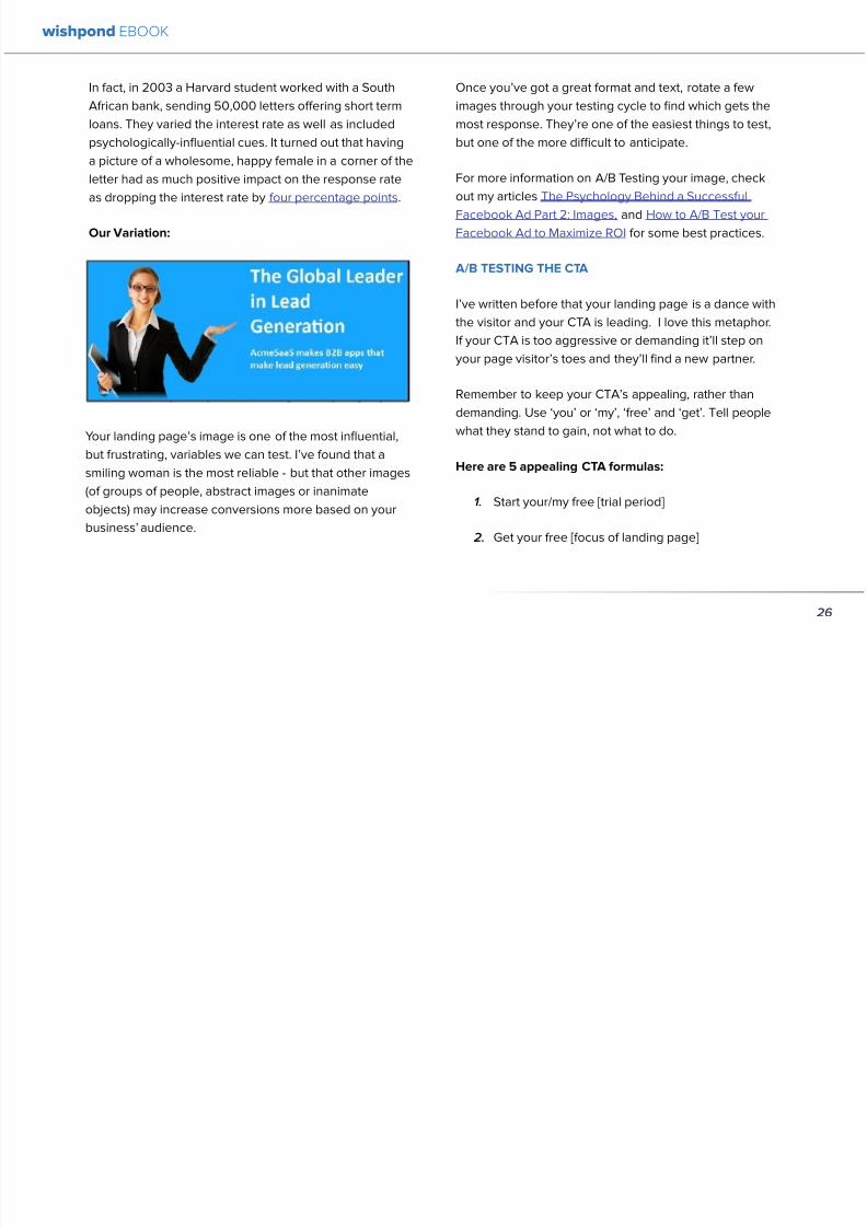
892019 Landing Pages eBook 1
httpslidepdfcomreaderfulllanding-pages-ebook-1 2665
In fact in 2003 a Harvard student worked with a South
African bank sending 50000 letters offering short term
loans They varied the interest rate as well as included
psychologically-influential cues It turned out that having
a picture of a wholesome happy female in a corner of the
letter had as much positive impact on the response rate
as dropping the interest rate by four percentage points
Our Variation
Your landing pagersquos image is one of the most influential
but frustrating variables we can test Irsquove found that asmiling woman is the most reliable - but that other images
(of groups of people abstract images or inanimate
objects) may increase conversions more based on your
businessrsquo audience
Once yoursquove got a great format and text rotate a few
images through your testing cycle to find which gets the
most response Theyrsquore one of the easiest things to test
but one of the more difficult to anticipate
For more information on AB Testing your image check
out my articles The Psychology Behind a Successful
Facebook Ad Part 2 Images and How to AB Test your
Facebook Ad to Maximize ROI for some best practices
AB TESTING THE CTA
Irsquove written before that your landing page is a dance withthe visitor and your CTA is leading I love this metaphor
If your CTA is too aggressive or demanding itrsquoll step on
your page visitorrsquos toes and theyrsquoll find a new partner
Remember to keep your CTArsquos appealing rather than
demanding Use lsquoyoursquo or lsquomyrsquo lsquofreersquo and lsquogetrsquo Tell people
what they stand to gain not what to do
Here are 5 appealing CTA formulas
1 Start yourmy free [trial period]
2 Get your free [focus of landing page]
wishpond EBOOK
26
892019 Landing Pages eBook 1
httpslidepdfcomreaderfulllanding-pages-ebook-1 2765
3 Increase yourmy [beneficial result of your service
tool] today
4 Learn more today
5 Try [servicetool] for free
Our Variation
I hear different results from using lsquoyourrsquo vs lsquomyrsquo in your
CTAs Some businesses have found the small change of
lsquoStart your free trialrsquo to lsquostart my free trialrsquo increases their
landing page CTR some find the opposite As a result
Irsquom not going to tell you which one will work for your
business Yoursquoll have to test it yourself
AB TESTING THE LIST OF BENEFITS
The list of benefits is something that may not necessarily
increase your pagersquos conversions but nor is it likely to
hurt them We include benefit lists to ensure that if a USP
headline subheader or traffic source (like an ad or social
media link) hasnrsquot already sold your lead they get that
little bit more encouragement they need to convert
Your list of benefits could be anything your service
product or tool offers beyond the USP This list gives
more information that people may need like how your
service works or the steps they need to take to get theresult yoursquove quoted them
Remember to keep your list of benefits short and sexy
Include a maximum of five and draw attention to them
with icons small images or a clear and delineated box
wishpond EBOOK
27
892019 Landing Pages eBook 1
httpslidepdfcomreaderfulllanding-pages-ebook-1 2865
Our Variation
AB TESTING THE TRUST SYMBOLCUSTOMER
TESTIMONIALS
Implementing trust symbols or customer testimonials
pretty much improves landing page conversions across-
the-board Blue Fountain Media found adding the
VeriSign logo to their page increased conversion by 42
and sign-up-form entries by 81
Basically yoursquore telling your landing page visitor that
yoursquore trustworthy that yoursquore not trying to cheat them
out of their hard-earned cash that other people have put
their faith in you before and won out
Unless you have a trust symbol from a seriously influential
and recognizable authority Irsquod recommend you use
customer testimonials over trust symbols Not only do
landing page visitors like to see that you have customers
they also trust them more than they do you Use directquotes from the most well-known brands yoursquove worked
with (as their business profile will increase yours)
Our Variation
wishpond EBOOK
28
892019 Landing Pages eBook 1
httpslidepdfcomreaderfulllanding-pages-ebook-1 2965
AB TESTING THE COLORS
Sometimes itrsquos the smallest details that have the largest effect on your conversions Itrsquos changing the color of your CTA
button from light green to yellow (145 conversion increase) Or contrasting the color of two links within a single image
(60 increase in conversions)
To get an idea of how color can affect your business persona elicit an emotion or encourage an action read The
Psychology Behind a Successful Facebook Ad Part 1 Color Or for the people who ate lunch at their desks todayhellip
Here are the psychological impacts of five main colors
1 Blue Blue is across both genders and all age-
groups most peoplersquos favorite color It is said tocreate the sensation of trust and security Lighter
blues are calming while darker blues denote
professionalism and sincerity
2 Green Associated with wealth as well as
environmental subjects green is the easiest color
for the eye to process Green signifies positive
action (thinkrsquogreen means gorsquo) and affirmation
3 Purple Associated with calm femininity and
wealth purple is the second most popular color
among women at 23 On the other hand purple
is the favorite color of 0 of the male population
4 Red The color red is associated with passion
excitement and urgency Itrsquos a dangerous colorin marketing as many people associate red with
negativity and mistakes However it attracts the
eye better than any other color and gives the
impression that time is passing faster than it is (as
it causes our heart to beat faster) causing us to act
when we otherwise wouldnrsquot
5 Orange Eye-catching bright and sunny orange is
one of the most popular colors for landing page
Calls-to-Action While a good tone and amount
of orange is seen as warm and inviting too much
has been associated with naiveteacute and a lack of
professionalism
wishpond EBOOK
29
892019 Landing Pages eBook 1
httpslidepdfcomreaderfulllanding-pages-ebook-1 3065
Our VariationFinal Edit
wishpond EBOOK
30
892019 Landing Pages eBook 1
httpslidepdfcomreaderfulllanding-pages-ebook-1 3165
What do you think Does your gut say the landing page
wersquove created would convert better than the original
Letrsquos do some quick arithmetic
bull AB Testing the USP Possible conversion rate
increase of 127
bull AB Testing the image Possible conversion
increase of 98
bull AB Testing the CTA Possible conversion rate
increase of 161
bull AB Testing the list of benefits Possible conversion
rate increase of 91
bull AB Testing the trust symbol Possible conversion
rate increase of 72
bull AB Testing the colors Possible conversion rate
increase of 21
Total possible increase in landing page conversions
570
Conclusion
AB Testing works And unless yoursquore going to engage
with a 3rd party provider with tested and proven landing
page templates (which Wishpond will be in a week or
two) you need to be doing it yourself Often
The AB Testing process is continuous - not necessarily
because your landing page isnrsquot optimized but because
it wonrsquot stay optimized And honestly itrsquos very likely
your landing page will never be 100 optimized for
conversions anyway Therersquos always small steps you can
take tiny variables to change that will affect the pagersquosconversion rate
wishpond EBOOK
31
892019 Landing Pages eBook 1
httpslidepdfcomreaderfulllanding-pages-ebook-1 3265
Chapter 4
Landing
PagesHow to Sell your
Product without
Selling your
Product
wishpond EBOOK
892019 Landing Pages eBook 1
httpslidepdfcomreaderfulllanding-pages-ebook-1 3365
Do you get solid traffic to your landing page but struggle
to convert a sale
This article will give you five proven strategies of selling
your product without spamming - of pushing a sale
without pushing your customer over
Landing pages are a delicate balance between promoting
enough to encourage a sale and little enough that the
lead doesnrsquot feel pressure and bounce
Letrsquos take a look at five ways you can sell without selling
1 OFFER BENEFITS NOT FEATURES
This is the most important thing to keep in mind when
writing up the sales points of your business or products
People get sold on how a product or business can solve
their problems not on the details
I admit promoting the benefits is harder than promoting
the features of your product Selling benefits means you
have to identify the problems of your target audience and
come up with how your product or service solves those
problems You have to leave the safety of jargon and
technical details and venture into the real world
To help you understand the difference between features
and benefits here are a few examples
Selling Features
1 The AcmeTikon12 has 300 gigabytes of space
2 Our AcmePad2000 has a 17GHz processor
3 Our AcmeWebToolrsquos templates have over 5000
color options
Selling Benefits
1 The AcmeTikon12 has enough space for 75000
songs
2 Our AcmePad2000 is our fastest than ever making
browsing a cinch
3 We guarantee our AcmeWebToolrsquos templates will
have your businessrsquo brand colors
wishpond EBOOK
33
i
892019 Landing Pages eBook 1
httpslidepdfcomreaderfulllanding-pages-ebook-1 3465
wishpond EBOOK
34
Features still have their place on your landing pages To
safely cover all your bases use your product or servicersquos
features to support the benefits to your target audience
Or translate the sexy-sounding (if somewhat obscure)
feature into a concrete benefit for the consumer like
Wishpond has done below
2 USE CUSTOMER TESTIMONIALS AND REVIEWS
Face it to most visitors to your landing page yoursquore not
exactly a trustworthy source They recognize yoursquore
the slightest bit biased when it comes to this particular
subject (your own product)
So donrsquot sell your own product have someone else do
it for you Since Amazon took over online selling about
20 years ago internet users are increasingly trusting the
word of their peers over any other sources
By the way did you know Amazon accounts for more
online sales than the next 12 competitors combined I
didnrsquot
Needless to say reviews have never been more
important nor have customer testimonials Yes visitors
to your landing pages know that these testimonials come
through your business but it doesnrsquot matter Not only do
customer testimonials function to make your audience
trust your business it gives them the assurance that
someone has engaged with you before - so theyrsquore safe
to do so
Herersquos an example from Wishpondrsquos FacebookSweepstakes App landing page - from our friend Josh
Beaty
i h d OO
892019 Landing Pages eBook 1
httpslidepdfcomreaderfulllanding-pages-ebook-1 3565
For ecommerce businesses test offering product reviews like Amazon does AB test stars or a 5-point system or whatever
creative method of reviewing you can think of Be aware though that the review process also opens up the chance of
negative feedback
Whatever you do donrsquot fake reviews If your products arenrsquot awesome enough to earn more positive reviews than negative
pull the review tool until yoursquove stepped it up
3 MAKE IT BEAUTIFUL
This should be an obvious one but I canrsquot tell you how many times I see an appealing product portrayed in an ugly way Put
time and effort into framing your product in the best possible light AB test a model with your product AB test the gender
of your model AB test the colors behind your model AB test no model but a beautiful abstract collage that resembles a
Kandinsky piece I donrsquot care - just make it pretty
To illustrate my point on the most basic level which one of these do you think will sell better Same sunglasses one with a
white background one with a Johnny Depp background
wishpond EBOOK
35
i h d EBOOK
892019 Landing Pages eBook 1
httpslidepdfcomreaderfulllanding-pages-ebook-1 3665
But making it beautiful isnrsquot just about your
picture
Words can also be beautiful and the words we use canmake our products just as appealing as a great picture A
quick look at the Lexus homepage and yoursquoll know what
Irsquom talking about Head to their lsquoAutomobilesrsquo tab (notice
that Lexus makes lsquoautomobilesrsquo not lsquocarsrsquo) Each class of
automobiles has its own slogan from the ISrsquos lsquoDriving in
Every Sensersquo to the GXrsquos lsquoExpand your Possibilitiesrsquo
Do these slogans have any real relevance to the car
they represent No But do these words create a certain
desirable feeling in their reader Absolutely
Lexus also makes it a point to frame their products in
terms of an ideal customer - a customer their customers
want to be For instance their LX (SUV) lsquoenables you
to venture where few others can while surrounded in
unsurpassed interior comfort and refinementrsquo which
sounds like something I might want to do
Words have a huge impact on us Of course putting your
product in the best possible visual light is vital to making
a sale but donrsquot neglect the importance of the words you
use
5 Phrases that Make your Product Sound Desirable
1 Sleek and sophisticated
2 Pinnacle of artistry
3 Premium technology and unparalleled innovation
4 Reinvention of [relevant field-focused term]
5 Faster newer affordable exclusive
4 MAKE YOUR LANDING PAGE CHILL
I was trying to think of a better word than lsquochillrsquo but I think
itrsquos actually the most accurate Donrsquot be needy Donrsquot be
pushy Let your product or service speak for itself through
clear benefits awesome images and appealing text Sit
back a bit If yoursquore ever feeling like lsquool Gil in the header
image up there remember to chill - your customers will
thank you
Keep a personal touch in all the written parts of your
landing page Test out framing your product or service
in terms of lsquoyoursquo or the idealized customer I referred to
above
wishpond EBOOK
36
i h d EBOOK
892019 Landing Pages eBook 1
httpslidepdfcomreaderfulllanding-pages-ebook-1 3765
Converting should be your visitorrsquos idea not yours They should be sold by the value theyrsquore receiving When creating your
optimized landing page keep in mind the ratio of risk over reward Is what yoursquore offering worth what yoursquore asking from
your customer
CTAs
Remember to keep your CTAs appealing rather than demanding Use lsquoyoursquo or lsquomyrsquo lsquofreersquo and lsquogetrsquo Tell people what they
stand to gain not what to do
Here are 5 appealing CTA formulas
1 Start yourmy free [trial period]
2 Get yourmy free [focus of landing page]
3 Increase yourmy [beneficial result of your servicetool] today
4 Learn more today
5 Try [servicetool] for free
wishpond EBOOK
37
wishpond EBOOK
892019 Landing Pages eBook 1
httpslidepdfcomreaderfulllanding-pages-ebook-1 3865
5 SELL THE DEAL NOT THE PRODUCT
Are you one of those people who finds themselves
buying things they donrsquot need just because itrsquos a great
deal I most definitely am (damn you IKEA) Offers andcontests are my favorite strategy for lead generation and
to encourage a sale (genuinely not just because I work
for a company that builds online promotional tools for
small business)
The right offer is sellable simply as an offer - the product
itself is actually secondary to the deal
The best strategy for using offers is to target well with
a Facebook Ad This way the traffic yoursquore generating
to your landing page is already half-nurtured whether
because of their interests job title relationship status
etc A half-nurtured lead will be better informed of how
good a deal theyrsquore getting making conversion more
likely
Remember however deals work best as value
propositions You need to back up your offer with some
substance
Donrsquot necessarily prioritize the offer over visuals benefits
and an awesome overall product An offer wonrsquot always
work entirely on its own (At least unless your deal is just insane I mean who hasnrsquot brought home bean-bag
chairs to their already fully-furnished tiny apartment
They were buy one get two free)
The best strategy is to use great images sell someone
on the product every benefit every facet of the thing
and then wow them with the fact that this amazing state-
of-the-art life-changing product is only $2999 for thismonth only
wishpond EBOOK
38
892019 Landing Pages eBook 1
httpslidepdfcomreaderfulllanding-pages-ebook-1 3965
wishpond EBOOK
892019 Landing Pages eBook 1
httpslidepdfcomreaderfulllanding-pages-ebook-1 4065
Chapter 5
Landing
PagesOptimizing your Page
for Lead Generation
wishpond EBOOK
wishpond EBOOK
892019 Landing Pages eBook 1
httpslidepdfcomreaderfulllanding-pages-ebook-1 4165
Do you have an awesome landing page Is it optimized
for your lead generation objectives
Email leads are the number one concern for online
marketers You need a landing page that converts has alow bounce rate and engages your consumer enough to
get the lucrative contact
In this article Irsquoll show you how to optimize your landing
page for lead generation by
bull optimizing your SEO
bull focusing on value
bull optimizing your entry form for engagement
bull implementing a customer testimonial campaign
Letrsquos check it out
OPTIMIZE IT FOR SEO
The chief source of most leads is still search Increase
the chance of a lead finding your landing page in the first
place by optimizing it with Googlersquos search algorithm in
mind
Optimize your Landing Pagersquos Title
Your landing pagersquos title is what shows up in the tab This
is different than your page headline USP or what shows
in the URL When creating your page in wordpress or withHTML keep in mind the title best practices
bull Keep it short
bull Keep it keyword-centric
bull Use long-tail format
Whatrsquos long-tail format
Since the Hummingbird update Google is prioritizing the
context of a search as much as it is the keywords Long-
tail is this context-centric search format
Think of asking SIRI lsquoWherersquos the best Thai restaurant
in the arearsquo She scurries off with that information and
comes back with a response that makes sense Google is
designing its search to do the same Instead of lsquoLanding
pages 10 steps to Conversionsrsquo test out calling your
landing page something like lsquoHow to Build a Landing
Page that Convertsrsquo as this is what people will ask of
wishpond EBOOK
41
wishpond EBOOK
892019 Landing Pages eBook 1
httpslidepdfcomreaderfulllanding-pages-ebook-1 4265
Your title is what Googlersquos little algorithm bot sees first
when itrsquos sent off by a web userrsquos search Optimize your
landing pagersquos title and that bot will see you first
Social Share Buttons
If yoursquore basing your landing page around a resource
(like an ebook or a whitepaper) that content is highly
shareable And since Googlersquos hummingbird update
earlier this fall social shares are more valuable than ever
In fact Google+1rsquos are now ranked as more important
than link-building (something traditional SEO gurus are
struggling with to say the least)
Encourage social engagement by promoting your landing
page on Facebook Twitter and especially Google+ And
perhaps most importantly (and simply) throw up a few
social share buttons along the side or at the top of your
landing page This has been quoted as increasing the
virality of a blog post for instance by up to 700
5 More Awesome SEO tips
1 Use different headings tags (like lth1gt and lth4gt)
and bold and italicize keywords the Google search
bot sees these more than it does normal text
2 Optimize your copy with keywords dynamically
and fluidly spread throughout
3 Include an image with alt tags - this lets the search
engine know what your image is about Also will
show up in image search
4 Link to your landing page within your own website
5 Syndicate your landing page as much as possible
with link-building on forums and social media
platforms
For more information about optimizing for SEO check
out my article How to Easily Optimize your Blog for SEO
Many of the takeaways apply for landing pages as well
FOCUS ON VALUE
In order to encourage a lead to engage you need to
convince them itrsquos worth it This means value propositions
wishpond EBOOK
42
wishpond EBOOK
892019 Landing Pages eBook 1
httpslidepdfcomreaderfulllanding-pages-ebook-1 4365
and a great USP It also means you keep your landing
page simple You should be convincing quickly and easily
Ask your page visitor to read too much do too much and
theyrsquoll bounce
Be Specific
One of the main strategies in lead generation is limiting
your landing pagersquos bounce rate to the smallest
percentage you can Realistically yoursquoll be jumping for
joy and screaming from the mountaintops if your pagersquos
conversion rate is over 20
A recently-discovered best practice is that people
respond to specific numbers far more than they do round
numbers For instance quoting your business as having
80000 customers is less believable (and therefore less
powerful for conversions) as quoting your business as
having 75250 customers
Also keep your value propositions simple
bull Make the benefit of your business easy to
understand
bull Use dollar values percentages the word lsquofreersquo
bull Donrsquot use too much page space selling the specifics
of your service or your resource
Benefit List
If yoursquore using an email-gated ebook or other resource
for lead-generation think about your benefit list as the
second point of your argument Your Value Proposition
and image draw their attention and your list of benefits
tell them specifically how they stand to benefit from
entering their information and downloading your
resource
3 Benefit Formulas
1 [Number of things] yoursquoll learn in this ebook
2 How this resource will cause a rsquo [desired result]
3 The [number of steps] to [a certain goal]
OPTIMIZE YOUR ENTRY FORM
Your entry form is the focus of a lead-generating landing
page As far as your lead-generation funnel goes that
entry form CTA is the equivalent of lsquoproceed to check
outrsquo So make sure itrsquos optimized for conversions with
wishpond EBOOK
43
wishpond EBOOK
892019 Landing Pages eBook 1
httpslidepdfcomreaderfulllanding-pages-ebook-1 4465
these easy steps
1 Draw the Eye
You want your entry form to be obvious - donrsquot hideit below-the-fold or with small font Not only will this
increase interaction itrsquoll make it clear to visitors what
yoursquore asking of them Web users like things simple
and clear If they feel therersquos any chance theyrsquore being
swindled theyrsquoll bounce
6 Entry Form Design Tips
1 Encapsulate your entry form within a box
2 Draw attention to your entry form with the br ightly-
colored CTA
3 Use a vertical or horizontal line to separate your
entry form from the rest of the page
4 Include an action-oriented headline above your
form fields (like lsquoget your trial startedrsquo or lsquostart
learning nowrsquo)
5 Contrast the colour of your entry form box with the
page around it
6 AB Test including a short descriptive sentence
describing what happens when they click your CTA
wishpond EBOOK
44
wishpond EBOOK
892019 Landing Pages eBook 1
httpslidepdfcomreaderfulllanding-pages-ebook-1 4565
2 Balance Demographic Collection with Bounce
Rate
Optimizing your entry form is about weighing up the
valuable information yoursquore getting from a lead (detailsyou can use to segment the emailsadvertisements they
receive) versus the amount of form fields it takes to
increase bounce rate
Pro Tip Unless itrsquos absolutely necessary
avoid asking for a phone number People
are far more resistant to giving out phone
numbers than they are of an email or even
an address Spam emails are more accepted
than telemarketing calls during dinner
Letrsquos say yoursquore heavily invested in email marketing and
itrsquos working really well for your business It may be more
important to your business to know the demographic
details of 10 leads than to know nothing about 20 Email
marketing works best if yoursquore able to personalize and
segment your emails However this is entirely up to your
business
One of the benefits of email-gating an ebook or other
resource for lead generation is that you know people who
downloaded it are interested in that content Target them
with similar content in the future
For more information on segmenting your emailmarketing campaigns to get the best ROI possible read
my colleague Kristarsquos article 4 Strategies to Optimize your
Email Segmentation
wishpond EBOOK
45
wishpond EBOOK
892019 Landing Pages eBook 1
httpslidepdfcomreaderfulllanding-pages-ebook-1 4665
CUSTOMER TESTIMONIALS OR TRUST SYMBOLS
Irsquove talked about the value of trust symbols before but I
donrsquot want you to think that just because yoursquore no longer
optimizing for a sale you can forget them
Letrsquos say your page is focused around a free ebook or
white-paper This valuable content is email-gated so
therersquos no real proof (apart from what yoursquore saying) that
what yoursquore promising will be delivered
That is unless you include a customer testimonial like a
quote (I recommend including a picture of the customeras it makes it far more trustworthy) or short video clip If
yoursquore asking for a phone number or email address be
sure to let people know - obviously - that you donrsquot sell
these details or spam them
Customer testimonials act as a social endorsement
which have grown in importance in the past few years
This is because since Amazon Yelp and other sites
made customer reviews such a huge part of a successful
product your service needs to do the same
Pro Tip Many businesses have found
their highest conversion rates come from
a landing page built around a photogenic
customerrsquos testimonial Incorporate
an awesome case study for the value
proposition with a large picture and a clear
benefit list of how your page visitor can getthe same result
wishpond EBOOK
46
wishpond EBOOK
892019 Landing Pages eBook 1
httpslidepdfcomreaderfulllanding-pages-ebook-1 4765
Conclusion
Hopefully you now have a better idea of how to optimize your landing page for lead generation Be sure to prioritize your
entry form communicate simply and accurately and use a customer testimonial to convince your possible lead to convert
wishpond EBOOK
47
wishpond EBOOK
892019 Landing Pages eBook 1
httpslidepdfcomreaderfulllanding-pages-ebook-1 4865
Chapter 6
Landing
PagesThe Science
Behind Designing
for Conversion
p
wishpond EBOOK
892019 Landing Pages eBook 1
httpslidepdfcomreaderfulllanding-pages-ebook-1 4965
Is your landing page converting well Is it converting
badly Do you know why I mean do you really know
This article will give you the science and psychology
of why your landing is engaging to visitors or why youmight be getting traffic - but no conversions
Irsquoll take a look at 5 principles of landing
page design that can mean the difference
between a successful page and one thatrsquos
just taking up space (or fumbling around in
the dark)
Letrsquos get started
1 DIRECTIONAL CUES
Directional Cues are key in landing page design as they
tell people what to focus on
The most important thing to remember when designingyour landing page is that people do not view it like they
do a book Itrsquos not left to right top to bottom You have to
tell people how to read your page and directional cues
(as well as encapsulation and contrast below) are how
you do this
My recommendation is to decide two things on your
landing page that you especially want to drive attention
to (say your CTA and your product image or maybe aUSP) Then integrate a couple of the strategies below
into your design and AB test it Maybe your audience
responds well to the overt arrow or maybe the more
subtle eye-gaze Test it for yourself
Therersquos three main ways that we signal a focus point in
landing pages
Arrows and lines
p
49
wishpond EBOOK
892019 Landing Pages eBook 1
httpslidepdfcomreaderfulllanding-pages-ebook-1 5065
The most straightforward way to direct attention at an object or heading is to draw an arrow or line to it Students of art
will know the importance of lines as humans have a natural (subconscious) impulse to follow them to their origin or their
destination This works great to focus peoplersquos gaze on your CTA USP value proposition or product image
Eye-direction
Humans are incredibly good at recognizing the eye-focus point of the people around them I recommend using an eye-
tracking software on your landing page to determine where people are focusing and whether this focus is resulting in an
increased click-through-rate
What Irsquom talking about (thanks to Neil Patel
for the eye-tracking examples)
The red spots indicate the areas which
viewers looked at most Take note of how
the eye direction in the example on the left
draws the viewer`s attention towards the
product
p
50
wishpond EBOOK
892019 Landing Pages eBook 1
httpslidepdfcomreaderfulllanding-pages-ebook-1 5165
Faces are the most eye-attracting image you can use (see
5 below) and the eyes are the most eye-attracting part
of the face
Yoursquoll notice the woman on the left is looking directly atthe camera (or visitor to your page) The woman on the
right is looking at the product that Sunsilk is trying to sell
You can see in concrete terms how the initial gaze goes
to the womanrsquos eyes and then tracks left to the product
whereas the face on the left gets all the attention and the
product none
PointingGesturing
I highly recommend you use an image of a person in your
landing page as itrsquos proven to be the most engaging
picture (more on that later though) Something to test
however is having that model gesturing or pointing
towards something you want to focus attention on
This is a dangerous one though as (in my mind) it can
come across as cheesy if done incorrectly Test what your
audience responds to Irsquove seen this both increase and
decrease conversion rates in many case studies
2 CONTRAST
Color contrast
Contrast is essential when working with landing pagesThe human eye is naturally attracted to contrasting color
I recommend you consider color contrast for your USP
and CTA - perhaps an orange CTA button on a dark blue
background
Blank space
The idea of blank space is well-known in the graphic
design world and no less a vital part of landing page
design The idea is that blank space is extremely
influential in focusing attention on non-blank space For
instance
p
51
wishpond EBOOK
892019 Landing Pages eBook 1
httpslidepdfcomreaderfulllanding-pages-ebook-1 5265
Another way of utilizing blank space is with
encapsulation This can be done by framing a section
of content with a border or a container (filled in with
a background color) Give the encapsulated section
enough space to allow it to function somewhatindependently of the rest of the composition
Will this work better than a directional cue Test it for
yourself and find out
Format contrast
Formatting size (of font for instance) also attracts the eyeIn a 4-week multivariate test in 2010 Paras Chopra tested
the performance of 12 different combinations of a Call-to-
Action and descriptive link
Option 10 with the largest contrast in color hue and size
(as well as the word Free) generated a 60 improvement
in conversion rate
3 COLOR
Color is extremely (though unconsciously) effective
at eliciting emotion in viewers I took an in-depth
look at color psychology in my series on the science
behind a successful Facebook Ad so check it out for a
comprehensive analysis (with science)
For now herersquos a breakdown of how humans areinfluenced by color - and how this knowledge can
improve your conversion rates
Blue Blue is across both genders and all age-groups
most peoplersquos favorite color (35 of women and 57
of men) It is said to create the sensation of trust and
security Lighter blues are calming while darker blues
denote professionalism and sincerity
Orange Eye-catching bright and sunny orange is one of
the most popular colors for landing page Calls-to-Action
While a good tone and amount of orange is seen as warm
and inviting too much has been associated with naivete
52
wishpond EBOOK
892019 Landing Pages eBook 1
httpslidepdfcomreaderfulllanding-pages-ebook-1 5365
and a lack of professionalism
Red The color red is associated with passion excitement
and urgency Itrsquos a dangerous color in advertising as
many people associate red with negativity and mistakesHowever it attracts the eye better than any other color
and gives the impression that time is passing faster than
it is (as it causes our heart to beat faster) causing us to act
when we otherwise wouldnrsquot
Green Associated with wealth as well as environmental
subjects green is the easiest color for the eye to process
Green also signifies positive action (thinkrsquogreen meansgorsquo) and affirmation
Green and teal have also been associated with shoppers
on a budget Itrsquos also the second and third most popular
color among men and women respectively
Purple Associated with calm femininity and wealth
purple is the second most popular color among women
at 23 Interestingly as women get older their liking for
the color purple increases On the other hand purple is
the favorite color of 0 of the male population
Black Powerful sleek and intellectual black signifies
permanence sincerity and sophistication While black
can like red and orange be a dangerous color if used
too much it can communicate professionalism and
sophistication when used in conjunction with a strong
clear white (avoid greys or tans as theyrsquoll wash out yourmessage)
4 IMAGERY
I could discuss the effectiveness of a picture of a smiling
person on your landing page for hours (and I havehellip) but
just trust me that having an image (especially a person)
will likely improve your conversion rates
Something Irsquove seen recently actually is incorporating a
customer testimonial with the main landing page image
Choose a photogenic customer and post it up next to an
awesome-sounding affirmation of how your product or
service made their lives easier
But letrsquos leave that for the moment assuming you
recognize its importance and talk about why it works
bull We respond far more emotionally to people (or pets
though people generally elicit a stronger response)
than we do to words or random images
53
wishpond EBOOK
892019 Landing Pages eBook 1
httpslidepdfcomreaderfulllanding-pages-ebook-1 5465
bull A picture of a person provides subtext to your
landing page - a story which people respond to
bull We completely subconsciously focus on the faces
of people we see (especially the eyes) In everyeye-tracking image Irsquove ever seen the hottest
points are the face and eyes Unless of course
the image is of a woman and wersquore talking about a
male demographic Then the eye-tracking software
shows our attention to behellip elsewhere
In my research for this article I came across an article by
VS Ramachandran (a neuroscientist from Oxford) whowrote that oftentimes a line drawing is more powerful
than a photograph He writes that this is because the
lsquoidearsquo of a person is more appealing than the truth of it
(why so much of art is exaggeration of the human form or
why caricatures are so aesthetically pleasing) Leave out
the details and all yoursquore left is the essence of a thing
Although I havenrsquot yet seen an example of this in a
landing page or incorporated it into my own I believe
that whoever does will see a dramatic increase in click-
throughs Get creative and let me know how it goes
5 TYPOGRAPHY AND STYLE
Yoursquoll think that Irsquom getting too detailed here that
different typographies text formats or styles canrsquot actually
increase or decrease conversion rates enough to matter
Herersquos the thing with AB testing details do matter
Letrsquos say your Ecommerce sitersquos landing page is currently
converting at 23 Yoursquore seeing traffic of around 2000
visitors per week and their average purchase is worth
50 dollars to your business Yoursquore making $23000 per
week
Letrsquos say we change your pagersquos headline length and
change the image from one of a woman looking at
the camera to one looking at the CTA (small changes
yoursquod agree) You see a conversion rate increase of
10 Suddenly yoursquore converting at 253 and yoursquove
increased your weekly income to $25300 Yearly
revenue increase $27600
Typography and style changes to AB test
bull Font size for headings and body copy (and the
difference between them)
54
wishpond EBOOK
892019 Landing Pages eBook 1
httpslidepdfcomreaderfulllanding-pages-ebook-1 5565
bull Heading length (short and succinct vs long and
detailed)
bull Number of different font sizes (too many makes
your landing page confusing - I recommend two orthree)
bull Fonts Keep in mind that different fonts are for
whatever reason viewed as more amateurish than
others We at Wishpond like San Sarif for headlines
and Sarif for body copy Avoid cursive (except
maybe for a header) and comic sans is a no-no for a
professional business
bull More text vs less (I like a simple landing page - get
to the point and leave any extraneous information
for later emails or different tabs But test this for
yourself)
Conclusion
Hopefully you now understand a little more of the
science and psychology behind landing page design best
practices Remember to provide visual clues for whereyou want your visitor to focus Donrsquot forget the details
like typography or eye-direction
And keep testing You can always improve your landing
page conversion rates Trust me
55
wishpond EBOOK
892019 Landing Pages eBook 1
httpslidepdfcomreaderfulllanding-pages-ebook-1 5665
Chapter 7
3 Landing
PageExamplesCritiqued to Hell and
Back
wishpond EBOOK
892019 Landing Pages eBook 1
httpslidepdfcomreaderfulllanding-pages-ebook-1 5765
Howrsquos your landing page doing Is it optimized for
conversions Optimized for lead generation
How about we check out a few pages from around
the web In this article Irsquoll dissect four landing pagesvariable by variable discussing where theyrsquove done it
right and where therersquos room for improvement
Itrsquos all well and good for me to tell you a picture is an
essential part of your landing page but until you see
(pardon the pun) what Irsquom talking about itrsquos just that
talk
So letrsquos do this thing
1 SALESFORCE
Salesforce (for those somehow unfamiliar) is a
Customer Relationship Management (CRM) business
based out of San Fran
Herersquos their current landing page raquo
57
wishpond EBOOK
892019 Landing Pages eBook 1
httpslidepdfcomreaderfulllanding-pages-ebook-1 5865
What I Like About this Page
bull The imagery The first thing that hits you when you
traffic to SalesForcersquos landing page is the visual
representation of what they do Though by nomeans unique the visuals of lsquoconnect everything
with our awesome appsrsquo is clear
bull The image size I like how prominent their visuals
are About 75 of their lsquoabove the foldrsquo landing
page area is taken up by this image
bull The prioritized pages What I mean by this is simple
the three blue buttons on the right side (and also
beneath the benefit list paragraph) will traffic to
equally-optimized landing pages The tabs in gray
at the top are quite clearly subordinate (I know
this because of their color contrast encapsulation
etc) and traffic on them will be substantially less I
like the emphasis being placed on the things most
important to their leads
bull The Value Proposition Salesforce has gone
with two value propositions over a USP for their
header I like the succinct and appealing ldquoConnect
everythingrdquo especially
bull The benefit list Though not in bullet-point form
the below-the-fold paragraph of USPrsquos and value
propositions is still effective lsquoBuild customer loyaltyrsquo
(Boom) lsquoIncrease first call resolution and agent
productivityrsquo (Boom) lsquoImprove customer satisfactionby 37rsquo (Boom)
bull The specificity Perhaps my favorite part of this
entire landing is the sentence lsquoimprove customer
satisfaction by 37rsquo This kind of statistic is
incredibly convincing as itrsquos low enough and
specific enough to be entirely believable It also
shows me that theyrsquore professional enough to havedone their research and (I trust) can back up this
statistic with proof
Where I Think they Could Optimize this Page
bull Contrast the imagery I like the use of multiple
images on landing pages (one primary above-the-
fold and one secondary below it) However to
maximize the appeal of your images I recommend
you make them distinct from each other These two
images accomplish the same visual representation
I mentioned above How about keeping the same
image at the top and changing the below-the-fold
58
wishpond EBOOK
892019 Landing Pages eBook 1
httpslidepdfcomreaderfulllanding-pages-ebook-1 5965
59
image to a satisfied customer instead
bull Customer testimonials Perhaps SalesForce is relying on their substantial reputation as the worldrsquos CRM leader but
Irsquod still recommend they included a picture (and quote) from one of their prominent clients This is a businesses that
regularly works with Facebook General Electric and Delta Airlines Irsquod recommend testing a quote and image fromone of these businesses with the brand namelogo prominently placed
AB Testing Postulation
Irsquod theorize that integrating a customer testimonial with an image into a revolving album below-the-fold (on the right) could
increase conversion rates on this page by 10
2 MAILCHIMP
Mailchimp is the most successful email automation company out there (with more than 5 million users)
View their landing page on the next page
wishpond EBOOK
892019 Landing Pages eBook 1
httpslidepdfcomreaderfulllanding-pages-ebook-1 6065
60
wishpond EBOOK
892019 Landing Pages eBook 1
httpslidepdfcomreaderfulllanding-pages-ebook-1 6165
61
What I Like About this Page
bull The tagline ldquoSend Better Emailrdquo is one of the
simplest and most straightforward of all successful
landing pages Irsquove seen Itrsquos to the point andeffective Mailchimp has also had this tagline since
mid June of 2013 meaning itrsquos working for them
bull The USP ldquoMore than 5 million people use
MailChimphelliprdquo is about as unique as you can get
Peer endorsement is the most powerful USP you
can bring into play
bull The Image Red on a blue background stands out
fantastically and attracts the eye - I also the giving
a snapshot of their tool giving people a glimpse at
what they have to offer
bull The CTA(s) Although not as noticeable as ldquoSign
up Freerdquo (which consistently performs better than
simply ldquoSign Uprdquo) I really like ldquoJoin them todayrdquo in
the small paragraph beneath the tagline This is as
much as CTA as the buttons are and plays to the
peer pressure effectiveness of the page
Where I Think they Could Optimize this Page
bull The color scheme Irsquod be interested to see the
effect of a dark blue background and white taglines
benefits As it stands now the page is somewhatboring
bull The toolbar at the top Such a simple and minimalist
landing page needs to accentuate their ldquoFeaturesrdquo
ldquoPricesrdquo and ldquoSupportrdquo buttons at the top to make
it easy to access these important parts of the
decision-making process
bull The CTA(s) While I like the language used Irsquod be
curious to see the effect of making the CTAs stand
out a bit more with a contrasting color to draw the
eye
bull Irsquod test a customer testimonial rotation Mentioning
the 5 million people who use Mailchimp is all
well and good but Irsquod recommend rotating in a
photogenic former customer with a quote on the
effect that Mailchimp had on their businessrsquo email
marketing ROI
wishpond EBOOK
892019 Landing Pages eBook 1
httpslidepdfcomreaderfulllanding-pages-ebook-1 6265
62
AB Testing Postulation
Irsquod theorize that a customer testimonial addition could increase conversions on this page by up to 10 A concrete number
or percentage taken from a case study would make the page more effective
3 KISSMETRICS
Customer analytics platform
Kissmetrics is entrepreneur Neil
Patelrsquos 2008 baby
Herersquos their current landing page raquo
wishpond EBOOK
892019 Landing Pages eBook 1
httpslidepdfcomreaderfulllanding-pages-ebook-1 6365
63
What I Like About this Page
bull The image If yoursquore unsure exactly what image
you should use for your landing page fall back
on something like this A smiling normal-lookingperson (photogenic but not a model) is your best
bet
bull The simplicity Yes this is the entire landing page
Nothing but lsquoabove-the-foldrsquo It relies entirely on the
USP which is incredibly effective
bull Knowing their market Customer analytics are a field
only interesting to people who know what Google
Analytics is Nobody starts with Kissmetrics and
moves to Google Analytics As such the USP is
incredibly effective
bull Logging in with a Google account Irsquove mentioned
before how an email address is worth so much
more to your business than it is to its owner (and
how a phone number is so much more of an ask)
Well a social platform login is worth even less to
its owner - this allows Kissmetrics to ask for less
from a lead and get exactly the same details (if not
more) than they would were they to ask for an email
address
bull The popup The bottom-right popup (which reads
lsquowhatrsquos preventing you from wanting to start a
free trial of Kissmetricsrsquo) does not appear forevery person that traffics to this landing page
This would mediate the drop in conversion rates
that this popup likely causes However this popup
also provides Kissmetrics with extremely valuable
information namely what they can do to encourage
a sign-up Trading a little conversion rate (especially
if you do this temporarily) can be worth more
information This is a similar trade Irsquove talked aboutbefore where more entry boxes give you better
lead knowledge but can decrease conversion rates
- something you have to balance
Check out my article lsquoValue Proposition Formulas that
Boost Conversion on Ads and Landing Pagesrsquo where I
take an in-depth look at how to use Kissmetricrsquos formula
and 6 others
Where I Think they Could Optimize this Page
bull The Image Okay I really like this image but Irsquod be
curious to see how a landing page with a revolving
wishpond EBOOK
892019 Landing Pages eBook 1
httpslidepdfcomreaderfulllanding-pages-ebook-1 6465
64
album would do How about three different USP
value proposition + image combinations revolving
every 75 seconds (Genuinely I recommend you
test the time lapse you use if you employ revolving
images)
bull Learn More The ldquoLearn Morerdquo link in the bottom
left of this landing page is too quiet Irsquod recommend
a subtle encapsulation and slightly larger font I
think this landing page is incredibly effective but
clearly the issue theyrsquoll have is not offering enough
information about what they do A ldquoLearn Morerdquo
link is an awesome way of doing this but itrsquos notobvious enough for everyone to see and I wonder if
that doesnrsquot increase their bounce rate
bull A Case Studies Tab I donrsquot want to ruin the
contemporary minimalist appeal of this landing
page but I would be interested in testing a lsquocase
studiesrsquo or lsquocustomer storiesrsquo tab next to lsquoSign Inrsquo on
the top bar Like the lsquoLearn Morersquo link this would
make it a little easier for visitors to find the answers
to their questions without cluttering the page with
the customer testimonials benefit list and trust
symbols I usually recommend
AB Testing Postulation
Irsquod theorize that making the lsquoLearn Morersquo link on the
bottom right just slightly more obvious would increase
conversions from this page Herersquos why If someone typesin lsquocustomer analyticsrsquo into Google search theyrsquoll click on
Kissmetrics Irsquod be concerned that at the moment they
may bounce due to lack of ready information A more
visible lsquoLearn Morersquo link could increase conversion by up
to 5
Conclusion
The variables Irsquove discussed and critiqued in this article
encompass most of the optimization strategies I give
our clients Remember that every audience is different
and that (unless yoursquore using an optimized landing page
template) yoursquoll need to AB test your own landing pages
on a monthly basis
wishpond EBOOK
892019 Landing Pages eBook 1
httpslidepdfcomreaderfulllanding-pages-ebook-1 6565
Creating and optimizing your businessrsquo landing pages can be the most influential change you make this year
Wishpondrsquos own landing pages are being constantly updated and optimized - our templates completely customizable Start
a free trial today to check them out and see if wersquore a fit for your business
Thanks for reading
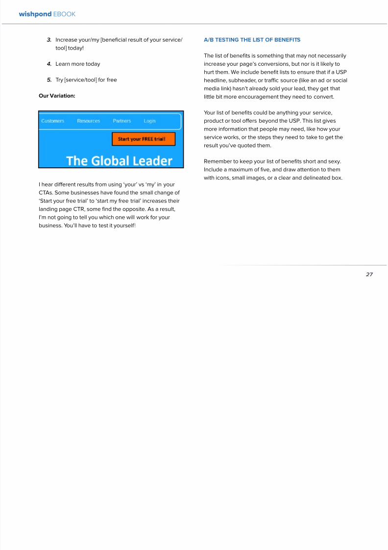
892019 Landing Pages eBook 1
httpslidepdfcomreaderfulllanding-pages-ebook-1 2965
AB TESTING THE COLORS
Sometimes itrsquos the smallest details that have the largest effect on your conversions Itrsquos changing the color of your CTA
button from light green to yellow (145 conversion increase) Or contrasting the color of two links within a single image
(60 increase in conversions)
To get an idea of how color can affect your business persona elicit an emotion or encourage an action read The
Psychology Behind a Successful Facebook Ad Part 1 Color Or for the people who ate lunch at their desks todayhellip
Here are the psychological impacts of five main colors
1 Blue Blue is across both genders and all age-
groups most peoplersquos favorite color It is said tocreate the sensation of trust and security Lighter
blues are calming while darker blues denote
professionalism and sincerity
2 Green Associated with wealth as well as
environmental subjects green is the easiest color
for the eye to process Green signifies positive
action (thinkrsquogreen means gorsquo) and affirmation
3 Purple Associated with calm femininity and
wealth purple is the second most popular color
among women at 23 On the other hand purple
is the favorite color of 0 of the male population
4 Red The color red is associated with passion
excitement and urgency Itrsquos a dangerous colorin marketing as many people associate red with
negativity and mistakes However it attracts the
eye better than any other color and gives the
impression that time is passing faster than it is (as
it causes our heart to beat faster) causing us to act
when we otherwise wouldnrsquot
5 Orange Eye-catching bright and sunny orange is
one of the most popular colors for landing page
Calls-to-Action While a good tone and amount
of orange is seen as warm and inviting too much
has been associated with naiveteacute and a lack of
professionalism
wishpond EBOOK
29
892019 Landing Pages eBook 1
httpslidepdfcomreaderfulllanding-pages-ebook-1 3065
Our VariationFinal Edit
wishpond EBOOK
30
892019 Landing Pages eBook 1
httpslidepdfcomreaderfulllanding-pages-ebook-1 3165
What do you think Does your gut say the landing page
wersquove created would convert better than the original
Letrsquos do some quick arithmetic
bull AB Testing the USP Possible conversion rate
increase of 127
bull AB Testing the image Possible conversion
increase of 98
bull AB Testing the CTA Possible conversion rate
increase of 161
bull AB Testing the list of benefits Possible conversion
rate increase of 91
bull AB Testing the trust symbol Possible conversion
rate increase of 72
bull AB Testing the colors Possible conversion rate
increase of 21
Total possible increase in landing page conversions
570
Conclusion
AB Testing works And unless yoursquore going to engage
with a 3rd party provider with tested and proven landing
page templates (which Wishpond will be in a week or
two) you need to be doing it yourself Often
The AB Testing process is continuous - not necessarily
because your landing page isnrsquot optimized but because
it wonrsquot stay optimized And honestly itrsquos very likely
your landing page will never be 100 optimized for
conversions anyway Therersquos always small steps you can
take tiny variables to change that will affect the pagersquosconversion rate
wishpond EBOOK
31
892019 Landing Pages eBook 1
httpslidepdfcomreaderfulllanding-pages-ebook-1 3265
Chapter 4
Landing
PagesHow to Sell your
Product without
Selling your
Product
wishpond EBOOK
892019 Landing Pages eBook 1
httpslidepdfcomreaderfulllanding-pages-ebook-1 3365
Do you get solid traffic to your landing page but struggle
to convert a sale
This article will give you five proven strategies of selling
your product without spamming - of pushing a sale
without pushing your customer over
Landing pages are a delicate balance between promoting
enough to encourage a sale and little enough that the
lead doesnrsquot feel pressure and bounce
Letrsquos take a look at five ways you can sell without selling
1 OFFER BENEFITS NOT FEATURES
This is the most important thing to keep in mind when
writing up the sales points of your business or products
People get sold on how a product or business can solve
their problems not on the details
I admit promoting the benefits is harder than promoting
the features of your product Selling benefits means you
have to identify the problems of your target audience and
come up with how your product or service solves those
problems You have to leave the safety of jargon and
technical details and venture into the real world
To help you understand the difference between features
and benefits here are a few examples
Selling Features
1 The AcmeTikon12 has 300 gigabytes of space
2 Our AcmePad2000 has a 17GHz processor
3 Our AcmeWebToolrsquos templates have over 5000
color options
Selling Benefits
1 The AcmeTikon12 has enough space for 75000
songs
2 Our AcmePad2000 is our fastest than ever making
browsing a cinch
3 We guarantee our AcmeWebToolrsquos templates will
have your businessrsquo brand colors
wishpond EBOOK
33
i
892019 Landing Pages eBook 1
httpslidepdfcomreaderfulllanding-pages-ebook-1 3465
wishpond EBOOK
34
Features still have their place on your landing pages To
safely cover all your bases use your product or servicersquos
features to support the benefits to your target audience
Or translate the sexy-sounding (if somewhat obscure)
feature into a concrete benefit for the consumer like
Wishpond has done below
2 USE CUSTOMER TESTIMONIALS AND REVIEWS
Face it to most visitors to your landing page yoursquore not
exactly a trustworthy source They recognize yoursquore
the slightest bit biased when it comes to this particular
subject (your own product)
So donrsquot sell your own product have someone else do
it for you Since Amazon took over online selling about
20 years ago internet users are increasingly trusting the
word of their peers over any other sources
By the way did you know Amazon accounts for more
online sales than the next 12 competitors combined I
didnrsquot
Needless to say reviews have never been more
important nor have customer testimonials Yes visitors
to your landing pages know that these testimonials come
through your business but it doesnrsquot matter Not only do
customer testimonials function to make your audience
trust your business it gives them the assurance that
someone has engaged with you before - so theyrsquore safe
to do so
Herersquos an example from Wishpondrsquos FacebookSweepstakes App landing page - from our friend Josh
Beaty
i h d OO
892019 Landing Pages eBook 1
httpslidepdfcomreaderfulllanding-pages-ebook-1 3565
For ecommerce businesses test offering product reviews like Amazon does AB test stars or a 5-point system or whatever
creative method of reviewing you can think of Be aware though that the review process also opens up the chance of
negative feedback
Whatever you do donrsquot fake reviews If your products arenrsquot awesome enough to earn more positive reviews than negative
pull the review tool until yoursquove stepped it up
3 MAKE IT BEAUTIFUL
This should be an obvious one but I canrsquot tell you how many times I see an appealing product portrayed in an ugly way Put
time and effort into framing your product in the best possible light AB test a model with your product AB test the gender
of your model AB test the colors behind your model AB test no model but a beautiful abstract collage that resembles a
Kandinsky piece I donrsquot care - just make it pretty
To illustrate my point on the most basic level which one of these do you think will sell better Same sunglasses one with a
white background one with a Johnny Depp background
wishpond EBOOK
35
i h d EBOOK
892019 Landing Pages eBook 1
httpslidepdfcomreaderfulllanding-pages-ebook-1 3665
But making it beautiful isnrsquot just about your
picture
Words can also be beautiful and the words we use canmake our products just as appealing as a great picture A
quick look at the Lexus homepage and yoursquoll know what
Irsquom talking about Head to their lsquoAutomobilesrsquo tab (notice
that Lexus makes lsquoautomobilesrsquo not lsquocarsrsquo) Each class of
automobiles has its own slogan from the ISrsquos lsquoDriving in
Every Sensersquo to the GXrsquos lsquoExpand your Possibilitiesrsquo
Do these slogans have any real relevance to the car
they represent No But do these words create a certain
desirable feeling in their reader Absolutely
Lexus also makes it a point to frame their products in
terms of an ideal customer - a customer their customers
want to be For instance their LX (SUV) lsquoenables you
to venture where few others can while surrounded in
unsurpassed interior comfort and refinementrsquo which
sounds like something I might want to do
Words have a huge impact on us Of course putting your
product in the best possible visual light is vital to making
a sale but donrsquot neglect the importance of the words you
use
5 Phrases that Make your Product Sound Desirable
1 Sleek and sophisticated
2 Pinnacle of artistry
3 Premium technology and unparalleled innovation
4 Reinvention of [relevant field-focused term]
5 Faster newer affordable exclusive
4 MAKE YOUR LANDING PAGE CHILL
I was trying to think of a better word than lsquochillrsquo but I think
itrsquos actually the most accurate Donrsquot be needy Donrsquot be
pushy Let your product or service speak for itself through
clear benefits awesome images and appealing text Sit
back a bit If yoursquore ever feeling like lsquool Gil in the header
image up there remember to chill - your customers will
thank you
Keep a personal touch in all the written parts of your
landing page Test out framing your product or service
in terms of lsquoyoursquo or the idealized customer I referred to
above
wishpond EBOOK
36
i h d EBOOK
892019 Landing Pages eBook 1
httpslidepdfcomreaderfulllanding-pages-ebook-1 3765
Converting should be your visitorrsquos idea not yours They should be sold by the value theyrsquore receiving When creating your
optimized landing page keep in mind the ratio of risk over reward Is what yoursquore offering worth what yoursquore asking from
your customer
CTAs
Remember to keep your CTAs appealing rather than demanding Use lsquoyoursquo or lsquomyrsquo lsquofreersquo and lsquogetrsquo Tell people what they
stand to gain not what to do
Here are 5 appealing CTA formulas
1 Start yourmy free [trial period]
2 Get yourmy free [focus of landing page]
3 Increase yourmy [beneficial result of your servicetool] today
4 Learn more today
5 Try [servicetool] for free
wishpond EBOOK
37
wishpond EBOOK
892019 Landing Pages eBook 1
httpslidepdfcomreaderfulllanding-pages-ebook-1 3865
5 SELL THE DEAL NOT THE PRODUCT
Are you one of those people who finds themselves
buying things they donrsquot need just because itrsquos a great
deal I most definitely am (damn you IKEA) Offers andcontests are my favorite strategy for lead generation and
to encourage a sale (genuinely not just because I work
for a company that builds online promotional tools for
small business)
The right offer is sellable simply as an offer - the product
itself is actually secondary to the deal
The best strategy for using offers is to target well with
a Facebook Ad This way the traffic yoursquore generating
to your landing page is already half-nurtured whether
because of their interests job title relationship status
etc A half-nurtured lead will be better informed of how
good a deal theyrsquore getting making conversion more
likely
Remember however deals work best as value
propositions You need to back up your offer with some
substance
Donrsquot necessarily prioritize the offer over visuals benefits
and an awesome overall product An offer wonrsquot always
work entirely on its own (At least unless your deal is just insane I mean who hasnrsquot brought home bean-bag
chairs to their already fully-furnished tiny apartment
They were buy one get two free)
The best strategy is to use great images sell someone
on the product every benefit every facet of the thing
and then wow them with the fact that this amazing state-
of-the-art life-changing product is only $2999 for thismonth only
wishpond EBOOK
38
892019 Landing Pages eBook 1
httpslidepdfcomreaderfulllanding-pages-ebook-1 3965
wishpond EBOOK
892019 Landing Pages eBook 1
httpslidepdfcomreaderfulllanding-pages-ebook-1 4065
Chapter 5
Landing
PagesOptimizing your Page
for Lead Generation
wishpond EBOOK
wishpond EBOOK
892019 Landing Pages eBook 1
httpslidepdfcomreaderfulllanding-pages-ebook-1 4165
Do you have an awesome landing page Is it optimized
for your lead generation objectives
Email leads are the number one concern for online
marketers You need a landing page that converts has alow bounce rate and engages your consumer enough to
get the lucrative contact
In this article Irsquoll show you how to optimize your landing
page for lead generation by
bull optimizing your SEO
bull focusing on value
bull optimizing your entry form for engagement
bull implementing a customer testimonial campaign
Letrsquos check it out
OPTIMIZE IT FOR SEO
The chief source of most leads is still search Increase
the chance of a lead finding your landing page in the first
place by optimizing it with Googlersquos search algorithm in
mind
Optimize your Landing Pagersquos Title
Your landing pagersquos title is what shows up in the tab This
is different than your page headline USP or what shows
in the URL When creating your page in wordpress or withHTML keep in mind the title best practices
bull Keep it short
bull Keep it keyword-centric
bull Use long-tail format
Whatrsquos long-tail format
Since the Hummingbird update Google is prioritizing the
context of a search as much as it is the keywords Long-
tail is this context-centric search format
Think of asking SIRI lsquoWherersquos the best Thai restaurant
in the arearsquo She scurries off with that information and
comes back with a response that makes sense Google is
designing its search to do the same Instead of lsquoLanding
pages 10 steps to Conversionsrsquo test out calling your
landing page something like lsquoHow to Build a Landing
Page that Convertsrsquo as this is what people will ask of
wishpond EBOOK
41
wishpond EBOOK
892019 Landing Pages eBook 1
httpslidepdfcomreaderfulllanding-pages-ebook-1 4265
Your title is what Googlersquos little algorithm bot sees first
when itrsquos sent off by a web userrsquos search Optimize your
landing pagersquos title and that bot will see you first
Social Share Buttons
If yoursquore basing your landing page around a resource
(like an ebook or a whitepaper) that content is highly
shareable And since Googlersquos hummingbird update
earlier this fall social shares are more valuable than ever
In fact Google+1rsquos are now ranked as more important
than link-building (something traditional SEO gurus are
struggling with to say the least)
Encourage social engagement by promoting your landing
page on Facebook Twitter and especially Google+ And
perhaps most importantly (and simply) throw up a few
social share buttons along the side or at the top of your
landing page This has been quoted as increasing the
virality of a blog post for instance by up to 700
5 More Awesome SEO tips
1 Use different headings tags (like lth1gt and lth4gt)
and bold and italicize keywords the Google search
bot sees these more than it does normal text
2 Optimize your copy with keywords dynamically
and fluidly spread throughout
3 Include an image with alt tags - this lets the search
engine know what your image is about Also will
show up in image search
4 Link to your landing page within your own website
5 Syndicate your landing page as much as possible
with link-building on forums and social media
platforms
For more information about optimizing for SEO check
out my article How to Easily Optimize your Blog for SEO
Many of the takeaways apply for landing pages as well
FOCUS ON VALUE
In order to encourage a lead to engage you need to
convince them itrsquos worth it This means value propositions
wishpond EBOOK
42
wishpond EBOOK
892019 Landing Pages eBook 1
httpslidepdfcomreaderfulllanding-pages-ebook-1 4365
and a great USP It also means you keep your landing
page simple You should be convincing quickly and easily
Ask your page visitor to read too much do too much and
theyrsquoll bounce
Be Specific
One of the main strategies in lead generation is limiting
your landing pagersquos bounce rate to the smallest
percentage you can Realistically yoursquoll be jumping for
joy and screaming from the mountaintops if your pagersquos
conversion rate is over 20
A recently-discovered best practice is that people
respond to specific numbers far more than they do round
numbers For instance quoting your business as having
80000 customers is less believable (and therefore less
powerful for conversions) as quoting your business as
having 75250 customers
Also keep your value propositions simple
bull Make the benefit of your business easy to
understand
bull Use dollar values percentages the word lsquofreersquo
bull Donrsquot use too much page space selling the specifics
of your service or your resource
Benefit List
If yoursquore using an email-gated ebook or other resource
for lead-generation think about your benefit list as the
second point of your argument Your Value Proposition
and image draw their attention and your list of benefits
tell them specifically how they stand to benefit from
entering their information and downloading your
resource
3 Benefit Formulas
1 [Number of things] yoursquoll learn in this ebook
2 How this resource will cause a rsquo [desired result]
3 The [number of steps] to [a certain goal]
OPTIMIZE YOUR ENTRY FORM
Your entry form is the focus of a lead-generating landing
page As far as your lead-generation funnel goes that
entry form CTA is the equivalent of lsquoproceed to check
outrsquo So make sure itrsquos optimized for conversions with
wishpond EBOOK
43
wishpond EBOOK
892019 Landing Pages eBook 1
httpslidepdfcomreaderfulllanding-pages-ebook-1 4465
these easy steps
1 Draw the Eye
You want your entry form to be obvious - donrsquot hideit below-the-fold or with small font Not only will this
increase interaction itrsquoll make it clear to visitors what
yoursquore asking of them Web users like things simple
and clear If they feel therersquos any chance theyrsquore being
swindled theyrsquoll bounce
6 Entry Form Design Tips
1 Encapsulate your entry form within a box
2 Draw attention to your entry form with the br ightly-
colored CTA
3 Use a vertical or horizontal line to separate your
entry form from the rest of the page
4 Include an action-oriented headline above your
form fields (like lsquoget your trial startedrsquo or lsquostart
learning nowrsquo)
5 Contrast the colour of your entry form box with the
page around it
6 AB Test including a short descriptive sentence
describing what happens when they click your CTA
wishpond EBOOK
44
wishpond EBOOK
892019 Landing Pages eBook 1
httpslidepdfcomreaderfulllanding-pages-ebook-1 4565
2 Balance Demographic Collection with Bounce
Rate
Optimizing your entry form is about weighing up the
valuable information yoursquore getting from a lead (detailsyou can use to segment the emailsadvertisements they
receive) versus the amount of form fields it takes to
increase bounce rate
Pro Tip Unless itrsquos absolutely necessary
avoid asking for a phone number People
are far more resistant to giving out phone
numbers than they are of an email or even
an address Spam emails are more accepted
than telemarketing calls during dinner
Letrsquos say yoursquore heavily invested in email marketing and
itrsquos working really well for your business It may be more
important to your business to know the demographic
details of 10 leads than to know nothing about 20 Email
marketing works best if yoursquore able to personalize and
segment your emails However this is entirely up to your
business
One of the benefits of email-gating an ebook or other
resource for lead generation is that you know people who
downloaded it are interested in that content Target them
with similar content in the future
For more information on segmenting your emailmarketing campaigns to get the best ROI possible read
my colleague Kristarsquos article 4 Strategies to Optimize your
Email Segmentation
wishpond EBOOK
45
wishpond EBOOK
892019 Landing Pages eBook 1
httpslidepdfcomreaderfulllanding-pages-ebook-1 4665
CUSTOMER TESTIMONIALS OR TRUST SYMBOLS
Irsquove talked about the value of trust symbols before but I
donrsquot want you to think that just because yoursquore no longer
optimizing for a sale you can forget them
Letrsquos say your page is focused around a free ebook or
white-paper This valuable content is email-gated so
therersquos no real proof (apart from what yoursquore saying) that
what yoursquore promising will be delivered
That is unless you include a customer testimonial like a
quote (I recommend including a picture of the customeras it makes it far more trustworthy) or short video clip If
yoursquore asking for a phone number or email address be
sure to let people know - obviously - that you donrsquot sell
these details or spam them
Customer testimonials act as a social endorsement
which have grown in importance in the past few years
This is because since Amazon Yelp and other sites
made customer reviews such a huge part of a successful
product your service needs to do the same
Pro Tip Many businesses have found
their highest conversion rates come from
a landing page built around a photogenic
customerrsquos testimonial Incorporate
an awesome case study for the value
proposition with a large picture and a clear
benefit list of how your page visitor can getthe same result
wishpond EBOOK
46
wishpond EBOOK
892019 Landing Pages eBook 1
httpslidepdfcomreaderfulllanding-pages-ebook-1 4765
Conclusion
Hopefully you now have a better idea of how to optimize your landing page for lead generation Be sure to prioritize your
entry form communicate simply and accurately and use a customer testimonial to convince your possible lead to convert
wishpond EBOOK
47
wishpond EBOOK
892019 Landing Pages eBook 1
httpslidepdfcomreaderfulllanding-pages-ebook-1 4865
Chapter 6
Landing
PagesThe Science
Behind Designing
for Conversion
p
wishpond EBOOK
892019 Landing Pages eBook 1
httpslidepdfcomreaderfulllanding-pages-ebook-1 4965
Is your landing page converting well Is it converting
badly Do you know why I mean do you really know
This article will give you the science and psychology
of why your landing is engaging to visitors or why youmight be getting traffic - but no conversions
Irsquoll take a look at 5 principles of landing
page design that can mean the difference
between a successful page and one thatrsquos
just taking up space (or fumbling around in
the dark)
Letrsquos get started
1 DIRECTIONAL CUES
Directional Cues are key in landing page design as they
tell people what to focus on
The most important thing to remember when designingyour landing page is that people do not view it like they
do a book Itrsquos not left to right top to bottom You have to
tell people how to read your page and directional cues
(as well as encapsulation and contrast below) are how
you do this
My recommendation is to decide two things on your
landing page that you especially want to drive attention
to (say your CTA and your product image or maybe aUSP) Then integrate a couple of the strategies below
into your design and AB test it Maybe your audience
responds well to the overt arrow or maybe the more
subtle eye-gaze Test it for yourself
Therersquos three main ways that we signal a focus point in
landing pages
Arrows and lines
p
49
wishpond EBOOK
892019 Landing Pages eBook 1
httpslidepdfcomreaderfulllanding-pages-ebook-1 5065
The most straightforward way to direct attention at an object or heading is to draw an arrow or line to it Students of art
will know the importance of lines as humans have a natural (subconscious) impulse to follow them to their origin or their
destination This works great to focus peoplersquos gaze on your CTA USP value proposition or product image
Eye-direction
Humans are incredibly good at recognizing the eye-focus point of the people around them I recommend using an eye-
tracking software on your landing page to determine where people are focusing and whether this focus is resulting in an
increased click-through-rate
What Irsquom talking about (thanks to Neil Patel
for the eye-tracking examples)
The red spots indicate the areas which
viewers looked at most Take note of how
the eye direction in the example on the left
draws the viewer`s attention towards the
product
p
50
wishpond EBOOK
892019 Landing Pages eBook 1
httpslidepdfcomreaderfulllanding-pages-ebook-1 5165
Faces are the most eye-attracting image you can use (see
5 below) and the eyes are the most eye-attracting part
of the face
Yoursquoll notice the woman on the left is looking directly atthe camera (or visitor to your page) The woman on the
right is looking at the product that Sunsilk is trying to sell
You can see in concrete terms how the initial gaze goes
to the womanrsquos eyes and then tracks left to the product
whereas the face on the left gets all the attention and the
product none
PointingGesturing
I highly recommend you use an image of a person in your
landing page as itrsquos proven to be the most engaging
picture (more on that later though) Something to test
however is having that model gesturing or pointing
towards something you want to focus attention on
This is a dangerous one though as (in my mind) it can
come across as cheesy if done incorrectly Test what your
audience responds to Irsquove seen this both increase and
decrease conversion rates in many case studies
2 CONTRAST
Color contrast
Contrast is essential when working with landing pagesThe human eye is naturally attracted to contrasting color
I recommend you consider color contrast for your USP
and CTA - perhaps an orange CTA button on a dark blue
background
Blank space
The idea of blank space is well-known in the graphic
design world and no less a vital part of landing page
design The idea is that blank space is extremely
influential in focusing attention on non-blank space For
instance
p
51
wishpond EBOOK
892019 Landing Pages eBook 1
httpslidepdfcomreaderfulllanding-pages-ebook-1 5265
Another way of utilizing blank space is with
encapsulation This can be done by framing a section
of content with a border or a container (filled in with
a background color) Give the encapsulated section
enough space to allow it to function somewhatindependently of the rest of the composition
Will this work better than a directional cue Test it for
yourself and find out
Format contrast
Formatting size (of font for instance) also attracts the eyeIn a 4-week multivariate test in 2010 Paras Chopra tested
the performance of 12 different combinations of a Call-to-
Action and descriptive link
Option 10 with the largest contrast in color hue and size
(as well as the word Free) generated a 60 improvement
in conversion rate
3 COLOR
Color is extremely (though unconsciously) effective
at eliciting emotion in viewers I took an in-depth
look at color psychology in my series on the science
behind a successful Facebook Ad so check it out for a
comprehensive analysis (with science)
For now herersquos a breakdown of how humans areinfluenced by color - and how this knowledge can
improve your conversion rates
Blue Blue is across both genders and all age-groups
most peoplersquos favorite color (35 of women and 57
of men) It is said to create the sensation of trust and
security Lighter blues are calming while darker blues
denote professionalism and sincerity
Orange Eye-catching bright and sunny orange is one of
the most popular colors for landing page Calls-to-Action
While a good tone and amount of orange is seen as warm
and inviting too much has been associated with naivete
52
wishpond EBOOK
892019 Landing Pages eBook 1
httpslidepdfcomreaderfulllanding-pages-ebook-1 5365
and a lack of professionalism
Red The color red is associated with passion excitement
and urgency Itrsquos a dangerous color in advertising as
many people associate red with negativity and mistakesHowever it attracts the eye better than any other color
and gives the impression that time is passing faster than
it is (as it causes our heart to beat faster) causing us to act
when we otherwise wouldnrsquot
Green Associated with wealth as well as environmental
subjects green is the easiest color for the eye to process
Green also signifies positive action (thinkrsquogreen meansgorsquo) and affirmation
Green and teal have also been associated with shoppers
on a budget Itrsquos also the second and third most popular
color among men and women respectively
Purple Associated with calm femininity and wealth
purple is the second most popular color among women
at 23 Interestingly as women get older their liking for
the color purple increases On the other hand purple is
the favorite color of 0 of the male population
Black Powerful sleek and intellectual black signifies
permanence sincerity and sophistication While black
can like red and orange be a dangerous color if used
too much it can communicate professionalism and
sophistication when used in conjunction with a strong
clear white (avoid greys or tans as theyrsquoll wash out yourmessage)
4 IMAGERY
I could discuss the effectiveness of a picture of a smiling
person on your landing page for hours (and I havehellip) but
just trust me that having an image (especially a person)
will likely improve your conversion rates
Something Irsquove seen recently actually is incorporating a
customer testimonial with the main landing page image
Choose a photogenic customer and post it up next to an
awesome-sounding affirmation of how your product or
service made their lives easier
But letrsquos leave that for the moment assuming you
recognize its importance and talk about why it works
bull We respond far more emotionally to people (or pets
though people generally elicit a stronger response)
than we do to words or random images
53
wishpond EBOOK
892019 Landing Pages eBook 1
httpslidepdfcomreaderfulllanding-pages-ebook-1 5465
bull A picture of a person provides subtext to your
landing page - a story which people respond to
bull We completely subconsciously focus on the faces
of people we see (especially the eyes) In everyeye-tracking image Irsquove ever seen the hottest
points are the face and eyes Unless of course
the image is of a woman and wersquore talking about a
male demographic Then the eye-tracking software
shows our attention to behellip elsewhere
In my research for this article I came across an article by
VS Ramachandran (a neuroscientist from Oxford) whowrote that oftentimes a line drawing is more powerful
than a photograph He writes that this is because the
lsquoidearsquo of a person is more appealing than the truth of it
(why so much of art is exaggeration of the human form or
why caricatures are so aesthetically pleasing) Leave out
the details and all yoursquore left is the essence of a thing
Although I havenrsquot yet seen an example of this in a
landing page or incorporated it into my own I believe
that whoever does will see a dramatic increase in click-
throughs Get creative and let me know how it goes
5 TYPOGRAPHY AND STYLE
Yoursquoll think that Irsquom getting too detailed here that
different typographies text formats or styles canrsquot actually
increase or decrease conversion rates enough to matter
Herersquos the thing with AB testing details do matter
Letrsquos say your Ecommerce sitersquos landing page is currently
converting at 23 Yoursquore seeing traffic of around 2000
visitors per week and their average purchase is worth
50 dollars to your business Yoursquore making $23000 per
week
Letrsquos say we change your pagersquos headline length and
change the image from one of a woman looking at
the camera to one looking at the CTA (small changes
yoursquod agree) You see a conversion rate increase of
10 Suddenly yoursquore converting at 253 and yoursquove
increased your weekly income to $25300 Yearly
revenue increase $27600
Typography and style changes to AB test
bull Font size for headings and body copy (and the
difference between them)
54
wishpond EBOOK
892019 Landing Pages eBook 1
httpslidepdfcomreaderfulllanding-pages-ebook-1 5565
bull Heading length (short and succinct vs long and
detailed)
bull Number of different font sizes (too many makes
your landing page confusing - I recommend two orthree)
bull Fonts Keep in mind that different fonts are for
whatever reason viewed as more amateurish than
others We at Wishpond like San Sarif for headlines
and Sarif for body copy Avoid cursive (except
maybe for a header) and comic sans is a no-no for a
professional business
bull More text vs less (I like a simple landing page - get
to the point and leave any extraneous information
for later emails or different tabs But test this for
yourself)
Conclusion
Hopefully you now understand a little more of the
science and psychology behind landing page design best
practices Remember to provide visual clues for whereyou want your visitor to focus Donrsquot forget the details
like typography or eye-direction
And keep testing You can always improve your landing
page conversion rates Trust me
55
wishpond EBOOK
892019 Landing Pages eBook 1
httpslidepdfcomreaderfulllanding-pages-ebook-1 5665
Chapter 7
3 Landing
PageExamplesCritiqued to Hell and
Back
wishpond EBOOK
892019 Landing Pages eBook 1
httpslidepdfcomreaderfulllanding-pages-ebook-1 5765
Howrsquos your landing page doing Is it optimized for
conversions Optimized for lead generation
How about we check out a few pages from around
the web In this article Irsquoll dissect four landing pagesvariable by variable discussing where theyrsquove done it
right and where therersquos room for improvement
Itrsquos all well and good for me to tell you a picture is an
essential part of your landing page but until you see
(pardon the pun) what Irsquom talking about itrsquos just that
talk
So letrsquos do this thing
1 SALESFORCE
Salesforce (for those somehow unfamiliar) is a
Customer Relationship Management (CRM) business
based out of San Fran
Herersquos their current landing page raquo
57
wishpond EBOOK
892019 Landing Pages eBook 1
httpslidepdfcomreaderfulllanding-pages-ebook-1 5865
What I Like About this Page
bull The imagery The first thing that hits you when you
traffic to SalesForcersquos landing page is the visual
representation of what they do Though by nomeans unique the visuals of lsquoconnect everything
with our awesome appsrsquo is clear
bull The image size I like how prominent their visuals
are About 75 of their lsquoabove the foldrsquo landing
page area is taken up by this image
bull The prioritized pages What I mean by this is simple
the three blue buttons on the right side (and also
beneath the benefit list paragraph) will traffic to
equally-optimized landing pages The tabs in gray
at the top are quite clearly subordinate (I know
this because of their color contrast encapsulation
etc) and traffic on them will be substantially less I
like the emphasis being placed on the things most
important to their leads
bull The Value Proposition Salesforce has gone
with two value propositions over a USP for their
header I like the succinct and appealing ldquoConnect
everythingrdquo especially
bull The benefit list Though not in bullet-point form
the below-the-fold paragraph of USPrsquos and value
propositions is still effective lsquoBuild customer loyaltyrsquo
(Boom) lsquoIncrease first call resolution and agent
productivityrsquo (Boom) lsquoImprove customer satisfactionby 37rsquo (Boom)
bull The specificity Perhaps my favorite part of this
entire landing is the sentence lsquoimprove customer
satisfaction by 37rsquo This kind of statistic is
incredibly convincing as itrsquos low enough and
specific enough to be entirely believable It also
shows me that theyrsquore professional enough to havedone their research and (I trust) can back up this
statistic with proof
Where I Think they Could Optimize this Page
bull Contrast the imagery I like the use of multiple
images on landing pages (one primary above-the-
fold and one secondary below it) However to
maximize the appeal of your images I recommend
you make them distinct from each other These two
images accomplish the same visual representation
I mentioned above How about keeping the same
image at the top and changing the below-the-fold
58
wishpond EBOOK
892019 Landing Pages eBook 1
httpslidepdfcomreaderfulllanding-pages-ebook-1 5965
59
image to a satisfied customer instead
bull Customer testimonials Perhaps SalesForce is relying on their substantial reputation as the worldrsquos CRM leader but
Irsquod still recommend they included a picture (and quote) from one of their prominent clients This is a businesses that
regularly works with Facebook General Electric and Delta Airlines Irsquod recommend testing a quote and image fromone of these businesses with the brand namelogo prominently placed
AB Testing Postulation
Irsquod theorize that integrating a customer testimonial with an image into a revolving album below-the-fold (on the right) could
increase conversion rates on this page by 10
2 MAILCHIMP
Mailchimp is the most successful email automation company out there (with more than 5 million users)
View their landing page on the next page
wishpond EBOOK
892019 Landing Pages eBook 1
httpslidepdfcomreaderfulllanding-pages-ebook-1 6065
60
wishpond EBOOK
892019 Landing Pages eBook 1
httpslidepdfcomreaderfulllanding-pages-ebook-1 6165
61
What I Like About this Page
bull The tagline ldquoSend Better Emailrdquo is one of the
simplest and most straightforward of all successful
landing pages Irsquove seen Itrsquos to the point andeffective Mailchimp has also had this tagline since
mid June of 2013 meaning itrsquos working for them
bull The USP ldquoMore than 5 million people use
MailChimphelliprdquo is about as unique as you can get
Peer endorsement is the most powerful USP you
can bring into play
bull The Image Red on a blue background stands out
fantastically and attracts the eye - I also the giving
a snapshot of their tool giving people a glimpse at
what they have to offer
bull The CTA(s) Although not as noticeable as ldquoSign
up Freerdquo (which consistently performs better than
simply ldquoSign Uprdquo) I really like ldquoJoin them todayrdquo in
the small paragraph beneath the tagline This is as
much as CTA as the buttons are and plays to the
peer pressure effectiveness of the page
Where I Think they Could Optimize this Page
bull The color scheme Irsquod be interested to see the
effect of a dark blue background and white taglines
benefits As it stands now the page is somewhatboring
bull The toolbar at the top Such a simple and minimalist
landing page needs to accentuate their ldquoFeaturesrdquo
ldquoPricesrdquo and ldquoSupportrdquo buttons at the top to make
it easy to access these important parts of the
decision-making process
bull The CTA(s) While I like the language used Irsquod be
curious to see the effect of making the CTAs stand
out a bit more with a contrasting color to draw the
eye
bull Irsquod test a customer testimonial rotation Mentioning
the 5 million people who use Mailchimp is all
well and good but Irsquod recommend rotating in a
photogenic former customer with a quote on the
effect that Mailchimp had on their businessrsquo email
marketing ROI
wishpond EBOOK
892019 Landing Pages eBook 1
httpslidepdfcomreaderfulllanding-pages-ebook-1 6265
62
AB Testing Postulation
Irsquod theorize that a customer testimonial addition could increase conversions on this page by up to 10 A concrete number
or percentage taken from a case study would make the page more effective
3 KISSMETRICS
Customer analytics platform
Kissmetrics is entrepreneur Neil
Patelrsquos 2008 baby
Herersquos their current landing page raquo
wishpond EBOOK
892019 Landing Pages eBook 1
httpslidepdfcomreaderfulllanding-pages-ebook-1 6365
63
What I Like About this Page
bull The image If yoursquore unsure exactly what image
you should use for your landing page fall back
on something like this A smiling normal-lookingperson (photogenic but not a model) is your best
bet
bull The simplicity Yes this is the entire landing page
Nothing but lsquoabove-the-foldrsquo It relies entirely on the
USP which is incredibly effective
bull Knowing their market Customer analytics are a field
only interesting to people who know what Google
Analytics is Nobody starts with Kissmetrics and
moves to Google Analytics As such the USP is
incredibly effective
bull Logging in with a Google account Irsquove mentioned
before how an email address is worth so much
more to your business than it is to its owner (and
how a phone number is so much more of an ask)
Well a social platform login is worth even less to
its owner - this allows Kissmetrics to ask for less
from a lead and get exactly the same details (if not
more) than they would were they to ask for an email
address
bull The popup The bottom-right popup (which reads
lsquowhatrsquos preventing you from wanting to start a
free trial of Kissmetricsrsquo) does not appear forevery person that traffics to this landing page
This would mediate the drop in conversion rates
that this popup likely causes However this popup
also provides Kissmetrics with extremely valuable
information namely what they can do to encourage
a sign-up Trading a little conversion rate (especially
if you do this temporarily) can be worth more
information This is a similar trade Irsquove talked aboutbefore where more entry boxes give you better
lead knowledge but can decrease conversion rates
- something you have to balance
Check out my article lsquoValue Proposition Formulas that
Boost Conversion on Ads and Landing Pagesrsquo where I
take an in-depth look at how to use Kissmetricrsquos formula
and 6 others
Where I Think they Could Optimize this Page
bull The Image Okay I really like this image but Irsquod be
curious to see how a landing page with a revolving
wishpond EBOOK
892019 Landing Pages eBook 1
httpslidepdfcomreaderfulllanding-pages-ebook-1 6465
64
album would do How about three different USP
value proposition + image combinations revolving
every 75 seconds (Genuinely I recommend you
test the time lapse you use if you employ revolving
images)
bull Learn More The ldquoLearn Morerdquo link in the bottom
left of this landing page is too quiet Irsquod recommend
a subtle encapsulation and slightly larger font I
think this landing page is incredibly effective but
clearly the issue theyrsquoll have is not offering enough
information about what they do A ldquoLearn Morerdquo
link is an awesome way of doing this but itrsquos notobvious enough for everyone to see and I wonder if
that doesnrsquot increase their bounce rate
bull A Case Studies Tab I donrsquot want to ruin the
contemporary minimalist appeal of this landing
page but I would be interested in testing a lsquocase
studiesrsquo or lsquocustomer storiesrsquo tab next to lsquoSign Inrsquo on
the top bar Like the lsquoLearn Morersquo link this would
make it a little easier for visitors to find the answers
to their questions without cluttering the page with
the customer testimonials benefit list and trust
symbols I usually recommend
AB Testing Postulation
Irsquod theorize that making the lsquoLearn Morersquo link on the
bottom right just slightly more obvious would increase
conversions from this page Herersquos why If someone typesin lsquocustomer analyticsrsquo into Google search theyrsquoll click on
Kissmetrics Irsquod be concerned that at the moment they
may bounce due to lack of ready information A more
visible lsquoLearn Morersquo link could increase conversion by up
to 5
Conclusion
The variables Irsquove discussed and critiqued in this article
encompass most of the optimization strategies I give
our clients Remember that every audience is different
and that (unless yoursquore using an optimized landing page
template) yoursquoll need to AB test your own landing pages
on a monthly basis
wishpond EBOOK
892019 Landing Pages eBook 1
httpslidepdfcomreaderfulllanding-pages-ebook-1 6565
Creating and optimizing your businessrsquo landing pages can be the most influential change you make this year
Wishpondrsquos own landing pages are being constantly updated and optimized - our templates completely customizable Start
a free trial today to check them out and see if wersquore a fit for your business
Thanks for reading
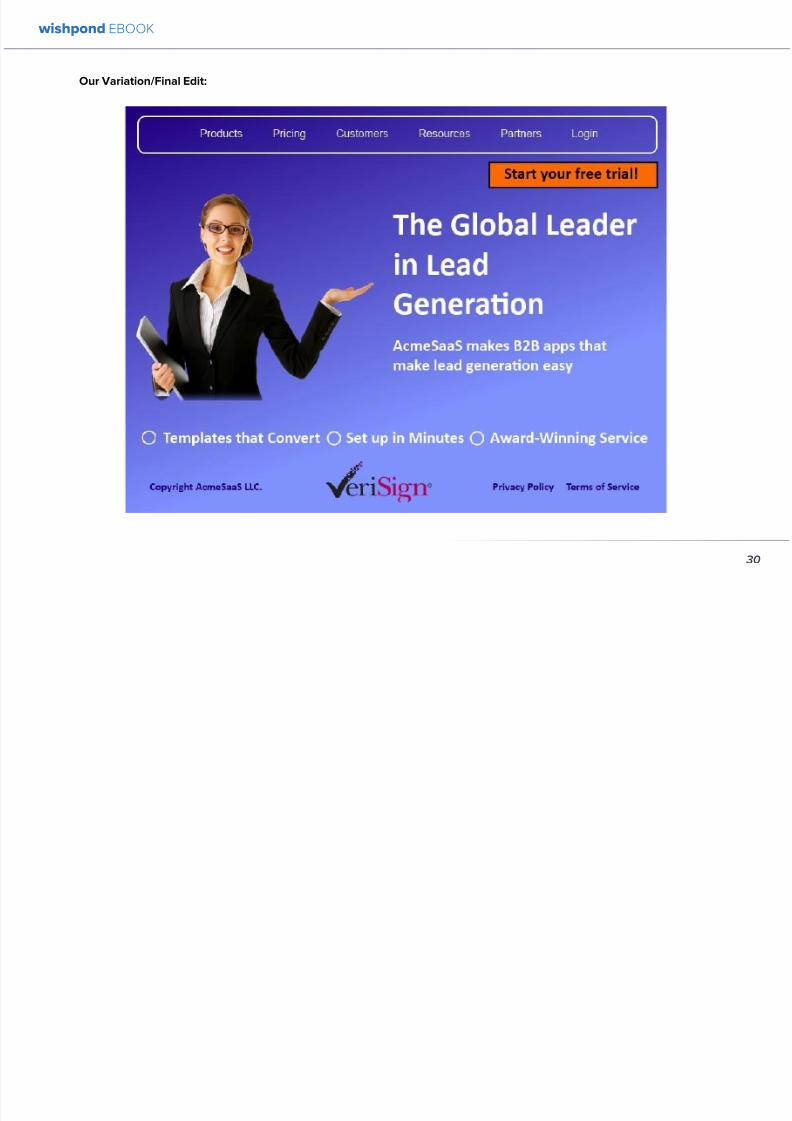
892019 Landing Pages eBook 1
httpslidepdfcomreaderfulllanding-pages-ebook-1 3065
Our VariationFinal Edit
wishpond EBOOK
30
892019 Landing Pages eBook 1
httpslidepdfcomreaderfulllanding-pages-ebook-1 3165
What do you think Does your gut say the landing page
wersquove created would convert better than the original
Letrsquos do some quick arithmetic
bull AB Testing the USP Possible conversion rate
increase of 127
bull AB Testing the image Possible conversion
increase of 98
bull AB Testing the CTA Possible conversion rate
increase of 161
bull AB Testing the list of benefits Possible conversion
rate increase of 91
bull AB Testing the trust symbol Possible conversion
rate increase of 72
bull AB Testing the colors Possible conversion rate
increase of 21
Total possible increase in landing page conversions
570
Conclusion
AB Testing works And unless yoursquore going to engage
with a 3rd party provider with tested and proven landing
page templates (which Wishpond will be in a week or
two) you need to be doing it yourself Often
The AB Testing process is continuous - not necessarily
because your landing page isnrsquot optimized but because
it wonrsquot stay optimized And honestly itrsquos very likely
your landing page will never be 100 optimized for
conversions anyway Therersquos always small steps you can
take tiny variables to change that will affect the pagersquosconversion rate
wishpond EBOOK
31
892019 Landing Pages eBook 1
httpslidepdfcomreaderfulllanding-pages-ebook-1 3265
Chapter 4
Landing
PagesHow to Sell your
Product without
Selling your
Product
wishpond EBOOK
892019 Landing Pages eBook 1
httpslidepdfcomreaderfulllanding-pages-ebook-1 3365
Do you get solid traffic to your landing page but struggle
to convert a sale
This article will give you five proven strategies of selling
your product without spamming - of pushing a sale
without pushing your customer over
Landing pages are a delicate balance between promoting
enough to encourage a sale and little enough that the
lead doesnrsquot feel pressure and bounce
Letrsquos take a look at five ways you can sell without selling
1 OFFER BENEFITS NOT FEATURES
This is the most important thing to keep in mind when
writing up the sales points of your business or products
People get sold on how a product or business can solve
their problems not on the details
I admit promoting the benefits is harder than promoting
the features of your product Selling benefits means you
have to identify the problems of your target audience and
come up with how your product or service solves those
problems You have to leave the safety of jargon and
technical details and venture into the real world
To help you understand the difference between features
and benefits here are a few examples
Selling Features
1 The AcmeTikon12 has 300 gigabytes of space
2 Our AcmePad2000 has a 17GHz processor
3 Our AcmeWebToolrsquos templates have over 5000
color options
Selling Benefits
1 The AcmeTikon12 has enough space for 75000
songs
2 Our AcmePad2000 is our fastest than ever making
browsing a cinch
3 We guarantee our AcmeWebToolrsquos templates will
have your businessrsquo brand colors
wishpond EBOOK
33
i
892019 Landing Pages eBook 1
httpslidepdfcomreaderfulllanding-pages-ebook-1 3465
wishpond EBOOK
34
Features still have their place on your landing pages To
safely cover all your bases use your product or servicersquos
features to support the benefits to your target audience
Or translate the sexy-sounding (if somewhat obscure)
feature into a concrete benefit for the consumer like
Wishpond has done below
2 USE CUSTOMER TESTIMONIALS AND REVIEWS
Face it to most visitors to your landing page yoursquore not
exactly a trustworthy source They recognize yoursquore
the slightest bit biased when it comes to this particular
subject (your own product)
So donrsquot sell your own product have someone else do
it for you Since Amazon took over online selling about
20 years ago internet users are increasingly trusting the
word of their peers over any other sources
By the way did you know Amazon accounts for more
online sales than the next 12 competitors combined I
didnrsquot
Needless to say reviews have never been more
important nor have customer testimonials Yes visitors
to your landing pages know that these testimonials come
through your business but it doesnrsquot matter Not only do
customer testimonials function to make your audience
trust your business it gives them the assurance that
someone has engaged with you before - so theyrsquore safe
to do so
Herersquos an example from Wishpondrsquos FacebookSweepstakes App landing page - from our friend Josh
Beaty
i h d OO
892019 Landing Pages eBook 1
httpslidepdfcomreaderfulllanding-pages-ebook-1 3565
For ecommerce businesses test offering product reviews like Amazon does AB test stars or a 5-point system or whatever
creative method of reviewing you can think of Be aware though that the review process also opens up the chance of
negative feedback
Whatever you do donrsquot fake reviews If your products arenrsquot awesome enough to earn more positive reviews than negative
pull the review tool until yoursquove stepped it up
3 MAKE IT BEAUTIFUL
This should be an obvious one but I canrsquot tell you how many times I see an appealing product portrayed in an ugly way Put
time and effort into framing your product in the best possible light AB test a model with your product AB test the gender
of your model AB test the colors behind your model AB test no model but a beautiful abstract collage that resembles a
Kandinsky piece I donrsquot care - just make it pretty
To illustrate my point on the most basic level which one of these do you think will sell better Same sunglasses one with a
white background one with a Johnny Depp background
wishpond EBOOK
35
i h d EBOOK
892019 Landing Pages eBook 1
httpslidepdfcomreaderfulllanding-pages-ebook-1 3665
But making it beautiful isnrsquot just about your
picture
Words can also be beautiful and the words we use canmake our products just as appealing as a great picture A
quick look at the Lexus homepage and yoursquoll know what
Irsquom talking about Head to their lsquoAutomobilesrsquo tab (notice
that Lexus makes lsquoautomobilesrsquo not lsquocarsrsquo) Each class of
automobiles has its own slogan from the ISrsquos lsquoDriving in
Every Sensersquo to the GXrsquos lsquoExpand your Possibilitiesrsquo
Do these slogans have any real relevance to the car
they represent No But do these words create a certain
desirable feeling in their reader Absolutely
Lexus also makes it a point to frame their products in
terms of an ideal customer - a customer their customers
want to be For instance their LX (SUV) lsquoenables you
to venture where few others can while surrounded in
unsurpassed interior comfort and refinementrsquo which
sounds like something I might want to do
Words have a huge impact on us Of course putting your
product in the best possible visual light is vital to making
a sale but donrsquot neglect the importance of the words you
use
5 Phrases that Make your Product Sound Desirable
1 Sleek and sophisticated
2 Pinnacle of artistry
3 Premium technology and unparalleled innovation
4 Reinvention of [relevant field-focused term]
5 Faster newer affordable exclusive
4 MAKE YOUR LANDING PAGE CHILL
I was trying to think of a better word than lsquochillrsquo but I think
itrsquos actually the most accurate Donrsquot be needy Donrsquot be
pushy Let your product or service speak for itself through
clear benefits awesome images and appealing text Sit
back a bit If yoursquore ever feeling like lsquool Gil in the header
image up there remember to chill - your customers will
thank you
Keep a personal touch in all the written parts of your
landing page Test out framing your product or service
in terms of lsquoyoursquo or the idealized customer I referred to
above
wishpond EBOOK
36
i h d EBOOK
892019 Landing Pages eBook 1
httpslidepdfcomreaderfulllanding-pages-ebook-1 3765
Converting should be your visitorrsquos idea not yours They should be sold by the value theyrsquore receiving When creating your
optimized landing page keep in mind the ratio of risk over reward Is what yoursquore offering worth what yoursquore asking from
your customer
CTAs
Remember to keep your CTAs appealing rather than demanding Use lsquoyoursquo or lsquomyrsquo lsquofreersquo and lsquogetrsquo Tell people what they
stand to gain not what to do
Here are 5 appealing CTA formulas
1 Start yourmy free [trial period]
2 Get yourmy free [focus of landing page]
3 Increase yourmy [beneficial result of your servicetool] today
4 Learn more today
5 Try [servicetool] for free
wishpond EBOOK
37
wishpond EBOOK
892019 Landing Pages eBook 1
httpslidepdfcomreaderfulllanding-pages-ebook-1 3865
5 SELL THE DEAL NOT THE PRODUCT
Are you one of those people who finds themselves
buying things they donrsquot need just because itrsquos a great
deal I most definitely am (damn you IKEA) Offers andcontests are my favorite strategy for lead generation and
to encourage a sale (genuinely not just because I work
for a company that builds online promotional tools for
small business)
The right offer is sellable simply as an offer - the product
itself is actually secondary to the deal
The best strategy for using offers is to target well with
a Facebook Ad This way the traffic yoursquore generating
to your landing page is already half-nurtured whether
because of their interests job title relationship status
etc A half-nurtured lead will be better informed of how
good a deal theyrsquore getting making conversion more
likely
Remember however deals work best as value
propositions You need to back up your offer with some
substance
Donrsquot necessarily prioritize the offer over visuals benefits
and an awesome overall product An offer wonrsquot always
work entirely on its own (At least unless your deal is just insane I mean who hasnrsquot brought home bean-bag
chairs to their already fully-furnished tiny apartment
They were buy one get two free)
The best strategy is to use great images sell someone
on the product every benefit every facet of the thing
and then wow them with the fact that this amazing state-
of-the-art life-changing product is only $2999 for thismonth only
wishpond EBOOK
38
892019 Landing Pages eBook 1
httpslidepdfcomreaderfulllanding-pages-ebook-1 3965
wishpond EBOOK
892019 Landing Pages eBook 1
httpslidepdfcomreaderfulllanding-pages-ebook-1 4065
Chapter 5
Landing
PagesOptimizing your Page
for Lead Generation
wishpond EBOOK
wishpond EBOOK
892019 Landing Pages eBook 1
httpslidepdfcomreaderfulllanding-pages-ebook-1 4165
Do you have an awesome landing page Is it optimized
for your lead generation objectives
Email leads are the number one concern for online
marketers You need a landing page that converts has alow bounce rate and engages your consumer enough to
get the lucrative contact
In this article Irsquoll show you how to optimize your landing
page for lead generation by
bull optimizing your SEO
bull focusing on value
bull optimizing your entry form for engagement
bull implementing a customer testimonial campaign
Letrsquos check it out
OPTIMIZE IT FOR SEO
The chief source of most leads is still search Increase
the chance of a lead finding your landing page in the first
place by optimizing it with Googlersquos search algorithm in
mind
Optimize your Landing Pagersquos Title
Your landing pagersquos title is what shows up in the tab This
is different than your page headline USP or what shows
in the URL When creating your page in wordpress or withHTML keep in mind the title best practices
bull Keep it short
bull Keep it keyword-centric
bull Use long-tail format
Whatrsquos long-tail format
Since the Hummingbird update Google is prioritizing the
context of a search as much as it is the keywords Long-
tail is this context-centric search format
Think of asking SIRI lsquoWherersquos the best Thai restaurant
in the arearsquo She scurries off with that information and
comes back with a response that makes sense Google is
designing its search to do the same Instead of lsquoLanding
pages 10 steps to Conversionsrsquo test out calling your
landing page something like lsquoHow to Build a Landing
Page that Convertsrsquo as this is what people will ask of
wishpond EBOOK
41
wishpond EBOOK
892019 Landing Pages eBook 1
httpslidepdfcomreaderfulllanding-pages-ebook-1 4265
Your title is what Googlersquos little algorithm bot sees first
when itrsquos sent off by a web userrsquos search Optimize your
landing pagersquos title and that bot will see you first
Social Share Buttons
If yoursquore basing your landing page around a resource
(like an ebook or a whitepaper) that content is highly
shareable And since Googlersquos hummingbird update
earlier this fall social shares are more valuable than ever
In fact Google+1rsquos are now ranked as more important
than link-building (something traditional SEO gurus are
struggling with to say the least)
Encourage social engagement by promoting your landing
page on Facebook Twitter and especially Google+ And
perhaps most importantly (and simply) throw up a few
social share buttons along the side or at the top of your
landing page This has been quoted as increasing the
virality of a blog post for instance by up to 700
5 More Awesome SEO tips
1 Use different headings tags (like lth1gt and lth4gt)
and bold and italicize keywords the Google search
bot sees these more than it does normal text
2 Optimize your copy with keywords dynamically
and fluidly spread throughout
3 Include an image with alt tags - this lets the search
engine know what your image is about Also will
show up in image search
4 Link to your landing page within your own website
5 Syndicate your landing page as much as possible
with link-building on forums and social media
platforms
For more information about optimizing for SEO check
out my article How to Easily Optimize your Blog for SEO
Many of the takeaways apply for landing pages as well
FOCUS ON VALUE
In order to encourage a lead to engage you need to
convince them itrsquos worth it This means value propositions
wishpond EBOOK
42
wishpond EBOOK
892019 Landing Pages eBook 1
httpslidepdfcomreaderfulllanding-pages-ebook-1 4365
and a great USP It also means you keep your landing
page simple You should be convincing quickly and easily
Ask your page visitor to read too much do too much and
theyrsquoll bounce
Be Specific
One of the main strategies in lead generation is limiting
your landing pagersquos bounce rate to the smallest
percentage you can Realistically yoursquoll be jumping for
joy and screaming from the mountaintops if your pagersquos
conversion rate is over 20
A recently-discovered best practice is that people
respond to specific numbers far more than they do round
numbers For instance quoting your business as having
80000 customers is less believable (and therefore less
powerful for conversions) as quoting your business as
having 75250 customers
Also keep your value propositions simple
bull Make the benefit of your business easy to
understand
bull Use dollar values percentages the word lsquofreersquo
bull Donrsquot use too much page space selling the specifics
of your service or your resource
Benefit List
If yoursquore using an email-gated ebook or other resource
for lead-generation think about your benefit list as the
second point of your argument Your Value Proposition
and image draw their attention and your list of benefits
tell them specifically how they stand to benefit from
entering their information and downloading your
resource
3 Benefit Formulas
1 [Number of things] yoursquoll learn in this ebook
2 How this resource will cause a rsquo [desired result]
3 The [number of steps] to [a certain goal]
OPTIMIZE YOUR ENTRY FORM
Your entry form is the focus of a lead-generating landing
page As far as your lead-generation funnel goes that
entry form CTA is the equivalent of lsquoproceed to check
outrsquo So make sure itrsquos optimized for conversions with
wishpond EBOOK
43
wishpond EBOOK
892019 Landing Pages eBook 1
httpslidepdfcomreaderfulllanding-pages-ebook-1 4465
these easy steps
1 Draw the Eye
You want your entry form to be obvious - donrsquot hideit below-the-fold or with small font Not only will this
increase interaction itrsquoll make it clear to visitors what
yoursquore asking of them Web users like things simple
and clear If they feel therersquos any chance theyrsquore being
swindled theyrsquoll bounce
6 Entry Form Design Tips
1 Encapsulate your entry form within a box
2 Draw attention to your entry form with the br ightly-
colored CTA
3 Use a vertical or horizontal line to separate your
entry form from the rest of the page
4 Include an action-oriented headline above your
form fields (like lsquoget your trial startedrsquo or lsquostart
learning nowrsquo)
5 Contrast the colour of your entry form box with the
page around it
6 AB Test including a short descriptive sentence
describing what happens when they click your CTA
wishpond EBOOK
44
wishpond EBOOK
892019 Landing Pages eBook 1
httpslidepdfcomreaderfulllanding-pages-ebook-1 4565
2 Balance Demographic Collection with Bounce
Rate
Optimizing your entry form is about weighing up the
valuable information yoursquore getting from a lead (detailsyou can use to segment the emailsadvertisements they
receive) versus the amount of form fields it takes to
increase bounce rate
Pro Tip Unless itrsquos absolutely necessary
avoid asking for a phone number People
are far more resistant to giving out phone
numbers than they are of an email or even
an address Spam emails are more accepted
than telemarketing calls during dinner
Letrsquos say yoursquore heavily invested in email marketing and
itrsquos working really well for your business It may be more
important to your business to know the demographic
details of 10 leads than to know nothing about 20 Email
marketing works best if yoursquore able to personalize and
segment your emails However this is entirely up to your
business
One of the benefits of email-gating an ebook or other
resource for lead generation is that you know people who
downloaded it are interested in that content Target them
with similar content in the future
For more information on segmenting your emailmarketing campaigns to get the best ROI possible read
my colleague Kristarsquos article 4 Strategies to Optimize your
Email Segmentation
wishpond EBOOK
45
wishpond EBOOK
892019 Landing Pages eBook 1
httpslidepdfcomreaderfulllanding-pages-ebook-1 4665
CUSTOMER TESTIMONIALS OR TRUST SYMBOLS
Irsquove talked about the value of trust symbols before but I
donrsquot want you to think that just because yoursquore no longer
optimizing for a sale you can forget them
Letrsquos say your page is focused around a free ebook or
white-paper This valuable content is email-gated so
therersquos no real proof (apart from what yoursquore saying) that
what yoursquore promising will be delivered
That is unless you include a customer testimonial like a
quote (I recommend including a picture of the customeras it makes it far more trustworthy) or short video clip If
yoursquore asking for a phone number or email address be
sure to let people know - obviously - that you donrsquot sell
these details or spam them
Customer testimonials act as a social endorsement
which have grown in importance in the past few years
This is because since Amazon Yelp and other sites
made customer reviews such a huge part of a successful
product your service needs to do the same
Pro Tip Many businesses have found
their highest conversion rates come from
a landing page built around a photogenic
customerrsquos testimonial Incorporate
an awesome case study for the value
proposition with a large picture and a clear
benefit list of how your page visitor can getthe same result
wishpond EBOOK
46
wishpond EBOOK
892019 Landing Pages eBook 1
httpslidepdfcomreaderfulllanding-pages-ebook-1 4765
Conclusion
Hopefully you now have a better idea of how to optimize your landing page for lead generation Be sure to prioritize your
entry form communicate simply and accurately and use a customer testimonial to convince your possible lead to convert
wishpond EBOOK
47
wishpond EBOOK
892019 Landing Pages eBook 1
httpslidepdfcomreaderfulllanding-pages-ebook-1 4865
Chapter 6
Landing
PagesThe Science
Behind Designing
for Conversion
p
wishpond EBOOK
892019 Landing Pages eBook 1
httpslidepdfcomreaderfulllanding-pages-ebook-1 4965
Is your landing page converting well Is it converting
badly Do you know why I mean do you really know
This article will give you the science and psychology
of why your landing is engaging to visitors or why youmight be getting traffic - but no conversions
Irsquoll take a look at 5 principles of landing
page design that can mean the difference
between a successful page and one thatrsquos
just taking up space (or fumbling around in
the dark)
Letrsquos get started
1 DIRECTIONAL CUES
Directional Cues are key in landing page design as they
tell people what to focus on
The most important thing to remember when designingyour landing page is that people do not view it like they
do a book Itrsquos not left to right top to bottom You have to
tell people how to read your page and directional cues
(as well as encapsulation and contrast below) are how
you do this
My recommendation is to decide two things on your
landing page that you especially want to drive attention
to (say your CTA and your product image or maybe aUSP) Then integrate a couple of the strategies below
into your design and AB test it Maybe your audience
responds well to the overt arrow or maybe the more
subtle eye-gaze Test it for yourself
Therersquos three main ways that we signal a focus point in
landing pages
Arrows and lines
p
49
wishpond EBOOK
892019 Landing Pages eBook 1
httpslidepdfcomreaderfulllanding-pages-ebook-1 5065
The most straightforward way to direct attention at an object or heading is to draw an arrow or line to it Students of art
will know the importance of lines as humans have a natural (subconscious) impulse to follow them to their origin or their
destination This works great to focus peoplersquos gaze on your CTA USP value proposition or product image
Eye-direction
Humans are incredibly good at recognizing the eye-focus point of the people around them I recommend using an eye-
tracking software on your landing page to determine where people are focusing and whether this focus is resulting in an
increased click-through-rate
What Irsquom talking about (thanks to Neil Patel
for the eye-tracking examples)
The red spots indicate the areas which
viewers looked at most Take note of how
the eye direction in the example on the left
draws the viewer`s attention towards the
product
p
50
wishpond EBOOK
892019 Landing Pages eBook 1
httpslidepdfcomreaderfulllanding-pages-ebook-1 5165
Faces are the most eye-attracting image you can use (see
5 below) and the eyes are the most eye-attracting part
of the face
Yoursquoll notice the woman on the left is looking directly atthe camera (or visitor to your page) The woman on the
right is looking at the product that Sunsilk is trying to sell
You can see in concrete terms how the initial gaze goes
to the womanrsquos eyes and then tracks left to the product
whereas the face on the left gets all the attention and the
product none
PointingGesturing
I highly recommend you use an image of a person in your
landing page as itrsquos proven to be the most engaging
picture (more on that later though) Something to test
however is having that model gesturing or pointing
towards something you want to focus attention on
This is a dangerous one though as (in my mind) it can
come across as cheesy if done incorrectly Test what your
audience responds to Irsquove seen this both increase and
decrease conversion rates in many case studies
2 CONTRAST
Color contrast
Contrast is essential when working with landing pagesThe human eye is naturally attracted to contrasting color
I recommend you consider color contrast for your USP
and CTA - perhaps an orange CTA button on a dark blue
background
Blank space
The idea of blank space is well-known in the graphic
design world and no less a vital part of landing page
design The idea is that blank space is extremely
influential in focusing attention on non-blank space For
instance
p
51
wishpond EBOOK
892019 Landing Pages eBook 1
httpslidepdfcomreaderfulllanding-pages-ebook-1 5265
Another way of utilizing blank space is with
encapsulation This can be done by framing a section
of content with a border or a container (filled in with
a background color) Give the encapsulated section
enough space to allow it to function somewhatindependently of the rest of the composition
Will this work better than a directional cue Test it for
yourself and find out
Format contrast
Formatting size (of font for instance) also attracts the eyeIn a 4-week multivariate test in 2010 Paras Chopra tested
the performance of 12 different combinations of a Call-to-
Action and descriptive link
Option 10 with the largest contrast in color hue and size
(as well as the word Free) generated a 60 improvement
in conversion rate
3 COLOR
Color is extremely (though unconsciously) effective
at eliciting emotion in viewers I took an in-depth
look at color psychology in my series on the science
behind a successful Facebook Ad so check it out for a
comprehensive analysis (with science)
For now herersquos a breakdown of how humans areinfluenced by color - and how this knowledge can
improve your conversion rates
Blue Blue is across both genders and all age-groups
most peoplersquos favorite color (35 of women and 57
of men) It is said to create the sensation of trust and
security Lighter blues are calming while darker blues
denote professionalism and sincerity
Orange Eye-catching bright and sunny orange is one of
the most popular colors for landing page Calls-to-Action
While a good tone and amount of orange is seen as warm
and inviting too much has been associated with naivete
52
wishpond EBOOK
892019 Landing Pages eBook 1
httpslidepdfcomreaderfulllanding-pages-ebook-1 5365
and a lack of professionalism
Red The color red is associated with passion excitement
and urgency Itrsquos a dangerous color in advertising as
many people associate red with negativity and mistakesHowever it attracts the eye better than any other color
and gives the impression that time is passing faster than
it is (as it causes our heart to beat faster) causing us to act
when we otherwise wouldnrsquot
Green Associated with wealth as well as environmental
subjects green is the easiest color for the eye to process
Green also signifies positive action (thinkrsquogreen meansgorsquo) and affirmation
Green and teal have also been associated with shoppers
on a budget Itrsquos also the second and third most popular
color among men and women respectively
Purple Associated with calm femininity and wealth
purple is the second most popular color among women
at 23 Interestingly as women get older their liking for
the color purple increases On the other hand purple is
the favorite color of 0 of the male population
Black Powerful sleek and intellectual black signifies
permanence sincerity and sophistication While black
can like red and orange be a dangerous color if used
too much it can communicate professionalism and
sophistication when used in conjunction with a strong
clear white (avoid greys or tans as theyrsquoll wash out yourmessage)
4 IMAGERY
I could discuss the effectiveness of a picture of a smiling
person on your landing page for hours (and I havehellip) but
just trust me that having an image (especially a person)
will likely improve your conversion rates
Something Irsquove seen recently actually is incorporating a
customer testimonial with the main landing page image
Choose a photogenic customer and post it up next to an
awesome-sounding affirmation of how your product or
service made their lives easier
But letrsquos leave that for the moment assuming you
recognize its importance and talk about why it works
bull We respond far more emotionally to people (or pets
though people generally elicit a stronger response)
than we do to words or random images
53
wishpond EBOOK
892019 Landing Pages eBook 1
httpslidepdfcomreaderfulllanding-pages-ebook-1 5465
bull A picture of a person provides subtext to your
landing page - a story which people respond to
bull We completely subconsciously focus on the faces
of people we see (especially the eyes) In everyeye-tracking image Irsquove ever seen the hottest
points are the face and eyes Unless of course
the image is of a woman and wersquore talking about a
male demographic Then the eye-tracking software
shows our attention to behellip elsewhere
In my research for this article I came across an article by
VS Ramachandran (a neuroscientist from Oxford) whowrote that oftentimes a line drawing is more powerful
than a photograph He writes that this is because the
lsquoidearsquo of a person is more appealing than the truth of it
(why so much of art is exaggeration of the human form or
why caricatures are so aesthetically pleasing) Leave out
the details and all yoursquore left is the essence of a thing
Although I havenrsquot yet seen an example of this in a
landing page or incorporated it into my own I believe
that whoever does will see a dramatic increase in click-
throughs Get creative and let me know how it goes
5 TYPOGRAPHY AND STYLE
Yoursquoll think that Irsquom getting too detailed here that
different typographies text formats or styles canrsquot actually
increase or decrease conversion rates enough to matter
Herersquos the thing with AB testing details do matter
Letrsquos say your Ecommerce sitersquos landing page is currently
converting at 23 Yoursquore seeing traffic of around 2000
visitors per week and their average purchase is worth
50 dollars to your business Yoursquore making $23000 per
week
Letrsquos say we change your pagersquos headline length and
change the image from one of a woman looking at
the camera to one looking at the CTA (small changes
yoursquod agree) You see a conversion rate increase of
10 Suddenly yoursquore converting at 253 and yoursquove
increased your weekly income to $25300 Yearly
revenue increase $27600
Typography and style changes to AB test
bull Font size for headings and body copy (and the
difference between them)
54
wishpond EBOOK
892019 Landing Pages eBook 1
httpslidepdfcomreaderfulllanding-pages-ebook-1 5565
bull Heading length (short and succinct vs long and
detailed)
bull Number of different font sizes (too many makes
your landing page confusing - I recommend two orthree)
bull Fonts Keep in mind that different fonts are for
whatever reason viewed as more amateurish than
others We at Wishpond like San Sarif for headlines
and Sarif for body copy Avoid cursive (except
maybe for a header) and comic sans is a no-no for a
professional business
bull More text vs less (I like a simple landing page - get
to the point and leave any extraneous information
for later emails or different tabs But test this for
yourself)
Conclusion
Hopefully you now understand a little more of the
science and psychology behind landing page design best
practices Remember to provide visual clues for whereyou want your visitor to focus Donrsquot forget the details
like typography or eye-direction
And keep testing You can always improve your landing
page conversion rates Trust me
55
wishpond EBOOK
892019 Landing Pages eBook 1
httpslidepdfcomreaderfulllanding-pages-ebook-1 5665
Chapter 7
3 Landing
PageExamplesCritiqued to Hell and
Back
wishpond EBOOK
892019 Landing Pages eBook 1
httpslidepdfcomreaderfulllanding-pages-ebook-1 5765
Howrsquos your landing page doing Is it optimized for
conversions Optimized for lead generation
How about we check out a few pages from around
the web In this article Irsquoll dissect four landing pagesvariable by variable discussing where theyrsquove done it
right and where therersquos room for improvement
Itrsquos all well and good for me to tell you a picture is an
essential part of your landing page but until you see
(pardon the pun) what Irsquom talking about itrsquos just that
talk
So letrsquos do this thing
1 SALESFORCE
Salesforce (for those somehow unfamiliar) is a
Customer Relationship Management (CRM) business
based out of San Fran
Herersquos their current landing page raquo
57
wishpond EBOOK
892019 Landing Pages eBook 1
httpslidepdfcomreaderfulllanding-pages-ebook-1 5865
What I Like About this Page
bull The imagery The first thing that hits you when you
traffic to SalesForcersquos landing page is the visual
representation of what they do Though by nomeans unique the visuals of lsquoconnect everything
with our awesome appsrsquo is clear
bull The image size I like how prominent their visuals
are About 75 of their lsquoabove the foldrsquo landing
page area is taken up by this image
bull The prioritized pages What I mean by this is simple
the three blue buttons on the right side (and also
beneath the benefit list paragraph) will traffic to
equally-optimized landing pages The tabs in gray
at the top are quite clearly subordinate (I know
this because of their color contrast encapsulation
etc) and traffic on them will be substantially less I
like the emphasis being placed on the things most
important to their leads
bull The Value Proposition Salesforce has gone
with two value propositions over a USP for their
header I like the succinct and appealing ldquoConnect
everythingrdquo especially
bull The benefit list Though not in bullet-point form
the below-the-fold paragraph of USPrsquos and value
propositions is still effective lsquoBuild customer loyaltyrsquo
(Boom) lsquoIncrease first call resolution and agent
productivityrsquo (Boom) lsquoImprove customer satisfactionby 37rsquo (Boom)
bull The specificity Perhaps my favorite part of this
entire landing is the sentence lsquoimprove customer
satisfaction by 37rsquo This kind of statistic is
incredibly convincing as itrsquos low enough and
specific enough to be entirely believable It also
shows me that theyrsquore professional enough to havedone their research and (I trust) can back up this
statistic with proof
Where I Think they Could Optimize this Page
bull Contrast the imagery I like the use of multiple
images on landing pages (one primary above-the-
fold and one secondary below it) However to
maximize the appeal of your images I recommend
you make them distinct from each other These two
images accomplish the same visual representation
I mentioned above How about keeping the same
image at the top and changing the below-the-fold
58
wishpond EBOOK
892019 Landing Pages eBook 1
httpslidepdfcomreaderfulllanding-pages-ebook-1 5965
59
image to a satisfied customer instead
bull Customer testimonials Perhaps SalesForce is relying on their substantial reputation as the worldrsquos CRM leader but
Irsquod still recommend they included a picture (and quote) from one of their prominent clients This is a businesses that
regularly works with Facebook General Electric and Delta Airlines Irsquod recommend testing a quote and image fromone of these businesses with the brand namelogo prominently placed
AB Testing Postulation
Irsquod theorize that integrating a customer testimonial with an image into a revolving album below-the-fold (on the right) could
increase conversion rates on this page by 10
2 MAILCHIMP
Mailchimp is the most successful email automation company out there (with more than 5 million users)
View their landing page on the next page
wishpond EBOOK
892019 Landing Pages eBook 1
httpslidepdfcomreaderfulllanding-pages-ebook-1 6065
60
wishpond EBOOK
892019 Landing Pages eBook 1
httpslidepdfcomreaderfulllanding-pages-ebook-1 6165
61
What I Like About this Page
bull The tagline ldquoSend Better Emailrdquo is one of the
simplest and most straightforward of all successful
landing pages Irsquove seen Itrsquos to the point andeffective Mailchimp has also had this tagline since
mid June of 2013 meaning itrsquos working for them
bull The USP ldquoMore than 5 million people use
MailChimphelliprdquo is about as unique as you can get
Peer endorsement is the most powerful USP you
can bring into play
bull The Image Red on a blue background stands out
fantastically and attracts the eye - I also the giving
a snapshot of their tool giving people a glimpse at
what they have to offer
bull The CTA(s) Although not as noticeable as ldquoSign
up Freerdquo (which consistently performs better than
simply ldquoSign Uprdquo) I really like ldquoJoin them todayrdquo in
the small paragraph beneath the tagline This is as
much as CTA as the buttons are and plays to the
peer pressure effectiveness of the page
Where I Think they Could Optimize this Page
bull The color scheme Irsquod be interested to see the
effect of a dark blue background and white taglines
benefits As it stands now the page is somewhatboring
bull The toolbar at the top Such a simple and minimalist
landing page needs to accentuate their ldquoFeaturesrdquo
ldquoPricesrdquo and ldquoSupportrdquo buttons at the top to make
it easy to access these important parts of the
decision-making process
bull The CTA(s) While I like the language used Irsquod be
curious to see the effect of making the CTAs stand
out a bit more with a contrasting color to draw the
eye
bull Irsquod test a customer testimonial rotation Mentioning
the 5 million people who use Mailchimp is all
well and good but Irsquod recommend rotating in a
photogenic former customer with a quote on the
effect that Mailchimp had on their businessrsquo email
marketing ROI
wishpond EBOOK
892019 Landing Pages eBook 1
httpslidepdfcomreaderfulllanding-pages-ebook-1 6265
62
AB Testing Postulation
Irsquod theorize that a customer testimonial addition could increase conversions on this page by up to 10 A concrete number
or percentage taken from a case study would make the page more effective
3 KISSMETRICS
Customer analytics platform
Kissmetrics is entrepreneur Neil
Patelrsquos 2008 baby
Herersquos their current landing page raquo
wishpond EBOOK
892019 Landing Pages eBook 1
httpslidepdfcomreaderfulllanding-pages-ebook-1 6365
63
What I Like About this Page
bull The image If yoursquore unsure exactly what image
you should use for your landing page fall back
on something like this A smiling normal-lookingperson (photogenic but not a model) is your best
bet
bull The simplicity Yes this is the entire landing page
Nothing but lsquoabove-the-foldrsquo It relies entirely on the
USP which is incredibly effective
bull Knowing their market Customer analytics are a field
only interesting to people who know what Google
Analytics is Nobody starts with Kissmetrics and
moves to Google Analytics As such the USP is
incredibly effective
bull Logging in with a Google account Irsquove mentioned
before how an email address is worth so much
more to your business than it is to its owner (and
how a phone number is so much more of an ask)
Well a social platform login is worth even less to
its owner - this allows Kissmetrics to ask for less
from a lead and get exactly the same details (if not
more) than they would were they to ask for an email
address
bull The popup The bottom-right popup (which reads
lsquowhatrsquos preventing you from wanting to start a
free trial of Kissmetricsrsquo) does not appear forevery person that traffics to this landing page
This would mediate the drop in conversion rates
that this popup likely causes However this popup
also provides Kissmetrics with extremely valuable
information namely what they can do to encourage
a sign-up Trading a little conversion rate (especially
if you do this temporarily) can be worth more
information This is a similar trade Irsquove talked aboutbefore where more entry boxes give you better
lead knowledge but can decrease conversion rates
- something you have to balance
Check out my article lsquoValue Proposition Formulas that
Boost Conversion on Ads and Landing Pagesrsquo where I
take an in-depth look at how to use Kissmetricrsquos formula
and 6 others
Where I Think they Could Optimize this Page
bull The Image Okay I really like this image but Irsquod be
curious to see how a landing page with a revolving
wishpond EBOOK
892019 Landing Pages eBook 1
httpslidepdfcomreaderfulllanding-pages-ebook-1 6465
64
album would do How about three different USP
value proposition + image combinations revolving
every 75 seconds (Genuinely I recommend you
test the time lapse you use if you employ revolving
images)
bull Learn More The ldquoLearn Morerdquo link in the bottom
left of this landing page is too quiet Irsquod recommend
a subtle encapsulation and slightly larger font I
think this landing page is incredibly effective but
clearly the issue theyrsquoll have is not offering enough
information about what they do A ldquoLearn Morerdquo
link is an awesome way of doing this but itrsquos notobvious enough for everyone to see and I wonder if
that doesnrsquot increase their bounce rate
bull A Case Studies Tab I donrsquot want to ruin the
contemporary minimalist appeal of this landing
page but I would be interested in testing a lsquocase
studiesrsquo or lsquocustomer storiesrsquo tab next to lsquoSign Inrsquo on
the top bar Like the lsquoLearn Morersquo link this would
make it a little easier for visitors to find the answers
to their questions without cluttering the page with
the customer testimonials benefit list and trust
symbols I usually recommend
AB Testing Postulation
Irsquod theorize that making the lsquoLearn Morersquo link on the
bottom right just slightly more obvious would increase
conversions from this page Herersquos why If someone typesin lsquocustomer analyticsrsquo into Google search theyrsquoll click on
Kissmetrics Irsquod be concerned that at the moment they
may bounce due to lack of ready information A more
visible lsquoLearn Morersquo link could increase conversion by up
to 5
Conclusion
The variables Irsquove discussed and critiqued in this article
encompass most of the optimization strategies I give
our clients Remember that every audience is different
and that (unless yoursquore using an optimized landing page
template) yoursquoll need to AB test your own landing pages
on a monthly basis
wishpond EBOOK
892019 Landing Pages eBook 1
httpslidepdfcomreaderfulllanding-pages-ebook-1 6565
Creating and optimizing your businessrsquo landing pages can be the most influential change you make this year
Wishpondrsquos own landing pages are being constantly updated and optimized - our templates completely customizable Start
a free trial today to check them out and see if wersquore a fit for your business
Thanks for reading
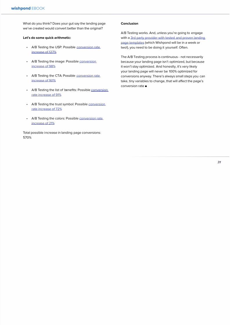
892019 Landing Pages eBook 1
httpslidepdfcomreaderfulllanding-pages-ebook-1 3165
What do you think Does your gut say the landing page
wersquove created would convert better than the original
Letrsquos do some quick arithmetic
bull AB Testing the USP Possible conversion rate
increase of 127
bull AB Testing the image Possible conversion
increase of 98
bull AB Testing the CTA Possible conversion rate
increase of 161
bull AB Testing the list of benefits Possible conversion
rate increase of 91
bull AB Testing the trust symbol Possible conversion
rate increase of 72
bull AB Testing the colors Possible conversion rate
increase of 21
Total possible increase in landing page conversions
570
Conclusion
AB Testing works And unless yoursquore going to engage
with a 3rd party provider with tested and proven landing
page templates (which Wishpond will be in a week or
two) you need to be doing it yourself Often
The AB Testing process is continuous - not necessarily
because your landing page isnrsquot optimized but because
it wonrsquot stay optimized And honestly itrsquos very likely
your landing page will never be 100 optimized for
conversions anyway Therersquos always small steps you can
take tiny variables to change that will affect the pagersquosconversion rate
wishpond EBOOK
31
892019 Landing Pages eBook 1
httpslidepdfcomreaderfulllanding-pages-ebook-1 3265
Chapter 4
Landing
PagesHow to Sell your
Product without
Selling your
Product
wishpond EBOOK
892019 Landing Pages eBook 1
httpslidepdfcomreaderfulllanding-pages-ebook-1 3365
Do you get solid traffic to your landing page but struggle
to convert a sale
This article will give you five proven strategies of selling
your product without spamming - of pushing a sale
without pushing your customer over
Landing pages are a delicate balance between promoting
enough to encourage a sale and little enough that the
lead doesnrsquot feel pressure and bounce
Letrsquos take a look at five ways you can sell without selling
1 OFFER BENEFITS NOT FEATURES
This is the most important thing to keep in mind when
writing up the sales points of your business or products
People get sold on how a product or business can solve
their problems not on the details
I admit promoting the benefits is harder than promoting
the features of your product Selling benefits means you
have to identify the problems of your target audience and
come up with how your product or service solves those
problems You have to leave the safety of jargon and
technical details and venture into the real world
To help you understand the difference between features
and benefits here are a few examples
Selling Features
1 The AcmeTikon12 has 300 gigabytes of space
2 Our AcmePad2000 has a 17GHz processor
3 Our AcmeWebToolrsquos templates have over 5000
color options
Selling Benefits
1 The AcmeTikon12 has enough space for 75000
songs
2 Our AcmePad2000 is our fastest than ever making
browsing a cinch
3 We guarantee our AcmeWebToolrsquos templates will
have your businessrsquo brand colors
wishpond EBOOK
33
i
892019 Landing Pages eBook 1
httpslidepdfcomreaderfulllanding-pages-ebook-1 3465
wishpond EBOOK
34
Features still have their place on your landing pages To
safely cover all your bases use your product or servicersquos
features to support the benefits to your target audience
Or translate the sexy-sounding (if somewhat obscure)
feature into a concrete benefit for the consumer like
Wishpond has done below
2 USE CUSTOMER TESTIMONIALS AND REVIEWS
Face it to most visitors to your landing page yoursquore not
exactly a trustworthy source They recognize yoursquore
the slightest bit biased when it comes to this particular
subject (your own product)
So donrsquot sell your own product have someone else do
it for you Since Amazon took over online selling about
20 years ago internet users are increasingly trusting the
word of their peers over any other sources
By the way did you know Amazon accounts for more
online sales than the next 12 competitors combined I
didnrsquot
Needless to say reviews have never been more
important nor have customer testimonials Yes visitors
to your landing pages know that these testimonials come
through your business but it doesnrsquot matter Not only do
customer testimonials function to make your audience
trust your business it gives them the assurance that
someone has engaged with you before - so theyrsquore safe
to do so
Herersquos an example from Wishpondrsquos FacebookSweepstakes App landing page - from our friend Josh
Beaty
i h d OO
892019 Landing Pages eBook 1
httpslidepdfcomreaderfulllanding-pages-ebook-1 3565
For ecommerce businesses test offering product reviews like Amazon does AB test stars or a 5-point system or whatever
creative method of reviewing you can think of Be aware though that the review process also opens up the chance of
negative feedback
Whatever you do donrsquot fake reviews If your products arenrsquot awesome enough to earn more positive reviews than negative
pull the review tool until yoursquove stepped it up
3 MAKE IT BEAUTIFUL
This should be an obvious one but I canrsquot tell you how many times I see an appealing product portrayed in an ugly way Put
time and effort into framing your product in the best possible light AB test a model with your product AB test the gender
of your model AB test the colors behind your model AB test no model but a beautiful abstract collage that resembles a
Kandinsky piece I donrsquot care - just make it pretty
To illustrate my point on the most basic level which one of these do you think will sell better Same sunglasses one with a
white background one with a Johnny Depp background
wishpond EBOOK
35
i h d EBOOK
892019 Landing Pages eBook 1
httpslidepdfcomreaderfulllanding-pages-ebook-1 3665
But making it beautiful isnrsquot just about your
picture
Words can also be beautiful and the words we use canmake our products just as appealing as a great picture A
quick look at the Lexus homepage and yoursquoll know what
Irsquom talking about Head to their lsquoAutomobilesrsquo tab (notice
that Lexus makes lsquoautomobilesrsquo not lsquocarsrsquo) Each class of
automobiles has its own slogan from the ISrsquos lsquoDriving in
Every Sensersquo to the GXrsquos lsquoExpand your Possibilitiesrsquo
Do these slogans have any real relevance to the car
they represent No But do these words create a certain
desirable feeling in their reader Absolutely
Lexus also makes it a point to frame their products in
terms of an ideal customer - a customer their customers
want to be For instance their LX (SUV) lsquoenables you
to venture where few others can while surrounded in
unsurpassed interior comfort and refinementrsquo which
sounds like something I might want to do
Words have a huge impact on us Of course putting your
product in the best possible visual light is vital to making
a sale but donrsquot neglect the importance of the words you
use
5 Phrases that Make your Product Sound Desirable
1 Sleek and sophisticated
2 Pinnacle of artistry
3 Premium technology and unparalleled innovation
4 Reinvention of [relevant field-focused term]
5 Faster newer affordable exclusive
4 MAKE YOUR LANDING PAGE CHILL
I was trying to think of a better word than lsquochillrsquo but I think
itrsquos actually the most accurate Donrsquot be needy Donrsquot be
pushy Let your product or service speak for itself through
clear benefits awesome images and appealing text Sit
back a bit If yoursquore ever feeling like lsquool Gil in the header
image up there remember to chill - your customers will
thank you
Keep a personal touch in all the written parts of your
landing page Test out framing your product or service
in terms of lsquoyoursquo or the idealized customer I referred to
above
wishpond EBOOK
36
i h d EBOOK
892019 Landing Pages eBook 1
httpslidepdfcomreaderfulllanding-pages-ebook-1 3765
Converting should be your visitorrsquos idea not yours They should be sold by the value theyrsquore receiving When creating your
optimized landing page keep in mind the ratio of risk over reward Is what yoursquore offering worth what yoursquore asking from
your customer
CTAs
Remember to keep your CTAs appealing rather than demanding Use lsquoyoursquo or lsquomyrsquo lsquofreersquo and lsquogetrsquo Tell people what they
stand to gain not what to do
Here are 5 appealing CTA formulas
1 Start yourmy free [trial period]
2 Get yourmy free [focus of landing page]
3 Increase yourmy [beneficial result of your servicetool] today
4 Learn more today
5 Try [servicetool] for free
wishpond EBOOK
37
wishpond EBOOK
892019 Landing Pages eBook 1
httpslidepdfcomreaderfulllanding-pages-ebook-1 3865
5 SELL THE DEAL NOT THE PRODUCT
Are you one of those people who finds themselves
buying things they donrsquot need just because itrsquos a great
deal I most definitely am (damn you IKEA) Offers andcontests are my favorite strategy for lead generation and
to encourage a sale (genuinely not just because I work
for a company that builds online promotional tools for
small business)
The right offer is sellable simply as an offer - the product
itself is actually secondary to the deal
The best strategy for using offers is to target well with
a Facebook Ad This way the traffic yoursquore generating
to your landing page is already half-nurtured whether
because of their interests job title relationship status
etc A half-nurtured lead will be better informed of how
good a deal theyrsquore getting making conversion more
likely
Remember however deals work best as value
propositions You need to back up your offer with some
substance
Donrsquot necessarily prioritize the offer over visuals benefits
and an awesome overall product An offer wonrsquot always
work entirely on its own (At least unless your deal is just insane I mean who hasnrsquot brought home bean-bag
chairs to their already fully-furnished tiny apartment
They were buy one get two free)
The best strategy is to use great images sell someone
on the product every benefit every facet of the thing
and then wow them with the fact that this amazing state-
of-the-art life-changing product is only $2999 for thismonth only
wishpond EBOOK
38
892019 Landing Pages eBook 1
httpslidepdfcomreaderfulllanding-pages-ebook-1 3965
wishpond EBOOK
892019 Landing Pages eBook 1
httpslidepdfcomreaderfulllanding-pages-ebook-1 4065
Chapter 5
Landing
PagesOptimizing your Page
for Lead Generation
wishpond EBOOK
wishpond EBOOK
892019 Landing Pages eBook 1
httpslidepdfcomreaderfulllanding-pages-ebook-1 4165
Do you have an awesome landing page Is it optimized
for your lead generation objectives
Email leads are the number one concern for online
marketers You need a landing page that converts has alow bounce rate and engages your consumer enough to
get the lucrative contact
In this article Irsquoll show you how to optimize your landing
page for lead generation by
bull optimizing your SEO
bull focusing on value
bull optimizing your entry form for engagement
bull implementing a customer testimonial campaign
Letrsquos check it out
OPTIMIZE IT FOR SEO
The chief source of most leads is still search Increase
the chance of a lead finding your landing page in the first
place by optimizing it with Googlersquos search algorithm in
mind
Optimize your Landing Pagersquos Title
Your landing pagersquos title is what shows up in the tab This
is different than your page headline USP or what shows
in the URL When creating your page in wordpress or withHTML keep in mind the title best practices
bull Keep it short
bull Keep it keyword-centric
bull Use long-tail format
Whatrsquos long-tail format
Since the Hummingbird update Google is prioritizing the
context of a search as much as it is the keywords Long-
tail is this context-centric search format
Think of asking SIRI lsquoWherersquos the best Thai restaurant
in the arearsquo She scurries off with that information and
comes back with a response that makes sense Google is
designing its search to do the same Instead of lsquoLanding
pages 10 steps to Conversionsrsquo test out calling your
landing page something like lsquoHow to Build a Landing
Page that Convertsrsquo as this is what people will ask of
wishpond EBOOK
41
wishpond EBOOK
892019 Landing Pages eBook 1
httpslidepdfcomreaderfulllanding-pages-ebook-1 4265
Your title is what Googlersquos little algorithm bot sees first
when itrsquos sent off by a web userrsquos search Optimize your
landing pagersquos title and that bot will see you first
Social Share Buttons
If yoursquore basing your landing page around a resource
(like an ebook or a whitepaper) that content is highly
shareable And since Googlersquos hummingbird update
earlier this fall social shares are more valuable than ever
In fact Google+1rsquos are now ranked as more important
than link-building (something traditional SEO gurus are
struggling with to say the least)
Encourage social engagement by promoting your landing
page on Facebook Twitter and especially Google+ And
perhaps most importantly (and simply) throw up a few
social share buttons along the side or at the top of your
landing page This has been quoted as increasing the
virality of a blog post for instance by up to 700
5 More Awesome SEO tips
1 Use different headings tags (like lth1gt and lth4gt)
and bold and italicize keywords the Google search
bot sees these more than it does normal text
2 Optimize your copy with keywords dynamically
and fluidly spread throughout
3 Include an image with alt tags - this lets the search
engine know what your image is about Also will
show up in image search
4 Link to your landing page within your own website
5 Syndicate your landing page as much as possible
with link-building on forums and social media
platforms
For more information about optimizing for SEO check
out my article How to Easily Optimize your Blog for SEO
Many of the takeaways apply for landing pages as well
FOCUS ON VALUE
In order to encourage a lead to engage you need to
convince them itrsquos worth it This means value propositions
wishpond EBOOK
42
wishpond EBOOK
892019 Landing Pages eBook 1
httpslidepdfcomreaderfulllanding-pages-ebook-1 4365
and a great USP It also means you keep your landing
page simple You should be convincing quickly and easily
Ask your page visitor to read too much do too much and
theyrsquoll bounce
Be Specific
One of the main strategies in lead generation is limiting
your landing pagersquos bounce rate to the smallest
percentage you can Realistically yoursquoll be jumping for
joy and screaming from the mountaintops if your pagersquos
conversion rate is over 20
A recently-discovered best practice is that people
respond to specific numbers far more than they do round
numbers For instance quoting your business as having
80000 customers is less believable (and therefore less
powerful for conversions) as quoting your business as
having 75250 customers
Also keep your value propositions simple
bull Make the benefit of your business easy to
understand
bull Use dollar values percentages the word lsquofreersquo
bull Donrsquot use too much page space selling the specifics
of your service or your resource
Benefit List
If yoursquore using an email-gated ebook or other resource
for lead-generation think about your benefit list as the
second point of your argument Your Value Proposition
and image draw their attention and your list of benefits
tell them specifically how they stand to benefit from
entering their information and downloading your
resource
3 Benefit Formulas
1 [Number of things] yoursquoll learn in this ebook
2 How this resource will cause a rsquo [desired result]
3 The [number of steps] to [a certain goal]
OPTIMIZE YOUR ENTRY FORM
Your entry form is the focus of a lead-generating landing
page As far as your lead-generation funnel goes that
entry form CTA is the equivalent of lsquoproceed to check
outrsquo So make sure itrsquos optimized for conversions with
wishpond EBOOK
43
wishpond EBOOK
892019 Landing Pages eBook 1
httpslidepdfcomreaderfulllanding-pages-ebook-1 4465
these easy steps
1 Draw the Eye
You want your entry form to be obvious - donrsquot hideit below-the-fold or with small font Not only will this
increase interaction itrsquoll make it clear to visitors what
yoursquore asking of them Web users like things simple
and clear If they feel therersquos any chance theyrsquore being
swindled theyrsquoll bounce
6 Entry Form Design Tips
1 Encapsulate your entry form within a box
2 Draw attention to your entry form with the br ightly-
colored CTA
3 Use a vertical or horizontal line to separate your
entry form from the rest of the page
4 Include an action-oriented headline above your
form fields (like lsquoget your trial startedrsquo or lsquostart
learning nowrsquo)
5 Contrast the colour of your entry form box with the
page around it
6 AB Test including a short descriptive sentence
describing what happens when they click your CTA
wishpond EBOOK
44
wishpond EBOOK
892019 Landing Pages eBook 1
httpslidepdfcomreaderfulllanding-pages-ebook-1 4565
2 Balance Demographic Collection with Bounce
Rate
Optimizing your entry form is about weighing up the
valuable information yoursquore getting from a lead (detailsyou can use to segment the emailsadvertisements they
receive) versus the amount of form fields it takes to
increase bounce rate
Pro Tip Unless itrsquos absolutely necessary
avoid asking for a phone number People
are far more resistant to giving out phone
numbers than they are of an email or even
an address Spam emails are more accepted
than telemarketing calls during dinner
Letrsquos say yoursquore heavily invested in email marketing and
itrsquos working really well for your business It may be more
important to your business to know the demographic
details of 10 leads than to know nothing about 20 Email
marketing works best if yoursquore able to personalize and
segment your emails However this is entirely up to your
business
One of the benefits of email-gating an ebook or other
resource for lead generation is that you know people who
downloaded it are interested in that content Target them
with similar content in the future
For more information on segmenting your emailmarketing campaigns to get the best ROI possible read
my colleague Kristarsquos article 4 Strategies to Optimize your
Email Segmentation
wishpond EBOOK
45
wishpond EBOOK
892019 Landing Pages eBook 1
httpslidepdfcomreaderfulllanding-pages-ebook-1 4665
CUSTOMER TESTIMONIALS OR TRUST SYMBOLS
Irsquove talked about the value of trust symbols before but I
donrsquot want you to think that just because yoursquore no longer
optimizing for a sale you can forget them
Letrsquos say your page is focused around a free ebook or
white-paper This valuable content is email-gated so
therersquos no real proof (apart from what yoursquore saying) that
what yoursquore promising will be delivered
That is unless you include a customer testimonial like a
quote (I recommend including a picture of the customeras it makes it far more trustworthy) or short video clip If
yoursquore asking for a phone number or email address be
sure to let people know - obviously - that you donrsquot sell
these details or spam them
Customer testimonials act as a social endorsement
which have grown in importance in the past few years
This is because since Amazon Yelp and other sites
made customer reviews such a huge part of a successful
product your service needs to do the same
Pro Tip Many businesses have found
their highest conversion rates come from
a landing page built around a photogenic
customerrsquos testimonial Incorporate
an awesome case study for the value
proposition with a large picture and a clear
benefit list of how your page visitor can getthe same result
wishpond EBOOK
46
wishpond EBOOK
892019 Landing Pages eBook 1
httpslidepdfcomreaderfulllanding-pages-ebook-1 4765
Conclusion
Hopefully you now have a better idea of how to optimize your landing page for lead generation Be sure to prioritize your
entry form communicate simply and accurately and use a customer testimonial to convince your possible lead to convert
wishpond EBOOK
47
wishpond EBOOK
892019 Landing Pages eBook 1
httpslidepdfcomreaderfulllanding-pages-ebook-1 4865
Chapter 6
Landing
PagesThe Science
Behind Designing
for Conversion
p
wishpond EBOOK
892019 Landing Pages eBook 1
httpslidepdfcomreaderfulllanding-pages-ebook-1 4965
Is your landing page converting well Is it converting
badly Do you know why I mean do you really know
This article will give you the science and psychology
of why your landing is engaging to visitors or why youmight be getting traffic - but no conversions
Irsquoll take a look at 5 principles of landing
page design that can mean the difference
between a successful page and one thatrsquos
just taking up space (or fumbling around in
the dark)
Letrsquos get started
1 DIRECTIONAL CUES
Directional Cues are key in landing page design as they
tell people what to focus on
The most important thing to remember when designingyour landing page is that people do not view it like they
do a book Itrsquos not left to right top to bottom You have to
tell people how to read your page and directional cues
(as well as encapsulation and contrast below) are how
you do this
My recommendation is to decide two things on your
landing page that you especially want to drive attention
to (say your CTA and your product image or maybe aUSP) Then integrate a couple of the strategies below
into your design and AB test it Maybe your audience
responds well to the overt arrow or maybe the more
subtle eye-gaze Test it for yourself
Therersquos three main ways that we signal a focus point in
landing pages
Arrows and lines
p
49
wishpond EBOOK
892019 Landing Pages eBook 1
httpslidepdfcomreaderfulllanding-pages-ebook-1 5065
The most straightforward way to direct attention at an object or heading is to draw an arrow or line to it Students of art
will know the importance of lines as humans have a natural (subconscious) impulse to follow them to their origin or their
destination This works great to focus peoplersquos gaze on your CTA USP value proposition or product image
Eye-direction
Humans are incredibly good at recognizing the eye-focus point of the people around them I recommend using an eye-
tracking software on your landing page to determine where people are focusing and whether this focus is resulting in an
increased click-through-rate
What Irsquom talking about (thanks to Neil Patel
for the eye-tracking examples)
The red spots indicate the areas which
viewers looked at most Take note of how
the eye direction in the example on the left
draws the viewer`s attention towards the
product
p
50
wishpond EBOOK
892019 Landing Pages eBook 1
httpslidepdfcomreaderfulllanding-pages-ebook-1 5165
Faces are the most eye-attracting image you can use (see
5 below) and the eyes are the most eye-attracting part
of the face
Yoursquoll notice the woman on the left is looking directly atthe camera (or visitor to your page) The woman on the
right is looking at the product that Sunsilk is trying to sell
You can see in concrete terms how the initial gaze goes
to the womanrsquos eyes and then tracks left to the product
whereas the face on the left gets all the attention and the
product none
PointingGesturing
I highly recommend you use an image of a person in your
landing page as itrsquos proven to be the most engaging
picture (more on that later though) Something to test
however is having that model gesturing or pointing
towards something you want to focus attention on
This is a dangerous one though as (in my mind) it can
come across as cheesy if done incorrectly Test what your
audience responds to Irsquove seen this both increase and
decrease conversion rates in many case studies
2 CONTRAST
Color contrast
Contrast is essential when working with landing pagesThe human eye is naturally attracted to contrasting color
I recommend you consider color contrast for your USP
and CTA - perhaps an orange CTA button on a dark blue
background
Blank space
The idea of blank space is well-known in the graphic
design world and no less a vital part of landing page
design The idea is that blank space is extremely
influential in focusing attention on non-blank space For
instance
p
51
wishpond EBOOK
892019 Landing Pages eBook 1
httpslidepdfcomreaderfulllanding-pages-ebook-1 5265
Another way of utilizing blank space is with
encapsulation This can be done by framing a section
of content with a border or a container (filled in with
a background color) Give the encapsulated section
enough space to allow it to function somewhatindependently of the rest of the composition
Will this work better than a directional cue Test it for
yourself and find out
Format contrast
Formatting size (of font for instance) also attracts the eyeIn a 4-week multivariate test in 2010 Paras Chopra tested
the performance of 12 different combinations of a Call-to-
Action and descriptive link
Option 10 with the largest contrast in color hue and size
(as well as the word Free) generated a 60 improvement
in conversion rate
3 COLOR
Color is extremely (though unconsciously) effective
at eliciting emotion in viewers I took an in-depth
look at color psychology in my series on the science
behind a successful Facebook Ad so check it out for a
comprehensive analysis (with science)
For now herersquos a breakdown of how humans areinfluenced by color - and how this knowledge can
improve your conversion rates
Blue Blue is across both genders and all age-groups
most peoplersquos favorite color (35 of women and 57
of men) It is said to create the sensation of trust and
security Lighter blues are calming while darker blues
denote professionalism and sincerity
Orange Eye-catching bright and sunny orange is one of
the most popular colors for landing page Calls-to-Action
While a good tone and amount of orange is seen as warm
and inviting too much has been associated with naivete
52
wishpond EBOOK
892019 Landing Pages eBook 1
httpslidepdfcomreaderfulllanding-pages-ebook-1 5365
and a lack of professionalism
Red The color red is associated with passion excitement
and urgency Itrsquos a dangerous color in advertising as
many people associate red with negativity and mistakesHowever it attracts the eye better than any other color
and gives the impression that time is passing faster than
it is (as it causes our heart to beat faster) causing us to act
when we otherwise wouldnrsquot
Green Associated with wealth as well as environmental
subjects green is the easiest color for the eye to process
Green also signifies positive action (thinkrsquogreen meansgorsquo) and affirmation
Green and teal have also been associated with shoppers
on a budget Itrsquos also the second and third most popular
color among men and women respectively
Purple Associated with calm femininity and wealth
purple is the second most popular color among women
at 23 Interestingly as women get older their liking for
the color purple increases On the other hand purple is
the favorite color of 0 of the male population
Black Powerful sleek and intellectual black signifies
permanence sincerity and sophistication While black
can like red and orange be a dangerous color if used
too much it can communicate professionalism and
sophistication when used in conjunction with a strong
clear white (avoid greys or tans as theyrsquoll wash out yourmessage)
4 IMAGERY
I could discuss the effectiveness of a picture of a smiling
person on your landing page for hours (and I havehellip) but
just trust me that having an image (especially a person)
will likely improve your conversion rates
Something Irsquove seen recently actually is incorporating a
customer testimonial with the main landing page image
Choose a photogenic customer and post it up next to an
awesome-sounding affirmation of how your product or
service made their lives easier
But letrsquos leave that for the moment assuming you
recognize its importance and talk about why it works
bull We respond far more emotionally to people (or pets
though people generally elicit a stronger response)
than we do to words or random images
53
wishpond EBOOK
892019 Landing Pages eBook 1
httpslidepdfcomreaderfulllanding-pages-ebook-1 5465
bull A picture of a person provides subtext to your
landing page - a story which people respond to
bull We completely subconsciously focus on the faces
of people we see (especially the eyes) In everyeye-tracking image Irsquove ever seen the hottest
points are the face and eyes Unless of course
the image is of a woman and wersquore talking about a
male demographic Then the eye-tracking software
shows our attention to behellip elsewhere
In my research for this article I came across an article by
VS Ramachandran (a neuroscientist from Oxford) whowrote that oftentimes a line drawing is more powerful
than a photograph He writes that this is because the
lsquoidearsquo of a person is more appealing than the truth of it
(why so much of art is exaggeration of the human form or
why caricatures are so aesthetically pleasing) Leave out
the details and all yoursquore left is the essence of a thing
Although I havenrsquot yet seen an example of this in a
landing page or incorporated it into my own I believe
that whoever does will see a dramatic increase in click-
throughs Get creative and let me know how it goes
5 TYPOGRAPHY AND STYLE
Yoursquoll think that Irsquom getting too detailed here that
different typographies text formats or styles canrsquot actually
increase or decrease conversion rates enough to matter
Herersquos the thing with AB testing details do matter
Letrsquos say your Ecommerce sitersquos landing page is currently
converting at 23 Yoursquore seeing traffic of around 2000
visitors per week and their average purchase is worth
50 dollars to your business Yoursquore making $23000 per
week
Letrsquos say we change your pagersquos headline length and
change the image from one of a woman looking at
the camera to one looking at the CTA (small changes
yoursquod agree) You see a conversion rate increase of
10 Suddenly yoursquore converting at 253 and yoursquove
increased your weekly income to $25300 Yearly
revenue increase $27600
Typography and style changes to AB test
bull Font size for headings and body copy (and the
difference between them)
54
wishpond EBOOK
892019 Landing Pages eBook 1
httpslidepdfcomreaderfulllanding-pages-ebook-1 5565
bull Heading length (short and succinct vs long and
detailed)
bull Number of different font sizes (too many makes
your landing page confusing - I recommend two orthree)
bull Fonts Keep in mind that different fonts are for
whatever reason viewed as more amateurish than
others We at Wishpond like San Sarif for headlines
and Sarif for body copy Avoid cursive (except
maybe for a header) and comic sans is a no-no for a
professional business
bull More text vs less (I like a simple landing page - get
to the point and leave any extraneous information
for later emails or different tabs But test this for
yourself)
Conclusion
Hopefully you now understand a little more of the
science and psychology behind landing page design best
practices Remember to provide visual clues for whereyou want your visitor to focus Donrsquot forget the details
like typography or eye-direction
And keep testing You can always improve your landing
page conversion rates Trust me
55
wishpond EBOOK
892019 Landing Pages eBook 1
httpslidepdfcomreaderfulllanding-pages-ebook-1 5665
Chapter 7
3 Landing
PageExamplesCritiqued to Hell and
Back
wishpond EBOOK
892019 Landing Pages eBook 1
httpslidepdfcomreaderfulllanding-pages-ebook-1 5765
Howrsquos your landing page doing Is it optimized for
conversions Optimized for lead generation
How about we check out a few pages from around
the web In this article Irsquoll dissect four landing pagesvariable by variable discussing where theyrsquove done it
right and where therersquos room for improvement
Itrsquos all well and good for me to tell you a picture is an
essential part of your landing page but until you see
(pardon the pun) what Irsquom talking about itrsquos just that
talk
So letrsquos do this thing
1 SALESFORCE
Salesforce (for those somehow unfamiliar) is a
Customer Relationship Management (CRM) business
based out of San Fran
Herersquos their current landing page raquo
57
wishpond EBOOK
892019 Landing Pages eBook 1
httpslidepdfcomreaderfulllanding-pages-ebook-1 5865
What I Like About this Page
bull The imagery The first thing that hits you when you
traffic to SalesForcersquos landing page is the visual
representation of what they do Though by nomeans unique the visuals of lsquoconnect everything
with our awesome appsrsquo is clear
bull The image size I like how prominent their visuals
are About 75 of their lsquoabove the foldrsquo landing
page area is taken up by this image
bull The prioritized pages What I mean by this is simple
the three blue buttons on the right side (and also
beneath the benefit list paragraph) will traffic to
equally-optimized landing pages The tabs in gray
at the top are quite clearly subordinate (I know
this because of their color contrast encapsulation
etc) and traffic on them will be substantially less I
like the emphasis being placed on the things most
important to their leads
bull The Value Proposition Salesforce has gone
with two value propositions over a USP for their
header I like the succinct and appealing ldquoConnect
everythingrdquo especially
bull The benefit list Though not in bullet-point form
the below-the-fold paragraph of USPrsquos and value
propositions is still effective lsquoBuild customer loyaltyrsquo
(Boom) lsquoIncrease first call resolution and agent
productivityrsquo (Boom) lsquoImprove customer satisfactionby 37rsquo (Boom)
bull The specificity Perhaps my favorite part of this
entire landing is the sentence lsquoimprove customer
satisfaction by 37rsquo This kind of statistic is
incredibly convincing as itrsquos low enough and
specific enough to be entirely believable It also
shows me that theyrsquore professional enough to havedone their research and (I trust) can back up this
statistic with proof
Where I Think they Could Optimize this Page
bull Contrast the imagery I like the use of multiple
images on landing pages (one primary above-the-
fold and one secondary below it) However to
maximize the appeal of your images I recommend
you make them distinct from each other These two
images accomplish the same visual representation
I mentioned above How about keeping the same
image at the top and changing the below-the-fold
58
wishpond EBOOK
892019 Landing Pages eBook 1
httpslidepdfcomreaderfulllanding-pages-ebook-1 5965
59
image to a satisfied customer instead
bull Customer testimonials Perhaps SalesForce is relying on their substantial reputation as the worldrsquos CRM leader but
Irsquod still recommend they included a picture (and quote) from one of their prominent clients This is a businesses that
regularly works with Facebook General Electric and Delta Airlines Irsquod recommend testing a quote and image fromone of these businesses with the brand namelogo prominently placed
AB Testing Postulation
Irsquod theorize that integrating a customer testimonial with an image into a revolving album below-the-fold (on the right) could
increase conversion rates on this page by 10
2 MAILCHIMP
Mailchimp is the most successful email automation company out there (with more than 5 million users)
View their landing page on the next page
wishpond EBOOK
892019 Landing Pages eBook 1
httpslidepdfcomreaderfulllanding-pages-ebook-1 6065
60
wishpond EBOOK
892019 Landing Pages eBook 1
httpslidepdfcomreaderfulllanding-pages-ebook-1 6165
61
What I Like About this Page
bull The tagline ldquoSend Better Emailrdquo is one of the
simplest and most straightforward of all successful
landing pages Irsquove seen Itrsquos to the point andeffective Mailchimp has also had this tagline since
mid June of 2013 meaning itrsquos working for them
bull The USP ldquoMore than 5 million people use
MailChimphelliprdquo is about as unique as you can get
Peer endorsement is the most powerful USP you
can bring into play
bull The Image Red on a blue background stands out
fantastically and attracts the eye - I also the giving
a snapshot of their tool giving people a glimpse at
what they have to offer
bull The CTA(s) Although not as noticeable as ldquoSign
up Freerdquo (which consistently performs better than
simply ldquoSign Uprdquo) I really like ldquoJoin them todayrdquo in
the small paragraph beneath the tagline This is as
much as CTA as the buttons are and plays to the
peer pressure effectiveness of the page
Where I Think they Could Optimize this Page
bull The color scheme Irsquod be interested to see the
effect of a dark blue background and white taglines
benefits As it stands now the page is somewhatboring
bull The toolbar at the top Such a simple and minimalist
landing page needs to accentuate their ldquoFeaturesrdquo
ldquoPricesrdquo and ldquoSupportrdquo buttons at the top to make
it easy to access these important parts of the
decision-making process
bull The CTA(s) While I like the language used Irsquod be
curious to see the effect of making the CTAs stand
out a bit more with a contrasting color to draw the
eye
bull Irsquod test a customer testimonial rotation Mentioning
the 5 million people who use Mailchimp is all
well and good but Irsquod recommend rotating in a
photogenic former customer with a quote on the
effect that Mailchimp had on their businessrsquo email
marketing ROI
wishpond EBOOK
892019 Landing Pages eBook 1
httpslidepdfcomreaderfulllanding-pages-ebook-1 6265
62
AB Testing Postulation
Irsquod theorize that a customer testimonial addition could increase conversions on this page by up to 10 A concrete number
or percentage taken from a case study would make the page more effective
3 KISSMETRICS
Customer analytics platform
Kissmetrics is entrepreneur Neil
Patelrsquos 2008 baby
Herersquos their current landing page raquo
wishpond EBOOK
892019 Landing Pages eBook 1
httpslidepdfcomreaderfulllanding-pages-ebook-1 6365
63
What I Like About this Page
bull The image If yoursquore unsure exactly what image
you should use for your landing page fall back
on something like this A smiling normal-lookingperson (photogenic but not a model) is your best
bet
bull The simplicity Yes this is the entire landing page
Nothing but lsquoabove-the-foldrsquo It relies entirely on the
USP which is incredibly effective
bull Knowing their market Customer analytics are a field
only interesting to people who know what Google
Analytics is Nobody starts with Kissmetrics and
moves to Google Analytics As such the USP is
incredibly effective
bull Logging in with a Google account Irsquove mentioned
before how an email address is worth so much
more to your business than it is to its owner (and
how a phone number is so much more of an ask)
Well a social platform login is worth even less to
its owner - this allows Kissmetrics to ask for less
from a lead and get exactly the same details (if not
more) than they would were they to ask for an email
address
bull The popup The bottom-right popup (which reads
lsquowhatrsquos preventing you from wanting to start a
free trial of Kissmetricsrsquo) does not appear forevery person that traffics to this landing page
This would mediate the drop in conversion rates
that this popup likely causes However this popup
also provides Kissmetrics with extremely valuable
information namely what they can do to encourage
a sign-up Trading a little conversion rate (especially
if you do this temporarily) can be worth more
information This is a similar trade Irsquove talked aboutbefore where more entry boxes give you better
lead knowledge but can decrease conversion rates
- something you have to balance
Check out my article lsquoValue Proposition Formulas that
Boost Conversion on Ads and Landing Pagesrsquo where I
take an in-depth look at how to use Kissmetricrsquos formula
and 6 others
Where I Think they Could Optimize this Page
bull The Image Okay I really like this image but Irsquod be
curious to see how a landing page with a revolving
wishpond EBOOK
892019 Landing Pages eBook 1
httpslidepdfcomreaderfulllanding-pages-ebook-1 6465
64
album would do How about three different USP
value proposition + image combinations revolving
every 75 seconds (Genuinely I recommend you
test the time lapse you use if you employ revolving
images)
bull Learn More The ldquoLearn Morerdquo link in the bottom
left of this landing page is too quiet Irsquod recommend
a subtle encapsulation and slightly larger font I
think this landing page is incredibly effective but
clearly the issue theyrsquoll have is not offering enough
information about what they do A ldquoLearn Morerdquo
link is an awesome way of doing this but itrsquos notobvious enough for everyone to see and I wonder if
that doesnrsquot increase their bounce rate
bull A Case Studies Tab I donrsquot want to ruin the
contemporary minimalist appeal of this landing
page but I would be interested in testing a lsquocase
studiesrsquo or lsquocustomer storiesrsquo tab next to lsquoSign Inrsquo on
the top bar Like the lsquoLearn Morersquo link this would
make it a little easier for visitors to find the answers
to their questions without cluttering the page with
the customer testimonials benefit list and trust
symbols I usually recommend
AB Testing Postulation
Irsquod theorize that making the lsquoLearn Morersquo link on the
bottom right just slightly more obvious would increase
conversions from this page Herersquos why If someone typesin lsquocustomer analyticsrsquo into Google search theyrsquoll click on
Kissmetrics Irsquod be concerned that at the moment they
may bounce due to lack of ready information A more
visible lsquoLearn Morersquo link could increase conversion by up
to 5
Conclusion
The variables Irsquove discussed and critiqued in this article
encompass most of the optimization strategies I give
our clients Remember that every audience is different
and that (unless yoursquore using an optimized landing page
template) yoursquoll need to AB test your own landing pages
on a monthly basis
wishpond EBOOK
892019 Landing Pages eBook 1
httpslidepdfcomreaderfulllanding-pages-ebook-1 6565
Creating and optimizing your businessrsquo landing pages can be the most influential change you make this year
Wishpondrsquos own landing pages are being constantly updated and optimized - our templates completely customizable Start
a free trial today to check them out and see if wersquore a fit for your business
Thanks for reading
892019 Landing Pages eBook 1
httpslidepdfcomreaderfulllanding-pages-ebook-1 3265
Chapter 4
Landing
PagesHow to Sell your
Product without
Selling your
Product
wishpond EBOOK
892019 Landing Pages eBook 1
httpslidepdfcomreaderfulllanding-pages-ebook-1 3365
Do you get solid traffic to your landing page but struggle
to convert a sale
This article will give you five proven strategies of selling
your product without spamming - of pushing a sale
without pushing your customer over
Landing pages are a delicate balance between promoting
enough to encourage a sale and little enough that the
lead doesnrsquot feel pressure and bounce
Letrsquos take a look at five ways you can sell without selling
1 OFFER BENEFITS NOT FEATURES
This is the most important thing to keep in mind when
writing up the sales points of your business or products
People get sold on how a product or business can solve
their problems not on the details
I admit promoting the benefits is harder than promoting
the features of your product Selling benefits means you
have to identify the problems of your target audience and
come up with how your product or service solves those
problems You have to leave the safety of jargon and
technical details and venture into the real world
To help you understand the difference between features
and benefits here are a few examples
Selling Features
1 The AcmeTikon12 has 300 gigabytes of space
2 Our AcmePad2000 has a 17GHz processor
3 Our AcmeWebToolrsquos templates have over 5000
color options
Selling Benefits
1 The AcmeTikon12 has enough space for 75000
songs
2 Our AcmePad2000 is our fastest than ever making
browsing a cinch
3 We guarantee our AcmeWebToolrsquos templates will
have your businessrsquo brand colors
wishpond EBOOK
33
i
892019 Landing Pages eBook 1
httpslidepdfcomreaderfulllanding-pages-ebook-1 3465
wishpond EBOOK
34
Features still have their place on your landing pages To
safely cover all your bases use your product or servicersquos
features to support the benefits to your target audience
Or translate the sexy-sounding (if somewhat obscure)
feature into a concrete benefit for the consumer like
Wishpond has done below
2 USE CUSTOMER TESTIMONIALS AND REVIEWS
Face it to most visitors to your landing page yoursquore not
exactly a trustworthy source They recognize yoursquore
the slightest bit biased when it comes to this particular
subject (your own product)
So donrsquot sell your own product have someone else do
it for you Since Amazon took over online selling about
20 years ago internet users are increasingly trusting the
word of their peers over any other sources
By the way did you know Amazon accounts for more
online sales than the next 12 competitors combined I
didnrsquot
Needless to say reviews have never been more
important nor have customer testimonials Yes visitors
to your landing pages know that these testimonials come
through your business but it doesnrsquot matter Not only do
customer testimonials function to make your audience
trust your business it gives them the assurance that
someone has engaged with you before - so theyrsquore safe
to do so
Herersquos an example from Wishpondrsquos FacebookSweepstakes App landing page - from our friend Josh
Beaty
i h d OO
892019 Landing Pages eBook 1
httpslidepdfcomreaderfulllanding-pages-ebook-1 3565
For ecommerce businesses test offering product reviews like Amazon does AB test stars or a 5-point system or whatever
creative method of reviewing you can think of Be aware though that the review process also opens up the chance of
negative feedback
Whatever you do donrsquot fake reviews If your products arenrsquot awesome enough to earn more positive reviews than negative
pull the review tool until yoursquove stepped it up
3 MAKE IT BEAUTIFUL
This should be an obvious one but I canrsquot tell you how many times I see an appealing product portrayed in an ugly way Put
time and effort into framing your product in the best possible light AB test a model with your product AB test the gender
of your model AB test the colors behind your model AB test no model but a beautiful abstract collage that resembles a
Kandinsky piece I donrsquot care - just make it pretty
To illustrate my point on the most basic level which one of these do you think will sell better Same sunglasses one with a
white background one with a Johnny Depp background
wishpond EBOOK
35
i h d EBOOK
892019 Landing Pages eBook 1
httpslidepdfcomreaderfulllanding-pages-ebook-1 3665
But making it beautiful isnrsquot just about your
picture
Words can also be beautiful and the words we use canmake our products just as appealing as a great picture A
quick look at the Lexus homepage and yoursquoll know what
Irsquom talking about Head to their lsquoAutomobilesrsquo tab (notice
that Lexus makes lsquoautomobilesrsquo not lsquocarsrsquo) Each class of
automobiles has its own slogan from the ISrsquos lsquoDriving in
Every Sensersquo to the GXrsquos lsquoExpand your Possibilitiesrsquo
Do these slogans have any real relevance to the car
they represent No But do these words create a certain
desirable feeling in their reader Absolutely
Lexus also makes it a point to frame their products in
terms of an ideal customer - a customer their customers
want to be For instance their LX (SUV) lsquoenables you
to venture where few others can while surrounded in
unsurpassed interior comfort and refinementrsquo which
sounds like something I might want to do
Words have a huge impact on us Of course putting your
product in the best possible visual light is vital to making
a sale but donrsquot neglect the importance of the words you
use
5 Phrases that Make your Product Sound Desirable
1 Sleek and sophisticated
2 Pinnacle of artistry
3 Premium technology and unparalleled innovation
4 Reinvention of [relevant field-focused term]
5 Faster newer affordable exclusive
4 MAKE YOUR LANDING PAGE CHILL
I was trying to think of a better word than lsquochillrsquo but I think
itrsquos actually the most accurate Donrsquot be needy Donrsquot be
pushy Let your product or service speak for itself through
clear benefits awesome images and appealing text Sit
back a bit If yoursquore ever feeling like lsquool Gil in the header
image up there remember to chill - your customers will
thank you
Keep a personal touch in all the written parts of your
landing page Test out framing your product or service
in terms of lsquoyoursquo or the idealized customer I referred to
above
wishpond EBOOK
36
i h d EBOOK
892019 Landing Pages eBook 1
httpslidepdfcomreaderfulllanding-pages-ebook-1 3765
Converting should be your visitorrsquos idea not yours They should be sold by the value theyrsquore receiving When creating your
optimized landing page keep in mind the ratio of risk over reward Is what yoursquore offering worth what yoursquore asking from
your customer
CTAs
Remember to keep your CTAs appealing rather than demanding Use lsquoyoursquo or lsquomyrsquo lsquofreersquo and lsquogetrsquo Tell people what they
stand to gain not what to do
Here are 5 appealing CTA formulas
1 Start yourmy free [trial period]
2 Get yourmy free [focus of landing page]
3 Increase yourmy [beneficial result of your servicetool] today
4 Learn more today
5 Try [servicetool] for free
wishpond EBOOK
37
wishpond EBOOK
892019 Landing Pages eBook 1
httpslidepdfcomreaderfulllanding-pages-ebook-1 3865
5 SELL THE DEAL NOT THE PRODUCT
Are you one of those people who finds themselves
buying things they donrsquot need just because itrsquos a great
deal I most definitely am (damn you IKEA) Offers andcontests are my favorite strategy for lead generation and
to encourage a sale (genuinely not just because I work
for a company that builds online promotional tools for
small business)
The right offer is sellable simply as an offer - the product
itself is actually secondary to the deal
The best strategy for using offers is to target well with
a Facebook Ad This way the traffic yoursquore generating
to your landing page is already half-nurtured whether
because of their interests job title relationship status
etc A half-nurtured lead will be better informed of how
good a deal theyrsquore getting making conversion more
likely
Remember however deals work best as value
propositions You need to back up your offer with some
substance
Donrsquot necessarily prioritize the offer over visuals benefits
and an awesome overall product An offer wonrsquot always
work entirely on its own (At least unless your deal is just insane I mean who hasnrsquot brought home bean-bag
chairs to their already fully-furnished tiny apartment
They were buy one get two free)
The best strategy is to use great images sell someone
on the product every benefit every facet of the thing
and then wow them with the fact that this amazing state-
of-the-art life-changing product is only $2999 for thismonth only
wishpond EBOOK
38
892019 Landing Pages eBook 1
httpslidepdfcomreaderfulllanding-pages-ebook-1 3965
wishpond EBOOK
892019 Landing Pages eBook 1
httpslidepdfcomreaderfulllanding-pages-ebook-1 4065
Chapter 5
Landing
PagesOptimizing your Page
for Lead Generation
wishpond EBOOK
wishpond EBOOK
892019 Landing Pages eBook 1
httpslidepdfcomreaderfulllanding-pages-ebook-1 4165
Do you have an awesome landing page Is it optimized
for your lead generation objectives
Email leads are the number one concern for online
marketers You need a landing page that converts has alow bounce rate and engages your consumer enough to
get the lucrative contact
In this article Irsquoll show you how to optimize your landing
page for lead generation by
bull optimizing your SEO
bull focusing on value
bull optimizing your entry form for engagement
bull implementing a customer testimonial campaign
Letrsquos check it out
OPTIMIZE IT FOR SEO
The chief source of most leads is still search Increase
the chance of a lead finding your landing page in the first
place by optimizing it with Googlersquos search algorithm in
mind
Optimize your Landing Pagersquos Title
Your landing pagersquos title is what shows up in the tab This
is different than your page headline USP or what shows
in the URL When creating your page in wordpress or withHTML keep in mind the title best practices
bull Keep it short
bull Keep it keyword-centric
bull Use long-tail format
Whatrsquos long-tail format
Since the Hummingbird update Google is prioritizing the
context of a search as much as it is the keywords Long-
tail is this context-centric search format
Think of asking SIRI lsquoWherersquos the best Thai restaurant
in the arearsquo She scurries off with that information and
comes back with a response that makes sense Google is
designing its search to do the same Instead of lsquoLanding
pages 10 steps to Conversionsrsquo test out calling your
landing page something like lsquoHow to Build a Landing
Page that Convertsrsquo as this is what people will ask of
wishpond EBOOK
41
wishpond EBOOK
892019 Landing Pages eBook 1
httpslidepdfcomreaderfulllanding-pages-ebook-1 4265
Your title is what Googlersquos little algorithm bot sees first
when itrsquos sent off by a web userrsquos search Optimize your
landing pagersquos title and that bot will see you first
Social Share Buttons
If yoursquore basing your landing page around a resource
(like an ebook or a whitepaper) that content is highly
shareable And since Googlersquos hummingbird update
earlier this fall social shares are more valuable than ever
In fact Google+1rsquos are now ranked as more important
than link-building (something traditional SEO gurus are
struggling with to say the least)
Encourage social engagement by promoting your landing
page on Facebook Twitter and especially Google+ And
perhaps most importantly (and simply) throw up a few
social share buttons along the side or at the top of your
landing page This has been quoted as increasing the
virality of a blog post for instance by up to 700
5 More Awesome SEO tips
1 Use different headings tags (like lth1gt and lth4gt)
and bold and italicize keywords the Google search
bot sees these more than it does normal text
2 Optimize your copy with keywords dynamically
and fluidly spread throughout
3 Include an image with alt tags - this lets the search
engine know what your image is about Also will
show up in image search
4 Link to your landing page within your own website
5 Syndicate your landing page as much as possible
with link-building on forums and social media
platforms
For more information about optimizing for SEO check
out my article How to Easily Optimize your Blog for SEO
Many of the takeaways apply for landing pages as well
FOCUS ON VALUE
In order to encourage a lead to engage you need to
convince them itrsquos worth it This means value propositions
wishpond EBOOK
42
wishpond EBOOK
892019 Landing Pages eBook 1
httpslidepdfcomreaderfulllanding-pages-ebook-1 4365
and a great USP It also means you keep your landing
page simple You should be convincing quickly and easily
Ask your page visitor to read too much do too much and
theyrsquoll bounce
Be Specific
One of the main strategies in lead generation is limiting
your landing pagersquos bounce rate to the smallest
percentage you can Realistically yoursquoll be jumping for
joy and screaming from the mountaintops if your pagersquos
conversion rate is over 20
A recently-discovered best practice is that people
respond to specific numbers far more than they do round
numbers For instance quoting your business as having
80000 customers is less believable (and therefore less
powerful for conversions) as quoting your business as
having 75250 customers
Also keep your value propositions simple
bull Make the benefit of your business easy to
understand
bull Use dollar values percentages the word lsquofreersquo
bull Donrsquot use too much page space selling the specifics
of your service or your resource
Benefit List
If yoursquore using an email-gated ebook or other resource
for lead-generation think about your benefit list as the
second point of your argument Your Value Proposition
and image draw their attention and your list of benefits
tell them specifically how they stand to benefit from
entering their information and downloading your
resource
3 Benefit Formulas
1 [Number of things] yoursquoll learn in this ebook
2 How this resource will cause a rsquo [desired result]
3 The [number of steps] to [a certain goal]
OPTIMIZE YOUR ENTRY FORM
Your entry form is the focus of a lead-generating landing
page As far as your lead-generation funnel goes that
entry form CTA is the equivalent of lsquoproceed to check
outrsquo So make sure itrsquos optimized for conversions with
wishpond EBOOK
43
wishpond EBOOK
892019 Landing Pages eBook 1
httpslidepdfcomreaderfulllanding-pages-ebook-1 4465
these easy steps
1 Draw the Eye
You want your entry form to be obvious - donrsquot hideit below-the-fold or with small font Not only will this
increase interaction itrsquoll make it clear to visitors what
yoursquore asking of them Web users like things simple
and clear If they feel therersquos any chance theyrsquore being
swindled theyrsquoll bounce
6 Entry Form Design Tips
1 Encapsulate your entry form within a box
2 Draw attention to your entry form with the br ightly-
colored CTA
3 Use a vertical or horizontal line to separate your
entry form from the rest of the page
4 Include an action-oriented headline above your
form fields (like lsquoget your trial startedrsquo or lsquostart
learning nowrsquo)
5 Contrast the colour of your entry form box with the
page around it
6 AB Test including a short descriptive sentence
describing what happens when they click your CTA
wishpond EBOOK
44
wishpond EBOOK
892019 Landing Pages eBook 1
httpslidepdfcomreaderfulllanding-pages-ebook-1 4565
2 Balance Demographic Collection with Bounce
Rate
Optimizing your entry form is about weighing up the
valuable information yoursquore getting from a lead (detailsyou can use to segment the emailsadvertisements they
receive) versus the amount of form fields it takes to
increase bounce rate
Pro Tip Unless itrsquos absolutely necessary
avoid asking for a phone number People
are far more resistant to giving out phone
numbers than they are of an email or even
an address Spam emails are more accepted
than telemarketing calls during dinner
Letrsquos say yoursquore heavily invested in email marketing and
itrsquos working really well for your business It may be more
important to your business to know the demographic
details of 10 leads than to know nothing about 20 Email
marketing works best if yoursquore able to personalize and
segment your emails However this is entirely up to your
business
One of the benefits of email-gating an ebook or other
resource for lead generation is that you know people who
downloaded it are interested in that content Target them
with similar content in the future
For more information on segmenting your emailmarketing campaigns to get the best ROI possible read
my colleague Kristarsquos article 4 Strategies to Optimize your
Email Segmentation
wishpond EBOOK
45
wishpond EBOOK
892019 Landing Pages eBook 1
httpslidepdfcomreaderfulllanding-pages-ebook-1 4665
CUSTOMER TESTIMONIALS OR TRUST SYMBOLS
Irsquove talked about the value of trust symbols before but I
donrsquot want you to think that just because yoursquore no longer
optimizing for a sale you can forget them
Letrsquos say your page is focused around a free ebook or
white-paper This valuable content is email-gated so
therersquos no real proof (apart from what yoursquore saying) that
what yoursquore promising will be delivered
That is unless you include a customer testimonial like a
quote (I recommend including a picture of the customeras it makes it far more trustworthy) or short video clip If
yoursquore asking for a phone number or email address be
sure to let people know - obviously - that you donrsquot sell
these details or spam them
Customer testimonials act as a social endorsement
which have grown in importance in the past few years
This is because since Amazon Yelp and other sites
made customer reviews such a huge part of a successful
product your service needs to do the same
Pro Tip Many businesses have found
their highest conversion rates come from
a landing page built around a photogenic
customerrsquos testimonial Incorporate
an awesome case study for the value
proposition with a large picture and a clear
benefit list of how your page visitor can getthe same result
wishpond EBOOK
46
wishpond EBOOK
892019 Landing Pages eBook 1
httpslidepdfcomreaderfulllanding-pages-ebook-1 4765
Conclusion
Hopefully you now have a better idea of how to optimize your landing page for lead generation Be sure to prioritize your
entry form communicate simply and accurately and use a customer testimonial to convince your possible lead to convert
wishpond EBOOK
47
wishpond EBOOK
892019 Landing Pages eBook 1
httpslidepdfcomreaderfulllanding-pages-ebook-1 4865
Chapter 6
Landing
PagesThe Science
Behind Designing
for Conversion
p
wishpond EBOOK
892019 Landing Pages eBook 1
httpslidepdfcomreaderfulllanding-pages-ebook-1 4965
Is your landing page converting well Is it converting
badly Do you know why I mean do you really know
This article will give you the science and psychology
of why your landing is engaging to visitors or why youmight be getting traffic - but no conversions
Irsquoll take a look at 5 principles of landing
page design that can mean the difference
between a successful page and one thatrsquos
just taking up space (or fumbling around in
the dark)
Letrsquos get started
1 DIRECTIONAL CUES
Directional Cues are key in landing page design as they
tell people what to focus on
The most important thing to remember when designingyour landing page is that people do not view it like they
do a book Itrsquos not left to right top to bottom You have to
tell people how to read your page and directional cues
(as well as encapsulation and contrast below) are how
you do this
My recommendation is to decide two things on your
landing page that you especially want to drive attention
to (say your CTA and your product image or maybe aUSP) Then integrate a couple of the strategies below
into your design and AB test it Maybe your audience
responds well to the overt arrow or maybe the more
subtle eye-gaze Test it for yourself
Therersquos three main ways that we signal a focus point in
landing pages
Arrows and lines
p
49
wishpond EBOOK
892019 Landing Pages eBook 1
httpslidepdfcomreaderfulllanding-pages-ebook-1 5065
The most straightforward way to direct attention at an object or heading is to draw an arrow or line to it Students of art
will know the importance of lines as humans have a natural (subconscious) impulse to follow them to their origin or their
destination This works great to focus peoplersquos gaze on your CTA USP value proposition or product image
Eye-direction
Humans are incredibly good at recognizing the eye-focus point of the people around them I recommend using an eye-
tracking software on your landing page to determine where people are focusing and whether this focus is resulting in an
increased click-through-rate
What Irsquom talking about (thanks to Neil Patel
for the eye-tracking examples)
The red spots indicate the areas which
viewers looked at most Take note of how
the eye direction in the example on the left
draws the viewer`s attention towards the
product
p
50
wishpond EBOOK
892019 Landing Pages eBook 1
httpslidepdfcomreaderfulllanding-pages-ebook-1 5165
Faces are the most eye-attracting image you can use (see
5 below) and the eyes are the most eye-attracting part
of the face
Yoursquoll notice the woman on the left is looking directly atthe camera (or visitor to your page) The woman on the
right is looking at the product that Sunsilk is trying to sell
You can see in concrete terms how the initial gaze goes
to the womanrsquos eyes and then tracks left to the product
whereas the face on the left gets all the attention and the
product none
PointingGesturing
I highly recommend you use an image of a person in your
landing page as itrsquos proven to be the most engaging
picture (more on that later though) Something to test
however is having that model gesturing or pointing
towards something you want to focus attention on
This is a dangerous one though as (in my mind) it can
come across as cheesy if done incorrectly Test what your
audience responds to Irsquove seen this both increase and
decrease conversion rates in many case studies
2 CONTRAST
Color contrast
Contrast is essential when working with landing pagesThe human eye is naturally attracted to contrasting color
I recommend you consider color contrast for your USP
and CTA - perhaps an orange CTA button on a dark blue
background
Blank space
The idea of blank space is well-known in the graphic
design world and no less a vital part of landing page
design The idea is that blank space is extremely
influential in focusing attention on non-blank space For
instance
p
51
wishpond EBOOK
892019 Landing Pages eBook 1
httpslidepdfcomreaderfulllanding-pages-ebook-1 5265
Another way of utilizing blank space is with
encapsulation This can be done by framing a section
of content with a border or a container (filled in with
a background color) Give the encapsulated section
enough space to allow it to function somewhatindependently of the rest of the composition
Will this work better than a directional cue Test it for
yourself and find out
Format contrast
Formatting size (of font for instance) also attracts the eyeIn a 4-week multivariate test in 2010 Paras Chopra tested
the performance of 12 different combinations of a Call-to-
Action and descriptive link
Option 10 with the largest contrast in color hue and size
(as well as the word Free) generated a 60 improvement
in conversion rate
3 COLOR
Color is extremely (though unconsciously) effective
at eliciting emotion in viewers I took an in-depth
look at color psychology in my series on the science
behind a successful Facebook Ad so check it out for a
comprehensive analysis (with science)
For now herersquos a breakdown of how humans areinfluenced by color - and how this knowledge can
improve your conversion rates
Blue Blue is across both genders and all age-groups
most peoplersquos favorite color (35 of women and 57
of men) It is said to create the sensation of trust and
security Lighter blues are calming while darker blues
denote professionalism and sincerity
Orange Eye-catching bright and sunny orange is one of
the most popular colors for landing page Calls-to-Action
While a good tone and amount of orange is seen as warm
and inviting too much has been associated with naivete
52
wishpond EBOOK
892019 Landing Pages eBook 1
httpslidepdfcomreaderfulllanding-pages-ebook-1 5365
and a lack of professionalism
Red The color red is associated with passion excitement
and urgency Itrsquos a dangerous color in advertising as
many people associate red with negativity and mistakesHowever it attracts the eye better than any other color
and gives the impression that time is passing faster than
it is (as it causes our heart to beat faster) causing us to act
when we otherwise wouldnrsquot
Green Associated with wealth as well as environmental
subjects green is the easiest color for the eye to process
Green also signifies positive action (thinkrsquogreen meansgorsquo) and affirmation
Green and teal have also been associated with shoppers
on a budget Itrsquos also the second and third most popular
color among men and women respectively
Purple Associated with calm femininity and wealth
purple is the second most popular color among women
at 23 Interestingly as women get older their liking for
the color purple increases On the other hand purple is
the favorite color of 0 of the male population
Black Powerful sleek and intellectual black signifies
permanence sincerity and sophistication While black
can like red and orange be a dangerous color if used
too much it can communicate professionalism and
sophistication when used in conjunction with a strong
clear white (avoid greys or tans as theyrsquoll wash out yourmessage)
4 IMAGERY
I could discuss the effectiveness of a picture of a smiling
person on your landing page for hours (and I havehellip) but
just trust me that having an image (especially a person)
will likely improve your conversion rates
Something Irsquove seen recently actually is incorporating a
customer testimonial with the main landing page image
Choose a photogenic customer and post it up next to an
awesome-sounding affirmation of how your product or
service made their lives easier
But letrsquos leave that for the moment assuming you
recognize its importance and talk about why it works
bull We respond far more emotionally to people (or pets
though people generally elicit a stronger response)
than we do to words or random images
53
wishpond EBOOK
892019 Landing Pages eBook 1
httpslidepdfcomreaderfulllanding-pages-ebook-1 5465
bull A picture of a person provides subtext to your
landing page - a story which people respond to
bull We completely subconsciously focus on the faces
of people we see (especially the eyes) In everyeye-tracking image Irsquove ever seen the hottest
points are the face and eyes Unless of course
the image is of a woman and wersquore talking about a
male demographic Then the eye-tracking software
shows our attention to behellip elsewhere
In my research for this article I came across an article by
VS Ramachandran (a neuroscientist from Oxford) whowrote that oftentimes a line drawing is more powerful
than a photograph He writes that this is because the
lsquoidearsquo of a person is more appealing than the truth of it
(why so much of art is exaggeration of the human form or
why caricatures are so aesthetically pleasing) Leave out
the details and all yoursquore left is the essence of a thing
Although I havenrsquot yet seen an example of this in a
landing page or incorporated it into my own I believe
that whoever does will see a dramatic increase in click-
throughs Get creative and let me know how it goes
5 TYPOGRAPHY AND STYLE
Yoursquoll think that Irsquom getting too detailed here that
different typographies text formats or styles canrsquot actually
increase or decrease conversion rates enough to matter
Herersquos the thing with AB testing details do matter
Letrsquos say your Ecommerce sitersquos landing page is currently
converting at 23 Yoursquore seeing traffic of around 2000
visitors per week and their average purchase is worth
50 dollars to your business Yoursquore making $23000 per
week
Letrsquos say we change your pagersquos headline length and
change the image from one of a woman looking at
the camera to one looking at the CTA (small changes
yoursquod agree) You see a conversion rate increase of
10 Suddenly yoursquore converting at 253 and yoursquove
increased your weekly income to $25300 Yearly
revenue increase $27600
Typography and style changes to AB test
bull Font size for headings and body copy (and the
difference between them)
54
wishpond EBOOK
892019 Landing Pages eBook 1
httpslidepdfcomreaderfulllanding-pages-ebook-1 5565
bull Heading length (short and succinct vs long and
detailed)
bull Number of different font sizes (too many makes
your landing page confusing - I recommend two orthree)
bull Fonts Keep in mind that different fonts are for
whatever reason viewed as more amateurish than
others We at Wishpond like San Sarif for headlines
and Sarif for body copy Avoid cursive (except
maybe for a header) and comic sans is a no-no for a
professional business
bull More text vs less (I like a simple landing page - get
to the point and leave any extraneous information
for later emails or different tabs But test this for
yourself)
Conclusion
Hopefully you now understand a little more of the
science and psychology behind landing page design best
practices Remember to provide visual clues for whereyou want your visitor to focus Donrsquot forget the details
like typography or eye-direction
And keep testing You can always improve your landing
page conversion rates Trust me
55
wishpond EBOOK
892019 Landing Pages eBook 1
httpslidepdfcomreaderfulllanding-pages-ebook-1 5665
Chapter 7
3 Landing
PageExamplesCritiqued to Hell and
Back
wishpond EBOOK
892019 Landing Pages eBook 1
httpslidepdfcomreaderfulllanding-pages-ebook-1 5765
Howrsquos your landing page doing Is it optimized for
conversions Optimized for lead generation
How about we check out a few pages from around
the web In this article Irsquoll dissect four landing pagesvariable by variable discussing where theyrsquove done it
right and where therersquos room for improvement
Itrsquos all well and good for me to tell you a picture is an
essential part of your landing page but until you see
(pardon the pun) what Irsquom talking about itrsquos just that
talk
So letrsquos do this thing
1 SALESFORCE
Salesforce (for those somehow unfamiliar) is a
Customer Relationship Management (CRM) business
based out of San Fran
Herersquos their current landing page raquo
57
wishpond EBOOK
892019 Landing Pages eBook 1
httpslidepdfcomreaderfulllanding-pages-ebook-1 5865
What I Like About this Page
bull The imagery The first thing that hits you when you
traffic to SalesForcersquos landing page is the visual
representation of what they do Though by nomeans unique the visuals of lsquoconnect everything
with our awesome appsrsquo is clear
bull The image size I like how prominent their visuals
are About 75 of their lsquoabove the foldrsquo landing
page area is taken up by this image
bull The prioritized pages What I mean by this is simple
the three blue buttons on the right side (and also
beneath the benefit list paragraph) will traffic to
equally-optimized landing pages The tabs in gray
at the top are quite clearly subordinate (I know
this because of their color contrast encapsulation
etc) and traffic on them will be substantially less I
like the emphasis being placed on the things most
important to their leads
bull The Value Proposition Salesforce has gone
with two value propositions over a USP for their
header I like the succinct and appealing ldquoConnect
everythingrdquo especially
bull The benefit list Though not in bullet-point form
the below-the-fold paragraph of USPrsquos and value
propositions is still effective lsquoBuild customer loyaltyrsquo
(Boom) lsquoIncrease first call resolution and agent
productivityrsquo (Boom) lsquoImprove customer satisfactionby 37rsquo (Boom)
bull The specificity Perhaps my favorite part of this
entire landing is the sentence lsquoimprove customer
satisfaction by 37rsquo This kind of statistic is
incredibly convincing as itrsquos low enough and
specific enough to be entirely believable It also
shows me that theyrsquore professional enough to havedone their research and (I trust) can back up this
statistic with proof
Where I Think they Could Optimize this Page
bull Contrast the imagery I like the use of multiple
images on landing pages (one primary above-the-
fold and one secondary below it) However to
maximize the appeal of your images I recommend
you make them distinct from each other These two
images accomplish the same visual representation
I mentioned above How about keeping the same
image at the top and changing the below-the-fold
58
wishpond EBOOK
892019 Landing Pages eBook 1
httpslidepdfcomreaderfulllanding-pages-ebook-1 5965
59
image to a satisfied customer instead
bull Customer testimonials Perhaps SalesForce is relying on their substantial reputation as the worldrsquos CRM leader but
Irsquod still recommend they included a picture (and quote) from one of their prominent clients This is a businesses that
regularly works with Facebook General Electric and Delta Airlines Irsquod recommend testing a quote and image fromone of these businesses with the brand namelogo prominently placed
AB Testing Postulation
Irsquod theorize that integrating a customer testimonial with an image into a revolving album below-the-fold (on the right) could
increase conversion rates on this page by 10
2 MAILCHIMP
Mailchimp is the most successful email automation company out there (with more than 5 million users)
View their landing page on the next page
wishpond EBOOK
892019 Landing Pages eBook 1
httpslidepdfcomreaderfulllanding-pages-ebook-1 6065
60
wishpond EBOOK
892019 Landing Pages eBook 1
httpslidepdfcomreaderfulllanding-pages-ebook-1 6165
61
What I Like About this Page
bull The tagline ldquoSend Better Emailrdquo is one of the
simplest and most straightforward of all successful
landing pages Irsquove seen Itrsquos to the point andeffective Mailchimp has also had this tagline since
mid June of 2013 meaning itrsquos working for them
bull The USP ldquoMore than 5 million people use
MailChimphelliprdquo is about as unique as you can get
Peer endorsement is the most powerful USP you
can bring into play
bull The Image Red on a blue background stands out
fantastically and attracts the eye - I also the giving
a snapshot of their tool giving people a glimpse at
what they have to offer
bull The CTA(s) Although not as noticeable as ldquoSign
up Freerdquo (which consistently performs better than
simply ldquoSign Uprdquo) I really like ldquoJoin them todayrdquo in
the small paragraph beneath the tagline This is as
much as CTA as the buttons are and plays to the
peer pressure effectiveness of the page
Where I Think they Could Optimize this Page
bull The color scheme Irsquod be interested to see the
effect of a dark blue background and white taglines
benefits As it stands now the page is somewhatboring
bull The toolbar at the top Such a simple and minimalist
landing page needs to accentuate their ldquoFeaturesrdquo
ldquoPricesrdquo and ldquoSupportrdquo buttons at the top to make
it easy to access these important parts of the
decision-making process
bull The CTA(s) While I like the language used Irsquod be
curious to see the effect of making the CTAs stand
out a bit more with a contrasting color to draw the
eye
bull Irsquod test a customer testimonial rotation Mentioning
the 5 million people who use Mailchimp is all
well and good but Irsquod recommend rotating in a
photogenic former customer with a quote on the
effect that Mailchimp had on their businessrsquo email
marketing ROI
wishpond EBOOK
892019 Landing Pages eBook 1
httpslidepdfcomreaderfulllanding-pages-ebook-1 6265
62
AB Testing Postulation
Irsquod theorize that a customer testimonial addition could increase conversions on this page by up to 10 A concrete number
or percentage taken from a case study would make the page more effective
3 KISSMETRICS
Customer analytics platform
Kissmetrics is entrepreneur Neil
Patelrsquos 2008 baby
Herersquos their current landing page raquo
wishpond EBOOK
892019 Landing Pages eBook 1
httpslidepdfcomreaderfulllanding-pages-ebook-1 6365
63
What I Like About this Page
bull The image If yoursquore unsure exactly what image
you should use for your landing page fall back
on something like this A smiling normal-lookingperson (photogenic but not a model) is your best
bet
bull The simplicity Yes this is the entire landing page
Nothing but lsquoabove-the-foldrsquo It relies entirely on the
USP which is incredibly effective
bull Knowing their market Customer analytics are a field
only interesting to people who know what Google
Analytics is Nobody starts with Kissmetrics and
moves to Google Analytics As such the USP is
incredibly effective
bull Logging in with a Google account Irsquove mentioned
before how an email address is worth so much
more to your business than it is to its owner (and
how a phone number is so much more of an ask)
Well a social platform login is worth even less to
its owner - this allows Kissmetrics to ask for less
from a lead and get exactly the same details (if not
more) than they would were they to ask for an email
address
bull The popup The bottom-right popup (which reads
lsquowhatrsquos preventing you from wanting to start a
free trial of Kissmetricsrsquo) does not appear forevery person that traffics to this landing page
This would mediate the drop in conversion rates
that this popup likely causes However this popup
also provides Kissmetrics with extremely valuable
information namely what they can do to encourage
a sign-up Trading a little conversion rate (especially
if you do this temporarily) can be worth more
information This is a similar trade Irsquove talked aboutbefore where more entry boxes give you better
lead knowledge but can decrease conversion rates
- something you have to balance
Check out my article lsquoValue Proposition Formulas that
Boost Conversion on Ads and Landing Pagesrsquo where I
take an in-depth look at how to use Kissmetricrsquos formula
and 6 others
Where I Think they Could Optimize this Page
bull The Image Okay I really like this image but Irsquod be
curious to see how a landing page with a revolving
wishpond EBOOK
892019 Landing Pages eBook 1
httpslidepdfcomreaderfulllanding-pages-ebook-1 6465
64
album would do How about three different USP
value proposition + image combinations revolving
every 75 seconds (Genuinely I recommend you
test the time lapse you use if you employ revolving
images)
bull Learn More The ldquoLearn Morerdquo link in the bottom
left of this landing page is too quiet Irsquod recommend
a subtle encapsulation and slightly larger font I
think this landing page is incredibly effective but
clearly the issue theyrsquoll have is not offering enough
information about what they do A ldquoLearn Morerdquo
link is an awesome way of doing this but itrsquos notobvious enough for everyone to see and I wonder if
that doesnrsquot increase their bounce rate
bull A Case Studies Tab I donrsquot want to ruin the
contemporary minimalist appeal of this landing
page but I would be interested in testing a lsquocase
studiesrsquo or lsquocustomer storiesrsquo tab next to lsquoSign Inrsquo on
the top bar Like the lsquoLearn Morersquo link this would
make it a little easier for visitors to find the answers
to their questions without cluttering the page with
the customer testimonials benefit list and trust
symbols I usually recommend
AB Testing Postulation
Irsquod theorize that making the lsquoLearn Morersquo link on the
bottom right just slightly more obvious would increase
conversions from this page Herersquos why If someone typesin lsquocustomer analyticsrsquo into Google search theyrsquoll click on
Kissmetrics Irsquod be concerned that at the moment they
may bounce due to lack of ready information A more
visible lsquoLearn Morersquo link could increase conversion by up
to 5
Conclusion
The variables Irsquove discussed and critiqued in this article
encompass most of the optimization strategies I give
our clients Remember that every audience is different
and that (unless yoursquore using an optimized landing page
template) yoursquoll need to AB test your own landing pages
on a monthly basis
wishpond EBOOK
892019 Landing Pages eBook 1
httpslidepdfcomreaderfulllanding-pages-ebook-1 6565
Creating and optimizing your businessrsquo landing pages can be the most influential change you make this year
Wishpondrsquos own landing pages are being constantly updated and optimized - our templates completely customizable Start
a free trial today to check them out and see if wersquore a fit for your business
Thanks for reading

892019 Landing Pages eBook 1
httpslidepdfcomreaderfulllanding-pages-ebook-1 3465
wishpond EBOOK
34
Features still have their place on your landing pages To
safely cover all your bases use your product or servicersquos
features to support the benefits to your target audience
Or translate the sexy-sounding (if somewhat obscure)
feature into a concrete benefit for the consumer like
Wishpond has done below
2 USE CUSTOMER TESTIMONIALS AND REVIEWS
Face it to most visitors to your landing page yoursquore not
exactly a trustworthy source They recognize yoursquore
the slightest bit biased when it comes to this particular
subject (your own product)
So donrsquot sell your own product have someone else do
it for you Since Amazon took over online selling about
20 years ago internet users are increasingly trusting the
word of their peers over any other sources
By the way did you know Amazon accounts for more
online sales than the next 12 competitors combined I
didnrsquot
Needless to say reviews have never been more
important nor have customer testimonials Yes visitors
to your landing pages know that these testimonials come
through your business but it doesnrsquot matter Not only do
customer testimonials function to make your audience
trust your business it gives them the assurance that
someone has engaged with you before - so theyrsquore safe
to do so
Herersquos an example from Wishpondrsquos FacebookSweepstakes App landing page - from our friend Josh
Beaty
i h d OO
892019 Landing Pages eBook 1
httpslidepdfcomreaderfulllanding-pages-ebook-1 3565
For ecommerce businesses test offering product reviews like Amazon does AB test stars or a 5-point system or whatever
creative method of reviewing you can think of Be aware though that the review process also opens up the chance of
negative feedback
Whatever you do donrsquot fake reviews If your products arenrsquot awesome enough to earn more positive reviews than negative
pull the review tool until yoursquove stepped it up
3 MAKE IT BEAUTIFUL
This should be an obvious one but I canrsquot tell you how many times I see an appealing product portrayed in an ugly way Put
time and effort into framing your product in the best possible light AB test a model with your product AB test the gender
of your model AB test the colors behind your model AB test no model but a beautiful abstract collage that resembles a
Kandinsky piece I donrsquot care - just make it pretty
To illustrate my point on the most basic level which one of these do you think will sell better Same sunglasses one with a
white background one with a Johnny Depp background
wishpond EBOOK
35
i h d EBOOK
892019 Landing Pages eBook 1
httpslidepdfcomreaderfulllanding-pages-ebook-1 3665
But making it beautiful isnrsquot just about your
picture
Words can also be beautiful and the words we use canmake our products just as appealing as a great picture A
quick look at the Lexus homepage and yoursquoll know what
Irsquom talking about Head to their lsquoAutomobilesrsquo tab (notice
that Lexus makes lsquoautomobilesrsquo not lsquocarsrsquo) Each class of
automobiles has its own slogan from the ISrsquos lsquoDriving in
Every Sensersquo to the GXrsquos lsquoExpand your Possibilitiesrsquo
Do these slogans have any real relevance to the car
they represent No But do these words create a certain
desirable feeling in their reader Absolutely
Lexus also makes it a point to frame their products in
terms of an ideal customer - a customer their customers
want to be For instance their LX (SUV) lsquoenables you
to venture where few others can while surrounded in
unsurpassed interior comfort and refinementrsquo which
sounds like something I might want to do
Words have a huge impact on us Of course putting your
product in the best possible visual light is vital to making
a sale but donrsquot neglect the importance of the words you
use
5 Phrases that Make your Product Sound Desirable
1 Sleek and sophisticated
2 Pinnacle of artistry
3 Premium technology and unparalleled innovation
4 Reinvention of [relevant field-focused term]
5 Faster newer affordable exclusive
4 MAKE YOUR LANDING PAGE CHILL
I was trying to think of a better word than lsquochillrsquo but I think
itrsquos actually the most accurate Donrsquot be needy Donrsquot be
pushy Let your product or service speak for itself through
clear benefits awesome images and appealing text Sit
back a bit If yoursquore ever feeling like lsquool Gil in the header
image up there remember to chill - your customers will
thank you
Keep a personal touch in all the written parts of your
landing page Test out framing your product or service
in terms of lsquoyoursquo or the idealized customer I referred to
above
wishpond EBOOK
36
i h d EBOOK
892019 Landing Pages eBook 1
httpslidepdfcomreaderfulllanding-pages-ebook-1 3765
Converting should be your visitorrsquos idea not yours They should be sold by the value theyrsquore receiving When creating your
optimized landing page keep in mind the ratio of risk over reward Is what yoursquore offering worth what yoursquore asking from
your customer
CTAs
Remember to keep your CTAs appealing rather than demanding Use lsquoyoursquo or lsquomyrsquo lsquofreersquo and lsquogetrsquo Tell people what they
stand to gain not what to do
Here are 5 appealing CTA formulas
1 Start yourmy free [trial period]
2 Get yourmy free [focus of landing page]
3 Increase yourmy [beneficial result of your servicetool] today
4 Learn more today
5 Try [servicetool] for free
wishpond EBOOK
37
wishpond EBOOK
892019 Landing Pages eBook 1
httpslidepdfcomreaderfulllanding-pages-ebook-1 3865
5 SELL THE DEAL NOT THE PRODUCT
Are you one of those people who finds themselves
buying things they donrsquot need just because itrsquos a great
deal I most definitely am (damn you IKEA) Offers andcontests are my favorite strategy for lead generation and
to encourage a sale (genuinely not just because I work
for a company that builds online promotional tools for
small business)
The right offer is sellable simply as an offer - the product
itself is actually secondary to the deal
The best strategy for using offers is to target well with
a Facebook Ad This way the traffic yoursquore generating
to your landing page is already half-nurtured whether
because of their interests job title relationship status
etc A half-nurtured lead will be better informed of how
good a deal theyrsquore getting making conversion more
likely
Remember however deals work best as value
propositions You need to back up your offer with some
substance
Donrsquot necessarily prioritize the offer over visuals benefits
and an awesome overall product An offer wonrsquot always
work entirely on its own (At least unless your deal is just insane I mean who hasnrsquot brought home bean-bag
chairs to their already fully-furnished tiny apartment
They were buy one get two free)
The best strategy is to use great images sell someone
on the product every benefit every facet of the thing
and then wow them with the fact that this amazing state-
of-the-art life-changing product is only $2999 for thismonth only
wishpond EBOOK
38
892019 Landing Pages eBook 1
httpslidepdfcomreaderfulllanding-pages-ebook-1 3965
wishpond EBOOK
892019 Landing Pages eBook 1
httpslidepdfcomreaderfulllanding-pages-ebook-1 4065
Chapter 5
Landing
PagesOptimizing your Page
for Lead Generation
wishpond EBOOK
wishpond EBOOK
892019 Landing Pages eBook 1
httpslidepdfcomreaderfulllanding-pages-ebook-1 4165
Do you have an awesome landing page Is it optimized
for your lead generation objectives
Email leads are the number one concern for online
marketers You need a landing page that converts has alow bounce rate and engages your consumer enough to
get the lucrative contact
In this article Irsquoll show you how to optimize your landing
page for lead generation by
bull optimizing your SEO
bull focusing on value
bull optimizing your entry form for engagement
bull implementing a customer testimonial campaign
Letrsquos check it out
OPTIMIZE IT FOR SEO
The chief source of most leads is still search Increase
the chance of a lead finding your landing page in the first
place by optimizing it with Googlersquos search algorithm in
mind
Optimize your Landing Pagersquos Title
Your landing pagersquos title is what shows up in the tab This
is different than your page headline USP or what shows
in the URL When creating your page in wordpress or withHTML keep in mind the title best practices
bull Keep it short
bull Keep it keyword-centric
bull Use long-tail format
Whatrsquos long-tail format
Since the Hummingbird update Google is prioritizing the
context of a search as much as it is the keywords Long-
tail is this context-centric search format
Think of asking SIRI lsquoWherersquos the best Thai restaurant
in the arearsquo She scurries off with that information and
comes back with a response that makes sense Google is
designing its search to do the same Instead of lsquoLanding
pages 10 steps to Conversionsrsquo test out calling your
landing page something like lsquoHow to Build a Landing
Page that Convertsrsquo as this is what people will ask of
wishpond EBOOK
41
wishpond EBOOK
892019 Landing Pages eBook 1
httpslidepdfcomreaderfulllanding-pages-ebook-1 4265
Your title is what Googlersquos little algorithm bot sees first
when itrsquos sent off by a web userrsquos search Optimize your
landing pagersquos title and that bot will see you first
Social Share Buttons
If yoursquore basing your landing page around a resource
(like an ebook or a whitepaper) that content is highly
shareable And since Googlersquos hummingbird update
earlier this fall social shares are more valuable than ever
In fact Google+1rsquos are now ranked as more important
than link-building (something traditional SEO gurus are
struggling with to say the least)
Encourage social engagement by promoting your landing
page on Facebook Twitter and especially Google+ And
perhaps most importantly (and simply) throw up a few
social share buttons along the side or at the top of your
landing page This has been quoted as increasing the
virality of a blog post for instance by up to 700
5 More Awesome SEO tips
1 Use different headings tags (like lth1gt and lth4gt)
and bold and italicize keywords the Google search
bot sees these more than it does normal text
2 Optimize your copy with keywords dynamically
and fluidly spread throughout
3 Include an image with alt tags - this lets the search
engine know what your image is about Also will
show up in image search
4 Link to your landing page within your own website
5 Syndicate your landing page as much as possible
with link-building on forums and social media
platforms
For more information about optimizing for SEO check
out my article How to Easily Optimize your Blog for SEO
Many of the takeaways apply for landing pages as well
FOCUS ON VALUE
In order to encourage a lead to engage you need to
convince them itrsquos worth it This means value propositions
wishpond EBOOK
42
wishpond EBOOK
892019 Landing Pages eBook 1
httpslidepdfcomreaderfulllanding-pages-ebook-1 4365
and a great USP It also means you keep your landing
page simple You should be convincing quickly and easily
Ask your page visitor to read too much do too much and
theyrsquoll bounce
Be Specific
One of the main strategies in lead generation is limiting
your landing pagersquos bounce rate to the smallest
percentage you can Realistically yoursquoll be jumping for
joy and screaming from the mountaintops if your pagersquos
conversion rate is over 20
A recently-discovered best practice is that people
respond to specific numbers far more than they do round
numbers For instance quoting your business as having
80000 customers is less believable (and therefore less
powerful for conversions) as quoting your business as
having 75250 customers
Also keep your value propositions simple
bull Make the benefit of your business easy to
understand
bull Use dollar values percentages the word lsquofreersquo
bull Donrsquot use too much page space selling the specifics
of your service or your resource
Benefit List
If yoursquore using an email-gated ebook or other resource
for lead-generation think about your benefit list as the
second point of your argument Your Value Proposition
and image draw their attention and your list of benefits
tell them specifically how they stand to benefit from
entering their information and downloading your
resource
3 Benefit Formulas
1 [Number of things] yoursquoll learn in this ebook
2 How this resource will cause a rsquo [desired result]
3 The [number of steps] to [a certain goal]
OPTIMIZE YOUR ENTRY FORM
Your entry form is the focus of a lead-generating landing
page As far as your lead-generation funnel goes that
entry form CTA is the equivalent of lsquoproceed to check
outrsquo So make sure itrsquos optimized for conversions with
wishpond EBOOK
43
wishpond EBOOK
892019 Landing Pages eBook 1
httpslidepdfcomreaderfulllanding-pages-ebook-1 4465
these easy steps
1 Draw the Eye
You want your entry form to be obvious - donrsquot hideit below-the-fold or with small font Not only will this
increase interaction itrsquoll make it clear to visitors what
yoursquore asking of them Web users like things simple
and clear If they feel therersquos any chance theyrsquore being
swindled theyrsquoll bounce
6 Entry Form Design Tips
1 Encapsulate your entry form within a box
2 Draw attention to your entry form with the br ightly-
colored CTA
3 Use a vertical or horizontal line to separate your
entry form from the rest of the page
4 Include an action-oriented headline above your
form fields (like lsquoget your trial startedrsquo or lsquostart
learning nowrsquo)
5 Contrast the colour of your entry form box with the
page around it
6 AB Test including a short descriptive sentence
describing what happens when they click your CTA
wishpond EBOOK
44
wishpond EBOOK
892019 Landing Pages eBook 1
httpslidepdfcomreaderfulllanding-pages-ebook-1 4565
2 Balance Demographic Collection with Bounce
Rate
Optimizing your entry form is about weighing up the
valuable information yoursquore getting from a lead (detailsyou can use to segment the emailsadvertisements they
receive) versus the amount of form fields it takes to
increase bounce rate
Pro Tip Unless itrsquos absolutely necessary
avoid asking for a phone number People
are far more resistant to giving out phone
numbers than they are of an email or even
an address Spam emails are more accepted
than telemarketing calls during dinner
Letrsquos say yoursquore heavily invested in email marketing and
itrsquos working really well for your business It may be more
important to your business to know the demographic
details of 10 leads than to know nothing about 20 Email
marketing works best if yoursquore able to personalize and
segment your emails However this is entirely up to your
business
One of the benefits of email-gating an ebook or other
resource for lead generation is that you know people who
downloaded it are interested in that content Target them
with similar content in the future
For more information on segmenting your emailmarketing campaigns to get the best ROI possible read
my colleague Kristarsquos article 4 Strategies to Optimize your
Email Segmentation
wishpond EBOOK
45
wishpond EBOOK
892019 Landing Pages eBook 1
httpslidepdfcomreaderfulllanding-pages-ebook-1 4665
CUSTOMER TESTIMONIALS OR TRUST SYMBOLS
Irsquove talked about the value of trust symbols before but I
donrsquot want you to think that just because yoursquore no longer
optimizing for a sale you can forget them
Letrsquos say your page is focused around a free ebook or
white-paper This valuable content is email-gated so
therersquos no real proof (apart from what yoursquore saying) that
what yoursquore promising will be delivered
That is unless you include a customer testimonial like a
quote (I recommend including a picture of the customeras it makes it far more trustworthy) or short video clip If
yoursquore asking for a phone number or email address be
sure to let people know - obviously - that you donrsquot sell
these details or spam them
Customer testimonials act as a social endorsement
which have grown in importance in the past few years
This is because since Amazon Yelp and other sites
made customer reviews such a huge part of a successful
product your service needs to do the same
Pro Tip Many businesses have found
their highest conversion rates come from
a landing page built around a photogenic
customerrsquos testimonial Incorporate
an awesome case study for the value
proposition with a large picture and a clear
benefit list of how your page visitor can getthe same result
wishpond EBOOK
46
wishpond EBOOK
892019 Landing Pages eBook 1
httpslidepdfcomreaderfulllanding-pages-ebook-1 4765
Conclusion
Hopefully you now have a better idea of how to optimize your landing page for lead generation Be sure to prioritize your
entry form communicate simply and accurately and use a customer testimonial to convince your possible lead to convert
wishpond EBOOK
47
wishpond EBOOK
892019 Landing Pages eBook 1
httpslidepdfcomreaderfulllanding-pages-ebook-1 4865
Chapter 6
Landing
PagesThe Science
Behind Designing
for Conversion
p
wishpond EBOOK
892019 Landing Pages eBook 1
httpslidepdfcomreaderfulllanding-pages-ebook-1 4965
Is your landing page converting well Is it converting
badly Do you know why I mean do you really know
This article will give you the science and psychology
of why your landing is engaging to visitors or why youmight be getting traffic - but no conversions
Irsquoll take a look at 5 principles of landing
page design that can mean the difference
between a successful page and one thatrsquos
just taking up space (or fumbling around in
the dark)
Letrsquos get started
1 DIRECTIONAL CUES
Directional Cues are key in landing page design as they
tell people what to focus on
The most important thing to remember when designingyour landing page is that people do not view it like they
do a book Itrsquos not left to right top to bottom You have to
tell people how to read your page and directional cues
(as well as encapsulation and contrast below) are how
you do this
My recommendation is to decide two things on your
landing page that you especially want to drive attention
to (say your CTA and your product image or maybe aUSP) Then integrate a couple of the strategies below
into your design and AB test it Maybe your audience
responds well to the overt arrow or maybe the more
subtle eye-gaze Test it for yourself
Therersquos three main ways that we signal a focus point in
landing pages
Arrows and lines
p
49
wishpond EBOOK
892019 Landing Pages eBook 1
httpslidepdfcomreaderfulllanding-pages-ebook-1 5065
The most straightforward way to direct attention at an object or heading is to draw an arrow or line to it Students of art
will know the importance of lines as humans have a natural (subconscious) impulse to follow them to their origin or their
destination This works great to focus peoplersquos gaze on your CTA USP value proposition or product image
Eye-direction
Humans are incredibly good at recognizing the eye-focus point of the people around them I recommend using an eye-
tracking software on your landing page to determine where people are focusing and whether this focus is resulting in an
increased click-through-rate
What Irsquom talking about (thanks to Neil Patel
for the eye-tracking examples)
The red spots indicate the areas which
viewers looked at most Take note of how
the eye direction in the example on the left
draws the viewer`s attention towards the
product
p
50
wishpond EBOOK
892019 Landing Pages eBook 1
httpslidepdfcomreaderfulllanding-pages-ebook-1 5165
Faces are the most eye-attracting image you can use (see
5 below) and the eyes are the most eye-attracting part
of the face
Yoursquoll notice the woman on the left is looking directly atthe camera (or visitor to your page) The woman on the
right is looking at the product that Sunsilk is trying to sell
You can see in concrete terms how the initial gaze goes
to the womanrsquos eyes and then tracks left to the product
whereas the face on the left gets all the attention and the
product none
PointingGesturing
I highly recommend you use an image of a person in your
landing page as itrsquos proven to be the most engaging
picture (more on that later though) Something to test
however is having that model gesturing or pointing
towards something you want to focus attention on
This is a dangerous one though as (in my mind) it can
come across as cheesy if done incorrectly Test what your
audience responds to Irsquove seen this both increase and
decrease conversion rates in many case studies
2 CONTRAST
Color contrast
Contrast is essential when working with landing pagesThe human eye is naturally attracted to contrasting color
I recommend you consider color contrast for your USP
and CTA - perhaps an orange CTA button on a dark blue
background
Blank space
The idea of blank space is well-known in the graphic
design world and no less a vital part of landing page
design The idea is that blank space is extremely
influential in focusing attention on non-blank space For
instance
p
51
wishpond EBOOK
892019 Landing Pages eBook 1
httpslidepdfcomreaderfulllanding-pages-ebook-1 5265
Another way of utilizing blank space is with
encapsulation This can be done by framing a section
of content with a border or a container (filled in with
a background color) Give the encapsulated section
enough space to allow it to function somewhatindependently of the rest of the composition
Will this work better than a directional cue Test it for
yourself and find out
Format contrast
Formatting size (of font for instance) also attracts the eyeIn a 4-week multivariate test in 2010 Paras Chopra tested
the performance of 12 different combinations of a Call-to-
Action and descriptive link
Option 10 with the largest contrast in color hue and size
(as well as the word Free) generated a 60 improvement
in conversion rate
3 COLOR
Color is extremely (though unconsciously) effective
at eliciting emotion in viewers I took an in-depth
look at color psychology in my series on the science
behind a successful Facebook Ad so check it out for a
comprehensive analysis (with science)
For now herersquos a breakdown of how humans areinfluenced by color - and how this knowledge can
improve your conversion rates
Blue Blue is across both genders and all age-groups
most peoplersquos favorite color (35 of women and 57
of men) It is said to create the sensation of trust and
security Lighter blues are calming while darker blues
denote professionalism and sincerity
Orange Eye-catching bright and sunny orange is one of
the most popular colors for landing page Calls-to-Action
While a good tone and amount of orange is seen as warm
and inviting too much has been associated with naivete
52
wishpond EBOOK
892019 Landing Pages eBook 1
httpslidepdfcomreaderfulllanding-pages-ebook-1 5365
and a lack of professionalism
Red The color red is associated with passion excitement
and urgency Itrsquos a dangerous color in advertising as
many people associate red with negativity and mistakesHowever it attracts the eye better than any other color
and gives the impression that time is passing faster than
it is (as it causes our heart to beat faster) causing us to act
when we otherwise wouldnrsquot
Green Associated with wealth as well as environmental
subjects green is the easiest color for the eye to process
Green also signifies positive action (thinkrsquogreen meansgorsquo) and affirmation
Green and teal have also been associated with shoppers
on a budget Itrsquos also the second and third most popular
color among men and women respectively
Purple Associated with calm femininity and wealth
purple is the second most popular color among women
at 23 Interestingly as women get older their liking for
the color purple increases On the other hand purple is
the favorite color of 0 of the male population
Black Powerful sleek and intellectual black signifies
permanence sincerity and sophistication While black
can like red and orange be a dangerous color if used
too much it can communicate professionalism and
sophistication when used in conjunction with a strong
clear white (avoid greys or tans as theyrsquoll wash out yourmessage)
4 IMAGERY
I could discuss the effectiveness of a picture of a smiling
person on your landing page for hours (and I havehellip) but
just trust me that having an image (especially a person)
will likely improve your conversion rates
Something Irsquove seen recently actually is incorporating a
customer testimonial with the main landing page image
Choose a photogenic customer and post it up next to an
awesome-sounding affirmation of how your product or
service made their lives easier
But letrsquos leave that for the moment assuming you
recognize its importance and talk about why it works
bull We respond far more emotionally to people (or pets
though people generally elicit a stronger response)
than we do to words or random images
53
wishpond EBOOK
892019 Landing Pages eBook 1
httpslidepdfcomreaderfulllanding-pages-ebook-1 5465
bull A picture of a person provides subtext to your
landing page - a story which people respond to
bull We completely subconsciously focus on the faces
of people we see (especially the eyes) In everyeye-tracking image Irsquove ever seen the hottest
points are the face and eyes Unless of course
the image is of a woman and wersquore talking about a
male demographic Then the eye-tracking software
shows our attention to behellip elsewhere
In my research for this article I came across an article by
VS Ramachandran (a neuroscientist from Oxford) whowrote that oftentimes a line drawing is more powerful
than a photograph He writes that this is because the
lsquoidearsquo of a person is more appealing than the truth of it
(why so much of art is exaggeration of the human form or
why caricatures are so aesthetically pleasing) Leave out
the details and all yoursquore left is the essence of a thing
Although I havenrsquot yet seen an example of this in a
landing page or incorporated it into my own I believe
that whoever does will see a dramatic increase in click-
throughs Get creative and let me know how it goes
5 TYPOGRAPHY AND STYLE
Yoursquoll think that Irsquom getting too detailed here that
different typographies text formats or styles canrsquot actually
increase or decrease conversion rates enough to matter
Herersquos the thing with AB testing details do matter
Letrsquos say your Ecommerce sitersquos landing page is currently
converting at 23 Yoursquore seeing traffic of around 2000
visitors per week and their average purchase is worth
50 dollars to your business Yoursquore making $23000 per
week
Letrsquos say we change your pagersquos headline length and
change the image from one of a woman looking at
the camera to one looking at the CTA (small changes
yoursquod agree) You see a conversion rate increase of
10 Suddenly yoursquore converting at 253 and yoursquove
increased your weekly income to $25300 Yearly
revenue increase $27600
Typography and style changes to AB test
bull Font size for headings and body copy (and the
difference between them)
54
wishpond EBOOK
892019 Landing Pages eBook 1
httpslidepdfcomreaderfulllanding-pages-ebook-1 5565
bull Heading length (short and succinct vs long and
detailed)
bull Number of different font sizes (too many makes
your landing page confusing - I recommend two orthree)
bull Fonts Keep in mind that different fonts are for
whatever reason viewed as more amateurish than
others We at Wishpond like San Sarif for headlines
and Sarif for body copy Avoid cursive (except
maybe for a header) and comic sans is a no-no for a
professional business
bull More text vs less (I like a simple landing page - get
to the point and leave any extraneous information
for later emails or different tabs But test this for
yourself)
Conclusion
Hopefully you now understand a little more of the
science and psychology behind landing page design best
practices Remember to provide visual clues for whereyou want your visitor to focus Donrsquot forget the details
like typography or eye-direction
And keep testing You can always improve your landing
page conversion rates Trust me
55
wishpond EBOOK
892019 Landing Pages eBook 1
httpslidepdfcomreaderfulllanding-pages-ebook-1 5665
Chapter 7
3 Landing
PageExamplesCritiqued to Hell and
Back
wishpond EBOOK
892019 Landing Pages eBook 1
httpslidepdfcomreaderfulllanding-pages-ebook-1 5765
Howrsquos your landing page doing Is it optimized for
conversions Optimized for lead generation
How about we check out a few pages from around
the web In this article Irsquoll dissect four landing pagesvariable by variable discussing where theyrsquove done it
right and where therersquos room for improvement
Itrsquos all well and good for me to tell you a picture is an
essential part of your landing page but until you see
(pardon the pun) what Irsquom talking about itrsquos just that
talk
So letrsquos do this thing
1 SALESFORCE
Salesforce (for those somehow unfamiliar) is a
Customer Relationship Management (CRM) business
based out of San Fran
Herersquos their current landing page raquo
57
wishpond EBOOK
892019 Landing Pages eBook 1
httpslidepdfcomreaderfulllanding-pages-ebook-1 5865
What I Like About this Page
bull The imagery The first thing that hits you when you
traffic to SalesForcersquos landing page is the visual
representation of what they do Though by nomeans unique the visuals of lsquoconnect everything
with our awesome appsrsquo is clear
bull The image size I like how prominent their visuals
are About 75 of their lsquoabove the foldrsquo landing
page area is taken up by this image
bull The prioritized pages What I mean by this is simple
the three blue buttons on the right side (and also
beneath the benefit list paragraph) will traffic to
equally-optimized landing pages The tabs in gray
at the top are quite clearly subordinate (I know
this because of their color contrast encapsulation
etc) and traffic on them will be substantially less I
like the emphasis being placed on the things most
important to their leads
bull The Value Proposition Salesforce has gone
with two value propositions over a USP for their
header I like the succinct and appealing ldquoConnect
everythingrdquo especially
bull The benefit list Though not in bullet-point form
the below-the-fold paragraph of USPrsquos and value
propositions is still effective lsquoBuild customer loyaltyrsquo
(Boom) lsquoIncrease first call resolution and agent
productivityrsquo (Boom) lsquoImprove customer satisfactionby 37rsquo (Boom)
bull The specificity Perhaps my favorite part of this
entire landing is the sentence lsquoimprove customer
satisfaction by 37rsquo This kind of statistic is
incredibly convincing as itrsquos low enough and
specific enough to be entirely believable It also
shows me that theyrsquore professional enough to havedone their research and (I trust) can back up this
statistic with proof
Where I Think they Could Optimize this Page
bull Contrast the imagery I like the use of multiple
images on landing pages (one primary above-the-
fold and one secondary below it) However to
maximize the appeal of your images I recommend
you make them distinct from each other These two
images accomplish the same visual representation
I mentioned above How about keeping the same
image at the top and changing the below-the-fold
58
wishpond EBOOK
892019 Landing Pages eBook 1
httpslidepdfcomreaderfulllanding-pages-ebook-1 5965
59
image to a satisfied customer instead
bull Customer testimonials Perhaps SalesForce is relying on their substantial reputation as the worldrsquos CRM leader but
Irsquod still recommend they included a picture (and quote) from one of their prominent clients This is a businesses that
regularly works with Facebook General Electric and Delta Airlines Irsquod recommend testing a quote and image fromone of these businesses with the brand namelogo prominently placed
AB Testing Postulation
Irsquod theorize that integrating a customer testimonial with an image into a revolving album below-the-fold (on the right) could
increase conversion rates on this page by 10
2 MAILCHIMP
Mailchimp is the most successful email automation company out there (with more than 5 million users)
View their landing page on the next page
wishpond EBOOK
892019 Landing Pages eBook 1
httpslidepdfcomreaderfulllanding-pages-ebook-1 6065
60
wishpond EBOOK
892019 Landing Pages eBook 1
httpslidepdfcomreaderfulllanding-pages-ebook-1 6165
61
What I Like About this Page
bull The tagline ldquoSend Better Emailrdquo is one of the
simplest and most straightforward of all successful
landing pages Irsquove seen Itrsquos to the point andeffective Mailchimp has also had this tagline since
mid June of 2013 meaning itrsquos working for them
bull The USP ldquoMore than 5 million people use
MailChimphelliprdquo is about as unique as you can get
Peer endorsement is the most powerful USP you
can bring into play
bull The Image Red on a blue background stands out
fantastically and attracts the eye - I also the giving
a snapshot of their tool giving people a glimpse at
what they have to offer
bull The CTA(s) Although not as noticeable as ldquoSign
up Freerdquo (which consistently performs better than
simply ldquoSign Uprdquo) I really like ldquoJoin them todayrdquo in
the small paragraph beneath the tagline This is as
much as CTA as the buttons are and plays to the
peer pressure effectiveness of the page
Where I Think they Could Optimize this Page
bull The color scheme Irsquod be interested to see the
effect of a dark blue background and white taglines
benefits As it stands now the page is somewhatboring
bull The toolbar at the top Such a simple and minimalist
landing page needs to accentuate their ldquoFeaturesrdquo
ldquoPricesrdquo and ldquoSupportrdquo buttons at the top to make
it easy to access these important parts of the
decision-making process
bull The CTA(s) While I like the language used Irsquod be
curious to see the effect of making the CTAs stand
out a bit more with a contrasting color to draw the
eye
bull Irsquod test a customer testimonial rotation Mentioning
the 5 million people who use Mailchimp is all
well and good but Irsquod recommend rotating in a
photogenic former customer with a quote on the
effect that Mailchimp had on their businessrsquo email
marketing ROI
wishpond EBOOK
892019 Landing Pages eBook 1
httpslidepdfcomreaderfulllanding-pages-ebook-1 6265
62
AB Testing Postulation
Irsquod theorize that a customer testimonial addition could increase conversions on this page by up to 10 A concrete number
or percentage taken from a case study would make the page more effective
3 KISSMETRICS
Customer analytics platform
Kissmetrics is entrepreneur Neil
Patelrsquos 2008 baby
Herersquos their current landing page raquo
wishpond EBOOK
892019 Landing Pages eBook 1
httpslidepdfcomreaderfulllanding-pages-ebook-1 6365
63
What I Like About this Page
bull The image If yoursquore unsure exactly what image
you should use for your landing page fall back
on something like this A smiling normal-lookingperson (photogenic but not a model) is your best
bet
bull The simplicity Yes this is the entire landing page
Nothing but lsquoabove-the-foldrsquo It relies entirely on the
USP which is incredibly effective
bull Knowing their market Customer analytics are a field
only interesting to people who know what Google
Analytics is Nobody starts with Kissmetrics and
moves to Google Analytics As such the USP is
incredibly effective
bull Logging in with a Google account Irsquove mentioned
before how an email address is worth so much
more to your business than it is to its owner (and
how a phone number is so much more of an ask)
Well a social platform login is worth even less to
its owner - this allows Kissmetrics to ask for less
from a lead and get exactly the same details (if not
more) than they would were they to ask for an email
address
bull The popup The bottom-right popup (which reads
lsquowhatrsquos preventing you from wanting to start a
free trial of Kissmetricsrsquo) does not appear forevery person that traffics to this landing page
This would mediate the drop in conversion rates
that this popup likely causes However this popup
also provides Kissmetrics with extremely valuable
information namely what they can do to encourage
a sign-up Trading a little conversion rate (especially
if you do this temporarily) can be worth more
information This is a similar trade Irsquove talked aboutbefore where more entry boxes give you better
lead knowledge but can decrease conversion rates
- something you have to balance
Check out my article lsquoValue Proposition Formulas that
Boost Conversion on Ads and Landing Pagesrsquo where I
take an in-depth look at how to use Kissmetricrsquos formula
and 6 others
Where I Think they Could Optimize this Page
bull The Image Okay I really like this image but Irsquod be
curious to see how a landing page with a revolving
wishpond EBOOK
892019 Landing Pages eBook 1
httpslidepdfcomreaderfulllanding-pages-ebook-1 6465
64
album would do How about three different USP
value proposition + image combinations revolving
every 75 seconds (Genuinely I recommend you
test the time lapse you use if you employ revolving
images)
bull Learn More The ldquoLearn Morerdquo link in the bottom
left of this landing page is too quiet Irsquod recommend
a subtle encapsulation and slightly larger font I
think this landing page is incredibly effective but
clearly the issue theyrsquoll have is not offering enough
information about what they do A ldquoLearn Morerdquo
link is an awesome way of doing this but itrsquos notobvious enough for everyone to see and I wonder if
that doesnrsquot increase their bounce rate
bull A Case Studies Tab I donrsquot want to ruin the
contemporary minimalist appeal of this landing
page but I would be interested in testing a lsquocase
studiesrsquo or lsquocustomer storiesrsquo tab next to lsquoSign Inrsquo on
the top bar Like the lsquoLearn Morersquo link this would
make it a little easier for visitors to find the answers
to their questions without cluttering the page with
the customer testimonials benefit list and trust
symbols I usually recommend
AB Testing Postulation
Irsquod theorize that making the lsquoLearn Morersquo link on the
bottom right just slightly more obvious would increase
conversions from this page Herersquos why If someone typesin lsquocustomer analyticsrsquo into Google search theyrsquoll click on
Kissmetrics Irsquod be concerned that at the moment they
may bounce due to lack of ready information A more
visible lsquoLearn Morersquo link could increase conversion by up
to 5
Conclusion
The variables Irsquove discussed and critiqued in this article
encompass most of the optimization strategies I give
our clients Remember that every audience is different
and that (unless yoursquore using an optimized landing page
template) yoursquoll need to AB test your own landing pages
on a monthly basis
wishpond EBOOK
892019 Landing Pages eBook 1
httpslidepdfcomreaderfulllanding-pages-ebook-1 6565
Creating and optimizing your businessrsquo landing pages can be the most influential change you make this year
Wishpondrsquos own landing pages are being constantly updated and optimized - our templates completely customizable Start
a free trial today to check them out and see if wersquore a fit for your business
Thanks for reading
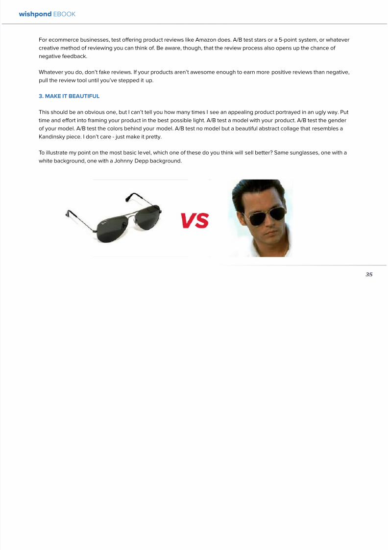
892019 Landing Pages eBook 1
httpslidepdfcomreaderfulllanding-pages-ebook-1 3565
For ecommerce businesses test offering product reviews like Amazon does AB test stars or a 5-point system or whatever
creative method of reviewing you can think of Be aware though that the review process also opens up the chance of
negative feedback
Whatever you do donrsquot fake reviews If your products arenrsquot awesome enough to earn more positive reviews than negative
pull the review tool until yoursquove stepped it up
3 MAKE IT BEAUTIFUL
This should be an obvious one but I canrsquot tell you how many times I see an appealing product portrayed in an ugly way Put
time and effort into framing your product in the best possible light AB test a model with your product AB test the gender
of your model AB test the colors behind your model AB test no model but a beautiful abstract collage that resembles a
Kandinsky piece I donrsquot care - just make it pretty
To illustrate my point on the most basic level which one of these do you think will sell better Same sunglasses one with a
white background one with a Johnny Depp background
wishpond EBOOK
35
i h d EBOOK
892019 Landing Pages eBook 1
httpslidepdfcomreaderfulllanding-pages-ebook-1 3665
But making it beautiful isnrsquot just about your
picture
Words can also be beautiful and the words we use canmake our products just as appealing as a great picture A
quick look at the Lexus homepage and yoursquoll know what
Irsquom talking about Head to their lsquoAutomobilesrsquo tab (notice
that Lexus makes lsquoautomobilesrsquo not lsquocarsrsquo) Each class of
automobiles has its own slogan from the ISrsquos lsquoDriving in
Every Sensersquo to the GXrsquos lsquoExpand your Possibilitiesrsquo
Do these slogans have any real relevance to the car
they represent No But do these words create a certain
desirable feeling in their reader Absolutely
Lexus also makes it a point to frame their products in
terms of an ideal customer - a customer their customers
want to be For instance their LX (SUV) lsquoenables you
to venture where few others can while surrounded in
unsurpassed interior comfort and refinementrsquo which
sounds like something I might want to do
Words have a huge impact on us Of course putting your
product in the best possible visual light is vital to making
a sale but donrsquot neglect the importance of the words you
use
5 Phrases that Make your Product Sound Desirable
1 Sleek and sophisticated
2 Pinnacle of artistry
3 Premium technology and unparalleled innovation
4 Reinvention of [relevant field-focused term]
5 Faster newer affordable exclusive
4 MAKE YOUR LANDING PAGE CHILL
I was trying to think of a better word than lsquochillrsquo but I think
itrsquos actually the most accurate Donrsquot be needy Donrsquot be
pushy Let your product or service speak for itself through
clear benefits awesome images and appealing text Sit
back a bit If yoursquore ever feeling like lsquool Gil in the header
image up there remember to chill - your customers will
thank you
Keep a personal touch in all the written parts of your
landing page Test out framing your product or service
in terms of lsquoyoursquo or the idealized customer I referred to
above
wishpond EBOOK
36
i h d EBOOK
892019 Landing Pages eBook 1
httpslidepdfcomreaderfulllanding-pages-ebook-1 3765
Converting should be your visitorrsquos idea not yours They should be sold by the value theyrsquore receiving When creating your
optimized landing page keep in mind the ratio of risk over reward Is what yoursquore offering worth what yoursquore asking from
your customer
CTAs
Remember to keep your CTAs appealing rather than demanding Use lsquoyoursquo or lsquomyrsquo lsquofreersquo and lsquogetrsquo Tell people what they
stand to gain not what to do
Here are 5 appealing CTA formulas
1 Start yourmy free [trial period]
2 Get yourmy free [focus of landing page]
3 Increase yourmy [beneficial result of your servicetool] today
4 Learn more today
5 Try [servicetool] for free
wishpond EBOOK
37
wishpond EBOOK
892019 Landing Pages eBook 1
httpslidepdfcomreaderfulllanding-pages-ebook-1 3865
5 SELL THE DEAL NOT THE PRODUCT
Are you one of those people who finds themselves
buying things they donrsquot need just because itrsquos a great
deal I most definitely am (damn you IKEA) Offers andcontests are my favorite strategy for lead generation and
to encourage a sale (genuinely not just because I work
for a company that builds online promotional tools for
small business)
The right offer is sellable simply as an offer - the product
itself is actually secondary to the deal
The best strategy for using offers is to target well with
a Facebook Ad This way the traffic yoursquore generating
to your landing page is already half-nurtured whether
because of their interests job title relationship status
etc A half-nurtured lead will be better informed of how
good a deal theyrsquore getting making conversion more
likely
Remember however deals work best as value
propositions You need to back up your offer with some
substance
Donrsquot necessarily prioritize the offer over visuals benefits
and an awesome overall product An offer wonrsquot always
work entirely on its own (At least unless your deal is just insane I mean who hasnrsquot brought home bean-bag
chairs to their already fully-furnished tiny apartment
They were buy one get two free)
The best strategy is to use great images sell someone
on the product every benefit every facet of the thing
and then wow them with the fact that this amazing state-
of-the-art life-changing product is only $2999 for thismonth only
wishpond EBOOK
38
892019 Landing Pages eBook 1
httpslidepdfcomreaderfulllanding-pages-ebook-1 3965
wishpond EBOOK
892019 Landing Pages eBook 1
httpslidepdfcomreaderfulllanding-pages-ebook-1 4065
Chapter 5
Landing
PagesOptimizing your Page
for Lead Generation
wishpond EBOOK
wishpond EBOOK
892019 Landing Pages eBook 1
httpslidepdfcomreaderfulllanding-pages-ebook-1 4165
Do you have an awesome landing page Is it optimized
for your lead generation objectives
Email leads are the number one concern for online
marketers You need a landing page that converts has alow bounce rate and engages your consumer enough to
get the lucrative contact
In this article Irsquoll show you how to optimize your landing
page for lead generation by
bull optimizing your SEO
bull focusing on value
bull optimizing your entry form for engagement
bull implementing a customer testimonial campaign
Letrsquos check it out
OPTIMIZE IT FOR SEO
The chief source of most leads is still search Increase
the chance of a lead finding your landing page in the first
place by optimizing it with Googlersquos search algorithm in
mind
Optimize your Landing Pagersquos Title
Your landing pagersquos title is what shows up in the tab This
is different than your page headline USP or what shows
in the URL When creating your page in wordpress or withHTML keep in mind the title best practices
bull Keep it short
bull Keep it keyword-centric
bull Use long-tail format
Whatrsquos long-tail format
Since the Hummingbird update Google is prioritizing the
context of a search as much as it is the keywords Long-
tail is this context-centric search format
Think of asking SIRI lsquoWherersquos the best Thai restaurant
in the arearsquo She scurries off with that information and
comes back with a response that makes sense Google is
designing its search to do the same Instead of lsquoLanding
pages 10 steps to Conversionsrsquo test out calling your
landing page something like lsquoHow to Build a Landing
Page that Convertsrsquo as this is what people will ask of
wishpond EBOOK
41
wishpond EBOOK
892019 Landing Pages eBook 1
httpslidepdfcomreaderfulllanding-pages-ebook-1 4265
Your title is what Googlersquos little algorithm bot sees first
when itrsquos sent off by a web userrsquos search Optimize your
landing pagersquos title and that bot will see you first
Social Share Buttons
If yoursquore basing your landing page around a resource
(like an ebook or a whitepaper) that content is highly
shareable And since Googlersquos hummingbird update
earlier this fall social shares are more valuable than ever
In fact Google+1rsquos are now ranked as more important
than link-building (something traditional SEO gurus are
struggling with to say the least)
Encourage social engagement by promoting your landing
page on Facebook Twitter and especially Google+ And
perhaps most importantly (and simply) throw up a few
social share buttons along the side or at the top of your
landing page This has been quoted as increasing the
virality of a blog post for instance by up to 700
5 More Awesome SEO tips
1 Use different headings tags (like lth1gt and lth4gt)
and bold and italicize keywords the Google search
bot sees these more than it does normal text
2 Optimize your copy with keywords dynamically
and fluidly spread throughout
3 Include an image with alt tags - this lets the search
engine know what your image is about Also will
show up in image search
4 Link to your landing page within your own website
5 Syndicate your landing page as much as possible
with link-building on forums and social media
platforms
For more information about optimizing for SEO check
out my article How to Easily Optimize your Blog for SEO
Many of the takeaways apply for landing pages as well
FOCUS ON VALUE
In order to encourage a lead to engage you need to
convince them itrsquos worth it This means value propositions
wishpond EBOOK
42
wishpond EBOOK
892019 Landing Pages eBook 1
httpslidepdfcomreaderfulllanding-pages-ebook-1 4365
and a great USP It also means you keep your landing
page simple You should be convincing quickly and easily
Ask your page visitor to read too much do too much and
theyrsquoll bounce
Be Specific
One of the main strategies in lead generation is limiting
your landing pagersquos bounce rate to the smallest
percentage you can Realistically yoursquoll be jumping for
joy and screaming from the mountaintops if your pagersquos
conversion rate is over 20
A recently-discovered best practice is that people
respond to specific numbers far more than they do round
numbers For instance quoting your business as having
80000 customers is less believable (and therefore less
powerful for conversions) as quoting your business as
having 75250 customers
Also keep your value propositions simple
bull Make the benefit of your business easy to
understand
bull Use dollar values percentages the word lsquofreersquo
bull Donrsquot use too much page space selling the specifics
of your service or your resource
Benefit List
If yoursquore using an email-gated ebook or other resource
for lead-generation think about your benefit list as the
second point of your argument Your Value Proposition
and image draw their attention and your list of benefits
tell them specifically how they stand to benefit from
entering their information and downloading your
resource
3 Benefit Formulas
1 [Number of things] yoursquoll learn in this ebook
2 How this resource will cause a rsquo [desired result]
3 The [number of steps] to [a certain goal]
OPTIMIZE YOUR ENTRY FORM
Your entry form is the focus of a lead-generating landing
page As far as your lead-generation funnel goes that
entry form CTA is the equivalent of lsquoproceed to check
outrsquo So make sure itrsquos optimized for conversions with
wishpond EBOOK
43
wishpond EBOOK
892019 Landing Pages eBook 1
httpslidepdfcomreaderfulllanding-pages-ebook-1 4465
these easy steps
1 Draw the Eye
You want your entry form to be obvious - donrsquot hideit below-the-fold or with small font Not only will this
increase interaction itrsquoll make it clear to visitors what
yoursquore asking of them Web users like things simple
and clear If they feel therersquos any chance theyrsquore being
swindled theyrsquoll bounce
6 Entry Form Design Tips
1 Encapsulate your entry form within a box
2 Draw attention to your entry form with the br ightly-
colored CTA
3 Use a vertical or horizontal line to separate your
entry form from the rest of the page
4 Include an action-oriented headline above your
form fields (like lsquoget your trial startedrsquo or lsquostart
learning nowrsquo)
5 Contrast the colour of your entry form box with the
page around it
6 AB Test including a short descriptive sentence
describing what happens when they click your CTA
wishpond EBOOK
44
wishpond EBOOK
892019 Landing Pages eBook 1
httpslidepdfcomreaderfulllanding-pages-ebook-1 4565
2 Balance Demographic Collection with Bounce
Rate
Optimizing your entry form is about weighing up the
valuable information yoursquore getting from a lead (detailsyou can use to segment the emailsadvertisements they
receive) versus the amount of form fields it takes to
increase bounce rate
Pro Tip Unless itrsquos absolutely necessary
avoid asking for a phone number People
are far more resistant to giving out phone
numbers than they are of an email or even
an address Spam emails are more accepted
than telemarketing calls during dinner
Letrsquos say yoursquore heavily invested in email marketing and
itrsquos working really well for your business It may be more
important to your business to know the demographic
details of 10 leads than to know nothing about 20 Email
marketing works best if yoursquore able to personalize and
segment your emails However this is entirely up to your
business
One of the benefits of email-gating an ebook or other
resource for lead generation is that you know people who
downloaded it are interested in that content Target them
with similar content in the future
For more information on segmenting your emailmarketing campaigns to get the best ROI possible read
my colleague Kristarsquos article 4 Strategies to Optimize your
Email Segmentation
wishpond EBOOK
45
wishpond EBOOK
892019 Landing Pages eBook 1
httpslidepdfcomreaderfulllanding-pages-ebook-1 4665
CUSTOMER TESTIMONIALS OR TRUST SYMBOLS
Irsquove talked about the value of trust symbols before but I
donrsquot want you to think that just because yoursquore no longer
optimizing for a sale you can forget them
Letrsquos say your page is focused around a free ebook or
white-paper This valuable content is email-gated so
therersquos no real proof (apart from what yoursquore saying) that
what yoursquore promising will be delivered
That is unless you include a customer testimonial like a
quote (I recommend including a picture of the customeras it makes it far more trustworthy) or short video clip If
yoursquore asking for a phone number or email address be
sure to let people know - obviously - that you donrsquot sell
these details or spam them
Customer testimonials act as a social endorsement
which have grown in importance in the past few years
This is because since Amazon Yelp and other sites
made customer reviews such a huge part of a successful
product your service needs to do the same
Pro Tip Many businesses have found
their highest conversion rates come from
a landing page built around a photogenic
customerrsquos testimonial Incorporate
an awesome case study for the value
proposition with a large picture and a clear
benefit list of how your page visitor can getthe same result
wishpond EBOOK
46
wishpond EBOOK
892019 Landing Pages eBook 1
httpslidepdfcomreaderfulllanding-pages-ebook-1 4765
Conclusion
Hopefully you now have a better idea of how to optimize your landing page for lead generation Be sure to prioritize your
entry form communicate simply and accurately and use a customer testimonial to convince your possible lead to convert
wishpond EBOOK
47
wishpond EBOOK
892019 Landing Pages eBook 1
httpslidepdfcomreaderfulllanding-pages-ebook-1 4865
Chapter 6
Landing
PagesThe Science
Behind Designing
for Conversion
p
wishpond EBOOK
892019 Landing Pages eBook 1
httpslidepdfcomreaderfulllanding-pages-ebook-1 4965
Is your landing page converting well Is it converting
badly Do you know why I mean do you really know
This article will give you the science and psychology
of why your landing is engaging to visitors or why youmight be getting traffic - but no conversions
Irsquoll take a look at 5 principles of landing
page design that can mean the difference
between a successful page and one thatrsquos
just taking up space (or fumbling around in
the dark)
Letrsquos get started
1 DIRECTIONAL CUES
Directional Cues are key in landing page design as they
tell people what to focus on
The most important thing to remember when designingyour landing page is that people do not view it like they
do a book Itrsquos not left to right top to bottom You have to
tell people how to read your page and directional cues
(as well as encapsulation and contrast below) are how
you do this
My recommendation is to decide two things on your
landing page that you especially want to drive attention
to (say your CTA and your product image or maybe aUSP) Then integrate a couple of the strategies below
into your design and AB test it Maybe your audience
responds well to the overt arrow or maybe the more
subtle eye-gaze Test it for yourself
Therersquos three main ways that we signal a focus point in
landing pages
Arrows and lines
p
49
wishpond EBOOK
892019 Landing Pages eBook 1
httpslidepdfcomreaderfulllanding-pages-ebook-1 5065
The most straightforward way to direct attention at an object or heading is to draw an arrow or line to it Students of art
will know the importance of lines as humans have a natural (subconscious) impulse to follow them to their origin or their
destination This works great to focus peoplersquos gaze on your CTA USP value proposition or product image
Eye-direction
Humans are incredibly good at recognizing the eye-focus point of the people around them I recommend using an eye-
tracking software on your landing page to determine where people are focusing and whether this focus is resulting in an
increased click-through-rate
What Irsquom talking about (thanks to Neil Patel
for the eye-tracking examples)
The red spots indicate the areas which
viewers looked at most Take note of how
the eye direction in the example on the left
draws the viewer`s attention towards the
product
p
50
wishpond EBOOK
892019 Landing Pages eBook 1
httpslidepdfcomreaderfulllanding-pages-ebook-1 5165
Faces are the most eye-attracting image you can use (see
5 below) and the eyes are the most eye-attracting part
of the face
Yoursquoll notice the woman on the left is looking directly atthe camera (or visitor to your page) The woman on the
right is looking at the product that Sunsilk is trying to sell
You can see in concrete terms how the initial gaze goes
to the womanrsquos eyes and then tracks left to the product
whereas the face on the left gets all the attention and the
product none
PointingGesturing
I highly recommend you use an image of a person in your
landing page as itrsquos proven to be the most engaging
picture (more on that later though) Something to test
however is having that model gesturing or pointing
towards something you want to focus attention on
This is a dangerous one though as (in my mind) it can
come across as cheesy if done incorrectly Test what your
audience responds to Irsquove seen this both increase and
decrease conversion rates in many case studies
2 CONTRAST
Color contrast
Contrast is essential when working with landing pagesThe human eye is naturally attracted to contrasting color
I recommend you consider color contrast for your USP
and CTA - perhaps an orange CTA button on a dark blue
background
Blank space
The idea of blank space is well-known in the graphic
design world and no less a vital part of landing page
design The idea is that blank space is extremely
influential in focusing attention on non-blank space For
instance
p
51
wishpond EBOOK
892019 Landing Pages eBook 1
httpslidepdfcomreaderfulllanding-pages-ebook-1 5265
Another way of utilizing blank space is with
encapsulation This can be done by framing a section
of content with a border or a container (filled in with
a background color) Give the encapsulated section
enough space to allow it to function somewhatindependently of the rest of the composition
Will this work better than a directional cue Test it for
yourself and find out
Format contrast
Formatting size (of font for instance) also attracts the eyeIn a 4-week multivariate test in 2010 Paras Chopra tested
the performance of 12 different combinations of a Call-to-
Action and descriptive link
Option 10 with the largest contrast in color hue and size
(as well as the word Free) generated a 60 improvement
in conversion rate
3 COLOR
Color is extremely (though unconsciously) effective
at eliciting emotion in viewers I took an in-depth
look at color psychology in my series on the science
behind a successful Facebook Ad so check it out for a
comprehensive analysis (with science)
For now herersquos a breakdown of how humans areinfluenced by color - and how this knowledge can
improve your conversion rates
Blue Blue is across both genders and all age-groups
most peoplersquos favorite color (35 of women and 57
of men) It is said to create the sensation of trust and
security Lighter blues are calming while darker blues
denote professionalism and sincerity
Orange Eye-catching bright and sunny orange is one of
the most popular colors for landing page Calls-to-Action
While a good tone and amount of orange is seen as warm
and inviting too much has been associated with naivete
52
wishpond EBOOK
892019 Landing Pages eBook 1
httpslidepdfcomreaderfulllanding-pages-ebook-1 5365
and a lack of professionalism
Red The color red is associated with passion excitement
and urgency Itrsquos a dangerous color in advertising as
many people associate red with negativity and mistakesHowever it attracts the eye better than any other color
and gives the impression that time is passing faster than
it is (as it causes our heart to beat faster) causing us to act
when we otherwise wouldnrsquot
Green Associated with wealth as well as environmental
subjects green is the easiest color for the eye to process
Green also signifies positive action (thinkrsquogreen meansgorsquo) and affirmation
Green and teal have also been associated with shoppers
on a budget Itrsquos also the second and third most popular
color among men and women respectively
Purple Associated with calm femininity and wealth
purple is the second most popular color among women
at 23 Interestingly as women get older their liking for
the color purple increases On the other hand purple is
the favorite color of 0 of the male population
Black Powerful sleek and intellectual black signifies
permanence sincerity and sophistication While black
can like red and orange be a dangerous color if used
too much it can communicate professionalism and
sophistication when used in conjunction with a strong
clear white (avoid greys or tans as theyrsquoll wash out yourmessage)
4 IMAGERY
I could discuss the effectiveness of a picture of a smiling
person on your landing page for hours (and I havehellip) but
just trust me that having an image (especially a person)
will likely improve your conversion rates
Something Irsquove seen recently actually is incorporating a
customer testimonial with the main landing page image
Choose a photogenic customer and post it up next to an
awesome-sounding affirmation of how your product or
service made their lives easier
But letrsquos leave that for the moment assuming you
recognize its importance and talk about why it works
bull We respond far more emotionally to people (or pets
though people generally elicit a stronger response)
than we do to words or random images
53
wishpond EBOOK
892019 Landing Pages eBook 1
httpslidepdfcomreaderfulllanding-pages-ebook-1 5465
bull A picture of a person provides subtext to your
landing page - a story which people respond to
bull We completely subconsciously focus on the faces
of people we see (especially the eyes) In everyeye-tracking image Irsquove ever seen the hottest
points are the face and eyes Unless of course
the image is of a woman and wersquore talking about a
male demographic Then the eye-tracking software
shows our attention to behellip elsewhere
In my research for this article I came across an article by
VS Ramachandran (a neuroscientist from Oxford) whowrote that oftentimes a line drawing is more powerful
than a photograph He writes that this is because the
lsquoidearsquo of a person is more appealing than the truth of it
(why so much of art is exaggeration of the human form or
why caricatures are so aesthetically pleasing) Leave out
the details and all yoursquore left is the essence of a thing
Although I havenrsquot yet seen an example of this in a
landing page or incorporated it into my own I believe
that whoever does will see a dramatic increase in click-
throughs Get creative and let me know how it goes
5 TYPOGRAPHY AND STYLE
Yoursquoll think that Irsquom getting too detailed here that
different typographies text formats or styles canrsquot actually
increase or decrease conversion rates enough to matter
Herersquos the thing with AB testing details do matter
Letrsquos say your Ecommerce sitersquos landing page is currently
converting at 23 Yoursquore seeing traffic of around 2000
visitors per week and their average purchase is worth
50 dollars to your business Yoursquore making $23000 per
week
Letrsquos say we change your pagersquos headline length and
change the image from one of a woman looking at
the camera to one looking at the CTA (small changes
yoursquod agree) You see a conversion rate increase of
10 Suddenly yoursquore converting at 253 and yoursquove
increased your weekly income to $25300 Yearly
revenue increase $27600
Typography and style changes to AB test
bull Font size for headings and body copy (and the
difference between them)
54
wishpond EBOOK
892019 Landing Pages eBook 1
httpslidepdfcomreaderfulllanding-pages-ebook-1 5565
bull Heading length (short and succinct vs long and
detailed)
bull Number of different font sizes (too many makes
your landing page confusing - I recommend two orthree)
bull Fonts Keep in mind that different fonts are for
whatever reason viewed as more amateurish than
others We at Wishpond like San Sarif for headlines
and Sarif for body copy Avoid cursive (except
maybe for a header) and comic sans is a no-no for a
professional business
bull More text vs less (I like a simple landing page - get
to the point and leave any extraneous information
for later emails or different tabs But test this for
yourself)
Conclusion
Hopefully you now understand a little more of the
science and psychology behind landing page design best
practices Remember to provide visual clues for whereyou want your visitor to focus Donrsquot forget the details
like typography or eye-direction
And keep testing You can always improve your landing
page conversion rates Trust me
55
wishpond EBOOK
892019 Landing Pages eBook 1
httpslidepdfcomreaderfulllanding-pages-ebook-1 5665
Chapter 7
3 Landing
PageExamplesCritiqued to Hell and
Back
wishpond EBOOK
892019 Landing Pages eBook 1
httpslidepdfcomreaderfulllanding-pages-ebook-1 5765
Howrsquos your landing page doing Is it optimized for
conversions Optimized for lead generation
How about we check out a few pages from around
the web In this article Irsquoll dissect four landing pagesvariable by variable discussing where theyrsquove done it
right and where therersquos room for improvement
Itrsquos all well and good for me to tell you a picture is an
essential part of your landing page but until you see
(pardon the pun) what Irsquom talking about itrsquos just that
talk
So letrsquos do this thing
1 SALESFORCE
Salesforce (for those somehow unfamiliar) is a
Customer Relationship Management (CRM) business
based out of San Fran
Herersquos their current landing page raquo
57
wishpond EBOOK
892019 Landing Pages eBook 1
httpslidepdfcomreaderfulllanding-pages-ebook-1 5865
What I Like About this Page
bull The imagery The first thing that hits you when you
traffic to SalesForcersquos landing page is the visual
representation of what they do Though by nomeans unique the visuals of lsquoconnect everything
with our awesome appsrsquo is clear
bull The image size I like how prominent their visuals
are About 75 of their lsquoabove the foldrsquo landing
page area is taken up by this image
bull The prioritized pages What I mean by this is simple
the three blue buttons on the right side (and also
beneath the benefit list paragraph) will traffic to
equally-optimized landing pages The tabs in gray
at the top are quite clearly subordinate (I know
this because of their color contrast encapsulation
etc) and traffic on them will be substantially less I
like the emphasis being placed on the things most
important to their leads
bull The Value Proposition Salesforce has gone
with two value propositions over a USP for their
header I like the succinct and appealing ldquoConnect
everythingrdquo especially
bull The benefit list Though not in bullet-point form
the below-the-fold paragraph of USPrsquos and value
propositions is still effective lsquoBuild customer loyaltyrsquo
(Boom) lsquoIncrease first call resolution and agent
productivityrsquo (Boom) lsquoImprove customer satisfactionby 37rsquo (Boom)
bull The specificity Perhaps my favorite part of this
entire landing is the sentence lsquoimprove customer
satisfaction by 37rsquo This kind of statistic is
incredibly convincing as itrsquos low enough and
specific enough to be entirely believable It also
shows me that theyrsquore professional enough to havedone their research and (I trust) can back up this
statistic with proof
Where I Think they Could Optimize this Page
bull Contrast the imagery I like the use of multiple
images on landing pages (one primary above-the-
fold and one secondary below it) However to
maximize the appeal of your images I recommend
you make them distinct from each other These two
images accomplish the same visual representation
I mentioned above How about keeping the same
image at the top and changing the below-the-fold
58
wishpond EBOOK
892019 Landing Pages eBook 1
httpslidepdfcomreaderfulllanding-pages-ebook-1 5965
59
image to a satisfied customer instead
bull Customer testimonials Perhaps SalesForce is relying on their substantial reputation as the worldrsquos CRM leader but
Irsquod still recommend they included a picture (and quote) from one of their prominent clients This is a businesses that
regularly works with Facebook General Electric and Delta Airlines Irsquod recommend testing a quote and image fromone of these businesses with the brand namelogo prominently placed
AB Testing Postulation
Irsquod theorize that integrating a customer testimonial with an image into a revolving album below-the-fold (on the right) could
increase conversion rates on this page by 10
2 MAILCHIMP
Mailchimp is the most successful email automation company out there (with more than 5 million users)
View their landing page on the next page
wishpond EBOOK
892019 Landing Pages eBook 1
httpslidepdfcomreaderfulllanding-pages-ebook-1 6065
60
wishpond EBOOK
892019 Landing Pages eBook 1
httpslidepdfcomreaderfulllanding-pages-ebook-1 6165
61
What I Like About this Page
bull The tagline ldquoSend Better Emailrdquo is one of the
simplest and most straightforward of all successful
landing pages Irsquove seen Itrsquos to the point andeffective Mailchimp has also had this tagline since
mid June of 2013 meaning itrsquos working for them
bull The USP ldquoMore than 5 million people use
MailChimphelliprdquo is about as unique as you can get
Peer endorsement is the most powerful USP you
can bring into play
bull The Image Red on a blue background stands out
fantastically and attracts the eye - I also the giving
a snapshot of their tool giving people a glimpse at
what they have to offer
bull The CTA(s) Although not as noticeable as ldquoSign
up Freerdquo (which consistently performs better than
simply ldquoSign Uprdquo) I really like ldquoJoin them todayrdquo in
the small paragraph beneath the tagline This is as
much as CTA as the buttons are and plays to the
peer pressure effectiveness of the page
Where I Think they Could Optimize this Page
bull The color scheme Irsquod be interested to see the
effect of a dark blue background and white taglines
benefits As it stands now the page is somewhatboring
bull The toolbar at the top Such a simple and minimalist
landing page needs to accentuate their ldquoFeaturesrdquo
ldquoPricesrdquo and ldquoSupportrdquo buttons at the top to make
it easy to access these important parts of the
decision-making process
bull The CTA(s) While I like the language used Irsquod be
curious to see the effect of making the CTAs stand
out a bit more with a contrasting color to draw the
eye
bull Irsquod test a customer testimonial rotation Mentioning
the 5 million people who use Mailchimp is all
well and good but Irsquod recommend rotating in a
photogenic former customer with a quote on the
effect that Mailchimp had on their businessrsquo email
marketing ROI
wishpond EBOOK
892019 Landing Pages eBook 1
httpslidepdfcomreaderfulllanding-pages-ebook-1 6265
62
AB Testing Postulation
Irsquod theorize that a customer testimonial addition could increase conversions on this page by up to 10 A concrete number
or percentage taken from a case study would make the page more effective
3 KISSMETRICS
Customer analytics platform
Kissmetrics is entrepreneur Neil
Patelrsquos 2008 baby
Herersquos their current landing page raquo
wishpond EBOOK
892019 Landing Pages eBook 1
httpslidepdfcomreaderfulllanding-pages-ebook-1 6365
63
What I Like About this Page
bull The image If yoursquore unsure exactly what image
you should use for your landing page fall back
on something like this A smiling normal-lookingperson (photogenic but not a model) is your best
bet
bull The simplicity Yes this is the entire landing page
Nothing but lsquoabove-the-foldrsquo It relies entirely on the
USP which is incredibly effective
bull Knowing their market Customer analytics are a field
only interesting to people who know what Google
Analytics is Nobody starts with Kissmetrics and
moves to Google Analytics As such the USP is
incredibly effective
bull Logging in with a Google account Irsquove mentioned
before how an email address is worth so much
more to your business than it is to its owner (and
how a phone number is so much more of an ask)
Well a social platform login is worth even less to
its owner - this allows Kissmetrics to ask for less
from a lead and get exactly the same details (if not
more) than they would were they to ask for an email
address
bull The popup The bottom-right popup (which reads
lsquowhatrsquos preventing you from wanting to start a
free trial of Kissmetricsrsquo) does not appear forevery person that traffics to this landing page
This would mediate the drop in conversion rates
that this popup likely causes However this popup
also provides Kissmetrics with extremely valuable
information namely what they can do to encourage
a sign-up Trading a little conversion rate (especially
if you do this temporarily) can be worth more
information This is a similar trade Irsquove talked aboutbefore where more entry boxes give you better
lead knowledge but can decrease conversion rates
- something you have to balance
Check out my article lsquoValue Proposition Formulas that
Boost Conversion on Ads and Landing Pagesrsquo where I
take an in-depth look at how to use Kissmetricrsquos formula
and 6 others
Where I Think they Could Optimize this Page
bull The Image Okay I really like this image but Irsquod be
curious to see how a landing page with a revolving
wishpond EBOOK
892019 Landing Pages eBook 1
httpslidepdfcomreaderfulllanding-pages-ebook-1 6465
64
album would do How about three different USP
value proposition + image combinations revolving
every 75 seconds (Genuinely I recommend you
test the time lapse you use if you employ revolving
images)
bull Learn More The ldquoLearn Morerdquo link in the bottom
left of this landing page is too quiet Irsquod recommend
a subtle encapsulation and slightly larger font I
think this landing page is incredibly effective but
clearly the issue theyrsquoll have is not offering enough
information about what they do A ldquoLearn Morerdquo
link is an awesome way of doing this but itrsquos notobvious enough for everyone to see and I wonder if
that doesnrsquot increase their bounce rate
bull A Case Studies Tab I donrsquot want to ruin the
contemporary minimalist appeal of this landing
page but I would be interested in testing a lsquocase
studiesrsquo or lsquocustomer storiesrsquo tab next to lsquoSign Inrsquo on
the top bar Like the lsquoLearn Morersquo link this would
make it a little easier for visitors to find the answers
to their questions without cluttering the page with
the customer testimonials benefit list and trust
symbols I usually recommend
AB Testing Postulation
Irsquod theorize that making the lsquoLearn Morersquo link on the
bottom right just slightly more obvious would increase
conversions from this page Herersquos why If someone typesin lsquocustomer analyticsrsquo into Google search theyrsquoll click on
Kissmetrics Irsquod be concerned that at the moment they
may bounce due to lack of ready information A more
visible lsquoLearn Morersquo link could increase conversion by up
to 5
Conclusion
The variables Irsquove discussed and critiqued in this article
encompass most of the optimization strategies I give
our clients Remember that every audience is different
and that (unless yoursquore using an optimized landing page
template) yoursquoll need to AB test your own landing pages
on a monthly basis
wishpond EBOOK
892019 Landing Pages eBook 1
httpslidepdfcomreaderfulllanding-pages-ebook-1 6565
Creating and optimizing your businessrsquo landing pages can be the most influential change you make this year
Wishpondrsquos own landing pages are being constantly updated and optimized - our templates completely customizable Start
a free trial today to check them out and see if wersquore a fit for your business
Thanks for reading
892019 Landing Pages eBook 1
httpslidepdfcomreaderfulllanding-pages-ebook-1 3665
But making it beautiful isnrsquot just about your
picture
Words can also be beautiful and the words we use canmake our products just as appealing as a great picture A
quick look at the Lexus homepage and yoursquoll know what
Irsquom talking about Head to their lsquoAutomobilesrsquo tab (notice
that Lexus makes lsquoautomobilesrsquo not lsquocarsrsquo) Each class of
automobiles has its own slogan from the ISrsquos lsquoDriving in
Every Sensersquo to the GXrsquos lsquoExpand your Possibilitiesrsquo
Do these slogans have any real relevance to the car
they represent No But do these words create a certain
desirable feeling in their reader Absolutely
Lexus also makes it a point to frame their products in
terms of an ideal customer - a customer their customers
want to be For instance their LX (SUV) lsquoenables you
to venture where few others can while surrounded in
unsurpassed interior comfort and refinementrsquo which
sounds like something I might want to do
Words have a huge impact on us Of course putting your
product in the best possible visual light is vital to making
a sale but donrsquot neglect the importance of the words you
use
5 Phrases that Make your Product Sound Desirable
1 Sleek and sophisticated
2 Pinnacle of artistry
3 Premium technology and unparalleled innovation
4 Reinvention of [relevant field-focused term]
5 Faster newer affordable exclusive
4 MAKE YOUR LANDING PAGE CHILL
I was trying to think of a better word than lsquochillrsquo but I think
itrsquos actually the most accurate Donrsquot be needy Donrsquot be
pushy Let your product or service speak for itself through
clear benefits awesome images and appealing text Sit
back a bit If yoursquore ever feeling like lsquool Gil in the header
image up there remember to chill - your customers will
thank you
Keep a personal touch in all the written parts of your
landing page Test out framing your product or service
in terms of lsquoyoursquo or the idealized customer I referred to
above
wishpond EBOOK
36
i h d EBOOK
892019 Landing Pages eBook 1
httpslidepdfcomreaderfulllanding-pages-ebook-1 3765
Converting should be your visitorrsquos idea not yours They should be sold by the value theyrsquore receiving When creating your
optimized landing page keep in mind the ratio of risk over reward Is what yoursquore offering worth what yoursquore asking from
your customer
CTAs
Remember to keep your CTAs appealing rather than demanding Use lsquoyoursquo or lsquomyrsquo lsquofreersquo and lsquogetrsquo Tell people what they
stand to gain not what to do
Here are 5 appealing CTA formulas
1 Start yourmy free [trial period]
2 Get yourmy free [focus of landing page]
3 Increase yourmy [beneficial result of your servicetool] today
4 Learn more today
5 Try [servicetool] for free
wishpond EBOOK
37
wishpond EBOOK
892019 Landing Pages eBook 1
httpslidepdfcomreaderfulllanding-pages-ebook-1 3865
5 SELL THE DEAL NOT THE PRODUCT
Are you one of those people who finds themselves
buying things they donrsquot need just because itrsquos a great
deal I most definitely am (damn you IKEA) Offers andcontests are my favorite strategy for lead generation and
to encourage a sale (genuinely not just because I work
for a company that builds online promotional tools for
small business)
The right offer is sellable simply as an offer - the product
itself is actually secondary to the deal
The best strategy for using offers is to target well with
a Facebook Ad This way the traffic yoursquore generating
to your landing page is already half-nurtured whether
because of their interests job title relationship status
etc A half-nurtured lead will be better informed of how
good a deal theyrsquore getting making conversion more
likely
Remember however deals work best as value
propositions You need to back up your offer with some
substance
Donrsquot necessarily prioritize the offer over visuals benefits
and an awesome overall product An offer wonrsquot always
work entirely on its own (At least unless your deal is just insane I mean who hasnrsquot brought home bean-bag
chairs to their already fully-furnished tiny apartment
They were buy one get two free)
The best strategy is to use great images sell someone
on the product every benefit every facet of the thing
and then wow them with the fact that this amazing state-
of-the-art life-changing product is only $2999 for thismonth only
wishpond EBOOK
38
892019 Landing Pages eBook 1
httpslidepdfcomreaderfulllanding-pages-ebook-1 3965
wishpond EBOOK
892019 Landing Pages eBook 1
httpslidepdfcomreaderfulllanding-pages-ebook-1 4065
Chapter 5
Landing
PagesOptimizing your Page
for Lead Generation
wishpond EBOOK
wishpond EBOOK
892019 Landing Pages eBook 1
httpslidepdfcomreaderfulllanding-pages-ebook-1 4165
Do you have an awesome landing page Is it optimized
for your lead generation objectives
Email leads are the number one concern for online
marketers You need a landing page that converts has alow bounce rate and engages your consumer enough to
get the lucrative contact
In this article Irsquoll show you how to optimize your landing
page for lead generation by
bull optimizing your SEO
bull focusing on value
bull optimizing your entry form for engagement
bull implementing a customer testimonial campaign
Letrsquos check it out
OPTIMIZE IT FOR SEO
The chief source of most leads is still search Increase
the chance of a lead finding your landing page in the first
place by optimizing it with Googlersquos search algorithm in
mind
Optimize your Landing Pagersquos Title
Your landing pagersquos title is what shows up in the tab This
is different than your page headline USP or what shows
in the URL When creating your page in wordpress or withHTML keep in mind the title best practices
bull Keep it short
bull Keep it keyword-centric
bull Use long-tail format
Whatrsquos long-tail format
Since the Hummingbird update Google is prioritizing the
context of a search as much as it is the keywords Long-
tail is this context-centric search format
Think of asking SIRI lsquoWherersquos the best Thai restaurant
in the arearsquo She scurries off with that information and
comes back with a response that makes sense Google is
designing its search to do the same Instead of lsquoLanding
pages 10 steps to Conversionsrsquo test out calling your
landing page something like lsquoHow to Build a Landing
Page that Convertsrsquo as this is what people will ask of
wishpond EBOOK
41
wishpond EBOOK
892019 Landing Pages eBook 1
httpslidepdfcomreaderfulllanding-pages-ebook-1 4265
Your title is what Googlersquos little algorithm bot sees first
when itrsquos sent off by a web userrsquos search Optimize your
landing pagersquos title and that bot will see you first
Social Share Buttons
If yoursquore basing your landing page around a resource
(like an ebook or a whitepaper) that content is highly
shareable And since Googlersquos hummingbird update
earlier this fall social shares are more valuable than ever
In fact Google+1rsquos are now ranked as more important
than link-building (something traditional SEO gurus are
struggling with to say the least)
Encourage social engagement by promoting your landing
page on Facebook Twitter and especially Google+ And
perhaps most importantly (and simply) throw up a few
social share buttons along the side or at the top of your
landing page This has been quoted as increasing the
virality of a blog post for instance by up to 700
5 More Awesome SEO tips
1 Use different headings tags (like lth1gt and lth4gt)
and bold and italicize keywords the Google search
bot sees these more than it does normal text
2 Optimize your copy with keywords dynamically
and fluidly spread throughout
3 Include an image with alt tags - this lets the search
engine know what your image is about Also will
show up in image search
4 Link to your landing page within your own website
5 Syndicate your landing page as much as possible
with link-building on forums and social media
platforms
For more information about optimizing for SEO check
out my article How to Easily Optimize your Blog for SEO
Many of the takeaways apply for landing pages as well
FOCUS ON VALUE
In order to encourage a lead to engage you need to
convince them itrsquos worth it This means value propositions
wishpond EBOOK
42
wishpond EBOOK
892019 Landing Pages eBook 1
httpslidepdfcomreaderfulllanding-pages-ebook-1 4365
and a great USP It also means you keep your landing
page simple You should be convincing quickly and easily
Ask your page visitor to read too much do too much and
theyrsquoll bounce
Be Specific
One of the main strategies in lead generation is limiting
your landing pagersquos bounce rate to the smallest
percentage you can Realistically yoursquoll be jumping for
joy and screaming from the mountaintops if your pagersquos
conversion rate is over 20
A recently-discovered best practice is that people
respond to specific numbers far more than they do round
numbers For instance quoting your business as having
80000 customers is less believable (and therefore less
powerful for conversions) as quoting your business as
having 75250 customers
Also keep your value propositions simple
bull Make the benefit of your business easy to
understand
bull Use dollar values percentages the word lsquofreersquo
bull Donrsquot use too much page space selling the specifics
of your service or your resource
Benefit List
If yoursquore using an email-gated ebook or other resource
for lead-generation think about your benefit list as the
second point of your argument Your Value Proposition
and image draw their attention and your list of benefits
tell them specifically how they stand to benefit from
entering their information and downloading your
resource
3 Benefit Formulas
1 [Number of things] yoursquoll learn in this ebook
2 How this resource will cause a rsquo [desired result]
3 The [number of steps] to [a certain goal]
OPTIMIZE YOUR ENTRY FORM
Your entry form is the focus of a lead-generating landing
page As far as your lead-generation funnel goes that
entry form CTA is the equivalent of lsquoproceed to check
outrsquo So make sure itrsquos optimized for conversions with
wishpond EBOOK
43
wishpond EBOOK
892019 Landing Pages eBook 1
httpslidepdfcomreaderfulllanding-pages-ebook-1 4465
these easy steps
1 Draw the Eye
You want your entry form to be obvious - donrsquot hideit below-the-fold or with small font Not only will this
increase interaction itrsquoll make it clear to visitors what
yoursquore asking of them Web users like things simple
and clear If they feel therersquos any chance theyrsquore being
swindled theyrsquoll bounce
6 Entry Form Design Tips
1 Encapsulate your entry form within a box
2 Draw attention to your entry form with the br ightly-
colored CTA
3 Use a vertical or horizontal line to separate your
entry form from the rest of the page
4 Include an action-oriented headline above your
form fields (like lsquoget your trial startedrsquo or lsquostart
learning nowrsquo)
5 Contrast the colour of your entry form box with the
page around it
6 AB Test including a short descriptive sentence
describing what happens when they click your CTA
wishpond EBOOK
44
wishpond EBOOK
892019 Landing Pages eBook 1
httpslidepdfcomreaderfulllanding-pages-ebook-1 4565
2 Balance Demographic Collection with Bounce
Rate
Optimizing your entry form is about weighing up the
valuable information yoursquore getting from a lead (detailsyou can use to segment the emailsadvertisements they
receive) versus the amount of form fields it takes to
increase bounce rate
Pro Tip Unless itrsquos absolutely necessary
avoid asking for a phone number People
are far more resistant to giving out phone
numbers than they are of an email or even
an address Spam emails are more accepted
than telemarketing calls during dinner
Letrsquos say yoursquore heavily invested in email marketing and
itrsquos working really well for your business It may be more
important to your business to know the demographic
details of 10 leads than to know nothing about 20 Email
marketing works best if yoursquore able to personalize and
segment your emails However this is entirely up to your
business
One of the benefits of email-gating an ebook or other
resource for lead generation is that you know people who
downloaded it are interested in that content Target them
with similar content in the future
For more information on segmenting your emailmarketing campaigns to get the best ROI possible read
my colleague Kristarsquos article 4 Strategies to Optimize your
Email Segmentation
wishpond EBOOK
45
wishpond EBOOK
892019 Landing Pages eBook 1
httpslidepdfcomreaderfulllanding-pages-ebook-1 4665
CUSTOMER TESTIMONIALS OR TRUST SYMBOLS
Irsquove talked about the value of trust symbols before but I
donrsquot want you to think that just because yoursquore no longer
optimizing for a sale you can forget them
Letrsquos say your page is focused around a free ebook or
white-paper This valuable content is email-gated so
therersquos no real proof (apart from what yoursquore saying) that
what yoursquore promising will be delivered
That is unless you include a customer testimonial like a
quote (I recommend including a picture of the customeras it makes it far more trustworthy) or short video clip If
yoursquore asking for a phone number or email address be
sure to let people know - obviously - that you donrsquot sell
these details or spam them
Customer testimonials act as a social endorsement
which have grown in importance in the past few years
This is because since Amazon Yelp and other sites
made customer reviews such a huge part of a successful
product your service needs to do the same
Pro Tip Many businesses have found
their highest conversion rates come from
a landing page built around a photogenic
customerrsquos testimonial Incorporate
an awesome case study for the value
proposition with a large picture and a clear
benefit list of how your page visitor can getthe same result
wishpond EBOOK
46
wishpond EBOOK
892019 Landing Pages eBook 1
httpslidepdfcomreaderfulllanding-pages-ebook-1 4765
Conclusion
Hopefully you now have a better idea of how to optimize your landing page for lead generation Be sure to prioritize your
entry form communicate simply and accurately and use a customer testimonial to convince your possible lead to convert
wishpond EBOOK
47
wishpond EBOOK
892019 Landing Pages eBook 1
httpslidepdfcomreaderfulllanding-pages-ebook-1 4865
Chapter 6
Landing
PagesThe Science
Behind Designing
for Conversion
p
wishpond EBOOK
892019 Landing Pages eBook 1
httpslidepdfcomreaderfulllanding-pages-ebook-1 4965
Is your landing page converting well Is it converting
badly Do you know why I mean do you really know
This article will give you the science and psychology
of why your landing is engaging to visitors or why youmight be getting traffic - but no conversions
Irsquoll take a look at 5 principles of landing
page design that can mean the difference
between a successful page and one thatrsquos
just taking up space (or fumbling around in
the dark)
Letrsquos get started
1 DIRECTIONAL CUES
Directional Cues are key in landing page design as they
tell people what to focus on
The most important thing to remember when designingyour landing page is that people do not view it like they
do a book Itrsquos not left to right top to bottom You have to
tell people how to read your page and directional cues
(as well as encapsulation and contrast below) are how
you do this
My recommendation is to decide two things on your
landing page that you especially want to drive attention
to (say your CTA and your product image or maybe aUSP) Then integrate a couple of the strategies below
into your design and AB test it Maybe your audience
responds well to the overt arrow or maybe the more
subtle eye-gaze Test it for yourself
Therersquos three main ways that we signal a focus point in
landing pages
Arrows and lines
p
49
wishpond EBOOK
892019 Landing Pages eBook 1
httpslidepdfcomreaderfulllanding-pages-ebook-1 5065
The most straightforward way to direct attention at an object or heading is to draw an arrow or line to it Students of art
will know the importance of lines as humans have a natural (subconscious) impulse to follow them to their origin or their
destination This works great to focus peoplersquos gaze on your CTA USP value proposition or product image
Eye-direction
Humans are incredibly good at recognizing the eye-focus point of the people around them I recommend using an eye-
tracking software on your landing page to determine where people are focusing and whether this focus is resulting in an
increased click-through-rate
What Irsquom talking about (thanks to Neil Patel
for the eye-tracking examples)
The red spots indicate the areas which
viewers looked at most Take note of how
the eye direction in the example on the left
draws the viewer`s attention towards the
product
p
50
wishpond EBOOK
892019 Landing Pages eBook 1
httpslidepdfcomreaderfulllanding-pages-ebook-1 5165
Faces are the most eye-attracting image you can use (see
5 below) and the eyes are the most eye-attracting part
of the face
Yoursquoll notice the woman on the left is looking directly atthe camera (or visitor to your page) The woman on the
right is looking at the product that Sunsilk is trying to sell
You can see in concrete terms how the initial gaze goes
to the womanrsquos eyes and then tracks left to the product
whereas the face on the left gets all the attention and the
product none
PointingGesturing
I highly recommend you use an image of a person in your
landing page as itrsquos proven to be the most engaging
picture (more on that later though) Something to test
however is having that model gesturing or pointing
towards something you want to focus attention on
This is a dangerous one though as (in my mind) it can
come across as cheesy if done incorrectly Test what your
audience responds to Irsquove seen this both increase and
decrease conversion rates in many case studies
2 CONTRAST
Color contrast
Contrast is essential when working with landing pagesThe human eye is naturally attracted to contrasting color
I recommend you consider color contrast for your USP
and CTA - perhaps an orange CTA button on a dark blue
background
Blank space
The idea of blank space is well-known in the graphic
design world and no less a vital part of landing page
design The idea is that blank space is extremely
influential in focusing attention on non-blank space For
instance
p
51
wishpond EBOOK
892019 Landing Pages eBook 1
httpslidepdfcomreaderfulllanding-pages-ebook-1 5265
Another way of utilizing blank space is with
encapsulation This can be done by framing a section
of content with a border or a container (filled in with
a background color) Give the encapsulated section
enough space to allow it to function somewhatindependently of the rest of the composition
Will this work better than a directional cue Test it for
yourself and find out
Format contrast
Formatting size (of font for instance) also attracts the eyeIn a 4-week multivariate test in 2010 Paras Chopra tested
the performance of 12 different combinations of a Call-to-
Action and descriptive link
Option 10 with the largest contrast in color hue and size
(as well as the word Free) generated a 60 improvement
in conversion rate
3 COLOR
Color is extremely (though unconsciously) effective
at eliciting emotion in viewers I took an in-depth
look at color psychology in my series on the science
behind a successful Facebook Ad so check it out for a
comprehensive analysis (with science)
For now herersquos a breakdown of how humans areinfluenced by color - and how this knowledge can
improve your conversion rates
Blue Blue is across both genders and all age-groups
most peoplersquos favorite color (35 of women and 57
of men) It is said to create the sensation of trust and
security Lighter blues are calming while darker blues
denote professionalism and sincerity
Orange Eye-catching bright and sunny orange is one of
the most popular colors for landing page Calls-to-Action
While a good tone and amount of orange is seen as warm
and inviting too much has been associated with naivete
52
wishpond EBOOK
892019 Landing Pages eBook 1
httpslidepdfcomreaderfulllanding-pages-ebook-1 5365
and a lack of professionalism
Red The color red is associated with passion excitement
and urgency Itrsquos a dangerous color in advertising as
many people associate red with negativity and mistakesHowever it attracts the eye better than any other color
and gives the impression that time is passing faster than
it is (as it causes our heart to beat faster) causing us to act
when we otherwise wouldnrsquot
Green Associated with wealth as well as environmental
subjects green is the easiest color for the eye to process
Green also signifies positive action (thinkrsquogreen meansgorsquo) and affirmation
Green and teal have also been associated with shoppers
on a budget Itrsquos also the second and third most popular
color among men and women respectively
Purple Associated with calm femininity and wealth
purple is the second most popular color among women
at 23 Interestingly as women get older their liking for
the color purple increases On the other hand purple is
the favorite color of 0 of the male population
Black Powerful sleek and intellectual black signifies
permanence sincerity and sophistication While black
can like red and orange be a dangerous color if used
too much it can communicate professionalism and
sophistication when used in conjunction with a strong
clear white (avoid greys or tans as theyrsquoll wash out yourmessage)
4 IMAGERY
I could discuss the effectiveness of a picture of a smiling
person on your landing page for hours (and I havehellip) but
just trust me that having an image (especially a person)
will likely improve your conversion rates
Something Irsquove seen recently actually is incorporating a
customer testimonial with the main landing page image
Choose a photogenic customer and post it up next to an
awesome-sounding affirmation of how your product or
service made their lives easier
But letrsquos leave that for the moment assuming you
recognize its importance and talk about why it works
bull We respond far more emotionally to people (or pets
though people generally elicit a stronger response)
than we do to words or random images
53
wishpond EBOOK
892019 Landing Pages eBook 1
httpslidepdfcomreaderfulllanding-pages-ebook-1 5465
bull A picture of a person provides subtext to your
landing page - a story which people respond to
bull We completely subconsciously focus on the faces
of people we see (especially the eyes) In everyeye-tracking image Irsquove ever seen the hottest
points are the face and eyes Unless of course
the image is of a woman and wersquore talking about a
male demographic Then the eye-tracking software
shows our attention to behellip elsewhere
In my research for this article I came across an article by
VS Ramachandran (a neuroscientist from Oxford) whowrote that oftentimes a line drawing is more powerful
than a photograph He writes that this is because the
lsquoidearsquo of a person is more appealing than the truth of it
(why so much of art is exaggeration of the human form or
why caricatures are so aesthetically pleasing) Leave out
the details and all yoursquore left is the essence of a thing
Although I havenrsquot yet seen an example of this in a
landing page or incorporated it into my own I believe
that whoever does will see a dramatic increase in click-
throughs Get creative and let me know how it goes
5 TYPOGRAPHY AND STYLE
Yoursquoll think that Irsquom getting too detailed here that
different typographies text formats or styles canrsquot actually
increase or decrease conversion rates enough to matter
Herersquos the thing with AB testing details do matter
Letrsquos say your Ecommerce sitersquos landing page is currently
converting at 23 Yoursquore seeing traffic of around 2000
visitors per week and their average purchase is worth
50 dollars to your business Yoursquore making $23000 per
week
Letrsquos say we change your pagersquos headline length and
change the image from one of a woman looking at
the camera to one looking at the CTA (small changes
yoursquod agree) You see a conversion rate increase of
10 Suddenly yoursquore converting at 253 and yoursquove
increased your weekly income to $25300 Yearly
revenue increase $27600
Typography and style changes to AB test
bull Font size for headings and body copy (and the
difference between them)
54
wishpond EBOOK
892019 Landing Pages eBook 1
httpslidepdfcomreaderfulllanding-pages-ebook-1 5565
bull Heading length (short and succinct vs long and
detailed)
bull Number of different font sizes (too many makes
your landing page confusing - I recommend two orthree)
bull Fonts Keep in mind that different fonts are for
whatever reason viewed as more amateurish than
others We at Wishpond like San Sarif for headlines
and Sarif for body copy Avoid cursive (except
maybe for a header) and comic sans is a no-no for a
professional business
bull More text vs less (I like a simple landing page - get
to the point and leave any extraneous information
for later emails or different tabs But test this for
yourself)
Conclusion
Hopefully you now understand a little more of the
science and psychology behind landing page design best
practices Remember to provide visual clues for whereyou want your visitor to focus Donrsquot forget the details
like typography or eye-direction
And keep testing You can always improve your landing
page conversion rates Trust me
55
wishpond EBOOK
892019 Landing Pages eBook 1
httpslidepdfcomreaderfulllanding-pages-ebook-1 5665
Chapter 7
3 Landing
PageExamplesCritiqued to Hell and
Back
wishpond EBOOK
892019 Landing Pages eBook 1
httpslidepdfcomreaderfulllanding-pages-ebook-1 5765
Howrsquos your landing page doing Is it optimized for
conversions Optimized for lead generation
How about we check out a few pages from around
the web In this article Irsquoll dissect four landing pagesvariable by variable discussing where theyrsquove done it
right and where therersquos room for improvement
Itrsquos all well and good for me to tell you a picture is an
essential part of your landing page but until you see
(pardon the pun) what Irsquom talking about itrsquos just that
talk
So letrsquos do this thing
1 SALESFORCE
Salesforce (for those somehow unfamiliar) is a
Customer Relationship Management (CRM) business
based out of San Fran
Herersquos their current landing page raquo
57
wishpond EBOOK
892019 Landing Pages eBook 1
httpslidepdfcomreaderfulllanding-pages-ebook-1 5865
What I Like About this Page
bull The imagery The first thing that hits you when you
traffic to SalesForcersquos landing page is the visual
representation of what they do Though by nomeans unique the visuals of lsquoconnect everything
with our awesome appsrsquo is clear
bull The image size I like how prominent their visuals
are About 75 of their lsquoabove the foldrsquo landing
page area is taken up by this image
bull The prioritized pages What I mean by this is simple
the three blue buttons on the right side (and also
beneath the benefit list paragraph) will traffic to
equally-optimized landing pages The tabs in gray
at the top are quite clearly subordinate (I know
this because of their color contrast encapsulation
etc) and traffic on them will be substantially less I
like the emphasis being placed on the things most
important to their leads
bull The Value Proposition Salesforce has gone
with two value propositions over a USP for their
header I like the succinct and appealing ldquoConnect
everythingrdquo especially
bull The benefit list Though not in bullet-point form
the below-the-fold paragraph of USPrsquos and value
propositions is still effective lsquoBuild customer loyaltyrsquo
(Boom) lsquoIncrease first call resolution and agent
productivityrsquo (Boom) lsquoImprove customer satisfactionby 37rsquo (Boom)
bull The specificity Perhaps my favorite part of this
entire landing is the sentence lsquoimprove customer
satisfaction by 37rsquo This kind of statistic is
incredibly convincing as itrsquos low enough and
specific enough to be entirely believable It also
shows me that theyrsquore professional enough to havedone their research and (I trust) can back up this
statistic with proof
Where I Think they Could Optimize this Page
bull Contrast the imagery I like the use of multiple
images on landing pages (one primary above-the-
fold and one secondary below it) However to
maximize the appeal of your images I recommend
you make them distinct from each other These two
images accomplish the same visual representation
I mentioned above How about keeping the same
image at the top and changing the below-the-fold
58
wishpond EBOOK
892019 Landing Pages eBook 1
httpslidepdfcomreaderfulllanding-pages-ebook-1 5965
59
image to a satisfied customer instead
bull Customer testimonials Perhaps SalesForce is relying on their substantial reputation as the worldrsquos CRM leader but
Irsquod still recommend they included a picture (and quote) from one of their prominent clients This is a businesses that
regularly works with Facebook General Electric and Delta Airlines Irsquod recommend testing a quote and image fromone of these businesses with the brand namelogo prominently placed
AB Testing Postulation
Irsquod theorize that integrating a customer testimonial with an image into a revolving album below-the-fold (on the right) could
increase conversion rates on this page by 10
2 MAILCHIMP
Mailchimp is the most successful email automation company out there (with more than 5 million users)
View their landing page on the next page
wishpond EBOOK
892019 Landing Pages eBook 1
httpslidepdfcomreaderfulllanding-pages-ebook-1 6065
60
wishpond EBOOK
892019 Landing Pages eBook 1
httpslidepdfcomreaderfulllanding-pages-ebook-1 6165
61
What I Like About this Page
bull The tagline ldquoSend Better Emailrdquo is one of the
simplest and most straightforward of all successful
landing pages Irsquove seen Itrsquos to the point andeffective Mailchimp has also had this tagline since
mid June of 2013 meaning itrsquos working for them
bull The USP ldquoMore than 5 million people use
MailChimphelliprdquo is about as unique as you can get
Peer endorsement is the most powerful USP you
can bring into play
bull The Image Red on a blue background stands out
fantastically and attracts the eye - I also the giving
a snapshot of their tool giving people a glimpse at
what they have to offer
bull The CTA(s) Although not as noticeable as ldquoSign
up Freerdquo (which consistently performs better than
simply ldquoSign Uprdquo) I really like ldquoJoin them todayrdquo in
the small paragraph beneath the tagline This is as
much as CTA as the buttons are and plays to the
peer pressure effectiveness of the page
Where I Think they Could Optimize this Page
bull The color scheme Irsquod be interested to see the
effect of a dark blue background and white taglines
benefits As it stands now the page is somewhatboring
bull The toolbar at the top Such a simple and minimalist
landing page needs to accentuate their ldquoFeaturesrdquo
ldquoPricesrdquo and ldquoSupportrdquo buttons at the top to make
it easy to access these important parts of the
decision-making process
bull The CTA(s) While I like the language used Irsquod be
curious to see the effect of making the CTAs stand
out a bit more with a contrasting color to draw the
eye
bull Irsquod test a customer testimonial rotation Mentioning
the 5 million people who use Mailchimp is all
well and good but Irsquod recommend rotating in a
photogenic former customer with a quote on the
effect that Mailchimp had on their businessrsquo email
marketing ROI
wishpond EBOOK
892019 Landing Pages eBook 1
httpslidepdfcomreaderfulllanding-pages-ebook-1 6265
62
AB Testing Postulation
Irsquod theorize that a customer testimonial addition could increase conversions on this page by up to 10 A concrete number
or percentage taken from a case study would make the page more effective
3 KISSMETRICS
Customer analytics platform
Kissmetrics is entrepreneur Neil
Patelrsquos 2008 baby
Herersquos their current landing page raquo
wishpond EBOOK
892019 Landing Pages eBook 1
httpslidepdfcomreaderfulllanding-pages-ebook-1 6365
63
What I Like About this Page
bull The image If yoursquore unsure exactly what image
you should use for your landing page fall back
on something like this A smiling normal-lookingperson (photogenic but not a model) is your best
bet
bull The simplicity Yes this is the entire landing page
Nothing but lsquoabove-the-foldrsquo It relies entirely on the
USP which is incredibly effective
bull Knowing their market Customer analytics are a field
only interesting to people who know what Google
Analytics is Nobody starts with Kissmetrics and
moves to Google Analytics As such the USP is
incredibly effective
bull Logging in with a Google account Irsquove mentioned
before how an email address is worth so much
more to your business than it is to its owner (and
how a phone number is so much more of an ask)
Well a social platform login is worth even less to
its owner - this allows Kissmetrics to ask for less
from a lead and get exactly the same details (if not
more) than they would were they to ask for an email
address
bull The popup The bottom-right popup (which reads
lsquowhatrsquos preventing you from wanting to start a
free trial of Kissmetricsrsquo) does not appear forevery person that traffics to this landing page
This would mediate the drop in conversion rates
that this popup likely causes However this popup
also provides Kissmetrics with extremely valuable
information namely what they can do to encourage
a sign-up Trading a little conversion rate (especially
if you do this temporarily) can be worth more
information This is a similar trade Irsquove talked aboutbefore where more entry boxes give you better
lead knowledge but can decrease conversion rates
- something you have to balance
Check out my article lsquoValue Proposition Formulas that
Boost Conversion on Ads and Landing Pagesrsquo where I
take an in-depth look at how to use Kissmetricrsquos formula
and 6 others
Where I Think they Could Optimize this Page
bull The Image Okay I really like this image but Irsquod be
curious to see how a landing page with a revolving
wishpond EBOOK
892019 Landing Pages eBook 1
httpslidepdfcomreaderfulllanding-pages-ebook-1 6465
64
album would do How about three different USP
value proposition + image combinations revolving
every 75 seconds (Genuinely I recommend you
test the time lapse you use if you employ revolving
images)
bull Learn More The ldquoLearn Morerdquo link in the bottom
left of this landing page is too quiet Irsquod recommend
a subtle encapsulation and slightly larger font I
think this landing page is incredibly effective but
clearly the issue theyrsquoll have is not offering enough
information about what they do A ldquoLearn Morerdquo
link is an awesome way of doing this but itrsquos notobvious enough for everyone to see and I wonder if
that doesnrsquot increase their bounce rate
bull A Case Studies Tab I donrsquot want to ruin the
contemporary minimalist appeal of this landing
page but I would be interested in testing a lsquocase
studiesrsquo or lsquocustomer storiesrsquo tab next to lsquoSign Inrsquo on
the top bar Like the lsquoLearn Morersquo link this would
make it a little easier for visitors to find the answers
to their questions without cluttering the page with
the customer testimonials benefit list and trust
symbols I usually recommend
AB Testing Postulation
Irsquod theorize that making the lsquoLearn Morersquo link on the
bottom right just slightly more obvious would increase
conversions from this page Herersquos why If someone typesin lsquocustomer analyticsrsquo into Google search theyrsquoll click on
Kissmetrics Irsquod be concerned that at the moment they
may bounce due to lack of ready information A more
visible lsquoLearn Morersquo link could increase conversion by up
to 5
Conclusion
The variables Irsquove discussed and critiqued in this article
encompass most of the optimization strategies I give
our clients Remember that every audience is different
and that (unless yoursquore using an optimized landing page
template) yoursquoll need to AB test your own landing pages
on a monthly basis
wishpond EBOOK
892019 Landing Pages eBook 1
httpslidepdfcomreaderfulllanding-pages-ebook-1 6565
Creating and optimizing your businessrsquo landing pages can be the most influential change you make this year
Wishpondrsquos own landing pages are being constantly updated and optimized - our templates completely customizable Start
a free trial today to check them out and see if wersquore a fit for your business
Thanks for reading
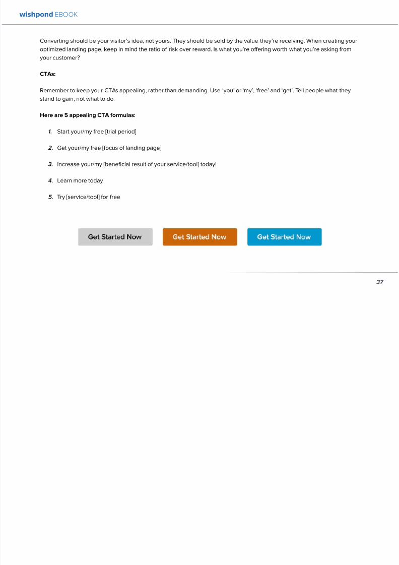
892019 Landing Pages eBook 1
httpslidepdfcomreaderfulllanding-pages-ebook-1 3865
5 SELL THE DEAL NOT THE PRODUCT
Are you one of those people who finds themselves
buying things they donrsquot need just because itrsquos a great
deal I most definitely am (damn you IKEA) Offers andcontests are my favorite strategy for lead generation and
to encourage a sale (genuinely not just because I work
for a company that builds online promotional tools for
small business)
The right offer is sellable simply as an offer - the product
itself is actually secondary to the deal
The best strategy for using offers is to target well with
a Facebook Ad This way the traffic yoursquore generating
to your landing page is already half-nurtured whether
because of their interests job title relationship status
etc A half-nurtured lead will be better informed of how
good a deal theyrsquore getting making conversion more
likely
Remember however deals work best as value
propositions You need to back up your offer with some
substance
Donrsquot necessarily prioritize the offer over visuals benefits
and an awesome overall product An offer wonrsquot always
work entirely on its own (At least unless your deal is just insane I mean who hasnrsquot brought home bean-bag
chairs to their already fully-furnished tiny apartment
They were buy one get two free)
The best strategy is to use great images sell someone
on the product every benefit every facet of the thing
and then wow them with the fact that this amazing state-
of-the-art life-changing product is only $2999 for thismonth only
wishpond EBOOK
38
892019 Landing Pages eBook 1
httpslidepdfcomreaderfulllanding-pages-ebook-1 3965
wishpond EBOOK
892019 Landing Pages eBook 1
httpslidepdfcomreaderfulllanding-pages-ebook-1 4065
Chapter 5
Landing
PagesOptimizing your Page
for Lead Generation
wishpond EBOOK
wishpond EBOOK
892019 Landing Pages eBook 1
httpslidepdfcomreaderfulllanding-pages-ebook-1 4165
Do you have an awesome landing page Is it optimized
for your lead generation objectives
Email leads are the number one concern for online
marketers You need a landing page that converts has alow bounce rate and engages your consumer enough to
get the lucrative contact
In this article Irsquoll show you how to optimize your landing
page for lead generation by
bull optimizing your SEO
bull focusing on value
bull optimizing your entry form for engagement
bull implementing a customer testimonial campaign
Letrsquos check it out
OPTIMIZE IT FOR SEO
The chief source of most leads is still search Increase
the chance of a lead finding your landing page in the first
place by optimizing it with Googlersquos search algorithm in
mind
Optimize your Landing Pagersquos Title
Your landing pagersquos title is what shows up in the tab This
is different than your page headline USP or what shows
in the URL When creating your page in wordpress or withHTML keep in mind the title best practices
bull Keep it short
bull Keep it keyword-centric
bull Use long-tail format
Whatrsquos long-tail format
Since the Hummingbird update Google is prioritizing the
context of a search as much as it is the keywords Long-
tail is this context-centric search format
Think of asking SIRI lsquoWherersquos the best Thai restaurant
in the arearsquo She scurries off with that information and
comes back with a response that makes sense Google is
designing its search to do the same Instead of lsquoLanding
pages 10 steps to Conversionsrsquo test out calling your
landing page something like lsquoHow to Build a Landing
Page that Convertsrsquo as this is what people will ask of
wishpond EBOOK
41
wishpond EBOOK
892019 Landing Pages eBook 1
httpslidepdfcomreaderfulllanding-pages-ebook-1 4265
Your title is what Googlersquos little algorithm bot sees first
when itrsquos sent off by a web userrsquos search Optimize your
landing pagersquos title and that bot will see you first
Social Share Buttons
If yoursquore basing your landing page around a resource
(like an ebook or a whitepaper) that content is highly
shareable And since Googlersquos hummingbird update
earlier this fall social shares are more valuable than ever
In fact Google+1rsquos are now ranked as more important
than link-building (something traditional SEO gurus are
struggling with to say the least)
Encourage social engagement by promoting your landing
page on Facebook Twitter and especially Google+ And
perhaps most importantly (and simply) throw up a few
social share buttons along the side or at the top of your
landing page This has been quoted as increasing the
virality of a blog post for instance by up to 700
5 More Awesome SEO tips
1 Use different headings tags (like lth1gt and lth4gt)
and bold and italicize keywords the Google search
bot sees these more than it does normal text
2 Optimize your copy with keywords dynamically
and fluidly spread throughout
3 Include an image with alt tags - this lets the search
engine know what your image is about Also will
show up in image search
4 Link to your landing page within your own website
5 Syndicate your landing page as much as possible
with link-building on forums and social media
platforms
For more information about optimizing for SEO check
out my article How to Easily Optimize your Blog for SEO
Many of the takeaways apply for landing pages as well
FOCUS ON VALUE
In order to encourage a lead to engage you need to
convince them itrsquos worth it This means value propositions
wishpond EBOOK
42
wishpond EBOOK
892019 Landing Pages eBook 1
httpslidepdfcomreaderfulllanding-pages-ebook-1 4365
and a great USP It also means you keep your landing
page simple You should be convincing quickly and easily
Ask your page visitor to read too much do too much and
theyrsquoll bounce
Be Specific
One of the main strategies in lead generation is limiting
your landing pagersquos bounce rate to the smallest
percentage you can Realistically yoursquoll be jumping for
joy and screaming from the mountaintops if your pagersquos
conversion rate is over 20
A recently-discovered best practice is that people
respond to specific numbers far more than they do round
numbers For instance quoting your business as having
80000 customers is less believable (and therefore less
powerful for conversions) as quoting your business as
having 75250 customers
Also keep your value propositions simple
bull Make the benefit of your business easy to
understand
bull Use dollar values percentages the word lsquofreersquo
bull Donrsquot use too much page space selling the specifics
of your service or your resource
Benefit List
If yoursquore using an email-gated ebook or other resource
for lead-generation think about your benefit list as the
second point of your argument Your Value Proposition
and image draw their attention and your list of benefits
tell them specifically how they stand to benefit from
entering their information and downloading your
resource
3 Benefit Formulas
1 [Number of things] yoursquoll learn in this ebook
2 How this resource will cause a rsquo [desired result]
3 The [number of steps] to [a certain goal]
OPTIMIZE YOUR ENTRY FORM
Your entry form is the focus of a lead-generating landing
page As far as your lead-generation funnel goes that
entry form CTA is the equivalent of lsquoproceed to check
outrsquo So make sure itrsquos optimized for conversions with
wishpond EBOOK
43
wishpond EBOOK
892019 Landing Pages eBook 1
httpslidepdfcomreaderfulllanding-pages-ebook-1 4465
these easy steps
1 Draw the Eye
You want your entry form to be obvious - donrsquot hideit below-the-fold or with small font Not only will this
increase interaction itrsquoll make it clear to visitors what
yoursquore asking of them Web users like things simple
and clear If they feel therersquos any chance theyrsquore being
swindled theyrsquoll bounce
6 Entry Form Design Tips
1 Encapsulate your entry form within a box
2 Draw attention to your entry form with the br ightly-
colored CTA
3 Use a vertical or horizontal line to separate your
entry form from the rest of the page
4 Include an action-oriented headline above your
form fields (like lsquoget your trial startedrsquo or lsquostart
learning nowrsquo)
5 Contrast the colour of your entry form box with the
page around it
6 AB Test including a short descriptive sentence
describing what happens when they click your CTA
wishpond EBOOK
44
wishpond EBOOK
892019 Landing Pages eBook 1
httpslidepdfcomreaderfulllanding-pages-ebook-1 4565
2 Balance Demographic Collection with Bounce
Rate
Optimizing your entry form is about weighing up the
valuable information yoursquore getting from a lead (detailsyou can use to segment the emailsadvertisements they
receive) versus the amount of form fields it takes to
increase bounce rate
Pro Tip Unless itrsquos absolutely necessary
avoid asking for a phone number People
are far more resistant to giving out phone
numbers than they are of an email or even
an address Spam emails are more accepted
than telemarketing calls during dinner
Letrsquos say yoursquore heavily invested in email marketing and
itrsquos working really well for your business It may be more
important to your business to know the demographic
details of 10 leads than to know nothing about 20 Email
marketing works best if yoursquore able to personalize and
segment your emails However this is entirely up to your
business
One of the benefits of email-gating an ebook or other
resource for lead generation is that you know people who
downloaded it are interested in that content Target them
with similar content in the future
For more information on segmenting your emailmarketing campaigns to get the best ROI possible read
my colleague Kristarsquos article 4 Strategies to Optimize your
Email Segmentation
wishpond EBOOK
45
wishpond EBOOK
892019 Landing Pages eBook 1
httpslidepdfcomreaderfulllanding-pages-ebook-1 4665
CUSTOMER TESTIMONIALS OR TRUST SYMBOLS
Irsquove talked about the value of trust symbols before but I
donrsquot want you to think that just because yoursquore no longer
optimizing for a sale you can forget them
Letrsquos say your page is focused around a free ebook or
white-paper This valuable content is email-gated so
therersquos no real proof (apart from what yoursquore saying) that
what yoursquore promising will be delivered
That is unless you include a customer testimonial like a
quote (I recommend including a picture of the customeras it makes it far more trustworthy) or short video clip If
yoursquore asking for a phone number or email address be
sure to let people know - obviously - that you donrsquot sell
these details or spam them
Customer testimonials act as a social endorsement
which have grown in importance in the past few years
This is because since Amazon Yelp and other sites
made customer reviews such a huge part of a successful
product your service needs to do the same
Pro Tip Many businesses have found
their highest conversion rates come from
a landing page built around a photogenic
customerrsquos testimonial Incorporate
an awesome case study for the value
proposition with a large picture and a clear
benefit list of how your page visitor can getthe same result
wishpond EBOOK
46
wishpond EBOOK
892019 Landing Pages eBook 1
httpslidepdfcomreaderfulllanding-pages-ebook-1 4765
Conclusion
Hopefully you now have a better idea of how to optimize your landing page for lead generation Be sure to prioritize your
entry form communicate simply and accurately and use a customer testimonial to convince your possible lead to convert
wishpond EBOOK
47
wishpond EBOOK
892019 Landing Pages eBook 1
httpslidepdfcomreaderfulllanding-pages-ebook-1 4865
Chapter 6
Landing
PagesThe Science
Behind Designing
for Conversion
p
wishpond EBOOK
892019 Landing Pages eBook 1
httpslidepdfcomreaderfulllanding-pages-ebook-1 4965
Is your landing page converting well Is it converting
badly Do you know why I mean do you really know
This article will give you the science and psychology
of why your landing is engaging to visitors or why youmight be getting traffic - but no conversions
Irsquoll take a look at 5 principles of landing
page design that can mean the difference
between a successful page and one thatrsquos
just taking up space (or fumbling around in
the dark)
Letrsquos get started
1 DIRECTIONAL CUES
Directional Cues are key in landing page design as they
tell people what to focus on
The most important thing to remember when designingyour landing page is that people do not view it like they
do a book Itrsquos not left to right top to bottom You have to
tell people how to read your page and directional cues
(as well as encapsulation and contrast below) are how
you do this
My recommendation is to decide two things on your
landing page that you especially want to drive attention
to (say your CTA and your product image or maybe aUSP) Then integrate a couple of the strategies below
into your design and AB test it Maybe your audience
responds well to the overt arrow or maybe the more
subtle eye-gaze Test it for yourself
Therersquos three main ways that we signal a focus point in
landing pages
Arrows and lines
p
49
wishpond EBOOK
892019 Landing Pages eBook 1
httpslidepdfcomreaderfulllanding-pages-ebook-1 5065
The most straightforward way to direct attention at an object or heading is to draw an arrow or line to it Students of art
will know the importance of lines as humans have a natural (subconscious) impulse to follow them to their origin or their
destination This works great to focus peoplersquos gaze on your CTA USP value proposition or product image
Eye-direction
Humans are incredibly good at recognizing the eye-focus point of the people around them I recommend using an eye-
tracking software on your landing page to determine where people are focusing and whether this focus is resulting in an
increased click-through-rate
What Irsquom talking about (thanks to Neil Patel
for the eye-tracking examples)
The red spots indicate the areas which
viewers looked at most Take note of how
the eye direction in the example on the left
draws the viewer`s attention towards the
product
p
50
wishpond EBOOK
892019 Landing Pages eBook 1
httpslidepdfcomreaderfulllanding-pages-ebook-1 5165
Faces are the most eye-attracting image you can use (see
5 below) and the eyes are the most eye-attracting part
of the face
Yoursquoll notice the woman on the left is looking directly atthe camera (or visitor to your page) The woman on the
right is looking at the product that Sunsilk is trying to sell
You can see in concrete terms how the initial gaze goes
to the womanrsquos eyes and then tracks left to the product
whereas the face on the left gets all the attention and the
product none
PointingGesturing
I highly recommend you use an image of a person in your
landing page as itrsquos proven to be the most engaging
picture (more on that later though) Something to test
however is having that model gesturing or pointing
towards something you want to focus attention on
This is a dangerous one though as (in my mind) it can
come across as cheesy if done incorrectly Test what your
audience responds to Irsquove seen this both increase and
decrease conversion rates in many case studies
2 CONTRAST
Color contrast
Contrast is essential when working with landing pagesThe human eye is naturally attracted to contrasting color
I recommend you consider color contrast for your USP
and CTA - perhaps an orange CTA button on a dark blue
background
Blank space
The idea of blank space is well-known in the graphic
design world and no less a vital part of landing page
design The idea is that blank space is extremely
influential in focusing attention on non-blank space For
instance
p
51
wishpond EBOOK
892019 Landing Pages eBook 1
httpslidepdfcomreaderfulllanding-pages-ebook-1 5265
Another way of utilizing blank space is with
encapsulation This can be done by framing a section
of content with a border or a container (filled in with
a background color) Give the encapsulated section
enough space to allow it to function somewhatindependently of the rest of the composition
Will this work better than a directional cue Test it for
yourself and find out
Format contrast
Formatting size (of font for instance) also attracts the eyeIn a 4-week multivariate test in 2010 Paras Chopra tested
the performance of 12 different combinations of a Call-to-
Action and descriptive link
Option 10 with the largest contrast in color hue and size
(as well as the word Free) generated a 60 improvement
in conversion rate
3 COLOR
Color is extremely (though unconsciously) effective
at eliciting emotion in viewers I took an in-depth
look at color psychology in my series on the science
behind a successful Facebook Ad so check it out for a
comprehensive analysis (with science)
For now herersquos a breakdown of how humans areinfluenced by color - and how this knowledge can
improve your conversion rates
Blue Blue is across both genders and all age-groups
most peoplersquos favorite color (35 of women and 57
of men) It is said to create the sensation of trust and
security Lighter blues are calming while darker blues
denote professionalism and sincerity
Orange Eye-catching bright and sunny orange is one of
the most popular colors for landing page Calls-to-Action
While a good tone and amount of orange is seen as warm
and inviting too much has been associated with naivete
52
wishpond EBOOK
892019 Landing Pages eBook 1
httpslidepdfcomreaderfulllanding-pages-ebook-1 5365
and a lack of professionalism
Red The color red is associated with passion excitement
and urgency Itrsquos a dangerous color in advertising as
many people associate red with negativity and mistakesHowever it attracts the eye better than any other color
and gives the impression that time is passing faster than
it is (as it causes our heart to beat faster) causing us to act
when we otherwise wouldnrsquot
Green Associated with wealth as well as environmental
subjects green is the easiest color for the eye to process
Green also signifies positive action (thinkrsquogreen meansgorsquo) and affirmation
Green and teal have also been associated with shoppers
on a budget Itrsquos also the second and third most popular
color among men and women respectively
Purple Associated with calm femininity and wealth
purple is the second most popular color among women
at 23 Interestingly as women get older their liking for
the color purple increases On the other hand purple is
the favorite color of 0 of the male population
Black Powerful sleek and intellectual black signifies
permanence sincerity and sophistication While black
can like red and orange be a dangerous color if used
too much it can communicate professionalism and
sophistication when used in conjunction with a strong
clear white (avoid greys or tans as theyrsquoll wash out yourmessage)
4 IMAGERY
I could discuss the effectiveness of a picture of a smiling
person on your landing page for hours (and I havehellip) but
just trust me that having an image (especially a person)
will likely improve your conversion rates
Something Irsquove seen recently actually is incorporating a
customer testimonial with the main landing page image
Choose a photogenic customer and post it up next to an
awesome-sounding affirmation of how your product or
service made their lives easier
But letrsquos leave that for the moment assuming you
recognize its importance and talk about why it works
bull We respond far more emotionally to people (or pets
though people generally elicit a stronger response)
than we do to words or random images
53
wishpond EBOOK
892019 Landing Pages eBook 1
httpslidepdfcomreaderfulllanding-pages-ebook-1 5465
bull A picture of a person provides subtext to your
landing page - a story which people respond to
bull We completely subconsciously focus on the faces
of people we see (especially the eyes) In everyeye-tracking image Irsquove ever seen the hottest
points are the face and eyes Unless of course
the image is of a woman and wersquore talking about a
male demographic Then the eye-tracking software
shows our attention to behellip elsewhere
In my research for this article I came across an article by
VS Ramachandran (a neuroscientist from Oxford) whowrote that oftentimes a line drawing is more powerful
than a photograph He writes that this is because the
lsquoidearsquo of a person is more appealing than the truth of it
(why so much of art is exaggeration of the human form or
why caricatures are so aesthetically pleasing) Leave out
the details and all yoursquore left is the essence of a thing
Although I havenrsquot yet seen an example of this in a
landing page or incorporated it into my own I believe
that whoever does will see a dramatic increase in click-
throughs Get creative and let me know how it goes
5 TYPOGRAPHY AND STYLE
Yoursquoll think that Irsquom getting too detailed here that
different typographies text formats or styles canrsquot actually
increase or decrease conversion rates enough to matter
Herersquos the thing with AB testing details do matter
Letrsquos say your Ecommerce sitersquos landing page is currently
converting at 23 Yoursquore seeing traffic of around 2000
visitors per week and their average purchase is worth
50 dollars to your business Yoursquore making $23000 per
week
Letrsquos say we change your pagersquos headline length and
change the image from one of a woman looking at
the camera to one looking at the CTA (small changes
yoursquod agree) You see a conversion rate increase of
10 Suddenly yoursquore converting at 253 and yoursquove
increased your weekly income to $25300 Yearly
revenue increase $27600
Typography and style changes to AB test
bull Font size for headings and body copy (and the
difference between them)
54
wishpond EBOOK
892019 Landing Pages eBook 1
httpslidepdfcomreaderfulllanding-pages-ebook-1 5565
bull Heading length (short and succinct vs long and
detailed)
bull Number of different font sizes (too many makes
your landing page confusing - I recommend two orthree)
bull Fonts Keep in mind that different fonts are for
whatever reason viewed as more amateurish than
others We at Wishpond like San Sarif for headlines
and Sarif for body copy Avoid cursive (except
maybe for a header) and comic sans is a no-no for a
professional business
bull More text vs less (I like a simple landing page - get
to the point and leave any extraneous information
for later emails or different tabs But test this for
yourself)
Conclusion
Hopefully you now understand a little more of the
science and psychology behind landing page design best
practices Remember to provide visual clues for whereyou want your visitor to focus Donrsquot forget the details
like typography or eye-direction
And keep testing You can always improve your landing
page conversion rates Trust me
55
wishpond EBOOK
892019 Landing Pages eBook 1
httpslidepdfcomreaderfulllanding-pages-ebook-1 5665
Chapter 7
3 Landing
PageExamplesCritiqued to Hell and
Back
wishpond EBOOK
892019 Landing Pages eBook 1
httpslidepdfcomreaderfulllanding-pages-ebook-1 5765
Howrsquos your landing page doing Is it optimized for
conversions Optimized for lead generation
How about we check out a few pages from around
the web In this article Irsquoll dissect four landing pagesvariable by variable discussing where theyrsquove done it
right and where therersquos room for improvement
Itrsquos all well and good for me to tell you a picture is an
essential part of your landing page but until you see
(pardon the pun) what Irsquom talking about itrsquos just that
talk
So letrsquos do this thing
1 SALESFORCE
Salesforce (for those somehow unfamiliar) is a
Customer Relationship Management (CRM) business
based out of San Fran
Herersquos their current landing page raquo
57
wishpond EBOOK
892019 Landing Pages eBook 1
httpslidepdfcomreaderfulllanding-pages-ebook-1 5865
What I Like About this Page
bull The imagery The first thing that hits you when you
traffic to SalesForcersquos landing page is the visual
representation of what they do Though by nomeans unique the visuals of lsquoconnect everything
with our awesome appsrsquo is clear
bull The image size I like how prominent their visuals
are About 75 of their lsquoabove the foldrsquo landing
page area is taken up by this image
bull The prioritized pages What I mean by this is simple
the three blue buttons on the right side (and also
beneath the benefit list paragraph) will traffic to
equally-optimized landing pages The tabs in gray
at the top are quite clearly subordinate (I know
this because of their color contrast encapsulation
etc) and traffic on them will be substantially less I
like the emphasis being placed on the things most
important to their leads
bull The Value Proposition Salesforce has gone
with two value propositions over a USP for their
header I like the succinct and appealing ldquoConnect
everythingrdquo especially
bull The benefit list Though not in bullet-point form
the below-the-fold paragraph of USPrsquos and value
propositions is still effective lsquoBuild customer loyaltyrsquo
(Boom) lsquoIncrease first call resolution and agent
productivityrsquo (Boom) lsquoImprove customer satisfactionby 37rsquo (Boom)
bull The specificity Perhaps my favorite part of this
entire landing is the sentence lsquoimprove customer
satisfaction by 37rsquo This kind of statistic is
incredibly convincing as itrsquos low enough and
specific enough to be entirely believable It also
shows me that theyrsquore professional enough to havedone their research and (I trust) can back up this
statistic with proof
Where I Think they Could Optimize this Page
bull Contrast the imagery I like the use of multiple
images on landing pages (one primary above-the-
fold and one secondary below it) However to
maximize the appeal of your images I recommend
you make them distinct from each other These two
images accomplish the same visual representation
I mentioned above How about keeping the same
image at the top and changing the below-the-fold
58
wishpond EBOOK
892019 Landing Pages eBook 1
httpslidepdfcomreaderfulllanding-pages-ebook-1 5965
59
image to a satisfied customer instead
bull Customer testimonials Perhaps SalesForce is relying on their substantial reputation as the worldrsquos CRM leader but
Irsquod still recommend they included a picture (and quote) from one of their prominent clients This is a businesses that
regularly works with Facebook General Electric and Delta Airlines Irsquod recommend testing a quote and image fromone of these businesses with the brand namelogo prominently placed
AB Testing Postulation
Irsquod theorize that integrating a customer testimonial with an image into a revolving album below-the-fold (on the right) could
increase conversion rates on this page by 10
2 MAILCHIMP
Mailchimp is the most successful email automation company out there (with more than 5 million users)
View their landing page on the next page
wishpond EBOOK
892019 Landing Pages eBook 1
httpslidepdfcomreaderfulllanding-pages-ebook-1 6065
60
wishpond EBOOK
892019 Landing Pages eBook 1
httpslidepdfcomreaderfulllanding-pages-ebook-1 6165
61
What I Like About this Page
bull The tagline ldquoSend Better Emailrdquo is one of the
simplest and most straightforward of all successful
landing pages Irsquove seen Itrsquos to the point andeffective Mailchimp has also had this tagline since
mid June of 2013 meaning itrsquos working for them
bull The USP ldquoMore than 5 million people use
MailChimphelliprdquo is about as unique as you can get
Peer endorsement is the most powerful USP you
can bring into play
bull The Image Red on a blue background stands out
fantastically and attracts the eye - I also the giving
a snapshot of their tool giving people a glimpse at
what they have to offer
bull The CTA(s) Although not as noticeable as ldquoSign
up Freerdquo (which consistently performs better than
simply ldquoSign Uprdquo) I really like ldquoJoin them todayrdquo in
the small paragraph beneath the tagline This is as
much as CTA as the buttons are and plays to the
peer pressure effectiveness of the page
Where I Think they Could Optimize this Page
bull The color scheme Irsquod be interested to see the
effect of a dark blue background and white taglines
benefits As it stands now the page is somewhatboring
bull The toolbar at the top Such a simple and minimalist
landing page needs to accentuate their ldquoFeaturesrdquo
ldquoPricesrdquo and ldquoSupportrdquo buttons at the top to make
it easy to access these important parts of the
decision-making process
bull The CTA(s) While I like the language used Irsquod be
curious to see the effect of making the CTAs stand
out a bit more with a contrasting color to draw the
eye
bull Irsquod test a customer testimonial rotation Mentioning
the 5 million people who use Mailchimp is all
well and good but Irsquod recommend rotating in a
photogenic former customer with a quote on the
effect that Mailchimp had on their businessrsquo email
marketing ROI
wishpond EBOOK
892019 Landing Pages eBook 1
httpslidepdfcomreaderfulllanding-pages-ebook-1 6265
62
AB Testing Postulation
Irsquod theorize that a customer testimonial addition could increase conversions on this page by up to 10 A concrete number
or percentage taken from a case study would make the page more effective
3 KISSMETRICS
Customer analytics platform
Kissmetrics is entrepreneur Neil
Patelrsquos 2008 baby
Herersquos their current landing page raquo
wishpond EBOOK
892019 Landing Pages eBook 1
httpslidepdfcomreaderfulllanding-pages-ebook-1 6365
63
What I Like About this Page
bull The image If yoursquore unsure exactly what image
you should use for your landing page fall back
on something like this A smiling normal-lookingperson (photogenic but not a model) is your best
bet
bull The simplicity Yes this is the entire landing page
Nothing but lsquoabove-the-foldrsquo It relies entirely on the
USP which is incredibly effective
bull Knowing their market Customer analytics are a field
only interesting to people who know what Google
Analytics is Nobody starts with Kissmetrics and
moves to Google Analytics As such the USP is
incredibly effective
bull Logging in with a Google account Irsquove mentioned
before how an email address is worth so much
more to your business than it is to its owner (and
how a phone number is so much more of an ask)
Well a social platform login is worth even less to
its owner - this allows Kissmetrics to ask for less
from a lead and get exactly the same details (if not
more) than they would were they to ask for an email
address
bull The popup The bottom-right popup (which reads
lsquowhatrsquos preventing you from wanting to start a
free trial of Kissmetricsrsquo) does not appear forevery person that traffics to this landing page
This would mediate the drop in conversion rates
that this popup likely causes However this popup
also provides Kissmetrics with extremely valuable
information namely what they can do to encourage
a sign-up Trading a little conversion rate (especially
if you do this temporarily) can be worth more
information This is a similar trade Irsquove talked aboutbefore where more entry boxes give you better
lead knowledge but can decrease conversion rates
- something you have to balance
Check out my article lsquoValue Proposition Formulas that
Boost Conversion on Ads and Landing Pagesrsquo where I
take an in-depth look at how to use Kissmetricrsquos formula
and 6 others
Where I Think they Could Optimize this Page
bull The Image Okay I really like this image but Irsquod be
curious to see how a landing page with a revolving
wishpond EBOOK
892019 Landing Pages eBook 1
httpslidepdfcomreaderfulllanding-pages-ebook-1 6465
64
album would do How about three different USP
value proposition + image combinations revolving
every 75 seconds (Genuinely I recommend you
test the time lapse you use if you employ revolving
images)
bull Learn More The ldquoLearn Morerdquo link in the bottom
left of this landing page is too quiet Irsquod recommend
a subtle encapsulation and slightly larger font I
think this landing page is incredibly effective but
clearly the issue theyrsquoll have is not offering enough
information about what they do A ldquoLearn Morerdquo
link is an awesome way of doing this but itrsquos notobvious enough for everyone to see and I wonder if
that doesnrsquot increase their bounce rate
bull A Case Studies Tab I donrsquot want to ruin the
contemporary minimalist appeal of this landing
page but I would be interested in testing a lsquocase
studiesrsquo or lsquocustomer storiesrsquo tab next to lsquoSign Inrsquo on
the top bar Like the lsquoLearn Morersquo link this would
make it a little easier for visitors to find the answers
to their questions without cluttering the page with
the customer testimonials benefit list and trust
symbols I usually recommend
AB Testing Postulation
Irsquod theorize that making the lsquoLearn Morersquo link on the
bottom right just slightly more obvious would increase
conversions from this page Herersquos why If someone typesin lsquocustomer analyticsrsquo into Google search theyrsquoll click on
Kissmetrics Irsquod be concerned that at the moment they
may bounce due to lack of ready information A more
visible lsquoLearn Morersquo link could increase conversion by up
to 5
Conclusion
The variables Irsquove discussed and critiqued in this article
encompass most of the optimization strategies I give
our clients Remember that every audience is different
and that (unless yoursquore using an optimized landing page
template) yoursquoll need to AB test your own landing pages
on a monthly basis
wishpond EBOOK
892019 Landing Pages eBook 1
httpslidepdfcomreaderfulllanding-pages-ebook-1 6565
Creating and optimizing your businessrsquo landing pages can be the most influential change you make this year
Wishpondrsquos own landing pages are being constantly updated and optimized - our templates completely customizable Start
a free trial today to check them out and see if wersquore a fit for your business
Thanks for reading
892019 Landing Pages eBook 1
httpslidepdfcomreaderfulllanding-pages-ebook-1 3965
wishpond EBOOK
892019 Landing Pages eBook 1
httpslidepdfcomreaderfulllanding-pages-ebook-1 4065
Chapter 5
Landing
PagesOptimizing your Page
for Lead Generation
wishpond EBOOK
wishpond EBOOK
892019 Landing Pages eBook 1
httpslidepdfcomreaderfulllanding-pages-ebook-1 4165
Do you have an awesome landing page Is it optimized
for your lead generation objectives
Email leads are the number one concern for online
marketers You need a landing page that converts has alow bounce rate and engages your consumer enough to
get the lucrative contact
In this article Irsquoll show you how to optimize your landing
page for lead generation by
bull optimizing your SEO
bull focusing on value
bull optimizing your entry form for engagement
bull implementing a customer testimonial campaign
Letrsquos check it out
OPTIMIZE IT FOR SEO
The chief source of most leads is still search Increase
the chance of a lead finding your landing page in the first
place by optimizing it with Googlersquos search algorithm in
mind
Optimize your Landing Pagersquos Title
Your landing pagersquos title is what shows up in the tab This
is different than your page headline USP or what shows
in the URL When creating your page in wordpress or withHTML keep in mind the title best practices
bull Keep it short
bull Keep it keyword-centric
bull Use long-tail format
Whatrsquos long-tail format
Since the Hummingbird update Google is prioritizing the
context of a search as much as it is the keywords Long-
tail is this context-centric search format
Think of asking SIRI lsquoWherersquos the best Thai restaurant
in the arearsquo She scurries off with that information and
comes back with a response that makes sense Google is
designing its search to do the same Instead of lsquoLanding
pages 10 steps to Conversionsrsquo test out calling your
landing page something like lsquoHow to Build a Landing
Page that Convertsrsquo as this is what people will ask of
wishpond EBOOK
41
wishpond EBOOK
892019 Landing Pages eBook 1
httpslidepdfcomreaderfulllanding-pages-ebook-1 4265
Your title is what Googlersquos little algorithm bot sees first
when itrsquos sent off by a web userrsquos search Optimize your
landing pagersquos title and that bot will see you first
Social Share Buttons
If yoursquore basing your landing page around a resource
(like an ebook or a whitepaper) that content is highly
shareable And since Googlersquos hummingbird update
earlier this fall social shares are more valuable than ever
In fact Google+1rsquos are now ranked as more important
than link-building (something traditional SEO gurus are
struggling with to say the least)
Encourage social engagement by promoting your landing
page on Facebook Twitter and especially Google+ And
perhaps most importantly (and simply) throw up a few
social share buttons along the side or at the top of your
landing page This has been quoted as increasing the
virality of a blog post for instance by up to 700
5 More Awesome SEO tips
1 Use different headings tags (like lth1gt and lth4gt)
and bold and italicize keywords the Google search
bot sees these more than it does normal text
2 Optimize your copy with keywords dynamically
and fluidly spread throughout
3 Include an image with alt tags - this lets the search
engine know what your image is about Also will
show up in image search
4 Link to your landing page within your own website
5 Syndicate your landing page as much as possible
with link-building on forums and social media
platforms
For more information about optimizing for SEO check
out my article How to Easily Optimize your Blog for SEO
Many of the takeaways apply for landing pages as well
FOCUS ON VALUE
In order to encourage a lead to engage you need to
convince them itrsquos worth it This means value propositions
wishpond EBOOK
42
wishpond EBOOK
892019 Landing Pages eBook 1
httpslidepdfcomreaderfulllanding-pages-ebook-1 4365
and a great USP It also means you keep your landing
page simple You should be convincing quickly and easily
Ask your page visitor to read too much do too much and
theyrsquoll bounce
Be Specific
One of the main strategies in lead generation is limiting
your landing pagersquos bounce rate to the smallest
percentage you can Realistically yoursquoll be jumping for
joy and screaming from the mountaintops if your pagersquos
conversion rate is over 20
A recently-discovered best practice is that people
respond to specific numbers far more than they do round
numbers For instance quoting your business as having
80000 customers is less believable (and therefore less
powerful for conversions) as quoting your business as
having 75250 customers
Also keep your value propositions simple
bull Make the benefit of your business easy to
understand
bull Use dollar values percentages the word lsquofreersquo
bull Donrsquot use too much page space selling the specifics
of your service or your resource
Benefit List
If yoursquore using an email-gated ebook or other resource
for lead-generation think about your benefit list as the
second point of your argument Your Value Proposition
and image draw their attention and your list of benefits
tell them specifically how they stand to benefit from
entering their information and downloading your
resource
3 Benefit Formulas
1 [Number of things] yoursquoll learn in this ebook
2 How this resource will cause a rsquo [desired result]
3 The [number of steps] to [a certain goal]
OPTIMIZE YOUR ENTRY FORM
Your entry form is the focus of a lead-generating landing
page As far as your lead-generation funnel goes that
entry form CTA is the equivalent of lsquoproceed to check
outrsquo So make sure itrsquos optimized for conversions with
wishpond EBOOK
43
wishpond EBOOK
892019 Landing Pages eBook 1
httpslidepdfcomreaderfulllanding-pages-ebook-1 4465
these easy steps
1 Draw the Eye
You want your entry form to be obvious - donrsquot hideit below-the-fold or with small font Not only will this
increase interaction itrsquoll make it clear to visitors what
yoursquore asking of them Web users like things simple
and clear If they feel therersquos any chance theyrsquore being
swindled theyrsquoll bounce
6 Entry Form Design Tips
1 Encapsulate your entry form within a box
2 Draw attention to your entry form with the br ightly-
colored CTA
3 Use a vertical or horizontal line to separate your
entry form from the rest of the page
4 Include an action-oriented headline above your
form fields (like lsquoget your trial startedrsquo or lsquostart
learning nowrsquo)
5 Contrast the colour of your entry form box with the
page around it
6 AB Test including a short descriptive sentence
describing what happens when they click your CTA
wishpond EBOOK
44
wishpond EBOOK
892019 Landing Pages eBook 1
httpslidepdfcomreaderfulllanding-pages-ebook-1 4565
2 Balance Demographic Collection with Bounce
Rate
Optimizing your entry form is about weighing up the
valuable information yoursquore getting from a lead (detailsyou can use to segment the emailsadvertisements they
receive) versus the amount of form fields it takes to
increase bounce rate
Pro Tip Unless itrsquos absolutely necessary
avoid asking for a phone number People
are far more resistant to giving out phone
numbers than they are of an email or even
an address Spam emails are more accepted
than telemarketing calls during dinner
Letrsquos say yoursquore heavily invested in email marketing and
itrsquos working really well for your business It may be more
important to your business to know the demographic
details of 10 leads than to know nothing about 20 Email
marketing works best if yoursquore able to personalize and
segment your emails However this is entirely up to your
business
One of the benefits of email-gating an ebook or other
resource for lead generation is that you know people who
downloaded it are interested in that content Target them
with similar content in the future
For more information on segmenting your emailmarketing campaigns to get the best ROI possible read
my colleague Kristarsquos article 4 Strategies to Optimize your
Email Segmentation
wishpond EBOOK
45
wishpond EBOOK
892019 Landing Pages eBook 1
httpslidepdfcomreaderfulllanding-pages-ebook-1 4665
CUSTOMER TESTIMONIALS OR TRUST SYMBOLS
Irsquove talked about the value of trust symbols before but I
donrsquot want you to think that just because yoursquore no longer
optimizing for a sale you can forget them
Letrsquos say your page is focused around a free ebook or
white-paper This valuable content is email-gated so
therersquos no real proof (apart from what yoursquore saying) that
what yoursquore promising will be delivered
That is unless you include a customer testimonial like a
quote (I recommend including a picture of the customeras it makes it far more trustworthy) or short video clip If
yoursquore asking for a phone number or email address be
sure to let people know - obviously - that you donrsquot sell
these details or spam them
Customer testimonials act as a social endorsement
which have grown in importance in the past few years
This is because since Amazon Yelp and other sites
made customer reviews such a huge part of a successful
product your service needs to do the same
Pro Tip Many businesses have found
their highest conversion rates come from
a landing page built around a photogenic
customerrsquos testimonial Incorporate
an awesome case study for the value
proposition with a large picture and a clear
benefit list of how your page visitor can getthe same result
wishpond EBOOK
46
wishpond EBOOK
892019 Landing Pages eBook 1
httpslidepdfcomreaderfulllanding-pages-ebook-1 4765
Conclusion
Hopefully you now have a better idea of how to optimize your landing page for lead generation Be sure to prioritize your
entry form communicate simply and accurately and use a customer testimonial to convince your possible lead to convert
wishpond EBOOK
47
wishpond EBOOK
892019 Landing Pages eBook 1
httpslidepdfcomreaderfulllanding-pages-ebook-1 4865
Chapter 6
Landing
PagesThe Science
Behind Designing
for Conversion
p
wishpond EBOOK
892019 Landing Pages eBook 1
httpslidepdfcomreaderfulllanding-pages-ebook-1 4965
Is your landing page converting well Is it converting
badly Do you know why I mean do you really know
This article will give you the science and psychology
of why your landing is engaging to visitors or why youmight be getting traffic - but no conversions
Irsquoll take a look at 5 principles of landing
page design that can mean the difference
between a successful page and one thatrsquos
just taking up space (or fumbling around in
the dark)
Letrsquos get started
1 DIRECTIONAL CUES
Directional Cues are key in landing page design as they
tell people what to focus on
The most important thing to remember when designingyour landing page is that people do not view it like they
do a book Itrsquos not left to right top to bottom You have to
tell people how to read your page and directional cues
(as well as encapsulation and contrast below) are how
you do this
My recommendation is to decide two things on your
landing page that you especially want to drive attention
to (say your CTA and your product image or maybe aUSP) Then integrate a couple of the strategies below
into your design and AB test it Maybe your audience
responds well to the overt arrow or maybe the more
subtle eye-gaze Test it for yourself
Therersquos three main ways that we signal a focus point in
landing pages
Arrows and lines
p
49
wishpond EBOOK
892019 Landing Pages eBook 1
httpslidepdfcomreaderfulllanding-pages-ebook-1 5065
The most straightforward way to direct attention at an object or heading is to draw an arrow or line to it Students of art
will know the importance of lines as humans have a natural (subconscious) impulse to follow them to their origin or their
destination This works great to focus peoplersquos gaze on your CTA USP value proposition or product image
Eye-direction
Humans are incredibly good at recognizing the eye-focus point of the people around them I recommend using an eye-
tracking software on your landing page to determine where people are focusing and whether this focus is resulting in an
increased click-through-rate
What Irsquom talking about (thanks to Neil Patel
for the eye-tracking examples)
The red spots indicate the areas which
viewers looked at most Take note of how
the eye direction in the example on the left
draws the viewer`s attention towards the
product
p
50
wishpond EBOOK
892019 Landing Pages eBook 1
httpslidepdfcomreaderfulllanding-pages-ebook-1 5165
Faces are the most eye-attracting image you can use (see
5 below) and the eyes are the most eye-attracting part
of the face
Yoursquoll notice the woman on the left is looking directly atthe camera (or visitor to your page) The woman on the
right is looking at the product that Sunsilk is trying to sell
You can see in concrete terms how the initial gaze goes
to the womanrsquos eyes and then tracks left to the product
whereas the face on the left gets all the attention and the
product none
PointingGesturing
I highly recommend you use an image of a person in your
landing page as itrsquos proven to be the most engaging
picture (more on that later though) Something to test
however is having that model gesturing or pointing
towards something you want to focus attention on
This is a dangerous one though as (in my mind) it can
come across as cheesy if done incorrectly Test what your
audience responds to Irsquove seen this both increase and
decrease conversion rates in many case studies
2 CONTRAST
Color contrast
Contrast is essential when working with landing pagesThe human eye is naturally attracted to contrasting color
I recommend you consider color contrast for your USP
and CTA - perhaps an orange CTA button on a dark blue
background
Blank space
The idea of blank space is well-known in the graphic
design world and no less a vital part of landing page
design The idea is that blank space is extremely
influential in focusing attention on non-blank space For
instance
p
51
wishpond EBOOK
892019 Landing Pages eBook 1
httpslidepdfcomreaderfulllanding-pages-ebook-1 5265
Another way of utilizing blank space is with
encapsulation This can be done by framing a section
of content with a border or a container (filled in with
a background color) Give the encapsulated section
enough space to allow it to function somewhatindependently of the rest of the composition
Will this work better than a directional cue Test it for
yourself and find out
Format contrast
Formatting size (of font for instance) also attracts the eyeIn a 4-week multivariate test in 2010 Paras Chopra tested
the performance of 12 different combinations of a Call-to-
Action and descriptive link
Option 10 with the largest contrast in color hue and size
(as well as the word Free) generated a 60 improvement
in conversion rate
3 COLOR
Color is extremely (though unconsciously) effective
at eliciting emotion in viewers I took an in-depth
look at color psychology in my series on the science
behind a successful Facebook Ad so check it out for a
comprehensive analysis (with science)
For now herersquos a breakdown of how humans areinfluenced by color - and how this knowledge can
improve your conversion rates
Blue Blue is across both genders and all age-groups
most peoplersquos favorite color (35 of women and 57
of men) It is said to create the sensation of trust and
security Lighter blues are calming while darker blues
denote professionalism and sincerity
Orange Eye-catching bright and sunny orange is one of
the most popular colors for landing page Calls-to-Action
While a good tone and amount of orange is seen as warm
and inviting too much has been associated with naivete
52
wishpond EBOOK
892019 Landing Pages eBook 1
httpslidepdfcomreaderfulllanding-pages-ebook-1 5365
and a lack of professionalism
Red The color red is associated with passion excitement
and urgency Itrsquos a dangerous color in advertising as
many people associate red with negativity and mistakesHowever it attracts the eye better than any other color
and gives the impression that time is passing faster than
it is (as it causes our heart to beat faster) causing us to act
when we otherwise wouldnrsquot
Green Associated with wealth as well as environmental
subjects green is the easiest color for the eye to process
Green also signifies positive action (thinkrsquogreen meansgorsquo) and affirmation
Green and teal have also been associated with shoppers
on a budget Itrsquos also the second and third most popular
color among men and women respectively
Purple Associated with calm femininity and wealth
purple is the second most popular color among women
at 23 Interestingly as women get older their liking for
the color purple increases On the other hand purple is
the favorite color of 0 of the male population
Black Powerful sleek and intellectual black signifies
permanence sincerity and sophistication While black
can like red and orange be a dangerous color if used
too much it can communicate professionalism and
sophistication when used in conjunction with a strong
clear white (avoid greys or tans as theyrsquoll wash out yourmessage)
4 IMAGERY
I could discuss the effectiveness of a picture of a smiling
person on your landing page for hours (and I havehellip) but
just trust me that having an image (especially a person)
will likely improve your conversion rates
Something Irsquove seen recently actually is incorporating a
customer testimonial with the main landing page image
Choose a photogenic customer and post it up next to an
awesome-sounding affirmation of how your product or
service made their lives easier
But letrsquos leave that for the moment assuming you
recognize its importance and talk about why it works
bull We respond far more emotionally to people (or pets
though people generally elicit a stronger response)
than we do to words or random images
53
wishpond EBOOK
892019 Landing Pages eBook 1
httpslidepdfcomreaderfulllanding-pages-ebook-1 5465
bull A picture of a person provides subtext to your
landing page - a story which people respond to
bull We completely subconsciously focus on the faces
of people we see (especially the eyes) In everyeye-tracking image Irsquove ever seen the hottest
points are the face and eyes Unless of course
the image is of a woman and wersquore talking about a
male demographic Then the eye-tracking software
shows our attention to behellip elsewhere
In my research for this article I came across an article by
VS Ramachandran (a neuroscientist from Oxford) whowrote that oftentimes a line drawing is more powerful
than a photograph He writes that this is because the
lsquoidearsquo of a person is more appealing than the truth of it
(why so much of art is exaggeration of the human form or
why caricatures are so aesthetically pleasing) Leave out
the details and all yoursquore left is the essence of a thing
Although I havenrsquot yet seen an example of this in a
landing page or incorporated it into my own I believe
that whoever does will see a dramatic increase in click-
throughs Get creative and let me know how it goes
5 TYPOGRAPHY AND STYLE
Yoursquoll think that Irsquom getting too detailed here that
different typographies text formats or styles canrsquot actually
increase or decrease conversion rates enough to matter
Herersquos the thing with AB testing details do matter
Letrsquos say your Ecommerce sitersquos landing page is currently
converting at 23 Yoursquore seeing traffic of around 2000
visitors per week and their average purchase is worth
50 dollars to your business Yoursquore making $23000 per
week
Letrsquos say we change your pagersquos headline length and
change the image from one of a woman looking at
the camera to one looking at the CTA (small changes
yoursquod agree) You see a conversion rate increase of
10 Suddenly yoursquore converting at 253 and yoursquove
increased your weekly income to $25300 Yearly
revenue increase $27600
Typography and style changes to AB test
bull Font size for headings and body copy (and the
difference between them)
54
wishpond EBOOK
892019 Landing Pages eBook 1
httpslidepdfcomreaderfulllanding-pages-ebook-1 5565
bull Heading length (short and succinct vs long and
detailed)
bull Number of different font sizes (too many makes
your landing page confusing - I recommend two orthree)
bull Fonts Keep in mind that different fonts are for
whatever reason viewed as more amateurish than
others We at Wishpond like San Sarif for headlines
and Sarif for body copy Avoid cursive (except
maybe for a header) and comic sans is a no-no for a
professional business
bull More text vs less (I like a simple landing page - get
to the point and leave any extraneous information
for later emails or different tabs But test this for
yourself)
Conclusion
Hopefully you now understand a little more of the
science and psychology behind landing page design best
practices Remember to provide visual clues for whereyou want your visitor to focus Donrsquot forget the details
like typography or eye-direction
And keep testing You can always improve your landing
page conversion rates Trust me
55
wishpond EBOOK
892019 Landing Pages eBook 1
httpslidepdfcomreaderfulllanding-pages-ebook-1 5665
Chapter 7
3 Landing
PageExamplesCritiqued to Hell and
Back
wishpond EBOOK
892019 Landing Pages eBook 1
httpslidepdfcomreaderfulllanding-pages-ebook-1 5765
Howrsquos your landing page doing Is it optimized for
conversions Optimized for lead generation
How about we check out a few pages from around
the web In this article Irsquoll dissect four landing pagesvariable by variable discussing where theyrsquove done it
right and where therersquos room for improvement
Itrsquos all well and good for me to tell you a picture is an
essential part of your landing page but until you see
(pardon the pun) what Irsquom talking about itrsquos just that
talk
So letrsquos do this thing
1 SALESFORCE
Salesforce (for those somehow unfamiliar) is a
Customer Relationship Management (CRM) business
based out of San Fran
Herersquos their current landing page raquo
57
wishpond EBOOK
892019 Landing Pages eBook 1
httpslidepdfcomreaderfulllanding-pages-ebook-1 5865
What I Like About this Page
bull The imagery The first thing that hits you when you
traffic to SalesForcersquos landing page is the visual
representation of what they do Though by nomeans unique the visuals of lsquoconnect everything
with our awesome appsrsquo is clear
bull The image size I like how prominent their visuals
are About 75 of their lsquoabove the foldrsquo landing
page area is taken up by this image
bull The prioritized pages What I mean by this is simple
the three blue buttons on the right side (and also
beneath the benefit list paragraph) will traffic to
equally-optimized landing pages The tabs in gray
at the top are quite clearly subordinate (I know
this because of their color contrast encapsulation
etc) and traffic on them will be substantially less I
like the emphasis being placed on the things most
important to their leads
bull The Value Proposition Salesforce has gone
with two value propositions over a USP for their
header I like the succinct and appealing ldquoConnect
everythingrdquo especially
bull The benefit list Though not in bullet-point form
the below-the-fold paragraph of USPrsquos and value
propositions is still effective lsquoBuild customer loyaltyrsquo
(Boom) lsquoIncrease first call resolution and agent
productivityrsquo (Boom) lsquoImprove customer satisfactionby 37rsquo (Boom)
bull The specificity Perhaps my favorite part of this
entire landing is the sentence lsquoimprove customer
satisfaction by 37rsquo This kind of statistic is
incredibly convincing as itrsquos low enough and
specific enough to be entirely believable It also
shows me that theyrsquore professional enough to havedone their research and (I trust) can back up this
statistic with proof
Where I Think they Could Optimize this Page
bull Contrast the imagery I like the use of multiple
images on landing pages (one primary above-the-
fold and one secondary below it) However to
maximize the appeal of your images I recommend
you make them distinct from each other These two
images accomplish the same visual representation
I mentioned above How about keeping the same
image at the top and changing the below-the-fold
58
wishpond EBOOK
892019 Landing Pages eBook 1
httpslidepdfcomreaderfulllanding-pages-ebook-1 5965
59
image to a satisfied customer instead
bull Customer testimonials Perhaps SalesForce is relying on their substantial reputation as the worldrsquos CRM leader but
Irsquod still recommend they included a picture (and quote) from one of their prominent clients This is a businesses that
regularly works with Facebook General Electric and Delta Airlines Irsquod recommend testing a quote and image fromone of these businesses with the brand namelogo prominently placed
AB Testing Postulation
Irsquod theorize that integrating a customer testimonial with an image into a revolving album below-the-fold (on the right) could
increase conversion rates on this page by 10
2 MAILCHIMP
Mailchimp is the most successful email automation company out there (with more than 5 million users)
View their landing page on the next page
wishpond EBOOK
892019 Landing Pages eBook 1
httpslidepdfcomreaderfulllanding-pages-ebook-1 6065
60
wishpond EBOOK
892019 Landing Pages eBook 1
httpslidepdfcomreaderfulllanding-pages-ebook-1 6165
61
What I Like About this Page
bull The tagline ldquoSend Better Emailrdquo is one of the
simplest and most straightforward of all successful
landing pages Irsquove seen Itrsquos to the point andeffective Mailchimp has also had this tagline since
mid June of 2013 meaning itrsquos working for them
bull The USP ldquoMore than 5 million people use
MailChimphelliprdquo is about as unique as you can get
Peer endorsement is the most powerful USP you
can bring into play
bull The Image Red on a blue background stands out
fantastically and attracts the eye - I also the giving
a snapshot of their tool giving people a glimpse at
what they have to offer
bull The CTA(s) Although not as noticeable as ldquoSign
up Freerdquo (which consistently performs better than
simply ldquoSign Uprdquo) I really like ldquoJoin them todayrdquo in
the small paragraph beneath the tagline This is as
much as CTA as the buttons are and plays to the
peer pressure effectiveness of the page
Where I Think they Could Optimize this Page
bull The color scheme Irsquod be interested to see the
effect of a dark blue background and white taglines
benefits As it stands now the page is somewhatboring
bull The toolbar at the top Such a simple and minimalist
landing page needs to accentuate their ldquoFeaturesrdquo
ldquoPricesrdquo and ldquoSupportrdquo buttons at the top to make
it easy to access these important parts of the
decision-making process
bull The CTA(s) While I like the language used Irsquod be
curious to see the effect of making the CTAs stand
out a bit more with a contrasting color to draw the
eye
bull Irsquod test a customer testimonial rotation Mentioning
the 5 million people who use Mailchimp is all
well and good but Irsquod recommend rotating in a
photogenic former customer with a quote on the
effect that Mailchimp had on their businessrsquo email
marketing ROI
wishpond EBOOK
892019 Landing Pages eBook 1
httpslidepdfcomreaderfulllanding-pages-ebook-1 6265
62
AB Testing Postulation
Irsquod theorize that a customer testimonial addition could increase conversions on this page by up to 10 A concrete number
or percentage taken from a case study would make the page more effective
3 KISSMETRICS
Customer analytics platform
Kissmetrics is entrepreneur Neil
Patelrsquos 2008 baby
Herersquos their current landing page raquo
wishpond EBOOK
892019 Landing Pages eBook 1
httpslidepdfcomreaderfulllanding-pages-ebook-1 6365
63
What I Like About this Page
bull The image If yoursquore unsure exactly what image
you should use for your landing page fall back
on something like this A smiling normal-lookingperson (photogenic but not a model) is your best
bet
bull The simplicity Yes this is the entire landing page
Nothing but lsquoabove-the-foldrsquo It relies entirely on the
USP which is incredibly effective
bull Knowing their market Customer analytics are a field
only interesting to people who know what Google
Analytics is Nobody starts with Kissmetrics and
moves to Google Analytics As such the USP is
incredibly effective
bull Logging in with a Google account Irsquove mentioned
before how an email address is worth so much
more to your business than it is to its owner (and
how a phone number is so much more of an ask)
Well a social platform login is worth even less to
its owner - this allows Kissmetrics to ask for less
from a lead and get exactly the same details (if not
more) than they would were they to ask for an email
address
bull The popup The bottom-right popup (which reads
lsquowhatrsquos preventing you from wanting to start a
free trial of Kissmetricsrsquo) does not appear forevery person that traffics to this landing page
This would mediate the drop in conversion rates
that this popup likely causes However this popup
also provides Kissmetrics with extremely valuable
information namely what they can do to encourage
a sign-up Trading a little conversion rate (especially
if you do this temporarily) can be worth more
information This is a similar trade Irsquove talked aboutbefore where more entry boxes give you better
lead knowledge but can decrease conversion rates
- something you have to balance
Check out my article lsquoValue Proposition Formulas that
Boost Conversion on Ads and Landing Pagesrsquo where I
take an in-depth look at how to use Kissmetricrsquos formula
and 6 others
Where I Think they Could Optimize this Page
bull The Image Okay I really like this image but Irsquod be
curious to see how a landing page with a revolving
wishpond EBOOK
892019 Landing Pages eBook 1
httpslidepdfcomreaderfulllanding-pages-ebook-1 6465
64
album would do How about three different USP
value proposition + image combinations revolving
every 75 seconds (Genuinely I recommend you
test the time lapse you use if you employ revolving
images)
bull Learn More The ldquoLearn Morerdquo link in the bottom
left of this landing page is too quiet Irsquod recommend
a subtle encapsulation and slightly larger font I
think this landing page is incredibly effective but
clearly the issue theyrsquoll have is not offering enough
information about what they do A ldquoLearn Morerdquo
link is an awesome way of doing this but itrsquos notobvious enough for everyone to see and I wonder if
that doesnrsquot increase their bounce rate
bull A Case Studies Tab I donrsquot want to ruin the
contemporary minimalist appeal of this landing
page but I would be interested in testing a lsquocase
studiesrsquo or lsquocustomer storiesrsquo tab next to lsquoSign Inrsquo on
the top bar Like the lsquoLearn Morersquo link this would
make it a little easier for visitors to find the answers
to their questions without cluttering the page with
the customer testimonials benefit list and trust
symbols I usually recommend
AB Testing Postulation
Irsquod theorize that making the lsquoLearn Morersquo link on the
bottom right just slightly more obvious would increase
conversions from this page Herersquos why If someone typesin lsquocustomer analyticsrsquo into Google search theyrsquoll click on
Kissmetrics Irsquod be concerned that at the moment they
may bounce due to lack of ready information A more
visible lsquoLearn Morersquo link could increase conversion by up
to 5
Conclusion
The variables Irsquove discussed and critiqued in this article
encompass most of the optimization strategies I give
our clients Remember that every audience is different
and that (unless yoursquore using an optimized landing page
template) yoursquoll need to AB test your own landing pages
on a monthly basis
wishpond EBOOK
892019 Landing Pages eBook 1
httpslidepdfcomreaderfulllanding-pages-ebook-1 6565
Creating and optimizing your businessrsquo landing pages can be the most influential change you make this year
Wishpondrsquos own landing pages are being constantly updated and optimized - our templates completely customizable Start
a free trial today to check them out and see if wersquore a fit for your business
Thanks for reading

892019 Landing Pages eBook 1
httpslidepdfcomreaderfulllanding-pages-ebook-1 4165
Do you have an awesome landing page Is it optimized
for your lead generation objectives
Email leads are the number one concern for online
marketers You need a landing page that converts has alow bounce rate and engages your consumer enough to
get the lucrative contact
In this article Irsquoll show you how to optimize your landing
page for lead generation by
bull optimizing your SEO
bull focusing on value
bull optimizing your entry form for engagement
bull implementing a customer testimonial campaign
Letrsquos check it out
OPTIMIZE IT FOR SEO
The chief source of most leads is still search Increase
the chance of a lead finding your landing page in the first
place by optimizing it with Googlersquos search algorithm in
mind
Optimize your Landing Pagersquos Title
Your landing pagersquos title is what shows up in the tab This
is different than your page headline USP or what shows
in the URL When creating your page in wordpress or withHTML keep in mind the title best practices
bull Keep it short
bull Keep it keyword-centric
bull Use long-tail format
Whatrsquos long-tail format
Since the Hummingbird update Google is prioritizing the
context of a search as much as it is the keywords Long-
tail is this context-centric search format
Think of asking SIRI lsquoWherersquos the best Thai restaurant
in the arearsquo She scurries off with that information and
comes back with a response that makes sense Google is
designing its search to do the same Instead of lsquoLanding
pages 10 steps to Conversionsrsquo test out calling your
landing page something like lsquoHow to Build a Landing
Page that Convertsrsquo as this is what people will ask of
wishpond EBOOK
41
wishpond EBOOK
892019 Landing Pages eBook 1
httpslidepdfcomreaderfulllanding-pages-ebook-1 4265
Your title is what Googlersquos little algorithm bot sees first
when itrsquos sent off by a web userrsquos search Optimize your
landing pagersquos title and that bot will see you first
Social Share Buttons
If yoursquore basing your landing page around a resource
(like an ebook or a whitepaper) that content is highly
shareable And since Googlersquos hummingbird update
earlier this fall social shares are more valuable than ever
In fact Google+1rsquos are now ranked as more important
than link-building (something traditional SEO gurus are
struggling with to say the least)
Encourage social engagement by promoting your landing
page on Facebook Twitter and especially Google+ And
perhaps most importantly (and simply) throw up a few
social share buttons along the side or at the top of your
landing page This has been quoted as increasing the
virality of a blog post for instance by up to 700
5 More Awesome SEO tips
1 Use different headings tags (like lth1gt and lth4gt)
and bold and italicize keywords the Google search
bot sees these more than it does normal text
2 Optimize your copy with keywords dynamically
and fluidly spread throughout
3 Include an image with alt tags - this lets the search
engine know what your image is about Also will
show up in image search
4 Link to your landing page within your own website
5 Syndicate your landing page as much as possible
with link-building on forums and social media
platforms
For more information about optimizing for SEO check
out my article How to Easily Optimize your Blog for SEO
Many of the takeaways apply for landing pages as well
FOCUS ON VALUE
In order to encourage a lead to engage you need to
convince them itrsquos worth it This means value propositions
wishpond EBOOK
42
wishpond EBOOK
892019 Landing Pages eBook 1
httpslidepdfcomreaderfulllanding-pages-ebook-1 4365
and a great USP It also means you keep your landing
page simple You should be convincing quickly and easily
Ask your page visitor to read too much do too much and
theyrsquoll bounce
Be Specific
One of the main strategies in lead generation is limiting
your landing pagersquos bounce rate to the smallest
percentage you can Realistically yoursquoll be jumping for
joy and screaming from the mountaintops if your pagersquos
conversion rate is over 20
A recently-discovered best practice is that people
respond to specific numbers far more than they do round
numbers For instance quoting your business as having
80000 customers is less believable (and therefore less
powerful for conversions) as quoting your business as
having 75250 customers
Also keep your value propositions simple
bull Make the benefit of your business easy to
understand
bull Use dollar values percentages the word lsquofreersquo
bull Donrsquot use too much page space selling the specifics
of your service or your resource
Benefit List
If yoursquore using an email-gated ebook or other resource
for lead-generation think about your benefit list as the
second point of your argument Your Value Proposition
and image draw their attention and your list of benefits
tell them specifically how they stand to benefit from
entering their information and downloading your
resource
3 Benefit Formulas
1 [Number of things] yoursquoll learn in this ebook
2 How this resource will cause a rsquo [desired result]
3 The [number of steps] to [a certain goal]
OPTIMIZE YOUR ENTRY FORM
Your entry form is the focus of a lead-generating landing
page As far as your lead-generation funnel goes that
entry form CTA is the equivalent of lsquoproceed to check
outrsquo So make sure itrsquos optimized for conversions with
wishpond EBOOK
43
wishpond EBOOK
892019 Landing Pages eBook 1
httpslidepdfcomreaderfulllanding-pages-ebook-1 4465
these easy steps
1 Draw the Eye
You want your entry form to be obvious - donrsquot hideit below-the-fold or with small font Not only will this
increase interaction itrsquoll make it clear to visitors what
yoursquore asking of them Web users like things simple
and clear If they feel therersquos any chance theyrsquore being
swindled theyrsquoll bounce
6 Entry Form Design Tips
1 Encapsulate your entry form within a box
2 Draw attention to your entry form with the br ightly-
colored CTA
3 Use a vertical or horizontal line to separate your
entry form from the rest of the page
4 Include an action-oriented headline above your
form fields (like lsquoget your trial startedrsquo or lsquostart
learning nowrsquo)
5 Contrast the colour of your entry form box with the
page around it
6 AB Test including a short descriptive sentence
describing what happens when they click your CTA
wishpond EBOOK
44
wishpond EBOOK
892019 Landing Pages eBook 1
httpslidepdfcomreaderfulllanding-pages-ebook-1 4565
2 Balance Demographic Collection with Bounce
Rate
Optimizing your entry form is about weighing up the
valuable information yoursquore getting from a lead (detailsyou can use to segment the emailsadvertisements they
receive) versus the amount of form fields it takes to
increase bounce rate
Pro Tip Unless itrsquos absolutely necessary
avoid asking for a phone number People
are far more resistant to giving out phone
numbers than they are of an email or even
an address Spam emails are more accepted
than telemarketing calls during dinner
Letrsquos say yoursquore heavily invested in email marketing and
itrsquos working really well for your business It may be more
important to your business to know the demographic
details of 10 leads than to know nothing about 20 Email
marketing works best if yoursquore able to personalize and
segment your emails However this is entirely up to your
business
One of the benefits of email-gating an ebook or other
resource for lead generation is that you know people who
downloaded it are interested in that content Target them
with similar content in the future
For more information on segmenting your emailmarketing campaigns to get the best ROI possible read
my colleague Kristarsquos article 4 Strategies to Optimize your
Email Segmentation
wishpond EBOOK
45
wishpond EBOOK
892019 Landing Pages eBook 1
httpslidepdfcomreaderfulllanding-pages-ebook-1 4665
CUSTOMER TESTIMONIALS OR TRUST SYMBOLS
Irsquove talked about the value of trust symbols before but I
donrsquot want you to think that just because yoursquore no longer
optimizing for a sale you can forget them
Letrsquos say your page is focused around a free ebook or
white-paper This valuable content is email-gated so
therersquos no real proof (apart from what yoursquore saying) that
what yoursquore promising will be delivered
That is unless you include a customer testimonial like a
quote (I recommend including a picture of the customeras it makes it far more trustworthy) or short video clip If
yoursquore asking for a phone number or email address be
sure to let people know - obviously - that you donrsquot sell
these details or spam them
Customer testimonials act as a social endorsement
which have grown in importance in the past few years
This is because since Amazon Yelp and other sites
made customer reviews such a huge part of a successful
product your service needs to do the same
Pro Tip Many businesses have found
their highest conversion rates come from
a landing page built around a photogenic
customerrsquos testimonial Incorporate
an awesome case study for the value
proposition with a large picture and a clear
benefit list of how your page visitor can getthe same result
wishpond EBOOK
46
wishpond EBOOK
892019 Landing Pages eBook 1
httpslidepdfcomreaderfulllanding-pages-ebook-1 4765
Conclusion
Hopefully you now have a better idea of how to optimize your landing page for lead generation Be sure to prioritize your
entry form communicate simply and accurately and use a customer testimonial to convince your possible lead to convert
wishpond EBOOK
47
wishpond EBOOK
892019 Landing Pages eBook 1
httpslidepdfcomreaderfulllanding-pages-ebook-1 4865
Chapter 6
Landing
PagesThe Science
Behind Designing
for Conversion
p
wishpond EBOOK
892019 Landing Pages eBook 1
httpslidepdfcomreaderfulllanding-pages-ebook-1 4965
Is your landing page converting well Is it converting
badly Do you know why I mean do you really know
This article will give you the science and psychology
of why your landing is engaging to visitors or why youmight be getting traffic - but no conversions
Irsquoll take a look at 5 principles of landing
page design that can mean the difference
between a successful page and one thatrsquos
just taking up space (or fumbling around in
the dark)
Letrsquos get started
1 DIRECTIONAL CUES
Directional Cues are key in landing page design as they
tell people what to focus on
The most important thing to remember when designingyour landing page is that people do not view it like they
do a book Itrsquos not left to right top to bottom You have to
tell people how to read your page and directional cues
(as well as encapsulation and contrast below) are how
you do this
My recommendation is to decide two things on your
landing page that you especially want to drive attention
to (say your CTA and your product image or maybe aUSP) Then integrate a couple of the strategies below
into your design and AB test it Maybe your audience
responds well to the overt arrow or maybe the more
subtle eye-gaze Test it for yourself
Therersquos three main ways that we signal a focus point in
landing pages
Arrows and lines
p
49
wishpond EBOOK
892019 Landing Pages eBook 1
httpslidepdfcomreaderfulllanding-pages-ebook-1 5065
The most straightforward way to direct attention at an object or heading is to draw an arrow or line to it Students of art
will know the importance of lines as humans have a natural (subconscious) impulse to follow them to their origin or their
destination This works great to focus peoplersquos gaze on your CTA USP value proposition or product image
Eye-direction
Humans are incredibly good at recognizing the eye-focus point of the people around them I recommend using an eye-
tracking software on your landing page to determine where people are focusing and whether this focus is resulting in an
increased click-through-rate
What Irsquom talking about (thanks to Neil Patel
for the eye-tracking examples)
The red spots indicate the areas which
viewers looked at most Take note of how
the eye direction in the example on the left
draws the viewer`s attention towards the
product
p
50
wishpond EBOOK
892019 Landing Pages eBook 1
httpslidepdfcomreaderfulllanding-pages-ebook-1 5165
Faces are the most eye-attracting image you can use (see
5 below) and the eyes are the most eye-attracting part
of the face
Yoursquoll notice the woman on the left is looking directly atthe camera (or visitor to your page) The woman on the
right is looking at the product that Sunsilk is trying to sell
You can see in concrete terms how the initial gaze goes
to the womanrsquos eyes and then tracks left to the product
whereas the face on the left gets all the attention and the
product none
PointingGesturing
I highly recommend you use an image of a person in your
landing page as itrsquos proven to be the most engaging
picture (more on that later though) Something to test
however is having that model gesturing or pointing
towards something you want to focus attention on
This is a dangerous one though as (in my mind) it can
come across as cheesy if done incorrectly Test what your
audience responds to Irsquove seen this both increase and
decrease conversion rates in many case studies
2 CONTRAST
Color contrast
Contrast is essential when working with landing pagesThe human eye is naturally attracted to contrasting color
I recommend you consider color contrast for your USP
and CTA - perhaps an orange CTA button on a dark blue
background
Blank space
The idea of blank space is well-known in the graphic
design world and no less a vital part of landing page
design The idea is that blank space is extremely
influential in focusing attention on non-blank space For
instance
p
51
wishpond EBOOK
892019 Landing Pages eBook 1
httpslidepdfcomreaderfulllanding-pages-ebook-1 5265
Another way of utilizing blank space is with
encapsulation This can be done by framing a section
of content with a border or a container (filled in with
a background color) Give the encapsulated section
enough space to allow it to function somewhatindependently of the rest of the composition
Will this work better than a directional cue Test it for
yourself and find out
Format contrast
Formatting size (of font for instance) also attracts the eyeIn a 4-week multivariate test in 2010 Paras Chopra tested
the performance of 12 different combinations of a Call-to-
Action and descriptive link
Option 10 with the largest contrast in color hue and size
(as well as the word Free) generated a 60 improvement
in conversion rate
3 COLOR
Color is extremely (though unconsciously) effective
at eliciting emotion in viewers I took an in-depth
look at color psychology in my series on the science
behind a successful Facebook Ad so check it out for a
comprehensive analysis (with science)
For now herersquos a breakdown of how humans areinfluenced by color - and how this knowledge can
improve your conversion rates
Blue Blue is across both genders and all age-groups
most peoplersquos favorite color (35 of women and 57
of men) It is said to create the sensation of trust and
security Lighter blues are calming while darker blues
denote professionalism and sincerity
Orange Eye-catching bright and sunny orange is one of
the most popular colors for landing page Calls-to-Action
While a good tone and amount of orange is seen as warm
and inviting too much has been associated with naivete
52
wishpond EBOOK
892019 Landing Pages eBook 1
httpslidepdfcomreaderfulllanding-pages-ebook-1 5365
and a lack of professionalism
Red The color red is associated with passion excitement
and urgency Itrsquos a dangerous color in advertising as
many people associate red with negativity and mistakesHowever it attracts the eye better than any other color
and gives the impression that time is passing faster than
it is (as it causes our heart to beat faster) causing us to act
when we otherwise wouldnrsquot
Green Associated with wealth as well as environmental
subjects green is the easiest color for the eye to process
Green also signifies positive action (thinkrsquogreen meansgorsquo) and affirmation
Green and teal have also been associated with shoppers
on a budget Itrsquos also the second and third most popular
color among men and women respectively
Purple Associated with calm femininity and wealth
purple is the second most popular color among women
at 23 Interestingly as women get older their liking for
the color purple increases On the other hand purple is
the favorite color of 0 of the male population
Black Powerful sleek and intellectual black signifies
permanence sincerity and sophistication While black
can like red and orange be a dangerous color if used
too much it can communicate professionalism and
sophistication when used in conjunction with a strong
clear white (avoid greys or tans as theyrsquoll wash out yourmessage)
4 IMAGERY
I could discuss the effectiveness of a picture of a smiling
person on your landing page for hours (and I havehellip) but
just trust me that having an image (especially a person)
will likely improve your conversion rates
Something Irsquove seen recently actually is incorporating a
customer testimonial with the main landing page image
Choose a photogenic customer and post it up next to an
awesome-sounding affirmation of how your product or
service made their lives easier
But letrsquos leave that for the moment assuming you
recognize its importance and talk about why it works
bull We respond far more emotionally to people (or pets
though people generally elicit a stronger response)
than we do to words or random images
53
wishpond EBOOK
892019 Landing Pages eBook 1
httpslidepdfcomreaderfulllanding-pages-ebook-1 5465
bull A picture of a person provides subtext to your
landing page - a story which people respond to
bull We completely subconsciously focus on the faces
of people we see (especially the eyes) In everyeye-tracking image Irsquove ever seen the hottest
points are the face and eyes Unless of course
the image is of a woman and wersquore talking about a
male demographic Then the eye-tracking software
shows our attention to behellip elsewhere
In my research for this article I came across an article by
VS Ramachandran (a neuroscientist from Oxford) whowrote that oftentimes a line drawing is more powerful
than a photograph He writes that this is because the
lsquoidearsquo of a person is more appealing than the truth of it
(why so much of art is exaggeration of the human form or
why caricatures are so aesthetically pleasing) Leave out
the details and all yoursquore left is the essence of a thing
Although I havenrsquot yet seen an example of this in a
landing page or incorporated it into my own I believe
that whoever does will see a dramatic increase in click-
throughs Get creative and let me know how it goes
5 TYPOGRAPHY AND STYLE
Yoursquoll think that Irsquom getting too detailed here that
different typographies text formats or styles canrsquot actually
increase or decrease conversion rates enough to matter
Herersquos the thing with AB testing details do matter
Letrsquos say your Ecommerce sitersquos landing page is currently
converting at 23 Yoursquore seeing traffic of around 2000
visitors per week and their average purchase is worth
50 dollars to your business Yoursquore making $23000 per
week
Letrsquos say we change your pagersquos headline length and
change the image from one of a woman looking at
the camera to one looking at the CTA (small changes
yoursquod agree) You see a conversion rate increase of
10 Suddenly yoursquore converting at 253 and yoursquove
increased your weekly income to $25300 Yearly
revenue increase $27600
Typography and style changes to AB test
bull Font size for headings and body copy (and the
difference between them)
54
wishpond EBOOK
892019 Landing Pages eBook 1
httpslidepdfcomreaderfulllanding-pages-ebook-1 5565
bull Heading length (short and succinct vs long and
detailed)
bull Number of different font sizes (too many makes
your landing page confusing - I recommend two orthree)
bull Fonts Keep in mind that different fonts are for
whatever reason viewed as more amateurish than
others We at Wishpond like San Sarif for headlines
and Sarif for body copy Avoid cursive (except
maybe for a header) and comic sans is a no-no for a
professional business
bull More text vs less (I like a simple landing page - get
to the point and leave any extraneous information
for later emails or different tabs But test this for
yourself)
Conclusion
Hopefully you now understand a little more of the
science and psychology behind landing page design best
practices Remember to provide visual clues for whereyou want your visitor to focus Donrsquot forget the details
like typography or eye-direction
And keep testing You can always improve your landing
page conversion rates Trust me
55
wishpond EBOOK
892019 Landing Pages eBook 1
httpslidepdfcomreaderfulllanding-pages-ebook-1 5665
Chapter 7
3 Landing
PageExamplesCritiqued to Hell and
Back
wishpond EBOOK
892019 Landing Pages eBook 1
httpslidepdfcomreaderfulllanding-pages-ebook-1 5765
Howrsquos your landing page doing Is it optimized for
conversions Optimized for lead generation
How about we check out a few pages from around
the web In this article Irsquoll dissect four landing pagesvariable by variable discussing where theyrsquove done it
right and where therersquos room for improvement
Itrsquos all well and good for me to tell you a picture is an
essential part of your landing page but until you see
(pardon the pun) what Irsquom talking about itrsquos just that
talk
So letrsquos do this thing
1 SALESFORCE
Salesforce (for those somehow unfamiliar) is a
Customer Relationship Management (CRM) business
based out of San Fran
Herersquos their current landing page raquo
57
wishpond EBOOK
892019 Landing Pages eBook 1
httpslidepdfcomreaderfulllanding-pages-ebook-1 5865
What I Like About this Page
bull The imagery The first thing that hits you when you
traffic to SalesForcersquos landing page is the visual
representation of what they do Though by nomeans unique the visuals of lsquoconnect everything
with our awesome appsrsquo is clear
bull The image size I like how prominent their visuals
are About 75 of their lsquoabove the foldrsquo landing
page area is taken up by this image
bull The prioritized pages What I mean by this is simple
the three blue buttons on the right side (and also
beneath the benefit list paragraph) will traffic to
equally-optimized landing pages The tabs in gray
at the top are quite clearly subordinate (I know
this because of their color contrast encapsulation
etc) and traffic on them will be substantially less I
like the emphasis being placed on the things most
important to their leads
bull The Value Proposition Salesforce has gone
with two value propositions over a USP for their
header I like the succinct and appealing ldquoConnect
everythingrdquo especially
bull The benefit list Though not in bullet-point form
the below-the-fold paragraph of USPrsquos and value
propositions is still effective lsquoBuild customer loyaltyrsquo
(Boom) lsquoIncrease first call resolution and agent
productivityrsquo (Boom) lsquoImprove customer satisfactionby 37rsquo (Boom)
bull The specificity Perhaps my favorite part of this
entire landing is the sentence lsquoimprove customer
satisfaction by 37rsquo This kind of statistic is
incredibly convincing as itrsquos low enough and
specific enough to be entirely believable It also
shows me that theyrsquore professional enough to havedone their research and (I trust) can back up this
statistic with proof
Where I Think they Could Optimize this Page
bull Contrast the imagery I like the use of multiple
images on landing pages (one primary above-the-
fold and one secondary below it) However to
maximize the appeal of your images I recommend
you make them distinct from each other These two
images accomplish the same visual representation
I mentioned above How about keeping the same
image at the top and changing the below-the-fold
58
wishpond EBOOK
892019 Landing Pages eBook 1
httpslidepdfcomreaderfulllanding-pages-ebook-1 5965
59
image to a satisfied customer instead
bull Customer testimonials Perhaps SalesForce is relying on their substantial reputation as the worldrsquos CRM leader but
Irsquod still recommend they included a picture (and quote) from one of their prominent clients This is a businesses that
regularly works with Facebook General Electric and Delta Airlines Irsquod recommend testing a quote and image fromone of these businesses with the brand namelogo prominently placed
AB Testing Postulation
Irsquod theorize that integrating a customer testimonial with an image into a revolving album below-the-fold (on the right) could
increase conversion rates on this page by 10
2 MAILCHIMP
Mailchimp is the most successful email automation company out there (with more than 5 million users)
View their landing page on the next page
wishpond EBOOK
892019 Landing Pages eBook 1
httpslidepdfcomreaderfulllanding-pages-ebook-1 6065
60
wishpond EBOOK
892019 Landing Pages eBook 1
httpslidepdfcomreaderfulllanding-pages-ebook-1 6165
61
What I Like About this Page
bull The tagline ldquoSend Better Emailrdquo is one of the
simplest and most straightforward of all successful
landing pages Irsquove seen Itrsquos to the point andeffective Mailchimp has also had this tagline since
mid June of 2013 meaning itrsquos working for them
bull The USP ldquoMore than 5 million people use
MailChimphelliprdquo is about as unique as you can get
Peer endorsement is the most powerful USP you
can bring into play
bull The Image Red on a blue background stands out
fantastically and attracts the eye - I also the giving
a snapshot of their tool giving people a glimpse at
what they have to offer
bull The CTA(s) Although not as noticeable as ldquoSign
up Freerdquo (which consistently performs better than
simply ldquoSign Uprdquo) I really like ldquoJoin them todayrdquo in
the small paragraph beneath the tagline This is as
much as CTA as the buttons are and plays to the
peer pressure effectiveness of the page
Where I Think they Could Optimize this Page
bull The color scheme Irsquod be interested to see the
effect of a dark blue background and white taglines
benefits As it stands now the page is somewhatboring
bull The toolbar at the top Such a simple and minimalist
landing page needs to accentuate their ldquoFeaturesrdquo
ldquoPricesrdquo and ldquoSupportrdquo buttons at the top to make
it easy to access these important parts of the
decision-making process
bull The CTA(s) While I like the language used Irsquod be
curious to see the effect of making the CTAs stand
out a bit more with a contrasting color to draw the
eye
bull Irsquod test a customer testimonial rotation Mentioning
the 5 million people who use Mailchimp is all
well and good but Irsquod recommend rotating in a
photogenic former customer with a quote on the
effect that Mailchimp had on their businessrsquo email
marketing ROI
wishpond EBOOK
892019 Landing Pages eBook 1
httpslidepdfcomreaderfulllanding-pages-ebook-1 6265
62
AB Testing Postulation
Irsquod theorize that a customer testimonial addition could increase conversions on this page by up to 10 A concrete number
or percentage taken from a case study would make the page more effective
3 KISSMETRICS
Customer analytics platform
Kissmetrics is entrepreneur Neil
Patelrsquos 2008 baby
Herersquos their current landing page raquo
wishpond EBOOK
892019 Landing Pages eBook 1
httpslidepdfcomreaderfulllanding-pages-ebook-1 6365
63
What I Like About this Page
bull The image If yoursquore unsure exactly what image
you should use for your landing page fall back
on something like this A smiling normal-lookingperson (photogenic but not a model) is your best
bet
bull The simplicity Yes this is the entire landing page
Nothing but lsquoabove-the-foldrsquo It relies entirely on the
USP which is incredibly effective
bull Knowing their market Customer analytics are a field
only interesting to people who know what Google
Analytics is Nobody starts with Kissmetrics and
moves to Google Analytics As such the USP is
incredibly effective
bull Logging in with a Google account Irsquove mentioned
before how an email address is worth so much
more to your business than it is to its owner (and
how a phone number is so much more of an ask)
Well a social platform login is worth even less to
its owner - this allows Kissmetrics to ask for less
from a lead and get exactly the same details (if not
more) than they would were they to ask for an email
address
bull The popup The bottom-right popup (which reads
lsquowhatrsquos preventing you from wanting to start a
free trial of Kissmetricsrsquo) does not appear forevery person that traffics to this landing page
This would mediate the drop in conversion rates
that this popup likely causes However this popup
also provides Kissmetrics with extremely valuable
information namely what they can do to encourage
a sign-up Trading a little conversion rate (especially
if you do this temporarily) can be worth more
information This is a similar trade Irsquove talked aboutbefore where more entry boxes give you better
lead knowledge but can decrease conversion rates
- something you have to balance
Check out my article lsquoValue Proposition Formulas that
Boost Conversion on Ads and Landing Pagesrsquo where I
take an in-depth look at how to use Kissmetricrsquos formula
and 6 others
Where I Think they Could Optimize this Page
bull The Image Okay I really like this image but Irsquod be
curious to see how a landing page with a revolving
wishpond EBOOK
892019 Landing Pages eBook 1
httpslidepdfcomreaderfulllanding-pages-ebook-1 6465
64
album would do How about three different USP
value proposition + image combinations revolving
every 75 seconds (Genuinely I recommend you
test the time lapse you use if you employ revolving
images)
bull Learn More The ldquoLearn Morerdquo link in the bottom
left of this landing page is too quiet Irsquod recommend
a subtle encapsulation and slightly larger font I
think this landing page is incredibly effective but
clearly the issue theyrsquoll have is not offering enough
information about what they do A ldquoLearn Morerdquo
link is an awesome way of doing this but itrsquos notobvious enough for everyone to see and I wonder if
that doesnrsquot increase their bounce rate
bull A Case Studies Tab I donrsquot want to ruin the
contemporary minimalist appeal of this landing
page but I would be interested in testing a lsquocase
studiesrsquo or lsquocustomer storiesrsquo tab next to lsquoSign Inrsquo on
the top bar Like the lsquoLearn Morersquo link this would
make it a little easier for visitors to find the answers
to their questions without cluttering the page with
the customer testimonials benefit list and trust
symbols I usually recommend
AB Testing Postulation
Irsquod theorize that making the lsquoLearn Morersquo link on the
bottom right just slightly more obvious would increase
conversions from this page Herersquos why If someone typesin lsquocustomer analyticsrsquo into Google search theyrsquoll click on
Kissmetrics Irsquod be concerned that at the moment they
may bounce due to lack of ready information A more
visible lsquoLearn Morersquo link could increase conversion by up
to 5
Conclusion
The variables Irsquove discussed and critiqued in this article
encompass most of the optimization strategies I give
our clients Remember that every audience is different
and that (unless yoursquore using an optimized landing page
template) yoursquoll need to AB test your own landing pages
on a monthly basis
wishpond EBOOK
892019 Landing Pages eBook 1
httpslidepdfcomreaderfulllanding-pages-ebook-1 6565
Creating and optimizing your businessrsquo landing pages can be the most influential change you make this year
Wishpondrsquos own landing pages are being constantly updated and optimized - our templates completely customizable Start
a free trial today to check them out and see if wersquore a fit for your business
Thanks for reading
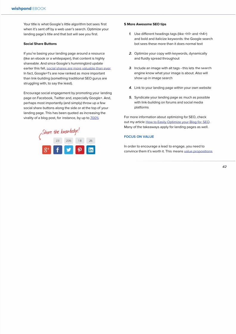
892019 Landing Pages eBook 1
httpslidepdfcomreaderfulllanding-pages-ebook-1 4265
Your title is what Googlersquos little algorithm bot sees first
when itrsquos sent off by a web userrsquos search Optimize your
landing pagersquos title and that bot will see you first
Social Share Buttons
If yoursquore basing your landing page around a resource
(like an ebook or a whitepaper) that content is highly
shareable And since Googlersquos hummingbird update
earlier this fall social shares are more valuable than ever
In fact Google+1rsquos are now ranked as more important
than link-building (something traditional SEO gurus are
struggling with to say the least)
Encourage social engagement by promoting your landing
page on Facebook Twitter and especially Google+ And
perhaps most importantly (and simply) throw up a few
social share buttons along the side or at the top of your
landing page This has been quoted as increasing the
virality of a blog post for instance by up to 700
5 More Awesome SEO tips
1 Use different headings tags (like lth1gt and lth4gt)
and bold and italicize keywords the Google search
bot sees these more than it does normal text
2 Optimize your copy with keywords dynamically
and fluidly spread throughout
3 Include an image with alt tags - this lets the search
engine know what your image is about Also will
show up in image search
4 Link to your landing page within your own website
5 Syndicate your landing page as much as possible
with link-building on forums and social media
platforms
For more information about optimizing for SEO check
out my article How to Easily Optimize your Blog for SEO
Many of the takeaways apply for landing pages as well
FOCUS ON VALUE
In order to encourage a lead to engage you need to
convince them itrsquos worth it This means value propositions
wishpond EBOOK
42
wishpond EBOOK
892019 Landing Pages eBook 1
httpslidepdfcomreaderfulllanding-pages-ebook-1 4365
and a great USP It also means you keep your landing
page simple You should be convincing quickly and easily
Ask your page visitor to read too much do too much and
theyrsquoll bounce
Be Specific
One of the main strategies in lead generation is limiting
your landing pagersquos bounce rate to the smallest
percentage you can Realistically yoursquoll be jumping for
joy and screaming from the mountaintops if your pagersquos
conversion rate is over 20
A recently-discovered best practice is that people
respond to specific numbers far more than they do round
numbers For instance quoting your business as having
80000 customers is less believable (and therefore less
powerful for conversions) as quoting your business as
having 75250 customers
Also keep your value propositions simple
bull Make the benefit of your business easy to
understand
bull Use dollar values percentages the word lsquofreersquo
bull Donrsquot use too much page space selling the specifics
of your service or your resource
Benefit List
If yoursquore using an email-gated ebook or other resource
for lead-generation think about your benefit list as the
second point of your argument Your Value Proposition
and image draw their attention and your list of benefits
tell them specifically how they stand to benefit from
entering their information and downloading your
resource
3 Benefit Formulas
1 [Number of things] yoursquoll learn in this ebook
2 How this resource will cause a rsquo [desired result]
3 The [number of steps] to [a certain goal]
OPTIMIZE YOUR ENTRY FORM
Your entry form is the focus of a lead-generating landing
page As far as your lead-generation funnel goes that
entry form CTA is the equivalent of lsquoproceed to check
outrsquo So make sure itrsquos optimized for conversions with
wishpond EBOOK
43
wishpond EBOOK
892019 Landing Pages eBook 1
httpslidepdfcomreaderfulllanding-pages-ebook-1 4465
these easy steps
1 Draw the Eye
You want your entry form to be obvious - donrsquot hideit below-the-fold or with small font Not only will this
increase interaction itrsquoll make it clear to visitors what
yoursquore asking of them Web users like things simple
and clear If they feel therersquos any chance theyrsquore being
swindled theyrsquoll bounce
6 Entry Form Design Tips
1 Encapsulate your entry form within a box
2 Draw attention to your entry form with the br ightly-
colored CTA
3 Use a vertical or horizontal line to separate your
entry form from the rest of the page
4 Include an action-oriented headline above your
form fields (like lsquoget your trial startedrsquo or lsquostart
learning nowrsquo)
5 Contrast the colour of your entry form box with the
page around it
6 AB Test including a short descriptive sentence
describing what happens when they click your CTA
wishpond EBOOK
44
wishpond EBOOK
892019 Landing Pages eBook 1
httpslidepdfcomreaderfulllanding-pages-ebook-1 4565
2 Balance Demographic Collection with Bounce
Rate
Optimizing your entry form is about weighing up the
valuable information yoursquore getting from a lead (detailsyou can use to segment the emailsadvertisements they
receive) versus the amount of form fields it takes to
increase bounce rate
Pro Tip Unless itrsquos absolutely necessary
avoid asking for a phone number People
are far more resistant to giving out phone
numbers than they are of an email or even
an address Spam emails are more accepted
than telemarketing calls during dinner
Letrsquos say yoursquore heavily invested in email marketing and
itrsquos working really well for your business It may be more
important to your business to know the demographic
details of 10 leads than to know nothing about 20 Email
marketing works best if yoursquore able to personalize and
segment your emails However this is entirely up to your
business
One of the benefits of email-gating an ebook or other
resource for lead generation is that you know people who
downloaded it are interested in that content Target them
with similar content in the future
For more information on segmenting your emailmarketing campaigns to get the best ROI possible read
my colleague Kristarsquos article 4 Strategies to Optimize your
Email Segmentation
wishpond EBOOK
45
wishpond EBOOK
892019 Landing Pages eBook 1
httpslidepdfcomreaderfulllanding-pages-ebook-1 4665
CUSTOMER TESTIMONIALS OR TRUST SYMBOLS
Irsquove talked about the value of trust symbols before but I
donrsquot want you to think that just because yoursquore no longer
optimizing for a sale you can forget them
Letrsquos say your page is focused around a free ebook or
white-paper This valuable content is email-gated so
therersquos no real proof (apart from what yoursquore saying) that
what yoursquore promising will be delivered
That is unless you include a customer testimonial like a
quote (I recommend including a picture of the customeras it makes it far more trustworthy) or short video clip If
yoursquore asking for a phone number or email address be
sure to let people know - obviously - that you donrsquot sell
these details or spam them
Customer testimonials act as a social endorsement
which have grown in importance in the past few years
This is because since Amazon Yelp and other sites
made customer reviews such a huge part of a successful
product your service needs to do the same
Pro Tip Many businesses have found
their highest conversion rates come from
a landing page built around a photogenic
customerrsquos testimonial Incorporate
an awesome case study for the value
proposition with a large picture and a clear
benefit list of how your page visitor can getthe same result
wishpond EBOOK
46
wishpond EBOOK
892019 Landing Pages eBook 1
httpslidepdfcomreaderfulllanding-pages-ebook-1 4765
Conclusion
Hopefully you now have a better idea of how to optimize your landing page for lead generation Be sure to prioritize your
entry form communicate simply and accurately and use a customer testimonial to convince your possible lead to convert
wishpond EBOOK
47
wishpond EBOOK
892019 Landing Pages eBook 1
httpslidepdfcomreaderfulllanding-pages-ebook-1 4865
Chapter 6
Landing
PagesThe Science
Behind Designing
for Conversion
p
wishpond EBOOK
892019 Landing Pages eBook 1
httpslidepdfcomreaderfulllanding-pages-ebook-1 4965
Is your landing page converting well Is it converting
badly Do you know why I mean do you really know
This article will give you the science and psychology
of why your landing is engaging to visitors or why youmight be getting traffic - but no conversions
Irsquoll take a look at 5 principles of landing
page design that can mean the difference
between a successful page and one thatrsquos
just taking up space (or fumbling around in
the dark)
Letrsquos get started
1 DIRECTIONAL CUES
Directional Cues are key in landing page design as they
tell people what to focus on
The most important thing to remember when designingyour landing page is that people do not view it like they
do a book Itrsquos not left to right top to bottom You have to
tell people how to read your page and directional cues
(as well as encapsulation and contrast below) are how
you do this
My recommendation is to decide two things on your
landing page that you especially want to drive attention
to (say your CTA and your product image or maybe aUSP) Then integrate a couple of the strategies below
into your design and AB test it Maybe your audience
responds well to the overt arrow or maybe the more
subtle eye-gaze Test it for yourself
Therersquos three main ways that we signal a focus point in
landing pages
Arrows and lines
p
49
wishpond EBOOK
892019 Landing Pages eBook 1
httpslidepdfcomreaderfulllanding-pages-ebook-1 5065
The most straightforward way to direct attention at an object or heading is to draw an arrow or line to it Students of art
will know the importance of lines as humans have a natural (subconscious) impulse to follow them to their origin or their
destination This works great to focus peoplersquos gaze on your CTA USP value proposition or product image
Eye-direction
Humans are incredibly good at recognizing the eye-focus point of the people around them I recommend using an eye-
tracking software on your landing page to determine where people are focusing and whether this focus is resulting in an
increased click-through-rate
What Irsquom talking about (thanks to Neil Patel
for the eye-tracking examples)
The red spots indicate the areas which
viewers looked at most Take note of how
the eye direction in the example on the left
draws the viewer`s attention towards the
product
p
50
wishpond EBOOK
892019 Landing Pages eBook 1
httpslidepdfcomreaderfulllanding-pages-ebook-1 5165
Faces are the most eye-attracting image you can use (see
5 below) and the eyes are the most eye-attracting part
of the face
Yoursquoll notice the woman on the left is looking directly atthe camera (or visitor to your page) The woman on the
right is looking at the product that Sunsilk is trying to sell
You can see in concrete terms how the initial gaze goes
to the womanrsquos eyes and then tracks left to the product
whereas the face on the left gets all the attention and the
product none
PointingGesturing
I highly recommend you use an image of a person in your
landing page as itrsquos proven to be the most engaging
picture (more on that later though) Something to test
however is having that model gesturing or pointing
towards something you want to focus attention on
This is a dangerous one though as (in my mind) it can
come across as cheesy if done incorrectly Test what your
audience responds to Irsquove seen this both increase and
decrease conversion rates in many case studies
2 CONTRAST
Color contrast
Contrast is essential when working with landing pagesThe human eye is naturally attracted to contrasting color
I recommend you consider color contrast for your USP
and CTA - perhaps an orange CTA button on a dark blue
background
Blank space
The idea of blank space is well-known in the graphic
design world and no less a vital part of landing page
design The idea is that blank space is extremely
influential in focusing attention on non-blank space For
instance
p
51
wishpond EBOOK
892019 Landing Pages eBook 1
httpslidepdfcomreaderfulllanding-pages-ebook-1 5265
Another way of utilizing blank space is with
encapsulation This can be done by framing a section
of content with a border or a container (filled in with
a background color) Give the encapsulated section
enough space to allow it to function somewhatindependently of the rest of the composition
Will this work better than a directional cue Test it for
yourself and find out
Format contrast
Formatting size (of font for instance) also attracts the eyeIn a 4-week multivariate test in 2010 Paras Chopra tested
the performance of 12 different combinations of a Call-to-
Action and descriptive link
Option 10 with the largest contrast in color hue and size
(as well as the word Free) generated a 60 improvement
in conversion rate
3 COLOR
Color is extremely (though unconsciously) effective
at eliciting emotion in viewers I took an in-depth
look at color psychology in my series on the science
behind a successful Facebook Ad so check it out for a
comprehensive analysis (with science)
For now herersquos a breakdown of how humans areinfluenced by color - and how this knowledge can
improve your conversion rates
Blue Blue is across both genders and all age-groups
most peoplersquos favorite color (35 of women and 57
of men) It is said to create the sensation of trust and
security Lighter blues are calming while darker blues
denote professionalism and sincerity
Orange Eye-catching bright and sunny orange is one of
the most popular colors for landing page Calls-to-Action
While a good tone and amount of orange is seen as warm
and inviting too much has been associated with naivete
52
wishpond EBOOK
892019 Landing Pages eBook 1
httpslidepdfcomreaderfulllanding-pages-ebook-1 5365
and a lack of professionalism
Red The color red is associated with passion excitement
and urgency Itrsquos a dangerous color in advertising as
many people associate red with negativity and mistakesHowever it attracts the eye better than any other color
and gives the impression that time is passing faster than
it is (as it causes our heart to beat faster) causing us to act
when we otherwise wouldnrsquot
Green Associated with wealth as well as environmental
subjects green is the easiest color for the eye to process
Green also signifies positive action (thinkrsquogreen meansgorsquo) and affirmation
Green and teal have also been associated with shoppers
on a budget Itrsquos also the second and third most popular
color among men and women respectively
Purple Associated with calm femininity and wealth
purple is the second most popular color among women
at 23 Interestingly as women get older their liking for
the color purple increases On the other hand purple is
the favorite color of 0 of the male population
Black Powerful sleek and intellectual black signifies
permanence sincerity and sophistication While black
can like red and orange be a dangerous color if used
too much it can communicate professionalism and
sophistication when used in conjunction with a strong
clear white (avoid greys or tans as theyrsquoll wash out yourmessage)
4 IMAGERY
I could discuss the effectiveness of a picture of a smiling
person on your landing page for hours (and I havehellip) but
just trust me that having an image (especially a person)
will likely improve your conversion rates
Something Irsquove seen recently actually is incorporating a
customer testimonial with the main landing page image
Choose a photogenic customer and post it up next to an
awesome-sounding affirmation of how your product or
service made their lives easier
But letrsquos leave that for the moment assuming you
recognize its importance and talk about why it works
bull We respond far more emotionally to people (or pets
though people generally elicit a stronger response)
than we do to words or random images
53
wishpond EBOOK
892019 Landing Pages eBook 1
httpslidepdfcomreaderfulllanding-pages-ebook-1 5465
bull A picture of a person provides subtext to your
landing page - a story which people respond to
bull We completely subconsciously focus on the faces
of people we see (especially the eyes) In everyeye-tracking image Irsquove ever seen the hottest
points are the face and eyes Unless of course
the image is of a woman and wersquore talking about a
male demographic Then the eye-tracking software
shows our attention to behellip elsewhere
In my research for this article I came across an article by
VS Ramachandran (a neuroscientist from Oxford) whowrote that oftentimes a line drawing is more powerful
than a photograph He writes that this is because the
lsquoidearsquo of a person is more appealing than the truth of it
(why so much of art is exaggeration of the human form or
why caricatures are so aesthetically pleasing) Leave out
the details and all yoursquore left is the essence of a thing
Although I havenrsquot yet seen an example of this in a
landing page or incorporated it into my own I believe
that whoever does will see a dramatic increase in click-
throughs Get creative and let me know how it goes
5 TYPOGRAPHY AND STYLE
Yoursquoll think that Irsquom getting too detailed here that
different typographies text formats or styles canrsquot actually
increase or decrease conversion rates enough to matter
Herersquos the thing with AB testing details do matter
Letrsquos say your Ecommerce sitersquos landing page is currently
converting at 23 Yoursquore seeing traffic of around 2000
visitors per week and their average purchase is worth
50 dollars to your business Yoursquore making $23000 per
week
Letrsquos say we change your pagersquos headline length and
change the image from one of a woman looking at
the camera to one looking at the CTA (small changes
yoursquod agree) You see a conversion rate increase of
10 Suddenly yoursquore converting at 253 and yoursquove
increased your weekly income to $25300 Yearly
revenue increase $27600
Typography and style changes to AB test
bull Font size for headings and body copy (and the
difference between them)
54
wishpond EBOOK
892019 Landing Pages eBook 1
httpslidepdfcomreaderfulllanding-pages-ebook-1 5565
bull Heading length (short and succinct vs long and
detailed)
bull Number of different font sizes (too many makes
your landing page confusing - I recommend two orthree)
bull Fonts Keep in mind that different fonts are for
whatever reason viewed as more amateurish than
others We at Wishpond like San Sarif for headlines
and Sarif for body copy Avoid cursive (except
maybe for a header) and comic sans is a no-no for a
professional business
bull More text vs less (I like a simple landing page - get
to the point and leave any extraneous information
for later emails or different tabs But test this for
yourself)
Conclusion
Hopefully you now understand a little more of the
science and psychology behind landing page design best
practices Remember to provide visual clues for whereyou want your visitor to focus Donrsquot forget the details
like typography or eye-direction
And keep testing You can always improve your landing
page conversion rates Trust me
55
wishpond EBOOK
892019 Landing Pages eBook 1
httpslidepdfcomreaderfulllanding-pages-ebook-1 5665
Chapter 7
3 Landing
PageExamplesCritiqued to Hell and
Back
wishpond EBOOK
892019 Landing Pages eBook 1
httpslidepdfcomreaderfulllanding-pages-ebook-1 5765
Howrsquos your landing page doing Is it optimized for
conversions Optimized for lead generation
How about we check out a few pages from around
the web In this article Irsquoll dissect four landing pagesvariable by variable discussing where theyrsquove done it
right and where therersquos room for improvement
Itrsquos all well and good for me to tell you a picture is an
essential part of your landing page but until you see
(pardon the pun) what Irsquom talking about itrsquos just that
talk
So letrsquos do this thing
1 SALESFORCE
Salesforce (for those somehow unfamiliar) is a
Customer Relationship Management (CRM) business
based out of San Fran
Herersquos their current landing page raquo
57
wishpond EBOOK
892019 Landing Pages eBook 1
httpslidepdfcomreaderfulllanding-pages-ebook-1 5865
What I Like About this Page
bull The imagery The first thing that hits you when you
traffic to SalesForcersquos landing page is the visual
representation of what they do Though by nomeans unique the visuals of lsquoconnect everything
with our awesome appsrsquo is clear
bull The image size I like how prominent their visuals
are About 75 of their lsquoabove the foldrsquo landing
page area is taken up by this image
bull The prioritized pages What I mean by this is simple
the three blue buttons on the right side (and also
beneath the benefit list paragraph) will traffic to
equally-optimized landing pages The tabs in gray
at the top are quite clearly subordinate (I know
this because of their color contrast encapsulation
etc) and traffic on them will be substantially less I
like the emphasis being placed on the things most
important to their leads
bull The Value Proposition Salesforce has gone
with two value propositions over a USP for their
header I like the succinct and appealing ldquoConnect
everythingrdquo especially
bull The benefit list Though not in bullet-point form
the below-the-fold paragraph of USPrsquos and value
propositions is still effective lsquoBuild customer loyaltyrsquo
(Boom) lsquoIncrease first call resolution and agent
productivityrsquo (Boom) lsquoImprove customer satisfactionby 37rsquo (Boom)
bull The specificity Perhaps my favorite part of this
entire landing is the sentence lsquoimprove customer
satisfaction by 37rsquo This kind of statistic is
incredibly convincing as itrsquos low enough and
specific enough to be entirely believable It also
shows me that theyrsquore professional enough to havedone their research and (I trust) can back up this
statistic with proof
Where I Think they Could Optimize this Page
bull Contrast the imagery I like the use of multiple
images on landing pages (one primary above-the-
fold and one secondary below it) However to
maximize the appeal of your images I recommend
you make them distinct from each other These two
images accomplish the same visual representation
I mentioned above How about keeping the same
image at the top and changing the below-the-fold
58
wishpond EBOOK
892019 Landing Pages eBook 1
httpslidepdfcomreaderfulllanding-pages-ebook-1 5965
59
image to a satisfied customer instead
bull Customer testimonials Perhaps SalesForce is relying on their substantial reputation as the worldrsquos CRM leader but
Irsquod still recommend they included a picture (and quote) from one of their prominent clients This is a businesses that
regularly works with Facebook General Electric and Delta Airlines Irsquod recommend testing a quote and image fromone of these businesses with the brand namelogo prominently placed
AB Testing Postulation
Irsquod theorize that integrating a customer testimonial with an image into a revolving album below-the-fold (on the right) could
increase conversion rates on this page by 10
2 MAILCHIMP
Mailchimp is the most successful email automation company out there (with more than 5 million users)
View their landing page on the next page
wishpond EBOOK
892019 Landing Pages eBook 1
httpslidepdfcomreaderfulllanding-pages-ebook-1 6065
60
wishpond EBOOK
892019 Landing Pages eBook 1
httpslidepdfcomreaderfulllanding-pages-ebook-1 6165
61
What I Like About this Page
bull The tagline ldquoSend Better Emailrdquo is one of the
simplest and most straightforward of all successful
landing pages Irsquove seen Itrsquos to the point andeffective Mailchimp has also had this tagline since
mid June of 2013 meaning itrsquos working for them
bull The USP ldquoMore than 5 million people use
MailChimphelliprdquo is about as unique as you can get
Peer endorsement is the most powerful USP you
can bring into play
bull The Image Red on a blue background stands out
fantastically and attracts the eye - I also the giving
a snapshot of their tool giving people a glimpse at
what they have to offer
bull The CTA(s) Although not as noticeable as ldquoSign
up Freerdquo (which consistently performs better than
simply ldquoSign Uprdquo) I really like ldquoJoin them todayrdquo in
the small paragraph beneath the tagline This is as
much as CTA as the buttons are and plays to the
peer pressure effectiveness of the page
Where I Think they Could Optimize this Page
bull The color scheme Irsquod be interested to see the
effect of a dark blue background and white taglines
benefits As it stands now the page is somewhatboring
bull The toolbar at the top Such a simple and minimalist
landing page needs to accentuate their ldquoFeaturesrdquo
ldquoPricesrdquo and ldquoSupportrdquo buttons at the top to make
it easy to access these important parts of the
decision-making process
bull The CTA(s) While I like the language used Irsquod be
curious to see the effect of making the CTAs stand
out a bit more with a contrasting color to draw the
eye
bull Irsquod test a customer testimonial rotation Mentioning
the 5 million people who use Mailchimp is all
well and good but Irsquod recommend rotating in a
photogenic former customer with a quote on the
effect that Mailchimp had on their businessrsquo email
marketing ROI
wishpond EBOOK
892019 Landing Pages eBook 1
httpslidepdfcomreaderfulllanding-pages-ebook-1 6265
62
AB Testing Postulation
Irsquod theorize that a customer testimonial addition could increase conversions on this page by up to 10 A concrete number
or percentage taken from a case study would make the page more effective
3 KISSMETRICS
Customer analytics platform
Kissmetrics is entrepreneur Neil
Patelrsquos 2008 baby
Herersquos their current landing page raquo
wishpond EBOOK
892019 Landing Pages eBook 1
httpslidepdfcomreaderfulllanding-pages-ebook-1 6365
63
What I Like About this Page
bull The image If yoursquore unsure exactly what image
you should use for your landing page fall back
on something like this A smiling normal-lookingperson (photogenic but not a model) is your best
bet
bull The simplicity Yes this is the entire landing page
Nothing but lsquoabove-the-foldrsquo It relies entirely on the
USP which is incredibly effective
bull Knowing their market Customer analytics are a field
only interesting to people who know what Google
Analytics is Nobody starts with Kissmetrics and
moves to Google Analytics As such the USP is
incredibly effective
bull Logging in with a Google account Irsquove mentioned
before how an email address is worth so much
more to your business than it is to its owner (and
how a phone number is so much more of an ask)
Well a social platform login is worth even less to
its owner - this allows Kissmetrics to ask for less
from a lead and get exactly the same details (if not
more) than they would were they to ask for an email
address
bull The popup The bottom-right popup (which reads
lsquowhatrsquos preventing you from wanting to start a
free trial of Kissmetricsrsquo) does not appear forevery person that traffics to this landing page
This would mediate the drop in conversion rates
that this popup likely causes However this popup
also provides Kissmetrics with extremely valuable
information namely what they can do to encourage
a sign-up Trading a little conversion rate (especially
if you do this temporarily) can be worth more
information This is a similar trade Irsquove talked aboutbefore where more entry boxes give you better
lead knowledge but can decrease conversion rates
- something you have to balance
Check out my article lsquoValue Proposition Formulas that
Boost Conversion on Ads and Landing Pagesrsquo where I
take an in-depth look at how to use Kissmetricrsquos formula
and 6 others
Where I Think they Could Optimize this Page
bull The Image Okay I really like this image but Irsquod be
curious to see how a landing page with a revolving
wishpond EBOOK
892019 Landing Pages eBook 1
httpslidepdfcomreaderfulllanding-pages-ebook-1 6465
64
album would do How about three different USP
value proposition + image combinations revolving
every 75 seconds (Genuinely I recommend you
test the time lapse you use if you employ revolving
images)
bull Learn More The ldquoLearn Morerdquo link in the bottom
left of this landing page is too quiet Irsquod recommend
a subtle encapsulation and slightly larger font I
think this landing page is incredibly effective but
clearly the issue theyrsquoll have is not offering enough
information about what they do A ldquoLearn Morerdquo
link is an awesome way of doing this but itrsquos notobvious enough for everyone to see and I wonder if
that doesnrsquot increase their bounce rate
bull A Case Studies Tab I donrsquot want to ruin the
contemporary minimalist appeal of this landing
page but I would be interested in testing a lsquocase
studiesrsquo or lsquocustomer storiesrsquo tab next to lsquoSign Inrsquo on
the top bar Like the lsquoLearn Morersquo link this would
make it a little easier for visitors to find the answers
to their questions without cluttering the page with
the customer testimonials benefit list and trust
symbols I usually recommend
AB Testing Postulation
Irsquod theorize that making the lsquoLearn Morersquo link on the
bottom right just slightly more obvious would increase
conversions from this page Herersquos why If someone typesin lsquocustomer analyticsrsquo into Google search theyrsquoll click on
Kissmetrics Irsquod be concerned that at the moment they
may bounce due to lack of ready information A more
visible lsquoLearn Morersquo link could increase conversion by up
to 5
Conclusion
The variables Irsquove discussed and critiqued in this article
encompass most of the optimization strategies I give
our clients Remember that every audience is different
and that (unless yoursquore using an optimized landing page
template) yoursquoll need to AB test your own landing pages
on a monthly basis
wishpond EBOOK
892019 Landing Pages eBook 1
httpslidepdfcomreaderfulllanding-pages-ebook-1 6565
Creating and optimizing your businessrsquo landing pages can be the most influential change you make this year
Wishpondrsquos own landing pages are being constantly updated and optimized - our templates completely customizable Start
a free trial today to check them out and see if wersquore a fit for your business
Thanks for reading
892019 Landing Pages eBook 1
httpslidepdfcomreaderfulllanding-pages-ebook-1 4365
and a great USP It also means you keep your landing
page simple You should be convincing quickly and easily
Ask your page visitor to read too much do too much and
theyrsquoll bounce
Be Specific
One of the main strategies in lead generation is limiting
your landing pagersquos bounce rate to the smallest
percentage you can Realistically yoursquoll be jumping for
joy and screaming from the mountaintops if your pagersquos
conversion rate is over 20
A recently-discovered best practice is that people
respond to specific numbers far more than they do round
numbers For instance quoting your business as having
80000 customers is less believable (and therefore less
powerful for conversions) as quoting your business as
having 75250 customers
Also keep your value propositions simple
bull Make the benefit of your business easy to
understand
bull Use dollar values percentages the word lsquofreersquo
bull Donrsquot use too much page space selling the specifics
of your service or your resource
Benefit List
If yoursquore using an email-gated ebook or other resource
for lead-generation think about your benefit list as the
second point of your argument Your Value Proposition
and image draw their attention and your list of benefits
tell them specifically how they stand to benefit from
entering their information and downloading your
resource
3 Benefit Formulas
1 [Number of things] yoursquoll learn in this ebook
2 How this resource will cause a rsquo [desired result]
3 The [number of steps] to [a certain goal]
OPTIMIZE YOUR ENTRY FORM
Your entry form is the focus of a lead-generating landing
page As far as your lead-generation funnel goes that
entry form CTA is the equivalent of lsquoproceed to check
outrsquo So make sure itrsquos optimized for conversions with
wishpond EBOOK
43
wishpond EBOOK
892019 Landing Pages eBook 1
httpslidepdfcomreaderfulllanding-pages-ebook-1 4465
these easy steps
1 Draw the Eye
You want your entry form to be obvious - donrsquot hideit below-the-fold or with small font Not only will this
increase interaction itrsquoll make it clear to visitors what
yoursquore asking of them Web users like things simple
and clear If they feel therersquos any chance theyrsquore being
swindled theyrsquoll bounce
6 Entry Form Design Tips
1 Encapsulate your entry form within a box
2 Draw attention to your entry form with the br ightly-
colored CTA
3 Use a vertical or horizontal line to separate your
entry form from the rest of the page
4 Include an action-oriented headline above your
form fields (like lsquoget your trial startedrsquo or lsquostart
learning nowrsquo)
5 Contrast the colour of your entry form box with the
page around it
6 AB Test including a short descriptive sentence
describing what happens when they click your CTA
wishpond EBOOK
44
wishpond EBOOK
892019 Landing Pages eBook 1
httpslidepdfcomreaderfulllanding-pages-ebook-1 4565
2 Balance Demographic Collection with Bounce
Rate
Optimizing your entry form is about weighing up the
valuable information yoursquore getting from a lead (detailsyou can use to segment the emailsadvertisements they
receive) versus the amount of form fields it takes to
increase bounce rate
Pro Tip Unless itrsquos absolutely necessary
avoid asking for a phone number People
are far more resistant to giving out phone
numbers than they are of an email or even
an address Spam emails are more accepted
than telemarketing calls during dinner
Letrsquos say yoursquore heavily invested in email marketing and
itrsquos working really well for your business It may be more
important to your business to know the demographic
details of 10 leads than to know nothing about 20 Email
marketing works best if yoursquore able to personalize and
segment your emails However this is entirely up to your
business
One of the benefits of email-gating an ebook or other
resource for lead generation is that you know people who
downloaded it are interested in that content Target them
with similar content in the future
For more information on segmenting your emailmarketing campaigns to get the best ROI possible read
my colleague Kristarsquos article 4 Strategies to Optimize your
Email Segmentation
wishpond EBOOK
45
wishpond EBOOK
892019 Landing Pages eBook 1
httpslidepdfcomreaderfulllanding-pages-ebook-1 4665
CUSTOMER TESTIMONIALS OR TRUST SYMBOLS
Irsquove talked about the value of trust symbols before but I
donrsquot want you to think that just because yoursquore no longer
optimizing for a sale you can forget them
Letrsquos say your page is focused around a free ebook or
white-paper This valuable content is email-gated so
therersquos no real proof (apart from what yoursquore saying) that
what yoursquore promising will be delivered
That is unless you include a customer testimonial like a
quote (I recommend including a picture of the customeras it makes it far more trustworthy) or short video clip If
yoursquore asking for a phone number or email address be
sure to let people know - obviously - that you donrsquot sell
these details or spam them
Customer testimonials act as a social endorsement
which have grown in importance in the past few years
This is because since Amazon Yelp and other sites
made customer reviews such a huge part of a successful
product your service needs to do the same
Pro Tip Many businesses have found
their highest conversion rates come from
a landing page built around a photogenic
customerrsquos testimonial Incorporate
an awesome case study for the value
proposition with a large picture and a clear
benefit list of how your page visitor can getthe same result
wishpond EBOOK
46
wishpond EBOOK
892019 Landing Pages eBook 1
httpslidepdfcomreaderfulllanding-pages-ebook-1 4765
Conclusion
Hopefully you now have a better idea of how to optimize your landing page for lead generation Be sure to prioritize your
entry form communicate simply and accurately and use a customer testimonial to convince your possible lead to convert
wishpond EBOOK
47
wishpond EBOOK
892019 Landing Pages eBook 1
httpslidepdfcomreaderfulllanding-pages-ebook-1 4865
Chapter 6
Landing
PagesThe Science
Behind Designing
for Conversion
p
wishpond EBOOK
892019 Landing Pages eBook 1
httpslidepdfcomreaderfulllanding-pages-ebook-1 4965
Is your landing page converting well Is it converting
badly Do you know why I mean do you really know
This article will give you the science and psychology
of why your landing is engaging to visitors or why youmight be getting traffic - but no conversions
Irsquoll take a look at 5 principles of landing
page design that can mean the difference
between a successful page and one thatrsquos
just taking up space (or fumbling around in
the dark)
Letrsquos get started
1 DIRECTIONAL CUES
Directional Cues are key in landing page design as they
tell people what to focus on
The most important thing to remember when designingyour landing page is that people do not view it like they
do a book Itrsquos not left to right top to bottom You have to
tell people how to read your page and directional cues
(as well as encapsulation and contrast below) are how
you do this
My recommendation is to decide two things on your
landing page that you especially want to drive attention
to (say your CTA and your product image or maybe aUSP) Then integrate a couple of the strategies below
into your design and AB test it Maybe your audience
responds well to the overt arrow or maybe the more
subtle eye-gaze Test it for yourself
Therersquos three main ways that we signal a focus point in
landing pages
Arrows and lines
p
49
wishpond EBOOK
892019 Landing Pages eBook 1
httpslidepdfcomreaderfulllanding-pages-ebook-1 5065
The most straightforward way to direct attention at an object or heading is to draw an arrow or line to it Students of art
will know the importance of lines as humans have a natural (subconscious) impulse to follow them to their origin or their
destination This works great to focus peoplersquos gaze on your CTA USP value proposition or product image
Eye-direction
Humans are incredibly good at recognizing the eye-focus point of the people around them I recommend using an eye-
tracking software on your landing page to determine where people are focusing and whether this focus is resulting in an
increased click-through-rate
What Irsquom talking about (thanks to Neil Patel
for the eye-tracking examples)
The red spots indicate the areas which
viewers looked at most Take note of how
the eye direction in the example on the left
draws the viewer`s attention towards the
product
p
50
wishpond EBOOK
892019 Landing Pages eBook 1
httpslidepdfcomreaderfulllanding-pages-ebook-1 5165
Faces are the most eye-attracting image you can use (see
5 below) and the eyes are the most eye-attracting part
of the face
Yoursquoll notice the woman on the left is looking directly atthe camera (or visitor to your page) The woman on the
right is looking at the product that Sunsilk is trying to sell
You can see in concrete terms how the initial gaze goes
to the womanrsquos eyes and then tracks left to the product
whereas the face on the left gets all the attention and the
product none
PointingGesturing
I highly recommend you use an image of a person in your
landing page as itrsquos proven to be the most engaging
picture (more on that later though) Something to test
however is having that model gesturing or pointing
towards something you want to focus attention on
This is a dangerous one though as (in my mind) it can
come across as cheesy if done incorrectly Test what your
audience responds to Irsquove seen this both increase and
decrease conversion rates in many case studies
2 CONTRAST
Color contrast
Contrast is essential when working with landing pagesThe human eye is naturally attracted to contrasting color
I recommend you consider color contrast for your USP
and CTA - perhaps an orange CTA button on a dark blue
background
Blank space
The idea of blank space is well-known in the graphic
design world and no less a vital part of landing page
design The idea is that blank space is extremely
influential in focusing attention on non-blank space For
instance
p
51
wishpond EBOOK
892019 Landing Pages eBook 1
httpslidepdfcomreaderfulllanding-pages-ebook-1 5265
Another way of utilizing blank space is with
encapsulation This can be done by framing a section
of content with a border or a container (filled in with
a background color) Give the encapsulated section
enough space to allow it to function somewhatindependently of the rest of the composition
Will this work better than a directional cue Test it for
yourself and find out
Format contrast
Formatting size (of font for instance) also attracts the eyeIn a 4-week multivariate test in 2010 Paras Chopra tested
the performance of 12 different combinations of a Call-to-
Action and descriptive link
Option 10 with the largest contrast in color hue and size
(as well as the word Free) generated a 60 improvement
in conversion rate
3 COLOR
Color is extremely (though unconsciously) effective
at eliciting emotion in viewers I took an in-depth
look at color psychology in my series on the science
behind a successful Facebook Ad so check it out for a
comprehensive analysis (with science)
For now herersquos a breakdown of how humans areinfluenced by color - and how this knowledge can
improve your conversion rates
Blue Blue is across both genders and all age-groups
most peoplersquos favorite color (35 of women and 57
of men) It is said to create the sensation of trust and
security Lighter blues are calming while darker blues
denote professionalism and sincerity
Orange Eye-catching bright and sunny orange is one of
the most popular colors for landing page Calls-to-Action
While a good tone and amount of orange is seen as warm
and inviting too much has been associated with naivete
52
wishpond EBOOK
892019 Landing Pages eBook 1
httpslidepdfcomreaderfulllanding-pages-ebook-1 5365
and a lack of professionalism
Red The color red is associated with passion excitement
and urgency Itrsquos a dangerous color in advertising as
many people associate red with negativity and mistakesHowever it attracts the eye better than any other color
and gives the impression that time is passing faster than
it is (as it causes our heart to beat faster) causing us to act
when we otherwise wouldnrsquot
Green Associated with wealth as well as environmental
subjects green is the easiest color for the eye to process
Green also signifies positive action (thinkrsquogreen meansgorsquo) and affirmation
Green and teal have also been associated with shoppers
on a budget Itrsquos also the second and third most popular
color among men and women respectively
Purple Associated with calm femininity and wealth
purple is the second most popular color among women
at 23 Interestingly as women get older their liking for
the color purple increases On the other hand purple is
the favorite color of 0 of the male population
Black Powerful sleek and intellectual black signifies
permanence sincerity and sophistication While black
can like red and orange be a dangerous color if used
too much it can communicate professionalism and
sophistication when used in conjunction with a strong
clear white (avoid greys or tans as theyrsquoll wash out yourmessage)
4 IMAGERY
I could discuss the effectiveness of a picture of a smiling
person on your landing page for hours (and I havehellip) but
just trust me that having an image (especially a person)
will likely improve your conversion rates
Something Irsquove seen recently actually is incorporating a
customer testimonial with the main landing page image
Choose a photogenic customer and post it up next to an
awesome-sounding affirmation of how your product or
service made their lives easier
But letrsquos leave that for the moment assuming you
recognize its importance and talk about why it works
bull We respond far more emotionally to people (or pets
though people generally elicit a stronger response)
than we do to words or random images
53
wishpond EBOOK
892019 Landing Pages eBook 1
httpslidepdfcomreaderfulllanding-pages-ebook-1 5465
bull A picture of a person provides subtext to your
landing page - a story which people respond to
bull We completely subconsciously focus on the faces
of people we see (especially the eyes) In everyeye-tracking image Irsquove ever seen the hottest
points are the face and eyes Unless of course
the image is of a woman and wersquore talking about a
male demographic Then the eye-tracking software
shows our attention to behellip elsewhere
In my research for this article I came across an article by
VS Ramachandran (a neuroscientist from Oxford) whowrote that oftentimes a line drawing is more powerful
than a photograph He writes that this is because the
lsquoidearsquo of a person is more appealing than the truth of it
(why so much of art is exaggeration of the human form or
why caricatures are so aesthetically pleasing) Leave out
the details and all yoursquore left is the essence of a thing
Although I havenrsquot yet seen an example of this in a
landing page or incorporated it into my own I believe
that whoever does will see a dramatic increase in click-
throughs Get creative and let me know how it goes
5 TYPOGRAPHY AND STYLE
Yoursquoll think that Irsquom getting too detailed here that
different typographies text formats or styles canrsquot actually
increase or decrease conversion rates enough to matter
Herersquos the thing with AB testing details do matter
Letrsquos say your Ecommerce sitersquos landing page is currently
converting at 23 Yoursquore seeing traffic of around 2000
visitors per week and their average purchase is worth
50 dollars to your business Yoursquore making $23000 per
week
Letrsquos say we change your pagersquos headline length and
change the image from one of a woman looking at
the camera to one looking at the CTA (small changes
yoursquod agree) You see a conversion rate increase of
10 Suddenly yoursquore converting at 253 and yoursquove
increased your weekly income to $25300 Yearly
revenue increase $27600
Typography and style changes to AB test
bull Font size for headings and body copy (and the
difference between them)
54
wishpond EBOOK
892019 Landing Pages eBook 1
httpslidepdfcomreaderfulllanding-pages-ebook-1 5565
bull Heading length (short and succinct vs long and
detailed)
bull Number of different font sizes (too many makes
your landing page confusing - I recommend two orthree)
bull Fonts Keep in mind that different fonts are for
whatever reason viewed as more amateurish than
others We at Wishpond like San Sarif for headlines
and Sarif for body copy Avoid cursive (except
maybe for a header) and comic sans is a no-no for a
professional business
bull More text vs less (I like a simple landing page - get
to the point and leave any extraneous information
for later emails or different tabs But test this for
yourself)
Conclusion
Hopefully you now understand a little more of the
science and psychology behind landing page design best
practices Remember to provide visual clues for whereyou want your visitor to focus Donrsquot forget the details
like typography or eye-direction
And keep testing You can always improve your landing
page conversion rates Trust me
55
wishpond EBOOK
892019 Landing Pages eBook 1
httpslidepdfcomreaderfulllanding-pages-ebook-1 5665
Chapter 7
3 Landing
PageExamplesCritiqued to Hell and
Back
wishpond EBOOK
892019 Landing Pages eBook 1
httpslidepdfcomreaderfulllanding-pages-ebook-1 5765
Howrsquos your landing page doing Is it optimized for
conversions Optimized for lead generation
How about we check out a few pages from around
the web In this article Irsquoll dissect four landing pagesvariable by variable discussing where theyrsquove done it
right and where therersquos room for improvement
Itrsquos all well and good for me to tell you a picture is an
essential part of your landing page but until you see
(pardon the pun) what Irsquom talking about itrsquos just that
talk
So letrsquos do this thing
1 SALESFORCE
Salesforce (for those somehow unfamiliar) is a
Customer Relationship Management (CRM) business
based out of San Fran
Herersquos their current landing page raquo
57
wishpond EBOOK
892019 Landing Pages eBook 1
httpslidepdfcomreaderfulllanding-pages-ebook-1 5865
What I Like About this Page
bull The imagery The first thing that hits you when you
traffic to SalesForcersquos landing page is the visual
representation of what they do Though by nomeans unique the visuals of lsquoconnect everything
with our awesome appsrsquo is clear
bull The image size I like how prominent their visuals
are About 75 of their lsquoabove the foldrsquo landing
page area is taken up by this image
bull The prioritized pages What I mean by this is simple
the three blue buttons on the right side (and also
beneath the benefit list paragraph) will traffic to
equally-optimized landing pages The tabs in gray
at the top are quite clearly subordinate (I know
this because of their color contrast encapsulation
etc) and traffic on them will be substantially less I
like the emphasis being placed on the things most
important to their leads
bull The Value Proposition Salesforce has gone
with two value propositions over a USP for their
header I like the succinct and appealing ldquoConnect
everythingrdquo especially
bull The benefit list Though not in bullet-point form
the below-the-fold paragraph of USPrsquos and value
propositions is still effective lsquoBuild customer loyaltyrsquo
(Boom) lsquoIncrease first call resolution and agent
productivityrsquo (Boom) lsquoImprove customer satisfactionby 37rsquo (Boom)
bull The specificity Perhaps my favorite part of this
entire landing is the sentence lsquoimprove customer
satisfaction by 37rsquo This kind of statistic is
incredibly convincing as itrsquos low enough and
specific enough to be entirely believable It also
shows me that theyrsquore professional enough to havedone their research and (I trust) can back up this
statistic with proof
Where I Think they Could Optimize this Page
bull Contrast the imagery I like the use of multiple
images on landing pages (one primary above-the-
fold and one secondary below it) However to
maximize the appeal of your images I recommend
you make them distinct from each other These two
images accomplish the same visual representation
I mentioned above How about keeping the same
image at the top and changing the below-the-fold
58
wishpond EBOOK
892019 Landing Pages eBook 1
httpslidepdfcomreaderfulllanding-pages-ebook-1 5965
59
image to a satisfied customer instead
bull Customer testimonials Perhaps SalesForce is relying on their substantial reputation as the worldrsquos CRM leader but
Irsquod still recommend they included a picture (and quote) from one of their prominent clients This is a businesses that
regularly works with Facebook General Electric and Delta Airlines Irsquod recommend testing a quote and image fromone of these businesses with the brand namelogo prominently placed
AB Testing Postulation
Irsquod theorize that integrating a customer testimonial with an image into a revolving album below-the-fold (on the right) could
increase conversion rates on this page by 10
2 MAILCHIMP
Mailchimp is the most successful email automation company out there (with more than 5 million users)
View their landing page on the next page
wishpond EBOOK
892019 Landing Pages eBook 1
httpslidepdfcomreaderfulllanding-pages-ebook-1 6065
60
wishpond EBOOK
892019 Landing Pages eBook 1
httpslidepdfcomreaderfulllanding-pages-ebook-1 6165
61
What I Like About this Page
bull The tagline ldquoSend Better Emailrdquo is one of the
simplest and most straightforward of all successful
landing pages Irsquove seen Itrsquos to the point andeffective Mailchimp has also had this tagline since
mid June of 2013 meaning itrsquos working for them
bull The USP ldquoMore than 5 million people use
MailChimphelliprdquo is about as unique as you can get
Peer endorsement is the most powerful USP you
can bring into play
bull The Image Red on a blue background stands out
fantastically and attracts the eye - I also the giving
a snapshot of their tool giving people a glimpse at
what they have to offer
bull The CTA(s) Although not as noticeable as ldquoSign
up Freerdquo (which consistently performs better than
simply ldquoSign Uprdquo) I really like ldquoJoin them todayrdquo in
the small paragraph beneath the tagline This is as
much as CTA as the buttons are and plays to the
peer pressure effectiveness of the page
Where I Think they Could Optimize this Page
bull The color scheme Irsquod be interested to see the
effect of a dark blue background and white taglines
benefits As it stands now the page is somewhatboring
bull The toolbar at the top Such a simple and minimalist
landing page needs to accentuate their ldquoFeaturesrdquo
ldquoPricesrdquo and ldquoSupportrdquo buttons at the top to make
it easy to access these important parts of the
decision-making process
bull The CTA(s) While I like the language used Irsquod be
curious to see the effect of making the CTAs stand
out a bit more with a contrasting color to draw the
eye
bull Irsquod test a customer testimonial rotation Mentioning
the 5 million people who use Mailchimp is all
well and good but Irsquod recommend rotating in a
photogenic former customer with a quote on the
effect that Mailchimp had on their businessrsquo email
marketing ROI
wishpond EBOOK
892019 Landing Pages eBook 1
httpslidepdfcomreaderfulllanding-pages-ebook-1 6265
62
AB Testing Postulation
Irsquod theorize that a customer testimonial addition could increase conversions on this page by up to 10 A concrete number
or percentage taken from a case study would make the page more effective
3 KISSMETRICS
Customer analytics platform
Kissmetrics is entrepreneur Neil
Patelrsquos 2008 baby
Herersquos their current landing page raquo
wishpond EBOOK
892019 Landing Pages eBook 1
httpslidepdfcomreaderfulllanding-pages-ebook-1 6365
63
What I Like About this Page
bull The image If yoursquore unsure exactly what image
you should use for your landing page fall back
on something like this A smiling normal-lookingperson (photogenic but not a model) is your best
bet
bull The simplicity Yes this is the entire landing page
Nothing but lsquoabove-the-foldrsquo It relies entirely on the
USP which is incredibly effective
bull Knowing their market Customer analytics are a field
only interesting to people who know what Google
Analytics is Nobody starts with Kissmetrics and
moves to Google Analytics As such the USP is
incredibly effective
bull Logging in with a Google account Irsquove mentioned
before how an email address is worth so much
more to your business than it is to its owner (and
how a phone number is so much more of an ask)
Well a social platform login is worth even less to
its owner - this allows Kissmetrics to ask for less
from a lead and get exactly the same details (if not
more) than they would were they to ask for an email
address
bull The popup The bottom-right popup (which reads
lsquowhatrsquos preventing you from wanting to start a
free trial of Kissmetricsrsquo) does not appear forevery person that traffics to this landing page
This would mediate the drop in conversion rates
that this popup likely causes However this popup
also provides Kissmetrics with extremely valuable
information namely what they can do to encourage
a sign-up Trading a little conversion rate (especially
if you do this temporarily) can be worth more
information This is a similar trade Irsquove talked aboutbefore where more entry boxes give you better
lead knowledge but can decrease conversion rates
- something you have to balance
Check out my article lsquoValue Proposition Formulas that
Boost Conversion on Ads and Landing Pagesrsquo where I
take an in-depth look at how to use Kissmetricrsquos formula
and 6 others
Where I Think they Could Optimize this Page
bull The Image Okay I really like this image but Irsquod be
curious to see how a landing page with a revolving
wishpond EBOOK
892019 Landing Pages eBook 1
httpslidepdfcomreaderfulllanding-pages-ebook-1 6465
64
album would do How about three different USP
value proposition + image combinations revolving
every 75 seconds (Genuinely I recommend you
test the time lapse you use if you employ revolving
images)
bull Learn More The ldquoLearn Morerdquo link in the bottom
left of this landing page is too quiet Irsquod recommend
a subtle encapsulation and slightly larger font I
think this landing page is incredibly effective but
clearly the issue theyrsquoll have is not offering enough
information about what they do A ldquoLearn Morerdquo
link is an awesome way of doing this but itrsquos notobvious enough for everyone to see and I wonder if
that doesnrsquot increase their bounce rate
bull A Case Studies Tab I donrsquot want to ruin the
contemporary minimalist appeal of this landing
page but I would be interested in testing a lsquocase
studiesrsquo or lsquocustomer storiesrsquo tab next to lsquoSign Inrsquo on
the top bar Like the lsquoLearn Morersquo link this would
make it a little easier for visitors to find the answers
to their questions without cluttering the page with
the customer testimonials benefit list and trust
symbols I usually recommend
AB Testing Postulation
Irsquod theorize that making the lsquoLearn Morersquo link on the
bottom right just slightly more obvious would increase
conversions from this page Herersquos why If someone typesin lsquocustomer analyticsrsquo into Google search theyrsquoll click on
Kissmetrics Irsquod be concerned that at the moment they
may bounce due to lack of ready information A more
visible lsquoLearn Morersquo link could increase conversion by up
to 5
Conclusion
The variables Irsquove discussed and critiqued in this article
encompass most of the optimization strategies I give
our clients Remember that every audience is different
and that (unless yoursquore using an optimized landing page
template) yoursquoll need to AB test your own landing pages
on a monthly basis
wishpond EBOOK
892019 Landing Pages eBook 1
httpslidepdfcomreaderfulllanding-pages-ebook-1 6565
Creating and optimizing your businessrsquo landing pages can be the most influential change you make this year
Wishpondrsquos own landing pages are being constantly updated and optimized - our templates completely customizable Start
a free trial today to check them out and see if wersquore a fit for your business
Thanks for reading

892019 Landing Pages eBook 1
httpslidepdfcomreaderfulllanding-pages-ebook-1 4565
2 Balance Demographic Collection with Bounce
Rate
Optimizing your entry form is about weighing up the
valuable information yoursquore getting from a lead (detailsyou can use to segment the emailsadvertisements they
receive) versus the amount of form fields it takes to
increase bounce rate
Pro Tip Unless itrsquos absolutely necessary
avoid asking for a phone number People
are far more resistant to giving out phone
numbers than they are of an email or even
an address Spam emails are more accepted
than telemarketing calls during dinner
Letrsquos say yoursquore heavily invested in email marketing and
itrsquos working really well for your business It may be more
important to your business to know the demographic
details of 10 leads than to know nothing about 20 Email
marketing works best if yoursquore able to personalize and
segment your emails However this is entirely up to your
business
One of the benefits of email-gating an ebook or other
resource for lead generation is that you know people who
downloaded it are interested in that content Target them
with similar content in the future
For more information on segmenting your emailmarketing campaigns to get the best ROI possible read
my colleague Kristarsquos article 4 Strategies to Optimize your
Email Segmentation
wishpond EBOOK
45
wishpond EBOOK
892019 Landing Pages eBook 1
httpslidepdfcomreaderfulllanding-pages-ebook-1 4665
CUSTOMER TESTIMONIALS OR TRUST SYMBOLS
Irsquove talked about the value of trust symbols before but I
donrsquot want you to think that just because yoursquore no longer
optimizing for a sale you can forget them
Letrsquos say your page is focused around a free ebook or
white-paper This valuable content is email-gated so
therersquos no real proof (apart from what yoursquore saying) that
what yoursquore promising will be delivered
That is unless you include a customer testimonial like a
quote (I recommend including a picture of the customeras it makes it far more trustworthy) or short video clip If
yoursquore asking for a phone number or email address be
sure to let people know - obviously - that you donrsquot sell
these details or spam them
Customer testimonials act as a social endorsement
which have grown in importance in the past few years
This is because since Amazon Yelp and other sites
made customer reviews such a huge part of a successful
product your service needs to do the same
Pro Tip Many businesses have found
their highest conversion rates come from
a landing page built around a photogenic
customerrsquos testimonial Incorporate
an awesome case study for the value
proposition with a large picture and a clear
benefit list of how your page visitor can getthe same result
wishpond EBOOK
46
wishpond EBOOK
892019 Landing Pages eBook 1
httpslidepdfcomreaderfulllanding-pages-ebook-1 4765
Conclusion
Hopefully you now have a better idea of how to optimize your landing page for lead generation Be sure to prioritize your
entry form communicate simply and accurately and use a customer testimonial to convince your possible lead to convert
wishpond EBOOK
47
wishpond EBOOK
892019 Landing Pages eBook 1
httpslidepdfcomreaderfulllanding-pages-ebook-1 4865
Chapter 6
Landing
PagesThe Science
Behind Designing
for Conversion
p
wishpond EBOOK
892019 Landing Pages eBook 1
httpslidepdfcomreaderfulllanding-pages-ebook-1 4965
Is your landing page converting well Is it converting
badly Do you know why I mean do you really know
This article will give you the science and psychology
of why your landing is engaging to visitors or why youmight be getting traffic - but no conversions
Irsquoll take a look at 5 principles of landing
page design that can mean the difference
between a successful page and one thatrsquos
just taking up space (or fumbling around in
the dark)
Letrsquos get started
1 DIRECTIONAL CUES
Directional Cues are key in landing page design as they
tell people what to focus on
The most important thing to remember when designingyour landing page is that people do not view it like they
do a book Itrsquos not left to right top to bottom You have to
tell people how to read your page and directional cues
(as well as encapsulation and contrast below) are how
you do this
My recommendation is to decide two things on your
landing page that you especially want to drive attention
to (say your CTA and your product image or maybe aUSP) Then integrate a couple of the strategies below
into your design and AB test it Maybe your audience
responds well to the overt arrow or maybe the more
subtle eye-gaze Test it for yourself
Therersquos three main ways that we signal a focus point in
landing pages
Arrows and lines
p
49
wishpond EBOOK
892019 Landing Pages eBook 1
httpslidepdfcomreaderfulllanding-pages-ebook-1 5065
The most straightforward way to direct attention at an object or heading is to draw an arrow or line to it Students of art
will know the importance of lines as humans have a natural (subconscious) impulse to follow them to their origin or their
destination This works great to focus peoplersquos gaze on your CTA USP value proposition or product image
Eye-direction
Humans are incredibly good at recognizing the eye-focus point of the people around them I recommend using an eye-
tracking software on your landing page to determine where people are focusing and whether this focus is resulting in an
increased click-through-rate
What Irsquom talking about (thanks to Neil Patel
for the eye-tracking examples)
The red spots indicate the areas which
viewers looked at most Take note of how
the eye direction in the example on the left
draws the viewer`s attention towards the
product
p
50
wishpond EBOOK
892019 Landing Pages eBook 1
httpslidepdfcomreaderfulllanding-pages-ebook-1 5165
Faces are the most eye-attracting image you can use (see
5 below) and the eyes are the most eye-attracting part
of the face
Yoursquoll notice the woman on the left is looking directly atthe camera (or visitor to your page) The woman on the
right is looking at the product that Sunsilk is trying to sell
You can see in concrete terms how the initial gaze goes
to the womanrsquos eyes and then tracks left to the product
whereas the face on the left gets all the attention and the
product none
PointingGesturing
I highly recommend you use an image of a person in your
landing page as itrsquos proven to be the most engaging
picture (more on that later though) Something to test
however is having that model gesturing or pointing
towards something you want to focus attention on
This is a dangerous one though as (in my mind) it can
come across as cheesy if done incorrectly Test what your
audience responds to Irsquove seen this both increase and
decrease conversion rates in many case studies
2 CONTRAST
Color contrast
Contrast is essential when working with landing pagesThe human eye is naturally attracted to contrasting color
I recommend you consider color contrast for your USP
and CTA - perhaps an orange CTA button on a dark blue
background
Blank space
The idea of blank space is well-known in the graphic
design world and no less a vital part of landing page
design The idea is that blank space is extremely
influential in focusing attention on non-blank space For
instance
p
51
wishpond EBOOK
892019 Landing Pages eBook 1
httpslidepdfcomreaderfulllanding-pages-ebook-1 5265
Another way of utilizing blank space is with
encapsulation This can be done by framing a section
of content with a border or a container (filled in with
a background color) Give the encapsulated section
enough space to allow it to function somewhatindependently of the rest of the composition
Will this work better than a directional cue Test it for
yourself and find out
Format contrast
Formatting size (of font for instance) also attracts the eyeIn a 4-week multivariate test in 2010 Paras Chopra tested
the performance of 12 different combinations of a Call-to-
Action and descriptive link
Option 10 with the largest contrast in color hue and size
(as well as the word Free) generated a 60 improvement
in conversion rate
3 COLOR
Color is extremely (though unconsciously) effective
at eliciting emotion in viewers I took an in-depth
look at color psychology in my series on the science
behind a successful Facebook Ad so check it out for a
comprehensive analysis (with science)
For now herersquos a breakdown of how humans areinfluenced by color - and how this knowledge can
improve your conversion rates
Blue Blue is across both genders and all age-groups
most peoplersquos favorite color (35 of women and 57
of men) It is said to create the sensation of trust and
security Lighter blues are calming while darker blues
denote professionalism and sincerity
Orange Eye-catching bright and sunny orange is one of
the most popular colors for landing page Calls-to-Action
While a good tone and amount of orange is seen as warm
and inviting too much has been associated with naivete
52
wishpond EBOOK
892019 Landing Pages eBook 1
httpslidepdfcomreaderfulllanding-pages-ebook-1 5365
and a lack of professionalism
Red The color red is associated with passion excitement
and urgency Itrsquos a dangerous color in advertising as
many people associate red with negativity and mistakesHowever it attracts the eye better than any other color
and gives the impression that time is passing faster than
it is (as it causes our heart to beat faster) causing us to act
when we otherwise wouldnrsquot
Green Associated with wealth as well as environmental
subjects green is the easiest color for the eye to process
Green also signifies positive action (thinkrsquogreen meansgorsquo) and affirmation
Green and teal have also been associated with shoppers
on a budget Itrsquos also the second and third most popular
color among men and women respectively
Purple Associated with calm femininity and wealth
purple is the second most popular color among women
at 23 Interestingly as women get older their liking for
the color purple increases On the other hand purple is
the favorite color of 0 of the male population
Black Powerful sleek and intellectual black signifies
permanence sincerity and sophistication While black
can like red and orange be a dangerous color if used
too much it can communicate professionalism and
sophistication when used in conjunction with a strong
clear white (avoid greys or tans as theyrsquoll wash out yourmessage)
4 IMAGERY
I could discuss the effectiveness of a picture of a smiling
person on your landing page for hours (and I havehellip) but
just trust me that having an image (especially a person)
will likely improve your conversion rates
Something Irsquove seen recently actually is incorporating a
customer testimonial with the main landing page image
Choose a photogenic customer and post it up next to an
awesome-sounding affirmation of how your product or
service made their lives easier
But letrsquos leave that for the moment assuming you
recognize its importance and talk about why it works
bull We respond far more emotionally to people (or pets
though people generally elicit a stronger response)
than we do to words or random images
53
wishpond EBOOK
892019 Landing Pages eBook 1
httpslidepdfcomreaderfulllanding-pages-ebook-1 5465
bull A picture of a person provides subtext to your
landing page - a story which people respond to
bull We completely subconsciously focus on the faces
of people we see (especially the eyes) In everyeye-tracking image Irsquove ever seen the hottest
points are the face and eyes Unless of course
the image is of a woman and wersquore talking about a
male demographic Then the eye-tracking software
shows our attention to behellip elsewhere
In my research for this article I came across an article by
VS Ramachandran (a neuroscientist from Oxford) whowrote that oftentimes a line drawing is more powerful
than a photograph He writes that this is because the
lsquoidearsquo of a person is more appealing than the truth of it
(why so much of art is exaggeration of the human form or
why caricatures are so aesthetically pleasing) Leave out
the details and all yoursquore left is the essence of a thing
Although I havenrsquot yet seen an example of this in a
landing page or incorporated it into my own I believe
that whoever does will see a dramatic increase in click-
throughs Get creative and let me know how it goes
5 TYPOGRAPHY AND STYLE
Yoursquoll think that Irsquom getting too detailed here that
different typographies text formats or styles canrsquot actually
increase or decrease conversion rates enough to matter
Herersquos the thing with AB testing details do matter
Letrsquos say your Ecommerce sitersquos landing page is currently
converting at 23 Yoursquore seeing traffic of around 2000
visitors per week and their average purchase is worth
50 dollars to your business Yoursquore making $23000 per
week
Letrsquos say we change your pagersquos headline length and
change the image from one of a woman looking at
the camera to one looking at the CTA (small changes
yoursquod agree) You see a conversion rate increase of
10 Suddenly yoursquore converting at 253 and yoursquove
increased your weekly income to $25300 Yearly
revenue increase $27600
Typography and style changes to AB test
bull Font size for headings and body copy (and the
difference between them)
54
wishpond EBOOK
892019 Landing Pages eBook 1
httpslidepdfcomreaderfulllanding-pages-ebook-1 5565
bull Heading length (short and succinct vs long and
detailed)
bull Number of different font sizes (too many makes
your landing page confusing - I recommend two orthree)
bull Fonts Keep in mind that different fonts are for
whatever reason viewed as more amateurish than
others We at Wishpond like San Sarif for headlines
and Sarif for body copy Avoid cursive (except
maybe for a header) and comic sans is a no-no for a
professional business
bull More text vs less (I like a simple landing page - get
to the point and leave any extraneous information
for later emails or different tabs But test this for
yourself)
Conclusion
Hopefully you now understand a little more of the
science and psychology behind landing page design best
practices Remember to provide visual clues for whereyou want your visitor to focus Donrsquot forget the details
like typography or eye-direction
And keep testing You can always improve your landing
page conversion rates Trust me
55
wishpond EBOOK
892019 Landing Pages eBook 1
httpslidepdfcomreaderfulllanding-pages-ebook-1 5665
Chapter 7
3 Landing
PageExamplesCritiqued to Hell and
Back
wishpond EBOOK
892019 Landing Pages eBook 1
httpslidepdfcomreaderfulllanding-pages-ebook-1 5765
Howrsquos your landing page doing Is it optimized for
conversions Optimized for lead generation
How about we check out a few pages from around
the web In this article Irsquoll dissect four landing pagesvariable by variable discussing where theyrsquove done it
right and where therersquos room for improvement
Itrsquos all well and good for me to tell you a picture is an
essential part of your landing page but until you see
(pardon the pun) what Irsquom talking about itrsquos just that
talk
So letrsquos do this thing
1 SALESFORCE
Salesforce (for those somehow unfamiliar) is a
Customer Relationship Management (CRM) business
based out of San Fran
Herersquos their current landing page raquo
57
wishpond EBOOK
892019 Landing Pages eBook 1
httpslidepdfcomreaderfulllanding-pages-ebook-1 5865
What I Like About this Page
bull The imagery The first thing that hits you when you
traffic to SalesForcersquos landing page is the visual
representation of what they do Though by nomeans unique the visuals of lsquoconnect everything
with our awesome appsrsquo is clear
bull The image size I like how prominent their visuals
are About 75 of their lsquoabove the foldrsquo landing
page area is taken up by this image
bull The prioritized pages What I mean by this is simple
the three blue buttons on the right side (and also
beneath the benefit list paragraph) will traffic to
equally-optimized landing pages The tabs in gray
at the top are quite clearly subordinate (I know
this because of their color contrast encapsulation
etc) and traffic on them will be substantially less I
like the emphasis being placed on the things most
important to their leads
bull The Value Proposition Salesforce has gone
with two value propositions over a USP for their
header I like the succinct and appealing ldquoConnect
everythingrdquo especially
bull The benefit list Though not in bullet-point form
the below-the-fold paragraph of USPrsquos and value
propositions is still effective lsquoBuild customer loyaltyrsquo
(Boom) lsquoIncrease first call resolution and agent
productivityrsquo (Boom) lsquoImprove customer satisfactionby 37rsquo (Boom)
bull The specificity Perhaps my favorite part of this
entire landing is the sentence lsquoimprove customer
satisfaction by 37rsquo This kind of statistic is
incredibly convincing as itrsquos low enough and
specific enough to be entirely believable It also
shows me that theyrsquore professional enough to havedone their research and (I trust) can back up this
statistic with proof
Where I Think they Could Optimize this Page
bull Contrast the imagery I like the use of multiple
images on landing pages (one primary above-the-
fold and one secondary below it) However to
maximize the appeal of your images I recommend
you make them distinct from each other These two
images accomplish the same visual representation
I mentioned above How about keeping the same
image at the top and changing the below-the-fold
58
wishpond EBOOK
892019 Landing Pages eBook 1
httpslidepdfcomreaderfulllanding-pages-ebook-1 5965
59
image to a satisfied customer instead
bull Customer testimonials Perhaps SalesForce is relying on their substantial reputation as the worldrsquos CRM leader but
Irsquod still recommend they included a picture (and quote) from one of their prominent clients This is a businesses that
regularly works with Facebook General Electric and Delta Airlines Irsquod recommend testing a quote and image fromone of these businesses with the brand namelogo prominently placed
AB Testing Postulation
Irsquod theorize that integrating a customer testimonial with an image into a revolving album below-the-fold (on the right) could
increase conversion rates on this page by 10
2 MAILCHIMP
Mailchimp is the most successful email automation company out there (with more than 5 million users)
View their landing page on the next page
wishpond EBOOK
892019 Landing Pages eBook 1
httpslidepdfcomreaderfulllanding-pages-ebook-1 6065
60
wishpond EBOOK
892019 Landing Pages eBook 1
httpslidepdfcomreaderfulllanding-pages-ebook-1 6165
61
What I Like About this Page
bull The tagline ldquoSend Better Emailrdquo is one of the
simplest and most straightforward of all successful
landing pages Irsquove seen Itrsquos to the point andeffective Mailchimp has also had this tagline since
mid June of 2013 meaning itrsquos working for them
bull The USP ldquoMore than 5 million people use
MailChimphelliprdquo is about as unique as you can get
Peer endorsement is the most powerful USP you
can bring into play
bull The Image Red on a blue background stands out
fantastically and attracts the eye - I also the giving
a snapshot of their tool giving people a glimpse at
what they have to offer
bull The CTA(s) Although not as noticeable as ldquoSign
up Freerdquo (which consistently performs better than
simply ldquoSign Uprdquo) I really like ldquoJoin them todayrdquo in
the small paragraph beneath the tagline This is as
much as CTA as the buttons are and plays to the
peer pressure effectiveness of the page
Where I Think they Could Optimize this Page
bull The color scheme Irsquod be interested to see the
effect of a dark blue background and white taglines
benefits As it stands now the page is somewhatboring
bull The toolbar at the top Such a simple and minimalist
landing page needs to accentuate their ldquoFeaturesrdquo
ldquoPricesrdquo and ldquoSupportrdquo buttons at the top to make
it easy to access these important parts of the
decision-making process
bull The CTA(s) While I like the language used Irsquod be
curious to see the effect of making the CTAs stand
out a bit more with a contrasting color to draw the
eye
bull Irsquod test a customer testimonial rotation Mentioning
the 5 million people who use Mailchimp is all
well and good but Irsquod recommend rotating in a
photogenic former customer with a quote on the
effect that Mailchimp had on their businessrsquo email
marketing ROI
wishpond EBOOK
892019 Landing Pages eBook 1
httpslidepdfcomreaderfulllanding-pages-ebook-1 6265
62
AB Testing Postulation
Irsquod theorize that a customer testimonial addition could increase conversions on this page by up to 10 A concrete number
or percentage taken from a case study would make the page more effective
3 KISSMETRICS
Customer analytics platform
Kissmetrics is entrepreneur Neil
Patelrsquos 2008 baby
Herersquos their current landing page raquo
wishpond EBOOK
892019 Landing Pages eBook 1
httpslidepdfcomreaderfulllanding-pages-ebook-1 6365
63
What I Like About this Page
bull The image If yoursquore unsure exactly what image
you should use for your landing page fall back
on something like this A smiling normal-lookingperson (photogenic but not a model) is your best
bet
bull The simplicity Yes this is the entire landing page
Nothing but lsquoabove-the-foldrsquo It relies entirely on the
USP which is incredibly effective
bull Knowing their market Customer analytics are a field
only interesting to people who know what Google
Analytics is Nobody starts with Kissmetrics and
moves to Google Analytics As such the USP is
incredibly effective
bull Logging in with a Google account Irsquove mentioned
before how an email address is worth so much
more to your business than it is to its owner (and
how a phone number is so much more of an ask)
Well a social platform login is worth even less to
its owner - this allows Kissmetrics to ask for less
from a lead and get exactly the same details (if not
more) than they would were they to ask for an email
address
bull The popup The bottom-right popup (which reads
lsquowhatrsquos preventing you from wanting to start a
free trial of Kissmetricsrsquo) does not appear forevery person that traffics to this landing page
This would mediate the drop in conversion rates
that this popup likely causes However this popup
also provides Kissmetrics with extremely valuable
information namely what they can do to encourage
a sign-up Trading a little conversion rate (especially
if you do this temporarily) can be worth more
information This is a similar trade Irsquove talked aboutbefore where more entry boxes give you better
lead knowledge but can decrease conversion rates
- something you have to balance
Check out my article lsquoValue Proposition Formulas that
Boost Conversion on Ads and Landing Pagesrsquo where I
take an in-depth look at how to use Kissmetricrsquos formula
and 6 others
Where I Think they Could Optimize this Page
bull The Image Okay I really like this image but Irsquod be
curious to see how a landing page with a revolving
wishpond EBOOK
892019 Landing Pages eBook 1
httpslidepdfcomreaderfulllanding-pages-ebook-1 6465
64
album would do How about three different USP
value proposition + image combinations revolving
every 75 seconds (Genuinely I recommend you
test the time lapse you use if you employ revolving
images)
bull Learn More The ldquoLearn Morerdquo link in the bottom
left of this landing page is too quiet Irsquod recommend
a subtle encapsulation and slightly larger font I
think this landing page is incredibly effective but
clearly the issue theyrsquoll have is not offering enough
information about what they do A ldquoLearn Morerdquo
link is an awesome way of doing this but itrsquos notobvious enough for everyone to see and I wonder if
that doesnrsquot increase their bounce rate
bull A Case Studies Tab I donrsquot want to ruin the
contemporary minimalist appeal of this landing
page but I would be interested in testing a lsquocase
studiesrsquo or lsquocustomer storiesrsquo tab next to lsquoSign Inrsquo on
the top bar Like the lsquoLearn Morersquo link this would
make it a little easier for visitors to find the answers
to their questions without cluttering the page with
the customer testimonials benefit list and trust
symbols I usually recommend
AB Testing Postulation
Irsquod theorize that making the lsquoLearn Morersquo link on the
bottom right just slightly more obvious would increase
conversions from this page Herersquos why If someone typesin lsquocustomer analyticsrsquo into Google search theyrsquoll click on
Kissmetrics Irsquod be concerned that at the moment they
may bounce due to lack of ready information A more
visible lsquoLearn Morersquo link could increase conversion by up
to 5
Conclusion
The variables Irsquove discussed and critiqued in this article
encompass most of the optimization strategies I give
our clients Remember that every audience is different
and that (unless yoursquore using an optimized landing page
template) yoursquoll need to AB test your own landing pages
on a monthly basis
wishpond EBOOK
892019 Landing Pages eBook 1
httpslidepdfcomreaderfulllanding-pages-ebook-1 6565
Creating and optimizing your businessrsquo landing pages can be the most influential change you make this year
Wishpondrsquos own landing pages are being constantly updated and optimized - our templates completely customizable Start
a free trial today to check them out and see if wersquore a fit for your business
Thanks for reading
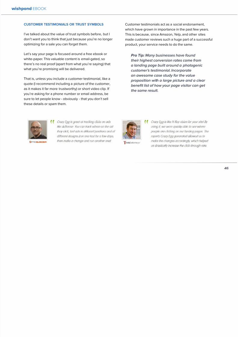
892019 Landing Pages eBook 1
httpslidepdfcomreaderfulllanding-pages-ebook-1 4865
Chapter 6
Landing
PagesThe Science
Behind Designing
for Conversion
p
wishpond EBOOK
892019 Landing Pages eBook 1
httpslidepdfcomreaderfulllanding-pages-ebook-1 4965
Is your landing page converting well Is it converting
badly Do you know why I mean do you really know
This article will give you the science and psychology
of why your landing is engaging to visitors or why youmight be getting traffic - but no conversions
Irsquoll take a look at 5 principles of landing
page design that can mean the difference
between a successful page and one thatrsquos
just taking up space (or fumbling around in
the dark)
Letrsquos get started
1 DIRECTIONAL CUES
Directional Cues are key in landing page design as they
tell people what to focus on
The most important thing to remember when designingyour landing page is that people do not view it like they
do a book Itrsquos not left to right top to bottom You have to
tell people how to read your page and directional cues
(as well as encapsulation and contrast below) are how
you do this
My recommendation is to decide two things on your
landing page that you especially want to drive attention
to (say your CTA and your product image or maybe aUSP) Then integrate a couple of the strategies below
into your design and AB test it Maybe your audience
responds well to the overt arrow or maybe the more
subtle eye-gaze Test it for yourself
Therersquos three main ways that we signal a focus point in
landing pages
Arrows and lines
p
49
wishpond EBOOK
892019 Landing Pages eBook 1
httpslidepdfcomreaderfulllanding-pages-ebook-1 5065
The most straightforward way to direct attention at an object or heading is to draw an arrow or line to it Students of art
will know the importance of lines as humans have a natural (subconscious) impulse to follow them to their origin or their
destination This works great to focus peoplersquos gaze on your CTA USP value proposition or product image
Eye-direction
Humans are incredibly good at recognizing the eye-focus point of the people around them I recommend using an eye-
tracking software on your landing page to determine where people are focusing and whether this focus is resulting in an
increased click-through-rate
What Irsquom talking about (thanks to Neil Patel
for the eye-tracking examples)
The red spots indicate the areas which
viewers looked at most Take note of how
the eye direction in the example on the left
draws the viewer`s attention towards the
product
p
50
wishpond EBOOK
892019 Landing Pages eBook 1
httpslidepdfcomreaderfulllanding-pages-ebook-1 5165
Faces are the most eye-attracting image you can use (see
5 below) and the eyes are the most eye-attracting part
of the face
Yoursquoll notice the woman on the left is looking directly atthe camera (or visitor to your page) The woman on the
right is looking at the product that Sunsilk is trying to sell
You can see in concrete terms how the initial gaze goes
to the womanrsquos eyes and then tracks left to the product
whereas the face on the left gets all the attention and the
product none
PointingGesturing
I highly recommend you use an image of a person in your
landing page as itrsquos proven to be the most engaging
picture (more on that later though) Something to test
however is having that model gesturing or pointing
towards something you want to focus attention on
This is a dangerous one though as (in my mind) it can
come across as cheesy if done incorrectly Test what your
audience responds to Irsquove seen this both increase and
decrease conversion rates in many case studies
2 CONTRAST
Color contrast
Contrast is essential when working with landing pagesThe human eye is naturally attracted to contrasting color
I recommend you consider color contrast for your USP
and CTA - perhaps an orange CTA button on a dark blue
background
Blank space
The idea of blank space is well-known in the graphic
design world and no less a vital part of landing page
design The idea is that blank space is extremely
influential in focusing attention on non-blank space For
instance
p
51
wishpond EBOOK
892019 Landing Pages eBook 1
httpslidepdfcomreaderfulllanding-pages-ebook-1 5265
Another way of utilizing blank space is with
encapsulation This can be done by framing a section
of content with a border or a container (filled in with
a background color) Give the encapsulated section
enough space to allow it to function somewhatindependently of the rest of the composition
Will this work better than a directional cue Test it for
yourself and find out
Format contrast
Formatting size (of font for instance) also attracts the eyeIn a 4-week multivariate test in 2010 Paras Chopra tested
the performance of 12 different combinations of a Call-to-
Action and descriptive link
Option 10 with the largest contrast in color hue and size
(as well as the word Free) generated a 60 improvement
in conversion rate
3 COLOR
Color is extremely (though unconsciously) effective
at eliciting emotion in viewers I took an in-depth
look at color psychology in my series on the science
behind a successful Facebook Ad so check it out for a
comprehensive analysis (with science)
For now herersquos a breakdown of how humans areinfluenced by color - and how this knowledge can
improve your conversion rates
Blue Blue is across both genders and all age-groups
most peoplersquos favorite color (35 of women and 57
of men) It is said to create the sensation of trust and
security Lighter blues are calming while darker blues
denote professionalism and sincerity
Orange Eye-catching bright and sunny orange is one of
the most popular colors for landing page Calls-to-Action
While a good tone and amount of orange is seen as warm
and inviting too much has been associated with naivete
52
wishpond EBOOK
892019 Landing Pages eBook 1
httpslidepdfcomreaderfulllanding-pages-ebook-1 5365
and a lack of professionalism
Red The color red is associated with passion excitement
and urgency Itrsquos a dangerous color in advertising as
many people associate red with negativity and mistakesHowever it attracts the eye better than any other color
and gives the impression that time is passing faster than
it is (as it causes our heart to beat faster) causing us to act
when we otherwise wouldnrsquot
Green Associated with wealth as well as environmental
subjects green is the easiest color for the eye to process
Green also signifies positive action (thinkrsquogreen meansgorsquo) and affirmation
Green and teal have also been associated with shoppers
on a budget Itrsquos also the second and third most popular
color among men and women respectively
Purple Associated with calm femininity and wealth
purple is the second most popular color among women
at 23 Interestingly as women get older their liking for
the color purple increases On the other hand purple is
the favorite color of 0 of the male population
Black Powerful sleek and intellectual black signifies
permanence sincerity and sophistication While black
can like red and orange be a dangerous color if used
too much it can communicate professionalism and
sophistication when used in conjunction with a strong
clear white (avoid greys or tans as theyrsquoll wash out yourmessage)
4 IMAGERY
I could discuss the effectiveness of a picture of a smiling
person on your landing page for hours (and I havehellip) but
just trust me that having an image (especially a person)
will likely improve your conversion rates
Something Irsquove seen recently actually is incorporating a
customer testimonial with the main landing page image
Choose a photogenic customer and post it up next to an
awesome-sounding affirmation of how your product or
service made their lives easier
But letrsquos leave that for the moment assuming you
recognize its importance and talk about why it works
bull We respond far more emotionally to people (or pets
though people generally elicit a stronger response)
than we do to words or random images
53
wishpond EBOOK
892019 Landing Pages eBook 1
httpslidepdfcomreaderfulllanding-pages-ebook-1 5465
bull A picture of a person provides subtext to your
landing page - a story which people respond to
bull We completely subconsciously focus on the faces
of people we see (especially the eyes) In everyeye-tracking image Irsquove ever seen the hottest
points are the face and eyes Unless of course
the image is of a woman and wersquore talking about a
male demographic Then the eye-tracking software
shows our attention to behellip elsewhere
In my research for this article I came across an article by
VS Ramachandran (a neuroscientist from Oxford) whowrote that oftentimes a line drawing is more powerful
than a photograph He writes that this is because the
lsquoidearsquo of a person is more appealing than the truth of it
(why so much of art is exaggeration of the human form or
why caricatures are so aesthetically pleasing) Leave out
the details and all yoursquore left is the essence of a thing
Although I havenrsquot yet seen an example of this in a
landing page or incorporated it into my own I believe
that whoever does will see a dramatic increase in click-
throughs Get creative and let me know how it goes
5 TYPOGRAPHY AND STYLE
Yoursquoll think that Irsquom getting too detailed here that
different typographies text formats or styles canrsquot actually
increase or decrease conversion rates enough to matter
Herersquos the thing with AB testing details do matter
Letrsquos say your Ecommerce sitersquos landing page is currently
converting at 23 Yoursquore seeing traffic of around 2000
visitors per week and their average purchase is worth
50 dollars to your business Yoursquore making $23000 per
week
Letrsquos say we change your pagersquos headline length and
change the image from one of a woman looking at
the camera to one looking at the CTA (small changes
yoursquod agree) You see a conversion rate increase of
10 Suddenly yoursquore converting at 253 and yoursquove
increased your weekly income to $25300 Yearly
revenue increase $27600
Typography and style changes to AB test
bull Font size for headings and body copy (and the
difference between them)
54
wishpond EBOOK
892019 Landing Pages eBook 1
httpslidepdfcomreaderfulllanding-pages-ebook-1 5565
bull Heading length (short and succinct vs long and
detailed)
bull Number of different font sizes (too many makes
your landing page confusing - I recommend two orthree)
bull Fonts Keep in mind that different fonts are for
whatever reason viewed as more amateurish than
others We at Wishpond like San Sarif for headlines
and Sarif for body copy Avoid cursive (except
maybe for a header) and comic sans is a no-no for a
professional business
bull More text vs less (I like a simple landing page - get
to the point and leave any extraneous information
for later emails or different tabs But test this for
yourself)
Conclusion
Hopefully you now understand a little more of the
science and psychology behind landing page design best
practices Remember to provide visual clues for whereyou want your visitor to focus Donrsquot forget the details
like typography or eye-direction
And keep testing You can always improve your landing
page conversion rates Trust me
55
wishpond EBOOK
892019 Landing Pages eBook 1
httpslidepdfcomreaderfulllanding-pages-ebook-1 5665
Chapter 7
3 Landing
PageExamplesCritiqued to Hell and
Back
wishpond EBOOK
892019 Landing Pages eBook 1
httpslidepdfcomreaderfulllanding-pages-ebook-1 5765
Howrsquos your landing page doing Is it optimized for
conversions Optimized for lead generation
How about we check out a few pages from around
the web In this article Irsquoll dissect four landing pagesvariable by variable discussing where theyrsquove done it
right and where therersquos room for improvement
Itrsquos all well and good for me to tell you a picture is an
essential part of your landing page but until you see
(pardon the pun) what Irsquom talking about itrsquos just that
talk
So letrsquos do this thing
1 SALESFORCE
Salesforce (for those somehow unfamiliar) is a
Customer Relationship Management (CRM) business
based out of San Fran
Herersquos their current landing page raquo
57
wishpond EBOOK
892019 Landing Pages eBook 1
httpslidepdfcomreaderfulllanding-pages-ebook-1 5865
What I Like About this Page
bull The imagery The first thing that hits you when you
traffic to SalesForcersquos landing page is the visual
representation of what they do Though by nomeans unique the visuals of lsquoconnect everything
with our awesome appsrsquo is clear
bull The image size I like how prominent their visuals
are About 75 of their lsquoabove the foldrsquo landing
page area is taken up by this image
bull The prioritized pages What I mean by this is simple
the three blue buttons on the right side (and also
beneath the benefit list paragraph) will traffic to
equally-optimized landing pages The tabs in gray
at the top are quite clearly subordinate (I know
this because of their color contrast encapsulation
etc) and traffic on them will be substantially less I
like the emphasis being placed on the things most
important to their leads
bull The Value Proposition Salesforce has gone
with two value propositions over a USP for their
header I like the succinct and appealing ldquoConnect
everythingrdquo especially
bull The benefit list Though not in bullet-point form
the below-the-fold paragraph of USPrsquos and value
propositions is still effective lsquoBuild customer loyaltyrsquo
(Boom) lsquoIncrease first call resolution and agent
productivityrsquo (Boom) lsquoImprove customer satisfactionby 37rsquo (Boom)
bull The specificity Perhaps my favorite part of this
entire landing is the sentence lsquoimprove customer
satisfaction by 37rsquo This kind of statistic is
incredibly convincing as itrsquos low enough and
specific enough to be entirely believable It also
shows me that theyrsquore professional enough to havedone their research and (I trust) can back up this
statistic with proof
Where I Think they Could Optimize this Page
bull Contrast the imagery I like the use of multiple
images on landing pages (one primary above-the-
fold and one secondary below it) However to
maximize the appeal of your images I recommend
you make them distinct from each other These two
images accomplish the same visual representation
I mentioned above How about keeping the same
image at the top and changing the below-the-fold
58
wishpond EBOOK
892019 Landing Pages eBook 1
httpslidepdfcomreaderfulllanding-pages-ebook-1 5965
59
image to a satisfied customer instead
bull Customer testimonials Perhaps SalesForce is relying on their substantial reputation as the worldrsquos CRM leader but
Irsquod still recommend they included a picture (and quote) from one of their prominent clients This is a businesses that
regularly works with Facebook General Electric and Delta Airlines Irsquod recommend testing a quote and image fromone of these businesses with the brand namelogo prominently placed
AB Testing Postulation
Irsquod theorize that integrating a customer testimonial with an image into a revolving album below-the-fold (on the right) could
increase conversion rates on this page by 10
2 MAILCHIMP
Mailchimp is the most successful email automation company out there (with more than 5 million users)
View their landing page on the next page
wishpond EBOOK
892019 Landing Pages eBook 1
httpslidepdfcomreaderfulllanding-pages-ebook-1 6065
60
wishpond EBOOK
892019 Landing Pages eBook 1
httpslidepdfcomreaderfulllanding-pages-ebook-1 6165
61
What I Like About this Page
bull The tagline ldquoSend Better Emailrdquo is one of the
simplest and most straightforward of all successful
landing pages Irsquove seen Itrsquos to the point andeffective Mailchimp has also had this tagline since
mid June of 2013 meaning itrsquos working for them
bull The USP ldquoMore than 5 million people use
MailChimphelliprdquo is about as unique as you can get
Peer endorsement is the most powerful USP you
can bring into play
bull The Image Red on a blue background stands out
fantastically and attracts the eye - I also the giving
a snapshot of their tool giving people a glimpse at
what they have to offer
bull The CTA(s) Although not as noticeable as ldquoSign
up Freerdquo (which consistently performs better than
simply ldquoSign Uprdquo) I really like ldquoJoin them todayrdquo in
the small paragraph beneath the tagline This is as
much as CTA as the buttons are and plays to the
peer pressure effectiveness of the page
Where I Think they Could Optimize this Page
bull The color scheme Irsquod be interested to see the
effect of a dark blue background and white taglines
benefits As it stands now the page is somewhatboring
bull The toolbar at the top Such a simple and minimalist
landing page needs to accentuate their ldquoFeaturesrdquo
ldquoPricesrdquo and ldquoSupportrdquo buttons at the top to make
it easy to access these important parts of the
decision-making process
bull The CTA(s) While I like the language used Irsquod be
curious to see the effect of making the CTAs stand
out a bit more with a contrasting color to draw the
eye
bull Irsquod test a customer testimonial rotation Mentioning
the 5 million people who use Mailchimp is all
well and good but Irsquod recommend rotating in a
photogenic former customer with a quote on the
effect that Mailchimp had on their businessrsquo email
marketing ROI
wishpond EBOOK
892019 Landing Pages eBook 1
httpslidepdfcomreaderfulllanding-pages-ebook-1 6265
62
AB Testing Postulation
Irsquod theorize that a customer testimonial addition could increase conversions on this page by up to 10 A concrete number
or percentage taken from a case study would make the page more effective
3 KISSMETRICS
Customer analytics platform
Kissmetrics is entrepreneur Neil
Patelrsquos 2008 baby
Herersquos their current landing page raquo
wishpond EBOOK
892019 Landing Pages eBook 1
httpslidepdfcomreaderfulllanding-pages-ebook-1 6365
63
What I Like About this Page
bull The image If yoursquore unsure exactly what image
you should use for your landing page fall back
on something like this A smiling normal-lookingperson (photogenic but not a model) is your best
bet
bull The simplicity Yes this is the entire landing page
Nothing but lsquoabove-the-foldrsquo It relies entirely on the
USP which is incredibly effective
bull Knowing their market Customer analytics are a field
only interesting to people who know what Google
Analytics is Nobody starts with Kissmetrics and
moves to Google Analytics As such the USP is
incredibly effective
bull Logging in with a Google account Irsquove mentioned
before how an email address is worth so much
more to your business than it is to its owner (and
how a phone number is so much more of an ask)
Well a social platform login is worth even less to
its owner - this allows Kissmetrics to ask for less
from a lead and get exactly the same details (if not
more) than they would were they to ask for an email
address
bull The popup The bottom-right popup (which reads
lsquowhatrsquos preventing you from wanting to start a
free trial of Kissmetricsrsquo) does not appear forevery person that traffics to this landing page
This would mediate the drop in conversion rates
that this popup likely causes However this popup
also provides Kissmetrics with extremely valuable
information namely what they can do to encourage
a sign-up Trading a little conversion rate (especially
if you do this temporarily) can be worth more
information This is a similar trade Irsquove talked aboutbefore where more entry boxes give you better
lead knowledge but can decrease conversion rates
- something you have to balance
Check out my article lsquoValue Proposition Formulas that
Boost Conversion on Ads and Landing Pagesrsquo where I
take an in-depth look at how to use Kissmetricrsquos formula
and 6 others
Where I Think they Could Optimize this Page
bull The Image Okay I really like this image but Irsquod be
curious to see how a landing page with a revolving
wishpond EBOOK
892019 Landing Pages eBook 1
httpslidepdfcomreaderfulllanding-pages-ebook-1 6465
64
album would do How about three different USP
value proposition + image combinations revolving
every 75 seconds (Genuinely I recommend you
test the time lapse you use if you employ revolving
images)
bull Learn More The ldquoLearn Morerdquo link in the bottom
left of this landing page is too quiet Irsquod recommend
a subtle encapsulation and slightly larger font I
think this landing page is incredibly effective but
clearly the issue theyrsquoll have is not offering enough
information about what they do A ldquoLearn Morerdquo
link is an awesome way of doing this but itrsquos notobvious enough for everyone to see and I wonder if
that doesnrsquot increase their bounce rate
bull A Case Studies Tab I donrsquot want to ruin the
contemporary minimalist appeal of this landing
page but I would be interested in testing a lsquocase
studiesrsquo or lsquocustomer storiesrsquo tab next to lsquoSign Inrsquo on
the top bar Like the lsquoLearn Morersquo link this would
make it a little easier for visitors to find the answers
to their questions without cluttering the page with
the customer testimonials benefit list and trust
symbols I usually recommend
AB Testing Postulation
Irsquod theorize that making the lsquoLearn Morersquo link on the
bottom right just slightly more obvious would increase
conversions from this page Herersquos why If someone typesin lsquocustomer analyticsrsquo into Google search theyrsquoll click on
Kissmetrics Irsquod be concerned that at the moment they
may bounce due to lack of ready information A more
visible lsquoLearn Morersquo link could increase conversion by up
to 5
Conclusion
The variables Irsquove discussed and critiqued in this article
encompass most of the optimization strategies I give
our clients Remember that every audience is different
and that (unless yoursquore using an optimized landing page
template) yoursquoll need to AB test your own landing pages
on a monthly basis
wishpond EBOOK
892019 Landing Pages eBook 1
httpslidepdfcomreaderfulllanding-pages-ebook-1 6565
Creating and optimizing your businessrsquo landing pages can be the most influential change you make this year
Wishpondrsquos own landing pages are being constantly updated and optimized - our templates completely customizable Start
a free trial today to check them out and see if wersquore a fit for your business
Thanks for reading
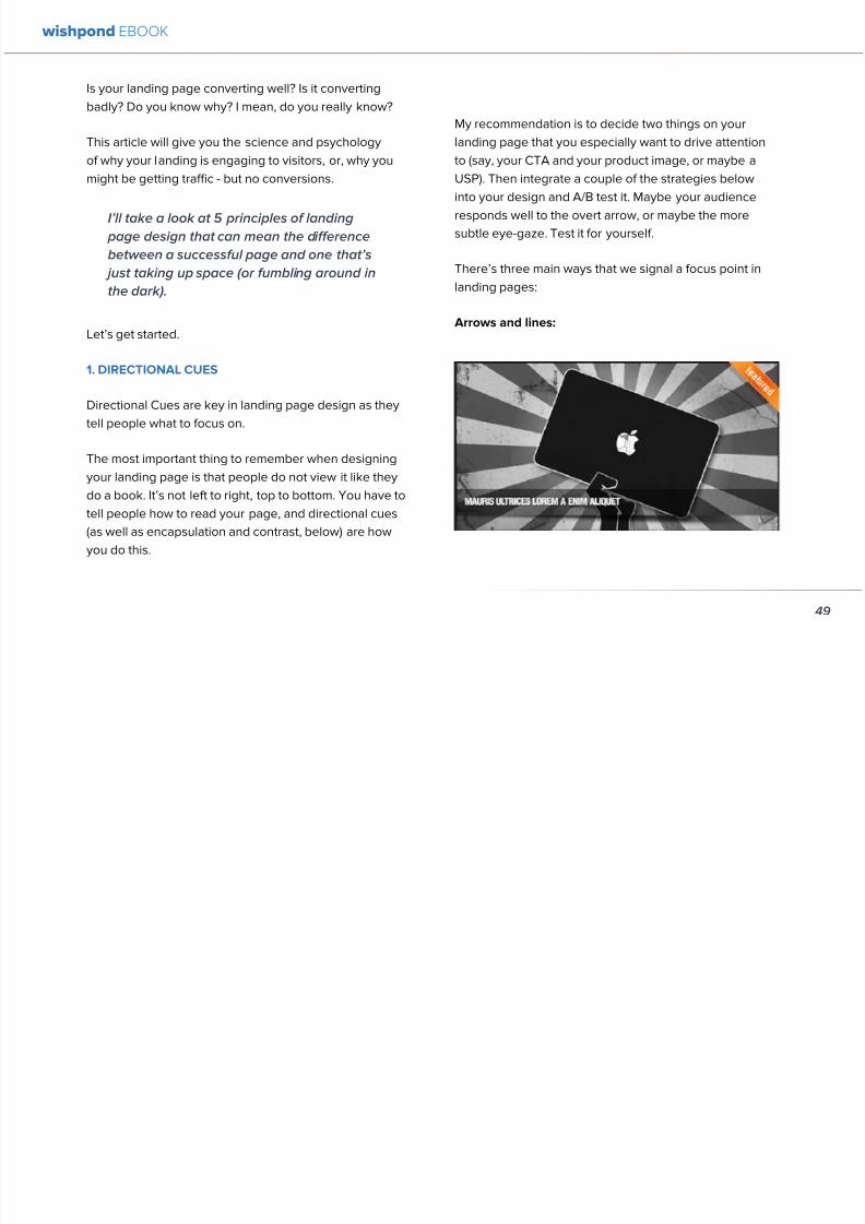
892019 Landing Pages eBook 1
httpslidepdfcomreaderfulllanding-pages-ebook-1 5065
The most straightforward way to direct attention at an object or heading is to draw an arrow or line to it Students of art
will know the importance of lines as humans have a natural (subconscious) impulse to follow them to their origin or their
destination This works great to focus peoplersquos gaze on your CTA USP value proposition or product image
Eye-direction
Humans are incredibly good at recognizing the eye-focus point of the people around them I recommend using an eye-
tracking software on your landing page to determine where people are focusing and whether this focus is resulting in an
increased click-through-rate
What Irsquom talking about (thanks to Neil Patel
for the eye-tracking examples)
The red spots indicate the areas which
viewers looked at most Take note of how
the eye direction in the example on the left
draws the viewer`s attention towards the
product
p
50
wishpond EBOOK
892019 Landing Pages eBook 1
httpslidepdfcomreaderfulllanding-pages-ebook-1 5165
Faces are the most eye-attracting image you can use (see
5 below) and the eyes are the most eye-attracting part
of the face
Yoursquoll notice the woman on the left is looking directly atthe camera (or visitor to your page) The woman on the
right is looking at the product that Sunsilk is trying to sell
You can see in concrete terms how the initial gaze goes
to the womanrsquos eyes and then tracks left to the product
whereas the face on the left gets all the attention and the
product none
PointingGesturing
I highly recommend you use an image of a person in your
landing page as itrsquos proven to be the most engaging
picture (more on that later though) Something to test
however is having that model gesturing or pointing
towards something you want to focus attention on
This is a dangerous one though as (in my mind) it can
come across as cheesy if done incorrectly Test what your
audience responds to Irsquove seen this both increase and
decrease conversion rates in many case studies
2 CONTRAST
Color contrast
Contrast is essential when working with landing pagesThe human eye is naturally attracted to contrasting color
I recommend you consider color contrast for your USP
and CTA - perhaps an orange CTA button on a dark blue
background
Blank space
The idea of blank space is well-known in the graphic
design world and no less a vital part of landing page
design The idea is that blank space is extremely
influential in focusing attention on non-blank space For
instance
p
51
wishpond EBOOK
892019 Landing Pages eBook 1
httpslidepdfcomreaderfulllanding-pages-ebook-1 5265
Another way of utilizing blank space is with
encapsulation This can be done by framing a section
of content with a border or a container (filled in with
a background color) Give the encapsulated section
enough space to allow it to function somewhatindependently of the rest of the composition
Will this work better than a directional cue Test it for
yourself and find out
Format contrast
Formatting size (of font for instance) also attracts the eyeIn a 4-week multivariate test in 2010 Paras Chopra tested
the performance of 12 different combinations of a Call-to-
Action and descriptive link
Option 10 with the largest contrast in color hue and size
(as well as the word Free) generated a 60 improvement
in conversion rate
3 COLOR
Color is extremely (though unconsciously) effective
at eliciting emotion in viewers I took an in-depth
look at color psychology in my series on the science
behind a successful Facebook Ad so check it out for a
comprehensive analysis (with science)
For now herersquos a breakdown of how humans areinfluenced by color - and how this knowledge can
improve your conversion rates
Blue Blue is across both genders and all age-groups
most peoplersquos favorite color (35 of women and 57
of men) It is said to create the sensation of trust and
security Lighter blues are calming while darker blues
denote professionalism and sincerity
Orange Eye-catching bright and sunny orange is one of
the most popular colors for landing page Calls-to-Action
While a good tone and amount of orange is seen as warm
and inviting too much has been associated with naivete
52
wishpond EBOOK
892019 Landing Pages eBook 1
httpslidepdfcomreaderfulllanding-pages-ebook-1 5365
and a lack of professionalism
Red The color red is associated with passion excitement
and urgency Itrsquos a dangerous color in advertising as
many people associate red with negativity and mistakesHowever it attracts the eye better than any other color
and gives the impression that time is passing faster than
it is (as it causes our heart to beat faster) causing us to act
when we otherwise wouldnrsquot
Green Associated with wealth as well as environmental
subjects green is the easiest color for the eye to process
Green also signifies positive action (thinkrsquogreen meansgorsquo) and affirmation
Green and teal have also been associated with shoppers
on a budget Itrsquos also the second and third most popular
color among men and women respectively
Purple Associated with calm femininity and wealth
purple is the second most popular color among women
at 23 Interestingly as women get older their liking for
the color purple increases On the other hand purple is
the favorite color of 0 of the male population
Black Powerful sleek and intellectual black signifies
permanence sincerity and sophistication While black
can like red and orange be a dangerous color if used
too much it can communicate professionalism and
sophistication when used in conjunction with a strong
clear white (avoid greys or tans as theyrsquoll wash out yourmessage)
4 IMAGERY
I could discuss the effectiveness of a picture of a smiling
person on your landing page for hours (and I havehellip) but
just trust me that having an image (especially a person)
will likely improve your conversion rates
Something Irsquove seen recently actually is incorporating a
customer testimonial with the main landing page image
Choose a photogenic customer and post it up next to an
awesome-sounding affirmation of how your product or
service made their lives easier
But letrsquos leave that for the moment assuming you
recognize its importance and talk about why it works
bull We respond far more emotionally to people (or pets
though people generally elicit a stronger response)
than we do to words or random images
53
wishpond EBOOK
892019 Landing Pages eBook 1
httpslidepdfcomreaderfulllanding-pages-ebook-1 5465
bull A picture of a person provides subtext to your
landing page - a story which people respond to
bull We completely subconsciously focus on the faces
of people we see (especially the eyes) In everyeye-tracking image Irsquove ever seen the hottest
points are the face and eyes Unless of course
the image is of a woman and wersquore talking about a
male demographic Then the eye-tracking software
shows our attention to behellip elsewhere
In my research for this article I came across an article by
VS Ramachandran (a neuroscientist from Oxford) whowrote that oftentimes a line drawing is more powerful
than a photograph He writes that this is because the
lsquoidearsquo of a person is more appealing than the truth of it
(why so much of art is exaggeration of the human form or
why caricatures are so aesthetically pleasing) Leave out
the details and all yoursquore left is the essence of a thing
Although I havenrsquot yet seen an example of this in a
landing page or incorporated it into my own I believe
that whoever does will see a dramatic increase in click-
throughs Get creative and let me know how it goes
5 TYPOGRAPHY AND STYLE
Yoursquoll think that Irsquom getting too detailed here that
different typographies text formats or styles canrsquot actually
increase or decrease conversion rates enough to matter
Herersquos the thing with AB testing details do matter
Letrsquos say your Ecommerce sitersquos landing page is currently
converting at 23 Yoursquore seeing traffic of around 2000
visitors per week and their average purchase is worth
50 dollars to your business Yoursquore making $23000 per
week
Letrsquos say we change your pagersquos headline length and
change the image from one of a woman looking at
the camera to one looking at the CTA (small changes
yoursquod agree) You see a conversion rate increase of
10 Suddenly yoursquore converting at 253 and yoursquove
increased your weekly income to $25300 Yearly
revenue increase $27600
Typography and style changes to AB test
bull Font size for headings and body copy (and the
difference between them)
54
wishpond EBOOK
892019 Landing Pages eBook 1
httpslidepdfcomreaderfulllanding-pages-ebook-1 5565
bull Heading length (short and succinct vs long and
detailed)
bull Number of different font sizes (too many makes
your landing page confusing - I recommend two orthree)
bull Fonts Keep in mind that different fonts are for
whatever reason viewed as more amateurish than
others We at Wishpond like San Sarif for headlines
and Sarif for body copy Avoid cursive (except
maybe for a header) and comic sans is a no-no for a
professional business
bull More text vs less (I like a simple landing page - get
to the point and leave any extraneous information
for later emails or different tabs But test this for
yourself)
Conclusion
Hopefully you now understand a little more of the
science and psychology behind landing page design best
practices Remember to provide visual clues for whereyou want your visitor to focus Donrsquot forget the details
like typography or eye-direction
And keep testing You can always improve your landing
page conversion rates Trust me
55
wishpond EBOOK
892019 Landing Pages eBook 1
httpslidepdfcomreaderfulllanding-pages-ebook-1 5665
Chapter 7
3 Landing
PageExamplesCritiqued to Hell and
Back
wishpond EBOOK
892019 Landing Pages eBook 1
httpslidepdfcomreaderfulllanding-pages-ebook-1 5765
Howrsquos your landing page doing Is it optimized for
conversions Optimized for lead generation
How about we check out a few pages from around
the web In this article Irsquoll dissect four landing pagesvariable by variable discussing where theyrsquove done it
right and where therersquos room for improvement
Itrsquos all well and good for me to tell you a picture is an
essential part of your landing page but until you see
(pardon the pun) what Irsquom talking about itrsquos just that
talk
So letrsquos do this thing
1 SALESFORCE
Salesforce (for those somehow unfamiliar) is a
Customer Relationship Management (CRM) business
based out of San Fran
Herersquos their current landing page raquo
57
wishpond EBOOK
892019 Landing Pages eBook 1
httpslidepdfcomreaderfulllanding-pages-ebook-1 5865
What I Like About this Page
bull The imagery The first thing that hits you when you
traffic to SalesForcersquos landing page is the visual
representation of what they do Though by nomeans unique the visuals of lsquoconnect everything
with our awesome appsrsquo is clear
bull The image size I like how prominent their visuals
are About 75 of their lsquoabove the foldrsquo landing
page area is taken up by this image
bull The prioritized pages What I mean by this is simple
the three blue buttons on the right side (and also
beneath the benefit list paragraph) will traffic to
equally-optimized landing pages The tabs in gray
at the top are quite clearly subordinate (I know
this because of their color contrast encapsulation
etc) and traffic on them will be substantially less I
like the emphasis being placed on the things most
important to their leads
bull The Value Proposition Salesforce has gone
with two value propositions over a USP for their
header I like the succinct and appealing ldquoConnect
everythingrdquo especially
bull The benefit list Though not in bullet-point form
the below-the-fold paragraph of USPrsquos and value
propositions is still effective lsquoBuild customer loyaltyrsquo
(Boom) lsquoIncrease first call resolution and agent
productivityrsquo (Boom) lsquoImprove customer satisfactionby 37rsquo (Boom)
bull The specificity Perhaps my favorite part of this
entire landing is the sentence lsquoimprove customer
satisfaction by 37rsquo This kind of statistic is
incredibly convincing as itrsquos low enough and
specific enough to be entirely believable It also
shows me that theyrsquore professional enough to havedone their research and (I trust) can back up this
statistic with proof
Where I Think they Could Optimize this Page
bull Contrast the imagery I like the use of multiple
images on landing pages (one primary above-the-
fold and one secondary below it) However to
maximize the appeal of your images I recommend
you make them distinct from each other These two
images accomplish the same visual representation
I mentioned above How about keeping the same
image at the top and changing the below-the-fold
58
wishpond EBOOK
892019 Landing Pages eBook 1
httpslidepdfcomreaderfulllanding-pages-ebook-1 5965
59
image to a satisfied customer instead
bull Customer testimonials Perhaps SalesForce is relying on their substantial reputation as the worldrsquos CRM leader but
Irsquod still recommend they included a picture (and quote) from one of their prominent clients This is a businesses that
regularly works with Facebook General Electric and Delta Airlines Irsquod recommend testing a quote and image fromone of these businesses with the brand namelogo prominently placed
AB Testing Postulation
Irsquod theorize that integrating a customer testimonial with an image into a revolving album below-the-fold (on the right) could
increase conversion rates on this page by 10
2 MAILCHIMP
Mailchimp is the most successful email automation company out there (with more than 5 million users)
View their landing page on the next page
wishpond EBOOK
892019 Landing Pages eBook 1
httpslidepdfcomreaderfulllanding-pages-ebook-1 6065
60
wishpond EBOOK
892019 Landing Pages eBook 1
httpslidepdfcomreaderfulllanding-pages-ebook-1 6165
61
What I Like About this Page
bull The tagline ldquoSend Better Emailrdquo is one of the
simplest and most straightforward of all successful
landing pages Irsquove seen Itrsquos to the point andeffective Mailchimp has also had this tagline since
mid June of 2013 meaning itrsquos working for them
bull The USP ldquoMore than 5 million people use
MailChimphelliprdquo is about as unique as you can get
Peer endorsement is the most powerful USP you
can bring into play
bull The Image Red on a blue background stands out
fantastically and attracts the eye - I also the giving
a snapshot of their tool giving people a glimpse at
what they have to offer
bull The CTA(s) Although not as noticeable as ldquoSign
up Freerdquo (which consistently performs better than
simply ldquoSign Uprdquo) I really like ldquoJoin them todayrdquo in
the small paragraph beneath the tagline This is as
much as CTA as the buttons are and plays to the
peer pressure effectiveness of the page
Where I Think they Could Optimize this Page
bull The color scheme Irsquod be interested to see the
effect of a dark blue background and white taglines
benefits As it stands now the page is somewhatboring
bull The toolbar at the top Such a simple and minimalist
landing page needs to accentuate their ldquoFeaturesrdquo
ldquoPricesrdquo and ldquoSupportrdquo buttons at the top to make
it easy to access these important parts of the
decision-making process
bull The CTA(s) While I like the language used Irsquod be
curious to see the effect of making the CTAs stand
out a bit more with a contrasting color to draw the
eye
bull Irsquod test a customer testimonial rotation Mentioning
the 5 million people who use Mailchimp is all
well and good but Irsquod recommend rotating in a
photogenic former customer with a quote on the
effect that Mailchimp had on their businessrsquo email
marketing ROI
wishpond EBOOK
892019 Landing Pages eBook 1
httpslidepdfcomreaderfulllanding-pages-ebook-1 6265
62
AB Testing Postulation
Irsquod theorize that a customer testimonial addition could increase conversions on this page by up to 10 A concrete number
or percentage taken from a case study would make the page more effective
3 KISSMETRICS
Customer analytics platform
Kissmetrics is entrepreneur Neil
Patelrsquos 2008 baby
Herersquos their current landing page raquo
wishpond EBOOK
892019 Landing Pages eBook 1
httpslidepdfcomreaderfulllanding-pages-ebook-1 6365
63
What I Like About this Page
bull The image If yoursquore unsure exactly what image
you should use for your landing page fall back
on something like this A smiling normal-lookingperson (photogenic but not a model) is your best
bet
bull The simplicity Yes this is the entire landing page
Nothing but lsquoabove-the-foldrsquo It relies entirely on the
USP which is incredibly effective
bull Knowing their market Customer analytics are a field
only interesting to people who know what Google
Analytics is Nobody starts with Kissmetrics and
moves to Google Analytics As such the USP is
incredibly effective
bull Logging in with a Google account Irsquove mentioned
before how an email address is worth so much
more to your business than it is to its owner (and
how a phone number is so much more of an ask)
Well a social platform login is worth even less to
its owner - this allows Kissmetrics to ask for less
from a lead and get exactly the same details (if not
more) than they would were they to ask for an email
address
bull The popup The bottom-right popup (which reads
lsquowhatrsquos preventing you from wanting to start a
free trial of Kissmetricsrsquo) does not appear forevery person that traffics to this landing page
This would mediate the drop in conversion rates
that this popup likely causes However this popup
also provides Kissmetrics with extremely valuable
information namely what they can do to encourage
a sign-up Trading a little conversion rate (especially
if you do this temporarily) can be worth more
information This is a similar trade Irsquove talked aboutbefore where more entry boxes give you better
lead knowledge but can decrease conversion rates
- something you have to balance
Check out my article lsquoValue Proposition Formulas that
Boost Conversion on Ads and Landing Pagesrsquo where I
take an in-depth look at how to use Kissmetricrsquos formula
and 6 others
Where I Think they Could Optimize this Page
bull The Image Okay I really like this image but Irsquod be
curious to see how a landing page with a revolving
wishpond EBOOK
892019 Landing Pages eBook 1
httpslidepdfcomreaderfulllanding-pages-ebook-1 6465
64
album would do How about three different USP
value proposition + image combinations revolving
every 75 seconds (Genuinely I recommend you
test the time lapse you use if you employ revolving
images)
bull Learn More The ldquoLearn Morerdquo link in the bottom
left of this landing page is too quiet Irsquod recommend
a subtle encapsulation and slightly larger font I
think this landing page is incredibly effective but
clearly the issue theyrsquoll have is not offering enough
information about what they do A ldquoLearn Morerdquo
link is an awesome way of doing this but itrsquos notobvious enough for everyone to see and I wonder if
that doesnrsquot increase their bounce rate
bull A Case Studies Tab I donrsquot want to ruin the
contemporary minimalist appeal of this landing
page but I would be interested in testing a lsquocase
studiesrsquo or lsquocustomer storiesrsquo tab next to lsquoSign Inrsquo on
the top bar Like the lsquoLearn Morersquo link this would
make it a little easier for visitors to find the answers
to their questions without cluttering the page with
the customer testimonials benefit list and trust
symbols I usually recommend
AB Testing Postulation
Irsquod theorize that making the lsquoLearn Morersquo link on the
bottom right just slightly more obvious would increase
conversions from this page Herersquos why If someone typesin lsquocustomer analyticsrsquo into Google search theyrsquoll click on
Kissmetrics Irsquod be concerned that at the moment they
may bounce due to lack of ready information A more
visible lsquoLearn Morersquo link could increase conversion by up
to 5
Conclusion
The variables Irsquove discussed and critiqued in this article
encompass most of the optimization strategies I give
our clients Remember that every audience is different
and that (unless yoursquore using an optimized landing page
template) yoursquoll need to AB test your own landing pages
on a monthly basis
wishpond EBOOK
892019 Landing Pages eBook 1
httpslidepdfcomreaderfulllanding-pages-ebook-1 6565
Creating and optimizing your businessrsquo landing pages can be the most influential change you make this year
Wishpondrsquos own landing pages are being constantly updated and optimized - our templates completely customizable Start
a free trial today to check them out and see if wersquore a fit for your business
Thanks for reading
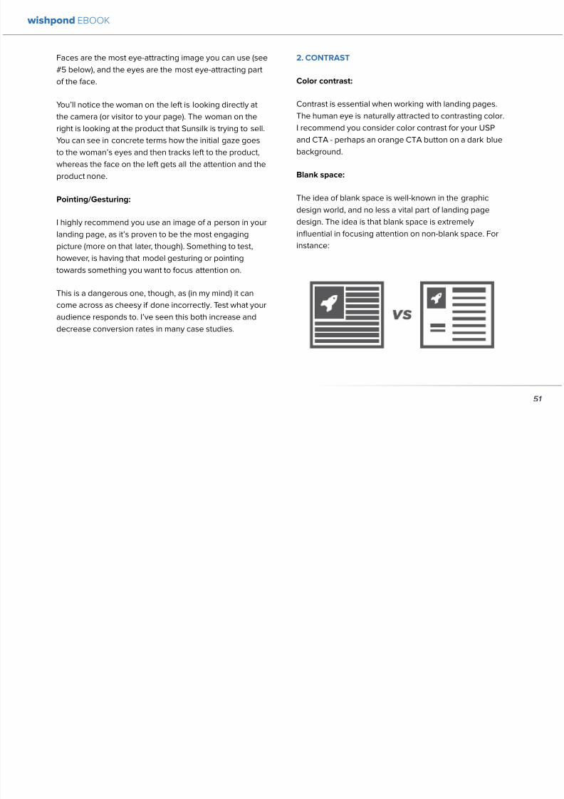
892019 Landing Pages eBook 1
httpslidepdfcomreaderfulllanding-pages-ebook-1 5465
bull A picture of a person provides subtext to your
landing page - a story which people respond to
bull We completely subconsciously focus on the faces
of people we see (especially the eyes) In everyeye-tracking image Irsquove ever seen the hottest
points are the face and eyes Unless of course
the image is of a woman and wersquore talking about a
male demographic Then the eye-tracking software
shows our attention to behellip elsewhere
In my research for this article I came across an article by
VS Ramachandran (a neuroscientist from Oxford) whowrote that oftentimes a line drawing is more powerful
than a photograph He writes that this is because the
lsquoidearsquo of a person is more appealing than the truth of it
(why so much of art is exaggeration of the human form or
why caricatures are so aesthetically pleasing) Leave out
the details and all yoursquore left is the essence of a thing
Although I havenrsquot yet seen an example of this in a
landing page or incorporated it into my own I believe
that whoever does will see a dramatic increase in click-
throughs Get creative and let me know how it goes
5 TYPOGRAPHY AND STYLE
Yoursquoll think that Irsquom getting too detailed here that
different typographies text formats or styles canrsquot actually
increase or decrease conversion rates enough to matter
Herersquos the thing with AB testing details do matter
Letrsquos say your Ecommerce sitersquos landing page is currently
converting at 23 Yoursquore seeing traffic of around 2000
visitors per week and their average purchase is worth
50 dollars to your business Yoursquore making $23000 per
week
Letrsquos say we change your pagersquos headline length and
change the image from one of a woman looking at
the camera to one looking at the CTA (small changes
yoursquod agree) You see a conversion rate increase of
10 Suddenly yoursquore converting at 253 and yoursquove
increased your weekly income to $25300 Yearly
revenue increase $27600
Typography and style changes to AB test
bull Font size for headings and body copy (and the
difference between them)
54
wishpond EBOOK
892019 Landing Pages eBook 1
httpslidepdfcomreaderfulllanding-pages-ebook-1 5565
bull Heading length (short and succinct vs long and
detailed)
bull Number of different font sizes (too many makes
your landing page confusing - I recommend two orthree)
bull Fonts Keep in mind that different fonts are for
whatever reason viewed as more amateurish than
others We at Wishpond like San Sarif for headlines
and Sarif for body copy Avoid cursive (except
maybe for a header) and comic sans is a no-no for a
professional business
bull More text vs less (I like a simple landing page - get
to the point and leave any extraneous information
for later emails or different tabs But test this for
yourself)
Conclusion
Hopefully you now understand a little more of the
science and psychology behind landing page design best
practices Remember to provide visual clues for whereyou want your visitor to focus Donrsquot forget the details
like typography or eye-direction
And keep testing You can always improve your landing
page conversion rates Trust me
55
wishpond EBOOK
892019 Landing Pages eBook 1
httpslidepdfcomreaderfulllanding-pages-ebook-1 5665
Chapter 7
3 Landing
PageExamplesCritiqued to Hell and
Back
wishpond EBOOK
892019 Landing Pages eBook 1
httpslidepdfcomreaderfulllanding-pages-ebook-1 5765
Howrsquos your landing page doing Is it optimized for
conversions Optimized for lead generation
How about we check out a few pages from around
the web In this article Irsquoll dissect four landing pagesvariable by variable discussing where theyrsquove done it
right and where therersquos room for improvement
Itrsquos all well and good for me to tell you a picture is an
essential part of your landing page but until you see
(pardon the pun) what Irsquom talking about itrsquos just that
talk
So letrsquos do this thing
1 SALESFORCE
Salesforce (for those somehow unfamiliar) is a
Customer Relationship Management (CRM) business
based out of San Fran
Herersquos their current landing page raquo
57
wishpond EBOOK
892019 Landing Pages eBook 1
httpslidepdfcomreaderfulllanding-pages-ebook-1 5865
What I Like About this Page
bull The imagery The first thing that hits you when you
traffic to SalesForcersquos landing page is the visual
representation of what they do Though by nomeans unique the visuals of lsquoconnect everything
with our awesome appsrsquo is clear
bull The image size I like how prominent their visuals
are About 75 of their lsquoabove the foldrsquo landing
page area is taken up by this image
bull The prioritized pages What I mean by this is simple
the three blue buttons on the right side (and also
beneath the benefit list paragraph) will traffic to
equally-optimized landing pages The tabs in gray
at the top are quite clearly subordinate (I know
this because of their color contrast encapsulation
etc) and traffic on them will be substantially less I
like the emphasis being placed on the things most
important to their leads
bull The Value Proposition Salesforce has gone
with two value propositions over a USP for their
header I like the succinct and appealing ldquoConnect
everythingrdquo especially
bull The benefit list Though not in bullet-point form
the below-the-fold paragraph of USPrsquos and value
propositions is still effective lsquoBuild customer loyaltyrsquo
(Boom) lsquoIncrease first call resolution and agent
productivityrsquo (Boom) lsquoImprove customer satisfactionby 37rsquo (Boom)
bull The specificity Perhaps my favorite part of this
entire landing is the sentence lsquoimprove customer
satisfaction by 37rsquo This kind of statistic is
incredibly convincing as itrsquos low enough and
specific enough to be entirely believable It also
shows me that theyrsquore professional enough to havedone their research and (I trust) can back up this
statistic with proof
Where I Think they Could Optimize this Page
bull Contrast the imagery I like the use of multiple
images on landing pages (one primary above-the-
fold and one secondary below it) However to
maximize the appeal of your images I recommend
you make them distinct from each other These two
images accomplish the same visual representation
I mentioned above How about keeping the same
image at the top and changing the below-the-fold
58
wishpond EBOOK
892019 Landing Pages eBook 1
httpslidepdfcomreaderfulllanding-pages-ebook-1 5965
59
image to a satisfied customer instead
bull Customer testimonials Perhaps SalesForce is relying on their substantial reputation as the worldrsquos CRM leader but
Irsquod still recommend they included a picture (and quote) from one of their prominent clients This is a businesses that
regularly works with Facebook General Electric and Delta Airlines Irsquod recommend testing a quote and image fromone of these businesses with the brand namelogo prominently placed
AB Testing Postulation
Irsquod theorize that integrating a customer testimonial with an image into a revolving album below-the-fold (on the right) could
increase conversion rates on this page by 10
2 MAILCHIMP
Mailchimp is the most successful email automation company out there (with more than 5 million users)
View their landing page on the next page
wishpond EBOOK
892019 Landing Pages eBook 1
httpslidepdfcomreaderfulllanding-pages-ebook-1 6065
60
wishpond EBOOK
892019 Landing Pages eBook 1
httpslidepdfcomreaderfulllanding-pages-ebook-1 6165
61
What I Like About this Page
bull The tagline ldquoSend Better Emailrdquo is one of the
simplest and most straightforward of all successful
landing pages Irsquove seen Itrsquos to the point andeffective Mailchimp has also had this tagline since
mid June of 2013 meaning itrsquos working for them
bull The USP ldquoMore than 5 million people use
MailChimphelliprdquo is about as unique as you can get
Peer endorsement is the most powerful USP you
can bring into play
bull The Image Red on a blue background stands out
fantastically and attracts the eye - I also the giving
a snapshot of their tool giving people a glimpse at
what they have to offer
bull The CTA(s) Although not as noticeable as ldquoSign
up Freerdquo (which consistently performs better than
simply ldquoSign Uprdquo) I really like ldquoJoin them todayrdquo in
the small paragraph beneath the tagline This is as
much as CTA as the buttons are and plays to the
peer pressure effectiveness of the page
Where I Think they Could Optimize this Page
bull The color scheme Irsquod be interested to see the
effect of a dark blue background and white taglines
benefits As it stands now the page is somewhatboring
bull The toolbar at the top Such a simple and minimalist
landing page needs to accentuate their ldquoFeaturesrdquo
ldquoPricesrdquo and ldquoSupportrdquo buttons at the top to make
it easy to access these important parts of the
decision-making process
bull The CTA(s) While I like the language used Irsquod be
curious to see the effect of making the CTAs stand
out a bit more with a contrasting color to draw the
eye
bull Irsquod test a customer testimonial rotation Mentioning
the 5 million people who use Mailchimp is all
well and good but Irsquod recommend rotating in a
photogenic former customer with a quote on the
effect that Mailchimp had on their businessrsquo email
marketing ROI
wishpond EBOOK
892019 Landing Pages eBook 1
httpslidepdfcomreaderfulllanding-pages-ebook-1 6265
62
AB Testing Postulation
Irsquod theorize that a customer testimonial addition could increase conversions on this page by up to 10 A concrete number
or percentage taken from a case study would make the page more effective
3 KISSMETRICS
Customer analytics platform
Kissmetrics is entrepreneur Neil
Patelrsquos 2008 baby
Herersquos their current landing page raquo
wishpond EBOOK
892019 Landing Pages eBook 1
httpslidepdfcomreaderfulllanding-pages-ebook-1 6365
63
What I Like About this Page
bull The image If yoursquore unsure exactly what image
you should use for your landing page fall back
on something like this A smiling normal-lookingperson (photogenic but not a model) is your best
bet
bull The simplicity Yes this is the entire landing page
Nothing but lsquoabove-the-foldrsquo It relies entirely on the
USP which is incredibly effective
bull Knowing their market Customer analytics are a field
only interesting to people who know what Google
Analytics is Nobody starts with Kissmetrics and
moves to Google Analytics As such the USP is
incredibly effective
bull Logging in with a Google account Irsquove mentioned
before how an email address is worth so much
more to your business than it is to its owner (and
how a phone number is so much more of an ask)
Well a social platform login is worth even less to
its owner - this allows Kissmetrics to ask for less
from a lead and get exactly the same details (if not
more) than they would were they to ask for an email
address
bull The popup The bottom-right popup (which reads
lsquowhatrsquos preventing you from wanting to start a
free trial of Kissmetricsrsquo) does not appear forevery person that traffics to this landing page
This would mediate the drop in conversion rates
that this popup likely causes However this popup
also provides Kissmetrics with extremely valuable
information namely what they can do to encourage
a sign-up Trading a little conversion rate (especially
if you do this temporarily) can be worth more
information This is a similar trade Irsquove talked aboutbefore where more entry boxes give you better
lead knowledge but can decrease conversion rates
- something you have to balance
Check out my article lsquoValue Proposition Formulas that
Boost Conversion on Ads and Landing Pagesrsquo where I
take an in-depth look at how to use Kissmetricrsquos formula
and 6 others
Where I Think they Could Optimize this Page
bull The Image Okay I really like this image but Irsquod be
curious to see how a landing page with a revolving
wishpond EBOOK
892019 Landing Pages eBook 1
httpslidepdfcomreaderfulllanding-pages-ebook-1 6465
64
album would do How about three different USP
value proposition + image combinations revolving
every 75 seconds (Genuinely I recommend you
test the time lapse you use if you employ revolving
images)
bull Learn More The ldquoLearn Morerdquo link in the bottom
left of this landing page is too quiet Irsquod recommend
a subtle encapsulation and slightly larger font I
think this landing page is incredibly effective but
clearly the issue theyrsquoll have is not offering enough
information about what they do A ldquoLearn Morerdquo
link is an awesome way of doing this but itrsquos notobvious enough for everyone to see and I wonder if
that doesnrsquot increase their bounce rate
bull A Case Studies Tab I donrsquot want to ruin the
contemporary minimalist appeal of this landing
page but I would be interested in testing a lsquocase
studiesrsquo or lsquocustomer storiesrsquo tab next to lsquoSign Inrsquo on
the top bar Like the lsquoLearn Morersquo link this would
make it a little easier for visitors to find the answers
to their questions without cluttering the page with
the customer testimonials benefit list and trust
symbols I usually recommend
AB Testing Postulation
Irsquod theorize that making the lsquoLearn Morersquo link on the
bottom right just slightly more obvious would increase
conversions from this page Herersquos why If someone typesin lsquocustomer analyticsrsquo into Google search theyrsquoll click on
Kissmetrics Irsquod be concerned that at the moment they
may bounce due to lack of ready information A more
visible lsquoLearn Morersquo link could increase conversion by up
to 5
Conclusion
The variables Irsquove discussed and critiqued in this article
encompass most of the optimization strategies I give
our clients Remember that every audience is different
and that (unless yoursquore using an optimized landing page
template) yoursquoll need to AB test your own landing pages
on a monthly basis
wishpond EBOOK
892019 Landing Pages eBook 1
httpslidepdfcomreaderfulllanding-pages-ebook-1 6565
Creating and optimizing your businessrsquo landing pages can be the most influential change you make this year
Wishpondrsquos own landing pages are being constantly updated and optimized - our templates completely customizable Start
a free trial today to check them out and see if wersquore a fit for your business
Thanks for reading
892019 Landing Pages eBook 1
httpslidepdfcomreaderfulllanding-pages-ebook-1 5665
Chapter 7
3 Landing
PageExamplesCritiqued to Hell and
Back
wishpond EBOOK
892019 Landing Pages eBook 1
httpslidepdfcomreaderfulllanding-pages-ebook-1 5765
Howrsquos your landing page doing Is it optimized for
conversions Optimized for lead generation
How about we check out a few pages from around
the web In this article Irsquoll dissect four landing pagesvariable by variable discussing where theyrsquove done it
right and where therersquos room for improvement
Itrsquos all well and good for me to tell you a picture is an
essential part of your landing page but until you see
(pardon the pun) what Irsquom talking about itrsquos just that
talk
So letrsquos do this thing
1 SALESFORCE
Salesforce (for those somehow unfamiliar) is a
Customer Relationship Management (CRM) business
based out of San Fran
Herersquos their current landing page raquo
57
wishpond EBOOK
892019 Landing Pages eBook 1
httpslidepdfcomreaderfulllanding-pages-ebook-1 5865
What I Like About this Page
bull The imagery The first thing that hits you when you
traffic to SalesForcersquos landing page is the visual
representation of what they do Though by nomeans unique the visuals of lsquoconnect everything
with our awesome appsrsquo is clear
bull The image size I like how prominent their visuals
are About 75 of their lsquoabove the foldrsquo landing
page area is taken up by this image
bull The prioritized pages What I mean by this is simple
the three blue buttons on the right side (and also
beneath the benefit list paragraph) will traffic to
equally-optimized landing pages The tabs in gray
at the top are quite clearly subordinate (I know
this because of their color contrast encapsulation
etc) and traffic on them will be substantially less I
like the emphasis being placed on the things most
important to their leads
bull The Value Proposition Salesforce has gone
with two value propositions over a USP for their
header I like the succinct and appealing ldquoConnect
everythingrdquo especially
bull The benefit list Though not in bullet-point form
the below-the-fold paragraph of USPrsquos and value
propositions is still effective lsquoBuild customer loyaltyrsquo
(Boom) lsquoIncrease first call resolution and agent
productivityrsquo (Boom) lsquoImprove customer satisfactionby 37rsquo (Boom)
bull The specificity Perhaps my favorite part of this
entire landing is the sentence lsquoimprove customer
satisfaction by 37rsquo This kind of statistic is
incredibly convincing as itrsquos low enough and
specific enough to be entirely believable It also
shows me that theyrsquore professional enough to havedone their research and (I trust) can back up this
statistic with proof
Where I Think they Could Optimize this Page
bull Contrast the imagery I like the use of multiple
images on landing pages (one primary above-the-
fold and one secondary below it) However to
maximize the appeal of your images I recommend
you make them distinct from each other These two
images accomplish the same visual representation
I mentioned above How about keeping the same
image at the top and changing the below-the-fold
58
wishpond EBOOK
892019 Landing Pages eBook 1
httpslidepdfcomreaderfulllanding-pages-ebook-1 5965
59
image to a satisfied customer instead
bull Customer testimonials Perhaps SalesForce is relying on their substantial reputation as the worldrsquos CRM leader but
Irsquod still recommend they included a picture (and quote) from one of their prominent clients This is a businesses that
regularly works with Facebook General Electric and Delta Airlines Irsquod recommend testing a quote and image fromone of these businesses with the brand namelogo prominently placed
AB Testing Postulation
Irsquod theorize that integrating a customer testimonial with an image into a revolving album below-the-fold (on the right) could
increase conversion rates on this page by 10
2 MAILCHIMP
Mailchimp is the most successful email automation company out there (with more than 5 million users)
View their landing page on the next page
wishpond EBOOK
892019 Landing Pages eBook 1
httpslidepdfcomreaderfulllanding-pages-ebook-1 6065
60
wishpond EBOOK
892019 Landing Pages eBook 1
httpslidepdfcomreaderfulllanding-pages-ebook-1 6165
61
What I Like About this Page
bull The tagline ldquoSend Better Emailrdquo is one of the
simplest and most straightforward of all successful
landing pages Irsquove seen Itrsquos to the point andeffective Mailchimp has also had this tagline since
mid June of 2013 meaning itrsquos working for them
bull The USP ldquoMore than 5 million people use
MailChimphelliprdquo is about as unique as you can get
Peer endorsement is the most powerful USP you
can bring into play
bull The Image Red on a blue background stands out
fantastically and attracts the eye - I also the giving
a snapshot of their tool giving people a glimpse at
what they have to offer
bull The CTA(s) Although not as noticeable as ldquoSign
up Freerdquo (which consistently performs better than
simply ldquoSign Uprdquo) I really like ldquoJoin them todayrdquo in
the small paragraph beneath the tagline This is as
much as CTA as the buttons are and plays to the
peer pressure effectiveness of the page
Where I Think they Could Optimize this Page
bull The color scheme Irsquod be interested to see the
effect of a dark blue background and white taglines
benefits As it stands now the page is somewhatboring
bull The toolbar at the top Such a simple and minimalist
landing page needs to accentuate their ldquoFeaturesrdquo
ldquoPricesrdquo and ldquoSupportrdquo buttons at the top to make
it easy to access these important parts of the
decision-making process
bull The CTA(s) While I like the language used Irsquod be
curious to see the effect of making the CTAs stand
out a bit more with a contrasting color to draw the
eye
bull Irsquod test a customer testimonial rotation Mentioning
the 5 million people who use Mailchimp is all
well and good but Irsquod recommend rotating in a
photogenic former customer with a quote on the
effect that Mailchimp had on their businessrsquo email
marketing ROI
wishpond EBOOK
892019 Landing Pages eBook 1
httpslidepdfcomreaderfulllanding-pages-ebook-1 6265
62
AB Testing Postulation
Irsquod theorize that a customer testimonial addition could increase conversions on this page by up to 10 A concrete number
or percentage taken from a case study would make the page more effective
3 KISSMETRICS
Customer analytics platform
Kissmetrics is entrepreneur Neil
Patelrsquos 2008 baby
Herersquos their current landing page raquo
wishpond EBOOK
892019 Landing Pages eBook 1
httpslidepdfcomreaderfulllanding-pages-ebook-1 6365
63
What I Like About this Page
bull The image If yoursquore unsure exactly what image
you should use for your landing page fall back
on something like this A smiling normal-lookingperson (photogenic but not a model) is your best
bet
bull The simplicity Yes this is the entire landing page
Nothing but lsquoabove-the-foldrsquo It relies entirely on the
USP which is incredibly effective
bull Knowing their market Customer analytics are a field
only interesting to people who know what Google
Analytics is Nobody starts with Kissmetrics and
moves to Google Analytics As such the USP is
incredibly effective
bull Logging in with a Google account Irsquove mentioned
before how an email address is worth so much
more to your business than it is to its owner (and
how a phone number is so much more of an ask)
Well a social platform login is worth even less to
its owner - this allows Kissmetrics to ask for less
from a lead and get exactly the same details (if not
more) than they would were they to ask for an email
address
bull The popup The bottom-right popup (which reads
lsquowhatrsquos preventing you from wanting to start a
free trial of Kissmetricsrsquo) does not appear forevery person that traffics to this landing page
This would mediate the drop in conversion rates
that this popup likely causes However this popup
also provides Kissmetrics with extremely valuable
information namely what they can do to encourage
a sign-up Trading a little conversion rate (especially
if you do this temporarily) can be worth more
information This is a similar trade Irsquove talked aboutbefore where more entry boxes give you better
lead knowledge but can decrease conversion rates
- something you have to balance
Check out my article lsquoValue Proposition Formulas that
Boost Conversion on Ads and Landing Pagesrsquo where I
take an in-depth look at how to use Kissmetricrsquos formula
and 6 others
Where I Think they Could Optimize this Page
bull The Image Okay I really like this image but Irsquod be
curious to see how a landing page with a revolving
wishpond EBOOK
892019 Landing Pages eBook 1
httpslidepdfcomreaderfulllanding-pages-ebook-1 6465
64
album would do How about three different USP
value proposition + image combinations revolving
every 75 seconds (Genuinely I recommend you
test the time lapse you use if you employ revolving
images)
bull Learn More The ldquoLearn Morerdquo link in the bottom
left of this landing page is too quiet Irsquod recommend
a subtle encapsulation and slightly larger font I
think this landing page is incredibly effective but
clearly the issue theyrsquoll have is not offering enough
information about what they do A ldquoLearn Morerdquo
link is an awesome way of doing this but itrsquos notobvious enough for everyone to see and I wonder if
that doesnrsquot increase their bounce rate
bull A Case Studies Tab I donrsquot want to ruin the
contemporary minimalist appeal of this landing
page but I would be interested in testing a lsquocase
studiesrsquo or lsquocustomer storiesrsquo tab next to lsquoSign Inrsquo on
the top bar Like the lsquoLearn Morersquo link this would
make it a little easier for visitors to find the answers
to their questions without cluttering the page with
the customer testimonials benefit list and trust
symbols I usually recommend
AB Testing Postulation
Irsquod theorize that making the lsquoLearn Morersquo link on the
bottom right just slightly more obvious would increase
conversions from this page Herersquos why If someone typesin lsquocustomer analyticsrsquo into Google search theyrsquoll click on
Kissmetrics Irsquod be concerned that at the moment they
may bounce due to lack of ready information A more
visible lsquoLearn Morersquo link could increase conversion by up
to 5
Conclusion
The variables Irsquove discussed and critiqued in this article
encompass most of the optimization strategies I give
our clients Remember that every audience is different
and that (unless yoursquore using an optimized landing page
template) yoursquoll need to AB test your own landing pages
on a monthly basis
wishpond EBOOK
892019 Landing Pages eBook 1
httpslidepdfcomreaderfulllanding-pages-ebook-1 6565
Creating and optimizing your businessrsquo landing pages can be the most influential change you make this year
Wishpondrsquos own landing pages are being constantly updated and optimized - our templates completely customizable Start
a free trial today to check them out and see if wersquore a fit for your business
Thanks for reading
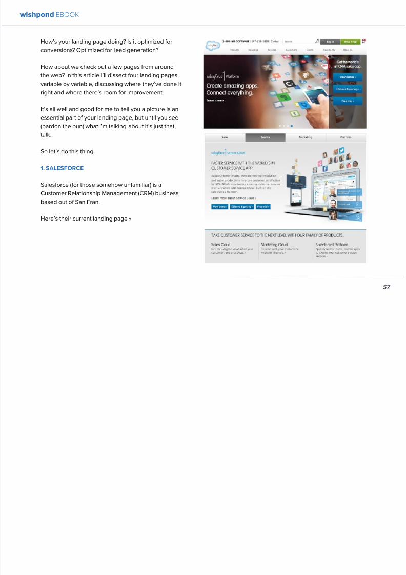
892019 Landing Pages eBook 1
httpslidepdfcomreaderfulllanding-pages-ebook-1 5765
Howrsquos your landing page doing Is it optimized for
conversions Optimized for lead generation
How about we check out a few pages from around
the web In this article Irsquoll dissect four landing pagesvariable by variable discussing where theyrsquove done it
right and where therersquos room for improvement
Itrsquos all well and good for me to tell you a picture is an
essential part of your landing page but until you see
(pardon the pun) what Irsquom talking about itrsquos just that
talk
So letrsquos do this thing
1 SALESFORCE
Salesforce (for those somehow unfamiliar) is a
Customer Relationship Management (CRM) business
based out of San Fran
Herersquos their current landing page raquo
57
wishpond EBOOK
892019 Landing Pages eBook 1
httpslidepdfcomreaderfulllanding-pages-ebook-1 5865
What I Like About this Page
bull The imagery The first thing that hits you when you
traffic to SalesForcersquos landing page is the visual
representation of what they do Though by nomeans unique the visuals of lsquoconnect everything
with our awesome appsrsquo is clear
bull The image size I like how prominent their visuals
are About 75 of their lsquoabove the foldrsquo landing
page area is taken up by this image
bull The prioritized pages What I mean by this is simple
the three blue buttons on the right side (and also
beneath the benefit list paragraph) will traffic to
equally-optimized landing pages The tabs in gray
at the top are quite clearly subordinate (I know
this because of their color contrast encapsulation
etc) and traffic on them will be substantially less I
like the emphasis being placed on the things most
important to their leads
bull The Value Proposition Salesforce has gone
with two value propositions over a USP for their
header I like the succinct and appealing ldquoConnect
everythingrdquo especially
bull The benefit list Though not in bullet-point form
the below-the-fold paragraph of USPrsquos and value
propositions is still effective lsquoBuild customer loyaltyrsquo
(Boom) lsquoIncrease first call resolution and agent
productivityrsquo (Boom) lsquoImprove customer satisfactionby 37rsquo (Boom)
bull The specificity Perhaps my favorite part of this
entire landing is the sentence lsquoimprove customer
satisfaction by 37rsquo This kind of statistic is
incredibly convincing as itrsquos low enough and
specific enough to be entirely believable It also
shows me that theyrsquore professional enough to havedone their research and (I trust) can back up this
statistic with proof
Where I Think they Could Optimize this Page
bull Contrast the imagery I like the use of multiple
images on landing pages (one primary above-the-
fold and one secondary below it) However to
maximize the appeal of your images I recommend
you make them distinct from each other These two
images accomplish the same visual representation
I mentioned above How about keeping the same
image at the top and changing the below-the-fold
58
wishpond EBOOK
892019 Landing Pages eBook 1
httpslidepdfcomreaderfulllanding-pages-ebook-1 5965
59
image to a satisfied customer instead
bull Customer testimonials Perhaps SalesForce is relying on their substantial reputation as the worldrsquos CRM leader but
Irsquod still recommend they included a picture (and quote) from one of their prominent clients This is a businesses that
regularly works with Facebook General Electric and Delta Airlines Irsquod recommend testing a quote and image fromone of these businesses with the brand namelogo prominently placed
AB Testing Postulation
Irsquod theorize that integrating a customer testimonial with an image into a revolving album below-the-fold (on the right) could
increase conversion rates on this page by 10
2 MAILCHIMP
Mailchimp is the most successful email automation company out there (with more than 5 million users)
View their landing page on the next page
wishpond EBOOK
892019 Landing Pages eBook 1
httpslidepdfcomreaderfulllanding-pages-ebook-1 6065
60
wishpond EBOOK
892019 Landing Pages eBook 1
httpslidepdfcomreaderfulllanding-pages-ebook-1 6165
61
What I Like About this Page
bull The tagline ldquoSend Better Emailrdquo is one of the
simplest and most straightforward of all successful
landing pages Irsquove seen Itrsquos to the point andeffective Mailchimp has also had this tagline since
mid June of 2013 meaning itrsquos working for them
bull The USP ldquoMore than 5 million people use
MailChimphelliprdquo is about as unique as you can get
Peer endorsement is the most powerful USP you
can bring into play
bull The Image Red on a blue background stands out
fantastically and attracts the eye - I also the giving
a snapshot of their tool giving people a glimpse at
what they have to offer
bull The CTA(s) Although not as noticeable as ldquoSign
up Freerdquo (which consistently performs better than
simply ldquoSign Uprdquo) I really like ldquoJoin them todayrdquo in
the small paragraph beneath the tagline This is as
much as CTA as the buttons are and plays to the
peer pressure effectiveness of the page
Where I Think they Could Optimize this Page
bull The color scheme Irsquod be interested to see the
effect of a dark blue background and white taglines
benefits As it stands now the page is somewhatboring
bull The toolbar at the top Such a simple and minimalist
landing page needs to accentuate their ldquoFeaturesrdquo
ldquoPricesrdquo and ldquoSupportrdquo buttons at the top to make
it easy to access these important parts of the
decision-making process
bull The CTA(s) While I like the language used Irsquod be
curious to see the effect of making the CTAs stand
out a bit more with a contrasting color to draw the
eye
bull Irsquod test a customer testimonial rotation Mentioning
the 5 million people who use Mailchimp is all
well and good but Irsquod recommend rotating in a
photogenic former customer with a quote on the
effect that Mailchimp had on their businessrsquo email
marketing ROI
wishpond EBOOK
892019 Landing Pages eBook 1
httpslidepdfcomreaderfulllanding-pages-ebook-1 6265
62
AB Testing Postulation
Irsquod theorize that a customer testimonial addition could increase conversions on this page by up to 10 A concrete number
or percentage taken from a case study would make the page more effective
3 KISSMETRICS
Customer analytics platform
Kissmetrics is entrepreneur Neil
Patelrsquos 2008 baby
Herersquos their current landing page raquo
wishpond EBOOK
892019 Landing Pages eBook 1
httpslidepdfcomreaderfulllanding-pages-ebook-1 6365
63
What I Like About this Page
bull The image If yoursquore unsure exactly what image
you should use for your landing page fall back
on something like this A smiling normal-lookingperson (photogenic but not a model) is your best
bet
bull The simplicity Yes this is the entire landing page
Nothing but lsquoabove-the-foldrsquo It relies entirely on the
USP which is incredibly effective
bull Knowing their market Customer analytics are a field
only interesting to people who know what Google
Analytics is Nobody starts with Kissmetrics and
moves to Google Analytics As such the USP is
incredibly effective
bull Logging in with a Google account Irsquove mentioned
before how an email address is worth so much
more to your business than it is to its owner (and
how a phone number is so much more of an ask)
Well a social platform login is worth even less to
its owner - this allows Kissmetrics to ask for less
from a lead and get exactly the same details (if not
more) than they would were they to ask for an email
address
bull The popup The bottom-right popup (which reads
lsquowhatrsquos preventing you from wanting to start a
free trial of Kissmetricsrsquo) does not appear forevery person that traffics to this landing page
This would mediate the drop in conversion rates
that this popup likely causes However this popup
also provides Kissmetrics with extremely valuable
information namely what they can do to encourage
a sign-up Trading a little conversion rate (especially
if you do this temporarily) can be worth more
information This is a similar trade Irsquove talked aboutbefore where more entry boxes give you better
lead knowledge but can decrease conversion rates
- something you have to balance
Check out my article lsquoValue Proposition Formulas that
Boost Conversion on Ads and Landing Pagesrsquo where I
take an in-depth look at how to use Kissmetricrsquos formula
and 6 others
Where I Think they Could Optimize this Page
bull The Image Okay I really like this image but Irsquod be
curious to see how a landing page with a revolving
wishpond EBOOK
892019 Landing Pages eBook 1
httpslidepdfcomreaderfulllanding-pages-ebook-1 6465
64
album would do How about three different USP
value proposition + image combinations revolving
every 75 seconds (Genuinely I recommend you
test the time lapse you use if you employ revolving
images)
bull Learn More The ldquoLearn Morerdquo link in the bottom
left of this landing page is too quiet Irsquod recommend
a subtle encapsulation and slightly larger font I
think this landing page is incredibly effective but
clearly the issue theyrsquoll have is not offering enough
information about what they do A ldquoLearn Morerdquo
link is an awesome way of doing this but itrsquos notobvious enough for everyone to see and I wonder if
that doesnrsquot increase their bounce rate
bull A Case Studies Tab I donrsquot want to ruin the
contemporary minimalist appeal of this landing
page but I would be interested in testing a lsquocase
studiesrsquo or lsquocustomer storiesrsquo tab next to lsquoSign Inrsquo on
the top bar Like the lsquoLearn Morersquo link this would
make it a little easier for visitors to find the answers
to their questions without cluttering the page with
the customer testimonials benefit list and trust
symbols I usually recommend
AB Testing Postulation
Irsquod theorize that making the lsquoLearn Morersquo link on the
bottom right just slightly more obvious would increase
conversions from this page Herersquos why If someone typesin lsquocustomer analyticsrsquo into Google search theyrsquoll click on
Kissmetrics Irsquod be concerned that at the moment they
may bounce due to lack of ready information A more
visible lsquoLearn Morersquo link could increase conversion by up
to 5
Conclusion
The variables Irsquove discussed and critiqued in this article
encompass most of the optimization strategies I give
our clients Remember that every audience is different
and that (unless yoursquore using an optimized landing page
template) yoursquoll need to AB test your own landing pages
on a monthly basis
wishpond EBOOK
892019 Landing Pages eBook 1
httpslidepdfcomreaderfulllanding-pages-ebook-1 6565
Creating and optimizing your businessrsquo landing pages can be the most influential change you make this year
Wishpondrsquos own landing pages are being constantly updated and optimized - our templates completely customizable Start
a free trial today to check them out and see if wersquore a fit for your business
Thanks for reading
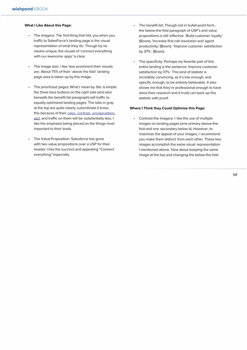
892019 Landing Pages eBook 1
httpslidepdfcomreaderfulllanding-pages-ebook-1 6165
61
What I Like About this Page
bull The tagline ldquoSend Better Emailrdquo is one of the
simplest and most straightforward of all successful
landing pages Irsquove seen Itrsquos to the point andeffective Mailchimp has also had this tagline since
mid June of 2013 meaning itrsquos working for them
bull The USP ldquoMore than 5 million people use
MailChimphelliprdquo is about as unique as you can get
Peer endorsement is the most powerful USP you
can bring into play
bull The Image Red on a blue background stands out
fantastically and attracts the eye - I also the giving
a snapshot of their tool giving people a glimpse at
what they have to offer
bull The CTA(s) Although not as noticeable as ldquoSign
up Freerdquo (which consistently performs better than
simply ldquoSign Uprdquo) I really like ldquoJoin them todayrdquo in
the small paragraph beneath the tagline This is as
much as CTA as the buttons are and plays to the
peer pressure effectiveness of the page
Where I Think they Could Optimize this Page
bull The color scheme Irsquod be interested to see the
effect of a dark blue background and white taglines
benefits As it stands now the page is somewhatboring
bull The toolbar at the top Such a simple and minimalist
landing page needs to accentuate their ldquoFeaturesrdquo
ldquoPricesrdquo and ldquoSupportrdquo buttons at the top to make
it easy to access these important parts of the
decision-making process
bull The CTA(s) While I like the language used Irsquod be
curious to see the effect of making the CTAs stand
out a bit more with a contrasting color to draw the
eye
bull Irsquod test a customer testimonial rotation Mentioning
the 5 million people who use Mailchimp is all
well and good but Irsquod recommend rotating in a
photogenic former customer with a quote on the
effect that Mailchimp had on their businessrsquo email
marketing ROI
wishpond EBOOK
892019 Landing Pages eBook 1
httpslidepdfcomreaderfulllanding-pages-ebook-1 6265
62
AB Testing Postulation
Irsquod theorize that a customer testimonial addition could increase conversions on this page by up to 10 A concrete number
or percentage taken from a case study would make the page more effective
3 KISSMETRICS
Customer analytics platform
Kissmetrics is entrepreneur Neil
Patelrsquos 2008 baby
Herersquos their current landing page raquo
wishpond EBOOK
892019 Landing Pages eBook 1
httpslidepdfcomreaderfulllanding-pages-ebook-1 6365
63
What I Like About this Page
bull The image If yoursquore unsure exactly what image
you should use for your landing page fall back
on something like this A smiling normal-lookingperson (photogenic but not a model) is your best
bet
bull The simplicity Yes this is the entire landing page
Nothing but lsquoabove-the-foldrsquo It relies entirely on the
USP which is incredibly effective
bull Knowing their market Customer analytics are a field
only interesting to people who know what Google
Analytics is Nobody starts with Kissmetrics and
moves to Google Analytics As such the USP is
incredibly effective
bull Logging in with a Google account Irsquove mentioned
before how an email address is worth so much
more to your business than it is to its owner (and
how a phone number is so much more of an ask)
Well a social platform login is worth even less to
its owner - this allows Kissmetrics to ask for less
from a lead and get exactly the same details (if not
more) than they would were they to ask for an email
address
bull The popup The bottom-right popup (which reads
lsquowhatrsquos preventing you from wanting to start a
free trial of Kissmetricsrsquo) does not appear forevery person that traffics to this landing page
This would mediate the drop in conversion rates
that this popup likely causes However this popup
also provides Kissmetrics with extremely valuable
information namely what they can do to encourage
a sign-up Trading a little conversion rate (especially
if you do this temporarily) can be worth more
information This is a similar trade Irsquove talked aboutbefore where more entry boxes give you better
lead knowledge but can decrease conversion rates
- something you have to balance
Check out my article lsquoValue Proposition Formulas that
Boost Conversion on Ads and Landing Pagesrsquo where I
take an in-depth look at how to use Kissmetricrsquos formula
and 6 others
Where I Think they Could Optimize this Page
bull The Image Okay I really like this image but Irsquod be
curious to see how a landing page with a revolving
wishpond EBOOK
892019 Landing Pages eBook 1
httpslidepdfcomreaderfulllanding-pages-ebook-1 6465
64
album would do How about three different USP
value proposition + image combinations revolving
every 75 seconds (Genuinely I recommend you
test the time lapse you use if you employ revolving
images)
bull Learn More The ldquoLearn Morerdquo link in the bottom
left of this landing page is too quiet Irsquod recommend
a subtle encapsulation and slightly larger font I
think this landing page is incredibly effective but
clearly the issue theyrsquoll have is not offering enough
information about what they do A ldquoLearn Morerdquo
link is an awesome way of doing this but itrsquos notobvious enough for everyone to see and I wonder if
that doesnrsquot increase their bounce rate
bull A Case Studies Tab I donrsquot want to ruin the
contemporary minimalist appeal of this landing
page but I would be interested in testing a lsquocase
studiesrsquo or lsquocustomer storiesrsquo tab next to lsquoSign Inrsquo on
the top bar Like the lsquoLearn Morersquo link this would
make it a little easier for visitors to find the answers
to their questions without cluttering the page with
the customer testimonials benefit list and trust
symbols I usually recommend
AB Testing Postulation
Irsquod theorize that making the lsquoLearn Morersquo link on the
bottom right just slightly more obvious would increase
conversions from this page Herersquos why If someone typesin lsquocustomer analyticsrsquo into Google search theyrsquoll click on
Kissmetrics Irsquod be concerned that at the moment they
may bounce due to lack of ready information A more
visible lsquoLearn Morersquo link could increase conversion by up
to 5
Conclusion
The variables Irsquove discussed and critiqued in this article
encompass most of the optimization strategies I give
our clients Remember that every audience is different
and that (unless yoursquore using an optimized landing page
template) yoursquoll need to AB test your own landing pages
on a monthly basis
wishpond EBOOK
892019 Landing Pages eBook 1
httpslidepdfcomreaderfulllanding-pages-ebook-1 6565
Creating and optimizing your businessrsquo landing pages can be the most influential change you make this year
Wishpondrsquos own landing pages are being constantly updated and optimized - our templates completely customizable Start
a free trial today to check them out and see if wersquore a fit for your business
Thanks for reading
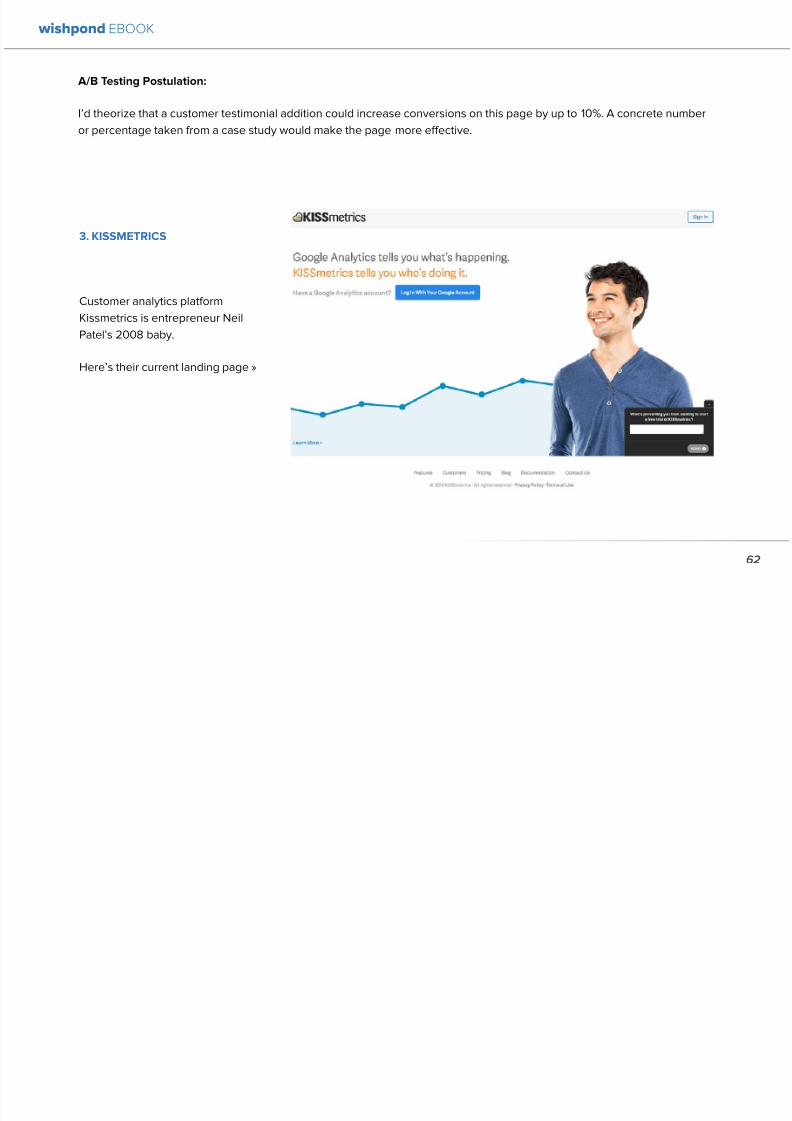
892019 Landing Pages eBook 1
httpslidepdfcomreaderfulllanding-pages-ebook-1 6365
63
What I Like About this Page
bull The image If yoursquore unsure exactly what image
you should use for your landing page fall back
on something like this A smiling normal-lookingperson (photogenic but not a model) is your best
bet
bull The simplicity Yes this is the entire landing page
Nothing but lsquoabove-the-foldrsquo It relies entirely on the
USP which is incredibly effective
bull Knowing their market Customer analytics are a field
only interesting to people who know what Google
Analytics is Nobody starts with Kissmetrics and
moves to Google Analytics As such the USP is
incredibly effective
bull Logging in with a Google account Irsquove mentioned
before how an email address is worth so much
more to your business than it is to its owner (and
how a phone number is so much more of an ask)
Well a social platform login is worth even less to
its owner - this allows Kissmetrics to ask for less
from a lead and get exactly the same details (if not
more) than they would were they to ask for an email
address
bull The popup The bottom-right popup (which reads
lsquowhatrsquos preventing you from wanting to start a
free trial of Kissmetricsrsquo) does not appear forevery person that traffics to this landing page
This would mediate the drop in conversion rates
that this popup likely causes However this popup
also provides Kissmetrics with extremely valuable
information namely what they can do to encourage
a sign-up Trading a little conversion rate (especially
if you do this temporarily) can be worth more
information This is a similar trade Irsquove talked aboutbefore where more entry boxes give you better
lead knowledge but can decrease conversion rates
- something you have to balance
Check out my article lsquoValue Proposition Formulas that
Boost Conversion on Ads and Landing Pagesrsquo where I
take an in-depth look at how to use Kissmetricrsquos formula
and 6 others
Where I Think they Could Optimize this Page
bull The Image Okay I really like this image but Irsquod be
curious to see how a landing page with a revolving
wishpond EBOOK
892019 Landing Pages eBook 1
httpslidepdfcomreaderfulllanding-pages-ebook-1 6465
64
album would do How about three different USP
value proposition + image combinations revolving
every 75 seconds (Genuinely I recommend you
test the time lapse you use if you employ revolving
images)
bull Learn More The ldquoLearn Morerdquo link in the bottom
left of this landing page is too quiet Irsquod recommend
a subtle encapsulation and slightly larger font I
think this landing page is incredibly effective but
clearly the issue theyrsquoll have is not offering enough
information about what they do A ldquoLearn Morerdquo
link is an awesome way of doing this but itrsquos notobvious enough for everyone to see and I wonder if
that doesnrsquot increase their bounce rate
bull A Case Studies Tab I donrsquot want to ruin the
contemporary minimalist appeal of this landing
page but I would be interested in testing a lsquocase
studiesrsquo or lsquocustomer storiesrsquo tab next to lsquoSign Inrsquo on
the top bar Like the lsquoLearn Morersquo link this would
make it a little easier for visitors to find the answers
to their questions without cluttering the page with
the customer testimonials benefit list and trust
symbols I usually recommend
AB Testing Postulation
Irsquod theorize that making the lsquoLearn Morersquo link on the
bottom right just slightly more obvious would increase
conversions from this page Herersquos why If someone typesin lsquocustomer analyticsrsquo into Google search theyrsquoll click on
Kissmetrics Irsquod be concerned that at the moment they
may bounce due to lack of ready information A more
visible lsquoLearn Morersquo link could increase conversion by up
to 5
Conclusion
The variables Irsquove discussed and critiqued in this article
encompass most of the optimization strategies I give
our clients Remember that every audience is different
and that (unless yoursquore using an optimized landing page
template) yoursquoll need to AB test your own landing pages
on a monthly basis
wishpond EBOOK
892019 Landing Pages eBook 1
httpslidepdfcomreaderfulllanding-pages-ebook-1 6565
Creating and optimizing your businessrsquo landing pages can be the most influential change you make this year
Wishpondrsquos own landing pages are being constantly updated and optimized - our templates completely customizable Start
a free trial today to check them out and see if wersquore a fit for your business
Thanks for reading
892019 Landing Pages eBook 1
httpslidepdfcomreaderfulllanding-pages-ebook-1 6465
64
album would do How about three different USP
value proposition + image combinations revolving
every 75 seconds (Genuinely I recommend you
test the time lapse you use if you employ revolving
images)
bull Learn More The ldquoLearn Morerdquo link in the bottom
left of this landing page is too quiet Irsquod recommend
a subtle encapsulation and slightly larger font I
think this landing page is incredibly effective but
clearly the issue theyrsquoll have is not offering enough
information about what they do A ldquoLearn Morerdquo
link is an awesome way of doing this but itrsquos notobvious enough for everyone to see and I wonder if
that doesnrsquot increase their bounce rate
bull A Case Studies Tab I donrsquot want to ruin the
contemporary minimalist appeal of this landing
page but I would be interested in testing a lsquocase
studiesrsquo or lsquocustomer storiesrsquo tab next to lsquoSign Inrsquo on
the top bar Like the lsquoLearn Morersquo link this would
make it a little easier for visitors to find the answers
to their questions without cluttering the page with
the customer testimonials benefit list and trust
symbols I usually recommend
AB Testing Postulation
Irsquod theorize that making the lsquoLearn Morersquo link on the
bottom right just slightly more obvious would increase
conversions from this page Herersquos why If someone typesin lsquocustomer analyticsrsquo into Google search theyrsquoll click on
Kissmetrics Irsquod be concerned that at the moment they
may bounce due to lack of ready information A more
visible lsquoLearn Morersquo link could increase conversion by up
to 5
Conclusion
The variables Irsquove discussed and critiqued in this article
encompass most of the optimization strategies I give
our clients Remember that every audience is different
and that (unless yoursquore using an optimized landing page
template) yoursquoll need to AB test your own landing pages
on a monthly basis
wishpond EBOOK
892019 Landing Pages eBook 1
httpslidepdfcomreaderfulllanding-pages-ebook-1 6565
Creating and optimizing your businessrsquo landing pages can be the most influential change you make this year
Wishpondrsquos own landing pages are being constantly updated and optimized - our templates completely customizable Start
a free trial today to check them out and see if wersquore a fit for your business
Thanks for reading